Embed Size (px)
Citation preview
Computer Graphics and the Visual System
Bobby BodenheimerElectrical Engineering and Computer Science

What is Computer Graphics?
Models Images
Graphics
Vision

More formally, Computer Graphics is the study of the processes involved in converting a mathematical description of an object (model) into a visualization, a two-dimensional projection that simulates the appearance of the real object.

Which is Real?

The point beingthat if you don’t understand the human visual system, you won’t understand how to make good images on a computer.

Change Blindness Demonstration
Change Blindness Demonstration
• Based on the work of Ronald Rensink at University of British Columbia
• http://www.usd.edu/psyc301/Rensink.htm
The Perceptual System
• Conflicting goals: high spatial resolution vs. wide aperture
• Organized in a “three-level hierarchy”– retina– fovea– receptors within fovea

What/Where Pathways
• Where Pathways– Motion Perception– Depth Perception– Spatial Organization– Figure/Background
Separation• Features
– Color Blind– Fast– High Contrast
Sensitivity
• What Pathway– Object Recognition– Face Recognition– Color Perception
• Features– Color Selective– Slow– Low Contrast
Sensitivity
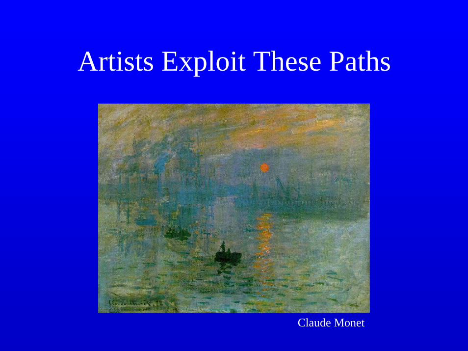
Artists Exploit These Paths
Claude Monet

Artists Exploit These Paths
Claude Monet

Artists Exploit These Paths
Abraham Walkowitz Raoul Drufy
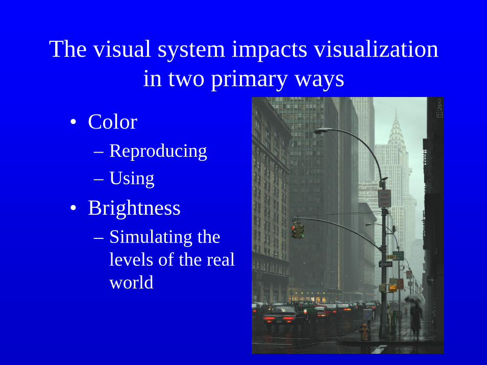
The visual system impacts visualization in two primary ways
• Color– Reproducing– Using
• Brightness– Simulating the
levels of the real world
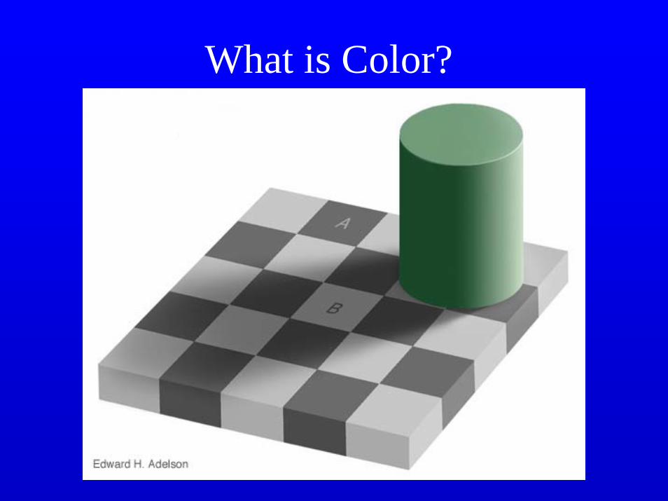
What is Color?
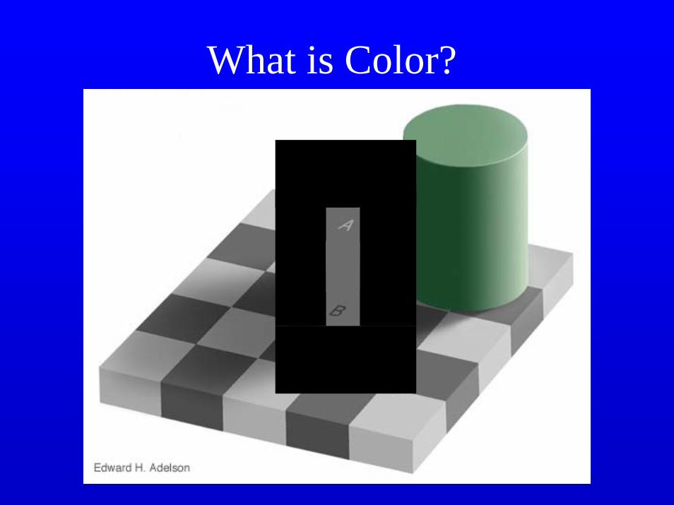
What is Color?

Color Terms
• Hue – dominant wavelength (red, blue, …).• Saturation – Purity (red = fully saturated;
pink = not full (add white light)).• Luminance – intensity of light (brightness,
but brightness is subjective).
Artists start with a "pure color or hue", then add black pigment to produce different shades. The more black pigment the darker the shade. They add white pigment and get different tints. Adding both black and white pigments gives different tones.
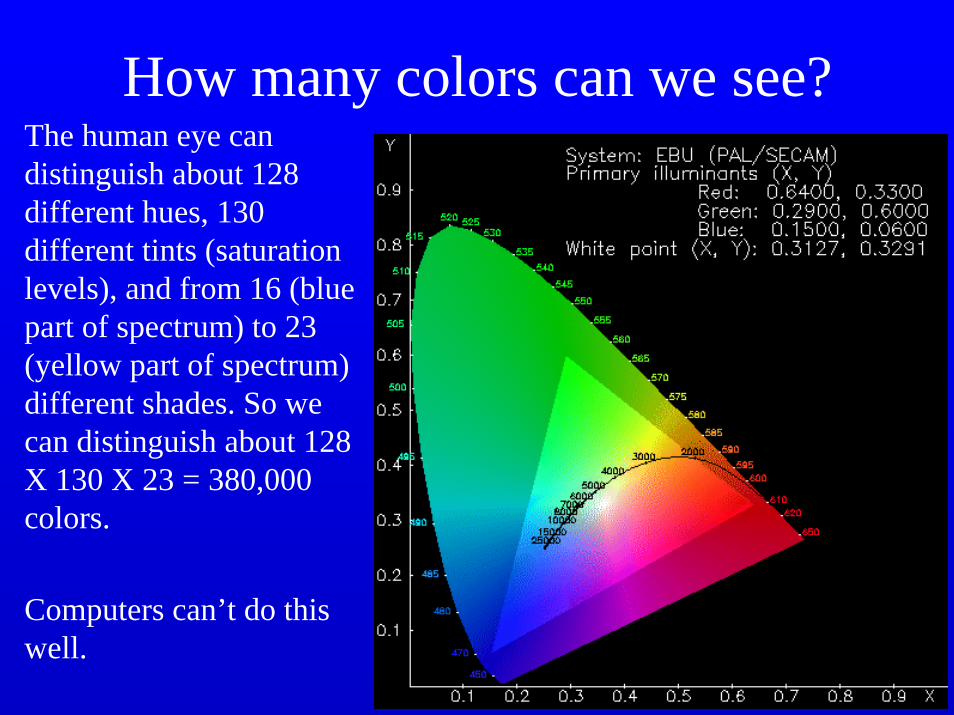
How many colors can we see?The human eye can distinguish about 128 different hues, 130 different tints (saturation levels), and from 16 (blue part of spectrum) to 23 (yellow part of spectrum) different shades. So we can distinguish about 128 X 130 X 23 = 380,000 colors.
Computers can’t do this well.
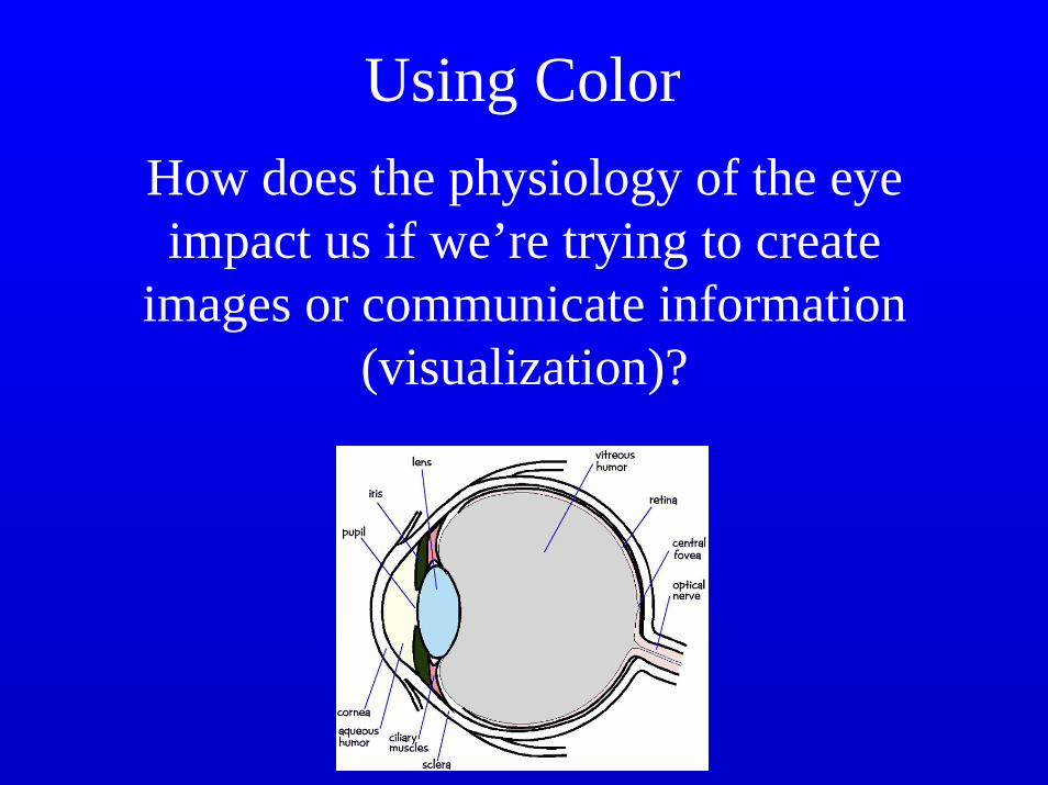
Using ColorHow does the physiology of the eye impact us if we’re trying to create
images or communicate information (visualization)?
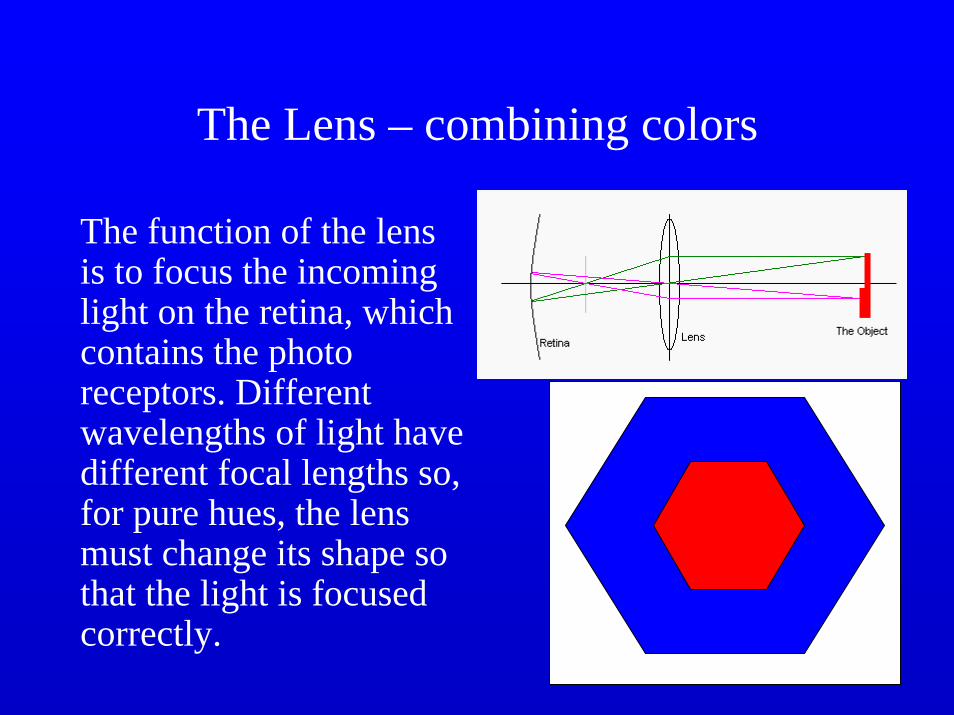
The Lens – combining colors
The function of the lens is to focus the incoming light on the retina, which contains the photo receptors. Different wavelengths of light have different focal lengths so, for pure hues, the lens must change its shape so that the light is focused correctly.

Chromostereopsis
• A related effect in which pure colors at the same distance away from the eye appear to be at different distances, red appears closer, blue further.
• Pure blues sometimes focus in front of the retina and thus appear unfocused (at night, a blue sign may appear fuzzy).
The effects of age
• Lens absorbs more (about twice) as much blue as red. As we age, the lens yellows, absorbing more shorter wavelengths.
• People are more sensitive to yellows and oranges, and this increases with age.
• The vitreous humor also absorbs light, and this increases as we age – apparent brightness and sensitivity to blue decreases.

Monet’s Cataracts
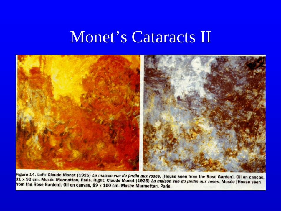
Monet’s Cataracts II
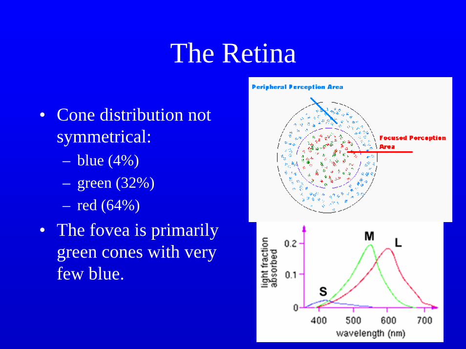
The Retina
• Cone distribution not symmetrical:– blue (4%)– green (32%)– red (64%)
• The fovea is primarily green cones with very few blue.
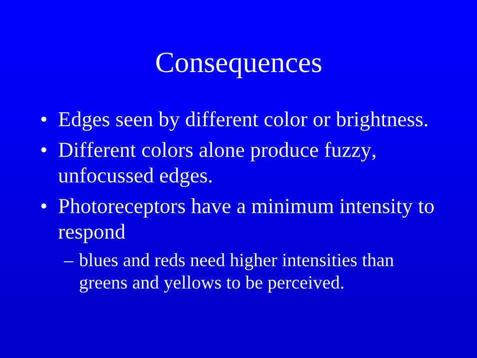
Consequences
• Edges seen by different color or brightness.• Different colors alone produce fuzzy,
unfocussed edges.• Photoreceptors have a minimum intensity to
respond– blues and reds need higher intensities than
greens and yellows to be perceived.

The BrainCells process color to
A = M +LR/G = M – LB/Y = S – A
So, transmitted in 3 axes: achromatic, red/green, blue/yellow.
Can’t have blueish yellow or reddish green.
Blue plays no part in brightness – things differing only in amount of blue produce fuzzy edges.

Color Blindness
• 8% of the male population, 0.6% of the female population has a color deficiency
• Genetic• Dichromats have one
type of cone missing• Anomalous
trichromats– shifted sensitivity Ishihara

Color Blind Impressions
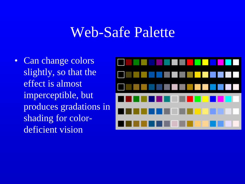
Web-Safe Palette
• Can change colors slightly, so that the effect is almost imperceptible, but produces gradations in shading for color-deficient vision
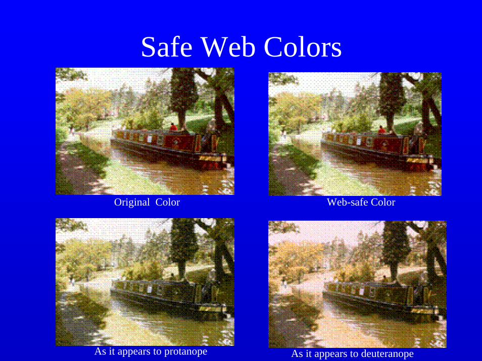
Safe Web Colors
Original Color Web-safe Color
As it appears to protanope As it appears to deuteranope
Guidelines
• Avoid simultaneous display of highly saturated, spectrally extreme colors: desaturate the colors or use colors close together in the spectrum.
• Avoid pure blue for text, thin lines, and small shapes. Blue makes an excellent background color (for computer displays it tends to blur the raster lines).

Guidelines
• Avoid adjacent colors differing only in the amount of blue (fuzzy edges).
• Older viewers need higher brightness levels to distinguish colors.
• The magnitude of detectable change in color varies across the spectrum.
• It’s difficult to focus upon edges created by color alone.
Guidelines
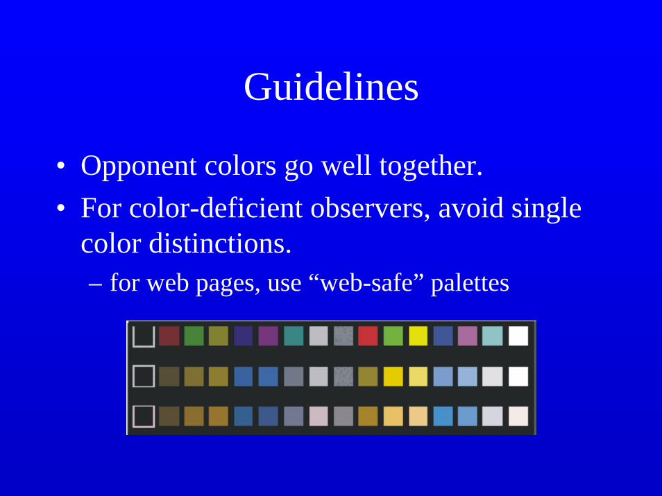
• Opponent colors go well together.• For color-deficient observers, avoid single
color distinctions.– for web pages, use “web-safe” palettes
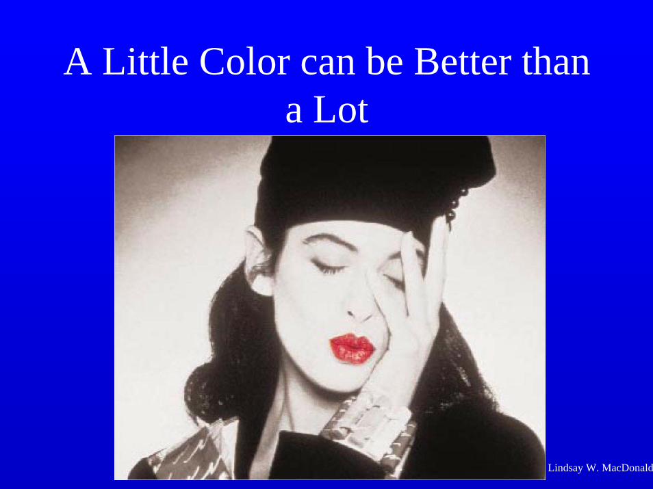
A Little Color can be Better than a Lot
Lindsay W. MacDonald
Resolution
• The human eye can resolve small details (under 1’ arc – 1/60th of a degree). This is our visual acuity
• Our eyes integrate detail that we cannot see, so we see an average intensity coming from small regions. This property is called spatial integration.
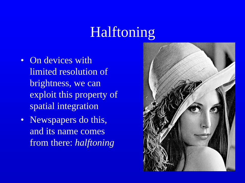
Halftoning
• On devices with limited resolution of brightness, we can exploit this property of spatial integration
• Newspapers do this, and its name comes from there: halftoning
What if we only have 2 intensity levels (white and black)?
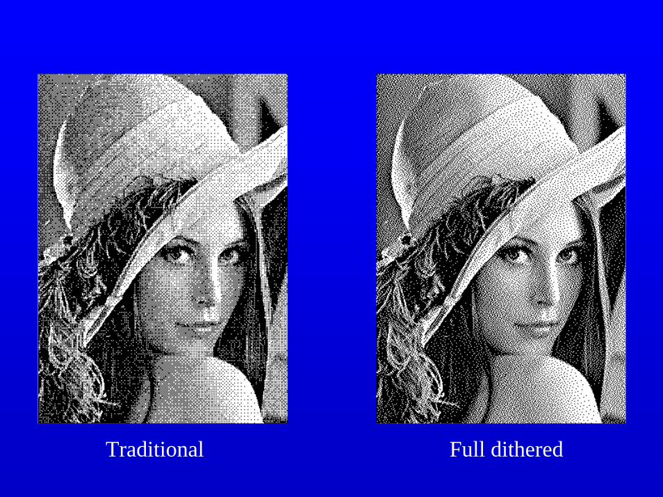
Traditional Full dithered
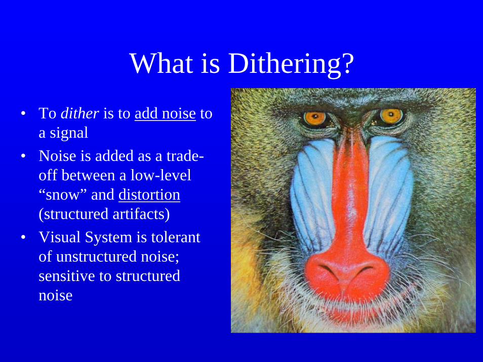
What is Dithering?• To dither is to add noise to
a signal• Noise is added as a trade-
off between a low-level “snow” and distortion(structured artifacts)
• Visual System is tolerant of unstructured noise; sensitive to structured noise

What do Artists Do?
Georges Suerat
• Pointillism• Reduced Color
Palette

Artistic Half-Toning
Ostromoukhov et al., SIGGRAPH ‘98

Photomosaics

Brightness (or Contrast)
• Computers have a fixed, linear range of brightness they can display, approximately 100 levels of contrast.
• The real world has contrast ranges of 100,000 or more, and the eye is generally capable of distinguishing them.
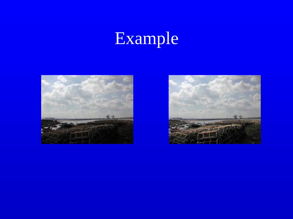
Example

Contrast ranges of common media
• Newspaper photographs 30:1• TV 60:1• Computer displays 100:1• Fine quality books 200:1• Slides 1000:1• Real World 100,000:1

What kinds of scenes have high contrast?
• Scenes including visible light sources, deep shadows, and specular highlights.
• How do we produce meaningful images with the limitations of our media?

We compress the light intensities
• Simple methods compress intensities and lose detail.
• More complicated methods can preserve detail.– selective compression that preserves edge and
texture information.

Example

What do Artists Do?
Georges Seurat

Example