Embed Size (px)
Citation preview
ComponentOne
Chart for Silverlight

Copyright 1987-2010 ComponentOne LLC. All rights reserved.
Corporate Headquarters
ComponentOne LLC
201 South Highland Avenue
3rd Floor
Pittsburgh, PA 15206 ∙ USA
Internet: [email protected]
Web site: http://www.componentone.com
Sales
E-mail: [email protected]
Telephone: 1.800.858.2739 or 1.412.681.4343 (Pittsburgh, PA USA Office)
Trademarks
The ComponentOne product name is a trademark and ComponentOne is a registered trademark of ComponentOne LLC. All
other trademarks used herein are the properties of their respective owners.
Warranty
ComponentOne warrants that the original CD (or diskettes) are free from defects in material and workmanship, assuming normal use, for a period of 90 days from the date of purchase. If a defect occurs during this time, you may return the defective
CD (or disk) to ComponentOne, along with a dated proof of purchase, and ComponentOne will replace it at no charge. After 90 days, you can obtain a replacement for a defective CD (or disk) by sending it and a check for $25 (to cover postage and
handling) to ComponentOne.
Except for the express warranty of the original CD (or disks) set forth here, ComponentOne makes no other warranties, express
or implied. Every attempt has been made to ensure that the information contained in this manual is correct as of the time it was
written. We are not responsible for any errors or omissions. ComponentOne’s liability is limited to the amount you paid for the product. ComponentOne is not liable for any special, consequential, or other damages for any reason.
Copying and Distribution
While you are welcome to make backup copies of the software for your own use and protection, you are not permitted to make
copies for the use of anyone else. We put a lot of time and effort into creating this product, and we appreciate your support in seeing that it is used by licensed users only.
This manual was produced using ComponentOne Doc-To-Help™.
iii
Table of Contents
Chart ................................................................................................................................................................. 1
Chart for Silverlight Key Features ....................................................................................................................... 1
Chart for Silverlight Quick Start .......................................................................................................................... 2
Step 1 of 4: Creating an Application with a C1Chart Control ............................................................ 2
Step 2 of 4: Adding Data to the Chart .................................................................................................. 3
Step 3 of 4: Format the Axes ................................................................................................................. 4
Step 4 of 4: Adjust the Chart’s Appearance .......................................................................................... 6
Chart for Silverlight Top Tips .............................................................................................................................. 7
C1Chart Concepts and Main Properties ........................................................................................................... 12
Common Usage for Basic 2D Charts ................................................................................................................ 13
Simple Charts ........................................................................................................................................ 13
Formatting Charts ................................................................................................................................ 25
Specialized Charts............................................................................................................................................... 26
Financial Charts ................................................................................................................................... 26
Gantt Charts ......................................................................................................................................... 27
Chart Types ......................................................................................................................................................... 29
Area Charts ........................................................................................................................................... 31
Bar Charts ............................................................................................................................................. 32
Bubble Charts ........................................................................................................................................ 34
Financial Charts ................................................................................................................................... 34
Column Charts ..................................................................................................................................... 37
Gantt Charts ......................................................................................................................................... 39
Line Charts............................................................................................................................................ 41
Pie Charts .............................................................................................................................................. 44
Polar and Radar Charts ........................................................................................................................ 46
Step Chart ............................................................................................................................................. 50
XYPlot Chart ........................................................................................................................................ 51
Chart Data Series ................................................................................................................................................ 51
Chart Data Series Types ...................................................................................................................... 51
Chart Data Series Appearance ............................................................................................................ 52
Differences Between DataSeries and XYDataSeries ......................................................................... 52
iv
Chart View .......................................................................................................................................................... 53
Axes ....................................................................................................................................................... 53
Axes Annotation................................................................................................................................... 61
Data Aggregation ................................................................................................................................................ 65
Data Labels ......................................................................................................................................................... 66
End User Interaction .......................................................................................................................................... 67
Run-Time Chart Editor ...................................................................................................................................... 68
Chart Tab .............................................................................................................................................. 69
Data Tab ............................................................................................................................................... 69
Axes Tab ............................................................................................................................................... 70
Data-Binding ....................................................................................................................................................... 71
Data-Binding to C1.Silverlight.Data ................................................................................................... 72
Data Labels and Tooltips ..................................................................................................................... 74
Advanced Topics ................................................................................................................................................ 77
Animation ............................................................................................................................................. 77
Zooming and Panning .......................................................................................................................... 80
Attaching Elements to Data Points ..................................................................................................... 84
Using XAML ...................................................................................................................................................... 86
Plotting Functions............................................................................................................................................... 88
Using a Code String to Define a Function ......................................................................................... 89
Calculating the Value for Functions ................................................................................................... 89
TrendLines .......................................................................................................................................................... 89
Chart for Silverlight Appearance ....................................................................................................................... 89
XAML Elements .................................................................................................................................. 89
Chart Resource Keys ............................................................................................................................ 90
Chart Themes ....................................................................................................................................... 91
Data Series Color Palette ..................................................................................................................... 99
Visual Effects ...................................................................................................................................... 107
Chart for Silverlight Samples ........................................................................................................................... 112
Chart for Silverlight Task-Based Help ............................................................................................................. 113
Adding a ScrollBar to C1Chart ......................................................................................................... 113
Rotating the Chart Labels in the X-Axis........................................................................................... 114
Creating a Custom Axis Label to Set the Mark at the Middle of the Year .................................... 114
Breaking Chart Lines when the Y-Value is Null .............................................................................. 114
Exporting the Chart Image to the PDF on the Client ...................................................................... 115
Saving the Chart Image as Jpeg or Png ............................................................................................ 115
Adding Data Values to a Pie Chart ................................................................................................... 116
v
Converting DataSet to DataSeries .................................................................................................... 116
Finding the Default Color Used for the Series ................................................................................. 117
Setting Custom Colors in DataSeries.Loaded Event ....................................................................... 117
Showing Trend Marks in C1Chart .................................................................................................... 118
Placing the Chart Annotations on Top ............................................................................................. 119
Display DataSeries Label as Tooltip on Mouseover in Line Chart ................................................ 119
Showing the X-Values in the Tooltip ................................................................................................ 120
Creating Wrap Around Text Blocks for Large Number of Series ................................................... 121
Creating a Mouse Move Event for Chart with Multiple Lines ....................................................... 121

1
Chart The C1.Silverlight.Chart assembly contains two main objects: the C1Chart and C1ChartLegend controls.
C1Chart is a powerful charting tool that allows you to display quantitative data in clear and attractive ways.
C1Chart also supports advanced features such as animations and user interactions, including zooming and
panning.
C1ChartLegend is a separate control used to display a chart legend for a given C1Chart control. The legend is
implemented as a separate control to leverage the Silverlight/WPF layout mechanism.
Chart for Silverlight Key Features ComponentOne Chart for Silverlight includes several key features, such as:
30+ Chart Types
Get the exact chart representation you need for your Silverlight application by choosing from over 30
popular 2D chart types. Available chart types include line, scatter, bar, column, pie, area and many more.
Professionally Designed with Just Two Properties
Chart includes 12 built-in themes and 22 built-in palettes. Both are set with just one property inside Visual
Studio! Themes apply to the entire chart area while palettes apply to just the chart elements (bars, points,
pie slices, etc). Combine themes with different palettes to effortlessly make an endless combination of
looks.
Labels and Tooltips
Display relative data values over chart elements as labels or tooltips. Any UI elements can be used as
labels and tooltips allowing full customization.
Chart Legends
Create a separate chart legend using the C1ChartLegend control that connects to the chart through one
property. This design provides maximum flexibility when styling and positioning the legend.
Fully Interactive Charts
Enhance the end-user experience by allowing end users to zoom in and out, scale, and scroll the chart.
Multiple Axes
Chart supports multiple, dependent axes that are added to the chart by simply defining an Axis object and
adding it to the chart’s View.Axes collection.
Logarithmic Axis Scales
Chart supports logarithmic axis scales of any base.
Trend Lines
Analyze your charted data with trend lines. Chart supports several automatic trend lines including
polynomial, exponential, logarithmic, power, fourier, averages, minimums and maximums.
Lighting and Shadow Effects
Create borders with lighting effects and add soft or hard shadows behind plot elements.
Stacked Charts
2
Stacking charts offers a simplified approach for representing complex data. Line, area, bar, radar, and plot
charts can be stacked to display more complex data in a smaller space.
Dynamic Graphics
Chart takes advantage of the dynamic graphics available in the Silverlight platform including perspective
and animation.
Silverlight Toolkit Themes Support
In addition to the 12 built-in themes, Chart ships with the most popular Microsoft Silverlight Toolkit
themes including ExpessionDark, ExpressionLight, WhistlerBlue, RainerOrange, ShinyBlue, and
BureauBlack.
Chart for Silverlight Quick Start The following quick start guide is intended to get you up and running with Chart for Silverlight. In this quick
start, you'll start in Visual Studio to create a new project with a C1Chart control. You will also customize the
accordion, add accordion panes and content to it, and then observe some of the run-time features of the control.
Step 1 of 4: Creating an Application with a C1Chart Control
In this step, you'll begin in Visual Studio to create a Silverlight application using Chart for Silverlight.
Complete the following steps:
1. In Visual Studio 2008, select File | New | Project.
2. In the New Project dialog box, select a language in the left pane, and in the templates list select
Silverlight Application. Enter a Name for your project and click OK. The New Silverlight Application
dialog box will appear.
3. Click OK to close the New Silverlight Application dialog box and create your project.
4. In the XAML window of the project, resize the UserControl by changing DesignWidth="640"
DesignHeight="480" to DesignWidth="Auto" DesignHeight="Auto" in the
<UserControl> tag so that it appears similar to the following: <UserControl x:Class="ChartSilverlight_Quick_Start.MainPage"
xmlns="http://schemas.microsoft.com/winfx/2006/xaml/presentation"
xmlns:x="http://schemas.microsoft.com/winfx/2006/xaml"
xmlns:d="http://schemas.microsoft.com/expression/blend/2008"
xmlns:mc="http://schemas.openxmlformats.org/markup-compatibility/2006"
mc:Ignorable="d" d:DesignWidth="Auto" d:DesignHeight="Auto">
The UserControl will now resize to accommodate any content placed within it.
5. In the XAML window of the project, place the cursor between the <Grid> and </Grid> tags and click
once. Note that you cannot currently add Silverlight controls directly to the design area in Visual Studio,
so you must add them to the XAML window as directed in the next step.
6. Navigate to the Toolbox and double-click the C1Chart icon to add the control to the grid. The XAML
markup resembles the following: <Grid x:Name="LayoutRoot">
<c1chart:C1Chart></c1chart:C1Chart>
</Grid>
7. Inside the Grid, initialize the C1Chart control and give it a name by adding x:Name=”c1Chart1” to the
<c1chart:C1Chart> tag so that it appears similar to the following: <c1chart:C1Chart Margin="0,0,8,8" MinHeight="160" MinWidth="240"
Name="c1Chart1">
</c1chart:C1Chart>
3
The chart appears empty since we did not add the data for it yet.
What You’ve Accomplished
You've successfully created a Silverlight application containing a C1Chart control. In the next step, you will Step 2
of 4: Adding Data to the Chart (page 3), you will add the data for C1Chart.
Step 2 of 4: Adding Data to the Chart
In the last step, you added the C1Chart control to the Window. In this step, you will add a DataSeries object and
data for it.
To add data to the chart programmatically in the code behind file
1. Right-click on the MainPage.xaml file and select View Code to open the editor.
2. Add the C1.Silverlight.C1Chart namespace directive
Visual Basic Imports C1.Silverlight.Chart
C# using C1.Silverlight.Chart;
3. Add the following code in the constructor Window1 class to create the Bar chart:
Visual Basic ' Clear previous data
c1Chart1.Data.Children.Clear()
' Add Data
Dim ProductNames As String() = {"Hand Mixer", "Stand Mixer", "Can
Opener", "Toaster", "Blender", "Food Processor", _
"Slow Cooker", "Microwave"}
Dim PriceX As Integer() = {80, 400, 20, 60, 150, 300, _
130, 500}
' create single series for product price
Dim ds1 As New DataSeries()
ds1.Label = "Price X"
'set price data
ds1.ValuesSource = PriceX
' add series to the chart
c1Chart1.Data.Children.Add(ds1)
' add item names
c1Chart1.Data.ItemNames = ProductNames
' Set chart type
c1Chart1.ChartType = ChartType.Bar
C# // Clear previous data
c1Chart1.Data.Children.Clear();
// Add Data
4
string[] ProductNames = { "Hand Mixer", "Stand Mixer", "Can Opener",
"Toaster", "Blender", "Food Processor", "Slow Cooker", "Microwave" };
int[] PriceX = { 80, 400, 20, 60, 150, 300, 130, 500 };
// create single series for product price
DataSeries ds1 = new DataSeries();
ds1.Label = "Price X";
//set price data
ds1.ValuesSource = PriceX;
// add series to the chart
c1Chart1.Data.Children.Add(ds1);
// add item names
c1Chart1.Data.ItemNames = ProductNames;
// Set chart type
c1Chart1.ChartType = ChartType.Bar;
In the next step, Step 3 of 4: Format the Axes (page 4), you’ll learn how to customize the axes
programmatically
What You’ve Accomplished
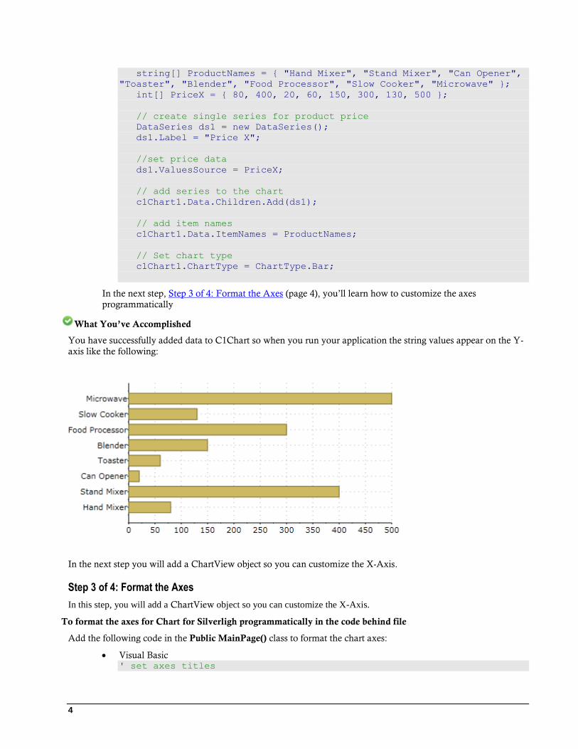
You have successfully added data to C1Chart so when you run your application the string values appear on the Y-
axis like the following:
In the next step you will add a ChartView object so you can customize the X-Axis.
Step 3 of 4: Format the Axes
In this step, you will add a ChartView object so you can customize the X-Axis.
To format the axes for Chart for Silverligh programmatically in the code behind file
Add the following code in the Public MainPage() class to format the chart axes:
Visual Basic ' set axes titles
5
C1Chart1.View.AxisY.Title = New TextBlock(New Run("Kitchen
Electronics"))
C1Chart1.View.AxisX.Title = New TextBlock(New Run("Price"))
' set axes bounds
C1Chart1.View.AxisX.Min = 0
C1Chart1.View.AxisX.Max = 500
c1Chart1.View.AxisX.MajorUnit = 20
' Financial formatting
C1Chart1.View.AxisX.AnnoFormat = "c"
' axis annotation rotation
C1Chart1.View.AxisX.AnnoAngle = "60"
C# // set axes titles
c1Chart1.View.AxisY.Title= new TextBlock() { Text = "Kitchen
Electronics" };
c1Chart1.View.AxisX.Title = new TextBlock() { Text = "Price" };
// set axes bounds
c1Chart1.View.AxisX.Min = 0;
c1Chart1.View.AxisX.Max = 500;
c1Chart1.View.AxisX.MajorUnit = 20;
// financial formatting
c1Chart1.View.AxisX.AnnoFormat = "c";
// axis annotation rotation
c1Chart1.View.AxisX.AnnoAngle=60;
In the next step, Step 4 of 4: Adjust the Chart’s Appearance (page 6), you’ll learn how to customize the
chart’s appearance programmatically.
What You’ve Accomplished
You have successfully formatted the Chart Axes so when you run your application the new format for the axis
annotation is applied to the chart.

6
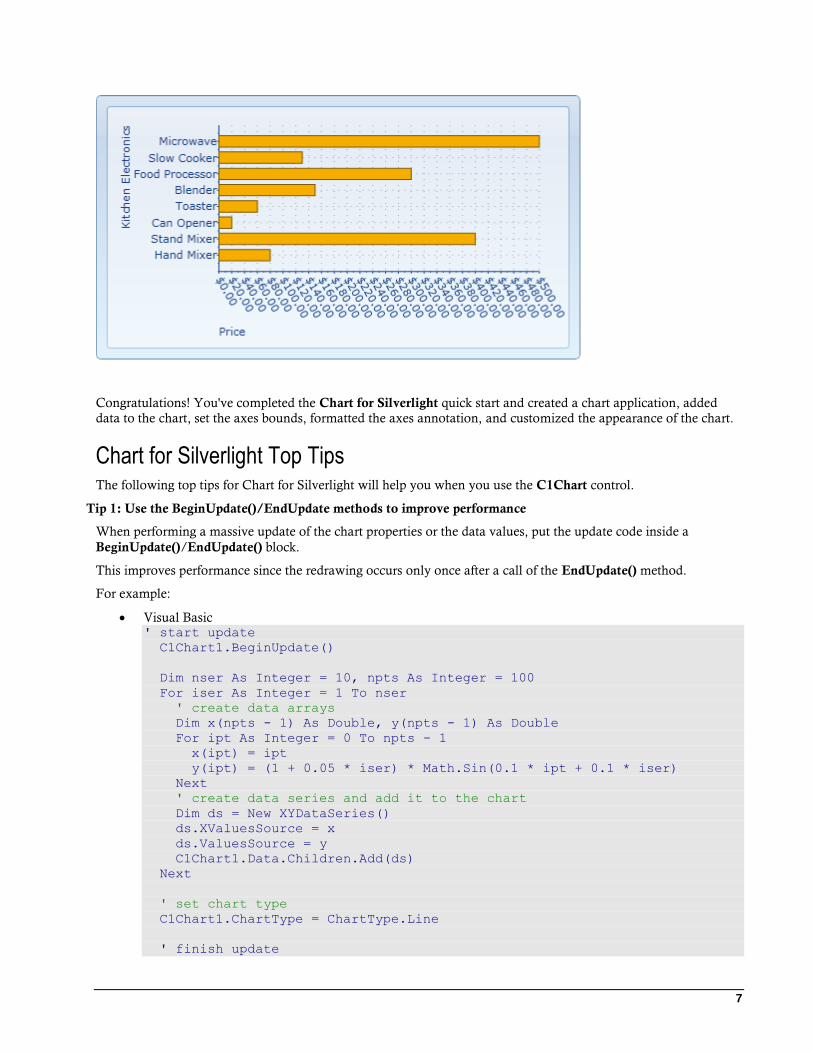
In the next step you will apply a theme and palette to C1Chart to adjust its appearance.
Step 4 of 4: Adjust the Chart’s Appearance
In this last step, you will adjust the chart’s appearance using the Theme property and the C1Chart.Palette property.
To set chart’s theme and palette programmatically in the code behind file
To specifically define the Office2007Blue theme in your chart, add the following code your project:
Visual Basic c1Chart1.Palette = Palette.Module;
c1Chart1.Theme = ChartTheme.Office2007Blue;
C# c1Chart1.Palette = Palette.Module;
c1Chart1.Theme = ChartTheme.Office2007Blue;
What You’ve Accomplished
You successfully applied the Office 2007 Blue theme and the Module to the C1Chart control. When you run your
application it appears like the following:
7
Congratulations! You've completed the Chart for Silverlight quick start and created a chart application, added
data to the chart, set the axes bounds, formatted the axes annotation, and customized the appearance of the chart.
Chart for Silverlight Top Tips The following top tips for Chart for Silverlight will help you when you use the C1Chart control.
Tip 1: Use the BeginUpdate()/EndUpdate methods to improve performance
When performing a massive update of the chart properties or the data values, put the update code inside a
BeginUpdate()/EndUpdate() block.
This improves performance since the redrawing occurs only once after a call of the EndUpdate() method.
For example:
Visual Basic ' start update
C1Chart1.BeginUpdate()
Dim nser As Integer = 10, npts As Integer = 100
For iser As Integer = 1 To nser
' create data arrays
Dim x(npts - 1) As Double, y(npts - 1) As Double
For ipt As Integer = 0 To npts - 1
x(ipt) = ipt
y(ipt) = (1 + 0.05 * iser) * Math.Sin(0.1 * ipt + 0.1 * iser)
Next
' create data series and add it to the chart
Dim ds = New XYDataSeries()
ds.XValuesSource = x
ds.ValuesSource = y
C1Chart1.Data.Children.Add(ds)
Next
' set chart type
C1Chart1.ChartType = ChartType.Line
' finish update
8
C1Chart1.EndUpdate()
C# // start update
c1Chart1.BeginUpdate();
int nser = 10, npts = 100;
for (int iser = 0; iser < nser; iser++)
{
// create data arrays
double[] x = new double[npts], y = new double[npts];
for (int ipt = 0; ipt < npts; ipt++)
{
x[ipt] = ipt;
y[ipt] = (1 + 0.05 * iser) * Math.Sin(0.1 * ipt + 0.1 * iser);
}
// create data series and add it to the chart
XYDataSeries ds = new XYDataSeries();
ds.XValuesSource = x; ds.ValuesSource = y;
c1Chart1.Data.Children.Add(ds);
}
// set chart type
c1Chart1.ChartType = ChartType.Line;
// finish update
c1Chart1.EndUpdate();
Tip 2: Use the line or area chart type for large data arrays
The line and area charts provide the best performance when you have a lots of data values.
To get better performance, enable built-in optimization for large data by setting the attached property,
LineAreaOptions.OptimizationRadius. For example:
Visual Basic LineAreaOptions.SetOptimizationRadius(C1Chart1, 1.0)
C# LineAreaOptions.SetOptimizationRadius(c1Chart1, 1.0);
It's recommended you use small values 1.0 - 2.0 as radius. A larger value may affect the accuracy of the plot.
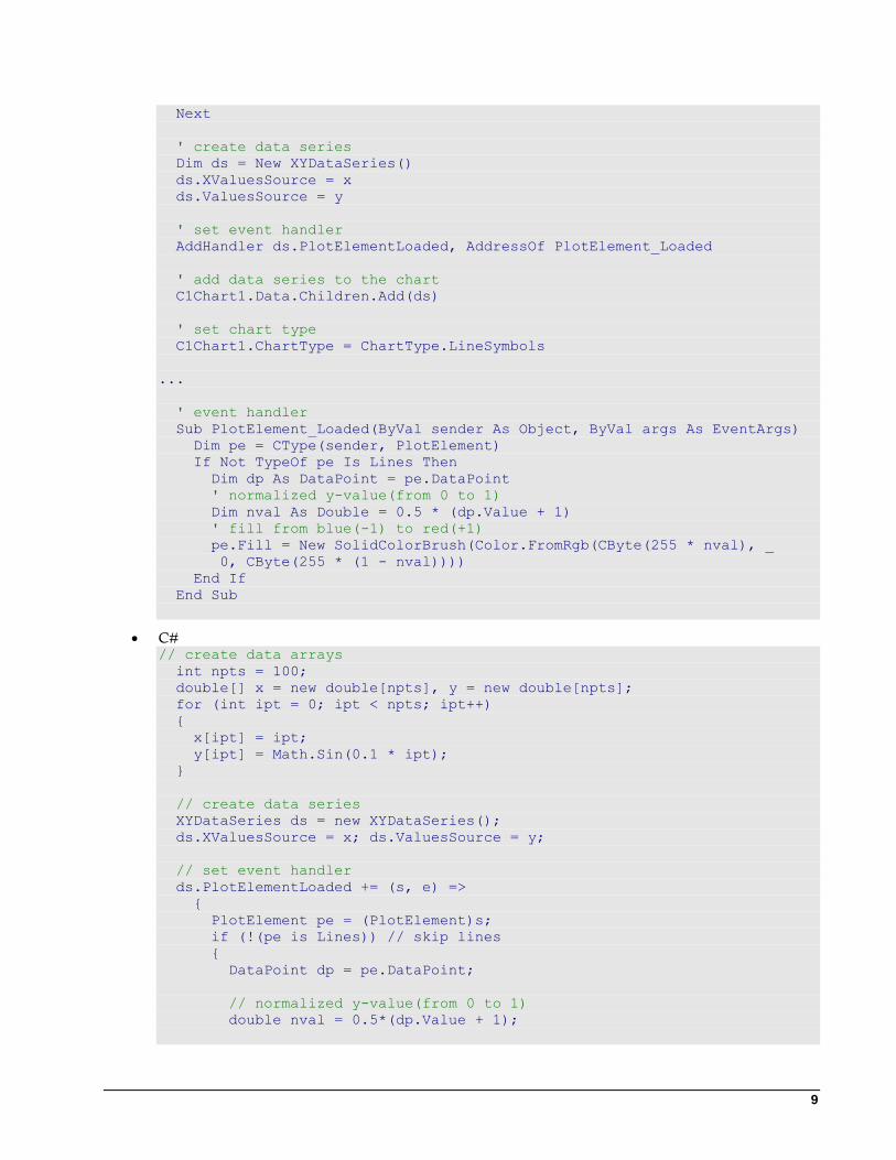
Tip 3: Update the appearance and behavior of a plot element using the DataSeries.PlotElementLoaded event
When any plot element (bar,column,pie, etc) is loaded it fires the PlotElementLoaded event. During this event you
have access to the plot element properties as well as to the corresponding data point.
The following code sets the colors of points depending on its y-value. For example:
Visual Basic ' create data arrays
Dim npts As Integer = 100
Dim x(npts - 1) As Double, y(npts - 1) As Double
For ipt As Integer = 0 To npts - 1
x(ipt) = ipt
y(ipt) = Math.Sin(0.1 * ipt)
9
Next
' create data series
Dim ds = New XYDataSeries()
ds.XValuesSource = x
ds.ValuesSource = y
' set event handler
AddHandler ds.PlotElementLoaded, AddressOf PlotElement_Loaded
' add data series to the chart
C1Chart1.Data.Children.Add(ds)
' set chart type
C1Chart1.ChartType = ChartType.LineSymbols
...
' event handler
Sub PlotElement_Loaded(ByVal sender As Object, ByVal args As EventArgs)
Dim pe = CType(sender, PlotElement)
If Not TypeOf pe Is Lines Then
Dim dp As DataPoint = pe.DataPoint
' normalized y-value(from 0 to 1)
Dim nval As Double = 0.5 * (dp.Value + 1)
' fill from blue(-1) to red(+1)
pe.Fill = New SolidColorBrush(Color.FromRgb(CByte(255 * nval), _
0, CByte(255 * (1 - nval))))
End If
End Sub
C# // create data arrays
int npts = 100;
double[] x = new double[npts], y = new double[npts];
for (int ipt = 0; ipt < npts; ipt++)
{
x[ipt] = ipt;
y[ipt] = Math.Sin(0.1 * ipt);
}
// create data series
XYDataSeries ds = new XYDataSeries();
ds.XValuesSource = x; ds.ValuesSource = y;
// set event handler
ds.PlotElementLoaded += (s, e) =>
{
PlotElement pe = (PlotElement)s;
if (!(pe is Lines)) // skip lines
{
DataPoint dp = pe.DataPoint;
// normalized y-value(from 0 to 1)
double nval = 0.5*(dp.Value + 1);

10
// fill from blue(-1) to red(+1)
pe.Fill = new SolidColorBrush(
Color.FromRgb((byte)(255 * nval), 0, (byte)(255 * (1-nval))));
}
};
// add data series to the chart
c1Chart1.Data.Children.Add(ds);
// set chart type
c1Chart1.ChartType = ChartType.LineSymbols;
Tip 4: Data point labels and tooltips
To create a data point label or tooltip, you should set the data template for the PointLabelTemplate or
PointTooltipTemplate property.
The following sample code shows the index for each data point.
XAML: <c1chart:C1Chart Name="c1Chart1" ChartType="XYPlot">
<c1chart:C1Chart.Data>
<c1chart:ChartData>
<!-- source collection -->
<c1chart:ChartData.ItemsSource>
<PointCollection>
<Point X="1" Y="1" />
<Point X="2" Y="2" />
<Point X="3" Y="3" />
<Point X="4" Y="2" />
<Point X="5" Y="1" />
</PointCollection>
</c1chart:ChartData.ItemsSource>
<c1chart:XYDataSeries SymbolSize="16,16"
XValueBinding="{Binding X}" ValueBinding="{Binding Y}">
<c1chart:XYDataSeries.PointLabelTemplate>
<DataTemplate>
<!-- display point index at the center of point symbol -->
<TextBlock
c1chart:PlotElement.LabelAlignment="MiddleCenter"
Text="{Binding PointIndex}" />
</DataTemplate>
</c1chart:XYDataSeries.PointLabelTemplate>
</c1chart:XYDataSeries>
</c1chart:ChartData>
</c1chart:C1Chart.Data>
</c1chart:C1Chart>
The data context of element created from the template is set to the instance of DataPoint class which contains
information about the corresponding data point.
Tip 5: Save chart as image
The following method saves chart image as png-file.
Visual Basic Sub Using stm = System.IO.File.Create(fileName)
c1Chart1.SaveImage(stm, ImageFormat.Png)
11
End Using
C# using (var stm = System.IO.File.Create(fileName))
{
c1Chart1.SaveImage(stm, ImageFormat.Png);
}
Tip 6: Printing chart
The following code prints the specified chart on the default printer with the default settings. For example:
Visual Basic Dim pd = New PrintDialog()
pd.PrintVisual(C1Chart1, "chart")
C# new PrintDialog().PrintVisual(c1Chart1, "chart");
Tip 7: Mixing Cartesian chart types
You can easily mix different chart types on the same Cartesian plot using the ChartType property.
The following code creates three data series: the first is area, the second is step, and the third has the default chart
type (line).
Visual Basic Dim nser As Integer = 3, npts As Integer = 25
For iser As Integer = 1 To nser
' create data arrays
Dim x(npts - 1) As Double, y(npts - 1) As Double
For ipt As Integer = 0 To npts - 1
x(ipt) = ipt
y(ipt) = (1 + 0.05 * iser) * Math.Sin(0.1 * ipt + 0.1 * iser)
Next
' create data series and add it to the chart
Dim ds = New XYDataSeries()
ds.XValuesSource = x
ds.ValuesSource = y
C1Chart1.Data.Children.Add(ds)
Next
'default chart type
C1Chart1.ChartType = ChartType.Line
' 1st series
C1Chart1.Data.Children(0).ChartType = ChartType.Area
' 2nd series
C1Chart1.Data.Children(1).ChartType = ChartType.Step
C# int nser = 3, npts = 25;
for (int iser = 0; iser < nser; iser++)
{
// create data arrays
12
double[] x = new double[npts], y = new double[npts];
for (int ipt = 0; ipt < npts; ipt++)
{
x[ipt] = ipt;
y[ipt] = (1 + 0.05 * iser) * Math.Sin(0.1 * ipt + 0.1 * iser);
}
// create data series and add it to the chart
XYDataSeries ds = new XYDataSeries();
ds.XValuesSource = x; ds.ValuesSource = y;
c1Chart1.Data.Children.Add(ds);
}
//default chart type
c1Chart1.ChartType = ChartType.Line;
// 1st series
c1Chart1.Data.Children[0].ChartType = ChartType.Area;
// 2nd series
c1Chart1.Data.Children[1].ChartType = ChartType.Step;
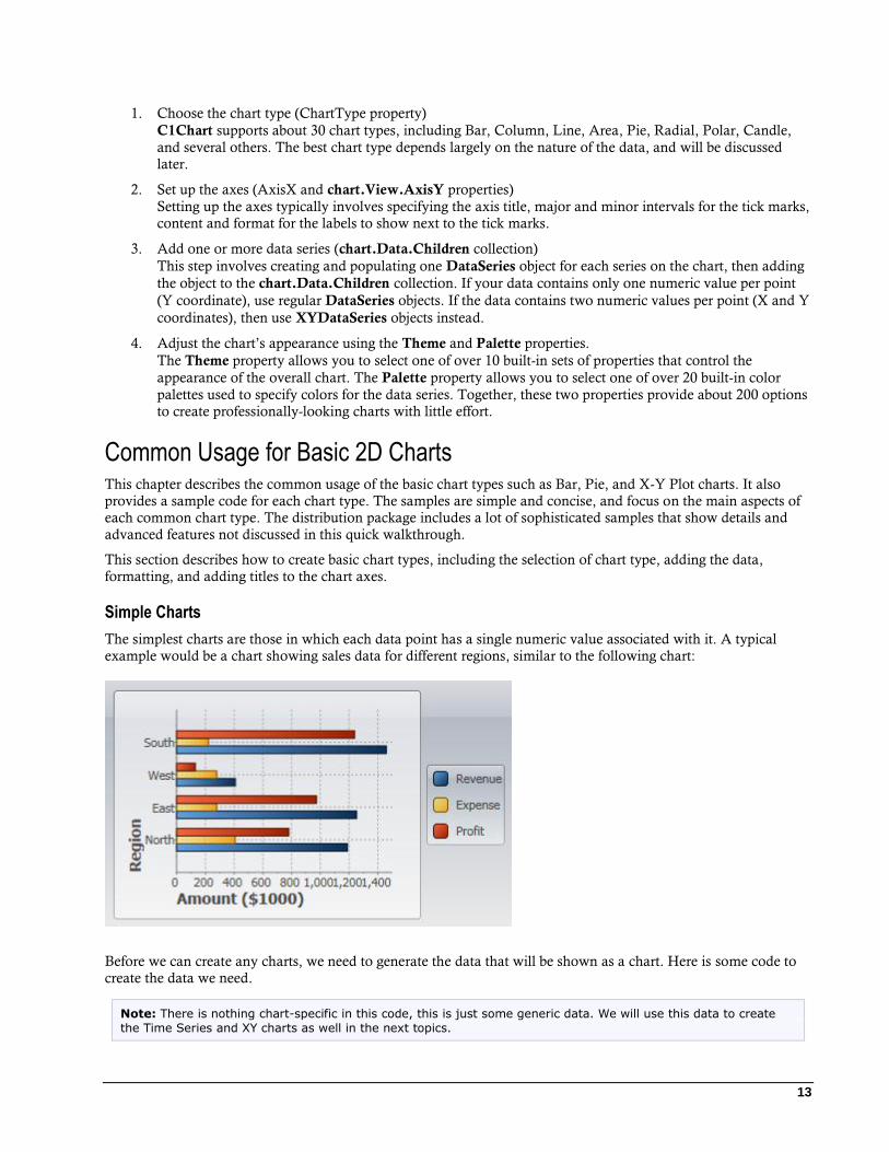
C1Chart Concepts and Main Properties In order to create and format charts using the C1Chart control, it is useful to understand how the main properties
map into chart elements. The diagram below illustrates this:
The steps involved in creating a typical chart are:
13
1. Choose the chart type (ChartType property)
C1Chart supports about 30 chart types, including Bar, Column, Line, Area, Pie, Radial, Polar, Candle,
and several others. The best chart type depends largely on the nature of the data, and will be discussed
later.
2. Set up the axes (AxisX and chart.View.AxisY properties)
Setting up the axes typically involves specifying the axis title, major and minor intervals for the tick marks,
content and format for the labels to show next to the tick marks.
3. Add one or more data series (chart.Data.Children collection)
This step involves creating and populating one DataSeries object for each series on the chart, then adding
the object to the chart.Data.Children collection. If your data contains only one numeric value per point
(Y coordinate), use regular DataSeries objects. If the data contains two numeric values per point (X and Y
coordinates), then use XYDataSeries objects instead.
4. Adjust the chart’s appearance using the Theme and Palette properties.
The Theme property allows you to select one of over 10 built-in sets of properties that control the
appearance of the overall chart. The Palette property allows you to select one of over 20 built-in color
palettes used to specify colors for the data series. Together, these two properties provide about 200 options
to create professionally-looking charts with little effort.
Common Usage for Basic 2D Charts This chapter describes the common usage of the basic chart types such as Bar, Pie, and X-Y Plot charts. It also
provides a sample code for each chart type. The samples are simple and concise, and focus on the main aspects of
each common chart type. The distribution package includes a lot of sophisticated samples that show details and
advanced features not discussed in this quick walkthrough.
This section describes how to create basic chart types, including the selection of chart type, adding the data,
formatting, and adding titles to the chart axes.
Simple Charts
The simplest charts are those in which each data point has a single numeric value associated with it. A typical
example would be a chart showing sales data for different regions, similar to the following chart:
Before we can create any charts, we need to generate the data that will be shown as a chart. Here is some code to
create the data we need.
Note: There is nothing chart-specific in this code, this is just some generic data. We will use this data to create
the Time Series and XY charts as well in the next topics.
14
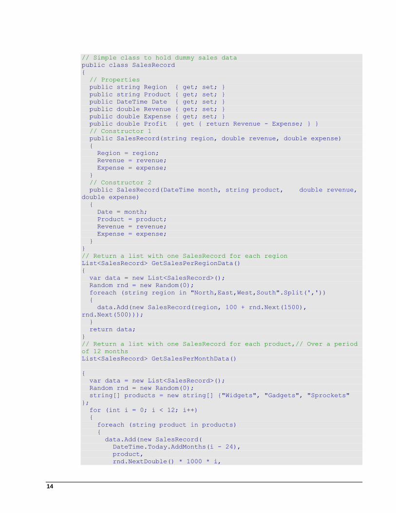
// Simple class to hold dummy sales data
public class SalesRecord
{
// Properties
public string Region { get; set; }
public string Product { get; set; }
public DateTime Date { get; set; }
public double Revenue { get; set; }
public double Expense { get; set; }
public double Profit { get { return Revenue - Expense; } }
// Constructor 1
public SalesRecord(string region, double revenue, double expense)
{
Region = region;
Revenue = revenue;
Expense = expense;
}
// Constructor 2
public SalesRecord(DateTime month, string product, double revenue,
double expense)
{
Date = month;
Product = product;
Revenue = revenue;
Expense = expense;
}
}
// Return a list with one SalesRecord for each region
List<SalesRecord> GetSalesPerRegionData()
{
var data = new List<SalesRecord>();
Random rnd = new Random(0);
foreach (string region in "North,East,West,South".Split(','))
{
data.Add(new SalesRecord(region, 100 + rnd.Next(1500),
rnd.Next(500)));
}
return data;
}
// Return a list with one SalesRecord for each product,// Over a period
of 12 months
List<SalesRecord> GetSalesPerMonthData()
{
var data = new List<SalesRecord>();
Random rnd = new Random(0);
string[] products = new string[] {"Widgets", "Gadgets", "Sprockets"
};
for (int i = 0; i < 12; i++)
{
foreach (string product in products)
{
data.Add(new SalesRecord(
DateTime.Today.AddMonths(i - 24),
product,
rnd.NextDouble() * 1000 * i,
15
rnd.NextDouble() * 1000 * i));
}
}
return data;
}
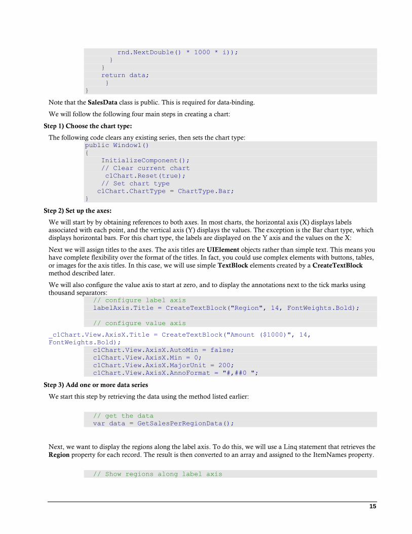
}
Note that the SalesData class is public. This is required for data-binding.
We will follow the following four main steps in creating a chart:
Step 1) Choose the chart type:
The following code clears any existing series, then sets the chart type: public Window1()
{
InitializeComponent();
// Clear current chart
c1Chart.Reset(true);
// Set chart type
c1Chart.ChartType = ChartType.Bar;
}
Step 2) Set up the axes:
We will start by by obtaining references to both axes. In most charts, the horizontal axis (X) displays labels
associated with each point, and the vertical axis (Y) displays the values. The exception is the Bar chart type, which
displays horizontal bars. For this chart type, the labels are displayed on the Y axis and the values on the X:
Next we will assign titles to the axes. The axis titles are UIElement objects rather than simple text. This means you
have complete flexibility over the format of the titles. In fact, you could use complex elements with buttons, tables,
or images for the axis titles. In this case, we will use simple TextBlock elements created by a CreateTextBlock
method described later.
We will also configure the value axis to start at zero, and to display the annotations next to the tick marks using
thousand separators: // configure label axis
labelAxis.Title = CreateTextBlock("Region", 14, FontWeights.Bold);
// configure value axis
_c1Chart.View.AxisX.Title = CreateTextBlock("Amount ($1000)", 14,
FontWeights.Bold);
c1Chart.View.AxisX.AutoMin = false;
c1Chart.View.AxisX.Min = 0;
c1Chart.View.AxisX.MajorUnit = 200;
c1Chart.View.AxisX.AnnoFormat = "#,##0 ";
Step 3) Add one or more data series
We start this step by retrieving the data using the method listed earlier:
// get the data
var data = GetSalesPerRegionData();
Next, we want to display the regions along the label axis. To do this, we will use a Linq statement that retrieves the
Region property for each record. The result is then converted to an array and assigned to the ItemNames property.
// Show regions along label axis

16
c1Chart.ChartData.ItemNames = (from r in data select
r.Region).ToArray();
Note how the use of Linq makes the code direct and concise. Things are made even simpler because our sample
data contains only one record per region. In a more realistic scenario, there would be several records per region,
and we would use a more complex Linq statement to group the data per region.
Now we are ready to create the actual DataSeries objects that will be added to the chart. We will create three
series: "Revenue", "Expenses", and "Profit":
// Add Revenue series
var ds = new DataSeries();
ds.Label = "Revenue";
ds.ValuesSource = (from r in data select r.Revenue).ToArray();
c1Chart.Data.Children.Add(ds);
// Add Expense series
ds = new DataSeries();
ds.Label = "Expense";
ds.ValuesSource = (from r in data select r.Expense).ToArray();
c1Chart.ChartData.Children.Add(ds);
// Add Profit series
ds = new DataSeries();
ds.Label = "Profit";
ds.ValuesSource = (from r in data select r.Profit).ToArray();
c1Chart.Data.Children.Add(ds);
For each series, the code creates a new DataSeries object, then sets its Label property. The label is optional; if
provided, it will be displayed in any C1ChartLegend objects associated with this chart. Next, a Linq statement is
used to retrieve the values from the data source. The result is assigned to the ValuesSource property of the data
series object. Finally, the data series is added to the chart’s Children collection.
Once again, note how the use of Linq makes the code concise and natural.
Step 4) Adjust the chart’s appearance
We will use the Theme property to quickly configure the chart appearance: // Set theme
c1Chart.Theme = _c1Chart.TryFindResource(new
ComponentResourceKey(typeof(C1.WPF.C1Chart.C1Chart),"Office2007Black"))
as ResourceDictionary;}
Recall that we used a CreateTextBlock helper method when setting up the axes. Here is the method definition: TextBlock CreateTextBlock(string text, double fontSize, FontWeight
fontWeight)
{
var tb = new TextBlock();
tb.Text = text;
tb.FontSize = fontSize;
tb.FontWeight = fontWeight;
return tb;
}
This concludes the code that generates simple value charts. You can test it by invoking the changing to value of the
ChartType property to any of the remaining simply chart type values: Bar, AreaStacked, and Pie to create charts of
different types. Note, if you change the ChartType to Column, you will need display the labels on the Y-Axis so
you will use AxisY. The result should be similar to the images below:
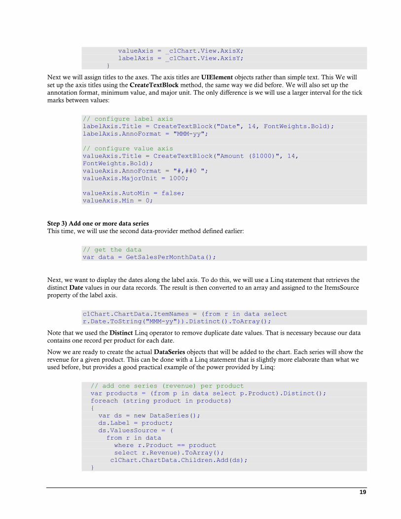
ChartType.Column
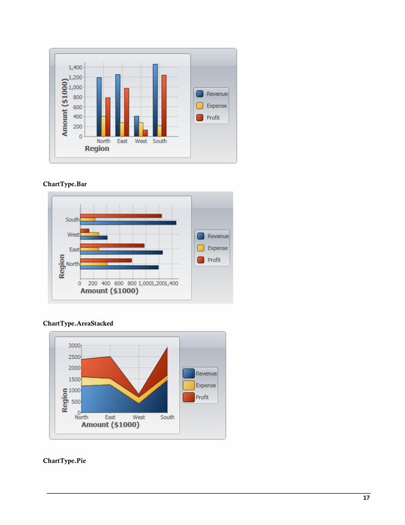
17
ChartType.Bar
ChartType.AreaStacked
ChartType.Pie
18
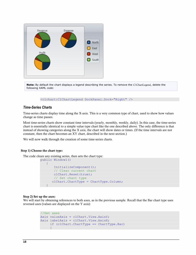
Note: By default the chart displays a legend describing the series. To remove the C1ChartLegend, delete the
following XAML code:
<c1chart:C1ChartLegend DockPanel.Dock="Right" />
Time-Series Charts
Time-series charts display time along the X-axis. This is a very common type of chart, used to show how values
change as time passes.
Most time-series charts show constant time intervals (yearly, monthly, weekly, daily). In this case, the time-series
chart is essentially identical to a simple value type chart like the one described above. The only difference is that
instead of showing categories along the X axis, the chart will show dates or times. (If the time intervals are not
constant, then the chart becomes an XY chart, described in the next section.)
We will now walk through the creation of some time-series charts.
Step 1) Choose the chart type:
The code clears any existing series, then sets the chart type: public Window1()
{
InitializeComponent();
// Clear current chart
c1Chart.Reset(true);
// Set chart type
c1Chart.ChartType = ChartType.Column;
}
Step 2) Set up the axes: We will start by obtaining references to both axes, as in the previous sample. Recall that the Bar chart type uses
reversed axes (values are displayed on the Y axis):
//Get axes
Axis valueAxis = c1Chart.View.AxisY;
Axis labelAxis = c1Chart.View.AxisX;
if (c1Chart.ChartType == ChartType.Bar)
{
19
valueAxis = _c1Chart.View.AxisX;
labelAxis = _c1Chart.View.AxisY;
}
Next we will assign titles to the axes. The axis titles are UIElement objects rather than simple text. This We will
set up the axis titles using the CreateTextBlock method, the same way we did before. We will also set up the
annotation format, minimum value, and major unit. The only difference is we will use a larger interval for the tick
marks between values:
// configure label axis
labelAxis.Title = CreateTextBlock("Date", 14, FontWeights.Bold);
labelAxis.AnnoFormat = "MMM-yy";
// configure value axis
valueAxis.Title = CreateTextBlock("Amount ($1000)", 14,
FontWeights.Bold);
valueAxis.AnnoFormat = "#,##0 ";
valueAxis.MajorUnit = 1000;
valueAxis.AutoMin = false;
valueAxis.Min = 0;
Step 3) Add one or more data series
This time, we will use the second data-provider method defined earlier:
// get the data
var data = GetSalesPerMonthData();
Next, we want to display the dates along the label axis. To do this, we will use a Linq statement that retrieves the
distinct Date values in our data records. The result is then converted to an array and assigned to the ItemsSource
property of the label axis.
c1Chart.ChartData.ItemNames = (from r in data select
r.Date.ToString("MMM-yy")).Distinct().ToArray();
Note that we used the Distinct Linq operator to remove duplicate date values. That is necessary because our data
contains one record per product for each date.
Now we are ready to create the actual DataSeries objects that will be added to the chart. Each series will show the
revenue for a given product. This can be done with a Linq statement that is slightly more elaborate than what we
used before, but provides a good practical example of the power provided by Linq:
// add one series (revenue) per product
var products = (from p in data select p.Product).Distinct();
foreach (string product in products)
{
var ds = new DataSeries();
ds.Label = product;
ds.ValuesSource = (
from r in data
where r.Product == product
select r.Revenue).ToArray();
c1Chart.ChartData.Children.Add(ds);
}
20
The code starts by building a list of products in the data source. Next, it creates one DataSeries for each product.
The label of the data series is simply the product name. The actual data is obtained by filtering the records that
belong to the current product and retrieving their Revenue property. The result is assigned to the ValuesSource
property of the data series as before.
Step 4) Adjust the chart’s appearance Once again, we will finish by setting the Theme and Palette properties to quickly configure the chart appearance:
c1Chart.Theme = "Office2007Black"
This concludes the code that generates our time-series charts. You can test it by running it and changing the
ChartType property to Bar, Column, AreaStacked, or Pie to create charts of different types. The result should be
similar to the images below:
ChartType.Column
Note: The AnnoAngle property was set to “30” to make room for the Axis X labels in the images above.
ChartType.Bar
21
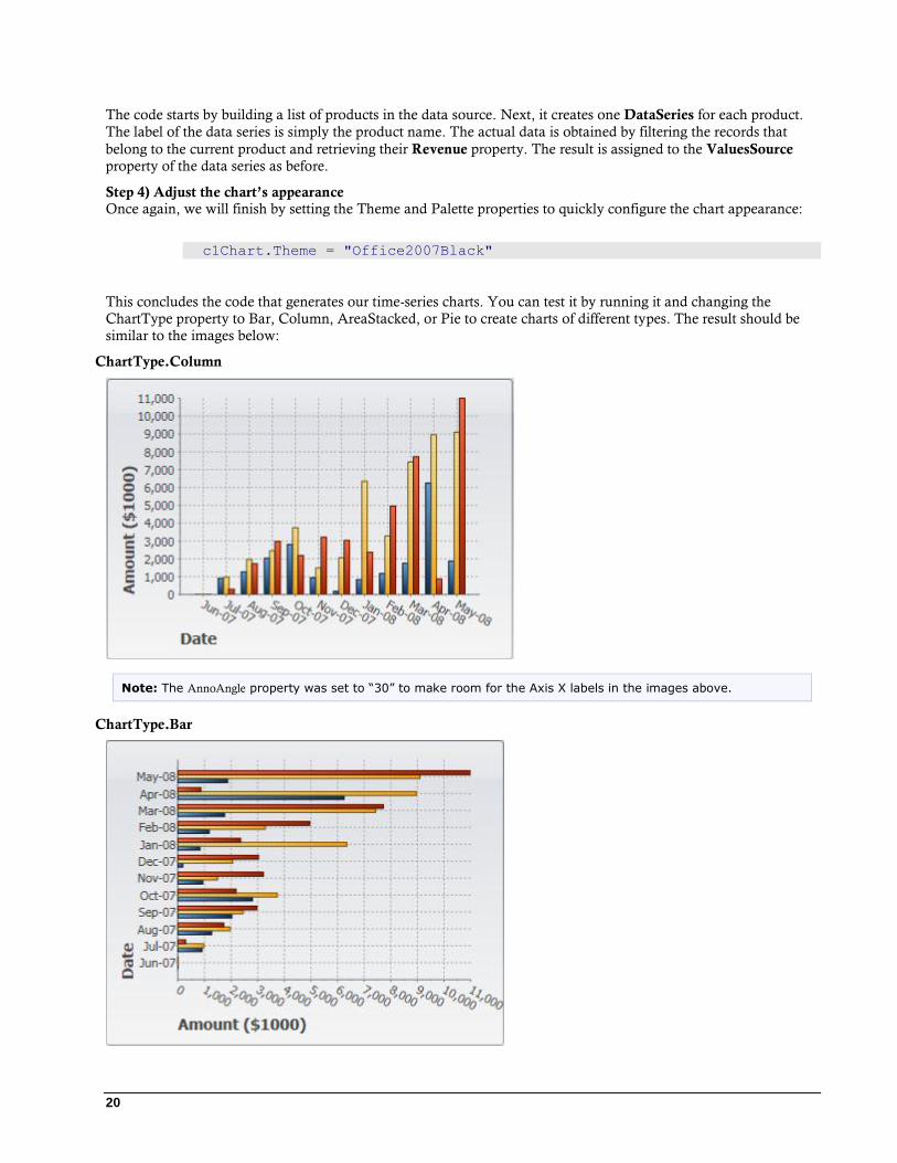
Note: The AnnoAngle property was set to “30” to make room for the Axis Y labels in the images above.
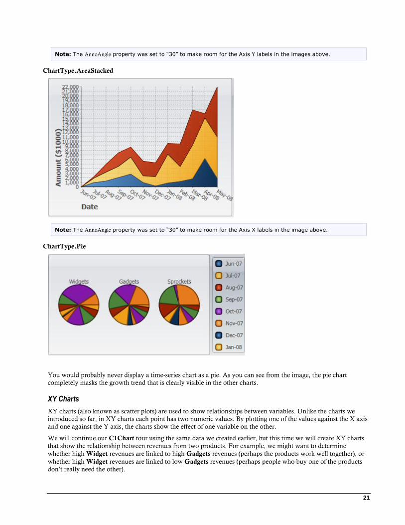
ChartType.AreaStacked
Note: The AnnoAngle property was set to “30” to make room for the Axis X labels in the image above.
ChartType.Pie
You would probably never display a time-series chart as a pie. As you can see from the image, the pie chart
completely masks the growth trend that is clearly visible in the other charts.
XY Charts
XY charts (also known as scatter plots) are used to show relationships between variables. Unlike the charts we
introduced so far, in XY charts each point has two numeric values. By plotting one of the values against the X axis
and one against the Y axis, the charts show the effect of one variable on the other.
We will continue our C1Chart tour using the same data we created earlier, but this time we will create XY charts
that show the relationship between revenues from two products. For example, we might want to determine
whether high Widget revenues are linked to high Gadgets revenues (perhaps the products work well together), or
whether high Widget revenues are linked to low Gadgets revenues (perhaps people who buy one of the products
don’t really need the other).
22
To do this, we will follow the same steps as before. The main differences are that this time we will add
XYDataSeries objects to the chart’s Data.Children collection instead of the simpler DataSeries objects. The Linq
statement used to obtain the data is also a little more refined and interesting.
Step 1) Choose the chart type: The code clears any existing series, then sets the chart type:
public Window1()
{
InitializeComponent();
// Clear current chart
c1Chart.Reset(true);
// Set chart type
c1Chart.ChartType = ChartType.XYPlot;
Step 2) Set up the axes: Since we’re now creating XY series, we have two value axes (before we had a label axis and a value axis). We will
attach titles and formats to both axes as we did before. We will also set the scale and annotation format as before.
We will also use the AnnoAngle property to rotate the annotation labels along the X axis so they don’t overlap:
// get axes
var yAxis = _c1Chart.View.AxisY;
var xAxis = _c1Chart.View.AxisX;
// configure Y axis
yAxis.Title = CreateTextBlock("Widget Revenues", 14,
FontWeights.Bold);
yAxis.AnnoFormat = "#,##0 ";
yAxis.AutoMin = false;
yAxis.Min = 0;
yAxis.MajorUnit = 2000;
yAxis.AnnoAngle = 0;
// configure X axis
xAxis.Title = CreateTextBlock("Gadget Revenues", 14,
FontWeights.Bold);
xAxis.AnnoFormat = "#,##0 ";
xAxis.AutoMin = false;
xAxis.Min = 0;
xAxis.MajorUnit = 2000;
xAxis.AnnoAngle = -90; // rotate annotations
Step 3) Add one or more data series Once again, we will use the second data-provider method defined earlier:
// get the data
var data = GetSalesPerMonthData();
Next, we need to obtain XY pairs that correspond to the total revenues for Widgets and Gadgets at each date. We
can use Linq to obtain this information directly from our data:
// group data by sales date
23
var dataGrouped = from r in data
group r by r.Date into g
select new
{
Date = g.Key, // group by date
Widgets = (from rp in g // add Widget revenues
where rp.Product == "Widgets"
select g.Sum(p => rp.Revenue)).Single(),
Gadgets = (from rp in g // add Gadget revenues
where rp.Product == "Gadgets"
select g.Sum(p => rp.Revenue)).Single(),
};
// sort data by widget sales
var dataSorted = from r in dataGrouped
orderby r.Gadgets
select r;
The first Linq query starts by grouping the data by Date. Then, for each group it creates a record containing the
Date and the sum of revenues within that date for each of the products we are interested in. The result is a list of
objects with three properties: Date, Widgets, and Gadgets. This type of data grouping and aggregation is a
powerful feature of Linq.
The second Linq query simply sorts the data by Gadget revenue. These are the values that will be plotted on the X
axis, and we want them to be in ascending order. Plotting unsorted values would look fine if we displayed only
symbols (ChartType = XYPlot), but it would look messy if we chose other chart types such as Line or Area.
Once the data has been properly grouped, summarized, and sorted, all we need to do is create one single data
series, and assign one set of values to the ValuesSource property and the to the XValuesSource property:
// create the new XYDataSeries
var ds = new XYDataSeries();
// set series label (displayed in a C1ChartLegend)
ds.Label = "Revenue:\r\nWidgets vs Gadgets";
// populate Y values
ds.ValuesSource = (
from r in dataSorted
select r.Widgets).ToArray();
// populate X values
ds.XValuesSource = (
from r in dataSorted
select r.Gadgets).ToArray();
// add the series to the chart
c1Chart.ChartData.Children.Add(ds);
Step 4) Adjust the chart’s appearance
Once again, we will finish by setting the Theme property to quickly configure the chart appearance: c1Chart.Theme = Theme.Office2007Black;
}
24
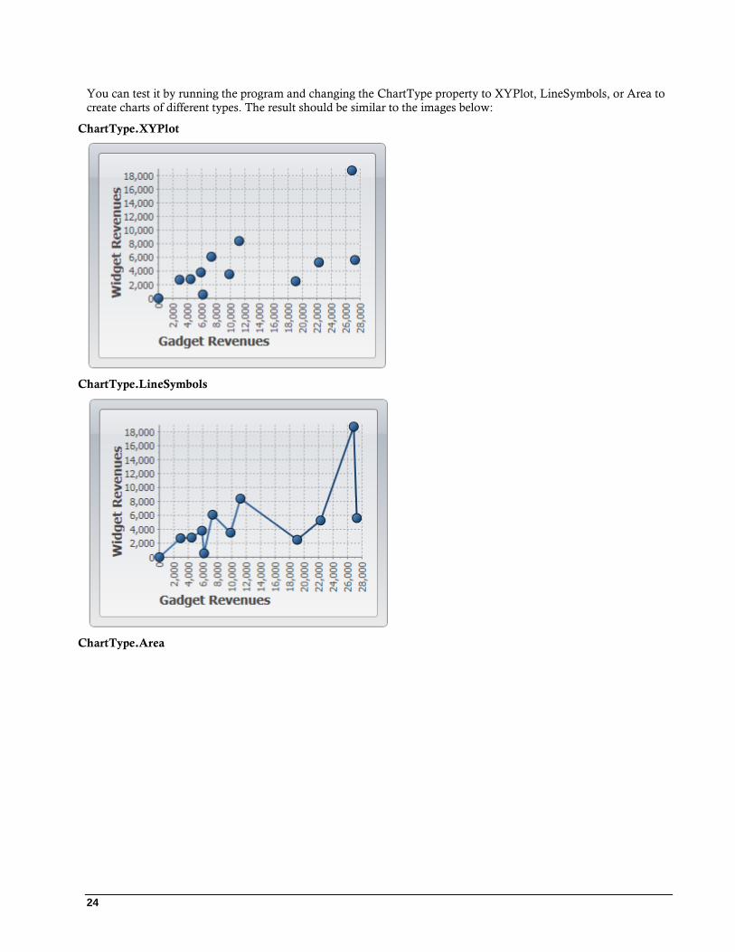
You can test it by running the program and changing the ChartType property to XYPlot, LineSymbols, or Area to
create charts of different types. The result should be similar to the images below:
ChartType.XYPlot
ChartType.LineSymbols
ChartType.Area

25
The most appropriate chart type in this case is the first, an XYPlot. The chart shows a positive correlation between
Gadget and Widget revenues.
This concludes the basic charting topic. You already have the tools you need to create all types of common charts.
Formatting Charts
The previous section introduced the Theme that you can use to select the appearance of your charts quickly and
easily. The Theme and Palette properties offer a long list of built-in options that were carefully developed to
provide great results with little effort from developers.
In most applications, you will choose the combination of settings for the Theme and Palette properties that is
closest to the feel you want for your application, then customize a few items if necessary. Items you may want to
customize include:
1. Axis titles: The axis titles are UIElement objects. You can customize them directly, and with complete
flexibility. The chart samples used in the Common Usage for Basic 2D Charts (page 13) topic uses the
TextElement objects, but you could use many other elements, including panels such as Border and Grid
objects. For more information on axis titles, see Axis Title (page 56).
2. Axis: The chart samples used in the Common Usage for Basic 2D Charts (page 13) topic shows how you
can customize axis scale, annotation angle, and annotation format. All these are accessible through the
Axis object exposed by the AxisX and AxisY properties. For more information on C1Chart’s axis, see
Axes (page 53).
The C1Chart control has the usual Font properties that determine how annotations are displayed along
both axes (FontFamily, FontSize, etc). If you need more control over the appearance of the annotations,
the Axis object also exposes an AnnoTemplate property that can be used to customize annotations even
further.
3. Grid lines: Grid lines are controlled by the Axis properties. There are properties for the major and minor
grid lines (MajorGridStrokeThickness, MajorGridStrokeThickness, MinorGridStrokeThickness,
MinorGridStrokeThickness, and so on). For more information on grid lines, see Axis Grid Lines (page
58).
4. Tick Marks: Tick marks are also controlled by the Axis properties. There are properties for the major and
minor ticks (MajorTickStroke, MajorTickThickness, MinorTickStroke, MinorTickThickness, and so on).
For more information on tick marks, see Axis Tick Marks (page 56).
26
Specialized Charts The chart types discussed so far have been fairly standard.
There are a few specialized chart types that are slightly different from the ones described so far. These are described
in the following sections.
Financial Charts
C1Chart implements two types of financial chart: Candle and HighLowOpenClose. Both are commonly used to
display variations in stock prices over a period of time.
The difference between common chart types and financial charts is that Candle and HighLowOpenClose charts
require a special type of data series object, the HighLowOpenCloseSeries. In this type of data series, each point
corresponds to a period (typically one day) and contains five values:
Time
Price at the beginning of period (Open)
Price at the end of period (Close)
Minimum price during period (Low)
Maximum price during period (High)
To create financial charts you need to provide all these values. For example, if the values were provided by the
application as collections, then you could use the code below to create the data series: // Create data series
HighLowOpenCloseSeries ds = new HighLowOpenCloseSeries();
ds.XValuesSource = dates; // Dates are along x-axis
ds.OpenValuesSource = open;
ds.CloseValuesSource = close;
ds.HighValuesSource = hi;
ds.LowValuesSource = lo;
// Add series to chart
chart.Data.Children.Add(ds);
// Set chart type
chart.ChartType = isCandle
? ChartType.Candle
: ChartType.HighLowOpenClose;
Another option is to use data-binding. For example, if the data is available as a collection of StockQuote objects
such as: public class Quote
{
public DateTime Date { get; set; }
public double Open { get; set; }
public double Close { get; set; }
public double High { get; set; }
public double Low { get; set; }
}
Then the code that creates the data series would be as follows: // Create data series
HighLowOpenCloseSeries ds = new HighLowOpenCloseSeries();
// Bind all five values
ds.XValueBinding = new Binding("Date"); // dates are along x-axis
27
ds.OpenValueBinding = new Binding("Open");
ds.CloseValueBinding = new Binding("Close");
ds.HighValueBinding = new Binding("High");
ds.LowValueBinding = new Binding("Low");
// Add series to chart
chart.Data.Children.Add(ds);
// Set chart type
chart.ChartType = isCandle
? ChartType.Candle
: ChartType.HighLowOpenClose;
Note that the SymbolSize.Width property of the data series can be used to change the width of the chart symbols.
Gantt Charts
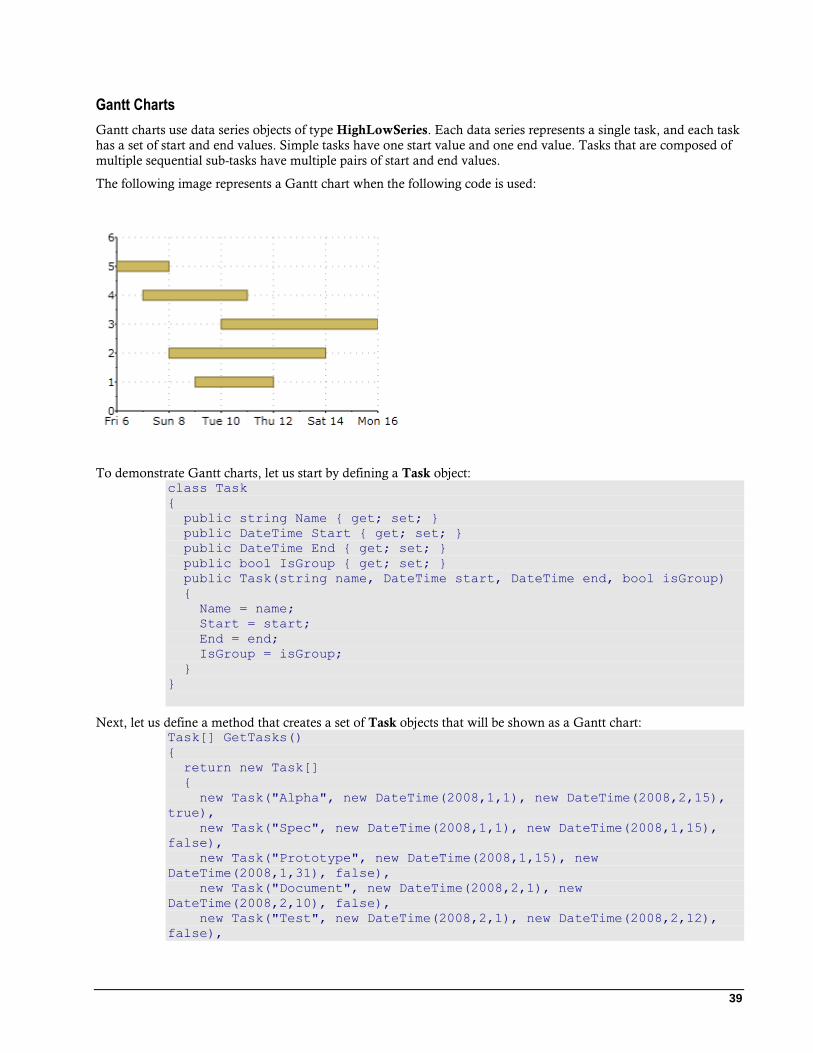
C1Chart implements Gantt charts, which show tasks organized along time.
Gantt charts use data series objects of type HighLowSeries. Each data series represents a single task, and each task
has a set of start and end values. Simple tasks have one start value and one end value. Tasks that are composed of
multiple sequential sub-tasks have multiple pairs of start and end values.
To demonstrate Gantt charts, let us start by defining a Task object: class Task
{
public string Name { get; set; }
public DateTime Start { get; set; }
public DateTime End { get; set; }
public bool IsGroup { get; set; }
public Task(string name, DateTime start, DateTime end, bool isGroup)
{
Name = name;
Start = start;
End = end;
IsGroup = isGroup;
}
}
Next, let us define a method that creates a set of Task objects that will be shown as a Gantt chart: Task[] GetTasks()
{
return new Task[]
{
new Task("Alpha", new DateTime(2008,1,1), new DateTime(2008,2,15), true),
new Task("Spec", new DateTime(2008,1,1), new DateTime(2008,1,15), false),
new Task("Prototype", new DateTime(2008,1,15), new DateTime(2008,1,31),
false),
new Task("Document", new DateTime(2008,2,1), new DateTime(2008,2,10),
false),
new Task("Test", new DateTime(2008,2,1), new DateTime(2008,2,12), false),
new Task("Setup", new DateTime(2008,2,12), new DateTime(2008,2,15),
false),
new Task("Beta", new DateTime(2008,2,15), new DateTime(2008,3,15), true),
new Task("WebPage", new DateTime(2008,2,15), new DateTime(2008,2,28),
false),
new Task("Save bugs", new DateTime(2008,2,28), new DateTime(2008,3,10),
false),
28
new Task("Fix bugs", new DateTime(2008,3,1), new DateTime(2008,3,15),
false),
new Task("Ship", new DateTime(2008,3,14), new DateTime(2008,3,15),
false),
};
}
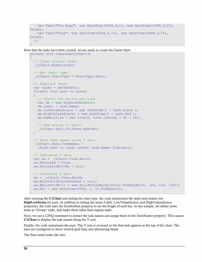
Now that the tasks have been created, we are ready to create the Gantt chart: private void CreateGanttChart()
{
// Clear current chart
_c1Chart.Reset(true);
// Set chart type
_c1Chart.ChartType = ChartType.Gantt;
// Populate chart
var tasks = GetTasks();
foreach (var task in tasks)
{
// Create one series per task
var ds = new HighLowSeries();
ds.Label = task.Name;
ds.LowValuesSource = new DateTime[] { task.Start };
ds.HighValuesSource = new DateTime[] { task.End };
ds.SymbolSize = new Size(0, task.IsGroup ? 30 : 10);
// Add series to chart
_c1Chart.Data.Children.Add(ds);
}
// Show task names along Y axis
_c1Chart.Data.ItemNames =
(from task in tasks select task.Name).ToArray();
// Customize Y axis
var ax = _c1Chart.View.AxisY;
ax.Reversed = true;
ax.MajorGridStroke = null;
// Customize X axis
ax = _c1Chart.View.AxisX;
ax.MajorGridStrokeDashes = null;
ax.MajorGridFill = new SolidColorBrush(Color.FromArgb(20, 120, 120, 120));
ax.Min = new DateTime(2008, 1, 1).ToOADate();
}
After clearing the C1Chart and setting the chart type, the code enumerates the tasks and creates one
HighLowSeries for each. In addition to setting the series Label, LowValuesSource and HighValuesSource
properties, the code uses the SymbolSize property to set the height of each bar. In this sample, we define some
tasks as "Group" tasks, and make them taller than regular tasks.
Next, we use a LINQ statement to extract the task names and assign them to the ItemNames property. This causes
C1Chart to display the task names along the Y axis.
Finally, the code customizes the axes. The Y axis is reversed so the first task appears at the top of the chart. The
axes are configured to show vertical grid lines and alternating bands.
The final result looks like this:
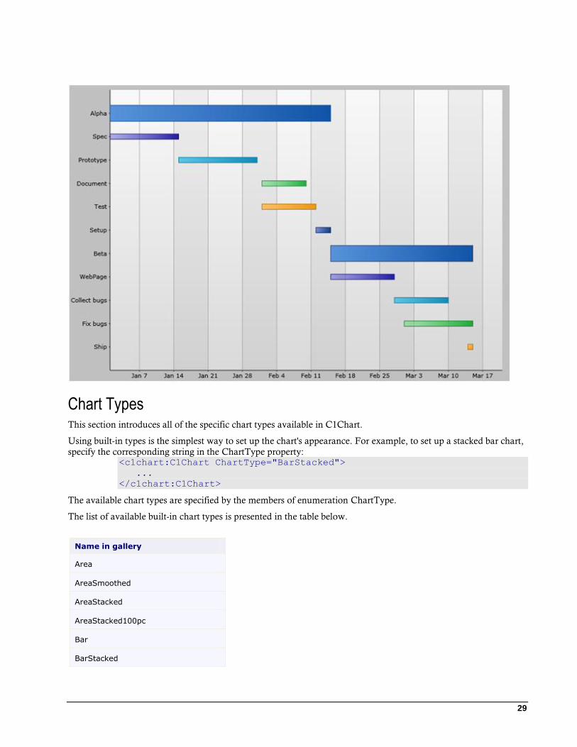
29
Chart Types This section introduces all of the specific chart types available in C1Chart.
Using built-in types is the simplest way to set up the chart's appearance. For example, to set up a stacked bar chart,
specify the corresponding string in the ChartType property: <c1chart:C1Chart ChartType="BarStacked">
...
</c1chart:C1Chart>
The available chart types are specified by the members of enumeration ChartType.
The list of available built-in chart types is presented in the table below.
Name in gallery
Area
AreaSmoothed
AreaStacked
AreaStacked100pc
Bar
BarStacked
30
BarStacked100pc
Bubble
Candle
Column
ColumnStacked
ColumnStacked100pc
Gantt
HighLowOpenClose
Line
LineSmoothed
LineStacked
LineStacked100pc
LineSymbols
LineSymbolsSmoothed
LineSymbolsStacked
LineSymbolsStacked100pc
Pie
PieDoughnut
PieExploded
PieExplodedDoughnut
PolarLines
PolarLinesSymbols
PolarSymbols
Radar
RadarFilled
RadarSymbols
Step
StepArea
StepSymbols
XYPlot
Area3D
Area3DSmoothed

31
Area3DStacked
Area3DStacked100pc
Bar3D
Bar3DStacked
Bar3DStacked100pc
Pie3D
Pie3DDoughnut
Pie3DExploded
Pie3DExplodedDougnut
Ribbon
Area Charts
An Area chart draws each series as connected points of data, filled below the points. Each series is drawn on top of
the preceding series. The series can be drawn independently or stacked. Chart for Silverlight supports the
following types of Area charts:
AreaSmoothed
AreaStacked
AreaStacked100pc
Area
The following image represents the Area chart when you set the ChartType property to Area:
Area Smoothed
The following image represents the Area Smoothed chart when you set the ChartType property to AreaSmoothed:
32
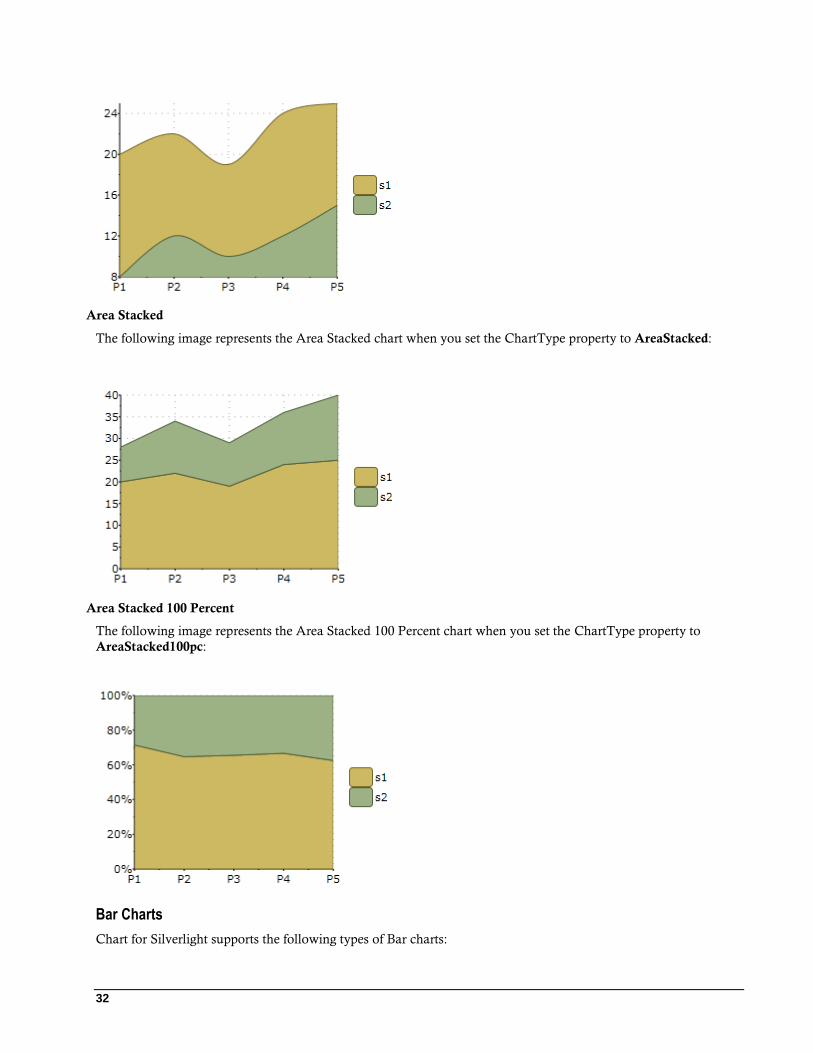
Area Stacked
The following image represents the Area Stacked chart when you set the ChartType property to AreaStacked:
Area Stacked 100 Percent
The following image represents the Area Stacked 100 Percent chart when you set the ChartType property to
AreaStacked100pc:
Bar Charts
Chart for Silverlight supports the following types of Bar charts:
33
Bar
BarStacked
BarStacked100pc
Bar
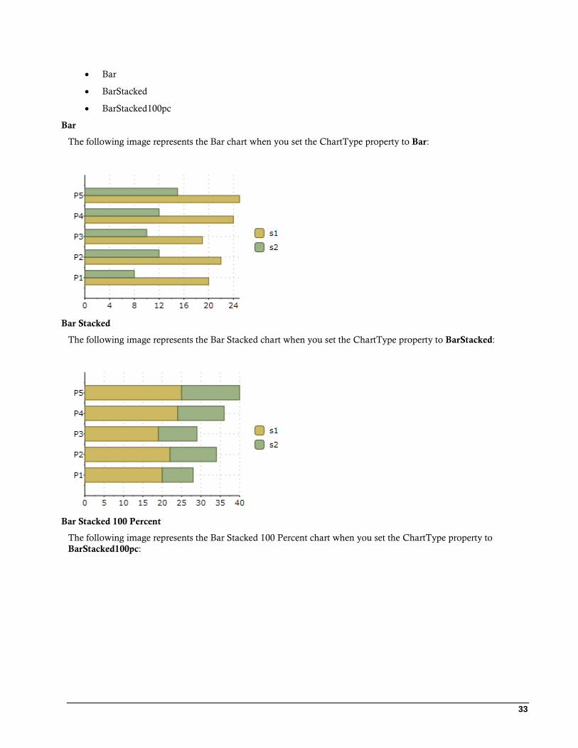
The following image represents the Bar chart when you set the ChartType property to Bar:
Bar Stacked
The following image represents the Bar Stacked chart when you set the ChartType property to BarStacked:
Bar Stacked 100 Percent
The following image represents the Bar Stacked 100 Percent chart when you set the ChartType property to
BarStacked100pc:
34
Bubble Charts
The following image represents the Bubble chart when you set ChartType property to Bubble:
The following XAML code creates a Bubble chart:
<c1chart:C1Chart Height="200" Width="300" ChartType="Bubble"
Margin="56,45,284,235" c1chart:BubbleOptions.MinSize="5,5"
c1chart:BubbleOptions.MaxSize="30,30"
c1chart:BubbleOptions.Scale="Area">
<c1chart:C1Chart.Data>
<c1chart:ChartData>
<c1chart:BubbleSeries Values="20 22 19 24 25" SizeValues="1 2 3
2 1" />
<c1chart:BubbleSeries Values="8 12 10 12 15" SizeValues="3 2 1
2 3"/>
</c1chart:ChartData>
</c1chart:C1Chart.Data>
</c1chart:C1Chart>
Financial Charts
C1Chart implements two types of financial chart: Candle and HighLowOpenClose. Both are commonly used to
display variations in stock prices over a period of time.
35
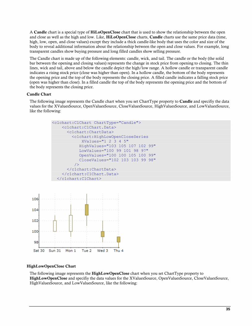
A Candle chart is a special type of HiLoOpenClose chart that is used to show the relationship between the open
and close as well as the high and low. Like, HiLoOpenClose charts, Candle charts use the same price data (time,
high, low, open, and close values) except they include a thick candle-like body that uses the color and size of the
body to reveal additional information about the relationship between the open and close values. For example, long
transparent candles show buying pressure and long filled candles show selling pressure.
The Candle chart is made up of the following elements: candle, wick, and tail. The candle or the body (the solid
bar between the opening and closing values) represents the change in stock price from opening to closing. The thin
lines, wick and tail, above and below the candle depict the high/low range. A hollow candle or transparent candle
indicates a rising stock price (close was higher than open). In a hollow candle, the bottom of the body represents
the opening price and the top of the body represents the closing price. A filled candle indicates a falling stock price
(open was higher than close). In a filled candle the top of the body represents the opening price and the bottom of
the body represents the closing price.
Candle Chart
The following image represents the Candle chart when you set ChartType property to Candle and specifiy the data
values for the XValuesSource, OpenValuesSource, CloseValuesSource, HighValuesSource, and LowValuesSource,
like the following:
<c1chart:C1Chart ChartType="Candle">
<c1chart:C1Chart.Data>
<c1chart:ChartData>
<c1chart:HighLowOpenCloseSeries
XValues="1 2 3 4 5"
HighValues="103 105 107 102 99"
LowValues="100 99 101 98 97"
OpenValues="100 100 105 100 99"
CloseValues="102 103 103 99 98"
/>
</c1chart:ChartData>
</c1chart:C1Chart.Data>
</c1chart:C1Chart>
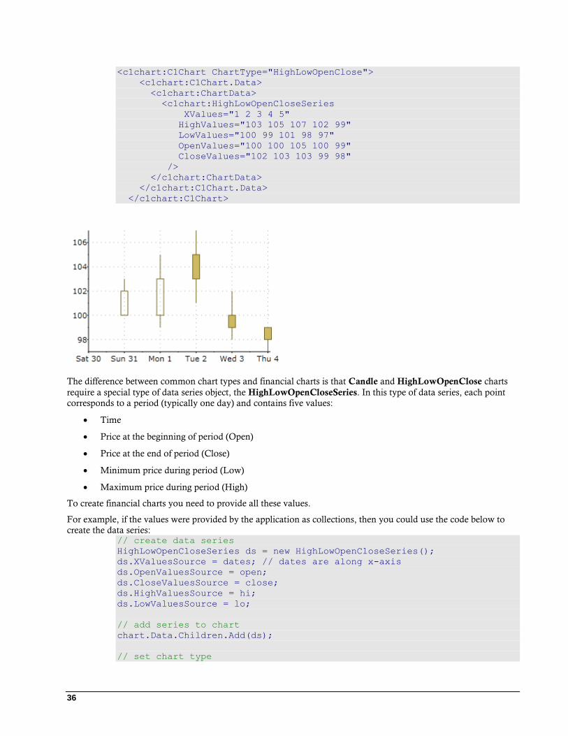
HighLowOpenClose Chart
The following image represents the HighLowOpenClose chart when you set ChartType property to
HighLowOpenClose and specifiy the data values for the XValuesSource, OpenValuesSource, CloseValuesSource,
HighValuesSource, and LowValuesSource, like the following:
36
<c1chart:C1Chart ChartType="HighLowOpenClose">
<c1chart:C1Chart.Data>
<c1chart:ChartData>
<c1chart:HighLowOpenCloseSeries
XValues="1 2 3 4 5"
HighValues="103 105 107 102 99"
LowValues="100 99 101 98 97"
OpenValues="100 100 105 100 99"
CloseValues="102 103 103 99 98"
/>
</c1chart:ChartData>
</c1chart:C1Chart.Data>
</c1chart:C1Chart>
The difference between common chart types and financial charts is that Candle and HighLowOpenClose charts
require a special type of data series object, the HighLowOpenCloseSeries. In this type of data series, each point
corresponds to a period (typically one day) and contains five values:
Time
Price at the beginning of period (Open)
Price at the end of period (Close)
Minimum price during period (Low)
Maximum price during period (High)
To create financial charts you need to provide all these values.
For example, if the values were provided by the application as collections, then you could use the code below to
create the data series: // create data series
HighLowOpenCloseSeries ds = new HighLowOpenCloseSeries();
ds.XValuesSource = dates; // dates are along x-axis
ds.OpenValuesSource = open;
ds.CloseValuesSource = close;
ds.HighValuesSource = hi;
ds.LowValuesSource = lo;
// add series to chart
chart.Data.Children.Add(ds);
// set chart type

37
chart.ChartType = isCandle
? ChartType.Candle
: ChartType.HighLowOpenClose;
Another option is to use data-binding. For example, if the data is available as a collection of StockQuote objects
such as: public class Quote
{
public DateTime Date { get; set; }
public double Open { get; set; }
public double Close { get; set; }
public double High { get; set; }
public double Low { get; set; }
}
Then the code that creates the data series would be as follows: // create data series
HighLowOpenCloseSeries ds = new HighLowOpenCloseSeries();
// bind all five values
ds.XValueBinding = new Binding("Date"); // dates are along x-axis
ds.OpenValueBinding = new Binding("Open");
ds.CloseValueBinding = new Binding("Close");
ds.HighValueBinding = new Binding("High");
ds.LowValueBinding = new Binding("Low");
// add series to chart
chart.Data.Children.Add(ds);
// set chart type
chart.ChartType = isCandle
? ChartType.Candle
: ChartType.HighLowOpenClose;
Column Charts
Chart for Silverlight supports the following types of Column charts:
Column
ColumnStacked
ColumnStacked100pc
Column
The following image represents the Column chart when you set the ChartType property to Column:
38
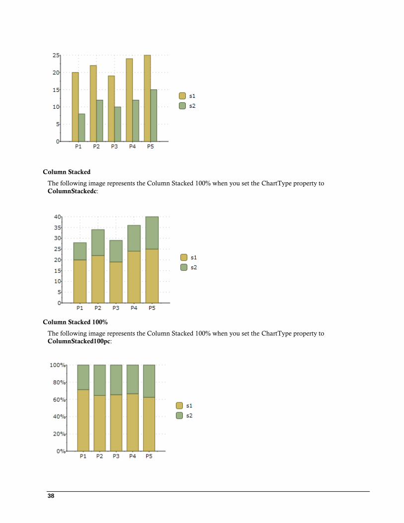
Column Stacked
The following image represents the Column Stacked 100% when you set the ChartType property to
ColumnStackedc:
Column Stacked 100%
The following image represents the Column Stacked 100% when you set the ChartType property to
ColumnStacked100pc:
39
Gantt Charts
Gantt charts use data series objects of type HighLowSeries. Each data series represents a single task, and each task
has a set of start and end values. Simple tasks have one start value and one end value. Tasks that are composed of
multiple sequential sub-tasks have multiple pairs of start and end values.
The following image represents a Gantt chart when the following code is used:
To demonstrate Gantt charts, let us start by defining a Task object: class Task
{
public string Name { get; set; }
public DateTime Start { get; set; }
public DateTime End { get; set; }
public bool IsGroup { get; set; }
public Task(string name, DateTime start, DateTime end, bool isGroup)
{
Name = name;
Start = start;
End = end;
IsGroup = isGroup;
}
}
Next, let us define a method that creates a set of Task objects that will be shown as a Gantt chart: Task[] GetTasks()
{
return new Task[]
{
new Task("Alpha", new DateTime(2008,1,1), new DateTime(2008,2,15),
true),
new Task("Spec", new DateTime(2008,1,1), new DateTime(2008,1,15),
false),
new Task("Prototype", new DateTime(2008,1,15), new
DateTime(2008,1,31), false),
new Task("Document", new DateTime(2008,2,1), new
DateTime(2008,2,10), false),
new Task("Test", new DateTime(2008,2,1), new DateTime(2008,2,12),
false),
40
new Task("Setup", new DateTime(2008,2,12), new DateTime(2008,2,15),
false),
new Task("Beta", new DateTime(2008,2,15), new DateTime(2008,3,15),
true),
new Task("WebPage", new DateTime(2008,2,15), new
DateTime(2008,2,28), false),
new Task("Save bugs", new DateTime(2008,2,28), new
DateTime(2008,3,10), false),
new Task("Fix bugs", new DateTime(2008,3,1), new
DateTime(2008,3,15), false),
new Task("Ship", new DateTime(2008,3,14), new DateTime(2008,3,15),
false),
};
}
Now that the tasks have been created, we are ready to create the Gantt chart: private void CreateGanttChart()
{
// clear current chart
c1Chart.Reset(true);
// set chart type
c1Chart.ChartType = ChartType.Gantt;
// populate chart
var tasks = GetTasks();
foreach (var task in tasks)
{
// create one series per task
var ds = new HighLowSeries();
ds.Label = task.Name;
ds.LowValuesSource = new DateTime[] { task.Start };
ds.HighValuesSource = new DateTime[] { task.End };
ds.SymbolSize = new Size(0, task.IsGroup ? 30 : 10);
// add series to chart
c1Chart.Data.Children.Add(ds);
}
// show task names along Y axis
c1Chart.Data.ItemNames =
(from task in tasks select task.Name).ToArray();
// customize Y axis
var ax = c1Chart.View.AxisY;
ax.Reversed = true;
ax.MajorGridStroke = null;
// customize X axis
ax = c1Chart.View.AxisX;
ax.MajorGridStrokeDashes = null;
ax.MajorGridFill = new SolidColorBrush(Color.FromArgb(20, 120, 120,
120));
ax.Min = new DateTime(2008, 1, 1).ToOADate();
}
41
After clearing the C1Chart and setting the chart type, the code enumerates the tasks and creates one
HighLowSeries for each. In addition to setting the series Label, LowValuesSource and HighValuesSource
properties, the code uses the SymbolSize property to set the height of each bar. In this sample, we define some
tasks as “Group” tasks, and make them taller than regular tasks.
Next, we use a Linq statement to extract the task names and assign them to the ItemNames property. This causes
C1Chart to display the task names along the Y axis.
Finally, the code customizes the axes. The Y axis is reversed so the first task appears at the top of the chart. The
axes are configured to show vertical grid lines and alternating bands.
Line Charts
Chart for Silverlight supports the following types of Line charts:
Line
LineSmoothed
LineStacked
LineStacked100pc
LineSymbols
LineSymbolsSmoothed
LineSymbolsStacked
LineSymbolsStacked100pc
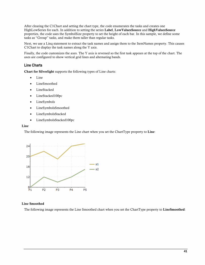
Line
The following image represents the Line chart when you set the ChartType property to Line:
Line Smoothed
The following image represents the Line Smoothed chart when you set the ChartType property to LineSmoothed:
42
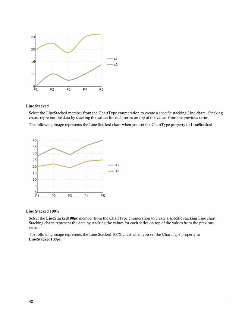
Line Stacked
Select the LineStacked member from the ChartType enumeration to create a specific stacking Line chart.. Stacking
charts represent the data by stacking the values for each series on top of the values from the previous series.
The following image represents the Line Stacked chart when you set the ChartType property to LineStacked:
Line Stacked 100%
Select the LineStacked100pc member from the ChartType enumeration to create a specific stacking Line chart.
Stacking charts represent the data by stacking the values for each series on top of the values from the previous
series.
The following image represents the Line Stacked 100% chart when you set the ChartType property to
LineStacked100pc:

43
Line Symbols
The following image represents the Line Symbols when you set the ChartType property to LineSymbols:
Line Symbols Stacked
The following image represents the Line Symbols Stacked chart when you set the ChartType property to
LineSymbolsStacked:
44
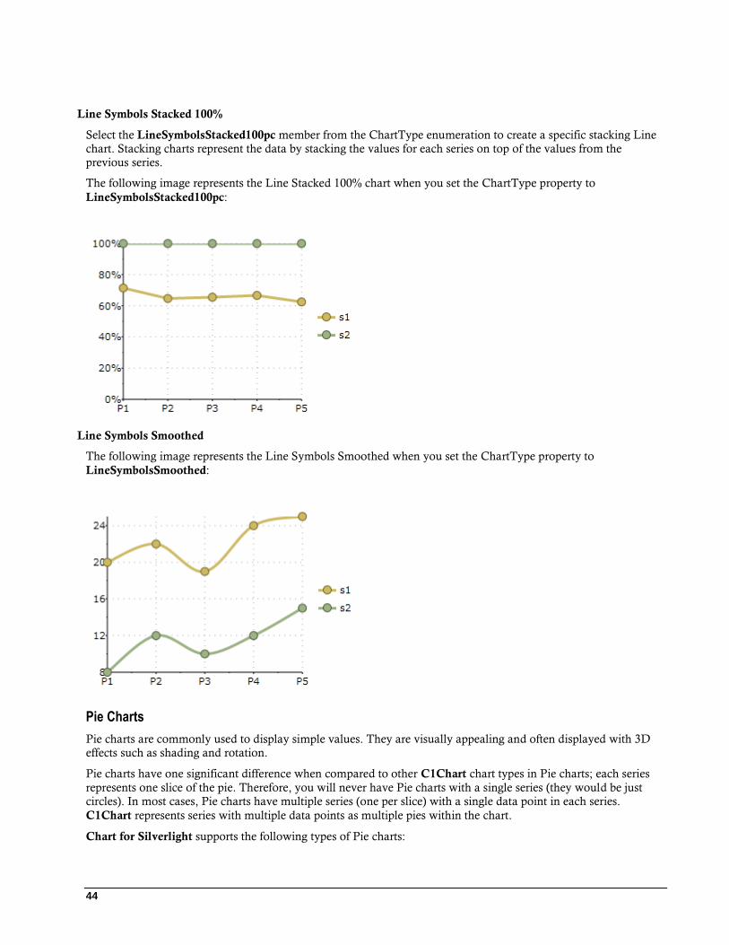
Line Symbols Stacked 100%
Select the LineSymbolsStacked100pc member from the ChartType enumeration to create a specific stacking Line
chart. Stacking charts represent the data by stacking the values for each series on top of the values from the
previous series.
The following image represents the Line Stacked 100% chart when you set the ChartType property to
LineSymbolsStacked100pc:
Line Symbols Smoothed
The following image represents the Line Symbols Smoothed when you set the ChartType property to
LineSymbolsSmoothed:
Pie Charts
Pie charts are commonly used to display simple values. They are visually appealing and often displayed with 3D
effects such as shading and rotation.
Pie charts have one significant difference when compared to other C1Chart chart types in Pie charts; each series
represents one slice of the pie. Therefore, you will never have Pie charts with a single series (they would be just
circles). In most cases, Pie charts have multiple series (one per slice) with a single data point in each series.
C1Chart represents series with multiple data points as multiple pies within the chart.
Chart for Silverlight supports the following types of Pie charts:
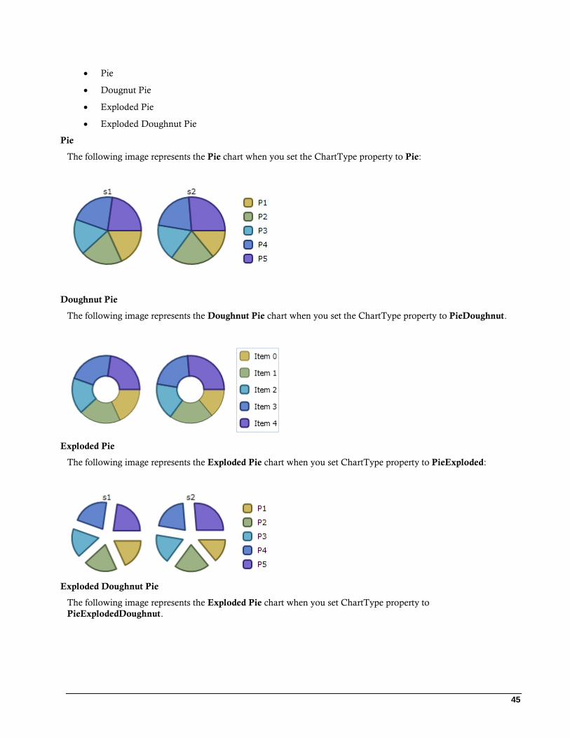
45
Pie
Dougnut Pie
Exploded Pie
Exploded Doughnut Pie
Pie
The following image represents the Pie chart when you set the ChartType property to Pie:
Doughnut Pie
The following image represents the Doughnut Pie chart when you set the ChartType property to PieDoughnut.
Exploded Pie
The following image represents the Exploded Pie chart when you set ChartType property to PieExploded:
Exploded Doughnut Pie
The following image represents the Exploded Pie chart when you set ChartType property to
PieExplodedDoughnut.
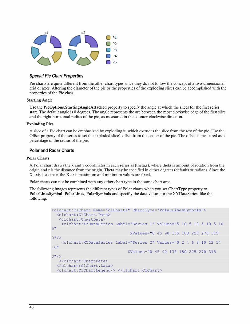
46
Special Pie Chart Properties
Pie charts are quite different from the other chart types since they do not follow the concept of a two-dimensional
grid or axes. Altering the diameter of the pie or the properties of the exploding slices can be accomplished with the
properties of the Pie class.
Starting Angle
Use the PieOptions.StartingAngleAttached property to specify the angle at which the slices for the first series
start. The default angle is 0 degrees. The angle represents the arc between the most clockwise edge of the first slice
and the right horizontal radius of the pie, as measured in the counter-clockwise direction.
Exploding Pies
A slice of a Pie chart can be emphasized by exploding it, which extrudes the slice from the rest of the pie. Use the
Offset property of the series to set the exploded slice's offset from the center of the pie. The offset is measured as a
percentage of the radius of the pie.
Polar and Radar Charts
Polar Charts
A Polar chart draws the x and y coordinates in each series as (theta,r), where theta is amount of rotation from the
origin and r is the distance from the origin. Theta may be specified in either degrees (default) or radians. Since the
X-axis is a circle, the X-axis maximum and minimum values are fixed.
Polar charts can not be combined with any other chart type in the same chart area.
The following images represents the different types of Polar charts when you set ChartType property to
PolarLinesSymbol, PolarLines, PolarSymbols and specifiy the data values for the XYDataSeries, like the
following:
<c1chart:C1Chart Name="c1Chart1" ChartType="PolarLinesSymbols">
<c1chart:C1Chart.Data>
<c1chart:ChartData>
<c1chart:XYDataSeries Label="Series 1" Values="5 10 5 10 5 10 5 10
5"
XValues="0 45 90 135 180 225 270 315
0"/>
<c1chart:XYDataSeries Label="Series 2" Values="0 2 4 6 8 10 12 14
16"
XValues="0 45 90 135 180 225 270 315
0"/>
</c1chart:ChartData>
</c1chart:C1Chart.Data>
<c1chart:C1ChartLegend/> </c1chart:C1Chart>

47
The following image represents the Polar chart with symbols and lines when you set ChartType property to
PolarLines. <c1chart:C1Chart Name="c1Chart1" ChartType="PolarLines">
<c1chart:C1Chart.Data>
<c1chart:ChartData>
<c1chart:XYDataSeries Label="Series 1" Values="5 10 5 10 5 10 5 10
5"
XValues="0 45 90 135 180 225 270 315
0"/>
<c1chart:XYDataSeries Label="Series 2" Values="0 2 4 6 8 10 12 14
16"
XValues="0 45 90 135 180 225 270 315
0"/>
</c1chart:ChartData>
</c1chart:C1Chart.Data>
<c1chart:C1ChartLegend/> </c1chart:C1Chart>
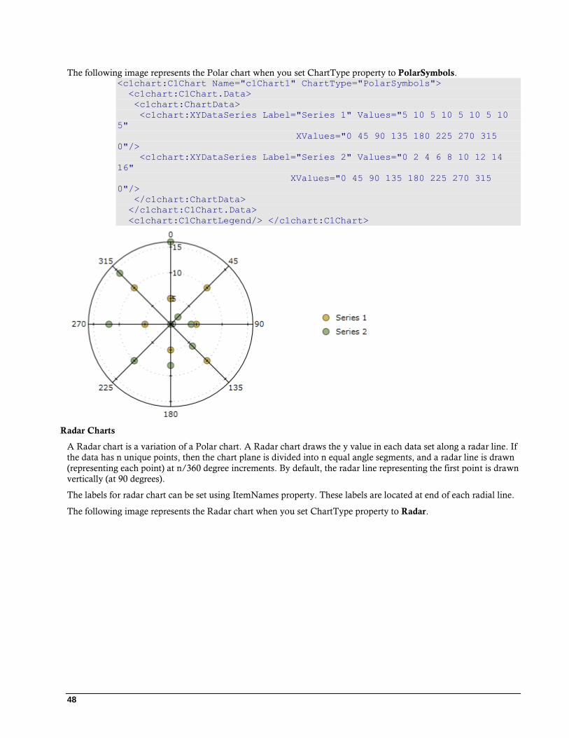
48
The following image represents the Polar chart when you set ChartType property to PolarSymbols. <c1chart:C1Chart Name="c1Chart1" ChartType="PolarSymbols">
<c1chart:C1Chart.Data>
<c1chart:ChartData>
<c1chart:XYDataSeries Label="Series 1" Values="5 10 5 10 5 10 5 10
5"
XValues="0 45 90 135 180 225 270 315
0"/>
<c1chart:XYDataSeries Label="Series 2" Values="0 2 4 6 8 10 12 14
16"
XValues="0 45 90 135 180 225 270 315
0"/>
</c1chart:ChartData>
</c1chart:C1Chart.Data>
<c1chart:C1ChartLegend/> </c1chart:C1Chart>
Radar Charts
A Radar chart is a variation of a Polar chart. A Radar chart draws the y value in each data set along a radar line. If
the data has n unique points, then the chart plane is divided into n equal angle segments, and a radar line is drawn
(representing each point) at n/360 degree increments. By default, the radar line representing the first point is drawn
vertically (at 90 degrees).
The labels for radar chart can be set using ItemNames property. These labels are located at end of each radial line.
The following image represents the Radar chart when you set ChartType property to Radar.
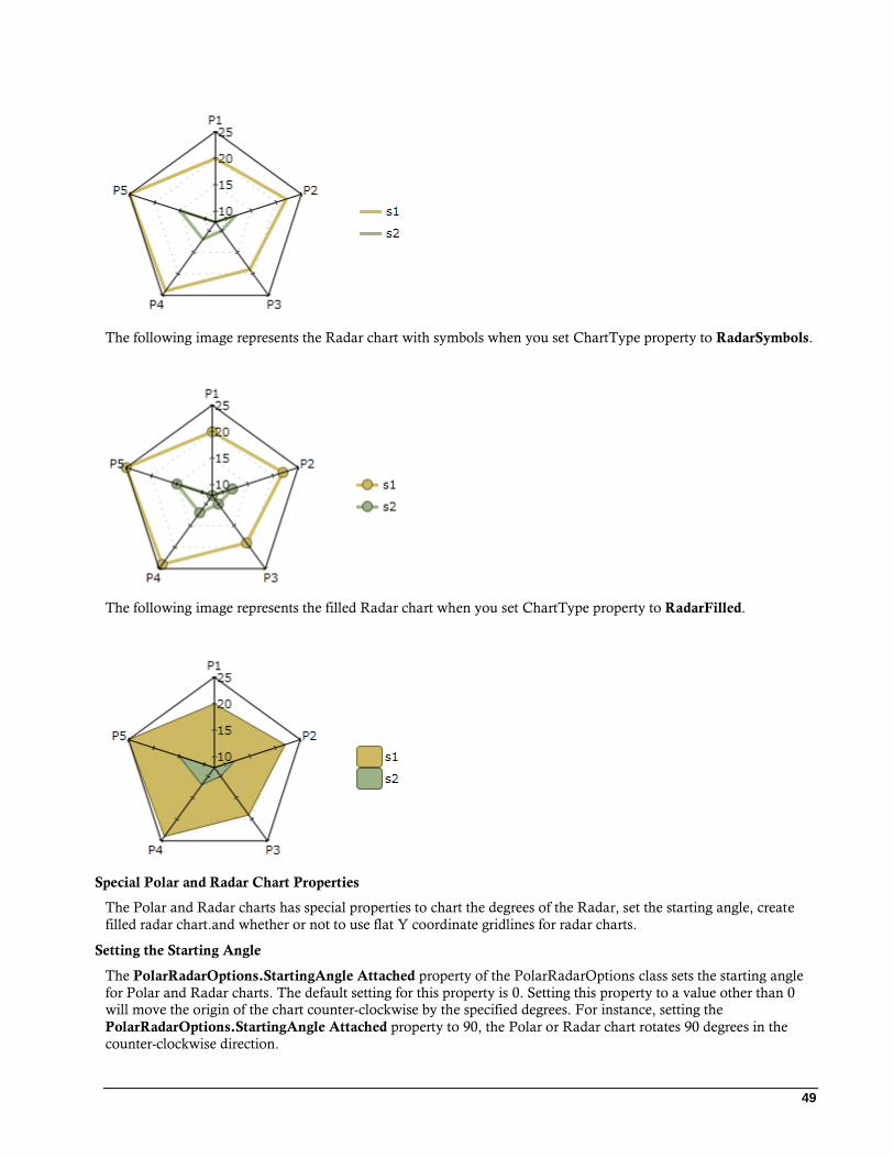
49
The following image represents the Radar chart with symbols when you set ChartType property to RadarSymbols.
The following image represents the filled Radar chart when you set ChartType property to RadarFilled.
Special Polar and Radar Chart Properties
The Polar and Radar charts has special properties to chart the degrees of the Radar, set the starting angle, create
filled radar chart.and whether or not to use flat Y coordinate gridlines for radar charts.
Setting the Starting Angle
The PolarRadarOptions.StartingAngle Attached property of the PolarRadarOptions class sets the starting angle
for Polar and Radar charts. The default setting for this property is 0. Setting this property to a value other than 0
will move the origin of the chart counter-clockwise by the specified degrees. For instance, setting the
PolarRadarOptions.StartingAngle Attached property to 90, the Polar or Radar chart rotates 90 degrees in the
counter-clockwise direction.
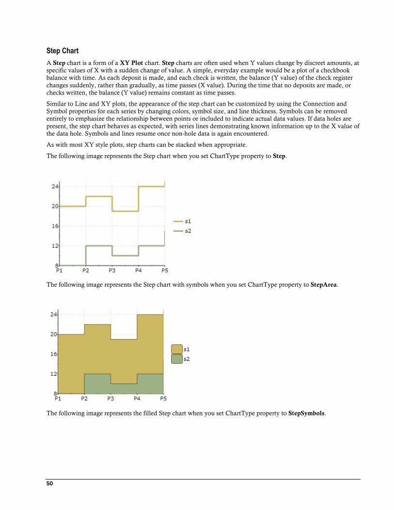
50
Step Chart
A Step chart is a form of a XY Plot chart. Step charts are often used when Y values change by discreet amounts, at
specific values of X with a sudden change of value. A simple, everyday example would be a plot of a checkbook
balance with time. As each deposit is made, and each check is written, the balance (Y value) of the check register
changes suddenly, rather than gradually, as time passes (X value). During the time that no deposits are made, or
checks written, the balance (Y value) remains constant as time passes.
Similar to Line and XY plots, the appearance of the step chart can be customized by using the Connection and
Symbol properties for each series by changing colors, symbol size, and line thickness. Symbols can be removed
entirely to emphasize the relationship between points or included to indicate actual data values. If data holes are
present, the step chart behaves as expected, with series lines demonstrating known information up to the X value of
the data hole. Symbols and lines resume once non-hole data is again encountered.
As with most XY style plots, step charts can be stacked when appropriate.
The following image represents the Step chart when you set ChartType property to Step.
The following image represents the Step chart with symbols when you set ChartType property to StepArea.
The following image represents the filled Step chart when you set ChartType property to StepSymbols.
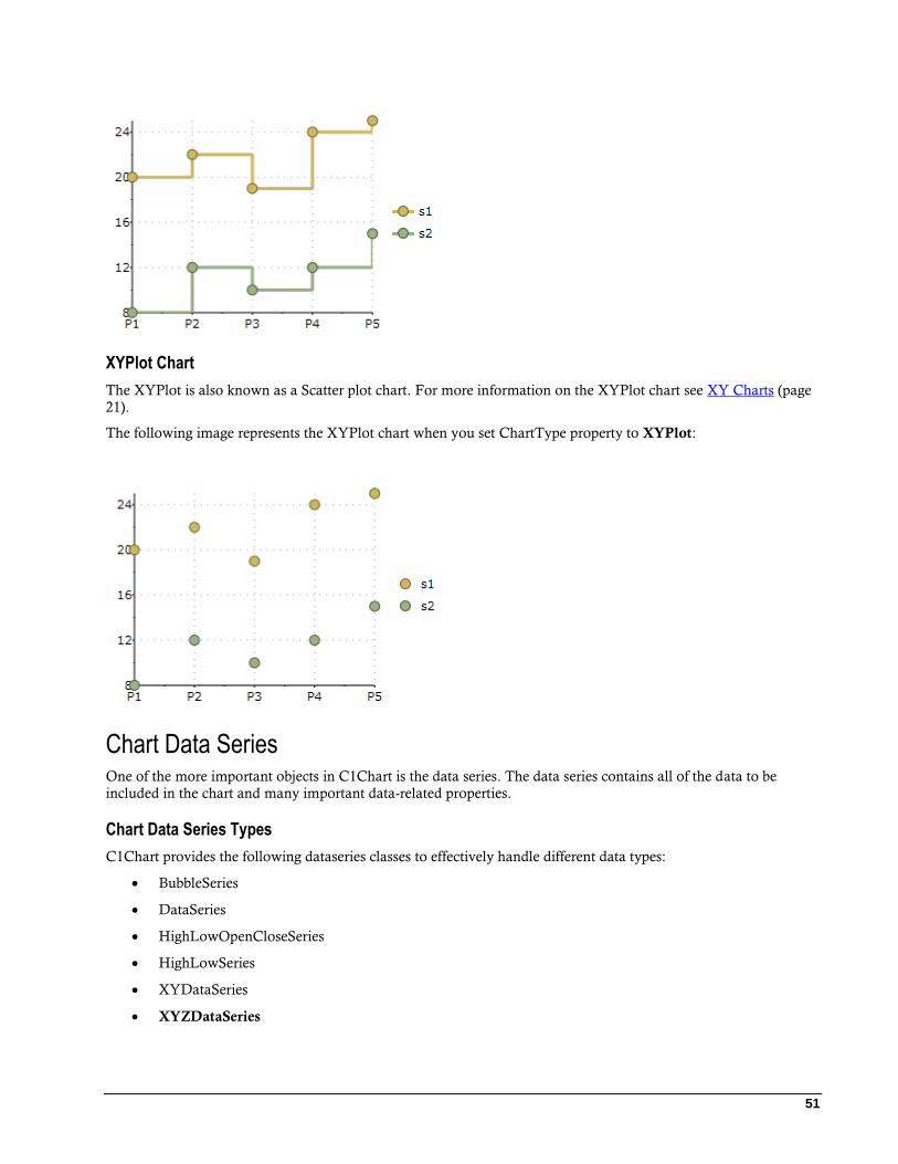
51
XYPlot Chart
The XYPlot is also known as a Scatter plot chart. For more information on the XYPlot chart see XY Charts (page
21).
The following image represents the XYPlot chart when you set ChartType property to XYPlot:
Chart Data Series One of the more important objects in C1Chart is the data series. The data series contains all of the data to be
included in the chart and many important data-related properties.
Chart Data Series Types
C1Chart provides the following dataseries classes to effectively handle different data types:
BubbleSeries
DataSeries
HighLowOpenCloseSeries
HighLowSeries
XYDataSeries
XYZDataSeries
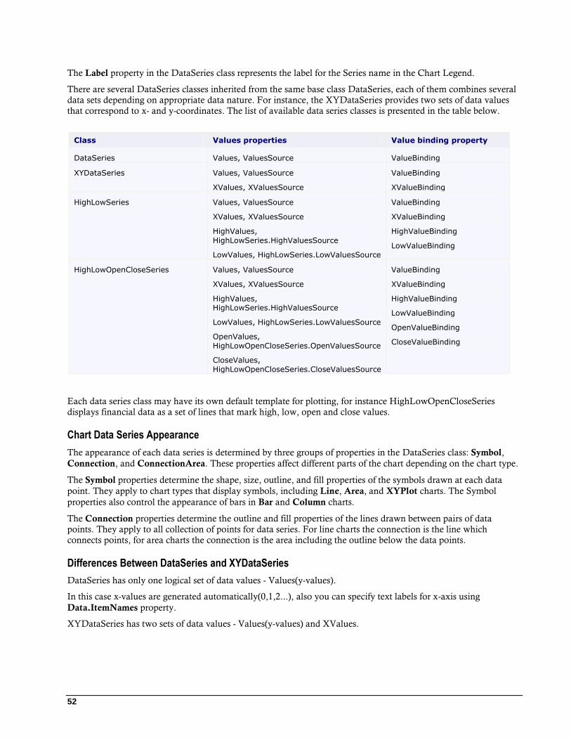
52
The Label property in the DataSeries class represents the label for the Series name in the Chart Legend.
There are several DataSeries classes inherited from the same base class DataSeries, each of them combines several
data sets depending on appropriate data nature. For instance, the XYDataSeries provides two sets of data values
that correspond to x- and y-coordinates. The list of available data series classes is presented in the table below.
Class Values properties Value binding property
DataSeries Values, ValuesSource ValueBinding
XYDataSeries Values, ValuesSource
XValues, XValuesSource
ValueBinding
XValueBinding
HighLowSeries Values, ValuesSource
XValues, XValuesSource
HighValues,
HighLowSeries.HighValuesSource
LowValues, HighLowSeries.LowValuesSource
ValueBinding
XValueBinding
HighValueBinding
LowValueBinding
HighLowOpenCloseSeries Values, ValuesSource
XValues, XValuesSource
HighValues, HighLowSeries.HighValuesSource
LowValues, HighLowSeries.LowValuesSource
OpenValues,
HighLowOpenCloseSeries.OpenValuesSource
CloseValues,
HighLowOpenCloseSeries.CloseValuesSource
ValueBinding
XValueBinding
HighValueBinding
LowValueBinding
OpenValueBinding
CloseValueBinding
Each data series class may have its own default template for plotting, for instance HighLowOpenCloseSeries
displays financial data as a set of lines that mark high, low, open and close values.
Chart Data Series Appearance
The appearance of each data series is determined by three groups of properties in the DataSeries class: Symbol,
Connection, and ConnectionArea. These properties affect different parts of the chart depending on the chart type.
The Symbol properties determine the shape, size, outline, and fill properties of the symbols drawn at each data
point. They apply to chart types that display symbols, including Line, Area, and XYPlot charts. The Symbol
properties also control the appearance of bars in Bar and Column charts.
The Connection properties determine the outline and fill properties of the lines drawn between pairs of data
points. They apply to all collection of points for data series. For line charts the connection is the line which
connects points, for area charts the connection is the area including the outline below the data points.
Differences Between DataSeries and XYDataSeries
DataSeries has only one logical set of data values - Values(y-values).
In this case x-values are generated automatically(0,1,2...), also you can specify text labels for x-axis using
Data.ItemNames property.
XYDataSeries has two sets of data values - Values(y-values) and XValues.

53
Chart View The ChartView object represents the area of the chart that contains data (excluding the titles and legend, but
including the axes). The View property returns a ChartView object with the following main properties:
Property Description
Axes Gets the axis collection. Stores x, y, and z axes. These axes are responsible for
the chart range (minimum, maximum, unit, and linear/logarithmic scale) and the appearance of the axis lines, grid lines, tick marks and axis labels.
AxisX, AxisY,
ChartView.AxisZ
Each of these properties returns Axis objects that allow you to customize the
appearance of the chart axes.
ChartView.Margin Returns a Margin object that allows you to specify the distance between the chart
area and the plot area. The axes labels are displayed in this space.
PlotRect Returns a Rect object that controls the appearance of the area inside the axes.
ChartView.Style Contains properties that set the color and border of the chart area.
Axes
The axes are represented by sub-properties of the View property: AxisX and AxisY. Each of these properties
returns an Axis object with the following main properties:
Layout, Style, and Value properties
The following properties below represent the layout and style of the axes in C1Chart:
Property Description
Position Allows you to set the position of the axis. For example, you may want
to display the X-axis above the data instead of below. For more information see Axis Position (page 56).
Reversed Allows you to reverse the direction of the axis. For example, you can
show Y values going down instead of up. For more information see Inverted and Reversed Chart Axes (page 60).
Title Sets a string to display next to the axis (this is typically used to
describe the variable and units being depicted by the axis). For more information see Axis Title (page 56).
Foreground Gets or sets the foreground brush of the axis.
AxisLine Gets or sets the axis line. The axis line connects the points on the plot
that correspond to the Min and Max of the axis.
IsTime Gets or sets whether the axis represents time values.
Scale Gets or sets the scale of the axis.
MinScale Gets or sets the minimal scale of the axis.
Annotation properties
The following properties below represent the format for the annotation of the axes in C1Chart:
Property Description
ItemsSource Gets or sets the source for axis annotations.
54
AnnoFormat A set of predefined formats used to format the values displayed next to
the axis.
AnnoAngle Allows you to rotate the values so they take up less space along the
axis. For more information see Axis Annotation Rotation (page 62).
AnnoTemplate Gets or sets the template for axis annotation.
Scaling Tickmark and Gridline properties
The following properties represent the scaling, tickmarks, and gridline styles and function for the axes in
C1Chart:
Property Description
AutoMin, AutoMax Determine whether the minimum and maximum values for the axis should be calculated automatically. For more information see Axis
Bounds.
Min, Max Set the minimum and maximum values for the axis (when AutoMin and
AutoMax are set to False). For more information see Axis Bounds (page 58).
MajorUnit, MinorUnit Set the spacing between the major and minor tickmarks (when the AutoMajor and AutoMinor properties are set to False).
MajorGridFill Gets or sets the fill based of the major grid. The MajorGridFill enables
you to create a striped plot appearance.
MajorGridStroke,
MinorGridStroke Gets or sets the brush of the major/minor grid lines.
MajorGridStrokeDashes,
MinorGridStrokeDashes Gets or sets the dash pattern of the major/minor grid lines.
MajorGridStrokeThicknes
s, MinorGridStrokeThickness
Gets or sets the thickness of the major/minor grid lines.
MajorTickHeight,
MinorTickHeight Gets or sets the major/minor tick height.
MajorTickStroke,
MinorTickStroke Gets or sets the major/minor tick stroke.
MajorTickThickness,
MinorTickThickness Gets or sets the major/minor tick thickness.
Axis Lines
The axis lines are lines that appear horizontally from the starting value to the ending value for the Y-Axis and
vertically from the starting value to the ending value for the X-Axis.
You can use either the Axis.Foreground or the ShapeStyle.Stroke property to apply color to the axis line. Note
that the Axis.Foreground property overrides the ShapeStyle.Stroke property.
Property Description
Foreground Gets or sets the foreground brush of the axis.

55
Stroke Gets or sets the stroke brush of the shape.
StrokeThickness Gets or sets the stroke thickness of the shape.
Dependent Axis
The IsDependent allows to link the auxiliary axis with one from the main axes(AxisX or AxisY, depending on
AxisType). The dependent axis always has the same minimum and maximum as the main axis.
New property DependentAxisConverter and delegate Axis.AxisConverter specifies function that is used to convert
coordinate from main axis to the dependent axis.
The following code creates a depepdent Y-Axis: c1Chart1.Reset(true);
c1Chart1.Data.Children.Add(
new DataSeries() { ValuesSource = new double[] { -10, 0, 10,
20, 30, 40 } });
c1Chart1.ChartType = ChartType.LineSymbols;
Axis axis = new Axis() { AxisType = AxisType.Y, IsDependent
=true};
// Celsius -> Fahrenheit
axis.DependentAxisConverter = (val) => val * 9 / 5 + 32;
c1Chart1.View.Axes.Add(axis);
The following image displays the dependent (leftmost) Y-Axis that shows values in Fahrenheits corresponding to
the Celsius on the main Y-axis:
56
Axis Position
You can specify the axis position by setting the Position property to near or far values. For vertical axis
Axis.Position.Near corresponds to the left and Axis.Position.Far corresponds to the right. For horizontal axis
Axis.Position.Near corresponds to bottom and Axis.Position.Far corresponds to the top.
Axis Title
Adding a title to an axis clarifies what is charted along that axis. For example if your data includes measurements
its helpful to include the unit of measurement (grams, meters, liters, etc) in the axis title. Axis titles can be added to
Area, XY-Plot, Bar, HiLoOpenClose or Candle charts.
The axis titles are UIElement objects rather than simple text. This means you have complete flexibility over the
format of the titles. In fact, you could use complex elements with buttons, tables, or images for the axis titles.
To set the Axis Title programmatically // Set axes titles
c1Chart1.View.AxisY.Title= new TextBlock() { Text = "Kitchen
Electronics" };
c1Chart1.View.AxisX.Title = new TextBlock() { Text = "Price" };
To set the Axis Title using XAML code <c1chart:C1Chart >
<c1chart:C1Chart.View>
<c1chart:ChartView>
<c1chart:ChartView.AxisX>
<c1chart:Axis>
<c1chart:Axis.Title>
<TextBlock Text="Price" TextAlignment="Center"
Foreground="Crimson"/>
</c1chart:Axis.Title>
</c1chart:Axis>
</c1chart:ChartView.AxisX>
<c1chart:ChartView.AxisY>
<c1chart:Axis>
<c1chart:Axis.Title>
<TextBlock Text="Kitchen Electronics"
TextAlignment="Center" Foreground="Crimson"/>
</c1chart:Axis.Title>
</c1chart:Axis>
</c1chart:ChartView.AxisY>
</c1chart:ChartView>
</c1chart:C1Chart.View>
</c1chart:C1Chart>
Axis Tick Marks
The chart automatically sets up the axis with both major and minor ticks. Customizing the tick spacing or
attributes is as easy as manipulating a set of properties.
The MajorUnit and MinorUnit properties set the state of the Axis' tick marks. To eliminate clutter in a chart, you
can display fewer labels or tick marks on the category (x) axis by specifying the intervals at which you want
categories to be labeled, or by specifying the number of categories that you want to display between tick marks.
Major Tick Overlap
You can determine the overlap value for the major tick mark by specifying a value range from 0 to 1 for the
MajorTickOverlap property. The default value is 0, which means there is not overlap. When the overlap is 1, the

57
whole tick is inside the plot area. As you increase the MajorTickOverlap value for the X-Axis, the tick mark moves
up and down as you descrease the value. As you increase the MajorTickOverlap value for the Y-Axis the tick mark
moves to the left. c1Chart1.Reset(true);
c1Chart1.Data.Children.Add(
new DataSeries() { ValuesSource = new double[] { 1, 2, 1, 2 } });
c1Chart1.ChartType = ChartType.LineSymbols;
c1Chart1.View.AxisX.MajorGridStrokeThickness = 0;
c1Chart1.View.AxisX.MajorTickThickness = 3;
c1Chart1.View.AxisX.MajorTickHeight = 10;
c1Chart1.View.AxisX.MajorTickOverlap = 0;
c1Chart1.View.AxisY.MajorGridStrokeThickness = 0;
c1Chart1.View.AxisY.MajorTickThickness = 3;
c1Chart1.View.AxisY.MajorTickHeight = 10;
c1Chart1.View.AxisY.MajorTickOverlap = 0;
The following image displays the MajorTickOverlap value as zero:
Minor Tick Overlap
You can determine the overlap value for the minor tick mark by specifying a value range from 0 to 1 for the
MinorTickOverlap property. The default value is 0 which, means there is not overlap. When the overlap is 1, the
whole tick is inside the plot area. c1Chart1.Reset(true);
c1Chart1.Data.Children.Add(
new DataSeries() { ValuesSource = new double[] { 1, 2, 1, 2 } });
c1Chart1.ChartType = ChartType.LineSymbols;
c1Chart1.View.AxisX.MinorGridStrokeThickness = 0;
c1Chart1.View.AxisX.MinorTickThickness = 3;
c1Chart1.View.AxisX.MinorTickHeight = 10;
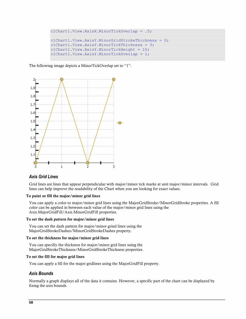
58
c1Chart1.View.AxisX.MinorTickOverlap = .5;
c1Chart1.View.AxisY.MinorGridStrokeThickness = 0;
c1Chart1.View.AxisY.MinorTickThickness = 3;
c1Chart1.View.AxisY.MinorTickHeight = 10;
c1Chart1.View.AxisY.MinorTickOverlap = 1;
The following image depicts a MinorTickOverlap set to “1”:
Axis Grid Lines
Grid lines are lines that appear perpendicular with major/minor tick marks at unit major/minor intervals. Grid
lines can help improve the readability of the Chart when you are looking for exact values.
To paint or fill the major/minor grid lines
You can apply a color to major/minor grid lines using the MajorGridStroke/MinorGridStroke properties. A fill
color can be applied in between each value of the major/minor grid lines using the
Axis.MajorGridFill/Axis.MinorGridFill properties.
To set the dash pattern for major/minor grid lines
You can set the dash pattern for major/minor grind lines using the
MajorGridStrokeDashes/MinorGridStrokeDashes property.
To set the thickness for major/minor grid lines
You can specifiy the thickness for major/minor grid lines using the
MajorGridStrokeThickness/MinorGridStrokeThickness properties.
To set the fill for major grid lines
You can apply a fill for the major gridlines using the MajorGridFill property.
Axis Bounds
Normally a graph displays all of the data it contains. However, a specific part of the chart can be displayed by
fixing the axis bounds.
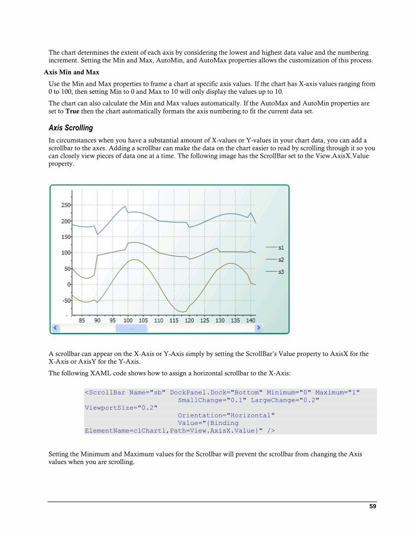
59
The chart determines the extent of each axis by considering the lowest and highest data value and the numbering
increment. Setting the Min and Max, AutoMin, and AutoMax properties allows the customization of this process.
Axis Min and Max
Use the Min and Max properties to frame a chart at specific axis values. If the chart has X-axis values ranging from
0 to 100, then setting Min to 0 and Max to 10 will only display the values up to 10.
The chart can also calculate the Min and Max values automatically. If the AutoMax and AutoMin properties are
set to True then the chart automatically formats the axis numbering to fit the current data set.
Axis Scrolling
In circumstances when you have a substantial amount of X-values or Y-values in your chart data, you can add a
scrollbar to the axes. Adding a scrollbar can make the data on the chart easier to read by scrolling through it so you
can closely view pieces of data one at a time. The following image has the ScrollBar set to the View.AxisX.Value
property.
A scrollbar can appear on the X-Axis or Y-Axis simply by setting the ScrollBar’s Value property to AxisX for the
X-Axis or AxisY for the Y-Axis.
The following XAML code shows how to assign a horizontal scrollbar to the X-Axis:
<ScrollBar Name="sb" DockPanel.Dock="Bottom" Minimum="0" Maximum="1"
SmallChange="0.1" LargeChange="0.2"
ViewportSize="0.2"
Orientation="Horizontal"
Value="{Binding
ElementName=c1Chart1,Path=View.AxisX.Value}" />
Setting the Minimum and Maximum values for the Scrollbar will prevent the scrollbar from changing the Axis
values when you are scrolling.

60
Inverted and Reversed Chart Axes
When a data set contains X or Y values which span a large range, sometimes the normal chart setup does not
display the information most effectively. Formatting a chart with a vertical Y-axis and axis annotation that begins
at the minimum value can sometimes be more visually appealing if the chart could be inverted or the axes reversed.
Therefore, C1Chart provides the Inverted property and the Reversed property of the axis.
Setting the Reversed property of the ChartView to True will reverse the axes. This means that the Max side of the
axis will take the place of the Min side of the axis, and the Min side of the axis will take the place of the Max side
of the axis. Initially, the chart displays the Minimum value on the left side of the X-axis, and on the bottom side of
the Y-axis. Setting the Reversed property of the Axis, however will juxtapose these Maximum and Minimum
values.
Multiple Axes
Multiple axes are commonly used when you have the following:
Two or more Data Series that have mixed types of data which make the scales very different
Wide range of data values that vary from Data Series to Data Series
The following chart uses five axes to effectively display the length and temperature in both metric and non-metric
measurements:
You can add multiple axes to the chart by adding a new Axis object and then specifying its type (X, Y, or Z) for the
Axis.AxisType property.
The following XAML code shows how to add multiple Y-axes to the chart: <c1chart:C1Chart Margin="0" Name="c1Chart1">
<c1chart:C1Chart.View>
<c1chart:ChartView>
<!-- Auxiliary y-axes -->
<c1chart:Axis Name="ay2" AxisType="Y" Position="Far" Min="0"
Max="10" />
<c1chart:Axis Name="ay3" AxisType="Y" Position="Far" Min="0"
Max="20" />
<c1chart:Axis Name="ay4" AxisType="Y" Position="Far" Min="0"
Max="50" />
</c1chart:ChartView>
61
</c1chart:C1Chart.View>
<c1chart:C1Chart.Data>
<c1chart:ChartData>
<c1chart:DataSeries Values="1 2 3 4 5" />
<c1chart:DataSeries AxisY="ay2" Values="1 2 3 4 5" />
<c1chart:DataSeries AxisY="ay3" Values="1 2 3 4 5" />
<c1chart:DataSeries AxisY="ay4" Values="1 2 3 4 5" />
</c1chart:ChartData>
</c1chart:C1Chart.Data>
</c1chart:C1Chart>
Axes Annotation
The annotation along each axis is an important part of any chart. The chart annotates the axes with numbers based
on the data/values entered into the BubbleSeries, DataSeries, HighLowOpenCloseSeries, HighLowSeries, or
XYDataSeries objects. Annotation for the Axes will always display basic text without any formatting applied to
them.
The chart automatically produces the most natural annotation possible, even as chart data changes. The following
Annotation properties can be modified to perfect this process:
Property Description
AnnoFormat A set of predefined formats used to format the values displayed next to the
axis.
AnnoAngle Gets or sets the rotation angle of axis annotation. This allows you to rotate
the values so they will take up less space along the axis.
AnnoTemplate Gets or sets the template for the axis annotation. This is useful for building
custom annotations.
ItemsSource Gets or sets the source for axis annotations.
Axis Annotation Format
You can control the annotation formatting for the values on the X or Y axis using the AnnoFormat property.
Setting the AnnoFormat property to a .NET Framework composite format string will format the data entered into
the property. For more information on the standard numeric format strings that you can use for the
Axis.AnnoFormat property see Standard Numeric Format Strings. For more information on the
DateTime Format Strings
The DateTime format strings are divided into two categories:
Standard Date Time Format Strings
Custom Date Time Format Strings
Numeric Format Strings
Standard Numeric Format Strings
Custom Numeric Format Strings
Custom Numeric Format Strings
You can also customize your format strings by using the custom numeric format strings.
To use the AnnoFormat property simply specifiy a standard or custom format string for it. For example the
following Bar chart’s AnnoFormat property is set to “c” to change the whole values to currency format.

62
XAML <c1chart:C1Chart.View>
<c1chart:ChartView>
<c1chart:ChartView.AxisX>
<c1chart:Axis Min="0" AnnoFormat="c"
AutoMin="false" AutoMax="false" Max="200" />
</c1chart:ChartView.AxisX>
</c1chart:ChartView>
</c1chart:C1Chart.View>
C# // Financial formatting
c1Chart1.View.AxisX.AnnoFormat = "c";
c1Chart1.View.AxisX.Min = 0;
Axis Annotation Rotation
Use the AnnoAngle property to rotate the axis annotation counterclockwise from the specified number of degrees.
This property is especially useful if the X-axis is crowded with annotation. Rotating the annotations +/- 30 or 60
degrees allows a much larger number of annotations in a confined space on horizontal axes. By utilizing the
AnnoAngle property, the X-axis annotation does not overlap, as shown below:
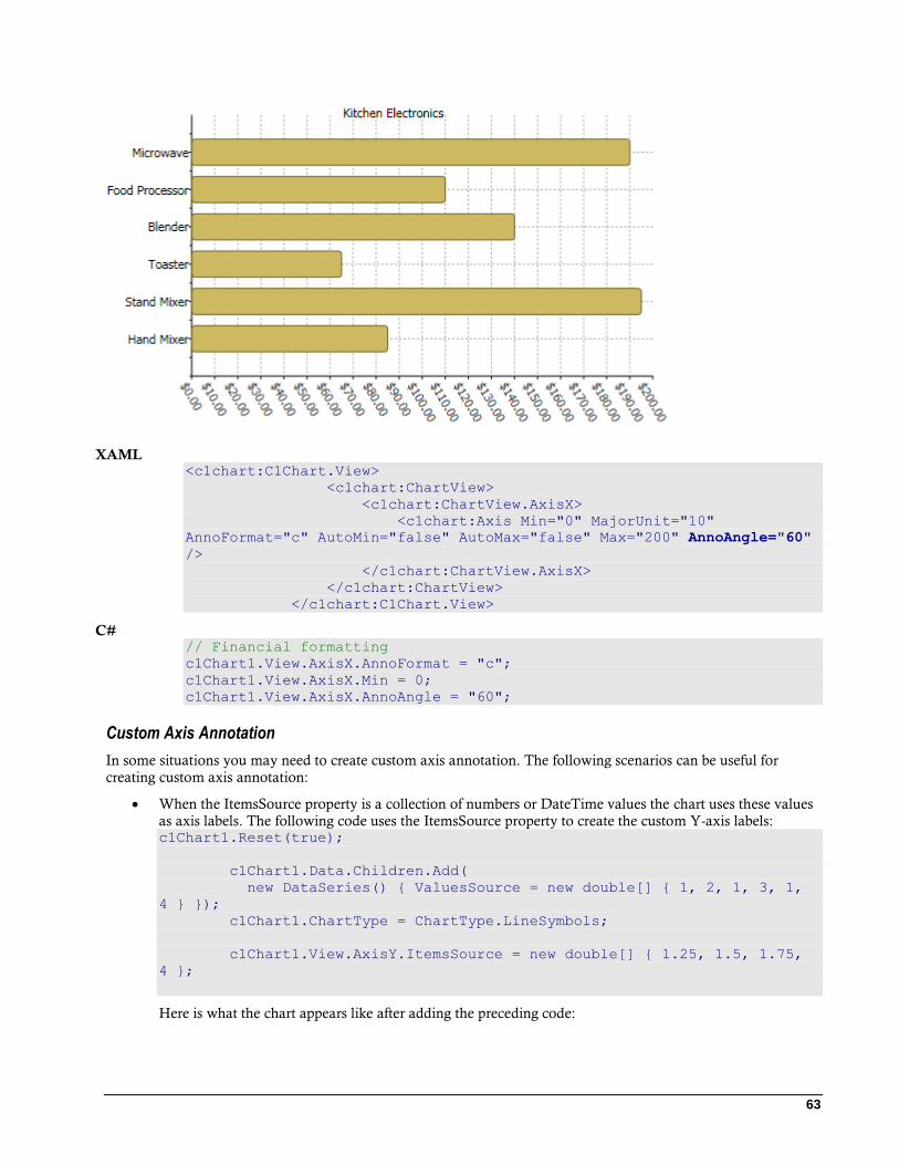
63
XAML <c1chart:C1Chart.View>
<c1chart:ChartView>
<c1chart:ChartView.AxisX>
<c1chart:Axis Min="0" MajorUnit="10"
AnnoFormat="c" AutoMin="false" AutoMax="false" Max="200" AnnoAngle="60"
/>
</c1chart:ChartView.AxisX>
</c1chart:ChartView>
</c1chart:C1Chart.View>
C# // Financial formatting
c1Chart1.View.AxisX.AnnoFormat = "c";
c1Chart1.View.AxisX.Min = 0;
c1Chart1.View.AxisX.AnnoAngle = "60";
Custom Axis Annotation
In some situations you may need to create custom axis annotation. The following scenarios can be useful for
creating custom axis annotation:
When the ItemsSource property is a collection of numbers or DateTime values the chart uses these values
as axis labels. The following code uses the ItemsSource property to create the custom Y-axis labels: c1Chart1.Reset(true);
c1Chart1.Data.Children.Add(
new DataSeries() { ValuesSource = new double[] { 1, 2, 1, 3, 1,
4 } });
c1Chart1.ChartType = ChartType.LineSymbols;
c1Chart1.View.AxisY.ItemsSource = new double[] { 1.25, 1.5, 1.75,
4 };
Here is what the chart appears like after adding the preceding code:
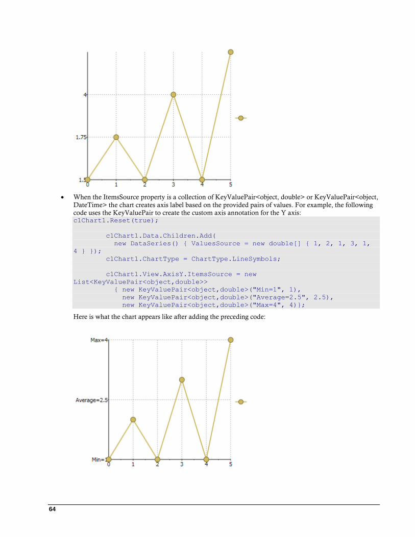
64
When the ItemsSource property is a collection of KeyValuePair<object, double> or KeyValuePair<object,
DateTime> the chart creates axis label based on the provided pairs of values. For example, the following
code uses the KeyValuePair to create the custom axis annotation for the Y axis: c1Chart1.Reset(true);
c1Chart1.Data.Children.Add(
new DataSeries() { ValuesSource = new double[] { 1, 2, 1, 3, 1,
4 } });
c1Chart1.ChartType = ChartType.LineSymbols;
c1Chart1.View.AxisY.ItemsSource = new
List<KeyValuePair<object,double>>
{ new KeyValuePair<object,double>("Min=1", 1),
new KeyValuePair<object,double>("Average=2.5", 2.5),
new KeyValuePair<object,double>("Max=4", 4)};
Here is what the chart appears like after adding the preceding code:
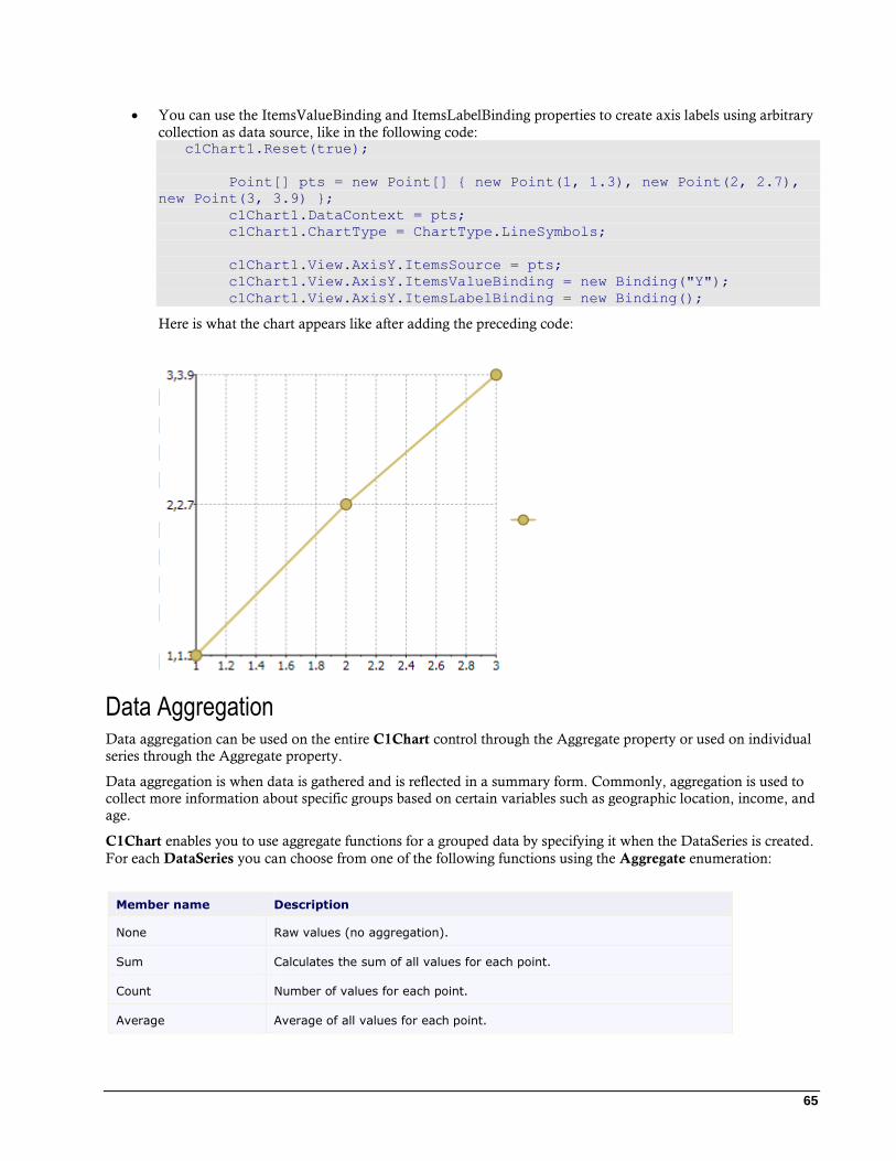
65
You can use the ItemsValueBinding and ItemsLabelBinding properties to create axis labels using arbitrary
collection as data source, like in the following code: c1Chart1.Reset(true);
Point[] pts = new Point[] { new Point(1, 1.3), new Point(2, 2.7),
new Point(3, 3.9) };
c1Chart1.DataContext = pts;
c1Chart1.ChartType = ChartType.LineSymbols;
c1Chart1.View.AxisY.ItemsSource = pts;
c1Chart1.View.AxisY.ItemsValueBinding = new Binding("Y");
c1Chart1.View.AxisY.ItemsLabelBinding = new Binding();
Here is what the chart appears like after adding the preceding code:
Data Aggregation Data aggregation can be used on the entire C1Chart control through the Aggregate property or used on individual
series through the Aggregate property.
Data aggregation is when data is gathered and is reflected in a summary form. Commonly, aggregation is used to
collect more information about specific groups based on certain variables such as geographic location, income, and
age.
C1Chart enables you to use aggregate functions for a grouped data by specifying it when the DataSeries is created.
For each DataSeries you can choose from one of the following functions using the Aggregate enumeration:
Member name Description
None Raw values (no aggregation).
Sum Calculates the sum of all values for each point.
Count Number of values for each point.
Average Average of all values for each point.
66
Minimum Gets the minimum value for each point.
Maximum Gets the maximum value for each point.
Variance Gets the variance of the values for each point (sample).
VariancePop Gets the variance of the values for each point (population).
StandardDeviation Gets the standard deviation of the values for each point (sample).
StandardDeviationPop Gets the standard deviation of the values for each point (population).
Data Labels Data labels are labels associated with data points on the chart. They can be useful on some charts by making it
easier to see which series a particular point belongs to, or its exact value.
C1Chart supports data labels. Each data series has a PointLabelTemplate property that specifies the visual element
that should be displayed next to each point. The PointLabelTemplate is usually defined as a XAML resource, and
may be assigned to the chart from XAML or from code.
You can add a DataTemplate to determine both visual aspects of how the data is presented and how data binding
accesses the presented data.
To define the PointLabelTemplate as a XAML resource you can create a Resource Dictionary, add the
DataTemplate resource to your Resource Dictionary and then in your Window.xaml file you can access the
DataTemplate resource.
To add a new resource dictionary:
1. In Solution Explorer, right-click your project, point to Add, and then select Resource Dictionary. The Add
New Item dialog box appears.
2. In the Name text box, name the dictionary Resources.xaml and click the Add button.
3. Resources.xaml is added to the project and opens in the code editor.
To create a label you need to create the label template and assign the PointLabelTemplate to the template.
When rendering the plot for each data point the label is created based on the specified template. The DataContext
property of the label is set to the current DataPoint instance that provides information about the point. When
using data binding it makes it easier to display this information in the label.
Here is the sample of a label template that displays the value of the point.
<DataTemplate x:Key="lbl">
<TextBlock Text="{Binding Path=Value}" />
</DataTemplate>
After you define a resource, you can reference the resource to be used for a property value by using a resource
markup extension syntax that specifies the key name
To assign the template to the data series set the PointLabelTemplate property to the following:
<c1chart:DataSeries PointLabelTemplate="{StaticResource lbl}" />
Since it is a standard data template, the complex label can be built, for example, the next sample template defines
the data label for the XY chart which shows both coordinates of the data point.
67
It uses the standard grid with two columns and two rows as a container. The x-value of the point is obtained with
indexer of the DataPoint class. The indexer allows getting the values for the data series classes which support
several data sets, such as XYDataSeries class.
<DataTemplate x:Key="lbl">
<!-- Grid 2x2 with black border -->
<Border BorderBrush="Black">
<Grid>
<Grid.ColumnDefinitions>
<ColumnDefinition />
<ColumnDefinition />
</Grid.ColumnDefinitions>
<Grid.RowDefinitions>
<RowDefinition />
<RowDefinition />
</Grid.RowDefinitions>
<!-- x-coordinate -->
<TextBlock Text="X=" />
<TextBlock Grid.Column="1" Text="{Binding Path=[XValues]}" />
<!-- y-coordinate -->
<TextBlock Grid.Row="1" Text="Y=" />
<TextBlock Grid.Row="1" Grid.Column="1" Text="{Binding
Path=Value}" />
</Grid>
</Border>
</DataTemplate>
When displaying the numerical data value often it is necessary to format the output value. With the static class
Format you can specify standard .Net format string inside the XAML code. For example, the sample code uses
converter to format percentage value.
<DataTemplate x:Key="lbl1">
<TextBlock Text="{Binding Path=PercentageSeries,
Converter={x:Static c1chart:Converters.Format},
ConverterParameter=#.#%}"/>
</DataTemplate>
End User Interaction C1Chart contains built-in tools that simplify the implementation of interactive behaviors for the end user. The end
user can explore, rotate and zoom chart using combinations of mouse and shift keys.
The control center for interactive features is the Actions property of C1Chart. The Action object has several
properties that allow customization of the interface. All of the properties can be set in XAML or programmatically
through the Actions collection.
The following list reveals the supported chart actions:
Scale action increases or decreases the scale of chart along the selected axis or axes. The ScaleAction class
represents the scale action.
Note: The zoom is not applicable for the chart's axis if the MinScale property is equal to 1.0. The MinScale property specifies the minimum scale that can be set for the axis.
Translate action provides the opportunity to scroll through the plot area. The TranslateAction class
represents the translate action.
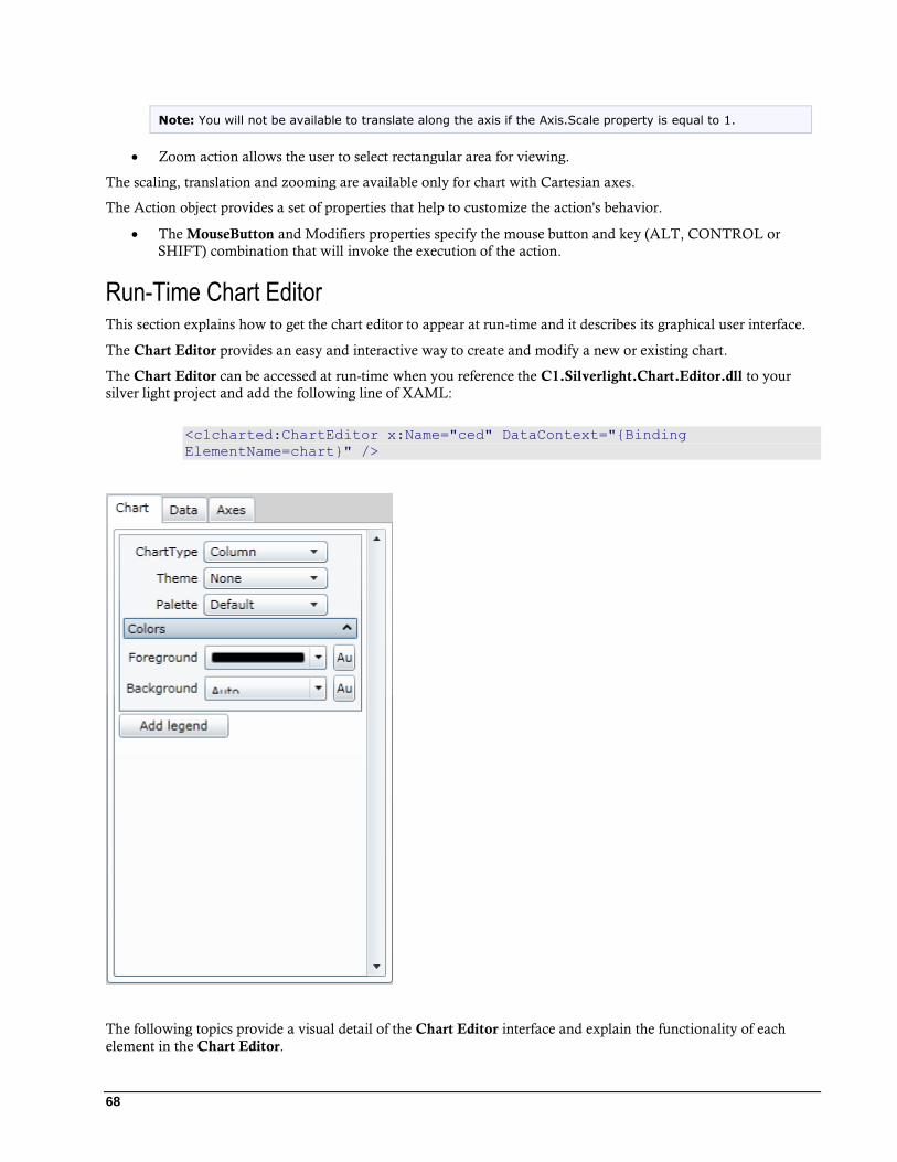
68
Note: You will not be available to translate along the axis if the Axis.Scale property is equal to 1.
Zoom action allows the user to select rectangular area for viewing.
The scaling, translation and zooming are available only for chart with Cartesian axes.
The Action object provides a set of properties that help to customize the action's behavior.
The MouseButton and Modifiers properties specify the mouse button and key (ALT, CONTROL or
SHIFT) combination that will invoke the execution of the action.
Run-Time Chart Editor This section explains how to get the chart editor to appear at run-time and it describes its graphical user interface.
The Chart Editor provides an easy and interactive way to create and modify a new or existing chart.
The Chart Editor can be accessed at run-time when you reference the C1.Silverlight.Chart.Editor.dll to your
silver light project and add the following line of XAML:
<c1charted:ChartEditor x:Name="ced" DataContext="{Binding
ElementName=chart}" />
The following topics provide a visual detail of the Chart Editor interface and explain the functionality of each
element in the Chart Editor.

69
Chart Tab
In the Chart tab you can choose from one of many chart types and then you customize the chart’s appearance by
choosing a theme, palette, foreground color, backround color, and legend.
Data Tab
In the Data tab you can add and remove point labels and point tooltips to C1Chart. To add point labels and/or
point tooltips click the associated Add button. To remove point labels and/or point tooltips click the associated
Remove button.
Once a point label has been added you can change the value of its text, alignment, and offset.

70
Axes Tab
You can select Axes tab to modify or create the format style, scale, and annotation of the axes.
The screen shot below represents the tab name for the selected Axis, in this example it is Axis X.
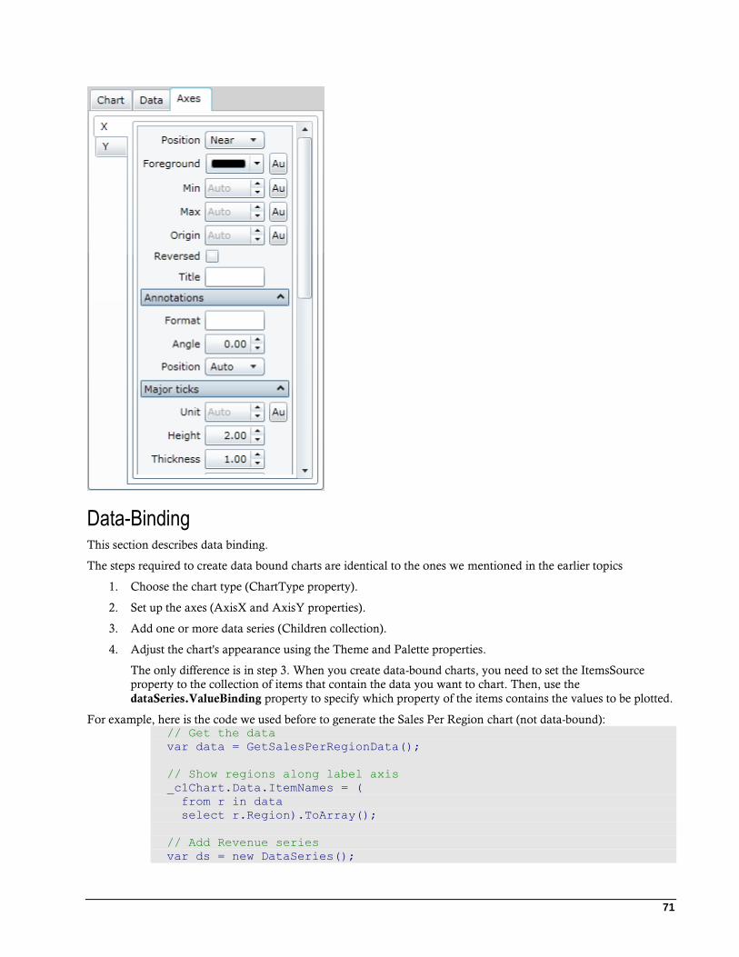
71
Data-Binding This section describes data binding.
The steps required to create data bound charts are identical to the ones we mentioned in the earlier topics
1. Choose the chart type (ChartType property).
2. Set up the axes (AxisX and AxisY properties).
3. Add one or more data series (Children collection).
4. Adjust the chart's appearance using the Theme and Palette properties.
The only difference is in step 3. When you create data-bound charts, you need to set the ItemsSource
property to the collection of items that contain the data you want to chart. Then, use the
dataSeries.ValueBinding property to specify which property of the items contains the values to be plotted.
For example, here is the code we used before to generate the Sales Per Region chart (not data-bound): // Get the data
var data = GetSalesPerRegionData();
// Show regions along label axis
_c1Chart.Data.ItemNames = (
from r in data
select r.Region).ToArray();
// Add Revenue series
var ds = new DataSeries();
72
ds.Label = "Revenue";
ds.ValuesSource = (from r in data select r.Revenue).ToArray();
_c1Chart.Data.Children.Add(ds);
// Add Expense series
ds = new DataSeries();
ds.Label = "Expense";
ds.ValuesSource = (from r in data select r.Expense).ToArray();
_c1Chart.Data.Children.Add(ds);
// Add Profit series
ds = new DataSeries();
ds.Label = "Profit";
ds.ValuesSource = (from r in data select r.Profit).ToArray();
_c1Chart.Data.Children.Add(ds);
Here is the data-bound version of the code (changes are highlighted). The result is identical: // Get the data
var data = GetSalesPerRegionData();
_c1Chart.Data.ItemsSource = data;
// Show regions along label axis
_c1Chart.Data.ItemNameBinding = new Binding("Region");
// Add data series
foreach (string series in "Revenue,Expense,Profit".Split(','))
{
var ds = new DataSeries();
ds.Label = series;
ds.ValueBinding = new Binding(series);
_c1Chart.Data.Children.Add(ds);
}
The data-bound version of the code is even more compact than the original. The three series are created in a loop,
taking advantage of the fact that the names of the properties we want to chart are the same as the names we want
to use for each data series.
You can assign any object that implements the IEnumerable interface to the ItemsSource property. This includes
simple lists as shown above, LINQ queries, and DataTable objects provided by the C1.Silverlight.Data assembly.
Data-Binding to C1.Silverlight.Data
C1.Silverlight.Data is an assembly that contains a subset of the data objects in ADO.NET built for the Silverlight
platform (DataSet, DataTable, DataView, and so on). It allows you to re-use your ADO.NET data and logic in
Silverlight applications, and integrates with LINQ and modern data-binding mechanisms as shown below.
Creating charts from DataTable objects is easy. The first step is obtaining the data from the server. Loading a
DataSet from a database or file is discussed in detail in the C1.Silverlight.Data documentation. The code below
shows one easy way to load a DataSet from an XML file: public Page()
{
InitializeComponent();
// Other initialization
// ...
// Go read NorthWind product data
WebClient wc = new WebClient();
wc.OpenReadCompleted += wc_OpenReadCompleted;
wc.OpenReadAsync(new Uri("products.xml", UriKind.Relative));
73
}
// Read NorthWind product data into data set
DataSet _dataSet = null;
void wc_OpenReadCompleted(object sender, OpenReadCompletedEventArgs
e)
{
_dataSet = new DataSet();
_dataSet.ReadXml(e.Result);
}
The code uses a WebClient object to obtain an XML stream from the server. It assumes the "products.xml" file is
present on the server and contains the NorthWind products table. The "products.xml" file was obtained by calling
the WriteXml method.
Once the data is available, creating the chart requires the same steps as before: void BuildNorthWindChart(ChartType chartType)
{
// Clear current chart
_c1Chart.Reset(true);
// Set chart type
_c1Chart.ChartType = chartType;
// Get axes
Axis valueAxis = _c1Chart.View.AxisY;
Axis labelAxis = _c1Chart.View.AxisX;
if (chartType == ChartType.Bar)
{
valueAxis = _c1Chart.View.AxisX;
labelAxis = _c1Chart.View.AxisY;
}
// Configure label axis
labelAxis.Title = CreateTextBlock("Product Name", 14,
FontWeights.Bold);
labelAxis.AutoMin = true;
labelAxis.AnnoAngle = 45;
// Configure value axis
valueAxis.Title = CreateTextBlock("Amount ($)", 14,
FontWeights.Bold);
valueAxis.AutoMin = false;
valueAxis.Min = 0;
// Get the data
DataView dv = _dataSet.Tables["Products"].DefaultView;
dv.RowFilter = "UnitPrice >= 35";
dv.Sort = "UnitPrice DESC";
_c1Chart.Data.ItemsSource = dv;
// Show Product Name along x axis
_c1Chart.Data.ItemNameBinding = new Binding("ProductName");
// Add data series
var ds = new DataSeries();
ds.Label = "Unit Price";
ds.ValueBinding = new Binding("UnitPrice");
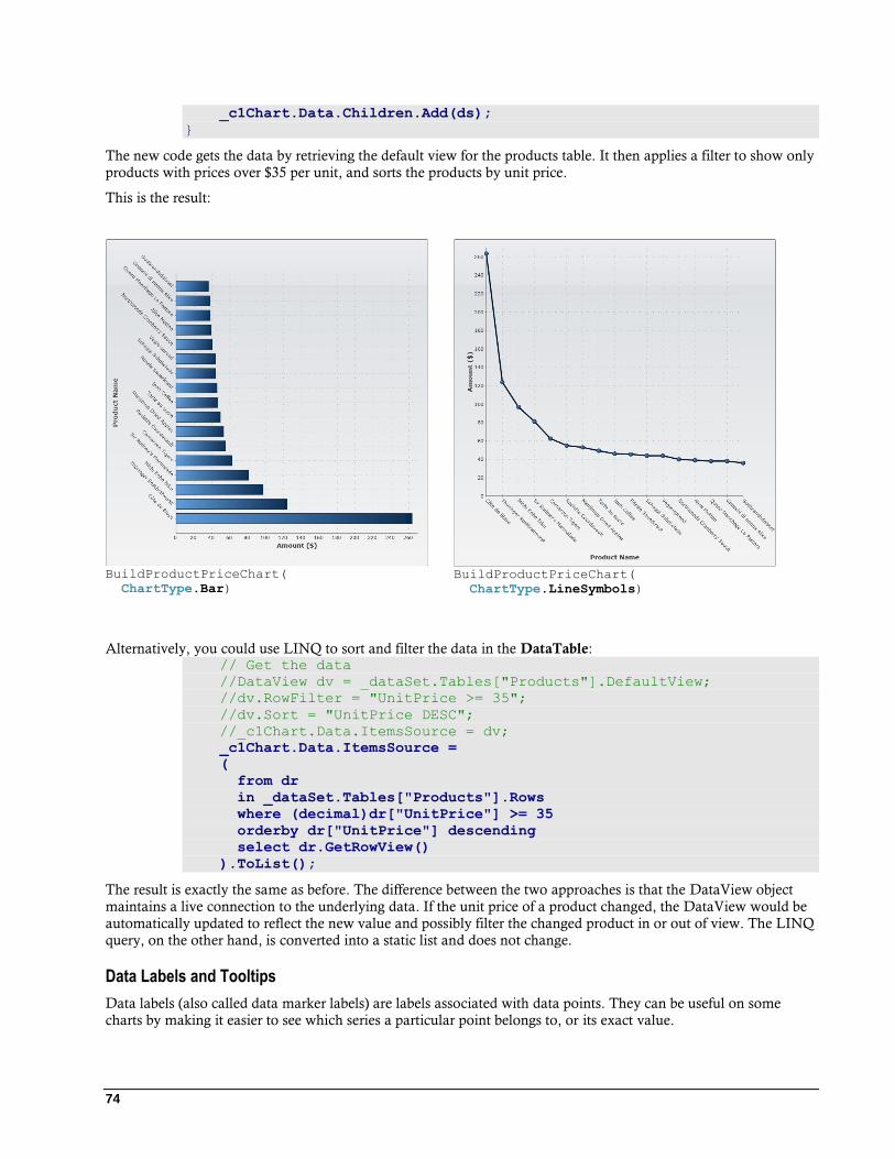
74
_c1Chart.Data.Children.Add(ds);
}
The new code gets the data by retrieving the default view for the products table. It then applies a filter to show only
products with prices over $35 per unit, and sorts the products by unit price.
This is the result:
BuildProductPriceChart(
ChartType.Bar)
BuildProductPriceChart(
ChartType.LineSymbols)
Alternatively, you could use LINQ to sort and filter the data in the DataTable: // Get the data
//DataView dv = _dataSet.Tables["Products"].DefaultView;
//dv.RowFilter = "UnitPrice >= 35";
//dv.Sort = "UnitPrice DESC";
//_c1Chart.Data.ItemsSource = dv;
_c1Chart.Data.ItemsSource =
(
from dr
in _dataSet.Tables["Products"].Rows
where (decimal)dr["UnitPrice"] >= 35
orderby dr["UnitPrice"] descending
select dr.GetRowView()
).ToList();
The result is exactly the same as before. The difference between the two approaches is that the DataView object
maintains a live connection to the underlying data. If the unit price of a product changed, the DataView would be
automatically updated to reflect the new value and possibly filter the changed product in or out of view. The LINQ
query, on the other hand, is converted into a static list and does not change.
Data Labels and Tooltips
Data labels (also called data marker labels) are labels associated with data points. They can be useful on some
charts by making it easier to see which series a particular point belongs to, or its exact value.
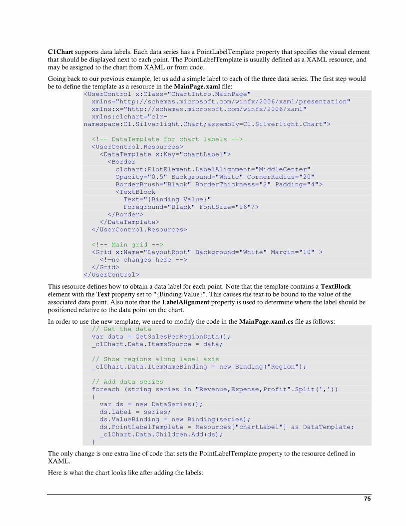
75
C1Chart supports data labels. Each data series has a PointLabelTemplate property that specifies the visual element
that should be displayed next to each point. The PointLabelTemplate is usually defined as a XAML resource, and
may be assigned to the chart from XAML or from code.
Going back to our previous example, let us add a simple label to each of the three data series. The first step would
be to define the template as a resource in the MainPage.xaml file: <UserControl x:Class="ChartIntro.MainPage"
xmlns="http://schemas.microsoft.com/winfx/2006/xaml/presentation"
xmlns:x="http://schemas.microsoft.com/winfx/2006/xaml"
xmlns:c1chart="clr-
namespace:C1.Silverlight.Chart;assembly=C1.Silverlight.Chart">
<!-- DataTemplate for chart labels -->
<UserControl.Resources>
<DataTemplate x:Key="chartLabel">
<Border
c1chart:PlotElement.LabelAlignment="MiddleCenter"
Opacity="0.5" Background="White" CornerRadius="20"
BorderBrush="Black" BorderThickness="2" Padding="4">
<TextBlock
Text="{Binding Value}"
Foreground="Black" FontSize="16"/>
</Border>
</DataTemplate>
</UserControl.Resources>
<!-- Main grid -->
<Grid x:Name="LayoutRoot" Background="White" Margin="10" >
<!—no changes here -->
</Grid>
</UserControl>
This resource defines how to obtain a data label for each point. Note that the template contains a TextBlock
element with the Text property set to "{Binding Value}". This causes the text to be bound to the value of the
associated data point. Also note that the LabelAlignment property is used to determine where the label should be
positioned relative to the data point on the chart.
In order to use the new template, we need to modify the code in the MainPage.xaml.cs file as follows: // Get the data
var data = GetSalesPerRegionData();
_c1Chart.Data.ItemsSource = data;
// Show regions along label axis
_c1Chart.Data.ItemNameBinding = new Binding("Region");
// Add data series
foreach (string series in "Revenue,Expense,Profit".Split(','))
{
var ds = new DataSeries();
ds.Label = series;
ds.ValueBinding = new Binding(series);
ds.PointLabelTemplate = Resources["chartLabel"] as DataTemplate;
_c1Chart.Data.Children.Add(ds);
}
The only change is one extra line of code that sets the PointLabelTemplate property to the resource defined in
XAML.
Here is what the chart looks like after adding the labels:
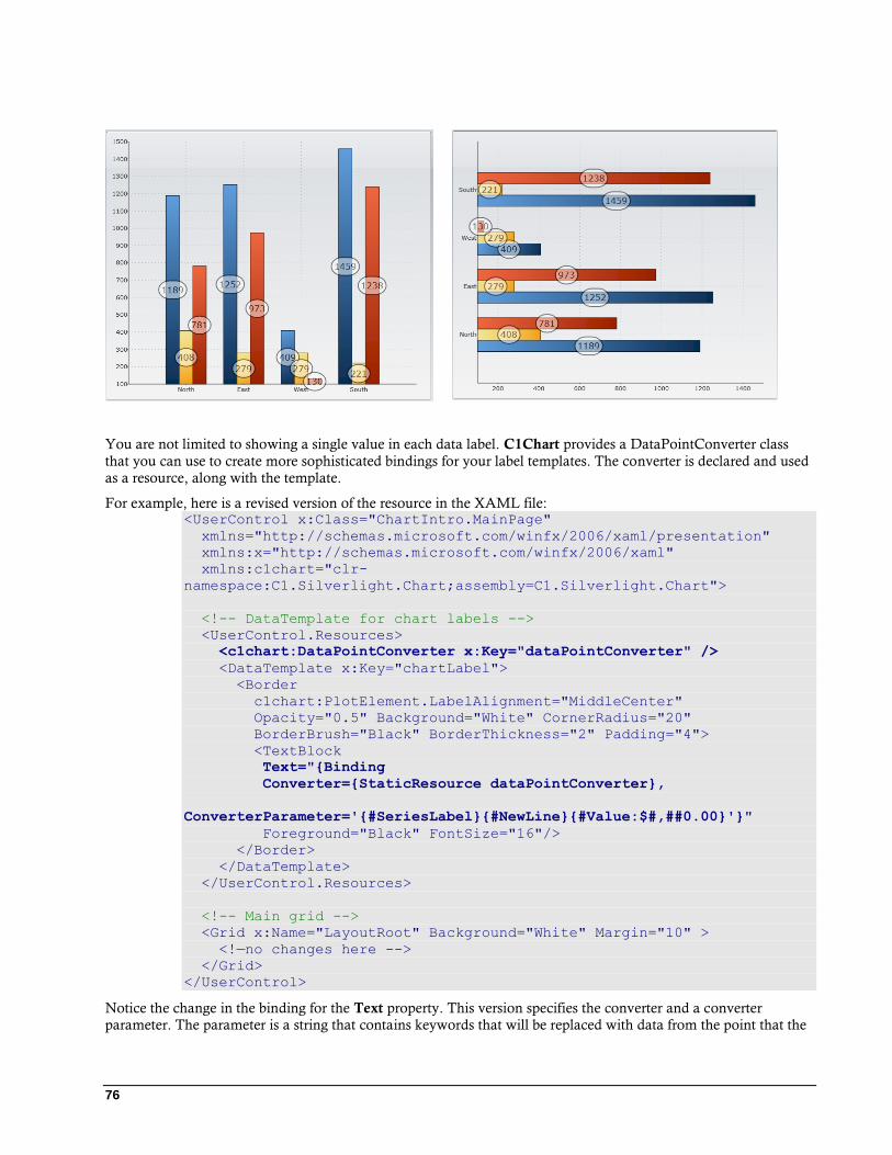
76
You are not limited to showing a single value in each data label. C1Chart provides a DataPointConverter class
that you can use to create more sophisticated bindings for your label templates. The converter is declared and used
as a resource, along with the template.
For example, here is a revised version of the resource in the XAML file: <UserControl x:Class="ChartIntro.MainPage"
xmlns="http://schemas.microsoft.com/winfx/2006/xaml/presentation"
xmlns:x="http://schemas.microsoft.com/winfx/2006/xaml"
xmlns:c1chart="clr-
namespace:C1.Silverlight.Chart;assembly=C1.Silverlight.Chart">
<!-- DataTemplate for chart labels -->
<UserControl.Resources>
<c1chart:DataPointConverter x:Key="dataPointConverter" />
<DataTemplate x:Key="chartLabel">
<Border
c1chart:PlotElement.LabelAlignment="MiddleCenter"
Opacity="0.5" Background="White" CornerRadius="20"
BorderBrush="Black" BorderThickness="2" Padding="4">
<TextBlock
Text="{Binding
Converter={StaticResource dataPointConverter},
ConverterParameter='{#SeriesLabel}{#NewLine}{#Value:$#,##0.00}'}"
Foreground="Black" FontSize="16"/>
</Border>
</DataTemplate>
</UserControl.Resources>
<!-- Main grid -->
<Grid x:Name="LayoutRoot" Background="White" Margin="10" >
<!—no changes here -->
</Grid>
</UserControl>
Notice the change in the binding for the Text property. This version specifies the converter and a converter
parameter. The parameter is a string that contains keywords that will be replaced with data from the point that the
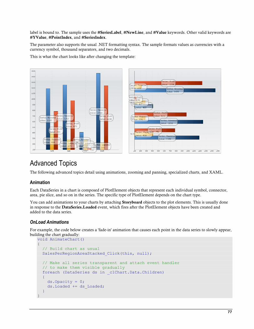
77
label is bound to. The sample uses the #SeriesLabel, #NewLine, and #Value keywords. Other valid keywords are
#YValue, #PointIndex, and #SeriesIndex.
The parameter also supports the usual .NET formatting syntax. The sample formats values as currencies with a
currency symbol, thousand separators, and two decimals.
This is what the chart looks like after changing the template:
Advanced Topics The following advanced topics detail using animations, zooming and panning, specialized charts, and XAML.
Animation
Each DataSeries in a chart is composed of PlotElement objects that represent each individual symbol, connector,
area, pie slice, and so on in the series. The specific type of PlotElement depends on the chart type.
You can add animations to your charts by attaching Storyboard objects to the plot elements. This is usually done
in response to the DataSeries.Loaded event, which fires after the PlotElement objects have been created and
added to the data series.
OnLoad Animations
For example, the code below creates a 'fade-in' animation that causes each point in the data series to slowly appear,
building the chart gradually: void AnimateChart()
{
// Build chart as usual
SalesPerRegionAreaStacked_Click(this, null);
// Make all series transparent and attach event handler
// to make them visible gradually
foreach (DataSeries ds in _c1Chart.Data.Children)
{
ds.Opacity = 0;
ds.Loaded += ds_Loaded;
}
}
78
The code starts by generating a chart as usual, and then loops through the DataSeries setting their Opacity to zero.
This way, the chart will appear blank when it loads.
The code also attaches a handler to the Loaded event. This is where the animations will be added to each
PlotElement. Here is the implementation: // Animate each PlotElement after it has been loaded
void ds_Loaded(object sender, EventArgs e)
{
PlotElement plotElement = sender as PlotElement;
if (plotElement != null)
{
// Create storyboard to animate PlotElement
Storyboard sb = new Storyboard();
Storyboard.SetTarget(sb, plotElement);
// Add Opacity animation to storyboard
DoubleAnimation da = new DoubleAnimation();
da.SetValue(Storyboard.TargetPropertyProperty, new
PropertyPath("Opacity"));
da.Duration = new Duration(TimeSpan.FromSeconds(2));
da.To = 1;
sb.Children.Add(da);
// Offset BeginTime for each series and point within series
double seconds = 2;
var dp = plotElement.DataPoint;
if (dp != null && dp.PointIndex > -1)
{
seconds = dp.SeriesIndex + dp.PointIndex * 0.1;
}
da.BeginTime = TimeSpan.FromSeconds(seconds);
// Start storyboard
sb.Begin();
}
}
This event handler gets called once for each PlotElement that is generated. The code creates a Storyboard object
for each PlotElement and uses it to gradually change the opacity of the element from zero to one (completely
transparent to completely solid).
Notice how the code uses the DataPoint property to determine which series and which data point the plot element
belongs to, and then sets the BeginTime property of the animation to cause each plot element to become visible at
different times. This way, the points appear one at a time, instead of all at once.
Notice also that the code tests the PointIndex property to make sure it is greater than -1. This is because some plot
elements do not correspond to individual points, but rather to the whole series. This is the case for Area elements
for example.
This code can be used for all chart types. You can use it to slowly show plot symbols, lines, pie slices, and so on.
OnMouseOver Animations
You can also create animations that execute when the user moves the mouse over elements. To do this, use the
Loaded event as before, but this time attach event handlers to each PlotElement's mouse event instead of creating
the animations directly.
For example: void AnimatePoints()
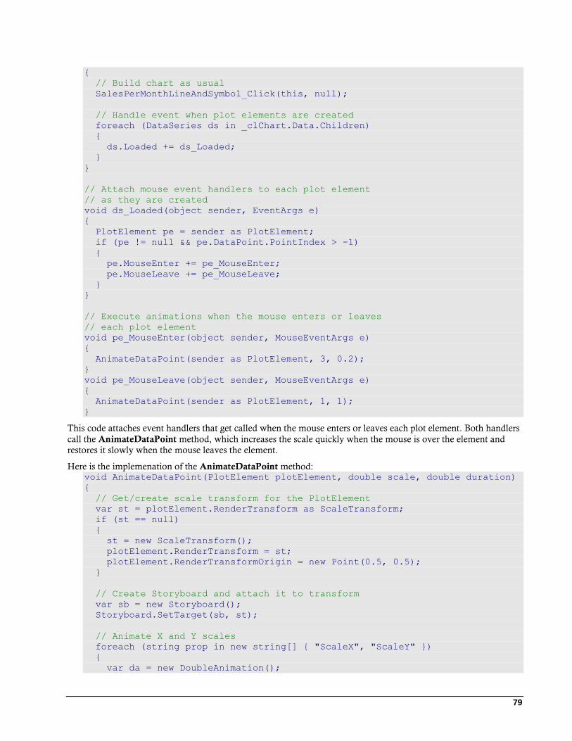
79
{
// Build chart as usual
SalesPerMonthLineAndSymbol_Click(this, null);
// Handle event when plot elements are created
foreach (DataSeries ds in _c1Chart.Data.Children)
{
ds.Loaded += ds_Loaded;
}
}
// Attach mouse event handlers to each plot element
// as they are created
void ds_Loaded(object sender, EventArgs e)
{
PlotElement pe = sender as PlotElement;
if (pe != null && pe.DataPoint.PointIndex > -1)
{
pe.MouseEnter += pe_MouseEnter;
pe.MouseLeave += pe_MouseLeave;
}
}
// Execute animations when the mouse enters or leaves
// each plot element
void pe_MouseEnter(object sender, MouseEventArgs e)
{
AnimateDataPoint(sender as PlotElement, 3, 0.2);
}
void pe_MouseLeave(object sender, MouseEventArgs e)
{
AnimateDataPoint(sender as PlotElement, 1, 1);
}
This code attaches event handlers that get called when the mouse enters or leaves each plot element. Both handlers
call the AnimateDataPoint method, which increases the scale quickly when the mouse is over the element and
restores it slowly when the mouse leaves the element.
Here is the implemenation of the AnimateDataPoint method: void AnimateDataPoint(PlotElement plotElement, double scale, double duration)
{
// Get/create scale transform for the PlotElement
var st = plotElement.RenderTransform as ScaleTransform;
if (st == null)
{
st = new ScaleTransform();
plotElement.RenderTransform = st;
plotElement.RenderTransformOrigin = new Point(0.5, 0.5);
}
// Create Storyboard and attach it to transform
var sb = new Storyboard();
Storyboard.SetTarget(sb, st);
// Animate X and Y scales
foreach (string prop in new string[] { "ScaleX", "ScaleY" })
{
var da = new DoubleAnimation();
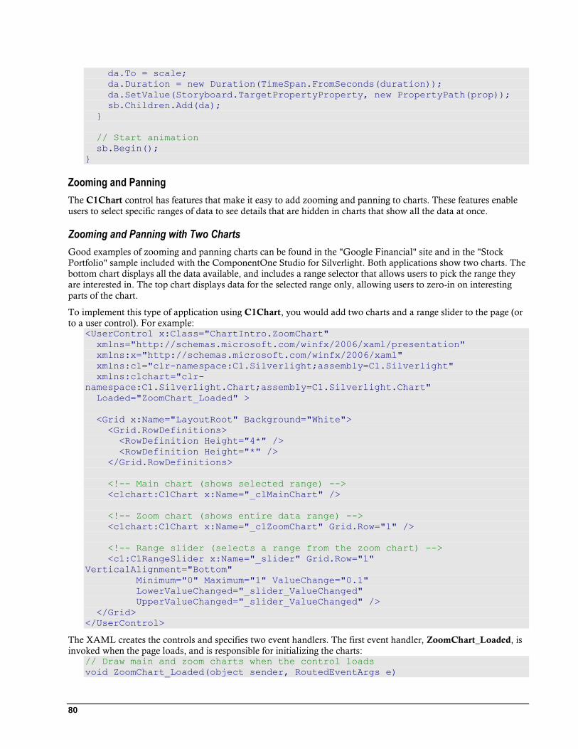
80
da.To = scale;
da.Duration = new Duration(TimeSpan.FromSeconds(duration));
da.SetValue(Storyboard.TargetPropertyProperty, new PropertyPath(prop));
sb.Children.Add(da);
}
// Start animation
sb.Begin();
}
Zooming and Panning
The C1Chart control has features that make it easy to add zooming and panning to charts. These features enable
users to select specific ranges of data to see details that are hidden in charts that show all the data at once.
Zooming and Panning with Two Charts
Good examples of zooming and panning charts can be found in the "Google Financial" site and in the "Stock
Portfolio" sample included with the ComponentOne Studio for Silverlight. Both applications show two charts. The
bottom chart displays all the data available, and includes a range selector that allows users to pick the range they
are interested in. The top chart displays data for the selected range only, allowing users to zero-in on interesting
parts of the chart.
To implement this type of application using C1Chart, you would add two charts and a range slider to the page (or
to a user control). For example: <UserControl x:Class="ChartIntro.ZoomChart"
xmlns="http://schemas.microsoft.com/winfx/2006/xaml/presentation"
xmlns:x="http://schemas.microsoft.com/winfx/2006/xaml"
xmlns:c1="clr-namespace:C1.Silverlight;assembly=C1.Silverlight"
xmlns:c1chart="clr-
namespace:C1.Silverlight.Chart;assembly=C1.Silverlight.Chart"
Loaded="ZoomChart_Loaded" >
<Grid x:Name="LayoutRoot" Background="White">
<Grid.RowDefinitions>
<RowDefinition Height="4*" />
<RowDefinition Height="*" />
</Grid.RowDefinitions>
<!-- Main chart (shows selected range) -->
<c1chart:C1Chart x:Name="_c1MainChart" />
<!-- Zoom chart (shows entire data range) -->
<c1chart:C1Chart x:Name="_c1ZoomChart" Grid.Row="1" />
<!-- Range slider (selects a range from the zoom chart) -->
<c1:C1RangeSlider x:Name="_slider" Grid.Row="1"
VerticalAlignment="Bottom"
Minimum="0" Maximum="1" ValueChange="0.1"
LowerValueChanged="_slider_ValueChanged"
UpperValueChanged="_slider_ValueChanged" />
</Grid>
</UserControl>
The XAML creates the controls and specifies two event handlers. The first event handler, ZoomChart_Loaded, is
invoked when the page loads, and is responsible for initializing the charts: // Draw main and zoom charts when the control loads
void ZoomChart_Loaded(object sender, RoutedEventArgs e)
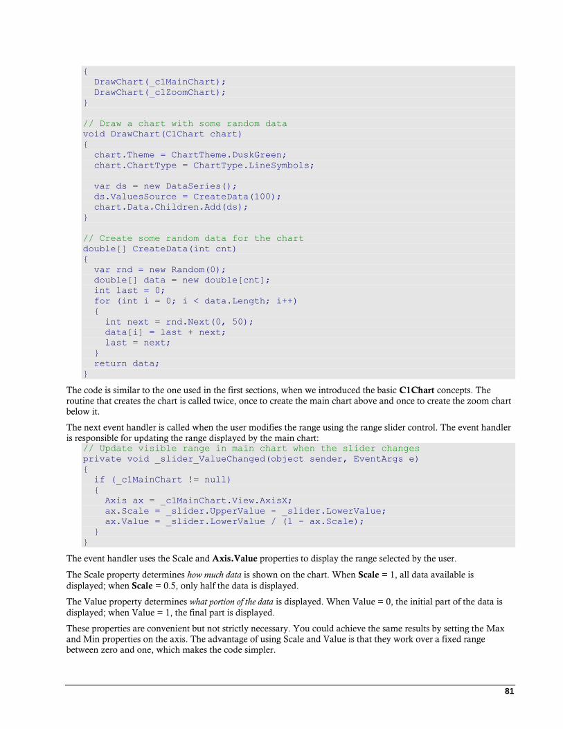
81
{
DrawChart(_c1MainChart);
DrawChart(_c1ZoomChart);
}
// Draw a chart with some random data
void DrawChart(C1Chart chart)
{
chart.Theme = ChartTheme.DuskGreen;
chart.ChartType = ChartType.LineSymbols;
var ds = new DataSeries();
ds.ValuesSource = CreateData(100);
chart.Data.Children.Add(ds);
}
// Create some random data for the chart
double[] CreateData(int cnt)
{
var rnd = new Random(0);
double[] data = new double[cnt];
int last = 0;
for (int i = 0; i < data.Length; i++)
{
int next = rnd.Next(0, 50);
data[i] = last + next;
last = next;
}
return data;
}
The code is similar to the one used in the first sections, when we introduced the basic C1Chart concepts. The
routine that creates the chart is called twice, once to create the main chart above and once to create the zoom chart
below it.
The next event handler is called when the user modifies the range using the range slider control. The event handler
is responsible for updating the range displayed by the main chart: // Update visible range in main chart when the slider changes
private void _slider_ValueChanged(object sender, EventArgs e)
{
if (_c1MainChart != null)
{
Axis ax = _c1MainChart.View.AxisX;
ax.Scale = _slider.UpperValue - _slider.LowerValue;
ax.Value = _slider.LowerValue / (1 - ax.Scale);
}
}
The event handler uses the Scale and Axis.Value properties to display the range selected by the user.
The Scale property determines how much data is shown on the chart. When Scale = 1, all data available is
displayed; when Scale = 0.5, only half the data is displayed.
The Value property determines what portion of the data is displayed. When Value = 0, the initial part of the data is
displayed; when Value = 1, the final part is displayed.
These properties are convenient but not strictly necessary. You could achieve the same results by setting the Max
and Min properties on the axis. The advantage of using Scale and Value is that they work over a fixed range
between zero and one, which makes the code simpler.
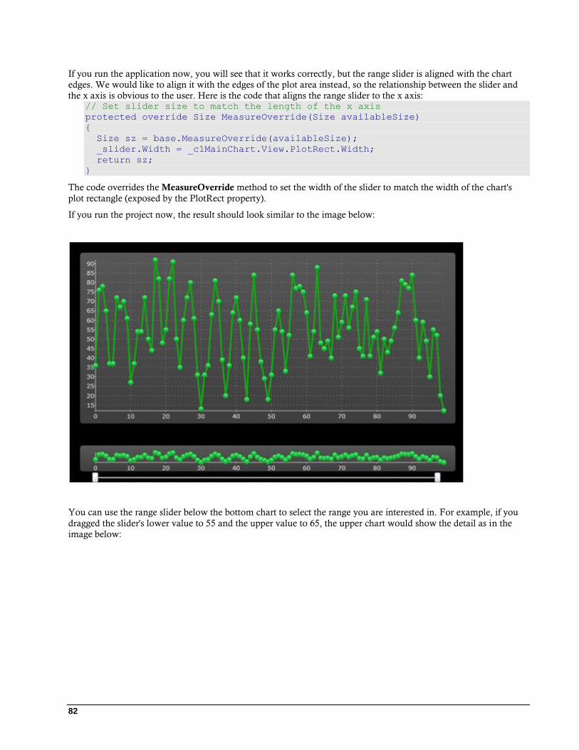
82
If you run the application now, you will see that it works correctly, but the range slider is aligned with the chart
edges. We would like to align it with the edges of the plot area instead, so the relationship between the slider and
the x axis is obvious to the user. Here is the code that aligns the range slider to the x axis: // Set slider size to match the length of the x axis
protected override Size MeasureOverride(Size availableSize)
{
Size sz = base.MeasureOverride(availableSize);
_slider.Width = _c1MainChart.View.PlotRect.Width;
return sz;
}
The code overrides the MeasureOverride method to set the width of the slider to match the width of the chart's
plot rectangle (exposed by the PlotRect property).
If you run the project now, the result should look similar to the image below:
You can use the range slider below the bottom chart to select the range you are interested in. For example, if you
dragged the slider's lower value to 55 and the upper value to 65, the upper chart would show the detail as in the
image below:

83
You could improve this application by changing the template used by the range slider control. This is
demonstrated in the "StockPortfolio" sample included with the ComponentOne Studio for Silverlight.
Zooming and Panning with a Single Chart
You can also implement zooming and panning using a single chart. The easiest way to achieve this is to use the
Actions property and the built-in mouse actions. C1Chart includes built-in actions for zooming, scaling, and
panning the chart with the mouse.
The code below shows how you can add mouse actions to a C1Chart control: // Show chart as usual
SalesPerRegionBar_Click(this, null);
// Add zoom action to mouse drag
_c1Chart.Actions.Add(new ZoomAction());
// Add scale action to control-mouse drag
_c1Chart.Actions.Add(new ScaleAction() { Modifiers = ModifierKeys.Control });
// Add pan action to shift-mouse drag
_c1Chart.Actions.Add(new TranslateAction() { Modifiers = ModifierKeys.Shift
});
Once the actions have been added to the Actions collection, you can use the mouse to perform the following
actions:
Zoom: Use the mouse to select a portion of the chart. When you release the mouse button, the chart will
zoom in on the selected portion of the chart. This action allows you to zoom in but not to zoom out.
Scale: Press the control button and move the mouse up or down to scale the chart interactively.
Pan: Press the shift button and move the mouse to pan the display and see different portions of the chart
without modifying the scale.
84
All built-in actions work by automatically setting the Scale property on each axis. You can limit or disable the
actions by setting the MinScale property to one for either axis.
Attaching Elements to Data Points
In previous sections, we discussed how you can customize the appearance of data series and individual data points.
We also discussed how you can add data labels and tooltips to charts.
In some cases, however, you may need to add custom elements and position them relative to specific data points.
For example, the Google Financials site displays charts with labels attached to specific data points. The labels
relate the data points to significant news that affected the values on the chart.
This can be done easily with C1Chart using the PointFromData method. This method converts a specific point
from chart coordinates to client coordinates, which you can use to position elements over the chart.
For example: // Custom elements used to indicate maximum and minimum values
Ellipse _minMark, _maxMark;
// Create chart and initialize custom elements
void CustomElementChart()
{
// Create chart as usual
BuildSalesPerRegionChart(ChartType.LineSymbols);
// Create min/max custom elements
_minMark = new Ellipse()
_minMark.Width = _minMark.Height = 45;
_minMark.Stroke = new SolidColorBrush(Colors.Blue);
_minMark.Fill = new SolidColorBrush(Color.FromArgb(64, 0, 0, 255));
_maxMark = new Ellipse()
_maxMark.Width = _maxMark.Height = 45;
_maxMark.Stroke = new SolidColorBrush(Colors.Red);
_maxMark.Fill = new SolidColorBrush(Color.FromArgb(64, 255, 0, 0));
// Add custom elements to the chart
_c1Chart.View.Children.Add(_minMark);
_c1Chart.View.Children.Add(_maxMark);
// Reposition custom elements when chart layout changes
_c1Chart.LayoutUpdated += _c1Chart_LayoutUpdated;
}
The code starts by creating a chart as usual. Then it creates two Ellipse elements that will be used to indicate the
minimum and maximum values on the chart. The custom elements are added to the View canvas. Finally, the
code adds an event handler to the chart's LayoutUpdated event. The event handler is responsible for positioning
the custom elements over data points on the chart whenever the chart layout changes (for example, when the chart
is resized).
Here is the code for the event handler: void _c1Chart_LayoutUpdated(object sender, EventArgs e)
{
// Find minimum and maximum values
int imax = 0, imin = 0;
double ymin = double.MaxValue, ymax = double.MinValue;
foreach (DataSeries ds in _c1Chart.Data.Children)
{
double[] values = ds.ValuesSource as double[];
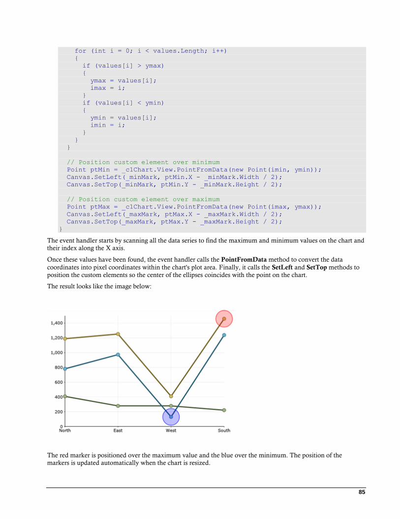
85
for (int i = 0; i < values.Length; i++)
{
if (values[i] > ymax)
{
ymax = values[i];
imax = i;
}
if (values[i] < ymin)
{
ymin = values[i];
imin = i;
}
}
}
// Position custom element over minimum
Point ptMin = _c1Chart.View.PointFromData(new Point(imin, ymin));
Canvas.SetLeft(_minMark, ptMin.X - _minMark.Width / 2);
Canvas.SetTop(_minMark, ptMin.Y - _minMark.Height / 2);
// Position custom element over maximum
Point ptMax = _c1Chart.View.PointFromData(new Point(imax, ymax));
Canvas.SetLeft(_maxMark, ptMax.X - _maxMark.Width / 2);
Canvas.SetTop(_maxMark, ptMax.Y - _maxMark.Height / 2);
}
The event handler starts by scanning all the data series to find the maximum and minimum values on the chart and
their index along the X axis.
Once these values have been found, the event handler calls the PointFromData method to convert the data
coordinates into pixel coordinates within the chart's plot area. Finally, it calls the SetLeft and SetTop methods to
position the custom elements so the center of the ellipses coincides with the point on the chart.
The result looks like the image below:
The red marker is positioned over the maximum value and the blue over the minimum. The position of the
markers is updated automatically when the chart is resized.
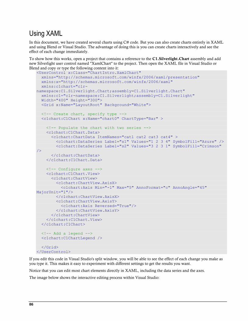
86
Using XAML In this document, we have created several charts using C# code. But you can also create charts entirely in XAML
and using Blend or Visual Studio. The advantage of doing this is you can create charts interactively and see the
effect of each change immediately.
To show how this works, open a project that contains a reference to the C1.Silverlight.Chart assembly and add
new Silverlight user control named "XamlChart" to the project. Then open the XAML file in Visual Studio or
Blend and copy or type the following content into it: <UserControl x:Class="ChartIntro.XamlChart"
xmlns="http://schemas.microsoft.com/winfx/2006/xaml/presentation"
xmlns:x="http://schemas.microsoft.com/winfx/2006/xaml"
xmlns:c1chart="clr-
namespace:C1.Silverlight.Chart;assembly=C1.Silverlight.Chart"
xmlns:c1="clr-namespace:C1.Silverlight;assembly=C1.Silverlight"
Width="400" Height="300">
<Grid x:Name="LayoutRoot" Background="White">
<!-- Create chart, specify type -->
<c1chart:C1Chart x:Name="chart0" ChartType="Bar" >
<!-- Populate the chart with two series -->
<c1chart:C1Chart.Data>
<c1chart:ChartData ItemNames="cat1 cat2 cat3 cat4" >
<c1chart:DataSeries Label="s1" Values="1 2 3 4" SymbolFill="Azure" />
<c1chart:DataSeries Label="s2" Values="3 2 3 1" SymbolFill="Crimson"
/>
</c1chart:ChartData>
</c1chart:C1Chart.Data>
<!-- Configure axes -->
<c1chart:C1Chart.View>
<c1chart:ChartView>
<c1chart:ChartView.AxisX>
<c1chart:Axis Min="-1" Max="5" AnnoFormat="c" AnnoAngle="45"
MajorUnit="1"/>
</c1chart:ChartView.AxisX>
<c1chart:ChartView.AxisY>
<c1chart:Axis Reversed="True"/>
</c1chart:ChartView.AxisY>
</c1chart:ChartView>
</c1chart:C1Chart.View>
</c1chart:C1Chart>
<!-- Add a legend -->
<c1chart:C1ChartLegend />
</Grid>
</UserControl>
If you edit this code in Visual Studio's split window, you will be able to see the effect of each change you make as
you type it. This makes it easy to experiment with different settings to get the results you want.
Notice that you can edit most chart elements directly in XAML, including the data series and the axes.
The image below shows the interactive editing process within Visual Studio:
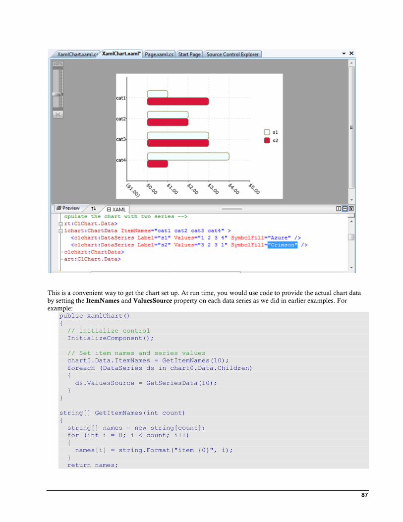
87
This is a convenient way to get the chart set up. At run time, you would use code to provide the actual chart data
by setting the ItemNames and ValuesSource property on each data series as we did in earlier examples. For
example: public XamlChart()
{
// Initialize control
InitializeComponent();
// Set item names and series values
chart0.Data.ItemNames = GetItemNames(10);
foreach (DataSeries ds in chart0.Data.Children)
{
ds.ValuesSource = GetSeriesData(10);
}
}
string[] GetItemNames(int count)
{
string[] names = new string[count];
for (int i = 0; i < count; i++)
{
names[i] = string.Format("item {0}", i);
}
return names;
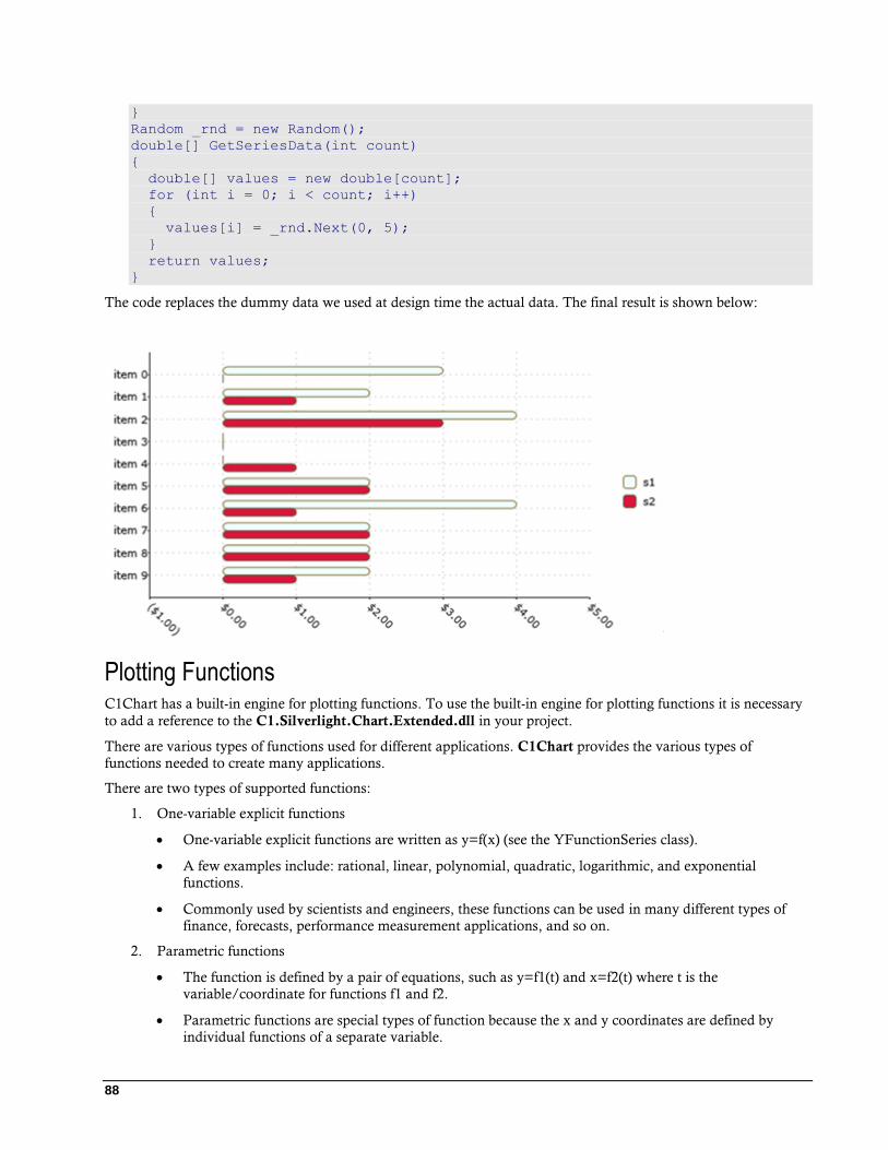
88
}
Random _rnd = new Random();
double[] GetSeriesData(int count)
{
double[] values = new double[count];
for (int i = 0; i < count; i++)
{
values[i] = _rnd.Next(0, 5);
}
return values;
}
The code replaces the dummy data we used at design time the actual data. The final result is shown below:
Plotting Functions C1Chart has a built-in engine for plotting functions. To use the built-in engine for plotting functions it is necessary
to add a reference to the C1.Silverlight.Chart.Extended.dll in your project.
There are various types of functions used for different applications. C1Chart provides the various types of
functions needed to create many applications.
There are two types of supported functions:
1. One-variable explicit functions
One-variable explicit functions are written as y=f(x) (see the YFunctionSeries class).
A few examples include: rational, linear, polynomial, quadratic, logarithmic, and exponential
functions.
Commonly used by scientists and engineers, these functions can be used in many different types of
finance, forecasts, performance measurement applications, and so on.
2. Parametric functions
The function is defined by a pair of equations, such as y=f1(t) and x=f2(t) where t is the
variable/coordinate for functions f1 and f2.
Parametric functions are special types of function because the x and y coordinates are defined by
individual functions of a separate variable.
89
They are used to represent various situations in mathematics and engineering, from heat transfer, fluid
mechanics, electromagnetic theory, planetary motion and aspects of the theory of relativity, to name a
few.
For more information about the parametric function (see the ParametricFunctionSeries class).
Using a Code String to Define a Function
When an interpretive code string is used to define a function of a function class (YFunctionSeries or
ParametricFunctionSeries), the string is compiled and the resulting code is dynamically included into the
application. Execution speed will be the same as any other compiled code.
For simple, one-variable explicit functions, the YFunctionSeries class object is used. This object has one code
property, FunctionCode. For YFunction objects, the independent variable is always assumed to be "x".
For parametric functions, a pair of equations must be defined using the ParametricFunctionSeries class object. This
object has two properties, one for each coordinate. The properties, XFunctionCode and YFunctionCode accept
code in which the independent variable is always assumed to be "t".
Calculating the Value for Functions
You can calculate the value of the functions for Parametric and YFunction using the CalculateValue method.
TrendLines The trend lines supported by chart with TrendLine objects can be divided into two groups, including regression
and non-regression. In 2D charts, trend lines are typically used in X-Y line, bar, or scatter charts.
Non-regression trendlines are MovingAverage, Average, Minimum, and Maximum. Moving Average trendline is
the average over the specified time.
Regression trend lines are polynomial, exponent, logarithmic, power and Fourier functions that approximate the
data which the functions trend.
To use the trend lines feature, it is necessary to add the reference to the C1.Silverlight.C1Chart.Extended.dll in
your project.
Chart for Silverlight Appearance The following topics detail how to customize the C1Chart control's appearance. Themes allow you to customize the
appearance of the chart and take advantage of Silverlight's XAML-based styling. You can also use templates to format
and layout the control and to customize the control's actions.
XAML Elements
Several auxiliary XAML elements are installed with ComponentOne Chart for Silverlight. These elements
include templates and themes and are located in the Chart for Silverlight installation directory, by default
C:\Program Files\ComponentOne\Studio for Silverlight\Help\C1.Silverlight.Chart. You can incorporate
these elements into your project, for example, to create your own theme based on the included Office 2007 themes.
For more information about the built-in themes some of these elements represent, see Chart Themes (page 91).
Included Auxiliary XAML Elements
The following auxiliary XAML elements are included with Chart for Silverlight with their location within the
C:\Program Files\ComponentOne\Studio for Silverlight\Help\C1.Silverlight.Chart folder noted:
Element Folder Description
DuskBlue.xaml ThemesSL Specifies the templates for the Dusk Blue theme.
90
DuskGreen.xaml ThemesSL Specifies the templates for the Dusk Green theme.
generic.xaml Themes Specifies the templates for different styles and the
initial style of the chart.
MediaPlayer.xaml ThemesSL Specifies the templates for the Media Player
theme.
Office2003Blue.xaml ThemesSL Specifies the templates for the Office 2003 Blue theme.
Office2003Classic.xaml ThemesSL Specifies the templates for the Office 2003 Classic
theme.
Office2003Olive.xaml ThemesSL Specifies the templates for the Office 2007 Olive
theme.
Office2003Royale.xaml ThemesSL Specifies the templates for the Office 2007 Royal
theme.
Office2003Silver.xaml ThemesSL Specifies the templates for the Office 2007 Silver
theme.
Office2007Black.xaml ThemesSL Specifies the templates for the Office 2007 Black
theme.
Office2007Blue.xaml ThemesSL Specifies the templates for the Office 2007 Blue
theme.
Office2007Silver.xaml ThemesSL Specifies the templates for the Office 2007 Silver
theme.
Vista.xaml ThemesSL Specifies the templates for the Vista theme.
Chart Resource Keys
Built in themes and resources have several incorporated resource keys. These keys include brush, border, and other
elements and can be customized to represent a unique appearance. When customizing a theme, a resource key that
is not explicitly specified will revert to the default. The included resource keys and their descriptions are noted in
the following topics.
The following tables describe chart resource keys for the chart control and its elements such as the chart area, plot
area, axes, and legend.
Chart Resource Key
Resource Key Description
C1Chart_Foreground_Color Represents C1Chart's forground color.
C1Chart_Background_Color Represents C1Chart's background color.
C1Chart_Background_Brush Represents C1Chart's background brush.
C1Chart_Foreground_Brush Represents C1Chart's foreground brush.
C1Chart_Border_Brush Represents C1Chart's border brush.
C1Chart_Border_Thickness Represents C1Chart's border thickness (all 4 edges).
C1Chart_CornerRadius Represents chart's corner radius (all 4 corners).
C1Chart_Padding Represents C1Chart's padding.
91
C1Chart_Margin Represents C1Chart's margin.
Legend Resource Keys
Resource Key Description
C1Chart_LegendBackground_Brush Represents C1Chart's legend background brush.
C1Chart_LegendForeground_Brush Represents Legend's foreground brush for the C1Chart control.
C1Chart_LegendBorder_Brush Represents Legend's border brush for the C1Chart control.
C1Chart_LegendBorder_Thickness Represents the Legend border's thickness (all 4 edges) for the
C1Chart control.
C1Chart_Legend_CornerRadius Represents the Legend's corner radius (all 4 corners).
Chart Area Resource Keys
Resource Key Description
C1Chart_ChartAreaBackground_Brush Represents the ChartArea's background brush.
C1Chart_ChartAreaForeground_Brush Represents the ChartArea's foreground brush on mouseover.
C1Chart_ChartAreaBorder_Brush Represents the ChartArea's border brush.
C1Chart_ChartAreaBorder_Thickness Represents the ChartArea's border thickness.
C1Chart_ChartArea_CornerRadius Represents the ChartArea's corner radius (all 4 corners).
C1Chart_ChartArea_Padding Represents the ChartAreas' padding.
Plot Area Resource Keys
Resource Key Description
C1Chart_PlotAreaBackground_Brush Represents the PlotArea's background brush.
Custom palette for plot elements Key
Resource Key Description
C1Chart_CustomPalette Represents the custom palette for plot elements.
Axis Keys
Resource Key Description
C1Chart_AxisMajorGridStroke_Brush Represents the AxisMajorGridStroke's brush.
C1Chart_AxisMinorGridStroke_Brush Represents the AxisMinorGridStroke's brush.
Chart Themes
ComponentOne Chart for Silverlight incorporates several themes, including Office 2003 Vista, and Office 2007
themes, that allow you to customize the appearance of your chart. The built-in themes are described and pictured
below:
Office2007Black Theme
This is the default theme based on the Office 2007 Black style and it appears as a dark gray-colored chart with
orange highlighting.

92
In XAML
To specifically define the Office2007Black theme in your chart add the following Theme XAML to the
<c1chart:C1Chart> tag so that it appears similar to the following: <c1chart:C1Chart Name="c1Chart1" Theme="Office2007Black”>
In Code
To specifically define the Office2007Black theme in your chart, add the following code your project:
Visual Basic C1Chart1.Theme = ChartTheme.Office2007Black
C# c1Chart1.Theme = ChartTheme.Office2007Black;
Office2007Blue Theme
This theme is based on the Office 2007 Blue style and it appears as a blue-colored chart with orange highlighting.
In XAML
To specifically define the Office2007Blue theme in your chart, add the following Theme XAML to the
<c1chart:C1Chart> tag so that it appears similar to the following: <c1chart:C1Chart Name="c1Chart1" Theme="Office2007Blue">
In Code
To specifically define the Office2007Blue theme in your chart, add the following code your project:

93
Visual Basic C1Chart1.Theme = ChartTheme.Office2007Blue
C# C1Chart1.Theme = ChartTheme.Office2007Blue;
Office2007Silver Theme
This theme is based on the Office 2007 Silver style and it appears as a silver-colored chart with orange highlighting.
In XAML
To specifically define the Office2007Silver theme in your chart, add the following Theme XAML to the
<c1chart:C1Chart> tag so that it appears similar to the following: <c1chart:C1Chart Name="c1Chart1" Theme="Office2007Silver">
In Code
To specifically define the Office2007Silver theme in your chart, add the following code your project:
Visual Basic C1Chart1.Theme = ChartTheme.Office2007Silver
C# c1Chart1.Theme = ChartTheme.Office2007Silver;
Vista Theme
This theme is based on the Vista style and it appears as a teal-colored chart with blue highlighting.
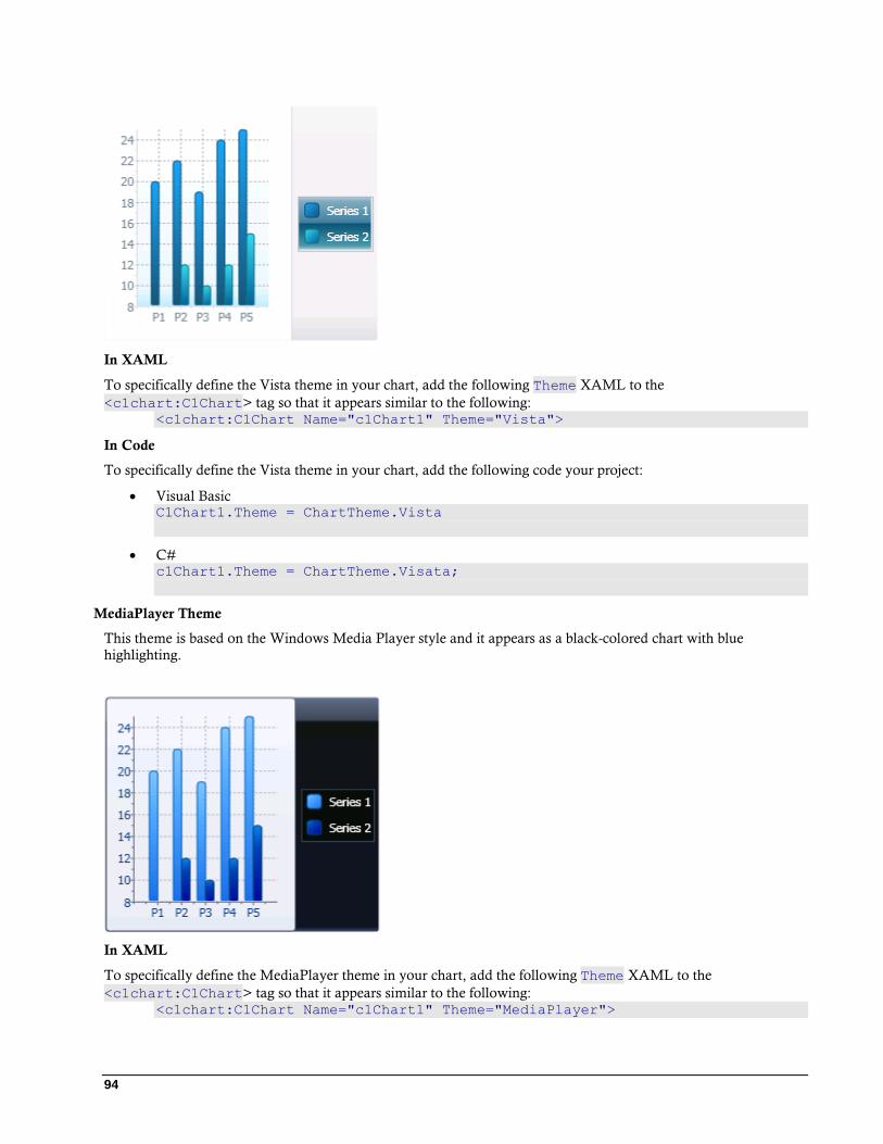
94
In XAML
To specifically define the Vista theme in your chart, add the following Theme XAML to the
<c1chart:C1Chart> tag so that it appears similar to the following: <c1chart:C1Chart Name="c1Chart1" Theme="Vista">
In Code
To specifically define the Vista theme in your chart, add the following code your project:
Visual Basic C1Chart1.Theme = ChartTheme.Vista
C# c1Chart1.Theme = ChartTheme.Visata;
MediaPlayer Theme
This theme is based on the Windows Media Player style and it appears as a black-colored chart with blue
highlighting.
In XAML
To specifically define the MediaPlayer theme in your chart, add the following Theme XAML to the
<c1chart:C1Chart> tag so that it appears similar to the following: <c1chart:C1Chart Name="c1Chart1" Theme="MediaPlayer">
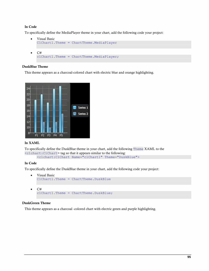
95
In Code
To specifically define the MediaPlayer theme in your chart, add the following code your project:
Visual Basic C1Chart1.Theme = ChartTheme.MediaPlayer
C# c1Chart1.Theme = ChartTheme.MediaPlayer;
DuskBlue Theme
This theme appears as a charcoal-colored chart with electric blue and orange highlighting.
In XAML
To specifically define the DuskBlue theme in your chart, add the following Theme XAML to the
<c1chart:C1Chart> tag so that it appears similar to the following: <c1chart:C1Chart Name="c1Chart1" Theme="DuskBlue">
In Code
To specifically define the DuskBlue theme in your chart, add the following code your project:
Visual Basic C1Chart1.Theme = ChartTheme.DuskBlue
C# c1Chart1.Theme = ChartTheme.DuskBlue;
DuskGreen Theme
This theme appears as a charcoal -colored chart with electric green and purple highlighting.

96
In XAML
To specifically define the DuskGreen theme in your chart, add the following Theme XAML to the
<c1chart:C1Chart> tag so that it appears similar to the following: <c1chart:C1Chart Name="c1Chart1" Theme="DuskGreen">
In Code
To specifically define the DuskGreen theme in your chart, add the following code your project:
Visual Basic C1Chart1.Theme = ChartTheme.DuskGreen
C# c1Chart1.Theme = ChartTheme.DuskGreen;
Office2003Blue Theme
This theme is based on the Office 2003 Blue style and it appears as a neutral-colored chart with blue and orange
highlighting.
In XAML
To specifically define the Office2003Blue theme in your chart, add the following Theme XAML to the
<c1chart:C1Chart> tag so that it appears similar to the following: <c1chart:C1Chart Name="c1Chart1" Theme="Office2003Blue">
In Code

97
To specifically define the Office2003Blue theme in your chart, add the following code your project:
Visual Basic C1Chart1.Theme = ChartTheme.Office2003Blue
C# c1Chart1.Theme = ChartTheme.Office2003Blue;
Office2003Classic Theme
This theme is based on the Office 2003 Classic style and appears as a gray-colored chart with slate-colored
highlighting.
In XAML
To specifically define the Office2003Classic theme in your chart, add the following Theme XAML to the
<c1chart:C1Chart> tag so that it appears similar to the following: <c1chart:C1Chart Name="c1Chart1" Theme="Office2003Classic">
In Code
To specifically define the Office2003Classic theme in your chart, add the following code your project:
Visual Basic C1Chart1.Theme = ChartTheme.Office2003Classic
C# c1Chart1.Theme = ChartTheme.Office2003Classic;
Office2003Olive Theme
This theme is based on the Office 2003 Olive style and it appears as a neutral-colored chart with olive green and
orange highlighting.
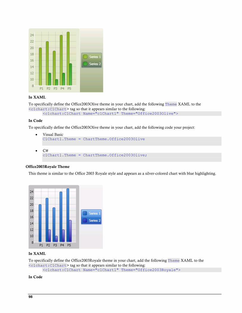
98
In XAML
To specifically define the Office2003Olive theme in your chart, add the following Theme XAML to the
<c1chart:C1Chart> tag so that it appears similar to the following: <c1chart:C1Chart Name="c1Chart1" Theme="Office2003Olive">
In Code
To specifically define the Office2003Olive theme in your chart, add the following code your project:
Visual Basic C1Chart1.Theme = ChartTheme.Office2003Olive
C# c1Chart1.Theme = ChartTheme.Office2003Olive;
Office2003Royale Theme
This theme is similar to the Office 2003 Royale style and appears as a silver-colored chart with blue highlighting.
In XAML
To specifically define the Office2003Royale theme in your chart, add the following Theme XAML to the
<c1chart:C1Chart> tag so that it appears similar to the following: <c1chart:C1Chart Name="c1Chart1" Theme="Office2003Royale">
In Code
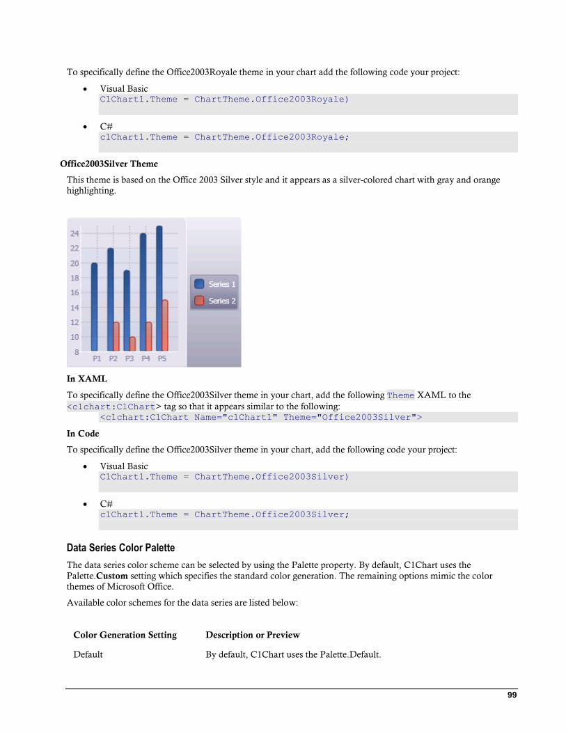
99
To specifically define the Office2003Royale theme in your chart add the following code your project:
Visual Basic C1Chart1.Theme = ChartTheme.Office2003Royale)
C# c1Chart1.Theme = ChartTheme.Office2003Royale;
Office2003Silver Theme
This theme is based on the Office 2003 Silver style and it appears as a silver-colored chart with gray and orange
highlighting.
In XAML
To specifically define the Office2003Silver theme in your chart, add the following Theme XAML to the
<c1chart:C1Chart> tag so that it appears similar to the following: <c1chart:C1Chart Name="c1Chart1" Theme="Office2003Silver">
In Code
To specifically define the Office2003Silver theme in your chart, add the following code your project:
Visual Basic C1Chart1.Theme = ChartTheme.Office2003Silver)
C# c1Chart1.Theme = ChartTheme.Office2003Silver;
Data Series Color Palette
The data series color scheme can be selected by using the Palette property. By default, C1Chart uses the
Palette.Custom setting which specifies the standard color generation. The remaining options mimic the color
themes of Microsoft Office.
Available color schemes for the data series are listed below:
Color Generation Setting Description or Preview
Default By default, C1Chart uses the Palette.Default.
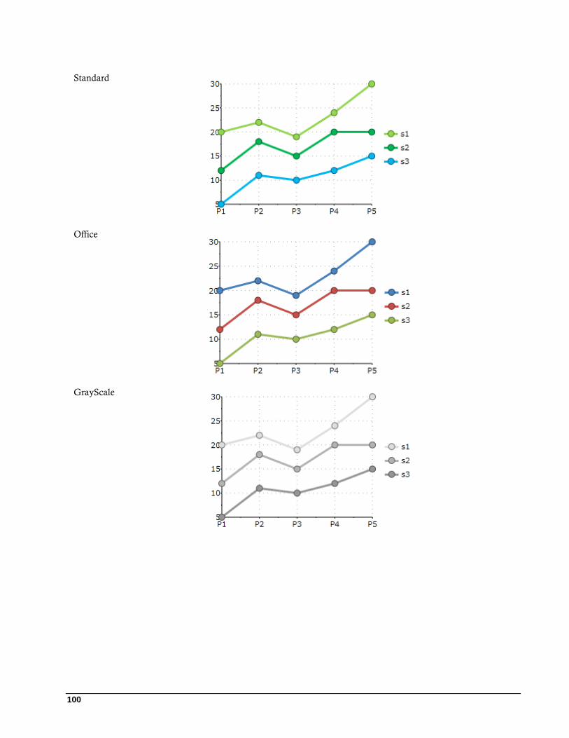
100
Standard
Office
GrayScale
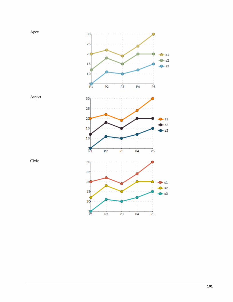
101
Apex
Aspect
Civic

102
Concourse
Equity
Flow
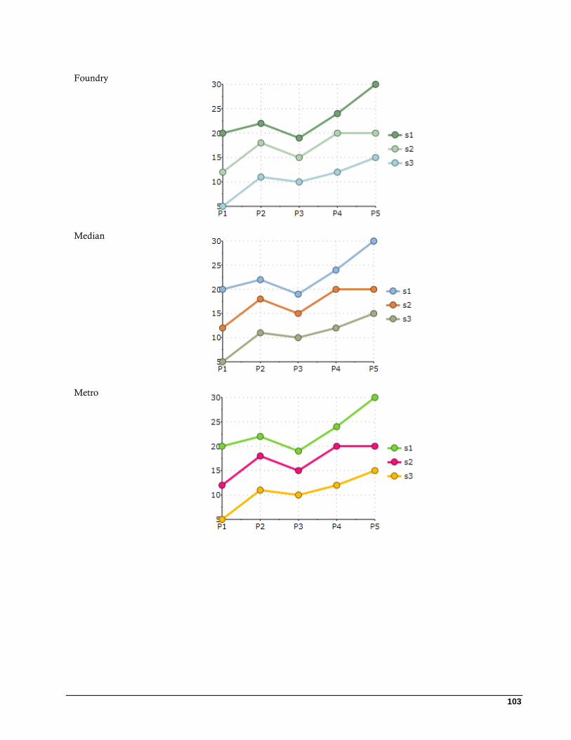
103
Foundry
Median
Metro
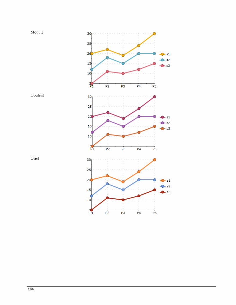
104
Module
Opulent
Oriel
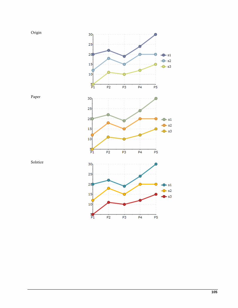
105
Origin
Paper
Solstice
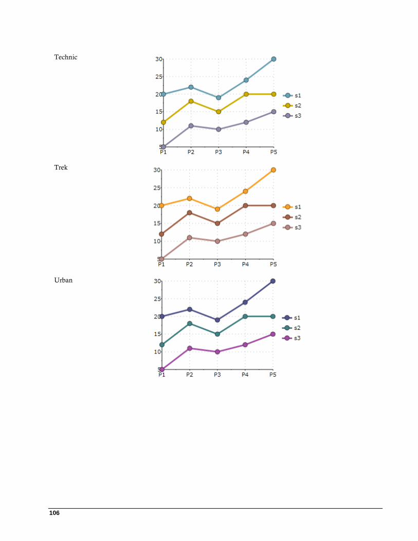
106
Technic
Trek
Urban

107
Verve
Visual Effects
Visual Effects is a tool used for visually enhancing the 2D C1Chart control's border effect and shadow effect for
the data series. Any existing project can use the new features provided by this tool. The chart's appearance can
dramatically improve in a few simple steps using visual effects.
Limitation
Visual effects rendering may not work effectively in case of very complex and large data arrays or when highest
performance is required.
C1Chart provides a VisualEffect class which is the base class. The following classes are derived from the
VisualEffect class:
BorderEffect – Defines the border effect for the data series. This class enables you to modify the border
style, light direction, and thickness of the border.
ShadowEffect – Defines the shadow effect for the data series. This class enables you modify the shadow
color, shadow depth, light direction of the shadow, shadow opacity, and softness.
VisualEffectGroup – Defines the visual effect that consists from the several effects.
Border Effects
You can control the light angle, saturation, and transparency of the light source of the data series using the
BorderEffects class. The BorderEffects class includes the follow properties:
Property Description
BorderStyle Gets or sets the border style.
LightAngle Gets or sets the light direction.
Thickness Gets or sets the thickness of the border.
BorderStyle Property
You can achieve a brightening or darkening effect on the data series using the BorderEffect.BorderStyle property.
The BorderEffect.BorderStyle property provides three options: light, dark, and combo. The Light value will make
the current data series color appear lighter in color. The Dark value produces a dark color effect for the current
data series color. The Combo value produces a combination of the light and dark values for the current data series
color.
The following table illustrates the effects of each value for the BorderEffect.BorderStyle property:

108
Value Result
BorderStyle.Light
BorderStyle.Combo
BorderStyle.Dark
LightAngle Property
You can change the angle of the visual rendering within the data series by setting its LightAngle property to a
different degree. The value of the LightAngle property ranges from -180 to 180 degrees.
The following table illustrates the data series with a LightAngle value of 53 degrees and the data seires with a no
LightAngle applied to it:
Value Result
53 degree angle
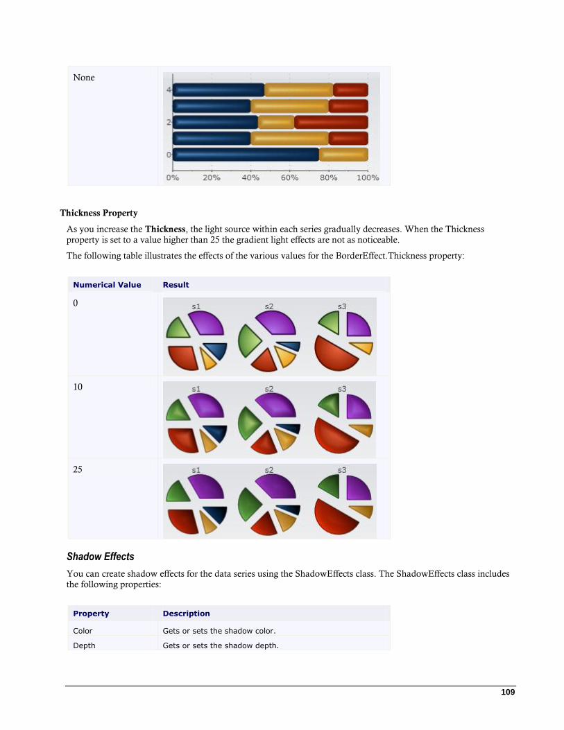
109
None
Thickness Property
As you increase the Thickness, the light source within each series gradually decreases. When the Thickness
property is set to a value higher than 25 the gradient light effects are not as noticeable.
The following table illustrates the effects of the various values for the BorderEffect.Thickness property:
Numerical Value Result
0
10
25
Shadow Effects
You can create shadow effects for the data series using the ShadowEffects class. The ShadowEffects class includes
the following properties:
Property Description
Color Gets or sets the shadow color.
Depth Gets or sets the shadow depth.
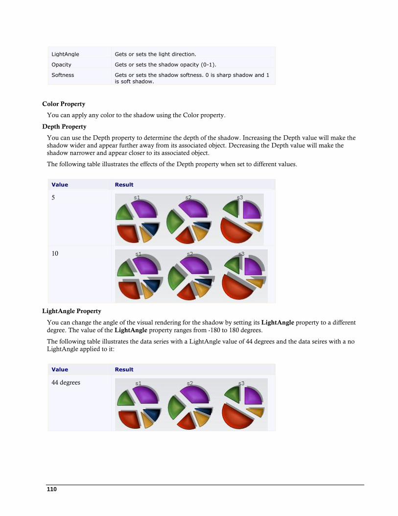
110
LightAngle Gets or sets the light direction.
Opacity Gets or sets the shadow opacity (0-1).
Softness Gets or sets the shadow softness. 0 is sharp shadow and 1
is soft shadow.
Color Property
You can apply any color to the shadow using the Color property.
Depth Property
You can use the Depth property to determine the depth of the shadow. Increasing the Depth value will make the
shadow wider and appear further away from its associated object. Decreasing the Depth value will make the
shadow narrower and appear closer to its associated object.
The following table illustrates the effects of the Depth property when set to different values.
Value Result
5
10
LightAngle Property
You can change the angle of the visual rendering for the shadow by setting its LightAngle property to a different
degree. The value of the LightAngle property ranges from -180 to 180 degrees.
The following table illustrates the data series with a LightAngle value of 44 degrees and the data seires with a no
LightAngle applied to it:
Value Result
44 degrees
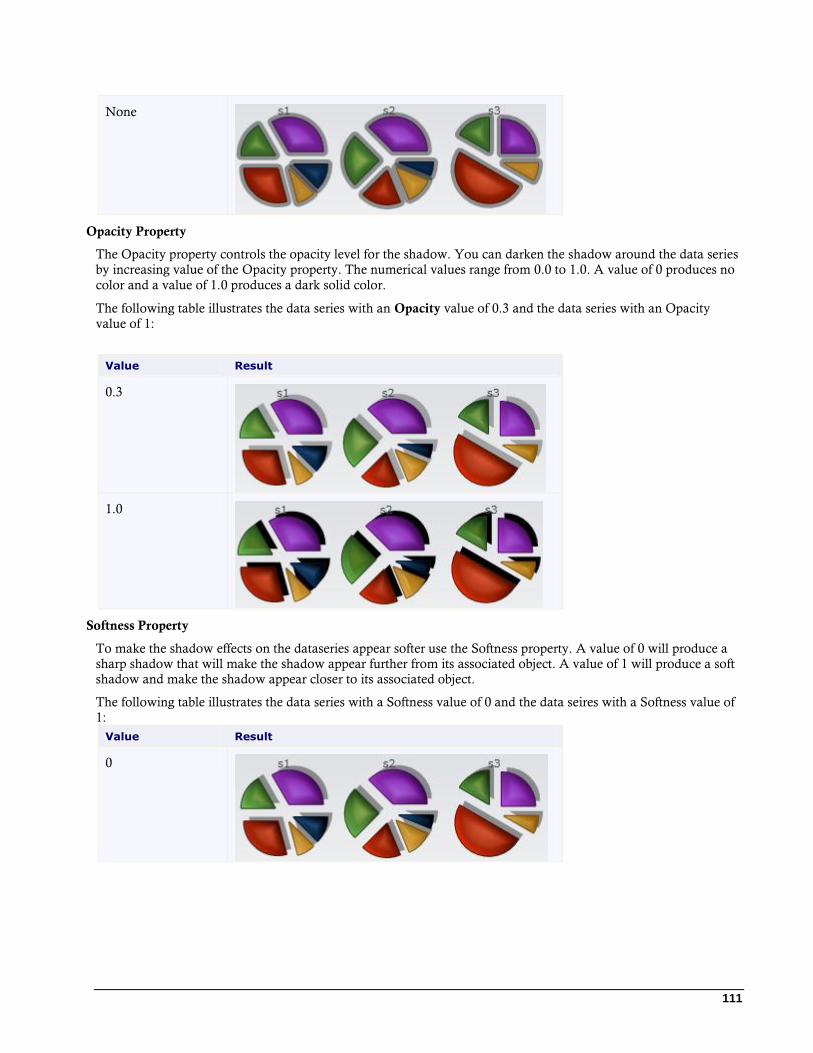
111
None
Opacity Property
The Opacity property controls the opacity level for the shadow. You can darken the shadow around the data series
by increasing value of the Opacity property. The numerical values range from 0.0 to 1.0. A value of 0 produces no
color and a value of 1.0 produces a dark solid color.
The following table illustrates the data series with an Opacity value of 0.3 and the data series with an Opacity
value of 1:
Value Result
0.3
1.0
Softness Property
To make the shadow effects on the dataseries appear softer use the Softness property. A value of 0 will produce a
sharp shadow that will make the shadow appear further from its associated object. A value of 1 will produce a soft
shadow and make the shadow appear closer to its associated object.
The following table illustrates the data series with a Softness value of 0 and the data seires with a Softness value of
1:
Value Result
0

112
1
Chart for Silverlight Samples Please be advised that this ComponentOne software tool is accompanied by various sample projects and/or
demos, which may make use of other ComponentOne development tools included with ComponentOne Studios.
Note: ComponentOne samples are also available at http://helpcentral.componentone.com.
C# ChartSamples Samples
Sample Description
Gallery Demonstrates the effect of the 12 different themes and palettes used on the
various chart types.
Labels and tooltips Shows how to use labels and tooltips on Column, Line Symbols, and Pie
charts.
Interactive chart Demonstrates how to use the mouse button to zoom, the ctrl key and mouse
button to scale, and the shift plus the mouse button to translate. It also shows how to zoom out.
Zoom chart Demonstrates how to zoom in sections of the Line chart.
Bubble chart Displays a Bubble chart.
Radar chart Displays a Radar chart.
Financial chart Displays a Financial chart.
Complex chart Displays a Complex chart that includes a stacked column chart and a line
chart.
Axis features Shows how to use various axis features sucha as Logarithmis axes, Custom
labels, Dependent axes, Axis origin, and Axis ticks.
Visual Effects Demonstrates the effects of the following visual effects properties on any of
the charts: BorderEffect.BorderStyle, BorderEffect.LightAngle, BorderEffect.Thickness, BorderStyle.Light, BorderStyle.Combo, BorderStyle.Dark, ShadowEffect.Color, ShadowEffect.Depth, ShadowEffect.LightAngle, ShadowEffect.Opacity, and ShadowEffect.Softness.
Themes Displays the following themes on the C1Chart control: BureauBlack,
ExpressionDark, ExpressionLight, RanierOrange, ShinyBlue, and WhistlerBlue.
C# ChartEditor Sample
Sample Description
ChartEditor Demonstrates how to use ChartEditor control. Main properties of the chart
can be edited at runtime with ChartEditor. The ChartEditor in this sample is
113
docked at the right of the form.
C# ChartExtended Sample
Sample Description
Functions Plots simple function y=f(x). The code of function can be modified at
runtime.
Parametric Plots parametric function that is defined by two equations x=x(t) and y=y(t).
TrendLines Shows various options of trend lines.
MovingAverage Plots moving average trend.
Live Plots dynamic data with automatic calculation of minimum, maximum and
average.
To run any of the Chart for Silverlight samples:
1. Open Visual Studio or Microsoft Expression Blend.
2. Select File | Open Project/Solution.
3. Click the drop-down Look in list and find the "<PersonalDocumentsFolder>\ComponentOne
Samples\Common" where <PersonalDocumentsFolder> is the users Documents folder. This is the
default location of the sample created by the installation program. The location may be different if you
installed Chart for Silverlight elsewhere on your machine.
4. Select the Samples.sln and click Open to open the project in Blend or Visual Studio
5. Select Project | Test Solution or click F5 to run the sample.
Chart for Silverlight Task-Based Help The task-based help assumes that you are familiar with programming in Visual Studio .NET and know how to use
the C1Chart control in general. If you are unfamiliar with the ComponentOne Chart for Silverlight product,
please see the Chart for Silverlight Quick Start first.
Each topic in this section provides a solution for specific tasks using the ComponentOne Chart for Silverlight
product.
Each task-based help topic also assumes that you have created a new Silverlight project.
Adding a ScrollBar to C1Chart
You can add a scrollbar to C1Chart by linking the chart axis with the standard scrollbar like the following:
XAML <Grid x:Name="LayoutRoot">
<Grid.RowDefinitions>
<RowDefinition />
<RowDefinition Height="Auto" />
</Grid.RowDefinitions>
<c1chart:C1Chart x:Name="chart" ></c1chart:C1Chart>
<ScrollBar x:Name="sb" Orientation="Horizontal" Grid.Row="1" />
</Grid>
114
C# // create some data
int npts = 1000;
double[] x = new double[npts], y = new double[npts];
for (int i = 0; i < npts; i++)
{
x[i] = i; y[i] = 100 * Math.Sin(0.1 * i) * Math.Cos(0.01 * i);
}
// add data to the chart
chart.Data.Children.Add(new XYDataSeries() { XValuesSource = x,
ValuesSource = y });
chart.ChartType = ChartType.Line;
// setup axis
double xscale = 0.05; // show only 1/20 of the full data range
chart.View.AxisX.Min = 0; chart.View.AxisX.Max = npts-1;
chart.View.AxisX.Scale = xscale;
sb.Minimum = 0; sb.Maximum = 1;
sb.SmallChange = 0.5*xscale; sb.LargeChange = xscale;
sb.ViewportSize = 1.0 / (1.0 - xscale) - 1.0;
// connect axis with toolbar
sb.ValueChanged += (s, e) => chart.View.AxisX.Value = sb.Value;
Rotating the Chart Labels in the X-Axis
To change the label rotation for the X-Axis, use the AnnoAngle property like the following: AxisX.AnnoAngle = -90
Creating a Custom Axis Label to Set the Mark at the Middle of the Year
Use custom axis labels to set the mark at the middle of year like in the following code:
Visual Basic chart.View.AxisX.ItemsSource = New DateTime() {New DateTime(2006, 1,
1).AddDays(0.5 * 365), New DateTime(2007, 1, 1).AddDays(0.5 * 365)}
C# chart.View.AxisX.ItemsSource = new DateTime[]
{
new DateTime(2006,1,1).AddDays(0.5*365),
new DateTime(2007,1,1).AddDays(0.5*365),
//...
};
Breaking Chart Lines when the Y-Value is Null
To break the chart lines when the Y-Value is null, use the following code:
Visual Basic dataSeries.Display = SeriesDisplay.ShowNaNGap
C# dataSeries.Display = SeriesDisplay.ShowNaNGap;
115
Exporting the Chart Image to the PDF on the Client
To export the chart image to the PDF on the client, use the following code:
Visual Basic Private Sub Button_Click(ByVal sender As Object, ByVal e As
RoutedEventArgs)
Dim wb As New WriteableBitmap(chart, Nothing)
Dim doc As New C1PdfDocument()
doc.Compression = CompressionLevelEnum.BestSpeed
doc.DrawImage(wb, New Rect(New Point(), doc.PageSize),
ContentAlignment.TopLeft, Stretch.None)
Dim sfd As New SaveFileDialog()
If sfd.ShowDialog() = True Then
Using stream = sfd.OpenFile()
doc.Save(stream)
End Using
End If
End Sub
C# private void Button_Click(object sender, RoutedEventArgs e)
{
WriteableBitmap wb = new WriteableBitmap(chart, null);
C1PdfDocument doc = new C1PdfDocument();
doc.Compression = CompressionLevelEnum.BestSpeed;
doc.DrawImage(wb, new Rect(new Point(),doc.PageSize),
ContentAlignment.TopLeft, Stretch.None);
SaveFileDialog sfd = new SaveFileDialog()
{
DefaultExt = "pdf",
Filter = "Pdf files (*.pdf)|*.pdf",
};
if (sfd.ShowDialog() == true)
{
using (var stream = sfd.OpenFile())
{
doc.Save(stream);
}
}
}
Saving the Chart Image as Jpeg or Png
To save the C1Chart control as a .Jpg or .Png, use the following code:
C# // should be added at the beginning of file
using C1.Silverlight.Chart.Extended;
...
// Silverlight
SaveFileDialog sfd = new SaveFileDialog();
sfd.Filter = "Jpeg files (*.jpg)|*.jpg|Png files (*.png)|*.png";
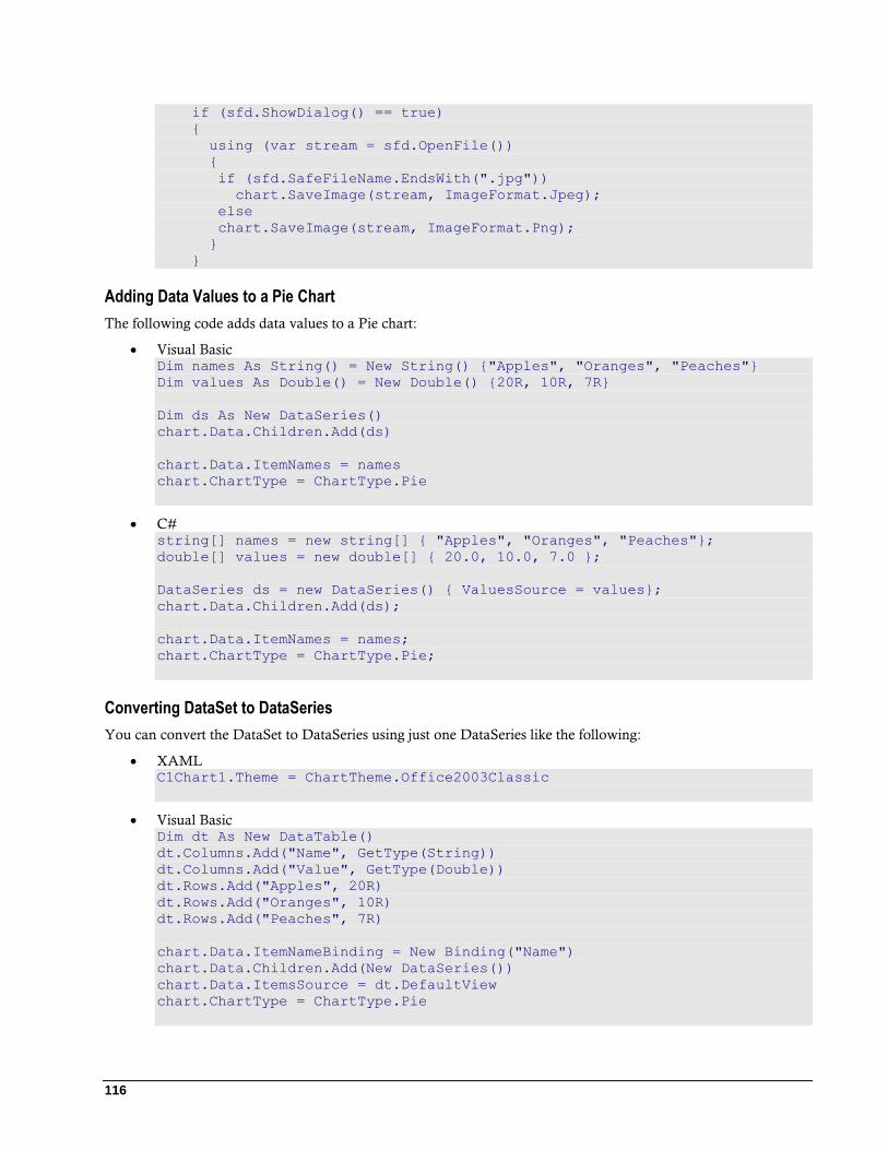
116
if (sfd.ShowDialog() == true)
{
using (var stream = sfd.OpenFile())
{
if (sfd.SafeFileName.EndsWith(".jpg"))
chart.SaveImage(stream, ImageFormat.Jpeg);
else
chart.SaveImage(stream, ImageFormat.Png);
}
}
Adding Data Values to a Pie Chart
The following code adds data values to a Pie chart:
Visual Basic Dim names As String() = New String() {"Apples", "Oranges", "Peaches"}
Dim values As Double() = New Double() {20R, 10R, 7R}
Dim ds As New DataSeries()
chart.Data.Children.Add(ds)
chart.Data.ItemNames = names
chart.ChartType = ChartType.Pie
C# string[] names = new string[] { "Apples", "Oranges", "Peaches"};
double[] values = new double[] { 20.0, 10.0, 7.0 };
DataSeries ds = new DataSeries() { ValuesSource = values};
chart.Data.Children.Add(ds);
chart.Data.ItemNames = names;
chart.ChartType = ChartType.Pie;
Converting DataSet to DataSeries
You can convert the DataSet to DataSeries using just one DataSeries like the following:
XAML C1Chart1.Theme = ChartTheme.Office2003Classic
Visual Basic Dim dt As New DataTable()
dt.Columns.Add("Name", GetType(String))
dt.Columns.Add("Value", GetType(Double))
dt.Rows.Add("Apples", 20R)
dt.Rows.Add("Oranges", 10R)
dt.Rows.Add("Peaches", 7R)
chart.Data.ItemNameBinding = New Binding("Name")
chart.Data.Children.Add(New DataSeries())
chart.Data.ItemsSource = dt.DefaultView
chart.ChartType = ChartType.Pie
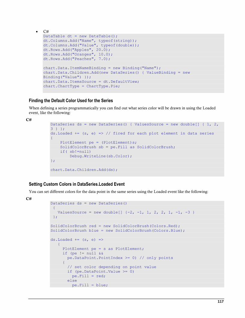
117
C# DataTable dt = new DataTable();
dt.Columns.Add("Name", typeof(string));
dt.Columns.Add("Value", typeof(double));
dt.Rows.Add("Apples", 20.0);
dt.Rows.Add("Oranges", 10.0);
dt.Rows.Add("Peaches", 7.0);
chart.Data.ItemNameBinding = new Binding("Name");
chart.Data.Children.Add(new DataSeries() { ValueBinding = new
Binding("Value") });
chart.Data.ItemsSource = dt.DefaultView;
chart.ChartType = ChartType.Pie;
Finding the Default Color Used for the Series
When defining a series programmatically you can find out what series color will be drawn in using the Loaded
event, like the following:
C# DataSeries ds = new DataSeries() { ValuesSource = new double[] { 1, 2,
3 } };
ds.Loaded += (s, e) => // fired for each plot element in data series
{
PlotElement pe = (PlotElement)s;
SolidColorBrush sb = pe.Fill as SolidColorBrush;
if( sb!=null)
Debug.WriteLine(sb.Color);
};
chart.Data.Children.Add(ds);
Setting Custom Colors in DataSeries.Loaded Event
You can set different colors for the data point in the same series using the Loaded event like the following:
C# DataSeries ds = new DataSeries()
{
ValuesSource = new double[] {-2, -1, 1, 2, 2, 1, -1, -3 }
};
SolidColorBrush red = new SolidColorBrush(Colors.Red);
SolidColorBrush blue = new SolidColorBrush(Colors.Blue);
ds.Loaded += (s, e) =>
{
PlotElement pe = s as PlotElement;
if (pe != null &&
pe.DataPoint.PointIndex >= 0) // only points
{
// set color depending on point value
if (pe.DataPoint.Value >= 0)
pe.Fill = red;
else
pe.Fill = blue;
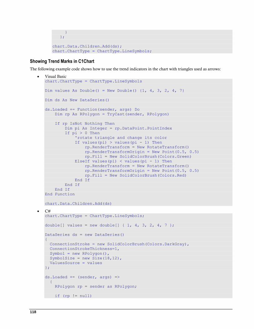
118
}
};
chart.Data.Children.Add(ds);
chart.ChartType = ChartType.LineSymbols;
Showing Trend Marks in C1Chart
The following example code shows how to use the trend indicators in the chart with triangles used as arrows:
Visual Basic chart.ChartType = ChartType.LineSymbols
Dim values As Double() = New Double() {1, 4, 3, 2, 4, 7}
Dim ds As New DataSeries()
ds.Loaded += Function(sender, args) Do
Dim rp As RPolygon = TryCast(sender, RPolygon)
If rp IsNot Nothing Then
Dim pi As Integer = rp.DataPoint.PointIndex
If pi > 0 Then
'rotate triangle and change its color
If values(pi) > values(pi - 1) Then
rp.RenderTransform = New RotateTransform()
rp.RenderTransformOrigin = New Point(0.5, 0.5)
rp.Fill = New SolidColorBrush(Colors.Green)
ElseIf values(pi) < values(pi - 1) Then
rp.RenderTransform = New RotateTransform()
rp.RenderTransformOrigin = New Point(0.5, 0.5)
rp.Fill = New SolidColorBrush(Colors.Red)
End If
End If
End If
End Function
chart.Data.Children.Add(ds)
C# chart.ChartType = ChartType.LineSymbols;
double[] values = new double[] { 1, 4, 3, 2, 4, 7 };
DataSeries ds = new DataSeries()
{
ConnectionStroke = new SolidColorBrush(Colors.DarkGray),
ConnectionStrokeThickness=1,
Symbol = new RPolygon(),
SymbolSize = new Size(18,12),
ValuesSource = values
};
ds.Loaded += (sender, args) =>
{
RPolygon rp = sender as RPolygon;
if (rp != null)
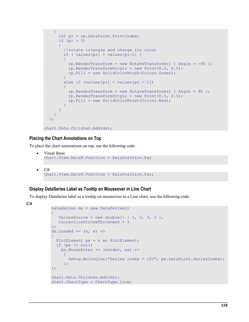
119
{
int pi = rp.DataPoint.PointIndex;
if (pi > 0)
{
//rotate triangle and change its color
if ( values[pi] > values[pi-1] )
{
rp.RenderTransform = new RotateTransform() { Angle = -90 };
rp.RenderTransformOrigin = new Point(0.5, 0.5);
rp.Fill = new SolidColorBrush(Colors.Green);
}
else if (values[pi] < values[pi - 1])
{
rp.RenderTransform = new RotateTransform() { Angle = 90 };
rp.RenderTransformOrigin = new Point(0.5, 0.5);
rp.Fill = new SolidColorBrush(Colors.Red);
}
}
}
};
chart.Data.Children.Add(ds);
Placing the Chart Annotations on Top
To place the chart annotations on top, use the following code:
Visual Basic chart.View.AxisX.Position = AxisPosition.Far
C# chart.View.AxisX.Position = AxisPosition.Far;
Display DataSeries Label as Tooltip on Mouseover in Line Chart
To display DataSeries label as a tooltip on mouseover in a Line chart, use the following code:
C# DataSeries ds = new DataSeries()
{
ValuesSource = new double[] { 1, 2, 3, 2 },
ConnectionStrokeThickness = 5
};
ds.Loaded += (s, e) =>
{
PlotElement pe = s as PlotElement;
if (pe != null)
pe.MouseEnter += (sender, ea) =>
{
Debug.WriteLine("Series index = {0}", pe.DataPoint.SeriesIndex);
};
};
chart.Data.Children.Add(ds);
chart.ChartType = ChartType.Line;
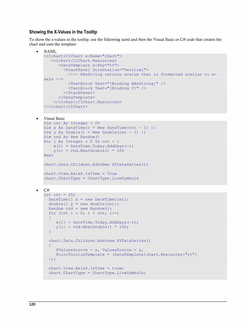
120
Showing the X-Values in the Tooltip
To show the x-values in the tooltip, use the following xaml and then the Visual Basic or C# code that creates the
chart and uses the template:
XAML <c1chart:C1Chart x:Name="chart">
<c1chart:C1Chart.Resources>
<DataTemplate x:Key="tt">
<StackPanel Orientation="Vertical">
<!-- XAsString returns xvalue that is formatted similar to x-
axis -->
<TextBlock Text="{Binding XAsString}" />
<TextBlock Text="{Binding Y}" />
</StackPanel>
</DataTemplate>
</c1chart:C1Chart.Resources>
</c1chart:C1Chart>
Visual Basic Dim cnt As Integer = 20
Dim x As DateTime() = New DateTime(cnt - 1) {}
Dim y As Double() = New Double(cnt - 1) {}
Dim rnd As New Random()
For i As Integer = 0 To cnt - 1
x(i) = DateTime.Today.AddDays(-i)
y(i) = rnd.NextDouble() * 100
Next
chart.Data.Children.Add(New XYDataSeries())
chart.View.AxisX.IsTime = True
chart.ChartType = ChartType.LineSymbols
C# int cnt = 20;
DateTime[] x = new DateTime[cnt];
double[] y = new double[cnt];
Random rnd = new Random();
for (int i = 0; i < cnt; i++)
{
x[i] = DateTime.Today.AddDays(-i);
y[i] = rnd.NextDouble() * 100;
}
chart.Data.Children.Add(new XYDataSeries()
{
XValuesSource = x, ValuesSource = y,
PointTooltipTemplate = (DataTemplate)chart.Resources["tt"]
});
chart.View.AxisX.IsTime = true;
chart.ChartType = ChartType.LineSymbols;
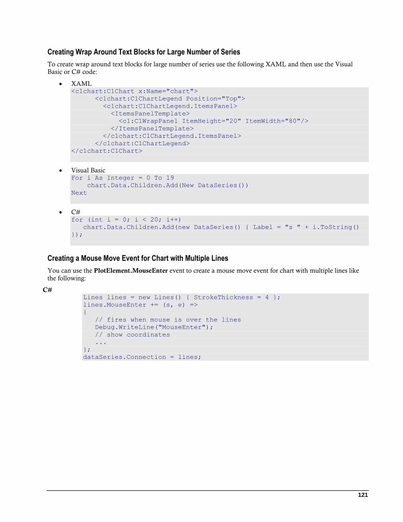
121
Creating Wrap Around Text Blocks for Large Number of Series
To create wrap around text blocks for large number of series use the following XAML and then use the Visual
Basic or C# code:
XAML <c1chart:C1Chart x:Name="chart">
<c1chart:C1ChartLegend Position="Top">
<c1chart:C1ChartLegend.ItemsPanel>
<ItemsPanelTemplate>
<c1:C1WrapPanel ItemHeight="20" ItemWidth="80"/>
</ItemsPanelTemplate>
</c1chart:C1ChartLegend.ItemsPanel>
</c1chart:C1ChartLegend>
</c1chart:C1Chart>
Visual Basic For i As Integer = 0 To 19
chart.Data.Children.Add(New DataSeries())
Next
C# for (int i = 0; i < 20; i++)
chart.Data.Children.Add(new DataSeries() { Label = "s " + i.ToString()
});
Creating a Mouse Move Event for Chart with Multiple Lines
You can use the PlotElement.MouseEnter event to create a mouse move event for chart with multiple lines like
the following:
C# Lines lines = new Lines() { StrokeThickness = 4 };
lines.MouseEnter += (s, e) =>
{
// fires when mouse is over the lines
Debug.WriteLine("MouseEnter");
// show coordinates
...
};
dataSeries.Connection = lines;