Embed Size (px)
Citation preview
Creating an international forum for book artists was an idea which was born in my family in 1988. At that time we didn’t think it would become
anything more than a publication which would serve small presses and book artists as a show window for their works.
But soon after the first editions we started getting the question where the books described could be seen, held, and evaluated. At first we organized small book art presentations in Germany, then we received invitations from neighboring countries. Finally we were organizing eight to ten such events each year.
The goal and purpose of these events was to gain new friends for contemporary book art and to identify purchasers of the books on exhibit. Those interested in buying items could then, through our mediation, get into direct contact with the artists and order from them.
Parallel to that we published our Compendium of Contemporary Handpress Prints, Artists’ Books, Painters’ Books, Portfolios and Broadsides – as our somewhat awkwardly named publication was called. It appeared at first at irregular intervals, then annually at the Frankfurt Book Fair.
I consider one of my most important tasks to be the introduction of these works to the public and the kindling of curiosity about them through this means. Many a viewer was motivated by our events to venture into the wide and colorful world of book art.
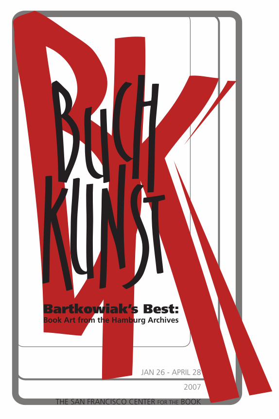
When I come in February, I would be happy to meet you and to hear your opinions of all you see in this exhibition. For the time being I have Steve Woodall, the organizer of the exhibit, to thank and to send you, dear visitors across the Big Pond, my greetings, wishing you much pleasure in the viewing of the books.
Heinz Stefan Bartkowiakforum book art HamburgJanuary 2007
The ChecklistAll text either compiled or written by H. Stefan Bartkowiak, edited by SFCB.
1 Offenbarungen über den Gott das Nichts und die Natur, sowie die Menschenseele und den Menschenleib
(Revelations Concerning God, Nothing, and Nature, as Well as the Soul and Body of Man)Correspondance des Arts; Lodz, Poland;1991 Author Jakob Boehme Illustrator/Artist Igor Podolczak (Ukraine) Printer Januz Tryzno Binder Correspondance des Arts Contact www.book.art.pl
Edition of 110, 30 pages. Ten etchings and four prints. Text printed in Zette Fraktur on paper hand made by Correspondance des Arts. Design by Igor Podolczak & Janusz Tryzno.
This is the 14th publication of CdA, 13 short fragments from Jacob Boehme’s (1575-1624) writings selected and translated into Polish by Jan Tomkowski, printed here in both Polish and the original German. Podolczak’s illustrations perfectly evoke Boehme’s mystic philosopy. In 1994 this book was awarded the Walter Tiemann Prize and the Schőnste Bőcher aus Aller Welt.
Correspondance des Arts has a 25-year history, with 23 artists’ books and several art projects and installations to its credit. Since 1993 CdA’s books have been produced in the Book Art Museum in Lodz.
2 Die Nacht aus Blei (. . .) (The Night of Lead . . .)
The Bear Press; Bayreuth, Germany; 1988 Author Hans Henny Jahnn Illustrator/Artist Klaus Böttger Printer Rudolf Ritscher Binder Werner G. Kiessig, Berlin Contact www.thebearpress.de Printed in an edition of 150 by the Offizin Poeschel in Trump-Mediaeval on Sandwich-Bütten paper. The 12 etchings by Klaus Böttger were printed by Norbert Weber of Eckernförde. The text was set by Kurt Mosebach.
Hans Henny Jahnn’s story, hardly recognized during the author’s lifetime, was published for the first time in 1956, three years before Jahnn’s death. The Bear Press’s editions are characterized by spiritual penetration of the material, and an exclusivity of idea and execution. By the use of an appropriate typeface, the
literary text is presented as an expression of the individual personality and intention of the author. The selection of the typeface has far-reaching technical implications: font size, leading, size of type area, ink color and the book proportions all constitute, as in architecture, the meaning as well as the construction of the work.
3 Das Naturgesetz und die Struktur der Materie (Natural Law and the Structure of Matter)
Belser-Presse; Stuttgart, Germany; 1967 Author Werner Heisenberg Illustrator/Artist Hans Erni, Lucerne Printer Chr. Belser Binder N/A Contact [email protected] The second book published by the Belser Press, 92 pages on handmade paper with four bound-in etchings on Japanese paper. Hand-set in narrow Gill Monotype 362 and printed by Chr. Belser. Two editions: 150 copies on Japanese paper and 850 copies on Zerkall-Bütten paper. The original English version appeared first in Frontiers of Modern Scientific Philosophy and Humanism, The Athens Meeting 1964. The translation into German was provided by the author himself for this edition.
The Belser Press was founded by Hans Weitpert. Jean Gebser is publisher. Friends of science and of art find both in these prints: important, rare and previously unpublished texts by great scholars and thinkers, combined with original graphics from artists of our time. They are works of exemplary book art design, and have won a number of awards.
4 Der nächste Mond wird anders sein(The Next Moon will be Different)
Belser-Presse; Stuttgart, Germany; 1988 Author Plato / Reinhard Furrer Illustrator/Artist Brigitte Eckel Printer Franz W. Wesel Binder C. Fikentscher Contact [email protected]
Ninth printing of the Belser Press. The 56 pages were printed in two-colored offset (duotone) with six original etchings by Brigitte Eckel. Typeset by Steffen Hahn.
The advances into outer space and the scientific exploration of the universe belong to the great adventures and discoveries of our time. This bibliophilic publication communicates interesting insights and ideas to stimulate one’s thinking. Visions of the Greek philosopher Plato about the world, which he put down in his dialog “Phaidon, ” are contrasted with the report of the German astronaut Reinhard Furrer.
Belser Press, see book 3.
5 Klingstedts Romantische Gründe(Klingstedts Romantic Reasons)
Handpressen Edition Clair Obscure; Weimar, Germany; 1988 Author Werner Söllner Illustrator/Artist Ullrich Panndorf Printer Ullrich Panndorf Binder Ullrich Panndorf Contact [email protected] Clair Obscure painter’s books Nr. 2. Letterpress on Zerkall-Bütten paper, 20 pages with five etchings. Edition of 50.
The second of the Clair-Obscure-Painter’s books, which Ullrich Panndorf inaugurated in 1987 with the unpublished poems of Ernest Wichner and which he continued in 1988 under the title KLINGSTEDTS ROMANTISCHE GRÜNDE with a text by the Romanian-German poet Werner Söllner.
Out of his love for books and the joy of his exchanges with poets, Panndorf was led to found his own press. It was a challenge for him to go beyond being a mere contributor and to take into his own hands the total design and production.
6 Venezia—Venedig (Venice)
CTL-Presse, Clemens-Tobias Lange; Hamburg, Germany; 1988 Authors Johannes Caspar Goethe, Johann Wolfgang Goethe and Clemens-Tobias Lange Illustrator/Artist Clemens-Tobias Lange Printer text SchumacherGebler München Printer images CTL Hamburg Binder Christian Zwang Contact www.ctl-presse.de The second book of CTL Presse. Book design Clemens-Tobias Lange. Set in Monotype Dante and Dante italic and printed letterpress on Japanese Hanakurabe Torinoko paper. Concertina binding, 2x42 pages. In Italian and German, with eight original color linocuts. Edition of 150, plus five numbered and signed copies.
The texts on Venice were taken from 1. Johann Caspar Goethe’s Reise durch Italien im Jahre 1740, Viaggio in Italia; 2. Johann Wolfgang Goethe’s Italienische Reise, Viaggio in Italia and 3. Carnevale der Serenissima, observations by Clemens-Tobias Lange with translation into Italian by Susanne Schoop.
Many consider the CTL-Press as a laboratory for research on the book – a poetic application of rarely used, fine or forgotten materials and languages. Sometimes there are collaborations with artists, as with Georges Adéagbo, Stephan Köhler, Jutta Schwöbel, Susanne Wenger and Domenico Brancale.
7 Ich habe behauptet / J’affirme / Ik heb beweerd (I Have Affirmed)
Despalles Éditions; Paris, France / Mainz, Germany; 1986/87 Author Johannes Beckelmann Artists Dieter Wagner, Dieter Hermann, Johannes Strugalla, Lothar M. Micklei Printers Dieter Wagner, Dieter Hermann, Johannes Strugalla, Lothar M. Micklei Binder Vitus Münch Contact www.13-plus.de
Five poems in German, with translation into French by Françoise Despalles, into Dutch by Machtelt van Thiel. Edition of 150, 82 pages. Handset letterpress and silkscreen.
Dieter Wagner was the initiator of this book, an interpretation of Beckelmann’s text by four artists, in four languages – in reaction to the atmosphere of the cold war. Dieter Wagner presents the German text with red, green and black typography on orange paper; Dieter Hermann/Infrarot (infrared) has an image related response in fluorescent colors; Johannes Strugalla, from Paris, uses poetic space to fill white figures on black paper; Lothar M. Micklei presents a fold-out Dutch text version in various types. The book was awarded the gold medal I.B.A. in Leipzig in 1989.
Despalles éditions appeared for the first time in 1982 at the Frankfurt Book Fair. Their first goal was to print, publish and distribute graphic editions. Since then, artists’ books and visual poetry have become the focus of their work. At the same time, the press sees itself as a bridge between France and Germany, introducing bilingual editions in the other lingual and cultural space. The works of Johannes Strugalla – visual artist, experimental typographer and author – has a forming influence on the editions. Books and prints are printed by letterpress as well by high quality inkjet and laser print. Françoise Despalles, initiator of the German book artists group 13+, and Strugalla run the press.
8 El Greco malt den Großinquisitor (El Greco paints the Grand Inquisitor)
dgd Bibliophile Editionen; Rome and Florence; Italy, 1984 Author Stefan Andres Illustrator/Artist Matthias Omahen Contact [email protected]
Forty-eight pages, edition of 300. Handmade paper by Franco Conti, Sicily. Full leather binding with relief embossing. A loose original engraving by Matthias Omahen is included.
Text from Stefan Anders, Meistererzählungen ® R. Piper & Co. Verlag, München 1984. Dieter Grauer is a book designer and publisher of bibliophilic editions in Rome and Florence.
9 Erde Feuer Luft Wasser (Earth Air Fire Water)
Literary quotations in alphabetical order, selected and augmented with illustrations by Peter MalutzkiFlugBlatt-presse; Lahnstein, Germany; 1986 Author various Illustrator/Artist Peter Malutzki Printer Peter Malutzki Binder Helmuth Halbach Contact www.tloen-enzyklopaedie.de
Black handset letterpress in Futura and Candida on Chromolux paper. The illustrationsare from wood and lead type, zinc plates and brass rules. Edition of 100, 144 pages.
This alphabet book deals with the four elements: earth, fire, air, and water. It contains 26 illustrated literary quotations from different novels and tales, one for each letter of the alphabet.
The FlugBlatt-Presse was founded in 1980 by Heidi Hübner, Peter Malutzki andManfred Prochotta. From 1987 until 2000 Malutzki ran the press on his own.Since 1997 he has worked with Ines von Ketelhodt on the ten-year project Zweite Enzyklopädie von Tlön. In 2006 they finished the 50-volume undertaking.
10 Die Stopfnadel (The Darning Needle)
Flugblattpresse; Lahnstein, Germany; 1985 Author Hans Christian Andersen Illustrator/Artist Peter Malutzki Printer Peter Malutzki Binder Helmuth Halbach Contact www.tloen-enzyklopaedie.de
The illustrations are made up of, among other things, brass rules, photographs, linocuts, wood type, a piece of a German newspaper from 1852 and a bit of genuine gold leaf. Typface: Legende (by Ernst Schneidler). Linen-over-board cover. Edition of 135, 48 pages.
A darning needle with pretensions tries to hold her own as she is shunted from a maid’s apron into a kitchen sink. Andersen’s cautionary tale of overweening pride is not without a certain grudging admiration for this attribute as a survival tool.
FlugBlatt-Presse, see book 9.
11 Josef (Joseph)
Verlag Galerie im Unteren Tor Bietigheim;
Bietigheim, Germany; 1988 Authors Detlef Willand, Dieter Petri, Jörg Thierfelder Illustrator/Artist Detlef Willand Printer Kortner-Druck Binder Buchbinderei Otto Zluham Contact [email protected] Fifty-six pages with 12 woodcuts printed from plates and a title woodcut based on Genesis 37-50. Set in Baskerville, printed on handmade paper, Japanese binding. Binding with title woodcut on Hahnemüle Bugra-Bütten paper. Typesetting by Alwin Maisch.
The story of Joseph belongs to the Old Testament’s patriarchal stories and concludes them. The 12 woodcuts show images which illuminate an important moment in the Joseph story. At the same time these representations of hands express important aspects of human behavior.
The Verlag der Galerie im Unteren Tor in Bietigheim is well-known for its publication of an annual woodcut calendar. The books published are primarily works by woodcut artists.
12 nachtstätten (night places)
Original Hersbrucker Bücherwerkstätte; Hersbruck, Germany; 1990 Author Manfred Rothenberger Illustrator/Artist Thomas A. Schmidt Printer text Druckerei Kröner Priner images Michael Gölling Binder Buchbinderei Kröner Contact [email protected]
Thirteen poems with eight colored linocuts. Offset printed in an edition of 88, numbers 1-10 with separate linocut, 26 pages.
Impressionist poems flowing into an ode to the night. The linocuts by T.A. Schmidt colorfully illustrate the different atmosphere of each poem.The Original Hersbrucker Bücherwerkstatt was founded in 1968 in Hersbruck, Bavaria, as a non-profit workshop combining an interest in literature and art with the goal of preserving the craft of hand printing and typesetting. The workshop’s volunteer craftsmen create hand-made woodcuts and linocuts, and work with a variety of letterpresses and a large collection of wood and metal type. The focal point for the workshop is a yearly calendar, but its craftsmen also participate in many individual and group exhibitions in the region.
13 The Battle of The Frogs and Mice Libanus Press; Marlborough, England; 1988
Author Unknown; translator, T.Parnell 1728 Illustrator Fiona MacVicar Contact www.libanuspress.co.uk
A single sheet, made up of a concertina folding of 32 leaves. Edition of 200, with a specially-bound edition of 30. Letterpress text; illustrations printed offset litho by Smith Settle, hand colored at Libanus Press. Text set in Monotype Poliphilus, Blado and Antigone.
Greek text written sometime in second century BC; translation by Parnell in 1728. This anti-war polemic, a parody of the Iliad, tells of two self-important tribes, the frogs and the mice who involve themselves in internecine war – reaching a level of bloodthirstiness which attracts the anger of Zeus, who stops the war with an army of crabs.
Libanus Press, established in 1976, printed letterpress books with wood engraved or drawn illustrations, specializing in dual text translations such as the then new, but by now standard translation of Plato’s Symposium. The letterpress workshop of the press closed in 2006. The design studio with Michael Mitchell and Susan Wightman continues to work in book and exhibition catalogue design and has recently published a magnum opus – Book Typography: a Manual for Designers – reviewing the entire process of book design for publishers and designers.
14 Jedes dritte Streichholz (Every Third Match)
Officina Ludi; Grosshansdorf near Hamburg, Germany; 1998 Author Kurt Kusenberg Illustrator/Artist Egbert Herfurth Printer Claus Lorenzen Binder Ursula Banert Contact www.officinaludi.de
Book design by Claus Lorenzen. Edition of 120, 26 pages with 15 original acrylic engravings. Hand set in semibold Thannhaeuser-Antiqua and printed by hand press on Fabriano Palatina. The Stiftung Buchkunst (Book Art Foundation) awarded this book the honor “Unter den schönsten Bücher des Jahres” (“Among the most beautiful books of the year”).
This scurrilous, richly allegorical tale from 1941, published uncensored during World War II, treats a declaration of war by the dictatorial republic of “San Trajano” against the citizen of a neighboring state for their criticizing in a travel book the inferior quality of matches in San Trajano. The allusion to Nazi Germany is unmistakable, but even today the tale remains in part a valid satire of any powerful nation groping to justify war against a weaker enemy.Officina Ludi, located in the small village of Grosshansdorf, has been in existence for
17 years. Founded and managed by Claus Lorenzen, it produces hand-printed limited editions of texts by major authors, illustrated by known artists.
15 Schreckliche Rache (A Terrible Revenge)
Quetsche. Verlag für Buchkunst; Witzwort, Germany; 1987 Author Nikolai Gogol Illustrator/Artist Gisela Mott-Dreizler Printer Reinhard Scheuble Binder Julia Büttelmann, Berlin Contact www.quetsche-witzwort.de
Edition of 95, printed on Hahnemüle Buetten paper, with 23 linocuts. Hand set in Mittel Vendome. A phantastical horror story by the Russian writer Nikolai Gogol.
Gisela Mott-Dreizler has produced nearly 30 art books featuring her original prints or hand-paintings. She works with many printing techniques, but in particular lino-etchings.
16 Traumalphabet (Dream Alphabet)
Raamin Presse Roswitha Quadflieg; Hamburg, Germany; 1985/86 Author 13 Authors Illustrator/Artist Roswitha Quadflieg Printer Roswitha Quadflieg Binder Christian Zwang Contact www.raaminpresse.de
The 15th book by the Raamin Press. Thirteen authors, 13 etchings in wood, synthetic resin and linoleum. Approximately 50 different typefaces. Edition of 195.
Dream Alphabet is based on the form of the typeface sample book. Dreams were chosen as texts because they frequently contain fragments from sentences, individual words or concepts and so seemed appropriate for the visual interlocking of type and image. Pharaoh’s dream in the Bible stands at the beginning, while Eugene Ionesco stands at the end – 13 dreams from world literature, linked to the 26 letters of our alphabet.
The private publishing studio of Roswitha Quadflieg in Schenefeld, on the western outskirts of Hamburg, was active 1973 - 2003. Here she designed, set and printed texts from world literature with her own original graphics, producing 28 limited editions, all bound by Christian and Thomas Zwang. As the last volume, the hitherto unpublished Hamburg chapter of Samuel Beckett’s German Diaries from 1936 appeared under the title “Alles kommt auf so viel an” (Everything depends on so
much). In 1998 the Raamin Press was awarded the publishing prize of the city of Hamburg.
17 Das Erdbeben von Chile (The Earthquake in Chile)
Otto Rohse-Presse; Hamburg, Germany; 1981 Author Heinrich von Kleist Illustrator Otto Rohse Printer Otto Rohse Binder Werner Bunz Contact [email protected]
The 13th edition from the Otto Rohse Press, 44 pages with 11 wood engravings. Edition of 45. Typesetting and printing by the students’ printshop of the Technical College in Darmstadt.
Otto Rohse founded his private press in Hamburg in 1962. Illustrated books as well as purely typographical prints have appeared at irregular intervals since then. Self-taught in the techniques of the wood cut, wood engraving and copper engraving, Rohse’s development as a graphic artist can be easily traced through editions of his press.
18 Sappho Schierlingspresse; Dreieich, Germany; 1987
Author Doris Sdun Artists Doris & Dieter Sdun Printer Dieter Emil Sdun Binder Helmut Fetschele Contact [email protected]
Edition of 70, 48 pages, hand set in Futura and letterpress printed on facsimile printer paper.
Text fragments by the Greek poet Sappho, shortened by Diktagramm. Names of 25 female poets (in alphabetical order) in anagram form.
Schierlingspress was founded in 1984 in Dreieich near Frankfurt, in the former studio of Sascha Juritz (Pawel Pan Presse). In 1996 the workshop moved to southern Spain, where it is now called Prensa Cicuta. New work in the studio in Los Guiraos (Cuevas del Almanzora Almeria) is with predominantly Spanish authors. Member of Centro Integral del Papel y las Artes del Libro (CIPAL); Benalúa - Guadix (Granada).
19 Pumpkin Moon & pas-des-deux Schierlingspresse; Dreieich, Germany; 1989
Author Dieter Emil Sdun Artist Dieter Emil Sdun
Printer Dieter Emil Sdun Binder Dieter Emil Sdun Contact [email protected]
Concertina-fold, edition of 40, six pages. Three-color woodcut by D. Sdun. Letterpress, hand set in Glass-Antiqua. Corrugated paper cover.A poem in Dada-style, presented as visual poetry.
20 11 Sieger (11 Winners)
Schwabacher Drucke; Schwabach, Germany; 1972 Illustrator/Artist Hubert Vogl Printer Hubert Vogl Binder Hubert Vogl Contact [email protected] Schwabacher Drucke Number 2, 12 embossed motivs on white handmade paper, brown separating pages with handwritten comments. Edition of 100.
Artist and art teacher Hubert Vogl has been making fine prints for over 30 years. The original impetus for this interest was the fortunate acquisition of a letterpress, and his response to the 1972 Olympic Games which were held in Germany. The sports euphoria and the nationalism provided topics he subjected to his unique ironic style. Since then over 70 more “Schwabacher Drucke” have appeared, which can’t necessarily be categorized under a single theme but which nevertheless have in common a constant critical look at the topic presented. Most of his work consists of lithographs and woodcuts with text, and lavish engravings in editions of 50 to 300.
As a maker of books Vogl performs all the functions: graphic artist, author, typesetter, printer and binder. The name “Schwabacher Drucke” has two meanings, for it recalls the typeface “Schwabacher Lettern, ” which was widely known in the 16th century in Germany, and it refers to the artist’s home, the city Schwabach in Middle Franconia.
21 Kein Seeweg nach Indien (No Sea Passage to India)
Edition Schwarzdruck; Berlin, German; 1992 Author Christoph Hein Illustrator/Artist Marc Berger and Roland Berger Printer Mark Berger Binder Mark Berger Contact www.edition-schwarzdruck.de
Twenty-two pages, five linoleum cuts by Roland Berger, hand set in Block and Berlin Grotesk, Japanese binding. This was the second book of the edition Schwarzdruck. Christoph Hein wrote this text during the 500th anniversary of Columbus’s voyage
(probably even on a trip to America). It is a story of Columbus’s search for a new world, but also serves as a metaphor for the social program of the DDR. The third level of meaning is the eternal longing of all seafarers for distant places, and the linoleum cuts make these multiple meanings clear. The typography is reminiscent of that of a Berlin tabloid and underscores the journalistic tone of the laconic narrative style for which Hein is known. Edition Schwarzdruck is an East Berlin hand press operation, which has published various books, broadsides and group projects since 1990. The emphasis is on critical German leftist literature, primarily from the former DDR.
22 Hereinspaziert!—Ein typografischer Cirkus (Walked right in!—A Typographical Circus)
Schwarze Kunst / Edition Klaus Raasch; Hamburg, Germany; 1990 Artist Klaus Raasch Printer Klaus Raasch Binder Buchbinderei Steinkuhl GmbH, Hamburg Contact www.edition-klaus-raasch.de
Twelve two-color typographic prints, set by hand in both metal and wood type, with ornaments from the collection of the Schwarze Kunst print workshop. BFK-Rives-Bütten paper, 13 pages. Edition of 30.
With simple typographic elements and reduced to the classical colors of red and black, Klaus Raasch creates a dense, lively scene, which leaves much to the imagination of the viewer. The letters are the main actors, who become animals, jugglers and acrobats.
Artur Dieckhoff and Klaus Raasch founded the printing studio Schwarze Kunst in 1984. They have produced numerous books, broadsides, portfolios and posters with original graphics – often in collaboration with other artists and authors. Raasch also produces artists’ books and bibliophilic editions for publishers, galleries and museums.
23 Der strickende Mann (The Man Knitting)
AtelierGrotesQue; Amsterdam, The Netherlands; 2000 Author Donald Liebetreu Illustrator/Artist Lokum Translation Machtelt van Thiel Printer Lokum Binder Sandor jr. Schouten Contact [email protected]
Hand set in Bodoni, Folio-Grotesque, Garamond, Memphis & Nobel typefaces and printed on Yearling Classic paper. Japanese style binding, with wool and a wooden knitting needle. Bilingual, German and Dutch. Twelve pages, edition of 60.
Nine short, philosophical interviews investigating the condition and the outlook of a man who observes the world while knitting. Setting by hand the many different typefaces in this work has allowed the principals to wholly immerse themselves in the design, in the process rediscovering the different characters. The design and composition is developed letter by letter.
AtelierGrotesQue is a letterpress printing and language workshop combined with a bibliophilic publishing house, founded in 1984 by the late Lothar Micklei (Lokum) and Machtelt van Thiel. Lokum (1944-2004) was a typesetter through and through, with a preference for unusual typefaces, matching layout with content to produce compositions capable of multiple interpretations. A precept: “Good use of format and design empowers the paper to speech.”
24 Vom Wunder der Vögel (About the Marvel of Birds)
Atelier Tita do Rêgo Silva; Hamburg, Germany; 1994 Author Jorge Amado Illustrator/Artist Tita do Rêgo Silva Printer Tita do Rêgo Silva Binder Steinkuhl, Hamburg Contact www.TitadoRegoSilva.de
Thirty-two pages with 21 original woodcuts. Printed in Linotype Helvetica and Tesch Hamburg on Werkdruck and Hahnemühle papers. Edition of 55.
Amado’s story about a handsome traveller who sells his little books in the poorest districts, and his troubles with jealous husbunds, is illuminated by Tita Rêgo Silva’s insightful woodcut illustrations. The translation is by Curt Meyer-Clason.
At her workshop in Hamburg, Do Rêgo Silva hand-prints and publishes books in small editions, illustrated with her woodcuts. The texts are from Brazilian literature.
25 Das prompte Eingreifen des Fallmeisters beim Versuch eines Hundes sich eigenmächtig auf die Hinterbeine zu stellen
(The Fallmaster’s Prompt Intervention During a Dog’s Attempt to Stand on its Hind Legs)Edition Treibholz, Michael Wolff; Mainz, Germany; 1987 Author William Totok Illustrator/Artist Michael Wolff Printer Michael Wolff Binder Gerd Adolf Schulz Contact [email protected]
Design and original graphics by Michael Wolff, edited by Peter Grosz. Set in Fleischmann-Antiqua and Times Antiqua and printed on Werkdruckpapier. Edition of
115, 64 pages.
“Here are verses and poems which now come cheap, they only cost a piece of life.”
Michael Wolff, born in Kelling, Transylvania (Romania), emigrated to the Federal Republic of Germany in 1983 after spending time as a political prisoner. He lives and works in Mainz as a sculptor and graphic artist.
26 Makulatur (Wastepaper)
Edition Dieter Wagner; Berlin, Germany; 1984 Author Wolfgang Nieblich Illustrator/Artist Dieter Wagner Printer Dieter Wagner Binder Reinhart & Wasser, Berlin Contact [email protected]
Japanese binding, 156 pages. Hand set in Gill, various wood types and reversed linotype lines, and printed on wastepaper. Edition of 250. Wolfgang Nieblich’s text describes the glory and misery of a fictitious bibliophilic passion for dummies, and can be understood as a parody of market mechanisms. The inventive typography, which goes against all convention, turns the book into a sensory experience. Dieter Wagner (1941-2004) lived since the 1960’s in Berlin. With his more than 30 books and broadsides, dating primarily from the 1980’s, he created a milestone in experimental book design. He printed diverse texts (Japanese short stories, both unpublished and classic German authors, text collages from gun catalogs, graffiti) – always with highly original typography. Wagner’s last work appeared in 1989.
27 Bound for the Goldfields The Wayzgoose Press; Katoomba, Australia; 1990
Author anonymous Illustrator/Artist Mike Hudson Printers Mike Hudson, Jadwiga Jarris Binder Mike Hudson Contact [email protected]
Nine meters of continuous text and illustrations folded into 33 pages and bound as a concertina. Hand set and printed in Monotype Baskerville on Mohawk letterpress paper. Illustrated with linocuts and wood engravings. Edition of 55.
The anonymous text was first published by Charles Dickens in his weekly journal Household Words in 1855. It is a true account of a journey from Melbourne to Castlemaine written by a carrier of supplies to the goldfields. “In our modern version,” says Mike Hudson, “the lines of text were gently bent and printed in graded
shades so that they form an integral part of the grasslands which were once the main feature of the journey. The book is read from top to bottom (as in a folded scroll), while viewed horizontally it presents a panoramic landscape of the Australian bush.”
Mike Hudson and Jadwiga Jarvis established Wayzgoose Press in 1985 with the aim of producing entirely hand-made limited edition books and broadsides dealing primarily, though not exclusively, with Australian prose and poetry. Since its inception, the press has produced 20 books, 45 broadsides and close to 100 items of printed ephemera.
28 Wood-engravings of John O’Connor The Whittington Press; Chelenham, Great Britain; 1989
Author Jeannie O’Connor Illustrator John O’Connor Printer The Whittington Press Binder The Fine Bindery, UK Contact www.whittingtonpress.com
This edition of 350 copies is set in Bell and printed on Tosa Bütten and Zerkall mold-made paper; 300 copies are quarter-bound in buckram, and 50 are quarter-bound in Nigerian Goatskin with a portfolio of additional proofs.
The Whittington Press started life in 1971 in the Cotswold village of Whittington, the result partly of an early enthusiasm for Caslon type, Albion presses and hand-made paper, and partly the wish to escape from London publishing jobs at the weekend. In 1974, the press became a full-time business, and has now published some 150 titles, including belles lettres, collections of wood-engravings, bibliographies of other presses, type specimens, and the internationally-acclaimed review for printers and bibliophiles, Matrix, now in its twenty-first year. Rose Randle does the administration, John Randle the printing, Miriam Macgregor is compositor, and Peter Sanderson the typecaster.
29 Mahamudra Die Fischbachpresse; Texing, Austria; 1993
Author Tilopa Typography Lui (Alois) Karner Printer Lui (Alois) Karner Binder Charlotte Karner Contact [email protected]
Thirty pages, edition of 150. Design and hand composition by Lui Karner in Romanée Romein, designed by Jan van Krimpen. Letterpress on Hahnemühle paper; cover, Lokta-paper from Nepal.
Mahamudra is a Tibetean text from the twelfth century by Tilopa, translated into German by Ernst Schönwiese. The book won the German Award for Communication Design in 1995.
Die Fischbachpresse was founded in 1990 by Lui (Alois) Karner, and has produced about 20 handmade books in limited editions over the past 15 years. With Giovanni de Faccio, an Italian calligrapher, Karner designed the digital typeface Rialto DF, a winner in the New York Type Director´s Club design competition in 2002.
30 Sandomir and Ti Svato Verlag; Hamburg; 1998
Author Günther Bruno Fuchs Illustrator/Artist Svato Zapletal Printer Svato Zapletal Binder Svato Zapletal Contact www.svato.de
Edition of 150, 48 pages. Set in Garamond, with 32 small and four full-page linoleum block prints.
“This book is a small tribute to Günter Bruno Fuchs, the poet, woodcutter and drinker, a friend of children, poets, artists of all colors and an old boozer in dilapidated pubs. He was no friend of wishful thinkers and the conventional; in the time of the Economic Miracle he was in the eyes of society just a comical backyard poet, a big, strange fellow and a good-for-nothing. But this story shows how humane and poetic his pen was.” – SZ
Graphic artist, painter and book designer Svato Zapletal has run his own publishing house for 30 years, with 45 titles to date, letterpress printed and illustrated chiefly with linoleum and wood block prints. German expressionist poets are favorite subjects.
31 Sonety – Sonette (Sonnets)
Urszula Kurtiak and Edward Ley; Koszalin, Poland; 1993 Author Heinrich Heine Illustrator/Artist Danuta Imielska-Gebethner Printer Elzbieta Chodkiewicz-Przypkowska Binder Urzula Kurtiak Contact www.kurtiak-ley.pl
Edition of 333, 52 pages. Handmade paper from the Museum of Paper in Duszniki Zdroj. Handset Nicolas Cochin type. Polish translation by Tadeusz Polanowski.
The Kurtiak and Ley Artistic Publishing House, founded in 1989 by the artist and book designers Urszula Kurtiak and Edward Ley, publishes limited edition handprinted and handbound books in fine materials. Many editions are bilingual, in an unusual range of languages. Kurtiak and Ley have produced more than 40 books in a variety of formats and binding structures, many of them commissioned as gifts for high-ranking political figures and celebrities.
32 Flags Edition Klaus Raasch; Hamburg; 1997
Author Foreword by Doreen Gliemann Artist Klaus Raasch Printer Klaus Raasch Binder Hatzel Holzwaren GmbH, Wiesenfeld Contact www.edition-klaus-raasch.de
Edition of 100. Printed beechwood case with a colored relief plate in the lid. Eleven colored original graphics (wooden and linoleum blocks, typographics, collages) on BFK-Rives-Bütten paper.
This work appeared at the time of the exhibition “Bildzeichen – Zeichenbilder” by Klaus Raasch in the Niedersächsischen Landesbibliothek Hannover 1997. The designs relate to the graphic cycles which were exhibited, from which the mounted plate in the inner lid also comes. For this reason, each case is unique.
Artur Dieckhoff and Klaus Raasch founded the Schwarze Kunst printing studio in 1984. They have produced numerous books, broadsides, portfolios and posters with original graphics – often in collaboration with other artists and authors. Raasch also produces artists’ books and bibliophilic editions for publishers, galleries and museums.
33 Hans Gentzfleisch an der Pleisse Signaturpresse; Leipzig, Germany; 1992
Author Albert Kapr Illustrator/Artist Egbert Herfurth Printer Philip Heinze Binder Dorfner-Werkstatt Weimar Contact www.hgb-leipzig.de Design by Günter Jacobi, Leipzig. Handset by Heinz Gärtner, Günter Jacobi and Ihris Köhler in Leipziger Antiqua. Edition of 500, 44 pages.
Published on the occasion of the 550th anniversary of the invention of letterpress printing and illustrated with three acrylic engravings by Egbert Herfurth, this book was produced at the Institute for Book Design at the Hochschule für Grafik und Buchkunst Leipzig. The Institute, founded in 1955, publishes theoretical texts on typography and illustration, and on book and publishing traditions. It also provides an institutional framework for the research and development of typefaces.
34 Weiter, Männer. Weiter! (Onward, Men, Onward!)
Handsatzatelier Heinz Becker; Lindenberg, Germany; 1992 Author An article from the newspaper Titanic Illuatrator/Artist Heinz Becker Printer Heinz Becker
Binder Heinz Becker Contact [email protected] Edition of 60 copies in portfolio; special edition of 20 copies bound using soccer boot studs from the German National League. Printed on Samtoffset paper on a Heidelberg letterpress and a Korrex proof press.
Produced in response to the 1991 German soccer championship win by the First Soccer Club Kaiserslautern. The typographic texts and figures of Heinz Becker reflect the championship year as he personally experienced it, deriving from remarks overheard in the stadium at Betzenberg and in pubs.
The HandsatzAtelier was founded by Heinz Becker in 1986 in a former henhouse, as reflected in the printer’s mark. The tiny studio, a one-man operation, is known for its typographic design elements.
35 Mit Blei und Seele (With Lead and Soul)
Handsatzatelier Heinz Becker; Lindenberg, Germany; 1991 Authors T. Fontane, E. Benyoetz, H. Wiesner, T. Gruber, B. Brecht, H. Seidel, J.W. Gothe, O. Ernst, Heinz Becker und Linne Illustrator/Artist Heinz Becker Printer Heinz Becker Binder Heinz Becker Contact [email protected]
Edition of 50, letterpress printed on a Heidelberg press and a Korrex proof press. Ten texts (prose, short stories, aphorisms) augmented with typographic elements.
HandsatzAtelier Heinz Becker, see book 34.
36 In memoriam J. F. Kennedy
Speech of the President of the United States of America J. F. Kennedy before the Schöneberg City Hall on June 26, 1963
Workshops of the Meisterschule für Graphik Druck und Werbung; Berlin, Germany; 1964 Author John F. Kennedy Printing/Binding Students at Masterschool for Graphics, Printing, and Advertising, Berlin Contact [email protected] Hand set and letterpress printed on Hahnemühle paper. Sixteen pages.
A bibliophilic gift for the friends of the Meisterschule für Grafik Druck und Werbung Berlin, created by students under the direction of Prof. Heinz Bartkowiak (Sr.)
The Meisterschule für Grafik Druck und Werbung in Berlin trained graphic designers, advertising professionals and printing specialists. For many years this institution
published annual bibliophilic prints in its workshops for its friends.
37 Winged by Their Own Need A Collection of Poems by the Winners and the Jurors of the �obert �ra�es Prize for �est Hungarianthe Jurors of the �obert �ra�es Prize for �est Hungarian
Poems of the Year 1970 – 86The New Seizin Press; Deiá, Mallorca, Islas Baleares, Spain; 1988 Editor Miklós Vajda Illustrator/Artist Michael Kane Printer Tomás Graves Binder Carmen Garcia-Gutierrez Contact [email protected]
Edition of 300, 80 pages. Hand set in Monotype Bembo, printed on ‘La Pedalette,’ a 1910 hand-driven cylinder press, on Johannot paper.
In 1983, Tibor Szánntó visited Mallorca to help Tomás Graves print the first book from the New Seizin Press. The following year in Budapest, during a meeting of Hungarian Pen Club, they invited each other to a typographic joust: having agreed upon the format and the number of copies, each would design and publish his own edition of this collection of poems – Szántó in Hungarian, at the Gyoma Printing House and Tomás Graves in this English translation, at the New Seizin Press.
The New Seizin Press was set up in 1981 in the same village where the original Seizin Press had operated fifty years earlier. It is run by Tomás Graves who studied typographic design in London and Carmen García-Gutierrez who learned bookbinding in Hungary. Together they design, set, print and bind books entirely by hand with illustrations by local artists.
38 Der Böse Finger (The Wicked Finger)
Original Hersbrucker Bücherwerkstatt; Hersbruck, Germany; 1986 Author Michael Gölling Illustrator/Artist Michael Gölling Printer Michael Gölling Binder Michael Gölling Contact [email protected]
Edition of 25, concertina, 12 pages. Copper press paper.
The story was inspired by the many “pointing fingers” owned by the workshop, which illustrate the book.
The Original Hersbrucker Bücherwerkstatt, see book 12.
39 Irische Drift (Irish Drift)
Offizin S.; Meran/Italy; 1994 Author Margarete Hannsmann Illustrator/Artist Peter Schlack Printer Siegfried Höllrigl Binder Bridgitte Widner, Meran Contact [email protected] Edition of 97, 73 copies in half-linen, 21 in full linen-bound author copies with a signed graphic by Peter Schlack on an additional page, and three one-of-a-kind copies bound in various leathers by Toni Innerhofer in Meran. Twenty-eight pages with three colored linoleum block prints. Printed in Schneidler Mediaeval on Rundsiebbütten Chamoix paper. The book contains 13 poems which the author brought back with her from a trip to Ireland in 1993: nature and travel impressions as well as apprehension about the destruction of our planet. In the middle section are the graphics by Peter Schlack. Offizin S., founded in 1985, sees itself as a workshop for literature, typography and graphics. The owner/printer, Siegfriend Höllrigl, prints primarily contemporary German poetry on hand proof presses, generally hand set and in a bibliophilic presentation. Höllrigl has collaborated with bookbinder Brigitte Widner since 1995.
40 The Naked Giantess Aulos; Prague, Czech Republic; 1999
Author Jiri Salamoun Illustrator/Artist Jiri Salamoun Printer Jaroslav Jand’ourek Binder Atelier Krupka Contact [email protected]
Book design by Zdenők Ziegler. Edition of 50, 61 pages with five original color lithographs. Printed in Franklin Gothic on Excudit Plzeő paper. Lithographs printed by Jiőí Lípa.
Jiőí Salamoun, an important Czech graphic artist, has recorded his dreams in images and words which tell us about life behind the mirror of sleep. Each drawing is accompanied by the author’s notes, integrated into the image. Salamoun made these notes originally for himself and only later decided to publish them. In creating this diary of his nights he tells us not only about himself but also about people around him.
Aulos, a publisher of fine books and a gallery, focuses on books and prints by Czech and international artists and authors. The works demonstrate the broad spectrum of Czech and international book culture and tradition. The Aulos Bookstore and Gallery is located in the historical center of Prague, in the Old Town.
41 panta rei Fliegenkopf, Handsatzwerkstatt; München; 1999
Author Heraclitus Illustrator Gisela Oberbeck Printer Christa Schwarztrauber Binder Christa Schwarztrauber Contact www.fliegenkopf-muenchen.de
Printed on Fabriano Tintoretto on a Korrex proof press. Spiral bound in slipcase, edition of 99.
The end of the past century prompted reflections about changes, and so between 1993 and 1999, in a series called Passages, the studio Fliegenkopf published selected texts from world literature which open vistas with few words. Each year a new volume appeared in a limited edition, hand set and printed, each volume illustrated in a different technique by a different artist. In 1999 the series came to an end with this volume of Heraclitus.
Fliegenkopf, was founded in 1989 by Christa Schwarztrauber, a master typesetter and printer who works in both traditional and experimental styles. The studio produces fine prints, typographic work and book art in collaboration with a variety of artists.
42 Absinth and Ambre Solaire Svato Verlag; Hamburg, Germany; 2000
Author Cees Nooteboom Illustrator/Artist Svato Zapletal Printer Svato Zapletal Binder Atelier Krupka Contact www.svato.de
Five short stories translated from the Dutch by Helga van Beuningen, with 13 small and five full-page linoleum prints. Text set in Vega and Futura, printed on Excudit card stock on a proof press. Edition of 170, 60 pages.
Cees Nooteboom’s novels and travel writings have made him known world-wide. In these five short stories Nooteboom writes about himself, but as a sensitive observer he intrudes on the center of the story only rarely, and when he does it is to comment on his inadequacies with the humorous distance characteristic of him.
Svato Verlag press, see book 30.
43 Erinnerungen sind Geschichten (Memories are Stories)
KellerPresse; Barcelona, Spain / Muenchen, Germany / Dornbirn, Austria; 2000 Author Peter Wiechmann
Illustrator Klaus Eberlein Printer Druckwerk, Dornbirn Binder Buchbinderei Schogla, Wien Contact [email protected]
Thirty-one stories illustrated by color linoleum block prints. Printed in Helvetica on Hemtec paper. Edition of 333, 80 pages.
This collection of stories begins with the assertion that there are exactly 31 important reasons for certain memories – the Paradise Memory, the Sly-fox Memory, the Desert Memory, the Dream Memory, etc. – exactly 31, not one more or less.
“After I passed the journeyman’s test as typesetter, my master gave me a handy Boston press and two boxes of type for my journey. I became a journalist and found my way, after several detours, to the comics. There I remained for 40 years, as inventor, developer and producer. In 1968 I founded the KellerPresse in München with my editors and we set, printed, and bound children’s books. Comics during the day – cabaret in the basement during the night. The Boston press stands in the garage today, unused, and Memories are Stories was the last book in the tradition of the legendary KellerPresse!” – Peter Wiechmann
44 Nathan der Weise (Nathan the Wise)
Leipziger Bibliophilen-Abend e. V.; Leipzig, Germany; 2002 Author Gotthold Ephraim Lessing Illustrator Volker Stelzmann Printer text Offizin Haag-Drugulin, Leipzig Printer etchings Reinhard Rössler Binder Kunst-und Verlagsbucherei, Leipzig-Baalsdorf Contact www.leipziger-bibliophilen-abend.de Book design by Walter Schiller. Six etchings. Edition of 150,160 pages. Printed in Fournier-Antiqua, Fournier-Kursiv, Grotesk on Römerturm Bütten Alt-Worms and Hahnemühle Bugra-Bütten paper.
This well-known opus from the time of the Enlightenment is accompanied by texts on tolerance from world religions.
Since 1991, Leipziger Bibliophilen-Abend has published more than 80 hand-printed limited editions. The selection of texts extends from classical world literature to novels and poems by contemporary writers. In the Leipzig tradition, the press maintains a high standard of craft.
45 Die Hundeblume Edition M & M; Hamburg, Germany; 1998
Author Wolfgang Borchert
Illustrator/Artist Jürgen Meyer Jurkowski Printer text Klaus Raasch, Hamburg Printer etchings Winfried Henkel, Viernau Binder Ludwig Vater, Jena Contact www.buchgrafik.de
Book design by Jürgen Meyer Jurkowski. Printed in Bembo at Offizin Haag-Drugulin on Hahnemühle mold-made paper. Edition of 50, 32 pages with seven etchings (line-etching, aquatinta, drypoint).
Wolfgang Borchert’s first novel, from 1947, is a story about a man in prison under the Nazi regime. The etchings of Meyer Jurkowski respond to the text’s atmosphere and move between realism and surrealism. The typography, following the monologigal structure of the novel, flows through the pages like a ribbon.
Edition M & M, founded in 1998 by artist and book designer Jürgen Meyer Jurkowski, sees book art as an integration of literary art and the art of illustration. The press has published four editions.
46 Rome, a Fragment Vladimir Sitnikov; Kiel; 2005
Author Nikolai Gogol Artist Vladimir Sitnikov Printer Thomas Siemon, edition carpe plumbum, Leipzig & Umtriebpresse, Kiel Binder Vladimir Sitnikov Contact [email protected]
Bi-lingual text (German, Russian), 28 pages with 17 illustrations, edition of 50. Relief printed on Hahnemühle Echt-Bütten paper.
Nikolai Wassiljewitsch Gogol (1809 – 1852) published the beginning of his novella Rome in a literary journal in 1842. Thereafter he worked exclusively on his novel Dead Souls and so there were no further installments. “My book,” says Vladimir Sitnikov, “takes up the challenge of bringing an uncompleted work, a fragment, to completion by giving it artistic form. The suggested magazine format, however, leaves open the possibility of future installments.”
Born in Moscow in 1958, Vladimir Sitnikov is a painter, graphic artist, and book artist who has participated in more than 100 group and 30 individual exhibits at home and abroad. He has lived in Germany for the past ten years.
47 Der Marschallstab (The Marshal’s Baton)
Edition M & M; Hamburg, Germany; 2002 Author Henryk Bardijewski
Illustrator/Artist Jürgen Meyer Jurkowski Printer Klaus Raasch, Hamburg Binder Buch Binderei Depping, Münster Contact www.buchgrafik.de Translated from the Polish by Karl Dedecius, book design by Jürgen Meyer Jurkowski. Hand set in Baskerville and Gill and printed on Zerkall Ingres rag paper. Edition of 40, 32 pages with three folded in woodcuts.
Napoleon once said that “everyone is to be a potential leader of men.” Bardijewski has written a dark satire on this dictum, Jurkowski’s woodcuts and expressive typographic art vividly conveying the satirical spirit of this very short text.
Edition M & M, see book 45.
48 Isthars Unterweltfahrt (Ishtar’s Underworld Journey)
University of Arts Bremen ; Bremen, Germany ; 1989 Author A 4,000 year old myth from Akkadia in a new translation by Egbert Richter- Ushanas Illustrator/Artist Antje Möbius Printer Antje Möbius/Hans Graf Binder Antje Möbius/Kurt Nieth Contact www.farbdesign.de
Concertina, 36 text plates and 36 illustration plates. Linocut illustrations printed on a hand press, text printed offset in Futura on Schneidersöhne Munken Lynx paper. Edition of 50. Ishtar’s journey into the underworld is on the one hand carried out vertically, between heaven and earth, the realm in-between and the underworld – and at the same time horizontally, in the sequences of the scenes. The figures of the myth are reduced to their subjective characteristic powers which find their visual counterparts in individual colors/archetypes.
Antje Möbius, book artist and designer, makes communication – the dialogue of painting and text – the subject of her work. Myth, poetry and abstract texts become both intellectual and emotional experiences.
49 FarbForm (Colorform)
Typographeum Barlo de Lüthe; Düsseldorf; 2004 Author Barlo de Lüthe Illustrator/Artist Christof Krall Printer Barlo de Lüthe Binder Klaus Heinrich, Buchmacherei Helserdeich
Contact [email protected]
Edition of 15, 30 pages.
At the end of mechanical typography, the term “colorform” lost its relevance for composition and printing. Barlo de Lüthe redefines ColorForm (Color [and] Form) as a fundamental prerequisite for the success of 500 years of printing, and as the most important legacy of the Gutenberg era to digital typography. The poems by Johannes Bauten (1848-1919) are set in 20 different types and illustrate the stages of development of block letters. For de Lüthe the nearly forgotten techniques of letterpress from the past are closely connected with the yet to be realized possibilities of our digital times.
50 wie weiß ist wissen die weisen ~ Prosa und Lyrik zur Farbe weiß (what white is the wise know ~ Prose and Poetry about the Color White)
Officina Ludi, Grosshansdorf / Hamburg, 2006 Editor Claus Lorenzen Authors Johann Wolfgang von Goethe, Herman Melville, Thomas Mann, Christian Morgenstern, Bertolt Brecht, Georg Trakl, Georg Heym, Francisca Stoecklin, Rose Ausländer, Peter Huchel, Hans Magnus Enzensberger, Eugen Gomringer, Joseph Johannes Illustrators John Gerard, Anne von Karstedt, Thomas Marutschke, Joseph Johannes, Visser, Svato Zapletal Printer Claus Lorenzen Binder Christian Zwang Contact www.officinaludi.de
Forty pages with six “white” original prints by several artists (see above) in various techniques. Texts embossed onto, stamped or laser cut into Zanders Medley 150g paper. Flexible cover with a lasered wrapper of Japanese paper; white embossed slip-case made of Efalin linen. Choice of texts, book design, setting, and printing of the embossed texts by Claus Lorenzen in cooperation with the Museum der Arbeit (Museum of Work) in Hamburg. Printing of the embossed films: Druckerei Max Siemens KG, Hamburg. Laser cuttings: Firma Kremo, Mosbach. Edition of 150, of which 25 are preferred editions with a slip-case of white Japanese paper and three additional prints.
The sentence from Eugen Gromringer “wie weiß ist wissen die weisen” (what white is the wise know) serves as the motto under which various literary texts in prose and poetry are brought together in this book, all of which treat the mystery and magic of the “color” white. The multiple nuances of “white” – which above all are conjured up by the play of light and shadow – are made visible by the design of the book: thus the texts are for the most part stamped into the paper, raised as a kind of braille, and in part enhanced with a thin film or lasered into the paper.
Officina Ludi, see book 14.
51 Dorothy Lamour’s Life as a Phrase Book The Wayzgoose Press; Katoomba, Australia; 2006
Author Noëlle Janaczewska Illustrator/Artist Mike Hudson Printer Mike Hudson and Jadwiga Jarvis Binder Mike Hudson and Jadwiga Jarvis Contact [email protected]
Bound as a concertina, the five meters of text and illustrations consist of 11 triple-gate folded pages, with color linocuts and hand illumination. Set in numerous sans serif types and printed on a Western proof press on Magnani Incisioni paper. Edition of 30.
Dorothy Lamour’s Life as a Phrase Book is one in a trilogy of stage plays inspired by Hollywood heroines of the 1930’s-1950’s. In this play, the glamour girl made famous by the “road movies” in which she co-starred with Bob Hope and Bing Crosby, finds herself in a poem instead of a movie and marooned in a dingy Sydney hotel. Dorothy’s miscasting leads to reflection and soul-searching.
“In order to maintain the spirit of a performance,” says Mike Hudson “we gave the book a theatrical setting; the hotel room, which appears on every page, is its ‘stage’ onto which various scenarios (suggested by the text but not a literal depiction thereof) are introduced.”
Wayzgoose Press, see book 27.
52 Moby Dick—Two Chapters Das Gasthaus zum blasenden Wal (The Spouter-Inn)
Die Weiße des Wales (The Whiteness of the Whale)Maximilian-Gesellschaft e.V.; Hamburg, Germany; 2002 Author Herman Melville Illustrator Michael Huth Printer instructors at Darmstadt Technical University Binder Gert Hoffrath, Rossdorf (near Darmstadt Contact www.maximillian-gesellschaft.de
Edition of 800, 98 pages with ten double-page linoleum block prints. Text letterpress printed on Zerkall-Bütten. Half parchment cover from a design by Michael Huth.
Two chapters excerpted from Melville’s book in the original American English and in a German translation by Richard Mummendey. The linoleum block prints contrast with the “thoroughly besmoked oil-painting” hanging in the Spouter-Inn and with the whiteness of the whale’s skin. The transparent long fiber paper on which the graphics are printed invites the reader to make playful combinations by overlaying the pages.
The Maximilian Society, which began in 1911 in Berlin and was newly founded in Hamburg in 1946, is considered among the most signficant bibliophilic organizations in Germany. In the tradition of the great English and French bibliophilic societies, it
has cultivated the book for book lovers in a lasting way. The society aims to represent and promote both old and new book art with its publications and events.
53 Amnesie in litteris (Literary Amnesia)
Officina Ludi; Grosshansdorf / Hamburg; 2001 Author Patrick Süskind Illustrator/Artist Joachim Jansong Printer Claus Lorenzen Binder Stefan Cseh Contact www.officinaludi.de
Book design by Claus Lorenzen. Thirty-six pages with three full-page etchings and three offset prints. Printed in hand-set Candida-Antiqua on a hand press on Velin d’arches and Schoellershammer papers. Etchings printed by Milan Drimal (Prague). Edition of 110 numbered copies, of which 10 are preferred editions in complete leather, embossed, with an additional original etching.
This short treatise deals thoughtfully and humorously with the phenomenon of literary forgetting, something familiar to any reader who picks up a book read years ago and scarcely remembers any detail of the story. Why, then, read at all? Maybe reading affects much more than just memory and is overlaid with other levels of consciousness. Thus, the illustrations by Joachim Jansong deal with various strata: strata in trees, in stones, in layers of wallpaper and, yes, even with strata in the brain – woven into pictures of ruined remains of parchment, old folios, fragments of prose and poetry and pictures of writers.
Officina Ludi, see book 14.
54 Amor und Psyche, Ein Märchen aus der Antike (Amor and Psyche, a fairytale from antiquity)
Ascona-Presse; Ascona, Switzerland; 1999 Author Lucius Apuleius Illustrator Felix Hoffmann Printer Wolfan Druck Binder Roland Meuter Contact www.rmeuter.ch
Edition of 100, 80 pages with 25 original engravings. Special edition 1-30 on parchment, various bindings; regular edition 31-100 on Romabütten-paper with vignette by Felix Hoffmann; contributors’ copies I-XX. Text printed in Stempel-Schneidler type on Hahnemühle Kupferdruckbüttenpapier. Typography by Erich Gülland. Afterword by Henning Wendland.
Between 1986 and 2006 the Ascona Press published 17 books hand bound by Roland Meuter and letterpress printed primarily under the direction of Erich Guelland.
55 Die Grüne (The Green Woman)
Hirundo Press; Hamburg, Germany; 1999 Author Kathleen Jamie Translator Caroline Saltzwedel Illustrator/Artist Caroline Saltzwedel Printer Klaus Raasch, Hamberg Binder Karen Begemann, Hamberg Contact www.hirundo-press.com Book design by Caroline Saltzwedel. Edition of 30, 20 pages printed in hand-set Walbaum Antiqua on Zerkall rag paper, with four etchings printed in the simultaneous color technique.
Kathleen Jamie’s poems vividly capture the circumstances before and immediately after the birth of her first child (the Scottish expression “a green woman” means someone who has just given birth). A few Scots terms appear in the poems and are briefly explained in a glossary at the end.
The Hirundo Press was founded by Caroline Saltzwedel in 1998 for the production of etchings and artist’s books in small editions. It takes its name from the swallow (Hirundo rustica). Hirundo Press occasionally produces new work by contemporary poets in letterpress editions. Other works relate to literary and mythological lodestars that guide the migratory bird through life: Joyce‘s Ulysses and Finnegans Wake, Homer‘s Odyssey, the Four Elements. Here the etchings, most of them printed in several colors simultaneously, play the most important role. To date, the Hirundo Press has published seven books and portfolio works.
This exhibition has been made possible with support from the following:
forum book art, HamburgThe Kahle/Austin FoundationGrants for the Arts, San Francisco Hotel Tax FundGoethe Institut San FranciscoPeter Koch and The Codex FoundationJohn Sullivan / Logos GraphicsGeorgianna Greenwood: exhibition logo (calligraphy) and book title translationMartha Cooper Design Maia Karolina de Raat / Dandy Lion Press: checklist & keepsake designFriends and patrons of San Francisco Center for the Book
Volunteers:Susan Angebranndt, Bernard Arejola, Hanna Bevil, Will Bucoy, Shayna Cohen, Emily Craig,Tae Dougherty, Melissa Fine, Jessica Fleischman, Nif Hodgson, Kevin Hoskins, Irvin Hubler, Jamye Jamison, Riya Lerner, Candice Obayashi, Kelsey Parker, John Sims, Thilde Weems, Carolee Wheeler, Sanaz Yamin
San Francisco Center for the BookArtistic Director: Steve WoodallExhibition installation: Colleen Stockmann and volunteersVolunteer coordinator: Katherine Case Interim Executive Director: Anne W. Smith
BoardMary Austin (chair), Kathleen Burch (vice-chair), Duff Axsom, Michael Bartalos, Marie Dern, Thacher Hurd, Thomas Ingalls, Richard Lang, Margaret Miller, Linda K. Smith, Patricia Myie Wakida, Larry Warnock, Susan West

300 De Haro StreetSan Francisco, CA
94103www.s fcb .org