Embed Size (px)
Citation preview

Comparing Household Food Consumption Indicators to Inform Acute Food Insecurity Phase Classification
Bapu Vaitla, Jennifer Coates, and Daniel Maxwell
December 2015
FANTAFHI 3601825 Connecticut Ave., NW Washington, DC 20009-5721Tel: 202-884-8000 Fax: 202-884-8432 [email protected] www.fantaproject.org
FAMINE EARLY WARNING SYSTEMS NETWORK

This publication is made possible by the generous support of the American people through the support of the Office of Health, Infectious Diseases, and Nutrition, Bureau for Global Health, U.S. Agency for International Development (USAID) and the Bureau for Africa, under terms of Cooperative Agreement No. AID-OAA-A-12-00005, through the Food and Nutrition Technical Assistance III Project (FANTA), managed by FHI 360. Additional support was provided by the USAID-funded Famine Early Warning Systems Network (FEWS NET) activity, managed by Chemonics International Inc. under Contract No. AID-OAA-I-12-00006. The contents are the responsibility of FHI 360 and FEWS NET and do not necessarily reflect the views of USAID or the United States Government. December 2015
Recommended Citation
Vaitla, Bapu; Coates, Jennifer; and Maxwell, Daniel. 2015. Comparing Household Food Consumption Indicators to Inform Acute Food Insecurity Phase Classification. Washington, DC: FHI 360/Food and Nutrition Technical Assistance III Project (FANTA). Contact Information
Food and Nutrition Technical Assistance III Project (FANTA) FHI 360 1825 Connecticut Avenue, NW Washington, DC 20009-5721 T 202-884-8000 F 202-884-8432 [email protected] www.fantaproject.org
Comparing Household Food Consumption Indicators to Inform Acute Food Insecurity Phase Classification
Contents
Acknowledgments ........................................................................................................................................ i
Executive Summary ................................................................................................................................... iii
1 Introduction ......................................................................................................................................... 1
2 Food Security Measurement and the IPC Approach ....................................................................... 4
2.1 Food Security Measurement ......................................................................................................... 4
2.2 The IPC Approach ........................................................................................................................ 4
2.3 Indicators in the Acute IPC Household Reference Table ............................................................. 6
2.4 Description of Key Study Indicators ............................................................................................. 7
3 Literature Review ............................................................................................................................. 10
3.1 Relationships among Measures of Food Security ....................................................................... 10
3.1.1 Household Diet Diversity Indicators ............................................................................................. 10
3.1.2 Experiential Indicators .................................................................................................................. 12
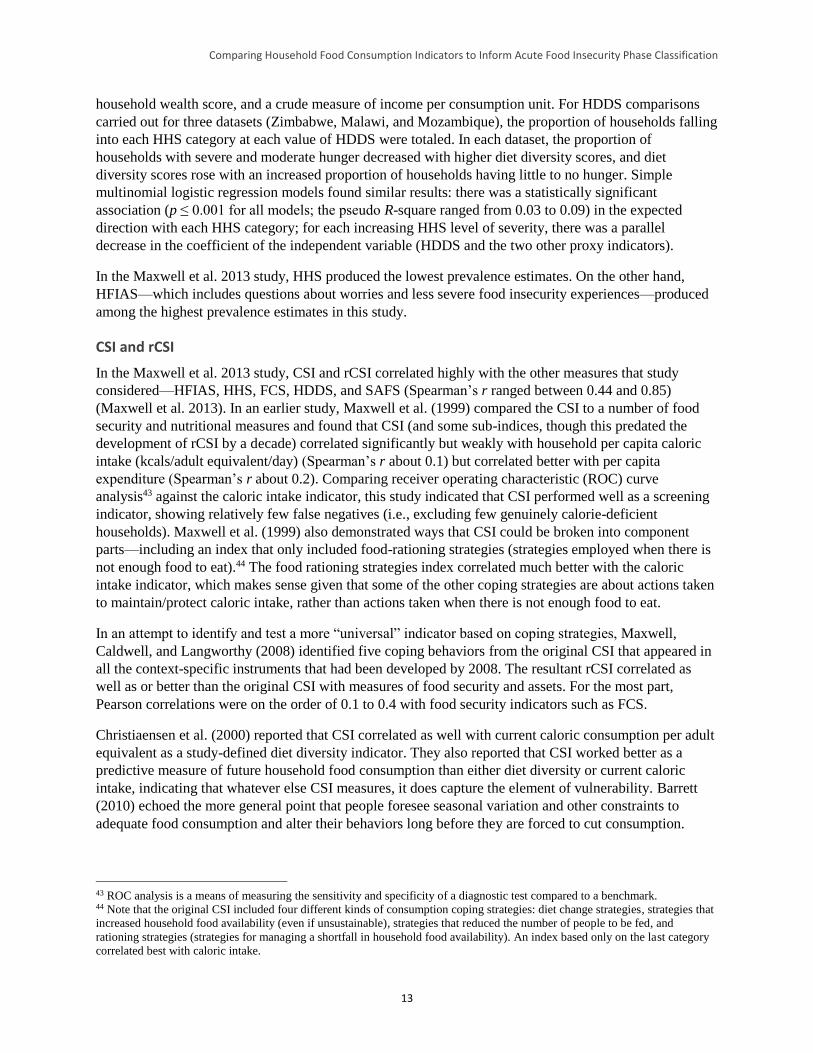
3.1.3 Multi-Indicator Comparisons ........................................................................................................ 14
3.1.4 Summarizing the Food Security Measurement Landscape ........................................................... 15
3.2 Summary of Key Issues and Implications for Empirical Analysis ............................................. 16
3.2.1 Dimensions of Food Security ........................................................................................................ 16
3.2.2 Convergence among Indicators in Their Continuous and Categorical Forms ............................... 17
3.2.3 Objective and Subjective Indicators .............................................................................................. 17
3.2.4 Aggregate Methods versus Disaggregated Approaches ................................................................ 18
3.2.5 Severity and Sensitivity ................................................................................................................. 18
3.2.6 Conclusion .................................................................................................................................... 18
4 Data, Methods, and Findings ........................................................................................................... 20
4.1 Introduction ................................................................................................................................. 20
4.2 Data ............................................................................................................................................. 20
4.3 Descriptive Statistics, Correlations, and Cross-Tabulations ....................................................... 26
4.3.1 Descriptive Statistics ..................................................................................................................... 26
4.3.2 Correlations ................................................................................................................................... 32
4.3.3 Cross-Tabulations ......................................................................................................................... 36
4.4 What Explains the Relationships between Indicators? ............................................................... 47
4.4.1 The “Dimensionality” of Food Insecurity ..................................................................................... 47
4.4.2 The Alignment of Indicator Categories ......................................................................................... 60
5 Discussion: Linking Findings to the IPC ........................................................................................ 67
5.2 Summary of Results .................................................................................................................... 67
5.2 Anchoring Indicators and Thresholds to IPC Phases .................................................................. 68
5.3 Study Limitations ........................................................................................................................ 73
5.4 Conclusions and Implications for Future Studies ....................................................................... 73
Appendix A. CSI Distributions by Dataset ............................................................................................. 80

Comparing Household Food Consumption Indicators to Inform Acute Food Insecurity Phase Classification
Appendix B. Categorical Results by Indicator and Dataset .................................................................. 82
Appendix C. Cutoff Choices and Concordance between Indicators .................................................... 85
Appendix D. Cross-Tabulation Results by Indicator Pair and Dataset ............................................. 102
Appendix E. Principal Components Analysis Communalities Table ................................................. 111
Appendix F. Detailed Results of Alignment Analysis .......................................................................... 113
Appendix G. Household Economy Approach Outcome Analysis Threshold Alignment Pilot ........ 127
Comparing Household Food Consumption Indicators to Inform Acute Food Insecurity Phase Classification
i
Acknowledgments
This analysis relied on organizations’ willingness to share data from their own work. As such, we thank
colleagues from the following stakeholder groups for their readiness to share their data and associated
resources and for their patience in fielding our questions as we cleaned and prepared the data for analysis:
Action Against Hunger (Action Contra la Faim), Catholic Relief Services, Food for the Hungry, the Food
Security Coordinating Unit of Haiti, the Food Security Monitoring Unit of Blue Nile and South Kordofan
in Sudan, the Food Security and Nutrition Analysis Unit for Somalia, the Kenya Food Security Steering
Group, Mekelle University in Ethiopia, Mercy Corps, the Relief Society of Tigray, Save the Children
U.S., Tufts University, UNICEF, the World Food Programme (WFP), and the Zimbabwe Vulnerability
Assessment Committee.
We would like to extend our sincere thanks to Laura Glaeser and Megan Deitchler at the Food and
Nutrition Technical Assistance III Project (FANTA); Chris Hillbruner at the Famine Early Warning
Systems Network; Astrid Mathiassen at WFP; and Leila Oliveira at the Integrated Food Security Phase
Classification Global Support Unit, all of whom provided valuable comments on drafts of this report and
helped guide the totality of this work to this concluding document. We would also like to thank FANTA’s
Communications Team for making this document publication-ready. Any remaining errors are the sole
responsibility of the authors.
Comparing Household Food Consumption Indicators to Inform Acute Food Insecurity Phase Classification
ii
Abbreviations and Acronyms
CFSVA Comprehensive Food Security and Vulnerability Assessment
CSI Coping Strategies Index
FANTA Food and Nutrition Technical Assistance III Project
FAO Food and Agriculture Organization of the United Nations
FAST Food Access Survey Tool
FCS Food Consumption Score
FSNAU Food Security and Nutrition Analysis Unit
HDDS Household Dietary Diversity Score
HEA Household Economy Approach
HES Household Expenditure Survey
HFIAS Household Food Insecurity Access Scale
HFCIS household food consumption indicators study
HHS Household Hunger Scale
IPC Integrated Food Security Phase Classification
kcals kilocalories
MAHFP Months of Adequate Household Food Provisioning
PDR (Lao) People’s Democratic Republic
rCSI Reduced Coping Strategies Index
ROC receiver operating characteristic curve
SAFS self-assessed measure of food security
WFP World Food Programme
USAID U.S. Agency for International Development
Comparing Household Food Consumption Indicators to Inform Acute Food Insecurity Phase Classification
iii
Executive Summary
Study Background
The Integrated Food Security Phase Classification (IPC) is a set of tools and procedures for classifying
the severity of chronic and acute food insecurity across geographic areas and time using a convergence of
available data and information. One important component of the acute IPC is the Acute Food Insecurity
Reference Table for Household Group Classification (household reference table). This table provides
qualitative, graduated descriptions of five acute food insecurity phases, along with thresholds for key
household-level outcome indicators that can be used to classify the severity of acute food insecurity (see
Table A for an abbreviated version of the acute IPC household reference table). Thresholds in the current
version of this table in the Integrated Food Security Phase Classification: Technical Manual Version 2.0
(p. 33), were devised after consultation with the developers of the indicators, including the Food and
Agriculture Organization of the United Nations (FAO), the Food and Nutrition Technical Assistance III
Project (FANTA), and the World Food Programme (WFP).
To date, little analysis has explored how well the food consumption indicators and their thresholds in the
acute IPC household reference table align with one another or with the phase descriptions provided in that
table. For example, there is little information on how well each of the indicators the table employs
captures the acute IPC’s five severity phases, how well each indicator’s thresholds align with the table’s
phase descriptions, or how well each indicator’s threshold for a given phase relates to another indicator’s
threshold for the same phase. To analyze the relationships among select household food consumption
indicators,1 FANTA and the Famine Early Warning Systems Network (FEWS NET) initiated a household
food consumption indicators study (HFCIS) based on available secondary data. The study was carried out
by a team of consultants affiliated with Tufts University, with technical management support and
guidance provided by FANTA and FEWS NET, and with technical input from WFP and the IPC Global
Support Unit. The study’s primary objective was to identify ways in which an improved understanding of
these indicator relationships can enhance acute IPC indicator threshold alignment, thus helping to
improve the convergence of evidence approach and overall quality of acute IPC analyses.
Summary of the Study Process
The HFCIS made use of 65,089 household-level observations from 21 representative, population-level
datasets spanning 10 countries: Ethiopia, Haiti, Kenya, Mongolia, Pakistan, Somalia, South Sudan,
Sudan, Uganda, and Zimbabwe. Data used in the analysis were collected between 2008 and 2013 and
contained at least two of the following indicators: the Coping Strategies Index (CSI), the Reduced Coping
Strategies Index (rCSI), the Food Consumption Score (FCS), the Household Dietary Diversity Score
(HDDS), and the Household Hunger Score (HHS).2 These indicators represent two broad indicator
1 Though the indicators examined in this study may be more typically understood as indicators of food security, this study refers
to them as “household food consumption indicators” because they are presented as food consumption outcome indicators in the
acute IPC household reference table. 2 HHS data used in this study were either collected directly or calculated from available Household Food Insecurity Access Scale
data. As CSI is so rarely implemented as designed, limited data were available for its analysis in the context of acute IPC
thresholds. In addition, rCSI has replaced CSI as WFP’s commonly collected indicator of coping and is available in many
datasets. Therefore, though rCSI is not included in Version 2.0 of the acute IPC household reference table, it was considered in
the HFCIS.
Comparing Household Food Consumption Indicators to Inform Acute Food Insecurity Phase Classification
iv
groups: experiential indicators and diet diversity indicators.3 Datasets employed in the analysis included
at least 200 observations per indicator and collected/tabulated indicator data according to the standard
methodology for each indicator.4
The HFCIS analysis included three main steps:
1. An exploration of the relationships between household food consumption indicators used in the acute
IPC household reference table through correlations and cross-tabulations
2. An analysis of two major factors hypothesized to influence the relationships between pairs of these
indicators: potential differences in the dimensions of food security measured by the indicators5 and
potential differences in the ranges of severity measured by the indicators
3. A comparison of how these different indicators aligned categorically (i.e., across study-constructed
food secure, moderately food insecure, and severely food insecure categories) and an examination of
potential alternative indicator category alignments
The results of the first three steps led to a series of proposed changes to the indicators and thresholds used
in the acute IPC household reference table.6
Summary of the Study Findings
The HFCIS correlation and cross-tabulation analyses identified strong relationships between two pairs
of study indicators—rCSI/HHS (p = 0.495) and FCS/HDDS (p = 0.592). However, the remaining
study indicator pairs were less strongly correlated and the consistency of indicator relationships
varied among datasets.7 This suggests that context (when and where data are collected) influences the
strength of the relationships between these household food consumption indicators.
The dimensionality analyses suggested that the indicators studied reflect different aspects of food
security (and, for the purposes of the acute IPC specifically, food consumption outcomes). The results
of these analyses were interpreted to indicate that the experiential indicators studied (HHS and rCSI)
are likely to be stronger proxies of diet quantity while the diet diversity indicators (HDDS and FCS)
are likely to be stronger measures of diet quality. This split warns against using these two groups of
indicators interchangeably as indicators of acute food consumption outcomes and suggests relying on
at least one indicator from each group for more accurate classification.
3 Experiential indicators ask respondents to rate the depth and/or frequency of their food insecurity. These indicators may contain
questions about experiences related to anxiety about household food access; satisfaction regarding food preferences, food
availability, and diversity; and signs of food shortages in daily life (IFPRI, 2012, Improving the Measurement of Food Security,
Discussion Paper 01225). Diet diversity indicators ask respondents about the number of different food groups consumed over a
reference period. Of the indicators studied here, the CSI, rCSI, and HHS indicators are considered experiential indicators, while
the FCS and HDDS indicators are considered diet diversity indicators. 4 While examination of the relationships among the indicators that proxy for food consumption outcomes in the acute IPC
household reference table is most effectively undertaken by comparing the performance of these indicators against caloric intake
data, such analysis was outside the scope of this study given the time and resources available and concerns regarding the
accuracy and methodological consistency of available caloric data. 5 Food security dimensions include stability, quantity, quality, acceptability, and safety (Coates 2013). 6 These proposed changes are made with the understanding that quantity deficits are the primary characteristic of the poor food
consumption the acute IPC aims to classify. The proposed changes to better measure quantity deficits are provided with the
limitation that there was no gold standard indicator of caloric adequacy against which to verify them. 7 Correlation coefficients for the remaining four study indicator pairs (rCSI/FCS, rCSI/HDDS, HHS/FCS, and HHS/HDDS) had
an absolute value of ρ <= 0.3. Even correlations among the indicator pairs that were strongly correlated across the study data
(rCSI/HHS and FCS/HDDS) varied among specific datasets (e.g., the rCSI/HHS relationship ranged from ρ = 0.597 in Ethiopia
to ρ = 0.323 in South Sudan).
Comparing Household Food Consumption Indicators to Inform Acute Food Insecurity Phase Classification
v
The HFCIS alignment analysis suggested four primary conclusions related to indicator alignment:
o None of the indicators performed well across the full range of food insecurity severity reflected in
the acute IPC’s five phases.
HHS appeared not to be sensitive in discriminating among relatively food secure households.
As HDDS and FCS scores increased (implying a more food secure situation), HHS scores did
not vary greatly.
HDDS and FCS, meanwhile, did not align well with HHS and rCSI when food insecurity was
severe, although it is unclear whether this was because the former are less sensitive at the more
severe end of the acute food insecurity spectrum or because the association between quantity
and quality of food consumption is attenuated in these situations.
o In the absence of caloric intake data, alignment analysis requires establishing an “anchor” against
which indicator relationships can be assessed. Two possible anchors were considered as indicators
of “catastrophe” (acute IPC Phase 5): HHS > 4 and FCS ≤ 10. Because FCS and HHS were not
well correlated at their extremes, alignment analysis suggested that only the indicator chosen as the
anchor would distinguish between Phases 4 and 5. HHS was ultimately selected as the study’s
anchor for the following reasons:
‒ The clear conceptual link between the severe caloric deficits described at acute IPC Phase
5 and the experiences that households with an HHS of 5 or 6 face
‒ The results of the study’s dimensionality analysis, which were interpreted to indicate that
HHS is a proxy of diet quantity
‒ The longer recall period used to collect HHS data
o On average, using current acute IPC thresholds for HHS, FCS, and HDDS and a set of study-
constructed thresholds for rCSI, a randomly selected pair of these four indicators classifies
households at the same level of food insecurity severity 42.7 percent of the time. This statistic is
referred to as average pairwise concordance.
o By adjusting some thresholds and removing others (i.e., deciding that certain indicators are unable
to distinguish a given phase), the final step in the HFCIS analysis suggested that there are a range
of options to achieve an average pairwise concordance of more than 50 percent while maintaining
the indicator thresholds’ logical consistency. Using the full study dataset, the best-performing
indicator threshold schemes achieve an average pairwise concordance of more than 60 percent.
Increased concordance of indicator thresholds is expected to improve acute IPC analyses by
increasing the likelihood that indicators classify households in the same way, thus facilitating the
convergence of evidence approach.
Key Implications for the Acute IPC Household Reference Table
Previous studies have suggested that the relationship between caloric consumption and some of the
indicators under study here varies across contexts.8 The results of the HFCIS analysis further indicate
that the relationships among the indicators themselves vary in different contexts. This underscores the
importance of employing a convergence of evidence approach and suggests that acute IPC analyses
that rely heavily on one quantitative indicator are likely prone to misclassification.
8 Lovon, M. and Mathiassen, A. 2014. “Are the World Food Programme’s Food Consumption Groups a Good Proxy for Energy
Deficiency?” Food Security. Vol. 6, Issue 4, pp. 461–470; Wiesmann, D.; Bassett, L.; Benson, T.; and Hoddinott, J. 2009.
“Validating the World Food Programme’s Food Consumption Score and Alternative Indicators of Household Food Security.”
IFPRI Discussion Paper 00870. Washington, DC.
Comparing Household Food Consumption Indicators to Inform Acute Food Insecurity Phase Classification
vi
When using a convergence of evidence approach in acute IPC analyses, the HFCIS findings strongly
suggest the use of at least one indicator from each of the two identified indicator groups (experiential
and diet diversity), that is, either HHS or rCSI and either FCS or HDDS.
The results of the alignment analysis suggest a range of opportunities to improve the average pairwise
concordance of the food consumption indicators under study. Determining which changes were most
appropriate was not simply a matter of selecting the threshold combinations with the highest
concordance. Rather, the range of possible options suggested by the empirical analysis was
considered in light of how the acute IPC is used and the need for conceptually valid thresholds.
Consultations among the study team suggested a series of specific changes to the number and ranges
of food consumption indicator thresholds in the acute IPC household reference table. Together, these
changes increased average pairwise concordance to 61.4 percent, an improvement of nearly 20
percentage points over the current acute IPC household reference table thresholds. The specific
changes are listed below and included in Table A:
o Small adjustments to HHS thresholds (HHS = 2 moves to Phase 2, HHS = 5 to 6 remains only in
Phase 5)
o The addition of rCSI to the reference table, with the following thresholds: 0 to 4 = Phase 1, 5 to 20
= Phase 2, ≥ 21 = Phase 3 or higher
o Reduction in the number of HDDS thresholds from four to two and an adjustment of these
thresholds such that HDDS 5 to 12 = Phase 1 or 2, HDDS 3 to 4 = Phase 3, and HDDS 0 to 2 =
Phase 4 or higher
o A shift from WFP’s food consumption categories (poor, borderline, and adequate) to raw FCS
scores to enhance classification precision and transparency, a reduction in the number of FCS
thresholds from four to two, and an adjustment of these thresholds such that FCS 35 to 112 =
Phase 1 or 2 (with an FCS 42 to 112 = Phase 1 among populations consuming oil and sugar daily),
FCS 13 to 34.5 = Phase 3 (with an FCS of 13 to 41.5 among populations consuming oil and sugar
daily), and FCS 0 to 12.5 = Phase 4 or higher
Although average pairwise concordance is improved by the changes proposed above, the study results
also highlight the limitations of these quantitative indicators. Given the importance of contextual
factors that was apparent in the study results, the IPC should re-emphasize the importance of
reinforcing quantitative indicators with a robust analysis of other food security information when
undertaking any classification.
Implications for Future Research and the IPC Chronic Reference Table
This analysis includes useful insights into the behavior and application of the study indicators, as well
as recommendations for related future research priorities. Suggested priority areas of future research
include:
o Primary data collection that includes all of the following in the same survey:
‒ Detailed information on caloric intake
‒ All four analyzed food consumption indicators (HHS, rCSI, FSC, and HDDS), collected
according to the standard methodology for each
‒ The recently developed Food Insecurity Experience Scale
‒ Quantitative indicator sampling in areas that have Household Economy Approach baselines
so that comparative analysis can be undertaken (see Appendix G for findings from an initial
exploration of such an analysis)
Comparing Household Food Consumption Indicators to Inform Acute Food Insecurity Phase Classification
vii
o Development of additional household-level indicators capable of distinguishing acute IPC Phases
4 and 5
Acute IPC classification of household groups is based on two groups of outcome indicators: food
consumption and livelihood change. This study focused on the former group of outcome indicators,
but more work is needed on the latter. This work should include further exploration of a CSI
constructed from context-specific changes to livelihood strategies (e.g., atypical migration, asset
sales, removal of children from school) due at least in part to food consumption challenges.
Although this study was initially developed to inform the acute IPC’s household reference table, it
also has implications for the chronic IPC’s reference table, given that many of the same indicators are
used in both classifications. The IPC working group responsible for harmonizing the IPC
classification tables should consider this study as they initiate and implement this effort.
Comparing Household Food Consumption Indicators to Inform Acute Food Insecurity Phase Classification
viii
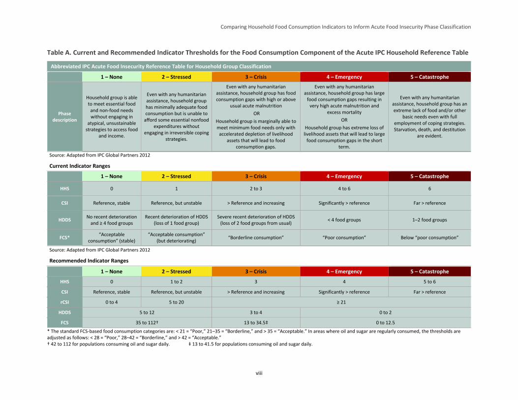
Table A. Current and Recommended Indicator Thresholds for the Food Consumption Component of the Acute IPC Household Reference Table
Abbreviated IPC Acute Food Insecurity Reference Table for Household Group Classification
1 – None 2 – Stressed 3 – Crisis 4 – Emergency 5 – Catastrophe
Phase description
Household group is able to meet essential food
and non-food needs without engaging in
atypical, unsustainable strategies to access food
and income.
Even with any humanitarian assistance, household group has minimally adequate food consumption but is unable to
afford some essential nonfood expenditures without
engaging in irreversible coping strategies.
Even with any humanitarian assistance, household group has food consumption gaps with high or above
usual acute malnutrition
OR
Household group is marginally able to meet minimum food needs only with accelerated depletion of livelihood
assets that will lead to food consumption gaps.
Even with any humanitarian assistance, household group has large
food consumption gaps resulting in very high acute malnutrition and
excess mortality
OR
Household group has extreme loss of livelihood assets that will lead to large
food consumption gaps in the short term.
Even with any humanitarian assistance, household group has an extreme lack of food and/or other
basic needs even with full employment of coping strategies. Starvation, death, and destitution
are evident.
Source: Adapted from IPC Global Partners 2012
Current Indicator Ranges
1 – None 2 – Stressed 3 – Crisis 4 – Emergency 5 – Catastrophe
HHS 0 1 2 to 3 4 to 6 6
CSI Reference, stable Reference, but unstable > Reference and increasing Significantly > reference Far > reference
HDDS No recent deterioration
and ≥ 4 food groups Recent deterioration of HDDS
(loss of 1 food group) Severe recent deterioration of HDDS
(loss of 2 food groups from usual) < 4 food groups 1–2 food groups
FCS* “Acceptable
consumption” (stable) “Acceptable consumption”
(but deteriorating) “Borderline consumption” “Poor consumption” Below “poor consumption”
Source: Adapted from IPC Global Partners 2012
Recommended Indicator Ranges
1 – None 2 – Stressed 3 – Crisis 4 – Emergency 5 – Catastrophe
HHS 0 1 to 2 3 4 5 to 6
CSI Reference, stable Reference, but unstable > Reference and increasing Significantly > reference Far > reference
rCSI 0 to 4 5 to 20 ≥ 21
HDDS 5 to 12 3 to 4 0 to 2
FCS 35 to 112† 13 to 34.5‡ 0 to 12.5
* The standard FCS-based food consumption categories are: < 21 = “Poor,” 21–35 = “Borderline,” and > 35 = “Acceptable.” In areas where oil and sugar are regularly consumed, the thresholds are adjusted as follows: < 28 = “Poor,” 28–42 = “Borderline,” and > 42 = “Acceptable.” † 42 to 112 for populations consuming oil and sugar daily. ‡ 13 to 41.5 for populations consuming oil and sugar daily.
Comparing Household Food Consumption Indicators to Inform Acute Food Insecurity Phase Classification
1
1 Introduction
Food security can be described and measured according to a variety of definitions, dimensions,
timeframes, and units of analysis. The most common definition is that of the Food and Agriculture
Organization of the United Nations (FAO): “All people, at all times, have physical and economic access
to sufficient, safe, and nutritious food to meet their dietary needs and food preferences for an active and
healthy life.”9 With so many factors folded into a single construct, the rapid, accurate, and comparable
measurement of food security has presented a longstanding puzzle to academics, policymakers, and
practitioners (Maxwell and Frankenberger 1992). A complete understanding of food security relies on a
variety of different measures, units of analysis, timeframes, and methods of information collection and
analysis.
The Integrated Food Security Phase Classification (IPC) engages in this type of multifaceted analysis. It
draws on food security indicators and related risk, livelihood, and nutrition information to classify the
severity of food insecurity situations over time and across geographic space and to guide appropriate
response. Developed by the FAO Food Security Analysis Unit (now the Food Security and Nutrition
Analysis Unit, or FSNAU) in Somalia in 2004, the IPC has been led since 2008 by a group of food
security-focused institutions and has expanded its mandate from classifying acute food insecurity to
include developing and providing guidance on the classification of chronic food insecurity and acute
malnutrition (IPC Partners 2012).10
Indicators included in the IPC’s reference tables for acute and chronic food insecurity and acute
malnutrition are supported by a body of scientific evidence from applications outside of the IPC that
attests to each indicator’s ability to capture one or more dimensions of food insecurity, its causes, and/or
its consequences. The acute IPC technical manual includes guidelines for how analysts should incorporate
different indicators into the phase classification process. Phase classification relies on a range of
information, including (1) indicators of food consumption, livelihood change, nutrition, and mortality
outcomes and (2) indicators associated with hazards and vulnerability and the various food security pillars
(availability, access, utilization, and stability). The Household Food Consumption Indicator Study
(HFCIS), the process for and findings of which are presented here, focused specifically on a subset of the
household food consumption indicators (introduced below) used in acute IPC analysis.
Utilizing food consumption outcome indicators for acute IPC classification relies on several underlying
assumptions: (1) the acute IPC’s food consumption metrics are well-suited to detect insufficient caloric
intake, which the IPC considers the benchmark of greatest interest for acute classification; (2) these
metrics have a spatially and temporally invariant relationship to caloric adequacy, and (3) these metrics
are significantly inter-correlated such that the information they generate offers a relatively consistent
picture of the nature and severity of food insecurity that can be used together with other information to
generate a classification. However, to date, few empirical studies have examined these assumptions.
9 FAO. 2002. The State of Food Insecurity in the World 2001. Rome: FAO, pp. 4–7. 10 IPC Partners include FAO, the United Nations World Food Programme (WFP), CARE, the Famine Early Warning Systems
Network (FEWS NET), the Food Security Cluster, the European Commission, Oxfam, and Save the Children. Funders include
AusAid, Germany’s Federal Ministry of Economic Cooperation and Development (BMZ), the Government of Canada, the
European Commission, the Swedish International Development Cooperation Agency, the United Kingdom’s Department for
International Development, and the United States Agency for International Development (USAID). In addition to supporting this
study, the Food and Nutrition Technical Assistance III Project (FANTA) served on the IPC’s chronic working group, as well as
the food security and harmonization working groups. FANTA participates in an observer status on the IPC nutrition working
group.
Comparing Household Food Consumption Indicators to Inform Acute Food Insecurity Phase Classification
2
This report has four main objectives. The first objective is to briefly introduce the categories of indicators
and specific measures of acute food insecurity that are incorporated into Version 2.0 of the acute IPC
technical manual. More specifically, this objective focuses on the subset of household food consumption
outcome indicators used in the IPC’s Acute Food Insecurity Reference Table for Household Group
Classification (household reference table), as well as other comparable food consumption measures.
These indicators include: the Household Dietary Diversity Score (HDDS), the Food Consumption Score
(FCS), the Household Hunger Score (HHS), and the Coping Strategies Index (CSI) and related Reduced
Coping Strategies Index (rCSI). Section 2 of this report addresses this objective.
The second objective of this report is to summarize available evidence on the relationships between these
indicators (how they relate to each other in terms of how each classifies food security and, to the extent
possible, how they relate to different phases of the acute IPC). The literature review in Section 3
addresses this objective and notes key issues that complicate the process of converging individual
indicators toward a single qualitative phase description as is done in acute IPC analysis.
The third objective of this report is to present an analysis of how the subset of household food
consumption indicators used in the acute IPC’s household reference table and under study here (see Table
1) relate to one another and to the phase cutoffs in the household reference table. Section 4 describes the
analytical methods used for this analysis and Section 5 presents the findings.
Table 1. Description of Indicators Used
Indicator Type of Information Recall Period
Type of Item Weighting
Reduced Coping Strategies Index (rCSI)
Behaviors taken to mitigate or react to shortfalls in food supply (rCSI is a subset of CSI and is generally understood to capture relatively less extreme coping strategies)
1 week or 1 month
More severe behaviors weighted more heavily
Coping Strategies Index (CSI) Same as rCSI, with a larger set of context-specific questions spanning a wider range of severity
1 week or 1 month
More severe behaviors weighted more heavily
Food Consumption Score (FCS)
Diet diversity based on food groups consumed
1 week More nutrient-dense food groups weighted more heavily
Household Dietary Diversity Score (HDDS) Diet diversity based on food groups consumed
1 day Unweighted
Household Hunger Score (HHS)
Cross-culturally validated questions on extreme food insufficiency, based on parent Household Food Insecurity and Access Scale (HFIAS)
1 month Unweighted
The fourth objective of this report is to outline what the findings of the HFCIS imply for future IPC
analysis, and in particular future acute IPC analysis, and to recommend associated modifications to IPC
analytical procedures. These implications and recommended modifications, as well as suggested areas of
future research, are presented in Section 6.
The appendices present additional supporting information from this study. Appendices A–F contain many
of the more specific, detailed results of this analysis for interested readers. Appendix G presents a

Comparing Household Food Consumption Indicators to Inform Acute Food Insecurity Phase Classification
3
complementary exploratory analysis, undertaken by the Food Economy Group through FEWS NET, of
the relationship between these quantitative indicators and available Household Economy Approach
(HEA) data.
Comparing Household Food Consumption Indicators to Inform Acute Food Insecurity Phase Classification
4
2 Food Security Measurement and the IPC Approach
2.1 Food Security Measurement
Food security indicators often measure attributes of one or more of the food security “pillars”
(availability, access, utilization, and vulnerability/risk—sometimes labeled “stability”11). Some of these
indicators capture “objective” information (e.g., dietary, economic, and health indicators), while others
capture “experiential” information (e.g., perceived adequacy of consumption, exposure to risk, and
cultural acceptability of foods) (Barrett 2010). Temporal aspects also differ in the measurement of food
security. These are usually expressed in terms of “acute food insecurity,” often associated with the impact
of a particular idiosyncratic or covariate shock, or “chronic food insecurity,” usually associated with a
persistent condition of poverty or marginalization (Headey 2012). In practice, acute food insecurity is
often used to label emergency situations in which short-term fluctuations in access are critical to monitor
and respond to, while chronic food insecurity is ascribed to longer-term situations or protracted
constraints to access that may not be subject to short-term fluctuations of large magnitude.
There is no “clinical assessment” for food security at the household level, and to date there is no widely
accepted “gold standard” measure of it. Over the past 20 years, a variety of indicators have emerged that
attempt to measure food security along a continuum and estimate its prevalence using thresholds that
categorize households as food secure or food insecure. Yet differing views remain about the best way to
measure food security (Heady and Ecker 2012; Carletto et al. 2013; Coates 2013; Maxwell et al. 2013),
which can result in divergent or even contradictory findings (de Haen et al. 2011). Because different
indicators reflect different food security dimensions,12 the general consensus is that a single measure
cannot adequately capture the complexity of the whole concept. Given this, it is common practice to
identify and apply a “suite” of indicators that capture the different dimensions of food security (Cafiero,
2012; FAO/WFP/International Fund for Agricultural Development (IFAD) 2013, Coates 2013).
It has been more than a decade since the international community began work to identify and agree on
which indicators would constitute such a “suite” and to understand how these indicators interrelate to
reflect the aforementioned dimensions and measurement objectives (FIVIMS 2002). However,
disagreement remains over how such a suite should be used in practice. While some continue to seek
options for aggregating food security information, others argue against seeking a single instrument that
aggregates diverse indicators, information sources, and methods (Carletto et al. 2013). Still others assert
that while aggregation may be necessary for certain purposes, measuring and reporting each dimension of
food insecurity separately is the preferred approach for diagnostic and evaluative objectives, particularly
given that the different dimensions are not necessarily correlated with each other in all contexts (Coates
2013).
2.2 The IPC Approach
Numerous approaches have been put forward to classify famine (Salama et al. 2001; Howe and Devereux
2004; FAO 2008). However, before the FAO Food Security and Nutrition Analysis Unit (FSNAU) for
11 Patrick Webb and Beatrice Rogers. 2003. Addressing the “In” in Food Insecurity. Occasional Paper No. 1. USAID Office for
Food for Peace. 12 Food security dimensions include stability, quantity, quality, acceptability, and safety (Coates 2013).
Comparing Household Food Consumption Indicators to Inform Acute Food Insecurity Phase Classification
5
Somalia13 developed the Integrated Phase Classification System (now referred to as the Integrated Food
Security Phase Classification, IPC) in 2004 for use in classifying the severity of food insecurity in
Somalia, there was no explicit and concerted (and, over time, widely adopted) effort to use disparate
indicators capturing multiple aspects of food security and its causes and consequences in a systematic
way for improved analysis, consensus-building, and response (FAO 2008). Version 2.0 of the acute IPC
builds on the experience of several years of acute IPC analysis in various contexts and relies on an
analytical framework drawn from four well-known conceptual frameworks: the risk analysis framework,
the sustainable livelihoods approach, the UNICEF framework for understanding undernutrition, and the
four “pillars” of food security (IPC Partners 2012).
In its own words, the IPC is “is a set of standardized tools that aims at providing a ‘common currency’ for
classifying the severity and magnitude of food insecurity.”14 The IPC’s Acute Food Insecurity Reference
Table for Household Group Classification (household reference table) and Acute Food Insecurity
Reference Table for Area Classification include five phases of acute food insecurity: None/Minimal,
Stressed, Crisis, Emergency, and Catastrophe/Famine. Four categories of indicators are used to reach
phase classification decisions: food consumption, livelihood change, prevalence of undernutrition, and
mortality (IPC Partners 2012). IPC analysis relies on a “convergence of evidence” approach to assess a
range of information within these four categories. This method recognizes that individual food security
data sources are likely to be incomplete, inconclusive, and/or insufficient, but that analytical judgments of
the entire body of evidence may allow consensus on the severity of food insecurity in a particular context.
In IPC analysis, acute classification is typically carried out first at the household group level15 (where
available food consumption and livelihood change outcome indicators are converged) and then at the area
level (where information from the household group-level classification is converged with available area-
based indicators of nutritional status and mortality16).17 According to Version 2.0 of the acute IPC’s
analytical approach, at least 20 percent of the population of a geographic area must be classified in a
given phase or worse before that area is depicted in that phase on acute IPC maps. Indeed, it is the most
severe phase into which at least 20 percent of the analyzed population falls, rather than the phase in which
13 The FSNAU was originally referred to as the Food Security Assessment Unit for Somalia (FSAU). The FSAU began in 1994
with funding from United States Agency for International Development’s Office of U.S. Foreign Disaster Assistance. Donor
support was broadened to include the European Commission and others the following year, and FSAU was operated jointly by
WFP and FAO. Nutrition surveillance was added to the FSAU’s remit in 2000, and its name was changed to the FSNAU in 2009.
The FSNAU is now a multi-donor-funded, independent analysis unit managed by FAO/Somalia. 14 http://www.ipcinfo.org/. 15 Households can be grouped based on variations in wealth, ethnic affiliation, livelihood, etc. Analysis of multiple household
groups within an area can be undertaken, assuming data availability, but must be done one group at a time. 16 Depending on the data source, area-based indicators may reference the same geographic area in which household group-level
classification is done or, more often, a broader geographic area. In the latter instance, analysts must use their judgment to
determine how best to converge the available area indicators with information from the household group classification. 17 The acute IPC also allows for area-only classification, depending on data availability and time and capacity constraints
associated with the analysis. In area-only classification, proportions of the population in other phases cannot be derived.
Comparing Household Food Consumption Indicators to Inform Acute Food Insecurity Phase Classification
6
the majority of the analyzed population falls, that acute IPC maps depict.18 Where information on
proportions of the population in other phases (not depicted on the map) is available, it is also noted.
2.3 Indicators in the Acute IPC Household Reference Table
As previously stated, the acute IPC household reference table includes a number of measures associated
with different food security categories (e.g., food consumption, livelihood change). For the food
consumption category, which the acute IPC describes as encompassing the quantity (referring to the
commonly used estimate of 2,100 kcals per person per day19) and nutrient quality (referring to
micronutrient content20) of food eaten,21 the associated indicators are:
HDDS: An indicator developed by the Food and Nutrition Technical Assistance Project (FANTA)
that captures the quantity and, to a lesser degree, quality of household food consumption
FCS: An indicator developed by WFP that captures the quantity and quality of [household] food
consumption
HHS: An indicator developed by FANTA that measures the experiences associated with severe
manifestations of household hunger
CSI: An indicator developed by Maxwell and Caldwell (2008) that tracks changes in household
behaviors and indicates an associated degree of food insecurity when compared over time or to a
baseline
HEA: An approach developed by Save the Children and the Food Economy Group (2008) to
comprehensively examine livelihood strategies and the impact of shocks on food consumption and
other livelihood needs.22
The acute IPC household reference table also includes other measures not explicitly explored in this paper
pertaining to livelihood change23, as well as information on background hazards and vulnerability, and
overall measures of food availability, access, utilization, and stability (IPC Partners 2012). The IPC Acute
Food Insecurity Reference Table for Area Classification also includes measures of nutritional status
18 For example, for a given household group, 20 percent of the population may be classified as acute IPC Phase 1, 45 percent in
acute IPC Phase 2, 30 percent in acute IPC Phase 3, 5 percent in acute IPC Phase 4, and no one within the group in acute IPC
Phase 5. In this instance, the acute IPC map would depict Phase 3, as (more than) 20 percent of the population falls into Phase 3
or worse. In another example, for a given household group, 30 percent of the population may be classified as acute IPC Phase 1,
40 percent in acute IPC Phase 2, 10 percent in acute IPC Phase 3, 15 percent in acute IPC Phase 4, and 5 percent in acute IPC
Phase 5. In this instance, the acute IPC map would depict Phase 4, as 20 percent of the population of that household group falls
into Phase 4 or worse (Phase 5). 19 According to the World Health Organization (WHO), this estimate covers the energy needs of a typical population in a
developing country. It assumes a standard population distribution, body size, ambient temperature, pre-emergency nutritional
status, and light physical activity level (WHO 2004). 20 The acute IPC does not focus on specific measures of the quality of food consumption but captures this aspect, in part, through
some of the food consumption outcome indicators it employs, such as HDDS and FCS. 21 IPC Partners 2012, pp. 29–31. 22 HEA is included in the acute IPC, but HEA is not an indicator per se. It is an analytical framework that relies on a set of data
collection and analysis procedures, assumptions, and outcomes different from the other indicators mentioned here. Appendix G
summarized the findings of an exploratory analysis of the relationship of the HEA to current IPC acute classification. 23 Acute IPC measures of livelihood change include three levels of livelihood-related coping: insurance strategies (e.g., reversible
coping, preserving productive assets, reducing food intake); crisis strategies (e.g., irreversible coping threatening future
livelihoods, selling productive assets); and distress symptoms (e.g., exhaustion of all coping mechanisms, starvation, death).
Comparing Household Food Consumption Indicators to Inform Acute Food Insecurity Phase Classification
7
(prevalence of wasting and low body mass index) and mortality (crude mortality and death rates among
children under 5).
2.4 Description of Key Study Indicators
This study examines a subset of the acute IPC’s food consumption indicators. While the IPC
acknowledges that food consumption comprises both caloric and micronutrient intake, this study begins
from an understanding that quantity deficits (measured by caloric inadequacy) are the primary
characteristic of food consumption that the acute IPC aims to classify. The typical means of measuring
caloric intake is either by conversion of 24-hour recall of all food consumed by members of a household
or the conversion of the previous 7 days’ worth of food purchases into the aggregate caloric value of the
food, divided by the number of people “sharing the same pot,” taking into consideration the different ages
and sexes of individuals in each household. This figure is then often compared to a cutoff representing the
minimum caloric intake requirement for that household’s composition (Smith and Subandoro 2007;
Swindale and Ohri-Vachaspati 2005). As mentioned above, the current acute IPC household reference
table uses a cutoff of 2,100 kcals per person per day (see footnote 19) as the threshold for caloric
adequacy (IPC Partners 2012). The key indicators examined in this study and a brief description of their
construction follow:
1. HDDS.24 The HDDS sums the total number of food groups (out of 12 possible groups) that any
member in the household has consumed over the previous 24 hours. Only foods consumed in the
home are counted in this indicator, and each food group is equally weighted, for a total possible score
ranging from 0 to 12. The 12 food groups HDDS captures are: cereals, root and tubers, vegetables,
fruits, meat and poultry, eggs, fish and seafood, pulses and legumes, milk/dairy products, fat and oil,
sugar, and other miscellaneous foods. The HDDS guidelines state that normative data on ideal/target
scores for the indicator are usually not available, but that context-specific thresholds can be developed
(Swindale and Bilinski 2006). The current acute IPC indicator thresholds for HDDS are: HDDS of ≥
4 with no recent deterioration (Phase 1), recent deterioration/loss of one food group from a typical
HDDS (Phase 2), severe recent deterioration of HDDS/loss of two food groups from typical HDDS
(Phase 3), HDDS < 4 (Phase 4), and HDDS of 1–2 (Phase 5) (IPC Partners 2012).
2. FCS.25 The FCS is a composite score based on the number of food groups (out of 8 possible food
groups) that any household member has consumed over the previous 7 days, multiplied by the
number of days that the food group was consumed, weighted by the nutritional importance of the food
group, for a total possible score ranging from 0 to 112. Only foods consumed in the home are counted
in this indicator. Broad food groups and associated FCS weights are: main staples—weighted at 2,
pulses—weighted at 3, vegetables—weighted at 1, fruit—weighted at 1, meat and fish—weighted at
4, milk—weighted at 4, sugar—weighted at 0.5, and oil—weighted at 0.5. (Condiments can also be
captured but are weighted at 0). Thresholds are imposed on the continuous score to differentiate
households into one of three categories: acceptable (> 35, > 42 in areas where oil and sugar are
consumed regularly), borderline (21–35; 28–42 in areas where oil and sugar are consumed regularly),
and poor (< 21; < 28 in areas where oil and sugar are consumed regularly) (WFP 2008). The current
24 Additional information on collecting, tabulating, and analyzing HDDS is available here:
http://www.fantaproject.org/sites/default/files/resources/HDDS_v2_Sep06_0.pdf. 25 Additional information on collecting, tabulating, and analyzing FCS is available here:
http://documents.wfp.org/stellent/groups/public/documents/manual_guide_proced/wfp197216.pdf.
Comparing Household Food Consumption Indicators to Inform Acute Food Insecurity Phase Classification
8
acute IPC indicator thresholds for FCS are: acceptable consumption, stable (Phase 1), acceptable but
deteriorating consumption (Phase 2), borderline (Phase 3), poor consumption (Phase 4), and below
poor consumption (Phase 5) (IPC Partners 2012).
3. CSI.26 Originally developed as an alternative to a food consumption survey questionnaire, the CSI
enumerates context-specific coping behaviors that household members rely on when they do not have
adequate food to consume and weights these behaviors according to their locally perceived severity.27
The measure then counts the frequency of identified behaviors through a survey and multiplies the
frequency by the determined severity weight, summing the results of each item to produce an index
score (Maxwell 1996; Maxwell and Caldwell 2008). Because of context specificity, the original CSI
scores were not comparable across different contexts, and the CSI does not have universal thresholds
for different categories of food insecurity but rather suggested measures against a location-specific
baseline. The current acute IPC household reference table suggests local baseline references for CSI,
mapping subsequent CSI measures against the reference as follows: subsequent measures showing
stability similar to the reference CSI (Phase 1), subsequent measures similar to the reference CSI but
showing instability (Phase 2), subsequent CSI greater than the reference and increasing (Phase 3),
subsequent CSI significantly greater than the reference (Phase 4), and subsequent CSI far greater than
the reference (Phase 5) (IPC Partners 2012). The CSI can be asked for either a 7-day or 30-day recall
period.
4. rCSI.28 To address the issue of the CSI’s context specificity, Maxwell et al. (2008) identified a subset
of coping behaviors and their related severity levels that were similar across all empirical contexts in
which the CSI had been measured. From this analysis, they suggested a “reduced” CSI (rCSI) that
was more universally applicable and included only five behaviors and associated (standard) weights.
In particular, this indicator captures how many times in the past 7 days any household member
engaged in the following behaviors: eating less preferred but less expensive foods—weighted at 1,
reducing the number of meals per day—weighted at 1, limiting portion size at mealtime—weighted at
1, prioritizing consumption for certain household members (e.g., limiting adult intake)—weighted at
3, and borrowing food/money from friends and relatives—weighted at 2, for a total possible index
score ranging from 0 to 56.29 Re-analyzing the data based on an index consisting of only these five
indicators produced results that correlated with other indicators as well as or better than the “full” CSI
(Maxwell and Caldwell 2008). The rCSI has been widely adopted, though it has not been integrated
26 Additional information on collecting, tabulating, and analyzing the CSI is available at:
http://www.seachangecop.org/sites/default/files/documents/2008%2001%20TANGO%20-
%20Coping%20Strategies%20Index.pdf. 27 The total possible CSI value varies by context, as no standard range of weights is required for the indicator, though a weighting
range of 1 to 4 is suggested (Maxwell and Caldwell 2008). 28 Additional information on collecting, tabulating, and analyzing the rCSI is available at:
http://www.seachangecop.org/sites/default/files/documents/2008%2001%20TANGO%20-
%20Coping%20Strategies%20Index.pdf. 29 While less common, a 30-day recall period for rCSI is also allowable, where the responses are in the form of day ranges—
never; seldom (3 days per month); sometimes (1-2 days per week); often (3-6 days per week); and daily. In such instances,
“seldom” responses are converted to a 7-day range by assuming that 3 days per month = 3/30 days = 0.1. Adjusted to weeks, this
is 0.1 * 7 = 0.7, which is rounded to 1. Thus, “seldom” responses are assumed to equate to 1 day per week. In addition, the
midpoint of the “sometimes” and “often” responses are rounded up, so they are interpreted as sometimes = 2 days per week and
often = 5 days per week. Daily is equal to 7 days per week.
Comparing Household Food Consumption Indicators to Inform Acute Food Insecurity Phase Classification
9
into the acute IPC household reference table and so does not have thresholds for acute IPC analysis.30
That said, given its close connection with CSI and its (perceived) more universal applicability, it was
included in this study.
5. HFIAS.31 The HFIAS grew out of a decade-long initiative of scale development and validation testing
sponsored by FANTA (Swindale and Bilinsky 2006). The first phase involved multiyear validation
studies in Bangladesh (Coates, Webb, and Houser 2003) and Burkina Faso (Frongillo and Nanama
2003). The results of these studies and others were harmonized to produce a nine-item indicator that
measures the frequency (rarely, sometimes, often) with which specific behaviors have occurred across
the previous 30 days. The HFIAS been widely adopted to assess the impacts of projects seeking to
improve food security. The HFIAS is conceptually similar to the CSI, except that it was intentionally
developed to reflect the four key underlying dimensions of food insecurity that appeared to be
universal from a review of ethnographic work on the subject: quantity, quality, preference, and
worry/uncertainty (Coates, Frongillo et al. 2006). The HFIAS underwent validation testing for
cultural invariance, which led to the creation of the HHS. The HFIAS does not feature in the acute
IPC household reference table, so it does not have thresholds for acute IPC analysis and therefore was
not included in this study’s analyses. However, because the HHS is a relatively common measure of
food insecurity and can be easily derived from HFIAS, analyses undertaken with the indicator have
been summarized in this study’s literature review.
6. HHS. The HHS consists of the last three questions from the HFIAS—the ones capturing experiences
that proved to be the most universal in terms of interpretation but also the most severe (Deitchler,
Ballard et al. 2010). These experiences include: having no food of any kind in the household, going to
sleep hungry because there was not enough food, and going a whole day and night without eating.
The response frequencies for HHS include “never,” “rarely,” “sometimes,” and “often” with
corresponding values of 0, 1, 1, and 2, respectively. The frequency of these experiences are summed
for each question to produce a scale with a range of 0–6. Questions for the HHS cover a 30-day recall
period. The current acute IPC indicator thresholds for the HHS are: HHS of 0 (Phase 1), HHS of 1
(Phase 2), HHS of 2–3 (Phase 3), HHS of 4–6 (Phase 4), and HHS of 6 (Phase 5) (IPC Partners
2012).
30 rCSI has replaced CSI as WFP’s commonly collected indicator of coping and is available in many datasets. Therefore, though
rCSI is not included in Version 2.0 of the acute IPC household reference table, it was considered in the HFCIS. 31 Additional information on collecting, tabulating, and analyzing HFIAS is available at:
http://www.fantaproject.org/sites/default/files/resources/HFIAS_ENG_v3_Aug07.pdf.
Comparing Household Food Consumption Indicators to Inform Acute Food Insecurity Phase Classification
10
3 Literature Review
3.1 Relationships among Measures of Food Security
A variety of studies have examined the comparability of different measures of food security, including
those indicators examined in this HFCIS. This section briefly reviews several of these studies, beginning
with recent studies that present relationships among different food security indicators and/or categories of
food security indicators. This is followed by a discussion of the implications of the existing research for
the HFCIS, from which three important conclusions are drawn.
3.1.1 Household Diet Diversity Indicators
Perhaps the most tested comparisons of different measures of food security have involved household diet
diversity indicators. A study conducted for WFP’s Strengthening Emergency Needs Assessment Capacity
project by Tufts University (Coates et al. 2007) compared various constructions of household diet
diversity indicators (including FCS and HDDS) in four different contexts to determine the best proxy for
household caloric intake.32 It also investigated which method of classifying households based on diet
diversity most accurately predicted household caloric adequacy. The study determined that the diet
diversity measures tested showed a consistent association with caloric adequacy: Spearman correlation
coefficients varied from 0.1 to 0.4, though the correlation was not significant for some of the relationships
tested (Coates et al. 2007). Importantly, the study also found that there was no single threshold (for any of
the diet diversity indicators) that could be used across all contexts to predict household caloric adequacy,
meaning that households in different contexts with the same diet diversity score did not necessarily have
similar levels of caloric intake.
Hoddinott and Yohannes (2002), in an earlier study, found that (with a few exceptions) there was a
significant correlation between household diet diversity—defined as the number of unique foods
consumed in the previous 7 days—and household per capita caloric availability in 10 countries.33 They
showed a range of correlation coefficients from 0.15 to 0.5, using both Pearson and Spearman correlation
coefficients (Hoddinott and Yohannes 2002).
A study by Wiesmann et al. (2009) also found significant associations between household diet diversity
indicators (FCS and HDDS) and household per capita caloric intake.34 The correlations between FCS and
household per capita caloric intake improved when small-quantity categories (e.g., sugar, oil) were
dropped from the FCS. Wiesmann et al. examined FCS cutoffs (used to define poor, borderline, and
adequate food consumption groups within the indicator; see Section 2.4 for a description of this indicator
and its group cutoffs) in relation to caloric adequacy. They found that the thresholds for FCS groups were
too low, meaning that they tended to undercount food insecurity compared to caloric intake. Wiesmann et
al. were not alone in noting FCS’s tendency to under-represent food insecurity compared to specified
measures of caloric intake (WFP 2012, Lovon and Mathiassen 2014, Mathiassen 2015). In addition to
excluding foods consumed in small quantities, Wiesmann et al. made several recommendations to
32 Household caloric intake in the Coates et al. (2007) study was derived from the pooled dataset using 2,100 kcals per adult
equivalent per day. 33 Household per capita caloric availability in the Hoddinott and Yohannes (2002) study was derived from the pooled dataset
using 2,100 kcals per adult equivalent per day. 34 Household per capita caloric intake in the Wiesmann et al. (2009) study was derived using 2,100 kcals per adult equivalent per
day.
Comparing Household Food Consumption Indicators to Inform Acute Food Insecurity Phase Classification
11
improve the validity of FCS, including recalibrating the cutoff points for the indicator’s different
categories (which would reduce the exclusion errors associated with the current cutoffs) and omitting the
indicator’s weighting factors since these made the analysis more complex but did not improve the
correlations with caloric measures (see Section 2.4 for a description of FCS weighting factors).
In a review of validation studies of FCS, Lovon and Mathiassen (2014) found that the standard
categorical thresholds for FCS frequently misclassified food insecurity defined in comparison to adequacy
of caloric intake.35 For example, in El Salvador, none of the households surveyed was classified as having
poor food consumption according to FCS categorical thresholds, but 20 percent of households were
classified as having poor caloric consumption (< 1,670 kcal/adult equivalent/day). Similarly, 2 percent of
households were classified as “borderline” by FCS, while 18 percent were classified that way according
to caloric intake (1,670–2,100 kcal). Similar results were noted in two other countries in Central America,
as well as in Nepal, Uganda, and Malawi. Lovon and Mathiassen suggested abandoning the attempt to
link FCS to household caloric intake and focusing instead on benchmarking FCS against a typical
(context-specific) food basket for low-income households because FCS is more highly correlated with
food basket measures and because sensitivity and specificity criteria are better met when setting
thresholds based on food poverty.
A study by Maxwell et al. (2013) compared seven food security indicators in northern Ethiopia: CSI,
rCSI, HFIAS, HHS, FCS, HDDS, and a self-assessed measure of food security (SAFS). Maxwell et al.
noted similar findings with regard to FCS: apart from HHS (which measures hunger, the most severe
manifestation of food insecurity), FCS tended to produce the lowest food insecurity prevalence estimates
of the indicators tested.36 Baumann et al. (2013) found that FCS underestimated food insecurity when
compared against a household caloric consumption standard,37 though, similar to Wiesmann et al. (2009),
Baumann et al. found that excluding foods consumed in small amounts (e.g., spices, condiments)
improved fit. The observation that FCS tends to give lower estimates of the prevalence of food insecurity
than caloric adequacy and other food security measures appears to be fairly widespread.
The studies reviewed in this section relied on data that were collected in situations of chronic food
insecurity. The Maxwell et al. 2013 study recommended further research on these indicators in
emergency-affected settings.
One study that tested food security indicators (HDDS and HHS) in acute emergencies was the
Cash/Voucher Monitoring Group for Somalia’s joint monitoring study, which examined the impact of
cash and voucher interventions during the Somalia famine of 2011–2012. While data quality concerns
necessitated the omission of much of the data from the Monitoring Group’s analysis of the relationship
between these indicators, the data that were used revealed a clear inverse relationship between HDDS and
HHS: as the impact of the cash and voucher interventions was felt, HDDS scores increased and HHS
scores declined (Hedlund et al. 2013).
35 Household caloric intake in the Lovon and Mathiassen (2015) study was derived from the pooled dataset using 2,100 kcals per
adult equivalent per day. 36 It should be noted that Maxwell et al. 2013 changed the recall period for all indicators examined to 30 days for comparative
purposes, rather than using the standard 7-day and 24-hour recalls for FCS and HDDS, respectively. 37 The household caloric consumption standard in the Baumann et al. (2013) study was derived using 2,100 kcals per adult
equivalent per day.
Comparing Household Food Consumption Indicators to Inform Acute Food Insecurity Phase Classification
12
Faber et al. (2009) compared HDDS, a living standards measure (months of food shortages),38 and HFIAS
in a small study in South Africa. They observed a relatively strong Spearman correlation of -0.45 between
HFIAS and HDDS,39 and the results of chi square tests suggested similar patterns in the categorization of
food secure and food insecure groups (using an HDDS cutoff of 4 and an HFIAS cutoff of 16).40 Kennedy
et al. (2010) found a high Spearman correlation between HDDS and FCS in Burkina Faso, Lao People’s
Democratic Republic (PDR), and northern Uganda (ranging from about 0.5 to 0.7). They also found a
high degree of agreement between these two indicators in identifying the most food insecure areas in
Uganda and Burkina Faso, but not in Lao PDR.41 Both indicators showed moderate correlations with
other proxy measures of food security, such as the number of meals consumed and various measures of
food expenditure (Kennedy et al. 2010).
3.1.2 Experiential Indicators
HHS and HFIAS
Becquey et al. (2010) measured HFIAS and an individual diet diversity score (IDDS) among women of
reproductive age in urban Burkina Faso and compared both with a household “mean adequacy ratio”
composed of energy and a range of micronutrients measured through two non-consecutive 24-hour recalls
of food consumed the day before the interviews. They concluded that both HFIAS and IDDS among
women provided reasonable estimates of diet adequacy at the population level but had insufficient
predictive power for targeting individual households. Gandure et al. (2010) found a significant, inverse
association between HFIAS and HDDS (r = –0.425) in Zimbabwe and demonstrated that households
reporting any food shortages in the past 12 months (using Months of Adequate Household Food
Provisioning, or MAHFP42) had worse HDDS and HFIAS scores than those that did not experience food
shortages (an average HDDS of 3.2 and an average HFIAS of 17.1 among households that experienced
food shortages, compared to an average HDDS of 3.9 and HFIAS of 12.0 among households that did not
experience food shortages, p < .05). A separate study by DeCock et al. (2013) measured HFIAS, HDDS,
MAHFP, percentage of total expenditure devoted to food, energy adequacy (measured by calculating
energy available to the household from production and purchases), and food poverty (a measure of the
ability to afford an identified low-cost, nutritious diet). Correlations between HFIAS and these other
indicators were highly significant and in the expected direction. The strongest correlation was between
HFIAS and MAHFP (r = –0.48, p < .001), followed by HFIAS and HDDS (r = –0.35, p < .001). Martin-
Prevel et al. (2012) found that both individual diet diversity and HFIAS worsened at a similar rate in
response to increasing food prices between 2007 and 2008 in Burkina Faso’s capital, Ouagadougou.
As previously noted, even though HFIAS and HHS are related measures that share a common origin, they
tend to provide different prevalence estimates of food insecurity due to the fact that HHS consists of the
three most severe questions on the HFIAS scale. During the HHS validation process, Deitchler et al.
(2010) examined the relationships between the proportion of households categorized by the HHS as
having “little to no,” “moderate,” and “severe” hunger and three different comparator indicators: HDDS,
38 The Faber et al. (2009) study defined months of food shortages as “months during which the household experienced a lack of
food such that one or more members of the household had to go hungry were recorded for the last 12 months.” 39 A negative correlation is expected, since HFIAS is a measure of food insecurity and HDDS is a measure of diet diversity (i.e.,
as food insecurity increases, diet diversity is expected to decrease). 40 Chi square tests are a common means of testing categorical associations. The HDDS and HFIAS cutoffs used here were
selected for this study and do not follow the standard indicator recommendations. 41 The association between the standard FCS cutoff points of ≤ 21 and 21–35 and selected HDDS cutoffs of ≤ 3 and ≤ 2 were
tested. 42 MAHFP is a household food consumption indicator that uses a 12-month recall to discern whether and the extent (number of
months) a household is able to meet its food needs. Additional information on collecting, tabulating, and analyzing MAHFP is
available at: http://www.fantaproject.org/sites/default/files/resources/MAHFP_June_2010_ENGLISH_v4.pdf.
Comparing Household Food Consumption Indicators to Inform Acute Food Insecurity Phase Classification
13
household wealth score, and a crude measure of income per consumption unit. For HDDS comparisons
carried out for three datasets (Zimbabwe, Malawi, and Mozambique), the proportion of households falling
into each HHS category at each value of HDDS were totaled. In each dataset, the proportion of
households with severe and moderate hunger decreased with higher diet diversity scores, and diet
diversity scores rose with an increased proportion of households having little to no hunger. Simple
multinomial logistic regression models found similar results: there was a statistically significant
association (p ≤ 0.001 for all models; the pseudo R-square ranged from 0.03 to 0.09) in the expected
direction with each HHS category; for each increasing HHS level of severity, there was a parallel
decrease in the coefficient of the independent variable (HDDS and the two other proxy indicators).
In the Maxwell et al. 2013 study, HHS produced the lowest prevalence estimates. On the other hand,
HFIAS—which includes questions about worries and less severe food insecurity experiences—produced
among the highest prevalence estimates in this study.
CSI and rCSI
In the Maxwell et al. 2013 study, CSI and rCSI correlated highly with the other measures that study
considered—HFIAS, HHS, FCS, HDDS, and SAFS (Spearman’s r ranged between 0.44 and 0.85)
(Maxwell et al. 2013). In an earlier study, Maxwell et al. (1999) compared the CSI to a number of food
security and nutritional measures and found that CSI (and some sub-indices, though this predated the
development of rCSI by a decade) correlated significantly but weakly with household per capita caloric
intake (kcals/adult equivalent/day) (Spearman’s r about 0.1) but correlated better with per capita
expenditure (Spearman’s r about 0.2). Comparing receiver operating characteristic (ROC) curve
analysis43 against the caloric intake indicator, this study indicated that CSI performed well as a screening
indicator, showing relatively few false negatives (i.e., excluding few genuinely calorie-deficient
households). Maxwell et al. (1999) also demonstrated ways that CSI could be broken into component
parts—including an index that only included food-rationing strategies (strategies employed when there is
not enough food to eat).44 The food rationing strategies index correlated much better with the caloric
intake indicator, which makes sense given that some of the other coping strategies are about actions taken
to maintain/protect caloric intake, rather than actions taken when there is not enough food to eat.
In an attempt to identify and test a more “universal” indicator based on coping strategies, Maxwell,
Caldwell, and Langworthy (2008) identified five coping behaviors from the original CSI that appeared in
all the context-specific instruments that had been developed by 2008. The resultant rCSI correlated as
well as or better than the original CSI with measures of food security and assets. For the most part,
Pearson correlations were on the order of 0.1 to 0.4 with food security indicators such as FCS.
Christiaensen et al. (2000) reported that CSI correlated as well with current caloric consumption per adult
equivalent as a study-defined diet diversity indicator. They also reported that CSI worked better as a
predictive measure of future household food consumption than either diet diversity or current caloric
intake, indicating that whatever else CSI measures, it does capture the element of vulnerability. Barrett
(2010) echoed the more general point that people foresee seasonal variation and other constraints to
adequate food consumption and alter their behaviors long before they are forced to cut consumption.
43 ROC analysis is a means of measuring the sensitivity and specificity of a diagnostic test compared to a benchmark. 44 Note that the original CSI included four different kinds of consumption coping strategies: diet change strategies, strategies that
increased household food availability (even if unsustainable), strategies that reduced the number of people to be fed, and
rationing strategies (strategies for managing a shortfall in household food availability). An index based only on the last category
correlated best with caloric intake.
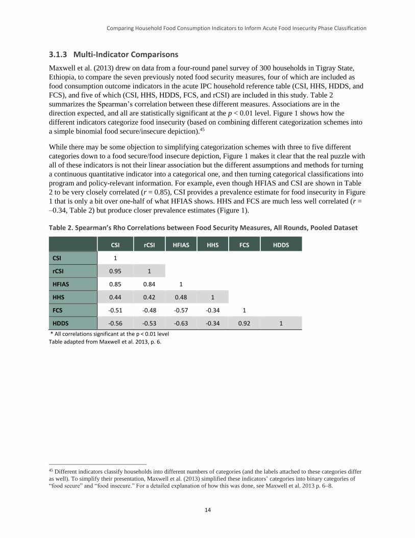
Comparing Household Food Consumption Indicators to Inform Acute Food Insecurity Phase Classification
14
3.1.3 Multi-Indicator Comparisons
Maxwell et al. (2013) drew on data from a four-round panel survey of 300 households in Tigray State,
Ethiopia, to compare the seven previously noted food security measures, four of which are included as
food consumption outcome indicators in the acute IPC household reference table (CSI, HHS, HDDS, and
FCS), and five of which (CSI, HHS, HDDS, FCS, and rCSI) are included in this study. Table 2
summarizes the Spearman’s correlation between these different measures. Associations are in the
direction expected, and all are statistically significant at the p < 0.01 level. Figure 1 shows how the
different indicators categorize food insecurity (based on combining different categorization schemes into
a simple binomial food secure/insecure depiction).45
While there may be some objection to simplifying categorization schemes with three to five different
categories down to a food secure/food insecure depiction, Figure 1 makes it clear that the real puzzle with
all of these indicators is not their linear association but the different assumptions and methods for turning
a continuous quantitative indicator into a categorical one, and then turning categorical classifications into
program and policy-relevant information. For example, even though HFIAS and CSI are shown in Table
2 to be very closely correlated (r = 0.85), CSI provides a prevalence estimate for food insecurity in Figure
1 that is only a bit over one-half of what HFIAS shows. HHS and FCS are much less well correlated (r =
–0.34, Table 2) but produce closer prevalence estimates (Figure 1).
Table 2. Spearman’s Rho Correlations between Food Security Measures, All Rounds, Pooled Dataset
CSI rCSI HFIAS HHS FCS HDDS
CSI 1
rCSI 0.95 1
HFIAS 0.85 0.84 1
HHS 0.44 0.42 0.48 1
FCS -0.51 -0.48 -0.57 -0.34 1
HDDS -0.56 -0.53 -0.63 -0.34 0.92 1
* All correlations significant at the p < 0.01 level
Table adapted from Maxwell et al. 2013, p. 6.
45 Different indicators classify households into different numbers of categories (and the labels attached to these categories differ
as well). To simplify their presentation, Maxwell et al. (2013) simplified these indicators’ categories into binary categories of
“food secure” and “food insecure.” For a detailed explanation of how this was done, see Maxwell et al. 2013 p. 6–8.
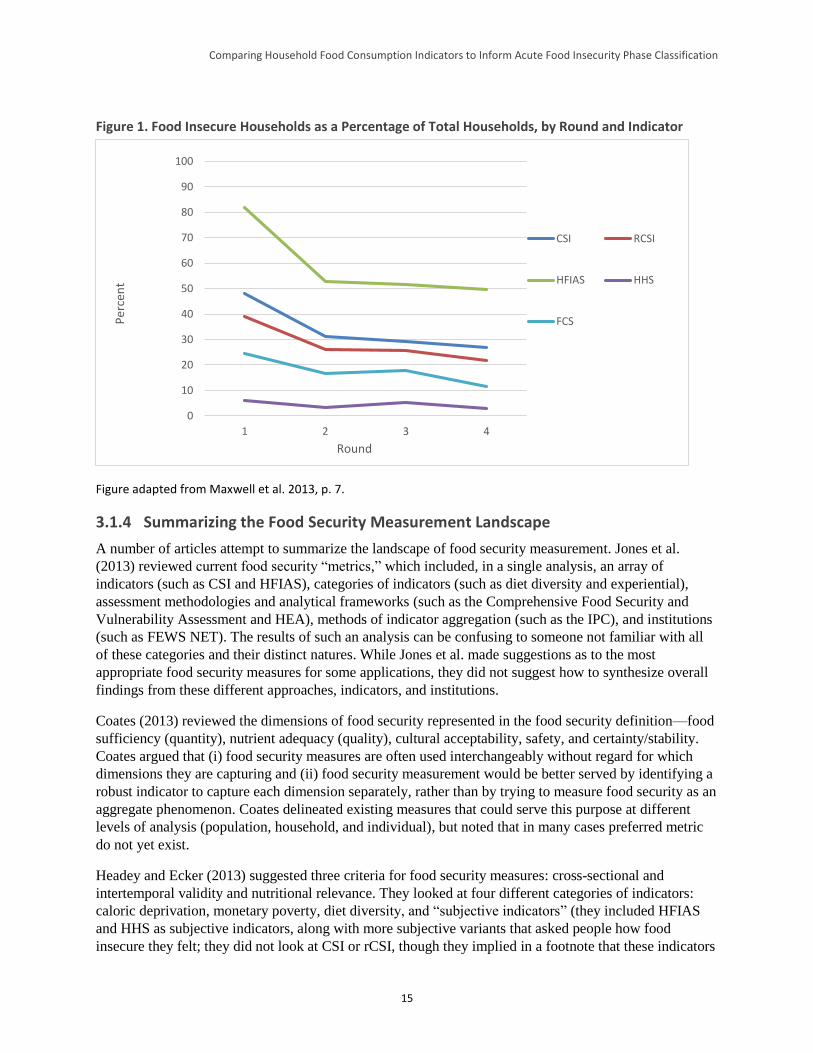
Comparing Household Food Consumption Indicators to Inform Acute Food Insecurity Phase Classification
15
Figure 1. Food Insecure Households as a Percentage of Total Households, by Round and Indicator
Figure adapted from Maxwell et al. 2013, p. 7.
3.1.4 Summarizing the Food Security Measurement Landscape
A number of articles attempt to summarize the landscape of food security measurement. Jones et al.
(2013) reviewed current food security “metrics,” which included, in a single analysis, an array of
indicators (such as CSI and HFIAS), categories of indicators (such as diet diversity and experiential),
assessment methodologies and analytical frameworks (such as the Comprehensive Food Security and
Vulnerability Assessment and HEA), methods of indicator aggregation (such as the IPC), and institutions
(such as FEWS NET). The results of such an analysis can be confusing to someone not familiar with all
of these categories and their distinct natures. While Jones et al. made suggestions as to the most
appropriate food security measures for some applications, they did not suggest how to synthesize overall
findings from these different approaches, indicators, and institutions.
Coates (2013) reviewed the dimensions of food security represented in the food security definition—food
sufficiency (quantity), nutrient adequacy (quality), cultural acceptability, safety, and certainty/stability.
Coates argued that (i) food security measures are often used interchangeably without regard for which
dimensions they are capturing and (ii) food security measurement would be better served by identifying a
robust indicator to capture each dimension separately, rather than by trying to measure food security as an
aggregate phenomenon. Coates delineated existing measures that could serve this purpose at different
levels of analysis (population, household, and individual), but noted that in many cases preferred metric
do not yet exist.
Headey and Ecker (2013) suggested three criteria for food security measures: cross-sectional and
intertemporal validity and nutritional relevance. They looked at four different categories of indicators:
caloric deprivation, monetary poverty, diet diversity, and “subjective indicators” (they included HFIAS
and HHS as subjective indicators, along with more subjective variants that asked people how food
insecure they felt; they did not look at CSI or rCSI, though they implied in a footnote that these indicators
0
10
20
30
40
50
60
70
80
90
100
1 2 3 4
Per
cen
t
Round
CSI RCSI
HFIAS HHS
FCS
Comparing Household Food Consumption Indicators to Inform Acute Food Insecurity Phase Classification
16
would fall in the same category)46 to assess which might be the best overall according to their criteria.
Headey and Ecker concluded that diet diversity measures have the most potential as overall food security
measures. They did not discuss ways that multiple indicators might be used together to improve food
security measurement. They emphasized, instead, choosing the category of indicator that performs the
best overall according to their criteria.
Carletto et al. (2013) reviewed a wide range of food security indicators, recognizing that no single
indicator or instrument will capture the full range of needed information. The authors suggested that pre-
existing national household consumption and expenditure surveys and other similar large-scale data
collection efforts could provide a mechanism for periodic collection of a harmonized “dashboard” of
indicators. However, they proposed a suite of standalone indicators, not a mechanism for integrating a
variety of indicators into a single classification as the acute IPC does.
Pangaribowo et al. (2013) reviewed national-level, composite food security indicators (e.g., the Global
Hunger Index, the Global Food Security Index), described their relationships to one another, and worked
to classify them according to the dimension of food security that they appeared to measure.47 They
considered the “dimensions of food insecurity” to be availability, access, utilization, and stability; the
“levels” of food insecurity to be national, household, and individual; the temporal scale of food insecurity
risks and impacts to be short-term and long-term; and the three main uses of a food security indicator to
be reporting on food security status/outcomes, measuring processes/interventions, and capturing
determinants/risks. The authors “mapped” the reviewed indicators according to each of these dimensions.
In so doing, they noted that composite indicators mix outcomes and drivers, making them difficult to
interpret for policy purposes. In addition, they noted that there is typically overlap between composite
indicators, so it is challenging to use them as complements to one another. Finally, the findings of
Pangaribowo et al. indicated that the dimension of stability is under-represented among the composite
indicators.
While Pangaribowo et al. attempted a conceptual mapping of indicators by dimension, neither they nor
any of the other studies identified in this literature review proposed a way in which a variety of indicators
might be pulled together to produce a single classification of food insecurity in the manner of the acute
IPC. As a result, while they each presented a good discussion of the existing compendium of measures,
none suggests a methodology for a comparison such as that put forth in this HFCIS.
3.2 Summary of Key Issues and Implications for Empirical Analysis
Several key themes emerged from the literature review and are highlighted below.
3.2.1 Dimensions of Food Security
None of the indicators of focus in this literature review (HDDS, FCS, HFIAS, HHS, and CSI/rCSI)
appears to capture all of the elements of food security that are contained in its most commonly used
definition. HDDS and FCS correlate with caloric intake and other measures of food consumption
quantity, but are also at least somewhat indicative of diet quality (see Smith 2006). CSI, HFIAS, and HHS
(particularly the rationing strategies the former two include) appear more linked to food consumption
46 This use of the term “subjective” in reference to HFIAS/HHS and CSI/rCSI is non-standard—typically, the preferred term is
“experiential.” 47 The Global Hunger Index is based on the prevalence of undernourishment (an FAO indicator), the prevalence of underweight
in children under 5, and the mortality rate of children under 5. More information on the Global Hunger Index is available at:
https://www.ifpri.org/topic/global-hunger-index. The Global Food Security Index relies on a mix of 28 individual indicators to
construct a combined measure of food affordability, availability, and quality across 109 different countries. More information on
the Global Food Security Index is available at: http://foodsecurityindex.eiu.com.
Comparing Household Food Consumption Indicators to Inform Acute Food Insecurity Phase Classification
17
sufficiency/adequacy, seemingly making them more closely indicative of quantity (see Coates 2013 and
Smith 2006). HFIAS and CSI both include items that capture preference, and HFIAS deliberately
includes an item to measure the psychological aspect of instability (worry/uncertainty). Christiaensen et
al. (2000) note that CSI is a better indicator of stability than are direct consumption measures such as
caloric intake. All of this implies that to capture a representative picture of food security, different
measures should be considered for their complementarity, rather than looking for the one “best”
standalone indicator. Aggregating information from a variety of indicators is also what the acute IPC
methodology prescribes (IPC Partners 2012).
3.2.2 Convergence among Indicators in Their Continuous and Categorical Forms
The food security indicators of focus in this literature review tend to be significantly associated with one
another when used in their continuous (scale or index) form, implying that all are capturing some
component of the same latent phenomenon (food insecurity). However, the work examined in this
literature review indicates that even those indicators that are highly correlated in their continuous forms
often provide very different prevalence estimates of food insecurity when used in their categorical forms.
One likely cause of these different prevalence estimates is the nature of the defining thresholds (or other
means of creating categories), which lack a gold standard(s) against which to calibrate these metrics. As a
result, each indicator uses a different set of thresholds, which contributes to a lack of alignment in
prevalence estimates. Unfortunately, improving alignment of prevalence estimates is not a simple matter
of selecting relatively analogous cutoff points for each indicator, as some indicators use cutoffs on a
continuous scale (FCS), while others use an algorithmic approach (HFIAS). The different approaches
used to select cutoffs are also responsible for some of the lack of convergence in prevalence among
different indicators.
The original HDDS methodology does not prescribe thresholds, although thresholds have been introduced
for IPC analysis. Various authors have suggested HDDS cutoff points that they used (Hedlund et al.
2013). Conversely, while FCS has “universal” thresholds, these do not consistently correlate well with
caloric intake in different contexts.
3.2.3 Objective and Subjective Indicators
Measuring the experiences of hunger, food insecurity, and famine is both an objective and a subjective
matter in the sense that while portions of the aggregate experience can be directly (objectively) measured
(e.g., comparison of calories consumed against an established minimum threshold for caloric intake),
other portions of the experience rely on (subjective) measures (e.g., perceptions of severity and worry).
Analyses tend to prioritize “objective” measures of these experiences for several reasons, including the
fact that objective measures are sometimes more comparable across contexts and that it can be difficult to
quantify some subjective experiences. Additionally, “objective” indicators are often preferred because of
fears of increased bias with subjective measures—that is, respondents who are asked subjective questions
or analysts who use subjective responses may attempt to “game the system” if there are resources at stake.
Yet there is ample evidence that objective measures of food insecurity can also be misleading, if not
outright wrong, if the measurement of subjective aspects of the experience is omitted completely
(Handino 2013; De Waal 2005). Finding the balance between subjective and objective measures, and
between comparability and context-specificity, is a constant challenge.48
48 This was, for example, the reason for deriving the Reduced Coping Strategies Index (rCSI), which is more comparable across
contexts since the behaviors and severity levels it uses are standard (based on available evidence about how similarly these are
perceived across different contexts). But there is little doubt that the original, context-specific CSI provides more nuanced
information about specific responses to inadequate access to food in a given location.
Comparing Household Food Consumption Indicators to Inform Acute Food Insecurity Phase Classification
18
3.2.4 Aggregate Methods versus Disaggregated Approaches
While it is clear that multiple indicators are required to capture a multifaceted phenomenon such as food
insecurity, few of the studies and papers examined for this literature review proposed an approach to
making this work in practice. Those who have thought about the challenge of applying multiple indicators
to capture a more holistic food security picture have approached it from different angles. Some propose
aggregating indicators—combining measures of different elements of food insecurity into a single scale—
as the acute IPC does. Others advocate for maintaining indicator results in a disaggregated form while
presenting their measures through cross-tabulations or other mechanisms that enable a transparent
examination of their relationships. While aggregating indicators offers the benefit of streamlining
communication about food insecurity, a more disaggregated approach recognizes that the various
dimensions of food insecurity are not always well correlated, nor do they always vary in the same
direction at a given time. Disaggregation (e.g., single indicators used in combination with one another, as
a “dashboard”) may provide a more useful set of diagnostic insights and can better assess which aspects
of food insecurity change, when, and for whom. Disaggregation also preserves the integrity of the
indicators applied, many of which may have undergone validation processes that informed their
construction.
3.2.5 Severity and Sensitivity
As previously discussed, the indicators reviewed for this study tend to be used fairly interchangeably,
without particular regard for which dimensions of food insecurity they capture (see Coates 2013 and
Maxwell et al. 2013). In addition, there was little discussion in the available literature about the ranges of
severity measured by each indicator or about which indicators are more sensitive to changes in food
consumption status or food security status more generally. The work by Maxwell et al. (2013) provided
initial insights into the issues of severity range and sensitivity to change. While the continuous form of
HFIAS measures a wide range of severity, the Maxwell et al. (2013) analysis suggested that HFIAS
cutoffs tend to categorize households as food insecure when the manifestations are still fairly mild. By
comparison, HHS has a more narrow severity range than HFIAS, as it is concentrated on the more severe
end of the spectrum. Households categorized as moderately/severely hungry using HHS thresholds tend to
exhibit more severe manifestations of food insecurity. CSI/rCSI and HDDS capture a broader range of
severity, but they do not have standard cutoffs. Regarding sensitivity to change, the analysis of Maxwell
et al. (2013) showed that all of these indicators (HFIAS, HSS, CSI/rCSI, and HDDS) followed similar
trajectories over four rounds of data collection when a common reference period of 30 days was used,
despite estimating rather different prevalences of food insecurity. This implies that the different measures
capture similar variability in the underlying phenomenon that presumably represented changes in food
insecurity. More analysis of sensitivity is needed to understand the best use of different indicators in
different contexts and to understand their relationship to the phase classifications in the acute IPC process.
The HFCIS examines these questions empirically.
3.2.6 Conclusion
To summarize, three main implications became clear from this literature review. First, the correlations
between the various food security indicators examined are significant and range from relatively weak
(0.1–0.2) to relatively strong (0.6–0.8). This suggests that they are capturing different aspects of food
security and/or are sensitive to food insecurity only in particular ranges of severity. Thus, the empirical
analysis of the HFCIS that follows suggests ways to extract the underlying aspect of food security
measured by each indicator and map the measurement overlap (or lack thereof) between indicators. The
HFCIS also attempts to illuminate the ranges of food insecurity in which each selected indicator is useful,
from infrequent food shortages (but perhaps psychological anxiety) to adverse nutritional outcomes.
Comparing Household Food Consumption Indicators to Inform Acute Food Insecurity Phase Classification
19
Second, the approaches utilized to create food security categories for each indicator strongly influence
how each indicator estimates food security prevalence and its relationship to other indicators. In the
absence of a food consumption gold standard, suggesting changes in threshold values—for use in the
acute IPC household reference table or more generally—is difficult and open to criticism. The HFCIS
performs a sensitivity analysis of how varying each indicator’s thresholds would impact interpretation of
food security in a given context and the implications of this on the process of acute IPC food insecurity
phase classification for household groups.
Finally, the studies and papers examined in this literature review clearly indicate that context matters. The
relationships between the indicators reviewed here and measures of caloric intake tend to vary by
location. This results in a trade-off that is built into practically any indicator choice: comparability across
contexts using standardized measures and thresholds versus the nuance of context-specific measures.
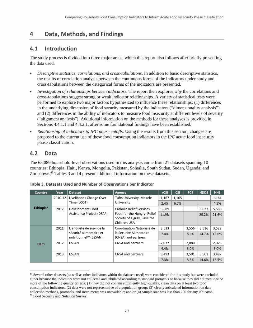
Comparing Household Food Consumption Indicators to Inform Acute Food Insecurity Phase Classification
20
4 Data, Methods, and Findings
4.1 Introduction
The study process is divided into three major areas, which this report also follows after briefly presenting
the data used.
Descriptive statistics, correlations, and cross-tabulations. In addition to basic descriptive statistics,
the results of correlation analysis between the continuous forms of the indicators under study and
cross-tabulations between the categorical forms of the indicators are presented.
Investigation of relationships between indicators. The report then explores why the correlations and
cross-tabulations suggest strong or weak indicator relationships. A variety of statistical tests were
performed to explore two major factors hypothesized to influence these relationships: (1) differences
in the underlying dimension of food security measured by the indicators (“dimensionality analysis”)
and (2) differences in the ability of indicators to measure food insecurity at different levels of severity
(“alignment analysis”). Additional information on the methods for these analyses is provided in
Sections 4.4.1.1 and 4.4.2.1, after some foundational findings have been established.
Relationship of indicators to IPC phase cutoffs. Using the results from this section, changes are
proposed to the current use of these food consumption indicators in the IPC acute food insecurity
phase classification.
4.2 Data
The 65,089 household-level observations used in this analysis come from 21 datasets spanning 10
countries: Ethiopia, Haiti, Kenya, Mongolia, Pakistan, Somalia, South Sudan, Sudan, Uganda, and
Zimbabwe.49 Tables 3 and 4 present additional information on these datasets.
Table 3. Datasets Used and Number of Observations per Indicator
Country Year Dataset Agency rCSI CSI FCS HDDS HHS
Ethiopiaa
2010-12 Livelihoods Change Over Time (LCOT)
Tufts University, Mekele University
1,167 1,165 1,164
2.4% 6.7% 4.5%
2012 Development Food Assistance Project (DFAP)
Catholic Relief Services, Food for the Hungry, Relief Society of Tigray, Save the Children USA
5,689 6,037 5,580
11.9% 25.2% 21.6%
Haiti
2011 L’enquête de suivi de la sécurité alimentaire et nutritionnel50 (ESSAN)
Coordination Nationale de la Securité Alimentaire (CNSA) and partners
3,533 3,556 3,516 3,522
7.4% 8.6% 14.7% 13.6%
2012 ESSAN CNSA and partners 2,077 2,080 2,078
4.4% 5.0% 8.0%
2013 ESSAN CNSA and partners 3,493 3,501 3,501 3,497
7.3% 8.5% 14.6% 13.5%
49 Several other datasets (as well as other indicators within the datasets used) were considered for this study but were excluded
either because the indicators were not collected and tabulated according to standard protocols or because they did not meet one or
more of the following quality criteria: (1) they did not contain sufficiently high-quality, clean data on at least two food
consumption indicators; (2) data were not representative of a population group; (3) clearly articulated information on data
collection methods, protocols, and instruments was unavailable; and/or (4) sample size was less than 200 for any indicator. 50 Food Security and Nutrition Survey.
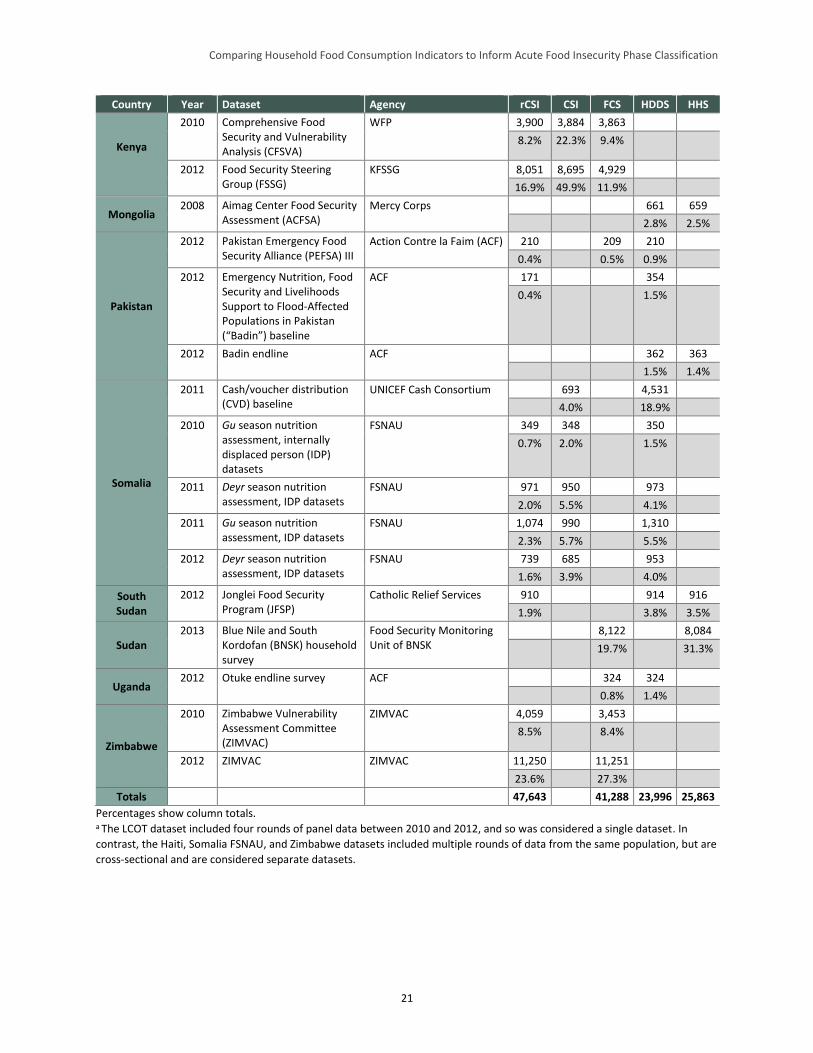
Comparing Household Food Consumption Indicators to Inform Acute Food Insecurity Phase Classification
21
Country Year Dataset Agency rCSI CSI FCS HDDS HHS
Kenya
2010 Comprehensive Food Security and Vulnerability Analysis (CFSVA)
WFP 3,900 3,884 3,863
8.2% 22.3% 9.4%
2012 Food Security Steering Group (FSSG)
KFSSG 8,051 8,695 4,929
16.9% 49.9% 11.9%
Mongolia 2008 Aimag Center Food Security
Assessment (ACFSA) Mercy Corps 661 659
2.8% 2.5%
Pakistan
2012 Pakistan Emergency Food Security Alliance (PEFSA) III
Action Contre la Faim (ACF) 210 209 210
0.4% 0.5% 0.9%
2012 Emergency Nutrition, Food Security and Livelihoods Support to Flood-Affected Populations in Pakistan (“Badin”) baseline
ACF 171 354
0.4% 1.5%
2012 Badin endline ACF 362 363
1.5% 1.4%
Somalia
2011 Cash/voucher distribution (CVD) baseline
UNICEF Cash Consortium 693 4,531
4.0% 18.9%
2010 Gu season nutrition assessment, internally displaced person (IDP) datasets
FSNAU 349 348 350
0.7% 2.0% 1.5%
2011 Deyr season nutrition assessment, IDP datasets
FSNAU 971 950 973
2.0% 5.5% 4.1%
2011 Gu season nutrition assessment, IDP datasets
FSNAU 1,074 990 1,310
2.3% 5.7% 5.5%
2012 Deyr season nutrition assessment, IDP datasets
FSNAU 739 685 953
1.6% 3.9% 4.0%
South Sudan
2012 Jonglei Food Security Program (JFSP)
Catholic Relief Services 910 914 916
1.9% 3.8% 3.5%
Sudan 2013 Blue Nile and South
Kordofan (BNSK) household survey
Food Security Monitoring Unit of BNSK
8,122 8,084
19.7% 31.3%
Uganda 2012 Otuke endline survey ACF 324 324
0.8% 1.4%
Zimbabwe
2010 Zimbabwe Vulnerability Assessment Committee (ZIMVAC)
ZIMVAC 4,059 3,453
8.5% 8.4%
2012 ZIMVAC ZIMVAC 11,250 11,251
23.6% 27.3%
Totals 47,643 41,288 23,996 25,863
Percentages show column totals. a The LCOT dataset included four rounds of panel data between 2010 and 2012, and so was considered a single dataset. In
contrast, the Haiti, Somalia FSNAU, and Zimbabwe datasets included multiple rounds of data from the same population, but are
cross-sectional and are considered separate datasets.
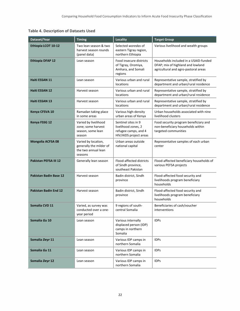
Comparing Household Food Consumption Indicators to Inform Acute Food Insecurity Phase Classification
22
Table 4. Description of Datasets Used
Dataset/Year Timing Locality Target Group
Ethiopia LCOT 10-12 Two lean season & two harvest season rounds (panel data)
Selected woredas of eastern Tigray region, northern Ethiopia
Various livelihood and wealth groups
Ethiopia DFAP 12 Lean season Food insecure districts of Tigray, Oromiya, Amhara, and Somali regions
Households included in a USAID-funded DFAP; mix of highland and lowland agricultural and agro-pastoral areas
Haiti ESSAN 11 Lean season Various urban and rural locations
Representative sample, stratified by department and urban/rural residence
Haiti ESSAN 12 Harvest season Various urban and rural locations
Representative sample, stratified by department and urban/rural residence
Haiti ESSAN 13 Harvest season Various urban and rural locations
Representative sample, stratified by department and urban/rural residence
Kenya CFSVA 10 Ramadan taking place in some areas
Various high-density urban areas of Kenya
Urban households associated with nine livelihood clusters
Kenya FSSG 12 Varied by livelihood zone; some harvest season, some lean season
Sentinel sites in 9 livelihood zones, 2 refugee camps, and 4 HIV/AIDS project areas
Food security program beneficiary and non-beneficiary households within targeted communities
Mongolia ACFSA 08 Varied by location, generally the milder of the two annual lean seasons
Urban areas outside national capital
Representative samples of each urban center
Pakistan PEFSA III 12 Generally lean season Flood-affected districts of Sindh province, southeast Pakistan
Flood-affected beneficiary households of various PEFSA projects
Pakistan Badin Base 12 Harvest season Badin district, Sindh province
Flood-affected food security and livelihoods program beneficiary households
Pakistan Badin End 12 Harvest season Badin district, Sindh province
Flood-affected food security and livelihoods program beneficiary households
Somalia CVD 11 Varied, as survey was conducted over a one-year period
9 regions of south-central Somalia
Beneficiaries of cash/voucher interventions
Somalia Gu 10 Lean season Various internally displaced person (IDP) camps in northern Somalia
IDPs
Somalia Deyr 11 Lean season Various IDP camps in northern Somalia
IDPs
Somalia Gu 11 Lean season Various IDP camps in northern Somalia
IDPs
Somalia Deyr 12 Lean season Various IDP camps in northern Somalia
IDPs
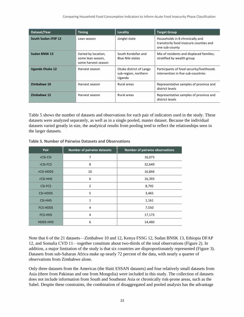
Comparing Household Food Consumption Indicators to Inform Acute Food Insecurity Phase Classification
23
Dataset/Year Timing Locality Target Group
South Sudan JFSP 12 Lean season Jonglei state Households in 8 chronically and transitorily food insecure counties and one sub-county
Sudan BNSK 13 Varied by location; some lean season, some harvest season
South Kordofan and Blue Nile states
Mix of residents and displaced families; stratified by wealth group
Uganda Otuke 12 Harvest season Otuke district of Lango sub-region, northern Uganda
Participants of food security/livelihoods intervention in five sub-countries
Zimbabwe 10 Harvest season Rural areas Representative samples of province and district levels
Zimbabwe 12 Harvest season Rural areas Representative samples of province and district levels
Table 5 shows the number of datasets and observations for each pair of indicators used in the study. These
datasets were analyzed separately, as well as in a single pooled, master dataset. Because the individual
datasets varied greatly in size, the analytical results from pooling tend to reflect the relationships seen in
the larger datasets.
Table 5. Number of Pairwise Datasets and Observations
Pair Number of pairwise datasets Number of pairwise observations
rCSI-CSI 7 16,073
rCSI-FCS 8 32,649
rCSI-HDDS 10 16,844
rCSI-HHS 6 16,393
CSI-FCS 2 8,792
CSI-HDDS 5 3,465
CSI-HHS 1 1,161
FCS-HDDS 4 7,550
FCS-HHS 4 17,173
HDDS-HHS 6 14,460
Note that 6 of the 21 datasets—Zimbabwe 10 and 12, Kenya FSSG 12, Sudan BNSK 13, Ethiopia DFAP
12, and Somalia CVD 11—together constitute about two-thirds of the total observations (Figure 2). In
addition, a major limitation of the study is that six countries are disproportionately represented (Figure 3).
Datasets from sub-Saharan Africa make up nearly 72 percent of the data, with nearly a quarter of
observations from Zimbabwe alone.
Only three datasets from the Americas (the Haiti ESSAN datasets) and four relatively small datasets from
Asia (three from Pakistan and one from Mongolia) were included in this study. The collection of datasets
does not include information from South and Southeast Asia or chronically risk-prone areas, such as the
Sahel. Despite these constraints, the combination of disaggregated and pooled analysis has the advantage
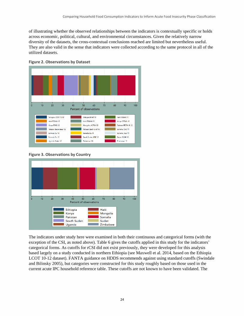
Comparing Household Food Consumption Indicators to Inform Acute Food Insecurity Phase Classification
24
of illustrating whether the observed relationships between the indicators is contextually specific or holds
across economic, political, cultural, and environmental circumstances. Given the relatively narrow
diversity of the datasets, the cross-contextual conclusions reached are limited but nevertheless useful.
They are also valid in the sense that indicators were collected according to the same protocol in all of the
utilized datasets.
Figure 2. Observations by Dataset
Figure 3. Observations by Country
The indicators under study here were examined in both their continuous and categorical forms (with the
exception of the CSI, as noted above). Table 6 gives the cutoffs applied in this study for the indicators’
categorical forms. As cutoffs for rCSI did not exist previously, they were developed for this analysis
based largely on a study conducted in northern Ethiopia (see Maxwell et al. 2014, based on the Ethiopia
LCOT 10-12 dataset). FANTA guidance on HDDS recommends against using standard cutoffs (Swindale
and Bilinsky 2005), but categories were constructed for this study roughly based on those used in the
current acute IPC household reference table. These cutoffs are not known to have been validated. The
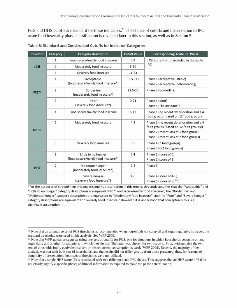
Comparing Household Food Consumption Indicators to Inform Acute Food Insecurity Phase Classification
25
FCS and HHS cutoffs are standard for these indicators.51 The choice of cutoffs and their relation to IPC
acute food insecurity phase classification is revisited later in this section, as well as in Section 5.
Table 6. Standard and Constructed Cutoffs for Indicator Categories
Indicator Category Category Description Cutoff Value Corresponding Acute IPC Phase
rCSI
1 Food secure/mildly food insecure 0-4 (rCSI currently not included in the acute IPC)
2 Moderately food insecure 5-10
3 Severely food insecure 11-63
FCS52
1 Acceptable (food secure/mildly food insecure*)
35.5-112 Phase 1 (acceptable, stable)
Phase 2 (acceptable, deteriorating)
2 Borderline (moderately food insecure*)
21.5-35 Phase 3 (borderline)
3 Poor (severely food insecure*)
0-21 Phase 4 (poor)
Phase 5 (“below poor”)
HDDS
1 Food secure/mildly food insecure 6-12 Phase 1 (no recent deterioration and ≥ 4 food groups (based on 12 food groups)
2 Moderately food insecure 4-5 Phase 1 (no recent deterioration and ≥ 4 food groups [based on 12 food groups])
Phase 2 (recent loss of 1 food group)
Phase 3 (recent loss of 2 food groups)
3 Severely food insecure 0-3 Phase 4 (3 food groups)
Phase 5 (0-2 food groups)
HHS
1 Little to no hunger (food secure/mildly food insecure*)
0-1 Phase 1 (score of 0)
Phase 2 (score of 1)
2 Moderate hunger (moderately food insecure*)
2-3 Phase 3
3 Severe hunger (severely food insecure*)
4-6 Phase 4 (score of 4-6)
Phase 5 (score of 6) 53
*For the purposes of streamlining this analysis and its presentation in this report, this study assumes that the “Acceptable” and
“Little to no hunger” category descriptions are equivalent to “Food secure/mildly food insecure”; the “Borderline” and
“Moderate hunger” category descriptions are equivalent to “Moderately food insecure”; and the “Poor” and “Severe hunger”
category descriptions are equivalent to “Severely food insecure.” However, it is understood that conceptually this is a
significant assumption.
51 Note that an alternative set of FCS thresholds is recommended when households consume oil and sugar regularly; however, the
standard thresholds were used in this analysis. See WFP 2009. 52 Note that WFP guidance suggests using two sets of cutoffs for FCS, one for situations in which households consume oil and
sugar daily and another for situations in which they do not. The latter was chosen for two reasons. First, evidence that the two
sets of thresholds imply equivalent caloric or micronutrient consumption is weak (WFP 2008). Second, the majority of the
analysis was run with both sets of households, and the results did not differ greatly from those presented; thus, for reasons of
simplicity of presentation, both sets of thresholds were not utilized. 53 Note that a single HHS score (6) is associated with two different acute IPC phases. This suggests that an HHS score of 6 does
not clearly signify a specific phase; additional information is required to make the phase determination.
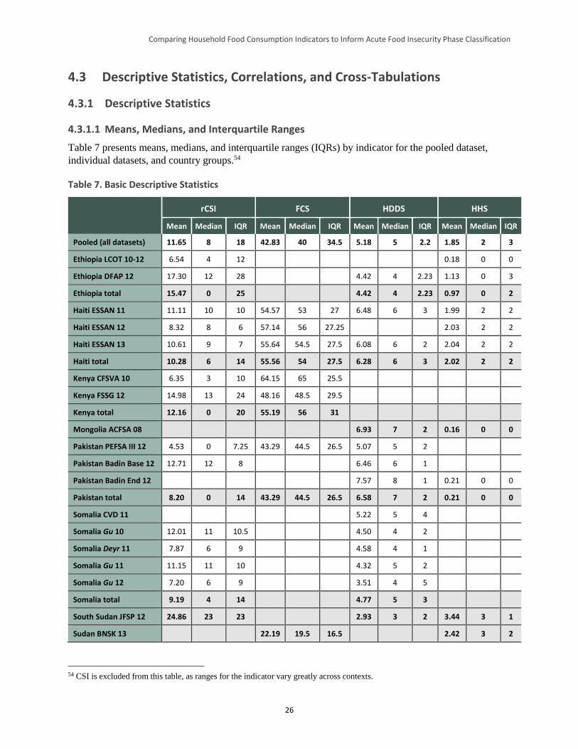
Comparing Household Food Consumption Indicators to Inform Acute Food Insecurity Phase Classification
26
4.3 Descriptive Statistics, Correlations, and Cross-Tabulations
4.3.1 Descriptive Statistics
4.3.1.1 Means, Medians, and Interquartile Ranges
Table 7 presents means, medians, and interquartile ranges (IQRs) by indicator for the pooled dataset,
individual datasets, and country groups.54
Table 7. Basic Descriptive Statistics
rCSI FCS HDDS HHS
Mean Median IQR Mean Median IQR Mean Median IQR Mean Median IQR
Pooled (all datasets) 11.65 8 18 42.83 40 34.5 5.18 5 2.2 1.85 2 3
Ethiopia LCOT 10-12 6.54 4 12 0.18 0 0
Ethiopia DFAP 12 17.30 12 28 4.42 4 2.23 1.13 0 3
Ethiopia total 15.47 0 25 4.42 4 2.23 0.97 0 2
Haiti ESSAN 11 11.11 10 10 54.57 53 27 6.48 6 3 1.99 2 2
Haiti ESSAN 12 8.32 8 6 57.14 56 27.25 2.03 2 2
Haiti ESSAN 13 10.61 9 7 55.64 54.5 27.5 6.08 6 2 2.04 2 2
Haiti total 10.28 6 14 55.56 54 27.5 6.28 6 3 2.02 2 2
Kenya CFSVA 10 6.35 3 10 64.15 65 25.5
Kenya FSSG 12 14.98 13 24 48.16 48.5 29.5
Kenya total 12.16 0 20 55.19 56 31
Mongolia ACFSA 08 6.93 7 2 0.16 0 0
Pakistan PEFSA III 12 4.53 0 7.25 43.29 44.5 26.5 5.07 5 2
Pakistan Badin Base 12 12.71 12 8 6.46 6 1
Pakistan Badin End 12 7.57 8 1 0.21 0 0
Pakistan total 8.20 0 14 43.29 44.5 26.5 6.58 7 2 0.21 0 0
Somalia CVD 11 5.22 5 4
Somalia Gu 10 12.01 11 10.5 4.50 4 2
Somalia Deyr 11 7.87 6 9 4.58 4 1
Somalia Gu 11 11.15 11 10 4.32 5 2
Somalia Gu 12 7.20 6 9 3.51 4 5
Somalia total 9.19 4 14 4.77 5 3
South Sudan JFSP 12 24.86 23 23 2.93 3 2 3.44 3 1
Sudan BNSK 13 22.19 19.5 16.5 2.42 3 2
54 CSI is excluded from this table, as ranges for the indicator vary greatly across contexts.
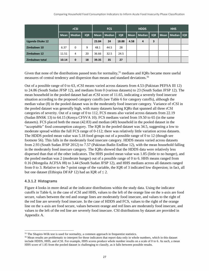
Comparing Household Food Consumption Indicators to Inform Acute Food Insecurity Phase Classification
27
rCSI FCS HDDS HHS
Mean Median IQR Mean Median IQR Mean Median IQR Mean Median IQR
Uganda Otuke 12 23.84 24 18.88 4.58 4 3
Zimbabwe 10 6.37 0 9 48.1 44.5 28
Zimbabwe 12 11.51 4 20 36.66 32.5 24.5
Zimbabwe total 10.14 0 18 39.35 35 27
Given that none of the distributions passed tests for normality,55 medians and IQRs became more useful
measures of central tendency and dispersion than means and standard deviations.56
Out of a possible range of 0 to 63, rCSI means varied across datasets from 4.53 (Pakistan PEFSA III 12)
to 24.86 (South Sudan JFSP 12), and medians from 0 (various datasets) to 23 (South Sudan JFSP 12). The
mean household in the pooled dataset had an rCSI score of 11.65, indicating a severely food insecure
situation according to the proposed category cutoffs (see Table 6 for category cutoffs), although the
median value (8) in the pooled dataset was in the moderately food insecure category. Variance of rCSI in
the pooled dataset was generally high, with many datasets having IQRs that spanned all three rCSI
categories of severity. Out of a range of 0 to 112, FCS means also varied across datasets from 22.19
(Sudan BNSK 13) to 64.15 (Kenya CFSVA 10). FCS medians varied from 19.50 to 65 (in the same
datasets). FCS placed both the mean (42.83) and median (40) household in the pooled dataset in the
“acceptable” food consumption category. The IQR in the pooled dataset was 34.5, suggesting a low to
moderate spread within the full FCS range of 0-112; there was relatively little variation across datasets.
The HDDS pooled mean value was 5.18 food groups out of a possible range of 0 to 12 (though see
footnote 56). This falls in the moderately food insecure category. HDDS means varied across datasets
from 2.93 (South Sudan JFSP 2012) to 7.57 (Pakistan Badin Endline 12), with the mean household falling
in the moderately food insecure category. The IQRs showed that the HDDS data were relatively less
dispersed than that of the other indicators. The HHS pooled mean value was 1.85 (little to no hunger), and
the pooled median was 2 (moderate hunger) out of a possible range of 0 to 6. HHS means ranged from
0.16 (Mongolia ACFSA 08) to 3.44 (South Sudan JFSP 12), and HHS medians across all datasets ranged
from 0 to 3. Relative to the 7-point range of the variable, the IQR of 3 indicated low dispersion; in fact, all
but one dataset (Ethiopia DFAP 12) had an IQR of ≤ 2.
4.3.1.2 Histograms
Figure 4 looks in more detail at the indicator distributions within the study data. Using the indicator
cutoffs in Table 6, in the case of rCSI and HHS, values to the left of the orange line on the x-axis are food
secure, values between the red and orange lines are moderately food insecure, and values to the right of
the red line are severely food insecure. In the case of HDDS and FCS, values to the right of the orange
line on the x-axis are food secure, values between orange and red lines are moderately food insecure, and
values to the left of the red line are severely food insecure. CSI distributions by dataset are provided in
Appendix A.
55 The Shapiro-Wilk test is used for normality, a common approach in frequentist statistics. 56 Mean results are problematic to interpret for those indicators that report data only in whole numbers, which in this dataset
include HDDS, HHS, and rCSI. For example, HHS scores produce whole number results on a scale of 0 to 6. As such, a mean
HHS score of 1.85 from the pooled dataset is challenging to classify, as it falls between possible results.
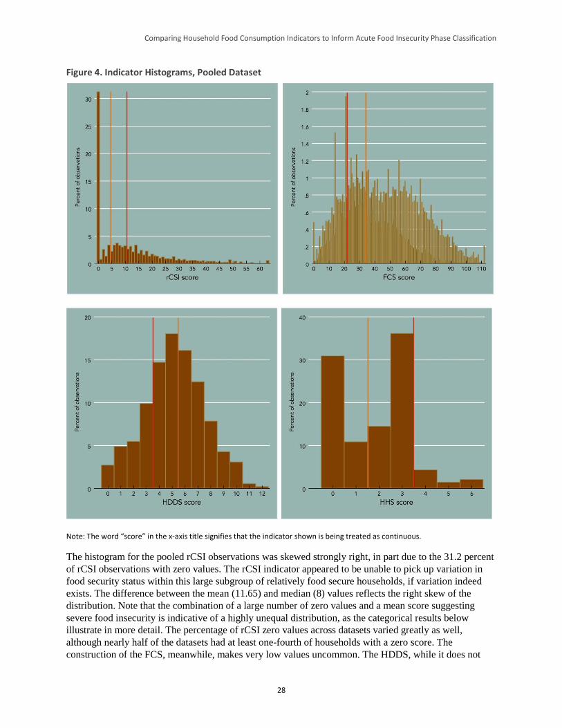
Comparing Household Food Consumption Indicators to Inform Acute Food Insecurity Phase Classification
28
Figure 4. Indicator Histograms, Pooled Dataset
Note: The word “score” in the x-axis title signifies that the indicator shown is being treated as continuous.
The histogram for the pooled rCSI observations was skewed strongly right, in part due to the 31.2 percent
of rCSI observations with zero values. The rCSI indicator appeared to be unable to pick up variation in
food security status within this large subgroup of relatively food secure households, if variation indeed
exists. The difference between the mean (11.65) and median (8) values reflects the right skew of the
distribution. Note that the combination of a large number of zero values and a mean score suggesting
severe food insecurity is indicative of a highly unequal distribution, as the categorical results below
illustrate in more detail. The percentage of rCSI zero values across datasets varied greatly as well,
although nearly half of the datasets had at least one-fourth of households with a zero score. The
construction of the FCS, meanwhile, makes very low values uncommon. The HDDS, while it does not
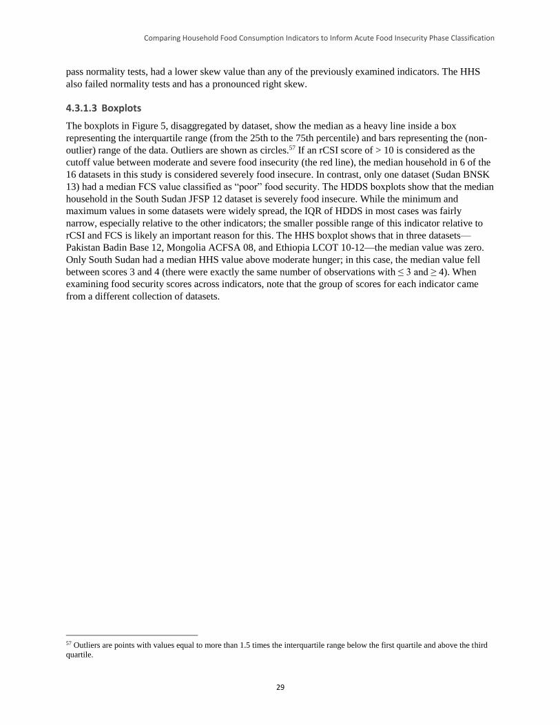
Comparing Household Food Consumption Indicators to Inform Acute Food Insecurity Phase Classification
29
pass normality tests, had a lower skew value than any of the previously examined indicators. The HHS
also failed normality tests and has a pronounced right skew.
4.3.1.3 Boxplots
The boxplots in Figure 5, disaggregated by dataset, show the median as a heavy line inside a box
representing the interquartile range (from the 25th to the 75th percentile) and bars representing the (non-
outlier) range of the data. Outliers are shown as circles.57 If an rCSI score of > 10 is considered as the
cutoff value between moderate and severe food insecurity (the red line), the median household in 6 of the
16 datasets in this study is considered severely food insecure. In contrast, only one dataset (Sudan BNSK
13) had a median FCS value classified as “poor” food security. The HDDS boxplots show that the median
household in the South Sudan JFSP 12 dataset is severely food insecure. While the minimum and
maximum values in some datasets were widely spread, the IQR of HDDS in most cases was fairly
narrow, especially relative to the other indicators; the smaller possible range of this indicator relative to
rCSI and FCS is likely an important reason for this. The HHS boxplot shows that in three datasets—
Pakistan Badin Base 12, Mongolia ACFSA 08, and Ethiopia LCOT 10-12—the median value was zero.
Only South Sudan had a median HHS value above moderate hunger; in this case, the median value fell
between scores 3 and 4 (there were exactly the same number of observations with ≤ 3 and ≥ 4). When
examining food security scores across indicators, note that the group of scores for each indicator came
from a different collection of datasets.
57 Outliers are points with values equal to more than 1.5 times the interquartile range below the first quartile and above the third
quartile.
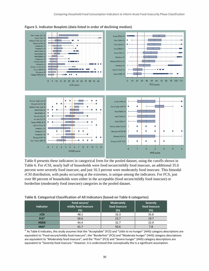
Comparing Household Food Consumption Indicators to Inform Acute Food Insecurity Phase Classification
30
Figure 5. Indicator Boxplots (data listed in order of declining median)
Table 8 presents these indicators in categorical form for the pooled dataset, using the cutoffs shown in
Table 6. For rCSI, nearly half of households were food secure/mildly food insecure, an additional 35.6
percent were severely food insecure, and just 16.3 percent were moderately food insecure. This bimodal
rCSI distribution, with peaks occurring at the extremes, is unique among the indicators. For FCS, just
over 80 percent of households were either in the acceptable (food secure/mildly food insecure) or
borderline (moderately food insecure) categories in the pooled dataset.
Table 8. Categorical Classification of All Indicators (based on Table 6 categories)
Indicator Food secure/
mildly food insecure (%)
Moderately food insecure
(%)
Severely food insecure
(%)
rCSI 48.1 16.3 35.6
FCS* 56.6 23.7 19.7
HDDS 44.4 32.7 22.9
HHS* 41.7 50.6 7.8
* As Table 6 indicates, this study assumes that the “Acceptable” (FCS) and “Little to no hunger” (HHS) category descriptions are
equivalent to “Food secure/mildly food insecure”; the “Borderline” (FCS) and “Moderate hunger” (HHS) category descriptions are equivalent to “Moderately food insecure”; and the “Poor” (FCS) and “Severe hunger” (HHS) category descriptions are equivalent to “Severely food insecure.” However, it is understood that conceptually this is a significant assumption.
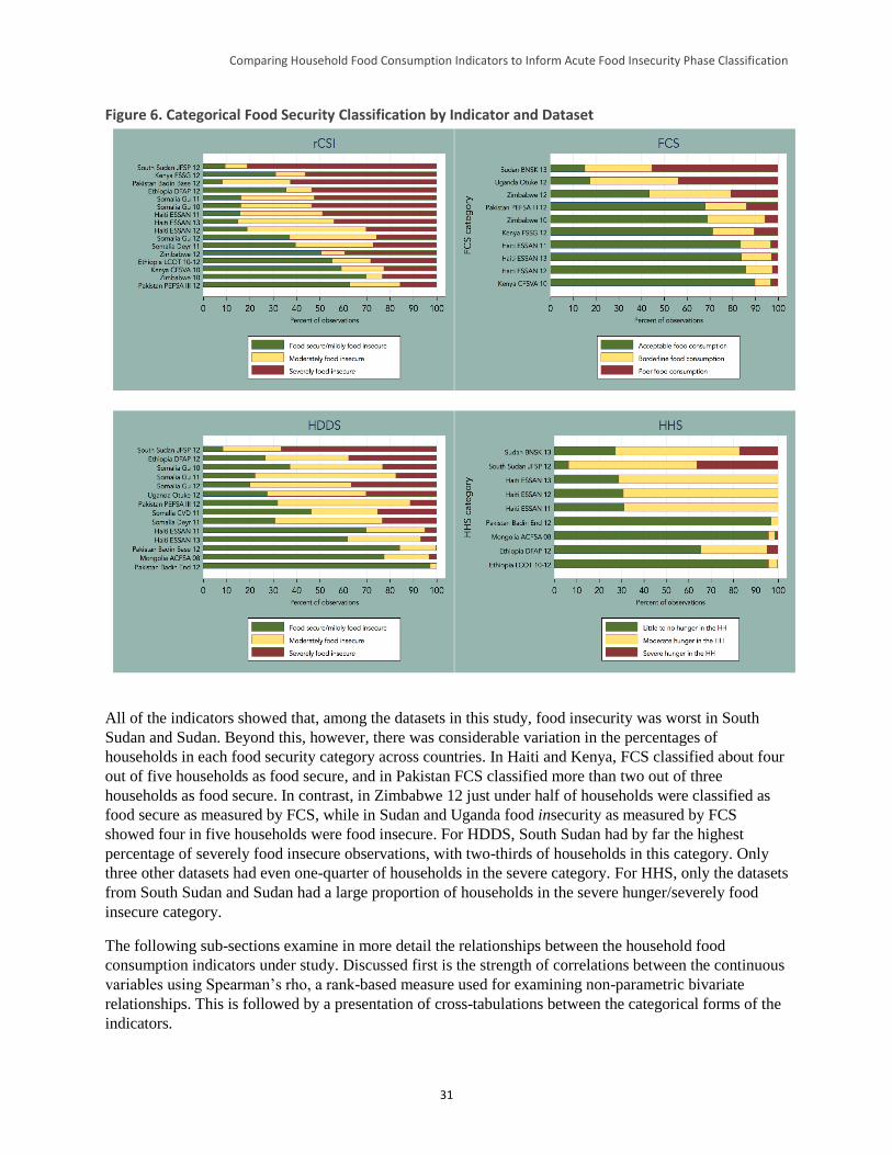
Comparing Household Food Consumption Indicators to Inform Acute Food Insecurity Phase Classification
31
Figure 6. Categorical Food Security Classification by Indicator and Dataset
All of the indicators showed that, among the datasets in this study, food insecurity was worst in South
Sudan and Sudan. Beyond this, however, there was considerable variation in the percentages of
households in each food security category across countries. In Haiti and Kenya, FCS classified about four
out of five households as food secure, and in Pakistan FCS classified more than two out of three
households as food secure. In contrast, in Zimbabwe 12 just under half of households were classified as
food secure as measured by FCS, while in Sudan and Uganda food insecurity as measured by FCS
showed four in five households were food insecure. For HDDS, South Sudan had by far the highest
percentage of severely food insecure observations, with two-thirds of households in this category. Only
three other datasets had even one-quarter of households in the severe category. For HHS, only the datasets
from South Sudan and Sudan had a large proportion of households in the severe hunger/severely food
insecure category.
The following sub-sections examine in more detail the relationships between the household food
consumption indicators under study. Discussed first is the strength of correlations between the continuous
variables using Spearman’s rho, a rank-based measure used for examining non-parametric bivariate
relationships. This is followed by a presentation of cross-tabulations between the categorical forms of the
indicators.
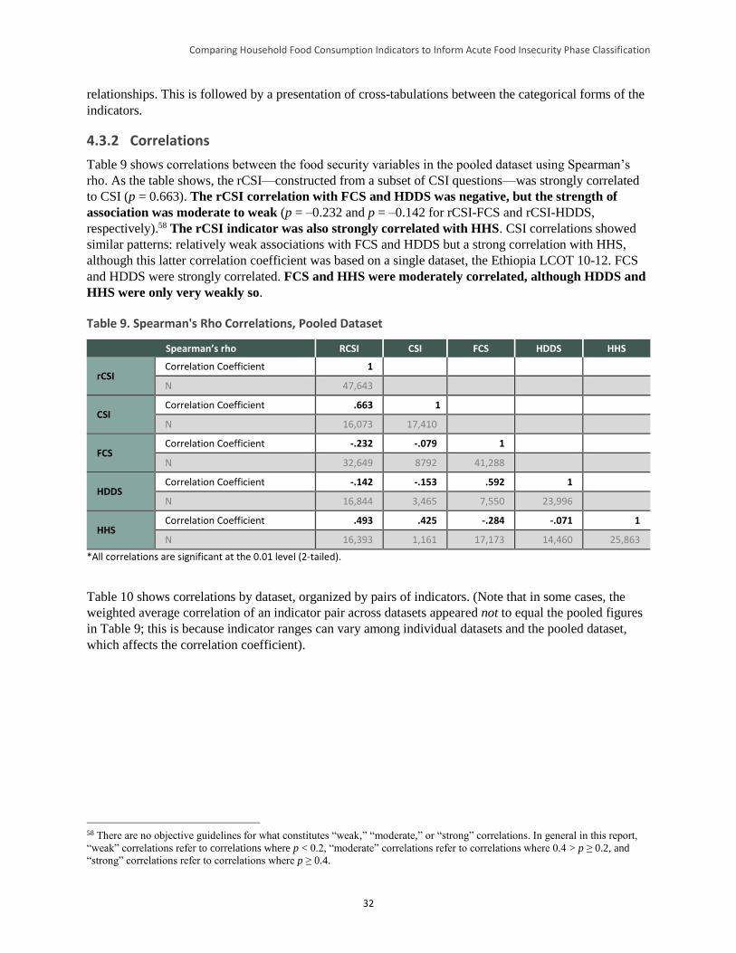
Comparing Household Food Consumption Indicators to Inform Acute Food Insecurity Phase Classification
32
relationships. This is followed by a presentation of cross-tabulations between the categorical forms of the
indicators.
4.3.2 Correlations
Table 9 shows correlations between the food security variables in the pooled dataset using Spearman’s
rho. As the table shows, the rCSI—constructed from a subset of CSI questions—was strongly correlated
to CSI (p = 0.663). The rCSI correlation with FCS and HDDS was negative, but the strength of
association was moderate to weak (p = –0.232 and p = –0.142 for rCSI-FCS and rCSI-HDDS,
respectively).58 The rCSI indicator was also strongly correlated with HHS. CSI correlations showed
similar patterns: relatively weak associations with FCS and HDDS but a strong correlation with HHS,
although this latter correlation coefficient was based on a single dataset, the Ethiopia LCOT 10-12. FCS
and HDDS were strongly correlated. FCS and HHS were moderately correlated, although HDDS and
HHS were only very weakly so.
Table 9. Spearman's Rho Correlations, Pooled Dataset
Spearman’s rho RCSI CSI FCS HDDS HHS
rCSI Correlation Coefficient 1
N 47,643
CSI Correlation Coefficient .663 1
N 16,073 17,410
FCS Correlation Coefficient -.232 -.079 1
N 32,649 8792 41,288
HDDS Correlation Coefficient -.142 -.153 .592 1
N 16,844 3,465 7,550 23,996
HHS Correlation Coefficient .493 .425 -.284 -.071 1
N 16,393 1,161 17,173 14,460 25,863
*All correlations are significant at the 0.01 level (2-tailed).
Table 10 shows correlations by dataset, organized by pairs of indicators. (Note that in some cases, the
weighted average correlation of an indicator pair across datasets appeared not to equal the pooled figures
in Table 9; this is because indicator ranges can vary among individual datasets and the pooled dataset,
which affects the correlation coefficient).
58 There are no objective guidelines for what constitutes “weak,” “moderate,” or “strong” correlations. In general in this report,
“weak” correlations refer to correlations where p < 0.2, “moderate” correlations refer to correlations where 0.4 > p ≥ 0.2, and
“strong” correlations refer to correlations where p ≥ 0.4.
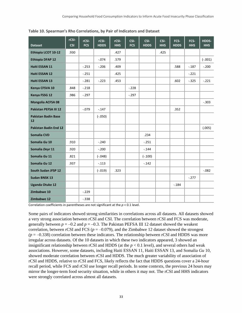
Comparing Household Food Consumption Indicators to Inform Acute Food Insecurity Phase Classification
33
Table 10. Spearman’s Rho Correlations, by Pair of Indicators and Dataset
Dataset
rCSI-
CSI rCSI-FCS
rCSI-HDDS
rCSI-HHS
CSI-FCS
CSI-HDDS
CSI-HHS
FCS-HDDS
FCS-HHS
HDDS-HHS
Ethiopia LCOT 10-12 .930 .427 .425
Ethiopia DFAP 12 -.074 .579 (-.001)
Haiti ESSAN 11 -.253 -.206 .409 .588 -.187 -.200
Haiti ESSAN 12 -.251 .425 -.221
Haiti ESSAN 13 -.281 -.223 .453 .602 -.325 -.221
Kenya CFSVA 10 .848 -.218 -.228
Kenya FSSG 12 .986 -.297 -.297
Mongolia ACFSA 08 -.303
Pakistan PEFSA III 12 -.079 -.147 .352
Pakistan Badin Base 12
(-.050)
Pakistan Badin End 12 (.005)
Somalia CVD .234
Somalia Gu 10 .910 -.240 -.251
Somalia Deyr 11 .920 -.200 -.144
Somalia Gu 11 .821 (-.048) (-.100)
Somalia Gu 12 .937 -.113 -.142
South Sudan JFSP 12 (-.019) .323 -.082
Sudan BNSK 13 -.277
Uganda Otuke 12 -.184
Zimbabwe 10 -.229
Zimbabwe 12 -.338
Correlation coefficients in parentheses are not significant at the p < 0.1 level.
Some pairs of indicators showed strong similarities in correlations across all datasets. All datasets showed
a very strong association between rCSI and CSI. The correlation between rCSI and FCS was moderate,
generally between p = –0.2 and p = –0.3. The Pakistan PEFSA III 12 dataset showed the weakest
correlation, between rCSI and FCS (p = –0.079), and the Zimbabwe 12 dataset showed the strongest
(p = –0.338) correlation between these indicators. The relationship between rCSI and HDDS was more
irregular across datasets. Of the 10 datasets in which these two indicators appeared, 3 showed an
insignificant relationship between rCSI and HDDS (at the p < 0.1 level), and several others had weak
associations. However, some datasets, including Haiti ESSAN 11, Haiti ESSAN 13, and Somalia Gu 10,
showed moderate correlation between rCSI and HDDS. The much greater variability of association of
rCSI and HDDS, relative to rCSI and FCS, likely reflects the fact that HDDS questions cover a 24-hour
recall period, while FCS and rCSI use longer recall periods. In some contexts, the previous 24 hours may
mirror the longer-term food security situation, while in others it may not. The rCSI and HHS indicators
were strongly correlated across almost all datasets.
Comparing Household Food Consumption Indicators to Inform Acute Food Insecurity Phase Classification
34
Only a few datasets included CSI, which constrains the ability to assess its relationship with the other
study variables. The Kenya datasets suggested a moderate strength of association between CSI and FCS.
The correlation between CSI and HDDS was more variable across datasets (as in the case of rCSI and
HDDS), despite the fact that all datasets came from the same country, Somalia. One of the five datasets in
which these two indicators appear showed an insignificant correlation between the two indicators (p
= 0.1). Two other datasets showed significant but weak correlations, and two showed significant moderate
correlations. Of the two showing moderate correlations, one showed a significant positive correlation—a
surprising finding given that higher CSI values indicate worse food security and higher HDDS values
indicate better food security. Ethiopia LCOT 10–12 was the only dataset with both CSI and HHS
included, and the variables were strongly correlated.
FCS and HDDS were very strongly correlated in two of the four datasets in which comparison was
possible (both from Haiti), moderately correlated in one other (Pakistan PEFSA III 12), and negatively
correlated in the last (Uganda Otuke 12). This suggests that the association between these indicators is
likely to vary considerably across contexts, particularly when the previous day’s consumption pattern is
not reflective of that of the previous week (but note that the Uganda sample is quite small and the
correlation coefficient may therefore be biased). The correlations between HDDS and an unweighted form
of FCS were also tested to ascertain whether the weights played a strong role in determining correlation.
In all cases, Spearman’s rho coefficients were only slightly altered, suggesting that the timeframe of
observation (the previous day for HDDS versus the previous week for FCS) might play a more important
role than the FCS weights in determining correlation.
The correlation of FCS and HHS was weak to moderate across the four datasets in which comparison was
possible. Finally, the relationship between HHS and HDDS was difficult to interpret. In two of six
datasets in which these two indicators appeared (Ethiopia DFAP 12 and Pakistan Badin End 12), the
association was weak or insignificant. In the other four datasets, the correlation ranged from weak (South
Sudan JFSP 12) to moderate (Mongolia AFSCA 08).
Figure 7 presents bivariate scatterplots of the relationship between each indicator pair (with the exception
of CSI pairs; different CSI ranges across datasets made interpretation of a pooled graph difficult). Both
linear and quadratic fit lines were tested on all scatterplots, and it was found that a quadratic relationship
improved explanatory fit only between rCSI and HHS. However, interpreting the shape of the quadratic
fit line was difficult: it appears that just beyond an rCSI score of about 40, higher rCSI scores were
associated with lower HHS scores. This may be an artifact of the relatively small number of observations
with HHS data and an rCSI score above 40 (n = 918 households).
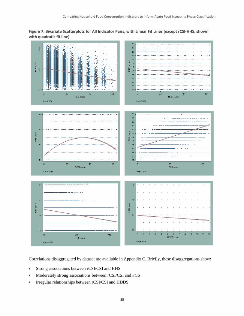
Comparing Household Food Consumption Indicators to Inform Acute Food Insecurity Phase Classification
35
Figure 7. Bivariate Scatterplots for All Indicator Pairs, with Linear Fit Lines (except rCSI-HHS, shown with quadratic fit line)
Correlations disaggregated by dataset are available in Appendix C. Briefly, these disaggregations show:
Strong associations between rCSI/CSI and HHS
Moderately strong associations between rCSI/CSI and FCS
Irregular relationships between rCSI/CSI and HDDS
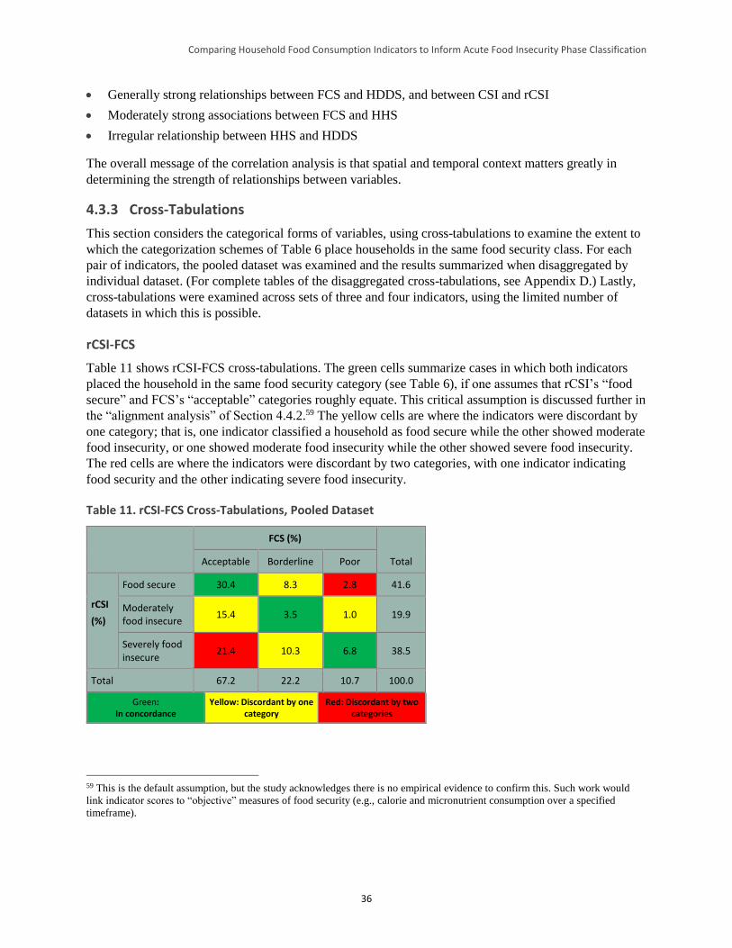
Comparing Household Food Consumption Indicators to Inform Acute Food Insecurity Phase Classification
36
Generally strong relationships between FCS and HDDS, and between CSI and rCSI
Moderately strong associations between FCS and HHS
Irregular relationship between HHS and HDDS
The overall message of the correlation analysis is that spatial and temporal context matters greatly in
determining the strength of relationships between variables.
4.3.3 Cross-Tabulations
This section considers the categorical forms of variables, using cross-tabulations to examine the extent to
which the categorization schemes of Table 6 place households in the same food security class. For each
pair of indicators, the pooled dataset was examined and the results summarized when disaggregated by
individual dataset. (For complete tables of the disaggregated cross-tabulations, see Appendix D.) Lastly,
cross-tabulations were examined across sets of three and four indicators, using the limited number of
datasets in which this is possible.
rCSI-FCS
Table 11 shows rCSI-FCS cross-tabulations. The green cells summarize cases in which both indicators
placed the household in the same food security category (see Table 6), if one assumes that rCSI’s “food
secure” and FCS’s “acceptable” categories roughly equate. This critical assumption is discussed further in
the “alignment analysis” of Section 4.4.2.59 The yellow cells are where the indicators were discordant by
one category; that is, one indicator classified a household as food secure while the other showed moderate
food insecurity, or one showed moderate food insecurity while the other showed severe food insecurity.
The red cells are where the indicators were discordant by two categories, with one indicator indicating
food security and the other indicating severe food insecurity.
Table 11. rCSI-FCS Cross-Tabulations, Pooled Dataset
FCS (%)
Total Acceptable Borderline Poor
rCSI
(%)
Food secure 30.4 8.3 2.8 41.6
Moderately food insecure
15.4 3.5 1.0 19.9
Severely food insecure
21.4 10.3 6.8 38.5
Total 67.2 22.2 10.7 100.0
Green: In concordance
Yellow: Discordant by one category
Red: Discordant by two categories
59 This is the default assumption, but the study acknowledges there is no empirical evidence to confirm this. Such work would
link indicator scores to “objective” measures of food security (e.g., calorie and micronutrient consumption over a specified
timeframe).
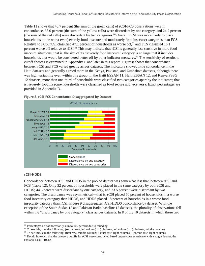
Comparing Household Food Consumption Indicators to Inform Acute Food Insecurity Phase Classification
37
Table 11 shows that 40.7 percent (the sum of the green cells) of rCSI-FCS observations were in
concordance, 35.0 percent (the sum of the yellow cells) were discordant by one category, and 24.2 percent
(the sum of the red cells) were discordant by two categories.60 Overall, rCSI was more likely to place
households in the worst two (severely food insecure and moderately food insecure) categories than FCS.
Relative to FCS, rCSI classified 47.1 percent of households as worse off,61 and FCS classified 16.1
percent worse off relative to rCSI.62 This may indicate that rCSI is generally less sensitive in more food
insecure situations; that is, the size of its “severely food insecure” category is so large that it includes
households that would be considered better off by other indicator measures.63 The sensitivity of results to
cutoff choices is examined in Appendix C and later in this report. Figure 8 shows that concordance
between rCSI and FCS varied greatly across datasets. The indicators showed little concordance in the
Haiti datasets and generally agreed more in the Kenya, Pakistan, and Zimbabwe datasets, although there
was high variability even within this group. In the Haiti ESSAN 11, Haiti ESSAN 12, and Kenya FSSG
12 datasets, more than one-third of households were classified two categories apart by the indicators; that
is, severely food insecure households were classified as food secure and vice versa. Exact percentages are
provided in Appendix D.
Figure 8. rCSI-FCS Concordance Disaggregated by Dataset
rCSI-HDDS
Concordance between rCSI and HDDS in the pooled dataset was somewhat less than between rCSI and
FCS (Table 12). Only 32 percent of households were placed in the same category by both rCSI and
HDDS; 44.5 percent were discordant by one category, and 23.5 percent were discordant by two
categories. The discordance was asymmetrical—that is, rCSI placed 50 percent of households in a worse
food insecurity category than HDDS, and HDDS placed 18 percent of households in a worse food
insecurity category than rCSI. Figure 9 disaggregates rCSI-HDDS concordance by dataset. With the
exception of the South Sudan 12 and Pakistan Badin baseline 12 datasets, the plurality of observations fell
within the “discordance by one category” class across datasets. In 8 of the 10 datasets in which these two
60 Percentages do not necessarily sum to 100 percent due to rounding. 61 To see this, sum the following: (second row, left column) + (third row, left column) + (third row, middle column). 62 To see this, sum the following: (first row, middle column) + (first row, right column) + (second row, right column). 63 Recall, however, that the category cutoffs for rCSI were constructed based on previous experience with a single dataset, the
Ethiopia LCOT 10-12.
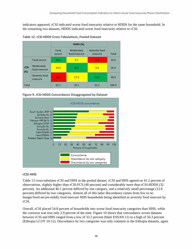
Comparing Household Food Consumption Indicators to Inform Acute Food Insecurity Phase Classification
38
indicators appeared, rCSI indicated worse food insecurity relative to HDDS for the same household. In
the remaining two datasets, HDDS indicated worse food insecurity relative to rCSI.
Table 12. rCSI-HDDS Cross-Tabulations, Pooled Dataset
HDDS (%)
Total Food
secure Moderately
food insecure Severely food
insecure
rCSI
(%)
Food secure 10.2 9.1 5.3 24.6
Moderately food insecure
14.3 8.5 3.6 26.4
Severely food insecure
18.2 17.5 13.3 49.0
Total 42.7 35.1 22.2 100.0
Figure 9. rCSI-HDDS Concordance Disaggregated by Dataset
rCSI-HHS
Table 13 cross-tabulates rCSI and HHS in the pooled dataset. rCSI and HHS agreed on 41.2 percent of
observations, slightly higher than rCSI-FCS (40 percent) and considerably more than rCSI-HDDS (32
percent). An additional 46.1 percent differed by one category, and a relatively small percentage (12.6
percent) differed by two categories. Almost all of this latter discordance comes from few to no
hunger/food secure-mildly food insecure HHS households being identified as severely food insecure by
rCSI.
Overall, rCSI placed 54.8 percent of households into worse food insecurity categories than HHS, while
the converse was true only 3.9 percent of the time. Figure 10 shows that concordance across datasets
between rCSI and HHS ranged from a low of 33.2 percent (Haiti ESSAN 11) to a high of 56.3 percent
(Ethiopia LCOT 10-12). Discordance by two categories was only common in the Ethiopia datasets, again
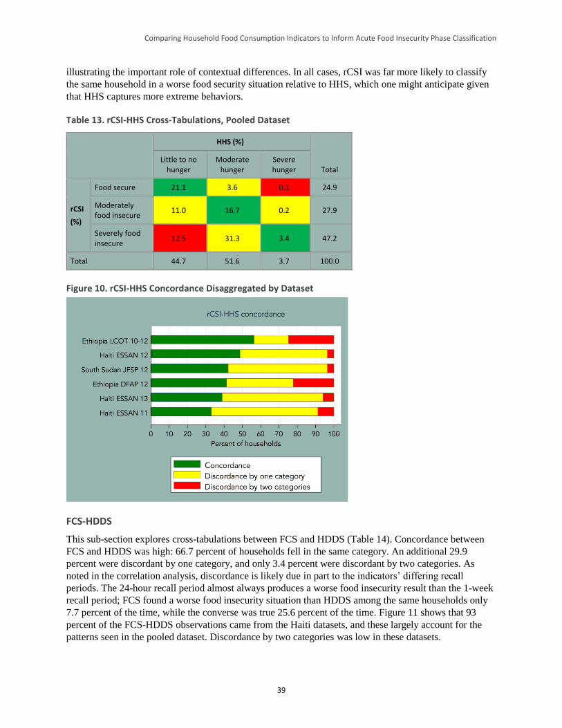
Comparing Household Food Consumption Indicators to Inform Acute Food Insecurity Phase Classification
39
illustrating the important role of contextual differences. In all cases, rCSI was far more likely to classify
the same household in a worse food security situation relative to HHS, which one might anticipate given
that HHS captures more extreme behaviors.
Table 13. rCSI-HHS Cross-Tabulations, Pooled Dataset
HHS (%)
Total Little to no
hunger Moderate
hunger Severe hunger
rCSI
(%)
Food secure 21.1 3.6 0.1 24.9
Moderately food insecure
11.0 16.7 0.2 27.9
Severely food insecure
12.5 31.3 3.4 47.2
Total 44.7 51.6 3.7 100.0
Figure 10. rCSI-HHS Concordance Disaggregated by Dataset
FCS-HDDS
This sub-section explores cross-tabulations between FCS and HDDS (Table 14). Concordance between
FCS and HDDS was high: 66.7 percent of households fell in the same category. An additional 29.9
percent were discordant by one category, and only 3.4 percent were discordant by two categories. As
noted in the correlation analysis, discordance is likely due in part to the indicators’ differing recall
periods. The 24-hour recall period almost always produces a worse food insecurity result than the 1-week
recall period; FCS found a worse food insecurity situation than HDDS among the same households only
7.7 percent of the time, while the converse was true 25.6 percent of the time. Figure 11 shows that 93
percent of the FCS-HDDS observations came from the Haiti datasets, and these largely account for the
patterns seen in the pooled dataset. Discordance by two categories was low in these datasets.
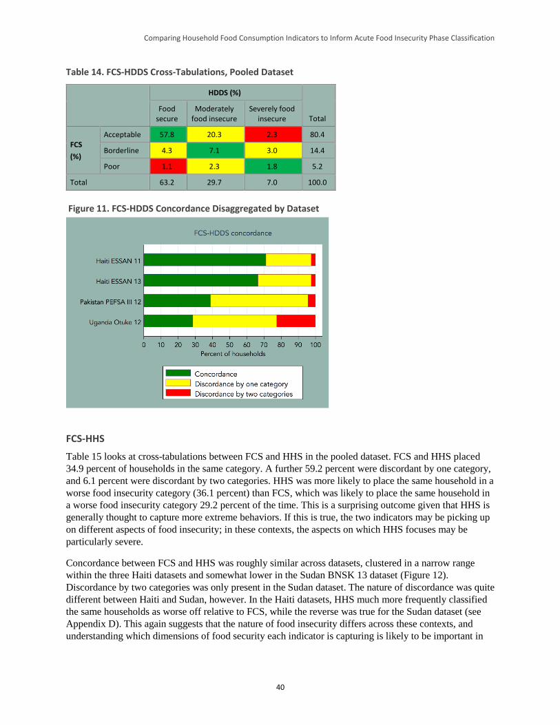
Comparing Household Food Consumption Indicators to Inform Acute Food Insecurity Phase Classification
40
Table 14. FCS-HDDS Cross-Tabulations, Pooled Dataset
HDDS (%)
Total Food
secure Moderately
food insecure Severely food
insecure
FCS
(%)
Acceptable 57.8 20.3 2.3 80.4
Borderline 4.3 7.1 3.0 14.4
Poor 1.1 2.3 1.8 5.2
Total 63.2 29.7 7.0 100.0
Figure 11. FCS-HDDS Concordance Disaggregated by Dataset
FCS-HHS
Table 15 looks at cross-tabulations between FCS and HHS in the pooled dataset. FCS and HHS placed
34.9 percent of households in the same category. A further 59.2 percent were discordant by one category,
and 6.1 percent were discordant by two categories. HHS was more likely to place the same household in a
worse food insecurity category (36.1 percent) than FCS, which was likely to place the same household in
a worse food insecurity category 29.2 percent of the time. This is a surprising outcome given that HHS is
generally thought to capture more extreme behaviors. If this is true, the two indicators may be picking up
on different aspects of food insecurity; in these contexts, the aspects on which HHS focuses may be
particularly severe.
Concordance between FCS and HHS was roughly similar across datasets, clustered in a narrow range
within the three Haiti datasets and somewhat lower in the Sudan BNSK 13 dataset (Figure 12).
Discordance by two categories was only present in the Sudan dataset. The nature of discordance was quite
different between Haiti and Sudan, however. In the Haiti datasets, HHS much more frequently classified
the same households as worse off relative to FCS, while the reverse was true for the Sudan dataset (see
Appendix D). This again suggests that the nature of food insecurity differs across these contexts, and
understanding which dimensions of food security each indicator is capturing is likely to be important in
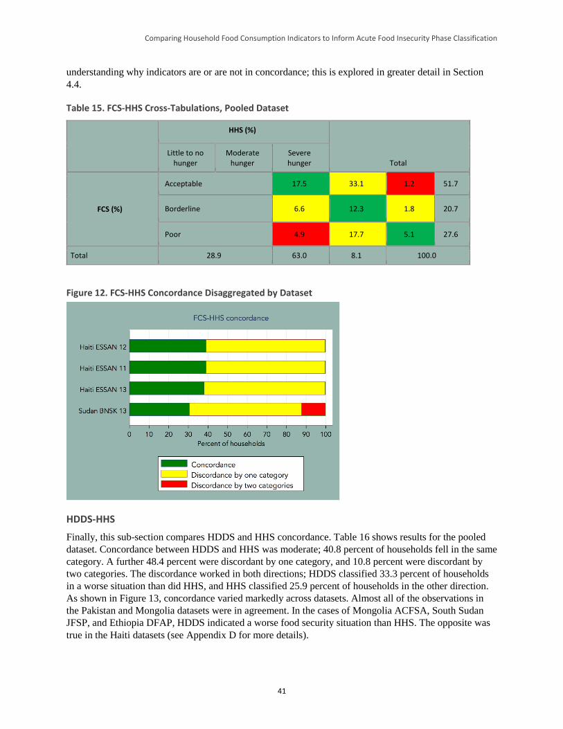
Comparing Household Food Consumption Indicators to Inform Acute Food Insecurity Phase Classification
41
understanding why indicators are or are not in concordance; this is explored in greater detail in Section
4.4.
Table 15. FCS-HHS Cross-Tabulations, Pooled Dataset
HHS (%)
Total Little to no
hunger Moderate
hunger Severe hunger
FCS (%)
Acceptable 17.5 33.1 1.2 51.7
Borderline 6.6 12.3 1.8 20.7
Poor 4.9 17.7 5.1 27.6
Total 28.9 63.0 8.1 100.0
Figure 12. FCS-HHS Concordance Disaggregated by Dataset
HDDS-HHS
Finally, this sub-section compares HDDS and HHS concordance. Table 16 shows results for the pooled
dataset. Concordance between HDDS and HHS was moderate; 40.8 percent of households fell in the same
category. A further 48.4 percent were discordant by one category, and 10.8 percent were discordant by
two categories. The discordance worked in both directions; HDDS classified 33.3 percent of households
in a worse situation than did HHS, and HHS classified 25.9 percent of households in the other direction.
As shown in Figure 13, concordance varied markedly across datasets. Almost all of the observations in
the Pakistan and Mongolia datasets were in agreement. In the cases of Mongolia ACFSA, South Sudan
JFSP, and Ethiopia DFAP, HDDS indicated a worse food security situation than HHS. The opposite was
true in the Haiti datasets (see Appendix D for more details).
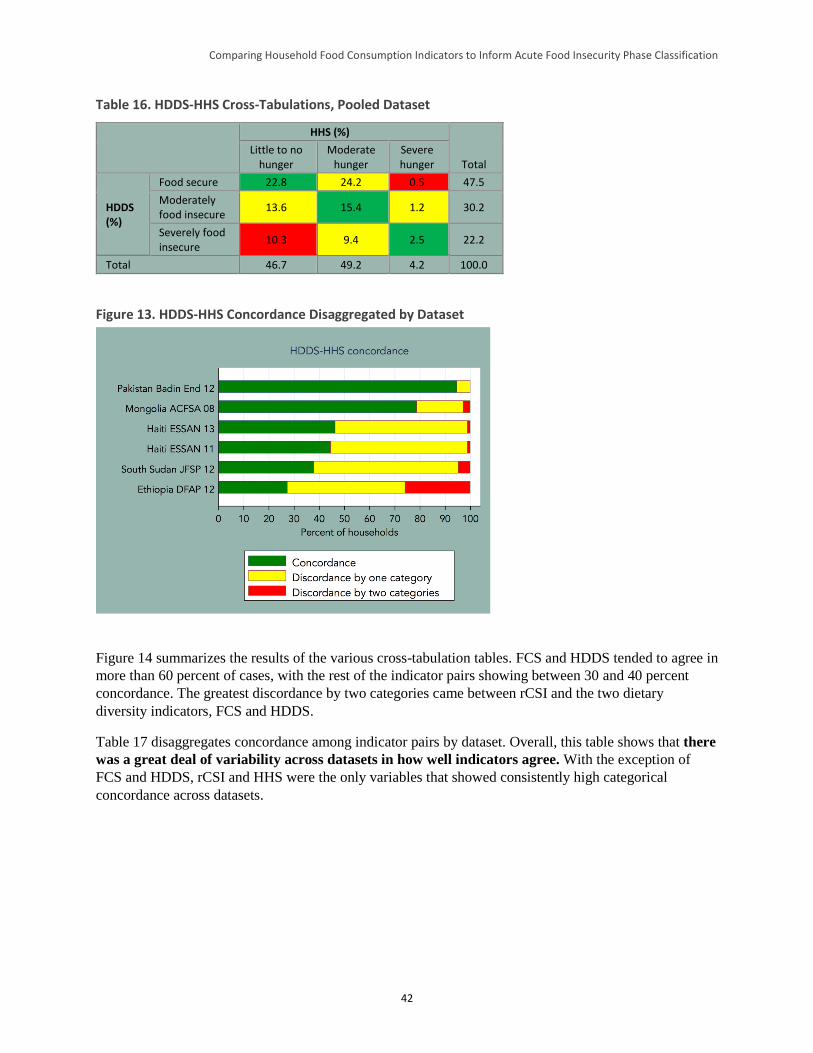
Comparing Household Food Consumption Indicators to Inform Acute Food Insecurity Phase Classification
42
Table 16. HDDS-HHS Cross-Tabulations, Pooled Dataset
HHS (%)
Total Little to no
hunger Moderate
hunger Severe hunger
HDDS (%)
Food secure 22.8 24.2 0.5 47.5
Moderately food insecure
13.6 15.4 1.2 30.2
Severely food insecure
10.3 9.4 2.5 22.2
Total 46.7 49.2 4.2 100.0
Figure 13. HDDS-HHS Concordance Disaggregated by Dataset
Figure 14 summarizes the results of the various cross-tabulation tables. FCS and HDDS tended to agree in
more than 60 percent of cases, with the rest of the indicator pairs showing between 30 and 40 percent
concordance. The greatest discordance by two categories came between rCSI and the two dietary
diversity indicators, FCS and HDDS.
Table 17 disaggregates concordance among indicator pairs by dataset. Overall, this table shows that there
was a great deal of variability across datasets in how well indicators agree. With the exception of
FCS and HDDS, rCSI and HHS were the only variables that showed consistently high categorical
concordance across datasets.
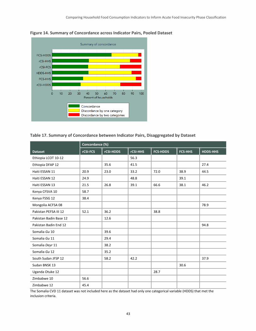
Comparing Household Food Consumption Indicators to Inform Acute Food Insecurity Phase Classification
43
Figure 14. Summary of Concordance across Indicator Pairs, Pooled Dataset
Table 17. Summary of Concordance between Indicator Pairs, Disaggregated by Dataset
Dataset
Concordance (%)
rCSI-FCS rCSI-HDDS rCSI-HHS FCS-HDDS FCS-HHS HDDS-HHS
Ethiopia LCOT 10-12 56.3
Ethiopia DFAP 12 35.6 41.5 27.4
Haiti ESSAN 11 20.9 23.0 33.2 72.0 38.9 44.5
Haiti ESSAN 12 24.9 48.8 39.1
Haiti ESSAN 13 21.5 26.8 39.1 66.6 38.1 46.2
Kenya CFSVA 10 58.7
Kenya FSSG 12 38.4
Mongolia ACFSA 08 78.9
Pakistan PEFSA III 12 52.1 36.2 38.8
Pakistan Badin Base 12 12.6
Pakistan Badin End 12 94.8
Somalia Gu 10 39.6
Somalia Gu 11 29.4
Somalia Deyr 11 38.2
Somalia Gu 12 35.2
South Sudan JFSP 12 58.2 42.2 37.9
Sudan BNSK 13 30.6
Uganda Otuke 12 28.7
Zimbabwe 10 56.6
Zimbabwe 12 45.4
The Somalia CVD 11 dataset was not included here as the dataset had only one categorical variable (HDDS) that met the
inclusion criteria.
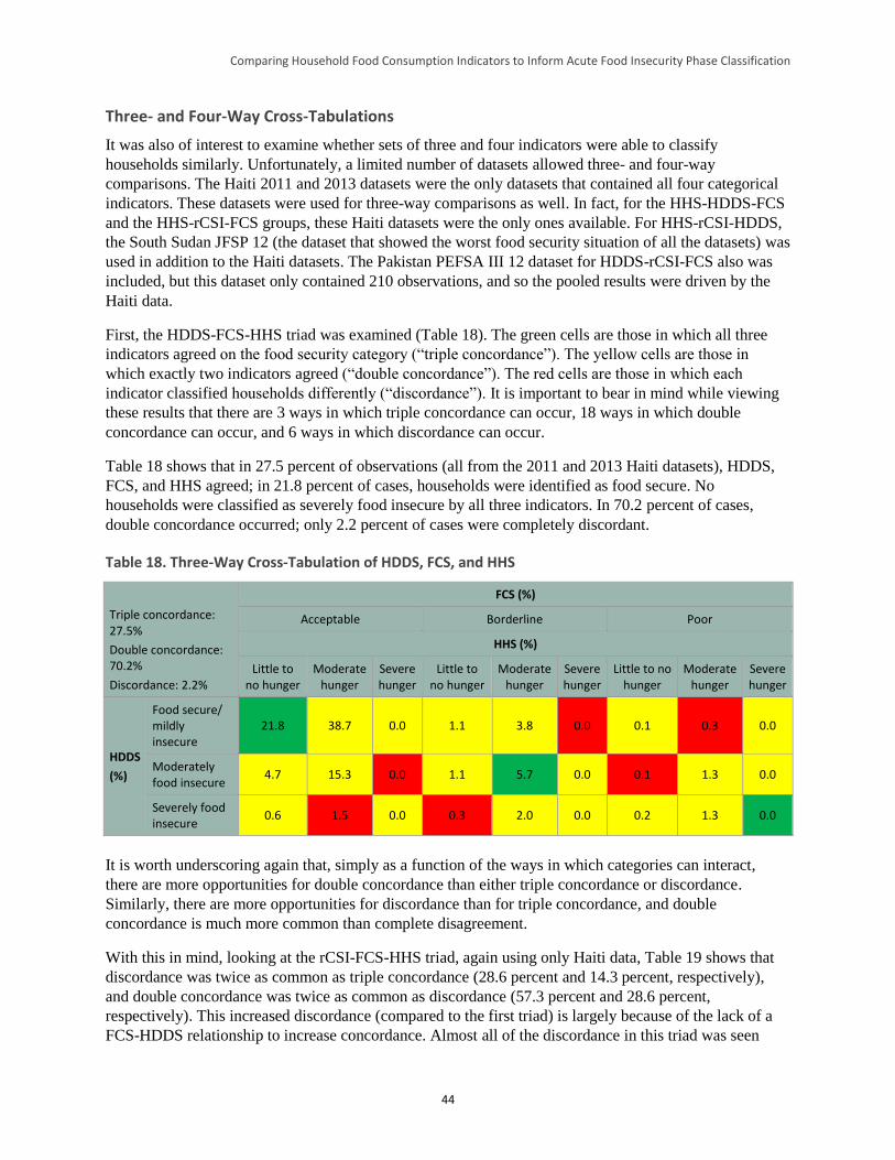
Comparing Household Food Consumption Indicators to Inform Acute Food Insecurity Phase Classification
44
Three- and Four-Way Cross-Tabulations
It was also of interest to examine whether sets of three and four indicators were able to classify
households similarly. Unfortunately, a limited number of datasets allowed three- and four-way
comparisons. The Haiti 2011 and 2013 datasets were the only datasets that contained all four categorical
indicators. These datasets were used for three-way comparisons as well. In fact, for the HHS-HDDS-FCS
and the HHS-rCSI-FCS groups, these Haiti datasets were the only ones available. For HHS-rCSI-HDDS,
the South Sudan JFSP 12 (the dataset that showed the worst food security situation of all the datasets) was
used in addition to the Haiti datasets. The Pakistan PEFSA III 12 dataset for HDDS-rCSI-FCS also was
included, but this dataset only contained 210 observations, and so the pooled results were driven by the
Haiti data.
First, the HDDS-FCS-HHS triad was examined (Table 18). The green cells are those in which all three
indicators agreed on the food security category (“triple concordance”). The yellow cells are those in
which exactly two indicators agreed (“double concordance”). The red cells are those in which each
indicator classified households differently (“discordance”). It is important to bear in mind while viewing
these results that there are 3 ways in which triple concordance can occur, 18 ways in which double
concordance can occur, and 6 ways in which discordance can occur.
Table 18 shows that in 27.5 percent of observations (all from the 2011 and 2013 Haiti datasets), HDDS,
FCS, and HHS agreed; in 21.8 percent of cases, households were identified as food secure. No
households were classified as severely food insecure by all three indicators. In 70.2 percent of cases,
double concordance occurred; only 2.2 percent of cases were completely discordant.
Table 18. Three-Way Cross-Tabulation of HDDS, FCS, and HHS
Triple concordance: 27.5%
Double concordance: 70.2%
Discordance: 2.2%
FCS (%)
Acceptable Borderline Poor
HHS (%)
Little to no hunger
Moderate hunger
Severe hunger
Little to no hunger
Moderate hunger
Severe hunger
Little to no hunger
Moderate hunger
Severe hunger
HDDS
(%)
Food secure/ mildly insecure
21.8 38.7 0.0 1.1 3.8 0.0 0.1 0.3 0.0
Moderately food insecure
4.7 15.3 0.0 1.1 5.7 0.0 0.1 1.3 0.0
Severely food insecure
0.6 1.5 0.0 0.3 2.0 0.0 0.2 1.3 0.0
It is worth underscoring again that, simply as a function of the ways in which categories can interact,
there are more opportunities for double concordance than either triple concordance or discordance.
Similarly, there are more opportunities for discordance than for triple concordance, and double
concordance is much more common than complete disagreement.
With this in mind, looking at the rCSI-FCS-HHS triad, again using only Haiti data, Table 19 shows that
discordance was twice as common as triple concordance (28.6 percent and 14.3 percent, respectively),
and double concordance was twice as common as discordance (57.3 percent and 28.6 percent,
respectively). This increased discordance (compared to the first triad) is largely because of the lack of a
FCS-HDDS relationship to increase concordance. Almost all of the discordance in this triad was seen
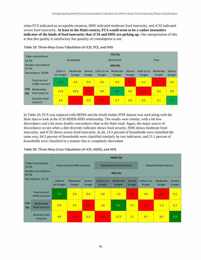
Comparing Household Food Consumption Indicators to Inform Acute Food Insecurity Phase Classification
45
when FCS indicated an acceptable situation, HHS indicated moderate food insecurity, and rCSI indicated
severe food insecurity. At least in the Haiti context, FCS would seem to be a rather insensitive
indicator of the kinds of food insecurity that rCSI and HHS are picking up. One interpretation of this
is that diet quality is satisfactory but quantity of consumption is not.
Table 19. Three-Way Cross-Tabulation of rCSI, FCS, and HHS
Triple concordance:
14.3%
Double concordance: 57.3%
Discordance: 28.6%
FCS (%)
Acceptable Borderline Poor
HHS (%)
Little to no hunger
Moderate hunger
Severe hunger
Little to no hunger
Moderate hunger
Severe hunger
Little to no hunger
Moderate hunger
Severe hunger
rCSI
(%)
Food secure/ mildly insecure
10.3 4.9 0.0 0.5 0.4 0.0 0.1 0.1 0.0
Moderately food insecure
11.9 23.6 0.0 0.9 4.0 0.0 0.2 0.6 0.0
Severely food insecure
5.4 27.4 0.0 0.9 6.7 0.0 0.2 2.1 0.0
In Table 20, FCS was replaced with HDDS and the South Sudan JFSP dataset was used along with the
Haiti data to look at the rCSI-HDDS-HHS relationship. The results were similar, with a bit less
discordance and a bit more double concordance than in the Haiti triad. Again, the major source of
discordance occurs when a diet diversity indicator shows food security, HHS shows moderate food
insecurity, and rCSI shows severe food insecurity. In all, 14.5 percent of households were classified the
same way, 64.5 percent of households were classified similarly by two indicators, and 21.1 percent of
households were classified in a manner that is completely discordant.
Table 20. Three-Way Cross-Tabulation of rCSI, HDDS, and HHS
Triple concordance: 14.5%
Double concordance: 64.5%
Discordance: 21.1%
HDDS (%)
Food secure/mildly insecure Moderately food insecure Severely food insecure
HHS (%)
Little to no hunger
Moderate hunger
Severe hunger
Little to no hunger
Moderate hunger
Severe hunger
Little to no hunger
Moderate hunger
Severe hunger
rCSI
(%)
Food secure/ mildly insecure
7.7 2.0 0.0 6.8 1.0 0.1 4.9 0.6 0.1
Moderately food insecure
6.0 9.5 0.0 2.6 4.3 0.1 1.5 1.3 0.1
Severely food insecure
4.6 14.8 0.5 4.1 11.5 1.1 4.1 8.3 2.5
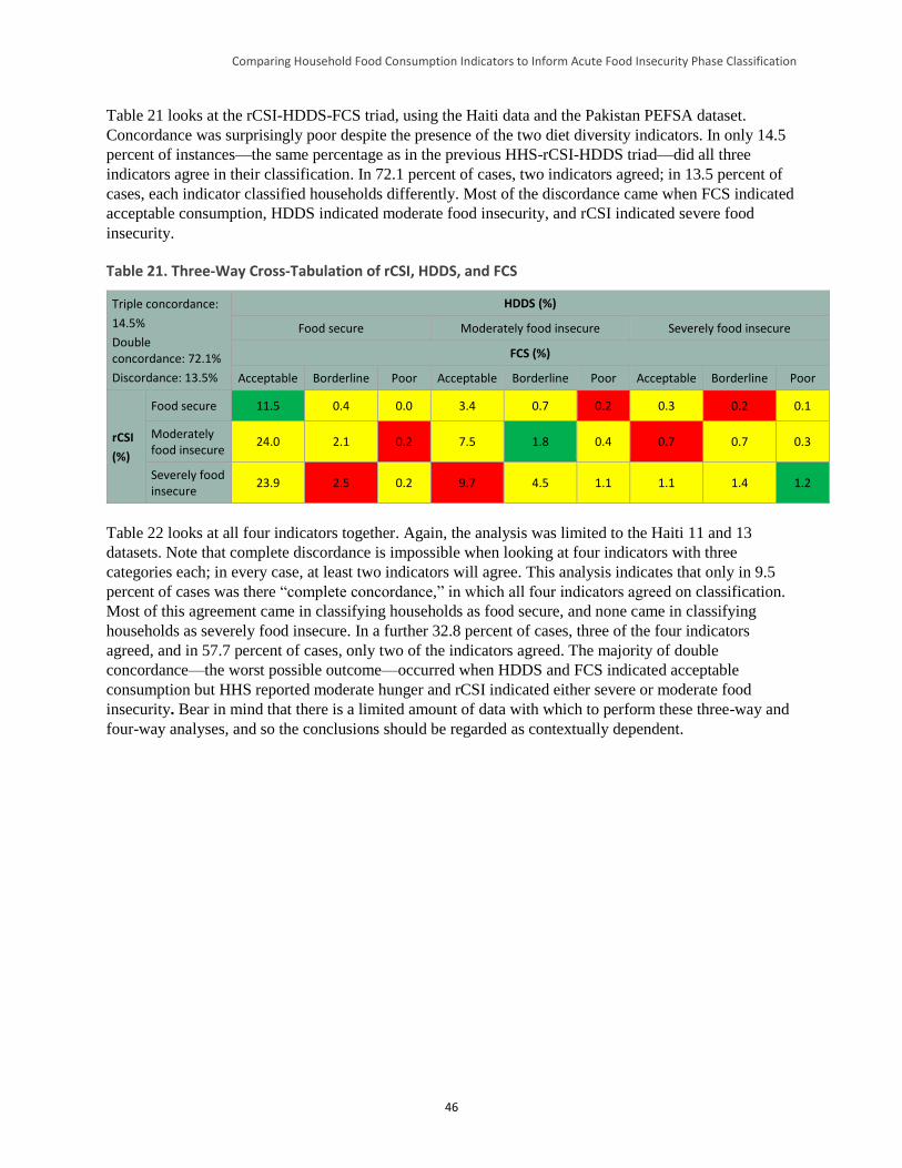
Comparing Household Food Consumption Indicators to Inform Acute Food Insecurity Phase Classification
46
Table 21 looks at the rCSI-HDDS-FCS triad, using the Haiti data and the Pakistan PEFSA dataset.
Concordance was surprisingly poor despite the presence of the two diet diversity indicators. In only 14.5
percent of instances—the same percentage as in the previous HHS-rCSI-HDDS triad—did all three
indicators agree in their classification. In 72.1 percent of cases, two indicators agreed; in 13.5 percent of
cases, each indicator classified households differently. Most of the discordance came when FCS indicated
acceptable consumption, HDDS indicated moderate food insecurity, and rCSI indicated severe food
insecurity.
Table 21. Three-Way Cross-Tabulation of rCSI, HDDS, and FCS
Triple concordance:
14.5%
Double concordance: 72.1%
Discordance: 13.5%
HDDS (%)
Food secure Moderately food insecure Severely food insecure
FCS (%)
Acceptable Borderline Poor Acceptable Borderline Poor Acceptable Borderline Poor
rCSI
(%)
Food secure 11.5 0.4 0.0 3.4 0.7 0.2 0.3 0.2 0.1
Moderately food insecure
24.0 2.1 0.2 7.5 1.8 0.4 0.7 0.7 0.3
Severely food insecure
23.9 2.5 0.2 9.7 4.5 1.1 1.1 1.4 1.2
Table 22 looks at all four indicators together. Again, the analysis was limited to the Haiti 11 and 13
datasets. Note that complete discordance is impossible when looking at four indicators with three
categories each; in every case, at least two indicators will agree. This analysis indicates that only in 9.5
percent of cases was there “complete concordance,” in which all four indicators agreed on classification.
Most of this agreement came in classifying households as food secure, and none came in classifying
households as severely food insecure. In a further 32.8 percent of cases, three of the four indicators
agreed, and in 57.7 percent of cases, only two of the indicators agreed. The majority of double
concordance—the worst possible outcome—occurred when HDDS and FCS indicated acceptable
consumption but HHS reported moderate hunger and rCSI indicated either severe or moderate food
insecurity. Bear in mind that there is a limited amount of data with which to perform these three-way and
four-way analyses, and so the conclusions should be regarded as contextually dependent.
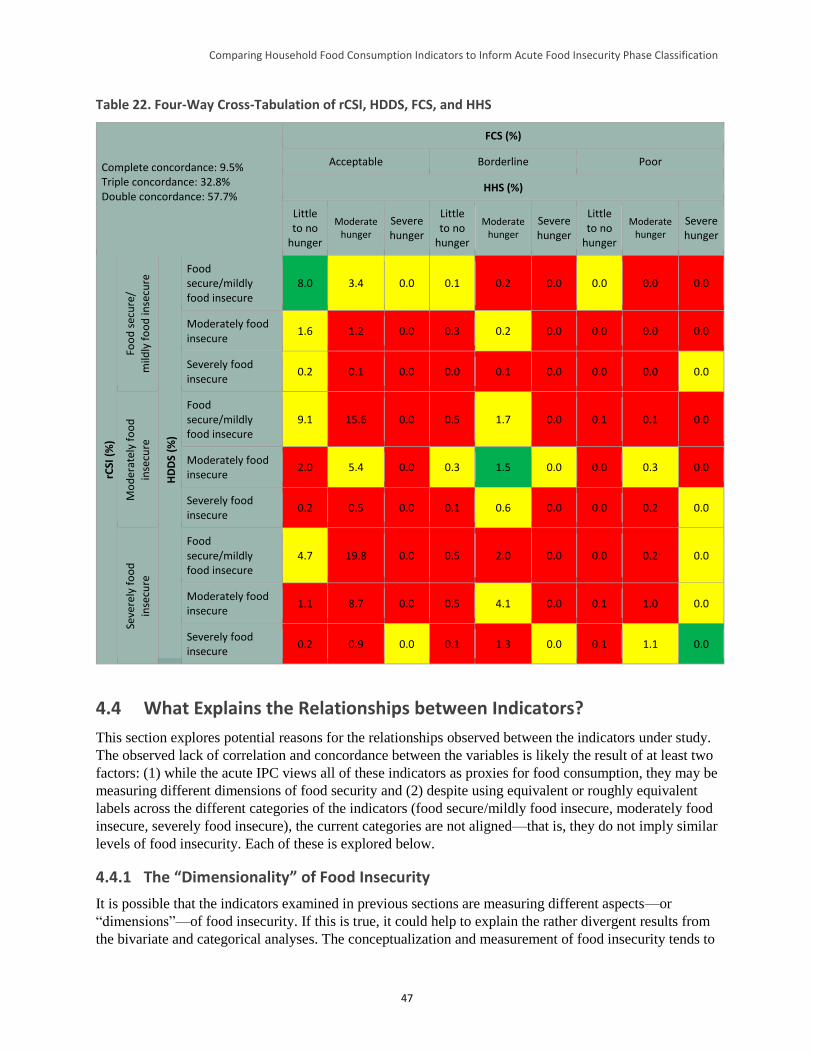
Comparing Household Food Consumption Indicators to Inform Acute Food Insecurity Phase Classification
47
Table 22. Four-Way Cross-Tabulation of rCSI, HDDS, FCS, and HHS
Complete concordance: 9.5% Triple concordance: 32.8% Double concordance: 57.7%
FCS (%)
Acceptable Borderline Poor
HHS (%)
Little to no
hunger
Moderate hunger
Severe hunger
Little to no
hunger
Moderate hunger
Severe hunger
Little to no
hunger
Moderate hunger
Severe hunger
rCSI
(%
)
Foo
d s
ecu
re/
mild
ly f
oo
d in
secu
re
HD
DS
(%)
Food secure/mildly food insecure
8.0 3.4 0.0 0.1 0.2 0.0 0.0 0.0 0.0
Moderately food insecure
1.6 1.2 0.0 0.3 0.2 0.0 0.0 0.0 0.0
Severely food insecure
0.2 0.1 0.0 0.0 0.1 0.0 0.0 0.0 0.0
Mo
der
atel
y fo
od
inse
cure
Food secure/mildly food insecure
9.1 15.6 0.0 0.5 1.7 0.0 0.1 0.1 0.0
Moderately food insecure
2.0 5.4 0.0 0.3 1.5 0.0 0.0 0.3 0.0
Severely food insecure
0.2 0.5 0.0 0.1 0.6 0.0 0.0 0.2 0.0
Seve
rely
fo
od
inse
cure
Food secure/mildly food insecure
4.7 19.8 0.0 0.5 2.0 0.0 0.0 0.2 0.0
Moderately food insecure
1.1 8.7 0.0 0.5 4.1 0.0 0.1 1.0 0.0
Severely food insecure
0.2 0.9 0.0 0.1 1.3 0.0 0.1 1.1 0.0
4.4 What Explains the Relationships between Indicators?
This section explores potential reasons for the relationships observed between the indicators under study.
The observed lack of correlation and concordance between the variables is likely the result of at least two
factors: (1) while the acute IPC views all of these indicators as proxies for food consumption, they may be
measuring different dimensions of food security and (2) despite using equivalent or roughly equivalent
labels across the different categories of the indicators (food secure/mildly food insecure, moderately food
insecure, severely food insecure), the current categories are not aligned—that is, they do not imply similar
levels of food insecurity. Each of these is explored below.
4.4.1 The “Dimensionality” of Food Insecurity
It is possible that the indicators examined in previous sections are measuring different aspects—or
“dimensions”—of food insecurity. If this is true, it could help to explain the rather divergent results from
the bivariate and categorical analyses. The conceptualization and measurement of food insecurity tends to
Comparing Household Food Consumption Indicators to Inform Acute Food Insecurity Phase Classification
48
focus on availability, access, and utilization as possible dimensions (Barrett 2010). Availability
concentrates on supply-side issues like production and marketing of food, while access focuses on
demand-side socioeconomic and political factors that determine whether households can obtain food.
Utilization focuses on the decisions households make in distributing and preparing their obtained food, as
well as on the ability of individuals to absorb and retain nutrients.
For this study, the dimensionality question focused on a frequently referenced definition of food security:
“Food security exists when all people, at all times, have physical and economic access to sufficient, safe,
and nutritious food that meets their dietary needs and food preferences for an active and healthy life”
(FAO 1996). Various dimensions can be extracted from this statement. Following the logic of Coates
(2013), which distinguishes between causes, effects, and experiences, this analysis focused on the
following dimensions: stability (“at all times”), quantity (“access to sufficient”), quality (“dietary needs”
or “diversity”), acceptability (“preferences”), and safety (“safe”). However, the indicators examined do
not necessarily cover all of these dimensions. Section 4.4.1.1 describes the methodological approach to
this portion of the analysis. Sections 4.4.1.2 and 4.4.1.3 present the results of the analysis using two
approaches: network modularity analysis and principal component analysis (PCA).
4.4.1.1 Methodology
The food security variables examined in this paper are composite indicators: They each contain specific
sub-questions, which are referred to as “items.” Because composite indicators may internally measure
more than one dimension of food security, the dimensionality analysis examined their specific constituent
items. The strategy applied for extracting dimensionality relied on analyzing the correlation structure of
the items. Clustering these items in intra-correlated groups could be conceptualized as representing
dimensions of food insecurity. Two items that measure quality, for example, would be expected to co-
vary to a greater degree than one item that measures quantity and another that measures quality. Table 23
lists all of the food security items associated with the indicators under study.
Table 23. Food Security Indicators and Component Items64
Parent Indicator
Item
Abbreviation Item
rCSI/CSI BORROWr In the past 7 days/month, if you did not have enough food to eat or did not have enough money to buy food, how often has the HH had to borrow food or rely on help from a relative?
rCSI/CSI LMTPRTr In the past 7 days/month, if you did not have enough food to eat or did not have enough money to buy food, how often has the HH had to limit portion size at mealtimes?
rCSI/CSI ADLRSTr In the past 7 days/month, if you did not have enough food to eat or did not have enough money to buy food, how often has the HH had to restrict consumption by adults in order to allow children to eat?
rCSI/CSI NUMMEALr In the past 7 days/month, if you did not have enough food to eat or did not have enough money to buy food, how often has the HH had to reduce the number of meals eaten in a day?
rCSI/CSI LSSPRFr In the past 7 days/month, if you did not have enough food to eat or did not have enough money to buy food, how often has the HH had to rely on less preferred or less expensive food?
CSI FDCRED In the past month, if you did not have enough food to eat or did not have enough money to buy food, how often has the HH had to purchase food on credit?
64 Note that for the dimensionality analyses, relationships were evaluated between unweighted constituent items using the
frequencies common to each indicator (e.g., 0-7 for FCS, 0-2 for HHS). Because the correlation matrix is, by definition,
normalized, the absence of weights does not affect the interpretation of relationships.
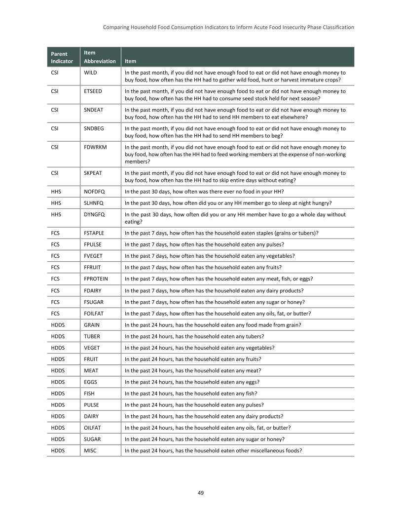
Comparing Household Food Consumption Indicators to Inform Acute Food Insecurity Phase Classification
49
Parent Indicator
Item
Abbreviation Item
CSI WILD In the past month, if you did not have enough food to eat or did not have enough money to buy food, how often has the HH had to gather wild food, hunt or harvest immature crops?
CSI ETSEED In the past month, if you did not have enough food to eat or did not have enough money to buy food, how often has the HH had to consume seed stock held for next season?
CSI SNDEAT In the past month, if you did not have enough food to eat or did not have enough money to buy food, how often has the HH had to send HH members to eat elsewhere?
CSI SNDBEG In the past month, if you did not have enough food to eat or did not have enough money to buy food, how often has the HH had to send HH members to beg?
CSI FDWRKM In the past month, if you did not have enough food to eat or did not have enough money to buy food, how often has the HH had to feed working members at the expense of non-working members?
CSI SKPEAT In the past month, if you did not have enough food to eat or did not have enough money to buy food, how often has the HH had to skip entire days without eating?
HHS NOFDFQ In the past 30 days, how often was there ever no food in your HH?
HHS SLHNFQ In the past 30 days, how often did you or any HH member go to sleep at night hungry?
HHS DYNGFQ In the past 30 days, how often did you or any HH member have to go a whole day without eating?
FCS FSTAPLE In the past 7 days, how often has the household eaten staples (grains or tubers)?
FCS FPULSE In the past 7 days, how often has the household eaten any pulses?
FCS FVEGET In the past 7 days, how often has the household eaten any vegetables?
FCS FFRUIT In the past 7 days, how often has the household eaten any fruits?
FCS FPROTEIN In the past 7 days, how often has the household eaten any meat, fish, or eggs?
FCS FDAIRY In the past 7 days, how often has the household eaten any dairy products?
FCS FSUGAR In the past 7 days, how often has the household eaten any sugar or honey?
FCS FOILFAT In the past 7 days, how often has the household eaten any oils, fat, or butter?
HDDS GRAIN In the past 24 hours, has the household eaten any food made from grain?
HDDS TUBER In the past 24 hours, has the household eaten any tubers?
HDDS VEGET In the past 24 hours, has the household eaten any vegetables?
HDDS FRUIT In the past 24 hours, has the household eaten any fruits?
HDDS MEAT In the past 24 hours, has the household eaten any meat?
HDDS EGGS In the past 24 hours, has the household eaten any eggs?
HDDS FISH In the past 24 hours, has the household eaten any fish?
HDDS PULSE In the past 24 hours, has the household eaten any pulses?
HDDS DAIRY In the past 24 hours, has the household eaten any dairy products?
HDDS OILFAT In the past 24 hours, has the household eaten any oils, fat, or butter?
HDDS SUGAR In the past 24 hours, has the household eaten any sugar or honey?
HDDS MISC In the past 24 hours, has the household eaten other miscellaneous foods?
Comparing Household Food Consumption Indicators to Inform Acute Food Insecurity Phase Classification
50
The covariance structure of the set of food security items listed above was analyzed in two ways. First,
the correlation matrix of food security items was represented as a network, with each constituent item of
each indicator represented as a node and the edge length (i.e., the distance of the links) between nodes
determined by the absolute value of their correlation coefficients.65 Various algorithms exist for
identifying “communities” (alternatively called “clusters” or “modules”) within networks, that is, groups
of nodes that are more strongly connected to each other than to the rest of the network. The principle
underlying most of these methods is to discover a way of grouping the network by which the weight of
the edges between the proposed groups is less than would be expected (or, equally, the weight of the
edges within proposed groups is more than would be expected) than if the network had been divided into
random groups. In a network constructed from the correlation matrix of the individual items from which
the food security indicators under study were constructed, the discovered communities could represent
“dimensions” of food security—collections of items that, judged by their close internal linkage relative to
other groups of items, are capturing similar phenomena. However, in both the network modularity
analysis and principal component analysis, determining exactly which dimension of food security the
communities represent is left to the judgment of the researcher, although for reasons explained further
below, this may be easier in the network analysis than in the PCA.
The extent to which a network is separable into communities is captured by a property called
“modularity.” In unweighted networks, the modularity score is the proportion of edges within groups
minus the proportion one would expect in a network constructed by random placement of edges (Clauset
et al. 2004). As noted earlier, in fully connected weighted networks like the correlation networks in this
study, modularity scores take into account edge weights (in this case, the absolute value of the correlation
coefficients) rather than the presence or absence of edges. A positive modularity indicates the presence of
underlying communities.
To discover communities in the correlation network of the food security indicators under study here, the
formulation of Clauset (2004) was used, further developed by Newman (2006) and Blondel (2008). Their
modularity algorithm maximizes the value of the following objective function to obtain the modularity
score Q:
𝑄 =1
2𝑚∑ [𝐴𝑖,𝑗 −
𝑘𝑖𝑘𝑗
2𝑚] 𝛿(𝑐𝑖, 𝑐𝑗)
𝑖,𝑗
where the subscripts i and j refer to the individual food security items; 𝐴𝑖𝑗 is the correlation between i and
j; 𝑚 =1
2∑ 𝐴𝑖,𝑗𝑖,𝑗 , the sum of correlations between every pair of items, divided by 2; 𝑘𝑖 is the sum of
correlations between i and all other items (and 𝑘𝑗 is the sum of correlations between j and all other items);
𝑐𝑖 and 𝑐𝑗 are the communities to which i and j are assigned; and the function 𝛿(𝑐𝑖 , 𝑐𝑗) is equal to 1 if i and
j are in the same community and zero if not. The possible range of the modularity score is thus [–1,1].
The second analytical approach is PCA, which reduces the set of independent variables into a smaller set
of derived variables (called “components”) that capture underlying shared variance. Mathematically, PCA
does this by creating a 𝑚 × 𝑛 covariance matrix A and solving the matrix equation 𝐴𝐴𝑇𝑣 = 𝜆𝑣, the
eigenvalue equation of the covariance matrix. Each vector—that is, each principal component—can be
thought of as representing a particular dimension of food security that can be extracted from the data. The
corresponding eigenvalues allow one to rank the “strength” of each dimension, that is, the degree to
which the data suggest the existence of such a dimension. However, the meaning of the components
65 It should be noted that the correlations between food security items were all of the expected sign, and thus using the absolute
value does not sacrifice information about the nature of the relationships between indicators (see Maxwell et al. 2014a for the
correlation matrix).
Comparing Household Food Consumption Indicators to Inform Acute Food Insecurity Phase Classification
51
themselves (i.e., the dimension of food security each component represents) must be interpreted in the
light of theory, as in the preceding network modularity analysis. The components themselves should be
treated as variables capturing food security. For example, households with higher scores in the first
component can be said to be more food insecure in that given dimension, and those with lower scores
more food secure.
These two ways of analyzing covariance structure have distinct strengths and weaknesses. The most
important difference between the approaches is that PCA places each food security item partially in one
component/dimension and partially in another, while modularity analysis places each item in a single
community/dimension. Because each item’s correlation with each component is easily computed in PCA,
the relative importance of any given item to any theorized dimension is easier to interpret than in network
modularity analysis. However, theorization of what the identified community/dimension actually means is
easier with modularity analysis, given that each item is assigned to a single community. It is also worth
noting that PCA will try to find orthogonal vectors, which means that scores along multiple components
combine to be as informative as possible. However, this makes secondary, tertiary, and later vectors
particularly difficult to interpret. The contrast between the two methods can be seen as a tradeoff between
conceptual clarity (the modularity analysis preserves “whole” food security items) and additional
information (the PCA more precisely captures shared variance).
4.4.1.2 Network Modularity Analysis
The network modularity analysis was based on calculating correlation coefficients between all of the food
security items that compose the indicators under study. Because the functional form of the relationship
between the items was unknown, Spearman’s rho, which uses ranks to calculate correlation, was chosen.
Before presenting the results of the clustering algorithm,66 a few reminders may be useful. The
correlations between items are represented by the spatial distance between the items: the stronger the
correlation, the more closely located the items. Note, however, that in the process of optimizing the
spatial layout, the underlying algorithm makes tradeoffs across the entire correlation matrix, and so the
distance between one pair of items and any other pair may not be proportional to their respective
correlation coefficients (such as, for example, CSI’s SKPEAT item and HHS’s DYNGFQ item, which ask
a very similar question but do not appear as close together as one might expect in the correlation network
figures that follow). The strength of the correlation is also depicted in the thickness of the link.
Insignificant correlations are not shown (i.e., links are absent). The entire correlation matrix underlying
the network is provided in Appendix E.
Because the results are affected by the order in which the clustering algorithm is run—that is, there is a
stochastic element to the results—the algorithm was run 100 times (an arbitrary choice that was
considered a sufficiently large sample). The average modularity score of these runs, within a possible
range of [-1, 1], was 0.2 (ranging narrowly between 0.193 and 0.202), suggesting a moderately strong
tendency for the items to cluster into groups. Note that this score was reduced by the fact that nearly all
pairs of variables have significant correlations.
The results of the network analysis are provided in the following figures. The network algorithm did not
produce the same results, or even the same number of clusters, in every run. In 59 percent of the runs, two
clusters were produced; in 15 percent of the runs, three clusters were produced; and in 26 percent of the
runs, four clusters were produced. Figure 15 shows the grouping pattern for the two-cluster network (56
66 The network analysis used the open source software GEPHI. The network was generated from the variable correlation matrix
by the Force Atlas2 attraction/repulsion algorithm, with scaling set to 10.0 and gravity 1.0. The Blondel et al. (2008) modularity
algorithm, with resolution 1.0, was used to generate the figures in this section.
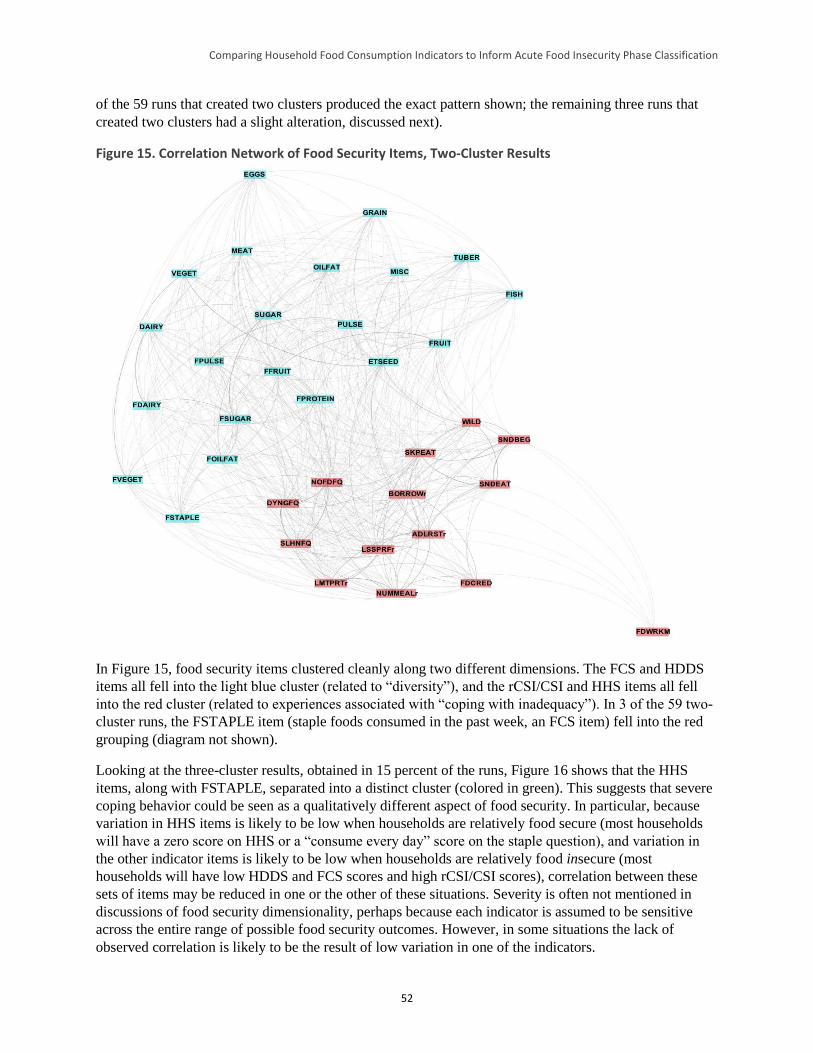
Comparing Household Food Consumption Indicators to Inform Acute Food Insecurity Phase Classification
52
of the 59 runs that created two clusters produced the exact pattern shown; the remaining three runs that
created two clusters had a slight alteration, discussed next).
Figure 15. Correlation Network of Food Security Items, Two-Cluster Results
In Figure 15, food security items clustered cleanly along two different dimensions. The FCS and HDDS
items all fell into the light blue cluster (related to “diversity”), and the rCSI/CSI and HHS items all fell
into the red cluster (related to experiences associated with “coping with inadequacy”). In 3 of the 59 two-
cluster runs, the FSTAPLE item (staple foods consumed in the past week, an FCS item) fell into the red
grouping (diagram not shown).
Looking at the three-cluster results, obtained in 15 percent of the runs, Figure 16 shows that the HHS
items, along with FSTAPLE, separated into a distinct cluster (colored in green). This suggests that severe
coping behavior could be seen as a qualitatively different aspect of food security. In particular, because
variation in HHS items is likely to be low when households are relatively food secure (most households
will have a zero score on HHS or a “consume every day” score on the staple question), and variation in
the other indicator items is likely to be low when households are relatively food insecure (most
households will have low HDDS and FCS scores and high rCSI/CSI scores), correlation between these
sets of items may be reduced in one or the other of these situations. Severity is often not mentioned in
discussions of food security dimensionality, perhaps because each indicator is assumed to be sensitive
across the entire range of possible food security outcomes. However, in some situations the lack of
observed correlation is likely to be the result of low variation in one of the indicators.
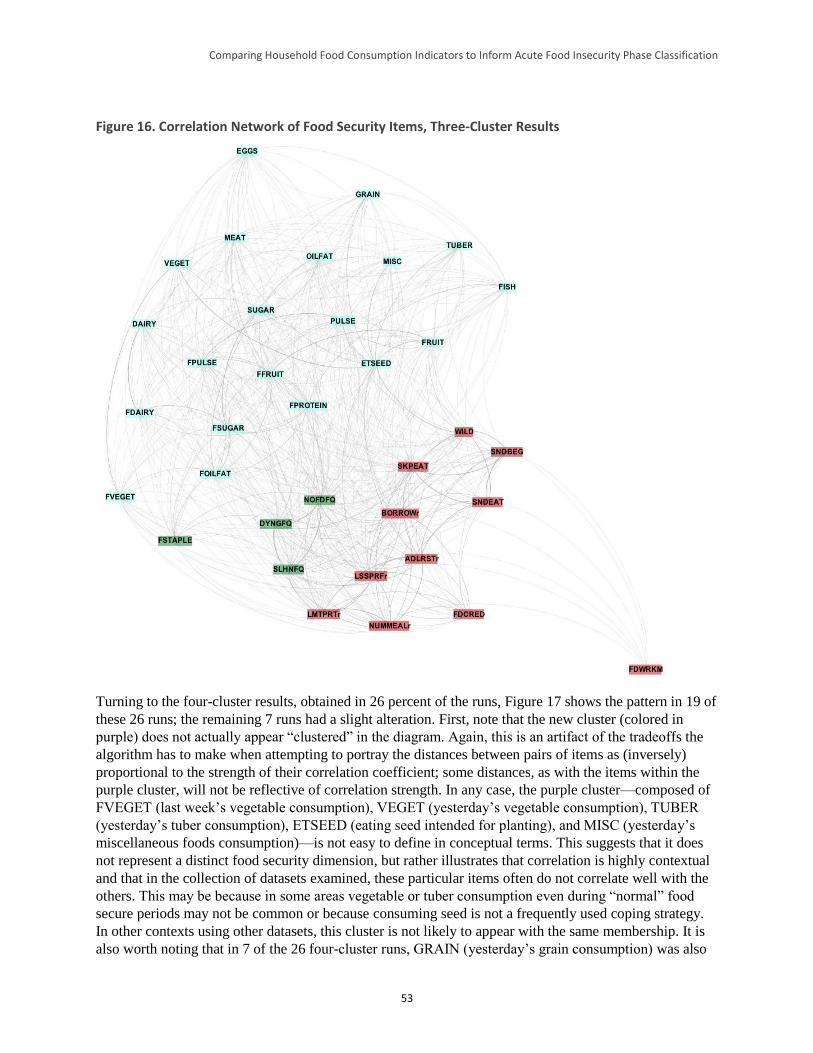
Comparing Household Food Consumption Indicators to Inform Acute Food Insecurity Phase Classification
53
Figure 16. Correlation Network of Food Security Items, Three-Cluster Results
Turning to the four-cluster results, obtained in 26 percent of the runs, Figure 17 shows the pattern in 19 of
these 26 runs; the remaining 7 runs had a slight alteration. First, note that the new cluster (colored in
purple) does not actually appear “clustered” in the diagram. Again, this is an artifact of the tradeoffs the
algorithm has to make when attempting to portray the distances between pairs of items as (inversely)
proportional to the strength of their correlation coefficient; some distances, as with the items within the
purple cluster, will not be reflective of correlation strength. In any case, the purple cluster—composed of
FVEGET (last week’s vegetable consumption), VEGET (yesterday’s vegetable consumption), TUBER
(yesterday’s tuber consumption), ETSEED (eating seed intended for planting), and MISC (yesterday’s
miscellaneous foods consumption)—is not easy to define in conceptual terms. This suggests that it does
not represent a distinct food security dimension, but rather illustrates that correlation is highly contextual
and that in the collection of datasets examined, these particular items often do not correlate well with the
others. This may be because in some areas vegetable or tuber consumption even during “normal” food
secure periods may not be common or because consuming seed is not a frequently used coping strategy.
In other contexts using other datasets, this cluster is not likely to appear with the same membership. It is
also worth noting that in 7 of the 26 four-cluster runs, GRAIN (yesterday’s grain consumption) was also
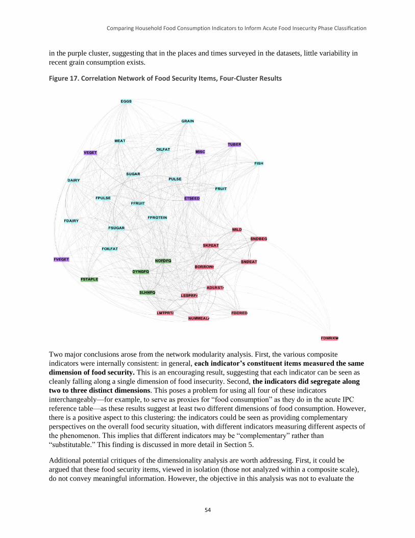
Comparing Household Food Consumption Indicators to Inform Acute Food Insecurity Phase Classification
54
in the purple cluster, suggesting that in the places and times surveyed in the datasets, little variability in
recent grain consumption exists.
Figure 17. Correlation Network of Food Security Items, Four-Cluster Results
Two major conclusions arose from the network modularity analysis. First, the various composite
indicators were internally consistent: in general, each indicator’s constituent items measured the same
dimension of food security. This is an encouraging result, suggesting that each indicator can be seen as
cleanly falling along a single dimension of food insecurity. Second, the indicators did segregate along
two to three distinct dimensions. This poses a problem for using all four of these indicators
interchangeably—for example, to serve as proxies for “food consumption” as they do in the acute IPC
reference table—as these results suggest at least two different dimensions of food consumption. However,
there is a positive aspect to this clustering: the indicators could be seen as providing complementary
perspectives on the overall food security situation, with different indicators measuring different aspects of
the phenomenon. This implies that different indicators may be “complementary” rather than
“substitutable.” This finding is discussed in more detail in Section 5.
Additional potential critiques of the dimensionality analysis are worth addressing. First, it could be
argued that these food security items, viewed in isolation (those not analyzed within a composite scale),
do not convey meaningful information. However, the objective in this analysis was not to evaluate the
Comparing Household Food Consumption Indicators to Inform Acute Food Insecurity Phase Classification
55
relationship of individual items to some latent trait (“dimension”) linked to food security (or, in this case,
food consumption). Rather, the objective of this analysis was to evaluate the consistency of the internal
structure of the composite indicators (i.e., whether internally they could be linked to multiple latent traits).
In other words, this study makes no claim that any individual item is, in isolation, an adequate
measurement variable for a latent trait linked to food security (food consumption). Using partial
correlations to define link strength in the network instead of bivariate correlations is preferable—as it
would control for the dependencies of each food security item on every other item, and thus extract a
“truer” association of each pair—but it requires datasets in which all four indicators are included, of
which only one was available for this study.
Second, the interpretation of link strength could be complicated by the fact that some items are
substitutable. For example, use of one coping strategy (e.g., selling livestock) could reduce use of another
(e.g., begging), although both may be measuring the same latent trait. However, because the network
analysis uses absolute values of the correlation coefficients, positive and negative correlations are dealt
with equivalently. If selling livestock leads to a strong decrease in begging, then both observed changes
could be part of the same dimension. Weak correlation may be more of a problem: that is, does a lack of
association nevertheless signify a causal relationship—e.g., selling livestock reduces begging but not
strongly—in which case both behaviors should be considered as representing the same latent trait? Or is
there no observed correlation because the two items are measuring different latent traits? This issue,
however, is a special case of the larger correlation-versus-causation issue, which cannot be resolved
empirically given the present datasets.
4.4.1.3 Principal Component Analysis
Because not every dataset made available for this study had information on every food security item, and
to avoid imputing values for the missing observations, PCA was performed only in a disaggregated
fashion for each of the 21 datasets. The similarities and differences between dataset results are discussed
in the following pages. Because results unweighted and weighted by the size of the dataset did not greatly
differ, only unweighted results are provided here. Unweighted results consider results from each dataset
to be of equal value rather than considering high-n datasets as proportionally more important.67
PCA depends upon the assumption that the functional relationships between variables are linear.68 This
assumption was tested by visually inspecting the scatterplots between every pair of food security items
under study, as well as evaluating the fit of linear, quadratic, and cubic trendlines for these graphs. In
cases where scatterplots suggested non-linear relationships and non-linear trendlines strongly improved
fit, the involved variables were transformed into logged forms. The following four coping strategy
variables appeared to have non-linear relationships with other variables: ADLRSTr (restrict adult food
consumption to allow children to eat), SNDEAT (send children to eat elsewhere), SNDBEG (send family
members to beg), and SKPEAT (skip entire days without eating). The logged forms of these four items
satisfy the linearity assumption, and these transformed variables were used in the subsequent PCA.
For every dataset, both the Kaiser-Meyer-Olkin Measure of Sampling Adequacy and the Bartlett’s Test of
Sphericity suggested that the PCA may be useful for data reduction. However, as detailed below, the
amount of total variance explained by the extracted principal components and the ways in which items
clustered together differed considerably across datasets.
67 Weighted results are available upon request. 68 To avoid making this assumption in the earlier correlation-based analyses, Spearman’s rho, a non-parametric method that uses
ranks, was used.
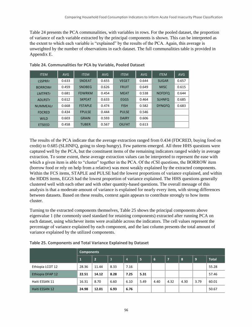
Comparing Household Food Consumption Indicators to Inform Acute Food Insecurity Phase Classification
56
Table 24 presents the PCA communalities, with variables in rows. For the pooled dataset, the proportion
of variance of each variable extracted by the principal components is shown. This can be interpreted as
the extent to which each variable is “explained” by the results of the PCA. Again, this average is
unweighted by the number of observations in each dataset. The full communalities table is provided in
Appendix E.
Table 24. Communalities for PCA by Variable, Pooled Dataset
ITEM AVG ITEM AVG ITEM AVG ITEM AVG
LSSPRFr 0.633 SNDEAT 0.655 VEGET 0.644 SUGAR 0.657
BORROWr 0.459 SNDBEG 0.626 FRUIT 0.649 MISC 0.615
LMTPRTr 0.681 FDWRKM 0.454 MEAT 0.538 NOFDFQ 0.644
ADLRSTr 0.612 SKPEAT 0.633 EGGS 0.464 SLHNFQ 0.685
NUMMEALr 0.668 FSTAPLE 0.474 FISH 0.582 DYNGFQ 0.683
FDCRED 0.434 FPULSE 0.444 PULSE 0.546
WILD 0.603 GRAIN 0.593 DAIRY 0.606
ETSEED 0.458 TUBER 0.567 OILFAT 0.613
The results of the PCA indicate that the average extraction ranged from 0.434 (FDCRED, buying food on
credit) to 0.685 (SLHNFQ, going to sleep hungry). Few patterns emerged. All three HHS questions were
captured well by the PCA, but the constituent items of the remaining indicators ranged widely in average
extraction. To some extent, these average extraction values can be interpreted to represent the ease with
which a given item is able to “cluster” together in the PCA. Of the rCSI questions, the BORROW item
(borrow food or rely on help from a relative) was most weakly explained by the extracted components.
Within the FCS items, STAPLE and PULSE had the lowest proportions of variance explained, and within
the HDDS items, EGGS had the lowest proportion of variance explained. The HHS questions generally
clustered well with each other and with other quantity-based questions. The overall message of this
analysis is that a moderate amount of variance is explained for nearly every item, with strong differences
between datasets. Based on these results, context again appears to contribute strongly to how items
cluster.
Turning to the extracted components themselves, Table 25 shows the principal components above
eigenvalue 1 (the commonly used standard for retaining components) extracted after running PCA on
each dataset, using whichever items were available across the indicators. The cell values represent the
percentage of variance explained by each component, and the last column presents the total amount of
variance explained by the utilized components.
Table 25. Components and Total Variance Explained by Dataset
Components
1 2 3 4 5 6 7 8 9 Total
Ethiopia LCOT 12 28.36 11.44 8.33 7.16 55.28
Ethiopia DFAP 12 22.51 14.12 8.28 7.25 5.31 57.46
Haiti ESSAN 11 16.31 8.70 6.60 6.10 5.49 4.40 4.32 4.30 3.79 60.01
Haiti ESSAN 12 24.98 12.01 6.93 6.76 50.67
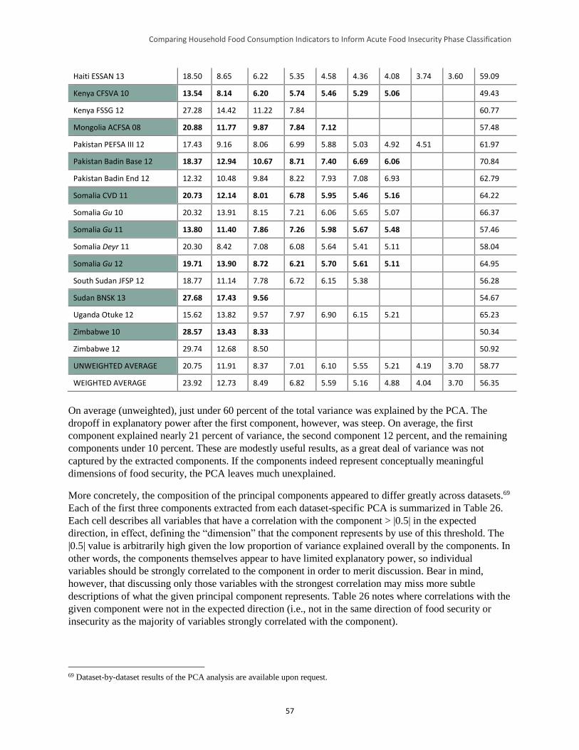
Comparing Household Food Consumption Indicators to Inform Acute Food Insecurity Phase Classification
57
Haiti ESSAN 13 18.50 8.65 6.22 5.35 4.58 4.36 4.08 3.74 3.60 59.09
Kenya CFSVA 10 13.54 8.14 6.20 5.74 5.46 5.29 5.06 49.43
Kenya FSSG 12 27.28 14.42 11.22 7.84 60.77
Mongolia ACFSA 08 20.88 11.77 9.87 7.84 7.12 57.48
Pakistan PEFSA III 12 17.43 9.16 8.06 6.99 5.88 5.03 4.92 4.51 61.97
Pakistan Badin Base 12 18.37 12.94 10.67 8.71 7.40 6.69 6.06 70.84
Pakistan Badin End 12 12.32 10.48 9.84 8.22 7.93 7.08 6.93 62.79
Somalia CVD 11 20.73 12.14 8.01 6.78 5.95 5.46 5.16 64.22
Somalia Gu 10 20.32 13.91 8.15 7.21 6.06 5.65 5.07 66.37
Somalia Gu 11 13.80 11.40 7.86 7.26 5.98 5.67 5.48 57.46
Somalia Deyr 11 20.30 8.42 7.08 6.08 5.64 5.41 5.11 58.04
Somalia Gu 12 19.71 13.90 8.72 6.21 5.70 5.61 5.11 64.95
South Sudan JFSP 12 18.77 11.14 7.78 6.72 6.15 5.38 56.28
Sudan BNSK 13 27.68 17.43 9.56 54.67
Uganda Otuke 12 15.62 13.82 9.57 7.97 6.90 6.15 5.21 65.23
Zimbabwe 10 28.57 13.43 8.33 50.34
Zimbabwe 12 29.74 12.68 8.50 50.92
UNWEIGHTED AVERAGE 20.75 11.91 8.37 7.01 6.10 5.55 5.21 4.19 3.70 58.77
WEIGHTED AVERAGE 23.92 12.73 8.49 6.82 5.59 5.16 4.88 4.04 3.70 56.35
On average (unweighted), just under 60 percent of the total variance was explained by the PCA. The
dropoff in explanatory power after the first component, however, was steep. On average, the first
component explained nearly 21 percent of variance, the second component 12 percent, and the remaining
components under 10 percent. These are modestly useful results, as a great deal of variance was not
captured by the extracted components. If the components indeed represent conceptually meaningful
dimensions of food security, the PCA leaves much unexplained.
More concretely, the composition of the principal components appeared to differ greatly across datasets.69
Each of the first three components extracted from each dataset-specific PCA is summarized in Table 26.
Each cell describes all variables that have a correlation with the component > |0.5| in the expected
direction, in effect, defining the “dimension” that the component represents by use of this threshold. The
|0.5| value is arbitrarily high given the low proportion of variance explained overall by the components. In
other words, the components themselves appear to have limited explanatory power, so individual
variables should be strongly correlated to the component in order to merit discussion. Bear in mind,
however, that discussing only those variables with the strongest correlation may miss more subtle
descriptions of what the given principal component represents. Table 26 notes where correlations with the
given component were not in the expected direction (i.e., not in the same direction of food security or
insecurity as the majority of variables strongly correlated with the component).
69 Dataset-by-dataset results of the PCA analysis are available upon request.
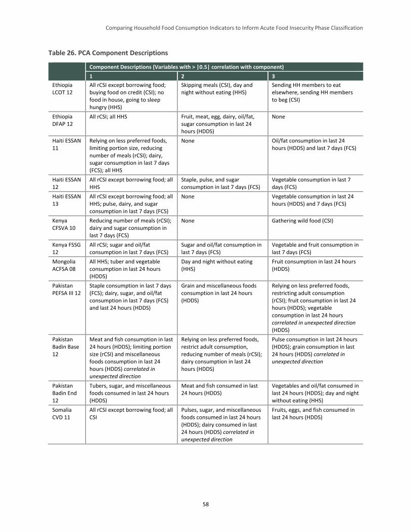
Comparing Household Food Consumption Indicators to Inform Acute Food Insecurity Phase Classification
58
Table 26. PCA Component Descriptions
Component Descriptions (Variables with > |0.5| correlation with component)
1 2 3
Ethiopia LCOT 12
All rCSI except borrowing food; buying food on credit (CSI); no food in house, going to sleep hungry (HHS)
Skipping meals (CSI), day and night without eating (HHS)
Sending HH members to eat elsewhere, sending HH members to beg (CSI)
Ethiopia DFAP 12
All rCSI; all HHS Fruit, meat, egg, dairy, oil/fat, sugar consumption in last 24 hours (HDDS)
None
Haiti ESSAN 11
Relying on less preferred foods, limiting portion size, reducing number of meals (rCSI); dairy, sugar consumption in last 7 days (FCS); all HHS
None Oil/fat consumption in last 24 hours (HDDS) and last 7 days (FCS)
Haiti ESSAN 12
All rCSI except borrowing food; all HHS
Staple, pulse, and sugar consumption in last 7 days (FCS)
Vegetable consumption in last 7 days (FCS)
Haiti ESSAN 13
All rCSI except borrowing food; all HHS; pulse, dairy, and sugar consumption in last 7 days (FCS)
None Vegetable consumption in last 24 hours (HDDS) and 7 days (FCS)
Kenya CFSVA 10
Reducing number of meals (rCSI); dairy and sugar consumption in last 7 days (FCS)
None Gathering wild food (CSI)
Kenya FSSG 12
All rCSI; sugar and oil/fat consumption in last 7 days (FCS)
Sugar and oil/fat consumption in last 7 days (FCS)
Vegetable and fruit consumption in last 7 days (FCS)
Mongolia ACFSA 08
All HHS; tuber and vegetable consumption in last 24 hours (HDDS)
Day and night without eating (HHS)
Fruit consumption in last 24 hours (HDDS)
Pakistan PEFSA III 12
Staple consumption in last 7 days (FCS); dairy, sugar, and oil/fat consumption in last 7 days (FCS) and last 24 hours (HDDS)
Grain and miscellaneous foods consumption in last 24 hours (HDDS)
Relying on less preferred foods, restricting adult consumption (rCSI); fruit consumption in last 24 hours (HDDS); vegetable consumption in last 24 hours correlated in unexpected direction (HDDS)
Pakistan Badin Base 12
Meat and fish consumption in last 24 hours (HDDS); limiting portion size (rCSI) and miscellaneous foods consumption in last 24 hours (HDDS) correlated in unexpected direction
Relying on less preferred foods, restrict adult consumption, reducing number of meals (rCSI); dairy consumption in last 24 hours (HDDS)
Pulse consumption in last 24 hours (HDDS); grain consumption in last 24 hours (HDDS) correlated in unexpected direction
Pakistan Badin End 12
Tubers, sugar, and miscellaneous foods consumed in last 24 hours (HDDS)
Meat and fish consumed in last 24 hours (HDDS)
Vegetables and oil/fat consumed in last 24 hours (HDDS); day and night without eating (HHS)
Somalia CVD 11
All rCSI except borrowing food; all CSI
Pulses, sugar, and miscellaneous foods consumed in last 24 hours (HDDS); dairy consumed in last 24 hours (HDDS) correlated in unexpected direction
Fruits, eggs, and fish consumed in last 24 hours (HDDS)
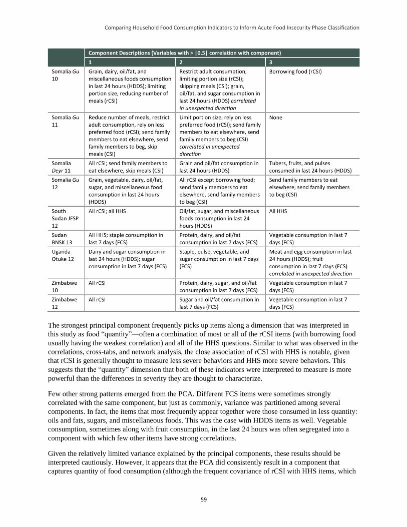
Comparing Household Food Consumption Indicators to Inform Acute Food Insecurity Phase Classification
59
Component Descriptions (Variables with > |0.5| correlation with component)
1 2 3
Somalia Gu 10
Grain, dairy, oil/fat, and miscellaneous foods consumption in last 24 hours (HDDS); limiting portion size, reducing number of meals (rCSI)
Restrict adult consumption, limiting portion size (rCSI); skipping meals (CSI); grain, oil/fat, and sugar consumption in last 24 hours (HDDS) correlated in unexpected direction
Borrowing food (rCSI)
Somalia Gu 11
Reduce number of meals, restrict adult consumption, rely on less preferred food (rCSI); send family members to eat elsewhere, send family members to beg, skip meals (CSI)
Limit portion size, rely on less preferred food (rCSI); send family members to eat elsewhere, send family members to beg (CSI) correlated in unexpected direction
None
Somalia Deyr 11
All rCSI; send family members to eat elsewhere, skip meals (CSI)
Grain and oil/fat consumption in last 24 hours (HDDS)
Tubers, fruits, and pulses consumed in last 24 hours (HDDS)
Somalia Gu 12
Grain, vegetable, dairy, oil/fat, sugar, and miscellaneous food consumption in last 24 hours (HDDS)
All rCSI except borrowing food; send family members to eat elsewhere, send family members to beg (CSI)
Send family members to eat elsewhere, send family members to beg (CSI)
South Sudan JFSP 12
All rCSI; all HHS Oil/fat, sugar, and miscellaneous foods consumption in last 24 hours (HDDS)
All HHS
Sudan BNSK 13
All HHS; staple consumption in last 7 days (FCS)
Protein, dairy, and oil/fat consumption in last 7 days (FCS)
Vegetable consumption in last 7 days (FCS)
Uganda Otuke 12
Dairy and sugar consumption in last 24 hours (HDDS); sugar consumption in last 7 days (FCS)
Staple, pulse, vegetable, and sugar consumption in last 7 days (FCS)
Meat and egg consumption in last 24 hours (HDDS); fruit consumption in last 7 days (FCS) correlated in unexpected direction
Zimbabwe 10
All rCSI Protein, dairy, sugar, and oil/fat consumption in last 7 days (FCS)
Vegetable consumption in last 7 days (FCS)
Zimbabwe 12
All rCSI Sugar and oil/fat consumption in last 7 days (FCS)
Vegetable consumption in last 7 days (FCS)
The strongest principal component frequently picks up items along a dimension that was interpreted in
this study as food “quantity”—often a combination of most or all of the rCSI items (with borrowing food
usually having the weakest correlation) and all of the HHS questions. Similar to what was observed in the
correlations, cross-tabs, and network analysis, the close association of rCSI with HHS is notable, given
that rCSI is generally thought to measure less severe behaviors and HHS more severe behaviors. This
suggests that the “quantity” dimension that both of these indicators were interpreted to measure is more
powerful than the differences in severity they are thought to characterize.
Few other strong patterns emerged from the PCA. Different FCS items were sometimes strongly
correlated with the same component, but just as commonly, variance was partitioned among several
components. In fact, the items that most frequently appear together were those consumed in less quantity:
oils and fats, sugars, and miscellaneous foods. This was the case with HDDS items as well. Vegetable
consumption, sometimes along with fruit consumption, in the last 24 hours was often segregated into a
component with which few other items have strong correlations.
Given the relatively limited variance explained by the principal components, these results should be
interpreted cautiously. However, it appears that the PCA did consistently result in a component that
captures quantity of food consumption (although the frequent covariance of rCSI with HHS items, which
Comparing Household Food Consumption Indicators to Inform Acute Food Insecurity Phase Classification
60
occurred together in this component, needs to be further investigated—again, rCSI is normally thought to
capture less severe coping behaviors and HHS more severe food security states). The diet diversity items
from HDDS and FCS were partitioned in more diverse ways across datasets, with different combinations
appearing in different components.
The network modularity analysis and PCA returned similar results in the identification of a dimension
that could be labeled as a “quantity” based on the meaning of items that constitute the component. They
also showed a linkage between rCSI and HHS (although in higher cluster network analysis results, the
rCSI and CSI items segregated from the HHS items). The two types of analysis differed in that the pooled
dataset-based network algorithm preserved the diet diversity item clustering, while the more fine-grained
PCA, with the ability to partition variance of a single item across various clusters, suggested that context
matters in determining the grouping of diet diversity items.
4.4.2 The Alignment of Indicator Categories
In the preceding subsections, the lack of greater observed correlation between indicator items is likely
because different variables measured different dimensions of food insecurity. With respect to
concordance—the similar or dissimilar classification of households into food security categories by
different indicators—where categorical thresholds are placed is also a significant issue. That is, although
the qualitative labels of the categories in Table 6 are similar, the cutoffs may be set in a way that makes
concordance unlikely. In other words, the categories may be “misaligned.” This sub-section presents an
investigation of the possibility that alignment is constrained because different indicators are insensitive to
different levels of food insecurity.
4.4.2.1 Alignment Analysis Methodology
The problem of “misalignment” is best illustrated with an example. In a relatively food secure situation,
the majority of households may report an HHS of 0, which makes establishing correlation between HHS
and other indicators (assuming these other indicators are able to detect the subtleties of a relatively more
food secure situation that HHS cannot) difficult. Similarly, other indicators may be unable to make
distinctions between households in very severe food insecurity situations. In the absence of a gold
standard food consumption indicator by which to objectively establish food security conditions, this
hypothesis of misalignment is difficult to test. As such, this sub-section explores how specific values of
one variable predict—or fail to predict—specific values of a second variable. The patterns that emerge
help to understand the ranges in which values for different indicators align.
One point is worth noting before proceeding: sensitivity analysis was performed testing the effect of
changes in the thresholds given in Table 6 on categorical concordance. This analysis was conducted
exhaustively, through cross-tabulating every possible combination of (whole number) threshold values for
every pair of indicators and describing how each tabulation affected the degree to which the indicators
classify households similarly. These results appear in Appendix C. However, the alignment analysis
illustrated that the problem of discordance is more general: not only are the current indicator categories
poorly aligned—despite the same or similar qualitative labels, they are not providing signals of the same
severity of food insecurity—but they cannot be completely aligned given the measurement limitations of
the various indicators. The alignment analysis was thus performed first to obtain a rough picture of the
best alignment possible. Then, a more restricted sensitivity analysis of the effect of changing categorical
thresholds on concordance was carried out, the results of which are discussed in Section 5.
A two-step process was followed for the alignment analysis. First, for every given value of Indicator 1,
the median and mean scores of Indicator 2 were calculated. For example, the analysis began by examining
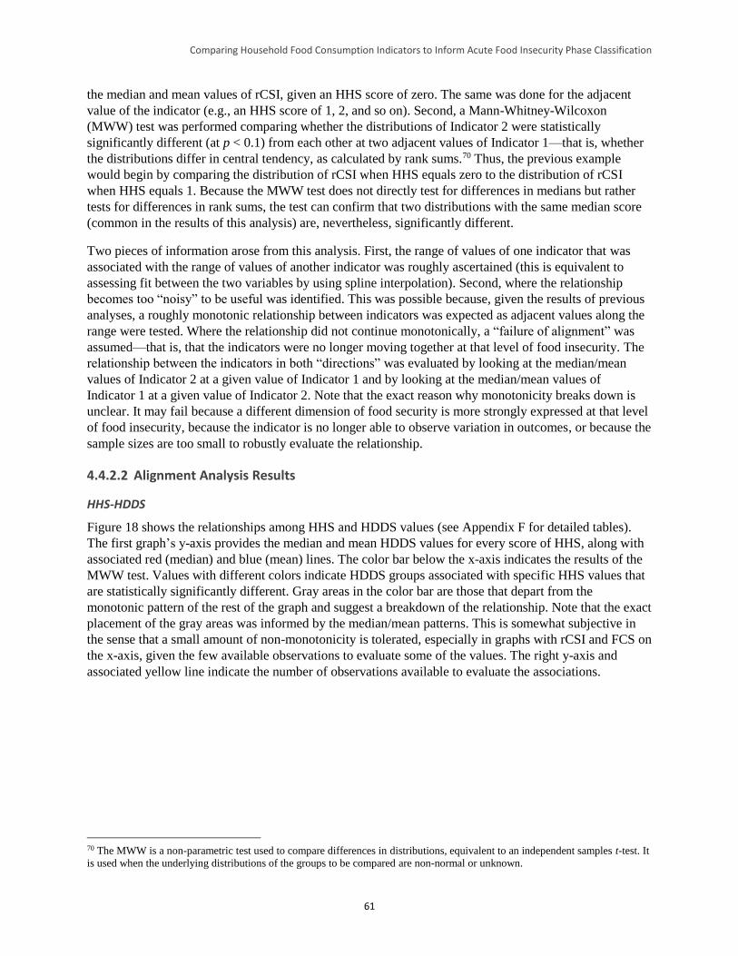
Comparing Household Food Consumption Indicators to Inform Acute Food Insecurity Phase Classification
61
the median and mean values of rCSI, given an HHS score of zero. The same was done for the adjacent
value of the indicator (e.g., an HHS score of 1, 2, and so on). Second, a Mann-Whitney-Wilcoxon
(MWW) test was performed comparing whether the distributions of Indicator 2 were statistically
significantly different (at p < 0.1) from each other at two adjacent values of Indicator 1—that is, whether
the distributions differ in central tendency, as calculated by rank sums.70 Thus, the previous example
would begin by comparing the distribution of rCSI when HHS equals zero to the distribution of rCSI
when HHS equals 1. Because the MWW test does not directly test for differences in medians but rather
tests for differences in rank sums, the test can confirm that two distributions with the same median score
(common in the results of this analysis) are, nevertheless, significantly different.
Two pieces of information arose from this analysis. First, the range of values of one indicator that was
associated with the range of values of another indicator was roughly ascertained (this is equivalent to
assessing fit between the two variables by using spline interpolation). Second, where the relationship
becomes too “noisy” to be useful was identified. This was possible because, given the results of previous
analyses, a roughly monotonic relationship between indicators was expected as adjacent values along the
range were tested. Where the relationship did not continue monotonically, a “failure of alignment” was
assumed—that is, that the indicators were no longer moving together at that level of food insecurity. The
relationship between the indicators in both “directions” was evaluated by looking at the median/mean
values of Indicator 2 at a given value of Indicator 1 and by looking at the median/mean values of
Indicator 1 at a given value of Indicator 2. Note that the exact reason why monotonicity breaks down is
unclear. It may fail because a different dimension of food security is more strongly expressed at that level
of food insecurity, because the indicator is no longer able to observe variation in outcomes, or because the
sample sizes are too small to robustly evaluate the relationship.
4.4.2.2 Alignment Analysis Results
HHS-HDDS
Figure 18 shows the relationships among HHS and HDDS values (see Appendix F for detailed tables).
The first graph’s y-axis provides the median and mean HDDS values for every score of HHS, along with
associated red (median) and blue (mean) lines. The color bar below the x-axis indicates the results of the
MWW test. Values with different colors indicate HDDS groups associated with specific HHS values that
are statistically significantly different. Gray areas in the color bar are those that depart from the
monotonic pattern of the rest of the graph and suggest a breakdown of the relationship. Note that the exact
placement of the gray areas was informed by the median/mean patterns. This is somewhat subjective in
the sense that a small amount of non-monotonicity is tolerated, especially in graphs with rCSI and FCS on
the x-axis, given the few available observations to evaluate some of the values. The right y-axis and
associated yellow line indicate the number of observations available to evaluate the associations.
70 The MWW is a non-parametric test used to compare differences in distributions, equivalent to an independent samples t-test. It
is used when the underlying distributions of the groups to be compared are non-normal or unknown.
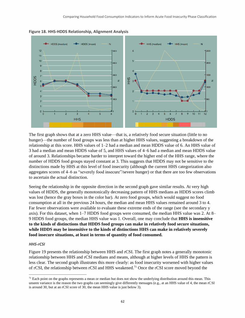
Comparing Household Food Consumption Indicators to Inform Acute Food Insecurity Phase Classification
62
Figure 18. HHS-HDDS Relationship, Alignment Analysis
The first graph shows that at a zero HHS value—that is, a relatively food secure situation (little to no
hunger)—the number of food groups was less than at higher HHS values, suggesting a breakdown of the
relationship at this score. HHS values of 1–2 had a median and mean HDDS value of 6. An HHS value of
3 had a median and mean HDDS value of 5, and HHS values of 4–6 had a median and mean HDDS value
of around 3. Relationships became harder to interpret toward the higher end of the HHS range, where the
number of HDDS food groups stayed constant at 3. This suggests that HDDS may not be sensitive to the
distinctions made by HHS at this level of food insecurity (although the current HHS categorization also
aggregates scores of 4–6 as “severely food insecure”/severe hunger) or that there are too few observations
to ascertain the actual distinction.
Seeing the relationship in the opposite direction in the second graph gave similar results. At very high
values of HDDS, the generally monotonically decreasing pattern of HHS medians as HDDS scores climb
was lost (hence the gray boxes in the color bar). At zero food groups, which would suggest no food
consumption at all in the previous 24 hours, the median and mean HHS values remained around 3 to 4.
Far fewer observations were available to evaluate these extreme ends of the range (see the secondary y
axis). For this dataset, when 1–7 HDDS food groups were consumed, the median HHS value was 2. At 8–
9 HDDS food groups, the median HHS value was 1. Overall, one may conclude that HHS is insensitive
to the kinds of distinctions that HDDS food groups can make in relatively food secure situations,
while HDDS may be insensitive to the kinds of distinctions HHS can make in relatively severely
food insecure situations, at least in terms of quantity of food consumed.
HHS-rCSI
Figure 19 presents the relationship between HHS and rCSI. The first graph notes a generally monotonic
relationship between HHS and rCSI medians and means, although at higher levels of HHS the pattern is
less clear. The second graph illustrates this more clearly: as food insecurity worsened with higher values
of rCSI, the relationship between rCSI and HHS weakened.71 Once the rCSI score moved beyond the
71 Each point on the graphs represents a mean or median but does not show the underlying distribution around this mean. This
unseen variance is the reason the two graphs can seemingly give differently messages (e.g., at an HHS value of 4, the mean rCSI
is around 30, but at an rCSI score of 30, the mean HHS value is just below 3).
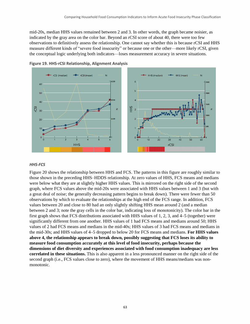
Comparing Household Food Consumption Indicators to Inform Acute Food Insecurity Phase Classification
63
mid-20s, median HHS values remained between 2 and 3. In other words, the graph became noisier, as
indicated by the gray area on the color bar. Beyond an rCSI score of about 40, there were too few
observations to definitively assess the relationship. One cannot say whether this is because rCSI and HHS
measure different kinds of “severe food insecurity” or because one or the other—more likely rCSI, given
the conceptual logic underlying both indicators—loses measurement accuracy in severe situations.
Figure 19. HHS-rCSI Relationship, Alignment Analysis
HHS-FCS
Figure 20 shows the relationship between HHS and FCS. The patterns in this figure are roughly similar to
those shown in the preceding HHS–HDDS relationship. At zero values of HHS, FCS means and medians
were below what they are at slightly higher HHS values. This is mirrored on the right side of the second
graph, where FCS values above the mid-20s were associated with HHS values between 1 and 3 (but with
a great deal of noise; the generally decreasing pattern begins to break down). There were fewer than 50
observations by which to evaluate the relationships at the high end of the FCS range. In addition, FCS
values between 20 and close to 80 had an only slightly shifting HHS mean around 2 (and a median
between 2 and 3; note the gray cells in the color bar, indicating loss of monotonicity). The color bar in the
first graph shows that FCS distributions associated with HHS values of 1, 2, 3, and 4–5 (together) were
significantly different from one another. HHS values of 1 had FCS means and medians around 50; HHS
values of 2 had FCS means and medians in the mid-40s; HHS values of 3 had FCS means and medians in
the mid-30s; and HHS values of 4–5 dropped to below 20 for FCS means and medians. For HHS values
above 4, the relationship appears to break down, possibly suggesting that FCS loses its ability to
measure food consumption accurately at this level of food insecurity, perhaps because the
dimensions of diet diversity and experiences associated with food consumption inadequacy are less
correlated in these situations. This is also apparent in a less pronounced manner on the right side of the
second graph (i.e., FCS values close to zero), where the movement of HHS means/medians was non-
monotonic.
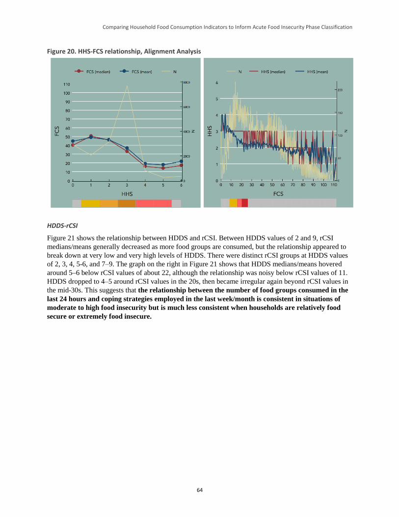
Comparing Household Food Consumption Indicators to Inform Acute Food Insecurity Phase Classification
64
Figure 20. HHS-FCS relationship, Alignment Analysis
HDDS-rCSI
Figure 21 shows the relationship between HDDS and rCSI. Between HDDS values of 2 and 9, rCSI
medians/means generally decreased as more food groups are consumed, but the relationship appeared to
break down at very low and very high levels of HDDS. There were distinct rCSI groups at HDDS values
of 2, 3, 4, 5-6, and 7–9. The graph on the right in Figure 21 shows that HDDS medians/means hovered
around 5–6 below rCSI values of about 22, although the relationship was noisy below rCSI values of 11.
HDDS dropped to 4–5 around rCSI values in the 20s, then became irregular again beyond rCSI values in
the mid-30s. This suggests that the relationship between the number of food groups consumed in the
last 24 hours and coping strategies employed in the last week/month is consistent in situations of
moderate to high food insecurity but is much less consistent when households are relatively food
secure or extremely food insecure.
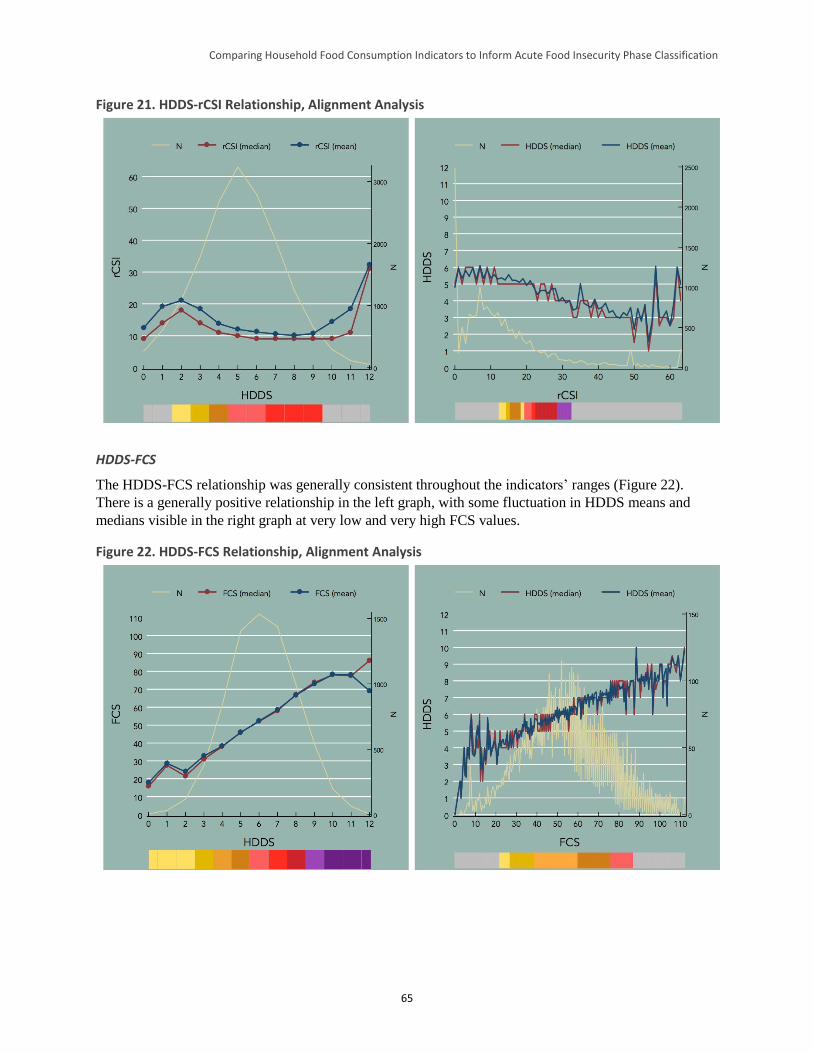
Comparing Household Food Consumption Indicators to Inform Acute Food Insecurity Phase Classification
65
Figure 21. HDDS-rCSI Relationship, Alignment Analysis
HDDS-FCS
The HDDS-FCS relationship was generally consistent throughout the indicators’ ranges (Figure 22).
There is a generally positive relationship in the left graph, with some fluctuation in HDDS means and
medians visible in the right graph at very low and very high FCS values.
Figure 22. HDDS-FCS Relationship, Alignment Analysis
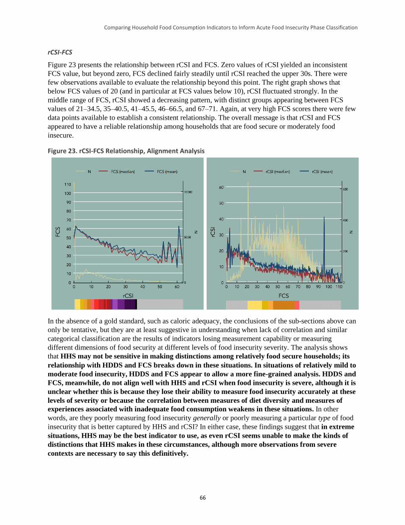
Comparing Household Food Consumption Indicators to Inform Acute Food Insecurity Phase Classification
66
rCSI-FCS
Figure 23 presents the relationship between rCSI and FCS. Zero values of rCSI yielded an inconsistent
FCS value, but beyond zero, FCS declined fairly steadily until rCSI reached the upper 30s. There were
few observations available to evaluate the relationship beyond this point. The right graph shows that
below FCS values of 20 (and in particular at FCS values below 10), rCSI fluctuated strongly. In the
middle range of FCS, rCSI showed a decreasing pattern, with distinct groups appearing between FCS
values of 21–34.5, 35–40.5, 41–45.5, 46–66.5, and 67–71. Again, at very high FCS scores there were few
data points available to establish a consistent relationship. The overall message is that rCSI and FCS
appeared to have a reliable relationship among households that are food secure or moderately food
insecure.
Figure 23. rCSI-FCS Relationship, Alignment Analysis
In the absence of a gold standard, such as caloric adequacy, the conclusions of the sub-sections above can
only be tentative, but they are at least suggestive in understanding when lack of correlation and similar
categorical classification are the results of indicators losing measurement capability or measuring
different dimensions of food security at different levels of food insecurity severity. The analysis shows
that HHS may not be sensitive in making distinctions among relatively food secure households; its
relationship with HDDS and FCS breaks down in these situations. In situations of relatively mild to
moderate food insecurity, HDDS and FCS appear to allow a more fine-grained analysis. HDDS and
FCS, meanwhile, do not align well with HHS and rCSI when food insecurity is severe, although it is
unclear whether this is because they lose their ability to measure food insecurity accurately at these
levels of severity or because the correlation between measures of diet diversity and measures of
experiences associated with inadequate food consumption weakens in these situations. In other
words, are they poorly measuring food insecurity generally or poorly measuring a particular type of food
insecurity that is better captured by HHS and rCSI? In either case, these findings suggest that in extreme
situations, HHS may be the best indicator to use, as even rCSI seems unable to make the kinds of
distinctions that HHS makes in these circumstances, although more observations from severe
contexts are necessary to say this definitively.
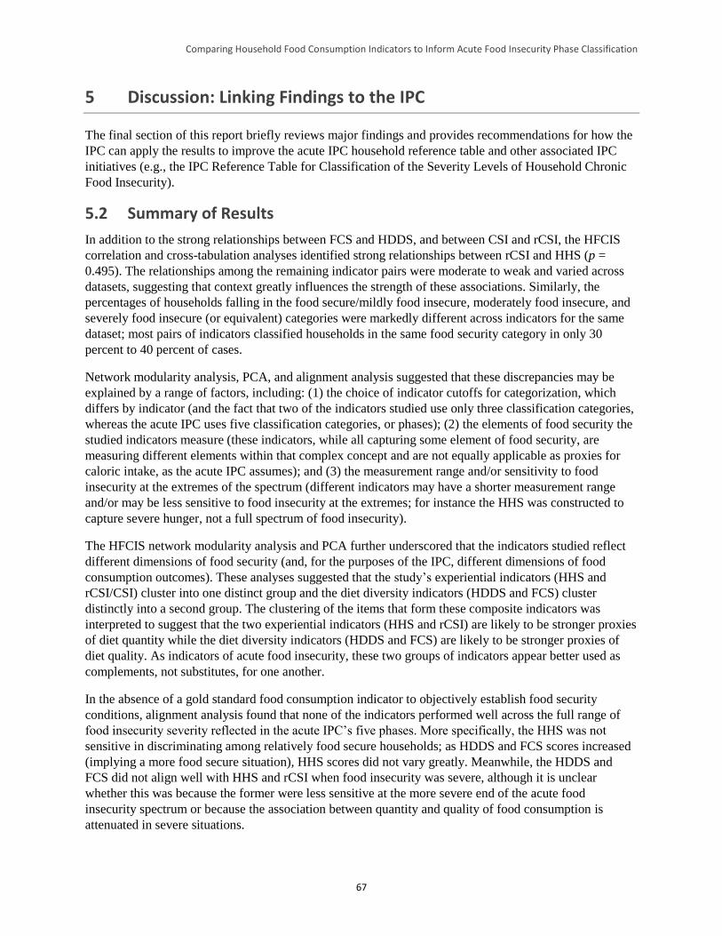
Comparing Household Food Consumption Indicators to Inform Acute Food Insecurity Phase Classification
67
5 Discussion: Linking Findings to the IPC
The final section of this report briefly reviews major findings and provides recommendations for how the
IPC can apply the results to improve the acute IPC household reference table and other associated IPC
initiatives (e.g., the IPC Reference Table for Classification of the Severity Levels of Household Chronic
Food Insecurity).
5.2 Summary of Results
In addition to the strong relationships between FCS and HDDS, and between CSI and rCSI, the HFCIS
correlation and cross-tabulation analyses identified strong relationships between rCSI and HHS (p =
0.495). The relationships among the remaining indicator pairs were moderate to weak and varied across
datasets, suggesting that context greatly influences the strength of these associations. Similarly, the
percentages of households falling in the food secure/mildly food insecure, moderately food insecure, and
severely food insecure (or equivalent) categories were markedly different across indicators for the same
dataset; most pairs of indicators classified households in the same food security category in only 30
percent to 40 percent of cases.
Network modularity analysis, PCA, and alignment analysis suggested that these discrepancies may be
explained by a range of factors, including: (1) the choice of indicator cutoffs for categorization, which
differs by indicator (and the fact that two of the indicators studied use only three classification categories,
whereas the acute IPC uses five classification categories, or phases); (2) the elements of food security the
studied indicators measure (these indicators, while all capturing some element of food security, are
measuring different elements within that complex concept and are not equally applicable as proxies for
caloric intake, as the acute IPC assumes); and (3) the measurement range and/or sensitivity to food
insecurity at the extremes of the spectrum (different indicators may have a shorter measurement range
and/or may be less sensitive to food insecurity at the extremes; for instance the HHS was constructed to
capture severe hunger, not a full spectrum of food insecurity).
The HFCIS network modularity analysis and PCA further underscored that the indicators studied reflect
different dimensions of food security (and, for the purposes of the IPC, different dimensions of food
consumption outcomes). These analyses suggested that the study’s experiential indicators (HHS and
rCSI/CSI) cluster into one distinct group and the diet diversity indicators (HDDS and FCS) cluster
distinctly into a second group. The clustering of the items that form these composite indicators was
interpreted to suggest that the two experiential indicators (HHS and rCSI) are likely to be stronger proxies
of diet quantity while the diet diversity indicators (HDDS and FCS) are likely to be stronger proxies of
diet quality. As indicators of acute food insecurity, these two groups of indicators appear better used as
complements, not substitutes, for one another.
In the absence of a gold standard food consumption indicator to objectively establish food security
conditions, alignment analysis found that none of the indicators performed well across the full range of
food insecurity severity reflected in the acute IPC’s five phases. More specifically, the HHS was not
sensitive in discriminating among relatively food secure households; as HDDS and FCS scores increased
(implying a more food secure situation), HHS scores did not vary greatly. Meanwhile, the HDDS and
FCS did not align well with HHS and rCSI when food insecurity was severe, although it is unclear
whether this was because the former were less sensitive at the more severe end of the acute food
insecurity spectrum or because the association between quantity and quality of food consumption is
attenuated in severe situations.
Comparing Household Food Consumption Indicators to Inform Acute Food Insecurity Phase Classification
68
5.2 Anchoring Indicators and Thresholds to IPC Phases
Because there is no gold standard food consumption indicator among the data used in this study, a way to
“anchor” the indicators examined to the acute IPC household reference table was required (i.e., to identify
indicators and scores that correspond to specific acute IPC phases). Without an objective reference
benchmark, this anchoring process was based on the prior analyses, experiences, and judgment of the
study authors and a broader technical advisory group from WFP, FAO, FANTA, and FEWS NET.
After considering two possible anchors as indicators of acute IPC phase 5 (catastrophe)—an HHS score
of > 4 (i.e., 5 to 6) or an FCS ≤ 10—it was decided to anchor an HHS score of 5 to 6 to an acute IPC
phase classification of 5, for several reasons. First, there is a clear conceptual link between the caloric
deficits described at the catastrophe phase and the experiences faced by food insecure households with an
HHS of 5 to 6. An HHS of 6 implies that the household did not have food to eat of any kind, went to sleep
at night hungry, and went an entire day or night without eating more than 10 days in the past month. This
is thus indicative of a catastrophic situation, described in the acute IPC household reference table as
follows: “Even with humanitarian assistance, the household group has an extreme lack of food and/or
other basic needs despite full employment of coping strategies. Starvation, destitution, and death are
evident.” An HHS of 5 can only be logically achieved in a limited number of ways. The only known
dataset examined with HHS information from an acute IPC Phase 5 situation is the Somalia CVD data
collected during the Somalia famine in 2011—particularly the baseline information at the beginning of
the response, before any cash transfers were made. These data were not included in the analysis above as
they were not tabulated according to the standard HHS methodology, but the data were consulted for the
anchor analysis. These data confirm that, in an actual famine, there will be many HHS values of 6. In the
Somalia CVD dataset, there were a limited number of households with an HHS of 5, which is not
surprising given the seemingly limited number of ways in which this score can be achieved. However, for
this reason, an HHS of 5 is conceptually more closely aligned with an HHS of 6 than with an HHS of 4,
hence the placement of an HHS of 5 in Table 28 HHS was also selected as the anchor because this study’s
dimensionality analysis indicates that HHS is a better proxy of the quantity of food consumed and
because HHS uses a longer recall period.
With this anchor in mind, and based on the results of the alignment analysis presented in Section 4, the
food security indicator score ranges for the acute IPC household reference table presented in Table 30 are
suggested. Before proceeding, it is important to note a few characteristics of this table. First, as a result of
selecting an HHS of 5 or 6 as the anchor, only HHS has a cutoff for each of the five acute IPC phases.
The other indicators have at least one set of cutoffs that spans more than one acute IPC phase. Second, the
values selected for a given cutoff range overlap within each indicator. For example, the HHS cutoff range
for Phase 2 is 1 to 2, while the cutoff range for Phase 3 is 2 to 4; the value “2” falls in both categories.
This is because in the next step of the analysis, all possible combinations of these values will be tested to
ascertain which combinations obtain the greatest concordance. Finally, some of the boundaries between
phases in Table 27 have a dotted line; these signify parts of the analysis where the effect on concordance
of including or eliminating these category distinctions is explored.
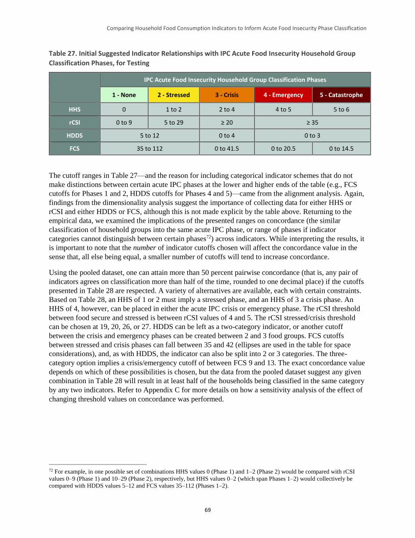
Comparing Household Food Consumption Indicators to Inform Acute Food Insecurity Phase Classification
69
Table 27. Initial Suggested Indicator Relationships with IPC Acute Food Insecurity Household Group
Classification Phases, for Testing
IPC Acute Food Insecurity Household Group Classification Phases
1 - None 2 - Stressed 3 - Crisis 4 - Emergency 5 - Catastrophe
HHS 0 1 to 2 2 to 4 4 to 5 5 to 6
rCSI 0 to 9 5 to 29 ≥ 20 ≥ 35
HDDS 5 to 12 0 to 4 0 to 3
FCS 35 to 112 0 to 41.5 0 to 20.5 0 to 14.5
The cutoff ranges in Table 27—and the reason for including categorical indicator schemes that do not
make distinctions between certain acute IPC phases at the lower and higher ends of the table (e.g., FCS
cutoffs for Phases 1 and 2, HDDS cutoffs for Phases 4 and 5)—came from the alignment analysis. Again,
findings from the dimensionality analysis suggest the importance of collecting data for either HHS or
rCSI and either HDDS or FCS, although this is not made explicit by the table above. Returning to the
empirical data, we examined the implications of the presented ranges on concordance (the similar
classification of household groups into the same acute IPC phase, or range of phases if indicator
categories cannot distinguish between certain phases72) across indicators. While interpreting the results, it
is important to note that the number of indicator cutoffs chosen will affect the concordance value in the
sense that, all else being equal, a smaller number of cutoffs will tend to increase concordance.
Using the pooled dataset, one can attain more than 50 percent pairwise concordance (that is, any pair of
indicators agrees on classification more than half of the time, rounded to one decimal place) if the cutoffs
presented in Table 28 are respected. A variety of alternatives are available, each with certain constraints.
Based on Table 28, an HHS of 1 or 2 must imply a stressed phase, and an HHS of 3 a crisis phase. An
HHS of 4, however, can be placed in either the acute IPC crisis or emergency phase. The rCSI threshold
between food secure and stressed is between rCSI values of 4 and 5. The rCSI stressed/crisis threshold
can be chosen at 19, 20, 26, or 27. HDDS can be left as a two-category indicator, or another cutoff
between the crisis and emergency phases can be created between 2 and 3 food groups. FCS cutoffs
between stressed and crisis phases can fall between 35 and 42 (ellipses are used in the table for space
considerations), and, as with HDDS, the indicator can also be split into 2 or 3 categories. The three-
category option implies a crisis/emergency cutoff of between FCS 9 and 13. The exact concordance value
depends on which of these possibilities is chosen, but the data from the pooled dataset suggest any given
combination in Table 28 will result in at least half of the households being classified in the same category
by any two indicators. Refer to Appendix C for more details on how a sensitivity analysis of the effect of
changing threshold values on concordance was performed.
72 For example, in one possible set of combinations HHS values 0 (Phase 1) and 1–2 (Phase 2) would be compared with rCSI
values 0–9 (Phase 1) and 10–29 (Phase 2), respectively, but HHS values 0–2 (which span Phases 1–2) would collectively be
compared with HDDS values 5–12 and FCS values 35–112 (Phases 1–2).
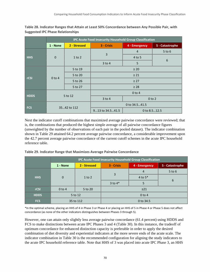
Comparing Household Food Consumption Indicators to Inform Acute Food Insecurity Phase Classification
70
Table 28. Indicator Ranges that Attain at Least 50% Concordance between Any Possible Pair, with
Suggested IPC Phase Relationships
IPC Acute Food Insecurity Household Group Classification
1 - None 2 - Stressed 3 - Crisis 4 - Emergency 5 - Catastrophe
HHS 0 1 to 2 3
4 5 to 6
4 to 5 6
3 to 4 5
rCSI 0 to 4
5 to 19 ≥ 20
5 to 20 ≥ 21
5 to 26 ≥ 27
5 to 27 ≥ 28
HDDS 5 to 12 0 to 4
3 to 4 0 to 2
FCS 35…42 to 112 0 to 34.5…41.5
9...13 to 34.5…41.5 0 to 8.5…12.5
Next the indicator cutoff combinations that maximized average pairwise concordance were reviewed; that
is, the combinations that produced the highest simple average of all pairwise concordance figures
(unweighted by the number of observations of each pair in the pooled dataset). The indicator combination
shown in Table 29 attained 64.2 percent average pairwise concordance, a considerable improvement upon
the 42.7 percent average pairwise concordance of the current cutoff schemes in the acute IPC household
reference table.
Table 29. Indicator Range that Maximizes Average Pairwise Concordance
IPC Acute Food Insecurity Household Group Classification
1 - None 2 - Stressed 3 - Crisis 4 - Emergency 5 - Catastrophe
HHS 0 1 to 2 3
4 5 to 6
4 to 5* 6
3 to 4* 5
rCSI 0 to 4 5 to 20 ≥21
HDDS 5 to 12 0 to 4
FCS 35 to 112 0 to 34.5
*In the optimal scheme, placing an HHS of 4 in Phase 3 or Phase 4 or placing an HHS of 5 in Phase 4 or Phase 5 does not affect
concordance (as none of the other indicators distinguishes between Phases 3 through 5).
However, one can attain only slightly less average pairwise concordance (61.4 percent) using HDDS and
FCS to make distinctions between acute IPC Phases 3 and 4 (Table 30). In this instance, the tradeoff of
optimum concordance for enhanced distinction capacity is preferable in order to apply the desired
combination of diet diversity and experiential indicators at the more severe ends of the acute scale. The
indicator combination in Table 30 is the recommended configuration for aligning the study indicators to
the acute IPC household reference table. Note that HHS of 3 was placed into acute IPC Phase 3, an HHS
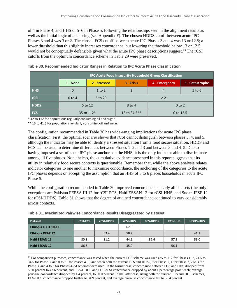
Comparing Household Food Consumption Indicators to Inform Acute Food Insecurity Phase Classification
71
of 4 in Phase 4, and HHS of 5–6 in Phase 5, following the relationships seen in the alignment results as
well as the initial logic of anchoring (see Appendix F). The chosen HDDS cutoff between acute IPC
Phases 3 and 4 was 3 or 2. The chosen FCS cutoff between acute IPC Phases 3 and 4 was 13 or 12.5; a
lower threshold than this slightly increases concordance, but lowering the threshold below 13 or 12.5
would not be conceptually defensible given what the acute IPC phase descriptions suggest.73 The rCSI
cutoffs from the optimum concordance scheme in Table 29 were preserved.
Table 30. Recommended Indicator Ranges in Relation to IPC Acute Phase Classification
IPC Acute Food Insecurity Household Group Classification
1 - None 2 - Stressed 3 - Crisis 4 - Emergency 5 - Catastrophe
HHS 0 1 to 2 3 4 5 to 6
rCSI 0 to 4 5 to 20 ≥ 21
HDDS 5 to 12 3 to 4 0 to 2
FCS 35 to 112* 13 to 34.5** 0 to 12.5
* 42 to 112 for populations regularly consuming oil and sugar.
** 13 to 41.5 for populations regularly consuming oil and sugar.
The configuration recommended in Table 30 has wide-ranging implications for acute IPC phase
classification. First, the optimal scenario shows that rCSI cannot distinguish between phases 3, 4, and 5,
although the indicator may be able to identify a stressed situation from a food secure situation. HDDS and
FCS can be used to determine differences between Phases 1–2 and 3 and between 3 and 4–5. Due to
having imposed a set of acute IPC phase anchors on the HHS, it is the only indicator able to discriminate
among all five phases. Nonetheless, the cumulative evidence presented in this report suggests that its
utility in relatively food secure contexts is questionable. Remember that, while the above analysis relates
indicator categories to one another to maximize concordance, the anchoring of the categories to the acute
IPC phases depends on accepting the assumption that an HHS of 5 to 6 places households in acute IPC
Phase 5.
While the configuration recommended in Table 30 improved concordance is nearly all datasets (the only
exceptions are Pakistan PEFSA III 12 for rCSI-FCS, Haiti ESSAN 12 for rCSI-HHS, and Sudan JFSP 12
for rCSI-HDDS), Table 31 shows that the degree of attained concordance continued to vary considerably
across contexts.
Table 31. Maximized Pairwise Concordance Results Disaggregated by Dataset
Dataset rCSI-FCS rCSI-HDDS rCSI-HHS FCS-HDDS FCS-HHS HDDS-HHS
Ethiopia LCOT 10-12 62.3
Ethiopia DFAP 12 53.4 58.7 41.1
Haiti ESSAN 11 80.8 81.2 44.6 82.6 57.3 56.0
Haiti ESSAN 12 86.8 35.9 56.1
73 For comparison purposes, concordance was tested when the current FCS scheme was used (35 to 112 for Phases 1–2, 21.5 to
34.5 for Phase 3, and 0 to 21 for Phases 4–5) and when both the current FCS and HHS (0 for Phase 1, 1 for Phase 2, 2 to 3 for
Phase 3, and 4 to 6 for Phases 4–5) schemes were used. In the former case, concordance between FCS and HHS dropped from
50.0 percent to 43.6 percent, and FCS-HDDS and FCS-rCSI concordance dropped by about 1 percentage point each; average
pairwise concordance dropped by 1.4 percent, to 60.0 percent. In the latter case, using both the current FCS and HHS schemes,
FCS-HHS concordance dropped further to 34.9 percent, and average pairwise concordance fell to 55.4 percent.
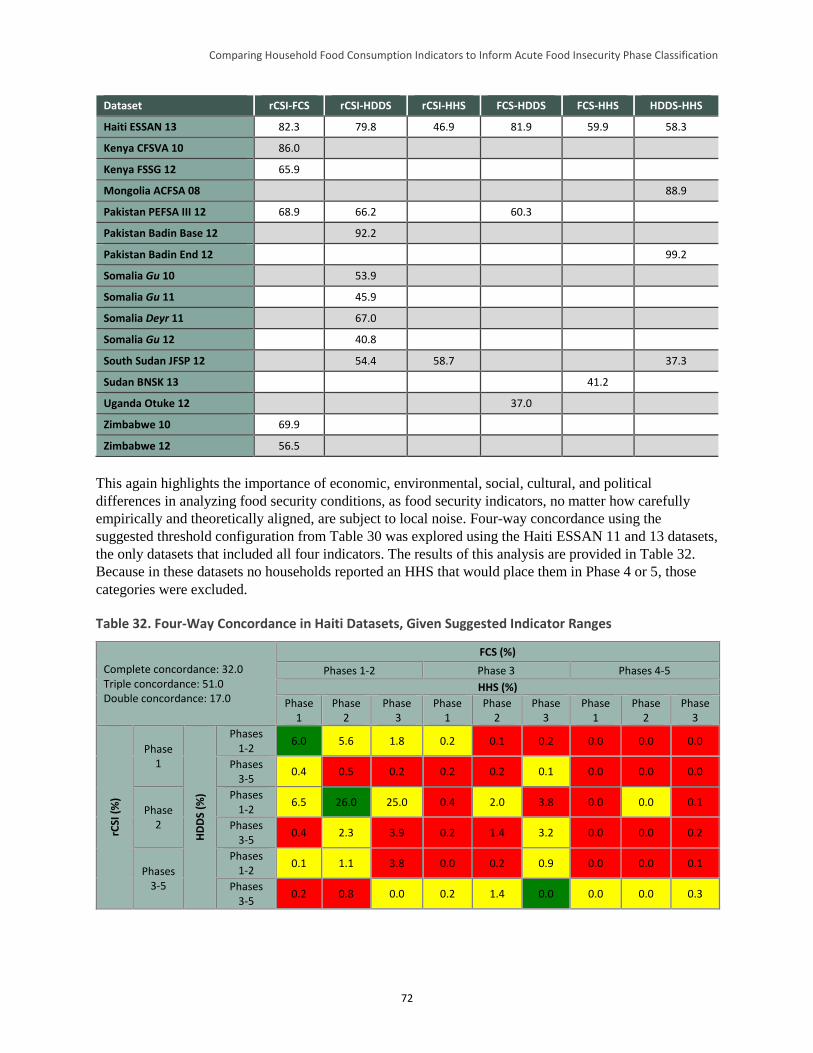
Comparing Household Food Consumption Indicators to Inform Acute Food Insecurity Phase Classification
72
Dataset rCSI-FCS rCSI-HDDS rCSI-HHS FCS-HDDS FCS-HHS HDDS-HHS
Haiti ESSAN 13 82.3 79.8 46.9 81.9 59.9 58.3
Kenya CFSVA 10 86.0
Kenya FSSG 12 65.9
Mongolia ACFSA 08 88.9
Pakistan PEFSA III 12 68.9 66.2 60.3
Pakistan Badin Base 12 92.2
Pakistan Badin End 12 99.2
Somalia Gu 10 53.9
Somalia Gu 11 45.9
Somalia Deyr 11 67.0
Somalia Gu 12 40.8
South Sudan JFSP 12 54.4 58.7 37.3
Sudan BNSK 13 41.2
Uganda Otuke 12 37.0
Zimbabwe 10 69.9
Zimbabwe 12 56.5
This again highlights the importance of economic, environmental, social, cultural, and political
differences in analyzing food security conditions, as food security indicators, no matter how carefully
empirically and theoretically aligned, are subject to local noise. Four-way concordance using the
suggested threshold configuration from Table 30 was explored using the Haiti ESSAN 11 and 13 datasets,
the only datasets that included all four indicators. The results of this analysis are provided in Table 32.
Because in these datasets no households reported an HHS that would place them in Phase 4 or 5, those
categories were excluded.
Table 32. Four-Way Concordance in Haiti Datasets, Given Suggested Indicator Ranges
Complete concordance: 32.0 Triple concordance: 51.0 Double concordance: 17.0
FCS (%)
Phases 1-2 Phase 3 Phases 4-5
HHS (%)
Phase 1
Phase 2
Phase 3
Phase 1
Phase 2
Phase 3
Phase 1
Phase 2
Phase 3
rCSI
(%
)
Phase 1
HD
DS
(%)
Phases 1-2
6.0 5.6 1.8 0.2 0.1 0.2 0.0 0.0 0.0
Phases 3-5
0.4 0.5 0.2 0.2 0.2 0.1 0.0 0.0 0.0
Phase 2
Phases 1-2
6.5 26.0 25.0 0.4 2.0 3.8 0.0 0.0 0.1
Phases 3-5
0.4 2.3 3.9 0.2 1.4 3.2 0.0 0.0 0.2
Phases 3-5
Phases 1-2
0.1 1.1 3.8 0.0 0.2 0.9 0.0 0.0 0.1
Phases 3-5
0.2 0.8 0.0 0.2 1.4 0.0 0.0 0.0 0.3
Comparing Household Food Consumption Indicators to Inform Acute Food Insecurity Phase Classification
73
Concordance between all four indicators was still only 32.0 percent, which is low but considerably higher
than the 9.5 percent concordance derived from the current acute IPC indicator schemes. Triple
concordance, wherein at least three indicators agree, was, at 51 percent, almost 20 percentage points
higher than the current scheme’s 32.7 percent, and double concordance (the worst possible outcome) was
down from 57.7 percent to 17.0 percent. However, it is important to remember that data from this dataset
indicates a relatively food secure context, with few observations from households in extreme
circumstances.
5.3 Study Limitations
Before presenting the conclusions of this study, some limitations are worth noting. First, as previously
mentioned, no caloric intake data were available to correlate indicator values to a food consumption gold
standard. This is a priority for future research. Second, as noted earlier, given the lack of universal cutoffs
and time-series data for all but one dataset, the CSI data cannot be used for more than descriptive
analysis, so little is known about how this indicator could potentially be reconciled with others in the
acute IPC process under study here. Third, as noted above, the coverage of datasets is limited, both in
geographic scope and in the range of severity of acute food security captured. This leads to some
uncertainty regarding how applicable the results may be to situations outside the contexts specifically
examined here. Fourth, although the dimensionality analysis in Section 4 identifies clusters within the
indicators, there is no objective means of knowing what those clusters signify, whether the bivariate
correlations observed are truly independent, or whether the interpretation of correlation is complicated by
substitutability among variables. Fifth, the alignment analysis in Section 4 often does not have an
adequate number of observations at the “ends” of the scale (very low or very high values) to confidently
analyze the relationship between indicators in these contexts. Finally, the anchor analysis in Section 5
depends on a subjective choice of “anchor,” or the indicator value to which a reference IPC phase is tied.
5.4 Conclusions and Implications for Future Studies
Despite these limitations, the study was able to draw some important conclusions. The major conclusion
of this study is that although in a very rough sense the five food security indicators under study send
similar signals, they are not interchangeable measures of food consumption. They are, however,
individually designed in ways that make them excellent complementary measures that together provide a
more multidimensional portrait of food consumption. Maximizing the utility of these indicators for the
acute IPC entails several steps. A revised categorization, such as that suggested in Table 30, is a useful
first step. Specifically, the following changes reflected in that table are recommended:
Small adjustments to HHS thresholds (HHS score of 2 moves to Phase 2, HHS scores of 5 to 6 appear
only in Phase 5)
Addition of rCSI to the reference table, with the following thresholds: 0 to 4 (Phase 1), 5 to 20 (Phase
2), 21 and above (Phase 3 or higher)
Reduction in the number of HDDS thresholds from four to two and an adjustment of thresholds such
that HDDS 5 to 12 signifies Phase 1 or 2, HDDS 3 to 4 signifies Phase 3, and HDDS 0 to 2 indicates
Phase 4 or higher
A shift from WFP’s food consumption categories (poor, borderline, acceptable) to raw FCS scores to
enhance classification precision and transparency, a reduction in the number of FCS thresholds from
four to two, and an adjustment of thresholds such that FCS 35 to 112 signifies Phase 1 or 2 (with an
FCS 42 to 112 indicating Phase 1 among populations consuming oil and sugar daily), FCS 13 to 34.5
signifies Phase 3 (with an FCS of 13 to 41.5 among populations consuming oil and sugar daily), and
FCS 0 to 12.5 signifies Phase 4 or higher
Comparing Household Food Consumption Indicators to Inform Acute Food Insecurity Phase Classification
74
These alterations reflect the fact that any given indicator has limitations in the range of severity of food
insecurity it can distinguish and that thresholds may have to be altered from those in the current acute IPC
household reference table to better align the indicators to one another and to the acute IPC phases.
The study findings further underscore the importance of using a convergence of evidence approach, since
reliance on one single indicator is likely to result in misclassification. When using a convergence of
evidence approach in acute IPC analyses, the study findings strongly suggest using at least one indicator
from each of the two identified indicator groups (HHS or rCSI, representing an estimate of the quantity of
intake, and FCS or HDDS, representing diet quality or diversity), that is, either HHS or rCSI and either
FCS or HDDS. Furthermore, given the variation in performance across settings, these results highlight the
need to complement information provided by these quantitative indicators with other food security
information when undertaking analysis for acute IPC classification.
In the longer term, a better understanding of these indicators’ correlation with calorie consumption over
time and across contexts is critical—not least for the setting of threshold cutoffs that are functionally
meaningful, since ultimately one can only be assured that the aligned categories have analogous meanings
across indicators if one knows what the categories mean in some objective sense.
This analysis includes useful insights into the behavior and application of the study indicators, as well as
recommendations for related future research priorities. Suggested priority areas of future research include:
Further testing of the study indicators, collected according to the standard methodology for each,
combined with detailed information on caloric intake in the same survey
Further testing of the study indicators with new indicators, including the Food Insecurity Experience
Scale, now under construction by FAO
Further testing of the study indicators in areas that have HEA baselines so that comparative analysis
can be undertaken (see Appendix G for findings from an initial exploration of such an analysis)
Development of additional household-level indicators capable of distinguishing acute IPC Phases 4
and 5
In addition, acute IPC classification of household groups is based on two groups of outcome indicators:
food consumption and livelihood change. This study focused on the former group of outcome indicators,
but more work is needed on the latter. This work should include further exploration of a CSI constructed
from context-specific changes to livelihood strategies (e.g., atypical migration, asset sales, removal of
children from school) due at least in part to food consumption challenges.
Lastly, although this study was initially developed to inform the acute IPC’s household reference table, it
also has implications for the chronic IPC’s reference table, given that many of the same indicators are
used in both classifications. The IPC working group responsible for harmonizing the IPC classification
tables should consider this study as they initiate and implement this effort.
Comparing Household Food Consumption Indicators to Inform Acute Food Insecurity Phase Classification
75
References
Ballard, Terri, Jennifer Coates, Anne Swindale, and Megan Deitchler. 2011. Household Hunger Scale:
Indicator Definition and Measurement Guide. Washington, DC: Food and Nutrition Technical Assistance
Project (FANTA).
Barrett, Christopher. 2010. “Measuring Food Insecurity.” Science. 327: 825–28.
Baumann, Soo Mee, Patrick Webb, and Manfred Zeller. 2013. “Validity of Food Consumption Indicators
in the Lao Context: Moving Toward Cross-Cultural Standardization.” Food and Nutrition Bulletin. 34 (1):
105–19.
Becquey, Elodie, Yves Marin-Prevel, Pierre Traissac, Bernard Dembèlè, Alain Bambara, and Francis
Delpeuch. 2010. “The Household Food Insecurity Access Scale and an Index-Member Dietary Diversity
Score Contribute Valid and Complementary Information on Household Food Insecurity in an Urban
West-African Setting.” Journal of Nutrition. 140: 2233–2240.
Blondel, V. D., Guillaume, J.-L., Lambiotte, R., and Lefebvre, E. 2008. “Fast Unfolding of Communities
in Large Networks.” Journal of Statistical Mechanics: Theory and Experiment. 10, P10008.
Cafiero, Carlo. 2012. “Advances in Hunger Measurement.” Presentation to the International Scientific
Symposium on Food and Nutrition Security Information. Rome: Food and Agriculture Organization of
the United Nations (FAO).
Carletto, Carlogero, Alberto Zezza, and Raka Banerjee. 2013. “Towards Better Measurement of
Household Food Security: Harmonizing Indicators and the Role of Household Surveys.” Global Food
Security 2: 30–40.
Christiaensen, Luc, and Richard Boisvert. 2000. “On Measuring Household Food Vulnerability: Case
Evidence from Northern Mali.” Working Paper. Department of Agricultural, Resource, and Managerial
Economics. Ithaca, New York: Cornell University.
Clauset, A., Newman, M. E. J., and Moore, C. 2004. “Finding Community Structure in Very Large
Networks.” Physical Review. E, Statistical, Nonlinear, and Soft Matter Physics. 70(6 Pt. 2), doi:
10.1103/PhysRevE.70.066111.
Coates, Jennifer. 2013. “Build It Back Better: Deconstructing Food Security for Improved Measurement
and Action.” Global Food Security. 2 (2013): 188–194.
Coates, Jennifer, Beatrice Lorge Rogers, Patrick Webb, Daniel Maxwell, Robert Houser, and Christine
McDonald. 2007. Dietary Diversity Study. Study commissioned by the World Food Programme. Boston:
Tufts University.
Coates, Jennifer, Anne Swindale, and Paula Bilinsky. 2007. Household Food Insecurity Access Scale
(HFIAS) for Measurement of Household Food Access: Indicator Guide (v. 2). Washington, DC: FANTA.
Coates, Jennifer, Patrick Webb, and Robert Houser. 2003. Measuring Food Insecurity: Going Beyond
Indicators of Income and Anthropometry. Washington, DC: FANTA.
de Haen, Hartwig, Stephan Klasen, and Matin Qaim. 2011. “What Do We Really Know? Metrics for
Food Insecurity and Undernutrition.” Food Policy. 36 (6):760–769.
Comparing Household Food Consumption Indicators to Inform Acute Food Insecurity Phase Classification
76
De Waal, Alex. 2005. Famine That Kills. New York: Oxford University Press.
DeCock, N.; M. D’Haese; N. Vink; C. J. van Rooyen; L. Staelens; H.C. Schönfeldt; and L. D’Haese.
2013. “Food Security in Rural Areas of Limpopo Province, South Africa.” Food Security Journal. 5:269–
282.
Deitchler, Megan, Terri Ballard, Anne Swindale, and Jennifer Coates. 2010. Validation of a Measure of
Household Hunger for Cross-Cultural Use. Washington, DC: Food and Nutrition Technical Assistance II
Project (FANTA-2).
Faber, Mieke, Craig Schwabe, and Scott Drimie. 2009. “Dietary Diversity in Relation to Other Household
Food Security Indicators.” International Journal of Food Safety, Nutrition, and Public Health. 2 (1):1–15.
Fiedler, John, Calogero Carletto, and Olivier Dupriez. 2012. “Still Waiting for Godot? Improving
Household Consumption and Expenditures Surveys (HCES) to Enable More Evidence-based Nutrition
Policies.” Food & Nutrition Bulletin. 33 (S2):242S–251S.
Food Insecurity and Vulnerability Information Management System (FIVIMS)/FAO. 2002. “Proceedings
of the International Scientific Symposium on Measurement and Assessment of Food Deprivation and
Undernutrition.” Rome: FAO.
FAO. 1996. The Rome Declaration on World Food Security. The World Food Summit. Rome: FAO.
FAO. 2002. The State of Food Insecurity in the World 2001. Rome: FAO.
FAO. 2012. Proceedings of the International Scientific Symposium on Food and Nutrition Security
Information. Rome: FAO.
FAO, World Food Programme (WFP), and International Fund for Agricultural Development (IFAD).
2012. The State of Food Insecurity in the World 2012. Rome: FAO.
FAO, WFP, and IFAD. 2013. The State of Food Insecurity in the World 2013: The Multiple Dimensions
of Food Security. Rome: FAO/WFP/IFAD.
Frongillo, Edward A. and Simeon Nanama. 2003. “Development and Validation of an Experience-Based
Tool to Directly Measure Household Food Insecurity Within and Across Seasons in Northern Burkina
Faso.” In FANTA Report for Cornell University Task Order 5. Ithaca: Division of Nutritional Sciences,
Cornell University.
Gandure, Sithabiso, Scott Drimie, and Mieke Faber. 2010. “Food Security Indicators After Humanitarian
Interventions Including Food Aid in Zimbabwe.” Food & Nutrition Bulletin. 31:513–523.
Handino, Mulugeta. 2014. “Green Famines in Ethiopia.” PhD Dissertation. Brighton: University of
Sussex.
Headey, Derek. 2013. “The Impact of the Global Food Crisis on Self-Assessed Food Security.” World
Bank Economic Review. Advance access; published January 7, 2013.
Headey, Derek. 2012. “Measuring Food Insecurity in Times of Crisis.” Presentation to the International
Scientific Symposium on Food and Nutrition Security Information. Rome: FAO.
Comparing Household Food Consumption Indicators to Inform Acute Food Insecurity Phase Classification
77
Headey, Derek and Olivier Ecker. 2013. “Rethinking the Measurement of Food Security: From First
Principles to Best Practice.” Food Security. 5:327–343.
Hoddinott, John and Yisehac Yohannes. 2002. “Dietary Diversity as a Food Security Indicator.” FCND
Discussion Paper No 136. Washington, DC: International Food Policy Research Institute (IFPRI).
Integrated Food Security Phase Classification (IPC) Global Partners. 2012. Integrated Food Security
Phase Classification Technical Manual Version 2.0.: Evidence and Standards for Better Food Security
Decisions. Rome: FAO.
IFPRI. 2013. The Global Hunger Index: The Challenge of Hunger—Building Resilience to Achieve Food
and Nutrition Security. Washington, DC: IFPRI.
Jones, Andrew D.; Francis M. Ngure; Gretel Pelto; and Sera L. Young. “What Are We Assessing When
We Measure Food Security? A Compendium and Review of Current Metrics.” Advances in Nutrition. 4
(2013): 481–505.
Kennedy, Gina, Andrea Bernardo, Cinzia Papavero, Peter Horjus, Terri Ballard, Marie-Claude Dop, Jan
Delbaere, and Inge D. Brouwer. 2010. “Proxy Measures of Household Food Consumption for Food
Security Assessment and Surveillance: Comparison of the Household Dietary Diversity and Food
Consumption Scores.” Public Health Nutrition. 13(12): 2010–18.
Lovon, Margarita and Astrid Mathiassen. 2014. “Are the World Food Programme’s Food Consumption
Groups a Good Proxy for Energy Deficiency?” Food Security. 6(4): 461–470.
Martin-Prevel, Yves, Elodie Becquey, Sylvestre Tapsoba, Florence Castan, Dramane Coulibaly, Sonia
Fortin, Mahama Zoungrana, Matthias Lange, Francis Delpeuch, and Mathilde Savy. 2012. “The 2008
Food Price Crisis Negatively Affected Household Food Security and Dietary Diversity in Urban Burkina
Faso.” Journal of Nutrition. 142 (9): 1748–55. doi:10.3945/jn.112.159996.
Mathiassen, Astrid. 2013. Validation of the Food Consumption Score Based on LSMS Data. Rome: WFP.
Mathiassen, Astrid. 2015. Towards a Better Benchmark: The Food Consumption Score and the Value of
Food Consumed. WFP. Rome: WFP.
Maxwell, Daniel G. 1996. “Measuring Food Insecurity: The Frequency and Severity of ‘Coping
Strategies’.” Food Policy. 21 (3):291–303.
Maxwell, Daniel, Clement Ahiadeke, Carol Levin, Margaret Armar-Klemesu, Sawudatu Zakariah, and
Grace Mary Lamptey. 1999. “Alternative Food-Security Indicators: Revisiting the Frequency and
Severity of 'Coping Strategies'.” Food Policy. 24 (4):411–429.
Maxwell, Daniel and Richard Caldwell. 2008. The Coping Strategies Index: The Field Methods Manual.
Atlanta, GA; Medford, MA; Tucson, AZ: CARE International, WFP, Feinstein International Center,
TANGO International.
Maxwell, Daniel, Richard Caldwell, and Mark Langworthy. 2008. “Measuring Food Insecurity: Can an
Indicator Based on Localized Coping Behaviors Be Used to Compare Across Contexts?” Food Policy. 33
(6):533–540.
Maxwell, Daniel and Benjamin Watkins. 2003. “Humanitarian Information Systems and Emergencies in
the Greater Horn of Africa: Logical Components and Logical Linkages.” Disasters. 27 (1):72–90.
Comparing Household Food Consumption Indicators to Inform Acute Food Insecurity Phase Classification
78
Maxwell, Simon and Timothy Frankenberger. 1992. Household Food Security: Concepts, Indicators,
Measurements. New York: UNICEF.
Médecins sans Frontières (MSF). 2001. Revised MSF Nutrition Guidelines. Amsterdam: MSF Holland.
Pangaribowo, Evita Hanie, Nicolas Gerber, and Maximo Torero. 2013. “Food and Nutrition Security
Indicators: A Review.” Working Paper 108. Bonn: Center for Development Research, University of
Bonn.
Psaki, Stephanie, Zulfiqar A. Bhutta, Tahmeed Ahmed, Shamsir Ahmed, Pascal Bessong, Munirul Islam,
Sushil John, Margaret Kosek, Aldo Lima, Cebisa Nesamvuni, Prakash Shrestha, Erling Svensen, Monica
McGrath, Stephanie Richard, Jessica Seidman, Laura Caulfield, Mark Miller, William Checkley, and
MALED Network Investigators. 2012. “Household Food Access and Child Malnutrition: Results From
the Eight-Country MAL-ED Study.” Population Health Metrics. 10 (1). doi:10.1186/1478-7954-10-24.
Rose, Diego, Amit Wadhwa, Rossella Bottone, Darryl Miller, Lisa Hjelm, Astrid Mathiassen, and Peter
Horjus. Food Security Assessment at WFP: Report on Continued Development and Testing of a
Standardized Approach. WFP, Vulnerability Assessment and Mapping (VAM) Unit. Rome: WFP.
Smith, Lisa C. 2002. “The Use of Household Expenditure Surveys for the Assessment of Food
Insecurity.” Paper read at Proceedings of the International Scientific Symposium on Measurement and
Assessment of Food Deprivation and Undernutrition, June 26–28, Rome.
Smith, Lisa C., Harold Alderman, and Dede Aduayom. 2006. Food Security in Sub-Saharan Africa: New
Estimates from Household Expenditure Surveys. IFPRI Research Report 146. Washington, DC: IFPRI.
Smith, Lisa C. and Ali Subandoro. 2007. Measuring Food Security Using Household Expenditure
Surveys—Food Security in Practice Technical Guide Series. Washington, DC: IFPRI.
Sulaiman, Norhasmah, Zalilah Mohd Shariff, Rohana Abdul Jalil, Mohd Nasir, Mohd Taib, Mirnalini
Kandiah, and Asnarulkhadi Abu Samah. 2011. “Validation of the Malaysian Coping Strategy Instrument
to Measure Household Food Insecurity in Kelantan, Malaysia.” Food and Nutrition Bulletin. 32 (4): 354–
64.
Swindale, Anne and Bilinsky, Paula. 2005. Household Dietary Diversity Score (HDDS) for Measurement
of Household Food Access: Indicator Guide. Washington, DC: FANTA.
Swindale, Anne, and Ohri-Vachaspati, Punam. 2005. Measuring Household Food Consumption: A
Technical Food Guide. Washington, DC: FANTA.
Thorne-Lyman, Andrew L., Natalie Valpiani, Kai Sun, Richard D. Semba, Christine L. Klotz, Klaus
Kraemer, Nasima Akhter, Saskia de Pee, Regina Moench-Pfanner, Mayang Sari, and Martin W. Bloem.
2009. “Household Dietary Diversity and Food Expenditures Are Closely Linked in Rural Bangladesh,
Increasing the Risk of Malnutrition Due to the Financial Crisis.” Journal of Nutrition. 140 (1): 182S–
188S. doi:10.3945/jn.109.110809.
Tiwari, Sailesh, Emmanuel Skoufias, and Maya Sherpa. 2014. “Shorter, Cheaper, Quicker, Better:
Linking Measures of Household Food Security to Nutritional Outcomes in Bangladesh, Nepal, Pakistan,
Uganda, and Tanzania.” World Bank Policy Research Working Paper 6584.
WFP. 2008. Food Consumption Analysis: Calculation and Use of the Food Consumption Score in Food
Security Analysis. Rome: WFP/VAM.
Comparing Household Food Consumption Indicators to Inform Acute Food Insecurity Phase Classification
79
WFP. 2009. Emergency Food Security Assessment Handbook. Rome, Italy: WFP, Emergency Needs
Assessment Branch (ODAN).
WFP. 2012. Validation of the WFP’s Food Consumption Score Indicator in the Centeral American
Context, with Emphasis on Intra-Household Sharing of Food. Rome, Italy: WFP, Vulnerability
Assessment and Mapping Unit.
Wiesmann, Doris, Lucy Bassett, Todd Benson, and John Hoddinott. 2009. Validation of the World Food
Programme’s Food Consumption Score and Alternative Indicators of Household Food Security. IFPRI
Discussion Paper 00870.
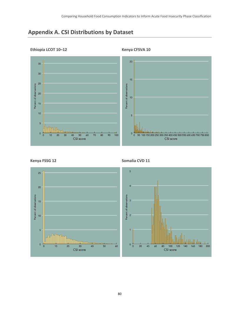
Comparing Household Food Consumption Indicators to Inform Acute Food Insecurity Phase Classification
80
Appendix A. CSI Distributions by Dataset
Ethiopia LCOT 10–12 Kenya CFSVA 10
Kenya FSSG 12 Somalia CVD 11
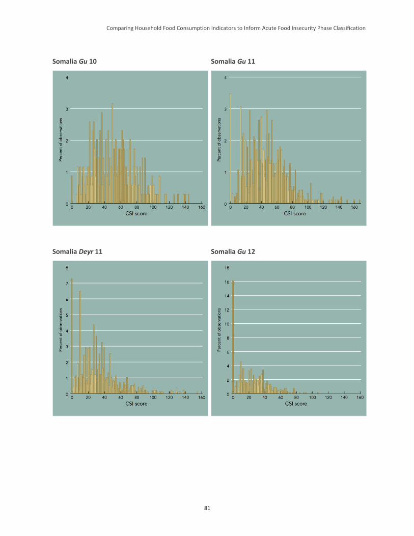
Comparing Household Food Consumption Indicators to Inform Acute Food Insecurity Phase Classification
81
Somalia Gu 10 Somalia Gu 11
Somalia Deyr 11 Somalia Gu 12
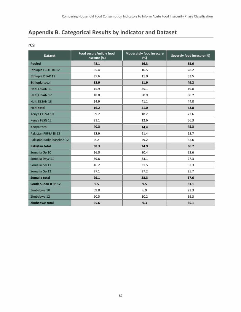
Comparing Household Food Consumption Indicators to Inform Acute Food Insecurity Phase Classification
82
Appendix B. Categorical Results by Indicator and Dataset
rCSI
Dataset Food secure/mildly food
insecure (%) Moderately food insecure
(%) Severely food insecure (%)
Pooled 48.1 16.3 35.6
Ethiopia LCOT 10-12 55.4 16.5 28.2
Ethiopia DFAP 12 35.6 11.0 53.5
Ethiopia total 38.9 11.9 49.2
Haiti ESSAN 11 15.9 35.1 49.0
Haiti ESSAN 12 18.8 50.9 30.2
Haiti ESSAN 13 14.9 41.1 44.0
Haiti total 16.2 41.0 42.8
Kenya CFSVA 10 59.2 18.2 22.6
Kenya FSSG 12 31.1 12.6 56.3
Kenya total 40.3 14.4 45.3
Pakistan PEFSA III 12 62.9 21.4 15.7
Pakistan Badin baseline 12 8.2 29.2 62.6
Pakistan total 38.3 24.9 36.7
Somalia Gu 10 16.0 30.4 53.6
Somalia Deyr 11 39.6 33.1 27.3
Somalia Gu 11 16.2 31.5 52.3
Somalia Gu 12 37.1 37.2 25.7
Somalia total 29.1 33.3 37.6
South Sudan JFSP 12 9.5 9.5 81.1
Zimbabwe 10 69.8 6.9 23.3
Zimbabwe 12 50.5 10.2 39.3
Zimbabwe total 55.6 9.3 35.1
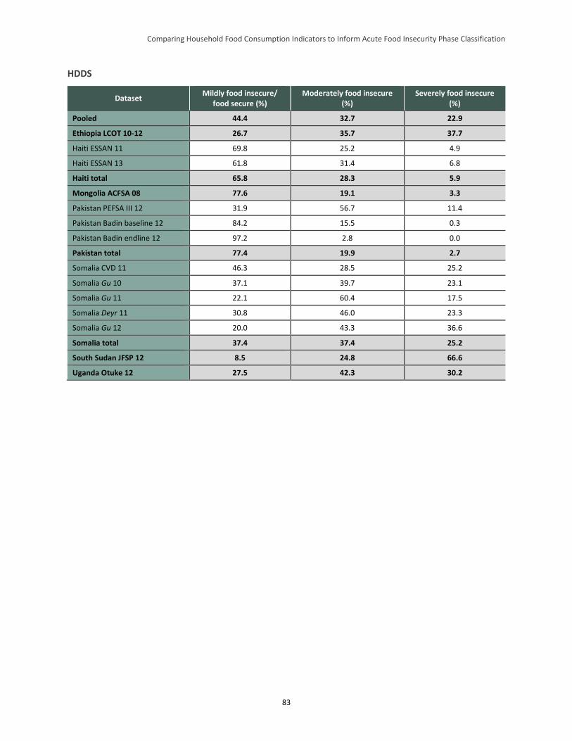
Comparing Household Food Consumption Indicators to Inform Acute Food Insecurity Phase Classification
83
HDDS
Dataset Mildly food insecure/
food secure (%) Moderately food insecure
(%) Severely food insecure
(%)
Pooled 44.4 32.7 22.9
Ethiopia LCOT 10-12 26.7 35.7 37.7
Haiti ESSAN 11 69.8 25.2 4.9
Haiti ESSAN 13 61.8 31.4 6.8
Haiti total 65.8 28.3 5.9
Mongolia ACFSA 08 77.6 19.1 3.3
Pakistan PEFSA III 12 31.9 56.7 11.4
Pakistan Badin baseline 12 84.2 15.5 0.3
Pakistan Badin endline 12 97.2 2.8 0.0
Pakistan total 77.4 19.9 2.7
Somalia CVD 11 46.3 28.5 25.2
Somalia Gu 10 37.1 39.7 23.1
Somalia Gu 11 22.1 60.4 17.5
Somalia Deyr 11 30.8 46.0 23.3
Somalia Gu 12 20.0 43.3 36.6
Somalia total 37.4 37.4 25.2
South Sudan JFSP 12 8.5 24.8 66.6
Uganda Otuke 12 27.5 42.3 30.2
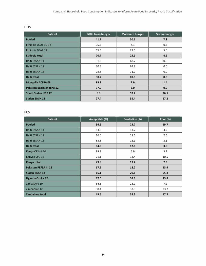
Comparing Household Food Consumption Indicators to Inform Acute Food Insecurity Phase Classification
84
HHS
Dataset Little to no hunger Moderate hunger Severe hunger
Pooled 41.7 50.6 7.8
Ethiopia LCOT 10-12 95.6 4.1 0.3
Ethiopia DFAP 12 65.5 29.5 5.0
Ethiopia total 70.7 25.1 4.2
Haiti ESSAN 11 31.3 68.7 0.0
Haiti ESSAN 12 30.8 69.2 0.0
Haiti ESSAN 13 28.8 71.2 0.0
Haiti total 30.2 69.8 0.0
Mongolia ACFSA 08 95.8 2.9 1.4
Pakistan Badin endline 12 97.0 3.0 0.0
South Sudan JFSP 12 6.3 57.2 36.5
Sudan BNSK 13 27.4 55.4 17.2
FCS
Dataset Acceptable (%) Borderline (%) Poor (%)
Pooled 56.6 23.7 19.7
Haiti ESSAN 11 83.6 13.2 3.2
Haiti ESSAN 12 86.0 11.5 2.5
Haiti ESSAN 13 83.8 13.1 3.1
Haiti total 84.3 12.8 3.0
Kenya CFSVA 10 89.8 6.9 3.2
Kenya FSSG 12 71.1 18.4 10.5
Kenya total 79.3 13.4 7.3
Pakistan PEFSA III 12 67.9 18.2 13.9
Sudan BNSK 13 15.1 29.6 55.3
Uganda Otuke 12 17.6 38.6 43.8
Zimbabwe 10 64.6 28.2 7.2
Zimbabwe 12 38.4 37.9 23.7
Zimbabwe total 49.5 33.2 17.3
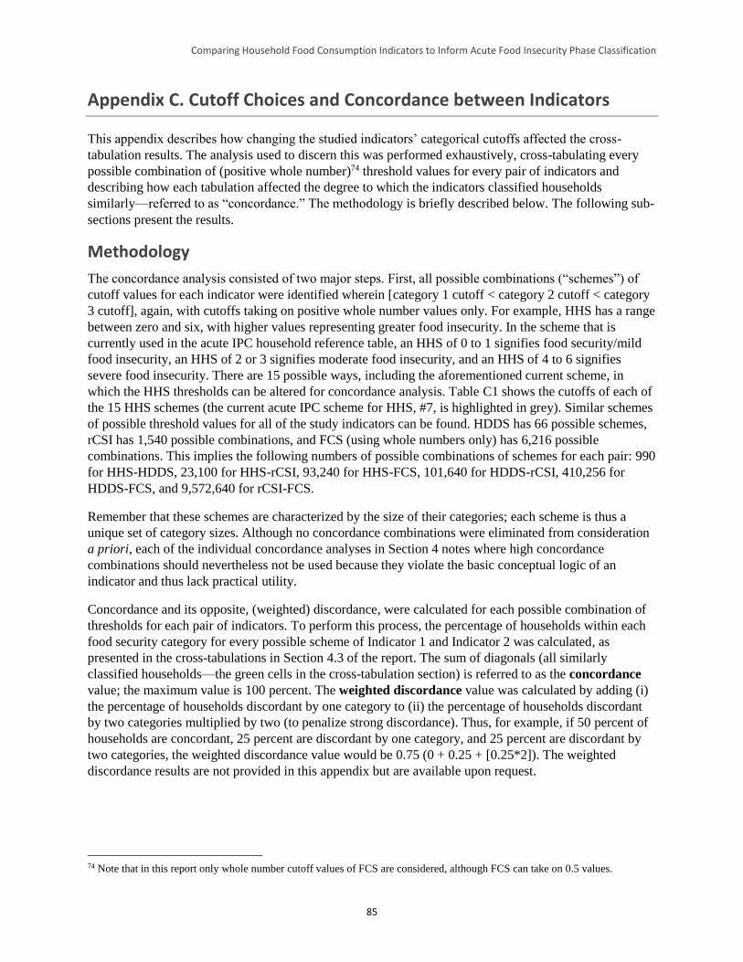
Comparing Household Food Consumption Indicators to Inform Acute Food Insecurity Phase Classification
85
Appendix C. Cutoff Choices and Concordance between Indicators
This appendix describes how changing the studied indicators’ categorical cutoffs affected the cross-
tabulation results. The analysis used to discern this was performed exhaustively, cross-tabulating every
possible combination of (positive whole number)74 threshold values for every pair of indicators and
describing how each tabulation affected the degree to which the indicators classified households
similarly—referred to as “concordance.” The methodology is briefly described below. The following sub-
sections present the results.
Methodology
The concordance analysis consisted of two major steps. First, all possible combinations (“schemes”) of
cutoff values for each indicator were identified wherein [category 1 cutoff < category 2 cutoff < category
3 cutoff], again, with cutoffs taking on positive whole number values only. For example, HHS has a range
between zero and six, with higher values representing greater food insecurity. In the scheme that is
currently used in the acute IPC household reference table, an HHS of 0 to 1 signifies food security/mild
food insecurity, an HHS of 2 or 3 signifies moderate food insecurity, and an HHS of 4 to 6 signifies
severe food insecurity. There are 15 possible ways, including the aforementioned current scheme, in
which the HHS thresholds can be altered for concordance analysis. Table C1 shows the cutoffs of each of
the 15 HHS schemes (the current acute IPC scheme for HHS, #7, is highlighted in grey). Similar schemes
of possible threshold values for all of the study indicators can be found. HDDS has 66 possible schemes,
rCSI has 1,540 possible combinations, and FCS (using whole numbers only) has 6,216 possible
combinations. This implies the following numbers of possible combinations of schemes for each pair: 990
for HHS-HDDS, 23,100 for HHS-rCSI, 93,240 for HHS-FCS, 101,640 for HDDS-rCSI, 410,256 for
HDDS-FCS, and 9,572,640 for rCSI-FCS.
Remember that these schemes are characterized by the size of their categories; each scheme is thus a
unique set of category sizes. Although no concordance combinations were eliminated from consideration
a priori, each of the individual concordance analyses in Section 4 notes where high concordance
combinations should nevertheless not be used because they violate the basic conceptual logic of an
indicator and thus lack practical utility.
Concordance and its opposite, (weighted) discordance, were calculated for each possible combination of
thresholds for each pair of indicators. To perform this process, the percentage of households within each
food security category for every possible scheme of Indicator 1 and Indicator 2 was calculated, as
presented in the cross-tabulations in Section 4.3 of the report. The sum of diagonals (all similarly
classified households—the green cells in the cross-tabulation section) is referred to as the concordance
value; the maximum value is 100 percent. The weighted discordance value was calculated by adding (i)
the percentage of households discordant by one category to (ii) the percentage of households discordant
by two categories multiplied by two (to penalize strong discordance). Thus, for example, if 50 percent of
households are concordant, 25 percent are discordant by one category, and 25 percent are discordant by
two categories, the weighted discordance value would be 0.75 (0 + 0.25 + [0.25*2]). The weighted
discordance results are not provided in this appendix but are available upon request.
74 Note that in this report only whole number cutoff values of FCS are considered, although FCS can take on 0.5 values.
Comparing Household Food Consumption Indicators to Inform Acute Food Insecurity Phase Classification
86
Table C1. Possible HHS Schemes, Based on Alterations of Thresholds
Scheme
Category
Food Secure Moderately Food Insecure Severely Food Insecure
Low High Low High Low High
1 0 0 1 1 2 6
2 0 0 1 2 3 6
3 0 0 1 3 4 6
4 0 0 1 4 5 6
5 0 0 1 5 6 6
6 0 1 2 2 3 6
7 0 1 2 3 4 6
8 0 1 2 4 5 6
9 0 1 2 5 6 6
10 0 2 3 3 4 6
11 0 2 3 4 5 6
12 0 2 3 5 6 6
13 0 3 4 4 5 6
14 0 3 4 5 6 6
15 0 4 5 5 6 6
Concordance results are presented in three ways. First, recall again that two variables—the size of any
two of the three food security categories—can be thought of as characterizing each indicator’s scheme.
For example, the size of the food secure category and the size of the severely food insecure category can
describe a given scheme (the size of the moderately food insecure category is a linear function of these
other two, and thus is not an independent variable).75 This evaluates concordance between two indicators
described by two variables each, and so concordance becomes a function of four category size variables.
To get a general sense of the relationship between concordance and schemes, one can regress the
concordance value against the four category variables using an ordinary least squares model. For
example, concordance between HHS and FCS can be regressed on the size of the HHS food secure
category, the HHS severely food insecure category, the FCS food secure category, and the FCS severely
food insecure category. All indicators except rCSI were introduced in linear form; specifications with
non-linear terms were attempted, but fit was not considerably improved. Partial correlations—the effect
of changes in a given category size on concordance, holding the other category sizes constant—were then
obtained. Note, however, that the regression coefficients represent average effects and do not illustrate the
individual combinations that optimize concordance, though they do illuminate general patterns and can be
compared across models.
Second, the results are presented by each individual combination (990 for HHS-HDDS, etc.) through
bivariate scatterplots of the relationship between each category’s size and concordance between the
75 One could choose any two of the three category sizes for each indicator and produce the same results. To be consistent, the
authors chose the size of the food secure and severely food insecure categories.
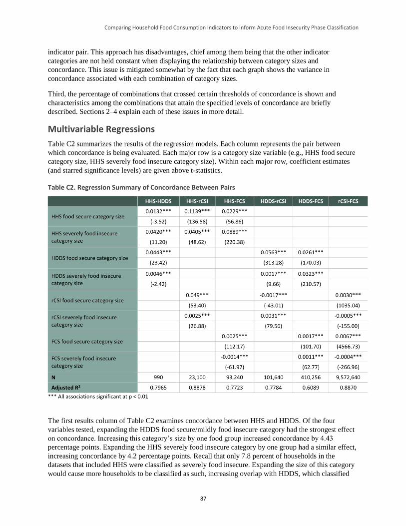
Comparing Household Food Consumption Indicators to Inform Acute Food Insecurity Phase Classification
87
indicator pair. This approach has disadvantages, chief among them being that the other indicator
categories are not held constant when displaying the relationship between category sizes and
concordance. This issue is mitigated somewhat by the fact that each graph shows the variance in
concordance associated with each combination of category sizes.
Third, the percentage of combinations that crossed certain thresholds of concordance is shown and
characteristics among the combinations that attain the specified levels of concordance are briefly
described. Sections 2–4 explain each of these issues in more detail.
Multivariable Regressions
Table C2 summarizes the results of the regression models. Each column represents the pair between
which concordance is being evaluated. Each major row is a category size variable (e.g., HHS food secure
category size, HHS severely food insecure category size). Within each major row, coefficient estimates
(and starred significance levels) are given above t-statistics.
Table C2. Regression Summary of Concordance Between Pairs
HHS-HDDS HHS-rCSI HHS-FCS HDDS-rCSI HDDS-FCS rCSI-FCS
HHS food secure category size 0.0132*** 0.1139*** 0.0229***
(-3.52) (136.58) (56.86)
HHS severely food insecure category size
0.0420*** 0.0405*** 0.0889***
(11.20) (48.62) (220.38)
HDDS food secure category size 0.0443*** 0.0563*** 0.0261***
(23.42) (313.28) (170.03)
HDDS severely food insecure category size
0.0046*** 0.0017*** 0.0323***
(-2.42) (9.66) (210.57)
rCSI food secure category size 0.049*** -0.0017*** 0.0030***
(53.40) (-43.01) (1035.04)
rCSI severely food insecure category size
0.0025*** 0.0031*** -0.0005***
(26.88) (79.56) (-155.00)
FCS food secure category size 0.0025*** 0.0017*** 0.0067***
(112.17) (101.70) (4566.73)
FCS severely food insecure category size
-0.0014*** 0.0011*** -0.0004***
(-61.97) (62.77) (-266.96)
N 990 23,100 93,240 101,640 410,256 9,572,640
Adjusted R2 0.7965 0.8878 0.7723 0.7784 0.6089 0.8870
*** All associations significant at p < 0.01
The first results column of Table C2 examines concordance between HHS and HDDS. Of the four
variables tested, expanding the HDDS food secure/mildly food insecure category had the strongest effect
on concordance. Increasing this category’s size by one food group increased concordance by 4.43
percentage points. Expanding the HHS severely food insecure category by one group had a similar effect,
increasing concordance by 4.2 percentage points. Recall that only 7.8 percent of households in the
datasets that included HHS were classified as severely food insecure. Expanding the size of this category
would cause more households to be classified as such, increasing overlap with HDDS, which classified
Comparing Household Food Consumption Indicators to Inform Acute Food Insecurity Phase Classification
88
22.9 percent of households as severely food insecure (0–3 food groups). Similarly, expanding the food
secure/mildly food insecure category for HDDS would create greater overlap with the large number of
households (41.7 percent) that HHS classifies as food secure/mildly food insecure in the aggregated
dataset.
Next, concordance between HHS and rCSI was examined.76 Expanding the size of the HHS food
secure/mildly food insecure category had the strongest effect on concordance; a 1-point increase was
associated with an increase in concordance of 11.4 percentage points. It was not immediately clear why
this was the case, but examination of individual combinations later in this section will illuminate this
result. Increasing the size of the HHS severely food insecure category also had a positive, though smaller,
effect on concordance. Changes in the size of the rCSI food secure/mildly food insecure category also had
strong effects: a 1-point increase—a small fraction of the 0–56 range (see footnote 76)—led to an increase
of nearly 5 percentage points in concordance.
Turning to concordance between HHS and FCS, expanding the size of the HHS severely food insecure
category by one point increased concordance by 8.9 percentage points. Increasing the size of the HHS
food secure/mildly food insecure category had a much smaller association with concordance, and
manipulations of FCS category sizes tended to have little effect. Given the relatively weak concordance of
HHS and FCS using the current acute IPC threshold combination (34.9 percent), as well as the highly
variable nature of their relationship as shown in the cross-tabulations in Section 4.3 of the report, context
appears to matter greatly in determining whether these two indicators send similar signals of food security
status. However, it would appear that in the pooled dataset, FCS tended to place more households in the
severe food insecurity category compared to HHS. Thus, expanding the size of this category in HHS
tended to increase concordance.
Regarding concordance between HDDS and rCSI, expanding the HDDS food secure/mildly food insecure
category size had the strongest impact; an increase of one food group led to an increase of 5.6 percentage
points in concordance. The other associations were weak. It is not conceptually clear why increasing the
size of this HDDS category would improve concordance with rCSI. The categorical results in Section 4.3
of the report revealed that rCSI tended to produce a bimodal pattern in many contexts—many households
fell into the food secure/mildly food insecure or severely food insecure category, but not many fell into
the moderately food insecure category. This is likely a result of the high number of zero values for this
indicator on the one hand, and the large percentage (84 percent) of the rCSI range that fell in the severely
food insecure category on the other. Expanding the size of the HDDS food secure/mildly food insecure
category at the expense of the moderately food insecure category helped to push HDDS toward a similar
bimodal distribution, which appeared to increase concordance with rCSI. The bivariate scatterplots appear
in the next section.
With respect to the relationship between FCS and HDDS, increasing the HDDS food secure/mildly food
insecure and severely food insecure category sizes led to a slightly stronger association with concordance,
by 2.6 percent and 3.2 percent, respectively. Manipulating FCS category size had little effect.
Regarding rCSI and FCS, large changes in category sizes were required to increase concordance. For
example, a 10-point increase in the rCSI food secure/mildly food insecure category size raised
76 This study’s concordance analysis only tested rCSI schemes up to a maximum score of 56, not 63, the latter of which is the
maximum score possible according to the current weighted scheme. This approach was necessary due to an oversight in the
dataset construction for this study. However, given that rCSI scores above 56 are likely only possible in very severe situations,
the authors chose not to extend the concordance analysis to the latter extreme end of the range, as by conceptual logic these
scores clearly belong in the severely food insecure category. Only 0.6 percent of households in the pooled master dataset had
rCSI scores above 56.
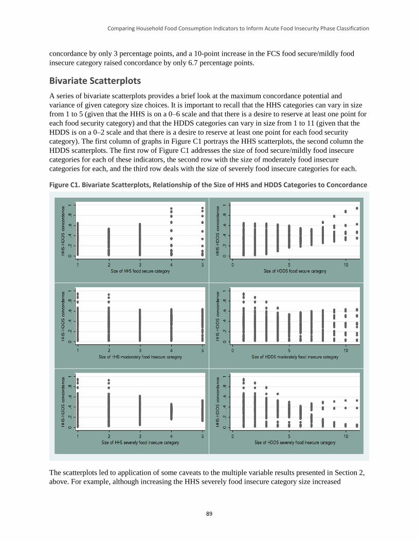
Comparing Household Food Consumption Indicators to Inform Acute Food Insecurity Phase Classification
89
concordance by only 3 percentage points, and a 10-point increase in the FCS food secure/mildly food
insecure category raised concordance by only 6.7 percentage points.
Bivariate Scatterplots
A series of bivariate scatterplots provides a brief look at the maximum concordance potential and
variance of given category size choices. It is important to recall that the HHS categories can vary in size
from 1 to 5 (given that the HHS is on a 0–6 scale and that there is a desire to reserve at least one point for
each food security category) and that the HDDS categories can vary in size from 1 to 11 (given that the
HDDS is on a 0–2 scale and that there is a desire to reserve at least one point for each food security
category). The first column of graphs in Figure C1 portrays the HHS scatterplots, the second column the
HDDS scatterplots. The first row of Figure C1 addresses the size of food secure/mildly food insecure
categories for each of these indicators, the second row with the size of moderately food insecure
categories for each, and the third row deals with the size of severely food insecure categories for each.
Figure C1. Bivariate Scatterplots, Relationship of the Size of HHS and HDDS Categories to Concordance
The scatterplots led to application of some caveats to the multiple variable results presented in Section 2,
above. For example, although increasing the HHS severely food insecure category size increased
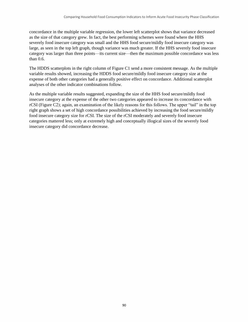
Comparing Household Food Consumption Indicators to Inform Acute Food Insecurity Phase Classification
90
concordance in the multiple variable regression, the lower left scatterplot shows that variance decreased
as the size of that category grew. In fact, the best performing schemes were found where the HHS
severely food insecure category was small and the HHS food secure/mildly food insecure category was
large, as seen in the top left graph, though variance was much greater. If the HHS severely food insecure
category was larger than three points—its current size—then the maximum possible concordance was less
than 0.6.
The HDDS scatterplots in the right column of Figure C1 send a more consistent message. As the multiple
variable results showed, increasing the HDDS food secure/mildly food insecure category size at the
expense of both other categories had a generally positive effect on concordance. Additional scatterplot
analyses of the other indicator combinations follow.
As the multiple variable results suggested, expanding the size of the HHS food secure/mildly food
insecure category at the expense of the other two categories appeared to increase its concordance with
rCSI (Figure C2); again, an examination of the likely reasons for this follows. The upper “tail” in the top
right graph shows a set of high concordance possibilities achieved by increasing the food secure/mildly
food insecure category size for rCSI. The size of the rCSI moderately and severely food insecure
categories mattered less; only at extremely high and conceptually illogical sizes of the severely food
insecure category did concordance decrease.
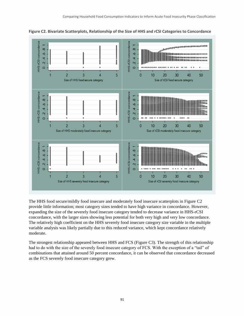
Comparing Household Food Consumption Indicators to Inform Acute Food Insecurity Phase Classification
91
Figure C2. Bivariate Scatterplots, Relationship of the Size of HHS and rCSI Categories to Concordance
The HHS food secure/mildly food insecure and moderately food insecure scatterplots in Figure C2
provide little information; most category sizes tended to have high variance in concordance. However,
expanding the size of the severely food insecure category tended to decrease variance in HHS-rCSI
concordance, with the larger sizes showing less potential for both very high and very low concordance.
The relatively high coefficient on the HHS severely food insecure category size variable in the multiple
variable analysis was likely partially due to this reduced variance, which kept concordance relatively
moderate.
The strongest relationship appeared between HHS and FCS (Figure C3). The strength of this relationship
had to do with the size of the severely food insecure category of FCS. With the exception of a “tail” of
combinations that attained around 50 percent concordance, it can be observed that concordance decreased
as the FCS severely food insecure category grew.
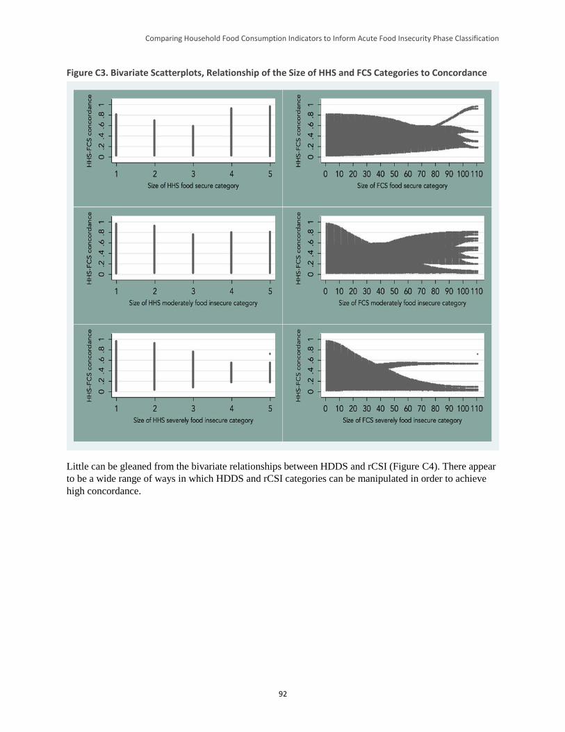
Comparing Household Food Consumption Indicators to Inform Acute Food Insecurity Phase Classification
92
Figure C3. Bivariate Scatterplots, Relationship of the Size of HHS and FCS Categories to Concordance
Little can be gleaned from the bivariate relationships between HDDS and rCSI (Figure C4). There appear
to be a wide range of ways in which HDDS and rCSI categories can be manipulated in order to achieve
high concordance.
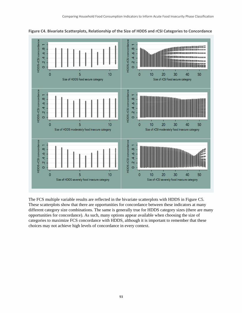
Comparing Household Food Consumption Indicators to Inform Acute Food Insecurity Phase Classification
93
Figure C4. Bivariate Scatterplots, Relationship of the Size of HDDS and rCSI Categories to Concordance
The FCS multiple variable results are reflected in the bivariate scatterplots with HDDS in Figure C5.
These scatterplots show that there are opportunities for concordance between these indicators at many
different category size combinations. The same is generally true for HDDS category sizes (there are many
opportunities for concordance). As such, many options appear available when choosing the size of
categories to maximize FCS concordance with HDDS, although it is important to remember that these
choices may not achieve high levels of concordance in every context.
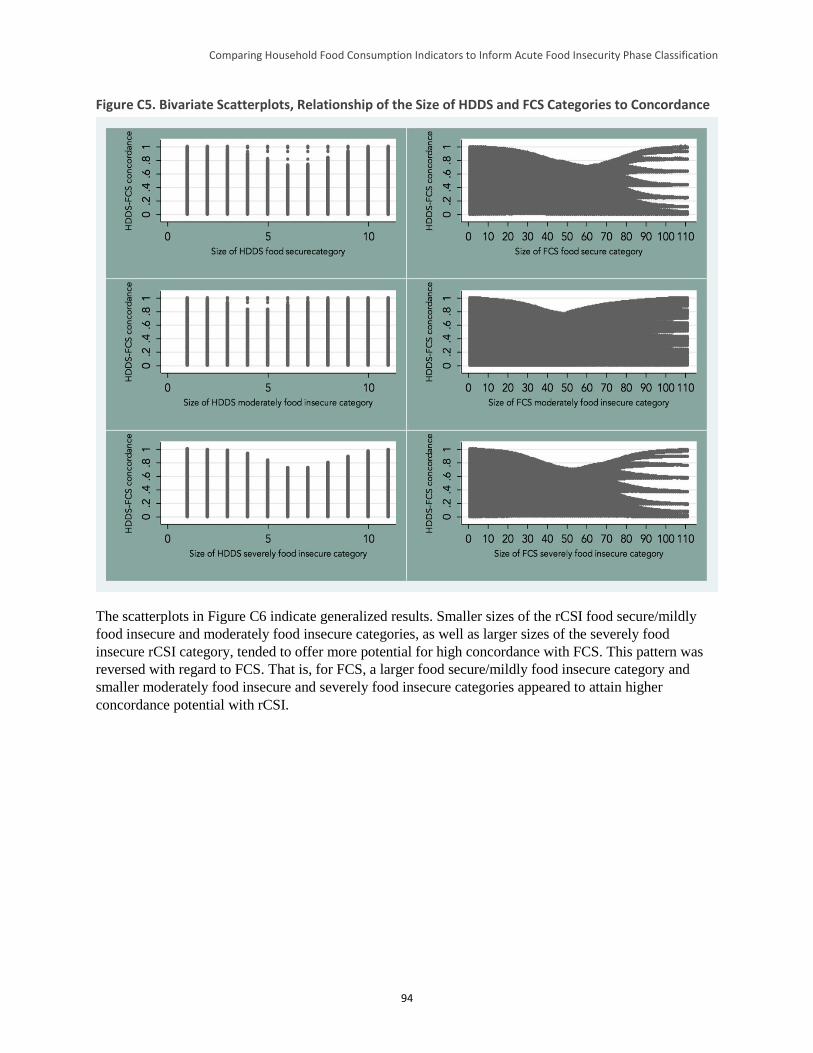
Comparing Household Food Consumption Indicators to Inform Acute Food Insecurity Phase Classification
94
Figure C5. Bivariate Scatterplots, Relationship of the Size of HDDS and FCS Categories to Concordance
The scatterplots in Figure C6 indicate generalized results. Smaller sizes of the rCSI food secure/mildly
food insecure and moderately food insecure categories, as well as larger sizes of the severely food
insecure rCSI category, tended to offer more potential for high concordance with FCS. This pattern was
reversed with regard to FCS. That is, for FCS, a larger food secure/mildly food insecure category and
smaller moderately food insecure and severely food insecure categories appeared to attain higher
concordance potential with rCSI.
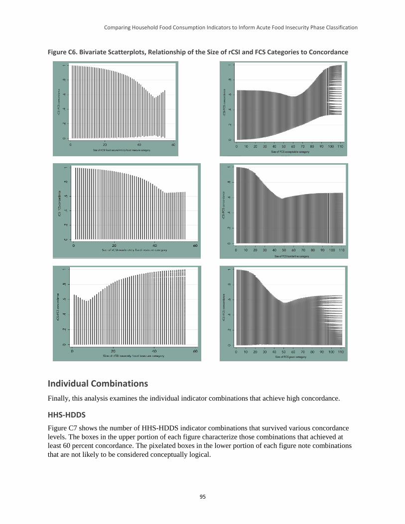
Comparing Household Food Consumption Indicators to Inform Acute Food Insecurity Phase Classification
95
Figure C6. Bivariate Scatterplots, Relationship of the Size of rCSI and FCS Categories to Concordance
Individual Combinations
Finally, this analysis examines the individual indicator combinations that achieve high concordance.
HHS-HDDS
Figure C7 shows the number of HHS-HDDS indicator combinations that survived various concordance
levels. The boxes in the upper portion of each figure characterize those combinations that achieved at
least 60 percent concordance. The pixelated boxes in the lower portion of each figure note combinations
that are not likely to be considered conceptually logical.
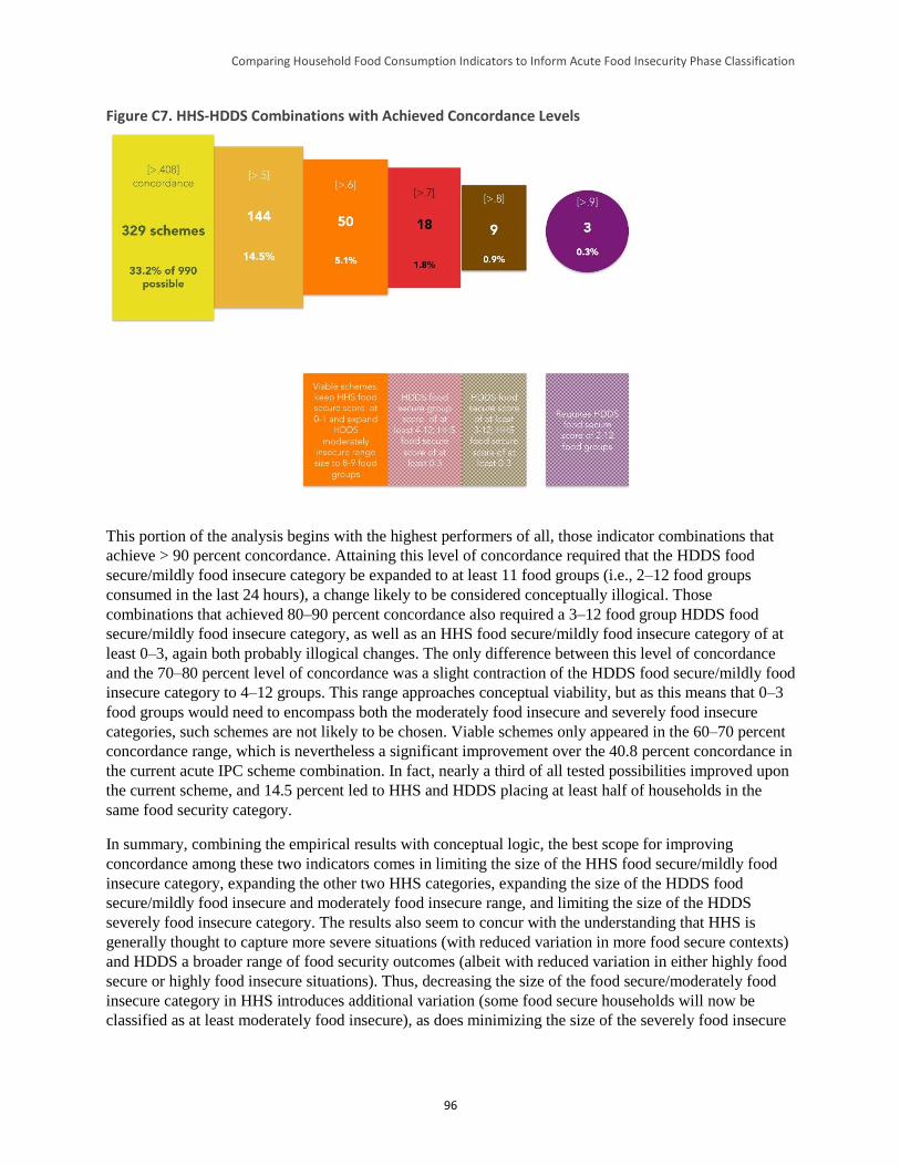
Comparing Household Food Consumption Indicators to Inform Acute Food Insecurity Phase Classification
96
Figure C7. HHS-HDDS Combinations with Achieved Concordance Levels
This portion of the analysis begins with the highest performers of all, those indicator combinations that
achieve > 90 percent concordance. Attaining this level of concordance required that the HDDS food
secure/mildly food insecure category be expanded to at least 11 food groups (i.e., 2–12 food groups
consumed in the last 24 hours), a change likely to be considered conceptually illogical. Those
combinations that achieved 80–90 percent concordance also required a 3–12 food group HDDS food
secure/mildly food insecure category, as well as an HHS food secure/mildly food insecure category of at
least 0–3, again both probably illogical changes. The only difference between this level of concordance
and the 70–80 percent level of concordance was a slight contraction of the HDDS food secure/mildly food
insecure category to 4–12 groups. This range approaches conceptual viability, but as this means that 0–3
food groups would need to encompass both the moderately food insecure and severely food insecure
categories, such schemes are not likely to be chosen. Viable schemes only appeared in the 60–70 percent
concordance range, which is nevertheless a significant improvement over the 40.8 percent concordance in
the current acute IPC scheme combination. In fact, nearly a third of all tested possibilities improved upon
the current scheme, and 14.5 percent led to HHS and HDDS placing at least half of households in the
same food security category.
In summary, combining the empirical results with conceptual logic, the best scope for improving
concordance among these two indicators comes in limiting the size of the HHS food secure/mildly food
insecure category, expanding the other two HHS categories, expanding the size of the HDDS food
secure/mildly food insecure and moderately food insecure range, and limiting the size of the HDDS
severely food insecure category. The results also seem to concur with the understanding that HHS is
generally thought to capture more severe situations (with reduced variation in more food secure contexts)
and HDDS a broader range of food security outcomes (albeit with reduced variation in either highly food
secure or highly food insecure situations). Thus, decreasing the size of the food secure/moderately food
insecure category in HHS introduces additional variation (some food secure households will now be
classified as at least moderately food insecure), as does minimizing the size of the severely food insecure
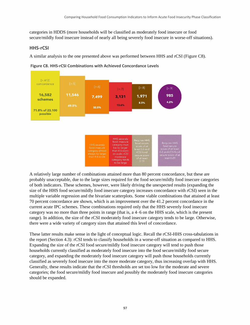
Comparing Household Food Consumption Indicators to Inform Acute Food Insecurity Phase Classification
97
categories in HDDS (more households will be classified as moderately food insecure or food
secure/mildly food insecure instead of nearly all being severely food insecure in worse-off situations).
HHS-rCSI
A similar analysis to the one presented above was performed between HHS and rCSI (Figure C8).
Figure C8. HHS-rCSI Combinations with Achieved Concordance Levels
A relatively large number of combinations attained more than 80 percent concordance, but these are
probably unacceptable, due to the large sizes required for the food secure/mildly food insecure categories
of both indicators. These schemes, however, were likely driving the unexpected results (expanding the
size of the HHS food secure/mildly food insecure category increases concordance with rCSI) seen in the
multiple variable regression and the bivariate scatterplots. Some viable combinations that attained at least
70 percent concordance are shown, which is an improvement over the 41.2 percent concordance in the
current acute IPC schemes. These combinations required only that the HHS severely food insecure
category was no more than three points in range (that is, a 4–6 on the HHS scale, which is the present
range). In addition, the size of the rCSI moderately food insecure category tends to be large. Otherwise,
there were a wide variety of category sizes that attained this level of concordance.
These latter results make sense in the light of conceptual logic. Recall the rCSI-HHS cross-tabulations in
the report (Section 4.3): rCSI tends to classify households in a worse-off situation as compared to HHS.
Expanding the size of the rCSI food secure/mildly food insecure category will tend to push those
households currently classified as moderately food insecure into the food secure/mildly food secure
category, and expanding the moderately food insecure category will push those households currently
classified as severely food insecure into the more moderate category, thus increasing overlap with HHS.
Generally, these results indicate that the rCSI thresholds are set too low for the moderate and severe
categories; the food secure/mildly food insecure and possibly the moderately food insecure categories
should be expanded.
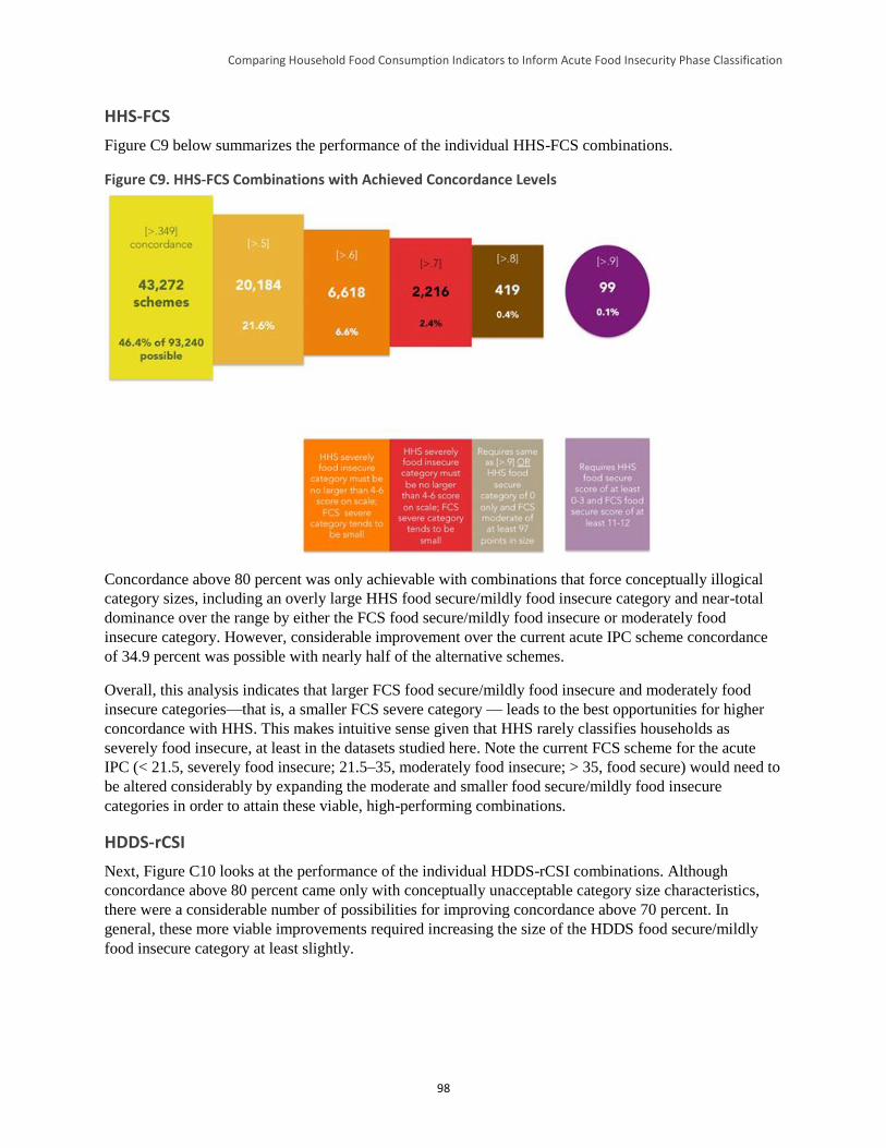
Comparing Household Food Consumption Indicators to Inform Acute Food Insecurity Phase Classification
98
HHS-FCS
Figure C9 below summarizes the performance of the individual HHS-FCS combinations.
Figure C9. HHS-FCS Combinations with Achieved Concordance Levels
Concordance above 80 percent was only achievable with combinations that force conceptually illogical
category sizes, including an overly large HHS food secure/mildly food insecure category and near-total
dominance over the range by either the FCS food secure/mildly food insecure or moderately food
insecure category. However, considerable improvement over the current acute IPC scheme concordance
of 34.9 percent was possible with nearly half of the alternative schemes.
Overall, this analysis indicates that larger FCS food secure/mildly food insecure and moderately food
insecure categories—that is, a smaller FCS severe category — leads to the best opportunities for higher
concordance with HHS. This makes intuitive sense given that HHS rarely classifies households as
severely food insecure, at least in the datasets studied here. Note the current FCS scheme for the acute
IPC (< 21.5, severely food insecure; 21.5–35, moderately food insecure; > 35, food secure) would need to
be altered considerably by expanding the moderate and smaller food secure/mildly food insecure
categories in order to attain these viable, high-performing combinations.
HDDS-rCSI
Next, Figure C10 looks at the performance of the individual HDDS-rCSI combinations. Although
concordance above 80 percent came only with conceptually unacceptable category size characteristics,
there were a considerable number of possibilities for improving concordance above 70 percent. In
general, these more viable improvements required increasing the size of the HDDS food secure/mildly
food insecure category at least slightly.
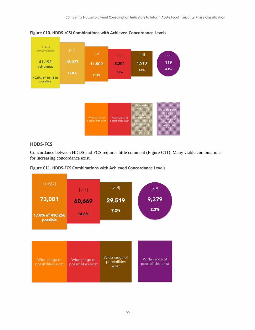
Comparing Household Food Consumption Indicators to Inform Acute Food Insecurity Phase Classification
99
Figure C10. HDDS-rCSI Combinations with Achieved Concordance Levels
HDDS-FCS
Concordance between HDDS and FCS requires little comment (Figure C11). Many viable combinations
for increasing concordance exist.
Figure C11. HDDS-FCS Combinations with Achieved Concordance Levels
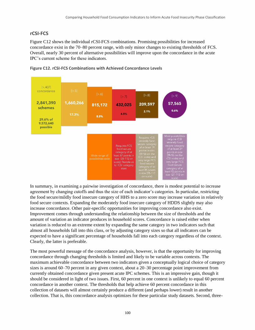
Comparing Household Food Consumption Indicators to Inform Acute Food Insecurity Phase Classification
100
rCSI-FCS
Figure C12 shows the individual rCSI-FCS combinations. Promising possibilities for increased
concordance exist in the 70–80 percent range, with only minor changes to existing thresholds of FCS.
Overall, nearly 30 percent of alternative possibilities will improve upon the concordance in the acute
IPC’s current scheme for these indicators.
Figure C12. rCSI-FCS Combinations with Achieved Concordance Levels
In summary, in examining a pairwise investigation of concordance, there is modest potential to increase
agreement by changing cutoffs and thus the size of each indicator’s categories. In particular, restricting
the food secure/mildly food insecure category of HHS to a zero score may increase variation in relatively
food secure contexts. Expanding the moderately food insecure category of HDDS slightly may also
increase concordance. Other pair-specific opportunities for improving concordance also exist.
Improvement comes through understanding the relationship between the size of thresholds and the
amount of variation an indicator produces in household scores. Concordance is raised either when
variation is reduced to an extreme extent by expanding the same category in two indicators such that
almost all households fall into this class, or by adjusting category sizes so that all indicators can be
expected to have a significant percentage of households fall into each category regardless of the context.
Clearly, the latter is preferable.
The most powerful message of the concordance analysis, however, is that the opportunity for improving
concordance through changing thresholds is limited and likely to be variable across contexts. The
maximum achievable concordance between two indicators given a conceptually logical choice of category
sizes is around 60–70 percent in any given context, about a 20–30 percentage point improvement from
currently obtained concordance given present acute IPC schemes. This is an impressive gain, though it
should be considered in light of two issues. First, 60 percent in one context is unlikely to equal 60 percent
concordance in another context. The thresholds that help achieve 60 percent concordance in this
collection of datasets will almost certainly produce a different (and perhaps lower) result in another
collection. That is, this concordance analysis optimizes for these particular study datasets. Second, three-

Comparing Household Food Consumption Indicators to Inform Acute Food Insecurity Phase Classification
101
way or four-way threshold shifting to maximize agreement will result in much lower concordance. There
is not a large amount of data to test this, but the cursory examination at the end of Section 4 of the report
suggests that more than a maximum of about 20 percent four-way concordance and a maximum of about
50 percent three-way concordance may be the best that can be hoped for.
Comparing Household Food Consumption Indicators to Inform Acute Food Insecurity Phase Classification
102
Appendix D. Cross-Tabulation Results by Indicator Pair and Dataset
rCSI-FCS
Dataset
FCS category
Total Acceptable Borderline Poor
Haiti ESSAN 11
rCSI category
Food secure/mildly food insecure 14.7% 1.2% 0.1% 15.9%
Moderately food insecure 30.7% 3.8% 0.7% 35.1%
Severely food insecure 38.3% 8.3% 2.4% 49.0%
Total 83.6 13.2% 3.2% 100.0%
Haiti ESSAN 12
rCSI category
Food secure/mildly food insecure 17.8% 0.9% 0.1% 18.8%
Moderately food insecure 44.4% 5.7% 0.9% 50.9%
Severely food insecure 23.8% 5.0% 1.4% 30.2%
Total 86.0% 11.6% 2.5% 100.0%
Haiti ESSAN 13
rCSI category
Food secure/mildly food insecure 14.2% 0.5% 0.1% 14.9%
Moderately food insecure 35.5% 5.0% 0.7% 41.1%
Severely food insecure 34.2% 7.5% 2.3% 44.0%
Total 83.9% 13.1% 3.1% 100.0%
Kenya CFSVA 2010
rCSI category
Food secure/mildly food insecure 55.5% 2.3% 1.1% 59.0%
Moderately food insecure 16.1% 1.6% 0.5% 18.3%
Severely food insecure 18.2% 3.0% 1.6% 22.8%
Total 89.8% 6.9% 3.2% 100.0%
Kenya FSSG 12
rCSI category
Food secure/mildly food insecure 27.9% 4.3% 1.3% 33.4%
Moderately food insecure 10.2% 2.2% 0.9% 13.3%
Severely food insecure 32.7% 12.2% 8.3% 53.2%
Total 70.8% 18.6% 10.5% 100.0%
Comparing Household Food Consumption Indicators to Inform Acute Food Insecurity Phase Classification
103
Dataset
FCS category
Total Acceptable Borderline Poor
Pakistan PEFSA III 12
rCSI category
Food secure/mildly food insecure 45.0% 11.5% 6.7% 63.2%
Moderately food insecure 13.4% 3.8% 3.3% 21.1%
Severely food insecure 9.6% 2.9% 3.3% 15.8%
Total 67.9% 18.2% 13.9% 100.0%
Zimbabwe 10
rCSI category
Food secure/mildly food insecure 52.3% 15.7% 2.9% 70.9%
Moderately food insecure 4.2% 2.0% 0.5% 6.7%
Severely food insecure 12.7% 7.4% 2.3% 22.4%
Total 69.2% 25.1% 5.7% 100.0%
Zimbabwe 12
rCSI category
Food secure/mildly food insecure 28.3% 16.0% 6.2% 50.5%
Moderately food insecure 4.4% 4.1% 1.6% 10.2%
Severely food insecure 10.7% 15.5% 13.0% 39.3%
Total 43.5% 35.7% 20.9% 100.0%
Zimbabwe 11 not shown due to small number of valid FCS observations.
rCSI-FCS Summary
Dataset % Concordance % Discordance
by one category
% Discordance by two
categories
% of observations with worse food
security according to rCSI as compared
to FCS
% of observations with worse food
security according to FCS as compared
to rCSI
Haiti ESSAN 11 20.9 40.9 38.4 77.3 2.0
Haiti ESSAN 12 24.9 51.2 23.9 73.2 1.9
Haiti ESSAN 13 21.5 44.2 34.3 77.2 1.3
Kenya CFSVA 10 58.7 21.9 19.3 37.3 3.9
Kenya FSSG 12 38.4 27.6 34.0 55.1 6.5
Pakistan PEFSA III 12 52.1 31.1 16.3 25.9 21.5
Zimbabwe 10 56.6 27.8 15.6 24.3 19.1
Zimbabwe 12 45.4 37.5 16.9% 30.6 23.8
Comparing Household Food Consumption Indicators to Inform Acute Food Insecurity Phase Classification
104
rCSI-HDDS
Dataset
HDDS category
Total Food secure Moderately
food insecure Severely food
insecure
Ethiopia DFAP 12
rCSI category
Food secure/mildly food insecure 9.40% 14.30% 11.80% 35.5%
Moderately food insecure 3.00% 4.10% 3.80% 10.9%
Severely food insecure 13.80% 17.60% 22.10% 53.5%
Total 37.8% 26.20% 36.00% 37.7%
Haiti ESSAN 11
rCSI category
Food secure/mildly food insecure 12.40% 3.00% 0.50% 15.90%
Moderately food insecure 26.50% 7.40% 1.20% 35.10%
Severely food insecure 30.90% 14.80% 3.20% 48.90%
Total 5.0% 69.80% 25.20% 4.90%
Haiti ESSAN 13
rCSI category
Food secure/mildly food insecure 10.80% 3.60% 0.40% 14.80%
Moderately food insecure 27.40% 11.70% 2.00% 41.10%
Severely food insecure 23.60% 16.10% 4.30% 44.00%
Total 6.8% 61.80% 31.40% 6.70%
Pakistan PEFSA III 12
rCSI category
Food secure/mildly food insecure 21.90% 35.70% 5.20% 62.80%
Moderately food insecure 4.80% 12.40% 4.30% 21.50%
Severely food insecure 5.20% 8.60% 1.90% 15.70%
Total 11.4% 31.90% 56.70% 11.40%
Pakistan Badin baseline 12
rCSI category
Food secure/mildly food insecure 8.40% 0.00% 0.00% 8.40%
Moderately food insecure 25.70% 4.20% 0.00% 29.90%
Severely food insecure 46.10% 15.60% 0.00% 61.70%
Total 0.0% 80.20% 19.80% 0.00%
Somalia Gu 10
rCSI category
Food secure/mildly food insecure 11.20% 2.60% 2.30% 16.10%
Moderately food insecure 10.30% 13.80% 6.30% 30.40%
Severely food insecure 15.80% 23.20% 14.60% 53.60%
Total 23.2% 37.30% 39.60% 23.20%
Somalia Gu 11
rCSI category
Food secure/mildly food insecure 3.70% 9.60% 2.90% 16.20%
Moderately food insecure 7.20% 17.70% 6.60% 31.50%
Severely food insecure 11.00% 33.30% 8.00% 52.30%
Total 17.5% 21.90% 60.60% 17.50%
Comparing Household Food Consumption Indicators to Inform Acute Food Insecurity Phase Classification
105
Dataset
HDDS category
Total Food secure Moderately
food insecure Severely food
insecure
Somalia Deyr 11
rCSI category
Food secure/mildly food insecure 17.20% 19.00% 3.70% 39.90%
Moderately food insecure 15.00% 15.90% 2.50% 33.40%
Severely food insecure 4.70% 17.10% 5.10% 26.90%
Total 11.2% 36.90% 52.00% 11.30%
Somalia Gu 12
rCSI category
Food secure/mildly food insecure 8.70% 15.20% 10.50% 34.40%
Moderately food insecure 8.20% 17.40% 16.00% 41.60%
Severely food insecure 3.80% 11.10% 9.10% 24.00%
Total 35.6% 20.70% 43.70% 35.60%
South Sudan JFSP 12
rCSI category
Food secure/mildly food insecure 1.30% 3.10% 5.10% 9.50%
Moderately food insecure 0.60% 2.20% 6.70% 9.50%
Severely food insecure 6.70% 19.60% 54.70% 81.00%
Total 66.5% 8.60% 24.90% 66.50%
rCSI-HDDS Summary
Dataset % Concordance % Discordance
by one category
% Discordance by two
categories
% of observations with worse food
security according to rCSI as
compared to HDDS
% of observations with worse food
security according to HDDS as compared to
rCSI
Ethiopia DFAP 12 35.6 38.7 25.6 34.4 29.9
Haiti ESSAN 11 23.0 45.5 31.4 72.2 4.7
Haiti ESSAN 13 26.8 49.1 24.0 67.1 6.0
Pakistan PEFSA III 12 36.2 53.4 10.4 18.6 45.2
Pakistan Badin Base 12 12.6 41.3 46.1 87.4 0.0
Somalia Gu 10 39.6 42.4 18.1 49.3 11.2
Somalia Gu 11 29.4 56.7 13.9 51.5 19.1
Somalia Deyr 11 38.2 53.6 8.4 36.8 25.2
Somalia Gu 12 35.2 50.5 14.3 23.1 41.7
South Sudan JFSP 12 58.2 30.0 11.8 26.9 14.9
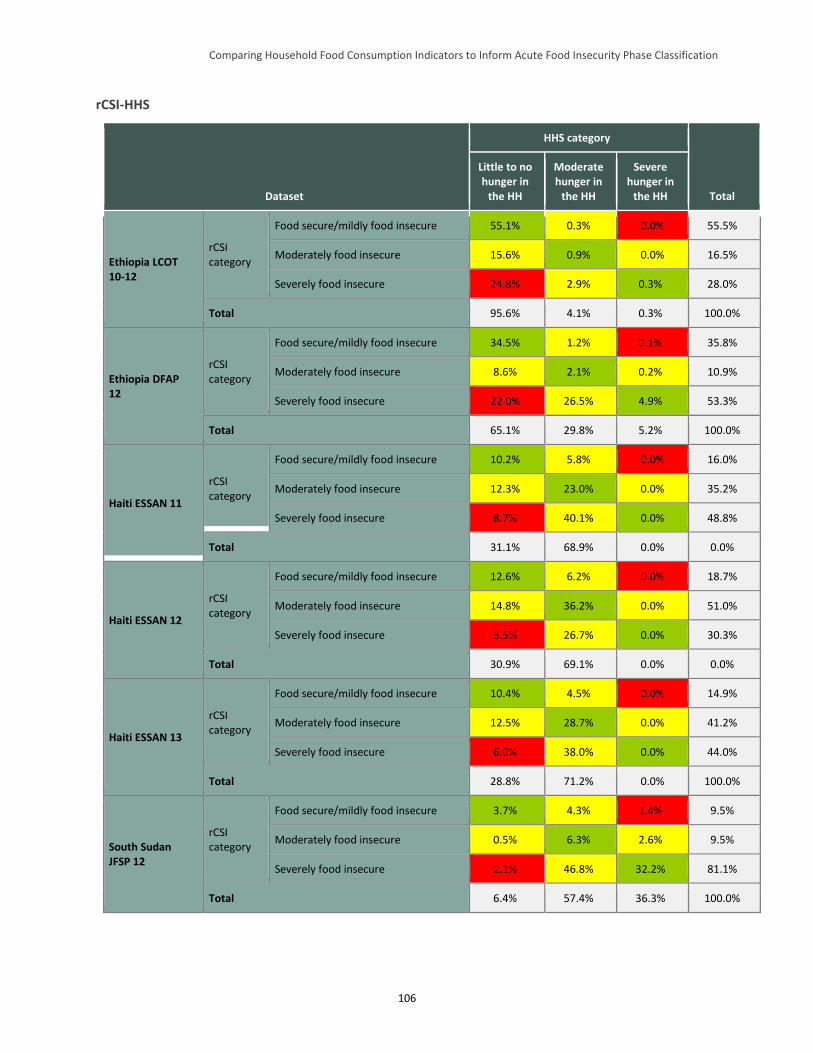
Comparing Household Food Consumption Indicators to Inform Acute Food Insecurity Phase Classification
106
rCSI-HHS
Dataset
HHS category
Total
Little to no hunger in
the HH
Moderate hunger in
the HH
Severe hunger in
the HH
Ethiopia LCOT 10-12
rCSI category
Food secure/mildly food insecure 55.1% 0.3% 0.0% 55.5%
Moderately food insecure 15.6% 0.9% 0.0% 16.5%
Severely food insecure 24.8% 2.9% 0.3% 28.0%
Total 95.6% 4.1% 0.3% 100.0%
Ethiopia DFAP 12
rCSI category
Food secure/mildly food insecure 34.5% 1.2% 0.1% 35.8%
Moderately food insecure 8.6% 2.1% 0.2% 10.9%
Severely food insecure 22.0% 26.5% 4.9% 53.3%
Total 65.1% 29.8% 5.2% 100.0%
Haiti ESSAN 11
rCSI category
Food secure/mildly food insecure 10.2% 5.8% 0.0% 16.0%
Moderately food insecure 12.3% 23.0% 0.0% 35.2%
Severely food insecure 8.7% 40.1% 0.0% 48.8%
Total 31.1% 68.9% 0.0% 0.0%
Haiti ESSAN 12
rCSI category
Food secure/mildly food insecure 12.6% 6.2% 0.0% 18.7%
Moderately food insecure 14.8% 36.2% 0.0% 51.0%
Severely food insecure 3.5% 26.7% 0.0% 30.3%
Total 30.9% 69.1% 0.0% 0.0%
Haiti ESSAN 13
rCSI category
Food secure/mildly food insecure 10.4% 4.5% 0.0% 14.9%
Moderately food insecure 12.5% 28.7% 0.0% 41.2%
Severely food insecure 6.0% 38.0% 0.0% 44.0%
Total 28.8% 71.2% 0.0% 100.0%
South Sudan JFSP 12
rCSI category
Food secure/mildly food insecure 3.7% 4.3% 1.4% 9.5%
Moderately food insecure 0.5% 6.3% 2.6% 9.5%
Severely food insecure 2.1% 46.8% 32.2% 81.1%
Total 6.4% 57.4% 36.3% 100.0%
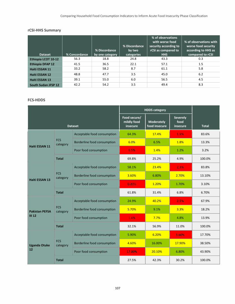
Comparing Household Food Consumption Indicators to Inform Acute Food Insecurity Phase Classification
107
rCSI-HHS Summary
Dataset % Concordance % Discordance
by one category
% Discordance by two
categories
% of observations with worse food
security according to rCSI as compared to
HHS
% of observations with worse food security according to HHS as
compared to rCSI
Ethiopia LCOT 10-12 56.3 18.8 24.8 43.3 0.3
Ethiopia DFAP 12 41.5 36.5 22.1 57.1 1.5
Haiti ESSAN 11 33.2 58.2 8.7 61.1 5.8
Haiti ESSAN 12 48.8 47.7 3.5 45.0 6.2
Haiti ESSAN 13 39.1 55.0 6.0 56.5 4.5
South Sudan JFSP 12 42.2 54.2 3.5 49.4 8.3
FCS-HDDS
Dataset
HDDS category
Total
Food secure/ mildly food
insecure Moderately
food insecure
Severely food
insecure
Haiti ESSAN 11
FCS category
Acceptable food consumption 64.3% 17.4% 1.9% 83.6%
Borderline food consumption 6.0% 6.5% 1.8% 13.3%
Poor food consumption 0.5% 1.4% 1.2% 3.2%
Total 69.8% 25.2% 4.9% 100.0%
Haiti ESSAN 13
FCS category
Acceptable food consumption 58.1% 23.4% 2.3% 83.8%
Borderline food consumption 3.60% 6.80% 2.70% 13.10%
Poor food consumption 0.20% 1.20% 1.70% 3.10%
Total 61.8% 31.4% 6.8% 6.70%
Pakistan PEFSA III 12
FCS category
Acceptable food consumption 24.9% 40.2% 2.9% 67.9%
Borderline food consumption 5.70% 9.1% 3.3% 18.2%
Poor food consumption 1.4% 7.7% 4.8% 13.9%
Total 32.1% 56.9% 11.0% 100.0%
Uganda Otuke 12
FCS category
Acceptable food consumption 5.90% 6.20% 5.60% 17.70%
Borderline food consumption 4.60% 16.00% 17.90% 38.50%
Poor food consumption 17.00% 20.10% 6.80% 43.90%
Total 27.5% 42.3% 30.2% 100.0%
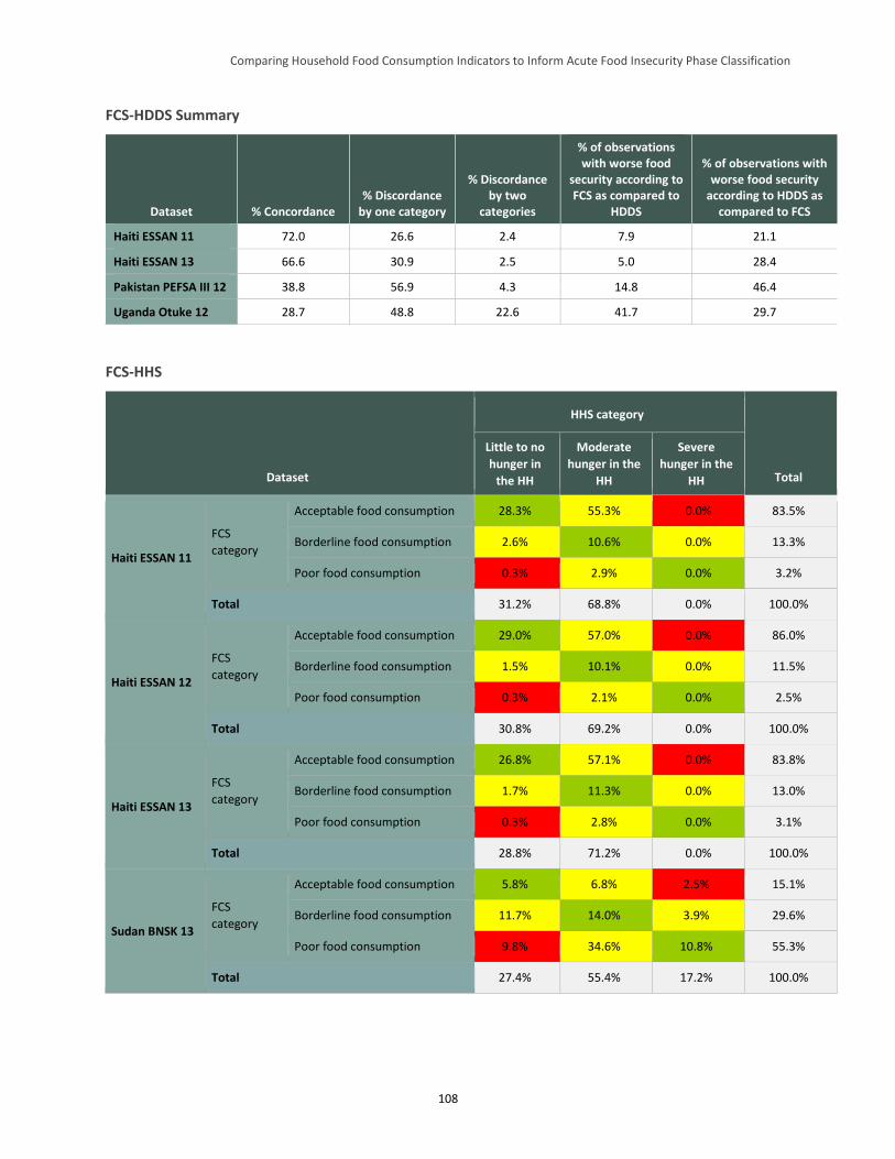
Comparing Household Food Consumption Indicators to Inform Acute Food Insecurity Phase Classification
108
FCS-HDDS Summary
Dataset % Concordance % Discordance
by one category
% Discordance by two
categories
% of observations with worse food
security according to FCS as compared to
HDDS
% of observations with worse food security
according to HDDS as compared to FCS
Haiti ESSAN 11 72.0 26.6 2.4 7.9 21.1
Haiti ESSAN 13 66.6 30.9 2.5 5.0 28.4
Pakistan PEFSA III 12 38.8 56.9 4.3 14.8 46.4
Uganda Otuke 12 28.7 48.8 22.6 41.7 29.7
FCS-HHS
Dataset
HHS category
Total
Little to no
hunger in
the HH
Moderate
hunger in the
HH
Severe
hunger in the
HH
Haiti ESSAN 11
FCS
category
Acceptable food consumption 28.3% 55.3% 0.0% 83.5%
Borderline food consumption 2.6% 10.6% 0.0% 13.3%
Poor food consumption 0.3% 2.9% 0.0% 3.2%
Total 31.2% 68.8% 0.0% 100.0%
Haiti ESSAN 12
FCS
category
Acceptable food consumption 29.0% 57.0% 0.0% 86.0%
Borderline food consumption 1.5% 10.1% 0.0% 11.5%
Poor food consumption 0.3% 2.1% 0.0% 2.5%
Total 30.8% 69.2% 0.0% 100.0%
Haiti ESSAN 13
FCS
category
Acceptable food consumption 26.8% 57.1% 0.0% 83.8%
Borderline food consumption 1.7% 11.3% 0.0% 13.0%
Poor food consumption 0.3% 2.8% 0.0% 3.1%
Total 28.8% 71.2% 0.0% 100.0%
Sudan BNSK 13
FCS
category
Acceptable food consumption 5.8% 6.8% 2.5% 15.1%
Borderline food consumption 11.7% 14.0% 3.9% 29.6%
Poor food consumption 9.8% 34.6% 10.8% 55.3%
Total 27.4% 55.4% 17.2% 100.0%
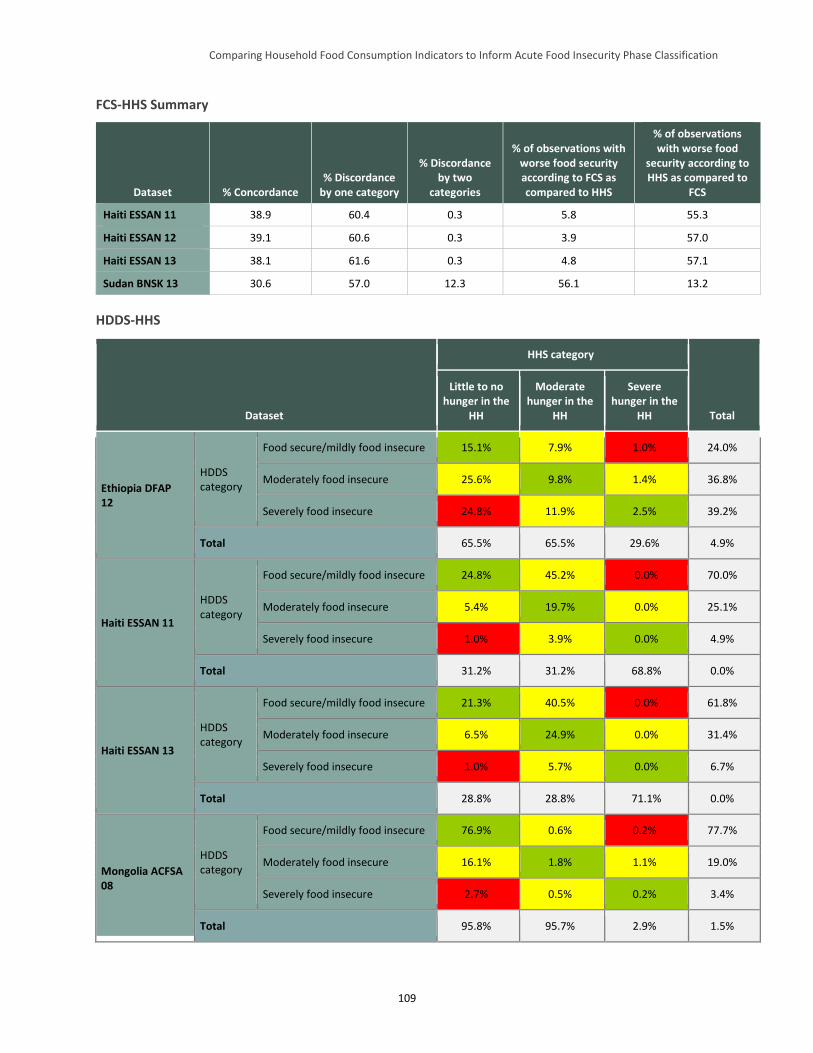
Comparing Household Food Consumption Indicators to Inform Acute Food Insecurity Phase Classification
109
FCS-HHS Summary
Dataset % Concordance % Discordance
by one category
% Discordance by two
categories
% of observations with worse food security according to FCS as compared to HHS
% of observations with worse food
security according to HHS as compared to
FCS
Haiti ESSAN 11 38.9 60.4 0.3 5.8 55.3
Haiti ESSAN 12 39.1 60.6 0.3 3.9 57.0
Haiti ESSAN 13 38.1 61.6 0.3 4.8 57.1
Sudan BNSK 13 30.6 57.0 12.3 56.1 13.2
HDDS-HHS
Dataset
HHS category
Total
Little to no hunger in the
HH
Moderate hunger in the
HH
Severe hunger in the
HH
Ethiopia DFAP 12
HDDS category
Food secure/mildly food insecure 15.1% 7.9% 1.0% 24.0%
Moderately food insecure 25.6% 9.8% 1.4% 36.8%
Severely food insecure 24.8% 11.9% 2.5% 39.2%
Total 65.5% 65.5% 29.6% 4.9%
Haiti ESSAN 11
HDDS category
Food secure/mildly food insecure 24.8% 45.2% 0.0% 70.0%
Moderately food insecure 5.4% 19.7% 0.0% 25.1%
Severely food insecure 1.0% 3.9% 0.0% 4.9%
Total 31.2% 31.2% 68.8% 0.0%
Haiti ESSAN 13
HDDS category
Food secure/mildly food insecure 21.3% 40.5% 0.0% 61.8%
Moderately food insecure 6.5% 24.9% 0.0% 31.4%
Severely food insecure 1.0% 5.7% 0.0% 6.7%
Total 28.8% 28.8% 71.1% 0.0%
Mongolia ACFSA 08
HDDS category
Food secure/mildly food insecure 76.9% 0.6% 0.2% 77.7%
Moderately food insecure 16.1% 1.8% 1.1% 19.0%
Severely food insecure 2.7% 0.5% 0.2% 3.4%
Total 95.8% 95.7% 2.9% 1.5%
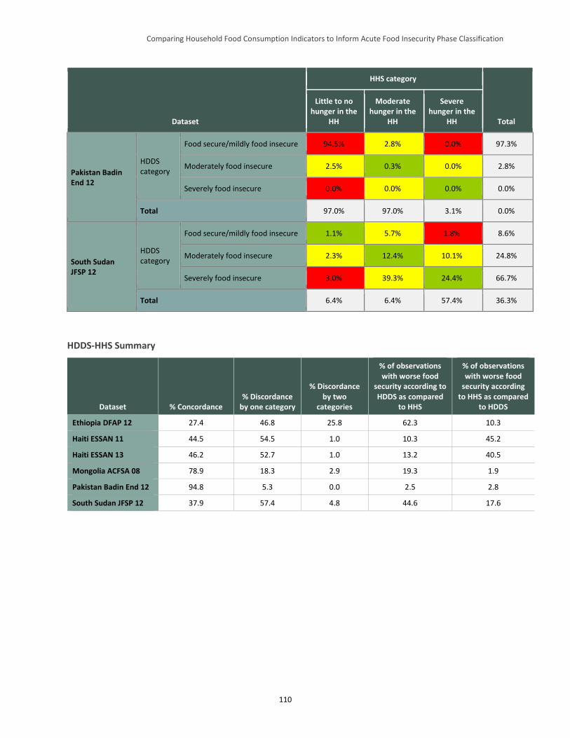
Comparing Household Food Consumption Indicators to Inform Acute Food Insecurity Phase Classification
110
Dataset
HHS category
Total
Little to no hunger in the
HH
Moderate hunger in the
HH
Severe hunger in the
HH
Pakistan Badin End 12
HDDS category
Food secure/mildly food insecure 94.5% 2.8% 0.0% 97.3%
Moderately food insecure 2.5% 0.3% 0.0% 2.8%
Severely food insecure 0.0% 0.0% 0.0% 0.0%
Total 97.0% 97.0% 3.1% 0.0%
South Sudan JFSP 12
HDDS category
Food secure/mildly food insecure 1.1% 5.7% 1.8% 8.6%
Moderately food insecure 2.3% 12.4% 10.1% 24.8%
Severely food insecure 3.0% 39.3% 24.4% 66.7%
Total 6.4% 6.4% 57.4% 36.3%
HDDS-HHS Summary
Dataset % Concordance % Discordance
by one category
% Discordance by two
categories
% of observations with worse food
security according to HDDS as compared
to HHS
% of observations with worse food
security according to HHS as compared
to HDDS
Ethiopia DFAP 12 27.4 46.8 25.8 62.3 10.3
Haiti ESSAN 11 44.5 54.5 1.0 10.3 45.2
Haiti ESSAN 13 46.2 52.7 1.0 13.2 40.5
Mongolia ACFSA 08 78.9 18.3 2.9 19.3 1.9
Pakistan Badin End 12 94.8 5.3 0.0 2.5 2.8
South Sudan JFSP 12 37.9 57.4 4.8 44.6 17.6
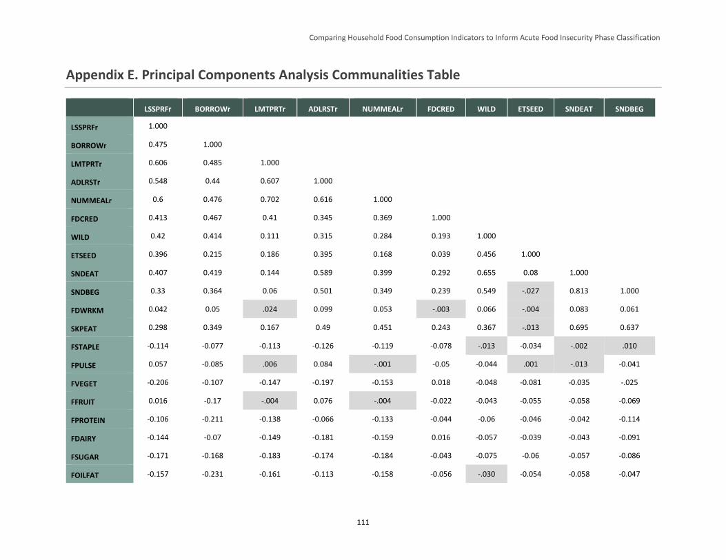
Comparing Household Food Consumption Indicators to Inform Acute Food Insecurity Phase Classification
111
Appendix E. Principal Components Analysis Communalities Table
LSSPRFr BORROWr LMTPRTr ADLRSTr NUMMEALr FDCRED WILD ETSEED SNDEAT SNDBEG
LSSPRFr 1.000
BORROWr 0.475 1.000
LMTPRTr 0.606 0.485 1.000
ADLRSTr 0.548 0.44 0.607 1.000
NUMMEALr 0.6 0.476 0.702 0.616 1.000
FDCRED 0.413 0.467 0.41 0.345 0.369 1.000
WILD 0.42 0.414 0.111 0.315 0.284 0.193 1.000
ETSEED 0.396 0.215 0.186 0.395 0.168 0.039 0.456 1.000
SNDEAT 0.407 0.419 0.144 0.589 0.399 0.292 0.655 0.08 1.000
SNDBEG 0.33 0.364 0.06 0.501 0.349 0.239 0.549 -.027 0.813 1.000
FDWRKM 0.042 0.05 .024 0.099 0.053 -.003 0.066 -.004 0.083 0.061
SKPEAT 0.298 0.349 0.167 0.49 0.451 0.243 0.367 -.013 0.695 0.637
FSTAPLE -0.114 -0.077 -0.113 -0.126 -0.119 -0.078 -.013 -0.034 -.002 .010
FPULSE 0.057 -0.085 .006 0.084 -.001 -0.05 -0.044 .001 -.013 -0.041
FVEGET -0.206 -0.107 -0.147 -0.197 -0.153 0.018 -0.048 -0.081 -0.035 -.025
FFRUIT 0.016 -0.17 -.004 0.076 -.004 -0.022 -0.043 -0.055 -0.058 -0.069
FPROTEIN -0.106 -0.211 -0.138 -0.066 -0.133 -0.044 -0.06 -0.046 -0.042 -0.114
FDAIRY -0.144 -0.07 -0.149 -0.181 -0.159 0.016 -0.057 -0.039 -0.043 -0.091
FSUGAR -0.171 -0.168 -0.183 -0.174 -0.184 -0.043 -0.075 -0.06 -0.057 -0.086
FOILFAT -0.157 -0.231 -0.161 -0.113 -0.158 -0.056 -.030 -0.054 -0.058 -0.047
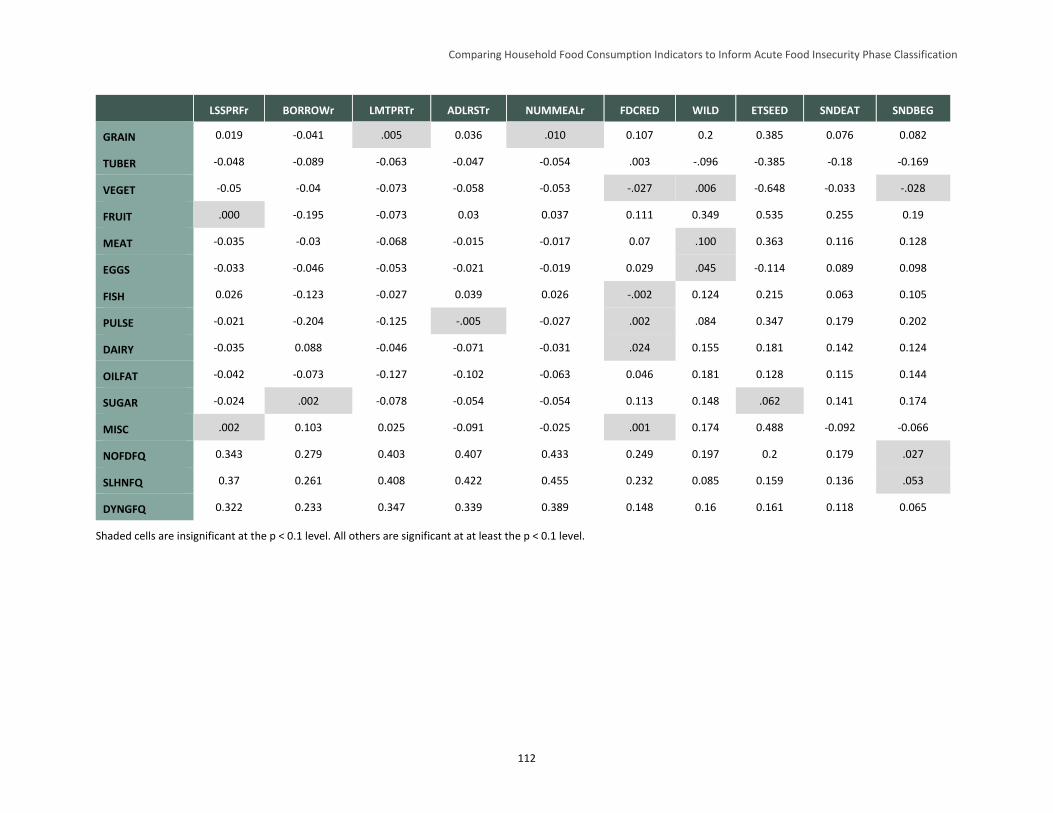
Comparing Household Food Consumption Indicators to Inform Acute Food Insecurity Phase Classification
112
LSSPRFr BORROWr LMTPRTr ADLRSTr NUMMEALr FDCRED WILD ETSEED SNDEAT SNDBEG
GRAIN 0.019 -0.041 .005 0.036 .010 0.107 0.2 0.385 0.076 0.082
TUBER -0.048 -0.089 -0.063 -0.047 -0.054 .003 -.096 -0.385 -0.18 -0.169
VEGET -0.05 -0.04 -0.073 -0.058 -0.053 -.027 .006 -0.648 -0.033 -.028
FRUIT .000 -0.195 -0.073 0.03 0.037 0.111 0.349 0.535 0.255 0.19
MEAT -0.035 -0.03 -0.068 -0.015 -0.017 0.07 .100 0.363 0.116 0.128
EGGS -0.033 -0.046 -0.053 -0.021 -0.019 0.029 .045 -0.114 0.089 0.098
FISH 0.026 -0.123 -0.027 0.039 0.026 -.002 0.124 0.215 0.063 0.105
PULSE -0.021 -0.204 -0.125 -.005 -0.027 .002 .084 0.347 0.179 0.202
DAIRY -0.035 0.088 -0.046 -0.071 -0.031 .024 0.155 0.181 0.142 0.124
OILFAT -0.042 -0.073 -0.127 -0.102 -0.063 0.046 0.181 0.128 0.115 0.144
SUGAR -0.024 .002 -0.078 -0.054 -0.054 0.113 0.148 .062 0.141 0.174
MISC .002 0.103 0.025 -0.091 -0.025 .001 0.174 0.488 -0.092 -0.066
NOFDFQ 0.343 0.279 0.403 0.407 0.433 0.249 0.197 0.2 0.179 .027
SLHNFQ 0.37 0.261 0.408 0.422 0.455 0.232 0.085 0.159 0.136 .053
DYNGFQ 0.322 0.233 0.347 0.339 0.389 0.148 0.16 0.161 0.118 0.065
Shaded cells are insignificant at the p < 0.1 level. All others are significant at at least the p < 0.1 level.
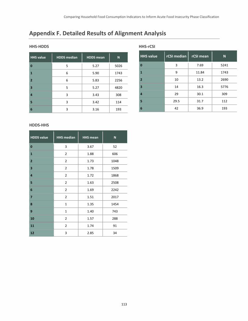
Comparing Household Food Consumption Indicators to Inform Acute Food Insecurity Phase Classification
113
Appendix F. Detailed Results of Alignment Analysis
HHS-HDDS HHS-rCSI
HDDS-HHS
HDDS value HHS median HHS mean N
0 3 3.67 52
1 2 1.88 606
2 2 1.73 1048
3 2 1.78 1509
4 2 1.72 1868
5 2 1.63 2508
6 2 1.69 2242
7 2 1.51 2017
8 1 1.35 1454
9 1 1.40 743
10 2 1.57 288
11 2 1.74 91
12 3 2.85 34
HHS value HDDS median HDDS mean N
0 5 5.27 5026
1 6 5.90 1743
2 6 5.83 2256
3 5 5.27 4820
4 3 3.43 308
5 3 3.42 114
6 3 3.16 193
HHS value rCSI median rCSI mean N
0 3 7.69 5241
1 9 11.84 1743
2 10 13.2 2690
3 14 16.3 5776
4 29 30.1 309
5 29.5 31.7 112
6 42 36.9 193
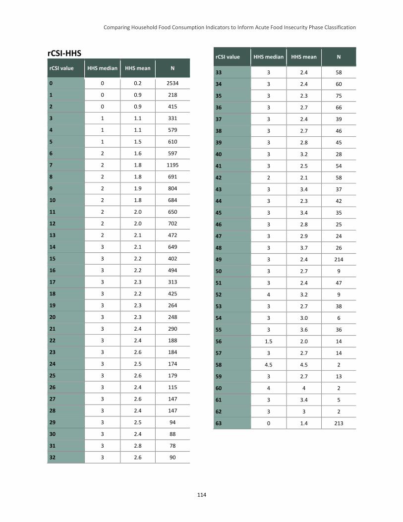
Comparing Household Food Consumption Indicators to Inform Acute Food Insecurity Phase Classification
114
rCSI-HHS
rCSI value HHS median HHS mean N
0 0 0.2 2534
1 0 0.9 218
2 0 0.9 415
3 1 1.1 331
4 1 1.1 579
5 1 1.5 610
6 2 1.6 597
7 2 1.8 1195
8 2 1.8 691
9 2 1.9 804
10 2 1.8 684
11 2 2.0 650
12 2 2.0 702
13 2 2.1 472
14 3 2.1 649
15 3 2.2 402
16 3 2.2 494
17 3 2.3 313
18 3 2.2 425
19 3 2.3 264
20 3 2.3 248
21 3 2.4 290
22 3 2.4 188
23 3 2.6 184
24 3 2.5 174
25 3 2.6 179
26 3 2.4 115
27 3 2.6 147
28 3 2.4 147
29 3 2.5 94
30 3 2.4 88
31 3 2.8 78
32 3 2.6 90
rCSI value HHS median HHS mean N
33 3 2.4 58
34 3 2.4 60
35 3 2.3 75
36 3 2.7 66
37 3 2.4 39
38 3 2.7 46
39 3 2.8 45
40 3 3.2 28
41 3 2.5 54
42 2 2.1 58
43 3 3.4 37
44 3 2.3 42
45 3 3.4 35
46 3 2.8 25
47 3 2.9 24
48 3 3.7 26
49 3 2.4 214
50 3 2.7 9
51 3 2.4 47
52 4 3.2 9
53 3 2.7 38
54 3 3.0 6
55 3 3.6 36
56 1.5 2.0 14
57 3 2.7 14
58 4.5 4.5 2
59 3 2.7 13
60 4 4 2
61 3 3.4 5
62 3 3 2
63 0 1.4 213
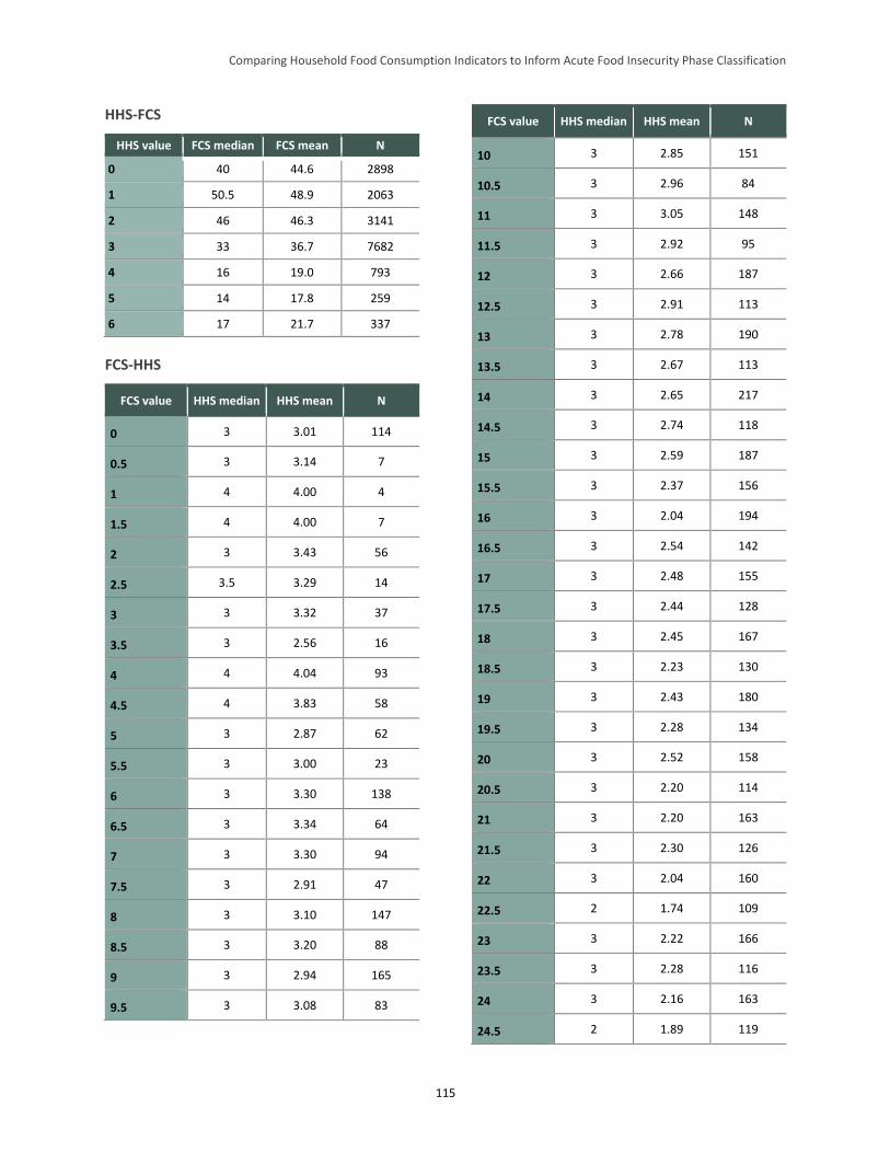
Comparing Household Food Consumption Indicators to Inform Acute Food Insecurity Phase Classification
115
HHS-FCS
HHS value FCS median FCS mean N
0 40 44.6 2898
1 50.5 48.9 2063
2 46 46.3 3141
3 33 36.7 7682
4 16 19.0 793
5 14 17.8 259
6 17 21.7 337
FCS-HHS
FCS value HHS median HHS mean N
0 3 3.01 114
0.5 3 3.14 7
1 4 4.00 4
1.5 4 4.00 7
2 3 3.43 56
2.5 3.5 3.29 14
3 3 3.32 37
3.5 3 2.56 16
4 4 4.04 93
4.5 4 3.83 58
5 3 2.87 62
5.5 3 3.00 23
6 3 3.30 138
6.5 3 3.34 64
7 3 3.30 94
7.5 3 2.91 47
8 3 3.10 147
8.5 3 3.20 88
9 3 2.94 165
9.5 3 3.08 83
FCS value HHS median HHS mean N
10 3 2.85 151
10.5 3 2.96 84
11 3 3.05 148
11.5 3 2.92 95
12 3 2.66 187
12.5 3 2.91 113
13 3 2.78 190
13.5 3 2.67 113
14 3 2.65 217
14.5 3 2.74 118
15 3 2.59 187
15.5 3 2.37 156
16 3 2.04 194
16.5 3 2.54 142
17 3 2.48 155
17.5 3 2.44 128
18 3 2.45 167
18.5 3 2.23 130
19 3 2.43 180
19.5 3 2.28 134
20 3 2.52 158
20.5 3 2.20 114
21 3 2.20 163
21.5 3 2.30 126
22 3 2.04 160
22.5 2 1.74 109
23 3 2.22 166
23.5 3 2.28 116
24 3 2.16 163
24.5 2 1.89 119
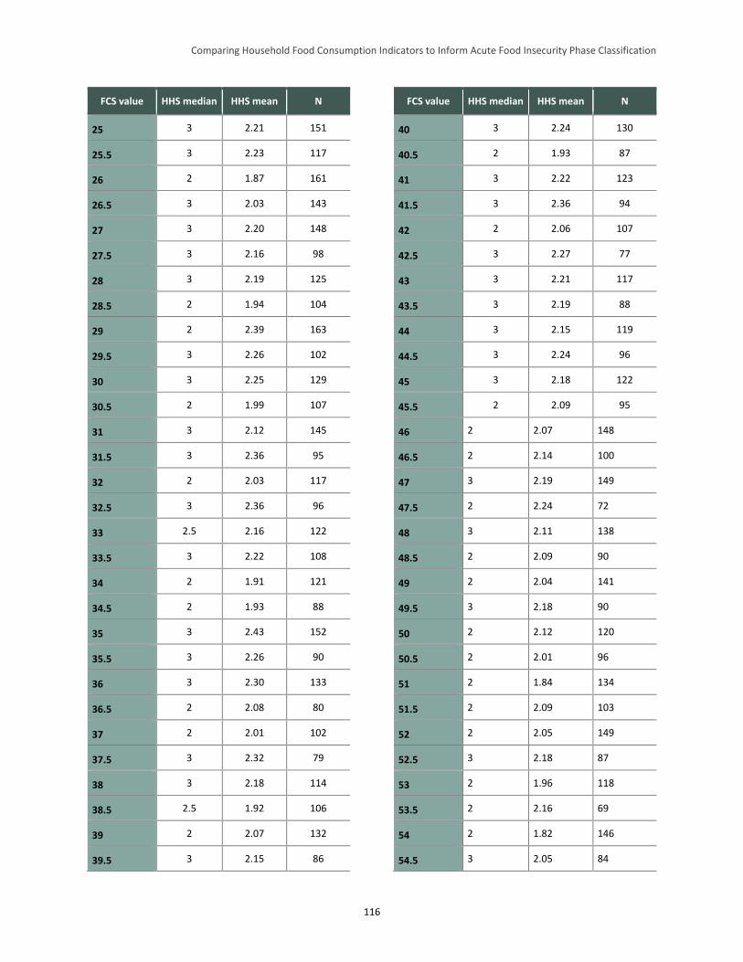
Comparing Household Food Consumption Indicators to Inform Acute Food Insecurity Phase Classification
116
FCS value HHS median HHS mean N
25 3 2.21 151
25.5 3 2.23 117
26 2 1.87 161
26.5 3 2.03 143
27 3 2.20 148
27.5 3 2.16 98
28 3 2.19 125
28.5 2 1.94 104
29 2 2.39 163
29.5 3 2.26 102
30 3 2.25 129
30.5 2 1.99 107
31 3 2.12 145
31.5 3 2.36 95
32 2 2.03 117
32.5 3 2.36 96
33 2.5 2.16 122
33.5 3 2.22 108
34 2 1.91 121
34.5 2 1.93 88
35 3 2.43 152
35.5 3 2.26 90
36 3 2.30 133
36.5 2 2.08 80
37 2 2.01 102
37.5 3 2.32 79
38 3 2.18 114
38.5 2.5 1.92 106
39 2 2.07 132
39.5 3 2.15 86
FCS value HHS median HHS mean N
40 3 2.24 130
40.5 2 1.93 87
41 3 2.22 123
41.5 3 2.36 94
42 2 2.06 107
42.5 3 2.27 77
43 3 2.21 117
43.5 3 2.19 88
44 3 2.15 119
44.5 3 2.24 96
45 3 2.18 122
45.5 2 2.09 95
46 2 2.07 148
46.5 2 2.14 100
47 3 2.19 149
47.5 2 2.24 72
48 3 2.11 138
48.5 2 2.09 90
49 2 2.04 141
49.5 3 2.18 90
50 2 2.12 120
50.5 2 2.01 96
51 2 1.84 134
51.5 2 2.09 103
52 2 2.05 149
52.5 3 2.18 87
53 2 1.96 118
53.5 2 2.16 69
54 2 1.82 146
54.5 3 2.05 84
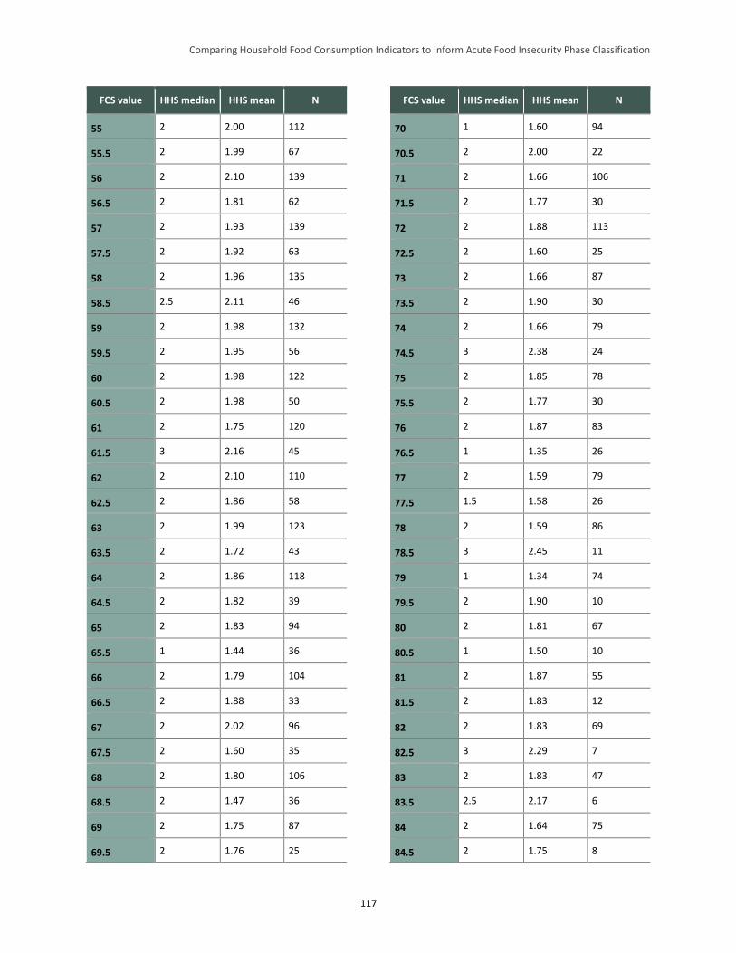
Comparing Household Food Consumption Indicators to Inform Acute Food Insecurity Phase Classification
117
FCS value HHS median HHS mean N
55 2 2.00 112
55.5 2 1.99 67
56 2 2.10 139
56.5 2 1.81 62
57 2 1.93 139
57.5 2 1.92 63
58 2 1.96 135
58.5 2.5 2.11 46
59 2 1.98 132
59.5 2 1.95 56
60 2 1.98 122
60.5 2 1.98 50
61 2 1.75 120
61.5 3 2.16 45
62 2 2.10 110
62.5 2 1.86 58
63 2 1.99 123
63.5 2 1.72 43
64 2 1.86 118
64.5 2 1.82 39
65 2 1.83 94
65.5 1 1.44 36
66 2 1.79 104
66.5 2 1.88 33
67 2 2.02 96
67.5 2 1.60 35
68 2 1.80 106
68.5 2 1.47 36
69 2 1.75 87
69.5 2 1.76 25
FCS value HHS median HHS mean N
70 1 1.60 94
70.5 2 2.00 22
71 2 1.66 106
71.5 2 1.77 30
72 2 1.88 113
72.5 2 1.60 25
73 2 1.66 87
73.5 2 1.90 30
74 2 1.66 79
74.5 3 2.38 24
75 2 1.85 78
75.5 2 1.77 30
76 2 1.87 83
76.5 1 1.35 26
77 2 1.59 79
77.5 1.5 1.58 26
78 2 1.59 86
78.5 3 2.45 11
79 1 1.34 74
79.5 2 1.90 10
80 2 1.81 67
80.5 1 1.50 10
81 2 1.87 55
81.5 2 1.83 12
82 2 1.83 69
82.5 3 2.29 7
83 2 1.83 47
83.5 2.5 2.17 6
84 2 1.64 75
84.5 2 1.75 8
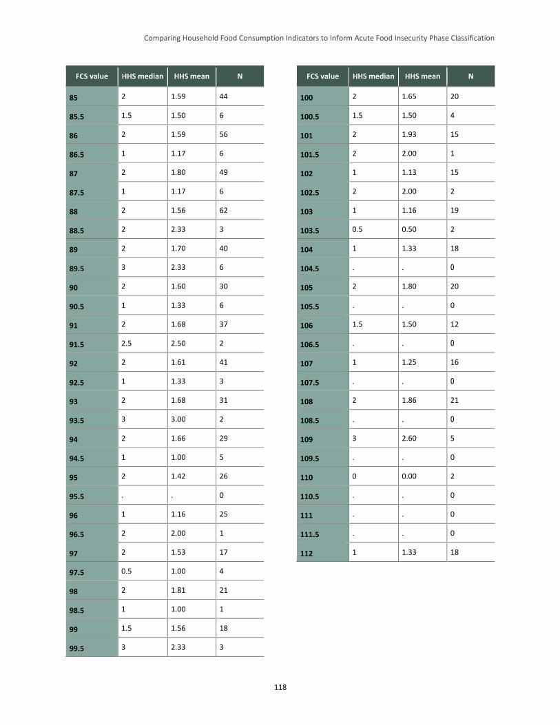
Comparing Household Food Consumption Indicators to Inform Acute Food Insecurity Phase Classification
118
FCS value HHS median HHS mean N
85 2 1.59 44
85.5 1.5 1.50 6
86 2 1.59 56
86.5 1 1.17 6
87 2 1.80 49
87.5 1 1.17 6
88 2 1.56 62
88.5 2 2.33 3
89 2 1.70 40
89.5 3 2.33 6
90 2 1.60 30
90.5 1 1.33 6
91 2 1.68 37
91.5 2.5 2.50 2
92 2 1.61 41
92.5 1 1.33 3
93 2 1.68 31
93.5 3 3.00 2
94 2 1.66 29
94.5 1 1.00 5
95 2 1.42 26
95.5 . . 0
96 1 1.16 25
96.5 2 2.00 1
97 2 1.53 17
97.5 0.5 1.00 4
98 2 1.81 21
98.5 1 1.00 1
99 1.5 1.56 18
99.5 3 2.33 3
FCS value HHS median HHS mean N
100 2 1.65 20
100.5 1.5 1.50 4
101 2 1.93 15
101.5 2 2.00 1
102 1 1.13 15
102.5 2 2.00 2
103 1 1.16 19
103.5 0.5 0.50 2
104 1 1.33 18
104.5 . . 0
105 2 1.80 20
105.5 . . 0
106 1.5 1.50 12
106.5 . . 0
107 1 1.25 16
107.5 . . 0
108 2 1.86 21
108.5 . . 0
109 3 2.60 5
109.5 . . 0
110 0 0.00 2
110.5 . . 0
111 . . 0
111.5 . . 0
112 1 1.33 18
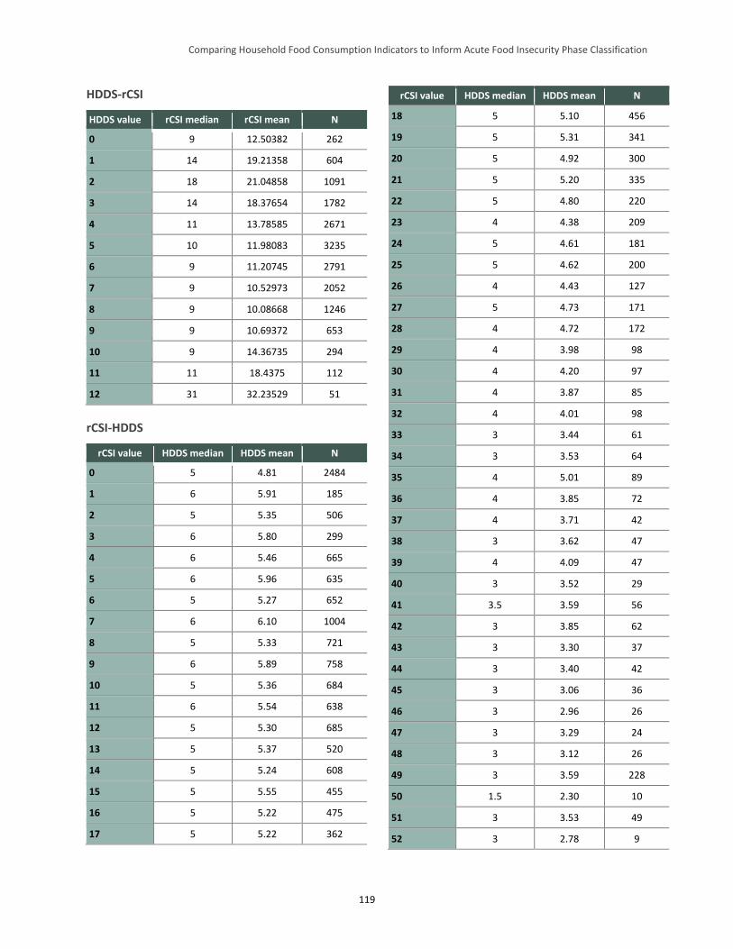
Comparing Household Food Consumption Indicators to Inform Acute Food Insecurity Phase Classification
119
HDDS-rCSI
HDDS value rCSI median rCSI mean N
0 9 12.50382 262
1 14 19.21358 604
2 18 21.04858 1091
3 14 18.37654 1782
4 11 13.78585 2671
5 10 11.98083 3235
6 9 11.20745 2791
7 9 10.52973 2052
8 9 10.08668 1246
9 9 10.69372 653
10 9 14.36735 294
11 11 18.4375 112
12 31 32.23529 51
rCSI-HDDS
rCSI value HDDS median HDDS mean N
0 5 4.81 2484
1 6 5.91 185
2 5 5.35 506
3 6 5.80 299
4 6 5.46 665
5 6 5.96 635
6 5 5.27 652
7 6 6.10 1004
8 5 5.33 721
9 6 5.89 758
10 5 5.36 684
11 6 5.54 638
12 5 5.30 685
13 5 5.37 520
14 5 5.24 608
15 5 5.55 455
16 5 5.22 475
17 5 5.22 362
rCSI value HDDS median HDDS mean N
18 5 5.10 456
19 5 5.31 341
20 5 4.92 300
21 5 5.20 335
22 5 4.80 220
23 4 4.38 209
24 5 4.61 181
25 5 4.62 200
26 4 4.43 127
27 5 4.73 171
28 4 4.72 172
29 4 3.98 98
30 4 4.20 97
31 4 3.87 85
32 4 4.01 98
33 3 3.44 61
34 3 3.53 64
35 4 5.01 89
36 4 3.85 72
37 4 3.71 42
38 3 3.62 47
39 4 4.09 47
40 3 3.52 29
41 3.5 3.59 56
42 3 3.85 62
43 3 3.30 37
44 3 3.40 42
45 3 3.06 36
46 3 2.96 26
47 3 3.29 24
48 3 3.12 26
49 3 3.59 228
50 1.5 2.30 10
51 3 3.53 49
52 3 2.78 9
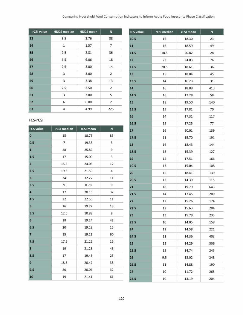
Comparing Household Food Consumption Indicators to Inform Acute Food Insecurity Phase Classification
120
rCSI value HDDS median HDDS mean N
53 3.5 3.76 38
54 1 1.57 7
55 2.5 2.81 36
56 5.5 6.06 18
57 2.5 3.00 14
58 3 3.00 2
59 3 3.38 13
60 2.5 2.50 2
61 3 3.80 5
62 6 6.00 2
63 4 4.99 225
FCS-rCSI
FCS value rCSI median rCSI mean N
0 15 18.73 85
0.5 7 19.33 3
1 28 25.89 9
1.5 17 15.00 3
2 15.5 24.08 12
2.5 19.5 21.50 4
3 34 32.27 11
3.5 9 8.78 9
4 17 20.16 37
4.5 22 22.55 11
5 16 19.72 18
5.5 12.5 10.88 8
6 18 19.24 42
6.5 20 19.13 15
7 15 19.23 60
7.5 17.5 21.25 16
8 19 21.28 46
8.5 17 19.43 23
9 18.5 20.47 38
9.5 20 20.06 32
10 19 21.41 61
FCS value rCSI median rCSI mean N
10.5 16 18.30 23
11 16 18.59 49
11.5 18.5 20.82 28
12 22 24.03 76
12.5 20.5 18.61 36
13 15 18.04 45
13.5 14 16.23 31
14 16 18.89 413
14.5 16 17.28 58
15 18 19.50 140
15.5 15 17.81 70
16 14 17.31 117
16.5 15 17.25 77
17 16 20.01 139
17.5 11 15.70 191
18 16 18.43 144
18.5 13 15.39 127
19 15 17.51 166
19.5 13 15.04 108
20 16 18.41 139
20.5 12 14.39 115
21 18 19.79 643
21.5 14 17.45 209
22 12 15.26 174
22.5 12 15.63 204
23 13 15.79 233
23.5 10 14.05 158
24 12 14.58 221
24.5 11 14.36 403
25 12 14.29 306
25.5 12 14.74 245
26 9.5 13.02 248
26.5 11 14.88 190
27 10 11.72 265
27.5 10 13.19 204
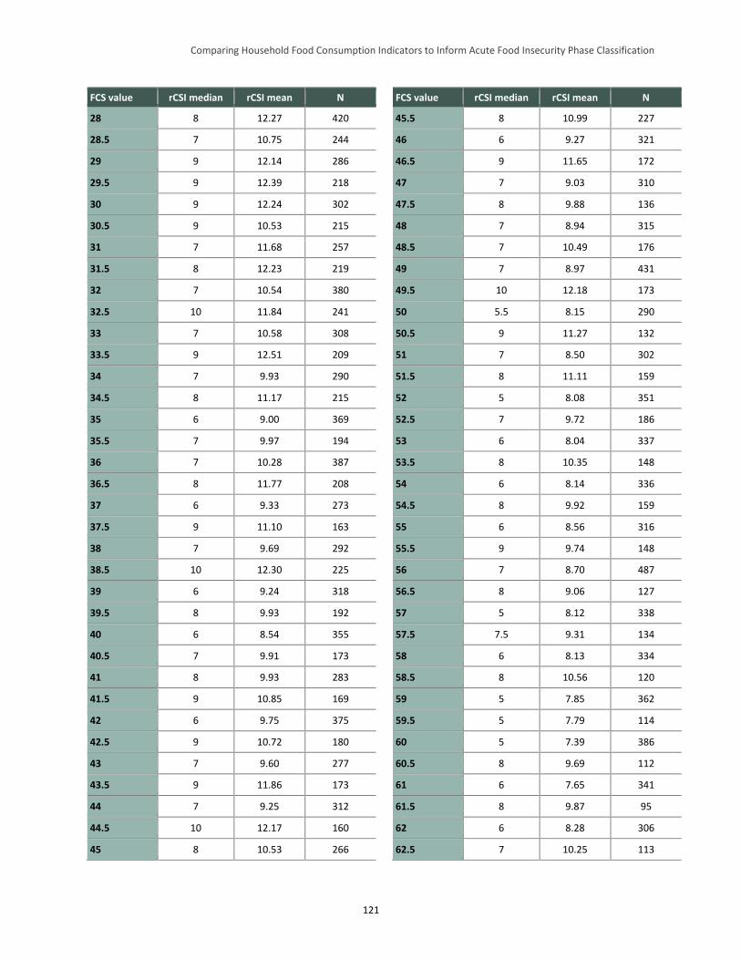
Comparing Household Food Consumption Indicators to Inform Acute Food Insecurity Phase Classification
121
FCS value rCSI median rCSI mean N
28 8 12.27 420
28.5 7 10.75 244
29 9 12.14 286
29.5 9 12.39 218
30 9 12.24 302
30.5 9 10.53 215
31 7 11.68 257
31.5 8 12.23 219
32 7 10.54 380
32.5 10 11.84 241
33 7 10.58 308
33.5 9 12.51 209
34 7 9.93 290
34.5 8 11.17 215
35 6 9.00 369
35.5 7 9.97 194
36 7 10.28 387
36.5 8 11.77 208
37 6 9.33 273
37.5 9 11.10 163
38 7 9.69 292
38.5 10 12.30 225
39 6 9.24 318
39.5 8 9.93 192
40 6 8.54 355
40.5 7 9.91 173
41 8 9.93 283
41.5 9 10.85 169
42 6 9.75 375
42.5 9 10.72 180
43 7 9.60 277
43.5 9 11.86 173
44 7 9.25 312
44.5 10 12.17 160
45 8 10.53 266
FCS value rCSI median rCSI mean N
45.5 8 10.99 227
46 6 9.27 321
46.5 9 11.65 172
47 7 9.03 310
47.5 8 9.88 136
48 7 8.94 315
48.5 7 10.49 176
49 7 8.97 431
49.5 10 12.18 173
50 5.5 8.15 290
50.5 9 11.27 132
51 7 8.50 302
51.5 8 11.11 159
52 5 8.08 351
52.5 7 9.72 186
53 6 8.04 337
53.5 8 10.35 148
54 6 8.14 336
54.5 8 9.92 159
55 6 8.56 316
55.5 9 9.74 148
56 7 8.70 487
56.5 8 9.06 127
57 5 8.12 338
57.5 7.5 9.31 134
58 6 8.13 334
58.5 8 10.56 120
59 5 7.85 362
59.5 5 7.79 114
60 5 7.39 386
60.5 8 9.69 112
61 6 7.65 341
61.5 8 9.87 95
62 6 8.28 306
62.5 7 10.25 113
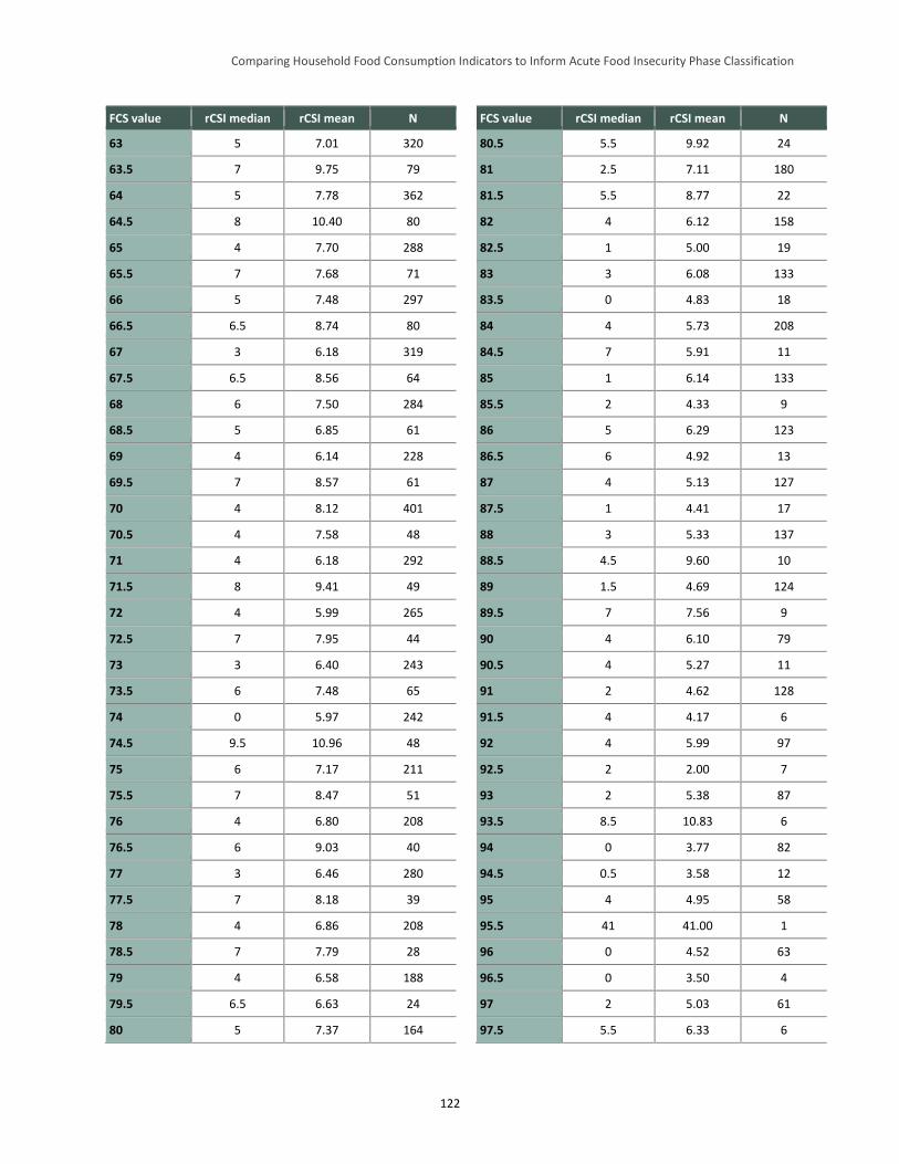
Comparing Household Food Consumption Indicators to Inform Acute Food Insecurity Phase Classification
122
FCS value rCSI median rCSI mean N
63 5 7.01 320
63.5 7 9.75 79
64 5 7.78 362
64.5 8 10.40 80
65 4 7.70 288
65.5 7 7.68 71
66 5 7.48 297
66.5 6.5 8.74 80
67 3 6.18 319
67.5 6.5 8.56 64
68 6 7.50 284
68.5 5 6.85 61
69 4 6.14 228
69.5 7 8.57 61
70 4 8.12 401
70.5 4 7.58 48
71 4 6.18 292
71.5 8 9.41 49
72 4 5.99 265
72.5 7 7.95 44
73 3 6.40 243
73.5 6 7.48 65
74 0 5.97 242
74.5 9.5 10.96 48
75 6 7.17 211
75.5 7 8.47 51
76 4 6.80 208
76.5 6 9.03 40
77 3 6.46 280
77.5 7 8.18 39
78 4 6.86 208
78.5 7 7.79 28
79 4 6.58 188
79.5 6.5 6.63 24
80 5 7.37 164
FCS value rCSI median rCSI mean N
80.5 5.5 9.92 24
81 2.5 7.11 180
81.5 5.5 8.77 22
82 4 6.12 158
82.5 1 5.00 19
83 3 6.08 133
83.5 0 4.83 18
84 4 5.73 208
84.5 7 5.91 11
85 1 6.14 133
85.5 2 4.33 9
86 5 6.29 123
86.5 6 4.92 13
87 4 5.13 127
87.5 1 4.41 17
88 3 5.33 137
88.5 4.5 9.60 10
89 1.5 4.69 124
89.5 7 7.56 9
90 4 6.10 79
90.5 4 5.27 11
91 2 4.62 128
91.5 4 4.17 6
92 4 5.99 97
92.5 2 2.00 7
93 2 5.38 87
93.5 8.5 10.83 6
94 0 3.77 82
94.5 0.5 3.58 12
95 4 4.95 58
95.5 41 41.00 1
96 0 4.52 63
96.5 0 3.50 4
97 2 5.03 61
97.5 5.5 6.33 6
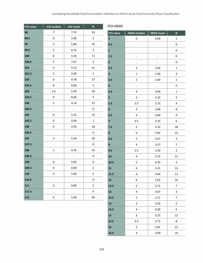
Comparing Household Food Consumption Indicators to Inform Acute Food Insecurity Phase Classification
123
FCS value rCSI median rCSI mean N
98 7 7.75 53
98.5 0 2.60 5
99 2 5.80 35
99.5 5 6.33 3
100 0 4.30 71
100.5 5 7.67 3
101 3 5.13 31
101.5 2 2.00 1
102 0 4.78 27
102.5 8 8.00 2
103 3.5 5.30 30
103.5 0 8.60 5
104 2 4.14 37
104.5 . . 0
105 0 5.25 55
105.5 0 0.00 1
106 0 4.50 26
106.5 . . 0
107 3 5.20 30
107.5 . . 0
108 2 4.76 41
108.5 . . 0
109 6 5.83 6
109.5 0 0.00 2
110 3 2.60 5
110.5 . . 0
111 0 0.00 2
111.5 . . 0
112 0 5.48 83
FCS-HDDS
FCS value HDDS median HDDS mean N
0 0 0.00 1
0.5 . . 0
1 . . 0
1.5 . . 0
2 . . 0
2.5 2 2.00 1
3 1 1.00 3
3.5 2 2.00 1
4 . . 0
4.5 4 4.00 1
5 3 2.33 3
5.5 2.5 2.25 4
6 4 3.88 8
6.5 4 4.00 9
7 3.5 3.33 6
7.5 5 5.32 38
8 6 5.82 22
8.5 5 3.67 3
9 4 3.57 7
9.5 3.5 3.50 2
10 4 3.73 11
10.5 5 4.33 3
11 4 5.31 13
11.5 4 4.64 11
12 6 5.63 16
12.5 2 2.71 7
13 4 3.67 3
13.5 2 2.71 7
14 3 3.20 5
14.5 4 4.00 6
15 3 3.25 12
15.5 3.5 3.75 8
16 5 5.81 21
16.5 4 3.90 10
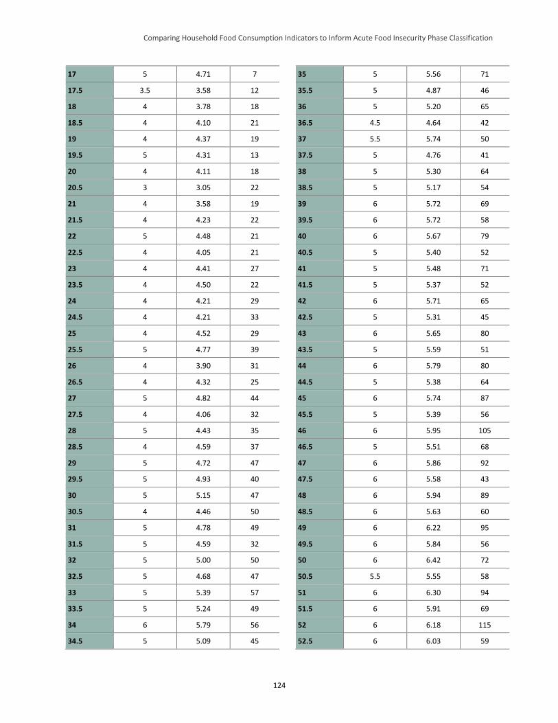
Comparing Household Food Consumption Indicators to Inform Acute Food Insecurity Phase Classification
124
17 5 4.71 7
17.5 3.5 3.58 12
18 4 3.78 18
18.5 4 4.10 21
19 4 4.37 19
19.5 5 4.31 13
20 4 4.11 18
20.5 3 3.05 22
21 4 3.58 19
21.5 4 4.23 22
22 5 4.48 21
22.5 4 4.05 21
23 4 4.41 27
23.5 4 4.50 22
24 4 4.21 29
24.5 4 4.21 33
25 4 4.52 29
25.5 5 4.77 39
26 4 3.90 31
26.5 4 4.32 25
27 5 4.82 44
27.5 4 4.06 32
28 5 4.43 35
28.5 4 4.59 37
29 5 4.72 47
29.5 5 4.93 40
30 5 5.15 47
30.5 4 4.46 50
31 5 4.78 49
31.5 5 4.59 32
32 5 5.00 50
32.5 5 4.68 47
33 5 5.39 57
33.5 5 5.24 49
34 6 5.79 56
34.5 5 5.09 45
35 5 5.56 71
35.5 5 4.87 46
36 5 5.20 65
36.5 4.5 4.64 42
37 5.5 5.74 50
37.5 5 4.76 41
38 5 5.30 64
38.5 5 5.17 54
39 6 5.72 69
39.5 6 5.72 58
40 6 5.67 79
40.5 5 5.40 52
41 5 5.48 71
41.5 5 5.37 52
42 6 5.71 65
42.5 5 5.31 45
43 6 5.65 80
43.5 5 5.59 51
44 6 5.79 80
44.5 5 5.38 64
45 6 5.74 87
45.5 5 5.39 56
46 6 5.95 105
46.5 5 5.51 68
47 6 5.86 92
47.5 6 5.58 43
48 6 5.94 89
48.5 6 5.63 60
49 6 6.22 95
49.5 6 5.84 56
50 6 6.42 72
50.5 5.5 5.55 58
51 6 6.30 94
51.5 6 5.91 69
52 6 6.18 115
52.5 6 6.03 59
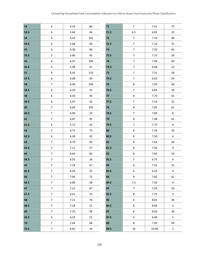
Comparing Household Food Consumption Indicators to Inform Acute Food Insecurity Phase Classification
125
53 6 6.33 86
53.5 6 5.84 44
54 6 6.43 101
54.5 6 5.68 56
55 6 6.30 90
55.5 5 5.60 45
56 6 6.47 106
56.5 6 5.98 41
57 6 6.45 110
57.5 6 6.08 50
58 7 6.46 106
58.5 6 6.50 32
59 6 6.43 96
59.5 6 5.97 32
60 7 6.69 105
60.5 7 6.90 29
61 7 6.87 95
61.5 6 5.72 25
62 7 6.75 73
62.5 6 6.38 42
63 7 6.79 95
63.5 7 7.11 27
64 7 6.64 83
64.5 7 6.92 26
65 7 7.19 67
65.5 7 6.44 25
66 7 7.06 72
66.5 7 6.89 28
67 7 7.21 67
67.5 7 6.61 23
68 7 7.21 76
68.5 7 7.29 21
69 7 7.33 58
69.5 6 6.33 21
70 7 7.04 68
70.5 7 6.81 16
71 7 7.41 75
71.5 6.5 6.82 22
72 7 7.33 89
72.5 7 7.14 21
73 7 7.25 65
73.5 7 7.15 26
74 7 7.48 60
74.5 7 6.68 22
75 7 7.31 58
75.5 7 6.63 24
76 8 7.93 60
76.5 7 6.83 18
77 8 7.70 61
77.5 7 7.14 21
78 8 7.82 61
78.5 7 7.00 8
79 8 7.48 61
79.5 7 7.75 8
80 8 7.76 50
80.5 8 7.50 6
81 8 7.64 44
81.5 8 7.56 9
82 8 7.83 54
82.5 7 6.75 4
83 8 7.52 31
83.5 6 6.25 4
84 8 7.82 61
84.5 7.5 7.50 4
85 7 7.59 29
85.5 8 7.75 4
86 8 8.02 46
86.5 8 8.00 5
87 8 8.03 30
87.5 6 6.40 5
88 8 7.92 49
88.5 10 10.00 2
Comparing Household Food Consumption Indicators to Inform Acute Food Insecurity Phase Classification
126
89 8 8.18 28
89.5 8 8.00 4
90 8 8.14 21
90.5 7 7.80 5
91 8 8.38 24
91.5 8 8.00 2
92 8 8.26 31
92.5 8 7.67 3
93 8.5 8.39 18
93.5 8 8.00 1
94 9 8.58 19
94.5 7.5 7.50 2
95 8 8.13 24
95.5 . . 0
96 9 8.55 20
96.5 6 6.00 1
97 7 7.75 12
97.5 8.5 8.50 2
98 7.5 7.94 16
98.5 . . 0
99 8 8.33 15
99.5 8 8.00 3
100 9 8.81 16
100.5 9 9.00 2
101 9 8.83 12
101.5 7 7.00 1
102 8 8.33 12
102.5 . . 0
103 8 8.73 15
103.5 6.5 6.50 2
104 9 8.92 13
104.5 . . 0
105 9 8.47 17
105.5 . . 0
106 9.5 9.38 8
106.5 . . 0
107 9 9.00 13
107.5 . . 0
108 8.5 8.92 12
108.5 . . 0
109 9.5 9.50 4
109.5 . . 0
110 8 8.00 2
110.5 . . 0
111 . . 0
111.5 . . 0
112 10 9.83 12
Comparing Household Food Consumption Indicators to Inform Acute Food Insecurity Phase Classification
127
Appendix G. Household Economy Approach Outcome Analysis Threshold Alignment Pilot
This appendix contains two parts. The first part presents the relationship of the overall findings of the
household economy approach (HEA) outcome analysis pilot to the quantitative indicator analysis
undertaken in the main body of the Household Food Consumption Indicators Study (HFCIS) report. In
particular, it examines the results of the HEA pilot as it relates to the current and HFCIS-proposed revised
thresholds for the Integrated Food Security Phase Classification’s (IPC’s) Acute Food Insecurity
Reference Table for Household Group Classification (household reference table) and encourages similar
future analyses in an effort to further expand the evidence base that this exploratory pilot analysis begins
to establish. The second part of this appendix presents background on HEA, how this pilot analysis was
constructed, and the results that it yielded, which informed Part 1.
Part I: Summary of the Household Economy Approach Pilot Analysis and Its Implications for the Acute IPC
The acute IPC’s household reference table includes five outcome indicators meant to proxy for food
consumption. Four of the indicators—Household Hunger Score (HHS), Household Dietary Diversity
Score (HDDS), Coping Strategies Index (CSI), and Food Consumption Score (FCS)—are quantitative
and are collected through household surveys. These were explored in the main body of the HFCIS
report.77 The fifth indicator, which estimated total food and income access from HEA outcome analysis, is
a modeled outcome. Therefore, the adequacy of its thresholds in the acute IPC household reference table
must be assessed using a different process than that presented in the main body of the HFCIS report.
Initially, the HEA analysis team78 proposed a two-step approach to assess the existing acute IPC
household reference table HEA outcome analysis thresholds (referred to as “HEA” in that table). The
steps consisted of (1) a pilot analysis followed by (2) a larger set of analyses. The purpose of the pilot
analysis was to assess the feasibility of conducting retrospective HEA outcome analysis, as HEA outcome
analysis is usually conducted in real time. Given this, it was unclear at the outset of the analysis how
effectively a retrospective examination that mimicked real-time HEA outcome analysis could be
implemented. A selection of woredas (districts) from Ethiopia’s eastern Amhara region was chosen for
the pilot based on the availability of HEA baselines and overlap with the geographic and temporal
coverage of the secondary datasets used for the quantitative portion of the HFCIS. Assuming a successful
pilot, the HEA analysis team planned to conduct a series of retrospective HEA outcome analyses in areas
where the broader HFCIS team had secondary data on at least two of the other quantitative food
consumption indicators examined (HHS, HDDS, CSI/rCSI, and FCS). The results of the quantitative
household survey data analysis and the HEA outcome analysis would then be compared and the acute
IPC’s current HEA outcome analysis thresholds assessed.
The report included in this appendix describes the pilot analysis and its results. Unfortunately, although
the pilot was successful, the secondary datasets collected for the quantitative HFCIS analysis did not
overlap with areas where HEA baselines were available, other than in Ethiopia. Therefore, additional
77 The analysis of the quantitative indicators presented in the main body of the HFCIS report also included the reduced CSI
(rCSI). 78 The Famine Early Warning Systems Network (FEWS NET) led the HEA analysis team; analysis was undertaken by Mark
Lawrence of the Food Economy Group.
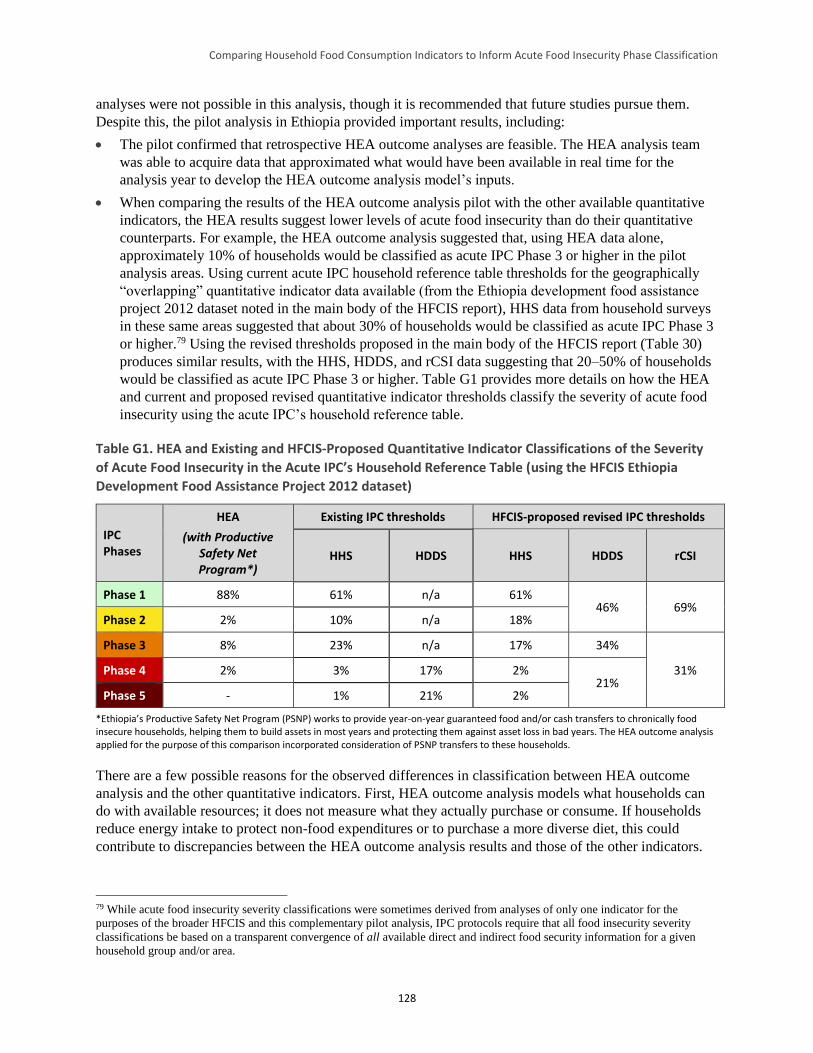
Comparing Household Food Consumption Indicators to Inform Acute Food Insecurity Phase Classification
128
analyses were not possible in this analysis, though it is recommended that future studies pursue them.
Despite this, the pilot analysis in Ethiopia provided important results, including:
The pilot confirmed that retrospective HEA outcome analyses are feasible. The HEA analysis team
was able to acquire data that approximated what would have been available in real time for the
analysis year to develop the HEA outcome analysis model’s inputs.
When comparing the results of the HEA outcome analysis pilot with the other available quantitative
indicators, the HEA results suggest lower levels of acute food insecurity than do their quantitative
counterparts. For example, the HEA outcome analysis suggested that, using HEA data alone,
approximately 10% of households would be classified as acute IPC Phase 3 or higher in the pilot
analysis areas. Using current acute IPC household reference table thresholds for the geographically
“overlapping” quantitative indicator data available (from the Ethiopia development food assistance
project 2012 dataset noted in the main body of the HFCIS report), HHS data from household surveys
in these same areas suggested that about 30% of households would be classified as acute IPC Phase 3
or higher.79 Using the revised thresholds proposed in the main body of the HFCIS report (Table 30)
produces similar results, with the HHS, HDDS, and rCSI data suggesting that 20–50% of households
would be classified as acute IPC Phase 3 or higher. Table G1 provides more details on how the HEA
and current and proposed revised quantitative indicator thresholds classify the severity of acute food
insecurity using the acute IPC’s household reference table.
Table G1. HEA and Existing and HFCIS-Proposed Quantitative Indicator Classifications of the Severity
of Acute Food Insecurity in the Acute IPC’s Household Reference Table (using the HFCIS Ethiopia
Development Food Assistance Project 2012 dataset)
IPC Phases
HEA
(with Productive Safety Net Program*)
Existing IPC thresholds HFCIS-proposed revised IPC thresholds
HHS HDDS HHS HDDS rCSI
Phase 1 88% 61% n/a 61% 46% 69%
Phase 2 2% 10% n/a 18%
Phase 3 8% 23% n/a 17% 34%
31% Phase 4 2% 3% 17% 2% 21%
Phase 5 - 1% 21% 2%
*Ethiopia’s Productive Safety Net Program (PSNP) works to provide year-on-year guaranteed food and/or cash transfers to chronically food insecure households, helping them to build assets in most years and protecting them against asset loss in bad years. The HEA outcome analysis applied for the purpose of this comparison incorporated consideration of PSNP transfers to these households.
There are a few possible reasons for the observed differences in classification between HEA outcome
analysis and the other quantitative indicators. First, HEA outcome analysis models what households can
do with available resources; it does not measure what they actually purchase or consume. If households
reduce energy intake to protect non-food expenditures or to purchase a more diverse diet, this could
contribute to discrepancies between the HEA outcome analysis results and those of the other indicators.
79 While acute food insecurity severity classifications were sometimes derived from analyses of only one indicator for the
purposes of the broader HFCIS and this complementary pilot analysis, IPC protocols require that all food insecurity severity
classifications be based on a transparent convergence of all available direct and indirect food security information for a given
household group and/or area.
Comparing Household Food Consumption Indicators to Inform Acute Food Insecurity Phase Classification
129
Second, HEA outcome analysis defines adequate food intake as the ability to meet energy requirements
through consumption of the cheapest available cereal. If the households analyzed tried to maintain any
diet diversity (e.g., consumption of pulses, vegetables, and/or oil in addition to staples), they could have
scored poorly on quantitative indicators such as rCSI despite the HEA outcome analysis suggesting they
had adequate resources to meet their energy needs.
Third, a significant mitigating factor in this pilot HEA outcome analysis was the presence of Ethiopia’s
Productive Safety Net Program (PSNP). Inclusion of PSNP transfers in the HEA outcome analysis
substantially reduced estimated levels of food insecurity. However, detailed information on actual PNSP
deliveries was limited, requiring the HEA analysis team to develop assumptions related to PSNP
performance. If these assumptions underestimated PSNP mis-targeting and dilution, this would at least
partially explain why the quantitative indicators studied suggested more severe acute food insecurity
during the analysis period.
Finally, the geographically “overlapping” quantitative indicators analyzed in the main body of the HFCIS
report (from the Ethiopia development food assistance project 2012 dataset) were collected during the
pre-harvest hunger season. However, current acute IPC guidance implies that HEA indicator classification
should be based on the size of the overall (typically, annual) livelihood protection (and, potentially,
survival) deficit that the HEA outcome analysis suggests. This approach can mask significant seasonal
variation in food access. Depending on the season, HEA outcome analysis may suggest substantially
better or worse household food access compared to the overall annual deficit to be used for acute IPC
classification. That said, seasonal outputs of the HEA model must also be interpreted carefully. Further
analysis and discussion is needed to develop clearer IPC guidance on this issue.
This pilot of retrospective HEA outcome analysis, the methods and findings of which are presented in this
appendix, was a useful first step in developing an improved understanding of HEA thresholds in the acute
IPC and their relation to the thresholds of other food consumption outcome indicators included in the
acute IPC household reference table. However, few solid conclusions can be drawn based solely on this
initial work. Additional analyses that more comprehensively compare the results of HEA outcome
analysis with quantitative outcome indicators are needed. Until these become available, it is
recommended that the current HEA thresholds remain in the acute IPC household reference table.
Part II: HEA Outcome Analysis Pilot
Introduction to the HEA Pilot Analysis
The pilot analysis was part of an effort by the Food and Nutrition Technical Assistance III Project
(FANTA) and the Famine Early Warning Systems Network (FEWS NET) to improve understanding of
the relationships among various household food consumption indicators, including HEA outcome
analysis, and between the indicators and the severity phases and phase descriptions in the IPC’s Acute
Food Insecurity Reference Table for Household Group Classification (household reference table). Nine
woredas in Ethiopia’s Amhara region were selected for the pilot HEA analysis based on the availability of
data for a range of quantitative household food consumption outcome indicators (e.g., CSI, rCSI, HDDS,
HHS, and FCS), and the practicality of preparing HEA outcome analyses for comparison. The timeframe
Comparing Household Food Consumption Indicators to Inform Acute Food Insecurity Phase Classification
130
for the HEA outcome analysis was November 2011 to October 2012, the consumption year following the
2011 meher harvest.80
The following provides an overview of and findings from the pilot HEA outcome analysis. For this
analysis, estimates of total food and cash income were prepared for four wealth groups (very poor, poor,
middle, and better-off) in each of the nine analysis districts’ livelihood zones. These incomes were
compared against two HEA thresholds—the survival threshold and the livelihoods protection
threshold81—to determine whether any livelihood and survival deficits existed, and if so, their type and
size. Resulting deficit data were then compared with the current acute IPC household reference table’s
HEA cutoffs to determine the acute food insecurity severity phase classification for each wealth group
and each livelihood zone/district combination in the analysis area.
HEA Overview and Pilot Background
HEA Overview
HEA is a method for assessing the impact of shocks on household livelihoods. It facilitates an
understanding of elements and dynamics crucial to a comprehensive picture of food security that are often
invisible in official statistics. HEA analysis is comprised of two main components:
1) Baseline analysis: Analysis of how people get by in a reference year, and the connections with other
people and places that enable them to do so. For this pilot analysis, the reference year was 2005–06.
2) Outcome analysis: Investigation of how baseline access to food and income might change as a result
of a specific shock(s), such as drought, or a positive change, such as a project input or a beneficial
price policy. The outcome analysis year for this pilot was 2011–12—the year for which the
quantitative household indicator data, which was analyzed in the main body of the HFCIS report, was
available.
Outcome analysis consists of three steps designed to produce a rational and defensible statement about the
predicted effects of a shock(s) or positive change(s) on household livelihood strategies (households’
ability to obtain food and cash income and acquire the non-food items they need to live). These steps are:
1) Problem specification: Translation of a shock, such as drought, into household-level economic
consequences, such as the percentage decrease in crop production or percentage increase in food
prices compared to the baseline. The problem specifications included in this pilot analysis are
described later in this appendix.
2) Coping analysis: Assessment of the capacity of households in different wealth groups to cope with
an identified shock. Information on the coping strategies applied in this analysis is described later in
this appendix.
80 The meher season is the main production season for most crop-producing areas of Ethiopia. It typically runs from mid-April
(planting) to early January (end of harvest). 81 The HEA survival threshold is defined as the total food and cash income required to cover the food and non-food items
necessary for survival in the short term. The survival threshold includes 100% of minimum food energy needs, the costs
associated with food preparation and consumption, and, where applicable, the cost of water for human consumption. The HEA
livelihoods protection threshold is defined as the total income required to sustain local livelihoods. The livelihoods protection
threshold includes total expenditure to: ensure basic survival (i.e., all items covered under the survival threshold), maintain access
to basic services (e.g., health and education), sustain livelihoods in the medium to long term, and achieve a minimum locally
acceptable standard of living (Holzmann et al. 2008).
Comparing Household Food Consumption Indicators to Inform Acute Food Insecurity Phase Classification
131
3) Projected outcome: Predicted household-level access to food and income for a defined future period
compared to survival and livelihood protection thresholds established in the baseline analysis (to
determine whether there is a deficit).82
HEA outcome analysis is run at a sub-national level, typically at the level of the district and/or the
livelihood zone.83 A livelihood zone is an area within which people broadly share the same patterns of
livelihood (e.g., they grow the same crops, keep the same types of livestock, access the same markets).
One district may contain several livelihood zones. Within each livelihood zone, outcome analysis is
typically run separately for four types of locally-defined households: the very poor, poor, middle, and
better-off.
A key concept in HEA is that the baseline analysis relates to a specific reference year (e.g., 2005–06, in
this case). For agricultural livelihood zones, the reference year typically starts with one harvest and ends
12 months later. For example, if crops are harvested in November, the reference year will run from
November through October. Generally, the reference year will be a year that was neither especially good
nor especially bad, but somewhere in the middle. The most important point about the reference year is
that it should provide a good starting point for understanding how livelihoods vary from one year to the
next in relation to changes in factors such as crop production and market prices.
HEA Outcomes and Acute IPC Phases
The acute IPC classifies household groups according to their food security status. Each area is then
assigned a phase according to the most severe phase attained by its household groups, provided they make
up at least 20% of the population.84 The acute IPC household reference table includes the HEA cutoffs
presented in Table G2.
82 A deficit in relation to the livelihoods protection threshold is referred to as a livelihoods protection deficit; a deficit in relation
to the survival threshold is referred to as a survival deficit. 83 Additional information on the HEA analytical framework and how HEA baselines, problem specifications, and coping
strategies data are constructed is available at:
http://www.savethechildren.org.uk/sites/default/files/docs/The_Practitioners_Guide_to_HEA_1.pdf. 84 For example, for a given household group, 20 percent of the population may be classified as acute IPC Phase 1, 45 percent in
acute IPC Phase 2, 30 percent in acute IPC Phase 3, 5 percent in acute IPC Phase 4, and no one within the group in acute IPC
Phase 5. In this instance, the acute IPC map would depict Phase 3, as (more than) 20 percent of the population falls into Phase 3
or worse. In another example, for a given household group, 30 percent of the population may be classified as acute IPC Phase 1,
40 percent in acute IPC Phase 2, 10 percent in acute IPC Phase 3, 15 percent in acute IPC Phase 4, and 5 percent in acute IPC
Phase 5. In this instance, the acute IPC map would depict Phase 4, as 20 percent of the population of that household group falls
into Phase 4 or worse (Phase 5).
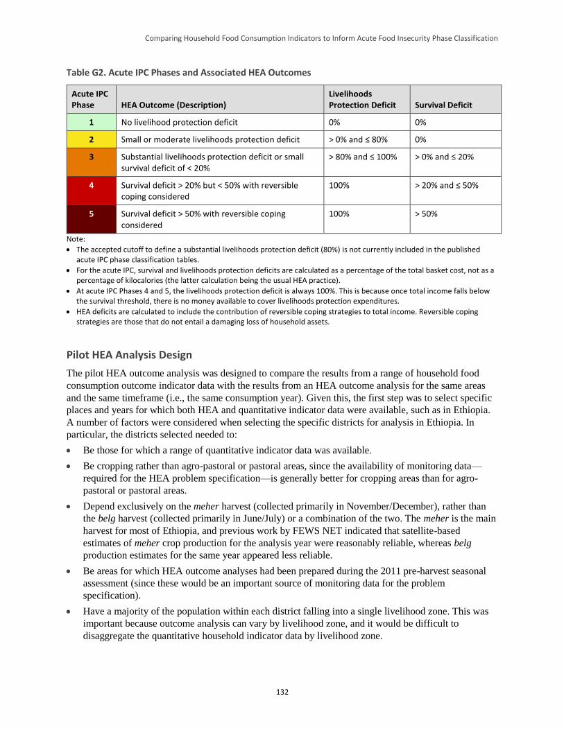
Comparing Household Food Consumption Indicators to Inform Acute Food Insecurity Phase Classification
132
Table G2. Acute IPC Phases and Associated HEA Outcomes
Acute IPC Phase HEA Outcome (Description)
Livelihoods Protection Deficit Survival Deficit
1 No livelihood protection deficit 0% 0%
2 Small or moderate livelihoods protection deficit > 0% and ≤ 80% 0%
3 Substantial livelihoods protection deficit or small survival deficit of < 20%
> 80% and ≤ 100% > 0% and ≤ 20%
4 Survival deficit > 20% but < 50% with reversible coping considered
100% > 20% and ≤ 50%
5 Survival deficit > 50% with reversible coping considered
100% > 50%
Note:
The accepted cutoff to define a substantial livelihoods protection deficit (80%) is not currently included in the published acute IPC phase classification tables.
For the acute IPC, survival and livelihoods protection deficits are calculated as a percentage of the total basket cost, not as a percentage of kilocalories (the latter calculation being the usual HEA practice).
At acute IPC Phases 4 and 5, the livelihoods protection deficit is always 100%. This is because once total income falls below the survival threshold, there is no money available to cover livelihoods protection expenditures.
HEA deficits are calculated to include the contribution of reversible coping strategies to total income. Reversible coping strategies are those that do not entail a damaging loss of household assets.
Pilot HEA Analysis Design
The pilot HEA outcome analysis was designed to compare the results from a range of household food
consumption outcome indicator data with the results from an HEA outcome analysis for the same areas
and the same timeframe (i.e., the same consumption year). Given this, the first step was to select specific
places and years for which both HEA and quantitative indicator data were available, such as in Ethiopia.
A number of factors were considered when selecting the specific districts for analysis in Ethiopia. In
particular, the districts selected needed to:
Be those for which a range of quantitative indicator data was available.
Be cropping rather than agro-pastoral or pastoral areas, since the availability of monitoring data—
required for the HEA problem specification—is generally better for cropping areas than for agro-
pastoral or pastoral areas.
Depend exclusively on the meher harvest (collected primarily in November/December), rather than
the belg harvest (collected primarily in June/July) or a combination of the two. The meher is the main
harvest for most of Ethiopia, and previous work by FEWS NET indicated that satellite-based
estimates of meher crop production for the analysis year were reasonably reliable, whereas belg
production estimates for the same year appeared less reliable.
Be areas for which HEA outcome analyses had been prepared during the 2011 pre-harvest seasonal
assessment (since these would be an important source of monitoring data for the problem
specification).
Have a majority of the population within each district falling into a single livelihood zone. This was
important because outcome analysis can vary by livelihood zone, and it would be difficult to
disaggregate the quantitative household indicator data by livelihood zone.
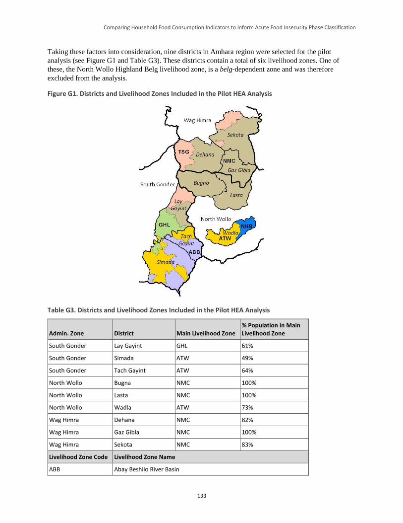
Comparing Household Food Consumption Indicators to Inform Acute Food Insecurity Phase Classification
133
Taking these factors into consideration, nine districts in Amhara region were selected for the pilot
analysis (see Figure G1 and Table G3). These districts contain a total of six livelihood zones. One of
these, the North Wollo Highland Belg livelihood zone, is a belg-dependent zone and was therefore
excluded from the analysis.
Figure G1. Districts and Livelihood Zones Included in the Pilot HEA Analysis
Table G3. Districts and Livelihood Zones Included in the Pilot HEA Analysis
Admin. Zone District Main Livelihood Zone % Population in Main Livelihood Zone
South Gonder Lay Gayint GHL 61%
South Gonder Simada ATW 49%
South Gonder Tach Gayint ATW 64%
North Wollo Bugna NMC 100%
North Wollo Lasta NMC 100%
North Wollo Wadla ATW 73%
Wag Himra Dehana NMC 82%
Wag Himra Gaz Gibla NMC 100%
Wag Himra Sekota NMC 83%
Livelihood Zone Code Livelihood Zone Name
ABB Abay Beshilo River Basin
Comparing Household Food Consumption Indicators to Inform Acute Food Insecurity Phase Classification
134
ATW Abay Tekeze Watershed
GHL Guna Highland
NMC North East Woyna Dega Mixed Cereal
TSG Tekeze Lowland Sorghum and Goats
NHB North Wollo Highland Belg
The Problem Specifications
Problem specification is a key step in HEA outcome analysis. It is the basis for calculating changes
between the reference and analysis years in access to food and cash income and in the cost of essential
food and non-food items. For each source of food/cash, analysis year access is expressed as a percentage
of reference year access (e.g., a maize production problem of 50% means that households have harvested
only half as much maize in the analysis year compared to the reference year). For sources of cash,
separate problems are calculated for amount (e.g., number of goats sold) and price (e.g., goat price).
These two problems are combined to estimate the total income from each source of cash in the analysis
year.
Crop Production
As previously noted, analysis year crop production is expressed as a percentage of reference year
production. Three separate estimates of analysis year meher crop production were available for this pilot.
These were:
1) District-level Ministry of Agriculture and Rural Development (MOARD) production estimates
provided to field teams undertaking the 2011 meher season pre-harvest assessment
2) Revisions to these estimates made by the field teams, based on observed crop conditions
3) Crop yield estimates based on satellite imagery (the water requirement satisfaction index [WRSI])85
assessed using the World Food Programme’s LEAP software.
Table G4 compares the problem specifications derived from these sources. Of note is that many districts
appear to have over-estimated production compared to field team and satellite imagery estimates. It is
possible that these districts were reporting planned rather than actual production.
Table G4. 2011 Meher Crop Production Problem for the Pilot HEA Analysis: Comparison of Data
Sources
Admin. Zone District
Source
District Ministry of Agriculture Field teams WRSI (LEAP)
South Gonder Lay Gayint 71% 56% 95%
South Gonder Simada 219% 81% 95%
South Gonder Tach Gayint 251% 81% 80%
85 The WRSI is an indicator of crop performance based on the availability of water to a given crop during the growing season.
WRSI is the ratio of seasonal actual crop evapotranspiration to the seasonal crop water requirement (Senay 2004).
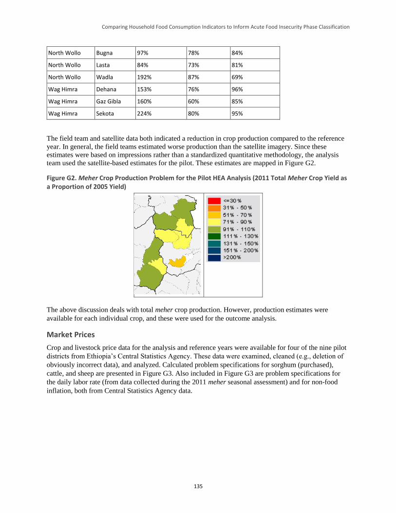
Comparing Household Food Consumption Indicators to Inform Acute Food Insecurity Phase Classification
135
North Wollo Bugna 97% 78% 84%
North Wollo Lasta 84% 73% 81%
North Wollo Wadla 192% 87% 69%
Wag Himra Dehana 153% 76% 96%
Wag Himra Gaz Gibla 160% 60% 85%
Wag Himra Sekota 224% 80% 95%
The field team and satellite data both indicated a reduction in crop production compared to the reference
year. In general, the field teams estimated worse production than the satellite imagery. Since these
estimates were based on impressions rather than a standardized quantitative methodology, the analysis
team used the satellite-based estimates for the pilot. These estimates are mapped in Figure G2.
Figure G2. Meher Crop Production Problem for the Pilot HEA Analysis (2011 Total Meher Crop Yield as a Proportion of 2005 Yield)
The above discussion deals with total meher crop production. However, production estimates were
available for each individual crop, and these were used for the outcome analysis.
Market Prices
Crop and livestock price data for the analysis and reference years were available for four of the nine pilot
districts from Ethiopia’s Central Statistics Agency. These data were examined, cleaned (e.g., deletion of
obviously incorrect data), and analyzed. Calculated problem specifications for sorghum (purchased),
cattle, and sheep are presented in Figure G3. Also included in Figure G3 are problem specifications for
the daily labor rate (from data collected during the 2011 meher seasonal assessment) and for non-food
inflation, both from Central Statistics Agency data.
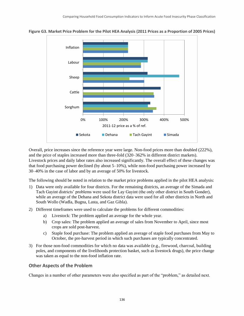
Comparing Household Food Consumption Indicators to Inform Acute Food Insecurity Phase Classification
136
Figure G3. Market Price Problem for the Pilot HEA Analysis (2011 Prices as a Proportion of 2005 Prices)
0% 100% 200% 300% 400% 500%
Sorghum
Cattle
Sheep
Labour
Inflation
2011-12 price as a % of ref.
Sekota Dehana Tach Gayint Simada
Overall, price increases since the reference year were large. Non-food prices more than doubled (222%),
and the price of staples increased more than three-fold (320–362% in different district markets).
Livestock prices and daily labor rates also increased significantly. The overall effect of these changes was
that food purchasing power declined (by about 5–10%), while non-food purchasing power increased by
30–40% in the case of labor and by an average of 50% for livestock.
The following should be noted in relation to the market price problems applied in the pilot HEA analysis:
1) Data were only available for four districts. For the remaining districts, an average of the Simada and
Tach Gayint districts’ problems were used for Lay Gayint (the only other district in South Gonder),
while an average of the Dehana and Sekota district data were used for all other districts in North and
South Wollo (Wadla, Bugna, Lasta, and Gaz Gibla).
2) Different timeframes were used to calculate the problems for different commodities:
a) Livestock: The problem applied an average for the whole year.
b) Crop sales: The problem applied an average of sales from November to April, since most
crops are sold post-harvest.
c) Staple food purchase: The problem applied an average of staple food purchases from May to
October, the pre-harvest period in which such purchases are typically concentrated.
3) For those non-food commodities for which no data was available (e.g., firewood, charcoal, building
poles, and components of the livelihoods protection basket, such as livestock drugs), the price change
was taken as equal to the non-food inflation rate.
Other Aspects of the Problem
Changes in a number of other parameters were also specified as part of the “problem,” as detailed next.
Comparing Household Food Consumption Indicators to Inform Acute Food Insecurity Phase Classification
137
Livestock holdings. Changes in livestock holdings affect the number of animals that can be sold and
the number of animals giving milk, and therefore levels of milk intake. Livestock holdings were left
unchanged in the pilot analysis (i.e., at 100% of reference year values), mainly because of a lack of
reliable data. However, this is not a major problem since the analysis areas were agricultural and therefore
livestock holdings of the very poor and poor were relatively small, providing only limited amounts of
either food or cash income to these wealth groups.
Local harvest labor. Local harvest labor was undertaken during the meher harvest at the beginning of
the consumption year. For this analysis, access to harvest labor was therefore set equal to the overall level
of meher crop production in the district compared to the baseline year (see Figure G2).
Local cultivation labor. Labor for crop cultivation was undertaken in the second half of the
consumption year, between June and September 2012. Assuming access to this type of labor varies in
proportion to the amount of rain received, the problem was calculated using satellite-based rainfall
estimates (see Table G5). The analysis was done at the livelihood zone level and the problem set for each
district according to the main livelihood zone in the district (see Table G3). Analysis year rainfall was
lower than that in the reference year, and as such, access to cultivation labor was set to 81–85% of
reference year levels.
Table G5. Cultivation Labor Problem for the Pilot HEA Analysis (2012 Rainfall Estimates as a Proportion
of 2006 Rainfall Estimates)
Livelihood Zone 2012 as a % of 2006 Rainfall Estimate
Guna Highland 83%
Abay Tekeze Watershed 81%
North East Woyna Dega Mixed Cereal 85%
Migrant labor. Labor migration is an important strategy for very poor and poor households in four of
the five livelihood zones included in the pilot analysis. Laborers migrate to two main areas, the Raya
plain in the east (to work on teff crops) and the lowlands of the northwest (to work on sesame crops).
Figure G4 provides satellite-based estimates of teff yield in these two areas (data on sesame yields were
not available, but sesame, like teff, is a short-cycle crop, so the figures for teff provide some guidance on
likely sesame yields).
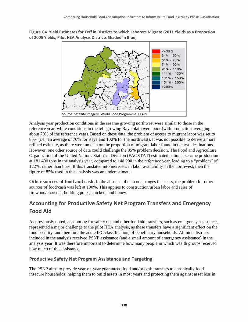
Comparing Household Food Consumption Indicators to Inform Acute Food Insecurity Phase Classification
138
Figure G4. Yield Estimates for Teff in Districts to which Laborers Migrate (2011 Yields as a Proportion of 2005 Yields; Pilot HEA Analysis Districts Shaded in Blue)
Source: Satellite imagery (World Food Programme, LEAP)
Analysis year production conditions in the sesame growing northwest were similar to those in the
reference year, while conditions in the teff-growing Raya plain were poor (with production averaging
about 70% of the reference year). Based on these data, the problem of access to migrant labor was set to
85% (i.e., an average of 70% for Raya and 100% for the northwest). It was not possible to derive a more
refined estimate, as there were no data on the proportion of migrant labor found in the two destinations.
However, one other source of data could challenge the 85% problem decision. The Food and Agriculture
Organization of the United Nations Statistics Division (FAOSTAT) estimated national sesame production
at 181,400 tons in the analysis year, compared to 148,900 in the reference year, leading to a “problem” of
122%, rather than 85%. If this translated into increases in labor availability in the northwest, then the
figure of 85% used in this analysis was an underestimate.
Other sources of food and cash. In the absence of data on changes in access, the problem for other
sources of food/cash was left at 100%. This applies to construction/urban labor and sales of
firewood/charcoal, building poles, chicken, and honey.
Accounting for Productive Safety Net Program Transfers and Emergency
Food Aid
As previously noted, accounting for safety net and other food aid transfers, such as emergency assistance,
represented a major challenge to the pilot HEA analysis, as these transfers have a significant effect on the
food security, and therefore the acute IPC classification, of beneficiary households. All nine districts
included in the analysis received PSNP assistance (and a small amount of emergency assistance) in the
analysis year. It was therefore important to determine how many people in which wealth groups received
how much of this assistance.
Productive Safety Net Program Assistance and Targeting
The PSNP aims to provide year-on-year guaranteed food and/or cash transfers to chronically food
insecure households, helping them to build assets in most years and protecting them against asset loss in
Comparing Household Food Consumption Indicators to Inform Acute Food Insecurity Phase Classification
139
bad years. The PSNP is complemented by the Household Asset Building Program (HABP).86 With
support from this program, the PSNP aims to “graduate” households into food security.
The PSNP uses a mix of geographic and community-based targeting to identify chronically food insecure
households in chronically food insecure districts. Figures on historic receipts of food aid are used to
determine the number of eligible beneficiaries in each region and district. District administrators then
select chronically food insecure kebeles (villages), distributing the district’s “PSNP quota” among these.87
Within PSNP-targeted villages, community-based targeting is used to identify eligible households, which
are then assigned to public works or direct support activities, depending on available labor (MOARD
2006).
The PSNP is targeted geographically to those regions and districts that received food aid for at least the 3
years before the program started in 2005. While there is a second level of geographic targeting (at the
village level), data from Sharp et al. (2006) indicate that in practice most villages within the targeted
districts are included in the program.88 Ayala (2013) wrote that studies from 2006 and 2008 (Sharp et al.
2006; Devereux et al. 2006 and 2008; and Coll-Black 2011) concluded that significant progress was made
between 2005 and 2006 in ensuring that the PSNP reached poor households and that institutional
structures for combined administrative and community targeting were in place in most areas.
Misinterpretations of targeting procedures in the safety net’s first year were corrected and no evidence of
systematic corruption or large-scale abuse of the system was found.
Coll-Black et al. (2011) concluded, based upon a statistically representative sample of 3,688 households,
that PSNP public works projects targeted the poor for participation, while direct support was targeted
toward households with limited labor endowments. They also concluded that the PSNP was generally
well-targeted, with a larger share of resources going to the poorest households, although it is noteworthy
in relation to the current analysis that the Amhara region performed less well in this respect than either
Tigray or Oromia regions.
Findings from studies between 2006 and 2008 indicated that the main problem with the PSNP was a
shortage of resources, which limited the number of beneficiaries (i.e., the problem was one of under-
coverage rather than poor targeting). A common response to this problem at the community level was to
spread PSNP assistance across a larger-than-planned number of households, a procedure known as
dilution. The most common form of dilution was to leave some members of each beneficiary household
off the register, and thus include more households in the program. This ran counter to an explicit PSNP
policy of “full family targeting” (which aimed to prevent dilution and maximize the chances that
participating households accumulate sufficient assets to graduate from the program). Despite this, Ayala
(2013) estimated—based upon field visits to three districts—that the number of household members was
still being under-registered by 20–30%. This was similar to the levels of dilution estimated by Sharp et al.
(2006).89
86 Beneficiaries of the Household Asset Building Program received at least one of several productivity enhancing transfers or
services, including access to credit, agricultural extension services, technology transfers, and/or irrigation and water harvesting
schemes. 87 The PSNP quota is the number of beneficiaries allocated to the district by the regional Ethiopian authorities. 88 Of the eight districts visited by Sharp et al. (2006), four included all villages in the 2006 program, while the other four included
93%, 91%, 81%, and 69% of villages. 89 Sharp et al. (2006) reported household survey data, which indicated that, where payment was in food alone, assistance intended
for 100 households was being shared between 127 households. Where payment was in cash alone, this figure rose to 144
households.
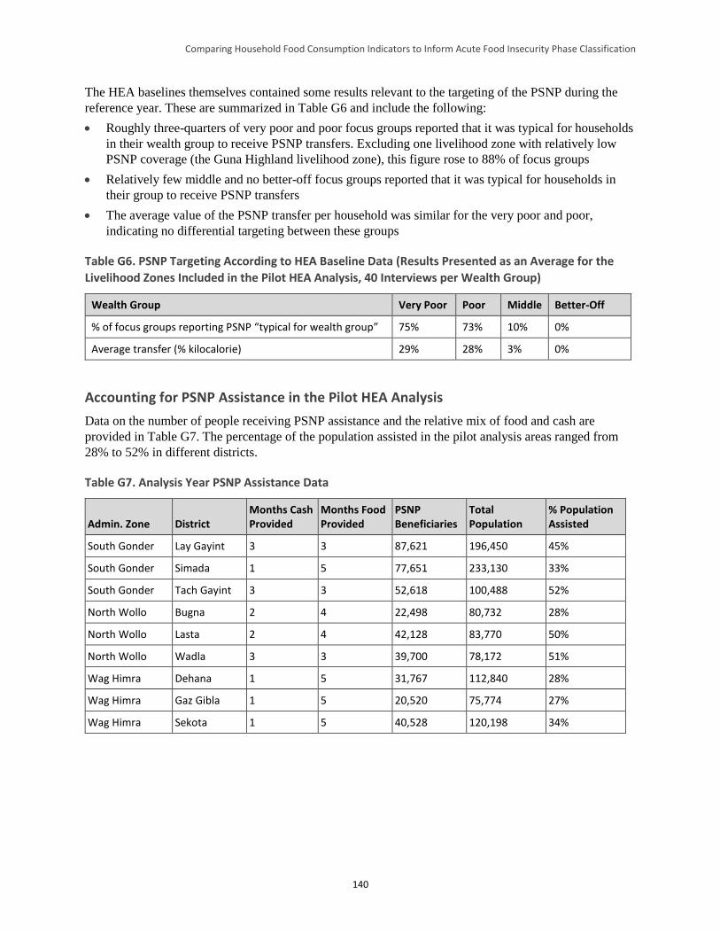
Comparing Household Food Consumption Indicators to Inform Acute Food Insecurity Phase Classification
140
The HEA baselines themselves contained some results relevant to the targeting of the PSNP during the
reference year. These are summarized in Table G6 and include the following:
Roughly three-quarters of very poor and poor focus groups reported that it was typical for households
in their wealth group to receive PSNP transfers. Excluding one livelihood zone with relatively low
PSNP coverage (the Guna Highland livelihood zone), this figure rose to 88% of focus groups
Relatively few middle and no better-off focus groups reported that it was typical for households in
their group to receive PSNP transfers
The average value of the PSNP transfer per household was similar for the very poor and poor,
indicating no differential targeting between these groups
Table G6. PSNP Targeting According to HEA Baseline Data (Results Presented as an Average for the
Livelihood Zones Included in the Pilot HEA Analysis, 40 Interviews per Wealth Group)
Wealth Group Very Poor Poor Middle Better-Off
% of focus groups reporting PSNP “typical for wealth group” 75% 73% 10% 0%
Average transfer (% kilocalorie) 29% 28% 3% 0%
Accounting for PSNP Assistance in the Pilot HEA Analysis
Data on the number of people receiving PSNP assistance and the relative mix of food and cash are
provided in Table G7. The percentage of the population assisted in the pilot analysis areas ranged from
28% to 52% in different districts.
Table G7. Analysis Year PSNP Assistance Data
Admin. Zone District Months Cash Provided
Months Food Provided
PSNP Beneficiaries
Total Population
% Population Assisted
South Gonder Lay Gayint 3 3 87,621 196,450 45%
South Gonder Simada 1 5 77,651 233,130 33%
South Gonder Tach Gayint 3 3 52,618 100,488 52%
North Wollo Bugna 2 4 22,498 80,732 28%
North Wollo Lasta 2 4 42,128 83,770 50%
North Wollo Wadla 3 3 39,700 78,172 51%
Wag Himra Dehana 1 5 31,767 112,840 28%
Wag Himra Gaz Gibla 1 5 20,520 75,774 27%
Wag Himra Sekota 1 5 40,528 120,198 34%
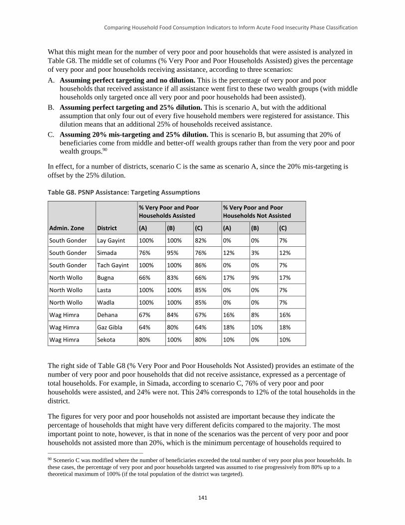
Comparing Household Food Consumption Indicators to Inform Acute Food Insecurity Phase Classification
141
What this might mean for the number of very poor and poor households that were assisted is analyzed in
Table G8. The middle set of columns (% Very Poor and Poor Households Assisted) gives the percentage
of very poor and poor households receiving assistance, according to three scenarios:
A. Assuming perfect targeting and no dilution. This is the percentage of very poor and poor
households that received assistance if all assistance went first to these two wealth groups (with middle
households only targeted once all very poor and poor households had been assisted).
B. Assuming perfect targeting and 25% dilution. This is scenario A, but with the additional
assumption that only four out of every five household members were registered for assistance. This
dilution means that an additional 25% of households received assistance.
C. Assuming 20% mis-targeting and 25% dilution. This is scenario B, but assuming that 20% of
beneficiaries come from middle and better-off wealth groups rather than from the very poor and poor
wealth groups.90
In effect, for a number of districts, scenario C is the same as scenario A, since the 20% mis-targeting is
offset by the 25% dilution.
Table G8. PSNP Assistance: Targeting Assumptions
Admin. Zone District
% Very Poor and Poor Households Assisted
% Very Poor and Poor Households Not Assisted
(A) (B) (C) (A) (B) (C)
South Gonder Lay Gayint 100% 100% 82% 0% 0% 7%
South Gonder Simada 76% 95% 76% 12% 3% 12%
South Gonder Tach Gayint 100% 100% 86% 0% 0% 7%
North Wollo Bugna 66% 83% 66% 17% 9% 17%
North Wollo Lasta 100% 100% 85% 0% 0% 7%
North Wollo Wadla 100% 100% 85% 0% 0% 7%
Wag Himra Dehana 67% 84% 67% 16% 8% 16%
Wag Himra Gaz Gibla 64% 80% 64% 18% 10% 18%
Wag Himra Sekota 80% 100% 80% 10% 0% 10%
The right side of Table G8 (% Very Poor and Poor Households Not Assisted) provides an estimate of the
number of very poor and poor households that did not receive assistance, expressed as a percentage of
total households. For example, in Simada, according to scenario C, 76% of very poor and poor
households were assisted, and 24% were not. This 24% corresponds to 12% of the total households in the
district.
The figures for very poor and poor households not assisted are important because they indicate the
percentage of households that might have very different deficits compared to the majority. The most
important point to note, however, is that in none of the scenarios was the percent of very poor and poor
households not assisted more than 20%, which is the minimum percentage of households required to
90 Scenerio C was modified where the number of beneficiaries exceeded the total number of very poor plus poor households. In
these cases, the percentage of very poor and poor households targeted was assumed to rise progressively from 80% up to a
theoretical maximum of 100% (if the total population of the district was targeted).
Comparing Household Food Consumption Indicators to Inform Acute Food Insecurity Phase Classification
142
determine the acute IPC phase for the area as a whole (see footnote 84). In other words, although a
minority of households may not have received PSNP assistance, it is unlikely that this represents a large
enough percentage for their status to affect the acute IPC phase classification.
The remainder of the pilot HEA outcome analysis was conducted on the assumption that scenario C was
the most likely (i.e., there was some mis-targeting and some dilution, and these two tended to offset one
another). The final calculation was of the amounts of assistance per household. These were calculated
from the distribution data, but assuming that only four out of every five household members were assisted
(to allow for the 25% dilution).
It is noteworthy that small amounts of emergency food assistance were also provided to a number of
districts during the pilot analysis period. However, only in two districts, Lasta and Sekota, was the
number of emergency beneficiaries significant. In those districts, 1.5 and 7.4 kilograms of food per
beneficiary per year, respectively, was added to the amount received from the PSNP transfer. The total
value of these transfers (in food terms) is presented in Table G9. Assuming 25% dilution, PSNP and
emergency assistance combined to provide between 28% and 33% of kilocalories (kcals) to assisted
households.
Table G9. 2012 PSNP and Emergency Food Aid Transfer Values, Assuming 25% Dilution
Admin. Zone District
PSNP Cash Transfer Value (Birr per person per year)
PSNP Food Transfer Value (kg per person per year)
Emergency Food Aid Transfer Value (kg per person per year)
Total Transfer Value (% kcals)
South Gonder Lay Gayint 165 36 0.0 30%
South Gonder Simada 55 60 0.0 32%
South Gonder Tach Gayint 168 36 0.0 32%
North Wollo Bugna 111 48 0.0 29%
North Wollo Lasta 112 48 1.5 30%
North Wollo Wadla 161 28 0.0 31%
Wag Himra Dehana 56 53 0.0 28%
Wag Himra Gaz Gibla 55 58 0.0 30%
Wag Himra Sekota 54 59 7.4 33%
Another assumption of the pilot analysis was that there was no differential targeting of PSNP assistance
between livelihood zones within districts. There is no data to indicate otherwise. Finally, it was assumed
that very poor and poor households received similar amounts of assistance, which is consistent with the
HEA data from the reference year.
Note that the effects of the developmental component of the PSNP, the Household Asset Building
Program, were not included in the pilot analysis. These effects would have included moving some
households out of the very poor and poor wealth groups and into the middle and better-off wealth groups.
This was unlikely to have had a major impact on the acute IPC phase classification for a particular area,
since classification is determined by the food security status of the majority of households in the very
poor and poor wealth groups.
Comparing Household Food Consumption Indicators to Inform Acute Food Insecurity Phase Classification
143
Results
Associating Acute IPC Phases with the Pilot HEA Analysis Results
Figure G5 shows the acute IPC phase classifications (see Table G2) associated with the calculated HEA
deficits for the analysis year.91 The results are shown with and without PSNP, Figures G5(A) and G5(B),
respectively. Since most very poor and poor households received PSNP transfers, Figure 5(A) represents
the expected area phase. With the exception of the Abay Beshilo River Basin livelihood zone in Tach
Gayint and Simada, which would have been in acute IPC Phase 3, all other areas would have been in
acute IPC Phase 1 according to the pilot HEA analysis results.
Figure G5. Acute IPC Phase Classification Associated with the Pilot HEA Analysis Results for the Analysis Year
(A) With PSNP (determines area phase)
(B) Without PSNP (minority of households)
Legend
IPC Phase
The situation of the minority of very poor and poor households not targeted for PSNP assistance is shown
in Figure G5(B). However, because these households represented less than 20% of the total population of
the analysis areas, they would not affect the areas’ phase classifications (see Table G8 for an estimate of
the percentage of households in the non-PSNP group, by district).
Detailed data on the HEA deficits and associated phase classifications, by district, livelihood zone, and
wealth group are presented in Tables G10 and G11, and estimates of the overall percentage of households
in different acute IPC phases are noted in Table G12 (by district and livelihood zone) and Table G13 (by
district). As previously noted, these estimates were calculated assuming 20% mis-targeting and 25%
dilution (i.e., scenario C). These results are consistent with the area phases mapped in Figure G5(A) (i.e.,
all areas are classified in acute IPC Phase 1, except the Abay Beshilo River Basin livelihood zone
spanning Tach Gayint and Simada districts).
91 This analysis included the income from low and medium cost coping strategies, but excluded high cost/irreversible coping
strategies such as excessive sale of livestock.
Comparing Household Food Consumption Indicators to Inform Acute Food Insecurity Phase Classification
144
Table G10. HEA Deficits and Associated Acute IPC Phase Classification, With PSNP Transfers (Results
Presented for Districts/Livelihood Zones Where Acute IPC Phase Classification > 1)
Wealth Group
Very Poor Poor Middle Better-Off
Simada
(Abay Beshilo River
Basin)
% Livelihood protection deficit 100% 0% 0% 0%
% Survival deficit 8% 0% 0% 0%
Acute IPC phase 3 1 1 1
Tach Gayint
(Abay Beshilo River
Basin)
% Livelihood protection deficit 100% 100% 0% 0%
% Survival deficit 16% 0% 0% 0%
Acute IPC phase 3 3 1 1
Note: The area phase is based upon the wealth group with the worst phase, provided this makes up 20% or more of
households. This is usually the very poor, except for the Guna Highland livelihood zone, where the very poor were 15% of
households. In this case, the area phase was “set” by the poor.
Table G11. HEA Deficits and Associated Acute IPC Phase Classification, Without PSNP Transfers
(Results Presented for Districts/Livelihood Zones Where Acute IPC Phase Classification > 1)
Wealth Group
Very Poor Poor Middle Better-Off
Lay Gayint (Abay Tekeze Watershed)
% Livelihood protection deficit 4% 0% 0% 0%
% Survival deficit 0% 0% 0% 0%
Acute IPC phase 2 1 1 1
Lay Gayint (North East Woyna Dega Mixed Cereal)
% Livelihood protection deficit 100% 100% 0% 0%
% Survival deficit 10% 1% 0% 0%
Acute IPC phase 3 3 1 1
Simada (Abay Beshilo River Basin)
% Livelihood protection deficit 100% 100% 0% 0%
% Survival deficit 38% 21% 0% 0%
Acute IPC phase 4 4 1 1
Simada (Abay Tekeze Watershed)
% Livelihood protection deficit 12% 0% 0% 0%
% Survival deficit 0% 0% 0% 0%
Acute IPC phase 2 1 1 1
Tach Gayint (Abay Beshilo River Basin)
% Livelihood protection deficit 100% 100% 0% 0%
% Survival deficit 44% 28% 0% 0%
Acute IPC phase 4 4 1 1
% Livelihood protection deficit 100% 0% 0% 0%
% Survival deficit 0% 0% 0% 0%
Comparing Household Food Consumption Indicators to Inform Acute Food Insecurity Phase Classification
145
Tach Gayint (Abay Tekeze Watershed)
Acute IPC phase 3 1 1 1
Bugna (North East Woyna Dega Mixed Cereal)
% Livelihood protection deficit 100% 94% 0% 0%
% Survival deficit 7% 0% 0% 0%
Acute IPC phase 3 3 1 1
Lasta (North East Woyna Dega Mixed Cereal)
% Livelihood protection deficit 100% 100% 0% 0%
% Survival deficit 8% 0% 0% 0%
Acute IPC phase 3 3 1 1
Dehana (North East Woyna Dega Mixed Cereal)
% Livelihood protection deficit 88% 35% 0% 0%
% Survival deficit 0% 0% 0% 0%
Acute IPC phase 3 2 1 1
Gaz Gibla (North East Woyna Dega Mixed Cereal)
% Livelihood protection deficit 100% 84% 0% 0%
% Survival deficit 5% 0% 0% 0%
Acute IPC phase 3 3 1 1
Sekota (North East Woyna Dega Mixed Cereal)
% Livelihood protection deficit 100% 43% 0% 0%
% Survival deficit 0% 0% 0% 0%
Acute IPC phase 3 2 1 1
Sekota (Tekeze Lowland Sorghum and Goats)
% Livelihood protection deficit 8% 0% 0% 0%
% Survival deficit 0% 0% 0% 0%
Acute IPC phase 2 1 1 1
Table G12. Percent of Households With PSNP Transfers at Different Acute IPC Phases, Assuming 20%
Mis-Targeting and 25% Dilution, by District and Livelihood Zone
District Livelihood Zone Acute IPC Phase 1
Acute IPC Phase 2
Acute IPC Phase 3
Acute IPC Phase 4
Acute IPC Phase 5 Total
Lay Gayint Abay Tekeze Watershed
96% 4% 0% 0% 0% 100%
Lay Gayint Guna Highland 100% 0% 0% 0% 0% 100%
Lay Gayint North East Woyna Dega Mixed Cereal
91% 0% 9% 0% 0% 100%
Lay Gayint Tekeze Lowland Sorghum and Goats
96% 4% 0% 0% 0% 100%
Simada Abay Beshilo River Basin
70% 0% 17% 13% 0% 100%
Simada Abay Tekeze Watershed
95% 5% 0% 0% 0% 100%
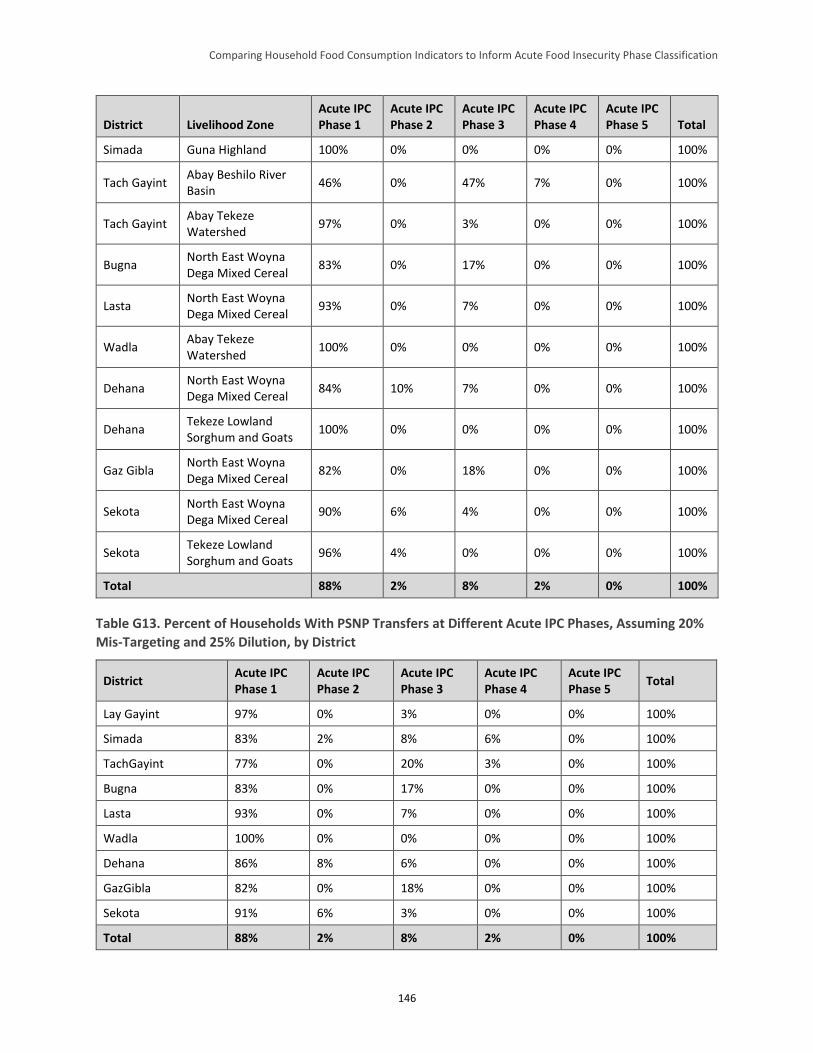
Comparing Household Food Consumption Indicators to Inform Acute Food Insecurity Phase Classification
146
District Livelihood Zone Acute IPC Phase 1
Acute IPC Phase 2
Acute IPC Phase 3
Acute IPC Phase 4
Acute IPC Phase 5 Total
Simada Guna Highland 100% 0% 0% 0% 0% 100%
Tach Gayint Abay Beshilo River Basin
46% 0% 47% 7% 0% 100%
Tach Gayint Abay Tekeze Watershed
97% 0% 3% 0% 0% 100%
Bugna North East Woyna Dega Mixed Cereal
83% 0% 17% 0% 0% 100%
Lasta North East Woyna Dega Mixed Cereal
93% 0% 7% 0% 0% 100%
Wadla Abay Tekeze Watershed
100% 0% 0% 0% 0% 100%
Dehana North East Woyna Dega Mixed Cereal
84% 10% 7% 0% 0% 100%
Dehana Tekeze Lowland Sorghum and Goats
100% 0% 0% 0% 0% 100%
Gaz Gibla North East Woyna Dega Mixed Cereal
82% 0% 18% 0% 0% 100%
Sekota North East Woyna Dega Mixed Cereal
90% 6% 4% 0% 0% 100%
Sekota Tekeze Lowland Sorghum and Goats
96% 4% 0% 0% 0% 100%
Total 88% 2% 8% 2% 0% 100%
Table G13. Percent of Households With PSNP Transfers at Different Acute IPC Phases, Assuming 20%
Mis-Targeting and 25% Dilution, by District
District Acute IPC Phase 1
Acute IPC Phase 2
Acute IPC Phase 3
Acute IPC Phase 4
Acute IPC Phase 5
Total
Lay Gayint 97% 0% 3% 0% 0% 100%
Simada 83% 2% 8% 6% 0% 100%
TachGayint 77% 0% 20% 3% 0% 100%
Bugna 83% 0% 17% 0% 0% 100%
Lasta 93% 0% 7% 0% 0% 100%
Wadla 100% 0% 0% 0% 0% 100%
Dehana 86% 8% 6% 0% 0% 100%
GazGibla 82% 0% 18% 0% 0% 100%
Sekota 91% 6% 3% 0% 0% 100%
Total 88% 2% 8% 2% 0% 100%
Comparing Household Food Consumption Indicators to Inform Acute Food Insecurity Phase Classification
147
Five examples of the HEA outcome analysis are presented for very poor households in Figure G6. These
examples are presented from left to right in order of total income in the reference year (highest income on
the left—from the Guna Highland livelihood zone, lowest income on the right—from the Abay Beshilo
River Basin livelihood zone). The first thing to note in these examples is that income for very poor
households in these areas is dominated by crops and local and migrant labor, with very little income
coming from livestock sales in either the reference or analysis years.
Comparing the reference year with the analysis year, inclusive of PSNP transfers, indicates that total
income (expressed in food terms)92 was generally lower in 2011–12 than in the reference year. For
households’ own sources of income (e.g., crop sales, labor), this results mainly from lower crop
production in the analysis year and resultant reduced access to harvest, cultivation, and migrant labor,
plus, in some areas, a reduction in the real daily labor rate (judged in terms of the amount of food that can
be purchased from payment for a day of labor). In comparing the household indicators for the analysis to
the reference years, the analysis year appears to be worse than the reference year.
A second point to note is that in some areas (e.g., Bugna district’s North East Woyna Dega Mixed Cereal
livelihood zone), total income, including PSNP transfers, is very close to the livelihoods protection
threshold. In other words, these areas are on the borderline between acute IPC Phase 1 and Phase 2.
Figure G6 reinforces the point that the PSNP is a critical factor in determining the food security status of
households in all nine districts. Comparing the bars with and without PSNP transfers shows how the
typical very poor household falls to or below the livelihoods protection threshold without PNSP transfers.
In each case (except Tach Gayint’s Abay Beshilo River Basin livelihood zone), total income from
households’ own sources (e.g., crop sales, labor) is higher without the PSNP. This reflects the additional
income generated from coping strategies such as sale of higher value crops (in order to purchase cheaper
staples), increased labor migration, and increased firewood and charcoal collection and sale. This increase
is not seen for Tach Gayint’s Abay Beshilo River Basin livelihood zone because these households faced a
deficit even with PSNP transfers, and because sustainable coping strategies were already maximized in
the “with PSNP transfers” analysis.
92 Income expressed in food terms is income expressed in comparison to the cost of 2,100 kcal of the cheapest locally available
cereal.
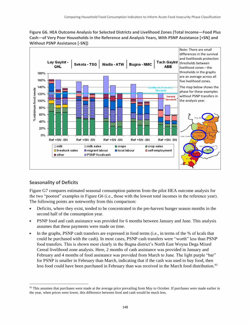
Comparing Household Food Consumption Indicators to Inform Acute Food Insecurity Phase Classification
148
Figure G6. HEA Outcome Analysis for Selected Districts and Livelihood Zones (Total Income—Food Plus Cash—of Very Poor Households in the Reference and Analysis Years, With PSNP Assistance [+SN] and Without PSNP Assistance [-SN])
Note: There are small differences in the survival and livelihoods protection thresholds between livelihood zones—the thresholds in the graphs are an average across all five livelihood zones.
The map below shows the phase for these examples without PSNP transfers in the analysis year.
Seasonality of Deficits
Figure G7 compares estimated seasonal consumption patterns from the pilot HEA outcome analysis for
the two “poorest” examples in Figure G6 (i.e., those with the lowest total incomes in the reference year).
The following points are noteworthy from this comparison:
Deficits, where they exist, tended to be concentrated in the pre-harvest hunger season months in the
second half of the consumption year.
PSNP food and cash assistance was provided for 6 months between January and June. This analysis
assumes that these payments were made on time.
In the graphs, PSNP cash transfers are expressed in food terms (i.e., in terms of the % of kcals that
could be purchased with the cash). In most cases, PSNP cash transfers were “worth” less than PSNP
food transfers. This is shown most clearly in the Bugna district’s North East Woyna Dega Mixed
Cereal livelihood zone analysis. Here, 2 months of cash assistance was provided in January and
February and 4 months of food assistance was provided from March to June. The light purple “bar”
for PSNP is smaller in February than March, indicating that if the cash was used to buy food, then
less food could have been purchased in February than was received in the March food distribution.93
93 This assumes that purchases were made at the average price prevailing from May to October. If purchases were made earlier in
the year, when prices were lower, this difference between food and cash would be much less.
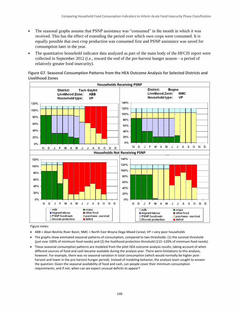
Comparing Household Food Consumption Indicators to Inform Acute Food Insecurity Phase Classification
149
The seasonal graphs assume that PSNP assistance was “consumed” in the month in which it was
received. This has the effect of extending the period over which own crops were consumed. It is
equally possible that own crop production was consumed first and PSNP assistance was saved for
consumption later in the year.
The quantitative household indicator data analyzed as part of the main body of the HFCIS report were
collected in September 2012 (i.e., toward the end of the pre-harvest hunger season—a period of
relatively greater food insecurity).
Figure G7. Seasonal Consumption Patterns from the HEA Outcome Analysis for Selected Districts and Livelihood Zones
Households Receiving PSNP
Households Not Receiving PSNP
Figure notes:
ABB = Aban Beshilo River Basin; NMC = North East Woyna Dega Mixed Cereal; VP = very poor households
The graphs show estimated seasonal patterns of consumption, compared to two thresholds: (1) the survival threshold (just over 100% of minimum food needs) and (2) the livelihood protection threshold (115–120% of minimum food needs).
These seasonal consumption patterns are modeled from the pilot HEA outcome analysis results, taking account of when different sources of food and cash became available during the analysis year. There were limitations to this analysis, however. For example, there was no seasonal variation in total consumption (which would normally be higher post-harvest and lower in the pre-harvest hunger period). Instead of modeling behavior, the analysis team sought to answer the question: Given the seasonal availability of food and cash, can people cover their minimum consumption requirements, and if not, when can we expect unusual deficits to appear?
Comparing Household Food Consumption Indicators to Inform Acute Food Insecurity Phase Classification
150
The Effect of Varying the Level of Coping
In the HEA, the analyst has the option to vary the types of coping included in the analysis. Reducing the
number of coping strategies has the effect of reducing total incomes and increasing deficits, and will
therefore tend to increase the acute IPC phase classification for a given area. In the analyses presented to
this point, all available reversible coping strategies were included, in line with the acute IPC household
reference table (see Table G2). This section presents the effect of varying the level of coping to see if it
impacts the acute IPC phase classification, and whether this might explain any differences between the
pilot HEA outcome analysis and the quantitative household indicator results discussed in the main body
of this report.
In the pilot analysis areas, there were few additional coping strategies that could have been included in the
analysis (see Table G14 for a full list of coping strategies included for very poor and poor households).
This makes sense given that these are poor and food insecure areas where people were already “coping”
to make ends meet in the reference year. There were not, therefore, many additional options for the very
poor and poor. Of those listed, the most important is to increase labor migration (see Figure G6).
Table G14. Coping Strategies for the Very Poor Included in the Pilot HEA Analysis
Coping Strategy
Sale of high-value crops to purchase lower-value staples (e.g., teff, pulses)
Increased livestock sales
Increased labor migration
Increased urban/construction labor
Increased firewood/charcoal sale
Notes:
Only strategies that increase food and cash income are listed here, not strategies that reduce consumption/expenditure.
High cost or unsustainable coping strategies are always excluded from HEA outcome analysis (e.g., unsustainable sale of livestock and sale/mortgaging of productive assets such as land, tools, and seeds). This is because the objective of the analysis is to determine deficits and assistance requirements before people resort to these strategies.
Figure G8 shows how acute IPC phase classification varies according to the types of coping included.
With PSNP assistance, the only effect of removing reversible coping is for the North East Woyna Dega
Mixed Cereal livelihood zone in some districts to move from acute IPC Phase 1 to Phase 2. Figure G6
shows that the North East Woyna Dega Mixed Cereal livelihood zone was near acute IPC Phase 2 with all
coping included. Reducing the level of coping pushes these areas over the threshold into acute IPC Phase
2. In other areas, the level of PSNP provision is sufficient to lift people some way above the livelihoods
protection threshold. In these areas, people do not need to make much use of additional coping strategies,
and excluding these strategies from the analysis has no effect on the ultimate acute IPC phase
determination. Without PSNP assistance, reducing the level of coping has modest effects on the acute IPC
phase classification, with some areas moving from acute IPC Phase 1 to Phase 2, and others from acute
IPC Phase 2 to Phase 3. This is, again, mainly a reflection of the limited options for coping in these areas.
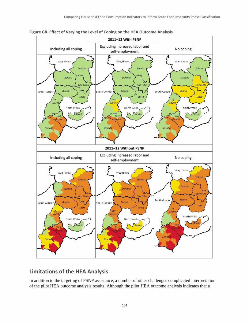
Comparing Household Food Consumption Indicators to Inform Acute Food Insecurity Phase Classification
151
Figure G8. Effect of Varying the Level of Coping on the HEA Outcome Analysis
2011–12 With PSNP
Including all coping Excluding increased labor and
self-employment No coping
2011–12 Without PSNP
Including all coping Excluding increased labor and
self-employment No coping
Limitations of the HEA Analysis
In addition to the targeting of PSNP assistance, a number of other challenges complicated interpretation
of the pilot HEA outcome analysis results. Although the pilot HEA outcome analysis indicates that a
Comparing Household Food Consumption Indicators to Inform Acute Food Insecurity Phase Classification
152
minority of very poor and poor households not targeted for PSNP assistance would have faced deficits in
the analysis year, this does not mean that the food security situation for all other households was
satisfactory. There are a number of reasons for this, including:
HEA looks at the status of typical households living at four different levels of wealth. It does not
generate information on individual households. HEA outcome analysis cannot therefore be used to
estimate the percentage of households with a given characteristic (e.g., the percentage of households
making use of one or another coping strategy).
HEA outcome analysis assumes that people will utilize their resources rationally (e.g., they will cut
back on the consumption of non-essential items, such as beer, when times are bad). While this is
rational in terms of determining whether a particular situation warrants intervention with external
resources, it is unrealistic to expect all households to behave with perfect economic rationality.
Specific households’ failure to make “rational” decisions may result in livelihood protection, and
potentially, survival deficits.
HEA outcome analysis does not take account of specific problems faced by individual households
(e.g., the illness or death of a productive member), which could cause that household to face a
significant livelihoods protection and, potentially, survival deficit.
Conclusion
This pilot HEA outcome analysis indicated that total income for all wealth groups in the analysis area was
above the livelihoods protection threshold in all but one livelihood zone, suggesting minimal (IPC Phase
1) acute food insecurity. However, this assumed that the PSNP reached the majority of very poor and
poor households. If PSNP assistance was poorly targeted, households not receiving this transfer (or
receiving it at less than the assumed level), would have faced deficits which could have affected their
classification within the acute IPC. This pilot also confirmed the feasibility of retrospective HEA outcome
analyses. However, given the exploratory nature of this work, conclusions beyond these must be stated
even less definiteively.
References
Ayala, F. 2013. “Assessment of the PSNP Targeting System and Feasibility Study for Moving into a
National Household Registry.” Report for the Government of Ethiopia.
Coll-Black, S. et al. 2011. Targeting Food Security Interventions When “Everyone is Poor”: The Case of
Ethiopia's Productive Safety Net Programme. Washington, DC: Development Strategy and Governance
Division, International Food Policy Research Institute - Ethiopia Strategy Support Program II.
Devereux, S.; Sabates-Wheeler, R.; and Tefera, M. 2006. Trends in PSNP Transfers. Addis Ababa and
Brighton: Indak International and Institute of Development Studies.
Devereux, S. et al. 2008. Ethiopia's Productive Safety Net Program: 2008 Assessment Report. Brighton
and London: Institute of Development Studies and Overseas Development Institute.
Holzmann, P. et al. 2008. The Household Economy Approach: A guide for programme planners and
policy-makers. London: Save the Children.
Ministry of Agriculture and Rural Development (MOARD). 2006. Productive Safety Net Programme:
Programme Implementation Manual (Revised). Addis Ababa: MOARD, Federal Democratic Republic of
Ethiopia.
Comparing Household Food Consumption Indicators to Inform Acute Food Insecurity Phase Classification
153
Senay, G. 2004. “Crop Water Requirement Satisfaction Index (WRSI): Model Description.” Available at:
http://iridl.ldeo.columbia.edu/documentation/usgs/adds/wrsi/WRSI_readme.pdf.
Sharp, K.; Brown, T.; and Teshome, A. 2006. Targeting Ethiopia's Productive Safety Net Programme
(PSNP). London: ODI.