Embed Size (px)
Citation preview
COMMUNICATION DESIGN
Associate Professor L. K. ChanFaculty of the College of Fine Arts, University of New South Wales, Sydney, Australia
Centre for Emerging Infectious Diseases, Chinese University of Hong Kong • 19 April 2007

L. K. Chan • Communication Design • Centre for Emerging Infectious Diseases, Chinese University of Hong Kong • 19 April 2007
Communication Design includes:
Graphic design e.g. posters, brochures, books, print and
television advertisements
Packaging design e.g. consumer goods packaging
Information design e.g. forms, signage and wayfinding
systems, directories, medicine labels
Web-based design e.g. websites, online content design
Interactive design e.g. computer games, animation, motion
design (film, video, television)

L. K. Chan • Communication Design • Centre for Emerging Infectious Diseases, Chinese University of Hong Kong • 19 April 2007
Why is Communication Design relevant?
• We generate more data/information than before.
• Data/information is becoming complex.
• Humans cannot process every bit of data/information.
• Not every piece of data/information is of paramount
importance to everyone.
• Computers and software help humans to generate more data.
• Non-designers are required to communicate using posters,
notices, brochures, websites etc.
• We need to provide data and information in a meaningful and
user-friendly way through design.

L. K. Chan • Communication Design • Centre for Emerging Infectious Diseases, Chinese University of Hong Kong • 19 April 2007
Data becomes information only when it is meaningful to the user.
Paraphrased from Richard Saul Wurman, Information Anxiety, 2002

L. K. Chan • Communication Design • Centre for Emerging Infectious Diseases, Chinese University of Hong Kong • 19 April 2007
Communicating data as information:
• use data only if relevant as information.
• edit or simplify data to make the information relevant within
the provided space.
• leave out unnecessary data.
• organise the information in a meaningful way.
• use relevant only text and/or images (pictures, diagrams) for
maximum visual impact.
• use images only if relevant to the content/topic.
• make use of ‘white space’ to balance the design for user-
friendly reading and impact.

L. K. Chan • Communication Design • Centre for Emerging Infectious Diseases, Chinese University of Hong Kong • 19 April 2007
White space
Poster © Sungkyunkwan University, Seoul, Korea and Korean Society of Mechanical Engineering.
L. K. Chan • Communication Design • Centre for Emerging Infectious Diseases, Chinese University of Hong Kong • 19 April 2007
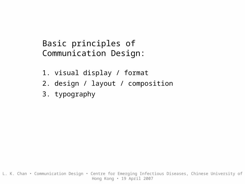
Basic principles of Communication Design:
1. visual display / format
2. design / layout / composition
3. typography

L. K. Chan • Communication Design • Centre for Emerging Infectious Diseases, Chinese University of Hong Kong • 19 April 2007
1. Visual display / format
Before considering the piece of communication design, address the following questions:
1. How will the information be displayed?
- Paper or screen-based projection? Note that designs for printing on paper have different requirements to screen-based designs e.g. webpage or for display on a projector screen (powerpoint slides) because our cognition varies with each medium.
- Will the display space for paper-based communication have enough natural or artificial lighting? This will affect legibility issues like size of typeface, contrast between colour of paper and colour of text, etc.
-

L. K. Chan • Communication Design • Centre for Emerging Infectious Diseases, Chinese University of Hong Kong • 19 April 2007
1. Visual display / formatBefore considering the piece of communication design, address the following questions:
2. Who will read the information?
- university students and/or staff (clear display of relevant information including date, time, venue, contact details like telephone, email, website, directions, etc.)
- general public (similar to above but may include brief instructions or diagram on campus location, transport routes, etc.)
- elderly persons and/or people with difficulty in reading small print (similar to above and requires larger format and appropriate type size)
L. K. Chan • Communication Design • Centre for Emerging Infectious Diseases, Chinese University of Hong Kong • 19 April 2007
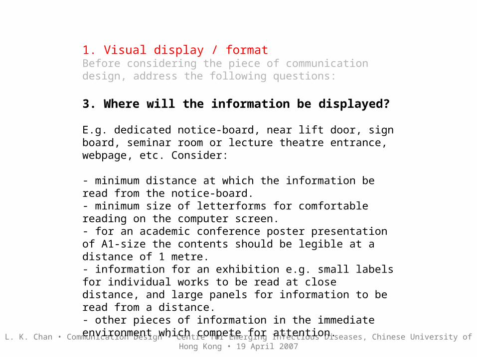
1. Visual display / formatBefore considering the piece of communication design, address the following questions:
3. Where will the information be displayed?
E.g. dedicated notice-board, near lift door, sign board, seminar room or lecture theatre entrance, webpage, etc. Consider:
- minimum distance at which the information be read from the notice-board.- minimum size of letterforms for comfortable reading on the computer screen.- for an academic conference poster presentation of A1-size the contents should be legible at a distance of 1 metre.- information for an exhibition e.g. small labels for individual works to be read at close distance, and large panels for information to be read from a distance.- other pieces of information in the immediate environment which compete for attention.

L. K. Chan • Communication Design • Centre for Emerging Infectious Diseases, Chinese University of Hong Kong • 19 April 2007
1. Visual display / formatBefore considering the piece of communication design, address the following questions:
4. What is the best format for visual display?
- This will be influenced by the answers to questions 1-3. Often we have to provide the same information in a variety of formats like A2-size poster, A4-size flyer and a webpage.
E.g. a conference can have a large poster with basic information and an attractive image plus an A4 flyer with similar design and extra information on both sides, and a webpage. All items require specific design considerations to suit the medium, format size, legibility, etc.
- Useful note: conference organisers specify a size for poster presentations to accommodate display at the conference venue.
- Size will be determined by the available display space, visual impact and competing designs in the immediate environment.

L. K. Chan • Communication Design • Centre for Emerging Infectious Diseases, Chinese University of Hong Kong • 19 April 2007
Examples of display formats:
Invitation, 100mm x 210mm
Poster, 420mm x 297mm
Webpage, 600 x 800 pixels
Poster © Sungkyunkwan University, Seoul, Korea and Korean Society of Mechanical Engineering.
Invitation © Goethe Institut and UNSW
Webpage © Imperial College London University

L. K. Chan • Communication Design • Centre for Emerging Infectious Diseases, Chinese University of Hong Kong • 19 April 2007
2. Design / layout / composition
• Determine the most appropriate format including size, direction (vertical or horizontal), medium (paper or screen-based) etc.
• Consider the amount of content - text and/or image - for the selected format. Prioritise content according to importance and relevance.
• Design an arrangement or system to show hierarchy or order: from top to low priority e.g. more prominent size and location for high priority information.
• Layout or composition refers to the arrangement of text and image on the selected format. Aim for a focus which will draw attention to the design.

L. K. Chan • Communication Design • Centre for Emerging Infectious Diseases, Chinese University of Hong Kong • 19 April 2007
2. Design / layout / composition - Example One• Consider the amount of content - text and/or image.
This invitation functions to provide information on the event ( a book launch), minimum details of the book and author, image of the book cover, the sponsor and organiser, plus details of the date, time, venue, and contact person for RSVP.
Invitation © Goethe Institut and UNSW

L. K. Chan • Communication Design • Centre for Emerging Infectious Diseases, Chinese University of Hong Kong • 19 April 2007
2. Design / layout / composition - Example One• Prioritise content according to importance. Design an order or system to show from top to low priority e.g. more prominent size and location for high priority information.
Top priority - Book title emphasised by using larger type size, bold, colour, and white space, followed by smaller type size for subtitle of book in same colour as book title.
Description of event in larger type size compared to body text for emphasis at top of layout.
Secondary information to describe person who will launch the event. The type size and colour do not draw attention away from the book title.
Tertiary information on date, time, venue, contact etc. Same size as secondary information but positioned lower in the order.
Useful graphic device to identify this as a book launch.
Logos are discreetly sized and positioned to promote sponsors but not detract from the real function of the invitation.
Book cover as picture for attracting attention. The image is about one third of the space and is well-balanced by white space.
Effective use of black for body text and green as the highlight colour for graphic device and high priority text to complement red in picture. Clarity and simplicity in design make this invitation attractive and easy to read.
Invitation © Goethe Institut and UNSW

L. K. Chan • Communication Design • Centre for Emerging Infectious Diseases, Chinese University of Hong Kong • 19 April 2007
2. Design / layout / composition - Example Two• Consider the amount of content - text and/or image.
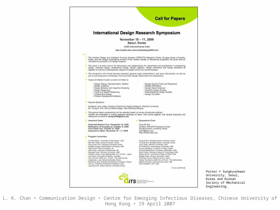
This poster serves to promote a symposium with details of topics, keynote speakers, tpes of presentation and the members of the program committee. Apart from the title of the symposium, dates and venue, the organisers have attempted to prioritise the rest of the information. It is quite easy to read after the priority items since there are bold sub-headings to assist with ‘navigating’ the mass of information. The design is also effective in the use of white space which contrasts the information.
For improvement, the graphic ‘guides’ can include slightly larger black (or green) and bold and all capital sub-headings to separate the different sections in the text block.
Poster © Sungkyunkwan University, Seoul, Korea and Korean Society of Mechanical Engineering.

L. K. Chan • Communication Design • Centre for Emerging Infectious Diseases, Chinese University of Hong Kong • 19 April 2007
2. Design / layout / composition - Example One• Prioritise content according to importance. Design an order or system to show from top to low priority e.g. more prominent size and location for high priority information.
Effective graphic device to attract attention. Colour and shape can be effective in providing an abstract element for visual appeal. The colour is well considered to complement the logo colours - black and green.
Well-considered use of white space necessary to balance the body text. Generous margin space provides a comfortable visual reading compared to text cramped tightly into the poster.
Some attempt to differentiate sub-headings from body text by using bold. May be too subtle to notice for navigation. Increase type size or use green feature colour or use all capital letters to highlight the sub-headings.
Poster © Sungkyunkwan University, Seoul, Korea and Korean Society of Mechanical Engineering.

L. K. Chan • Communication Design • Centre for Emerging Infectious Diseases, Chinese University of Hong Kong • 19 April 2007
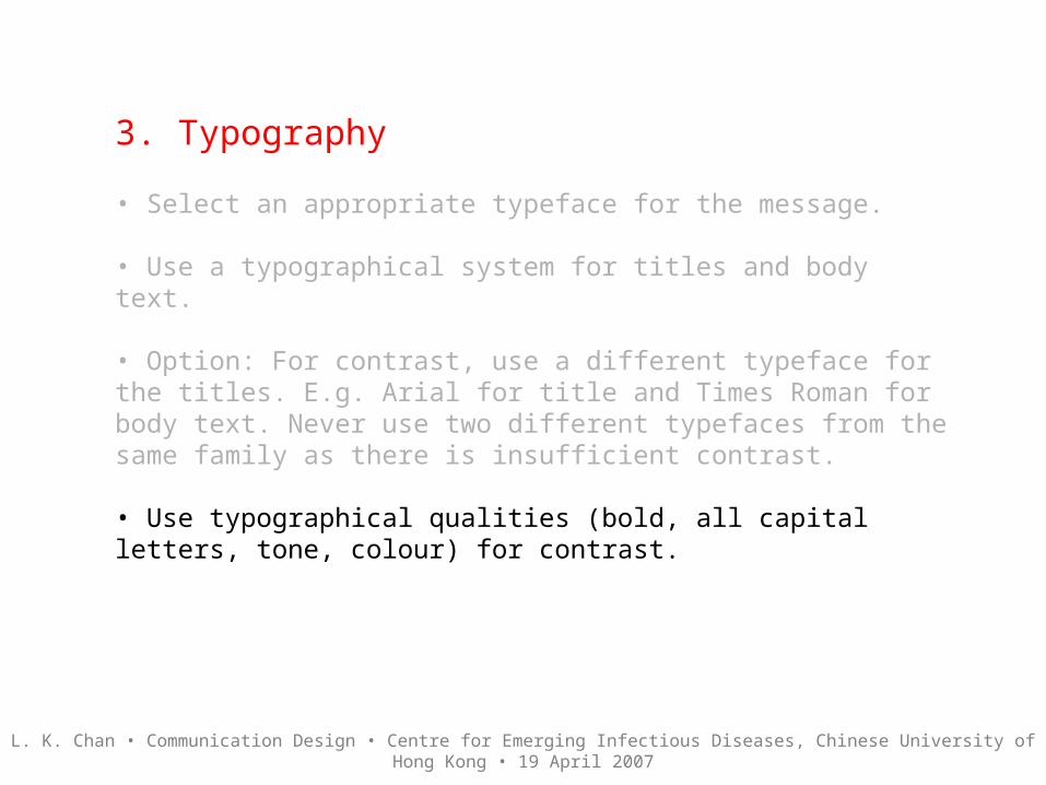
3. Typography
• Select an appropriate typeface for the message.Some typefaces like Times New Roman, Palatino and Baskerville are classic serif typefaces and are easy to read when you have lots of textual information. Times New Roman was designed specially for The Times newspaper in London. The serifs at the top and bottom of the letterfoms help to ‘link’ letters together visually when we read. Helvetica is a sans serif typeface designed for signage, and its application can be a problem when there is a lot of text to read like a thesis.
• Use a typographical system for titles and body text.
• Option: For contrast, use a different typeface for the titles. E.g. Arial for title and Times Roman for body text. Never use two different typefaces from the same family as there is insufficient contrast.
• Use typographical qualities (bold, all capital letters, tone, colour) for contrast.
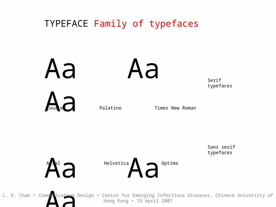
TYPEFACE Family of typefaces
Aa Aa Aa
Aa Aa Aa
Serif typefaces
Sans serif typefaces
Courier Palatino Times New Roman
Arial Helvetica Optima
L. K. Chan • Communication Design • Centre for Emerging Infectious Diseases, Chinese University of Hong Kong • 19 April 2007

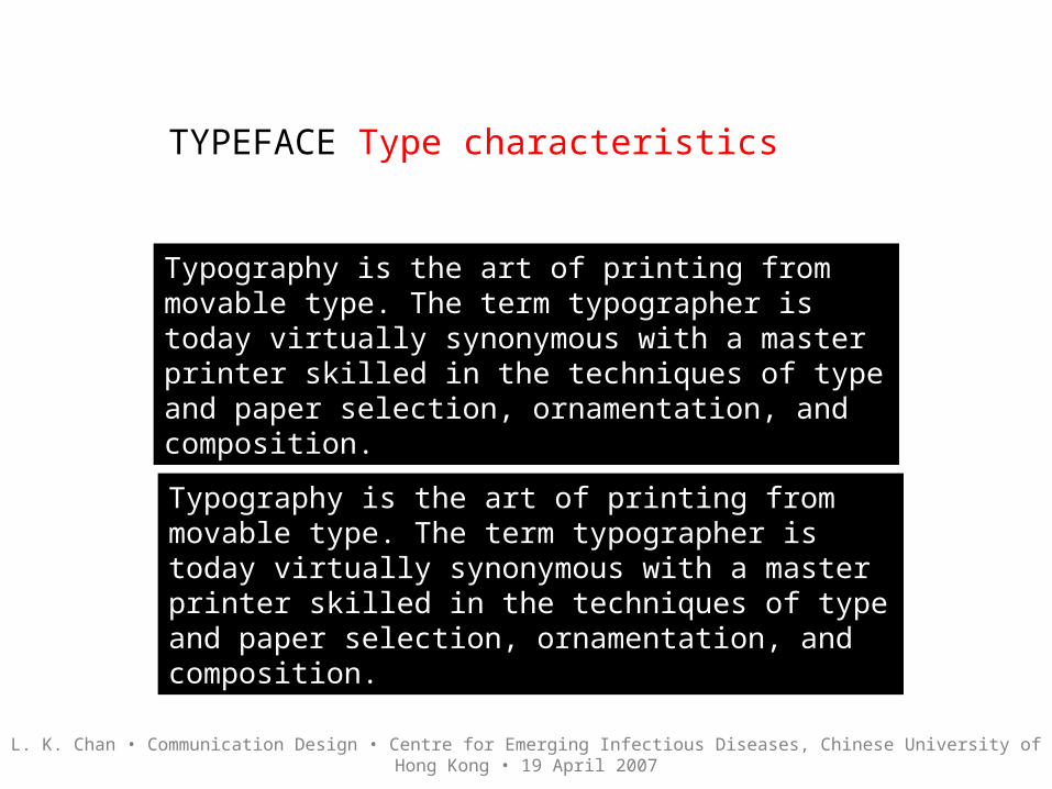
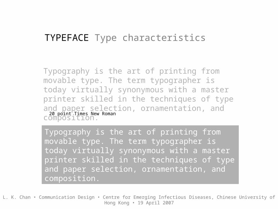
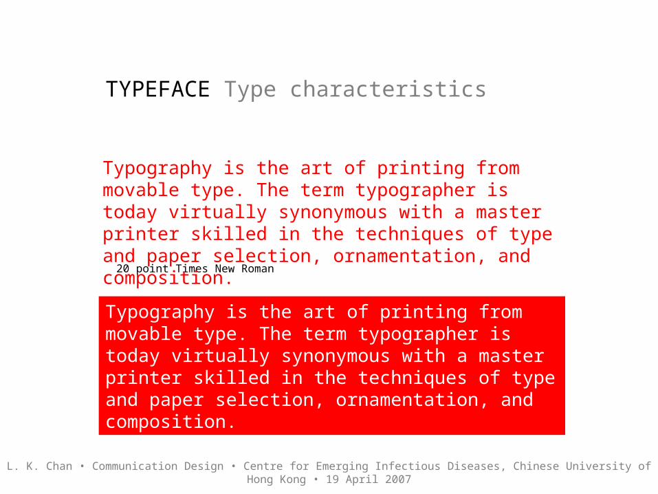
TYPEFACE Type characteristics
Typography is the art of printing from movable type. The term typographer is today virtually synonymous with a master printer skilled in the techniques of type and paper selection, ornamentation, and composition.
Typography is the art of printing from movable type. The term typographer is today virtually synonymous with a master printer skilled in the techniques of type
and paper selection, ornamentation, and composition.
20 point Times New Roman
20 point Helvetica
L. K. Chan • Communication Design • Centre for Emerging Infectious Diseases, Chinese University of Hong Kong • 19 April 2007

L. K. Chan • Communication Design • Centre for Emerging Infectious Diseases, Chinese University of Hong Kong • 19 April 2007
3. Typography
• Select an appropriate typeface for the message.
• Use a typographical system for titles and body text.Consider an order for main heading, sub-heading(s), body text as a system. Use different type sizes, bold or all capital letters to vary the different types of headings.
• Option: For contrast, use a different typeface for the titles. E.g. Arial for title and Times Roman for body text. Never use two different typefaces from the same family as there is insufficient contrast.
• Use typographical qualities (bold, all capital letters, tone, colour) for contrast.

L. K. Chan • Communication Design • Centre for Emerging Infectious Diseases, Chinese University of Hong Kong • 19 April 2007
3. Typography• Use a typographical system for titles and body text.
Announcement, 340mm x 210mm
Larger typesize and bold for the conference title and sub-title. Note the use of all capital letters in the main title to highlight the nature of the conference.
Secondary information requires slightly smaller type size.
Body text has the smallest type size in the system. Some bold type to emphasise names of speakers.
The white space is used erratically. There is a lack of balance in the margin space and spaces between different sections in the text. This makes navigation less clear in terms of order. The top graphic has two spot colours - blue - which are not used in the rest of the design. The blue could be considered as an aid for navigation to break the monotonal black text block.
Design © Museum of Contemporary Art, Sydney

L. K. Chan • Communication Design • Centre for Emerging Infectious Diseases, Chinese University of Hong Kong • 19 April 2007
3. Typography
• Select an appropriate typeface for the message.
• Use a typographical system for titles and body text.
• Option: For contrast, use a different typeface for the titles. E.g. Arial for title and Times Roman for body text. Never use two different typefaces from the same family as there is insufficient contrast.
• Use typographical qualities (bold, all capital letters, tone, colour) for contrast.

L. K. Chan • Communication Design • Centre for Emerging Infectious Diseases, Chinese University of Hong Kong • 19 April 2007
3. Typography• For contrast, use a different typeface for the titles. E.g. Arial for title and Times Roman for body text. Avoid using two different typefaces from the same family as there is insufficient contrast.
ABSTRACTNation-building campaigns are characterised by the symbiotic conjunction of messages and representations, the authorial voices of the agency which legitimise the messages, and the target audiences which the designers of the campaigns intend to reach. The social construction of national identity and race both connote and connect images with associated imagery, as they also concretise representational codas which as Aynsley (1993), Burke (2001) and Margolin (1995), have in their different ways argued, reveals the graphic as a medium for critical engagement.
This paper ‘unpacks’ the construction of race and the nation-state in the analysis of the broad range of graphic representations, in images and texts, which are constitutive of socio-cultural, economic and political discourses about post-colonialism, multiracialism and national identity. For most Singaporeans the meaning of belonging and sharing has become critically signifi
Title: Goudy bold. Body text: Times Roman Title: Arial bold. Body text: Times Roman
L. K. Chan • Communication Design • Centre for Emerging Infectious Diseases, Chinese University of Hong Kong • 19 April 2007
3. Typography
• Select an appropriate typeface for the message.
• Use a typographical system for titles and body text.
• Option: For contrast, use a different typeface for the titles. E.g. Arial for title and Times Roman for body text. Never use two different typefaces from the same family as there is insufficient contrast.
• Use typographical qualities (bold, all capital letters, tone, colour) for contrast.

L. K. Chan • Communication Design • Centre for Emerging Infectious Diseases, Chinese University of Hong Kong • 19 April 2007
3. Typography• Use typographical qualities (bold, all capital letters, tone, colour) for contrast.
SYMBOLISM AND GRAPHICS
IntroductionNation-building campaigns are characterised by the symbiotic conjunction of messages and representations, the authorial voices of the agency which legitimise the messages, and the target audiences which the designers of the campaigns intend to reach. The social construction of national identity and race both connote and connect images with associated imagery, as they also concretise representational codas which as Aynsley (1993), Burke (2001) and Margolin (1995), have in their different ways argued, reveals the graphic as a medium for critical engagement.
Function and purposeThis paper ‘unpacks’ the construction of race and the nation-state in the analysis of the broad range of graphic representations, in images and texts, which are constitutive of socio-cultural, economic and political discourses about post-colonialism, multiracialism and national identity.
Symbolism and Graphics
INTRODUCTIONNation-building campaigns are characterised by the symbiotic conjunction of messages and representations, the authorial voices of the agency which legitimise the messages, and the target audiences which the designers of the campaigns intend to reach. The social construction of national identity and race both connote and connect images with associated imagery, as they also concretise representational codas which as Aynsley (1993), Burke (2001) and Margolin (1995), have in their different ways argued, reveals the graphic as a medium for critical engagement.
Function and purposeThis paper ‘unpacks’ the construction of race and the nation-state in the analysis of the broad range of graphic representations, in images and texts, which are constitutive of socio-cultural, economic and political discourses about post-colonialism,

TYPEFACE Type characteristics
New Typography Positive
Reverse
New Typography
L. K. Chan • Communication Design • Centre for Emerging Infectious Diseases, Chinese University of Hong Kong • 19 April 2007

TYPEFACE Type characteristics
Typography is the art of printing from movable type. The term typographer is today virtually synonymous with a master printer skilled in the techniques of type and paper selection, ornamentation, and composition.
20 point Times New Roman
20 point Times New Roman reverse
Typography is the art of printing from movable type. The term typographer is today virtually synonymous with a master printer skilled in the techniques of type and paper selection, ornamentation, and composition.
L. K. Chan • Communication Design • Centre for Emerging Infectious Diseases, Chinese University of Hong Kong • 19 April 2007
TYPEFACE Type characteristics
20 point Times New Roman reverse
20 point Helvetica reverse
Typography is the art of printing from movable type. The term typographer is today virtually synonymous with a master printer skilled in the techniques of type and paper selection, ornamentation, and composition.
Typography is the art of printing from movable type. The term typographer is today virtually synonymous with a master printer skilled in the techniques of type and paper selection, ornamentation, and composition.
L. K. Chan • Communication Design • Centre for Emerging Infectious Diseases, Chinese University of Hong Kong • 19 April 2007
TYPEFACE Type characteristics
20 point Times New Roman
20 point Times New Roman reverse
Typography is the art of printing from movable type. The term typographer is today virtually synonymous with a master printer skilled in the techniques of type and paper selection, ornamentation, and composition.
Typography is the art of printing from movable type. The term typographer is today virtually synonymous with a master printer skilled in the techniques of type and paper selection, ornamentation, and composition.
L. K. Chan • Communication Design • Centre for Emerging Infectious Diseases, Chinese University of Hong Kong • 19 April 2007
L. K. Chan • Communication Design • Centre for Emerging Infectious Diseases, Chinese University of Hong Kong • 19 April 2007
Examples

L. K. Chan • Communication Design • Centre for Emerging Infectious Diseases, Chinese University of Hong Kong • 19 April 2007
Invitation © Goethe Institut and UNSW

L. K. Chan • Communication Design • Centre for Emerging Infectious Diseases, Chinese University of Hong Kong • 19 April 2007
Invitation © BisTrade
L. K. Chan • Communication Design • Centre for Emerging Infectious Diseases, Chinese University of Hong Kong • 19 April 2007
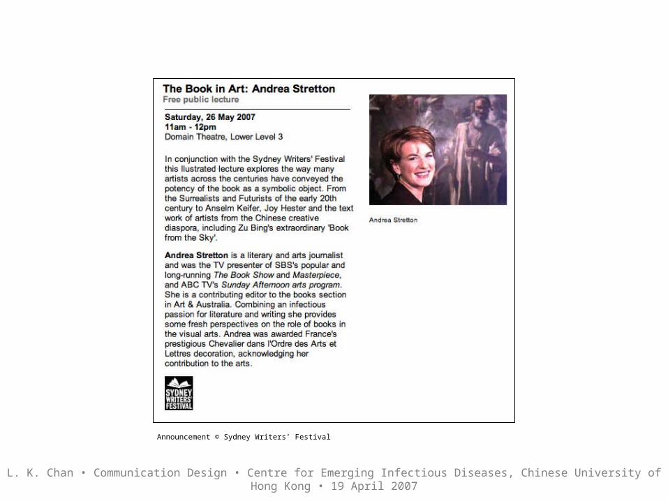
Announcement © Sydney Writers’ Festival

L. K. Chan • Communication Design • Centre for Emerging Infectious Diseases, Chinese University of Hong Kong • 19 April 2007
Design © Faculty of the Built Environment, UNSW

L. K. Chan • Communication Design • Centre for Emerging Infectious Diseases, Chinese University of Hong Kong • 19 April 2007
Newsletter © Graduate Research School, UNSW
L. K. Chan • Communication Design • Centre for Emerging Infectious Diseases, Chinese University of Hong Kong • 19 April 2007
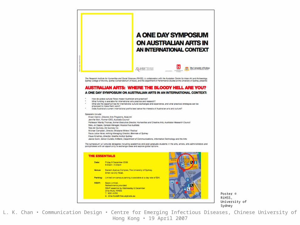
Poster © RiHSS, University of Sydney
L. K. Chan • Communication Design • Centre for Emerging Infectious Diseases, Chinese University of Hong Kong • 19 April 2007
Poster © Sungkyunkwan University, Seoul, Korea and Korean Society of Mechanical Engineering.
L. K. Chan • Communication Design • Centre for Emerging Infectious Diseases, Chinese University of Hong Kong • 19 April 2007
Poster © Melbourne Museum

L. K. Chan • Communication Design • Centre for Emerging Infectious Diseases, Chinese University of Hong Kong • 19 April 2007
Flyer © Graduate Research School, UNSW

L. K. Chan • Communication Design • Centre for Emerging Infectious Diseases, Chinese University of Hong Kong • 19 April 2007
Flyer © Graduate Research School, UNSW
L. K. Chan • Communication Design • Centre for Emerging Infectious Diseases, Chinese University of Hong Kong • 19 April 2007
Announcement © connectED 2007: International Conference on Design Education, UNSW

L. K. Chan • Communication Design • Centre for Emerging Infectious Diseases, Chinese University of Hong Kong • 19 April 2007
Poster © London College of Communication

L. K. Chan • Communication Design • Centre for Emerging Infectious Diseases, Chinese University of Hong Kong • 19 April 2007
Invitation © Blender Gallery, Sydney
L. K. Chan • Communication Design • Centre for Emerging Infectious Diseases, Chinese University of Hong Kong • 19 April 2007
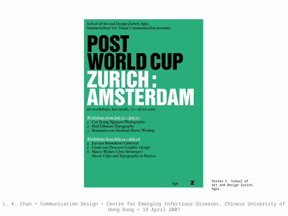
Poster © School of Art and Design Zurich, hgkz.
L. K. Chan • Communication Design • Centre for Emerging Infectious Diseases, Chinese University of Hong Kong • 19 April 2007
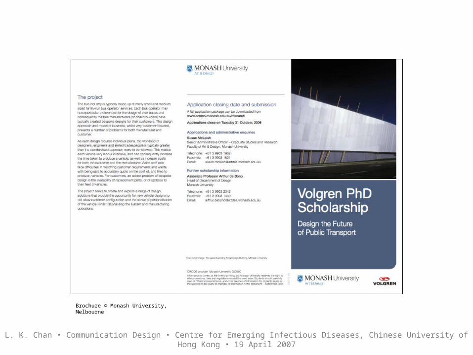
Brochure © Monash University, Melbourne

Thank you.


![Greyhound Racing in New South Wales Report (Final) · Greyhound racing in New South Wales / Legislative Council, Select Committee on Greyhound Racing in New South Wales [Sydney, N.S.W.]](https://img.pdfslide.us/doc/110x75/60015053a174b7080373b52d/greyhound-racing-in-new-south-wales-report-final-greyhound-racing-in-new-south.jpg)