Embed Size (px)
Citation preview
CO-084
COLOURS HARMONY IN CARTOGRAPHY
CHRISTOPHE S.(1), ZANIN C.(2), ROUSSAFFA H.(3)
(1) COGIT Laboratory, SAINT-MANDÉ, FRANCE ; (2) Umr 8504 Géographie-cités, PARIS, FRANCE ;
(3) Université Paris Diderot Master Géographie et sciences des territoires- Carthagéo, UFR GHSS, PARIS, FRANCE
Quality of cartographic message depends on qualities of chosen data and symbols. During map design
process, symbol specification is often uncertain. Graphical signs choices may be unsuitable to tastes, needs
and context of use.
Colours use is of special relevance to environmental, topographic and thematic maps whose primary
purpose is to create a mental image of main characteristics conveyed by the map. Communication in
colour is more effective if the colours used are appropriate. Colours choices, as mistakes or
misunderstandings, are often highlighted: too many colours, colours un-adapted to user‟s data, too
meaningful colours, etc. involving disturbances when readers try to understand its cartographic message.
Visual variable colour is powerful, but users face difficulties when they have to use it. In particular,
colours combinations uses on map are not something easy to manage. This assessment leads us to the issue
of colours harmony. We assume that proposing colours harmony on a map facilitates its reading. But what
does mean colours harmony for a map?
This paper presents an explorative research work about colours harmony in cartography. First, we try to
specify why such a research work is essential in current semiotics thought. Then, we present our approach
and quantitative method, through a proposition of our definition and characterisation of colours harmony.
Finally, we present some examples of the evaluation of colours combinations and harmony on maps.
1. COLOURS HARMONY IN CARTOGRAPHY: AN ESSENTIAL ISSUE FOR GRAPHIC
SEMIOTICS Colours uses in cartography seem simple and precise. Printing in colours is not anymore dealing with high
cost or any delay. Various colours conversion sites generate colour schemes or harmonies . But
cartographers know that selecting effective colours for maps is still a challenge.
1.1 Colours issues
Colour is physiological sensation resulting from all radiations received by the eye when looking at an
object lit in solar light. We can define colour as a personal impression but it is difficult to measure it,
because variations in human perception are big, and it‟s quite impossible to make standard, objective
observations or develop standardized or quantitative rules for using colour (Zanin 2003). However, we can
make some general statements about the ways map users perceive colour, thus to develop better ways to
apply colour to symbol design and other design aspects of maps.
Purpose of Bertin‟s graphic semiotics (1967) is to establish visual variables and rules for correct visual
representation of qualitative or quantitative information. Graphic semiotics is widely used in cartography:
the complexity of designing map concerns the selection of visual variable which would be the most
appropriate to represent selective, associative, quantitative or hierarchal information.
The colour dimensions include hue, value and saturation. Hue can be defined like the various colours we
perceive e.g., red, blue, green, etc. (Figure 1.1). It is possible to create millions of hues by combining
various percentages of the primary hues and altering their value and saturation.
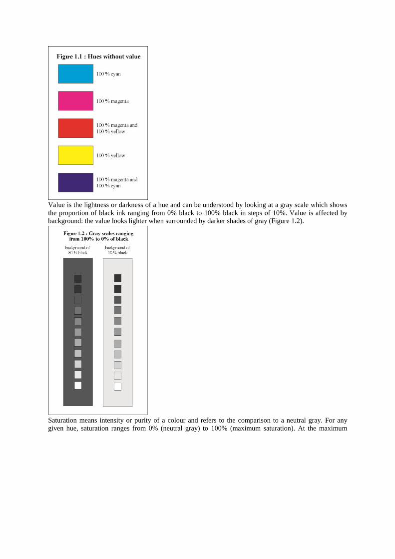
Value is the lightness or darkness of a hue and can be understood by looking at a gray scale which shows
the proportion of black ink ranging from 0% black to 100% black in steps of 10%. Value is affected by
background: the value looks lighter when surrounded by darker shades of gray (Figure 1.2).
Saturation means intensity or purity of a colour and refers to the comparison to a neutral gray. For any
given hue, saturation ranges from 0% (neutral gray) to 100% (maximum saturation). At the maximum
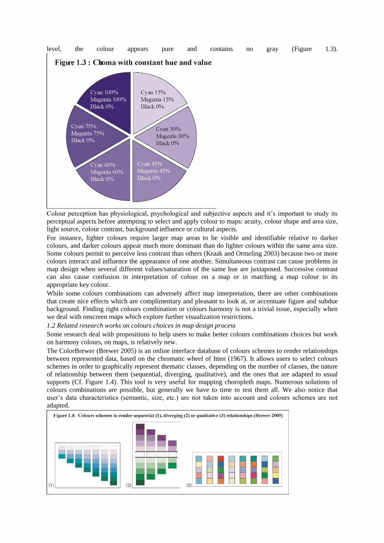
level, the colour appears pure and contains no gray (Figure 1.3).
Colour perception has physiological, psychological and subjective aspects and it‟s important to study its
perceptual aspects before attempting to select and apply colour to maps: acuity, colour shape and area size,
light source, colour contrast, background influence or cultural aspects.
For instance, lighter colours require larger map areas to be visible and identifiable relative to darker
colours, and darker colours appear much more dominant than do lighter colours within the same area size.
Some colours permit to perceive less contrast than others (Kraak and Ormeling 2003) because two or more
colours interact and influence the appearance of one another. Simultaneous contrast can cause problems in
map design when several different values/saturation of the same hue are juxtaposed. Successive contrast
can also cause confusion in interpretation of colour on a map or in matching a map colour to its
appropriate key colour.
While some colours combinations can adversely affect map interpretation, there are other combinations
that create nice effects which are complimentary and pleasant to look at, or accentuate figure and subdue
background. Finding right colours combination or colours harmony is not a trivial issue, especially when
we deal with onscreen maps which explore further visualization restrictions.
1.2 Related research works on colours choices in map design process
Some research deal with propositions to help users to make better colours combinations choices but work
on harmony colours, on maps, is relatively new.
The ColorBrewer (Brewer 2005) is an online interface database of colours schemes to render relationships
between represented data, based on the chromatic wheel of Itten (1967). It allows users to select colours
schemes in order to graphically represent thematic classes, depending on the number of classes, the nature
of relationship between them (sequential, diverging, qualitative), and the ones that are adapted to usual
supports (Cf. Figure 1.4). This tool is very useful for mapping choropleth maps. Numerous solutions of
colours combinations are possible, but generally we have to time to test them all. We also notice that
user‟s data characteristics (semantic, size, etc.) are not taken into account and colours schemes are not
adapted.
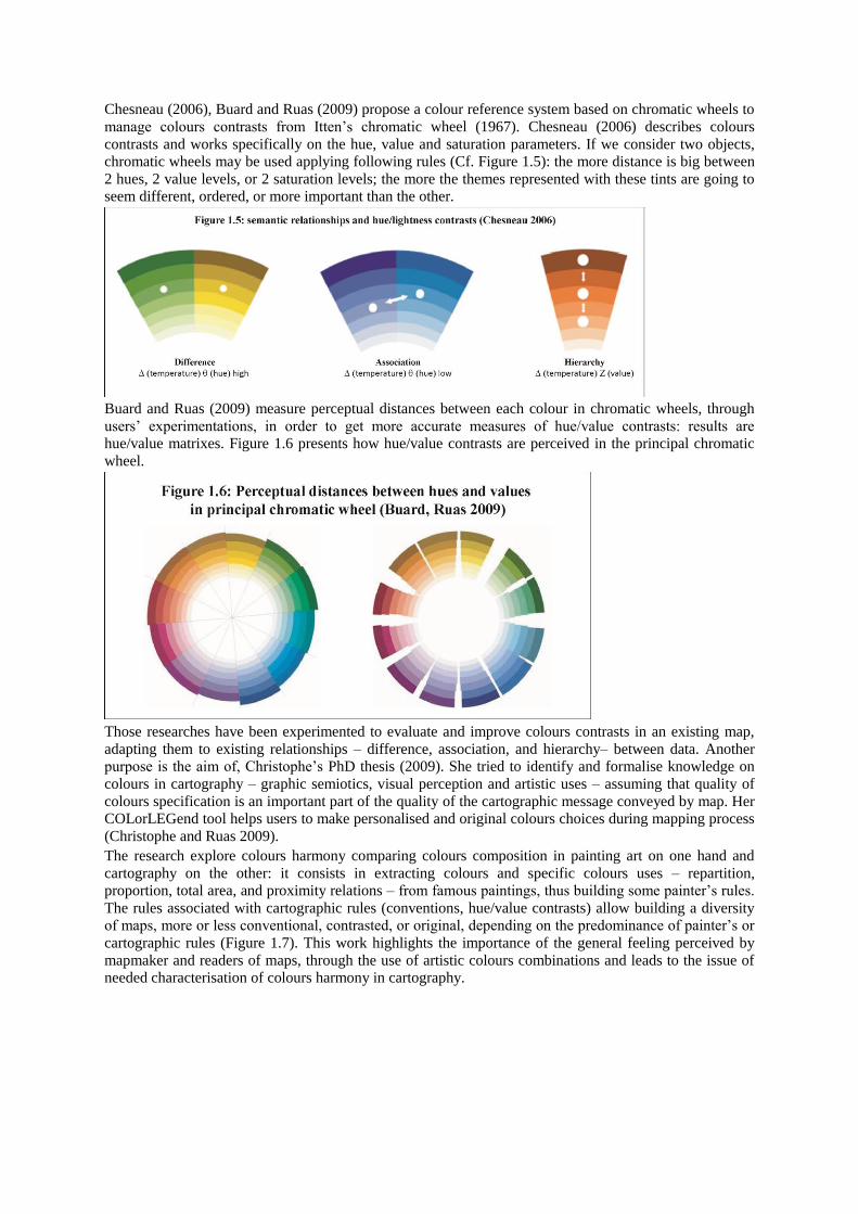
Chesneau (2006), Buard and Ruas (2009) propose a colour reference system based on chromatic wheels to
manage colours contrasts from Itten‟s chromatic wheel (1967). Chesneau (2006) describes colours
contrasts and works specifically on the hue, value and saturation parameters. If we consider two objects,
chromatic wheels may be used applying following rules (Cf. Figure 1.5): the more distance is big between
2 hues, 2 value levels, or 2 saturation levels; the more the themes represented with these tints are going to
seem different, ordered, or more important than the other.
Buard and Ruas (2009) measure perceptual distances between each colour in chromatic wheels, through
users‟ experimentations, in order to get more accurate measures of hue/value contrasts: results are
hue/value matrixes. Figure 1.6 presents how hue/value contrasts are perceived in the principal chromatic
wheel.
Those researches have been experimented to evaluate and improve colours contrasts in an existing map,
adapting them to existing relationships – difference, association, and hierarchy– between data. Another
purpose is the aim of, Christophe‟s PhD thesis (2009). She tried to identify and formalise knowledge on
colours in cartography – graphic semiotics, visual perception and artistic uses – assuming that quality of
colours specification is an important part of the quality of the cartographic message conveyed by map. Her
COLorLEGend tool helps users to make personalised and original colours choices during mapping process
(Christophe and Ruas 2009).
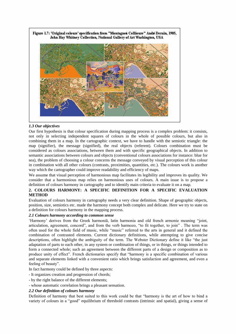
The research explore colours harmony comparing colours composition in painting art on one hand and
cartography on the other: it consists in extracting colours and specific colours uses – repartition,
proportion, total area, and proximity relations – from famous paintings, thus building some painter‟s rules.
The rules associated with cartographic rules (conventions, hue/value contrasts) allow building a diversity
of maps, more or less conventional, contrasted, or original, depending on the predominance of painter‟s or
cartographic rules (Figure 1.7). This work highlights the importance of the general feeling perceived by
mapmaker and readers of maps, through the use of artistic colours combinations and leads to the issue of
needed characterisation of colours harmony in cartography.
1.3 Our objectives
Our first hypothesis is that colour specification during mapping process is a complex problem: it consists,
not only in selecting independent squares of colours in the whole of possible colours, but also in
combining them in a map. In the cartographic context, we have to handle with the semiotic triangle: the
map (signifier), the message (signified), the real objects (referent). Colours combination must be
considered as colours associations, between them and with specific geographical objects. In addition to
semantic associations between colours and objects (conventional colours associations for instance: blue for
sea), the problem of choosing a colour concerns the message conveyed by visual perception of this colour
in combination with all other colours (contrasts, proximities, quantities, etc.). The colours work is another
way which the cartographer could improve readability and efficiency of maps.
We assume that visual perception of harmonious map facilitates its legibility and improves its quality. We
consider that a harmonious map relies on harmonious uses of colours. A main issue is to propose a
definition of colours harmony in cartography and to identify main criteria to evaluate it on a map.
2. COLOURS HARMONY: A SPECIFIC DEFINITION FOR A SPECIFIC EVALUATION
METHOD Evaluation of colours harmony in cartography needs a very clear definition. Shape of geographic objects,
position, size, semiotics etc. made the harmony concept both complex and delicate. Here we try to state on
a definition for colours harmony in the mapping process.
2.1 Colours harmony according to common sense
„Harmony‟ derives from the Greek harmoniā, latin harmonia and old french armonie meaning “joint,
articulation, agreement, concord”, and from the verb harmozo, “to fit together, to join” . The term was
often used for the whole field of music, while “music” referred to the arts in general and it defined the
combination of contrasted elements. Current dictionary definitions, while attempting to give concise
descriptions, often highlight the ambiguity of the term. The Webster Dictionary define it like “the just
adaptation of parts to each other, in any system or combination of things, or in things, or things intended to
form a connected whole; such an agreement between the different parts of a design or composition as to
produce unity of effect”. French dictionaries specify that “harmony is a specific combination of various
and separate elements linked with a convenient ratio which brings satisfaction and agreement, and even a
feeling of beauty”.
In fact harmony could be defined by three aspects:
- It organizes creation and progression of chords;
- by the right balance of the different elements;
- whose automatic correlation brings a pleasant sensation.
2.2 Our definition of colours harmony
Definition of harmony that best suited to this work could be that “harmony is the art of how to bind a
variety of colours in a “good” equilibrium of threshold contrasts (intrinsic and spatial), giving a sense of

understanding particularly subjective” (Roussaffa 2009). Applied to cartography, this definition brings us
to chromatic scales, creation and progression of chords.
A colour palette may be a monochrome or a colour combination associating different or opposite colours,
and it‟s always nicer to do it with colours of the same „harmony‟ dealing with a nice equilibrium in colours
areas, colours energy or light degrees (Sutter 1858). So, colours characteristics may be perceived well
balanced or not. Some intrinsic colour‟s contrasts may then interfere like hue and value, colour
temperature or complementary colours.
These aspects are enforced by a series of principles:
- The link between elements allows to show diverse elements which articulate with others in a composition
forming a whole.
- Unity of opposite: connection of two opposites set in a harmonious system (eg, black and white).
- The measure: colours must be measure in a scale of human capacity perception.
- The equilibrium: harmony is balance and symmetry. We can reach the balance thanks to the creation of a
proportion system allowing quantifying elements, i.e. contrasts.
- The simplicity is neatness and brightness participating in well comprehension of the message.
- The aesthetics: Harmony is all relative and subjective.
- The rationality: relations between tones, colours brightness or saturations in a set are subordinated to the
formal logic of contrast and balance, but also to the logic of contents and function.
- The order: The reading of the map is simplified thanks to correct graphic semiotics; it‟s especially true
since the message is organized by some harmony (to avoid the important contrasts which take aback the
reader without reason).
A map is harmonious if it can associate all these principles and if semiotics and conventional rules are
used in proper way, but not only. Its main objective is to associate or opposite elements between them. Our
objective is to propose some criteria for a measure of colours harmony. These criteria lead on the idea of
linkage between colours, bringing to colours cohesion of the user, and the balance between these colours,
bringing contrasts quality.
2.3 Our method
To propose criteria to measure harmony level out of a set of colours chosen by a user, we need to measure
colours harmony of a map through 2 concepts: linkage of colours (highlighting distances between them),
and balance between colours (highlighting quality of contrasts). Therefore, we propose to build groups of
closed colours that we call chromatic families: such a system allows characterising linkage and balance
and thus harmony, through distances measures.
An Ascending Hierarchical Clustering (AHC) was applied on both hue and value matrixes of Buard and
Ruas (2009), gathering all measures of perceptual distances respectively between hues and between values
. Two criteria are necessary for the classification, the criterion of distance (Euclidean distance) and the
criterion of aggregation (criterion of Ward).
The AHC realised on the hue matrix lead to thirteen hues clusters. A second one is applied on the value
matrix and five value clusters are obtained. Inside the thirteen classes of hues, colours are grouped together
according to classes of value: we define a chromatic family as a set of colours to which hues are very close
and the value vary according to five levels (very clear, clear, average, dark and very dark). Thirteen
chromatic families are thus created. Figure 2.1 presents them: grey-blue (1), blue-purple (2), cyan (3),
yellow-orange (4), brown-ochre (5), orange-ochre (6), grey-mole (7), green (8), magenta (9), purple (10),
black (11), white (12), grey (13). These families are not homogeneous in terms of resemblance between
families and between colours.
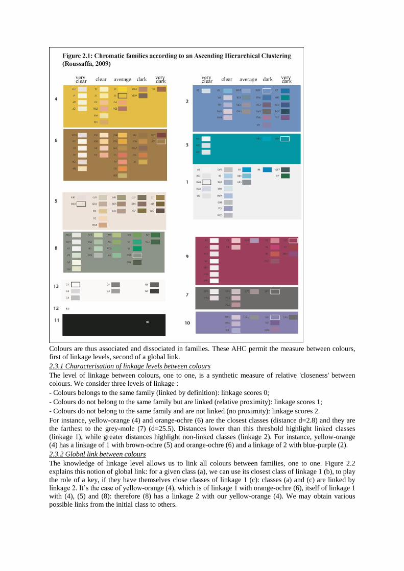
Colours are thus associated and dissociated in families. These AHC permit the measure between colours,
first of linkage levels, second of a global link.
2.3.1 Characterisation of linkage levels between colours
The level of linkage between colours, one to one, is a synthetic measure of relative 'closeness' between
colours. We consider three levels of linkage :
- Colours belongs to the same family (linked by definition): linkage scores 0;
- Colours do not belong to the same family but are linked (relative proximity): linkage scores 1;
- Colours do not belong to the same family and are not linked (no proximity): linkage scores 2.
For instance, yellow-orange (4) and orange-ochre (6) are the closest classes (distance d=2.8) and they are
the farthest to the grey-mole (7) (d=25.5). Distances lower than this threshold highlight linked classes
(linkage 1), while greater distances highlight non-linked classes (linkage 2). For instance, yellow-orange
(4) has a linkage of 1 with brown-ochre (5) and orange-ochre (6) and a linkage of 2 with blue-purple (2).
2.3.2 Global link between colours
The knowledge of linkage level allows us to link all colours between families, one to one. Figure 2.2
explains this notion of global link: for a given class (a), we can use its closest class of linkage 1 (b), to play
the role of a key, if they have themselves close classes of linkage 1 (c): classes (a) and (c) are linked by
linkage 2. It‟s the case of yellow-orange (4), which is of linkage 1 with orange-ochre (6), itself of linkage 1
with (4), (5) and (8): therefore (8) has a linkage 2 with our yellow-orange (4). We may obtain various
possible links from the initial class to others.

We thus rely on key classes to ensure cohesion of colours: a global link and a related distance between
colour hue classes and colour value classes may be obtained. With these chromatic families, we have now
thresholds to manage hue and value contrasts, but also temperature contrasts. These contrasts can be
included in what we call intrinsic contrasts between colours.
3. QUANTITATIVE EVALUATION OF COLOURS HARMONY IN CARTOGRAPHY From classification explained in previous section, three criteria to evaluate a user‟s colours combination
are highlighted in the following paragraphs. Evaluations of those criteria allow us to a final score of
harmony. We give examples of how each criterion can be evaluated and finally how harmony score can be
given to a user‟s map, through their colours choices.
3.1 Criteria to evaluate user’s colours
We define the three following criteria to evaluate a user‟s colours combination:
- The level of linkage between colours;
- The balance between colours;
- The balance of the relation between intrinsic and spatial contrasts.
3.1.1 Criterion 1: level of linkage between colours
With the help of the chromatic families, we are able to analyse a set of colours chosen by a user in:
- Associating each colour to its related chromatic family;
- Assessing colours distances;
- Qualifying their level of linkage.
For a given colours combination, we may find that no linkage exists between a couple of hues or a couple
of values: a key colour is missing. In such a case, we cannot say that this colours combination is linked.
We decide to attribute two kinds of score:
- If all hues are linked, we give a hue score of 1.
- If all values are linked, we give a value score of 1.
Linkage score of a colours combination is sums of the hue and value scores, thus is 0 to 2.
3.1.2 Criterion 2: the balance between colours
The balance may be characterised by certain diversity between user‟s colours: it consists in verifying that
colour hues and colours value are sufficiently contrasted.
A hypothesis to compute the balance for a given colours combination is that this combination is linked,
thus the previous score of linkage is 2. For instance :
- If hues/values are of linkage 0, it means that all hues/values are in same families: we consider they are
not balanced and we give a score of 0.
- If hues are of linkage 0 and values of linkage 1 and 2, it means that colours from a same hue class are
value shaded: we consider there is a balance in value and we give a score of 1.
- If hues are of linkage 1 or 2 and values of linkage 0, it means that colours from a same value class are
hue shaded: we consider there is a balance in hue and we give a score of 1.
3.1.3 Criterion 3: the balance of the relation between intrinsic and spatial contrasts
Perception of a colours combination as squares of colours and perception of the same colours combination
applied to data, thus to cartographic objects, may be totally different: other visual variables play a role in
colours perception, and thus in colours harmony. Therefore, we propose to analyse contrasts of colours
quantity in a map.
We assume that colour harmony depends on a relation between intrinsic contrasts (hue, value, etc.) and spatial contrasts (shape, size, proximity, distribution, etc.). Nevertheless it‟s difficult to establish the type
or even the degree of relation who could exist between these two contrasts. From Itten„s (1967) work, we

consider that the modification of area ratio between colours is function of the level of hue and value
contrasts: Figure 3.1 shows this effect: the increase of the value contrast involves the perception of an
increase of the area ratio.
We thus propose a simple measure of this relation, between contrasts of hue and value (for the intrinsic
contrasts) and surface (for the spatial contrast): more the area size ratio is strong between two objects,
more hue or value contrast must be strong to bring some balance on the dominant colour. From (Chesneau
2006)‟s work, we consider three thresholds for area ratio:
- Balanced ratio is 1 to 4;
- Moderately balanced ratio is 4 to 16;
- Not balanced ratio: area ratio is superior to 16.
To evaluate the area/contrast relation, on a map, we need to consider the largest object (the dominant
colour), and we focus on two parameters: area ratio and contrast level, for each ratio.
3.2 Examples of colours harmony characterization
Based on evaluations of previous section, a score for harmony level of a map can be built, in summing all
scores of the three criteria.
3.2.1 Evaluation of linkage and balance of colours combinations
Figure 3.2 shows some examples of coloured combinations chosen by user, and whose criteria of linkage
(C1) and balance (C2) have been evaluated:
- (1) Hues/values are not linked (C1=0).
- (2) Values are linked, but not hues (C1=1).
- (3) Hues/Values are linked (C1=2), well contrasted:
- (3a)this blue shade provides diversity between different values but is low hue diversified: the
combination is balanced (C2=1).
- (3b)this hue variation provides diversity between different hues but is low value diversified: the
combination is balanced (C2=1).
- (4) Hues/values are linked (C1=2) and balanced (C2=1): we notice a great diversity both in hue and
value.
(4a) and (4b) are the same colours combination but presented in different orders: we highlight that the
perception of the same colours combination is different between both presentations, just because of the
choice of ordering and proximities between colours.
3.2.2 Evaluation of the balance of the relation area/colours (C3)
Once colours combination has been considered as linked and balanced, thus harmonious, the question is
the following: are the map(s) rendered by this colours combination harmonious?
For this evaluation, we use the colours combination presented above (4a/4b). The application of this
combination to user‟s dataset, i.e. the use of these colours to render user‟s objects, is presented Figure 3.3.
On top map, darkest blue colour is used to render the sea, while it‟s used to render the cemetery on the
bottom map; on the top map, brown colour is used to render background while it‟s used to render buildings
on bottom map, etc. Two different maps are thus obtained, given clearly different colours perceptions.
To evaluate the balance of the relation between contrasts, we have to first compute total areas occupied by
each cartographic object and the total area on map. The user‟s dataset has five types of objects: wooded
area, cemetery, sea, building and background (Cf. Figure 3.3). We compute the area ratio between each
represented type, considering only the area ratio referring to dominant area, i.e. the background area. We
also compute number of objects, and their density. Building, wooded area and sea have similar total areas :
their area ratios are balanced. Roads are more difficult to analyse: we consider network length and
thickness and decide to manage them as buildings, because of their similar type of spatial distribution
(little objects, high density).
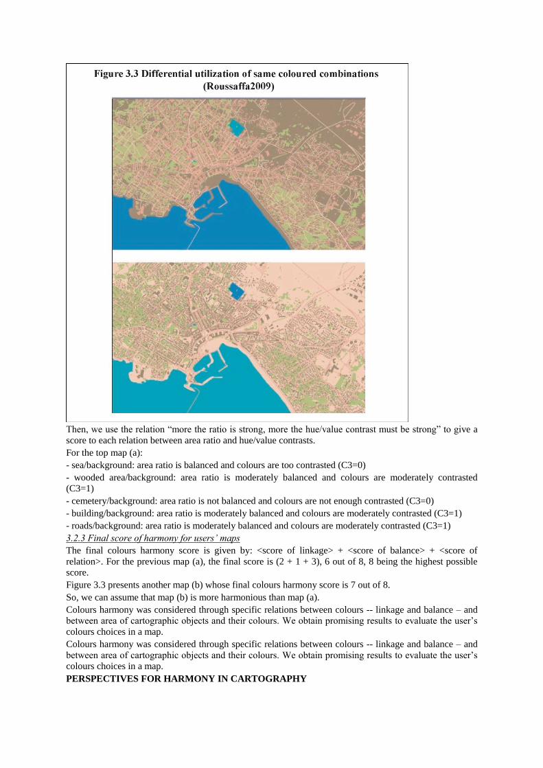
Then, we use the relation “more the ratio is strong, more the hue/value contrast must be strong” to give a
score to each relation between area ratio and hue/value contrasts.
For the top map (a):
- sea/background: area ratio is balanced and colours are too contrasted (C3=0)
- wooded area/background: area ratio is moderately balanced and colours are moderately contrasted
(C3=1)
- cemetery/background: area ratio is not balanced and colours are not enough contrasted (C3=0)
- building/background: area ratio is moderately balanced and colours are moderately contrasted (C3=1)
- roads/background: area ratio is moderately balanced and colours are moderately contrasted (C3=1)
3.2.3 Final score of harmony for users’ maps
The final colours harmony score is given by: <score of linkage> + <score of balance> + <score of
relation>. For the previous map (a), the final score is (2 + 1 + 3), 6 out of 8, 8 being the highest possible
score.
Figure 3.3 presents another map (b) whose final colours harmony score is 7 out of 8.
So, we can assume that map (b) is more harmonious than map (a).
Colours harmony was considered through specific relations between colours -- linkage and balance – and
between area of cartographic objects and their colours. We obtain promising results to evaluate the user‟s
colours choices in a map.
Colours harmony was considered through specific relations between colours -- linkage and balance – and
between area of cartographic objects and their colours. We obtain promising results to evaluate the user‟s
colours choices in a map.
PERSPECTIVES FOR HARMONY IN CARTOGRAPHY
Finding harmony in colours may be defined as a visually pleasant arrangement of colours and can simply
be achieved by the use of complementary, analogous or monochromatic colours. In the map design reality,
colours harmony is a complex and ambivalent challenge. Harmony could be defined more like a special
way to mix colours but in a linked and balanced contrast in chromatic scales and map surfaces. Instead of working on delicate qualitative aspects, we proposed quantitative method to define and
characterise colours harmony. We demonstrate that dealing with harmony consists in trying to find “good”
contrasts equilibrium. In maps, colours harmony depends on intrinsic colours contrasts and spatial
contrasts. We assume that we can link area (for the spatial contrast), and hue and value contrasts (for
intrinsic contrast): more the factor of size is high between two objects, more the hue and value contrasts
should be high to balance the dominance proportion.
We thus proposed criteria to intrinsically and spatially evaluate users‟ colours combinations, and a score of
colours harmony for user‟s maps. First results are encouraging. Experimental users‟ tests to validate those
criteria and harmony scores have been driven and are under analysis. Further characterisation is in
progress. In particular, the best way to use a colours combination is still in question: is it possible to plan a
combination colours in order to have a better final score of colours harmony?
REFERENCES
Bertin, J. 1967. Sémiologie Graphique, Paris, Mouton.
Brewer, C. 2005. Designing better maps: A Guide for GIS Users. ESRI Press, Redlands CA, 203 pp.
Buard, E., Ruas, A. 2009. Processes for improving the colours of topographic maps in the the context of
maps on demand, In proceedings of the XXIVe International Cartographic Conference (ICC’09), Santiago
de Chile, 15th - 21st November 2009.
Chesneau, E. 2006. Modèle d'amélioration automatique des contrastes de couleurs en cartographie - Application aux cartes de risque, PhD Thesis, Marne La Vallée University.
Christophe S. 2009. Aide à la conception de légendes personnalisées et originales : proposition d’une méthode coopérative pour le choix des couleurs, PhD Thesis, Paris-Est University.
Christophe S., Ruas A. 2009. A process to design creative legend on-demand. In proceedings of the XXIVe
International Cartographic Conference (ICC’09), Santiago de Chile, 15th - 21st November 2009.
Itten, J. 1967. Art de la couleur. Original edition in 1961: Kunst der Farbe. Eds Dessain and Tobra.
Kraak, M-J., Ormeling, F. 2003. Cartography. Visualization of Geospatial Data. Second edition 1996:
Pearson Education Limited.
Roussaffa, H., Zanin C. (dir.), Christophe S. (dir). 2009. Caractérisation de l‟harmonie des couleurs dans
une carte. Mémoire de M1 de Géographie et Sciences des territoires . Université Paris Diderot Paris 7, 114
p.
Sutter D. 1858. Philosophie des beaux-arts appliquée à la peinture. Jules Tardieu Libraire-éditeur, Havard
University Library, 352 p.
Sutton T., Whelan B. 2004. The complete color harmony: expert color information for professional color
results, Rockport, 218 p.
Zanin C., Tremelo M.L. 2003. Savoir faire une carte. Aide à la conception et à la réalisation d’une carte thématique univariée. Belin, 197 p.