Embed Size (px)
Citation preview

COLOURFUTURESTM 2020INTERNATIONAL COLOUR TRENDS
This ColourFuturesTM reference manual is and remains the property of AkzoNobel N.V. and is loaned on condition that it is used solely to specify products manufactured/or supplied by AkzoNobel N.V. (and other companies in the AkzoNobel Group) and on condition that it shall be returned to AkzoNobel N.V. on demand. The contents of this reference manual are for information only. No representation or warranty is given, nor liability accepted, regarding the information given. We have reproduced paint colours as faithfully as printing will allow. However, the shape, size and lighting of a surface can influence the appearance of the final colour.AkzoNobel, the AkzoNobel logo, the flourish, Dulux Trade, and ColourFutures are the trade marks of the AkzoNobel group©. AkzoNobel 2019
AkzoNobel Decorative PaintsWexham Road, Slough, Berkshire SL2 5DS
2 3
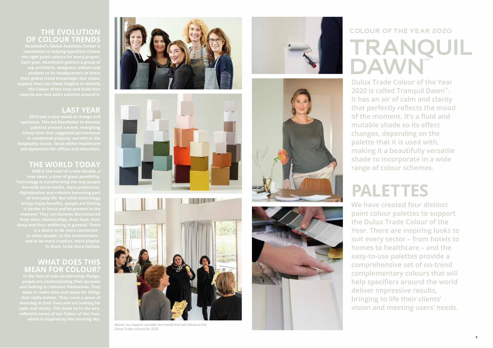
Dulux Trade Colour of the Year 2020 is called Tranquil DawnTM. It has an air of calm and clarity that perfectly reflects the mood of the moment. It’s a fluid and mutable shade so its effect changes, depending on the palette that it is used with, making it a beautifully versatile shade to incorporate in a wide range of colour schemes.
PALETTESWe have created four distinct paint colour palettes to support the Dulux Trade Colour of the Year. There are inspiring looks to suit every sector – from hotels to homes to healthcare – and the easy-to-use palettes provide a comprehensive set of on-trend complementary colours that will help specifiers around the world deliver impressive results, bringing to life their clients’ vision and meeting users’ needs.
COLOUR OF THE YEAR 2020
TRANQUILDAWN
THE EVOLUTION OF COLOUR TRENDS
AkzoNobel’s Global Aesthetic Center is committed to helping specifiers choose
the right paint colours for every project. Each year, AkzoNobel gathers a group of
top architects, designers, editors and analysts to its headquarters to share
their global trend knowledge. Our colour experts then use these insights to identify
the Colour of the Year and build four easy-to-use new paint palettes around it.
LAST YEAR2019 saw a new mood of change and
optimism. This led AkzoNobel to develop palettes around a warm, energising
honey tone that suggested permanence in residential projects, warmth in the
hospitality sector, focus within healthcare and dynamism for offices and education.
THE WORLD TODAY2020 is the start of a new decade, a
new dawn; a time of great possibility. Technology is transforming the way people
live with social media, mass production, digitalisation and robotics becoming part
of everyday life. But while technology brings many benefits, people are finding
it harder to focus and be present in the moment. They can become disconnected from their relationships, their food, their
sleep and their wellbeing in general. There is a desire to be more connected –
to other people, to the environment – and to be more creative, more playful.
In short, to be more human.
WHAT DOES THIS MEAN FOR COLOUR?In the face of ever-accelerating change,
people are contemplating their purpose and looking to reinvent themselves. They
want to make time and space for things that really matter. They crave a sense of
meaning in their lives and are looking for calm and clarity. This leads us to the airy, reflective tones of our Colour of the Year,
which is inspired by the morning sky.Above: our experts consider the trends that will influence the Dulux Trade colours for 2020
TM
4 5
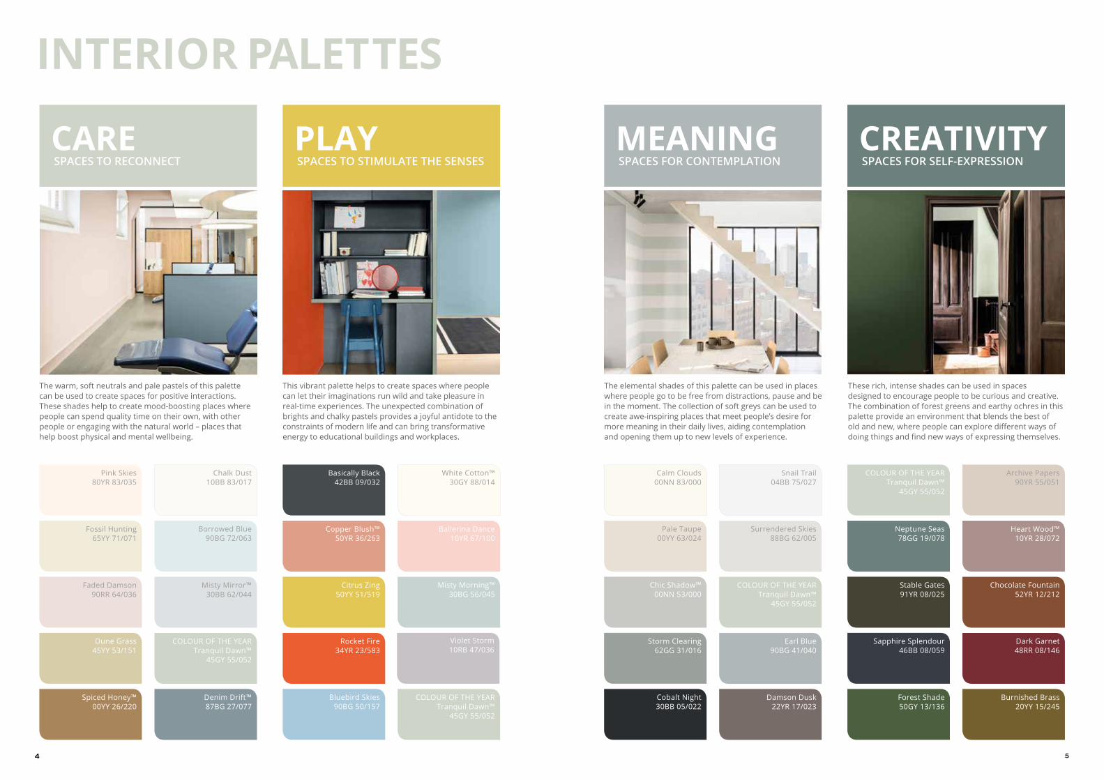
CARE SPACES TO RECONNECT
Denim Drift™87BG 27/077
Pink Skies80YR 83/035
Chalk Dust10BB 83/017
Borrowed Blue90BG 72/063
Dune Grass45YY 53/151
Faded Damson90RR 64/036
Spiced Honey™00YY 26/220
Fossil Hunting65YY 71/071
Misty Mirror™30BB 62/044
COLOUR OF THE YEARTranquil Dawn™
45GY 55/052
The warm, soft neutrals and pale pastels of this palette can be used to create spaces for positive interactions. These shades help to create mood-boosting places where people can spend quality time on their own, with other people or engaging with the natural world – places that help boost physical and mental wellbeing.
MEANING SPACES FOR CONTEMPLATION
Earl Blue90BG 41/040
Pale Taupe00YY 63/024
Calm Clouds00NN 83/000
Cobalt Night30BB 05/022
Surrendered Skies88BG 62/005
Damson Dusk22YR 17/023
COLOUR OF THE YEARTranquil Dawn™
45GY 55/052
Snail Trail04BB 75/027
Chic Shadow™00NN 53/000
Storm Clearing62GG 31/016
The elemental shades of this palette can be used in places where people go to be free from distractions, pause and be in the moment. The collection of soft greys can be used to create awe-inspiring places that meet people’s desire for more meaning in their daily lives, aiding contemplation and opening them up to new levels of experience.
CREATIVITY SPACES FOR SELF-EXPRESSION
Chocolate Fountain52YR 12/212
Forest Shade50GY 13/136
Archive Papers90YR 55/051
COLOUR OF THE YEARTranquil Dawn™
45GY 55/052
Neptune Seas78GG 19/078
Dark Garnet48RR 08/146
Stable Gates91YR 08/025
Burnished Brass20YY 15/245
Sapphire Splendour46BB 08/059
Heart Wood™10YR 28/072
These rich, intense shades can be used in spaces designed to encourage people to be curious and creative. The combination of forest greens and earthy ochres in this palette provide an environment that blends the best of old and new, where people can explore different ways of doing things and find new ways of expressing themselves.
PLAY SPACES TO STIMULATE THE SENSES
COLOUR OF THE YEARTranquil Dawn™
45GY 55/052
Basically Black42BB 09/032
Bluebird Skies90BG 50/157
Rocket Fire34YR 23/583
White Cotton™30GY 88/014
Misty Morning™30BG 56/045
Citrus Zing50YY 51/519
Copper Blush™50YR 36/263
Ballerina Dance10YR 67/100
Violet Storm10RB 47/036
INTERIOR PALETTES
This vibrant palette helps to create spaces where people can let their imaginations run wild and take pleasure in real-time experiences. The unexpected combination of brights and chalky pastels provides a joyful antidote to the constraints of modern life and can bring transformative energy to educational buildings and workplaces.
6 7
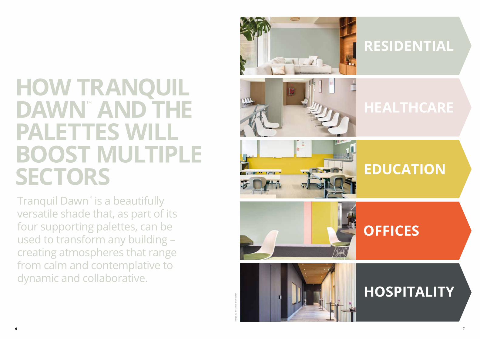
RESIDENTIAL
HEALTHCARE
EDUCATION
OFFICES
HOSPITALITY
HOW TRANQUIL DAWNTM AND THE PALETTES WILL BOOST MULTIPLE SECTORSTranquil DawnTM is a beautifully versatile shade that, as part of its four supporting palettes, can be used to transform any building – creating atmospheres that range from calm and contemplative to dynamic and collaborative.
Imag
e by
mec
anoo
arc
hite
cten

8 9
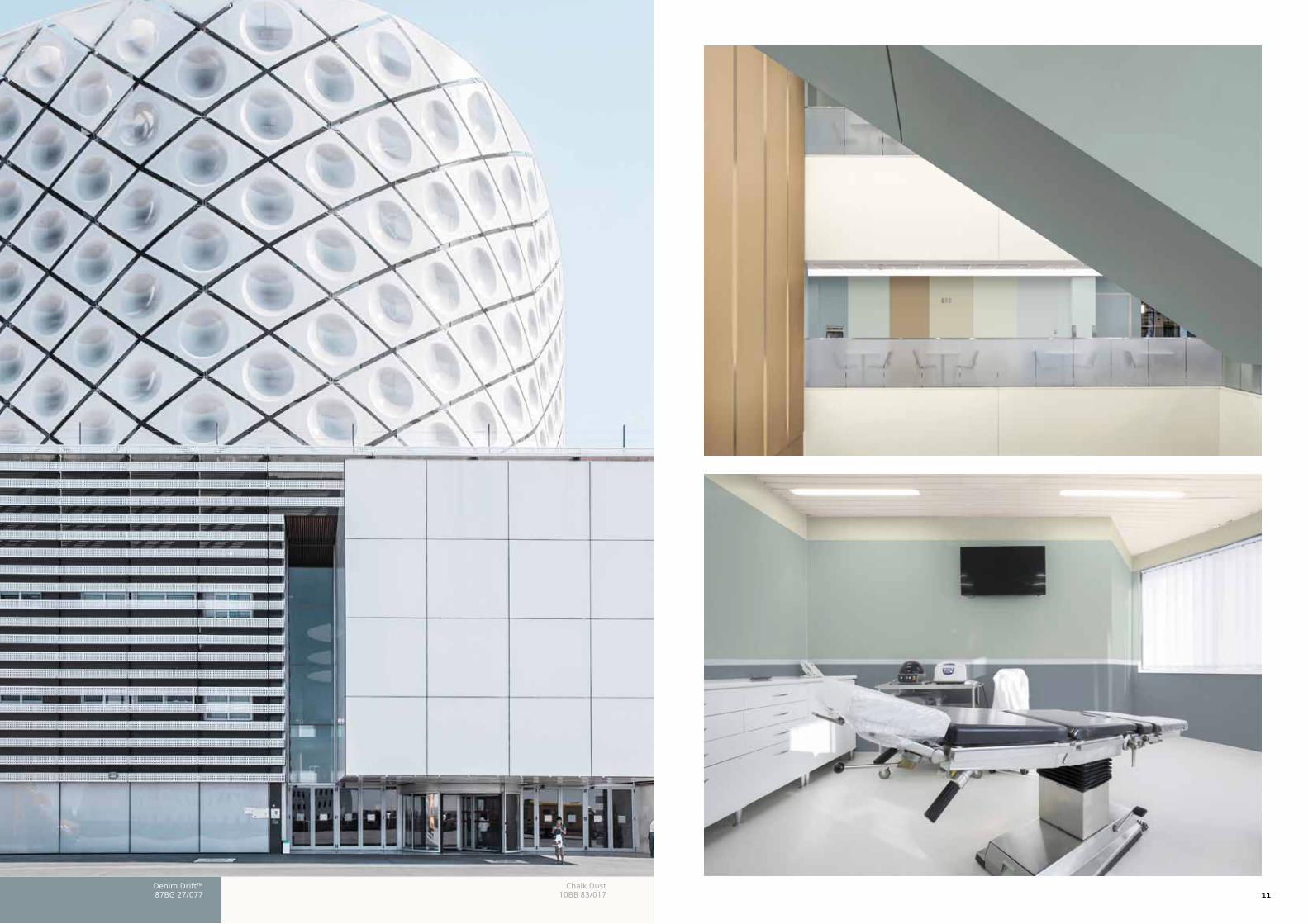
SPACES TO RECONNECT The soft blue and grey shades create a calming and restorative atmosphere, while the richer tones are suggestive of the natural world, evoking a sense of balance in spaces such as healthcare where the emphasis is on recuperation and wellbeing.
THE RESULT: This palette encourages compassion and calm, boosting human interaction and improving working relationships.
Denim Drift™87BG 27/077
Misty Mirror™30BB 62/044
Tranquil Dawn™45GY 55/052
CAREThis palette of gentle neutrals and pale pastels, framed by clean lines and pale woods help to create a reassuring and nurturing environment.
10 11Denim Drift™87BG 27/077
Chalk Dust10BB 83/017

1312Dune Grass
45YY 53/151Pink Skies
80YR 83/035Spiced
Honey™00YY 26/220
Tranquil Dawn™45GY 55/052
15
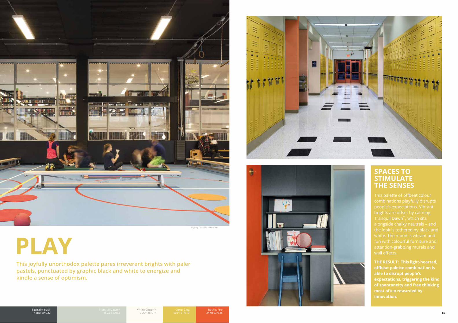
PLAYThis joyfully unorthodox palette pares irreverent brights with paler pastels, punctuated by graphic black and white to energize and kindle a sense of optimism.
Basically Black42BB 09/032
Tranquil Dawn™45GY 55/052
Citrus Zing50YY 51/519
Rocket Fire34YR 23/538
Image by Mecanoo architecten
White Cotton™30GY 88/014
SPACES TO STIMULATE THE SENSES This palette of offbeat colour combinations playfully disrupts people’s expectations. Vibrant brights are offset by calming Tranquil DawnTM, which sits alongside chalky neutrals – and the look is tethered by black and white. The mood is vibrant and fun with colourful furniture and attention-grabbing murals and wall effects.
THE RESULT: This light-hearted, offbeat palette combination is able to disrupt people’s expectations, triggering the kind of spontaneity and free thinking most often rewarded by innovation.

16 17Citrus Zing
50YY 51/519Basically Black
42BB 09/032Rocket Fire
34YR 23/583Tranquil Dawn™
45GY 55/052
Nex
t Arc
hite
cts
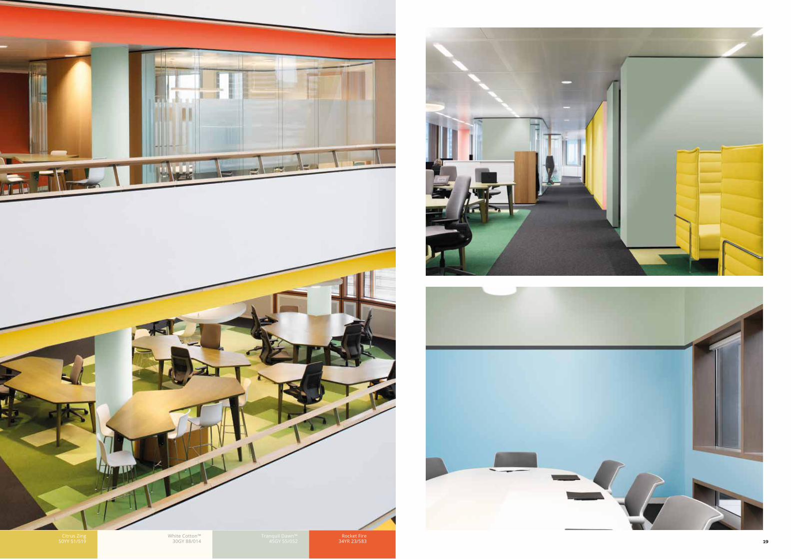
18 19White Cotton™
30GY 88/014Citrus Zing
50YY 51/519Tranquil Dawn™
45GY 55/052Rocket Fire
34YR 23/583
21
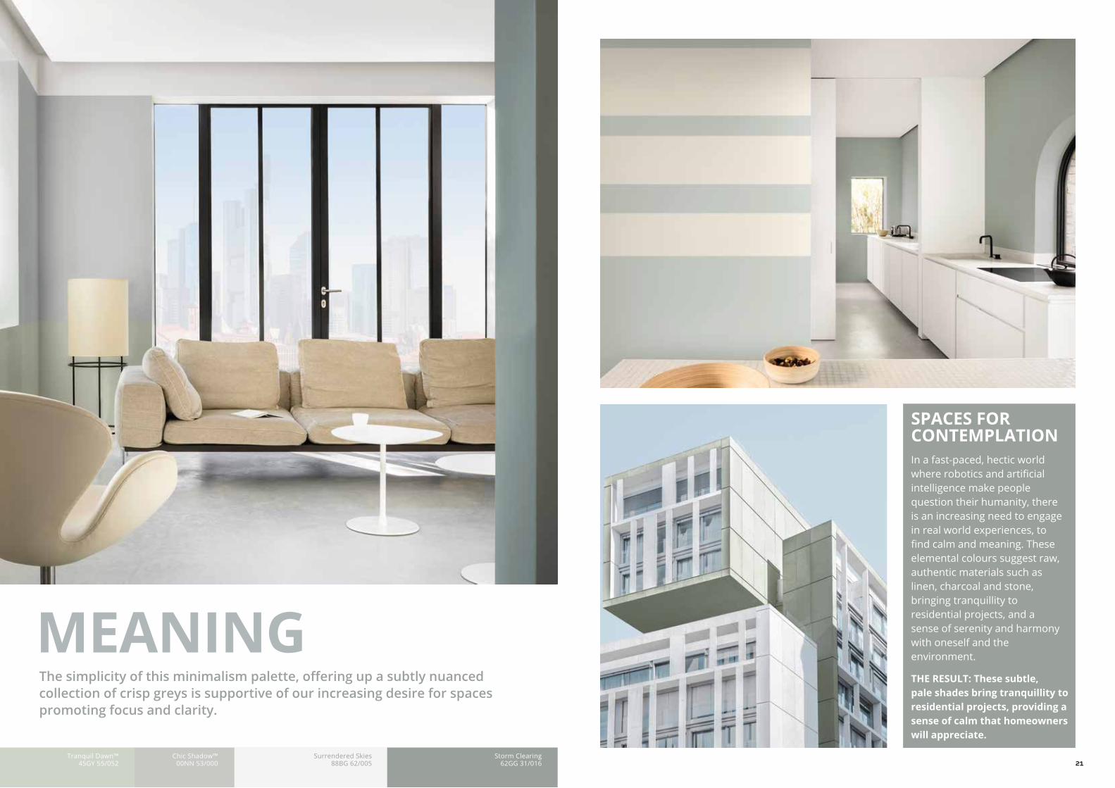
SPACES FOR CONTEMPLATIONIn a fast-paced, hectic world where robotics and artificial intelligence make people question their humanity, there is an increasing need to engage in real world experiences, to find calm and meaning. These elemental colours suggest raw, authentic materials such as linen, charcoal and stone, bringing tranquillity to residential projects, and a sense of serenity and harmony with oneself and the environment.
THE RESULT: These subtle, pale shades bring tranquillity to residential projects, providing a sense of calm that homeowners will appreciate.
MEANINGThe simplicity of this minimalism palette, offering up a subtly nuanced collection of crisp greys is supportive of our increasing desire for spaces promoting focus and clarity.
Tranquil Dawn™45GY 55/052
Chic Shadow™00NN 53/000
Surrendered Skies88BG 62/005
Storm Clearing62GG 31/016

22 23Calm Clouds
00NN 83/000Tranquil Dawn™
45GY 55/052Cobalt Night30BB 05/022
25Tranquil Dawn™
45GY 55/052Tranquil Dawn™
45GY 55/052Neptune Seas78GG 19/078
Stable Gates 91YR 08/025
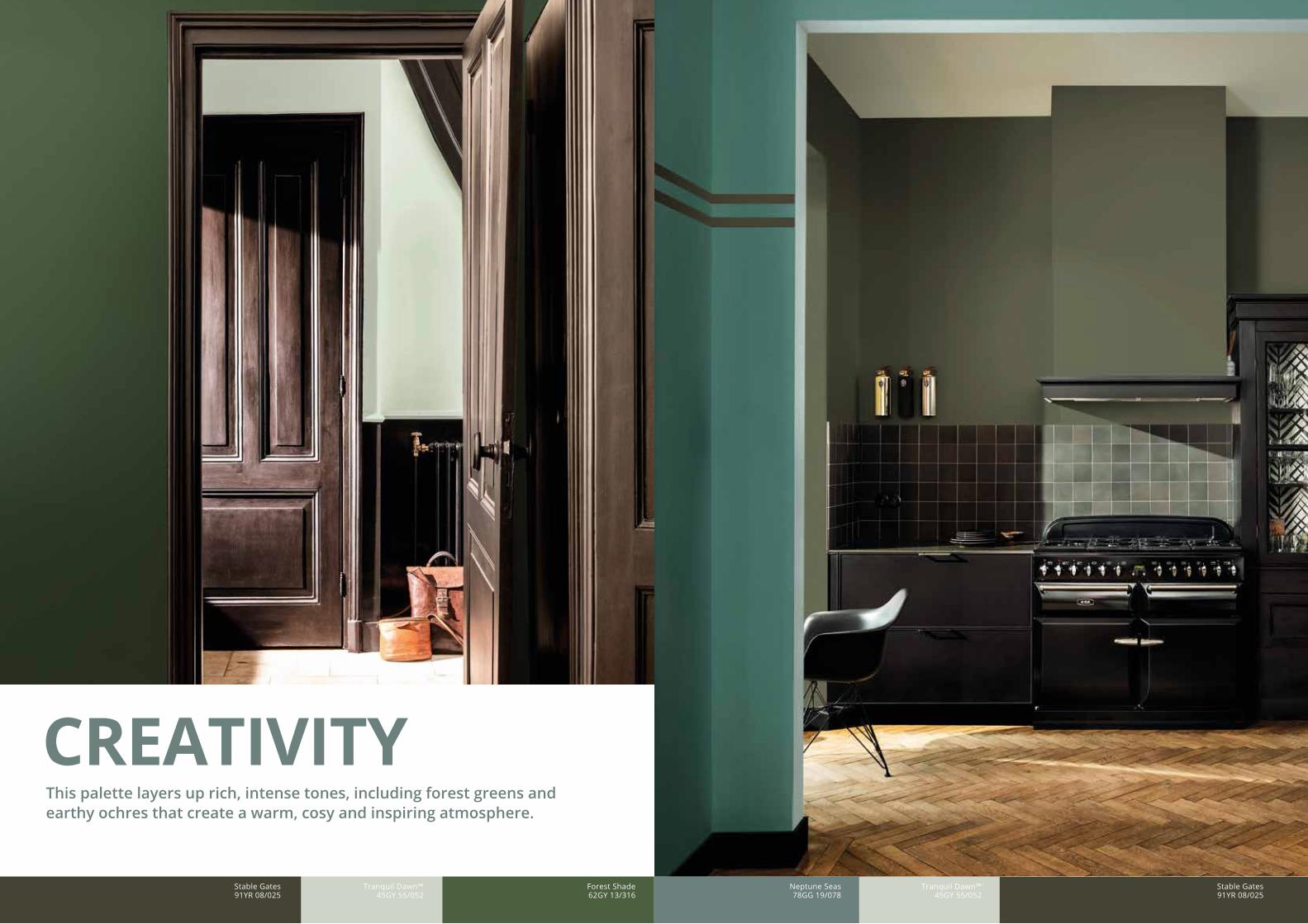
CREATIVITYThis palette layers up rich, intense tones, including forest greens and earthy ochres that create a warm, cosy and inspiring atmosphere.
Stable Gates 91YR 08/025
Forest Shade62GY 13/316

26
SPACES FOR SELF-EXPRESSIONThese heritage inspired; rich yet subtly muted shades provide a connection between the past and the way people live their lives today. These powerful hues create an intimacy that enables individuals to share stories and reconnect with who they are.
THE RESULT: Inspiring spaces that enable people to express themselves more freely and explore new ways of doing things, whether through social activities or creative pursuits.
Tranquil Dawn™45GY 55/052
Burnished Brass20YY 15/245
Forest Shade50GY 13/136

31
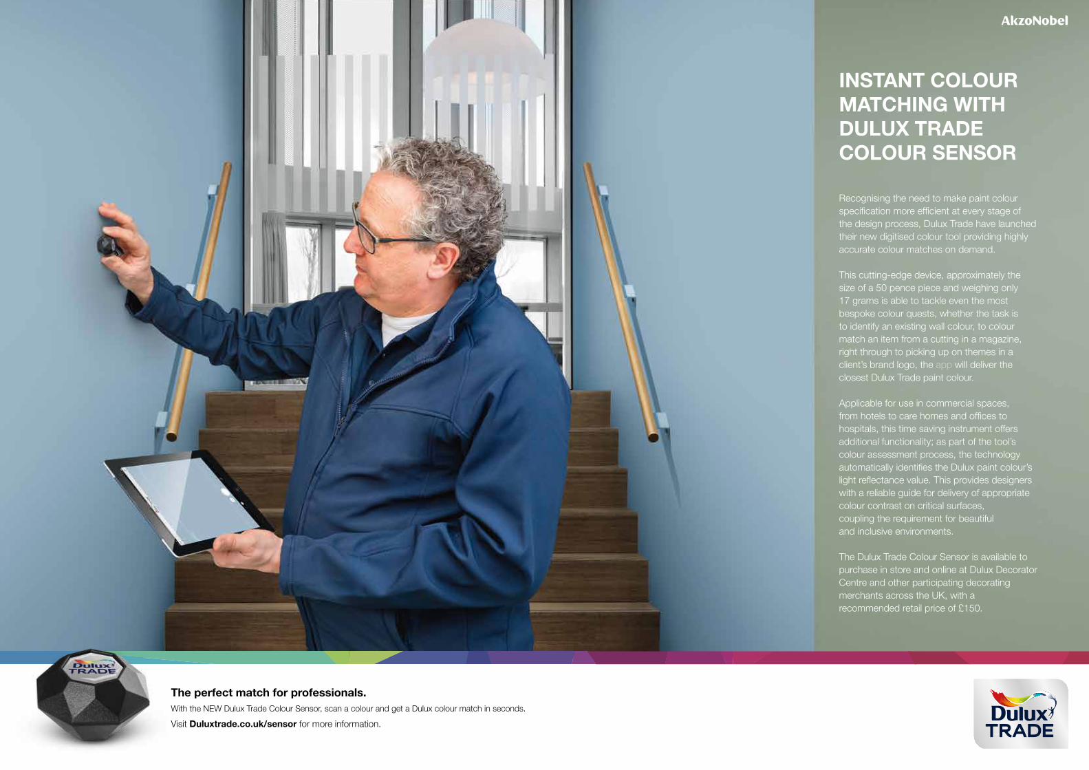
The perfect match for professionals.With the NEW Dulux Trade Colour Sensor, scan a colour and get a Dulux colour match in seconds.
Visit Duluxtrade.co.uk/sensor for more information.
INSTANT COLOUR MATCHING WITH DULUX TRADE COLOUR SENSOR
Recognising the need to make paint colour specification more efficient at every stage of the design process, Dulux Trade have launched their new digitised colour tool providing highly accurate colour matches on demand.
This cutting-edge device, approximately the size of a 50 pence piece and weighing only 17 grams is able to tackle even the mostbespoke colour quests, whether the task is to identify an existing wall colour, to colour match an item from a cutting in a magazine, right through to picking up on themes in a client’s brand logo, the app will deliver the closest Dulux Trade paint colour.
Applicable for use in commercial spaces, from hotels to care homes and offices to hospitals, this time saving instrument offers additional functionality; as part of the tool’s colour assessment process, the technology automatically identifies the Dulux paint colour’s light reflectance value. This provides designers with a reliable guide for delivery of appropriate colour contrast on critical surfaces,coupling the requirement for beautifuland inclusive environments. The Dulux Trade Colour Sensor is available to purchase in store and online at Dulux Decorator Centre and other participating decorating merchants across the UK, with arecommended retail price of £150.