Embed Size (px)
Citation preview
Page
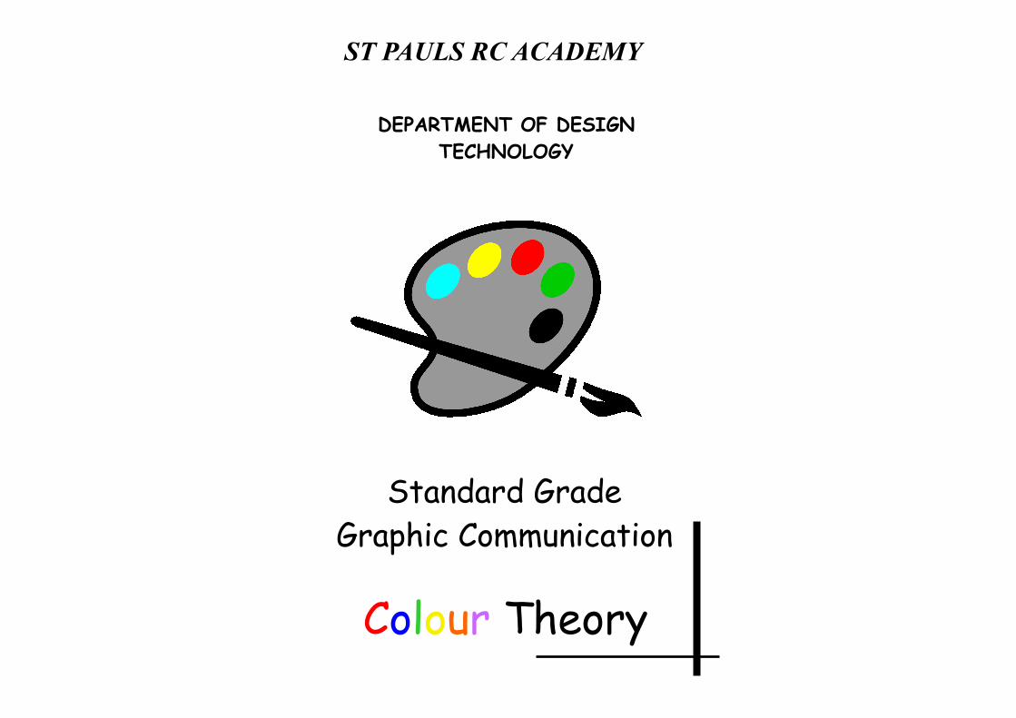
Standard Grade Graphic Communication
Colour Theory
DEPARTMENT OF DESIGN TECHNOLOGY
ST PAULS RC ACADEMY
Page 2
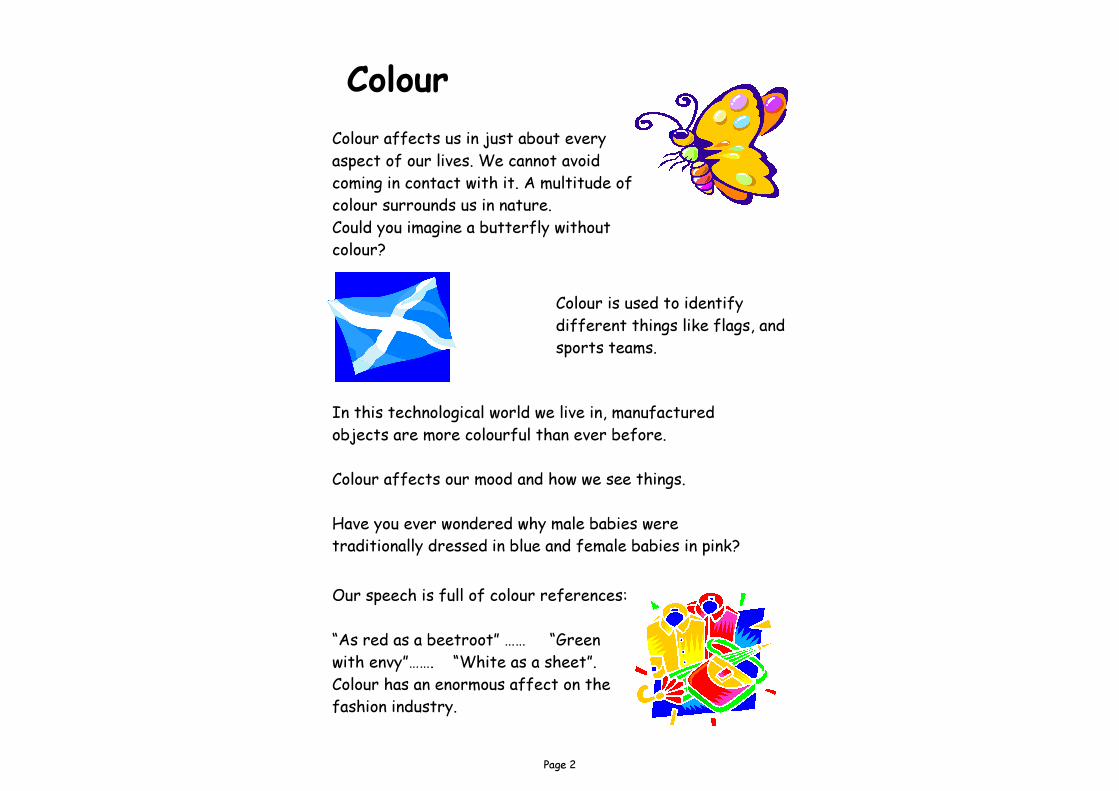
Colour Colour affects us in just about every aspect of our lives. We cannot avoid coming in contact with it. A multitude of colour surrounds us in nature. Could you imagine a butterfly without colour?
In this technological world we live in, manufactured objects are more colourful than ever before. Colour affects our mood and how we see things. Have you ever wondered why male babies were traditionally dressed in blue and female babies in pink?
Colour is used to identify different things like flags, and sports teams.
Our speech is full of colour references: “As red as a beetroot” …… “Green with envy”……. “White as a sheet”. Colour has an enormous affect on the fashion industry.
Page 3
In order to understand colour, we have to realise that it is not just a useful tool to decorate our lives with, but a very powerful means of expressing our mood and personality. The communication power of colour is as complex a language as our use of words and music. The words light and pigment are used regularly in this book. A short description of each word is given below.
Light In 1860, James Clerk Maxwell showed that light was a form of electromagnetic energy. In the same way that a radio can receive electromagnetic energy of certain frequencies and turn them into sound, the eye is able to receive light waves between 400 billion cycles per second and 800 billion cycles per second, and we see these light waves as colour. The colour components of light will vary according to the light source. The colour components of sunlight will be slightly different from those of fluorescent light or incandescent light.
Pigments Pigments are colouring materials which are used in paints or dyes. These materials are found in nature in animals and plants. They can also be produced by the Chemical Industry. Paint is usually produced by mixing a pigment with a binder and solvent. It is the pigment that gives the paint it’s colour.
Page 4
Mixing Colours Colour can be mixed in two distinct ways: 1. By mixing coloured light. 2. By mixing coloured pigments. (dyes and paint)
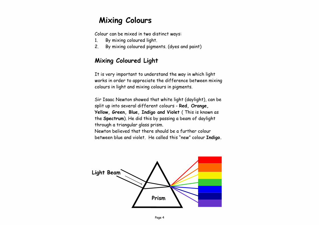
Mixing Coloured Light It is very important to understand the way in which light works in order to appreciate the difference between mixing colours in light and mixing colours in pigments. Sir Isaac Newton showed that white light (daylight), can be split up into several different colours - Red, Orange, Yellow, Green, Blue, Indigo and Violet ( This is known as the Spectrum). He did this by passing a beam of daylight through a triangular glass prism. Newton believed that there should be a further colour between blue and violet. He called this “new” colour Indigo.
Prism
Light Beam
Page 5
The range and order of the colours of the spectrum can be easily remembered by using the following Mnemonic:
Red Richard Orange Of Yellow York Green Gave Blue Battle Indigo In Violet Vain
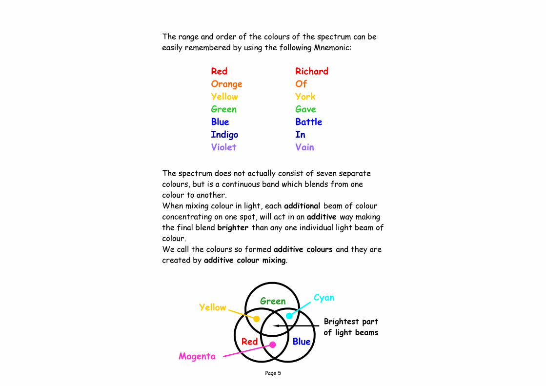
The spectrum does not actually consist of seven separate colours, but is a continuous band which blends from one colour to another. When mixing colour in light, each additional beam of colour concentrating on one spot, will act in an additive way making the final blend brighter than any one individual light beam of colour. We call the colours so formed additive colours and they are created by additive colour mixing.
Brightest part of light beams Red Blue
Green Yellow Cyan
Magenta
Page 6
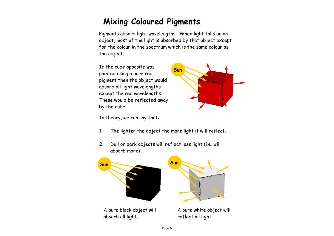
Mixing Coloured Pigments Pigments absorb light wavelengths. When light falls on an object, most of the light is absorbed by that object except for the colour in the spectrum which is the same colour as the object. If the cube opposite was painted using a pure red pigment then the object would absorb all light wavelengths except the red wavelengths. These would be reflected away by the cube. In theory, we can say that: 1. The lighter the object the more light it will reflect. 2. Dull or dark objects will reflect less light (i.e. will absorb more)
A pure black object will absorb all light.
A pure white object will reflect all light.
Sun
Sun Sun
Page 7
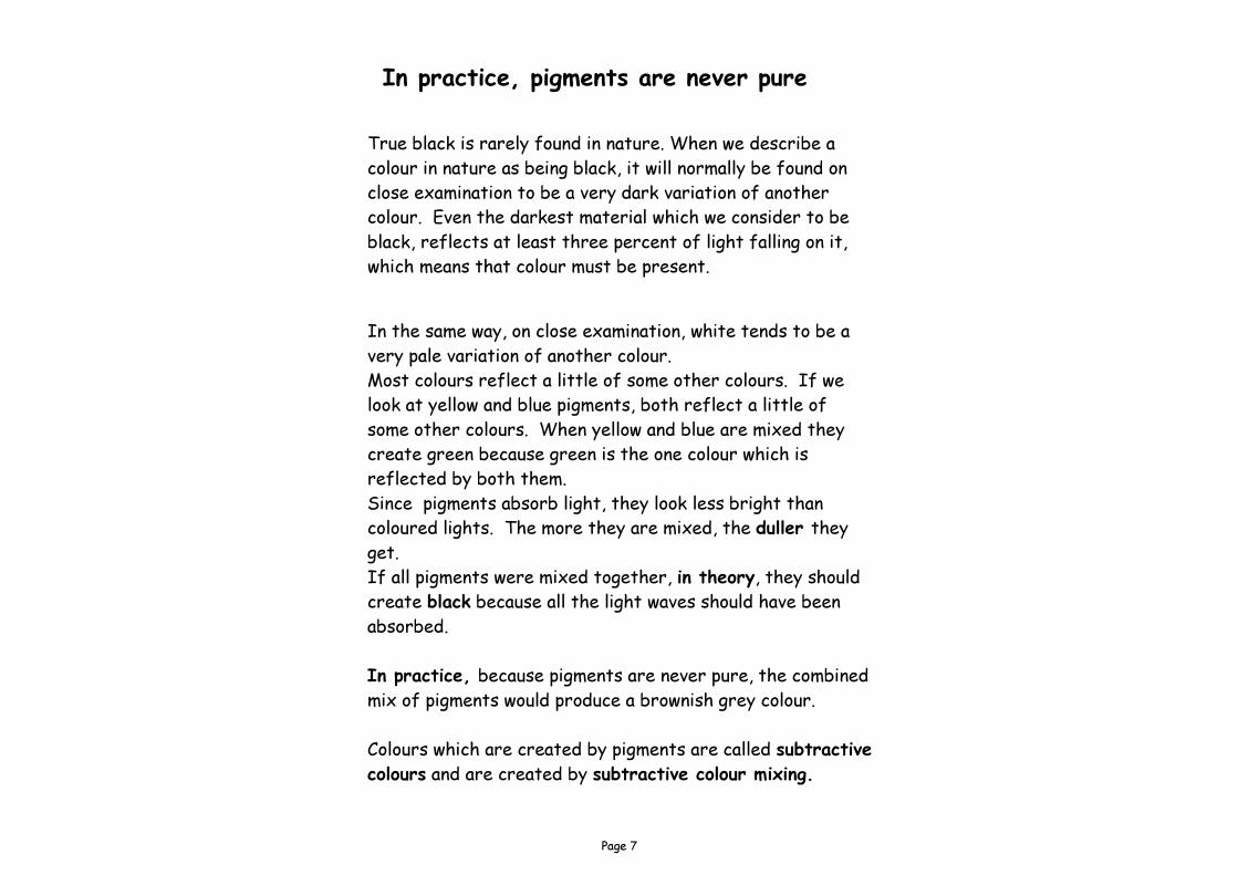
In practice, pigments are never pure True black is rarely found in nature. When we describe a colour in nature as being black, it will normally be found on close examination to be a very dark variation of another colour. Even the darkest material which we consider to be black, reflects at least three percent of light falling on it, which means that colour must be present.
In the same way, on close examination, white tends to be a very pale variation of another colour. Most colours reflect a little of some other colours. If we look at yellow and blue pigments, both reflect a little of some other colours. When yellow and blue are mixed they create green because green is the one colour which is reflected by both them. Since pigments absorb light, they look less bright than coloured lights. The more they are mixed, the duller they get. If all pigments were mixed together, in theory, they should create black because all the light waves should have been absorbed. In practice, because pigments are never pure, the combined mix of pigments would produce a brownish grey colour. Colours which are created by pigments are called subtractive colours and are created by subtractive colour mixing.
Page 8
Primary Colours
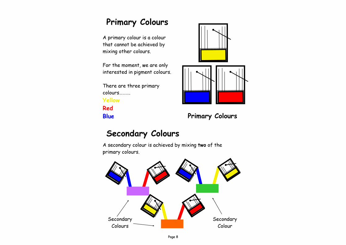
A primary colour is a colour that cannot be achieved by mixing other colours. For the moment, we are only interested in pigment colours. There are three primary colours………. Yellow Red Blue
Secondary Colours A secondary colour is achieved by mixing two of the primary colours.
Primary Colours
Secondary Colours
Secondary Colour
Page 9
Language of Colour
When dealing with colour, it is not enough to simply describe a colour as say red or blue. There are bluey-reds, yellowy-reds, greeny-blues, dark blues, light reds, etc. To help us with these differing colours we need a vocabulary to explain colour in more detail.
Hue The word hue is what is commonly thought of as colour. This is simply the identification of say red, blue, yellow, green, etc. The hue of a colour can be changed by mixing it with another colour. It is estimated that most people with normal vision can differentiate approximately ten million different hues.
Saturation
Saturation describes the purity or strength of a specific colour. A printer would use the word saturation to describe the strength of a colour while someone working in television would use the word chroma to describe the same thing. You can also use words like colourfulness and intensity.
Page 10
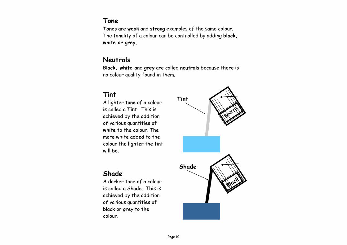
Tone Tones are weak and strong examples of the same colour. The tonality of a colour can be controlled by adding black, white or grey.
Neutrals Black, white and grey are called neutrals because there is no colour quality found in them.
Tint A lighter tone of a colour is called a Tint. This is achieved by the addition of various quantities of white to the colour. The more white added to the colour the lighter the tint will be.
Shade A darker tone of a colour is called a Shade. This is achieved by the addition of various quantities of black or grey to the colour.
Tint
Shade
Page 11
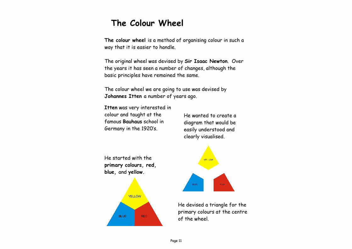
The Colour Wheel The colour wheel is a method of organising colour in such a way that it is easier to handle. The original wheel was devised by Sir Isaac Newton. Over the years it has seen a number of changes, although the basic principles have remained the same. The colour wheel we are going to use was devised by Johannes Itten a number of years ago. Itten was very interested in colour and taught at the famous Bauhaus school in Germany in the 1920’s.
He wanted to create a diagram that would be easily understood and clearly visualised.
He started with the primary colours, red, blue, and yellow.
He devised a triangle for the primary colours at the centre of the wheel.
Page 12
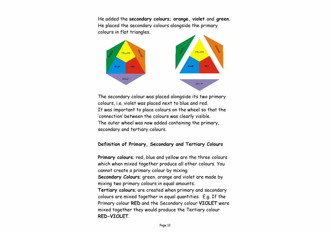
The secondary colour was placed alongside its two primary colours, i.e. violet was placed next to blue and red. It was important to place colours on the wheel so that the ‘connection’ between the colours was clearly visible. The outer wheel was now added containing the primary, secondary and tertiary colours.
He added the secondary colours; orange, violet and green. He placed the secondary colours alongside the primary colours in flat triangles.
Definition of Primary, Secondary and Tertiary Colours Primary colours; red, blue and yellow are the three colours which when mixed together produce all other colours. You cannot create a primary colour by mixing. Secondary Colours; green, orange and violet are made by mixing two primary colours in equal amounts. Tertiary colours; are created when primary and secondary colours are mixed together in equal quantities. E.g. If the Primary colour RED and the Secondary colour VIOLET were mixed together they would produce the Tertiary colour RED-VIOLET.
Page 13
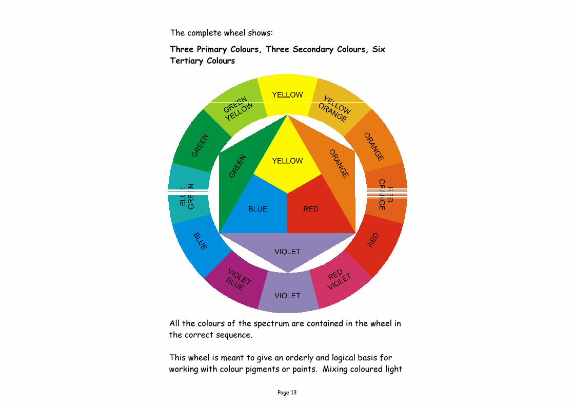
All the colours of the spectrum are contained in the wheel in the correct sequence. This wheel is meant to give an orderly and logical basis for working with colour pigments or paints. Mixing coloured light
Three Primary Colours, Three Secondary Colours, Six Tertiary Colours
The complete wheel shows:
Page 14
Colour Arrangements
In any arrangement which uses colour, whether it is a room setting, clothes, a design, or packaging; the relationship between colours is as important as the actual choice of colour. Choosing colours that go well together does not come naturally to everyone. If we introduce too many colours to a room, it may appear hectic and uncoordinated. If we introduce too few colours, the room may look dull and uninteresting. Colours which are related to each other or close to each other on the wheel are said to be in harmony.
There are some colour schemes many people find comfortable, and are not irritated or disturbed by them. We call these colour schemes harmonious, balanced or pleasing, and by following some simple rules, we can create successful colour schemes.
Harmony
Page 15
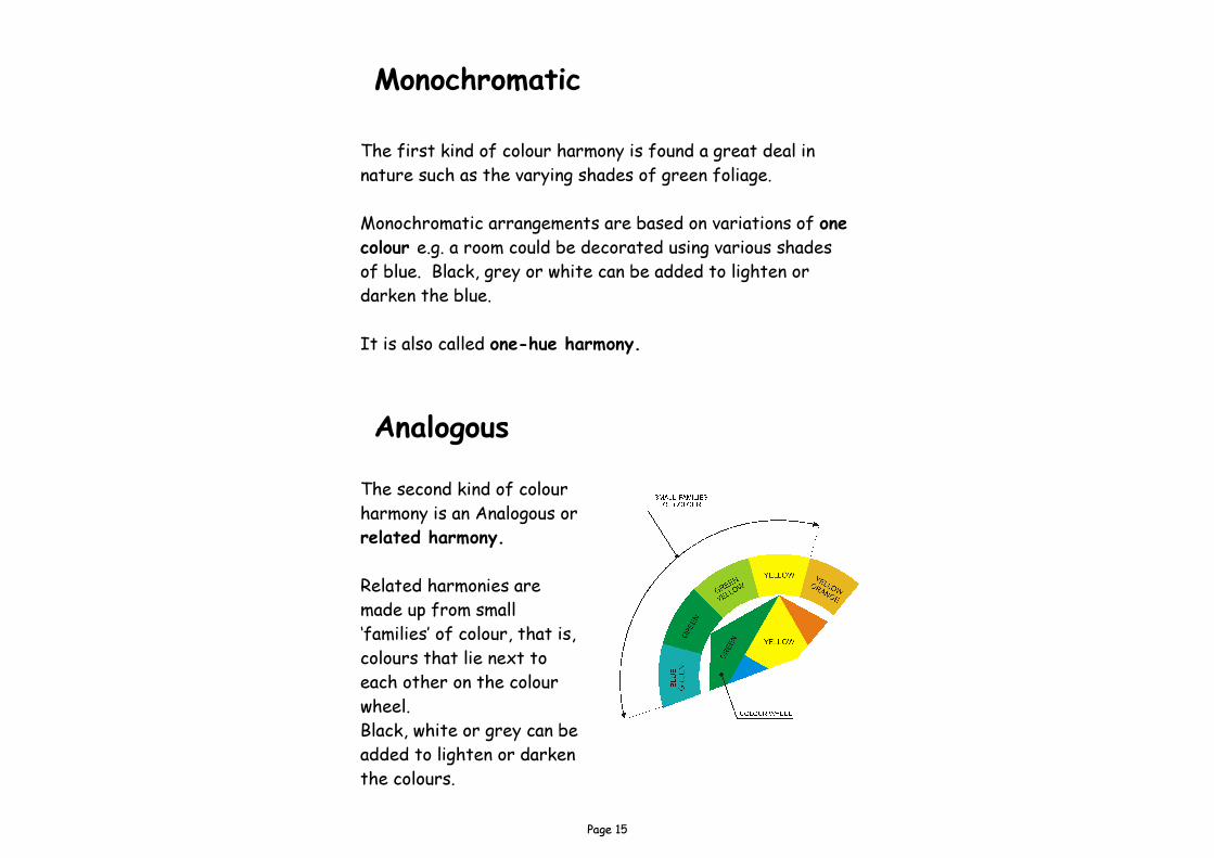
The first kind of colour harmony is found a great deal in nature such as the varying shades of green foliage. Monochromatic arrangements are based on variations of one colour e.g. a room could be decorated using various shades of blue. Black, grey or white can be added to lighten or darken the blue. It is also called one-hue harmony.
Monochromatic
The second kind of colour harmony is an Analogous or related harmony. Related harmonies are made up from small ‘families’ of colour, that is, colours that lie next to each other on the colour wheel. Black, white or grey can be added to lighten or darken the colours.
Analogous
Page 16
Contrast Harmony
Complementary Complementary colour schemes involve the use of various mixes of colour which are directly opposite to each other on the colour wheel, e.g. red and green, blue and orange. Have a look at your colour wheel on page 13.
The third kind of colour harmony is based on related harmony with the edition of a small amount of contrasting colour or colours. Contrasting colours are those which are not related to each other. A small dash of blue within a bedroom scheme comprising yellows and pinks can become a visual delight. This use of colour to accent and emphasise a related family of colour is called contrast harmony. Accents can be introduced to a colour scheme in the form of plants or flowers, soft or loose furnishings such as rugs, cushions, curtains or lampshades. The introduction of green plants to accent a pink painted room or red roses to accent a soft green room are ways of providing contrasts. This type of harmony is often used to bring a colour scheme vividly to life.
Page 17
Achromatic schemes contain no colour (hue) at all. They contain variations of black and white mix only.
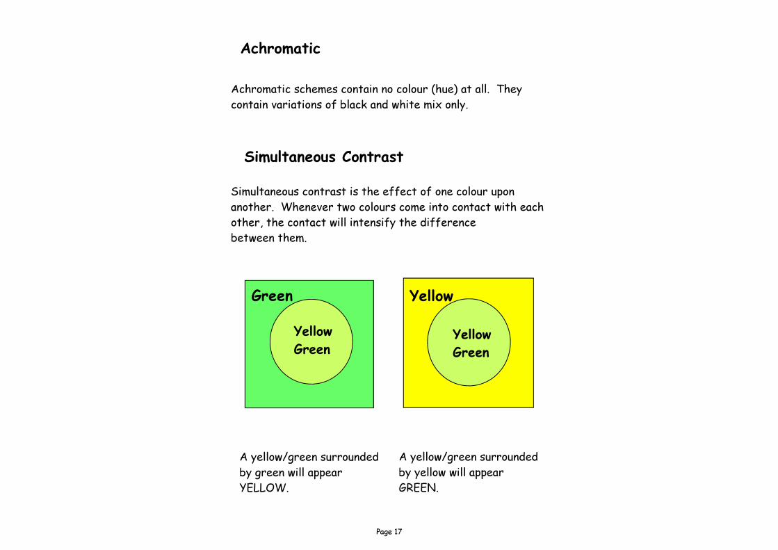
Simultaneous contrast is the effect of one colour upon another. Whenever two colours come into contact with each other, the contact will intensify the difference between them.
Yellow Yellow Green
Green Yellow Green
A yellow/green surrounded by green will appear YELLOW.
A yellow/green surrounded by yellow will appear GREEN.
Simultaneous Contrast
Achromatic
Page 18
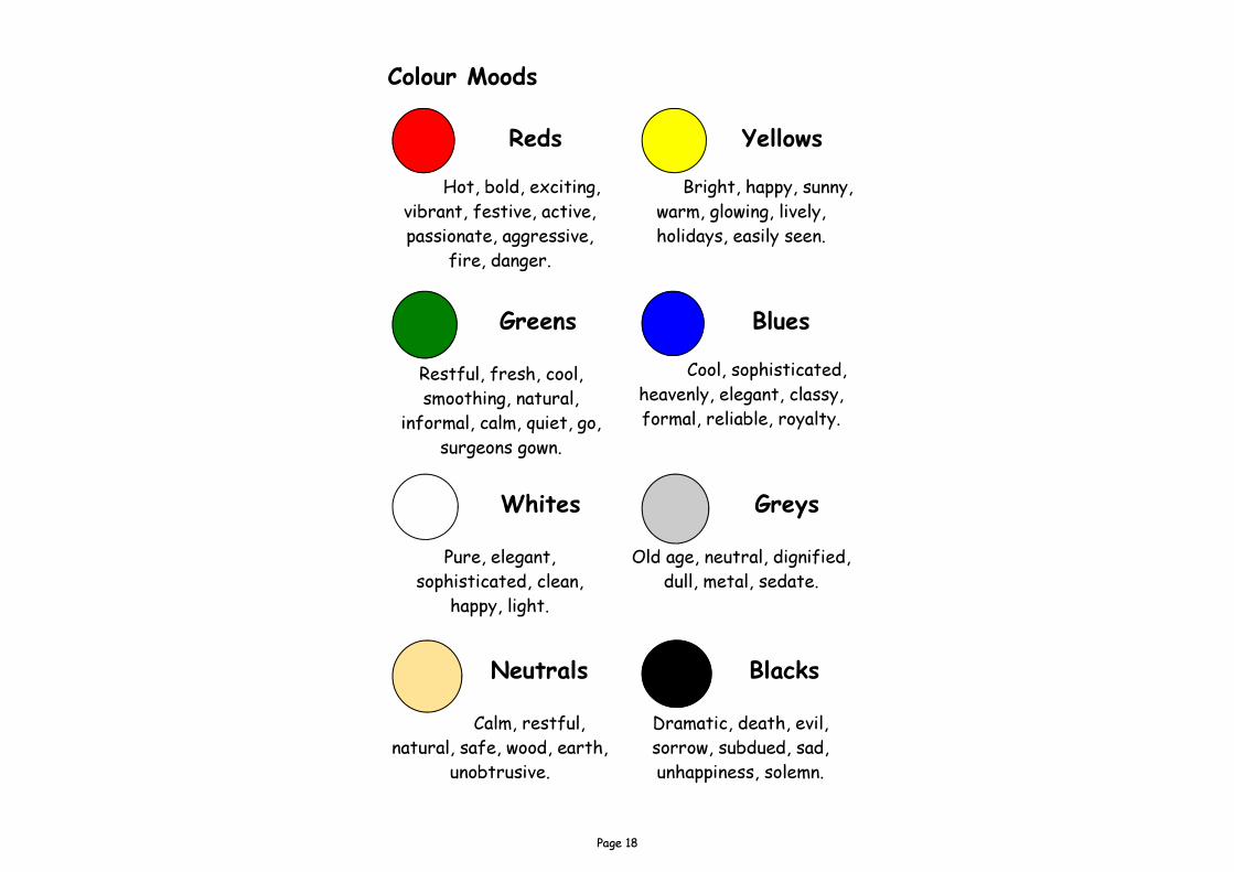
Reds
Hot, bold, exciting, vibrant, festive, active, passionate, aggressive,
fire, danger.
Yellows
Bright, happy, sunny, warm, glowing, lively, holidays, easily seen.
Blues
Cool, sophisticated, heavenly, elegant, classy, formal, reliable, royalty.
Greens
Restful, fresh, cool, smoothing, natural,
informal, calm, quiet, go, surgeons gown.
Neutrals
Calm, restful, natural, safe, wood, earth,
unobtrusive.
Blacks
Dramatic, death, evil, sorrow, subdued, sad, unhappiness, solemn.
Greys
Old age, neutral, dignified, dull, metal, sedate.
Whites
Pure, elegant, sophisticated, clean,
happy, light.
Colour Moods
Page 19
Receding Colours When using the colours blue, violet and green to paint a surface, the surface appears to be further away than it actually is. Colours which give this effect are called receding colours. i.e. they recede away from you. Pale tones of other colours have they same effect, especially neutrals,
Advancing Colours When using the colours red, yellow and orange to paint a surface, the surface appears to be closer than it actually is. Colours which give this effect are called advancing colours. i.e. they advance towards you. Dark tones of other colours have they same effect.
The colours you use in your presentation can make all the difference to your design. Tips Don’t let the background colour take over. If the design has a message: safe, friendly, fast, etc. the background colour should support the message.
Page 20
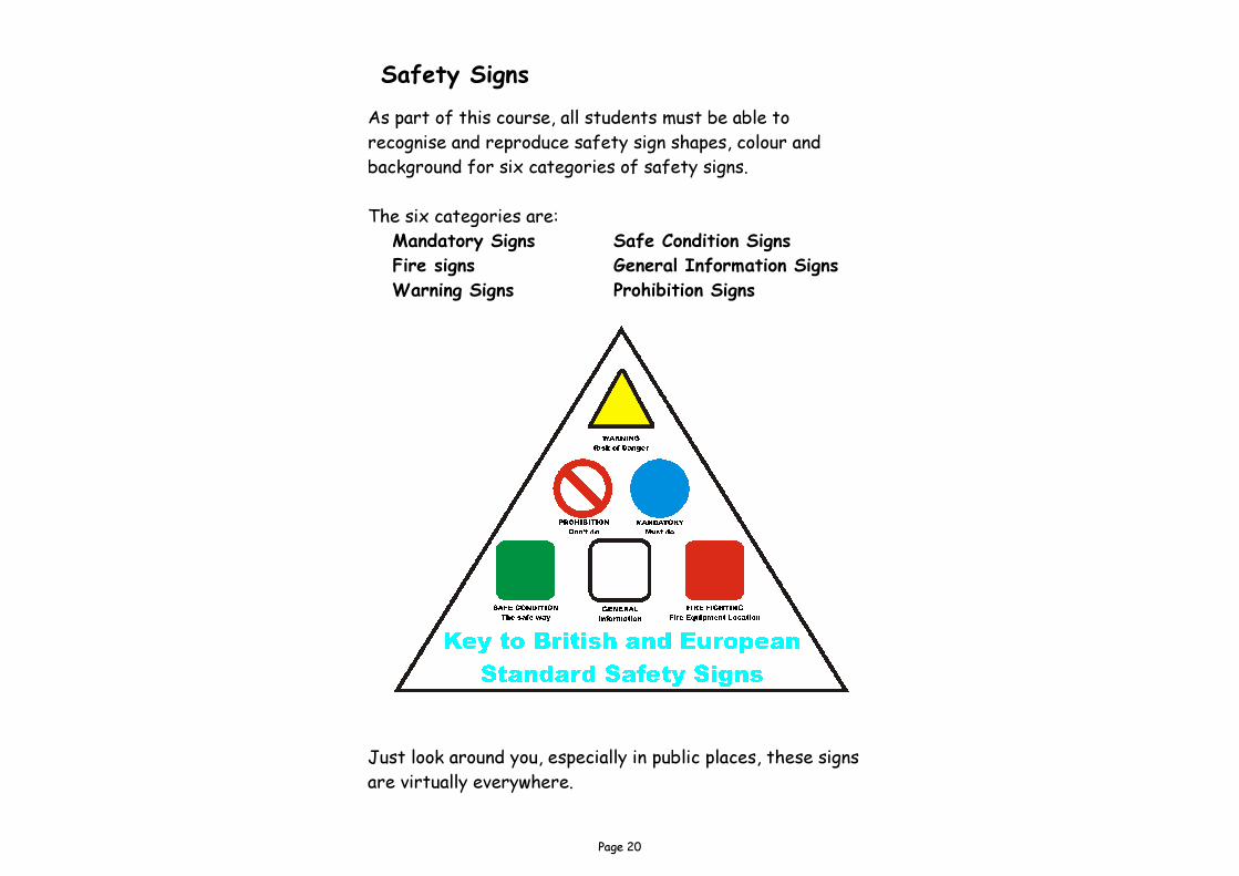
Safety Signs As part of this course, all students must be able to recognise and reproduce safety sign shapes, colour and background for six categories of safety signs. The six categories are: Mandatory Signs Safe Condition Signs Fire signs General Information Signs Warning Signs Prohibition Signs
Just look around you, especially in public places, these signs are virtually everywhere.
Page 21
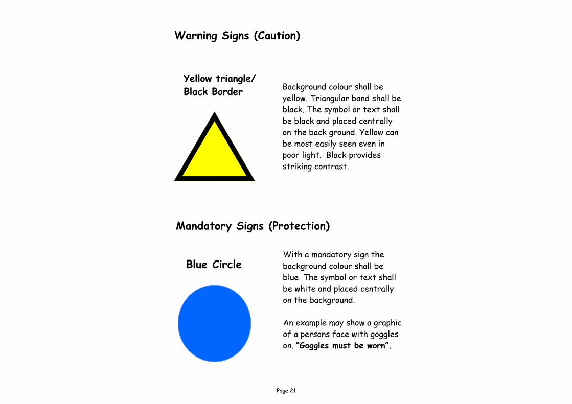
Mandatory Signs (Protection)
Blue Circle
Warning Signs (Caution)
Yellow triangle/Black Border
With a mandatory sign the background colour shall be blue. The symbol or text shall be white and placed centrally on the background. An example may show a graphic of a persons face with goggles on. “Goggles must be worn”.
Background colour shall be yellow. Triangular band shall be black. The symbol or text shall be black and placed centrally on the back ground. Yellow can be most easily seen even in poor light. Black provides striking contrast.
Page 22
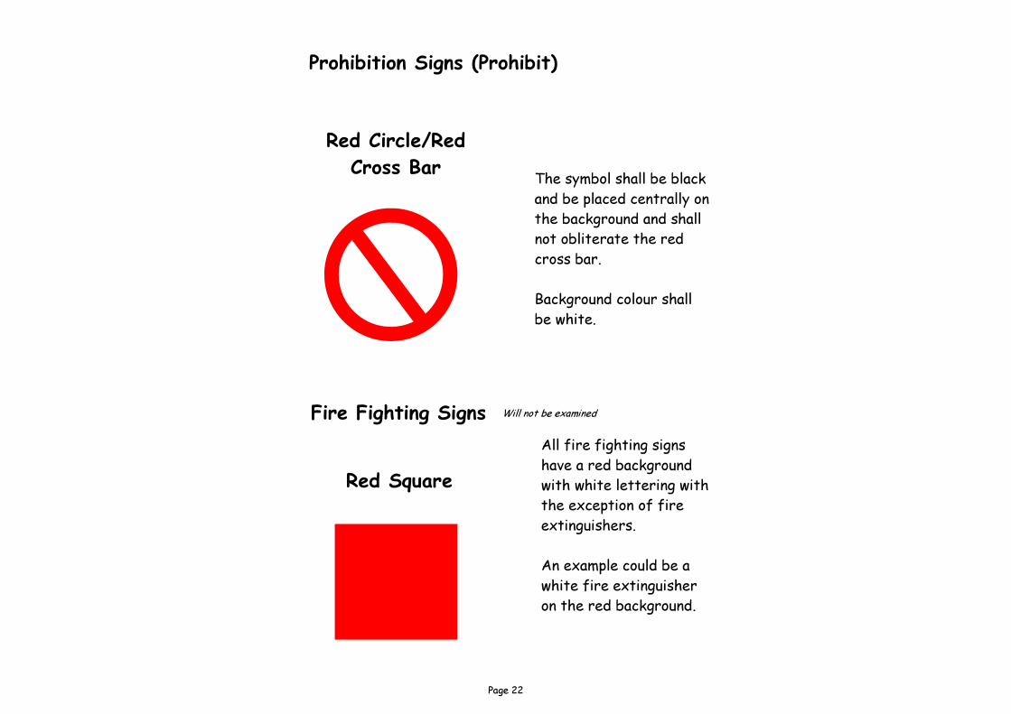
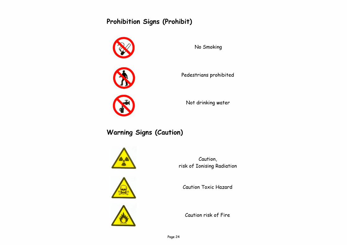
Prohibition Signs (Prohibit)
Red Circle/Red Cross Bar The symbol shall be black
and be placed centrally on the background and shall not obliterate the red cross bar. Background colour shall be white.
Fire Fighting Signs
Red Square All fire fighting signs have a red background with white lettering with the exception of fire extinguishers. An example could be a white fire extinguisher on the red background.
Will not be examined
Page 23
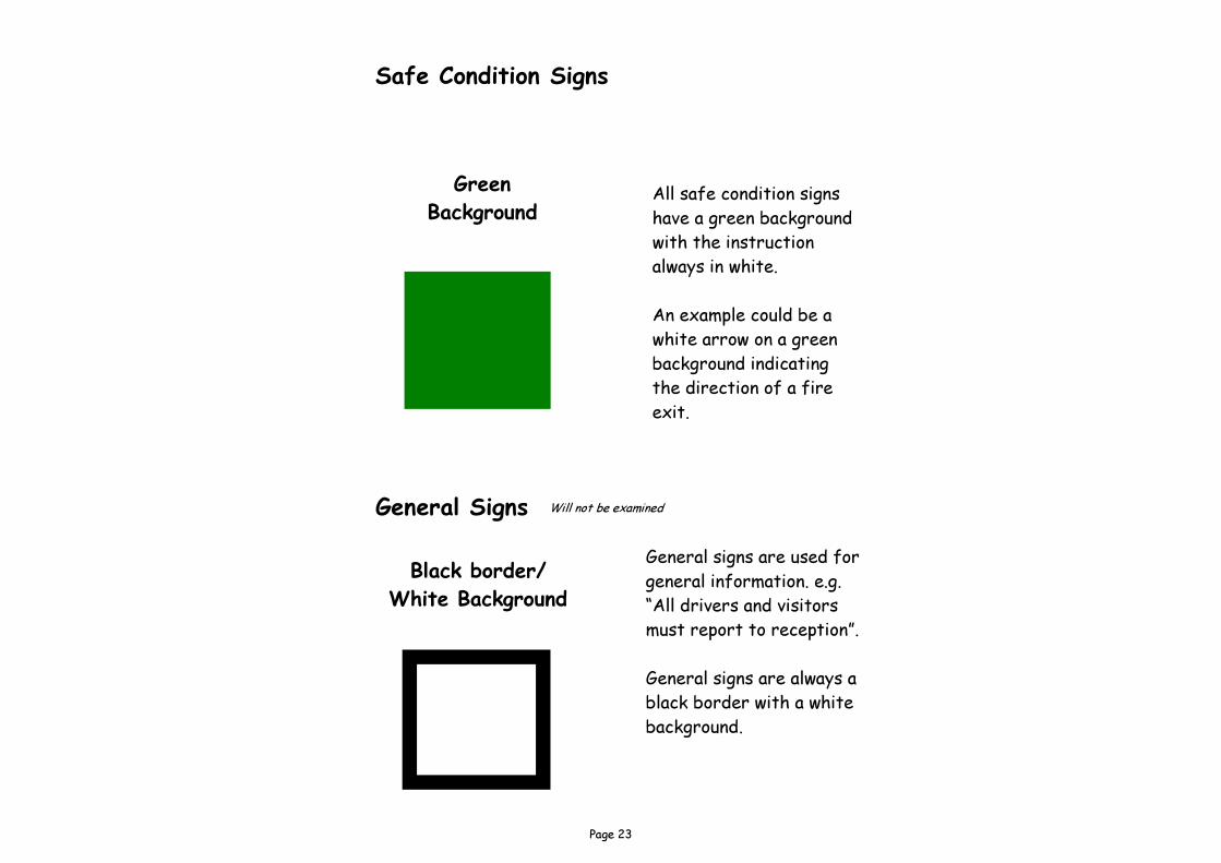
Safe Condition Signs
General Signs
Green Background
Black border/White Background
All safe condition signs have a green background with the instruction always in white. An example could be a white arrow on a green background indicating the direction of a fire exit.
General signs are used for general information. e.g. “All drivers and visitors must report to reception”. General signs are always a black border with a white background.
Will not be examined
Page 24
Prohibition Signs (Prohibit)
No Smoking
Pedestrians prohibited
Caution Toxic Hazard
Not drinking water
Caution, risk of Ionising Radiation
Caution risk of Fire
Warning Signs (Caution)