Embed Size (px)
Citation preview
311 Imago TemporIs. medIum aevum, XIII (2019): 311-331 / ISSN 1888-3931 / DOI 10.21001/itma.2019.13.14
COLORED AS ITS CREATORS INTENDED: PAINTED MAPS IN THE 1513 EDITION
OF PTOLEMY’S ‘GEOGRAPHY’
Chet van duzer broWn university
Usa
Date of receipt: 5th of September, 2018Final date of acceptance: 27th of November, 2018
abstract
The article examines all of the extant hand-colored exemplars of the 1513 edition of Ptolemy’s Geography, whose maps were made by Martin Waldseemüller, in an effort to identify the coloring scheme intended by the creators of the edition. Almost half of the existing exemplars were found to have essentially the same coloring scheme. Further, some remarks made by Waldseemüller about the coloring of maps, as well as some experiments with color printing of maps in the 1513 edition of Ptolemy, allow the identification of this scheme as the workshop scheme. The results shed light not only on Waldseemüller’s workshop practices and early modern hand-coloring techniques, but also on the cartographic and aesthetic philosophy behind the coloring of these maps.
keywords
History of cartography, Hand-coloring, Martin Waldseemüller, Ptolemy’s Geography, Sixteenth Century.
caPItalIa Verba
Historia cartographiae, Manupicturatum, Martinus Waldseemüller, Ptolaemei Geographia, Sextumdecimum saeculum.
Imago TemporIs. medIum aevum, XIII (2019): 311-331 / ISSN 1888-3931 / DOI 10.21001/itma.2019.13.14
Chet van Duzer312
The earliest set of instructions on how to hand-color printed maps appears in a surveying manual printed in London in 1610, William Folkingham’s Feudigraphia: The Synopsis or Epitome of Surueying Methodized.1 Even for some decades after this date, we usually have little evidence to work with to investigate hand-colored maps other than the maps themselves, and this is all the more the case with maps made before Folkingham wrote. In this article I will examine hand-colored exemplars of the 1513 edition of Ptolemy’s Geography, the most important edition of the sixteenth century, whose maps were made by Martin Waldseemüller, in an effort to identify the workshop coloring scheme, that is, the coloring scheme intended by the creators of the edition. The results should shed light not only on Waldseemüller’s workshop practices and early modern hand-coloring techniques, but also on the cartographic and aesthetic philosophy being the coloring of these maps.
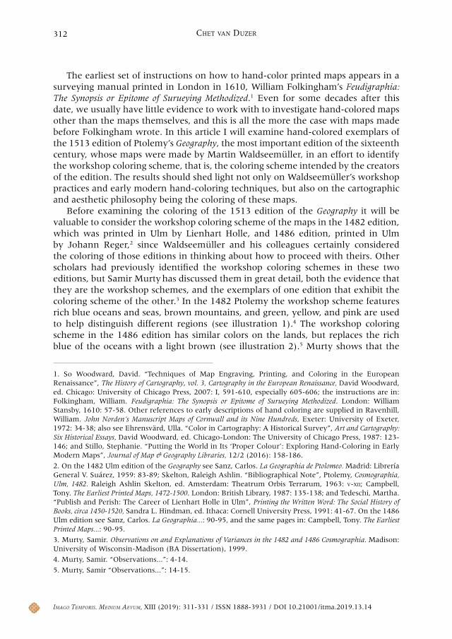
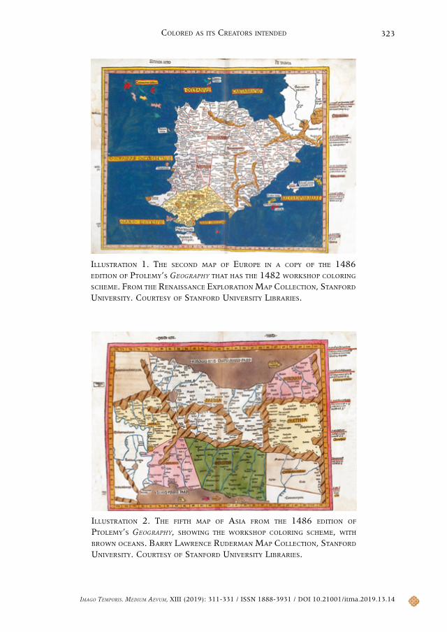
Before examining the coloring of the 1513 edition of the Geography it will be valuable to consider the workshop coloring scheme of the maps in the 1482 edition, which was printed in Ulm by Lienhart Holle, and 1486 edition, printed in Ulm by Johann Reger,2 since Waldseemüller and his colleagues certainly considered the coloring of those editions in thinking about how to proceed with theirs. Other scholars had previously identified the workshop coloring schemes in these two editions, but Samir Murty has discussed them in great detail, both the evidence that they are the workshop schemes, and the exemplars of one edition that exhibit the coloring scheme of the other.3 In the 1482 Ptolemy the workshop scheme features rich blue oceans and seas, brown mountains, and green, yellow, and pink are used to help distinguish different regions (see illustration 1).4 The workshop coloring scheme in the 1486 edition has similar colors on the lands, but replaces the rich blue of the oceans with a light brown (see illustration 2).5 Murty shows that the
1. So Woodward, David. “Techniques of Map Engraving, Printing, and Coloring in the European Renaissance”, The History of Cartography, vol. 3, Cartography in the European Renaissance, David Woodward, ed. Chicago: University of Chicago Press, 2007: I, 591-610, especially 605-606; the instructions are in: Folkingham, William. Feudigraphia: The Synopsis or Epitome of Surueying Methodized. London: William Stansby, 1610: 57-58. Other references to early descriptions of hand coloring are supplied in Ravenhill, William. John Norden’s Manuscript Maps of Cornwall and its Nine Hundreds, Exeter: University of Exeter, 1972: 34-38; also see Ehrensvärd, Ulla. “Color in Cartography: A Historical Survey”, Art and Cartography: Six Historical Essays, David Woodward, ed. Chicago-London: The University of Chicago Press, 1987: 123-146; and Stillo, Stephanie. “Putting the World in Its ‘Proper Colour’: Exploring Hand-Coloring in Early Modern Maps”, Journal of Map & Geography Libraries, 12/2 (2016): 158-186.
2. On the 1482 Ulm edition of the Geography see Sanz, Carlos. La Geographia de Ptolomeo. Madrid: Librería General V. Suárez, 1959: 83-89; Skelton, Raleigh Ashlin. “Bibliographical Note”, Ptolemy, Cosmographia, Ulm, 1482. Raleigh Ashlin Skelton, ed. Amsterdam: Theatrum Orbis Terrarum, 1963: v-xii; Campbell, Tony. The Earliest Printed Maps, 1472-1500. London: British Library, 1987: 135-138; and Tedeschi, Martha. “Publish and Perish: The Career of Lienhart Holle in Ulm”, Printing the Written Word: The Social History of Books, circa 1450-1520, Sandra L. Hindman, ed. Ithaca: Cornell University Press, 1991: 41-67. On the 1486 Ulm edition see Sanz, Carlos. La Geographia...: 90-95, and the same pages in: Campbell, Tony. The Earliest Printed Maps...: 90-95.
3. Murty, Samir. Observations on and Explanations of Variances in the 1482 and 1486 Cosmographia. Madison: University of Wisconsin-Madison (BA Dissertation), 1999.
4. Murty, Samir. “Observations...”: 4-14.
5. Murty, Samir “Observations...”: 14-15.
Imago TemporIs. medIum aevum, XIII (2019): 311-331 / ISSN 1888-3931 / DOI 10.21001/itma.2019.13.14
Colored aS ItS CreatorS Intended 313
exemplars printed on vellum were among the earliest of the 1482 edition; these exemplars consistently have rich blue oceans; and as a result this can be considered the workshop scheme. The coloring of the colored exemplars of the 1486 edition is very consistent, so there can be no doubt that the light brown oceans represent the workshop scheme.
Martin Waldseemüller and his colleague Matthias Ringmann began work on a new edition of the Geography in 1505; after various delays, it was finally published by Johann Schott in Strasbourg in 1513.6 In addition to the standard twenty-seven Ptolemaic maps this edition has twenty tabulae modernae or modern maps based on more recent data, all but one of them based on information from nautical charts.7 These maps constitute a cartographic parallel universe to Ptolemy’s, a different vision of the world. One of the innovations in this edition was that it involved two experiments with color printing, something that Schott had extensive experience with.8 Bernardus Sylvanus had used red ink to print place names and the titles of the maps (and also the parrot in the border of the fourth map of Africa) in his 1513 edition of the Geography,9 but Waldseemüller and Ringmann and Schott had more ambitious plans.
6. For discussion of the 1513 edition of Ptolemy see Oehme, Ruthardt. “Martin Waldseemüller und der Straßburger Ptolemäus von 1513”, Beiträge zur Sprachwissenschaft und Volkskunde: Festschrift für Ernst Ochs zum 60 Geburtstag, Karl Friedrich Müller, ed. Lahr: M. Schauenburg, 1951: 155-167; Sanz, Carlos. La Geographia...: 123-146; Skelton, Raleigh Ashlin. “Bibliographical Note”, Ptolemy. Geographia, Strassburg, 1513, ed. Raleigh Ashlin Skelton. Amsterdam: Theatrum Orbis Terrarum, 1966: v-xx; Pastoureau, Mireille. Les atlas français (XVIe-XVIIe siècles): répertoire bibliographique et étude. Paris: Bibliothèque nationale, Département des cartes et plans, 1984: 371-385; and Hiatt, Alfred. “Mutation and Supplement: The 1513 Strasbourg Ptolemy”, Ptolemy’s ‘Geography’ in the Renaissance, Zur Shalev, Charles Burnett, eds. London-Turin: Warburg Institute-Nino Aragno Editore, 2011: 143-161.
7. For discussion of the Tabulae modernae or Tabulae novae added to manuscripts and editions of Ptolemy see Akerman, James Richard. On the Shoulders of a Titan: Viewing the World of the Past in Atlas Structure, State College: The Pennsylvania State University (PhD Dissertation), 1991: 228-253. On maps of the New World in printed editions of Ptolemy see Dilke, Oswald A. W.; Dilke, Margaret S. “The Adjustment of Ptolemaic Atlases to Feature the New World”, The Classical Tradition and the Americas, vol. 1.1, European Images of the Americas and the Classical Tradition, Wolfgang Haase, Meyer Reinhold, eds. Berlin-New York: Walter de Gruyter, 1994: 117-134; and for lists of the tabulae modernae in several printed editions of Ptolemy see Lindgren, Uta. “Die Geographie des Claudius Ptolemaeus in München: Beschreibung der gedruckten Exemplare in der Bayerischen Staatsbibliothek”. Archives Internationales d’Histoire des Sciences, 35/114-115 (1985): 148-239.
8. See Klein, Alice. “Hans Wechtlin and the Production of German Colour Woodcuts”, Printing Colour 1400-1700: History, Techniques, Functions and Receptions, Ad Stijnman, Elizabeth Savage, eds. Leiden-Boston: Brill, 2015: 103-115; Savage, Elizabeth. “Identifying Johann Schott as Hans Baldung Grien’s Colour Printer, c.1511-12”, forthcoming, and also her chapter, Savage, Elizabeth. “Innovation and Experimentation in Strasbourg, 1509-1515”, A Guide to German Renaissance Colour Woodcuts at the British Museum, London: University College London Press, forthcoming.
9. Skelton, Raleigh Ashlin. “Bibliographical Note”, Ptolemy. Geographia, Venice, 1511, ed. Raleigh Ashlin Skelton. Amsterdam: Theatrum Orbis Terrarum, 1969: v-xi, especially x. The earliest map printed in two colors is that in Lilio, Zaccaria. Orbis breviarium. Florence: Antonio di Bartolommeo Miscomini, 1493: f. 4v: see Campbell, Tony. Earliest Printed Maps...: 112.
Imago TemporIs. medIum aevum, XIII (2019): 311-331 / ISSN 1888-3931 / DOI 10.21001/itma.2019.13.14
Chet van Duzer314
1. Waldseemüller’s and Schott’s Interest in Colored Maps
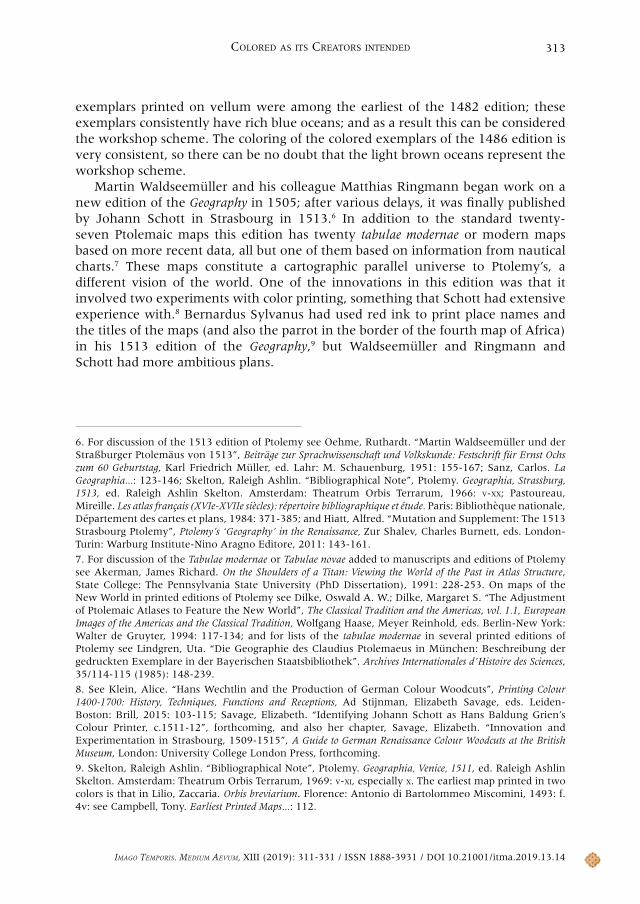
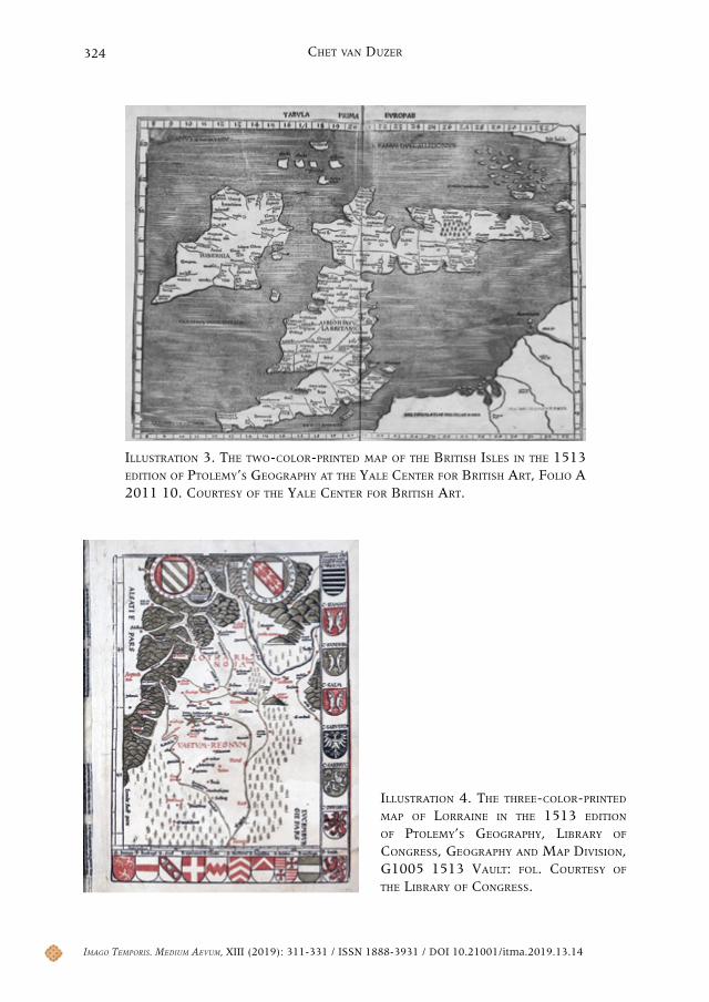
In a few copies of the 1513 edition the first map of Europe is printed in two colors, black for the cartographic elements, and a dark green for the ocean (see illustration 3).10 The surviving copies of the map are evidently early proofs, for the inscriptions in the sea are incomplete. Only a handful of these maps survive, and it is not clear in what respect the experiment was found unsatisfactory, though it is easy to imagine that there were problems with registration, with getting the color-printed area of the sea to fit well within the borders of the map. But in any case, this experiment does show Waldseemüller and Schott’s interest in adding color to maps. Much better known is the map of Lorraine in the 1513 Ptolemy which is printed in three colors —black, red, and green— and is usually the last among the modern maps in the book (illustration 4).11 There were serious problems with registration in the printing of the map, with the color appears outside of its intended borders, and one can imagine that this is what dissuaded Waldseemüller and Schott from employing color printing in other maps in the edition.
Waldseemüller also expressed interest in using color on his 1507 world map.12 He may have been thinking of hand-applied color, and there are no such colors on the one surviving exemplar of the map in the Library of Congress; if he was thinking about color printing, these plans certainly did not come to fruition. In chapter 9 the Cosmographiae introductio, the pamphlet that Waldseemüller and Ringmann had printed to accompany the map, they explain that:
The greater part of Africa and a part of Asia we have distinguished by crescents, which are the emblems of the Sultan of Babylonia, the Lord of all Egypt, and of a part of Asia. The part of Asia called Asia Minor we have surrounded with a saffron-
10. Shirley, Rodney W. “Karte der Britischen Inseln von 1513: eine der ersten farbig gedruckten Karten”. Cartographica Helvetica, 19-20 (1999): 13-17; the example that Shirley discusses is a loose map in British Library. Maps CC.5.a.171; the exemplar in the Library of Congress, Geography and Map Division, G1005 1513 Vault has the color printed version of this map, and the book is available in digital format at “Claudii Ptolemei viri Alexandrini mathematice discipline philosophi doctissimi Geographie opus nouissima traductione e Grecorum archetypis castigatissime pressum, ceteris ante lucubratorum multo prestantius”. Library of Congress. 15 March 2018 <http://hdl.loc.gov/loc.gmd/g3200m.gct00262>. The map is also printed in color in Solothurn, Zentralbibliothek, Altbestand, Magazin Rara, ZBSO Rar II 157; and Nancy, Bibliothèque Municipale, Fonds ancient, Rés. 556.
11. On the map of Lorraine see Eiselé, Albert. “La carte ‘Lotharingia-Vastum Regnum’ de 1508-1513: Observations et réflexions”. Les Cahiers Lorrains, 3-4 (1990): 297-318; and Gérardin, Jean-Marie. “1508-2008: A propos de la première carte imprimée du duché de Lorraine et du Vastum Regnum”. L’Annuaire de la Société du Val de Villé, 33 (2008) : 57-77. Plate 15 in The History of Cartography, vol. 3...: part 1, shows the maps of Lorraine from four different exemplars of the 1513 edition of Ptolemy.
12. The unique surviving exemplar of Waldseemüller’s 1507 world map is on permanent display at the Library of Congress; it is well reproduced in Hessler, John W.; Van Duzer, Chet. Seeing the World Anew: The Radical Vision of Martin Waldseemüller’s 1507 & 1516 World Maps. Washington D.C.-Delray Beach: Library of Congress-Levenger Press, 2012: 24-47. There are two excellent high-resolution scans of the map available on the internet site of the Library of Congress: “Universalis cosmographia secundum Ptholomaei traditionem et Americi Vespucii alioru[m]que lustrationes”. Library of Congress. 24 April 2019 <https://lccn.loc.gov/2003626426>.
Imago TemporIs. medIum aevum, XIII (2019): 311-331 / ISSN 1888-3931 / DOI 10.21001/itma.2019.13.14
Colored aS ItS CreatorS Intended 315
colored cross joined to a branding iron, which is the symbol of the Sultans of the Turks, who rules Scythia this side of the Imaus, the highest mountains of Asia and Sarmatian Scythia. Asiatic Scythia we have marked by anchors, which are the emblems of the great Tartar Khan. A red cross symbolizes Prester John (who rules both eastern and southern India and who resides in Biberith)....13
Given Waldseemüller and Ringmann’s expression of interest in color on maps here, and also the experiments Waldseemüller and Schott made with color printing in their edition of Ptolemy, the question of the workshop scheme of hand-coloring for the 1513 Ptolemy, that is, the scheme intended by its creators, takes on a particular interest and importance.
2. The Workshop Coloring Scheme
Examining just a few hand-colored copies of the 1513 Ptolemy reveals considerable variation in the coloring, and thus is not very encouraging in terms of finding a consistent workshop scheme, but I undertook a global census of the hand-colored copies of the book, seeing some of the exemplars in person,14 while for the rest I ordered digital images of a selection of the maps. The results of the census are presented in the Appendix. Of the 35 surviving hand-colored copies of the book that I located, 16, or just under half, show a consistent coloring scheme. This scheme involves a light blue-gray wash for the seas; green for the mountains; yellow for the borders of the maps; and yellow, light red, a yellowish green, and a light gray wash for the lands. A dark blue was used for the clouds that surround the Ptolemaic world map, and for some of the islands in the Red Sea on the sixth map of Asia and the modern map of northern Africa. The high percentage of copies of the book that have this same coloring scheme makes the conclusion that this was the workshop coloring scheme inescapable. In addition, it is worth remarking that the colors used in this scheme overlap with those used in printing the map of Lorraine in the 1513 Ptolemy (green and red), and those mentioned by Waldseemüller and Ringmann in their Cosmographiae introductio (saffron and red). This latter is not strong corribation of the connection between Waldseemüller and the coloring scheme, as these colors were readily available, but as various other colors were readily available too, the coincidence of colors is of some probatory value
The exemplars of the book with workshop coloring whose colors remain the most vibrant are those in Aarau, Switzerland, in the Aargauer Kantonsbibliothek
13. The translation is from Joseph Fischer and Franz von Wieser, on the back of the diagram between pages 66 and 77, in: Waldseemüller, Martin. The ‘Cosmographiae introductio’ of Martin Waldseemüller in Facsimile, Followed by the Four Voyages of Amerigo Vespucci, with their Translation into English, ed. Charles George Herbermann. New York: The United States Catholic Historical Society, 1907: 66-77 (chapter 8).
14. The copies I consulted in person as part of the project are those in Cambridge (UK), London (2), Paris (6), Ann Arbor, Cambridge (MA), Chicago, New York, and Washington, DC (2)—see the census in the Appendix below.
Imago TemporIs. medIum aevum, XIII (2019): 311-331 / ISSN 1888-3931 / DOI 10.21001/itma.2019.13.14
Chet van Duzer316
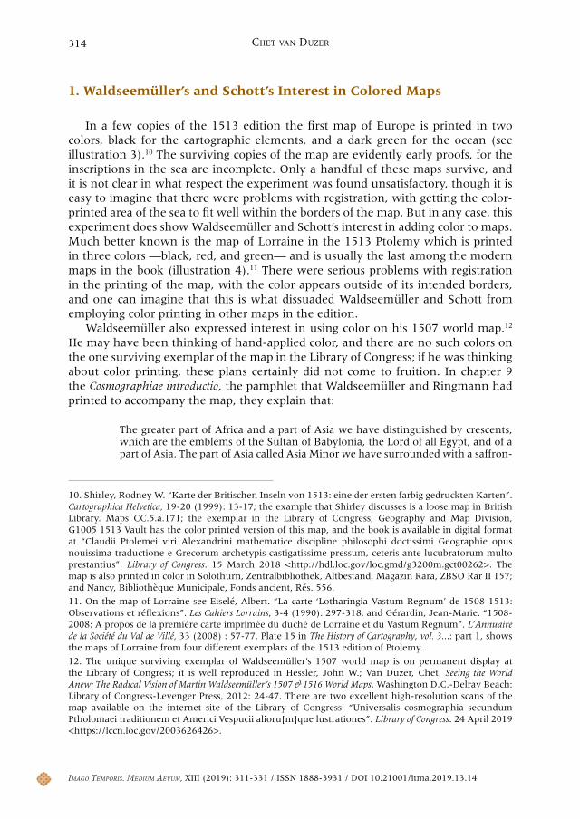
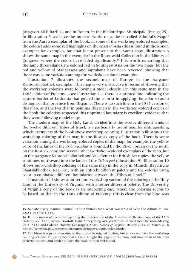
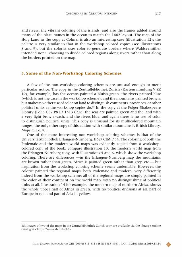
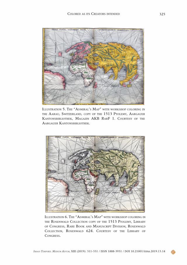
(Magazin AKB RarF 1), and in Rouen, in the Bibliothèque Municipale (Inc. gg 25). In illustration 5 we have the modern world map, the so-called Admiral’s Map,15 from the Aarau exemplar of the book; in some of the workshop-colored examples, the colorist adds some red highlights on the coast of Asia (this is found in the Rouen exemplar for example), but that is not present in the Aarau copy. Illustration 6 shows the same map in the exemplar in the Rosenwald Collection in the Library of Congress, where the colors have faded significantly.16 It is worth remarking that the same three islands are colored red in Southeast Asia on the two maps, but the red and yellow of Madagascar and Taprobana have been reversed, showing that there was some variation among the workshop colored examples.
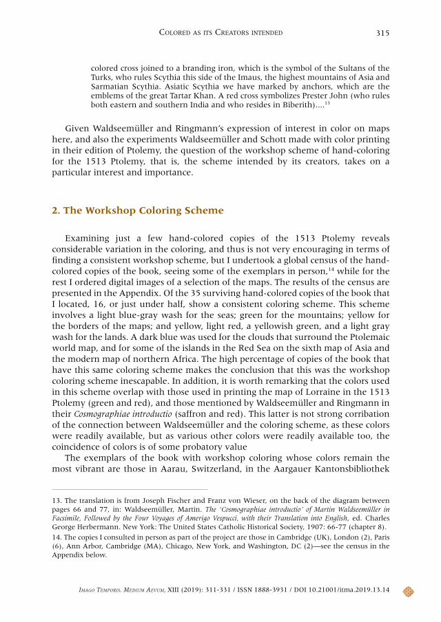
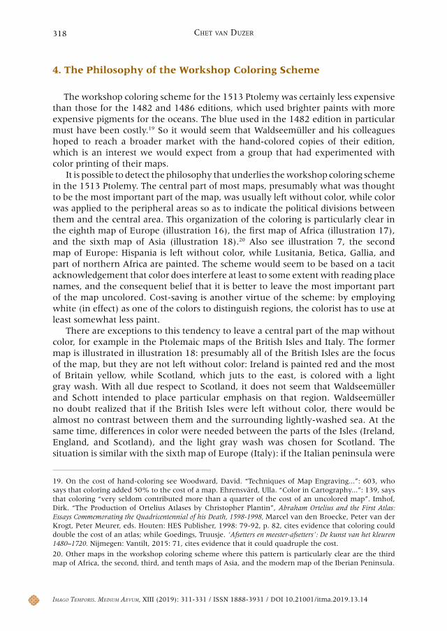
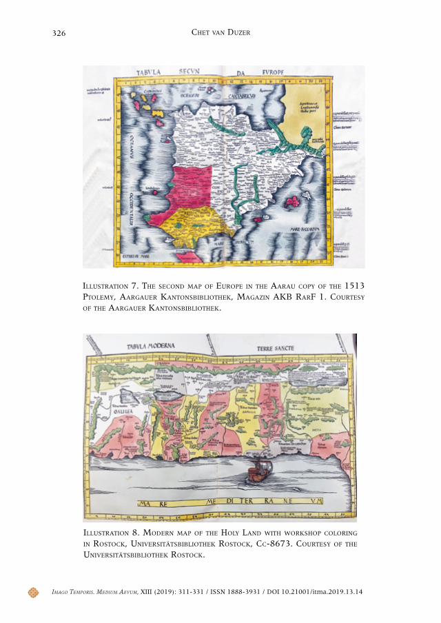
Illustration 7 illustrates the second map of Europe in the Aargauer Kantonsbibliothek exemplar. This map is very instructive in terms of showing that the workshop colorists were following a model closely. On this same map in the 1482 edition of Ptolemy —see Illustration 1— there is a printed line indicating the eastern border of Lusitania that guided the colorist in applying the color so as to distinguish that province from Hispania. There is no such line in the 1513 version of this map, and the fact that in painting this map in the workshop-colored copies of the book the colorists respected this unprinted boundary is excellent evidence that they were following model maps.
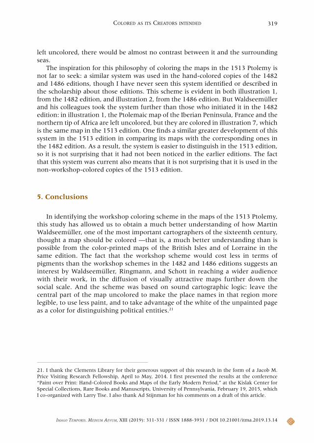
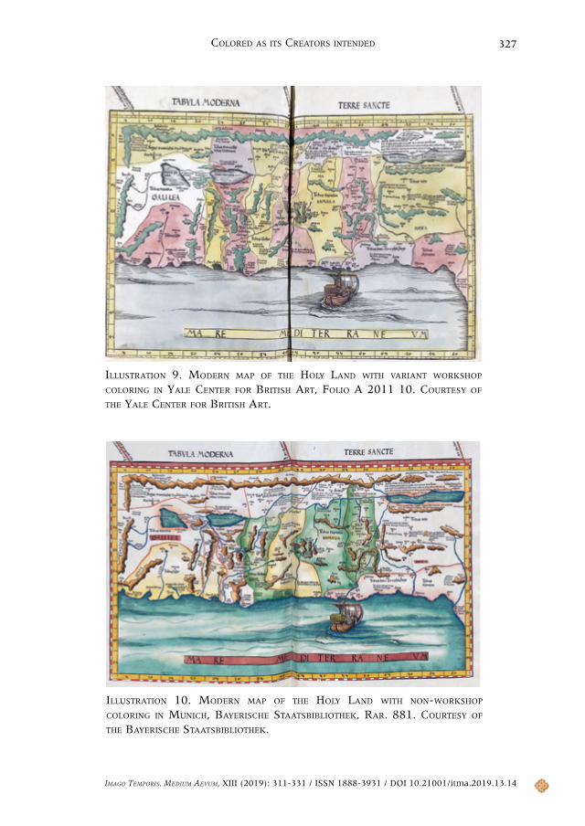
The modern map of the Holy Land, divided into the twelve different lands of the twelve different Tribes of Israel, is a particularly useful map for distinguishing which exemplars of the book show workshop coloring. Illustration 8 illustrates the workshop coloring of that map in the Rostock copy of the book. There is some variation among the workshop-colored copies of the map: for example, the yellow color of the lands of the Tribus isachar is bounded by the River Jordan on the north on the Rostock copy and several other workshop-colored exemplars of the map, but on the Aargauer Kantonsbibliothek and Yale Center for British Art copies, the yellow continues northward into the lands of the Tribus gad (illustration 9). Illustration 10 shows non-workshop coloring of the same map in the copy in Munich, Bayerische Staatsbibliothek, Rar. 881, with an entirely different palette and the colorist using color to emphasize different boundaries between the Tribes of Israel.17
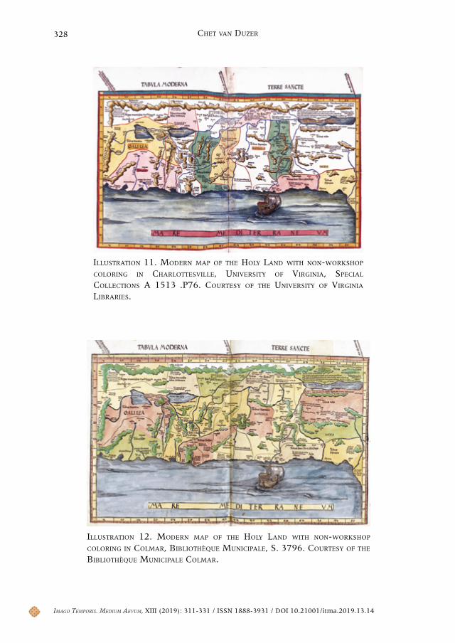
Illustration 11 shows another non-workshop variant of the coloring of the Holy Land at the University of Virginia, with another different palette. The University of Virginia copy of the book is an interesting case where the coloring seems to be based on that in the 1482 edition of Ptolemy: this is clear from the blue seas
15. See McCoskry Stanton, Samuel. “The Admiral’s Map What Was It? And Who the Admiral?”. Isis, 22/2 (1935): 511-515.
16. For discussion of decisions regarding the preservation of the Rosenwal Collection copy of the 1513 Ptolemy see: Albro, Sylvia; Brostoff, Lynn. “Integrating Analytical Tools in Treatment Decision-Making for a 1513 Hand-Colored Ptolemy Geographia Atlas”. Library of Congress, 10 July 2013. 18 March 2018 <https://www.loc.gov/preservation/outreach/tops/verdigris/index.html>.
17. The Munich copy is interesting in that it is in its original binding, but it does not have the workshop coloring scheme. This indicates that a client bought the pages of the book and took them to his own preferred colorist and binder to have the book colored and bound.
Imago TemporIs. medIum aevum, XIII (2019): 311-331 / ISSN 1888-3931 / DOI 10.21001/itma.2019.13.14
Colored aS ItS CreatorS Intended 317
and rivers, the vibrant coloring of the islands, and also the frames added around many of the place names in the ocean to match the 1482 layout. The map of the Holy Land in the copy at Colmar is also an interesting case (illustration 12): the palette is very similar to that in the workshop-colored copies (see illustrations 8 and 9), but the colorist uses color to generate borders where Waldseemüller intended none, choosing to divide colored regions along rivers rather than along the borders printed on the map.
3. Some of the Non-Workshop Coloring Schemes
A few of the non-workshop coloring schemes are unusual enough to merit particular notice. The copy in the Zentralbibliothek Zurich (Kartensammlung V ZZ 19), for example, has the oceans painted a bluish-green, the rivers painted blue (which is not the case in the workshop scheme), and the mountains painted brown, but makes no other use of color on land to distinguish continents, provinces, or other political units as the workshop copies do.18 In the copy at the Folger Shakespeare Library (Folio G87.P8 L3 1513 Cage) the seas are painted green and the land with a very light brown wash, and the rivers blue, and again there is no use of color to distinguish political units. This copy is unusual for its multicolored mountain ranges; the only other copy of this edition with similar mountains is British Library, Maps C.1.e.10.
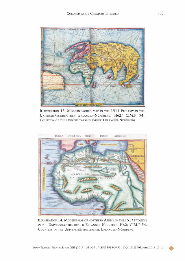
One of the more interesting non-workshop coloring schemes is that of the Universitätsbibliothek Erlangen-Nürnberg, H62/ CIM.P 54. The coloring of both the Ptolemaic and the modern world maps was evidently copied from a workshop-colored copy of the book: compare illustration 13, the modern world map from the Erlangen-Nürnberg copy, with illustrations 5 and 6, which show the workshop coloring. There are differences —in the Erlangen-Nürnberg map the mountains are brown rather than green, Africa is painted green rather than grey, etc.— but inspiration from the workshop coloring scheme seems undeniable. However, the colorist painted the regional maps, both Ptolemaic and modern, very differently indeed from the workshop scheme: all of the regional maps are simply painted in the color of their continent on the world map, with no distinguishing of political units at all. Illustration 14 for example, the modern map of northern Africa, shows the whole upper half of Africa in green, with no political divisions at all, part of Europe in red, and part of Asia in yellow.
18. Images of two of the maps in the Zentralbibliothek Zurich copy are available via the library’s online catalog at <https://www.zb.uzh.ch/>.
Imago TemporIs. medIum aevum, XIII (2019): 311-331 / ISSN 1888-3931 / DOI 10.21001/itma.2019.13.14
Chet van Duzer318
4. The Philosophy of the Workshop Coloring Scheme
The workshop coloring scheme for the 1513 Ptolemy was certainly less expensive than those for the 1482 and 1486 editions, which used brighter paints with more expensive pigments for the oceans. The blue used in the 1482 edition in particular must have been costly.19 So it would seem that Waldseemüller and his colleagues hoped to reach a broader market with the hand-colored copies of their edition, which is an interest we would expect from a group that had experimented with color printing of their maps.
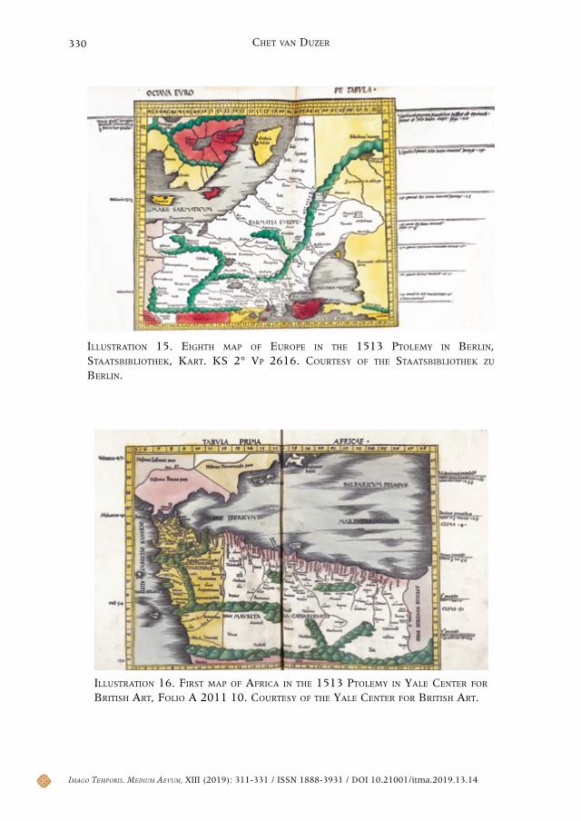
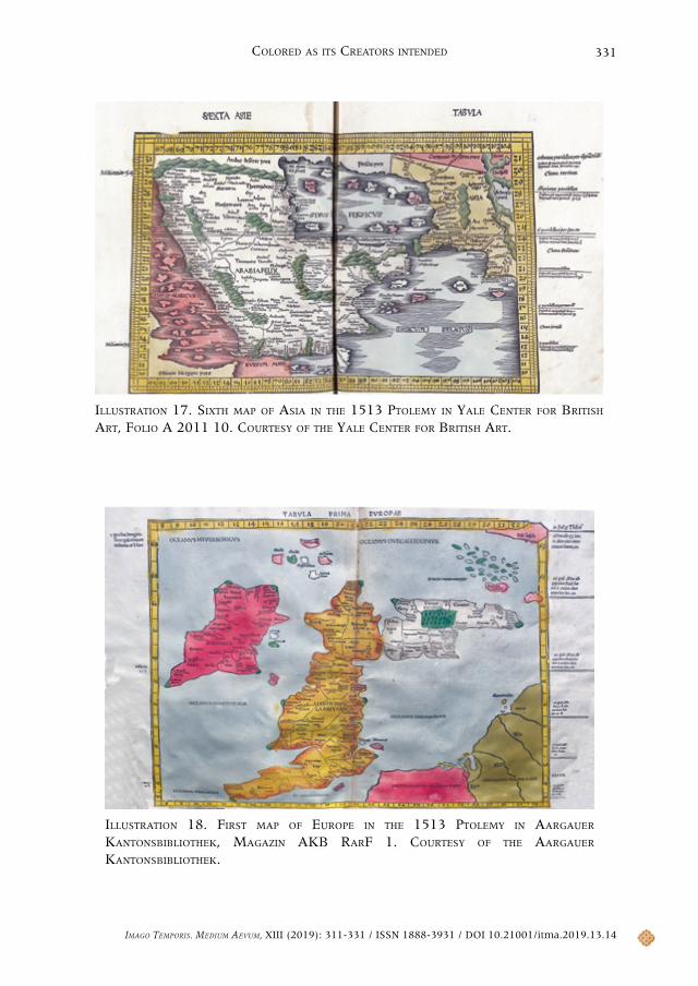
It is possible to detect the philosophy that underlies the workshop coloring scheme in the 1513 Ptolemy. The central part of most maps, presumably what was thought to be the most important part of the map, was usually left without color, while color was applied to the peripheral areas so as to indicate the political divisions between them and the central area. This organization of the coloring is particularly clear in the eighth map of Europe (illustration 16), the first map of Africa (illustration 17), and the sixth map of Asia (illustration 18).20 Also see illustration 7, the second map of Europe: Hispania is left without color, while Lusitania, Betica, Gallia, and part of northern Africa are painted. The scheme would seem to be based on a tacit acknowledgement that color does interfere at least to some extent with reading place names, and the consequent belief that it is better to leave the most important part of the map uncolored. Cost-saving is another virtue of the scheme: by employing white (in effect) as one of the colors to distinguish regions, the colorist has to use at least somewhat less paint.
There are exceptions to this tendency to leave a central part of the map without color, for example in the Ptolemaic maps of the British Isles and Italy. The former map is illustrated in illustration 18: presumably all of the British Isles are the focus of the map, but they are not left without color: Ireland is painted red and the most of Britain yellow, while Scotland, which juts to the east, is colored with a light gray wash. With all due respect to Scotland, it does not seem that Waldseemüller and Schott intended to place particular emphasis on that region. Waldseemüller no doubt realized that if the British Isles were left without color, there would be almost no contrast between them and the surrounding lightly-washed sea. At the same time, differences in color were needed between the parts of the Isles (Ireland, England, and Scotland), and the light gray wash was chosen for Scotland. The situation is similar with the sixth map of Europe (Italy): if the Italian peninsula were
19. On the cost of hand-coloring see Woodward, David. “Techniques of Map Engraving...”: 603, who says that coloring added 50% to the cost of a map. Ehrensvärd, Ulla. “Color in Cartography...”: 139, says that coloring “very seldom contributed more than a quarter of the cost of an uncolored map”. Imhof, Dirk. “The Production of Ortelius Atlases by Christopher Plantin”, Abraham Ortelius and the First Atlas: Essays Commemorating the Quadricentennial of his Death, 1598-1998, Marcel van den Broecke, Peter van der Krogt, Peter Meurer, eds. Houten: HES Publisher, 1998: 79-92, p. 82, cites evidence that coloring could double the cost of an atlas; while Goedings, Truusje. ‘Afsetters en meester-afsetters’: De kunst van het kleuren 1480–1720. Nijmegen: Vantilt, 2015: 71, cites evidence that it could quadruple the cost.
20. Other maps in the workshop coloring scheme where this pattern is particularly clear are the third map of Africa, the second, third, and tenth maps of Asia, and the modern map of the Iberian Peninsula.
Imago TemporIs. medIum aevum, XIII (2019): 311-331 / ISSN 1888-3931 / DOI 10.21001/itma.2019.13.14
Colored aS ItS CreatorS Intended 319
left uncolored, there would be almost no contrast between it and the surrounding seas.
The inspiration for this philosophy of coloring the maps in the 1513 Ptolemy is not far to seek: a similar system was used in the hand-colored copies of the 1482 and 1486 editions, though I have never seen this system identified or described in the scholarship about those editions. This scheme is evident in both illustration 1, from the 1482 edition, and illustration 2, from the 1486 edition. But Waldseemüller and his colleagues took the system further than those who initiated it in the 1482 edition: in illustration 1, the Ptolemaic map of the Iberian Peninsula, France and the northern tip of Africa are left uncolored, but they are colored in illustration 7, which is the same map in the 1513 edition. One finds a similar greater development of this system in the 1513 edition in comparing its maps with the corresponding ones in the 1482 edition. As a result, the system is easier to distinguish in the 1513 edition, so it is not surprising that it had not been noticed in the earlier editions. The fact that this system was current also means that it is not surprising that it is used in the non-workshop-colored copies of the 1513 edition.
5. Conclusions
In identifying the workshop coloring scheme in the maps of the 1513 Ptolemy, this study has allowed us to obtain a much better understanding of how Martin Waldseemüller, one of the most important cartographers of the sixteenth century, thought a map should be colored —that is, a much better understanding than is possible from the color-printed maps of the British Isles and of Lorraine in the same edition. The fact that the workshop scheme would cost less in terms of pigments than the workshop schemes in the 1482 and 1486 editions suggests an interest by Waldseemüller, Ringmann, and Schott in reaching a wider audience with their work, in the diffusion of visually attractive maps further down the social scale. And the scheme was based on sound cartographic logic: leave the central part of the map uncolored to make the place names in that region more legible, to use less paint, and to take advantage of the white of the unpainted page as a color for distinguishing political entities.21
21. I thank the Clements Library for their generous support of this research in the form of a Jacob M. Price Visiting Research Fellowship, April to May, 2014. I first presented the results at the conference “Paint over Print: Hand-Colored Books and Maps of the Early Modern Period,” at the Kislak Center for Special Collections, Rare Books and Manuscripts, University of Pennsylvania, February 19, 2015, which I co-organized with Larry Tise. I also thank Ad Stijnman for his comments on a draft of this article.
Imago TemporIs. medIum aevum, XIII (2019): 311-331 / ISSN 1888-3931 / DOI 10.21001/itma.2019.13.14
Chet van Duzer320
6. Appendix: Census of the Hand-Colored Exemplars of the 1513 Edition of Ptolemy’s Geography
Copies of the book that have only a few hand-colored maps are excluded. When a digital version of a specific hand-colored exemplar is available, that is indicated with a note.
6.1. Europe
Aarau, Aargauer Kantonsbibliothek, Magazin AKB RarF 1Workshop coloring scheme
Berlin, Staatsbibliothek, Kart. KS 2° Vp 2616Workshop coloring scheme
Brussels, Bibliothèque Royale, Inc C 202Workshop coloring scheme
Cambridge, Cambridge University, Trinity Hall Old Library, E.II.30Workshop coloring scheme
Colmar, Bibliothèque Municipale, S. 3796Non-workshop coloring
Erlangen, Friedrich-Alexander-Universität Erlangen-Nürnberg, H62/ CIM.P 54Non-workshop coloringAvailable in digital format
Erlangen, Friedrich-Alexander-Universität Erlangen-Nürnberg, H62 Inc 1906aNon-workshop coloringAvailable in digital format
Lisbon, Biblioteca Nacional de Portugal, Cartografia, C.A. 152 V.Non-workshop coloringAvailable in digital format
London, British Library, Maps C.1.e.10.Non-workshop coloring
London, British Library, Items Maps C.1.d.9.Workshop coloring scheme
Munich, Bayerische Staatsbibliothek, Rar. 881
Imago TemporIs. medIum aevum, XIII (2019): 311-331 / ISSN 1888-3931 / DOI 10.21001/itma.2019.13.14
Colored aS ItS CreatorS Intended 321
Non-workshop coloringAvailable in digital format
Paris, Bibliothèque Mazarin, 2° 4870 B 2e ex.Workshop coloring scheme (twelve maps missing)
Paris, Bibliothèque nationale de France, FOL SG BON S-3Non-workshop coloring scheme
Paris, Bibliothèque nationale de France, GE DD-1009 RESWorkshop coloring schemeAvailable in digital format from http://gallica.bnf.fr
Paris, Bibliothèque nationale de France, GE DD-1010 RESWorkshop coloring schemeAvailable in digital format from http://gallica.bnf.fr
Paris, Bibliothèque nationale de France, Tolbiac RES-G-42Non-workshop coloring
Paris, Bibliothèque nationale de France, Tolbiac, Smith Lesouëf. Rés. 35Non-workshop coloring
Rostock, Universitätsbibliothek Rostock, Cc-8673Workshop coloring scheme
Rouen, Bibliothèque Municipale, Inc. gg 25Workshop coloring scheme
Solothurn, Zentralbibliothek, Altbestand, Magazin Rara, ZBSO Rar II 157Non-workshop coloring
Zurich, Zentralbibliothek, Kartensammlung V ZZ 19Non-workshop coloring
6.2. Middle East
Jerusalem, National Library of Israel, System Number 003092875, copy 5Workshop coloring scheme.
Imago TemporIs. medIum aevum, XIII (2019): 311-331 / ISSN 1888-3931 / DOI 10.21001/itma.2019.13.14
Chet van Duzer322
6.3. North America
Ann Arbor, MI, Clements Library, Atl 1513 Pt, copy 1Workshop coloring scheme
Bloomington, IN, Indiana University, Lilly Library, Vault Flat G1005 1513Non-workshop coloring
Cambridge, MA, Harvard University, Houghton Library, pf *65-592Non-workshop coloring
Charlottesville, VA, University of Virginia, Special Collections A 1513.P76Non-workshop coloringAvailable in digital format
Chicago, Newberry Library, VAULT Ayer 6.P9 1513Non-workshop coloring
La Jolla, CA, Map & Atlas Museum of La JollaNon-workshop coloring
New Haven, CT, Yale Center for British Art, Folio A 2011 10Workshop coloring scheme
New York, New York Public Library, *KB+++ 1513, copy 2Non-workshop coloring
Washington, DC, Folger Shakespeare Library, Folio G87.P8 L3 1513 CageNon-workshop coloring scheme
Washington, DC, Library of Congress, Rare Book and Manuscript Division, Rosenwald Collection, Rosenwald 624
Workshop coloring scheme
Williamstown, MA, Williams College, Chapin Library, Am1513.P75 ffolioNon-workshop coloring
6.4. South America
Rio de Janeiro, Biblioteca NacionalWorkshop coloring scheme (colors very faded)Available in digital format
Imago TemporIs. medIum aevum, XIII (2019): 311-331 / ISSN 1888-3931 / DOI 10.21001/itma.2019.13.14
Colored aS ItS CreatorS Intended 323
illUstration 1. the second maP of eUroPe in a coPy of the 1486 edition of Ptolemy’s GeoGraphy that has the 1482 workshoP coloring scheme. from the renaissance exPloration maP collection, stanford University. coUrtesy of stanford University liBraries.
illUstration 2. the fifth maP of asia from the 1486 edition of Ptolemy’s GeoGraphy, showing the workshoP coloring scheme, with Brown oceans. Barry lawrence rUderman maP collection, stanford University. coUrtesy of stanford University liBraries.
Imago TemporIs. medIum aevum, XIII (2019): 311-331 / ISSN 1888-3931 / DOI 10.21001/itma.2019.13.14
Chet van Duzer324
illUstration 3. the two-color-Printed maP of the British isles in the 1513 edition of Ptolemy’s geograPhy at the yale center for British art, folio a 2011 10. coUrtesy of the yale center for British art.
illUstration 4. the three-color-Printed maP of lorraine in the 1513 edition of Ptolemy’s geograPhy, liBrary of congress, geograPhy and maP division, g1005 1513 vaUlt: fol. coUrtesy of the liBrary of congress.
Imago TemporIs. medIum aevum, XIII (2019): 311-331 / ISSN 1888-3931 / DOI 10.21001/itma.2019.13.14
Colored aS ItS CreatorS Intended 325
illUstration 5. the “admiral’s maP” with workshoP coloring in the aaraU, switzerland, coPy of the 1513 Ptolemy, aargaUer kantonsBiBliothek, magazin akB rarf 1. coUrtesy of the aargaUer kantonsBiBliothek.
illUstration 6. the “admiral’s maP” with workshoP coloring in the rosenwald collection coPy of the 1513 Ptolemy, liBrary of congress, rare Book and manUscriPt division, rosenwald collection, rosenwald 624. coUrtesy of the liBrary of congress.
Imago TemporIs. medIum aevum, XIII (2019): 311-331 / ISSN 1888-3931 / DOI 10.21001/itma.2019.13.14
Chet van Duzer326
illUstration 7. the second maP of eUroPe in the aaraU coPy of the 1513 Ptolemy, aargaUer kantonsBiBliothek, magazin akB rarf 1. coUrtesy of the aargaUer kantonsBiBliothek.
illUstration 8. modern maP of the holy land with workshoP coloring in rostock, UniversitätsBiBliothek rostock, cc-8673. coUrtesy of the UniversitätsBiBliothek rostock.
Imago TemporIs. medIum aevum, XIII (2019): 311-331 / ISSN 1888-3931 / DOI 10.21001/itma.2019.13.14
Colored aS ItS CreatorS Intended 327
illUstration 9. modern maP of the holy land with variant workshoP coloring in yale center for British art, folio a 2011 10. coUrtesy of the yale center for British art.
illUstration 10. modern maP of the holy land with non-workshoP coloring in mUnich, Bayerische staatsBiBliothek, rar. 881. coUrtesy of the Bayerische staatsBiBliothek.
Imago TemporIs. medIum aevum, XIII (2019): 311-331 / ISSN 1888-3931 / DOI 10.21001/itma.2019.13.14
Chet van Duzer328
illUstration 11. modern maP of the holy land with non-workshoP coloring in charlottesville, University of virginia, sPecial collections a 1513 .P76. coUrtesy of the University of virginia liBraries.
illUstration 12. modern maP of the holy land with non-workshoP coloring in colmar, BiBliothèQUe mUniciPale, s. 3796. coUrtesy of the BiBliothèQUe mUniciPale colmar.
Imago TemporIs. medIum aevum, XIII (2019): 311-331 / ISSN 1888-3931 / DOI 10.21001/itma.2019.13.14
Colored aS ItS CreatorS Intended 329
illUstration 13. modern world maP in the 1513 Ptolemy in the UniversitätsBiBliothek erlangen-nürnBerg, h62/ cim.P 54. coUrtesy of the UniversitätsBiBliothek erlangen-nürnBerg.
illUstration 14. modern maP of northern africa in the 1513 Ptolemy in the UniversitätsBiBliothek erlangen-nürnBerg, h62/ cim.P 54. coUrtesy of the UniversitätsBiBliothek erlangen-nürnBerg.
Imago TemporIs. medIum aevum, XIII (2019): 311-331 / ISSN 1888-3931 / DOI 10.21001/itma.2019.13.14
Chet van Duzer330
illUstration 15. eighth maP of eUroPe in the 1513 Ptolemy in Berlin, staatsBiBliothek, kart. ks 2° vP 2616. coUrtesy of the staatsBiBliothek zU Berlin.
illUstration 16. first maP of africa in the 1513 Ptolemy in yale center for British art, folio a 2011 10. coUrtesy of the yale center for British art.
Imago TemporIs. medIum aevum, XIII (2019): 311-331 / ISSN 1888-3931 / DOI 10.21001/itma.2019.13.14
Colored aS ItS CreatorS Intended 331
illUstration 17. sixth maP of asia in the 1513 Ptolemy in yale center for British art, folio a 2011 10. coUrtesy of the yale center for British art.
illUstration 18. first maP of eUroPe in the 1513 Ptolemy in aargaUer kantonsBiBliothek, magazin akB rarf 1. coUrtesy of the aargaUer kantonsBiBliothek.