Embed Size (px)
Citation preview
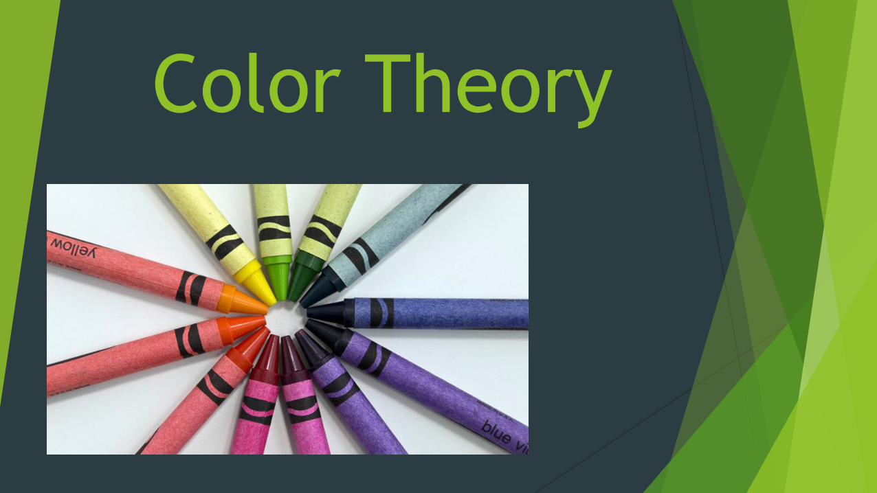
Color Theory
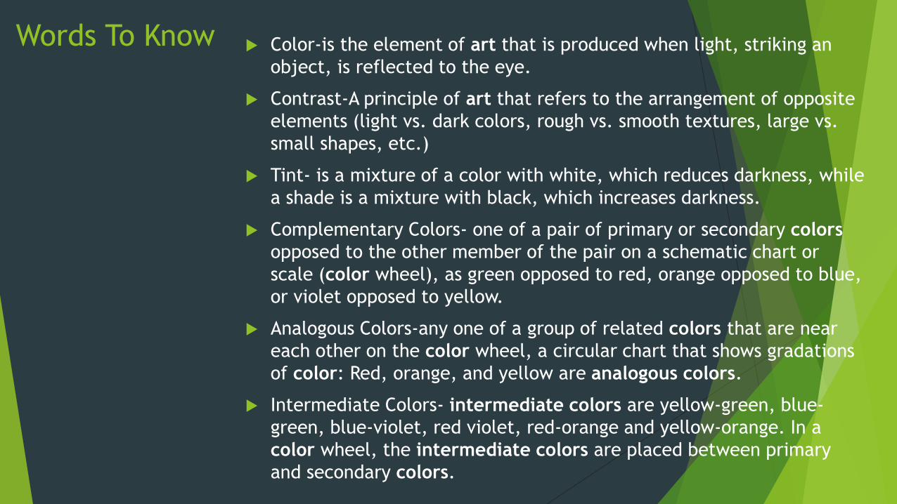
Words To Know Color-is the element of art that is produced when light, striking an
object, is reflected to the eye.
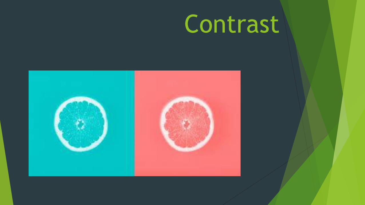
Contrast-A principle of art that refers to the arrangement of opposite
elements (light vs. dark colors, rough vs. smooth textures, large vs.
small shapes, etc.)
Tint- is a mixture of a color with white, which reduces darkness, while
a shade is a mixture with black, which increases darkness.
Complementary Colors- one of a pair of primary or secondary colors
opposed to the other member of the pair on a schematic chart or
scale (color wheel), as green opposed to red, orange opposed to blue,
or violet opposed to yellow.
Analogous Colors-any one of a group of related colors that are near
each other on the color wheel, a circular chart that shows gradations
of color: Red, orange, and yellow are analogous colors.
Intermediate Colors- intermediate colors are yellow-green, blue-
green, blue-violet, red violet, red-orange and yellow-orange. In a
color wheel, the intermediate colors are placed between primary
and secondary colors.
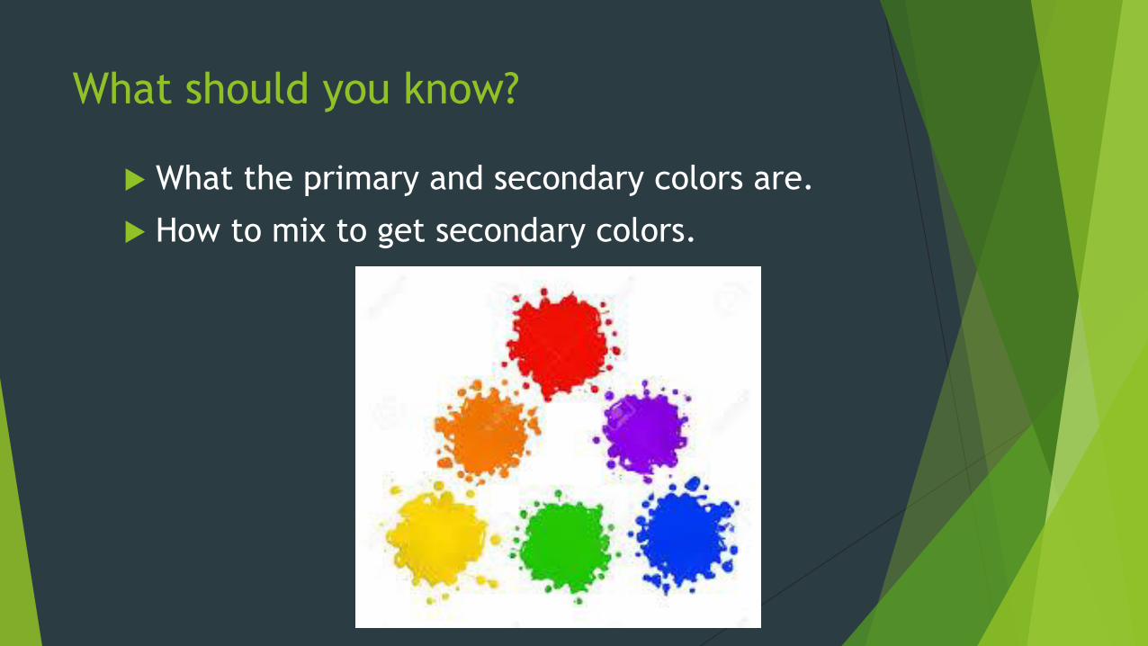
What should you know?
What the primary and secondary colors are.
How to mix to get secondary colors.
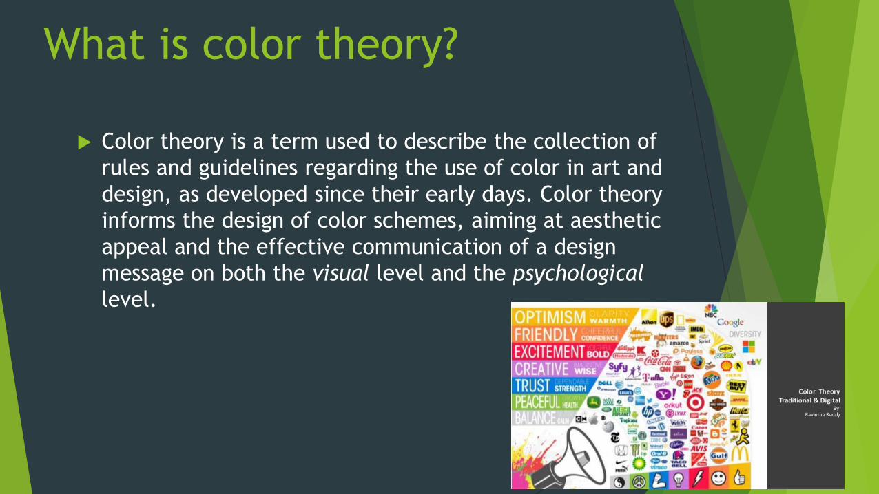
What is color theory?
Color theory is a term used to describe the collection of
rules and guidelines regarding the use of color in art and
design, as developed since their early days. Color theory
informs the design of color schemes, aiming at aesthetic
appeal and the effective communication of a design
message on both the visual level and the psychological
level.
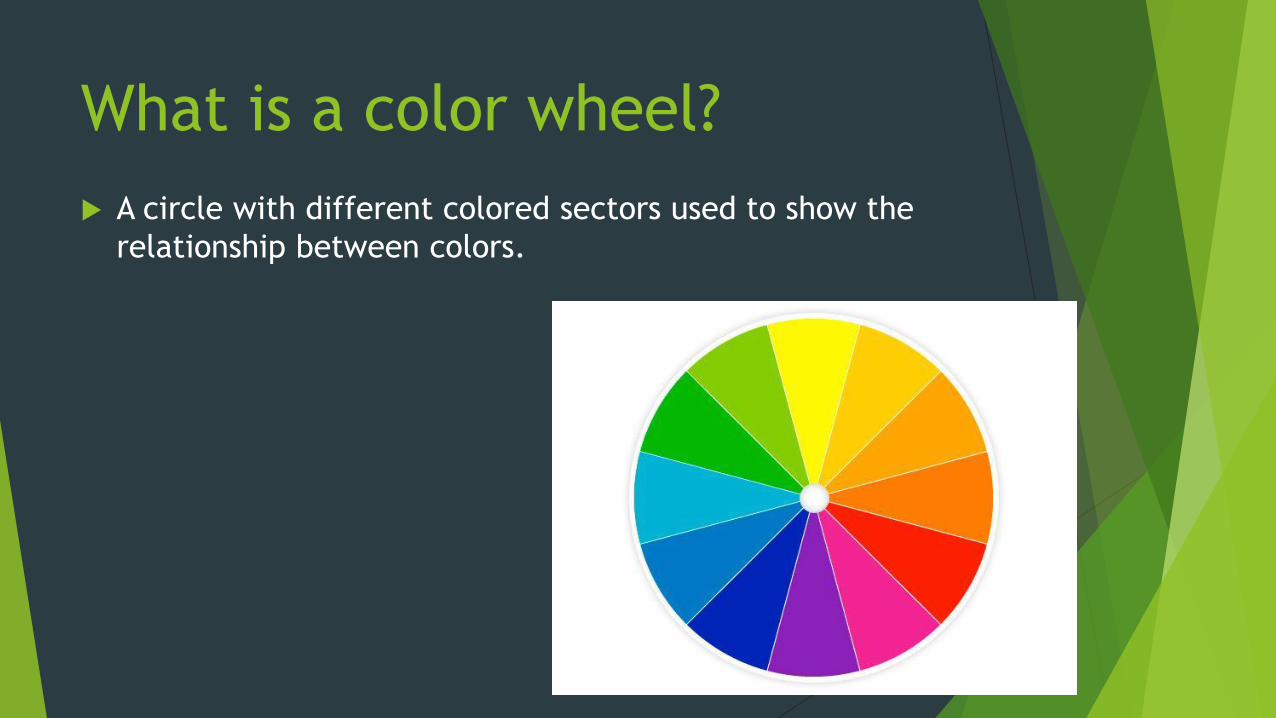
What is a color wheel?
A circle with different colored sectors used to show the
relationship between colors.
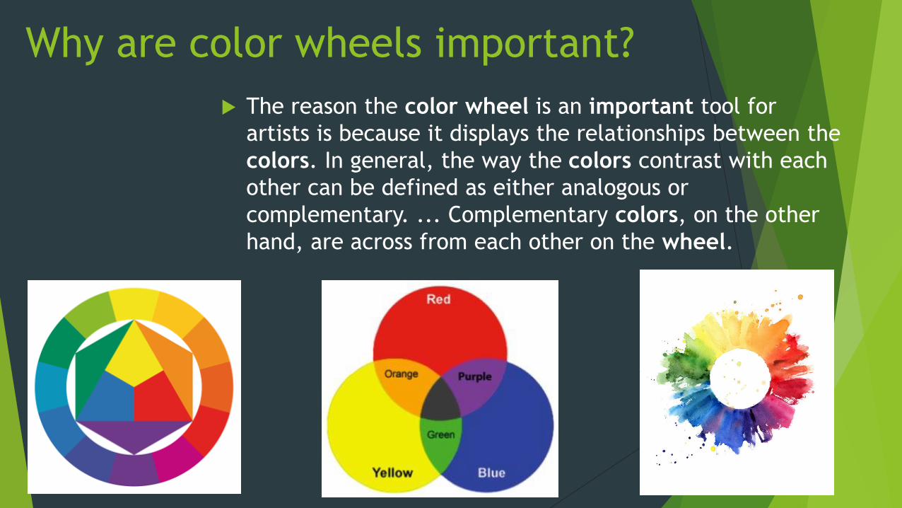
Why are color wheels important?
The reason the color wheel is an important tool for
artists is because it displays the relationships between the
colors. In general, the way the colors contrast with each
other can be defined as either analogous or
complementary. ... Complementary colors, on the other
hand, are across from each other on the wheel.
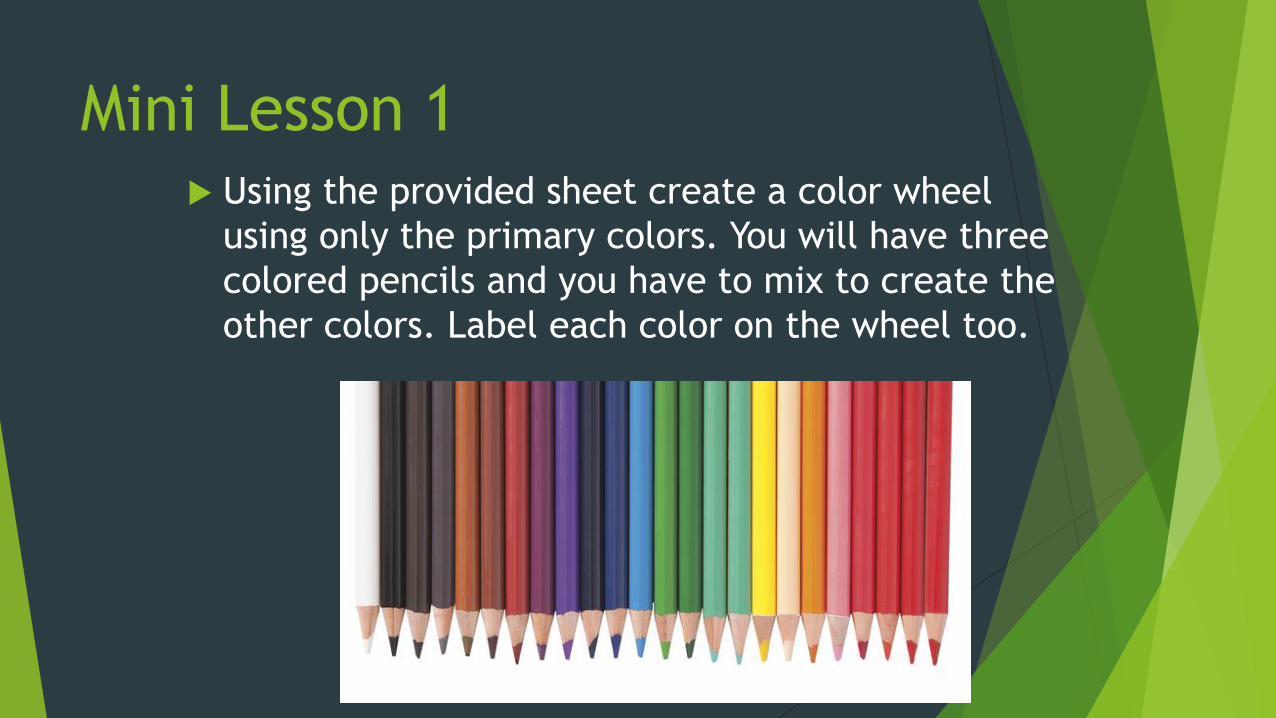
Mini Lesson 1 Using the provided sheet create a color wheel
using only the primary colors. You will have three
colored pencils and you have to mix to create the
other colors. Label each color on the wheel too.
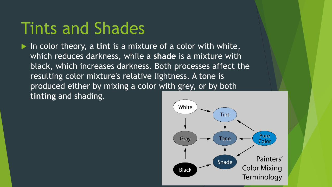
Tints and Shades In color theory, a tint is a mixture of a color with white,
which reduces darkness, while a shade is a mixture with
black, which increases darkness. Both processes affect the
resulting color mixture's relative lightness. A tone is
produced either by mixing a color with grey, or by both
tinting and shading.
When to apply tints and
shade? If you were representing light areas of a specific
color you should apply a tint.
When creating dark areas or shadows on a color
you should apply a shade.
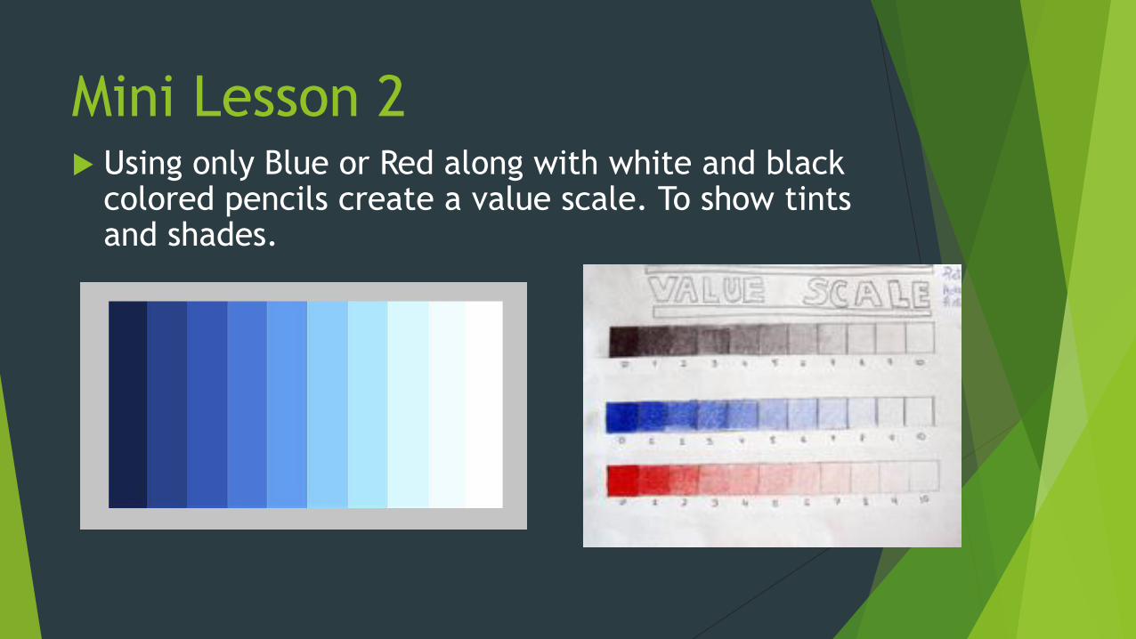
Mini Lesson 2 Using only Blue or Red along with white and black
colored pencils create a value scale. To show tints and shades.
Contrast
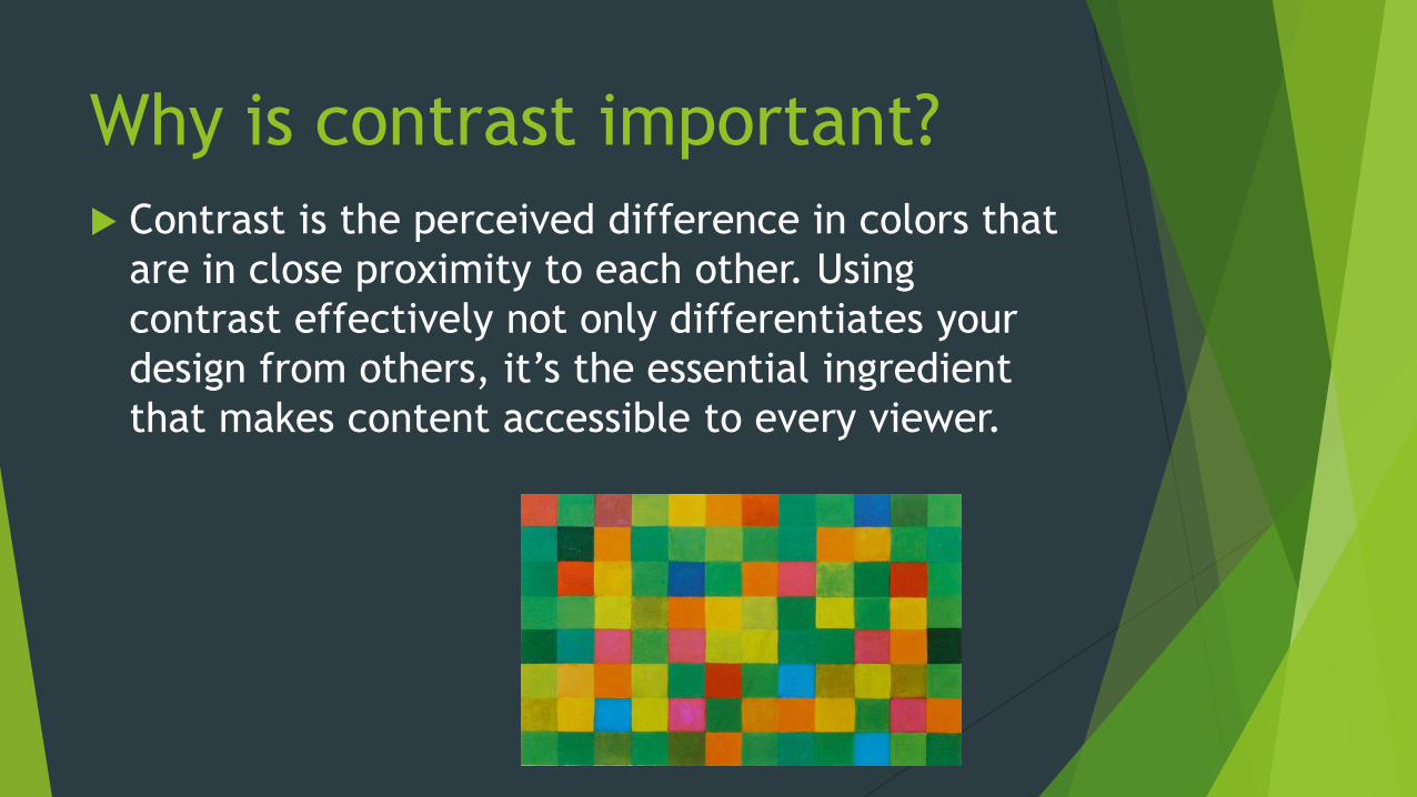
Why is contrast important?
Contrast is the perceived difference in colors that
are in close proximity to each other. Using
contrast effectively not only differentiates your
design from others, it’s the essential ingredient
that makes content accessible to every viewer.
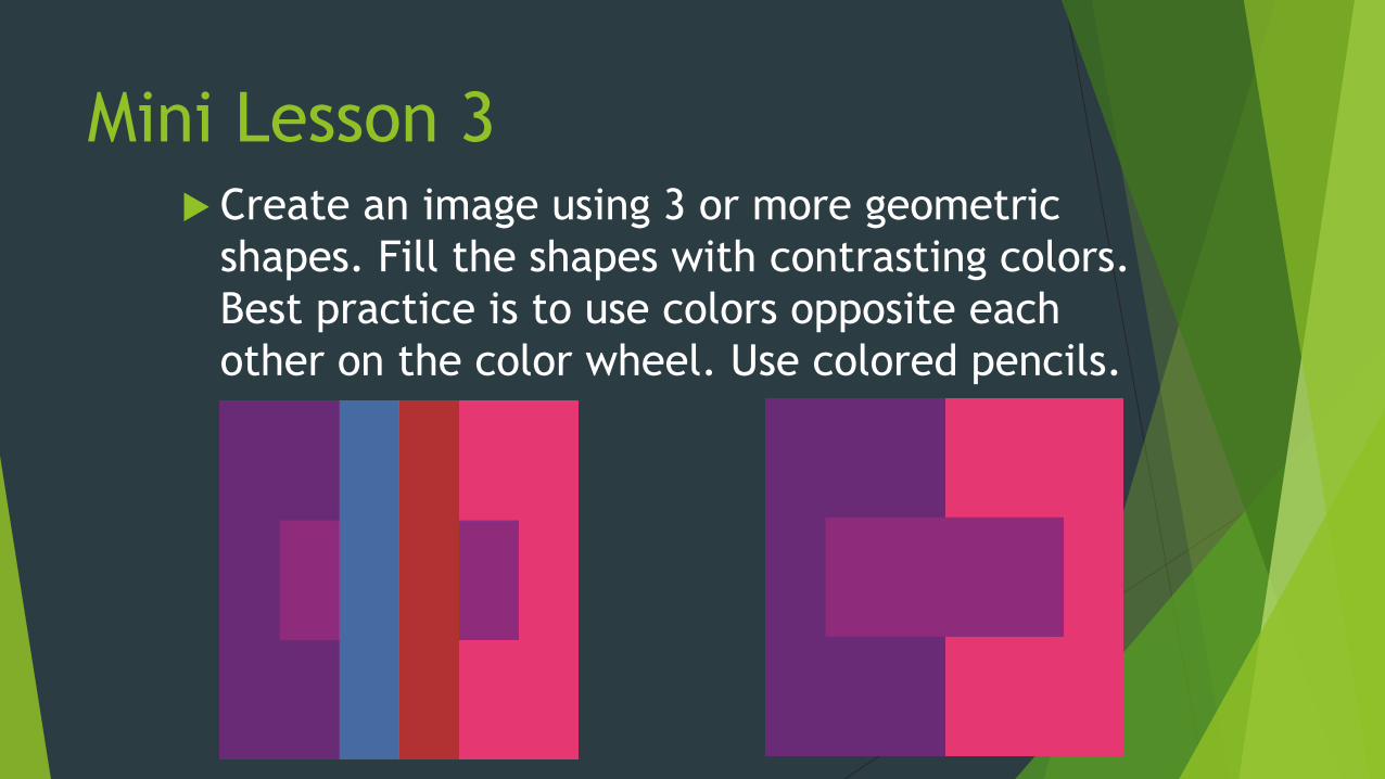
Mini Lesson 3 Create an image using 3 or more geometric
shapes. Fill the shapes with contrasting colors.
Best practice is to use colors opposite each
other on the color wheel. Use colored pencils.
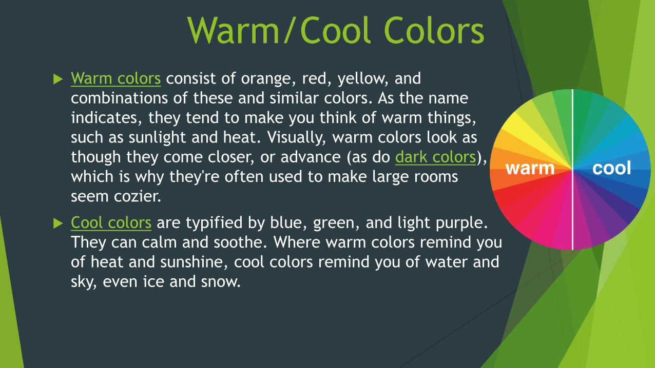
Warm/Cool Colors Warm colors consist of orange, red, yellow, and
combinations of these and similar colors. As the name
indicates, they tend to make you think of warm things,
such as sunlight and heat. Visually, warm colors look as
though they come closer, or advance (as do dark colors),
which is why they're often used to make large rooms
seem cozier.
Cool colors are typified by blue, green, and light purple.
They can calm and soothe. Where warm colors remind you
of heat and sunshine, cool colors remind you of water and
sky, even ice and snow.
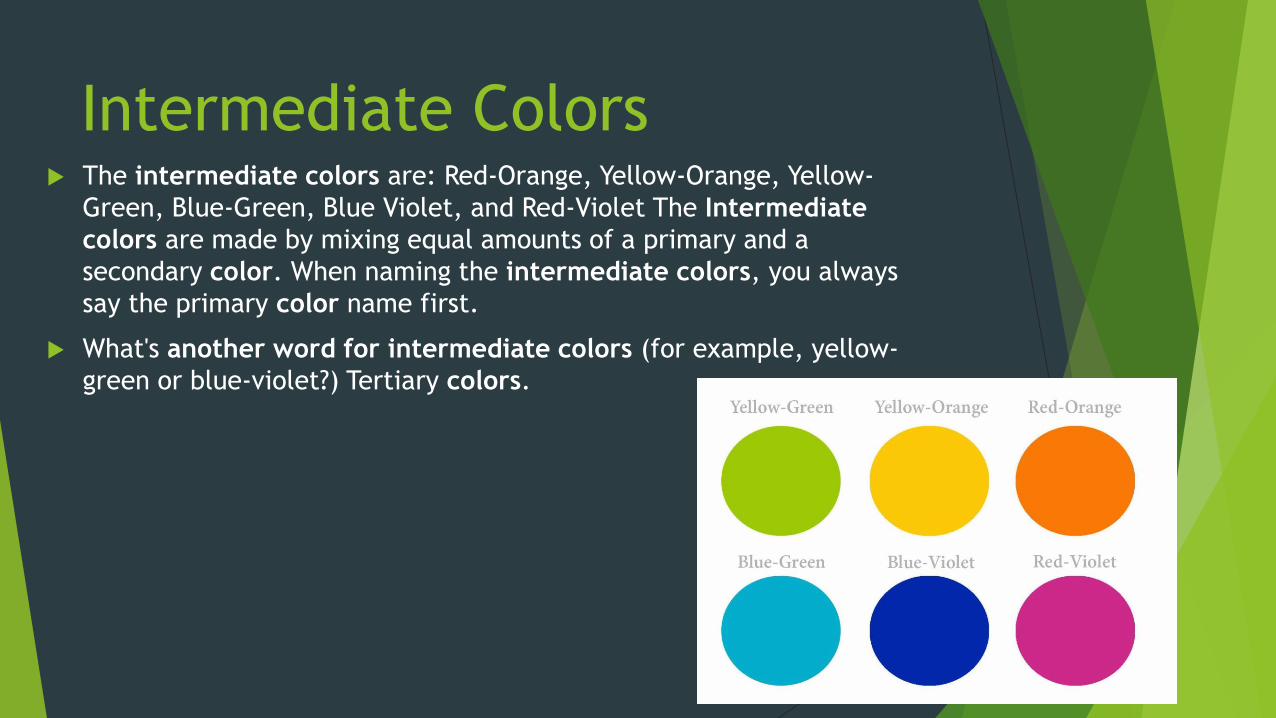
Intermediate Colors The intermediate colors are: Red-Orange, Yellow-Orange, Yellow-
Green, Blue-Green, Blue Violet, and Red-Violet The Intermediate
colors are made by mixing equal amounts of a primary and a
secondary color. When naming the intermediate colors, you always
say the primary color name first.
What's another word for intermediate colors (for example, yellow-
green or blue-violet?) Tertiary colors.
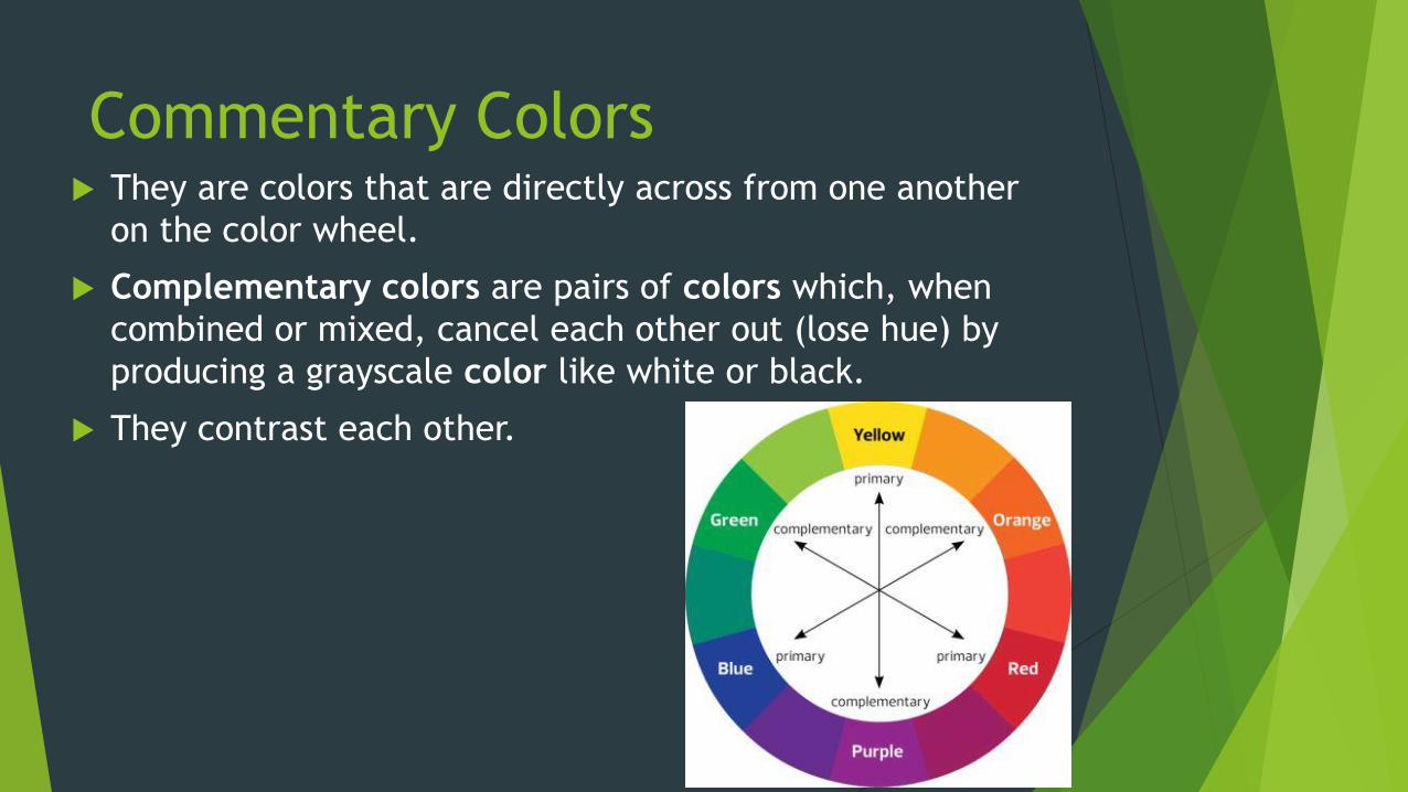
Commentary Colors They are colors that are directly across from one another
on the color wheel.
Complementary colors are pairs of colors which, when
combined or mixed, cancel each other out (lose hue) by
producing a grayscale color like white or black.
They contrast each other.
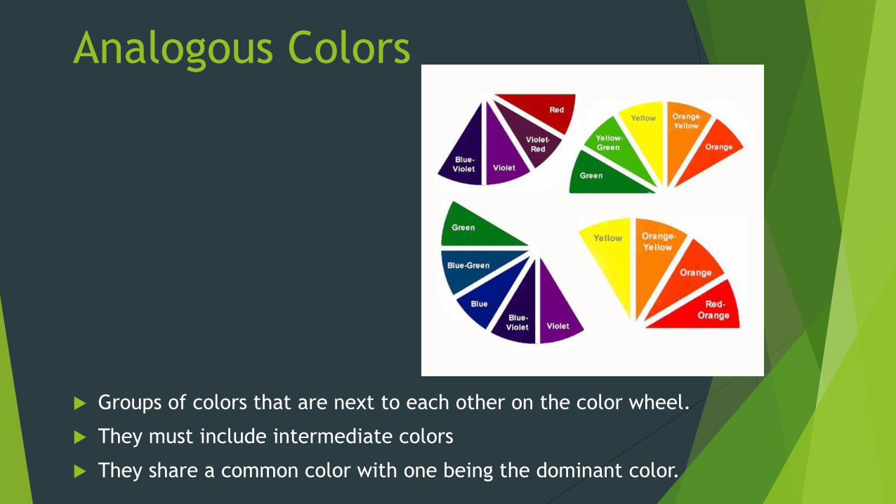
Analogous Colors
Groups of colors that are next to each other on the color wheel.
They must include intermediate colors
They share a common color with one being the dominant color.
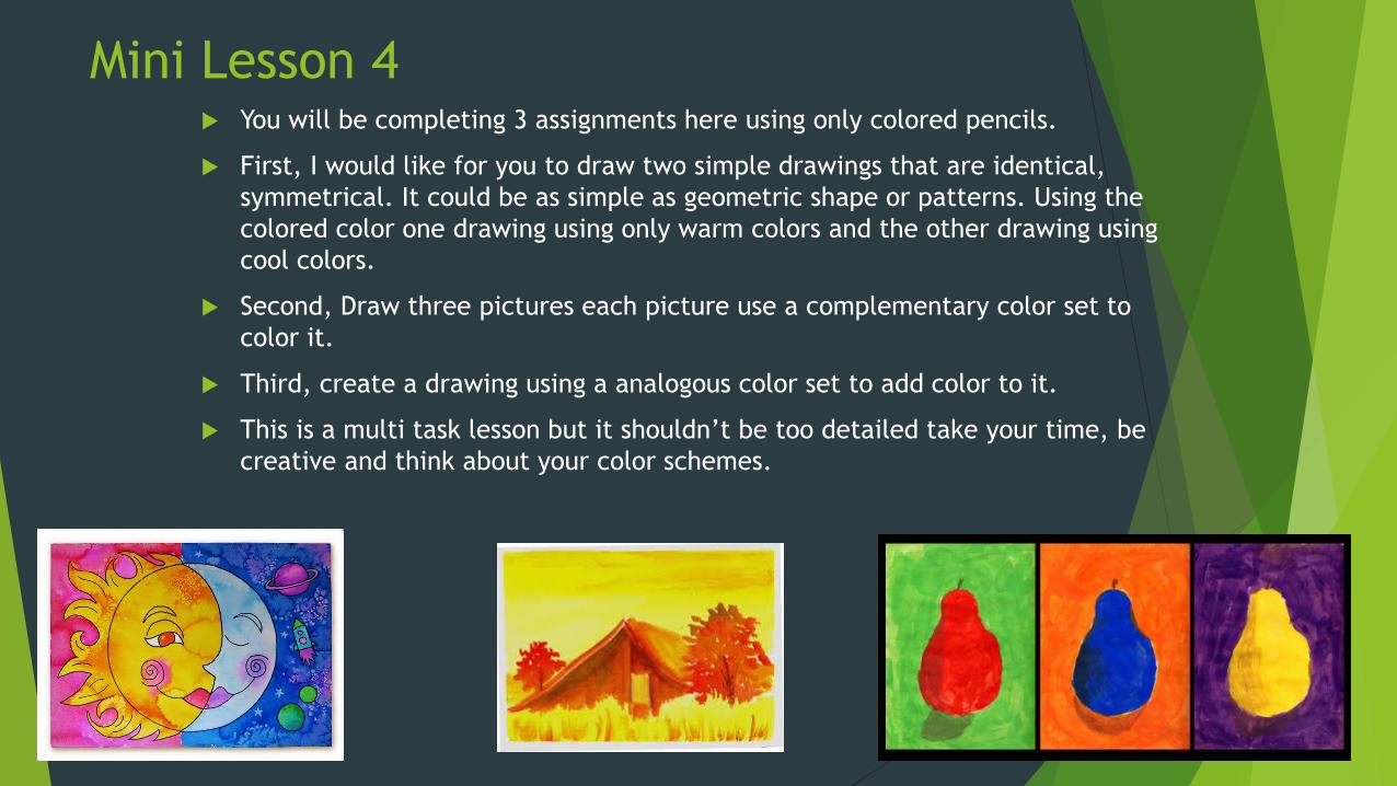
Mini Lesson 4 You will be completing 3 assignments here using only colored pencils.
First, I would like for you to draw two simple drawings that are identical,
symmetrical. It could be as simple as geometric shape or patterns. Using the
colored color one drawing using only warm colors and the other drawing using
cool colors.
Second, Draw three pictures each picture use a complementary color set to
color it.
Third, create a drawing using a analogous color set to add color to it.
This is a multi task lesson but it shouldn’t be too detailed take your time, be
creative and think about your color schemes.
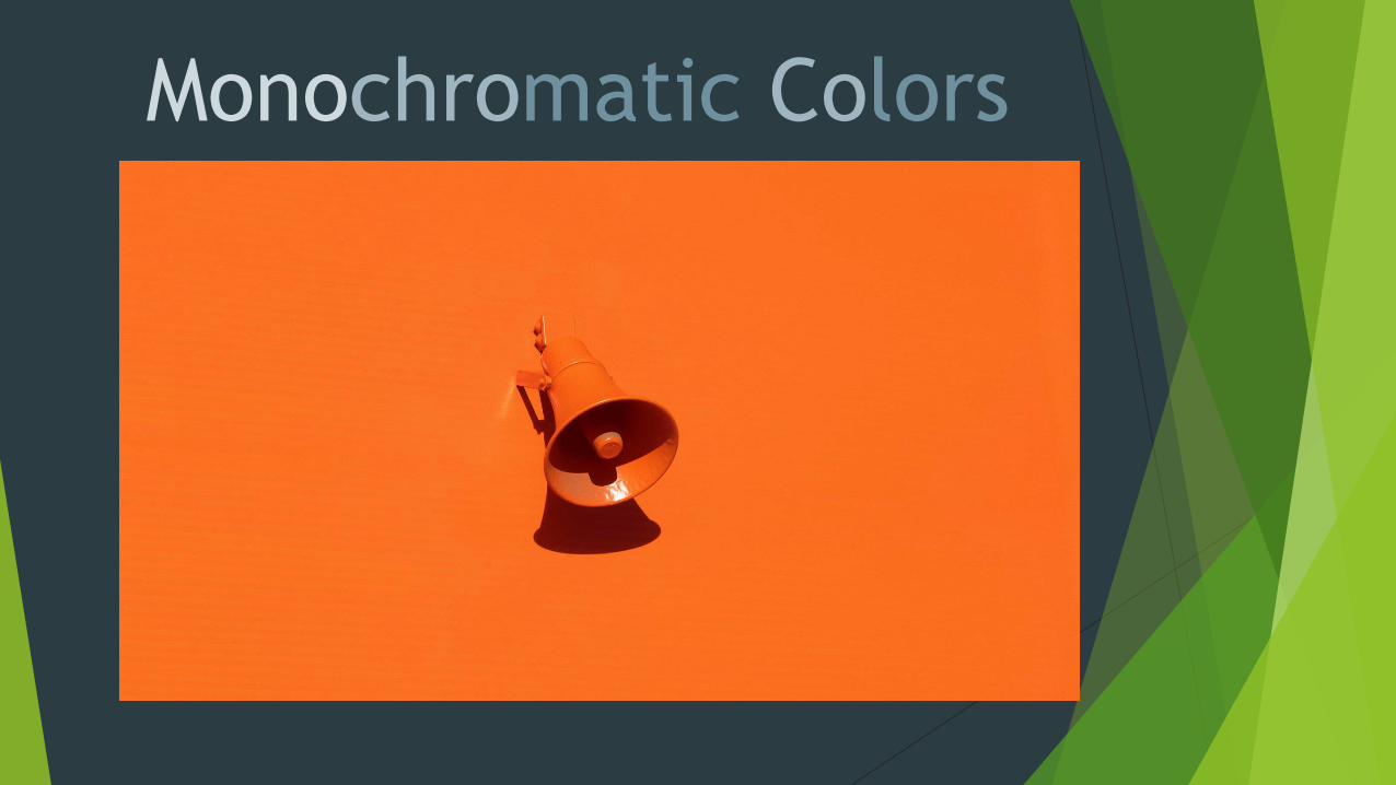
Monochromatic Colors
Monochromatic Color:refers to a color scheme that is comprised
of variations of one color. You can use
any color to create a monochromatic
color scheme. For example, adding white
to red creates pink, adding black to red
creates maroon, etc. Then, you could
have a monochromatic color scheme of
pink, red, and maroon.
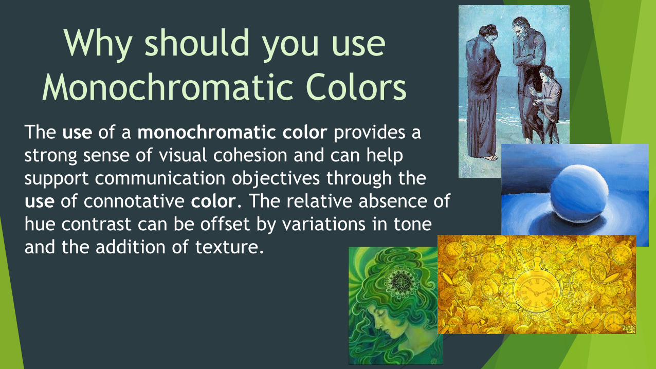
The use of a monochromatic color provides a
strong sense of visual cohesion and can help
support communication objectives through the
use of connotative color. The relative absence of
hue contrast can be offset by variations in tone
and the addition of texture.
Why should you use
Monochromatic Colors
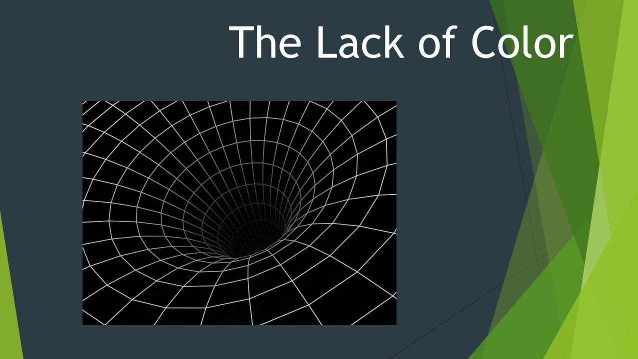
The Lack of Color
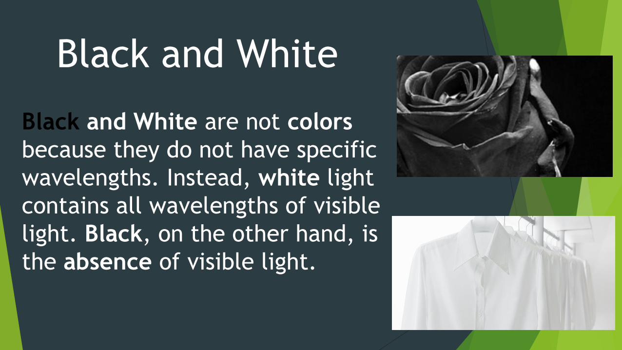
Black and White
Black and White are not colors
because they do not have specific
wavelengths. Instead, white light
contains all wavelengths of visible
light. Black, on the other hand, is
the absence of visible light.
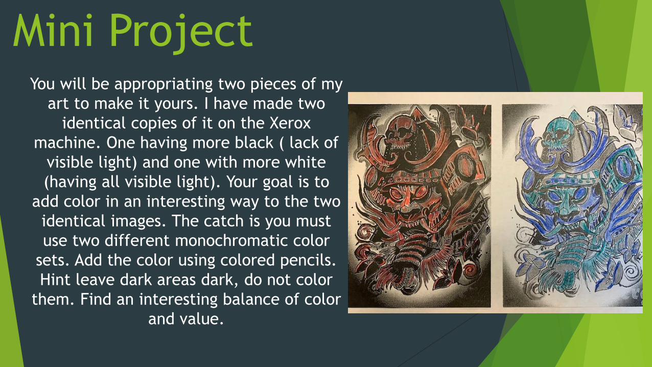
Mini ProjectYou will be appropriating two pieces of my
art to make it yours. I have made two
identical copies of it on the Xerox
machine. One having more black ( lack of
visible light) and one with more white
(having all visible light). Your goal is to
add color in an interesting way to the two
identical images. The catch is you must
use two different monochromatic color
sets. Add the color using colored pencils.
Hint leave dark areas dark, do not color
them. Find an interesting balance of color
and value.