Embed Size (px)
Citation preview
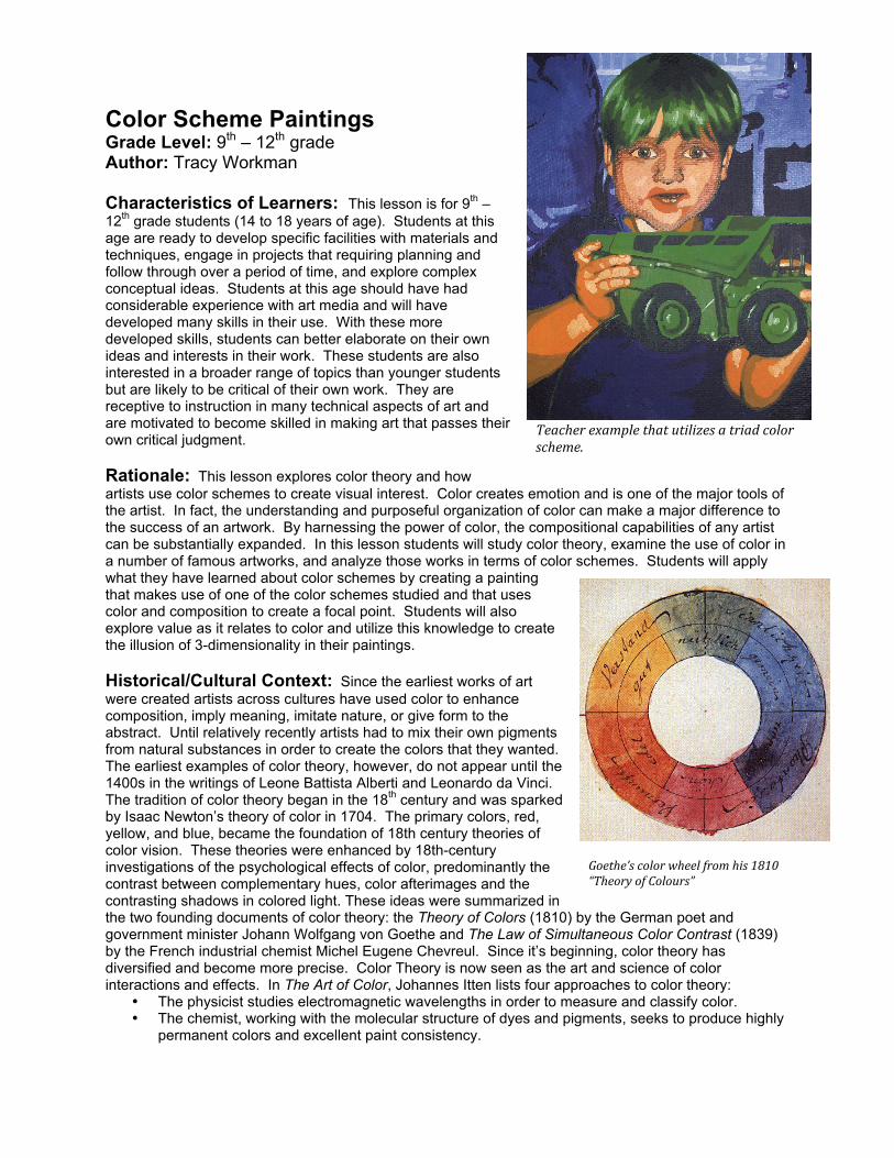
Color Scheme Paintings Grade Level: 9th – 12th grade Author: Tracy Workman Characteristics of Learners: This lesson is for 9th – 12th grade students (14 to 18 years of age). Students at this age are ready to develop specific facilities with materials and techniques, engage in projects that requiring planning and follow through over a period of time, and explore complex conceptual ideas. Students at this age should have had considerable experience with art media and will have developed many skills in their use. With these more developed skills, students can better elaborate on their own ideas and interests in their work. These students are also interested in a broader range of topics than younger students but are likely to be critical of their own work. They are receptive to instruction in many technical aspects of art and are motivated to become skilled in making art that passes their own critical judgment. Rationale: This lesson explores color theory and how artists use color schemes to create visual interest. Color creates emotion and is one of the major tools of the artist. In fact, the understanding and purposeful organization of color can make a major difference to the success of an artwork. By harnessing the power of color, the compositional capabilities of any artist can be substantially expanded. In this lesson students will study color theory, examine the use of color in a number of famous artworks, and analyze those works in terms of color schemes. Students will apply what they have learned about color schemes by creating a painting that makes use of one of the color schemes studied and that uses color and composition to create a focal point. Students will also explore value as it relates to color and utilize this knowledge to create the illusion of 3-dimensionality in their paintings. Historical/Cultural Context: Since the earliest works of art were created artists across cultures have used color to enhance composition, imply meaning, imitate nature, or give form to the abstract. Until relatively recently artists had to mix their own pigments from natural substances in order to create the colors that they wanted. The earliest examples of color theory, however, do not appear until the 1400s in the writings of Leone Battista Alberti and Leonardo da Vinci. The tradition of color theory began in the 18th century and was sparked by Isaac Newton’s theory of color in 1704. The primary colors, red, yellow, and blue, became the foundation of 18th century theories of color vision. These theories were enhanced by 18th-century investigations of the psychological effects of color, predominantly the contrast between complementary hues, color afterimages and the contrasting shadows in colored light. These ideas were summarized in the two founding documents of color theory: the Theory of Colors (1810) by the German poet and government minister Johann Wolfgang von Goethe and The Law of Simultaneous Color Contrast (1839) by the French industrial chemist Michel Eugene Chevreul. Since it’s beginning, color theory has diversified and become more precise. Color Theory is now seen as the art and science of color interactions and effects. In The Art of Color, Johannes Itten lists four approaches to color theory:
• The physicist studies electromagnetic wavelengths in order to measure and classify color. • The chemist, working with the molecular structure of dyes and pigments, seeks to produce highly
permanent colors and excellent paint consistency.
Teacherexamplethatutilizesatriadcolorscheme.
Goethe’scolorwheelfromhis1810“TheoryofColours”
• The physiologist investigates the effects of color and light on our eyes and brain. • The psychologist studies the expressive effects of color on our mind and spirit.
Artists combine all of these areas of knowledge. Note: See Appendix A for sources Sunshine Standards: Students will: (1) know how the elements of art and the principles of design can be used to solve specific art problems; (2) use two-dimensional and three dimensional media, techniques, tools, and processes to communicate an idea or concept based on research, environment, personal experience, observation, or imagination; and (3) understands that works of art can communicate an idea and elicit a variety of responses through the use of selected media, techniques and processes. Objectives: By the end of this lesson, students will be able to: (1) analyze the use of color in a work and identify color schemes, (2) demonstrate an understanding of color theory and color schemes by accurately mixing their own colors and creating a painting that makes use of one of the color schemes discussed, (3) demonstrate skill in the use and application of acrylic paint by mixing their own colors, creating clean edges, using thorough paint coverage, and a good attention to craft, (4) demonstrate an ability to create tints and shades to create a value range within a color and to use those values to imply form, (5) demonstrate an ability to use color and composition to create a focal point. Resources and Materials: Slides, posters, transparencies, digital images or videos that explain color theory and illustrate artists’ use of color schemes. A PowerPoint presentation is recommended. Background information from the websites: http://en.wikipedia.org/wiki/Color_theory and http://psychology.about.com/od/sensationandperception/a/colorpsych.htm and from the books The World of Color and How to Use It by William F. Powell, Launching the Imagination by Mary Stewart, and Exploring Painting by Gerald Brommer, and Nancy Kinne can also be useful. You will also need pencils, erasers, paper, 9” x 12” canvas panels, newspaper, paper towels, acrylic paints in the primary colors and black and white, a variety of paint brushes, cups for water, a paint tray for each student, digital cameras for student use, a color printer, access to Adobe Photoshop or Adobe Illustrator, one copy of the color theory handout for each student, one copy of each of the paint mixing exercise handouts for each student, one copy of the self-assessment sheet for each student, and one copy of the grading rubric for each student. Vocabulary: see handout Preparations: Prepare a bulletin board and a PowerPoint that introduces students to color theory and color schemes. These should include a color wheel with primary, secondary, and tertiary colors, the properties of color: hue, value and intensity, and the following color schemes: complementary, split complementary, triad, analogous, warm, cool, and monochromatic (see handout). Gather art prints or digital images that illustrate the use of color schemes for students to study and discuss. Create copies of the handout, exercise sheets, self-assessment sheets, and grading rubrics for each student. Secure access to digital cameras for student use, making sure that they are charged and that the memory is clear. Create an example “working image” by taking a photograph and reducing the color depth in Photoshop or Illustrator (see procedures). Organize paints, brushes, trays, paper towels and newspaper at a central station where students can easily obtain supplies for the project and that can easily be monitored. Find somewhere on campus with interesting photo opportunities where the teacher can monitor everyone.
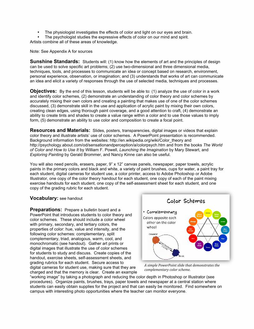
AsimplePowerPointslidethatdemonstratesthecomplementarycolorscheme.
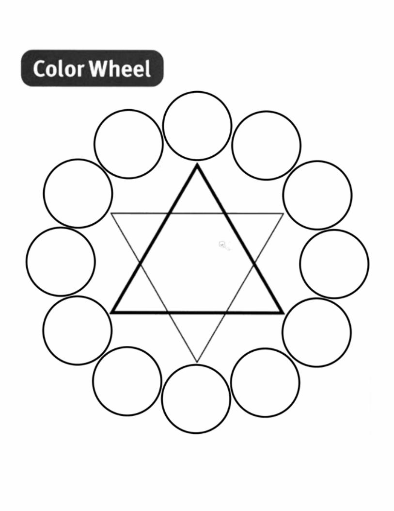
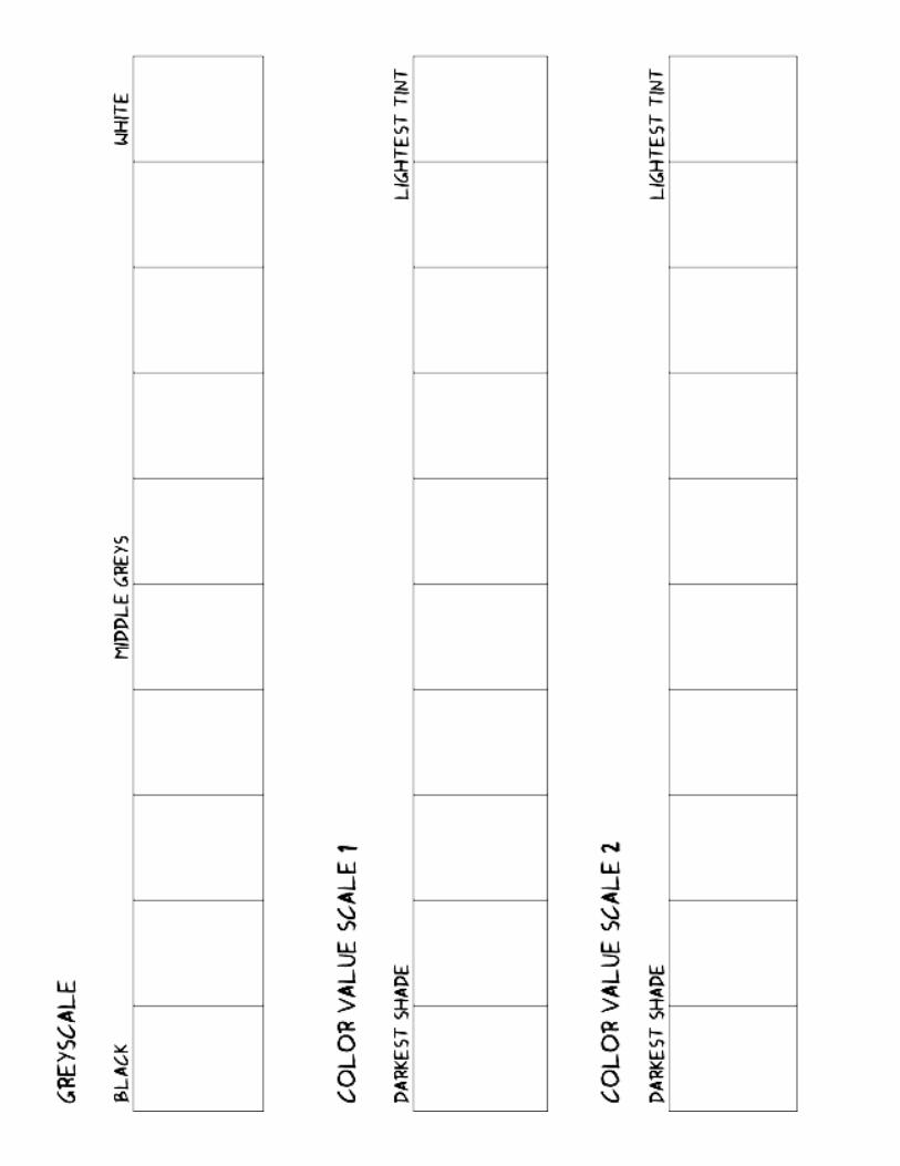
Introduction: (Day 1) Begin the lesson by looking at some of the example artworks that you have gathered for the project. Ask “What colors do you see in this image?”, “Why do you think the artist used those colors?”, “How does the artist use of color effect the image?”, “How do you think it would effect the work if the colors were changed to ________?”. Engage the class in discussion. Follow this discussion by presenting a PowerPoint on Color Theory. During this PowerPoint ask questions to activate students’ existing knowledge of the subject and to help them make connections themselves: “Who knows what the primary colors are?”, “what color is the complement of orange?”, etc. After this presentation look at more artworks as a class, have students identify color schemes, and readdress the questions asked before the presentation. Introduce students to the colors scheme painting project. If desired, instruct students to read pages 80-87 in Exploring Painting for more information on color theory and an introduction to acrylic paint. Before beginning the project students need to practice the knowledge they have just learned by creating their own color wheels. These will also serve as reference material later on. Before students begin this, however, they should be given a short demonstration on the proper way to care for brushes and work with acrylic paint. Clean-up procedures should also be discussed. Students should also be instructed to not begin until you tell them to do so. Supply each student with a color wheel exercise sheet and in small groups allow students to gather their supplies: newspaper, a medium sized paint brush, a paint tray, a paper towel, and small amounts of red, yellow and blue paint. Alternatively, one person from each table can be assigned to gather the materials for that table. Newspaper should be laid out at each student’s workspace to keep the table clean. When every student is prepared explain that the points of the bold triangle point to the three primary colors and demonstrate cleanly and thoroughly painting these colors within the circles. Allow students to follow on their own color wheels and continue by demonstrating that the secondary colors go at the points of the thinner triangle and that the tertiary colors go in the remaining circles. Use the opportunity to ask students where colors should go and how to create them. The second exercise will allow students to practice using value in tandem with color. For this exercise students will need to start with a clean tray and some black and white paint. Distribute the value scale handout to students as before and demonstrate how to complete it. The first of the scales is a grey scale. The left-most square should be black, the right-most square should be white, and a full range of grays should fill in the middle. It is easiest to find a middle-gray first and work on each side of the scale from there. During this exercise students will need the teacher to walk around the room and give advice where needed. When the first scale has been done correctly students can move on. The second scale is to be done with a primary color and black and white. Students should first find where the pure color falls on the value scale. Red and blue will likely be to the left of the middle grays while yellow will likely fall to the right. Once students have painted a square with the pure color they will mix black with their color to get all of the colors to the left (shades) and they will mix white with their color to get all of the colors on the right (tints). The third scale will be done the same way but will start with a secondary color that students mix themselves. Though tedious, these exercises are extremely valuable and will provide students with the skills necessary to create a successful color scheme painting. For both exercises, make sure that students write their names on them. Procedures: Model every step of this process for the students, and walk around the room to assist students who need help. (Step 1) To begin, students will be taking digital photographs to base their paintings on. Before distributing cameras explain to students that they should take photographs that have simple, uncluttered compositions. In their images, students should create a clear focal point by focusing on one object. Close-ups should be encouraged. Show students your example image to familiarize them with how their photos will be altered before they begin painting. Arrange students in pairs and distribute one camera to each pair. As a class, leave the classroom and go somewhere on campus with interesting photo opportunities where the teacher can monitor everyone. Allow students to explore their own ideas with their photographs and bring the class back to the classroom with at least 20 minutes left in class. When
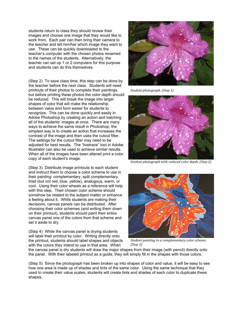
students return to class they should review their images and choose one image that they would like to work from. Each pair can then bring their camera to the teacher and tell him/her which image they want to use. These can be quickly downloaded to the teacher’s computer with the chosen photos renamed to the names of the students. Alternatively, the teacher can set up 1 or 2 computers for this purpose and students can do this themselves. (Step 2) To save class time, this step can be done by the teacher before the next class. Students will need printouts of their photos to complete their paintings, but before printing these photos the color depth should be reduced. This will break the image into larger shapes of color that will make the relationship between value and form easier for students to recognize. This can be done quickly and easily in Adobe Photoshop by creating an action and batching all of the students’ images at once. There are many ways to achieve the same result in Photoshop, the simplest way is to create an action that increases the contrast of the image and then uses the cutout filter. The settings for the cutout filter may need to be adjusted for best results. The “livetrace” tool in Adobe Illustrator can also be used to achieve similar results. When all of the images have been altered print a color copy of each student’s image. (Step 3) Distribute image printouts to each student and instruct them to choose a color scheme to use in their painting: complementary, split complementary, triad (but not red, blue, yellow), analogous, warm, or cool. Using their color wheels as a reference will help with this step. Their chosen color scheme should somehow be related to the subject matter or enhance a feeling about it. While students are making their decisions, canvas panels can be distributed. After choosing their color schemes (and writing them down on their printout), students should paint their entire canvas panel one of the colors from that scheme and set it aside to dry. (Step 4) While the canvas panel is drying students will label their printout by color. Writing directly onto the printout, students should label shapes and objects with the colors they intend to use in that area. When the canvas panel is dry students will draw the major shapes from their image (with pencil) directly onto the panel. With their labeled printout as a guide, they will simply fill in the shapes with those colors. (Step 5) Since the photograph has been broken up into shapes of color and value, it will be easy to see how one area is made up of shades and tints of the same color. Using the same technique that they used to create their value scales, students will create tints and shades of each color to duplicate these shapes.
Studentphotograph.(Step1)
Studentphotographwithreducedcolordepth.(Step2)
Studentpaintinginacomplementarycolorscheme.(Step5)
Distribution and Clean-Up: Before beginning, organize paints, brushes, trays, paper towels and newspaper at a central station where students can easily obtain supplies for the project and that can easily be monitored. Alternatively, one person from each table can be assigned to gather the materials for that table. Before students begin they should be given a short demonstration on the proper way to care for brushes and work with acrylic paint. Newspaper should be laid out at each student’s workspace to keep the table clean. For clean-up students should be instructed to completely rinse out their brushes, trays, and cups (and be shown the proper way to do so), stack them to dry, and place their newspaper in a bin for future use. A drying rack or area should also be ready to accommodate student work. To facilitate clean up students can be sent to the clean up sinks in small groups and/or monitors can be assigned to make sure everything goes smoothly. Instruct students to begin cleaning up about 10 minutes before the end of class to ensure that there is enough time to do everything right. It is also a good idea for the teacher to check the cleaning station before releasing the students from the classroom. Closure: At the end of the project student work should be shared with the class via a critique. This can be done in small groups or as a whole class activity. For small group critiques, distribute 3” x 5” cards to students and instruct them to review the work of the 2 or 3 other students in their group. On this card students should analyze their peers’ works based upon the criteria of the assignment in addition to their own likes and dislikes. Instruct students to write 2 specific things that the work does well and three specific things that could be improved. Discuss how different students approached the project and how the use of color schemes affected the work. After the peer review and discussion cards should be given to the artist and students should fill out the self-assessment worksheet (see appendix). Students should gather their 2 exercise worksheets, their peer review cards, and their self-assessment worksheet to turn in with their painting. If possible display the students’ paintings for the rest of the school to see. Assessment: Questions to consider when evaluating students’ learning and performance in this lesson include: To what extent were students able to analyze the use of color in a work and identify color schemes? How successfully did students demonstrate an understanding of color theory and color schemes by accurately mixing their own colors and creating a painting that makes use of one of the color schemes discussed? Did students demonstrate skill in the use and application of acrylic paint by mixing their own colors, creating clean edges, using thorough paint coverage, and a good attention to craft. Were students able to demonstrate an ability to create tints and shades to create a value range within a color and to use those values to imply form? Did students demonstrate an ability to use color and composition to create a focal point? Refer to students’ own self-assessment and preliminary exercises in assessing the outcomes of the lesson. See attachment for a rubric to assist in assessing student work. This rubric should be filled out for each student with the appropriate levels of achievement circled in each category. A grade and additional notes can be written on it as well before it is handed back to the student. With this specific feedback students can be given extra time to revise their works if desired. Extensions: (1) Divide the class into 2 or 3 groups and give each group one image. Have each group create paintings of their image in different color schemes. How does the color scheme affect the image? (2) Allow students to apply their knowledge of color schemes with a digital project. Have students take their photographs and manipulate them digitally to achieve a number of different color schemes. How do the images feel different in each color scheme?
Appendix A: Bibliography: Brommer, Gerald, and Nancy Kinne, Exploring Painting, Davis Publications, Worcester, pages 80-87. “Color Theory,” Wikipedia, http://en.wikipedia.org/wiki/Color_theory Powell, William F., The World of Color and How to Use it, Walter Foster Publishing, 1984 Stewart, Mary, “The Element of Color,” Launching the Imagination, McGraw Hill, New York, 2006, pages 52-75 Van Wagner, Kendra, “Color Psychology: How Colors Impact Moods, Feelings, and Behaviors,” About.com, http://psychology.about.com/od/sensationandperception/a/colorpsych.htm Appendix B: Handouts:
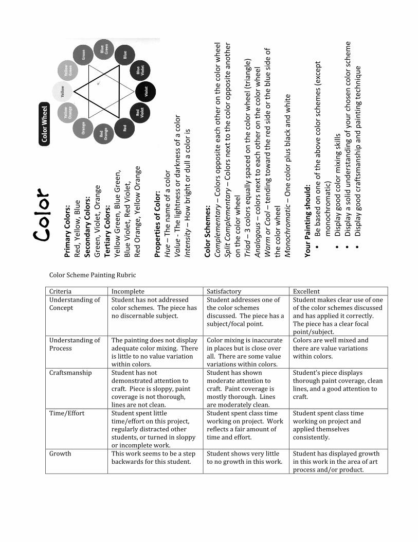
ColorSchemePaintingRubricCriteria Incomplete Satisfactory ExcellentUnderstandingofConcept
Studenthasnotaddressedcolorschemes.Thepiecehasnodiscernablesubject.
Studentaddressesoneofthecolorschemesdiscussed.Thepiecehasasubject/focalpoint.
Studentmakesclearuseofoneofthecolorschemesdiscussedandhasapplieditcorrectly.Thepiecehasaclearfocalpoint/subject.
UnderstandingofProcess
Thepaintingdoesnotdisplayadequatecolormixing.Thereislittletonovaluevariationwithincolors.
Colormixingisinaccurateinplacesbutiscloseoverall.Therearesomevaluevariationswithincolors.
Colorsarewellmixedandtherearevaluevariationswithincolors.
Craftsmanship Studenthasnotdemonstratedattentiontocraft.Pieceissloppy,paintcoverageisnotthorough,linesarenotclean.
Studenthasshownmoderateattentiontocraft.Paintcoverageismostlythorough.Linesaremoderatelyclean.
Student’spiecedisplaysthoroughpaintcoverage,cleanlines,andagoodattentiontocraft.
Time/Effort Studentspentlittletime/effortonthisproject,regularlydistractedotherstudents,orturnedinsloppyorincompletework.
Studentspentclasstimeworkingonproject.Workreflectsafairamountoftimeandeffort.
Studentspentclasstimeworkingonprojectandappliedthemselvesconsistently.
Growth Thisworkseemstobeastepbackwardsforthisstudent.
Studentshowsverylittletonogrowthinthiswork.
Studenthasdisplayedgrowthinthisworkintheareaofartprocessand/orproduct.
Color
PrimaryCo
lors:
Red
,Yellow,B
lue
Secon
daryColors:
Green
,Violet,Orange
TertiaryCo
lors:
YellowGreen
,BlueGreen
,BlueViolet,R
edViolet,
Red
Orange,YellowOrange
Prope
rtiesofColor:
Hue–The
nam
eofacolor
Value‐Thelightne
ssordarkne
ssofacolor
Intensity–How
brighto
rdu
llacoloris
ColorSchem
es:
Com
plem
entary–Colorsop
positeeachothe
ron
thecolorwhe
el
SplitCo
mplem
entary–Colorsne
xtto
thecolorop
positeano
ther
onthecolorwhe
el
Tria
d–3colorsequ
allyspacedon
thecolorwhe
el(triangle)
Ana
logo
us–colorsne
xtto
eachothe
ron
thecolorwhe
el
WarmorC
ool–te
ndingtowardtheredside
ortheblue
sideof
the
colorwhe
el
Mon
ochrom
atic–One
colorplusblackandwhite
You
rPa
intingsho
uld:
• Be
based
onon
eofth
eabovecolorsche
mes(e
xcep
tmon
ochrom
atic)
• Displaygoo
dcolormixingskills
• Displayasolidund
erstandingofyou
rchosen
colorschem
e•
Displaygoo
dcraftsmanshipand
paintingtechniqu
e
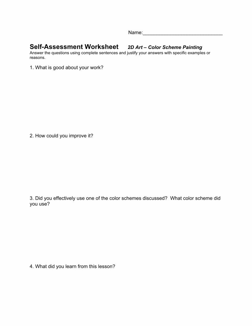
Name:_____________________________ Self-Assessment Worksheet 2D Art – Color Scheme Painting Answer the questions using complete sentences and justify your answers with specific examples or reasons. 1. What is good about your work? 2. How could you improve it? 3. Did you effectively use one of the color schemes discussed? What color scheme did you use? 4. What did you learn from this lesson?