Embed Size (px)
Citation preview

primary and secondary colors
COLOR PALETTE
@%452
@12
graphic identity standards manual
i ns t i t u t e o F c l a s s i c a l
architecture & art
This guide details the elements that support and define the ICAA identity program. The information is designed to present
the ICAA logo and image in a consistent way in all communication materials.

@%452
contents
2mission
3
language
4logohistory
full and one color applications
chapter and patron logos
embellishments
incorrect usage
9color
10typographyprimary typefaces
trajan
centaur
copperplate gothic
alternate typefaces for print
alternate typefaces for web
17pattern
18framing

@22
@%452
mission
The InsTITuTe of ClassICal arChITeCTure & arT (ICaa) Is The leadIng naTIonal
nonprofIT organIzaTIon dedICaTed To advanCIng The praCTICe and
appreCIaTIon of The ClassICal TradITIon In arChITeCTure and The allIed arTs.
ICaa fulfIlls ITs mIssIon Through four program areas:
eduCaTIon, publICaTIons, awards, and advoCaCy.
....................
eduCaTIon
ICaa provides a forum and comprehensive educational resource for students, design and building professionals, and the general public, both in the united states and in europe.
programs Continuing education courses; study and drawing tours; seminars; intensive winter and summer programs for
professionals; academic partnerships extending a unique curriculum. also included are lectures, exhibits, walking and travel tours, and conferences available to the general public. These programs are increasingly available at
ICAA Chapters nationwide as well as at the New York national office. Additionally in New York, the Grand Central Academy of Art provides fine art instruction in both full-time and part-time programs and the Beaux-Arts
Atelier is a non-accredited, full-time program in classical architecture.
publICaTIons
ICaa publishes an annual journal, The Classicist, and new and reprinted books on classical design through “The Classical america series in art and architecture.” The Forum, a newsletter for members, is published twice
a year, complemented by a lively array of email updates from across the country throughout the year. There is also an online blog at blog.classicist.org.
awards
Through the annual arthur ross awards ceremony, ICaa recognizes excellence by honoring the achievements and contributions of architects, painters, sculptors, artisans, landscape designers, patrons, and others in preserving
and advancing the classical tradition. The Rieger-Graham Prize and the Alma Schapiro Prize provide opportunities for designers, architects and fine artists to study abroad as affiliated fellows of the American Academy in Rome.
advoCaCy
ICaa maintains a strong voice in the public domain, championing the continuation of the classical tradition as a vital cultural resource.

@32
@%452
editorial guidelines
language
This graphic Identity manual is meant to set a standard for the Institute of Classical architecture & art (ICaa), both for the national office in New York and for the ICAA Chapters nationwide. It is meant above all to provide continuity of branding and identity as the organization continues to evolve. The name of the organization has had an evolutionary
trajectory befitting the growth from the six-week summer program in 1992 to the national multi-layered membership and education provider that it is today.
following the combination of the Institute of Classical architecture & Classical america (ICa&Ca), and responding to the growth of the larger community of practitioners and members of the general public interested in the classical tradition in architecture and its allied arts, the ICaa encouraged the development of regional, state, or local member Chapters.
The creation of the Chapters nationwide and the desire to emphasize the classical tradition in both architecture and the fine arts led to the new name, Institute of Classical Architecture & Art (ICAA) in 2011. Please note as of this writing,
the name is a dba (doing business as) or aKa (also known as). The legal name for the organization is Center for the study of Classical architecture.
In text, in the first instance, the standard is to use the full name followed by the acronym parenthetically: Institute of Classical architecture & art (ICaa)
In text, in the first instance, do not refer to the name as The Institute of Classical architecture & art or The Institute of Classical architecture and art
Thereafter the acronym may be used like this: ICaa
The acryonym is not ICa&a or ICa & a
one may refer to: “the Institute” or “the ICaa”
It is in the best interest of all those who are part of the organization to work together to embrace the standards set forth in this manual. Consistency of use will ensure successful communication and recognition of the ICaa brand.
Questions and concerns no doubt will arise as the ICaa continues to develop and should be directed to the national office and dyad communications.
....................
Institute of Classical architecture & art: henrika Taylor [email protected]
or (212) 730-9646
dyad communications: [email protected] or (215) 636-0505

@42
@%452
history
logo
The Institute of Classical Architecture & Art (ICAA) is represented by the Augustus Saint-Gauden’s sculpture of Roman goddess Diana. The bronze statue topped Stanford White’s 19th century Madison Square Garden. When the building was demolished in 1926, a rallying cry for historic preservation erupted and inspired a revival in traditional and classical
architecture and art. A translation of the Diana statue, coupled with a classical typographic configuration, is the cornerstone of the ICaa graphic identity program.
i ns t i t u t e o F c l a s s i c a l
architecture & art

@52
@%452
full color and one color applications
logo
full color
i ns t i t u t e o F c l a s s i c a l
architecture & art
full color with address
full color on black backgroundfull color on gold background
1 color logotype 100% black; Diana 30% black
i ns t i t u t e o F c l a s s i c a l
architecture & art
i ns t i t u t e o F c l a s s i c a l
architecture & art
Several versions of the ICAA logo have been created to provide the most flexibility for a range of applications. depending upon usage criteria, the most legible and appropriate selection for print or web will be chosen by the user.
maintaining contrast between the logo and background is paramount.
The file formats provided are: Eps: traditional offset and digital print applications
Jpg: web applications

@62
chapter and patron logos
logo
Chapter and donor level specific versions of the primary logo are offered to maintain consistency throughout our nationally recognized organization. The artwork is provided as a “lock-up” to retain the elements in their correct positions
and proportions. The chapter or donor level name is included under the lock-up of the organization name but does not include the word “chapter” or “member”. These logos are available by contacting Kelly price at [email protected]
or (212) 730-9646.
@%452

@72
logo
visual materials for ICaa chapters may be enhanced with embellishments such as relevant line art. recommended usage is either screened or light colors applied beneath the logo as to not hinder legibility. The intention
of an embellishment is to accent print or web materials and not compete with the official lock-up chapter logo as with the examples below.
@%452
embellishments

@82
incorrect usage
logo
The following examples illustrate incorrect logo interpretation: diminished readability, compromised integrity, and reduced impact. while not every possible situation is illustrated, the user will get an idea of what is acceptable and what is not.
be mindful that when using the logo, the primary goal is to provide maximum legibility.
do not set name in a different typeface do not include additional text with the logo do not change the heirarchy of organization name
Institute of Classical
architecture & art
do not skew or distort the logo
i ns t i t u t e o F c l a s s i c a l
architecture & art
do not place on backgrounds that render the logo indistinct
i ns t i t u t e o F c l a s s i c a l
architecture & art
do not render type in another color
classical architecture & arti n s t i t u t e o f
do not center logo above name
i ns t i t u t e o F c l a s s i c a l
architecture & art
A proud member of
@%452

@92
The core ICAA identity colors are Pantone 874 and black and are recommended for official materials such as stationary and support materials. Pantone 874 is a bronze color and used to reflect the Diana sculpture’s original material.
When printing either digitally or traditional four-color process, the conversion for Pantone 874 is 0% Cyan, 20% Magenta, 50% Yellow, and 30% Black.
a secondary palette is provided to offer more variation when designing ICaa visual materials. These colors are suggestions that complement the ICaa brand, but certainly other choices are permissible.
Note: Printed colors may appear different on coated and uncoated paper.
primary colors...
secondary colors...
Black0% Cyan, 0% Magenta, 0% Yellow, 0% Black
Hex: 0060a9
Pantone 74991% Cyan, 2% Magenta, 20% Yellow, 0% Black
Hex: ffce0
Pantone 74060% Cyan, 17% Magenta, 100% Yellow, 0% Black
Hex: d4b255
Pantone 87423% Cyan, 0% Magenta, 100% Yellow, 17% Black
Hex: bb9b6d
Pantone 1730% Cyan, 80% Magenta, 94% Yellow, 1% Black
Hex: bb9b6d
Pantone 542544% Cyan, 15% Magenta, 7% Yellow, 22% Black
Hex: 82a1b5
primary and secondary color palettes
COLOR
@%452

@%452
@102
primary typefaces
typography
The three core font families that comprise the ICAA identity program are: Trajan, Copperplate Gothic 31 BC, and Centaur. The classical character of these typefaces contributes to the overall graphic style of the ICaa.
use of these recommended fonts ensures impact and consistency.
situations may arise when it is desirable to include fonts that are an addition or substitution to the core font family. other classical typeface options are available that will maintain the goal of readability and legibility.
when choosing fonts, judicious selection is suggested.
....................
TrajanABCDEFGHIJKLMNOPQRSTUVWXYZ
1234567890
CenTaurabCdefghIJKlmnopQrsTuvwXyz
abcdefghijklmnopqrstuvwxyz1234567890
ABCDEFGHIJKLMNOPQRSTUVWXYZabcdefghijklmnopqrstuvwxyz
1234567890
COPPERPLATE GOTHIC 31BC

@112
@%452
trajan — regular
typography
The works of the famous Andrea Palladio,
published by himself at Venice in the
year 1570 have been universally esteemed
the best standard of architecture hitherto
extant. The original work written in Italian
being very scarce, several have attempted to
translate the same into English, and to copy
his excellent and most accurate wooden
prints on copper plates. To do justice there-
fore to Palladio, and to perpetuate his most
valueable remains amongst us, are the principal
inducements to my undertaking so great and
laborious a work.
Trajan is an all capital letter typeface. To create visual impact, hierarchy and emphasis, the use of color and size differentiation is recommended. To maintain the integrity of the font, use only the regular weight
instead of the heavier, bold weight.
....................
Trajan is a glyphic typeface. Glyphic designs are based on letters carved or chiseled in stone. Since most inscribed letters are capitals, glyphic typefaces also tend to only have capitals. The design of the Trajan typeface is based on the letterforms of capitalis monumentalis or Roman
square capitals, as used for the inscription at the base of Trajan’s Column from which the typeface takes its name.

@122
@%452
centaur — roman, italic, small caps
typography
The works of the famous Andrea palladio, published by himself at Venice in the year 1570 have been universally esteemed the best
standard of architecture hitherto extant. The original work written in Italian being very scarce, several have attempted to translate the same into english, and to copy his excellent and most accurate wooden prints on copper plates. To do justice therefore to palladio, and to perpetuate his most valueable remains amongst us, are the principal inducements to my undertaking so great and laborious a work.
Centaur has been customized for the ICAA with old style figures to include numerals and letterforms that hang either above or below the baseline. To create visual impact, hierarchy and emphasis, the use of color and
size differentiation is recommended.
....................
Centaur is a Venetian typeface. Named after the first Roman typefaces that appeared in Venice in 1470, Venetian typefaces were initially designed to imitate the handwriting of Italian Renaissance scholars.

@132
typography
The works of the famous andrea palladio,
published by himself at venice in the year 1570 have been
universally esteemed the best standard of architecture
hitherto extant. the original work written in italian
being very scarce, several have attempted to translate
the same into english, and to copy his excellent and most
accurate wooden prints on copper plates. to do justice
therefore to palladio, and to perpetuate his most value-
able remains amongst us, are the principal inducements
to my undertaking so great and laborious a work.
Copperplate Gothic 31 is an all capital letter typeface. To create visual impact, hierarchy and emphasis, the use of color and size differentiation is recommended.
....................
Copperplate Gothic 31 is a glyphic typeface. Glyphic designs are based on letters carved or chiseled in stone. Since most inscribed letters are capitals, glyphic typefaces also tend to only have capitals.
@%452
copperplate gothic — 31bc

@142
@%452
alternate typefaces — for print materials
typography
adobe garamond pro may be substituted for Centaur when Centaur is unavailable such as in microsoft word. both regular and italic weights of may be used.
....................
Garamond is the name given to a group of old-style serif typefaces named after the letter-cutter Claude Garamond (c. 1480–1561). Most of the Garamond faces are more closely related to the work of a later letter-cutter, Jean Jannon. A direct relationship between Garamond’s
letterforms and contemporary type can be found in the Roman versions of the typefaces Adobe Garamond.
ADOBE GARAMOND PRO
Adobe Garamond Pro – Italic
ABCDEFGHIJKLMNOPQRSTUVWXYZabcdefghijklmnopqrstuvwxyz
1234567890
ABCDEFGHIJKLMNOPQRSTUVWXYZabcdefghijklmnopqrstuvwxyz
1234567890

@152
@%452
alternate typefaces — for web applications
typography
arial, georgia, and helvetica are suggested fonts for web applications. each is represented in classicist.org and have been chosen for optimal on-screen legibility and rendering across Mac and Windows platforms and browsers. Arial is used
for the navigation, helvetica for the body text and georgia for the small sidebar serif font. using other typefaces on the web such as Trajan is not recommended, as they may prove to be functionally unstable. mac and windows platforms render specific default fonts; Arial, Georgia, and Helvetica are among these and will provide the most consistent and readable results.
....................
Arial is a near-copy of Helvetica, updated slightly. Windows uses Arial in place of Helvetica. Helvetica is a sans-serif font. It is highly legible on-screen and a good choice for short text, perhaps a paragraph or two in length.
Georgia is a Microsoft Web font. It has serifs but also has large lowercase letters. It is a nicely readable screen font.
arialaBCDEFGHiJKlMNOPQrSTUVWXYZ
1234567890
GeorgiaABCDEFGHIJKLMNOPQRSTUVWXYZ
abcdefghijklmnopqrstuvwxyz1234567890
HelveticaABCDEFGHIJKLMNOPQRSTUVWXYZ
abcdefghijklmnopqrstuvwxyz1234567890
primary and secondary colors
COLOR PALETTE
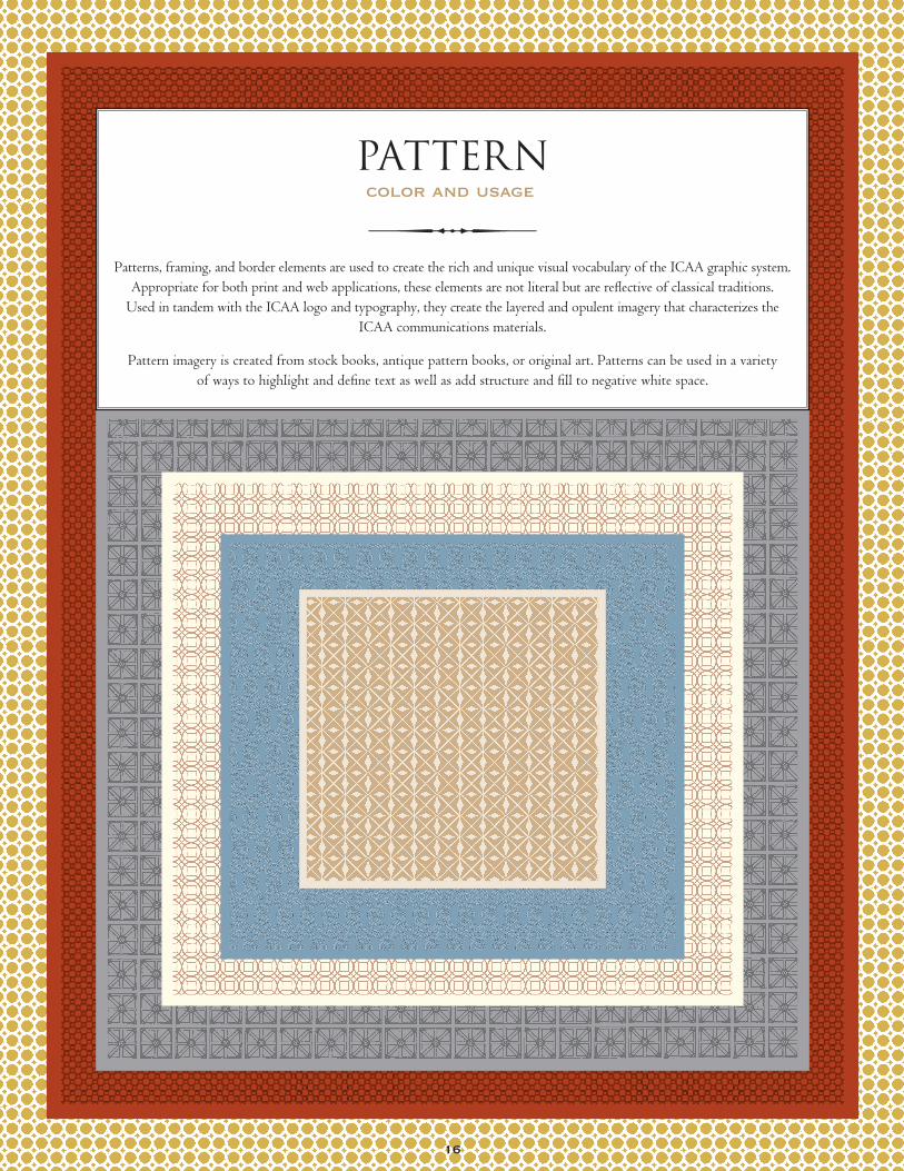
@%452patterns, framing, and border elements are used to create the rich and unique visual vocabulary of the ICaa graphic system.
Appropriate for both print and web applications, these elements are not literal but are reflective of classical traditions. used in tandem with the ICaa logo and typography, they create the layered and opulent imagery that characterizes the
ICaa communications materials.
pattern imagery is created from stock books, antique pattern books, or original art. patterns can be used in a variety of ways to highlight and define text as well as add structure and fill to negative white space.
color and usage
pattern
@%452
16

@17 2
@%452
borders
framing
line borders and frames are used to accent photography and establish boundaries. These elements may be used individually or in combination. They add importance and a more polished appearance to the typographic area or image that it surrounds.
varied line weights and spacing make borders and frames more unique. In addition to the examples of border and frame treatments below, each page of this identity guide utilizes recommended treatments.