Embed Size (px)
Citation preview
www.campusconnections.us
Cognitive Walkthrough Evaluation
Yale University School of Art
Allison Hall
LIS 644 - Usability Theory & Practice
Pratt SILS
1
Executive Summary
Yale University is one of the most revered higher education institutes in the world. As an Ivy League
school they are held to certain standards of professionalism and expertise. Yale’s website offers
extensive information about the university and it serves as a virtual representation of the institution.
This report evaluates the usability of the School of Art section of Yale’s website. Through a cognitive
walkthrough approach it has been determined that first time users to the site would confront
navigation, usability, and findability issues. Fortunately, the issues found with the site are simple
design fixes that will visually and virtually support Yale’s steadfast reputation of holding the bar high.
Recommended fixes include:
● Creating consistent backgrounds, colors, and fonts on each page. Content and images
should not be placed arbitrarily. Users need to comfortably read each page and
quickly access the information they seek.
● Using proper spatial alignment to reorganize information on each page. Important
information should be presented prominently so that it does not become buried with
other second tier content of the page.
● Restructuring navigation options to group content and create hierarchies. This will
help users find information more efficiently.
● Prominently display Yale University’s name or logo at the top of each page. A user
should be reassured they are on the correct site.
These research supported findings will help create a more intuitive and useful experience for the
user. Once these recommendations have been implemented, the site will blend in more cohesively
with the rest of Yale’s website. A sense of uniformity between all aspects of Yale’s site will help
maintain its strong reputation and allow users to feel confident using their site. Ultimately, users of
the School of Art site will easily find, explore, and enjoy the excellent information available on the
site.
2
CONTENTS
Executive Summary 2
Introduction 4
Methodology 4
Findings and Recommendations 5
Problem and Solution 1 5
Problem and Solution 2 6-7
Problem and Solution 3 8
Problem and Solution 4 9
Example Solutions 9-10
Conclusion 10
Appendix 11-12
3
Introduction
Yale University is widely known as one of the most prestigious Ivy League schools. This historic
institution is at the pinnacle of American higher education. With great power comes great
responsibility and Yale works hard to maintain their reputation. This report evaluates and discusses
an area of the institution that has perhaps been overlooked; Yale’s School of Art website. The School
of Art site is not uniform with the rest of the website and while unique, this is confusing to first time
users of the site. Below are the results and recommendations found in a cognitive walkthrough of
Yale’s Art School website.
Methodology
A cognitive walkthrough was performed to carry out a task on Yale’s School of Art site. This
methodology was modeled after The Cognitive Walkthrough Method: A Practitioner's Guide
(Wharton, et al). Each step, which can be found below, was determined a success or a failure based
on four questions created by Wharton et al. These questions are: Will the user try to achieve the right
effect? Will the user notice if the correct action is available? Will the user associate the correct action
with the effect trying to be achieved? If the correct action is being performed, will the user see that
progress is being made toward solution of the task?
Four usability researchers collaborated to complete each step of the task and examined them as the
users of the website. Using the results from each step the researchers were able to create a
comprehensive evaluation of the task and provide solutions to some of the site’s shortcomings.
A detailed summary of each step of the walkthrough defined as a success or failure is described in
the appendix of this report.
Target User: The target user of Yale’s School of Art site is a prospective art student. The user is also a
first time visitor to the site. The general age range of users ranges from 17 years old and up assuming
that high school students interested in college programs would be some of the most common
visitors. With short attention spans or inexperience researching, these users need the information
they seek to be obvious and readily available.
Task: Find the description of the “Mobile Computing” Graphic Design class and see if there are any
limitations or requirements for enrollment in that class.
Action Sequence for Interface: www.yale.edu → art.yale.edu
1. (on the Yale homepage) Click Academic Programs
2. Click Schools
3. Click School of Art
4. Click Courses
5. Click Graphic Design 752a: Mobile Computing
6. Find course description and prerequisite/limitation information.
4
Findings and Recommendations
Yale’s School of Art website is one of a kind from an artistic standpoint. The website is clear that the
content is a collaboration of student and staff/faculty contributions which also makes it unique.
While these are important qualities, the results of the cognitive walkthrough show that some
structural and visual improvements could help the overall functionality of the site.
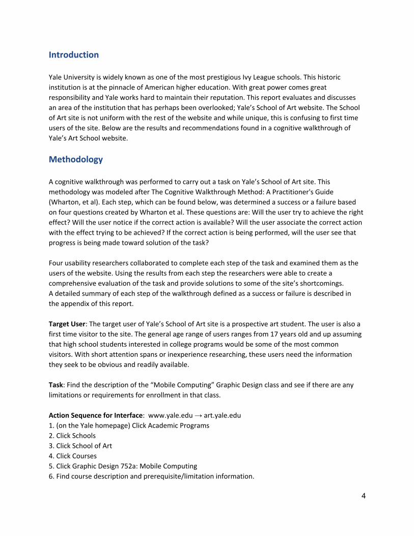
Problem #1: Inconsistent background, colors, fonts, and images. The user has a hard time locating and
reading content.
This is the current homepage for Yale’s School of Art site. One of the most important concerns in
visual design for a website is readability. If a user has difficulty reading a page, the design has failed.
While it is clear that the designers of this page put a lot of effort into creating it, they definitely
overlooked some main usability issues. Repetition and alignment are two basic principles of visual
design. Instead of using different fonts, fonts colors, and font sizes, it would make it much easier for
the user if these items were similar. It is best to avoid noise and clutter. Instead of arbitrarily placing
information on the page, it should be mapped out visually so that a user can make intuitive decisions
about how they are to use the site. As a general rule, if there is no clear purpose of, for example,
alternating the color of every other letter in a sentence, then it should not be done.
Solution #1: Create a more consistent background for each page. This includes colors, fonts, and
images. The user should know they are on a page associated with Yale.
5
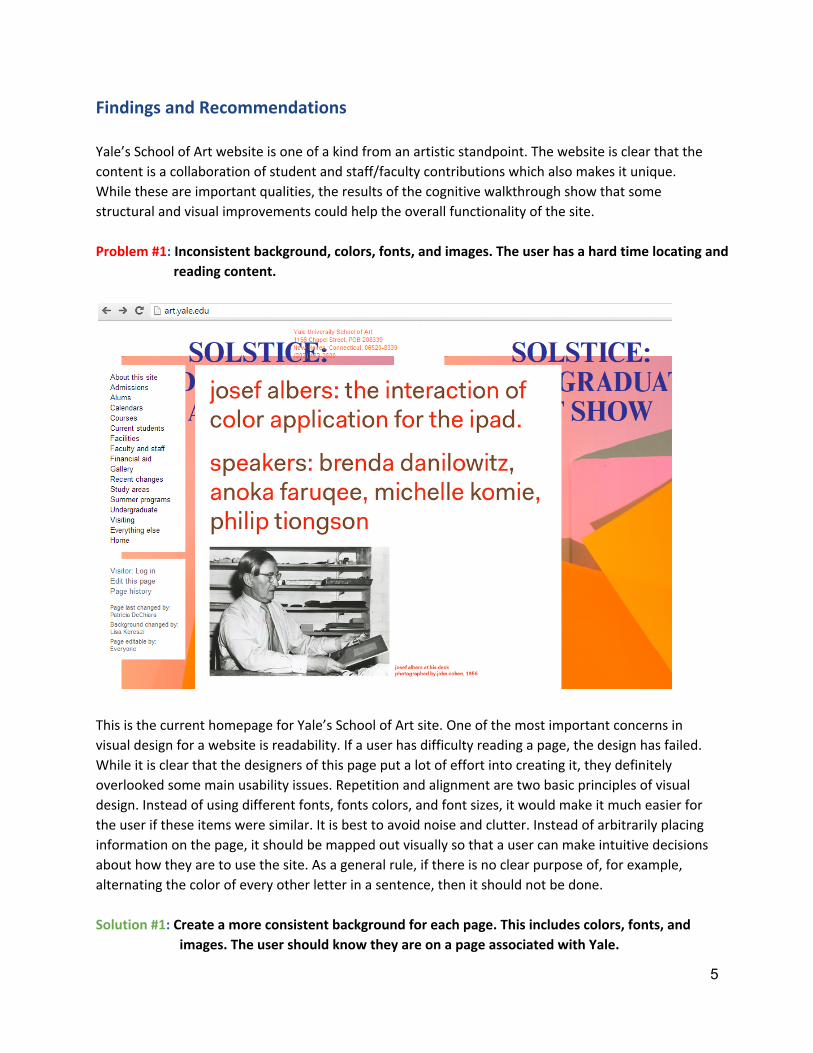
Problem #2: Course page layout is structured without clear mapping or spatial alignment. Information
is buried in the page.
This is the mobile computing class homepage. This is the first thing the user sees without scrolling
down. While there is a simple white background, it is unclear if the content of the page so far relates
to the course.
(continued on next page)
6

About 3/4ths down the page the user can find a scrollable course description (pictured above). If the
user makes it this far (content not pictured are several images, PDF files, and a youtube video) they
then have to read in a separate box and scroll down to find all course information. There are many
things happening on the page which distract the user from the information on the page. Reorganizing
this page and any other course page similar to this would improve usability, readability, and
findability. The creators of the site are clearly excited and put a lot of effort into getting interesting
(and what appears to be relevant) items on the page. They were meticulous about small details like
gradation in the course description. It is important to be detailed but not without purpose. This site
right now looks more like a gallery page or blog instead of a representation of the university’s art
school. A more structured page would definitely help the user understand the site better as well as
find the information they seek.
Solution #2: Reorganize each Course page to make sure that the course description and relevant
prerequisite information is at the top. Consider a template for each page to create
consistency.
7
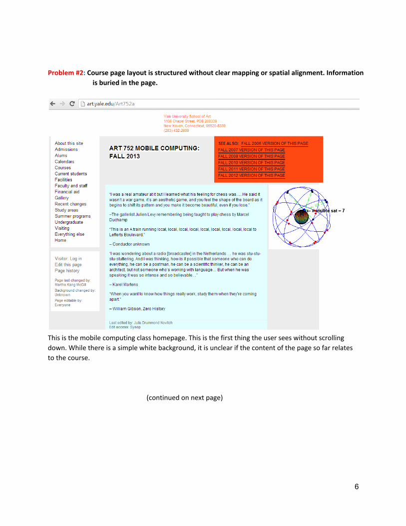
Problem #3: Navigation has no grouped content or hierarchy.
It is important that information on websites is created with clear hierarchies. The navigation bar on
the left hand side of the page is listed in alphabetical order (aside from “Everything Else” and
“Home”). The current navigation has seventeen main links. It appears to be more of a list than a
directory of information. Users need guidance when they get to a page. Navigation and content that
is logically grouped together help the user orient themselves so that they can find information.
Giving the user too many ungrouped options at once can confuse them. It is recommended that the
navigation bar is limited to between five and ten main links. This will help create consistent visual
and content organization for the user. It is often better to have a logical hierarchy of information as
opposed to a list of categories and subjects.
Solution #3: Restructure Navigation bar to create a logical hierarchy for increased usability.
8
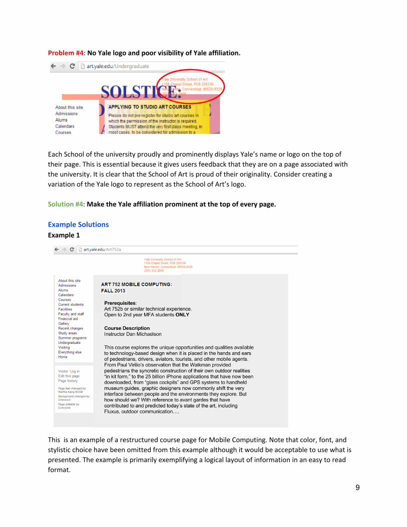
Problem #4: No Yale logo and poor visibility of Yale affiliation.
Each School of the university proudly and prominently displays Yale’s name or logo on the top of
their page. This is essential because it gives users feedback that they are on a page associated with
the university. It is clear that the School of Art is proud of their originality. Consider creating a
variation of the Yale logo to represent as the School of Art’s logo.
Solution #4: Make the Yale affiliation prominent at the top of every page.
Example Solutions
Example 1
This is an example of a restructured course page for Mobile Computing. Note that color, font, and
stylistic choice have been omitted from this example although it would be acceptable to use what is
presented. The example is primarily exemplifying a logical layout of information in an easy to read
format.
9
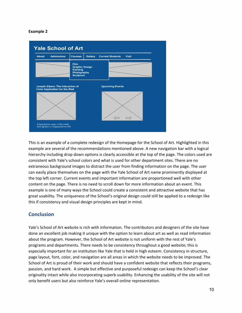
Example 2
This is an example of a complete redesign of the Homepage for the School of Art. Highlighted in this
example are several of the recommendations mentioned above. A new navigation bar with a logical
hierarchy including drop down options is clearly accessible at the top of the page. The colors used are
consistent with Yale’s school colors and what is used for other department sites. There are no
extraneous background images to distract the user from finding information on the page. The user
can easily place themselves on the page with the Yale School of Art name prominently displayed at
the top left corner. Current events and important information are proportioned well with other
content on the page. There is no need to scroll down for more information about an event. This
example is one of many ways the School could create a consistent and attractive website that has
great usability. The uniqueness of the School’s original design could still be applied to a redesign like
this if consistency and visual design principles are kept in mind.
Conclusion
Yale’s School of Art website is rich with information. The contributors and designers of the site have
done an excellent job making it unique with the option to learn about art as well as read information
about the program. However, the School of Art website is not uniform with the rest of Yale’s
programs and departments. There needs to be consistency throughout a good website; this is
especially important for an institution like Yale that is held in high esteem. Consistency in structure,
page layout, font, color, and navigation are all areas in which the website needs to be improved. The
School of Art is proud of their work and should have a confident website that reflects their programs,
passion, and hard work. A simple but effective and purposeful redesign can keep the School’s clear
originality intact while also incorporating superb usability. Enhancing the usability of the site will not
only benefit users but also reinforce Yale’s overall online representation.
10
Appendix
This appendix provides a summary of each step of the cognitive walkthrough using Wharton et al’s
model for proper step-by-step analysis.
Step 1: Click Academic Programs - Success
This step is located on the homepage of the Yale website. It is intended to bring the user,
who is interested in finding more information about a specific academic program, into the
correct directory. The given task is easy for the user to complete as Academic Programs is a
clickable button on the main navigation bar. Immediate feedback is given as the button
changes colors when hovering over it and when clicked it takes the user to the desired page.
Step 2: Click Schools - Success
This step is very direct and a clear option on the page. A user will know what to do and they
will notice the correct action is available right away. The School link changes color when it is
hovered over to indicate that it is a link. Once clicked, it brings the user to a new page so
immediate positive feedback is give.
Step 3: Click School of Art - Success
This is also a success. The next step makes senses to users and they are able to find School of
Art easily as the schools are listed alphabetically. Again, the link changes color to indicated it
is clickable and when the user clicks it they are taken to a new page.
Step 4: Click Courses - Failure
Based on on visibility alone this step fails. This step brings the user to the School of Art
homepage and the user becomes disoriented. The page is not uniform with the rest of Yale’s
site and the user may feel that they have been redirected to another site completely. This
could very easily tempt the user to leave the page. Furthermore, the navigation is listed
together quite compactly on the left hand side. The Courses tab seems buried in a list of
other main navigation options and is hard to find.
Step 5: Click Graphic Design: 752a “Mobile Computing” - Success (with improvements needed)
For the most part this step was a success. The user will definitely try to achieve the right
effect and scroll down the page as it is logical to do so. Graphic Design courses happen to be
at the top of the course list because they are listed alphabetically. If this was not the case the
user might have trouble locating this step due to lack of visibility. Other than that it is very
obvious to the user that they are on the right page to find what they’re looking for.
11
Step 6: Find the course description and any prerequisite or limitation information - Failure
This step did not pass any of the cognitive walkthrough questions successfully. The graphics
and colors on the page distract and disorient the user. The main information on the page is
located near the bottom. It is likely that the use may not find it or know what to do. There is
no feedback or affordances give to the user to indicate they are making progress to find what
they’re looking for.
References
Wharton, C., Rieman, J., Lewis, C., Polson, P. The Cognitive Walkthrough Method: A Practitioner'sGuide. University of Colorado Boulder; Institute of Cognitive Science, 1994.
12