Embed Size (px)
Citation preview
Page 1 of 35
Cognitive and psychological science insights to improve 1
climate change data visualisation 2
3
Author information 4
Jordan Harold* 5
School of Psychology and Tyndall Centre for Climate Change Research, University of East 6
Anglia, Norwich, NR4 7TJ, UK. 7
9
Irene Lorenzoni 10
School of Environmental Sciences, Tyndall Centre for Climate Change Research, and 11
Science, Society and Sustainability (3S) Research Group, University of East Anglia, 12
Norwich, NR4 7TJ, UK. 13
15
Thomas F. Shipley 16
Department of Psychology, Temple University, Philadelphia PA 19122, USA. 17
19
Kenny R. Coventry* 20
School of Psychology, University of East Anglia, Norwich, NR4 7TJ, UK. 21
23
24
25
Page 2 of 35
26
Corresponding author 27
Correspondence to: Jordan Harold or Kenny R. Coventry 28
29
Acknowledgements 30
This work was supported by a PhD Studentship from the School of Psychology, University of 31
East Anglia (UEA) to J.H. and support from the Spatial Intelligence & Learning Centre 32
(SILC), Temple University (SBE-1041707 from the National Science Foundation) including a 33
travel grant to J.H. We would like to thank members of the Cognition Action Perception 34
research group in the School of Psychology, UEA for their participation in a workshop to 35
explore the scope of the review, and members of the Tyndall Centre for Climate Change 36
Research, UEA for their feedback on how the presented guidelines could work in practice. 37
38
Contributions 39
J.H. and K.R.C. outlined the scope of the review with input from T.F.S. and I.L. The 40
manuscript was drafted and prepared by J.H. with critical feedback from K.R.C., I.L. and 41
T.F.S. All authors contributed to editing of the final manuscript. 42
43
Competing financial interests 44
The authors declare no competing financial interests. 45
46
47
48
Page 3 of 35
Abstract 49
50
Visualisation of climate data plays an integral role in the communication of climate change 51
findings to both expert and non-expert audiences. The cognitive and psychological sciences 52
can provide valuable insights into how to improve visualisation of climate data based on 53
knowledge of how the human brain processes visual and linguistic information. We review 54
four key research areas to demonstrate their potential to make data more accessible to 55
diverse audiences: directing visual attention; visual complexity; making inferences from 56
visuals; and the mapping between visuals and language. We present evidence-informed 57
guidelines to help climate scientists increase the accessibility of graphics to non-experts, and 58
illustrate how the guidelines can work in practice in the context of IPCC graphics. 59
60
61
62
63
Page 4 of 35
Limiting the risks of severe impacts from climate change will require substantial changes in 64
society to mitigate greenhouse gas emissions and adapt to a changing world1. Scientific 65
information is one factor among many that can influence decision-making to action change2,3 66
and there is an increasing demand for accessible and relevant climate data by decision-67
makers4. Global assessments of climate change by the Intergovernmental Panel on Climate 68
Change (IPCC) provide important policy-relevant information. While summaries of these 69
assessments are primarily aimed at experts working in government, they have been 70
criticised for being inaccessible to non-experts, with particular focus on the complexity of 71
language used in Summaries for Policy Makers (SPMs)5,6,7. However, figures within SPMs 72
(i.e. graphics of scientific information in the form of graphs, diagrams, thematic maps and 73
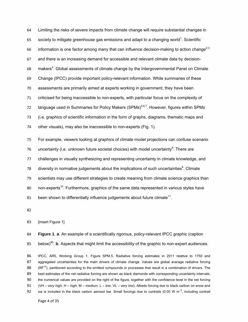
other visuals), may also be inaccessible to non-experts (Fig. 1). 74
For example, viewers looking at graphics of climate model projections can confuse scenario 75
uncertainty (i.e. unknown future societal choices) with model uncertainty8. There are 76
challenges in visually synthesizing and representing uncertainty in climate knowledge, and 77
diversity in normative judgements about the implications of such uncertainties9. Climate 78
scientists may use different strategies to create meaning from climate science graphics than 79
non-experts10. Furthermore, graphics of the same data represented in various styles have 80
been shown to differentially influence judgements about future climate11. 81
82
[insert Figure 1] 83
Figure 1. a. An example of a scientifically rigorous, policy-relevant IPCC graphic (caption 84
below)99. b. Aspects that might limit the accessibility of the graphic to non-expert audiences. 85
IPCC, AR5, Working Group 1, Figure SPM.5. Radiative forcing estimates in 2011 relative to 1750 and 86 aggregated uncertainties for the main drivers of climate change. Values are global average radiative forcing 87 (RF14), partitioned according to the emitted compounds or processes that result in a combination of drivers. The 88 best estimates of the net radiative forcing are shown as black diamonds with corresponding uncertainty intervals; 89 the numerical values are provided on the right of the figure, together with the confidence level in the net forcing 90 (VH – very high, H – high, M – medium, L – low, VL – very low). Albedo forcing due to black carbon on snow and 91 ice is included in the black carbon aerosol bar. Small forcings due to contrails (0.05 W m–2, including contrail 92
Page 5 of 35
induced cirrus), and HFCs, PFCs and SF6 (total 0.03 W m–2) are not shown. Concentration-based RFs for gases 93 can be obtained by summing the like-coloured bars. Volcanic forcing is not included as its episodic nature makes 94 is difficult to compare to other forcing mechanisms. Total anthropogenic radiative forcing is provided for three 95 different years relative to 1750. 96
97
Visually representing climate data to inform decision-making can be challenging due to the 98
multi-dimensionality of data, the diversity in users’ needs across different stakeholder 99
groups, and challenges and limitations in the use of software and tools to create graphics12. 100
However, graphics can, in principle, support thinking13 and support narratives when 101
communicating with stakeholders14. Creating graphics of climate change data that overcome 102
comprehension difficulties and avoid misconceptions has the potential to enhance climate 103
change communications. 104
How can scientific graphics about climate change be made more accessible, while retaining 105
their scientific integrity? This question has been posed by the IPCC as they look ahead to 106
the Sixth IPCC Assessment Report15. In this review we consider research from the cognitive 107
and psychological sciences to help answer this question. One of the goals of these 108
disciplines is to understand how people comprehend written and visual information. We 109
provide an overview of how people create meaning from graphical representations of data 110
and highlight that intuitive design may not always correspond to best practice informed by 111
evidence. We then consider four key areas: directing visual attention; reducing visual 112
complexity; supporting inference-making; and integrating text with graphics. We present 113
evidence-informed guidelines to support climate scientists in developing more accessible 114
graphics, show how the guidelines can be applied in practice, and provide recommendations 115
on how the IPCC might utilise these guidelines in the development of future reports. 116
We argue that improving accessibility to graphics of climate change data does not 117
necessitate reducing or simplifying the content of the graphics per se (which might come 118
with a risk of diluting the science), but can be achieved by supporting cognitive processing of 119
the visual information. 120
Page 6 of 35
Creating meaning from a scientific graphic 121
Graphics are often an effective way to communicate climate data - not only can they store 122
and organise data efficiently, but they enable us to think about the data using visual 123
perception13. Representing data visually can create patterns that the human visual system 124
can easily process (e.g. the iconic ‘hockey-stick’ graph). However, graphics are not direct 125
representations of reality; the meaning of the data they represent must be interpreted by the 126
viewer. Therefore, prior to identifying how graphics of climate data might be made more 127
accessible, we outline how the human brain creates meaning from a graphic. 128
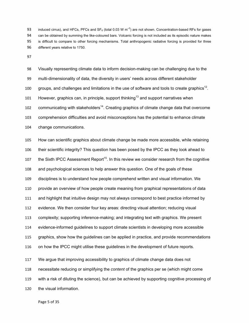
First, sensory processes direct the eyes to specific features of the graphic. Visual attention 129
determines which features of the graphic the viewer looks at. Features that are visually 130
salient (e.g. by virtue of their colour, shape, size) can draw the attention of the viewer – 131
known as bottom-up visual processing. Conversely, the viewer’s expectations, driven by 132
prior knowledge (their previous experience of the world, and their goal or reason for looking 133
at the graphic), can also direct visual attention – top-down visual processing (Fig. 2a)16. As 134
visual information is perceived from the features of the graphic, a mental representation of 135
the information is created in memory. The nature of the mental representation is influenced 136
by prior knowledge and goals and is constantly updated as the viewer visually explores the 137
graphic13. 138
These cognitive processes are cyclical in nature; perceived and mentally represented 139
information acts on expectations, which in turn direct further exploration of the graphic17. 140
The human brain is thought to support cognition by constantly trying to match incoming 141
sensory information against predictions of what to expect18. When perceived information 142
matches our expectations, then comprehension is easy. Accessibility of a graphic can 143
therefore be improved by matching visual features and prior knowledge (Fig. 2b). 144
145
146
Page 7 of 35
[insert Figure 2] 147
Figure 2: Conceptual overview of the process of graphic comprehension and approaches to 148
improving accessibility. 149
150
Intuitive design ≠ improved accessibility 151
Advances in computing and software technologies have enabled climate scientists to create 152
a wide-range of visual representations of scientific data12. In addition, such representations 153
may offer the viewer flexibility in how the data are displayed via interaction with the graphic. 154
Such advances offer the potential to better match graphic parameters to viewer parameters 155
to improve accessibility. However, these advances also place demands on creators and 156
viewers of graphics in terms of their competence in selecting effective visual representations 157
of the data for the task at hand19. 158
Evidence suggests there may be limits to experts’ self-awareness (metacognition) for 159
creating or choosing effective visual representations of data. For example, some experts, as 160
well as non-experts, show preferences for graphic features that can actually impair 161
comprehension, such as realistic features20, 3D features21 and extraneous variables in 162
data22. Consequently, intuitions about good design practices may not always match best 163
practice informed by cognitive principles, and viewer preferences may not always be 164
predictive of ease of comprehension. Conversely, designing graphics with cognitive 165
principles in mind, and testing them with viewers, offers an empirical approach to improving 166
the visual communication of climate science data. 167
168
169
170
Page 8 of 35
Accessibility ≠ loss of scientific rigour 171
The role of visual attention 172
To understand the details of a graphic we use our central vision, afforded by the fovea 173
centralis, which provides greater acuity than our peripheral vision. The visual field of the 174
fovea centralis is approximately two degrees of visual angle in diameter23, meaning that 175
when viewing an image from a distance of 60 cm (such as on a computer screen at about 176
arm’s length), our central vision covers an area approximately 2 cm wide. At any one 177
moment in time our central vision can only focus on a limited area of a graphic. Therefore, 178
we move our eye gaze to sample information from different spatial locations (Fig. 3a), and to 179
build a detailed representation of the graphic as a whole we encode and retain information 180
from these different spatial locations in memory. 181
Limited cognitive resources mean that only a fraction of the rich visual information entering 182
the eyes at any given point in time is meaningfully processed and encoded to our internal 183
representation in memory24. Where to look, and what information to process, is directed by 184
visual attention. Consequently, if important details in a graphic are not captured by our 185
attention, they will not be processed by the brain and will not be drawn on to help 186
comprehend and interpret the data in the graphic (Fig. 3b). Directing visual attention to 187
important details can therefore make graphics more accessible by supporting viewers to look 188
at aspects of the graphic that afford understanding. 189
190
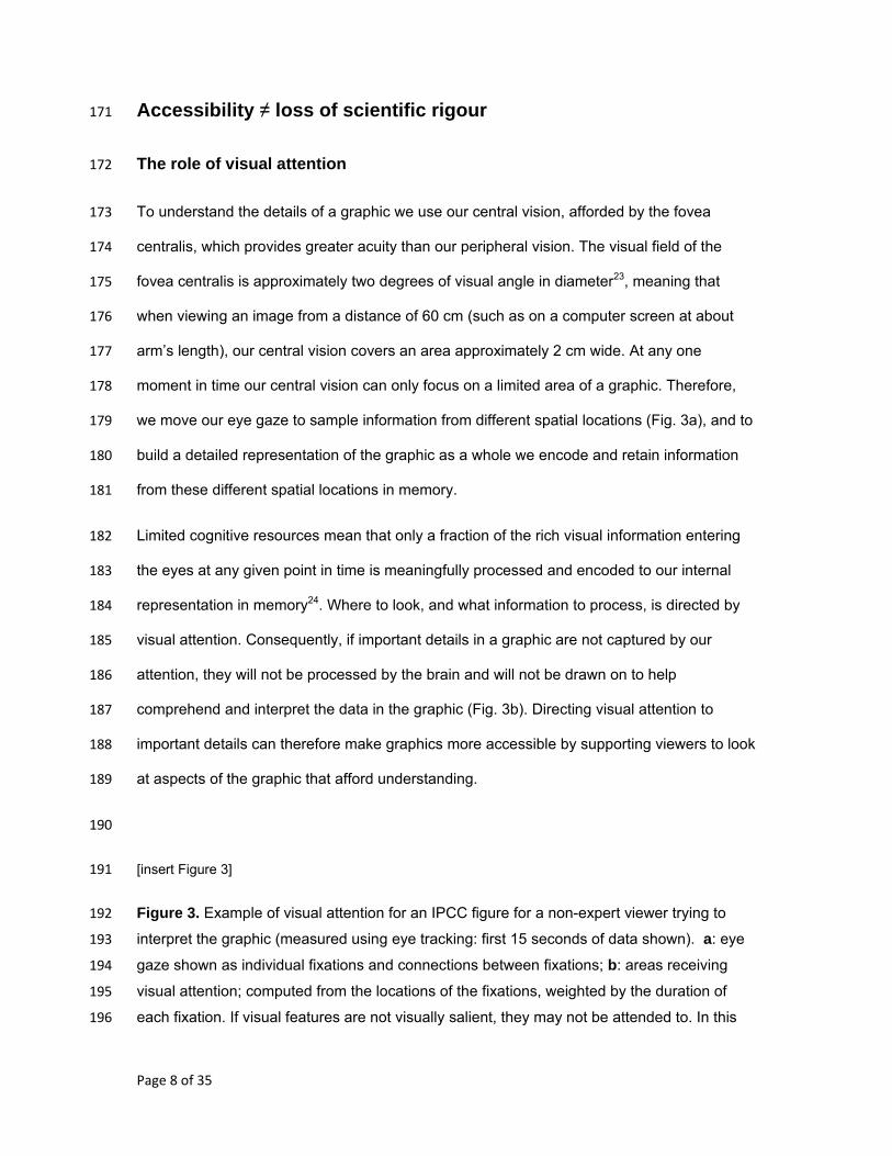
[insert Figure 3] 191
Figure 3. Example of visual attention for an IPCC figure for a non-expert viewer trying to 192
interpret the graphic (measured using eye tracking: first 15 seconds of data shown). a: eye 193
gaze shown as individual fixations and connections between fixations; b: areas receiving 194
visual attention; computed from the locations of the fixations, weighted by the duration of 195
each fixation. If visual features are not visually salient, they may not be attended to. In this 196
Page 9 of 35
example, the graphic’s legend receives little visual attention and some parts of the legend 197
receive no visual attention at all. 198
Figure shown is IPCC, AR5, Working Group 1, Figure SPM.6.99 Comparison of observed and simulated climate 199 change based on three large-scale indicators in the atmosphere, the cryosphere and the ocean: change in 200 continental land surface air temperatures (yellow panels), Arctic and Antarctic September sea ice extent (white 201 panels), and upper ocean heat content in the major ocean basins (blue panels). Global average changes are also 202 given. Anomalies are given relative to 1880–1919 for surface temperatures, 1960–1980 for ocean heat content 203 and 1979–1999 for sea ice. All time-series are decadal averages, plotted at the centre of the decade. For 204 temperature panels, observations are dashed lines if the spatial coverage of areas being examined is below 50%. 205 For ocean heat content and sea ice panels the solid line is where the coverage of data is good and higher in 206 quality, and the dashed line is where the data coverage is only adequate, and thus, uncertainty is larger. Model 207 results shown are Coupled Model Intercomparison Project Phase 5 (CMIP5) multi-model ensemble ranges, with 208 shaded bands indicating the 5 to 95% confidence intervals. 209
210
Directing attention by visual design 211
Visual properties that can capture attention by acting on bottom-up perceptual processing 212
include colour, motion, orientation and size25. In addition, there are well-documented 213
‘Gestalt’ principles governing how individual elements in a graphic are grouped together 214
psychologically into meaningful entities26. When elements of a graphic show a large degree 215
of contrast in these properties, the contrasting visual information is automatically captured by 216
attention and appears to ‘pop-out’ from the display (Fig. 4b-4d). 217
Another way to direct attention is through the use of arrows. Arrows are the symbolic visual 218
equivalent of pointing gestures, which have a widely accepted meaning of ‘look here’ and 219
are thought to direct attention automatically27. They can therefore be particularly efficient 220
visual cues to establish joint attention between the author and the viewer for specific 221
features in a graphic (Fig. 4e). Of course arrows also have other uses – such as denoting 222
motion or temporal change – and one has to be careful not to use arrows to denote different 223
operations within the same graphic. 224
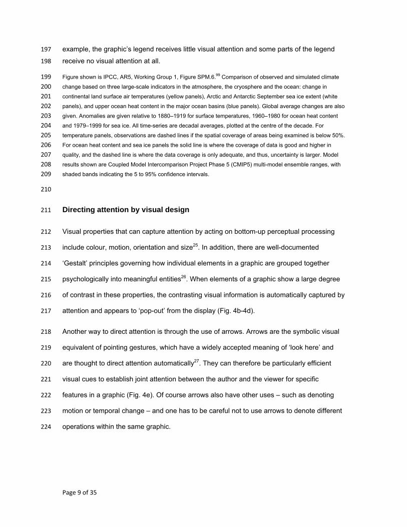
Page 10 of 35
Using these properties in the visual design of climate science graphics can therefore help 225
guide attention. Particular visual properties (or combinations of these properties) to direct 226
attention may be more suited than others, depending on the context in which they are used. 227
Informed by human behaviour and neuroscience, computational models of ‘bottom-up’ visual 228
attention have been able to accurately predict which features of an image are most likely to 229
be attended to28. Such models provide immediate assessments of visually salient features of 230
a graphic, and might be useful to inform the design process29. To check viewers’ actual 231
visual attention for a graphic, eye-tracking can provide empirical evidence to inform visual 232
design. For example, eye tracking has been used to observe differences in the eye 233
movements of individuals who were successful or unsuccessful in solving a problem 234
scenario depicted in a graphic; visual elements that supported problem solving could then be 235
made more visually salient30. 236
237
[insert Figure 4] 238
Figure 4. Schematic of properties known to direct visual attention that can be used in the design of 239
graphics to help direct viewers’ attention to important information. 240
241
Directing attention by informing expectation 242
The details that are looked at within a graphic can also be directed by expectations about the 243
task at hand. For example, patterns of eye gaze are different when viewers search a graphic 244
for a specific feature, compared to when they try to memorise the graphic as a whole31, or 245
when a map is studied to learn routes as opposed to the overall layout32. Explicitly stating 246
the intended task for which the graphic was created can help guide viewers’ visual attention 247
to appropriate information. Furthermore, prior knowledge about the data, and prior 248
knowledge about the format or type of graphic chosen to represent the data, can also 249
influence a viewer’s cognition33,34. 250
Page 11 of 35
Research on the comprehension of meteorological charts has shown that providing viewers 251
with relevant knowledge can support attention by directing it towards task-relevant features 252
and away from task-irrelevant features35. Furthermore, making task-relevant features visually 253
salient by adapting visual design may enhance performance once appropriate knowledge is 254
provided35. Hence the interaction between bottom-up perceptual processing and top-down 255
attentional control should be considered when designing graphics, with particular 256
consideration given to what knowledge the viewer needs to correctly interpret the data. 257
258
Handling complexity 259
Some climate science graphics are more visually complex than others. For example, 260
ensemble datasets of climate models can be particularly complex and challenging to 261
visualise36. What is visual complexity, and how can complexity be handled to enable 262
graphics to be more accessible? Possible components that might contribute towards defining 263
and measuring visual complexity include the number of variables and/or data points in a 264
graphic37, the degree of uniformity of relationships represented by the data33, or the degree 265
to which the data are organised to make relevant relationships in the data easier to identify38. 266
However, while these components might be informative for simple graphics, they may not be 267
easily applied across the diverse types of graphics used to communicate climate science, 268
and may not always be predictive of comprehension. For example, in some instances an 269
increasing number of data points might make patterns in the data more obvious. 270
An alternative proxy for visual complexity is ‘visual clutter’, where excess visual information, 271
or a lack of organisation of that information, impairs cognition39. Excess visual clutter can 272
increase the time it takes to search for an item40, increase errors in judgments41 and impair 273
processing of language accompanying a graphic42. Computer models, based on principles of 274
human cognition, can assess graphics for visual clutter and have been validated against 275
viewers’ actual performance when undertaking simple tasks with graphics, such as 276
Page 12 of 35
searching for a specific feature39. Although such models have yet to be established as 277
offering diagnostic value in identifying comprehension problems with graphics, they can be 278
useful to inform the design process by comparing different design options for a given 279
graphic29. 280
One approach to avoid unnecessary visual complexity is to only include information in a 281
graphic that is absolutely needed for the intended purpose43. However, climate science 282
graphics may need to contain a certain level of detail or information to maintain scientific 283
integrity (i.e. to accurately represent the extent of, or limits to, scientific knowledge). Such 284
graphics may still be visually complex in spite of only showing important information. While 285
experts can integrate complex visual features into meaningful units of information 286
(perceptual ‘chunks’), non-experts may lack such skills44. Hence, segmenting information 287
into chunks of appropriate size and difficulty, and guiding viewers’ attention to connections 288
between these components could make comprehension of the data easier45. However, such 289
an approach should be taken with care. If the task expected of the viewer is to compare or 290
contrast data represented in a graphic (known as ‘integrative tasks’), then this may be more 291
easily performed when the data to be compared share representational similarities, such as 292
close spatial proximity, or the same colour46. 293
294
Supporting inference-making 295
Comprehension of a graphic of climate data goes beyond just perceptual processing of 296
visual features. For example, enabling viewers to make relevant and scientifically robust 297
inferences from data might be preferable to merely stating intended inferences in the 298
accompanying text of a graphic. Furthermore, graphics are not only used to impart 299
information, they can also be used to support sense-making and guide decision-making. In 300
the context of the science-policy interface, this is indeed one of the goals of science 301
Page 13 of 35
communication and aligns with the IPCC’s remit of being policy-relevant and not policy 302
prescriptive47. 303
Improving accessibility to climate science graphics therefore involves supporting viewers to 304
make appropriate inferences. Symbolic elements in diagrams, such as lines, boxes, crosses 305
and circles can support inference-making about relationships in the data, based on their 306
geometric properties48. For example, lines indicate connections, while arrows can indicate 307
dynamic, causal or functional information49. 308
Inferences may also relate to the mappings between the visual features of the graphic and 309
the data that they represent. Much of our cognition of conceptual ideas is thought to be 310
metaphorical in nature50. For example, more of something is conceptualised in mind as up, 311
and so temperature is said to be rising; similarly, financial concepts are used metaphorically 312
in speech with regards to limiting carbon emissions, i.e. having a carbon budget. Using 313
mappings that match natural or cultural metaphors can therefore aid cognition50. For 314
example, colour contains symbolic meaning, with red usually associated with ‘warm’ and 315
blue with ‘cold’51, and indeed these colour choices are often used to represent temperature 316
values in meteorological graphics. Metaphors often differ between cultures52 and so choice 317
of metaphors should be informed by the target audience (see section below on tailoring 318
graphics to different audiences). 319
How data are structured in a graphic can influence the type of information extracted, and in 320
turn, what inferences are made about the data53. For example, global climate projections are 321
typically plotted as line graphs with time on the x-axis and the variable of interest (e.g. 322
temperature anomaly) on the y-axis, which may direct viewers to consider given points in 323
time and their associated temperature projections. Conversely, plotting temperature 324
anomalies on the x-axis and time on the y-axis frames the data in terms of a projection of 325
time for a given temperature threshold54. Although in both cases the data are the same, the 326
alternative graphical representations may result in viewers drawing different inferences. 327
Page 14 of 35
Sometimes the viewer of a graphic may need to make inferences about the data that are not 328
explicitly represented in the graphic. Examples include making inferences about the 329
uncertainty of the data55, relationships across multiple graphics56, and relationships between 330
a theory and data in a graphic57. Such tasks involve spatial reasoning, i.e. the viewer must 331
mentally infer information through spatial transformations58. In such cases, inferences can be 332
supported either by explicitly showing the inferences in the graphic (and so removing the 333
need for spatial reasoning), or by supporting viewers’ spatial reasoning, for example by 334
using text accompanying the graphic (see section below). 335
336
Using text to support cognition 337
Graphics of climate data are rarely used in isolation of accompanying text - text labels 338
typically indicate the referents of the data, such as what the axes and data points represent. 339
In accordance with norms of scientific reporting, captions provide contextual information and 340
are placed under graphics, while the relevance of the graphic and inferences that can be 341
drawn from it are placed in the body text, sometimes spatially distant from the graphic. 342
Separating text from graphics comes with a cognitive cost, known as the spatial contiguity 343
effect59. When there is distance between the spatial locations of the text and corresponding 344
graphic, attention must be split between the two. The viewer must visually search for the 345
corresponding elements (i.e. moving from text to graphic, or vice versa) and then integrate 346
both sources of information. Viewers may not exert effort to do this and instead may simply 347
treat text and graphics as independent units of information and read them independently of 348
one another60. However, when the distance between text and graphic is reduced, less 349
searching is required, and connections can be more easily made, resulting in improved 350
comprehension61. Tightly integrating text and graphic has been advocated as good design 351
practice to support comprehension, i.e. embedding text within a graphic (Fig. 4f), or even 352
embedding small graphics within text62. 353
Page 15 of 35
Furthermore, language that accompanies a graphic has the potential not only to provide 354
context, but also to influence thought about the spatial relationships of the properties of the 355
graphic. Tasks involving spatial relationships might include comparisons of temperature 356
anomalies at different spatial locations on a map, inferring trends in data from observed 357
time-series data (which spatially plot x-y relationships), or comparing uncertainty ranges for 358
future projections of climate under different scenarios. These tasks all involve spatial 359
cognition, i.e. thinking about spatial relationships. Attending to linguistic information while 360
looking at visual information is known to influence spatial cognition, such as supporting 361
spatial reasoning63. For example, a short sentence asking viewers to ignore extreme data 362
points when looking at graphics of time series data results in participants attending to trends 363
during encoding64. Language can also influence the extent to which a static visual is mentally 364
animated and the manner in which it is animated65, which again might help with spatial 365
reasoning. Accompanying text can therefore support viewers in making appropriate spatial 366
inferences from a graphic. 367
368
Tailoring graphics to different audiences 369
We have so far considered insights drawn from general principles of human cognition to help 370
inform improved visual communication of climate science data. However, it is important to 371
acknowledge that certain cognitive factors may differ between audience groups, and 372
between individuals within those groups. 373
Colour is one area where there is marked individual and cultural variation. People who 374
experience colour-blindness perceive colours differently from the general population and so 375
colour choices for scientific graphics should be carefully chosen to avoid perceptual 376
difficulties66. The native language one speaks can also influence colour perception – the 377
number of colour terms available in a language can influence colour discrimination67, which 378
might result in perceptual differences in the boundaries of colour-mapped data. Such 379
Page 16 of 35
problems can be avoided by using achromatic (e.g. greyscale) colour mappings in which 380
data values are mapped to luminance rather than hue68, or by using colour scales that 381
enable easy differentiation of colour.69 382
As well as perceptual differences, there are also group differences in higher-level cognitive 383
skills, such as spatial reasoning. Experts often have strong spatial reasoning skills, as has 384
been shown in the geosciences70, whereas spatial reasoning by non-experts may depend on 385
their general visuospatial abilities71. Moreover, how attention is directed across a page 386
exhibits marked cultural variations, with reading direction in a language (e.g. English – left to 387
right; Arabic – right to left) associated with the direction of attention in visuospatial tasks72. 388
Other differences are more tied to an individual’s personal knowledge and experience. For 389
example, prior experience can lead to a knowledge of ‘where to look’ and so can limit visual 390
attention to specific spatial locations73. Similarly, the extent of prior knowledge about the 391
data being visualised and prior experience using specific graphical formats can influence the 392
ease with which inferences can be drawn from data74. There can be trade-offs between 393
using an unfamiliar graphical format that may be difficult to initially interpret but which 394
efficiently represents a set of data, and a more familiar format whose structure can easily be 395
grasped but which may provide an inefficient representation of the data34. Individuals may 396
hold different and sometimes inaccurate mental models about complex scientific systems75, 397
such as the underlying physical principles of climate change76. Understanding a viewer’s 398
existing mental model about the data and the systems from which the data originate can 399
inform how they can best be supported to make scientifically robust inferences. 400
While comprehension of a graphic can be dependent on such factors outlined above, the 401
underlying mechanisms responsible for human cognition are shared by everyone. Hence, 402
general principles drawn from human cognition can inform approaches to improve the 403
accessibility of graphics, but the specific way in which they are applied needs to be tailored. 404
Consequently, testing of graphics is important to ensure they are comprehensible to achieve 405
the desired communication goals8,13. 406
Page 17 of 35
Gaps in current knowledge 407
Despite advances in our understanding of the comprehension of graphics, there are 408
important gaps in current knowledge that are of direct relevance to visualising climate data. 409
Uncertainties of data can be difficult to communicate77,78. Although general principles have 410
been proposed for visually communicating probabilistic uncertainty, the deep uncertainties of 411
climate change, in which knowledge and values are often disputed and outcomes are 412
dependent on human behaviour, may not easily translate into visual representations79. 413
Further research is needed on how different visual representations of uncertainty might 414
support or hinder decision-making80 and the cognitive processes involved in such tasks. 415
To provide decision-makers with access to data tailored to their needs, researchers and 416
climate service providers are exploring the use of interactive web-based graphics, such as 417
The Climate Explorer (part of the U.S. Climate Resilience Toolkit)81 and The IMPACT2C 418
web-atlas82. Interaction, such as filtering or highlighting task-relevant information83 has the 419
potential to support comprehension. However, there can be large individual differences in 420
the degree to which people use interactive functions and the extent to which they use these 421
functions effectively84; viewers require competence in meta-representational skills to make 422
appropriate interactions19. Consequently, unless viewers have the required skills, there may 423
be limits to how useful interactive graphics are to support comprehension and accessibility. 424
Both interactive graphics and animated graphics have been suggested to support the 425
outreach of future IPCC assessments15. Research comparing static graphics with animated 426
graphics is often confounded by additional information being provided in animated graphics; 427
hence observed benefits of animation in some tasks may not be due to animation per se85. 428
In some cases animation may impair comprehension86. Viewers may extract perceptually 429
salient information rather than task-relevant information from animations87,88 and cognitive 430
processing of the visual information may not be able to keep up with the pace of the 431
animation87,89. Animating graphics might be beneficial in specific situations if cognitive 432
demands of processing the information are factored into the design of such graphics90. 433

Page 18 of 35
Providing an element of user-control offers the potential to overcome some of these 434
information processing limitations91. The decision to use an animated or interactive graphic 435
over a static graphic should be informed by cognitive demands and task requirements, be 436
designed taking cognitive principles into account, and be tested with viewers to check 437
comprehension92. 438
439
Page 19 of 35
Evidence-informed guidelines 440
Here we summarise the psychological insights considered by this review and provide 441
associated guidelines that can help to improve accessibility of graphics of climate science 442
(Table 1). 443
444
Table 1. Evidence-informed guidelines to improve accessibility of scientific graphics of 445
climate science. 446
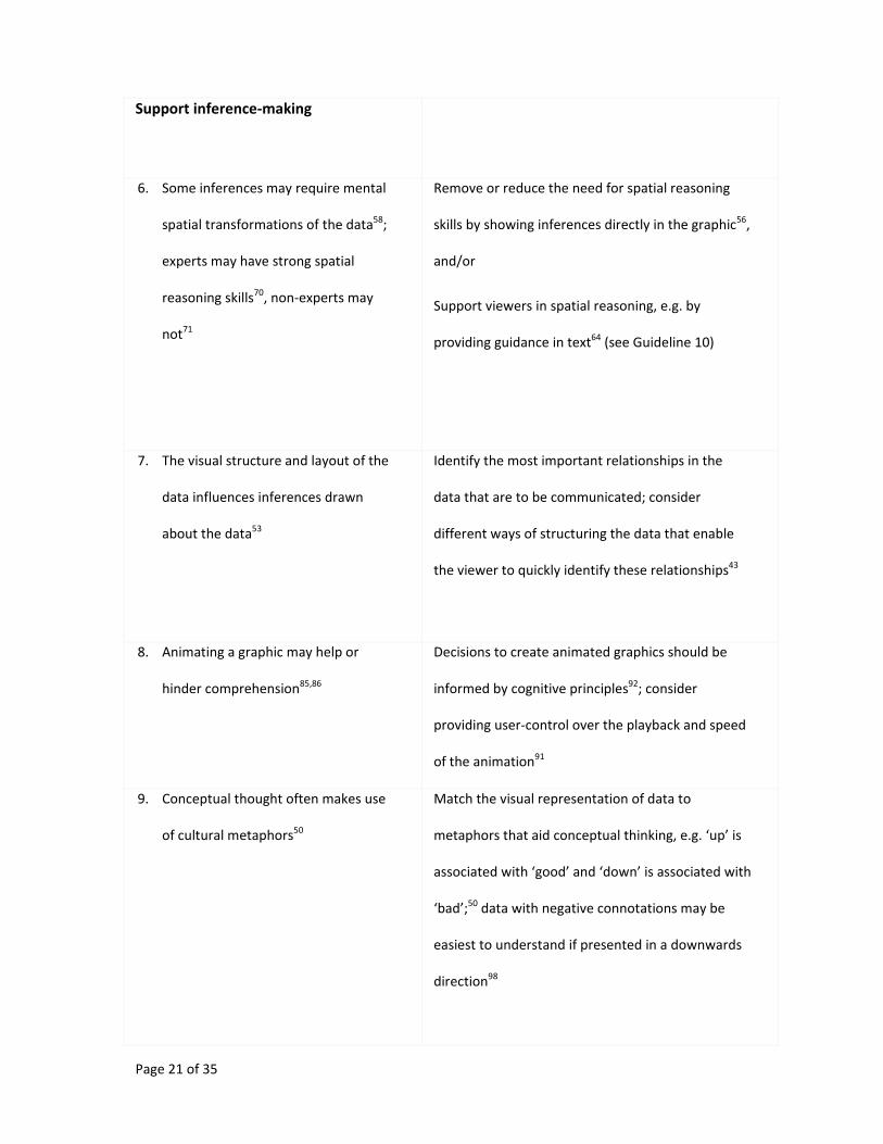
Psychological insights Associated guidelines to improve
accessibility
1. Intuitions about effective graphics do
not always correspond to evidence-
informed best practice for increasing
accessibility20,21,22
Use cognitive and psychological principles to inform
the design of graphics; test graphics during their
development to understand viewers’
comprehension of them8,13
Direct visual attention
2. Visual attention is limited and
selective – visual information in a
graphic may or may not be looked at
and/or processed by viewers24
Present only the visual information that is required
for the communication goal at hand43
Direct viewers’ visual attention to visual features of
the graphic that support inferences about the data97
Page 20 of 35
3. Salient visual features (where there is
contrast in size, shape, colour or
motion) can attract visual
attention25,26
Make important visual features of the graphic
perceptually salient so that they ‘capture’ the
attention of the viewer97
4. Prior experience and knowledge can
direct visual attention34,35
Choose and design graphics informed by viewers’
familiarity and knowledge of using graphics and
their knowledge of the domain, i.e. knowledge
about what the data represents43
Provide knowledge to viewers about which features
of the graphic are important to look at, e.g. in text
positioned close to the graphic (see Guideline 10)
Reduce complexity
5. An excess of visual information can
create visual clutter and impair
comprehension40,41,42
Only include information that is needed for the
intended purpose of the graphic43; break down the
graphic into visual ‘chunks’, each of which should
contain enough information for the intended task
or message38
Page 21 of 35
Support inference-making
6. Some inferences may require mental
spatial transformations of the data58;
experts may have strong spatial
reasoning skills70, non-experts may
not71
Remove or reduce the need for spatial reasoning
skills by showing inferences directly in the graphic56,
and/or
Support viewers in spatial reasoning, e.g. by
providing guidance in text64 (see Guideline 10)
7. The visual structure and layout of the
data influences inferences drawn
about the data53
Identify the most important relationships in the
data that are to be communicated; consider
different ways of structuring the data that enable
the viewer to quickly identify these relationships43
8. Animating a graphic may help or
hinder comprehension85,86
Decisions to create animated graphics should be
informed by cognitive principles92; consider
providing user-control over the playback and speed
of the animation91
9. Conceptual thought often makes use
of cultural metaphors50
Match the visual representation of data to
metaphors that aid conceptual thinking, e.g. ‘up’ is
associated with ‘good’ and ‘down’ is associated with
‘bad’;50 data with negative connotations may be
easiest to understand if presented in a downwards
direction98
Page 22 of 35
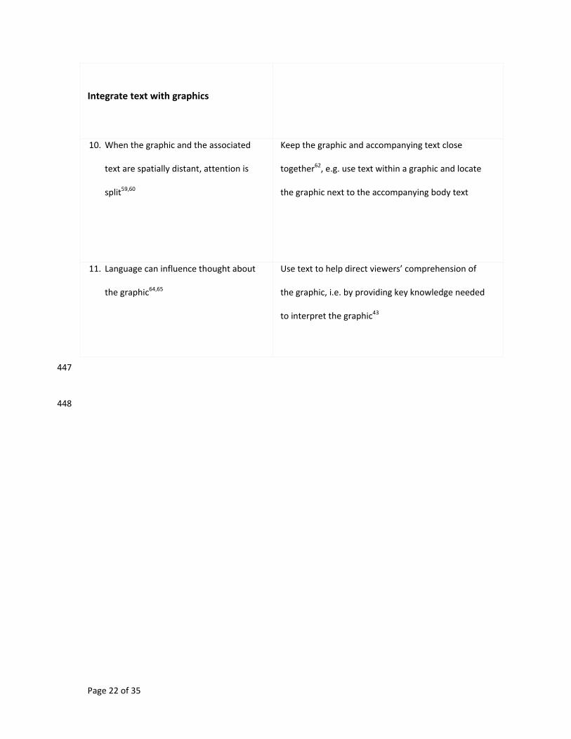
Integrate text with graphics
10. When the graphic and the associated
text are spatially distant, attention is
split59,60
Keep the graphic and accompanying text close
together62, e.g. use text within a graphic and locate
the graphic next to the accompanying body text
11. Language can influence thought about
the graphic64,65
Use text to help direct viewers’ comprehension of
the graphic, i.e. by providing key knowledge needed
to interpret the graphic43
447
448
Page 23 of 35
Guidelines in practice 449
To demonstrate how the guidelines can be applied in practice, we selected an IPCC SPM 450
graphic (Fig. 1a) identified by IPCC authors (personal communication) as potentially 451
challenging for comprehension. We first identified aspects that might hinder comprehension, 452
especially when interpreted by non-experts (Fig. 1b). Drawing on the guidelines we then 453
created a cognitively inspired version of the graphic, with the aim of making the data more 454
widely accessible while retaining scientific integrity (Fig. 5 and Box 1). 455
456
[insert Figure 5] 457
Figure 5. | A cognitively inspired version of IPCC AR5 WG1 SPM Figure SPM.699, using the 458
guidelines in Table 1 to increase accessibility while maintaining scientific rigour (see also 459
Box 1). 460
461
Box 1 | Guidelines used in the cognitively inspired version of IPCC AR5 WG1 SPM 462
Figure SPM.6. 463
The cognitively inspired version provides knowledge of the meaning of all abbreviations (guideline 464
11); breaks down information into ‘chunks’ to reduce complexity and clutter (guideline 5); uses larger 465
font size for headings, relative to other text, to attract attention (guideline 2 and 3); uses contrast in 466
colour to encourage attention of the distinction between human and natural radiative forcings 467
(guideline 3); shows the relationship between the 2011 total and the contributions to the total 468
(guideline 7); integrates the caption text within the graphic to reduce the need for splitting attention 469
(guideline 10); plots only point estimates and uncertainty ranges, i.e. removes bars, to reduce clutter 470
and encourage thinking about the best estimate and uncertainty (guidelines 3 and 5); removes the 471
need for multiple colours to represent each compound to reduce clutter (guideline 5); and uses text, 472
and colour as a metaphor, to support understanding of link between the data and surface 473
warming/cooling (guidelines 4,9,11). 474
475
Page 24 of 35
We tested the alternative version of the graphic (Fig. 5) and the original (Fig. 1a) on a 476
sample of experts (ten climate change researchers) and non-experts (ten psychology 477
researchers). Eighty percent of participants indicated a preference for the cognitively 478
inspired version, significantly more than expected by chance against the null hypothesis of 479
there being no difference in preferences, exact binomial p = .012 (two-tailed). Such user-480
testing can help inform the development of graphics as part of an iterative design cycle. 481
482
483
Creating accessible graphics 484
There is the potential to develop improved scientific graphics of climate change data that are 485
cognitively-inspired and easier to comprehend. This goal in particular aligns with the IPCC’s 486
desire to make outputs of future reports more accessible and user-friendly to diverse 487
audiences93. 488
In addition, the ease of accessibility of graphics of climate science also has implications for 489
how society might make best use of scientific knowledge. There have been calls for climate 490
scientists to take participatory roles in co-productive frameworks alongside stakeholders to 491
help inform societal decision-making94. Graphics of climate data that are accessible to all 492
parties involved could support improved engagement, dialogue and decision-making 493
between scientists, policy-makers, practitioners, communities and publics. Climate service 494
providers (who supply tailored climate knowledge to decision-makers) often use graphics to 495
communicate findings, and although the communication goals and intended audience may 496
be much more specific in these contexts than the global assessments made by the IPCC, 497
data visualisation challenges remain95. 498
While the science underpinning graphic comprehension is still developing, the guidelines 499
presented in this review provide a useful reference for climate scientists to apply 500
psychological and cognitive insights when creating graphics of data. However, as individuals 501
Page 25 of 35
and groups can differ, there is no substitute for empirically testing graphics with the target 502
audience. Such testing need not be costly or time-consuming. Asking people to look at and 503
interpret drafts of graphics can indicate if graphics are broadly understandable or not. 504
Furthermore, rich diagnostic evidence afforded by eye tracking can indicate the efficiency of 505
comprehension and can identify reasons why comprehension is impaired, such as assessing 506
whether task-relevant information is visually salient or not. Informed by such evidence, 507
appropriate adjustments to graphics can be made and then they can be re-tested. 508
Greater collaboration between the climate change research community, the psychology and 509
cognitive science community and those working in associated disciplines, could help to 510
realise such an approach. For example, as the IPCC looks ahead to their Sixth Assessment 511
Report, there is an opportunity for the IPCC to open up the review process and ask these 512
communities for feedback on drafts of SPM graphics. Climate scientists and psychologists 513
could also jointly develop cognitively-inspired graphics of climate data, which are both 514
accessible and scientifically robust, for use in outputs outside of the formal IPCC process 515
(so-called ‘derivative products’). Similar collaborations between research communities have 516
led to improved communication in related fields such as cartography96 and geoscience70. 517
Graphics of climate data are integral to scientific assessments of climate change, but only 518
support communication and decision-making if they are understood. Empirically testing 519
graphics and applying insights from the science of human cognition to help overcome 520
comprehension problems, offers the potential to make climate science knowledge more 521
accessible to decision-makers in society, while also retaining the integrity of the scientific 522
data and evidence on which they are based. 523
524
525
526
527
Page 26 of 35
References 528
1 IPCC Climate Change 2014: Synthesis Report (eds Pachauri, R. K. et al.) (Cambridge
Univ. Press, 2014).
2 Clayton, S. et al. Psychological research and global climate change. Nature Clim.
Change 5, 640-646 (2015).
3 Dilling, L. & Lemos, M. C. Creating usable science: Opportunities and constraints for
climate knowledge use and their implications for science policy. Glob. Environ. Change
21, 680-689 (2011).
4 Overpeck, J. T., Meehl, G. A., Bony, S. & Easterling D. R. Climate data challenges in the
21st century. Science 331, 700-702 (2011).
5 Barkemeyer, R., Dessai, S., Monge-Sanz, B., Renzi, B. G. & Napolitano, G. Linguistic
analysis of IPCC summaries for policymakers and associated coverage. Nature Clim.
Change 6, 311-317 (2016).
6 Hollin, G. J. S. & Pearce, W. Tension between scientific certainty and meaning
complicates communication of IPCC reports. Nature Clim. Change 5, 753-756 (2015).
7 Budescu, D. V., Por, H. H., Broomell, S. B. & Smithson, M. The interpretation of IPCC
probabilistic statements around the world. Nature Clim. Change 4, 508-512 (2014).
8 McMahon, R., Stauffacher, M. & Knutti, R. The unseen uncertainties in climate change:
reviewing comprehension of an IPCC scenario graph. Clim. Change 133, 141-154
(2015).
9 Mahony, M. & Hulme, M. The colour of risk: An exploration of the IPCC's “burning embers”
diagram. Spontaneous Generations: Journal for the History and Philosophy of Science
6, 75-89 (2012).
Page 27 of 35
10 Stofer, K. & Che, X. Comparing experts and novices on scaffolded data visualizations
using eye-tracking. J. Eye Mov. Res. 7(5), 2 (2014).
11 Daron, J. D., Lorenz, S., Wolski, P., Blamey, R. C. & Jack, C. Interpreting climate data
visualisations to inform adaptation decisions. Clim. Risk Manage. 10, 17-26 (2015).
12 Nocke, T., Sterzel, T., Böttinger, M. & Wrobel, M. (2008) in Digital Earth Summit on
Geoinformatics 2008: Tools for Global Change Research. (eds Ehlers M. et al.) 226-232
(Wichmann, 2008).
13 Hegarty, M. The cognitive science of visual‐spatial displays: Implications for design. Top.
Cogn. Sci. 3, 446-474 (2011).
14 O’Neill, S., Williams, H. T. P., Kurz, T., Wiersma, B. & Boykoff, M. Dominant frames in
legacy and social media coverage of the IPCC Fifth Assessment Report. Nature Clim.
Change 5, 380-385 (2015).
15 IPCC Expert Meeting on Communication Meeting Report (eds Lynn, J. et al.) (World
Meteorological Organization, 2016).
16 Pinker, S. in Artificial Intelligence and the Future of Testing (ed Freedle, R.) 73-126
(Lawrence Erlbaum Associates, 1990).
17 Neisser, U. Cognition and Reality: Principles and Implications of Cognitive Psychology.
(W. H. Freeman & Company, 1976).
18 Clark, A. Whatever next? Predictive brains, situated agents, and the future of cognitive
science. Behav. Brain Sci. 36, 181-204 (2013).
19 diSessa, A. A. Metarepresentation: Native competence and targets for instruction.
Cognition Instruct. 22, 293-331 (2004).
20 Smallman, H. S. & St. John, M. Naïve realism: Misplaced faith in realistic displays. Ergon.
Des. 13, 6-13 (2005).
Page 28 of 35
21 Zacks, J., Levy, E., Tversky, B. & Schiano, D. J. Reading bar graphs: Effects of
extraneous depth cues and graphical context. J. Exp. Psychol. Appl. 4, 119-138 (1998).
22 Hegarty, M., Smallman, H. S., Stull, A. T. & Canham, M. S. Naïve cartography: How
intuitions about display configuration can hurt performance. Cartographica 44, 171-186
(2009).
23 Rayner, K. Eye movements and attention in reading, scene perception, and visual
search. Q. J. Exp. Psychol. 62, 1457-1506 (2009).
24 Simons, D. J. & Chabris, C. F. Gorillas in our midst: Sustained inattentional blindness for
dynamic events. Perception 28, 1059-1074 (1999).
25 Wolfe, J. M. & Horowitz, T. S. What attributes guide the deployment of visual attention
and how do they do it? Nature Rev. Neurosci. 5, 495-501 (2004).
26 Bruce, V., Green, P. R., & Georgeson, M. A. Visual Perception: Physiology, Psychology,
& Ecology. (Psychology Press, 2003).
27 Hommel, B., Pratt, J., Colzato, L. & Godijn, R. Symbolic control of visual
attention. Psychol. Sci. 12, 360-365 (2001).
28 Itti, L. & Koch, C. Computational modelling of visual attention. Nature Rev. Neurosci. 2,
194-203 (2001).
29 Rosenholtz, R., Dorai, A. & Freeman, R. Do predictions of visual perception aid
design? ACM Trans. Appl. Percep. (TAP) 8, 12 (2011).
30 Grant, E. R. & Spivey, M. J. Eye movements and problem solving: Guiding attention
guides thought. Psychol. Sci. 14, 462-466 (2003).
31 Henderson, J. M., Weeks, P. A. & Hollingworth, A. The effects of semantic consistency
on eye movements during complex scene viewing. J. Exp. Psychol. Hum. Percept.
Perform. 25, 210–228 (1999).
Page 29 of 35
32 Brunyé, T. T. & Taylor, H. A. When goals constrain: Eye movements and memory for
goal‐oriented map study. Appl. Cognitive Psych. 23, 772-787 (2009).
33 Carpenter, P. A. & Shah, P. A model of the perceptual and conceptual processes in
graph comprehension. J. Exp. Psychol. Appl. 4, 75-100 (1998).
34 Peebles, D. & Cheng, P. C. H. Modeling the effect of task and graphical representation
on response latency in a graph reading task. Hum. Factors 45, 28-46 (2003).
35 Hegarty, M., Canham, M. S. & Fabrikant, S. I. Thinking about the weather: How display
salience and knowledge affect performance in a graphic inference task. J. Exp. Psychol.
Learn. Mem. Cogn. 36, 37-53 (2010).
36 Potter, K. et al. Ensemble-vis: A framework for the statistical visualization of ensemble
data. IEEE International Conference on Data Mining Workshops, 233-240 (2009).
37 Meyer, J., Shinar, D. & Leiser, D. Multiple factors that determine performance with tables
and graphs. Hum. Factors 39, 268-286 (1997).
38 Shah P., Mayer, R. E. & Hegarty, M. Graphs as aids to knowledge construction: Signaling
techniques for guiding the process of graph comprehension. J. Educ. Psychol. 91, 690-
702 (1999).
39 Rosenholtz, R., Li, Y. & Nakano, L. Measuring visual clutter. J. Vision 7, 17 (2007).
40 Neider, M. B. & Zelinsky, G. J. Cutting through the clutter: Searching for targets in
evolving complex scenes. J. Vision 11, 7 (2011).
41 Baldassi, S., Megna, N. & Burr, D. C. Visual clutter causes high-magnitude errors. PLoS
Biol. 4, e56 (2006).
42 Coco, M. I. & Keller, F. in Proceedings of the 31st Annual Conference of the Cognitive
Science Society (eds Taatgen, N. & van Rijn, H.) 274-279 (Cognitive Science Society,
2009).
Page 30 of 35
43 Kosslyn, S. M. Graph design for the eye and mind. (OUP, 2006).
44 Chase, W. G. & Simon, H. A. Perception in chess. Cognitive Psychol. 4, 55-81 (1973).
45 Gobet, F. Chunking models of expertise: Implications for education. Appl. Cognitive
Psych. 19, 183-204 (2005).
46 Wickens, C. D. & Carswell, C. M. The proximity compatibility principle: Its psychological
foundation and relevance to display design. Hum. Factors 37, 473-494 (1995).
47 Decisions Taken with Respect to the Review of IPCC Processes and Procedures:
Communications Strategy (IPCC, 2012);
http://www.ipcc.ch/meetings/session35/IAC_CommunicationStrategy.pdf
48 Tversky, B. in Handbook of Higher-Level Visuospatial Thinking (eds Shah, P. & Miyake,
A.) 1-34 (Cambridge Univ. Press, 2005).
49 Heiser, J. & Tversky, B. Arrows in comprehending and producing mechanical
diagrams. Cognitive Sci. 30, 581-592 (2006).
50 Lakoff, G. & Johnson, M. The metaphorical structure of the human conceptual
system. Cognitive Sci. 4, 195-208 (1980).
51 Ho, H. N., Van Doorn, G. H., Kawabe, T., Watanabe, J. & Spence, C. Colour-temperature
correspondences: When reactions to thermal stimuli are influenced by colour. PloS
One 9, e91854 (2014).
52 Kövecses, Z. Metaphor in culture: Universality and variation. (Cambridge University
Press, 2005).
53 Shah, P. & Carpenter, P. A. Conceptual limitations in comprehending line graphs. J. Exp.
Psychol. Gen. 124, 43-61 (1995).
Page 31 of 35
54 Joshi, M., Hawkins, E., Sutton R., Lowe, J. & Frame, D. Projections of when temperature
change will exceed 2 °C above pre-industrial levels. Nature Clim. Change 1, 407-412
(2011).
55 Trickett, S. B., Trafton, J. G., Saner, L. & Schunn, C. D. in Thinking with Data (eds Lovett,
M. C. & Shah, P.) 65-85 (Psychology Press, 2007).
56 Trafton, J. G. et al. Turning pictures into numbers: Extracting and generating information
from complex visualizations. Int. J. Hum.-Comp. St. 53, 827-850 (2000).
57 Trafton, J. G., Trickett, S. B. & Mintz, F. E. Connecting internal and external
representations: Spatial transformations of scientific visualizations. Found. Sci. 10, 89-
106 (2005).
58 Trafton, J. G., Marshall, S., Mintz, F. & Trickett, S. B. in Diagrammatic Representation
and Inference, Volume 2317 Lecture Notes in Computer Science (eds Hegarty, M.,
Meyer, B. & Narayanan, N. H.) 206-220. (Springer Berlin, 2002).
59 Mayer, R.E. Multimedia Learning (Cambridge Univ. Press, 2009).
60 Holsanova, J., Holmberg, N. & Holmqvist, K. Reading information graphics: The role of
spatial contiguity and dual attentional guidance. Appl. Cognitive Psychol. 23, 1215-1226
(2009).
61 Ginns, P. Integrating information: A meta-analysis of the spatial contiguity and temporal
contiguity effects. Learn. Instr. 16, 511-525 (2006).
62 Tufte, E. R. Beautiful Evidence (Graphics Press, 2006).
63 Loewenstein, J. & Gentner, D. Relational language and the development of relational
mapping. Cognitive Psychol. 50, 315-353 (2005).
Page 32 of 35
64 Harold, J., Coventry, K. R., Lorenzoni, I. & Shipley, T. F. in Proceedings of the 37th
Annual Meeting of the Cognitive Science Society (eds Noelle, D. C. et al.) 872-877.
(Cognitive Science Society, 2015).
65 Coventry, K. R., Christophel, T. B., Fehr, T., Valdés-Conroy, B. & Herrmann, M. Multiple
routes to mental animation: Language and functional relations drive motion processing
for static Images. Psychol. Sci. 24, 1379-1388 (2013).
66 Light, A. & Bartlein, P. J. The end of the rainbow? Color schemes for improved data
graphics. Eos 85, 385-391 (2004).
67 Thierry, G., Athanasopoulos, P., Wiggett, A., Dering, B. & Kuipers, J. R. Unconscious
effects of language-specific terminology on preattentive color perception. PNAS 106,
4567-4570 (2009).
68 Moreland, K. in Proceedings of the 5th International Symposium on Advances in Visual
Computing: Part II (eds Bebis, G. et al.) 92-103 (Springer-Verlag Berlin, 2009).
69 Harrower, M. & Brewer, C. A. ColorBrewer.org: An online tool for selecting colour
schemes for maps. Cartogr. J. 40, 27-37 (2003).
70 Shipley, T. F., Tikoff, B., Ormand, C. & Manduca, C. Structural geology practice and
learning, from the perspective of cognitive science. J. Struct. Geol. 54, 72-84 (2013).
71 Hambrick, D. Z. et al. A test of the circumvention-of-limits hypothesis in scientific problem
solving: The case of geological bedrock mapping. J. Exp. Psychol. Gen. 141, 397-403
(2012).
72 Shaki S., Fischer M. H. & Petrusic W. M. Reading habits for both words and numbers
contribute to the SNARC effect. Psychon. B. Rev. 16, 328–331 (2009).
Page 33 of 35
73 Torralba, A., Oliva, A., Castelhano, M. S. & Henderson, J. M. Contextual guidance of eye
movements and attention in real-world scenes: The role of global features in object
search. Psychol. Rev. 113, 766-786 (2006).
74 Ratwani, R. M. & Trafton, J. G. (2008). Shedding light on the graph schema: Perceptual
features versus invariant structure. Psychon. B. Rev. 15, 757-762 (2008).
75 Gentner, D. & Gentner, D. R. in Mental Models (eds Gentner, D. & Stevens, A. L.) 99-129
(Lawrence Erlbaum Associates, 1983).
76 Sterman, J. D. & Sweeney, L. B. Understanding public complacency about climate
change: Adults’ mental models of climate change violate conservation of matter. Clim.
Change 80, 213-238 (2007).
77 Gigerenzer, G., Hertwig, R., van den Broek, E., Fasolo, B. & Katsikopoulos, K. V. “A 30%
chance of rain tomorrow”: How does the public understand probabilistic weather
forecasts? Risk Anal. 25, 623-629 (2005).
78 Budescu, D. V., Broomell, S. & Por, H. H. Improving communication of uncertainty in the
reports of the Intergovernmental Panel on Climate Change. Psychol. Sci. 20, 299-308
(2009).
79 Spiegelhalter, D., Pearson, M. & Short, I. Visualizing uncertainty about the future.
Science 333, 1393-1400 (2011).
80 Andrienko, G. et al. Space, time and visual analytics. Int. J. Geogr. Inf. Sci. 24, 1577-
1600 (2010).
81 U.S. Climate Resilience Toolkit, The Climate Explorer. https://toolkit.climate.gov/climate-
explorer2/
82 IMPACT2C web-atlas. https://www.atlas.impact2c.eu/
Page 34 of 35
83 Crampton, J. W. Interactivity types in geographic visualization. Cartogr. Geogr. Inf.
Sci. 29, 85-98 (2002).
84 Cohen, C. A. & Hegarty, M. Individual differences in use of external visualisations to
perform an internal visualisation task. Appl. Cognitive Psych. 21, 701-711 (2007).
85 Tversky, B., Morrison, J. B. & Betrancourt, M. Animation: can it facilitate? Int. J. Hum.-
Comput. St. 57, 247-262 (2002).
86 Mayer, R. E., Hegarty, M., Mayer, S. & Campbell, J. When static media promote active
learning: Annotated illustrations versus narrated animations in multimedia instruction. J.
Exp. Psychol. Appl. 11, 256-265 (2005).
87 Lowe, R. K. Extracting information from an animation during complex visual learning. Eur.
J. Psychol. Educ. 14, 225-244 (1999).
88 Lowe, R. K. Animation and learning: Selective processing of information in dynamic
graphics. Learn. Instr. 13, 157-176 (2003).
89 Hegarty, M., Kriz, S. & Cate, C. The roles of mental animations and external animations
in understanding mechanical systems. Cognition Instruct. 21, 325-360 (2003).
90 Griffin, A. L., MacEachren, A. M., Hardisty, F., Steiner, E. & Li, B. A comparison of
animated maps with static small-multiple maps for visually identifying space-time
clusters. Ann. Assoc. Am. Geogr. 96, 740-753 (2006).
91 Betrancourt, M. in The Cambridge Handbook of Multimedia Learning (ed Mayer, R. E.)
287-296 (Cambridge Univ. Press, 2005).
92 Shipley, T. F., Fabrikant, S. I. & Lautenschütz, A. K. in Cognitive and Linguistic Aspects
of Geographic Space (eds Raubal, M., Mark, D. M. & Frank, A. U.) 259-270 (Springer-
Verlag Berlin, 2013).
Page 35 of 35
93 Report of the 41st Session of the IPCC. (IPCC, 2015);
http://ipcc.ch/meetings/session41/final_report_p41.pdf
94 Rapley, C. G., et al. Time for Change? Climate Science Reconsidered, Report of the UCL
Policy Commission on Communicating Climate Science (2014).
95 Davis, M., Lowe, R., Steffen, S., Doblas-Reyes, F. & Rodó, X. in Communicating Climate-
Change and Natural Hazard Risk and Cultivating Resilience (eds Drake, J. L., Kontar, Y.
Y., Eichelberger, J. C., Rupp, T. S. & Taylor, K. M.) 95-113 (Springer International
Publishing, 2016).
96 Fabrikant, S. I., Hespanha, S. R. & Hegarty, M. Cognitively inspired and perceptually
salient graphic displays for efficient spatial inference making. Ann. Assoc. Am.
Geogr. 100, 13-29 (2010).
97 Kosslyn, S. M. Understanding charts and graphs. Appl. Cognitive Psych. 3, 185-225
(1989).
98 Meier, B. P. & Robinson, M. D. Why the sunny side is up: Associations between affect
and vertical position. Psychol. Sci. 15, 243-247 (2004).
99 IPCC Climate Change 2013: The Physical Science Basis (eds Stocker, T. et al.)
(Cambridge Univ. Press, 2013).
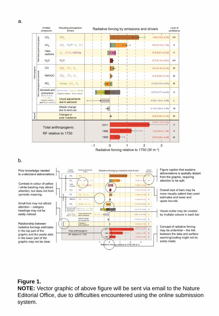
Figure 1.
NOTE: Vector graphic of above figure will be sent via email to the Nature
Editorial Office, due to difficulties encountered using the online submission
system.
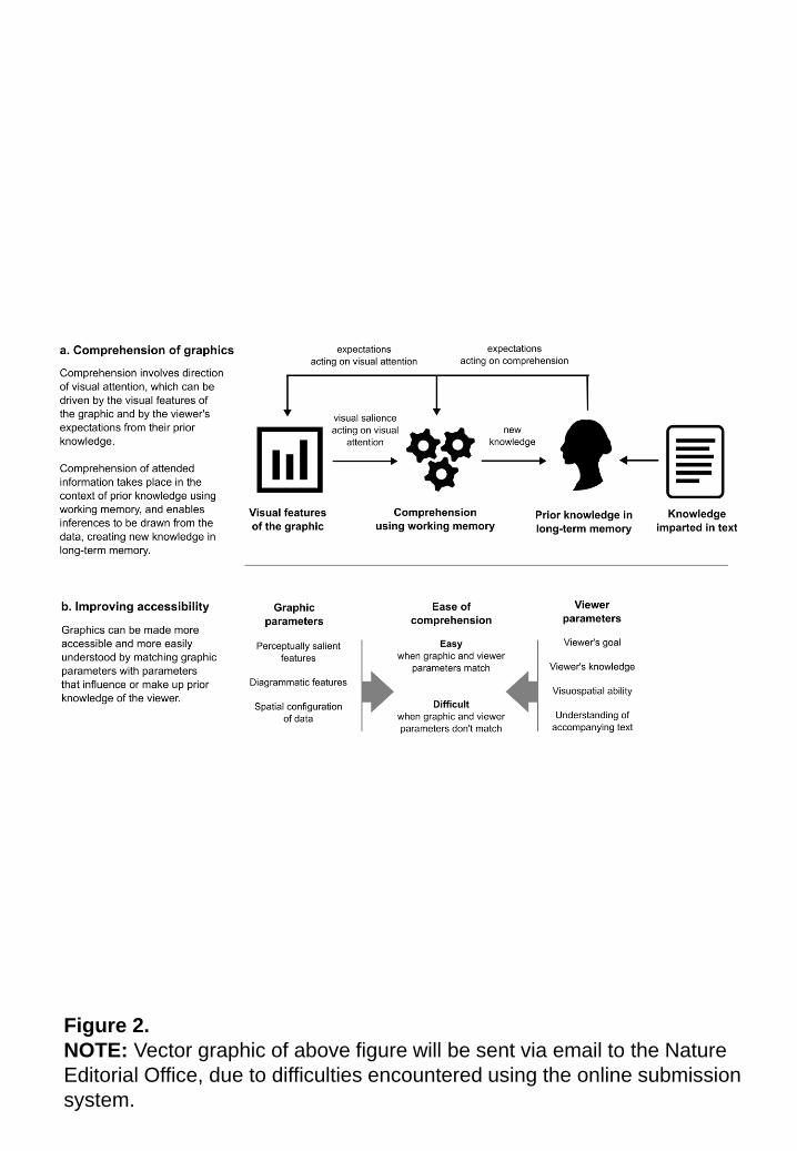
Figure 2.
NOTE: Vector graphic of above figure will be sent via email to the Nature
Editorial Office, due to difficulties encountered using the online submission
system.
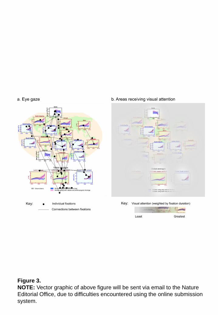
Figure 3.
NOTE: Vector graphic of above figure will be sent via email to the Nature
Editorial Office, due to difficulties encountered using the online submission
system.
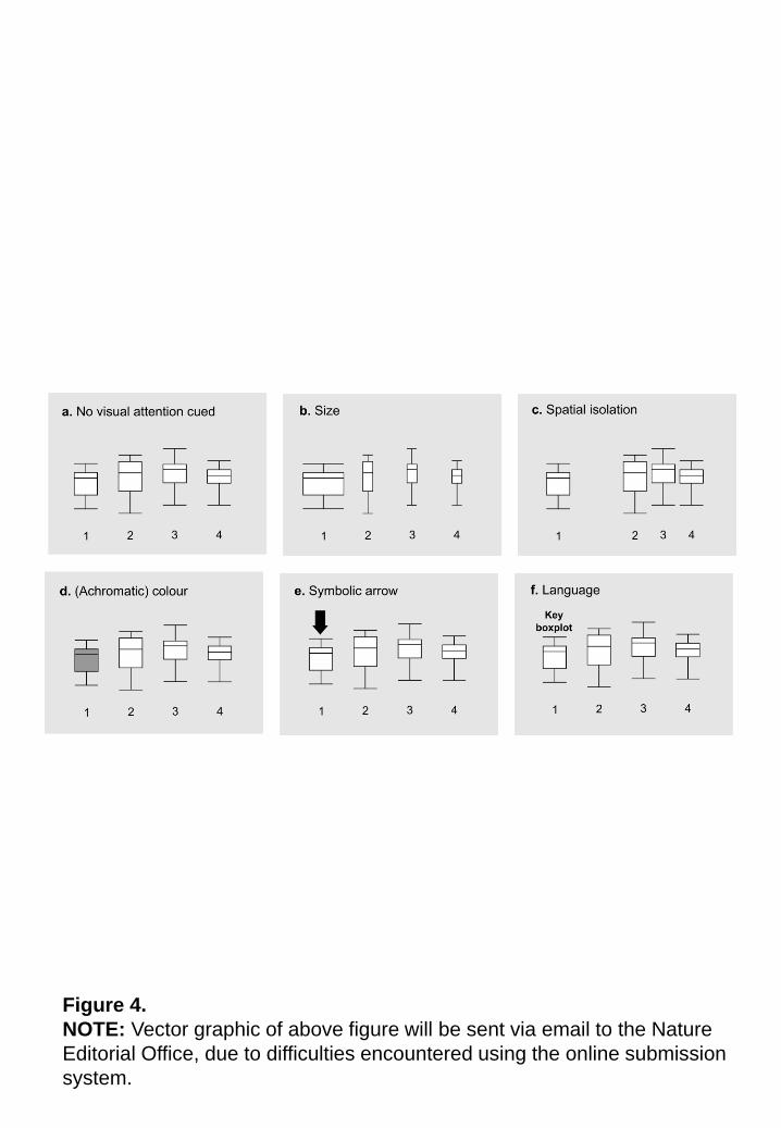
Figure 4.
NOTE: Vector graphic of above figure will be sent via email to the Nature
Editorial Office, due to difficulties encountered using the online submission
system.
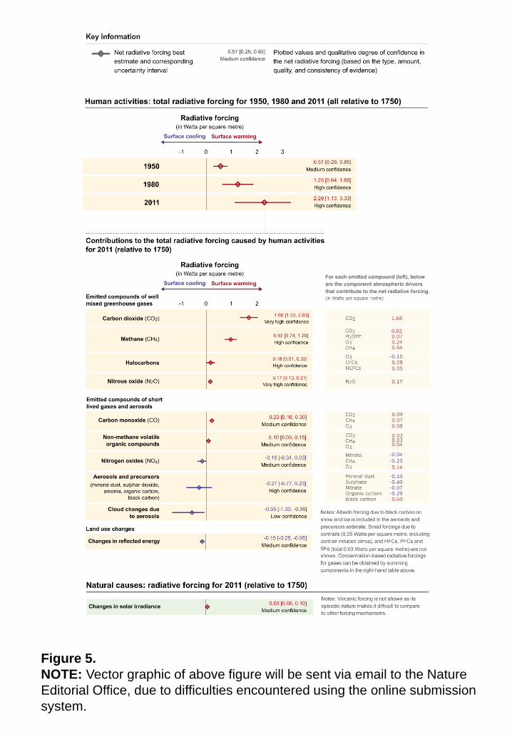
Figure 5.
NOTE: Vector graphic of above figure will be sent via email to the Nature
Editorial Office, due to difficulties encountered using the online submission
system.