Embed Size (px)
Citation preview

1
Climate4you update November 2011
www.climate4you.com
November 2011 global surface air temperature overview
November 2011 surface air temperature compared to the average 1998-2006. Green-yellow-red colours indicate areas with higher
temperature than the 1998-2006 average, while blue colours indicate lower than average temperatures. Data source: Goddard Institute
for Space Studies (GISS)

2
Comments to the November 2011 global surface air temperature overview
General: This newsletter contains graphs showing a
selection of key meteorological variables for the
past month. All temperatures are given in degrees
Celsius.
In the above maps showing the geographical pattern
of surface air temperatures, the period 1998-2006 is
used as reference period. The reason for comparing
with this recent period instead of the official WMO
‘normal’ period 1961-1990, is that the latter period
is affected by the relatively cold period 1945-1980.
Almost any comparison with such a low average
value will therefore appear as high or warm, and it
will be difficult to decide if and where modern
surface air temperatures are increasing or decreasing
at the moment. Comparing with a more recent
period overcomes this problem. In addition to this
consideration, the recent temperature development
suggests that the time window 1998-2006 may
roughly represent a global temperature peak. If so,
negative temperature anomalies will gradually
become more and more widespread as time goes on.
However, if positive anomalies instead gradually
become more widespread, this reference period only
represented a temperature plateau.
In the other diagrams in this newsletter the thin line
represents the monthly global average value, and
the thick line indicate a simple running average, in
most cases a simple moving 37-month average,
nearly corresponding to a three year average. The
37-month average is calculated from values
covering a range from 18 month before to
18 months after, with equal weight for every month.
The year 1979 has been chosen as starting point in
many diagrams, as this roughly corresponds to both
the beginning of satellite observations and the onset
of the late 20th century warming period. However,
several of the records have a much longer record
length, which may be inspected in grater detail on
www.Climate4you.com.
The average global surface air temperatures
November 2011:
The Northern Hemisphere was characterised by
high regional variability. Warmer than 1998-2006
average temperatures extended across most of
western and northern Europe and eastern Canada.
Lower than average temperatures were recorded in
Alaska, western Canada and USA, eastern
Mediterranean, southern Russia and eastern Siberia.
The Southern Hemisphere in general was close to or
below average 1998-2006 conditions. Most of
Africa experienced below average temperatures.
Near Equator temperatures conditions were in
general below average 1998-2006 temperature
conditions.
The Arctic was characterized by a high variability of
average surface air temperatures. The European
Arctic and easternmost Arctic Canada had above
average temperatures. Eastern Siberia, Alaska and
western Canada saw below average temperatures.
Most of the Antarctic continent experienced above
average temperatures.
The global oceanic heat content has been almost
stable since 2003/2004, but the latest update July-
September 2011 suggests a new temperature
increase (page 10).
The global sea level has not been changing very
much since 2009 (page 17).
Most diagrams shown in this newsletter are also available for download on www.climate4you.com
3
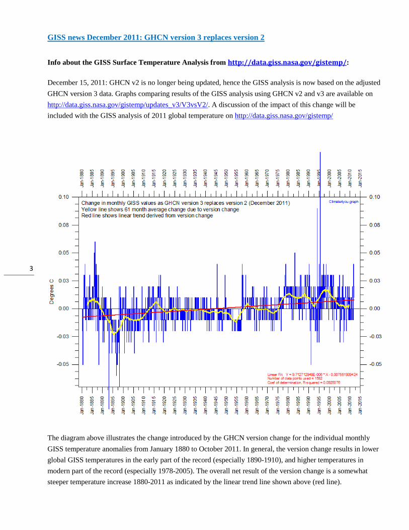
GISS news December 2011: GHCN version 3 replaces version 2
Info about the GISS Surface Temperature Analysis from http://data.giss.nasa.gov/gistemp/:
December 15, 2011: GHCN v2 is no longer being updated, hence the GISS analysis is now based on the adjusted
GHCN version 3 data. Graphs comparing results of the GISS analysis using GHCN v2 and v3 are available on
http://data.giss.nasa.gov/gistemp/updates_v3/V3vsV2/. A discussion of the impact of this change will be
included with the GISS analysis of 2011 global temperature on http://data.giss.nasa.gov/gistemp/
The diagram above illustrates the change introduced by the GHCN version change for the individual monthly
GISS temperature anomalies from January 1880 to October 2011. In general, the version change results in lower
global GISS temperatures in the early part of the record (especially 1890-1910), and higher temperatures in
modern part of the record (especially 1978-2005). The overall net result of the version change is a somewhat
steeper temperature increase 1880-2011 as indicated by the linear trend line shown above (red line).

4
Lower troposphere temperature from satellites, updated to November 2011
Global monthly average lower troposphere temperature (thin line) since 1979 according to University of Alabama at Huntsville, USA.
The thick line is the simple running 37 month average.
Global monthly average lower troposphere temperature (thin line) since 1979 according to according to Remote Sensing Systems (RSS),
USA. The thick line is the simple running 37 month average.

5
Global surface air temperature, updated to November 2011
Global monthly average surface air temperature (thin line) since 1979 according to according to the Hadley Centre for Climate
Prediction and Research and the University of East Anglia's Climatic Research Unit (CRU), UK. The thick line is the simple running 37
month average.
Global monthly average surface air temperature (thin line) since 1979 according to according to the Goddard Institute for Space Studies
(GISS), at Columbia University, New York City, USA. The thick line is the simple running 37 month average.

6
Global monthly average surface air temperature since 1979 according to according to the National Climatic Data Center (NCDC), USA.
The thick line is the simple running 37 month average.
A note on data record stability:
All the above temperature estimates display changes
when one compare with previous monthly data sets,
not only for the most recent months as a result of
additional data being added, but actually for all
months back to the very beginning of the records.
Presumably this reflects recognition of errors and
changes in the averaging procedure followed.
The most stable temperature record over time of the
five global records shown above is the HadCRUT3
series.
The interested reader may find more on the issue of
temporal stability (or lack of this) on
www.climate4you (go to: Global Temperature,
followed by Temporal Stability).
7
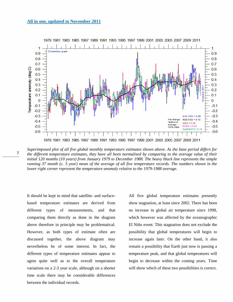
All in one, updated to November 2011
Superimposed plot of all five global monthly temperature estimates shown above. As the base period differs for
the different temperature estimates, they have all been normalised by comparing to the average value of their
initial 120 months (10 years) from January 1979 to December 1988. The heavy black line represents the simple
running 37 month (c. 3 year) mean of the average of all five temperature records. The numbers shown in the
lower right corner represent the temperature anomaly relative to the 1979-1988 average.
It should be kept in mind that satellite- and surface-
based temperature estimates are derived from
different types of measurements, and that
comparing them directly as done in the diagram
above therefore in principle may be problematical.
However, as both types of estimate often are
discussed together, the above diagram may
nevertheless be of some interest. In fact, the
different types of temperature estimates appear to
agree quite well as to the overall temperature
variations on a 2-3 year scale, although on a shorter
time scale there may be considerable differences
between the individual records.
All five global temperature estimates presently
show stagnation, at least since 2002. There has been
no increase in global air temperature since 1998,
which however was affected by the oceanographic
El Niño event. This stagnation does not exclude the
possibility that global temperatures will begin to
increase again later. On the other hand, it also
remain a possibility that Earth just now is passing a
temperature peak, and that global temperatures will
begin to decrease within the coming years. Time
will show which of these two possibilities is correct.

8
Global sea surface temperature, updated to the end of November 2011
Sea surface temperature anomaly at 29 November 2011. Map source: National Centers for Environmental
Prediction (NOAA).
Relative cold surface water dominates the regions
near Equator, especially in the eastern Pacific
Ocean, and represents remnants of the previous La
Niña, fading away in the spring 2011. Apparently a
new El Niño is not going to materialise, and surface
temperatures are dropping. Because of the large
surface areas involved near Equator, the relatively
cold surface water in these regions affects the global
atmospheric temperature.
The significance of any warming or cooling seen in
surface air temperatures should not be over stated.
Whenever Earth experiences cold La Niña or warm
El Niño episodes (Pacific Ocean) major heat
exchanges takes place between the Pacific Ocean
and the atmosphere above, eventually showing up in
estimates of the global air temperature. However,
this does not reflect similar changes in the total heat
content of the atmosphere-ocean system. In fact, net
changes may be small, as the above heat exchange
mainly reflects a redistribution of energy between
ocean and atmosphere. What matters is the overall
temperature development when seen over a number
of years.

9
Global monthly average lower troposphere temperature over oceans (thin line) since 1979 according to University of Alabama at
Huntsville, USA. The thick line is the simple running 37 month average.
Global monthly average sea surface temperature since 1979 according to University of East Anglia's Climatic Research Unit (CRU), UK.
Base period: 1961-1990. The thick line is the simple running 37 month average.
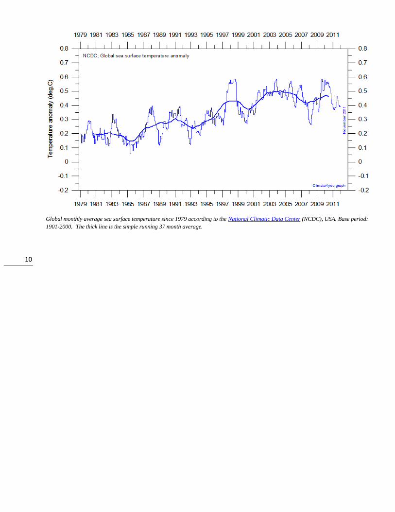
10
Global monthly average sea surface temperature since 1979 according to the National Climatic Data Center (NCDC), USA. Base period:
1901-2000. The thick line is the simple running 37 month average.

11
Global ocean heat content, updated to September 2011
Global monthly heat content anomaly (GJ/m2) in the uppermost 700 m of the oceans since January 1979. Data source: National
Oceanographic Data Center(NODC).
Global monthly heat content anomaly (GJ/m2) in the uppermost 700 m of the oceans since January 1955. Data source: National
Oceanographic Data Center(NODC).

12
Arctic and Antarctic lower troposphere temperature, updated to November 2011
Global monthly average lower troposphere temperature since 1979 for the North Pole and South Pole regions, based on satellite
observations (University of Alabama at Huntsville, USA). The thick line is the simple running 37 month average, nearly corresponding to
a running 3 yr average.

13
Arctic and Antarctic surface air temperature, updated to October 2011
Diagram showing Arctic monthly surface air temperature anomaly 70-90oN since January 2000, in relation to the WMO reference
“normal” period 1961-1990. The thin blue line shows the monthly temperature anomaly, while the thicker red line shows the running 13
month average. Data provided by the Hadley Centre for Climate Prediction and Research and the University of East Anglia's Climatic
Research Unit (CRU), UK.
Diagram showing Antarctic monthly surface air temperature anomaly 70-90oS since January 2000, in relation to the WMO reference
“normal” period 1961-1990. The thin blue line shows the monthly temperature anomaly, while the thicker red line shows the running 13
month average. Data provided by the Hadley Centre for Climate Prediction and Research and the University of East Anglia's Climatic
Research Unit (CRU), UK.

14
Diagram showing Arctic monthly surface air temperature anomaly 70-90oN since January 1957, in relation to the WMO reference
“normal” period 1961-1990. The year 1957 has been chosen as starting year, to ensure easy comparison with the maximum length of the
realistic Antarctic temperature record shown below. The thin blue line shows the monthly temperature anomaly, while the thicker red line
shows the running 13 month average. Data provided by the Hadley Centre for Climate Prediction and Research and the University of
East Anglia's Climatic Research Unit (CRU), UK.
Diagram showing Antarctic monthly surface air temperature anomaly 70-90oS since January 1957, in relation to the WMO reference
“normal” period 1961-1990. The year 1957 was an international geophysical year, and several meteorological stations were established
in the Antarctic because of this. Before 1957, the meteorological coverage of the Antarctic continent is poor. The thin blue line shows the
monthly temperature anomaly, while the thicker red line shows the running 13 month average. Data provided by the Hadley Centre for
Climate Prediction and Research and the University of East Anglia's Climatic Research Unit (CRU), UK.

15
Diagram showing Arctic monthly surface air temperature anomaly 70-90oN since January 1900, in relation to the WMO reference
“normal” period 1961-1990. The thin blue line shows the monthly temperature anomaly, while the thicker red line shows the running 13
month average. In general, the range of monthly temperature variations decreases throughout the first 30-50 years of the record,
reflecting the increasing number of meteorological stations north of 70oN over time. Especially the period from about 1930 saw the
establishment of many new Arctic meteorological stations, first in Russia and Siberia, and following the 2nd World War, also in North
America. Because of the relatively small number of stations before 1930, details in the early part of the Arctic temperature record should
not be over interpreted. The rapid Arctic warming around 1920 is, however, clearly visible, and is also documented by other sources of
information. The period since 2000 is warm, about as warm as the period 1930-1940. Data provided by the Hadley Centre for Climate
Prediction and Research and the University of East Anglia's Climatic Research Unit (CRU), UK
In general, the Arctic temperature record appears to be
less variable than the Antarctic record, presumably at
least partly due to the higher number of meteorological
stations north of 70oN, compared to the number of
stations south of 70oS.
As data coverage is sparse in the Polar Regions, the
procedure of Gillet et al. 2008 has been followed,
giving equal weight to data in each 5ox5
o grid cell when
calculating means, with no weighting by the surface areas
of the individual grid dells.
Literature:
Gillett, N.P., Stone, D.A., Stott, P.A., Nozawa, T.,
Karpechko, A.Y.U., Hegerl, G.C., Wehner, M.F. and
Jones, P.D. 2008. Attribution of polar warming to human
influence. Nature Geoscience 1, 750-754.

16
Arctic and Antarctic sea ice, updated to November 2011
Graphs showing monthly Antarctic, Arctic and global sea ice extent since November 1978, according to the National Snow and Ice data
Center (NSIDC).
Graph showing daily Arctic sea ice extent since June 2002, to October 3, 2011, by courtesy of Japan Aerospace Exploration Agency
(JAXA). Please note that this diagram is not updated beyond 3 October 2011 due to the suspension of AMSR-E observation.

17
Northern hemisphere sea ice thickness on 29 November 2011 according to the Arctic Cap Nowcast/Forecast System (ACNFS), US Naval
Research Laboratory. Thickness scale (m) is shown to the right.
18
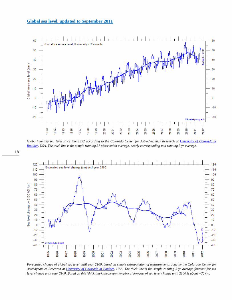
Global sea level, updated to September 2011
Globa lmonthly sea level since late 1992 according to the Colorado Center for Astrodynamics Research at University of Colorado at
Boulder, USA. The thick line is the simple running 37 observation average, nearly corresponding to a running 3 yr average.
Forecasted change of global sea level until year 2100, based on simple extrapolation of measurements done by the Colorado Center for
Astrodynamics Research at University of Colorado at Boulder, USA. The thick line is the simple running 3 yr average forecast for sea
level change until year 2100. Based on this (thick line), the present empirical forecast of sea level change until 2100 is about +20 cm.

19
Atmospheric CO2, updated to November 2011
Monthly amount of atmospheric CO2 (above) and annual growth rate (below; average last 12 months minus average preceding 12
months) of atmospheric CO2 since 1959, according to data provided by the Mauna Loa Observatory, Hawaii, USA. The thick line is the
simple running 37 observation average, nearly corresponding to a running 3 yr average.

20
Northern Hemisphere weekly snow cover, updated to early December 2011
Northern hemisphere weekly snow cover since January 2000 according to Rutgers University Global Snow Laboratory. The thin line is
the weekly data, and the thick line is the running 53 week average (approximately 1 year).
Northern hemisphere weekly snow cover since October 1966 according to Rutgers University Global Snow Laboratory. The thin line is
the weekly data, and the thick line is the running 53 week average (approximately 1 year). The running average is not calculated before
1971 because of some data irregularities in this early period.

21
Global surface air temperature and atmospheric CO2, updated to November 2011

22
Diagrams showing HadCRUT3, GISS, and NCDC monthly global surface air temperature estimates (blue) and the monthly
atmospheric CO2 content (red) according to the Mauna Loa Observatory, Hawaii. The Mauna Loa data series begins in
March 1958, and 1958 has therefore been chosen as starting year for the diagrams. Reconstructions of past atmospheric
CO2 concentrations (before 1958) are not incorporated in this diagram, as such past CO2 values are derived by other
means (ice cores, stomata, or older measurements using different methodology, and therefore are not directly comparable
with modern atmospheric measurements. The dotted grey line indicates the approximate linear temperature trend, and the
boxes in the lower part of the diagram indicate the relation between atmospheric CO2 and global surface air temperature,
negative or positive.
Most climate models assume the greenhouse gas
carbon dioxide CO2 to influence significantly upon
global temperature. Thus, it is relevant to compare
the different global temperature records with
measurements of atmospheric CO2, as shown in the
diagrams above. Any comparison, however, should
not be made on a monthly or annual basis, but for a
longer time period, as other effects (oceanographic,
clouds, volcanic, etc.) may well override the
potential influence of CO2 on short time scales such
as just a few years.
It is of cause equally inappropriate to present new
meteorological record values, whether daily,
monthly or annual, as support for the hypothesis
ascribing high importance of atmospheric CO2 for
global temperatures. Any such short-period
meteorological record value may well be the result
of other phenomena than atmospheric CO2.
What exactly defines the critical length of a relevant
time period to consider for evaluating the alleged
high importance of CO2 remains elusive. However,
the length of the critical period must be inversely
proportional to the importance of CO2 on the global
temperature, including possible feedback effects. So
if the net effect of CO2 is strong, the length of the
critical period is short, and vice versa.

23
After about 10 years of global temperature increase
following global cooling 1940-1978, IPCC was
established in 1988. Presumably, several scientists
interested in climate in 1988 felt intuitively that
their empirical and theoretical understanding of
climate dynamics was sufficient to conclude about
the high importance of CO2 for global temperature.
However, for obtaining public and political support
for the CO2-hyphotesis the 10 year warming period
leading up to 1988 in all likelihood was important.
Had the global temperature instead been decreasing,
political and public support for the CO2-hypothesis
would have been difficult to obtain. Adopting this
approach as to critical time length, the varying
relation (positive or negative) between global
temperature and atmospheric CO2 has been
indicated in the lower panels of the three diagrams
above.
Last 20 year surface temperature changes, updated to November 2011
Last 20 years global monthly average surface air temperature according to Hadley CRUT, a cooperative effort between the
Hadley Centre for Climate Prediction and Research and the University of East Anglia's Climatic Research Unit (CRU), UK.
The thin blue line represents the monthly values. The thick red line is the linear fit, with 95% confidence intervals indicated
by the two thin red lines. The thick green line represents a 5-degree polynomial fit, with 95% confidence intervals indicated
by the two thin green lines. A few key statistics is given in the lower part of the diagram. Last month included in analysis:
November 2011.
From time to time it is debated if the global surface temperature is increasing, or if the temperature has leveled
out during the last 10-15 years. The above diagram may be useful in this context. If nothing else, it demonstrates
the differences between two different statistical approaches to determine recent temperature trends.

24
Climate and history; one example among many
200-0 BC: European Science and Meteorology in the balance: Alexandria and Rome
The Royal Library of Alexandria, or Ancient Library of Alexandria, in Alexandria, Egypt, was probably the largest, and certainly the most famous, of the libraries of the ancient world. It flourished under the patronage of the Ptolemaic dynasty, and functioned as a major centre of scholarship, at least until the time of Rome's conquest of Egypt, and probably for many centuries thereafter.
Around 200 BC the Greek centre of science has
more or less ceased to exist, and most of the
previous scientific activity had moved away from
Europe to Alexandria in the Nile delta. Alexandria
was founded around a small pharaonic town c. 331
BC by Alexander the Great. Within a century,
Alexandria had become the largest city in the world
and, for some centuries more, was second only to
Rome. It became Egypt's main Greek city, with
Greek people from diverse backgrounds. It
remained Egypt's capital for nearly a thousand
years, until the Muslim conquest of Egypt in AD
641. Much of the summary below is adopted from
different sources in Wikepedia and from Rasmussen
2010, from where additional information is
available.
The Royal Library of Alexandria, or Ancient
Library of Alexandria, was the largest and most
significant library of the ancient world. It flourished
under the patronage of the Ptolemaic dynasty and
functioned as a major centre of scholarship from its
construction in the 3rd century BC until the Roman
conquest of Egypt in 30 BC. Apparently the library
was initially organized by Demetrius of Phaleron, a
student of Aristotle, under the reign of Ptolemy
Soter (ca.367 BC—ca.283 BC). The library had
about 500,000 books in its collections and also
comprised gardens, a room for shared dining, a
reading room, lecture halls and meeting rooms. The
influence of this model may still be seen today in
the layout of many university campuses. The library
itself is known to have had an acquisitions
department, and a cataloguing department. A hall
contained shelves for the collections of scrolls
(books were at this time on papyrus scrolls), known
as bibliothekai. Legend has it that carved into the
wall above the shelves was an inscription that read:
The place of the cure of the soul.
The first known library of its kind to gather a
serious collection of books from beyond its
country's borders, the Library at Alexandria was
charged with collecting the entire world's
knowledge. It did so through an aggressive and
well-funded royal mandate involving trips to the
book fairs of Rhodes and Athens, supplemented by
a policy of pulling the books off every ship that
came into port. They kept the original texts and
made copies to send back to their owners.

25
Other than collecting works from the past, the
library was also home to a host of international
scholars, well-patronized by the Ptolemaic dynasty
with travel, lodging and stipends for their whole
families. As a research institution, the library filled
its stacks with new works in mathematics,
astronomy, physics, natural sciences and other
subjects. In this way much of the knowledge
acquired and formulated by Aristotle and his
students were kept alive after the golden period of
science had ceased in Greece, and for a period,
Alexandria became the new scientific center in the
Mediterranean area. Part of the reason for the
golden period of science coming to an end in
Greece was the growing power of the Roman
Republic and later the Roman Empire, spreading
throughout the Mediterranean.
The Roman Republic was the period of the ancient
Roman civilization where the government operated
as a republic. It began with the overthrow of the
Roman monarchy around 508 BC, and its
replacement by a government headed by two
consuls, elected annually by the citizens and advised
by a senate. A complex constitution gradually
developed, centered on the principles of a separation
of powers and checks and balances. Except in times
of dire national emergency, public offices were
limited to one year, so in theory at least, no single
individual could dominate his fellow-citizens.
The Roman Republic was gradually weakened
through several civil wars, and several events are
commonly proposed to mark the transition from
Republic to Empire, including Julius Caesar's
appointment as perpetual dictator (44 BC) and the
Battle of Actium (2 September 31 BC).
Roman expansion began in the days of the
Republic, but the Empire reached its greatest extent
under Emperor Trajan: during his reign (98 to 117
AD) the Roman Empire controlled approximately
6.5 million km2 of land surface. Because of the
Empire's vast extent and long endurance, the
institutions and culture of Rome had a profound and
lasting influence on the development of language,
religion, architecture, philosophy, law, and forms of
government in the territory it governed, particularly
Europe, and by means of European expansionism
throughout the modern world.
Both the Roman Republic and the Roman Empire,
however, had little interest in science. Scientific
knowledge was only regarded as relevant from an
applied point of view, and basic research was
neither interesting nor encouraged by the society.
This is why the Library at Alexandria for some time
developed into a safe haven for much of the
knowledge, including meteorological, which has
been developed by Aristotle and his students in
Greece during the golden period.
At the same time, Christianity was increasing its
influence rapidly in Europe, and the Greek scientific
knowledge was increasingly considered as an
expression of old paganism, and for that reason
something which should be subjected to suppression
and ban. As the political influence of Christianity
grew in Europe and across the entire Mediterranean
region, it became more and more difficult for the
Library at Alexandria to carry on as previously.
Eventually, many of the scientists associated with
the Library were exposed to persecution. Many
therefore had to leave Alexandria and moved to
Damascus, into the growing Arab Caliphate, where
science and scientists were welcomed. So once
again, the scientific tradition and knowledge
established by Aristotle and his students had to
evacuate to a new safe haven outside Europe, in
order to survive.
References:
Rasmussen, E.A. 2010. Vejret gennem 5000 år (Weather through 5000 years). Meteorologiens historie. Aarhus
Universitetsforlag, Århus, Denmark, 367 pp, ISBN 978 87 7934 300 9.
*****

26
All the above diagrams with supplementary information, including links to data sources and previous
issues of this newsletter, are available on www.climate4you.com
Yours sincerely, Ole Humlum ([email protected])
22 December 2011.