Embed Size (px)
Citation preview
How to Choose the Perfect Colors • How to Choose the Ideal Color Scheme | 64
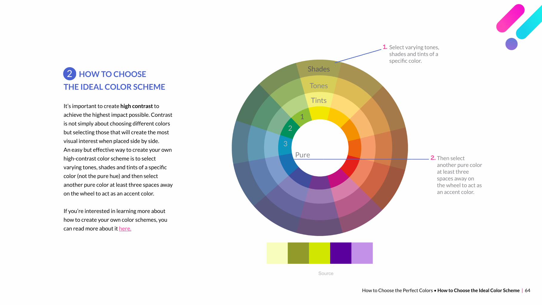
It’s important to create high contrast to
achieve the highest impact possible. Contrast
is not simply about choosing different colors
but selecting those that will create the most
visual interest when placed side by side.
An easy but effective way to create your own
high-contrast color scheme is to select
varying tones, shades and tints of a specific
color (not the pure hue) and then select
another pure color at least three spaces away
on the wheel to act as an accent color.
If you’re interested in learning more about
how to create your own color schemes, you
can read more about it here.
HOW TO CHOOSE
THE IDEAL COLOR SCHEME
2
Shades
Tones
Tints
1
2
3
Select varying tones,shades and tints of aspecific color.
1.
Then selectanother pure colorat least threespaces away onthe wheel to act asan accent color.
2.Pure
Source

How to Choose the Perfect Colors • How to Choose the Ideal Color Scheme | 65
If you don’t have time to create your
own color schemes, there are plenty of
free color scheme generators such as:
Color Scheme Tools
Adobe Color CC
Coolors.co
Paletton
Here are a few color schemes
automatically generated by these tools:
Click on scheme to see hex code
How to Choose the Perfect Colors • How to Choose the Ideal Color Scheme | 66
You’ve probably heard this
before, but when it comes to
design, less is usually more.
Try to keep it simple and don’t
use too many colors. In general,
three to four colors is sufficient
for a presentation.
Keep It Simple
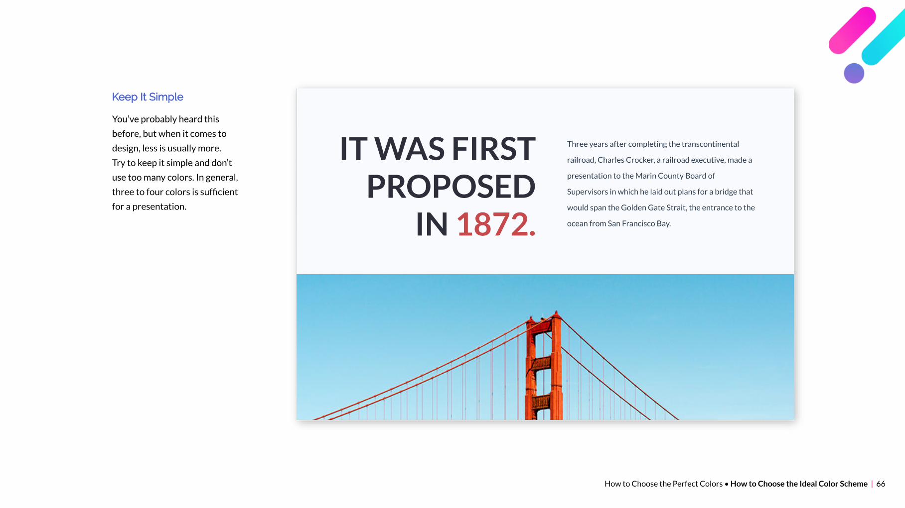
IT WAS FIRSTPROPOSED
IN 1872.
Three years after completing the transcontinental
railroad, Charles Crocker, a railroad executive, made a
presentation to the Marin County Board of
Supervisors in which he laid out plans for a bridge that
would span the Golden Gate Strait, the entrance to the
ocean from San Francisco Bay.
How to Choose the Perfect Colors • How to Choose the Ideal Color Scheme | 67
The 60-30-10 Rule
An easy way to create a balanced
slide deck is to stick to the
60-30-10 rule.
This means that if you’ve chosen
three colors, as recommended
previously, then you should devote
60 percent of the space to the
primary color, 30 percent to the
secondary and 10 percent to the
accent color.
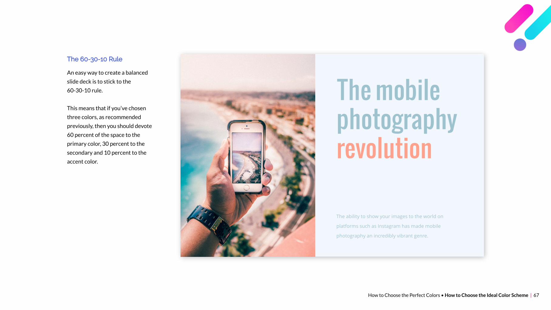
The mobilephotographyrevolution
The ability to show your images to the world on
platforms such as Instagram has made mobile
photography an incredibly vibrant genre.

How to Choose the Perfect Colors • How to Choose the Ideal Color Scheme | 68
Spread Content Out
Another simple rule is to spread your
content out into bite-sized morsels
throughout your presentation so that it
is as easy to digest as possible.
Long gone are the days when you used
to create presentations with 10 or 15
slides. Nowadays, engaging
presentations that can be viewed in less
than 3 minutes consist of 50 to 60 slides.
Why? Because the lower the slide count,
the more information you’ve probably
crammed into each slide. On the other
hand, the higher the slide count, the
more visuals and the less words you’ve
probably used to explain each concept.
Source

How to Choose the Perfect Colors • How to Choose the Ideal Color Scheme | 69
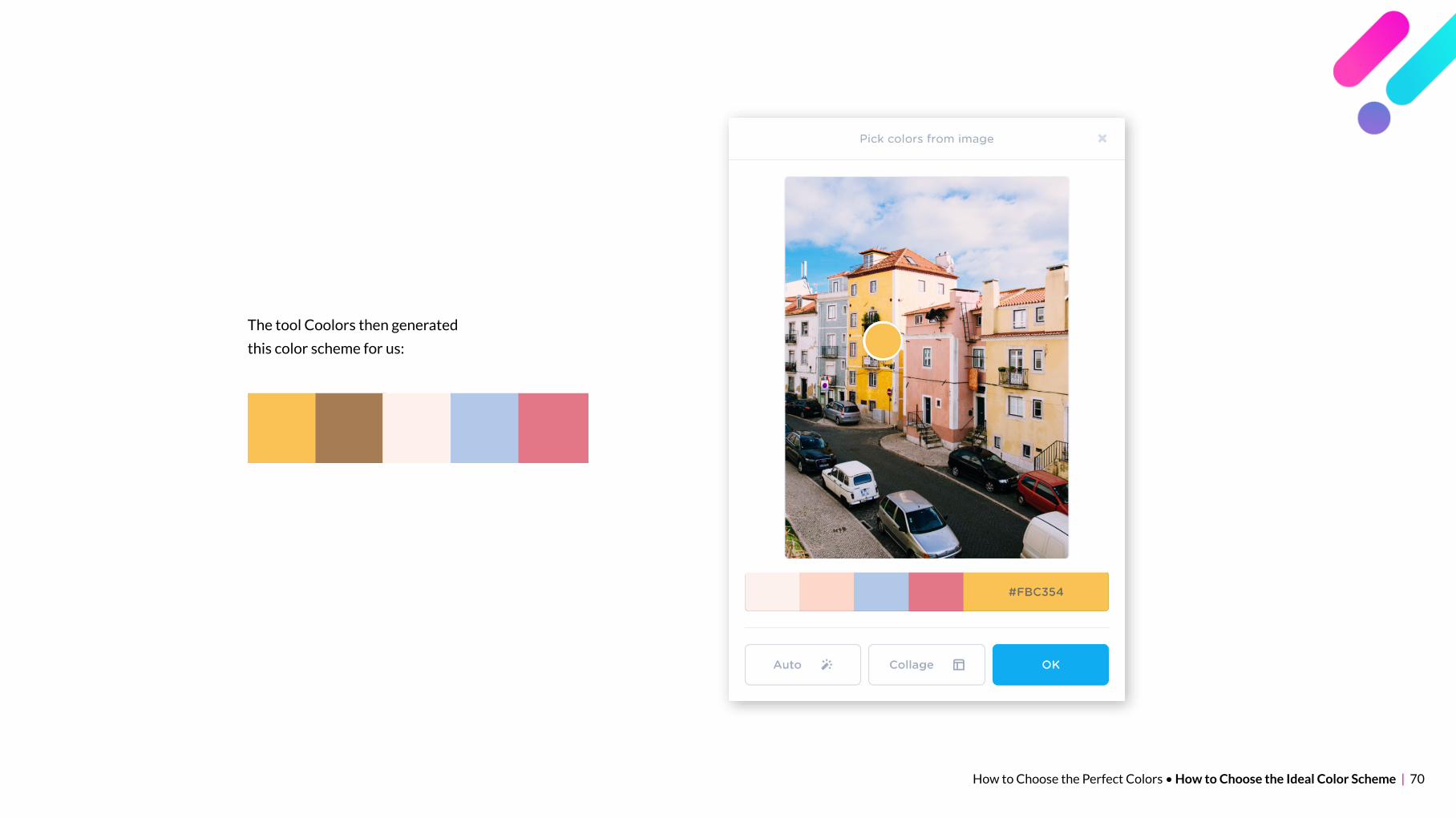
How to Create Your Own Palettes
One designer’s secret for finding just the right color
scheme for your presentation is to use one of the color
scheme tools listed here to create vivid color palettes
from your favorite photos.
All you have to do is upload an image with a color scheme
that evokes the emotions you’re going for and then save
the hex color codes generated by the tool.
For example, we chose this image because of the way the
colors convey calmness and warmth:
How to Choose the Perfect Colors • How to Choose the Ideal Color Scheme | 70
The tool Coolors then generated
this color scheme for us:
How to Choose the Perfect Colors • How to Choose the Ideal Color Scheme | 71
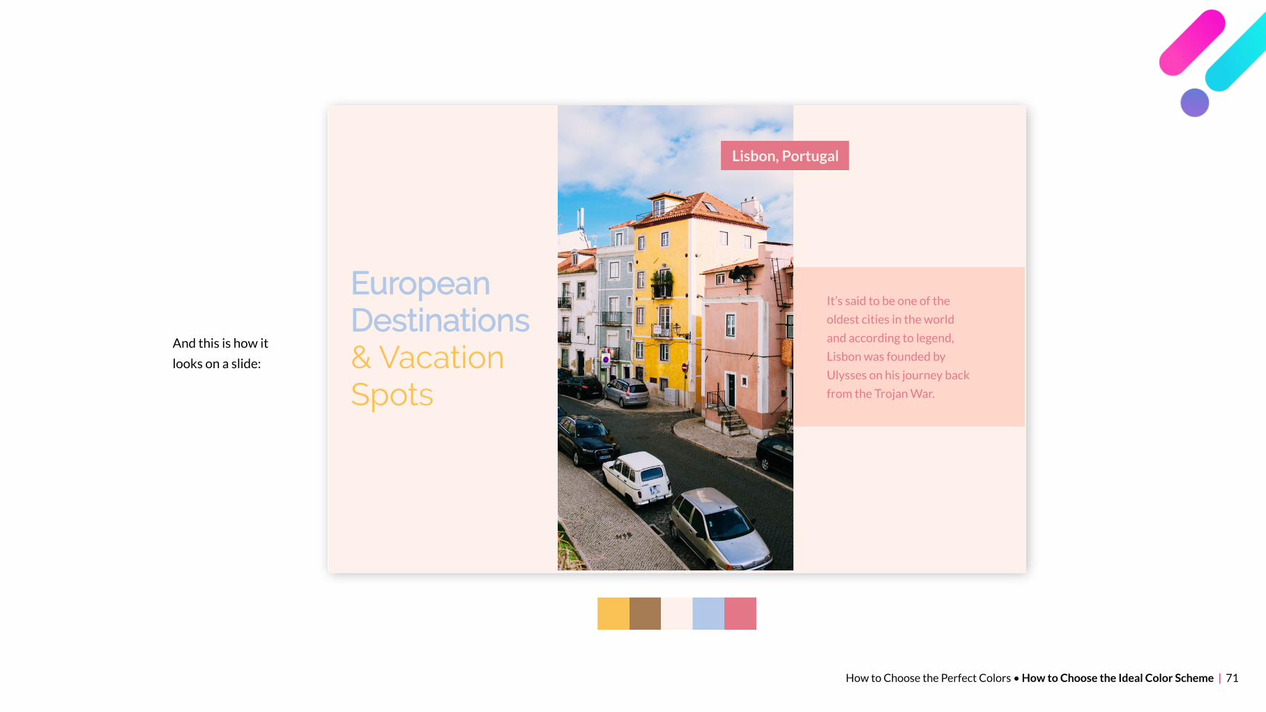
And this is how it
looks on a slide:
EuropeanDestinations& VacationSpots
Lisbon, Portugal
It’s said to be one of the
oldest cities in the world
and according to legend,
Lisbon was founded by
Ulysses on his journey back
from the Trojan War.
How to Choose the Perfect Colors • How to Choose the Ideal Color Scheme | 72
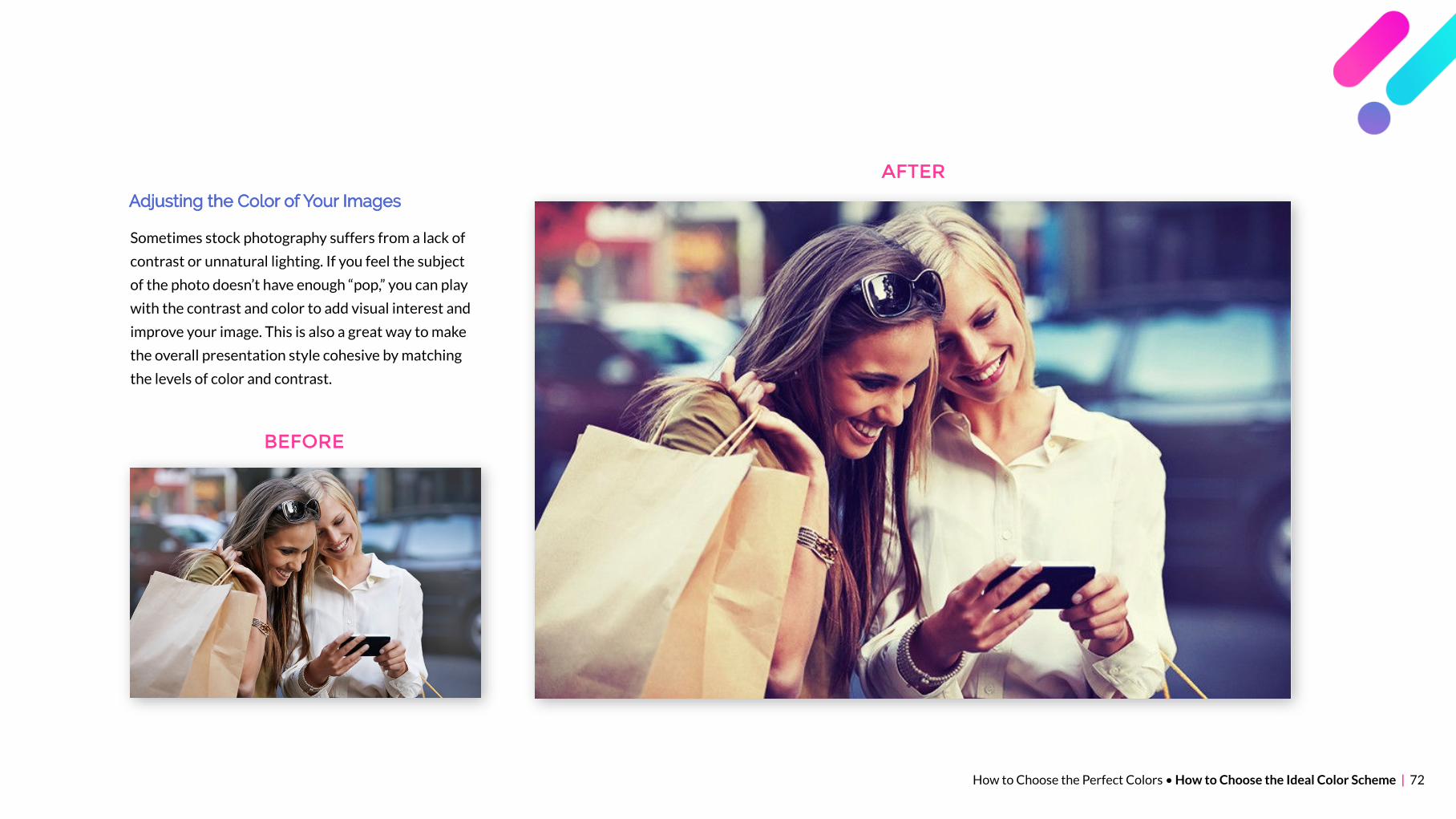
Adjusting the Color of Your Images
Sometimes stock photography suffers from a lack of
contrast or unnatural lighting. If you feel the subject
of the photo doesn’t have enough “pop,” you can play
with the contrast and color to add visual interest and
improve your image. This is also a great way to make
the overall presentation style cohesive by matching
the levels of color and contrast.
AFTER
BEFORE