Embed Size (px)
Citation preview
theHow computer mapping at Harvard became GIS
ChartingUnknown
Nick Chrisman
thethethetheCharting
thetheCharting
thetheCharting
theChartingChartingChartingChartingChartingChartingChartingChartingChartingChartingChartingChartingChartingChartingChartingChartingChartingCharting
nknownChartingCharting
UCharting
nknownCharting
UCharting
UCharting
UCharting
nknownnknownnknownnknownnknownnknownnknownnknownnknownnknownnknownnknownnknownnknownnknownnknownnknownnknownnknownnknownnknownUnknownUCharting
UCharting
nknownCharting
UChartingCharting
nknownChartingCharting
UCharting
nknownCharting
UCharting
�������������������������������������������������������������������
����������������������������������������������������
��������������������������������������������������������������
��������������������������������������������������������������������������
�����������������������������������������������������
�����������������������������������������������������������������������������������������������������������������
���������������������������������������������������������������������������������������������
�����������������������������������������������������������������
�����������������������������������������������������������������������������������������������������������������������
��������������������������������������������������������
������������������������������
�����������������������������
����
����
����
����
����
����
����
����
����
����
����
����
����
����
����
����
����
����
����
����
����
����
����
����
����
����
����
�
�����
����
����
���
����
���
����
�
����
�
�����
��
����
���
����
���
�����
�������
�����
����
�
��������������������������
������������
�������������
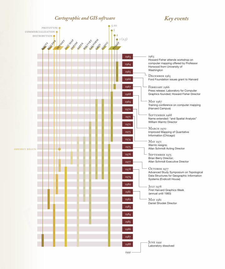
Cartographic and GIS software Key events
1
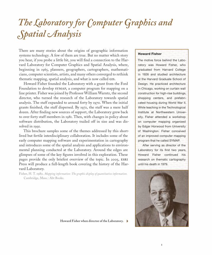
The Laboratory for Computer Graphics and Spatial Analysis
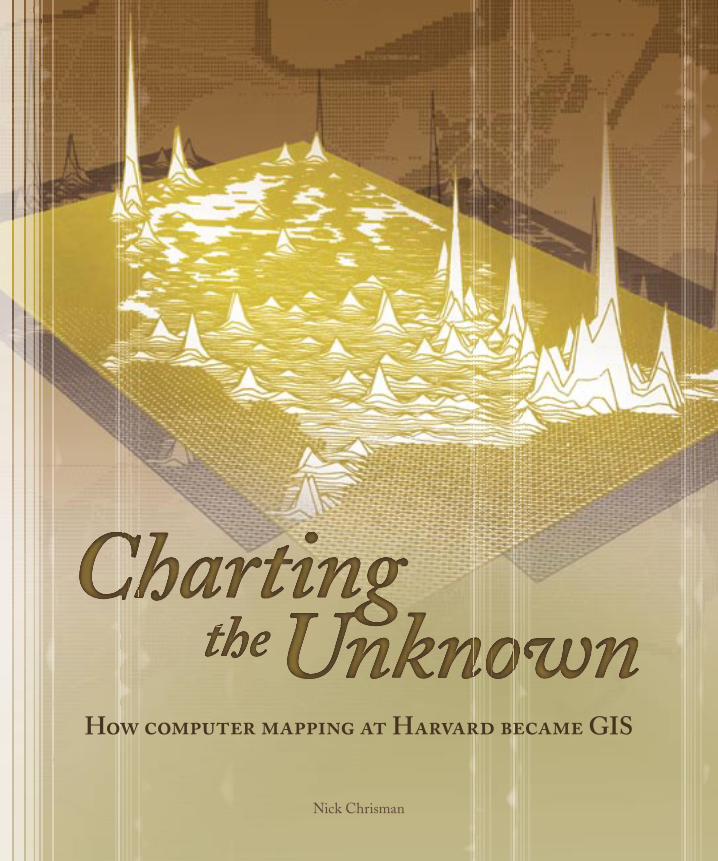
There are many stories about the origins of geographic information systems technology. A few of them are true. But no matter which story you hear, if you probe a little bit, you will fi nd a connection to the Har-vard Laboratory for Computer Graphics and Spatial Analysis, where, beginning in 1965, planners, geographers, cartographers, mathemati-cians, computer scientists, artists, and many others converged to rethink thematic mapping, spatial analysis, and what is now called gis.
Howard Fisher founded the Laboratory with a grant from the Ford Foundation to develop symap, a computer program for mapping on a line printer. Fisher was joined by Professor William Warntz, the second director, who turned the research of the Laboratory towards spatial analysis. The staff expanded to around forty by 1970. When the initial grants fi nished, the staff dispersed. By 1972, the staff was a mere half dozen. After fi nding new sources of support, the Laboratory grew back to over forty staff members in 1981. Then, with changes in policy about software distribution, the Laboratory trailed off in size and was dis-solved in 1991.
This brochure samples some of the themes addressed by this short-lived but fertile interdisciplinary collaboration. It includes some of the early computer mapping software and experimentation in cartography and introduces some of the spatial analysis and applications to environ-mental planning conducted at the Laboratory. Around the edges are glimpses of some of the key fi gures involved in this exploration. These pages provide the only briefest overview of the topic. In 2005, esriPress will produce a full-length book covering the history of the Har-vard Laboratory.Fisher, H. T. 1982. Mapping information: The graphic display of quantitative information.
Cambridge, Mass.: Abt Books.
Howard Fisher
The motive force behind the Labo-
ratory was Howard Fisher, who
graduated from Harvard College
in 1926 and studied architecture
at the Harvard Graduate School of
Design. He practiced architecture
in Chicago, working on curtain wall
construction for high-rise buildings,
shopping centers, and prefabri-
cated housing during World War II.
While teaching in the Technological
Institute at Northwestern Univer-
sity, Fisher attended a workshop
on computer mapping organized
by Edgar Horwood from University
of Washington. Fisher conceived
of an improved computer mapping
program that he called SYMAP.
After serving as director of the
Laboratory for its fi rst two years,
Howard Fisher continued his
research on thematic cartography
until his death in 1979.
Howard Fisher when director of the Laboratory. 4
2
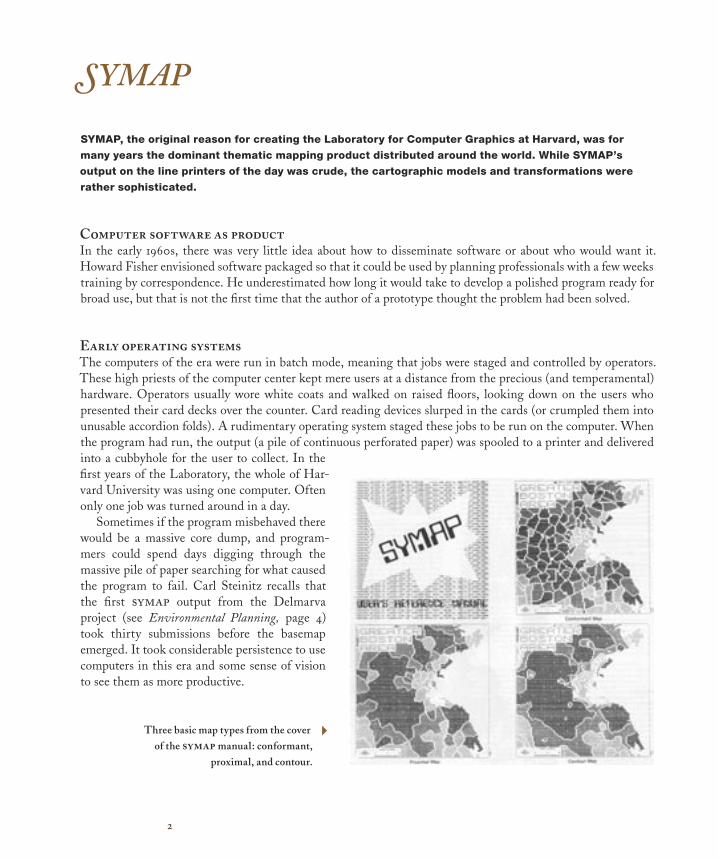
SYMAP
SYMAP, the original reason for creating the Laboratory for Computer Graphics at Harvard, was for
many years the dominant thematic mapping product distributed around the world. While SYMAP’s
output on the line printers of the day was crude, the cartographic models and transformations were
rather sophisticated.
Computer software as productIn the early 1960s, there was very little idea about how to disseminate software or about who would want it. Howard Fisher envisioned software packaged so that it could be used by planning professionals with a few weeks training by correspondence. He underestimated how long it would take to develop a polished program ready for broad use, but that is not the first time that the author of a prototype thought the problem had been solved.
Early operating systemsThe computers of the era were run in batch mode, meaning that jobs were staged and controlled by operators. These high priests of the computer center kept mere users at a distance from the precious (and temperamental) hardware. Operators usually wore white coats and walked on raised floors, looking down on the users who presented their card decks over the counter. Card reading devices slurped in the cards (or crumpled them into unusable accordion folds). A rudimentary operating system staged these jobs to be run on the computer. When the program had run, the output (a pile of continuous perforated paper) was spooled to a printer and delivered into a cubbyhole for the user to collect. In the first years of the Laboratory, the whole of Har-vard University was using one computer. Often only one job was turned around in a day.
Sometimes if the program misbehaved there would be a massive core dump, and program-mers could spend days digging through the massive pile of paper searching for what caused the program to fail. Carl Steinitz recalls that the first symap output from the Delmarva project (see Environmental Planning, page 4) took thirty submissions before the basemap emerged. It took considerable persistence to use computers in this era and some sense of vision to see them as more productive.
Three basic map types from the cover of the symap manual: conformant,
proximal, and contour.
4
3
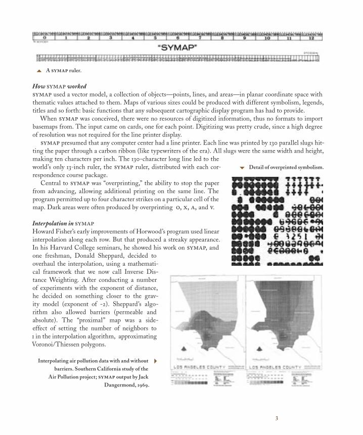
How symap workedsymap used a vector model, a collection of objects—points, lines, and areas—in planar coordinate space with thematic values attached to them. Maps of various sizes could be produced with different symbolism, legends, titles and so forth: basic functions that any subsequent cartographic display program has had to provide.
When symap was conceived, there were no resources of digitized information, thus no formats to import basemaps from. The input came on cards, one for each point. Digitizing was pretty crude, since a high degree of resolution was not required for the line printer display.
symap presumed that any computer center had a line printer. Each line was printed by 130 parallel slugs hit-ting the paper through a carbon ribbon (like typewriters of the era). All slugs were the same width and height, making ten characters per inch. The 130-character long line led to the world’s only 13-inch ruler, the symap ruler, distributed with each cor-respondence course package.
Central to symap was “overprinting,” the ability to stop the paper from advancing, allowing additional printing on the same line. The program permitted up to four character strikes on a particular cell of the map. Dark areas were often produced by overprinting o, x, a, and v.
Interpolation in symapHoward Fisher’s early improvements of Horwood’s program used linear interpolation along each row. But that produced a streaky appearance. In his Harvard College seminars, he showed his work on symap, and one freshman, Donald Sheppard, decided to overhaul the interpolation, using a mathemati-cal framework that we now call Inverse Dis-tance Weighting. After conducting a number of experiments with the exponent of distance, he decided on something closer to the grav-ity model (exponent of -2). Sheppard’s algo-rithm also allowed barriers (permeable and absolute). The “proximal” map was a side-effect of setting the number of neighbors to 1 in the interpolation algorithm, approximating Voronoi/Thiessen polygons.
5 A symap ruler.
6 Detail of overprinted symbolism.
Interpolating air pollution data with and without barriers. Southern California study of the
Air Pollution project; symap output by Jack Dangermond, 1969.
4
4
Environmental Planning
Led by Carl Steinitz, one group applied computer mapping to environmental planning, closely
coordinating their work with the instructional program of the Department of Landscape Architecture
and other research projects. In 1967, a major regional study was conducted for the Delmarva Peninsula,
a project pivotal to understanding early GIS.
Setting the sceneHoward Fisher’s 1965 proposal to the Ford Foundation emphasized gathering factual information about urban planning. The word environment hardly appeared at all. But by 1967, with issues of environmental planning increasing in prominence, Professor Harris in the Department of Landscape Architecture at the Graduate School of Design would have several students comparing techniques used for environmental analysis and design. With some funding from the Conservation Foundation, three prominent practitioners came to Harvard to describe their techniques. This project brought representatives together from each of the sources that would be identified as the origins of gis.
Angus Hill, a soil scientist and forester from Ontario Department of Lands and Forests, presented his hier-archical land evaluation technique. It was strongly linked to geomorphic land units, with vegetation indicating the ecological systems. In Ottawa, a project for converting Hill’s maps to digital form would be first to use the term “geographic information system” (in a paper Roger Tomlinson delivered in Australia in 1968). Yet Hill’s technique is the one that least needs a gis. Manual compilation of each map evaluated the suitability of each polygon; the gis had only to tabulate the areas.
The other two practitioners were Philip Lewis from University of Wisconsin and Ian McHarg from Uni-versity of Pennsylvania, both landscape architects, who assembled maps from various sources using transparent overlays. McHarg’s book Design with Nature (published two years later) inspired the environmental movement. They both preached the integration of diverse sources, key for gis development.
While what emerges at Harvard is certainly innovative, the group at the Laboratory was working closely with ideas and techniques from each of the other locations considered “origins” of gis, with each place in contact with the others.
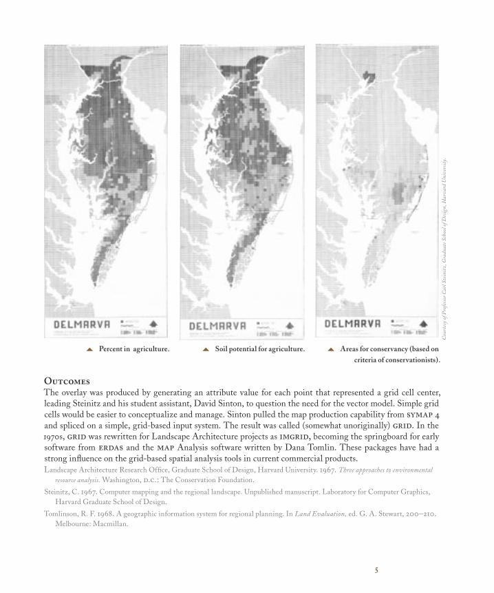
Delmarva Project In 1967, both City Planning and Landscape Architecture chose to work on the Delmarva Peninsula (Delaware, Eastern Maryland, and a tip of Virginia). Carl Steinitz applied the Laboratory’s toolkit (symap) to this enter-prise. This was the integration between the Laboratory and the Graduate School of Design that Fisher had assumed would be created.
The project had all the components of any GIS enterprise: base layers, computer-generated intermediaries, and results. The base layers included topographic maps, soil maps, airphotograph interpretation, and the census for county-level statistics. Counties, shoreline, and roads were entered as vector objects, but most environmental sources were coded according to grid cells two miles by two miles. Land use was recorded as the percentage of the cell that was forest or agriculture. Topographic relief was recorded as an “average” elevation. In symap, the grid cells were treated as points, and the maps were interpolated to show a smoother rendition than the grid cells would allow. The main results were produced by a map overlay of all factors. Suitability for a range of different uses was assessed using the weighted sum of the factor scores.
5
OutcomesThe overlay was produced by generating an attribute value for each point that represented a grid cell center, leading Steinitz and his student assistant, David Sinton, to question the need for the vector model. Simple grid cells would be easier to conceptualize and manage. Sinton pulled the map production capability from symap 4 and spliced on a simple, grid-based input system. The result was called (somewhat unoriginally) grid. In the 1970s, grid was rewritten for Landscape Architecture projects as imgrid, becoming the springboard for early software from erdas and the map Analysis software written by Dana Tomlin. These packages have had a strong influence on the grid-based spatial analysis tools in current commercial products.Landscape Architecture Research Office, Graduate School of Design, Harvard University. 1967. Three approaches to environmental
resource analysis. Washington, d.c.: The Conservation Foundation.
Steinitz, C. 1967. Computer mapping and the regional landscape. Unpublished manuscript. Laboratory for Computer Graphics, Harvard Graduate School of Design.
Tomlinson, R. F. 1968. A geographic information system for regional planning. In Land Evaluation, ed. G. A. Stewart, 200–210. Melbourne: Macmillan.
5 Percent in agriculture. 5 Soil potential for agriculture. 5 Areas for conservancy (based on criteria of conservationists).
Cou
rtes
y of
Pro
fess
or C
arl S
tein
itz,
Gra
duat
e Sch
ool o
f Des
ign,
Har
vard
Uni
vers
ity.
6
Spatial Analysis
The Laboratory added “Spatial Analysis” to its title in 1968, leading to many of its more important
innovations. William Warntz set the original direction with his theory of surfaces, and additional themes
of topology and computational geometry can be traced in current GIS practice.
Visions of planetary scopeWorld War II and nuclear weapons placed academic physicists in the unexpected position of conspiring to destroy the planet. Reacting to the Manhattan Project, J. Q. Stewart, president of the American Physical Society, proposed a “social physics,” applying models of gravitation to social behavior. Stewart’s crisis of social conscience resonated with a few social scientists, though it had little impact on physics.
After the war, disciplines that studied people, including sociology, anthropology, geography, and economics became embroiled in becoming more “scientific,” demonstrable theory and more mathematical treatment of quantitative data. Hard numbers were thought to lead inexorably to harder theories.
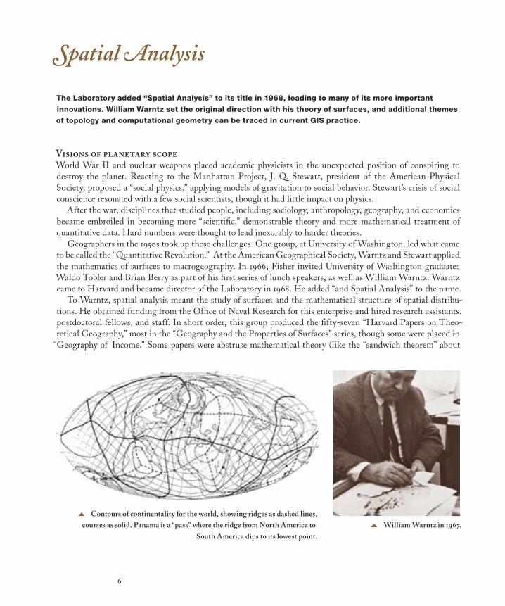
Geographers in the 1950s took up these challenges. One group, at University of Washington, led what came to be called the “Quantitative Revolution.” At the American Geographical Society, Warntz and Stewart applied the mathematics of surfaces to macrogeography. In 1966, Fisher invited University of Washington graduates Waldo Tobler and Brian Berry as part of his first series of lunch speakers, as well as William Warntz. Warntz came to Harvard and became director of the Laboratory in 1968. He added “and Spatial Analysis” to the name.
To Warntz, spatial analysis meant the study of surfaces and the mathematical structure of spatial distribu-tions. He obtained funding from the Office of Naval Research for this enterprise and hired research assistants, postdoctoral fellows, and staff. In short order, this group produced the fifty-seven “Harvard Papers on Theo-retical Geography,” most in the “Geography and the Properties of Surfaces” series, though some were placed in
“Geography of Income.” Some papers were abstruse mathematical theory (like the “sandwich theorem” about
5 William Warntz in 1967.5 Contours of continentality for the world, showing ridges as dashed lines,
courses as solid. Panama is a “pass” where the ridge from North America to South America dips to its lowest point.
7
the topology of entities); some were morphological (like “Law and Order in the Human Lung,” which applied stream ordering to branching networks).
While others saw surfaces as cellular, the Laboratory emphasized topology, fundamental to Triangular Irregular Networks (tin) and similar software. Warntz was primarily interested in thematic surfaces, such as population, income, and continentality, and his theory of the topological structure of surfaces based on points (peaks and pits; passes and pales), lines (ridges and courses), and areas (hills and dales) works equally well for thematic and physical surfaces.
As a bomber navigator during World War II, Warntz had learned “pressure pattern flying,” taking winds into account to find the fastest path. Current software capabilities that construct least-cost paths over surfaces can be traced back to this experience and the theoretical work at the Laboratory that followed.
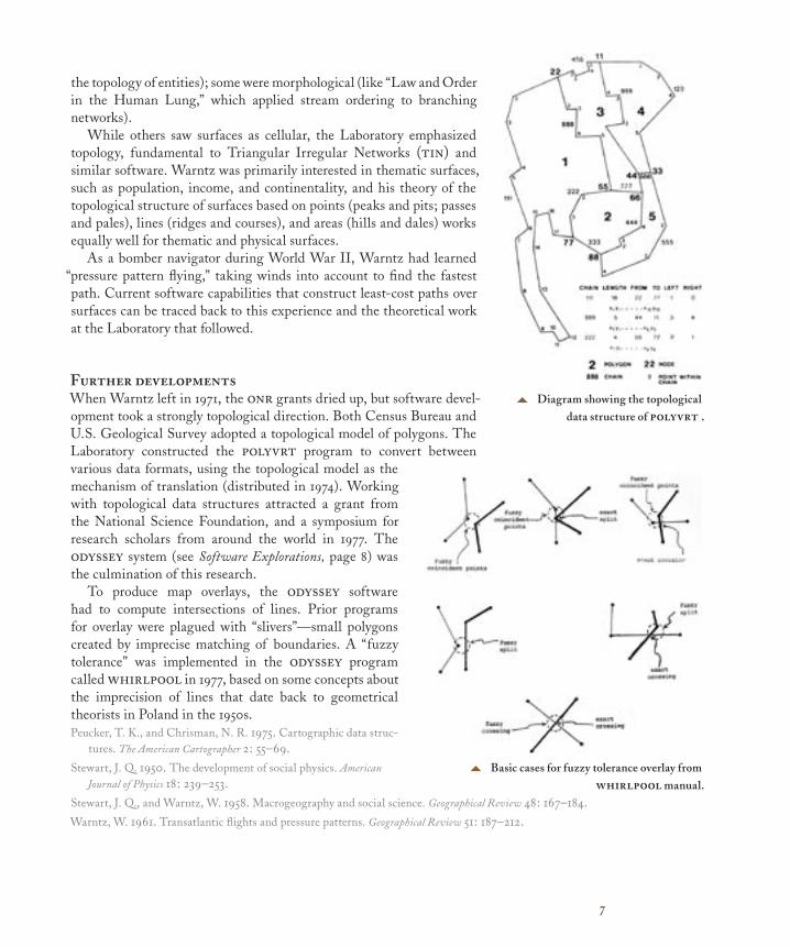
Further developmentsWhen Warntz left in 1971, the onr grants dried up, but software devel-opment took a strongly topological direction. Both Census Bureau and U.S. Geological Survey adopted a topological model of polygons. The Laboratory constructed the polyvrt program to convert between various data formats, using the topological model as the mechanism of translation (distributed in 1974). Working with topological data structures attracted a grant from the National Science Foundation, and a symposium for research scholars from around the world in 1977. The odyssey system (see Software Explorations, page 8) was the culmination of this research.
To produce map overlays, the odyssey software had to compute intersections of lines. Prior programs for overlay were plagued with “slivers”—small polygons created by imprecise matching of boundaries. A “fuzzy tolerance” was implemented in the odyssey program called whirlpool in 1977, based on some concepts about the imprecision of lines that date back to geometrical theorists in Poland in the 1950s.Peucker, T. K., and Chrisman, N. R. 1975. Cartographic data struc-
tures. The American Cartographer 2: 55–69.Stewart, J. Q. 1950. The development of social physics. American
Journal of Physics 18: 239–253.Stewart, J. Q., and Warntz, W. 1958. Macrogeography and social science. Geographical Review 48: 167–184.Warntz, W. 1961. Transatlantic flights and pressure patterns. Geographical Review 51: 187–212.
5 Diagram showing the topological data structure of polyvrt .
5 Basic cases for fuzzy tolerance overlay from whirlpool manual.
8
Software Explorations
While the Laboratory was founded with SYMAP as a core project, it continued to develop software with
packages like SYMVU and CALFORM providing cartographic displays on devices beyond the line printer
and ASPEX and INPOM to accommodate interactive computing. The largest project was ODYSSEY, a
prototype for the modern geographic information system. Beyond cartography and GIS were attempts to
deal with 3-D spaces for architectural applications.
Changing environmentssymap was intended to run on any computer of the time, which meant sacrificing the resolution of the output and putting up with the card-deck mentality of batch jobs. Little by little these constraints evaporated, and software development at the Laboratory explored the emerging alternatives.
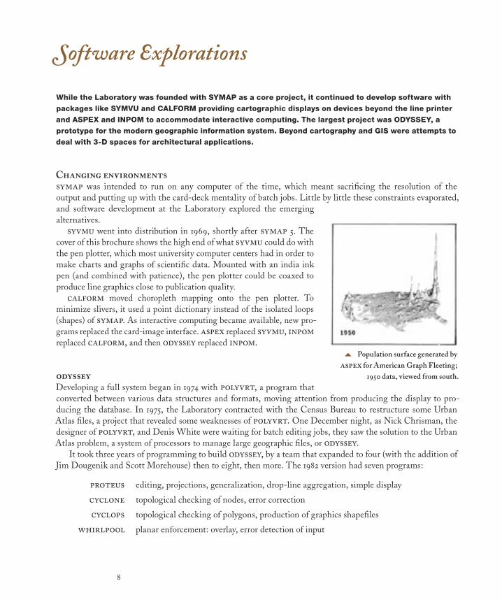
syvmu went into distribution in 1969, shortly after symap 5. The cover of this brochure shows the high end of what syvmu could do with the pen plotter, which most university computer centers had in order to make charts and graphs of scientific data. Mounted with an india ink pen (and combined with patience), the pen plotter could be coaxed to produce line graphics close to publication quality.
calform moved choropleth mapping onto the pen plotter. To minimize slivers, it used a point dictionary instead of the isolated loops (shapes) of symap. As interactive computing became available, new pro-grams replaced the card-image interface. aspex replaced syvmu, inpom replaced calform, and then odyssey replaced inpom.
odysseyDeveloping a full system began in 1974 with polyvrt, a program that converted between various data structures and formats, moving attention from producing the display to pro-ducing the database. In 1975, the Laboratory contracted with the Census Bureau to restructure some Urban Atlas files, a project that revealed some weaknesses of polyvrt. One December night, as Nick Chrisman, the designer of polyvrt, and Denis White were waiting for batch editing jobs, they saw the solution to the Urban Atlas problem, a system of processors to manage large geographic files, or odyssey.
It took three years of programming to build odyssey, by a team that expanded to four (with the addition of Jim Dougenik and Scott Morehouse) then to eight, then more. The 1982 version had seven programs:
proteus editing, projections, generalization, drop-line aggregation, simple display
cyclone topological checking of nodes, error correction
cyclops topological checking of polygons, production of graphics shapefiles
whirlpool planar enforcement: overlay, error detection of input
5 Population surface generated by aspex for American Graph Fleeting;
1950 data, viewed from south.
9
calypso attribute manipulations (areal interpolation)
polyps planar choropleth display
prism raised 3-d prisms
odyssey had common modules to manage both the files and the user interface. The glib pro-gram compiled languages to be operated by linguist, the run-time system. As a system, not a program, odyssey had many functions of a modern gis, like the overlay processor with its advanced capacity to treat fuzzy tolerances.
odyssey gave the Laboratory some grand moments but also led to some difficult decisions. It was not at all clear how Harvard would handle the commercial potential of a major software prod-uct. Between 1979 and 1983, contracts were signed and broken, agreements negotiated and breached, money spent and bad feelings all around. In 1981, the Laboratory had over forty employees prepar-ing odyssey for its commercial debut. When the decisions changed, the budget for the Laboratory collapsed. The team dispersed and attempts to sell odyssey according to the symap model were limited.
Architectural softwareAs part of the Graduate School of Design, the Laboratory had sporadic contacts with design disciplines (primarily architecture) that worked with built objects rather than maps. A three-dimensional viewing program, ototrol, had drawn the logo for the Laboratory but was not able to remove hidden lines or shade surfaces.
In 1981, Bruce Donald created builder to manage complex three-dimensional objects generated as extrusions of planar forms. This program solved hidden lines and shaded surfaces according to assumptions about illumination. In 1986, a separate team led by Mark Van Norman built a pack-age for architectural use, called schema.[A timeline of software distribution for cartogra-phy and gis appears inside the front cover of this brochure.]
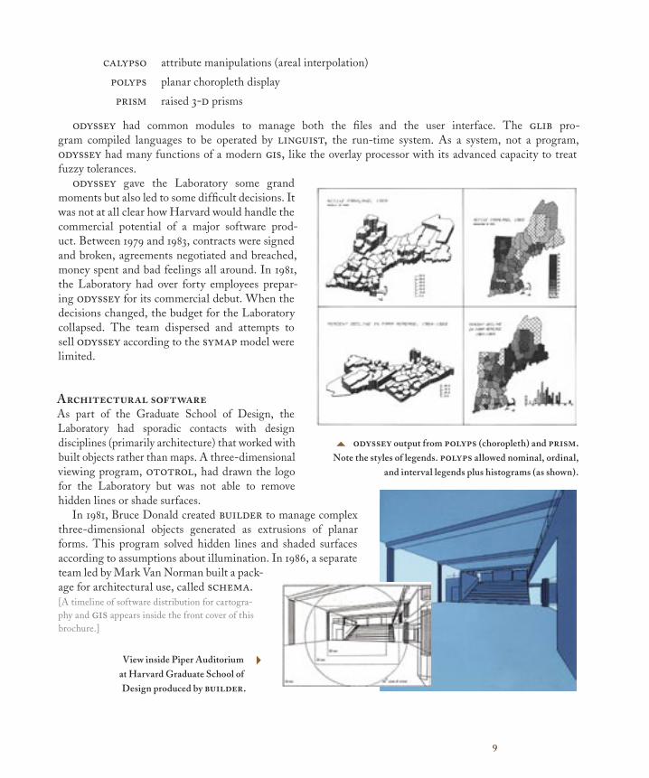
5 odyssey output from polyps (choropleth) and prism. Note the styles of legends. polyps allowed nominal, ordinal,
and interval legends plus histograms (as shown).
View inside Piper Auditorium at Harvard Graduate School of Design produced by builder.
4
10
Experimental Cartography
For decades, the Laboratory’s work involved new techniques for thematic cartography. Although
Howard Fisher’s book, Mapping information: The graphic display of quantitative information didn’t
appear until after his death, some form of it was around from the early days, as were the following
examples of experimental cartography.
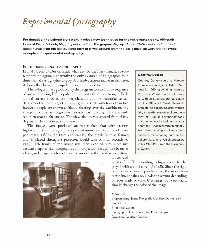
Four-dimensional cartographyIn 1978, Geoffrey Dutton made what may be the fi rst thematic spatio–temporal hologram, apparently the only example of holographic four-dimensional cartographic display. A cylinder sixteen inches in diameter, it shows the changes in population over time as it turns.
The hologram was produced by the program aspex from a sequence of images showing U.S. population by county from 1790 to 1970. Each annual surface is based on interpolation from the decennial census data, smoothed onto a grid of 82 by 127 cells. Cells with fewer than fi ve hundred people are shown as blank. Starting over the Caribbean, the viewpoint shifts two degrees with each year, rotating full circle with one turn around the image. The view also moves upward from thirty degrees at the start to sixty at the end.
The images were produced on paper then shot with 16-mm high-contrast fi lm using a pin-registered animation stand, fi ve frames per image. (With the titles and credits, the movie is 1080 frames, and, if played through a projector, would take only 45 seconds to run.) Each frame of the movie was then exposed onto successive vertical strips of the holographic fi lm, projected through one beam of a laser, and merged with a reference beam so that the interference pattern
is recorded on the fi lm. The resulting hologram can be dis-played with an ordinary light bulb. Since the light bulb is not a perfect point-source, the monochro-matic image takes on a color spectrum depending on your angle of view. Changing your eye-height should change the color of the image.
Geoffrey Dutton
Geoffrey Dutton came to Harvard
for a master’s degree in Urban Plan-
ning in 1969, gravitating towards
Professor Warntz and the Labora-
tory. Hired as a research assistant
on the Offi ce of Naval Research
projects, he continued, after Warntz
left, as spatial analyst and program-
mer until 1984. In a group that took
a strongly topological and vector
approach, Geoff played raster gadfl y.
He also developed hierarchical
schemes for encoding data on the
sphere, variants of which appeared
in his 1998 PhD from the University
of Zurich.
Film creditsProgramming: James Dougenik, Geoffrey Dutton, andJames LittleFilm: Jody CulkinHolography: The Holographic Film CompanyDirection: Geoffrey Dutton
11
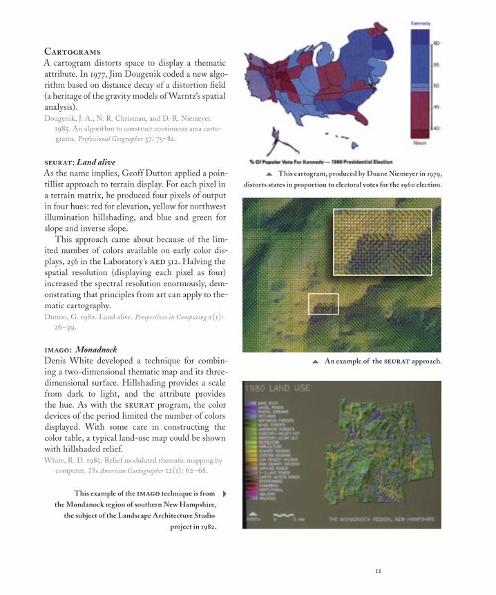
CartogramsA cartogram distorts space to display a thematic attribute. In 1977, Jim Dougenik coded a new algo-rithm based on distance decay of a distortion fi eld (a heritage of the gravity models of Warntz’s spatial analysis). Dougenik, J. A., N. R. Chrisman, and D. R. Niemeyer.
1985. An algorithm to construct continuous area carto-grams. Professional Geographer 37: 75–81.
seurat: Land aliveAs the name implies, Geoff Dutton applied a poin-tillist approach to terrain display. For each pixel in a terrain matrix, he produced four pixels of output in four hues: red for elevation, yellow for northwest illumination hillshading, and blue and green for slope and inverse slope.
This approach came about because of the lim-ited number of colors available on early color dis-plays, 256 in the Laboratory’s aed 512. Halving the spatial resolution (displaying each pixel as four) increased the spectral resolution enormously, dem-onstrating that principles from art can apply to the-matic cartography. Dutton, G. 1982. Land alive. Perspectives in Computing 2(1):
26–39.
imago: MonadnockDenis White developed a technique for combin-ing a two-dimensional thematic map and its three-dimensional surface. Hillshading provides a scale from dark to light, and the attribute provides the hue. As with the seurat program, the color devices of the period limited the number of colors displayed. With some care in constructing the color table, a typical land-use map could be shown with hillshaded relief. White, R. D. 1985. Relief modulated thematic mapping by
computer. The American Cartographer 12(1): 62–68.
5 An example of the seurat approach.
5 This cartogram, produced by Duane Niemeyer in 1979,distorts states in proportion to electoral votes for the 1960 election.
This example of the imago technique is from the Mondanock region of southern New Hampshire,
the subject of the Landscape Architecture Studio project in 1982.
4
12
Allan Schmidt and his Future Directions
Allan Schmidt worked at the Laboratory from 1967 to 1981 with the titles of assistant director, acting
director, and executive director. Always a center of calm in the turmoil of ardent enthusiasms, his sense
of future directions was, in retrospect, nothing less than uncanny.
Before the LaboratoryWith undergraduate degrees from Valparaiso University in Chemistry and Geography, Allan Schmidt obtained a masters in City Planning from University of Illinois in 1962. He worked for a planning agency in Jefferson-ville, Indiana. Attending one of Howard Fisher’s short courses at Northwestern University sparked an interest in computer mapping. After Allan moved to Michigan State University, Howard Fisher, having just secured a Ford Foundation grant, recruited him for the Laboratory.
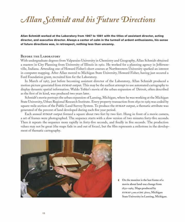
In March of 1967, just before becoming assistant director of the Laboratory, Allan Schmidt produced a motion picture generated from symap output. This may be the earliest attempt to use automated cartography to display dynamic spatial information. Waldo Tobler’s movie of the urban expansion of Detroit, often described as the first of its kind, was produced two years later.
Schmidt’s movie portrays the urban expansion of Lansing, Michigan, where he was working at the Michigan State University, Urban Regional Research Institute. Every property transaction from 1850 to 1965 was coded by square-mile section of the Public Land Survey System. To produce the symap output, a thematic attribute was generated of the percent of land developed during each five year period.
Each annual symap output formed a square about two feet by two feet. Hung in front of a movie camera, a set of frames were photographed. The sequence starts with a slow version of two minutes forty-five seconds. Then it repeats the sequence more rapidly in forty-five seconds, and finally in five seconds. The production values may not be great (the maps fade in and out of focus), but the film represents a milestone in the develop-ment of thematic cartography.
On the monitor is the last frame of a movie about land-use change from 1830–1965. Maps produced by symap 3 on a cdc 3600, Michigan State University in Lansing, Michigan.
3
13
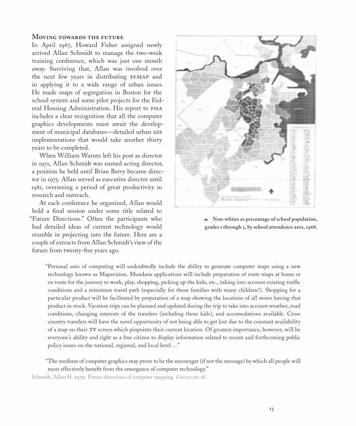
Moving towards the futureIn April 1967, Howard Fisher assigned newly arrived Allan Schmidt to manage the two-week training conference, which was just one month away. Surviving that, Allan was involved over the next few years in distributing symap and in applying it to a wide range of urban issues. He made maps of segregation in Boston for the school system and some pilot projects for the Fed-eral Housing Administration. His report to fha includes a clear recognition that all the computer graphics developments must await the develop-ment of municipal databases—detailed urban gis implementations that would take another thirty years to be completed.
When William Warntz left his post as director in 1971, Allan Schmidt was named acting director, a position he held until Brian Berry became direc-tor in 1975. Allan served as executive director until 1981, overseeing a period of great productivity in research and outreach.
At each conference he organized, Allan would hold a final session under some title related to
“Future Directions.” Often the participants who had detailed ideas of current technology would stumble in projecting into the future. Here are a couple of extracts from Allan Schmidt’s view of the future from twenty-five years ago.
“Personal uses of computing will undoubtedly include the ability to generate computer maps using a new technology known as Mapavision. Mundane applications will include preparation of route maps at home or en route for the journey to work, play, shopping, picking up the kids, etc., taking into account existing traffic conditions and a minimum travel path (especially for those families with many children!). Shopping for a particular product will be facilitated by preparation of a map showing the locations of all stores having that product in stock. Vacation trips can be planned and updated during the trip to take into account weather, road conditions, changing interests of the travelers (including those kids), and accomodations available. Cross country travelers will have the novel opportunity of not being able to get lost due to the constant availability of a map on their tv screen which pinpoints their current location. Of greatest importance, however, will be everyone’s ability and right as a free citizen to display information related to recent and forthcoming public policy issues on the national, regional, and local level….”
“The medium of computer graphics may prove to be the messenger (if not the message) by which all people will most effectively benefit from the emergence of computer technology.”
Schmidt, Allan H. 1979. Future directions of computer mapping. Context 10: 16.
5 Non-whites as percentage of school population, grades 1 through 3, by school attendence area, 1968.
How computer mapping at Harvard became GIS
About the authorNick Chrisman came to the Laboratory in 1972 from an undergraduate degree in Geography at University of Massachusetts–Amherst. While an undergraduate, he had digitized maps and converted calform to operate on the umass computer. Allan Schmidt snatched him up before he could escape to graduate school.Chrisman quickly became an ardent (often animated) advocate of topo-logical data structures. He designed polyvrt and joined with Denis White, Jim Dougenik, and Scott Morehouse to design odyssey. Once the odyssey prototype was complete, he went off to England to com-plete a PhD on error in gis data. He took an academic job at University of Wisconsin–Madison in 1982, then moved to University of Washing-ton in 1987. He has written a textbook on gis, and articles on topics from the technological detail to the social context of gis.Chrisman, N. R. 1997. Exploring geographic information. Wiley. Second edition 2002.
ESRI Press publishes award-winning books about geographic information systems (GIS) applications, cartography, science, and technology. You can purchase these books directly from ESRI at 1-800-447-9778, online at www.esri.com/esripress, or at better book stores worldwide. Browse our complete selection of GIS titles from ESRI Press and other publishers at www.esri.com/bookstore.
For additional GIS resources, visit the ESRI Library at www.esri.com/library.
Information for resellers: ESRI Press books are available to resellers worldwide through our distributor, Independent Publishers Group (IPG). For information on volume discounts or to place an order, please call IPG at 1-800-888-4741 toll free in the United States, or at 312-337-0747 outside the United States.
For additional information, e-mail [email protected].
Copyright ©2004 ESRI. All rights reserved. Company names and products mentioned herein may be trademarks or registered trademarks of their respective owners.
Charting the Unknown: How computer mapping at Harvard became GIS will include a CD with digital
video interviews and profi les of early GIS innovators.
A new book to be publshed in 2005. ISBN: 1-58948-118-6