Embed Size (px)
Citation preview
CHAPTER FIVE
CROSSTABS PROCEDURE
5.0 Introduction
This chapter focuses on how to compare groups when the outcome is categorical
(nominal or ordinal) by using SPSS. The aim of the series of exercise is to ensure the
student can summarize and interpret at the relationship between the variables.
Crosstabs procedure is used as a statistical measurement to describe and examine the
relationship between two categorical variables via a cross tabulation table. A cross
tabulation table which also known as contingency table, is a co-frequency table of counts,
where each row or column is frequency value of one variable for observation falling
within in the same category of the other variable. In survey work, a cross tabulation table
can serve in two main purposes; descriptive and relationship inferences. Descriptive is
normally used to provide some useful information about the survey data such as
demographic information on courses of a faculty or student grades of a subject.
Crosstabs procedure is also used to conclude the relationships among the variables. In
order to make such inference of relationship, a set of hypothesis must be constructed first
and statistical test using chi-square test of independence is applied into the procedure. A
lot of surveys require the relationship inferences in their analysis. Because of that,
crosstabs procedure is used for both of purposes.
In this chapter, we first need to understand about the type of data. In SPSS we have to
identify the data whether it is scale or in categorical form to ensure that we choose the
right procedure to analyze. Next, we describe the use of Chi-square through a manual
calculation. Later, by using a student data set, we perform the crosstabs procedure for
testing the relationship among the variables.
5.1 Understand the categorical data
In general, there are two main types of variables for statistical analysis; scale and
categorical. Most of the scale variable in survey work is in interval measurement which
134
means a unit increase in numeric value represents the same changes in quantity.
Statistical technique such as regression and analysis of variance assume that the
dependent (or outcome) measure is measured on an interval scale. For example income in
ringgit Malaysia(RM) or age in years.
Categorical variable can be easily determined when each data represents an identified
group. In SPSS, categorical variable can be defined either nominal or ordinal. Nominal is
where each numeric value represents a category or group identifier only. The categories
have no underlying any numeric value or ranking value. For example, gender can be
coded as 1 (Female ) and 0 (Male) or vice versa. Ordinal is the data value that represent
ranking or ordering information. An example would be specifying how satisfy you are
with your internet service provider, coded 1(Not Satisfy), 2(Satisfy), and 3(Very Satisfy).
5.2 Chi-square ( ) test of independence: Direction and Strength
Chi-square( ) test of independence is used for deciding whether the hypothesis of
independence between difference variable is tenable(Hamburg and Young 1994). The test
compares the observed frequencies in different categories with the expected frequencies
from the hypothesis.
Statistically is defined as:
where
is an observed frequency
is a expected frequency
and test is used to provide an answer under the hypothesis of independence which
may be stated in general as follows:
: There is independency between observed variables
: There is not independency between observed variables
The general nature of the test is best explained with the further example. However before
continue the tests there are few assumptions need to be concerned:
1. Sample is randomly selected from the population.
2. All observations are independent.
3. Limited to nominal data
4. No more than 20% of the cells have an expected frequency less than 5
135
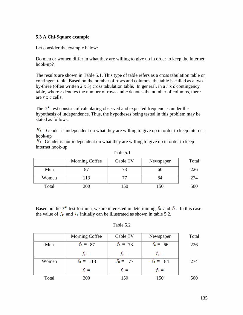
5.3 A Chi-Square example
Let consider the example below:
Do men or women differ in what they are willing to give up in order to keep the Internet
hook-up?
The results are shown in Table 5.1. This type of table refers as a cross tabulation table or
contingent table. Based on the number of rows and columns, the table is called as a two-
by-three (often written 2 x 3) cross tabulation table. In general, in a r x c contingency
table, where r denotes the number of rows and c denotes the number of columns, there
are r x c cells.
The test consists of calculating observed and expected frequencies under the
hypothesis of independence. Thus, the hypotheses being tested in this problem may be
stated as follows:
: Gender is independent on what they are willing to give up in order to keep internet
hook-up
: Gender is not independent on what they are willing to give up in order to keep
internet hook-up
Table 5.1
Morning Coffee Cable TV Newspaper Total
Men 87 73 66 226
Women 113 77 84 274
Total 200 150 150 500
Based on the test formula, we are interested in determining and . In this case
the value of and initially can be illustrated as shown in table 5.2.
Table 5.2
Morning Coffee Cable TV Newspaper Total
Men 87
73
66
226
Women 113
77
84
274
Total 200 150 150 500
136
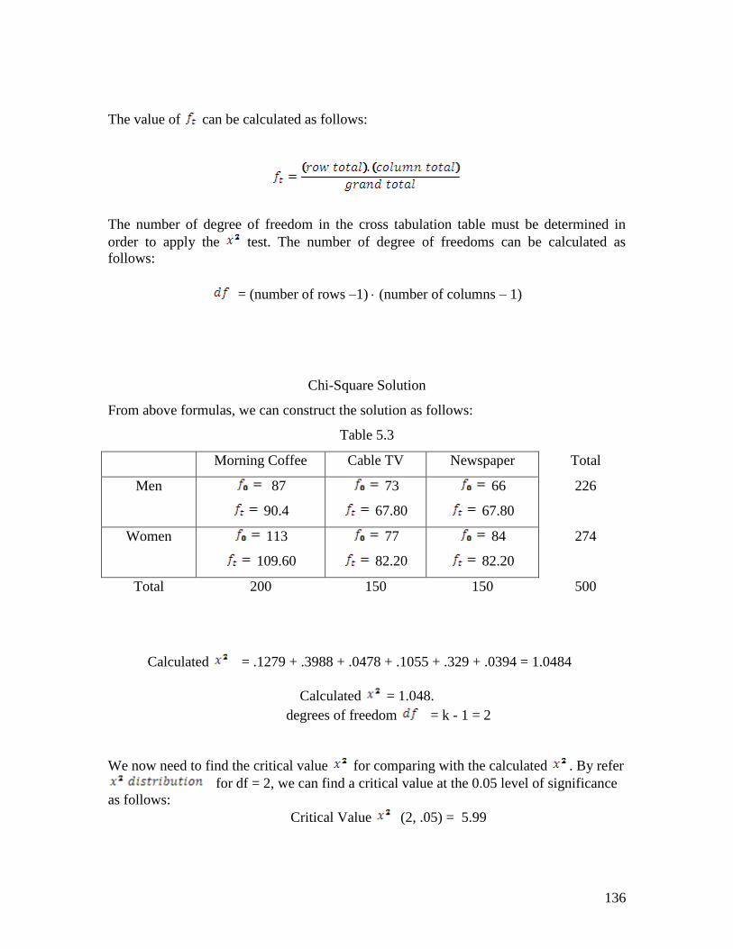
The value of can be calculated as follows:
The number of degree of freedom in the cross tabulation table must be determined in
order to apply the test. The number of degree of freedoms can be calculated as
follows:
= (number of rows –1) (number of columns – 1)
Chi-Square Solution
From above formulas, we can construct the solution as follows:
Table 5.3
Morning Coffee Cable TV Newspaper Total
Men 87
90.4
73
67.80
66
67.80
226
Women 113
109.60
77
82.20
84
82.20
274
Total 200 150 150 500
Calculated = .1279 + .3988 + .0478 + .1055 + .329 + .0394 = 1.0484
Calculated = 1.048.
degrees of freedom = k - 1 = 2
We now need to find the critical value for comparing with the calculated . By refer
for df = 2, we can find a critical value at the 0.05 level of significance
as follows:
Critical Value (2, .05) = 5.99
137
Then we can state the decision rule for this problem as (Hamburg and Young 1994):
If reject
If do reject
In this problem, calculated < critical value (1.0484 < 5.99). Thus, it failed to reject
the null hypothesis (accept the null hypothesis). So we can conclude that there were no
significant differences between men and women in their willingness to give up morning
coffee, cable television, or the newspaper to keep the Internet.
5.4 Crosstab procedure using SPSS
In SPSS, crosstabs is one of analysis under descriptive statistics. To understand how we
can use crosstabs procedure in SPSS, let us consider the problem below:
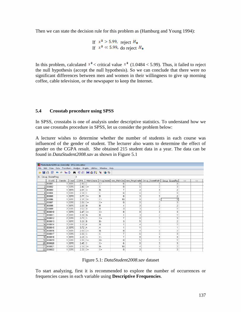
A lecturer wishes to determine whether the number of students in each course was
influenced of the gender of student. The lecturer also wants to determine the effect of
gender on the CGPA result. She obtained 215 student data in a year. The data can be
found in DataStudent2008.sav as shown in Figure 5.1
Figure 5.1: DataStudent2008.sav dataset
To start analyzing, first it is recommended to explore the number of occurrences or
frequencies cases in each variable using Descriptive Frequencies.
138
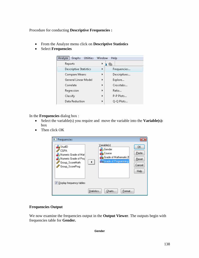
Procedure for conducting Descriptive Frequencies :
From the Analyze menu click on Descriptive Statistics
Select Frequencies
In the Frequencies dialog box :
Select the variable(s) you require and move the variable into the Variable(s):
box
Then click OK
Frequencies Output
We now examine the frequencies output in the Output Viewer. The outputs begin with
frequencies table for Gender.
Gender
139
Frequency Percent Valid Percent
Cumulative
Percent
Valid MALE 108 50.2 50.2 50.2
FEMALE 107 49.8 49.8 100.0
Total 215 100.0 100.0
By default, value labels appear in the first column of the table. The Frequency column
contains counts or the number of occurances of each variable. The Percent column
shows the percentage of cases in each group relative to the number cases in the entire
data set including those with missing values. The Valid Percent column contains the
percentage of cases in each group without missing (non-missing). The Cumulative
Percent contains cumulative percentages without containing a missing value. In our
case, the variable gender contains non-missing value which means, the Percent and Valid
Percent are similar. By examine the frequencies of gender variable, we might be
understand that MALE and FEMALE have slightly equal in sample size.
Since we also select other variables in this frequencies analysis, we can also examine the
frequencies of Course, the student grade in mathematics and programming subjects as
shown in the outputs below :
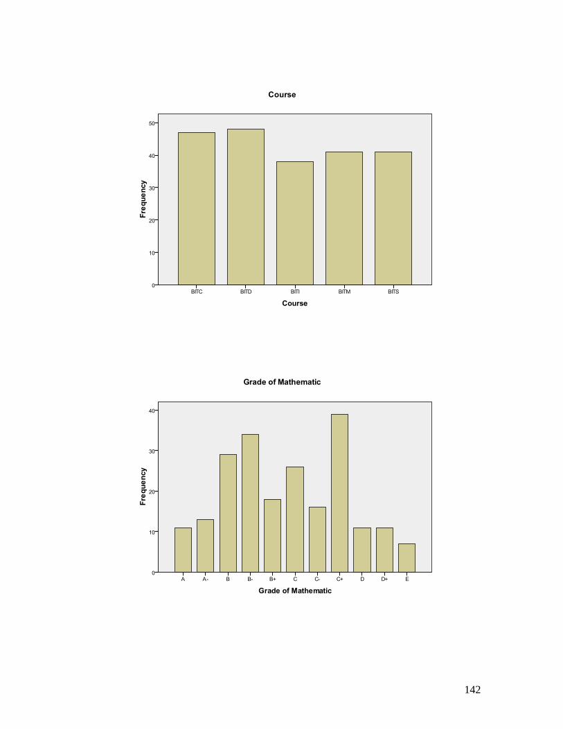
Course
Frequency Percent Valid Percent
Cumulative
Percent
Valid BITC 47 21.9 21.9 21.9
BITD 48 22.3 22.3 44.2
BITI 38 17.7 17.7 61.9
BITM 41 19.1 19.1 80.9
BITS 41 19.1 19.1 100.0
Total 215 100.0 100.0
Grade of Mathematic
Frequency Percent Valid Percent Cumulative
Percent
Valid A- 13 6.0 6.0 6.0
A 11 5.1 5.1 11.2
B- 34 15.8 15.8 27.0
B 29 13.5 13.5 40.5
B+ 18 8.4 8.4 48.8
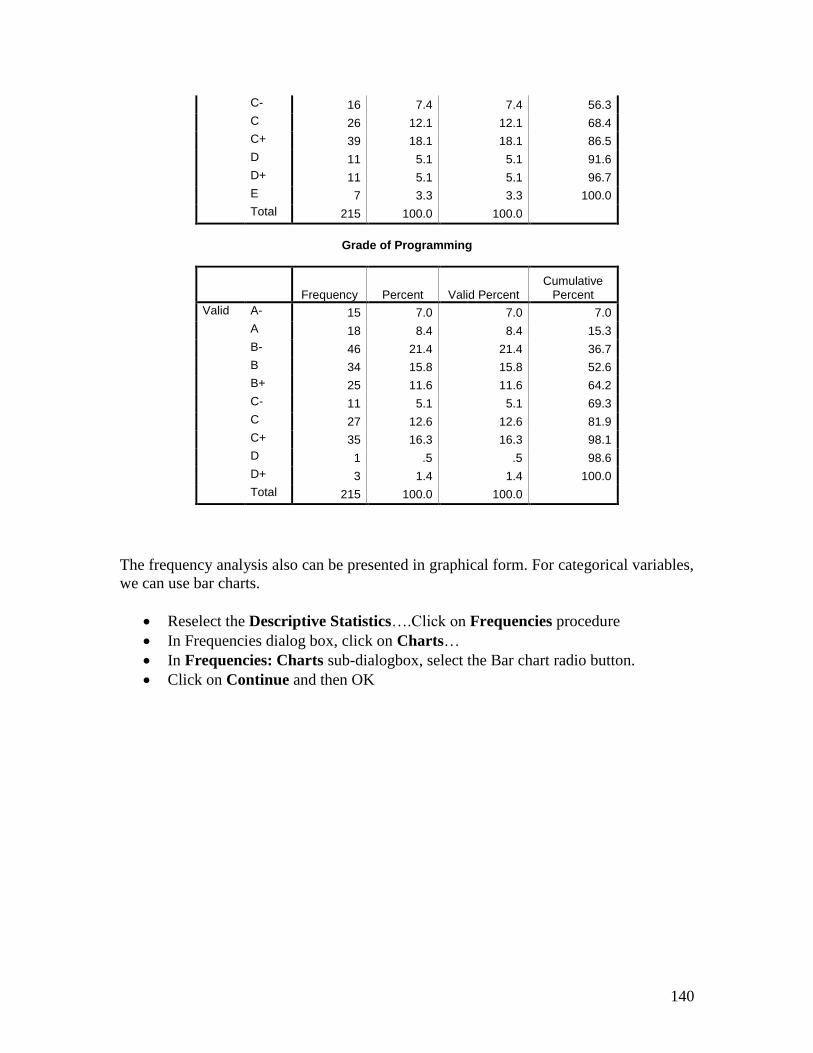
140
C- 16 7.4 7.4 56.3
C 26 12.1 12.1 68.4
C+ 39 18.1 18.1 86.5
D 11 5.1 5.1 91.6
D+ 11 5.1 5.1 96.7
E 7 3.3 3.3 100.0
Total 215 100.0 100.0
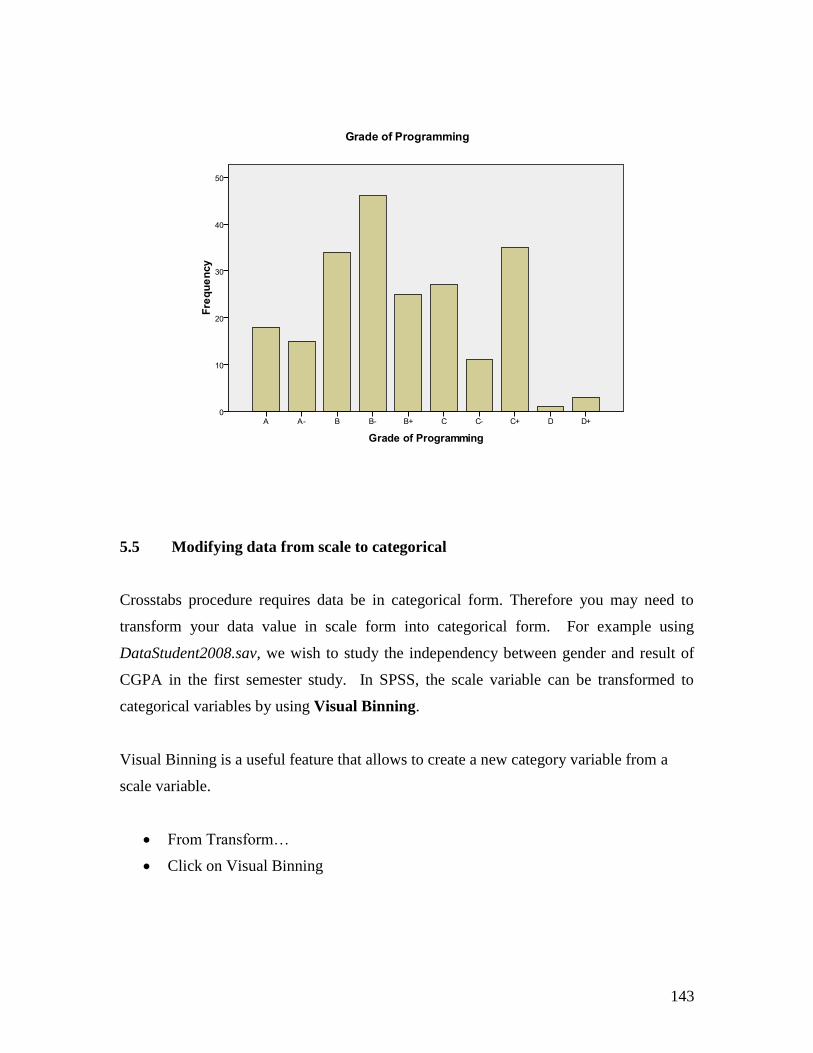
Grade of Programming
Frequency Percent Valid Percent Cumulative
Percent
Valid A- 15 7.0 7.0 7.0
A 18 8.4 8.4 15.3
B- 46 21.4 21.4 36.7
B 34 15.8 15.8 52.6
B+ 25 11.6 11.6 64.2
C- 11 5.1 5.1 69.3
C 27 12.6 12.6 81.9
C+ 35 16.3 16.3 98.1
D 1 .5 .5 98.6
D+ 3 1.4 1.4 100.0
Total 215 100.0 100.0
The frequency analysis also can be presented in graphical form. For categorical variables,
we can use bar charts.
Reselect the Descriptive Statistics….Click on Frequencies procedure
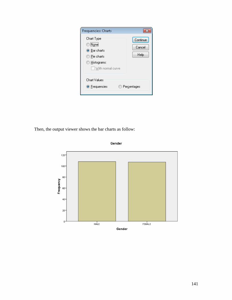
In Frequencies dialog box, click on Charts…
In Frequencies: Charts sub-dialogbox, select the Bar chart radio button.
Click on Continue and then OK
141
Then, the output viewer shows the bar charts as follow:
142
143
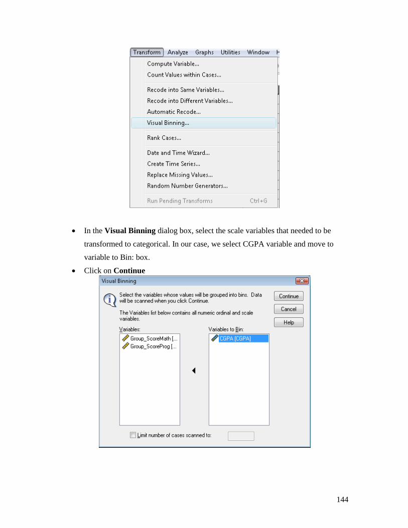
5.5 Modifying data from scale to categorical
Crosstabs procedure requires data be in categorical form. Therefore you may need to
transform your data value in scale form into categorical form. For example using
DataStudent2008.sav, we wish to study the independency between gender and result of
CGPA in the first semester study. In SPSS, the scale variable can be transformed to
categorical variables by using Visual Binning.
Visual Binning is a useful feature that allows to create a new category variable from a
scale variable.
From Transform…
Click on Visual Binning
144
In the Visual Binning dialog box, select the scale variables that needed to be
transformed to categorical. In our case, we select CGPA variable and move to
variable to Bin: box.
Click on Continue
145
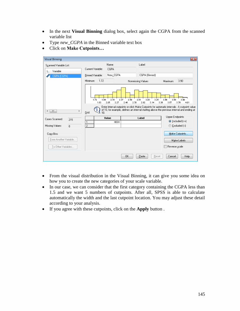
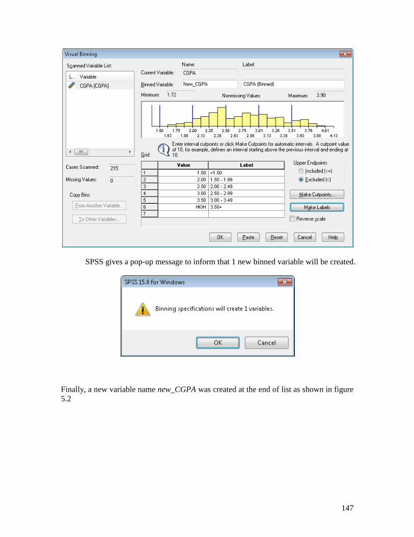
In the next Visual Binning dialog box, select again the CGPA from the scanned
variable list
Type new_CGPA in the Binned variable text box
Click on Make Cutpoints…
From the visual distribution in the Visual Binning, it can give you some idea on
how you to create the new categories of your scale variable.
In our case, we can consider that the first category containing the CGPA less than
1.5 and we want 5 numbers of cutpoints. After all, SPSS is able to calculate
automatically the width and the last cutpoint location. You may adjust these detail
according to your analysis.
If you agree with these cutpoints, click on the Apply button .
146
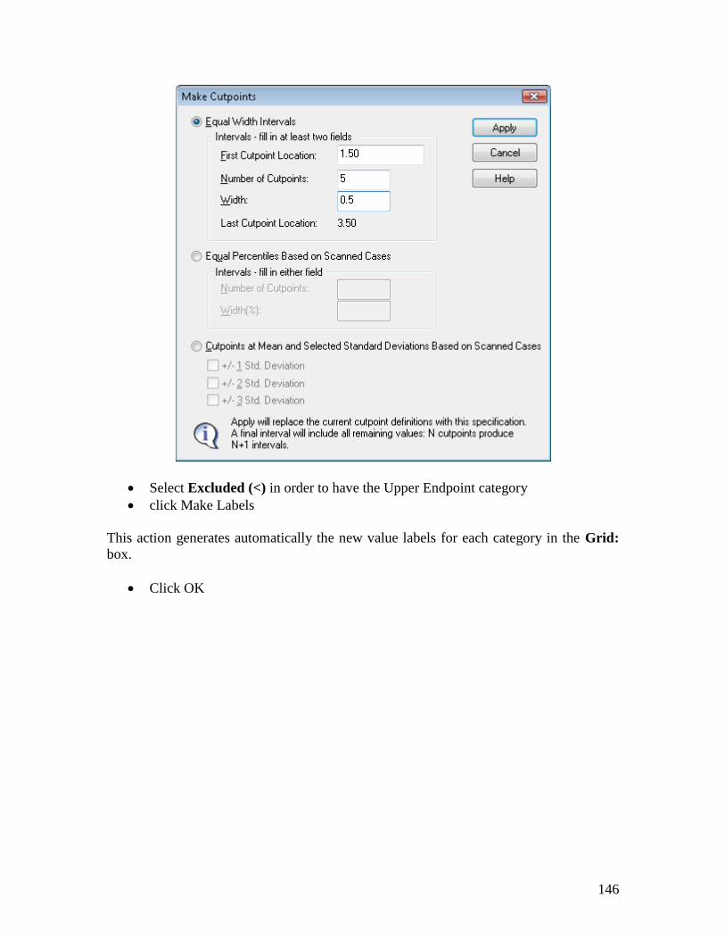
Select Excluded (<) in order to have the Upper Endpoint category
click Make Labels
This action generates automatically the new value labels for each category in the Grid:
box.
Click OK
147
SPSS gives a pop-up message to inform that 1 new binned variable will be created.
Finally, a new variable name new_CGPA was created at the end of list as shown in figure
5.2
148
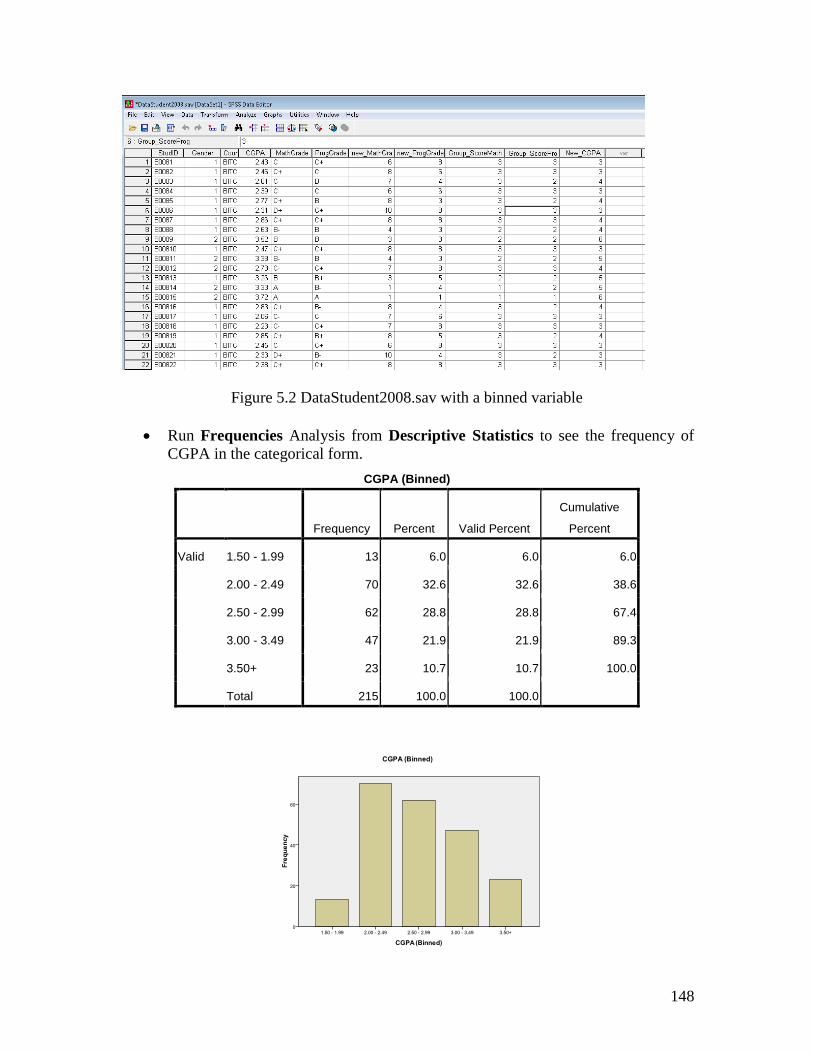
Figure 5.2 DataStudent2008.sav with a binned variable
Run Frequencies Analysis from Descriptive Statistics to see the frequency of
CGPA in the categorical form.
CGPA (Binned)
Frequency Percent Valid Percent
Cumulative
Percent
Valid 1.50 - 1.99 13 6.0 6.0 6.0
2.00 - 2.49 70 32.6 32.6 38.6
2.50 - 2.99 62 28.8 28.8 67.4
3.00 - 3.49 47 21.9 21.9 89.3
3.50+ 23 10.7 10.7 100.0
Total 215 100.0 100.0
149
By looking at the Valid Percent in the Frequencies table and the bar chart, we can see
that the majority of students are in the CGPA value from 2.00-2.49 and less than 20
students got the CGPA below than 2.00.
At this point, we only explore the frequencies for each variable isolated through
frequency table or by visual charts. We not yet compare the frequencies between the
variables and see their relationship. In order to do that, we continue by using Crosstabs
procedure.
5.6 Conducting a Crosstabs procedure
Objective 1: A lecturer wishes to determine whether the number of student in each course
was influenced by of the gender of student.
So we do understand that we want to test the relationship between gender and course.
Before we start to do analysis, it is better to state the hypothesis so that, we can easily
answer the test question. The hypotheses may be stated as follows:
: There is no relationship between gender and the number of student in each course
: There is relationship between gender and the number of student in each course
Now, you may start to analyze the data.
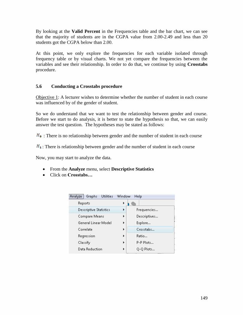
From the Analyze menu, select Descriptive Statistics
Click on Crosstabs…
150
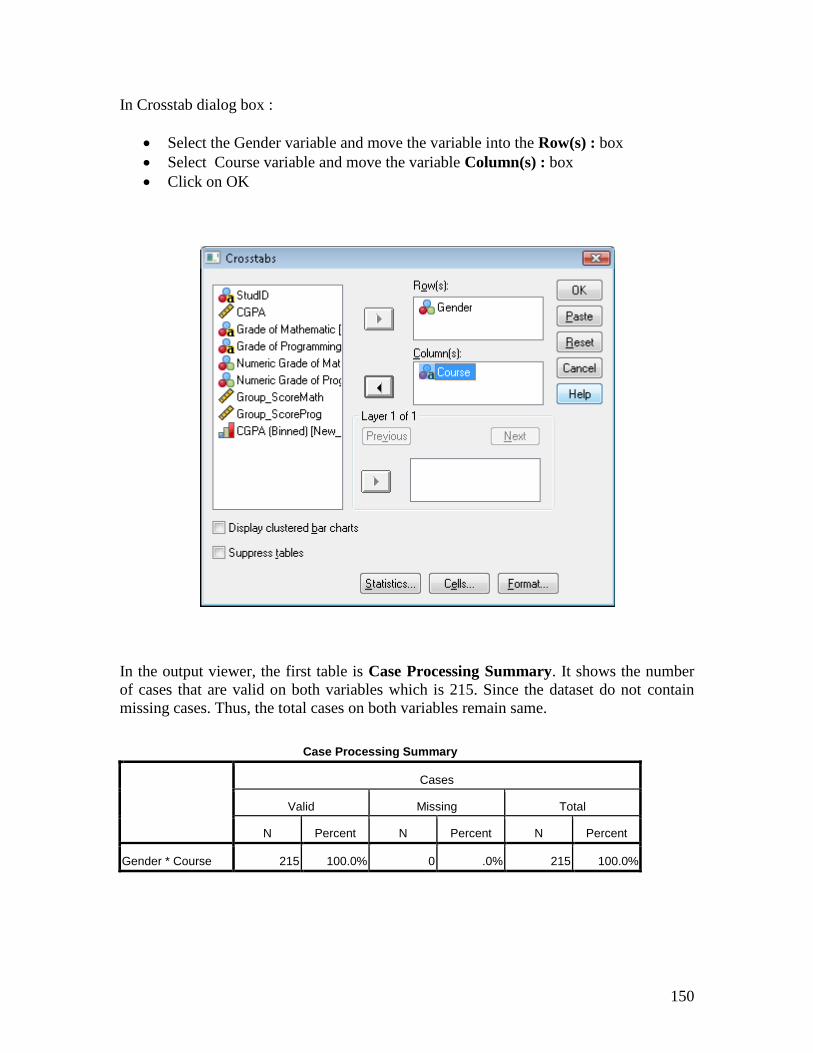
In Crosstab dialog box :
Select the Gender variable and move the variable into the Row(s) : box
Select Course variable and move the variable Column(s) : box
Click on OK
In the output viewer, the first table is Case Processing Summary. It shows the number
of cases that are valid on both variables which is 215. Since the dataset do not contain
missing cases. Thus, the total cases on both variables remain same.
Case Processing Summary
Cases
Valid Missing Total
N Percent N Percent N Percent
Gender * Course 215 100.0% 0 .0% 215 100.0%
151
The second part of the output gives the crosstabulation table of observed frequencies for
each possible combination of the two variables. In this example, we can see the
frequencies of female and male for the each course.
Gender * Course Crosstabulation
Count
Course
Total BITC BITD BITI BITM BITS
Gender MALE 27 15 24 19 23 108
FEMALE 20 33 14 22 18 107
Total 47 48 38 41 41 215
As can be seen from crosstabulation table above, by default the Crosstabulation
procedure will display only counts in the each cell of the table. In the total column for
Gender, there were 108 male students and 107 female students. Thus we can understand
that female and male only give very slight difference (difference in one case). In the total
for Course, BITD and BITC have more number of students compared other courses. BITI
is the course that has fewer students compared other courses. It is often difficult, to
interpret the frequency between variable in the each cell if we use only observed count.
Therefore you may request percentages for easy interpretation.
5.7 Procedure request percentages in Crosstabs:
Re- select Descriptive Statistics
Click on Crosstabs…
In Crosstabs dialog box, click on the Cell…
Then it open the Crosstabs: Cell Display dialog box
In the percentages box, click on the Column check box
152
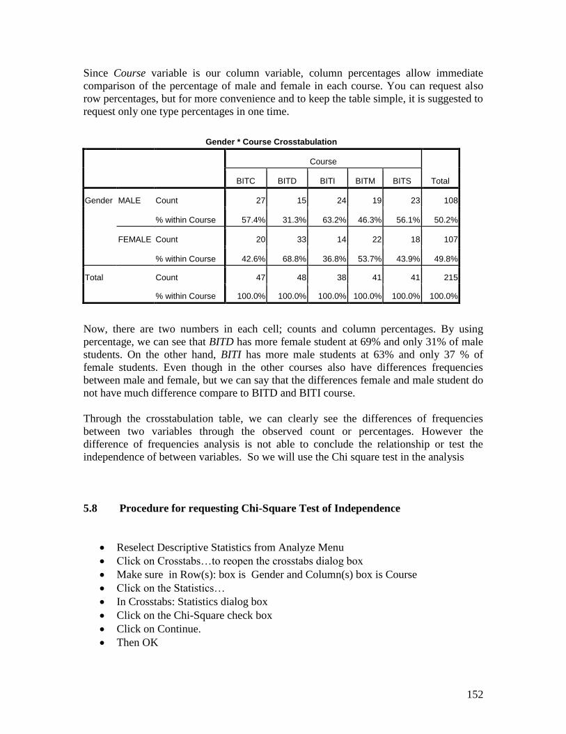
Since Course variable is our column variable, column percentages allow immediate
comparison of the percentage of male and female in each course. You can request also
row percentages, but for more convenience and to keep the table simple, it is suggested to
request only one type percentages in one time.
Gender * Course Crosstabulation
Course
Total BITC BITD BITI BITM BITS
Gender MALE Count 27 15 24 19 23 108
% within Course 57.4% 31.3% 63.2% 46.3% 56.1% 50.2%
FEMALE Count 20 33 14 22 18 107
% within Course 42.6% 68.8% 36.8% 53.7% 43.9% 49.8%
Total Count 47 48 38 41 41 215
% within Course 100.0% 100.0% 100.0% 100.0% 100.0% 100.0%
Now, there are two numbers in each cell; counts and column percentages. By using
percentage, we can see that BITD has more female student at 69% and only 31% of male
students. On the other hand, BITI has more male students at 63% and only 37 % of
female students. Even though in the other courses also have differences frequencies
between male and female, but we can say that the differences female and male student do
not have much difference compare to BITD and BITI course.
Through the crosstabulation table, we can clearly see the differences of frequencies
between two variables through the observed count or percentages. However the
difference of frequencies analysis is not able to conclude the relationship or test the
independence of between variables. So we will use the Chi square test in the analysis
5.8 Procedure for requesting Chi-Square Test of Independence
Reselect Descriptive Statistics from Analyze Menu
Click on Crosstabs…to reopen the crosstabs dialog box
Make sure in Row(s): box is Gender and Column(s) box is Course
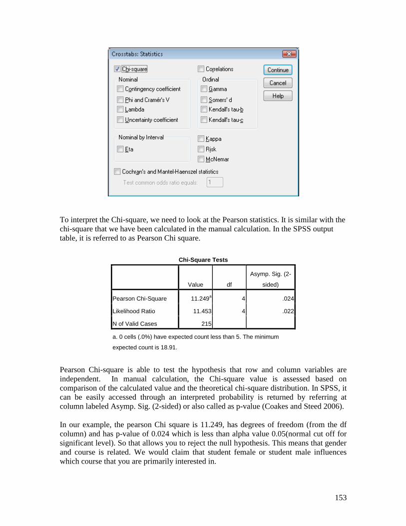
Click on the Statistics…
In Crosstabs: Statistics dialog box
Click on the Chi-Square check box
Click on Continue.
Then OK
153
To interpret the Chi-square, we need to look at the Pearson statistics. It is similar with the
chi-square that we have been calculated in the manual calculation. In the SPSS output
table, it is referred to as Pearson Chi square.
Chi-Square Tests
Value df
Asymp. Sig. (2-
sided)
Pearson Chi-Square 11.249a 4 .024
Likelihood Ratio 11.453 4 .022
N of Valid Cases 215
a. 0 cells (.0%) have expected count less than 5. The minimum
expected count is 18.91.
Pearson Chi-square is able to test the hypothesis that row and column variables are
independent. In manual calculation, the Chi-square value is assessed based on
comparison of the calculated value and the theoretical chi-square distribution. In SPSS, it
can be easily accessed through an interpreted probability is returned by referring at
column labeled Asymp. Sig. (2-sided) or also called as p-value (Coakes and Steed 2006).
In our example, the pearson Chi square is 11.249, has degrees of freedom (from the df
column) and has p-value of 0.024 which is less than alpha value 0.05(normal cut off for
significant level). So that allows you to reject the null hypothesis. This means that gender
and course is related. We would claim that student female or student male influences
which course that you are primarily interested in.
154
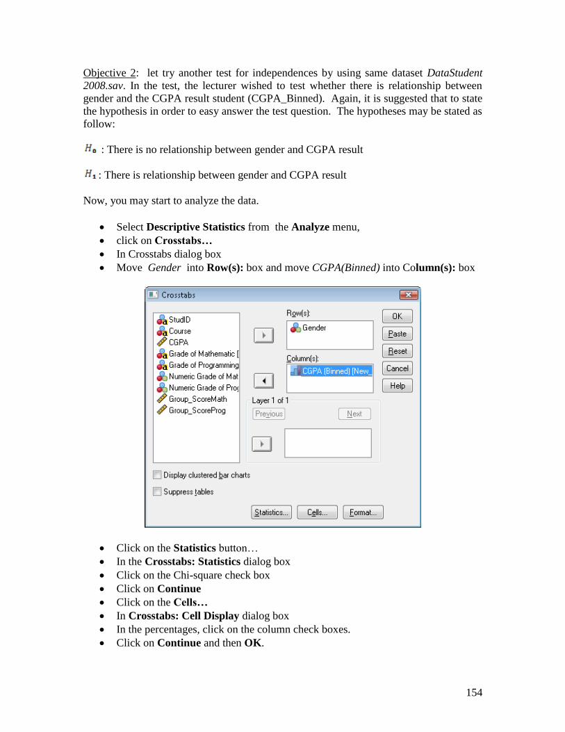
Objective 2: let try another test for independences by using same dataset DataStudent
2008.sav. In the test, the lecturer wished to test whether there is relationship between
gender and the CGPA result student (CGPA_Binned). Again, it is suggested that to state
the hypothesis in order to easy answer the test question. The hypotheses may be stated as
follow:
: There is no relationship between gender and CGPA result
: There is relationship between gender and CGPA result
Now, you may start to analyze the data.
Select Descriptive Statistics from the Analyze menu,
click on Crosstabs…
In Crosstabs dialog box
Move Gender into Row(s): box and move CGPA(Binned) into Column(s): box
Click on the Statistics button…
In the Crosstabs: Statistics dialog box
Click on the Chi-square check box
Click on Continue
Click on the Cells…
In Crosstabs: Cell Display dialog box
In the percentages, click on the column check boxes.
Click on Continue and then OK.
155
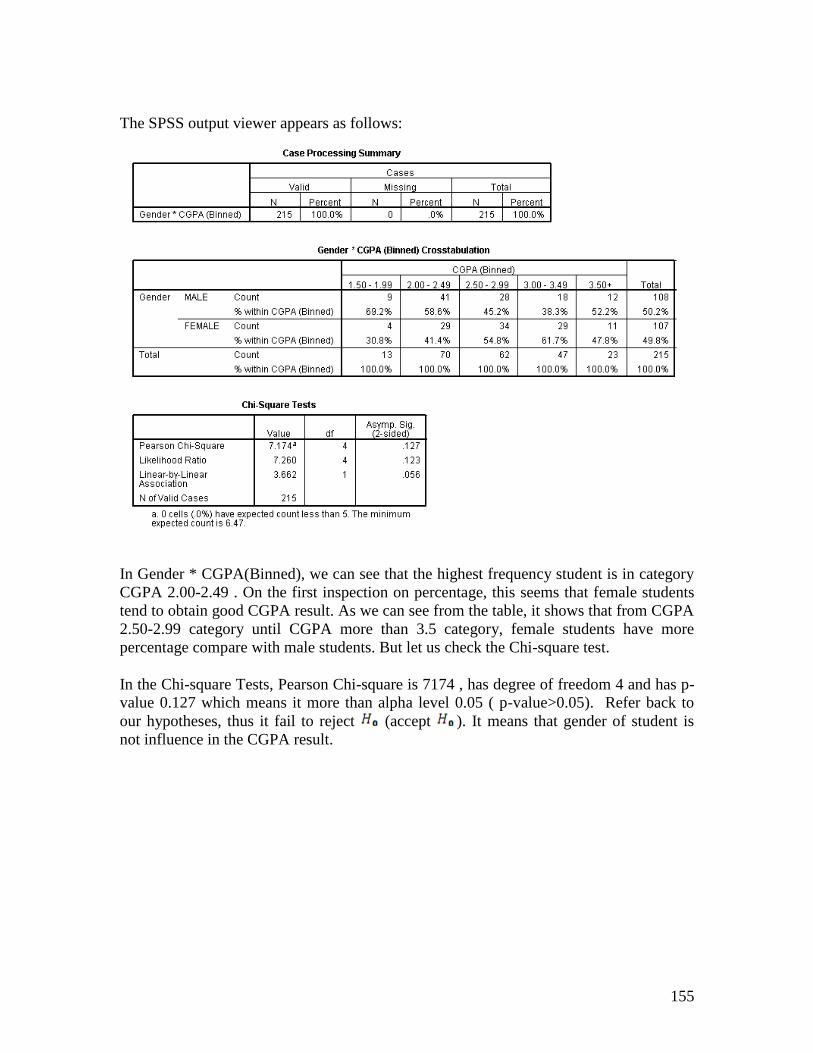
The SPSS output viewer appears as follows:
In Gender * CGPA(Binned), we can see that the highest frequency student is in category
CGPA 2.00-2.49 . On the first inspection on percentage, this seems that female students
tend to obtain good CGPA result. As we can see from the table, it shows that from CGPA
2.50-2.99 category until CGPA more than 3.5 category, female students have more
percentage compare with male students. But let us check the Chi-square test.
In the Chi-square Tests, Pearson Chi-square is 7174 , has degree of freedom 4 and has p-
value 0.127 which means it more than alpha level 0.05 ( p-value>0.05). Refer back to
our hypotheses, thus it fail to reject (accept ). It means that gender of student is
not influence in the CGPA result.