Embed Size (px)
Citation preview

Chapter 9Text
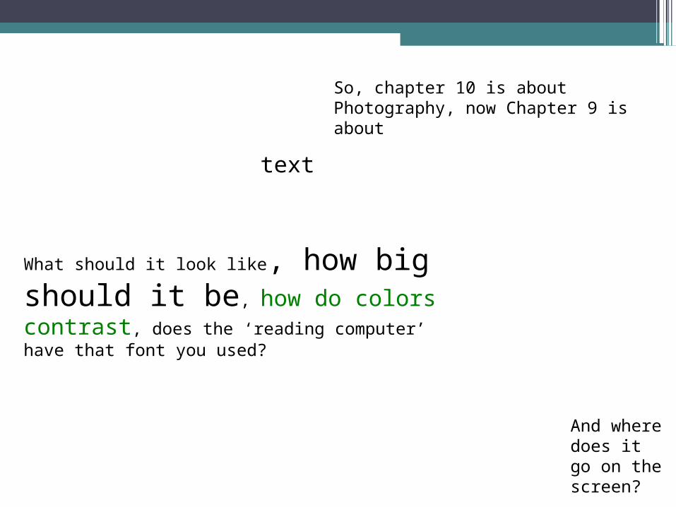
So, chapter 10 is about Photography, now Chapter 9 is about
text
What should it look like, how big should it be, how do colors contrast, does the ‘reading computer’ have that font you used?
And where does it go on the screen?
Text
The element of text is one of the most important components of a multimedia experience.
• We continue to rely on text as the primary means of recording, receiving, and transferring human knowledge and ideas.

TypographyA thoughtful arrangement of stylized text can be used creatively as an element of both form and content.

Font Families
• A font family includes all the variant styles associated with a particular typeface.
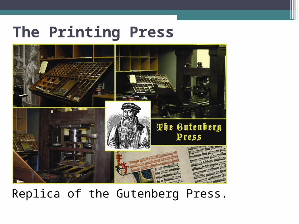
The Printing Press
Replica of the Gutenberg Press.

Legibility & ReadabilityLegibility
Refers to a typeface’s characteristics
Can change depending on font size
Readability How easy text is to read in context, not
just as isolated letters
Depends on a variety of factors
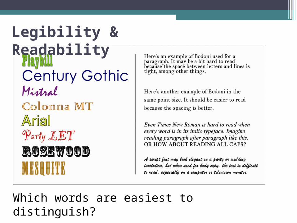
Legibility & Readability
Which words are easiest to distinguish?

Stroke, Contrast, & Stress Strokes can move vertically, horizontally,
diagonally, or in a curved direction
Stress is the location or angle of a transition from thick to thin, or vice versa
Contrast refers to the transition between the thick and thin areas of a stroke

High/Low contrast typefaces
Garamond (high contrast) vs. Arial (low contrast).
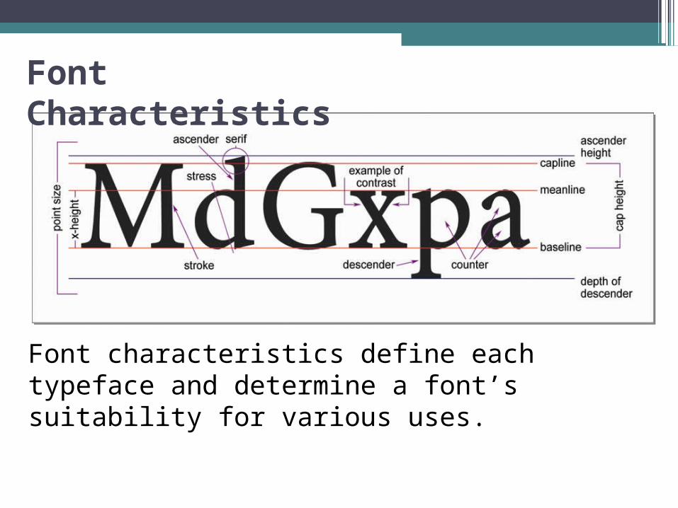
Font Characteristics
Font characteristics define each typeface and determine a font’s suitability for various uses.
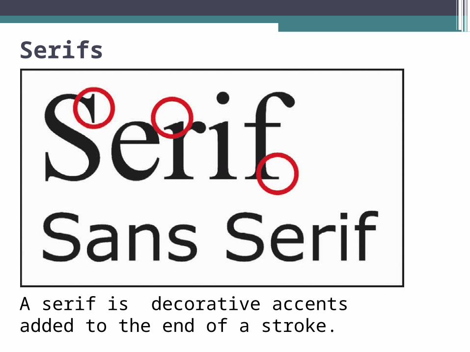
Serifs
A serif is decorative accents added to the end of a stroke.
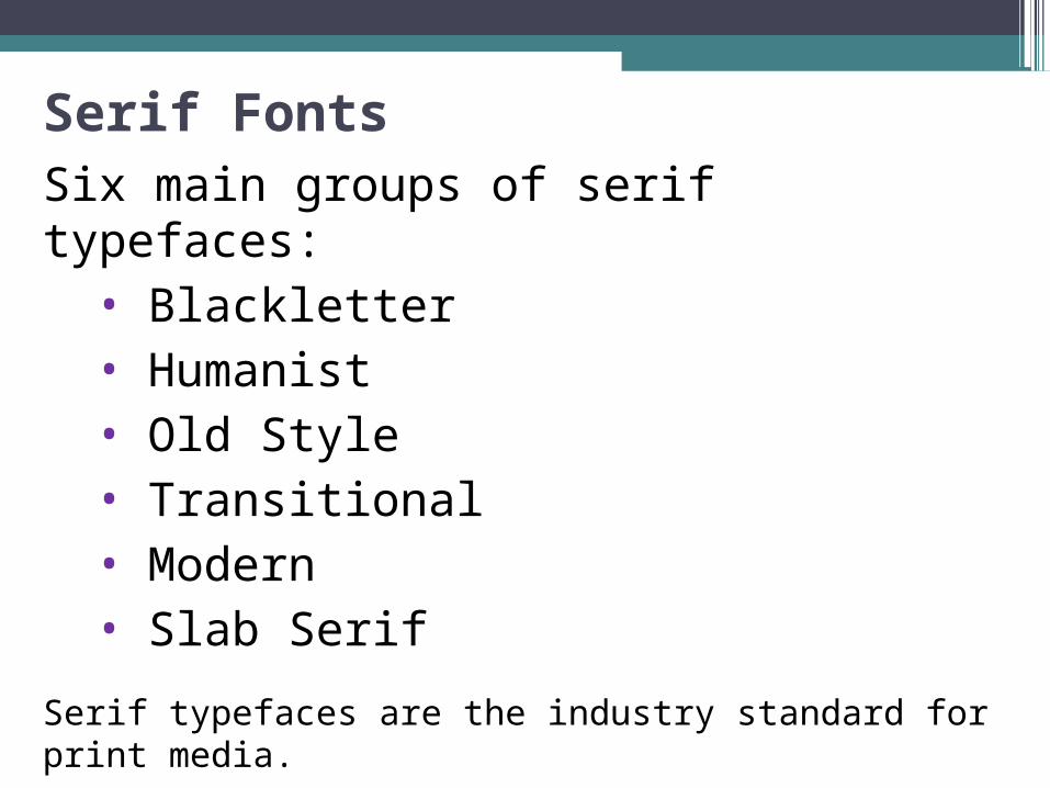
Serif FontsSix main groups of serif typefaces:
• Blackletter• Humanist• Old Style• Transitional• Modern• Slab Serif
Serif typefaces are the industry standard for print media.

Sans-Serif FontsSans is a French word for without. Sans-serif literally means without serif.
Three types of Sans-serif typefaces:
Humanist
Geometric
Transitional
Sans-serif typefaces are ideal for headings and digital media where lower resolution can make serifs harder to render cleanly.

Typeface development through history
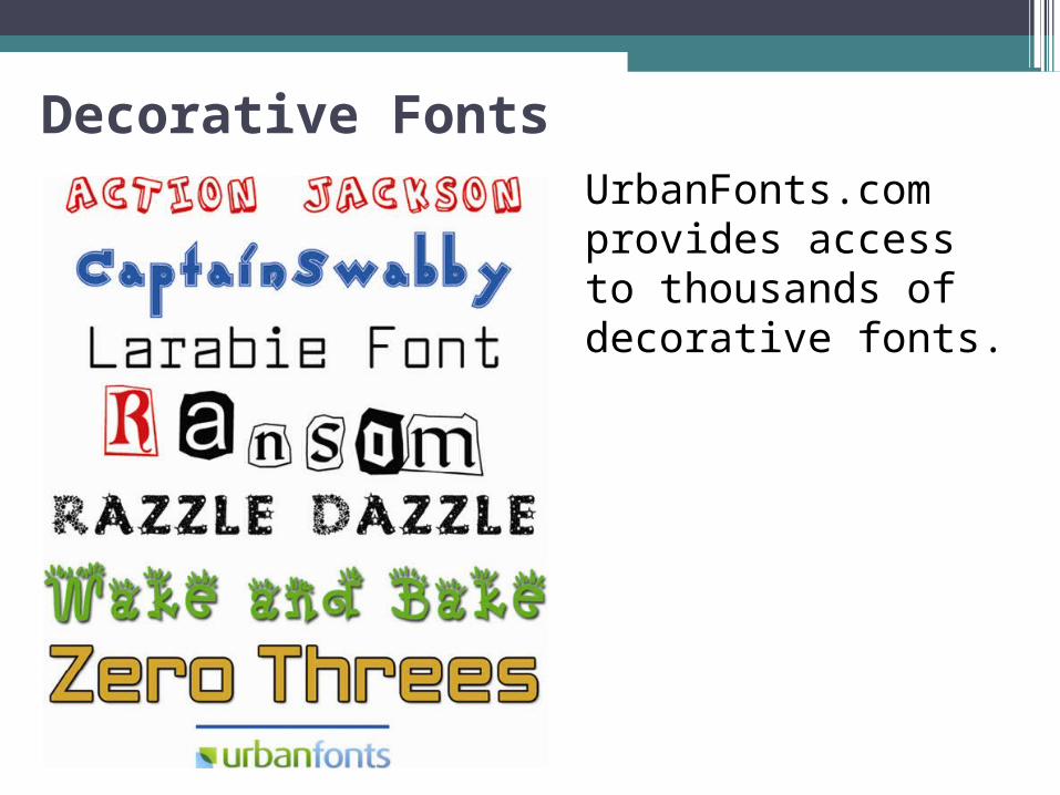
Decorative FontsUrbanFonts.com provides access to thousands of decorative fonts.
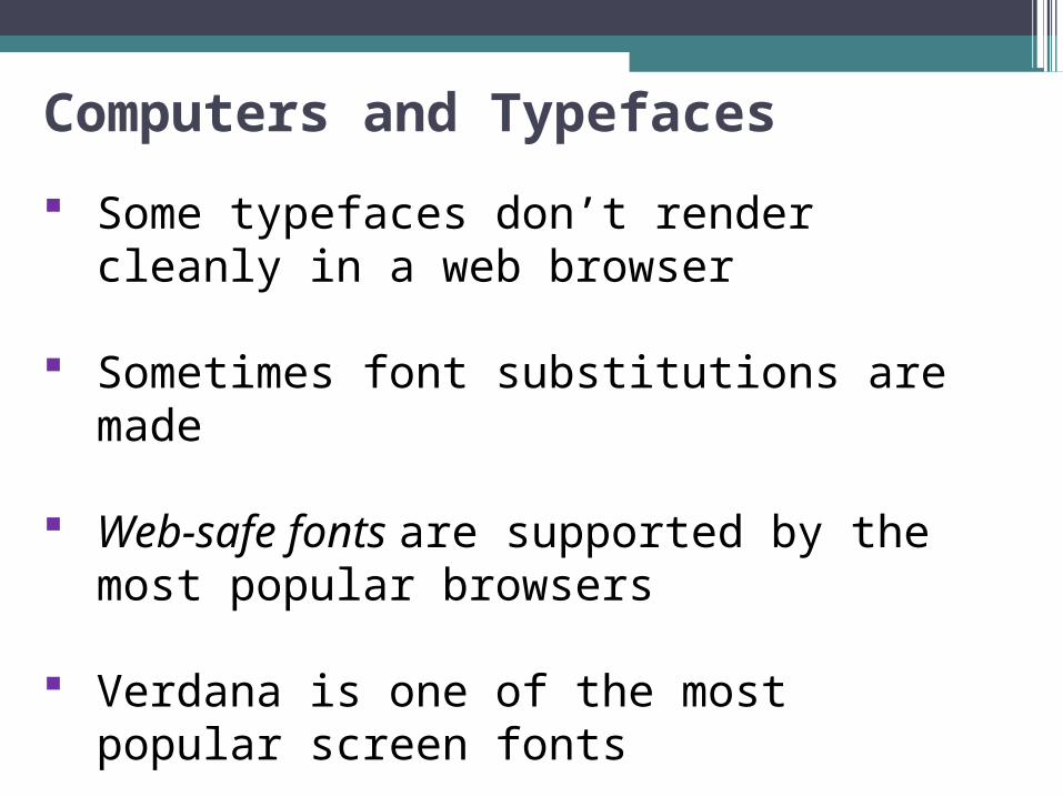
Computers and Typefaces
Some typefaces don’t render cleanly in a web browser
Sometimes font substitutions are made
Web-safe fonts are supported by the most popular browsers
Verdana is one of the most popular screen fonts
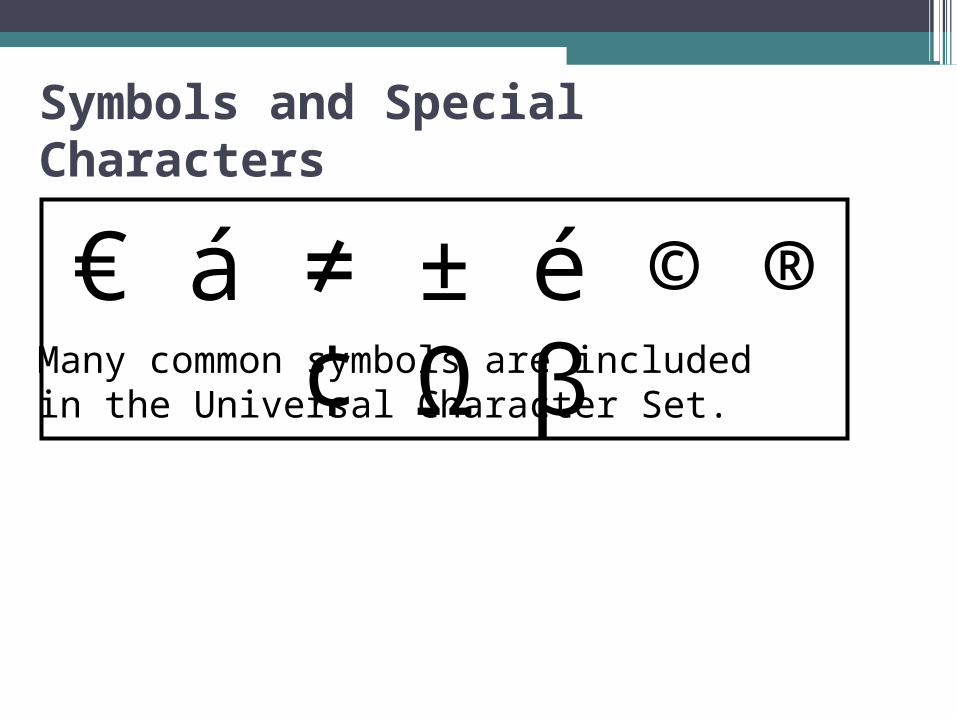
Symbols and Special Characters
€ á ≠ ± é © ® ¢ Ω βMany common symbols are included in the Universal Character Set.
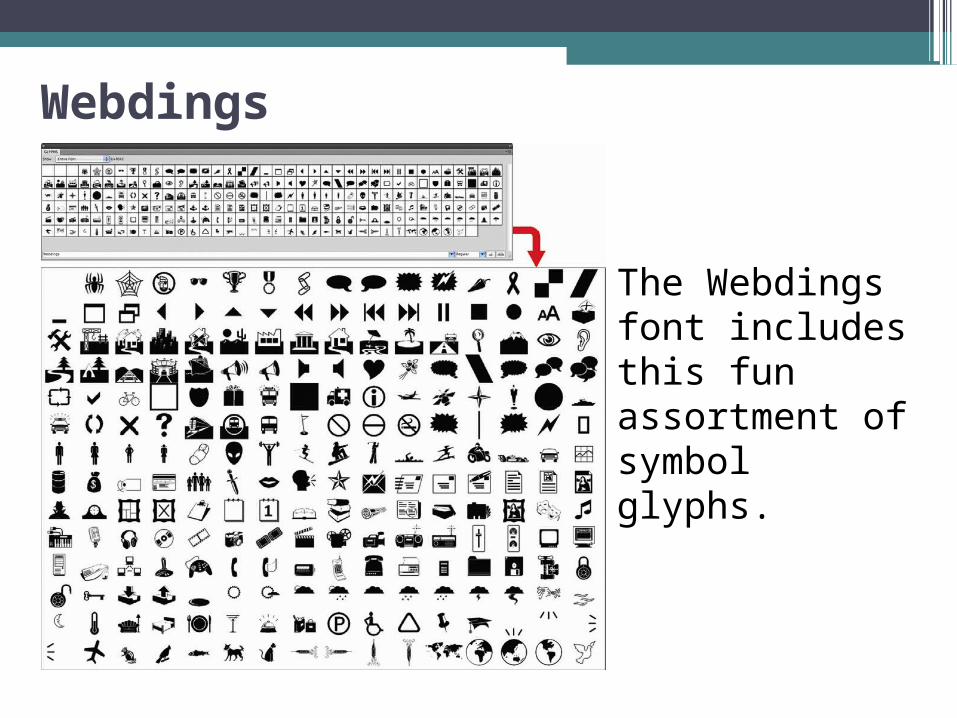
Webdings
The Webdings font includes this fun assortment of symbol glyphs.
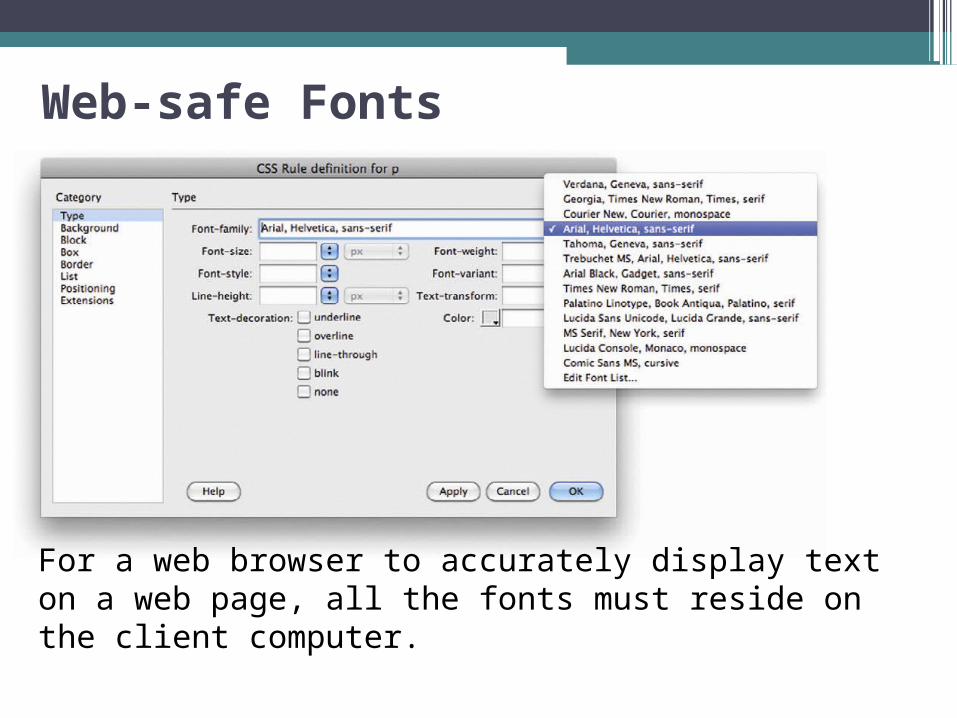
Web-safe Fonts
For a web browser to accurately display text on a web page, all the fonts must reside on the client computer.

Commercial Typefaces Linotype is a commercial
type foundry that specializes in the design of commercial typefaces.
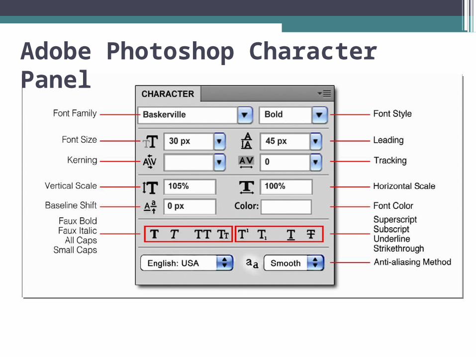
Adobe Photoshop Character Panel

Font Effects
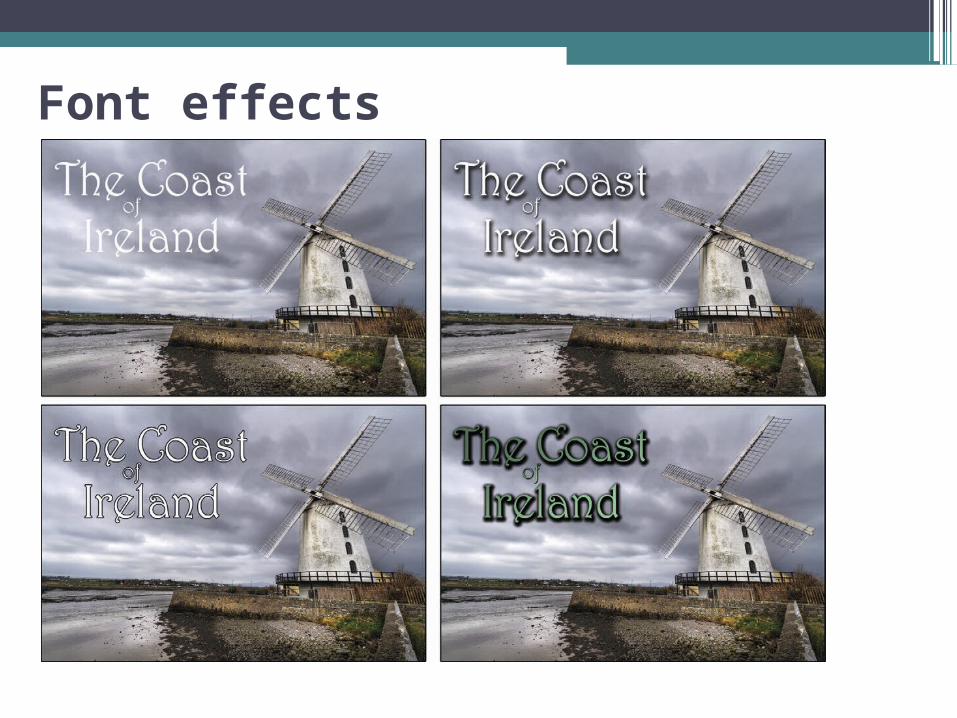
Differences between True Bold, Italic, and Faux effects are quite apparent when compared side-by-side.

Vertical & Horizontal Scaling
Type can be condensed, expanded, scaled, or stretched.
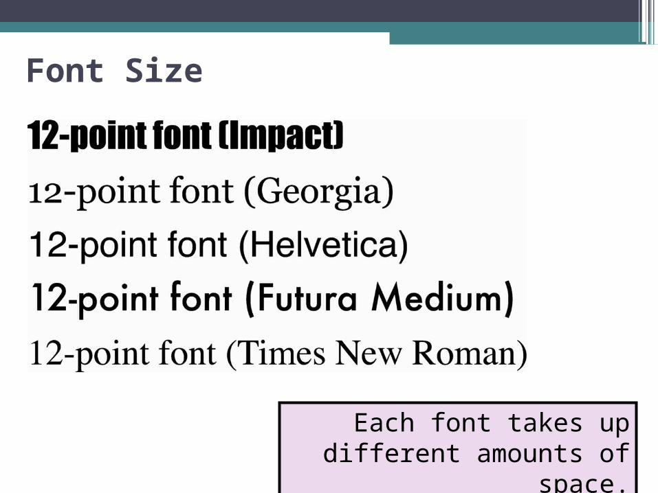
Font Size
Each font takes up different amounts of space.
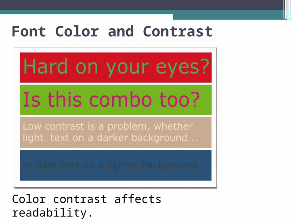
Font Color and Contrast
Color contrast affects readability.
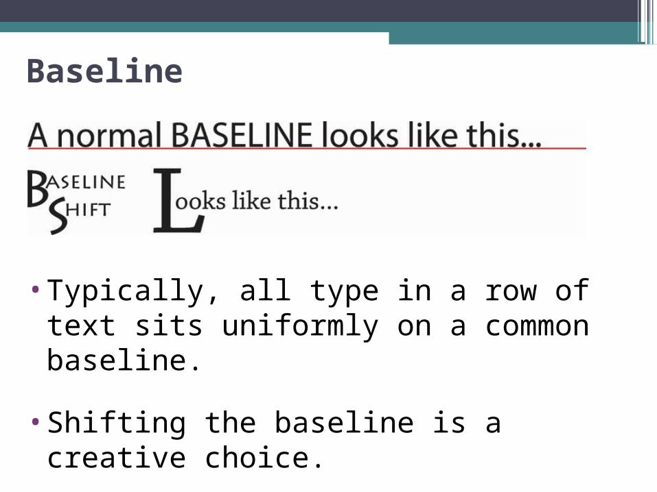
Baseline
• Typically, all type in a row of text sits uniformly on a common baseline.
• Shifting the baseline is a creative choice.
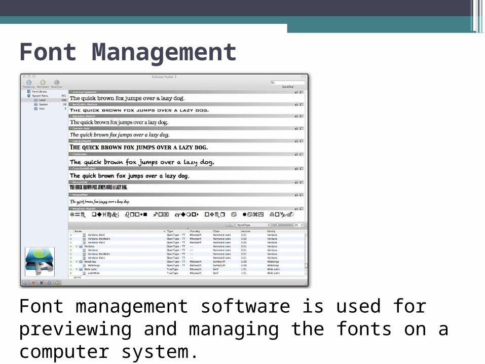
Font Management
Font management software is used for previewing and managing the fonts on a computer system.

Font Book
Font Book is Apple’s proprietary font manager utility for computers running OS X.

Kerning & Tracking
Kerning selectively varies the amount of space between a single pair of letters.
It accounts for letter shape.
Tracking uniformly adjusts letter spacing across a range of selected text.
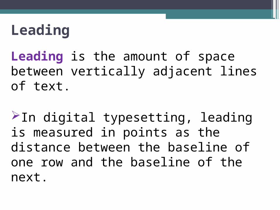
Leading
Leading is the amount of space between vertically adjacent lines of text.
In digital typesetting, leading is measured in points as the distance between the baseline of one row and the baseline of the next.
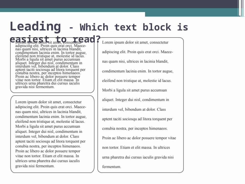
Leading - Which text block is easiest to read?

Justification - Which text block is easiest to read?
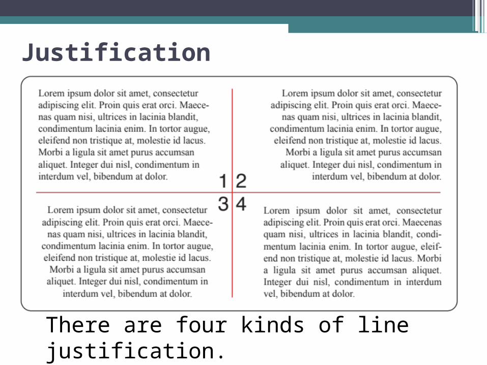
Justification
There are four kinds of line justification.

1. Ragged-right or Left-justified
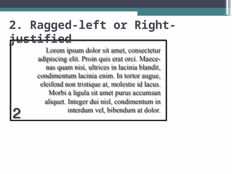
2. Ragged-left or Right-justified
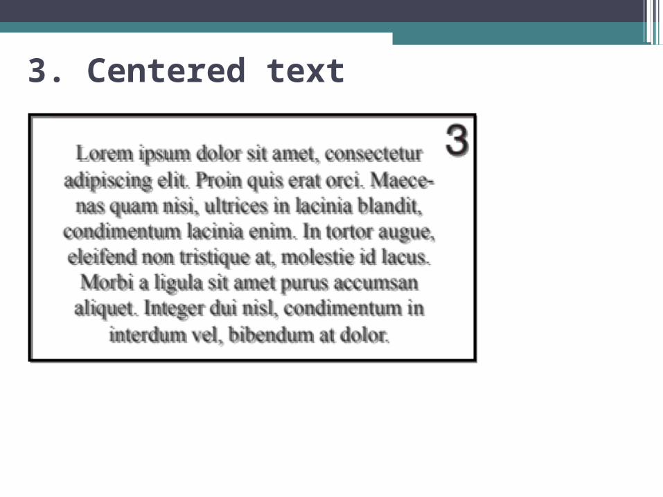
3. Centered text
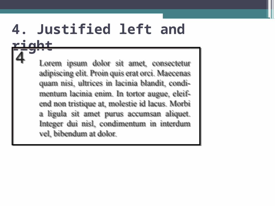
4. Justified left and right
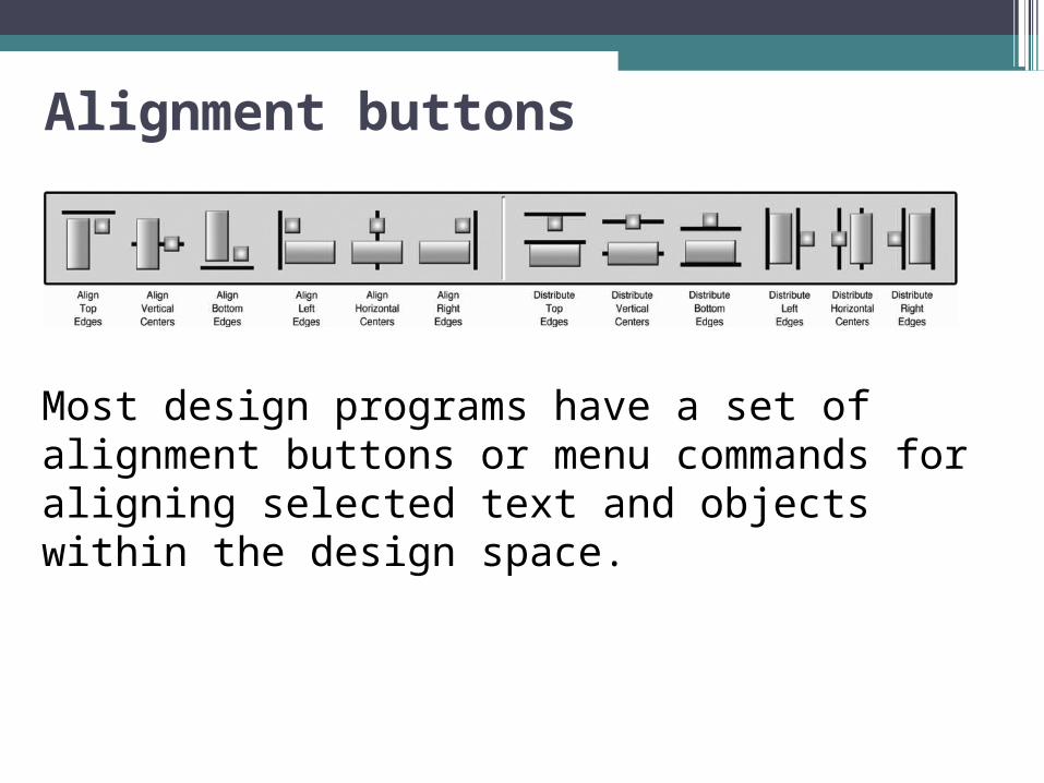
Alignment buttons
Most design programs have a set of alignment buttons or menu commands for aligning selected text and objects within the design space.
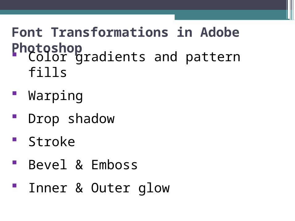
Font Transformations in Adobe Photoshop Color gradients and pattern fills
Warping
Drop shadow
Stroke
Bevel & Emboss
Inner & Outer glow
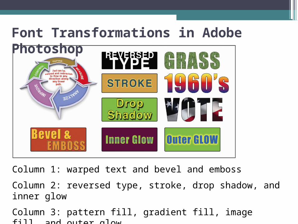
Column 1: warped text and bevel and emboss
Column 2: reversed type, stroke, drop shadow, and inner glow
Column 3: pattern fill, gradient fill, image fill, and outer glow
Font Transformations in Adobe Photoshop
Font effects
Font Effects
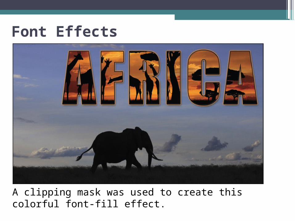
A clipping mask was used to create this colorful font-fill effect.
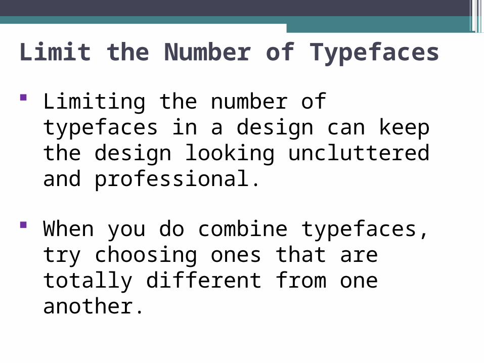
Limit the Number of Typefaces
Limiting the number of typefaces in a design can keep the design looking uncluttered and professional.
When you do combine typefaces, try choosing ones that are totally different from one another.
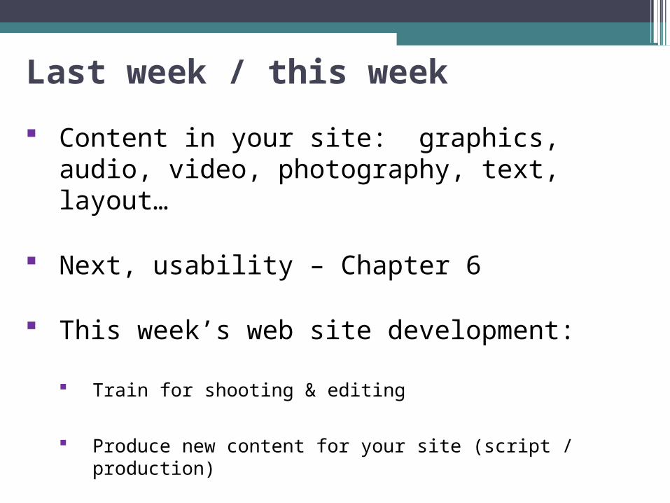
Last week / this week
Content in your site: graphics, audio, video, photography, text, layout…
Next, usability – Chapter 6
This week’s web site development:
Train for shooting & editing
Produce new content for your site (script / production)
WordPress
Break, then WordPress installation and set up…