Embed Size (px)
Citation preview
Chapter 8 – Historical Graph View
ShareScope User Guide Page 1 of 19
Chapter 8 – Historical Graph View
NOTE: We recommend that you read Chapter 5 – Settings before this section.
What you will learn in this chapter:
How to read the Graph view.
How to change the style and time frame of the Graph view.
How to add technical analysis tools to help you try and predict future price movement and trend changes.
How to add lines, shapes and text to a graph.
How to compare an instrument’s performance to one or more other instruments.
How to save up to 12 of your favourite chart configurations – called Graph Settings.
Chapter 8 – Historical Graph View
ShareScope User Guide Page 2 of 19
8.1 The Historical Graph view
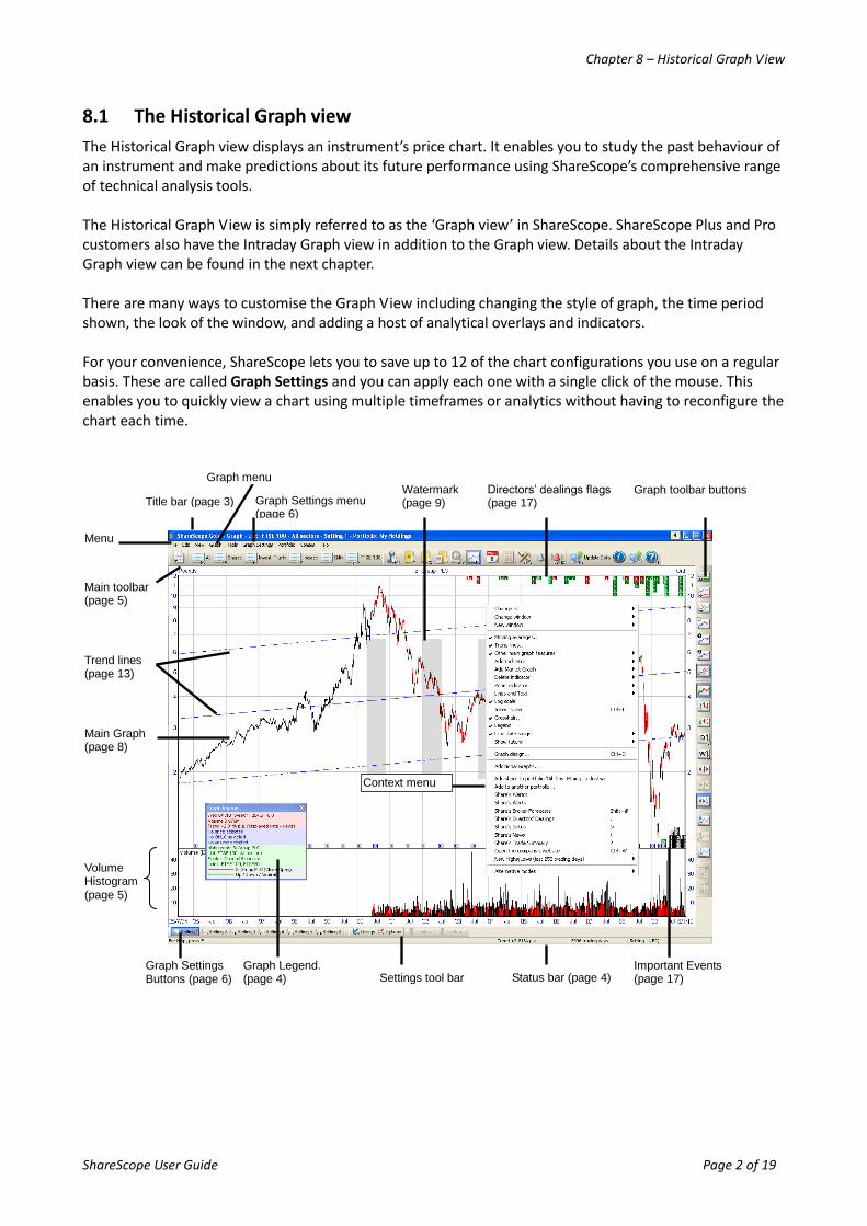
The Historical Graph view displays an instrument’s price chart. It enables you to study the past behaviour of an instrument and make predictions about its future performance using ShareScope’s comprehensive range of technical analysis tools. The Historical Graph View is simply referred to as the ‘Graph view’ in ShareScope. ShareScope Plus and Pro customers also have the Intraday Graph view in addition to the Graph view. Details about the Intraday Graph view can be found in the next chapter. There are many ways to customise the Graph View including changing the style of graph, the time period shown, the look of the window, and adding a host of analytical overlays and indicators. For your convenience, ShareScope lets you to save up to 12 of the chart configurations you use on a regular basis. These are called Graph Settings and you can apply each one with a single click of the mouse. This enables you to quickly view a chart using multiple timeframes or analytics without having to reconfigure the chart each time.
Main toolbar (page 5)
Menu
Directors’ dealings flags (page 17)
Trend lines (page 13)
Main Graph (page 8)
Graph Settings Buttons (page 6) Status bar (page 4) Settings tool bar
Title bar (page 3)
Context menu
Graph Legend. (page 4)
Volume Histogram (page 5)
Graph toolbar buttons Graph Settings menu
(page 6)
Watermark (page 9)
Graph menu
Important Events (page 17)
Chapter 8 – Historical Graph View
ShareScope User Guide Page 3 of 19
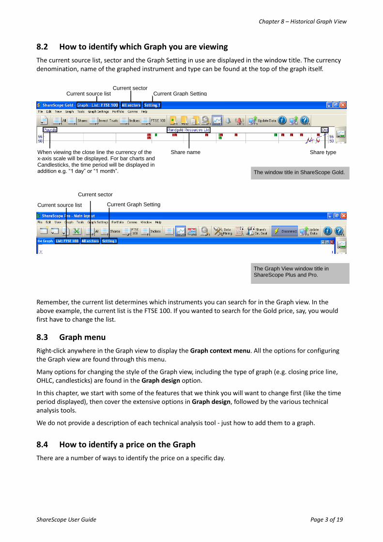
8.2 How to identify which Graph you are viewing
The current source list, sector and the Graph Setting in use are displayed in the window title. The currency denomination, name of the graphed instrument and type can be found at the top of the graph itself.
Remember, the current list determines which instruments you can search for in the Graph view. In the above example, the current list is the FTSE 100. If you wanted to search for the Gold price, say, you would first have to change the list.
8.3 Graph menu
Right-click anywhere in the Graph view to display the Graph context menu. All the options for configuring the Graph view are found through this menu.
Many options for changing the style of the Graph view, including the type of graph (e.g. closing price line, OHLC, candlesticks) are found in the Graph design option.
In this chapter, we start with some of the features that we think you will want to change first (like the time period displayed), then cover the extensive options in Graph design, followed by the various technical analysis tools.
We do not provide a description of each technical analysis tool - just how to add them to a graph.
8.4 How to identify a price on the Graph
There are a number of ways to identify the price on a specific day.
Current source list
Current source list
Current Graph Setting Current sector
The window title in ShareScope Gold.
The Graph View window title in ShareScope Plus and Pro.
Current Graph Setting
Current sector
Share name Share type When viewing the close line the currency of the x-axis scale will be displayed. For bar charts and Candlesticks, the time period will be displayed in addition e.g. “1 day” or “1 month”.
Chapter 8 – Historical Graph View
ShareScope User Guide Page 4 of 19
8.4.1 The Status bar
The Status bar appears at the bottom of the ShareScope window. When the cursor is over the Graph view, the status bar will display the date and price at the cursor position.
8.4.2 The Crosshair
The crosshair ads a vertical and horizontal line at the cursor position so that you can match up points on the graph with the data and price axes. You can also choose to display the date, closing price and price change at the cursor position. To add a crosshair to the graph, right click on the graph and select Crosshair... from the context menu. To freeze the crosshair at a specific point on the graph, press Ctrl + X on the keyboard. Press Ctrl + X again to unfreeze the crosshair.
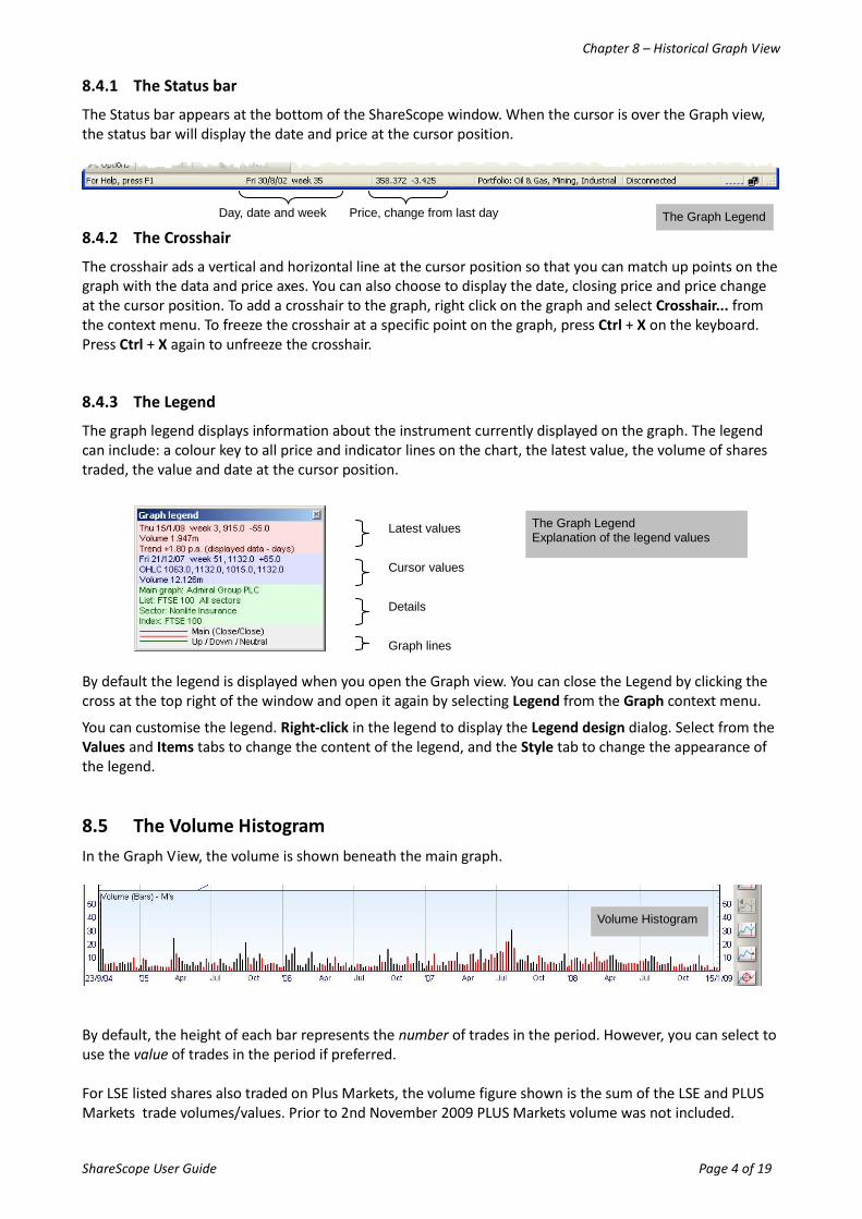
8.4.3 The Legend
The graph legend displays information about the instrument currently displayed on the graph. The legend can include: a colour key to all price and indicator lines on the chart, the latest value, the volume of shares traded, the value and date at the cursor position.
By default the legend is displayed when you open the Graph view. You can close the Legend by clicking the cross at the top right of the window and open it again by selecting Legend from the Graph context menu.
You can customise the legend. Right-click in the legend to display the Legend design dialog. Select from the Values and Items tabs to change the content of the legend, and the Style tab to change the appearance of the legend.
8.5 The Volume Histogram
In the Graph View, the volume is shown beneath the main graph.
By default, the height of each bar represents the number of trades in the period. However, you can select to use the value of trades in the period if preferred. For LSE listed shares also traded on Plus Markets, the volume figure shown is the sum of the LSE and PLUS Markets trade volumes/values. Prior to 2nd November 2009 PLUS Markets volume was not included.
The Graph Legend Explanation of the legend values
Latest values
Cursor values
Details
Graph lines
Volume Histogram
The Graph Legend Day, date and week Price, change from last day
Chapter 8 – Historical Graph View
ShareScope User Guide Page 5 of 19
The volume histogram uses the same time period as the main graph. The volume graph can be removed or customised using the Graph design option on the Graph context menu.
8.6 View another instrument
To search for another instrument in the underlying list, simply start typing its name, EPIC, SEDOL or ISIN (see Find a share in Chapter 3 for more details). To display an instrument in another list, right-click in the graph and select Change list. Once you have selected a new list, the List view will be displayed. Find the instrument you require and press the Enter key to display the Graph view. To display the instruments in the underlying list one after another, press the Space bar key. Instruments will be displayed in the order that they are sorted in the List view. Pres the Shift and Spacebar keys together to move back through the list.
8.7 Changing the timescale of the Graph view
There are numerous ways to change the timescale of the Graph view:
8.7.1 Limit date range
This important option on the Graph context menu enables you to permanently limit the timescale on the graph to a specific period (e.g. 6 months, 1 year). It applies to all graphs using the current graph setting. Double-clicking the graph will display the full price history. Repeat to display the set time period. Use in conjunction with the Show future option.
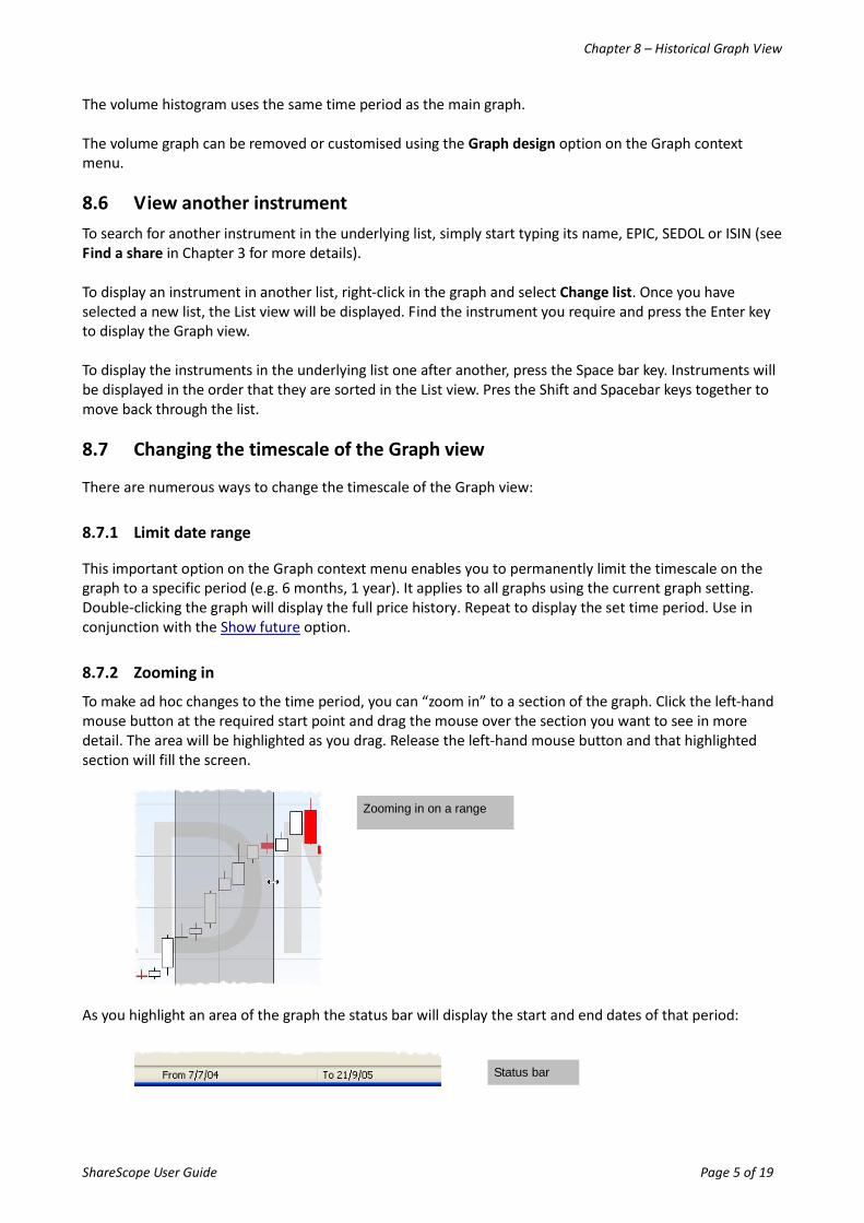
8.7.2 Zooming in
To make ad hoc changes to the time period, you can “zoom in” to a section of the graph. Click the left-hand mouse button at the required start point and drag the mouse over the section you want to see in more detail. The area will be highlighted as you drag. Release the left-hand mouse button and that highlighted section will fill the screen.
As you highlight an area of the graph the status bar will display the start and end dates of that period:
Zooming in on a range
Status bar
Chapter 8 – Historical Graph View
ShareScope User Guide Page 6 of 19
These changes will be temporary and apply only to the graph for the currently selected instrument. Double-click on the graph to zoom back out to the full history or, if you have the used the Limit date range feature, to the set time period.
8.7.3 Set Graph Start and End Date
You can set the start or end date of the graph by clicking on the first or last date on the time axis. You can choose a specific start date or the start of the week, month, quarter or year that the current graph start date belongs to. Similarly, you can set a specific end date or the end of the week, month, quarter or year that the current end date of the graph belongs to. These changes will be temporary and apply only to the graph for the currently selected instrument. Double-click on the graph to zoom back out to the full history or, if you have the used the Limit date range feature, to the set time period.
8.7.4 Scrolling
Position the mouse cursor near to the left hand vertical axis and pressing the left mouse button will scroll backwards through the price history. You can scroll forward through the price history by positioning the mouse cursor near to the right hand vertical axis and pressing the right mouse button. This is only applicable if the Limit data range feature has been used. Double-click on the graph to zoom back out to the original time period.
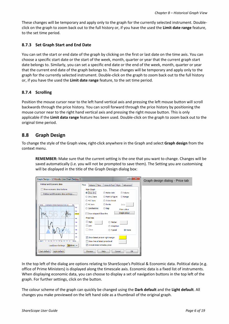
8.8 Graph Design
To change the style of the Graph view, right-click anywhere in the Graph and select Graph design from the context menu.
REMEMBER: Make sure that the current setting is the one that you want to change. Changes will be saved automatically (i.e. you will not be prompted to save them). The Setting you are customising will be displayed in the title of the Graph Design dialog box:
In the top left of the dialog are options relating to ShareScope’s Political & Economic data. Political data (e.g. office of Prime Ministers) is displayed along the timescale axis. Economic data is a fixed list of instruments. When displaying economic data, you can choose to display a set of navigation buttons in the top left of the graph. For further settings, click on the button. The colour scheme of the graph can quickly be changed using the Dark default and the Light default. All changes you make previewed on the left hand side as a thumbnail of the original graph.
Graph design dialog - Price tab
Chapter 8 – Historical Graph View
ShareScope User Guide Page 7 of 19
8.8.1 Price Tab
You can change the type of graph in use in the current Setting from the Price tab. To change the graph type, choose from the nine options under Main Graph. The graph types available to you are summarised below:
Graph Type Description
Close The historical closing price of the share is displayed as a line chart.
Bar charts
OHLC bars The highest and lowest prices are displayed as a vertical line and the opening and closing price displayed as horizontal bars against the vertical line.
HLC bars The highest and lowest prices are displayed as a vertical line and only the closing price is displayed as a horizontal bar against the vertical line.
HL bars The highest and lowest prices are displayed as a vertical line only.
Candlestick The highest, lowest, closing and opening prices are displayed as a rectangle with a vertical line through its middle. The top and bottom of the vertical line represents the highest and lowest prices. The top and bottom of the rectangle represents the open and close prices. If a candle is hollow the closing price is higher than the opening prices for that candle. If a candle is filled the price closed lower than its open.
Heikin-Ashi Heikin-Ashi charts - "average bar" in Japanese - can be used in conjunction with candlestick charts to improve the identification of trends. Instead of using the open-high-low-close (OHLC) bars like standard candlestick charts, the Heikin-Ashi technique uses a modified formula. The down days are represented by filled bars, while the up days are represented by hollow bars. Standard candlestick patterns can be used with Heikin-Ashi charts.
Point & figure The graph displays the underlying supply and demand of prices. Rising prices are displayed as a column of X’s and denote demand. Falling prices are displayed as a column of O’s and denote supply. A series of short columns show that supply and demand are relatively equal. Time is irrelevant, a column of X’s and O’s could represent 1 day’s prices or a year or more prices.
Kagi The graph represents supply and demand. Each day represents a session. A session is drawn in a Kagi chart: as a thick line if demand is exceeding supply (current closing price is greater or equal to previous closing price); a thin line if supply is exceeding demand (current closing price is less than or equal to previous closing price) and; alternating thickness of lines when supply and demand are equal.
Renko The graph represents the direction and movement of closing prices. Black bricks represent the start of an uptrend and red bricks represent the start of a downtrend.
3 – Line break The graph represents the direction and movement of closing prices. If the day’s closing price exceeds the previous line’s high price, a new black line is drawn. If the day’s closing price falls below the previous line’s low price, a new red line is drawn. If the closing price does not move, nothing is drawn.
Volume Candlesticks based on trade volume rather than time periods. Standard candlestick patterns can be used with Volume charts.
Range Candlesticks based on trading range rather than time periods. Standard candlestick patterns can be used with Range charts.
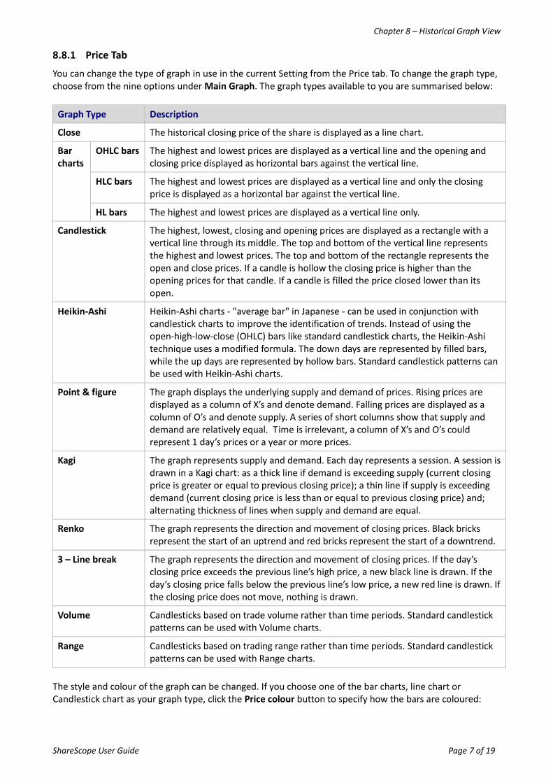
The style and colour of the graph can be changed. If you choose one of the bar charts, line chart or Candlestick chart as your graph type, click the Price colour button to specify how the bars are coloured:
Chapter 8 – Historical Graph View
ShareScope User Guide Page 8 of 19
If you use Kagi, Point & Figure, 3-Line break or Renko graph, select the colour of Up or Down price movement, in place of where the Price colour button appears. You can also change the graph type by using buttons from the graph toolbar which appears on the right hand side of the ShareScope window. More buttons can be added to this graph toolbar if needed. To customise the graph toolbar, see page xxx.
8.8.2 The Time Tab
The Time tab enables you to change the graph time period. You can choose how long a period each price bar (or candlestick, depending on the selected chart type) covers. As this applies to bar charts or candlestick charts, this option is not relevant when viewing a closing price line. So if looking at a one month period of a price chart, you may wish to see a price bar for each day. But if looking at a year of data, you may prefer weekly bars (e.g. a weekly OHLC price bar will show Monday's opening price and the closing price of Friday with the highest and lowest prices touched throughout the week). The Dynamic selection of scale option, which is the default setting, means that ShareScope will adjust whether one-day, two-day, two-week etc. bars are displayed according to how much data is currently in view. The period covered by each bar is shown at the top left of the graph with '(dyn.)' shown to indicate that this 'dynamic selection' option has been chosen. If you can not see the period at the top left of the graph, you may need to expand the window. You can of course set the chart to always show your preferred option regardless of how much data is visible. Adjusting the time period per bar will apply to all graphs in the current Graph Setting.
8.8.3 Other Tabs
There are many other configurable options in the Graph Design dialog box. A summary of the features found on each tab is given in the table below.
The design view – setting the bar or price line colours.
Example of graph toolbar buttons. Change to close line
Change to OHLC bar chart
Change to candlestick
Chapter 8 – Historical Graph View
ShareScope User Guide Page 9 of 19
Tab Description
Volume tab
The Volume tab allows you to specify options for the volume histogram which appears at the bottom of the main graph to indicate the number of shares traded each day (in either thousands or millions).
Lines and Text tab
The Lines & Text tab can be used to edit the style of lines and texts on display. You can also toggle the display of the graph scales and graph flags.
Style The style tab allows you to customise the amount of white space used, the number of vertical and horizontal grid lines, the background of the graph, and watermarks.
Advanced The Advanced tab allows you to set global style options for how Analytics are displayed
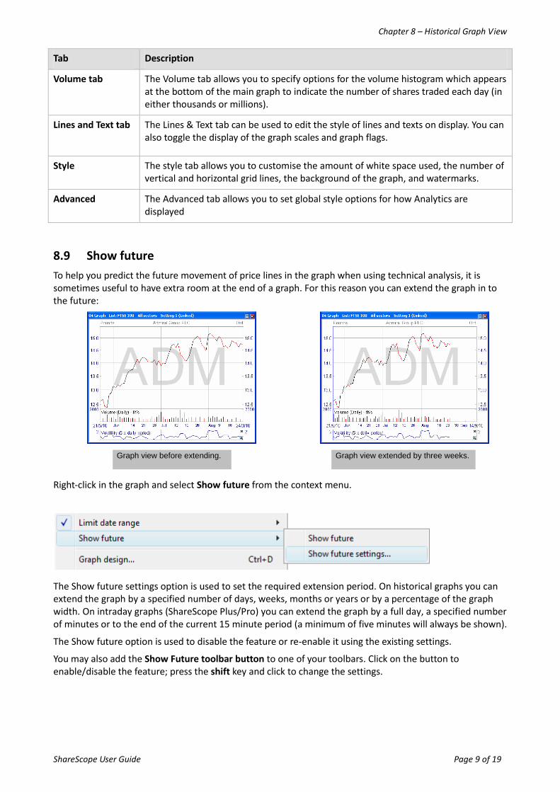
8.9 Show future
To help you predict the future movement of price lines in the graph when using technical analysis, it is sometimes useful to have extra room at the end of a graph. For this reason you can extend the graph in to the future:
Right-click in the graph and select Show future from the context menu.
The Show future settings option is used to set the required extension period. On historical graphs you can extend the graph by a specified number of days, weeks, months or years or by a percentage of the graph width. On intraday graphs (ShareScope Plus/Pro) you can extend the graph by a full day, a specified number of minutes or to the end of the current 15 minute period (a minimum of five minutes will always be shown).
The Show future option is used to disable the feature or re-enable it using the existing settings.
You may also add the Show Future toolbar button to one of your toolbars. Click on the button to enable/disable the feature; press the shift key and click to change the settings.
Graph view before extending. Graph view extended by three weeks.
Chapter 8 – Historical Graph View
ShareScope User Guide Page 10 of 19
8.10 Log scale
If the log scale is chosen, then the vertical scale is adjusted so that equal relative movements are equal distances. For example, a move from 100p to 150p would be the same vertical distance as 200p to 300p.
This can be changed from the Graph context menu, the Log toolbar button or clicking the Graph toolbar button when in an historical graph.
If a company share is growing at a steady rate, the price line would be a straight line (indicating continuous increase of X%) whereas, without the log scale, the line would curve up.
Alternatively, click again on the Graph toolbar button to switch between linear (flat) and log scale.
8.11 Events
The Events feature allows you to add flags to the Graph view indicating the timing of news stories, results, ex-dividend dates, director and major shareholder dealings and your own purchases and sales of the instrument. They are a great way to monitor, at a glance, many of the factors that can affect price movement. You can mouse over the flags to reveal further information (e.g. latest news headlines or the date and value of a dividend payment). In fact, you can largely manage an investment just by monitoring the flags on its chart.
Right-click in the Graph screen to display the context menu. ShareScope Gold users should select Events; Plus and Pro users need to select Other main graph features and then Events.
The Show events check box toggles the display of events on or off.
Click on the event options that you want to add to the chart.
Note: on intraday graphs (ShareScope Plus/Pro), only News and Transaction events can be displayed.
Click on the coloured marker next to each event option to edit the style of the flag, as well as the its position on the graph. You can choose to display an event at the top of the screen, at the bottom, or next to the price on that day. You can also select any combination of these positions.
Events will be displayed on the date they occurred.
Event markers for your buy and sell transactions can be positioned, in addition or instead, at either the level of the price paid/received per share excluding costs (Deal Price), or the price paid/received per share taking account of all costs (Cost Price).
Results and Director/Major Shareholder Dealings can be positioned at the level of the closing price for the date on which they occur.
The Lines option enables you to add vertical lines from the close price on the day of the event to the top and bottom of the chart.
Depending on the scale at which a graph is displayed, events on the same day or on adjacent days may not all be displayed. Zooming in on the graph will display as many of the events as possible given the space constraints. Events on the same day will be stacked with a maximum of five displayed at one time.
8.12 Stop-Loss and Stop-Gain
When you make an investment or open a trade it is prudent to set a stop-loss position. This is the point at which you would wish to exit, or at least review, the position. A stop-gain is the equivalent for short positions. We shall use the term stop-loss to refer to both.
Chapter 8 – Historical Graph View
ShareScope User Guide Page 11 of 19
There are two types of stop-loss: one which tracks the price (a trailing stop-loss) and one set at a specific price level (static stop-loss).
The point of a trailing stop-loss is to move the stop-loss up with the share price – to “lock in” profit. For example, if you set a stop-loss at 10% below your entry price, the share could go up by 50% and then come back down to trigger your stop-loss without you taking a profit. By trailing the price, you would trigger your stop-loss, in this example, 10% below the high – banking a nice profit.
The stop-loss feature in ShareScope is for setting trailing stop-losses and is described below. If you want to set a stop-loss at a specific price level, draw a horizontal line on the graph at the required level and set an alarm on the line.
A trailing stop-loss works like this:
Let’s say you buy a share for 100p and you want to set a trailing stop-loss at 5%. If the price goes up, the stop-loss line steps up with it. So if the price increases to 102p, the stop-loss line will move up to 96.9p (95% of 102p). If the price of the share goes down, however, the stop-loss line remains static (i.e. it goes sideways). If the price continues to fall it will either breach the stop-loss line, telling you that your exit position has been reached, or it will start to go back up again. If the price goes back up again, the stop-loss line will remain flat until the price has re-established the 5% margin.
You can add stop-losses based on a percentage of the price, an absolute price difference (e.g. 5p) or a multiple of ATR (not available in Gold).
8.12.1 Adding a stop-loss
Stop losses can be added to historical and intraday graphs. There are options for adding a stop-loss for an individual instrument (Stop loss – this share) or for all instruments (Stop loss – global).
In ShareScope Gold, these options are found on the Graph context menu; in ShareScope Plus & Pro they are found via the Other main graph features menu on the Graph context menu.
When you select either option a dialog box will be displayed which enables you to configure the stop-loss:
The first thing to specify is whether you want to set a stop-loss or a stop gain.
Next you need to decide on the nature of the stop-loss. There are three options:
Percent – using this option, the stop-loss will trail the price by the specified percentage.
Value - using this option, the stop-loss will trial the price by the specified value.
ATR – using this option, the stop-loss will trial the price by a multiple of ATR (14 period). This option is not available in ShareScope Gold).
There is a button for changing the colour and style of the line.
You will most likely to want to specify when the stop-loss should start – most likely when you opened your position. On historical graphs, you can set the start date. The stop-loss will be based on that day’s closing price.
On intraday graphs, you can select the time and date. You can also choose to base the stop-loss on the bid, mid or offer price. A stop-loss added to an intraday graph will continue to be displayed on subsequent days.
Two optional features you might like to consider are:
Chapter 8 – Historical Graph View
ShareScope User Guide Page 12 of 19
Move down as well as up – Using this option, the stop-loss will follow the price down after it has breached the stop-loss.
Flip when triggered – This option works in conjunction with the above. If the price breaches the stop-loss line it will immediately become a stop gain line (and vice versa).
Lastly, you should decide whether you want the stop-loss to appear just in the current graph setting, on all graph settings, or on selected settings. Use the button at the bottom of the dialog.
8.12.2 Deleting stop-losses
When you set a global stop-loss, you will notice a tick box at the top of the dialog box. This will be ticked when you set a stop-loss. To delete a global stop-loss, go back to this dialog box and untick the box.
When you add a stop-loss for an individual instrument, you will notice the Delete and Delete All options in the bottom right of the dialog box. The Delete button enables you to subsequently delete the stop-loss for the currently displayed instrument. The Delete All button enables you to delete all individual stop-losses.
8.12.3 Stop-Loss Toolbar Buttons
There are six toolbar buttons that can be used to adjust stop-loss lines:
Global stop-loss - adds/removes a stop-loss line. Use with the shift key to access the Global stop-loss settings dialog.
Share’s Stop-loss - adds/removes the current share’s stop-loss line. Use with the shift key to access the current graph’s Stop-loss settings dialog.
Global stop-loss settings - changes the global stop-loss settings.
Stop-loss - changes the individual stop-loss settings.
Increase Stop-loss - increases the level of the current share’s stop-loss. If there is no stop-loss for this share, then one is added.
Decrease Stop-loss - lowers the level of the current share’s stop-loss. If there is no stop-loss for this share, then one is added.
8.13 Technical Analysis
ShareScope provides a comprehensive suite of technical analysis tools that can help you try to predict future price movement. The technical analysis tools on the Graph context menu are:
Tool Description
Trend lines Used for establishing the presence and strength of a trend.
Moving averages Add multiple moving averages and moving average-based analytics such as Bollinger bands and envelopes.
Other main graph features (Plus & Pro only)
A range of chart overlays including pivot points, swing charts and Ichimoku. These analytics are superimposed on the main graph.
Indicators Add a wide range of popular indicators based on an instrument’s price, volume or breadth. Includes MACD, RSI and Stochastics. These indicators are added to a separate window beneath the main graph.
Market graphs Market graphs use data from an entire market rather than a specific instrument. Market graphs include Advance/Decline Line, TICK and TRIN.
Lines and Text (and shapes) Use these options for adding your own lines, text and shapes or line studies such as Fibonacci Retracement.
Chapter 8 – Historical Graph View
ShareScope User Guide Page 13 of 19
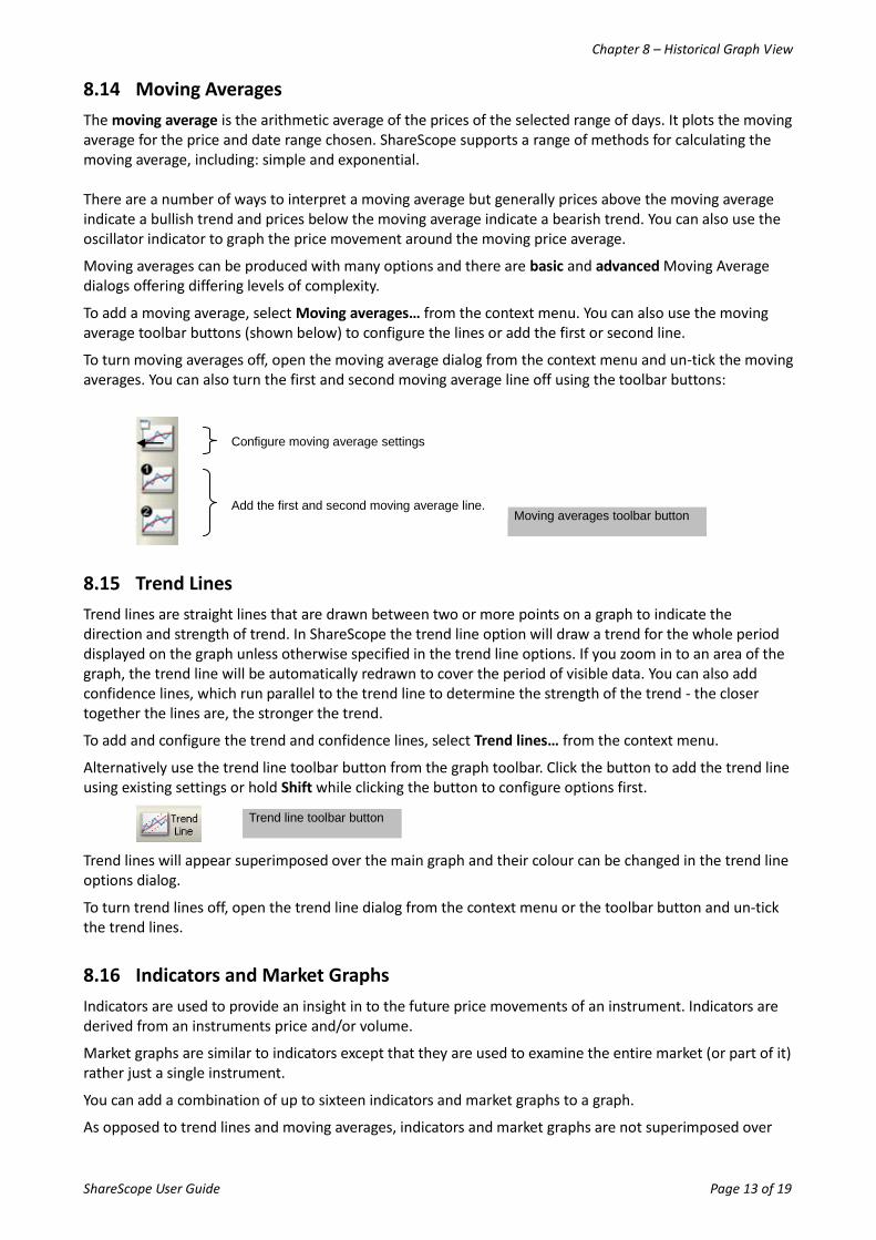
8.14 Moving Averages
The moving average is the arithmetic average of the prices of the selected range of days. It plots the moving average for the price and date range chosen. ShareScope supports a range of methods for calculating the moving average, including: simple and exponential. There are a number of ways to interpret a moving average but generally prices above the moving average indicate a bullish trend and prices below the moving average indicate a bearish trend. You can also use the oscillator indicator to graph the price movement around the moving price average.
Moving averages can be produced with many options and there are basic and advanced Moving Average dialogs offering differing levels of complexity.
To add a moving average, select Moving averages… from the context menu. You can also use the moving average toolbar buttons (shown below) to configure the lines or add the first or second line.
To turn moving averages off, open the moving average dialog from the context menu and un-tick the moving averages. You can also turn the first and second moving average line off using the toolbar buttons:
8.15 Trend Lines
Trend lines are straight lines that are drawn between two or more points on a graph to indicate the direction and strength of trend. In ShareScope the trend line option will draw a trend for the whole period displayed on the graph unless otherwise specified in the trend line options. If you zoom in to an area of the graph, the trend line will be automatically redrawn to cover the period of visible data. You can also add confidence lines, which run parallel to the trend line to determine the strength of the trend - the closer together the lines are, the stronger the trend.
To add and configure the trend and confidence lines, select Trend lines… from the context menu.
Alternatively use the trend line toolbar button from the graph toolbar. Click the button to add the trend line using existing settings or hold Shift while clicking the button to configure options first.
Trend lines will appear superimposed over the main graph and their colour can be changed in the trend line options dialog.
To turn trend lines off, open the trend line dialog from the context menu or the toolbar button and un-tick the trend lines.
8.16 Indicators and Market Graphs
Indicators are used to provide an insight in to the future price movements of an instrument. Indicators are derived from an instruments price and/or volume.
Market graphs are similar to indicators except that they are used to examine the entire market (or part of it) rather just a single instrument.
You can add a combination of up to sixteen indicators and market graphs to a graph.
As opposed to trend lines and moving averages, indicators and market graphs are not superimposed over
Configure moving average settings
Moving averages toolbar button Add the first and second moving average line.
Trend line toolbar button
Chapter 8 – Historical Graph View
ShareScope User Guide Page 14 of 19
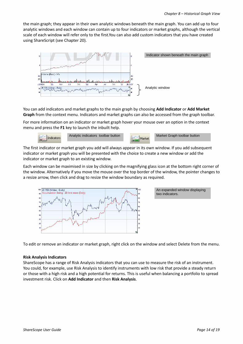
the main graph; they appear in their own analytic windows beneath the main graph. You can add up to four analytic windows and each window can contain up to four indicators or market graphs, although the vertical scale of each window will refer only to the first.You can also add custom indicators that you have created using ShareScript (see Chapter 20).
You can add indicators and market graphs to the main graph by choosing Add Indicator or Add Market Graph from the context menu. Indicators and market graphs can also be accessed from the graph toolbar.
For more information on an indicator or market graph hover your mouse over an option in the context menu and press the F1 key to launch the inbuilt help.
The first indicator or market graph you add will always appear in its own window. If you add subsequent indicator or market graph you will be presented with the choice to create a new window or add the indicator or market graph to an existing window.
Each window can be maximised in size by clicking on the magnifying glass icon at the bottom right corner of the window. Alternatively if you move the mouse over the top border of the window, the pointer changes to a resize arrow, then click and drag to resize the window boundary as required.
To edit or remove an indicator or market graph, right click on the window and select Delete from the menu.
Risk Analysis Indicators ShareScope has a range of Risk Analysis indicators that you can use to measure the risk of an instrument. You could, for example, use Risk Analysis to identify instruments with low risk that provide a steady return or those with a high risk and a high potential for returns. This is useful when balancing a portfolio to spread investment risk. Click on Add Indicator and then Risk Analysis.
Market Graph toolbar button
Indicator shown beneath the main graph
An expanded window displaying two indicators.
Analytic window
Analytic indicators toolbar button
Chapter 8 – Historical Graph View
ShareScope User Guide Page 15 of 19
8.17 Other main graph features (Plus & Pro only)
The table below outlines the technical analysis tools found on the Other main graph features menu option. For more information about any of the tools mentioned, hover the mouse over the tool in the menu and press the F1 key to launch the in-built help. You can also open ShareScope’s Help from the Help menu.
Menu Option Description
Pivot Points Pivot points are used as a predictive indicator of price movement. A pivot point is calculated as an average of the high, low and close over a selected time period. Levels of support and resistance are calculated along side pivot points. A pivot point and the lines of support and resistance are used to determine bullish and bearish trends and the extent to which they may last.
Swing Charts Swing charts are used to identify short term corrections in an underlying trend. ShareScope has a comprehensive implementation of swing charts that is well documented in the in-built help and ShareScope InfoCentre. To launch the InfoCentre select the View menu and then InfoCentre.
Zig Zag Chart The zigzag line is a method of filtering out random noise and comparing relative price movements. The line is produced by drawing straight lines between points at which the price has risen or reversed by a specified amount. This emphasizes the most significant changes in price movement, making the overall trends easier to see.
Parabolic SAR Parabolic SAR is used to identify exit points. In concept, you should close long positions when the price falls below the SAR and close short positions when the price rises above the SAR. The indicator works well in trending markets but provides “whipsaws” during sideways price movements.
Ichimoku Charts Ichimoku charts are based on candlestick charting but include more price data and are designed to improve the accuracy of future price predictions.
Price / Donchian Channels Price channels typically plot the highest high and the lowest low for the period specified (excluding the current period’s data). They define the range of price action over a given period. New highs or lows may be interpreted as a breakout from the recent trading range.
Events See Section 8.11.
Candlestick Patterns ShareScope can automatically recognise candlestick patterns and highlight them on your charts. You can choose to display all patterns or specified patterns only. A description of the candlestick patterns that ShareScope recognises can be found in ShareScope’s in-built Help. Press F1 while hovering the mouse over this menu option to open Help at the relevant page.
Political & Economic Data
This option enables you to plot the terms of successive political and financial heads along the time axis of the chart.
ShareScript indicators Enables you to add custom indicators created using ShareScript to the chart. These will be displayed underneath the main chart like standard indicators.
ShareScript studies
This option enables you to overlay a custom chart study created in ShareScript to the chart.
Stop-Loss See Section 8.12.
Chapter 8 – Historical Graph View
ShareScope User Guide Page 16 of 19
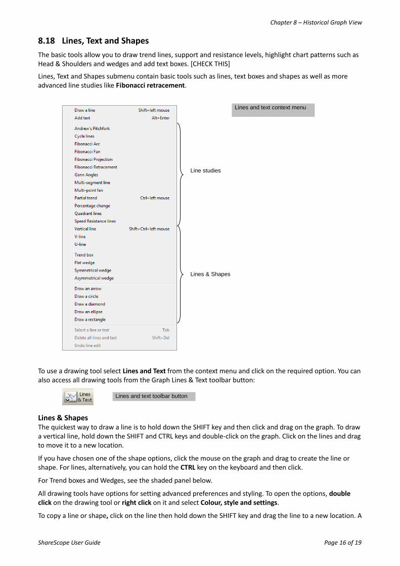
8.18 Lines, Text and Shapes
The basic tools allow you to draw trend lines, support and resistance levels, highlight chart patterns such as Head & Shoulders and wedges and add text boxes. [CHECK THIS]
Lines, Text and Shapes submenu contain basic tools such as lines, text boxes and shapes as well as more advanced line studies like Fibonacci retracement.
To use a drawing tool select Lines and Text from the context menu and click on the required option. You can also access all drawing tools from the Graph Lines & Text toolbar button:
Lines & Shapes The quickest way to draw a line is to hold down the SHIFT key and then click and drag on the graph. To draw a vertical line, hold down the SHIFT and CTRL keys and double-click on the graph. Click on the lines and drag to move it to a new location.
If you have chosen one of the shape options, click the mouse on the graph and drag to create the line or shape. For lines, alternatively, you can hold the CTRL key on the keyboard and then click.
For Trend boxes and Wedges, see the shaded panel below.
All drawing tools have options for setting advanced preferences and styling. To open the options, double click on the drawing tool or right click on it and select Colour, style and settings.
To copy a line or shape, click on the line then hold down the SHIFT key and drag the line to a new location. A
Lines and text toolbar button
Line studies
Lines & Shapes
Lines and text context menu
Chapter 8 – Historical Graph View
ShareScope User Guide Page 17 of 19
duplicate line will be created. This is useful when drawing support and resistance lines.
TIP: You can easily set an alarm on a line. Right-click on the line and select Alarm on line from the menu. The alarm will be triggered when the line is breached by the price.
Draw a trend box
1. Select Trend box from the Lines & text menu. The cursor will turn into a crosshair.
2. When drawing a trend box, first visualise where you want to draw the box. For example, imagine a downward-sloping rhombus for a down trend channel or an upward sloping rhombus for an up trend channel.
3. Click the mouse cursor once where you want the top left of the box to be.
4. Then click once more where you want the bottom left corner to be.
5. Finally click where you want the bottom right corner to be. A trend channel box will be drawn.
6. Click on the box and a marker will appear in each corner of the box.
7. Click and drag either of the left-hand markers vertically to change the height of the box. Click and drag horizontally to change the height, angle and length simultaneously.
8. Click and drag either of the right-hand markers to change the angle and/or length of the box.
9. Click and drag anywhere else on the frame of the box to move the whole box.
Draw a flat wedge
1. Select Flat wedge option from the Lines & text menu. The cursor will turn into a crosshair.
2. To draw a wedge you need to decide where the three corners of the wedge are going to be and click in these locations. You click on the corners of the wide end first and then the narrow end. The flat side of the wedge will be drawn from the first location you click, so if you want the flat side at the bottom, click at the bottom of the wide end of the wedge first.
3. After your third mouse-click the wedge will be drawn.
4. Click on the wedge and "markers" will appear on the corners of the wedge.
5. Click and drag any of the markers to re-shape the wedge.
6. Click on the border of the wedge and drag to move it to a different position.
Draw a symmetrical wedge or asymmetrical wedge
1. Select the required wedge option from the Lines & text menu. The cursor will turn into a crosshair.
2. To draw a wedge you need to decide where the three corners of the wedge are going to be and click in these locations. You click on the corners of the wide end first and then the narrow end. After your third mouse-click the wedge will be drawn.
3. Click on the wedge and "markers" will appear on the corners of the wedge.
4. Click and drag any of the markers to re-shape the wedge.
5. Click on the border of the wedge and drag to move it to a different position.
Text Boxes If you have selected the Add text option, click on the graph and a text box will appear. An alternative method is to press the Alt and Enter keys and click for the text box to appear.
To change the text style or colour, right-click on the box and select Colours & style.
Chapter 8 – Historical Graph View
ShareScope User Guide Page 18 of 19
When labelling a graph with text boxes, you can assign a text box to a price on the graph. If you then zoom in on a portion of the graph containing prices which have been assigned text boxes, those text boxes will always appear alongside the price. To assign a text box to a price or any position of the graph, right click on the text box and select Set Anchor from the context menu. The mouse cursor will change to a cross hair and capital 'A'. Click on the desired price or point on the graph you wish to assign the text box to.
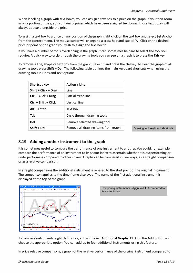
If you have a number of tools overlapping in the graph, it can sometimes be hard to select the tool you require. A quick way to cycle through the drawing tools you can see on a graph is to press the Tab key. To remove a line, shape or text box from the graph, select it and press the Del key. To clear the graph of all drawing tools press Shift + Del. The following table outlines the main keyboard shortcuts when using the drawing tools in Lines and Text option:
Shortcut Key Action / Line
Shift + Click + Drag Line
Ctrl + Click + Drag Partial trend line
Ctrl + Shift + Click Vertical line
Alt + Enter Text box
Tab Cycle through drawing tools
Del Remove selected drawing tool
Shift + Del Remove all drawing items from graph
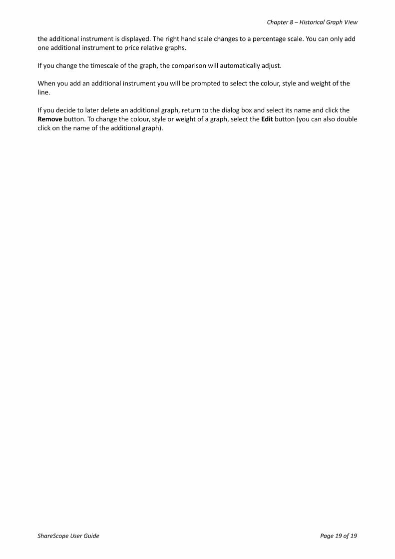
8.19 Adding another instrument to the graph
It is sometimes useful to compare the performance of one instrument to another. You could, for example, compare the performance of an instrument to its sector index to ascertain whether it is outperforming or underperforming compared to other shares. Graphs can be compared in two ways, as a straight comparison or as a relative comparison. In straight comparisons the additional instrument is rebased to the start point of the original instrument. The comparison applies to the time frame displayed. The name of the first additional instrument is displayed at the top of the graph.
To compare instruments, right click on a graph and select Additional Graphs. Click on the Add button and choose the appropriate option. You can add up to four additional instruments using this feature. In price relative comparisons, a graph of the relative performance of the original instrument compared to
Comparing instruments - Aggreko PLC compared to its sector index.
Drawing tool keyboard shortcuts
Chapter 8 – Historical Graph View
ShareScope User Guide Page 19 of 19
the additional instrument is displayed. The right hand scale changes to a percentage scale. You can only add one additional instrument to price relative graphs. If you change the timescale of the graph, the comparison will automatically adjust. When you add an additional instrument you will be prompted to select the colour, style and weight of the line. If you decide to later delete an additional graph, return to the dialog box and select its name and click the Remove button. To change the colour, style or weight of a graph, select the Edit button (you can also double click on the name of the additional graph).