Embed Size (px)
Citation preview
1
CHAPTER 7 ATTRIBUTE CONTROL CHARTS
Sections Introduction Types of Attribute Control Charts Classification Charts The p Chart for Constant Subgroup Sizes The p Chart for Variable Subgroup Sizes The np Chart Count Charts c Charts u Charts Limitations of Attribute Control Charts Summary Exercises References and Additional Readings Appendix A7.1: Using Minitab for Attribute Control Charts
Chapter Objectives
To discuss when to use the different types of attribute control charts
To construct the different types of attribute control charts: p chart, np chart, c chart and u chart
To analyze and interpret attribute control charts
To discuss the limitations of attribute control charts
7.1 Introduction Attribute data are data based on classifying an item, such as a unit, a form, a person, an interaction into one of two categories, such as defective or non-defective, conforming or non-conforming, good or bad, etc., or counting the number of defects per item, such as number of errors per bank application, number of accidents per department and overall in a factory per month, etc. In Chapter 6, we saw that the first step on the ladder of quality consciousness is sorting defective from non-defective items. This step focuses on defect detection and on trying to inspect quality in by removing defective items. This stage is characterized by dependence on mass inspection, rather than statistical process control. Even today, many firms consider this quality control. Also in Chapter 6, we saw that the second step on the ladder of quality consciousness is improving a process to eliminate defectives or defects by using attribute statistical process
2
control charts: p charts, np charts, c charts, or u charts, to be discussed in this chapter) Information about why an item is either defective or contains defects (that is, fails to meet a given specification[s]) does not answer the question of why the specification was not met. Total (100 percent) conformance to specifications does not provide a mechanism for never-ending process improvement, or the reduction of unit-to-unit variation within specification limits. Reducing variation within specification limits, absent capital investment, results in higher quality outputs at lower cost. Chapter 8 discusses the third step on the ladder of quality consciousness: the continuous and never-ending reduction of unit-to-unit variation within specification limits through the use of variables statistical process control charts.
7.2 Types of Attribute Control Charts There are two basic types of attribute control charts: classification charts and count charts. Each type is discussed below. 7.2.1 Classification Charts Classification charts deal with the percentage of defective items in a subgroup of items. A subgroup defines a particular time period, such as a day, a week, a month, a quarter, or a year, place, such as location in a hospital, or a combination of time and place, such as percentage of errors in hospital Ward 5 South by month. They also deal with the number of items in a subgroup that have a particular characteristic, such as number of accidents, by department and overall, by month. p Chart. The p chart is used to control the proportion, or percentage, of items with the characteristic of interest. Subgroup sizes in a p chart may remain constant or may vary. A p chart might be used to control defective versus non-defective items, or acceptable versus not acceptable items. np Chart. The np chart serves the same function as the p chart except that it is used to control the number rather than the fraction of items with the characteristic of interest. It is only used with constant subgroup sizes. It delivers the same information as a p chart. 7.2.2 Count Charts Count charts deal with the number of times a set of characteristics, such as defects, appear in some given area of opportunity. A defect can be an omission of a piece of information on a bank form, an accident in a hospital, or a warranty claim for a particular model car, for example. An area of opportunity can be a
3
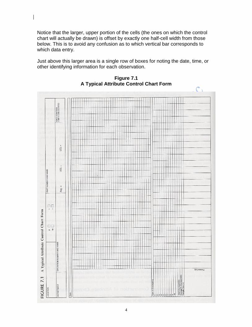
bank form, a geographical area in which one or more accidents can occur in a hospital, or a time period in which warranty claims are made. c Chart. A c chart is used to control the number of times a particular characteristic, such as defects, appears in a constant area of opportunity. A constant area of opportunity is one in which each subgroup used in constructing the control chart provides the same area or number of places in which the characteristic of interest may occur. For example, defects per air conditioner, accidents per workweek in a factory, and deaths per week in a city all provide an approximately constant area of opportunity for the characteristic of interest to occur. The area of opportunity is a subgroup of constant size, whether it is the air conditioner, the factory workweek, or the week in the city. u Chart. A u chart serves the same basic function as a c chart, but it is used when the area of opportunity changes from subgroup to subgroup. For example, we may examine varying square footage of paper selected from rolls of paper for blemishes, or carloads of lumber for damage when the contents of the rail cars vary from rail car to rail car. 7.2.3 Manual Construction of Attribute Control Charts Whether data is collected manually or electronically, standard forms exist for the construction of attribute control charts. Although there may be some slight individualizing from firm to firm, certain standard areas are almost always provided on the forms. Figure 7.1 shows an example of an attribute control chart form. In the upper left corner the plant/factory/office location is entered; then just to the right the type of control chart is noted. The next box requires information on the part name and number. Other identifying entries include the department and the operation number and name. The next two boxes provide space to enter the process average, UCL, and LCL plus the date on which they were calculated. At the bottom of the page are spaces for entering the total number of discrepancies, or defects; the percentage, or fraction, of discrepancies; and the sample, or subgroup, size, n. Also included is a process log sheet (a diary of defects and circumstances that may affect the process) to help identify possible sources of variation. There are ten cells directly above these for listing the type of discrepancy, usually by code number because of space constraints on the form. The large open area on the left is for calibration and identification of the control chart's scale. The scale should be created to accommodate all observed and anticipated data entries. The control limits should fall well within the created scale, leaving room left for any points beyond the control limits to be entered on the graph.
4
Notice that the larger, upper portion of the cells (the ones on which the control chart will actually be drawn) is offset by exactly one half-cell width from those below. This is to avoid any confusion as to which vertical bar corresponds to which data entry. Just above this larger area is a single row of boxes for noting the date, time, or other identifying information for each observation.
Figure 7.1 A Typical Attribute Control Chart Form
7.2.4 Computerized Construction of Attribute Control Charts Using Minitab Attribute control charts can be created using Minitab. Appendix A7.1 provides detailed instructions on how to use Minitab to create attribute control charts.
7.3 Classification Charts Defect prevention, the second step in the journey toward quality consciousness, relies on the use of attribute control charts to help to begin to reduce the difference between customer specifications and process performance. When the data are in the form of classifications, either a p chart or an np chart is used. 7.3.1 Conditions for Use When each unit can be classified as either conforming or nonconforming (or defective or not defective), or having some characteristic of interest or not, a classification chart is appropriate. Samples of n items are periodically selected from process output. For these n distinct units comprising a subgroup: 1. Each unit must be classifiable as either possessing or not possessing the
characteristic of interest. For example, each unit in a subgroup might be classified as either defective or non-defective, or conforming or nonconforming. The number of units possessing the characteristic of interest is called the count, X.
2. The probability that a unit possesses the characteristic of interest is assumed to be stable from unit to unit.
3. Within a given area of opportunity, the probability that a given unit possesses the characteristic of interest is assumed to be independent of whether any other unit possesses the characteristic.
For data satisfying these conditions, we may use a p chart or np chart.

5
7.3.2 When Not to Use p Charts or np Charts
Occasionally data based on measurements (variables data) are downgraded into data in terms of conformance or nonconformance (attribute data). This is not a good practice because the data based on measurements can provide more information than the data based on conformance or nonconformance. It is also important that the denominator in the fraction being charted is the proper area of opportunity. If it is not, then the data are not truly a proportion but a ratio. For example, the fraction of defectives found on the second shift will be a useful proportion only if it is computed by dividing the number of defectives found on the second shift by the proper area of opportunity: the number of units produced on the second shift. If a ratio is created using the number of defectives found on the second shift divided by the number of items shipped by the second shift, there is no way of knowing that the items shipped during the second shift were all produced on the second shift. Some items shipped on the second shift may have been produced during the first shift and therefore this may be an inappropriate area of opportunity. Last, we must exercise caution to ensure that the control chart is being created for a single process. Control charting output from combined different processes will result in irrational subgroups that will not enable us to distinguish special from common causes of variation. Little if anything can be learned from such charts and the net effect may be a masking of special causes of variation. 7.3.3 Constructing Classification Charts
An adaptation of the Deming Cycle, discussed in Chapter 2, may be used to construct and interpret a p chart or np chart. I. Plan a. The process to be studied using the control chart must be named and
flowcharted. b. The purpose of the chart must be determined. c. The characteristic to be charted must be selected and operationally defined. d. The manner, size, and frequency of subgroup selection must be established. e. The type of chart (i.e., p chart or np chart) must be established. f. Forms for recording and constructing the control chart must be established. II. Do a. Data must be recorded either manually onto control chart paper or
electronically onto an Excel or Minitab worksheet; see Appendix 7 for instructions on using Minitab to create attributes control charts.
b. The fraction of items with the characteristic of interest must be calculated for each of the subgroups, either manually or electronically by Minitab.
c. The average value must be calculated, either manually or electronically by Minitab.

6
d. The control limits and zone boundaries must be calculated and plotted onto the control chart, either manually or electronically by Minitab.
e. The data points must be entered on the control chart, either manually or electronically by Minitab.
III. Study a. The control chart must be examined for indications of special causes of
variation, either manually or electronically using the Test option in Minitab. b. All aspects of the control chart must be reviewed periodically and appropriate
changes made when required. IV. Act a. Actions must be undertaken to bring the process under control by eliminating
any negative special causes of variation, or instilling any positive special causes of variation.
b. Actions must be undertaken to reduce the causes of common variation for the purpose of never-ending improvement of the process.
c. Specifications must be reviewed in relation to the capability of the process. d. The purpose of the control chart must be reconsidered by returning to the
Plan stage. The Plan Stage. The first step in the Plan stage is to name and flowchart the process to be studied using the control chart. The second step in the Plan stage is to determine the purpose of the chart. 1. For data at the process level, a p chart or np chart may be created to search
for special causes of variation in a chaotic system, or to search for the common causes of variation in a stable system.
2. For data that has been aggregated over two or more processes, a p chart or np chart may be used to keep management from over-reacting to common causes of variation.
The third step in the Plan stage is to select and operationally define the characteristic for control charting. Very often a single item possesses several characteristics, any of which may cause the item to be considered defective or nonconforming. Generally, a single chart will be kept for the entire item, but frequently separate charts will be kept for individual characteristics. It is usually efficient to concentrate initial efforts on control charts for the characteristics that cause problems for the customer and are within control of the process owner studying the problem. Some of the techniques to be discussed in Chapter 10, such as brainstorming, may be useful in selecting the characteristics to be charted. The fourth step in the Plan stage is to determine the manner, size, and frequency for the selection of subgroups. The subgroup size is the number of items to be

7
observed at each sampling to determine the fraction conforming or nonconforming. As we will see in Chapter 8, rational subgroups should be selected to minimize within-subgroup variation. Frequently subgroups are selected in the order of production or over time. The decisions concerning the method of selection and the factors to be isolated will require careful planning by those individuals with knowledge of, and experience with, the process. Early efforts may need revision as a result of unexpected factors that may be revealed while developing the control chart. This may lead to the creation of several charts where only one was initially contemplated, but this may be of use in resolving special causes of variation and reducing common variation in the areas charted. The necessary subgroup size will be discussed later in this chapter, in section 7.4.4. The frequency with which the subgroups are selected is generally specific to each situation and depends upon factors such as the rate of production, elapsed time, and shift duration. The frequency should be logical in terms of shifts, time periods, or any other rational grouping. The shorter the intervals between subgroups, the more quickly information may be fed back for possible action. Cost will naturally be a factor, but after process stability has been established, frequency of subgroup selection can often be decreased and efforts focused elsewhere. The fifth step in the Plan stage is to decide whether to use a p chart or an np chart. There is no substantive difference between these two charts. The information portrayed is essentially the same; only the form is different. The p chart displays the fraction with the characteristic of interest, while the np chart displays the number of items with that characteristic of interest. From a technical standpoint, they may be used interchangeably. Nevertheless, as the np chart permits the data to be entered as whole numbers (rather than as the ratio of the number of nonconforming items to the subgroup size), the np chart may be preferable. However, as we will discuss later in this chapter, if subgroup size varies from subgroup to subgroup, a p chart is typically used. The final step in the Plan stage is to select the control chart form. Standard forms are available from the American Society for Quality Control for attribute control charts. [American Society for Quality] Many firms have developed their own forms, such as the one in Figure 7.1. Alternatively, Minitab may be used to construct the control chart form, as described in Appendix A7.1. Occasionally, supplemental forms, or check sheets, are used to collect the initial data, as shown in Figure 7.2. The data are then transferred to a control chart. This technique may be especially convenient if the control chart is to be drawn at another time or with the aid of a computer or if the work environment is not suitable for drawing the chart.
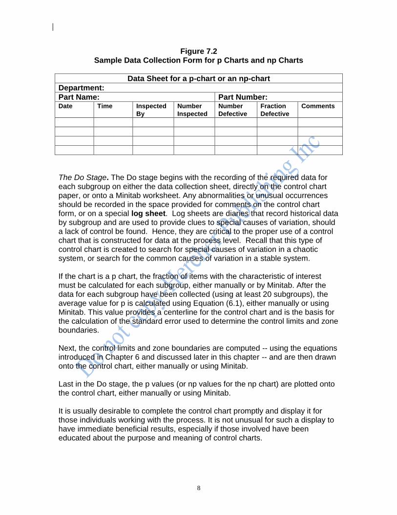
8
Figure 7.2 Sample Data Collection Form for p Charts and np Charts
Data Sheet for a p-chart or an np-chart
Department:
Part Name: Part Number: Date Time Inspected
By
Number
Inspected
Number
Defective
Fraction
Defective
Comments
The Do Stage. The Do stage begins with the recording of the required data for each subgroup on either the data collection sheet, directly on the control chart paper, or onto a Minitab worksheet. Any abnormalities or unusual occurrences should be recorded in the space provided for comments on the control chart form, or on a special log sheet. Log sheets are diaries that record historical data by subgroup and are used to provide clues to special causes of variation, should a lack of control be found. Hence, they are critical to the proper use of a control chart that is constructed for data at the process level. Recall that this type of control chart is created to search for special causes of variation in a chaotic system, or search for the common causes of variation in a stable system. If the chart is a p chart, the fraction of items with the characteristic of interest must be calculated for each subgroup, either manually or by Minitab. After the data for each subgroup have been collected (using at least 20 subgroups), the average value for p is calculated using Equation (6.1), either manually or using Minitab. This value provides a centerline for the control chart and is the basis for the calculation of the standard error used to determine the control limits and zone boundaries. Next, the control limits and zone boundaries are computed -- using the equations introduced in Chapter 6 and discussed later in this chapter -- and are then drawn onto the control chart, either manually or using Minitab. Last in the Do stage, the p values (or np values for the np chart) are plotted onto the control chart, either manually or using Minitab. It is usually desirable to complete the control chart promptly and display it for those individuals working with the process. It is not unusual for such a display to have immediate beneficial results, especially if those involved have been educated about the purpose and meaning of control charts.
9
The Study Stage. Using the rules introduced in Chapter 6 and detailed in Chapter 9, we either manually examine the control chart from right to left (looking backward in time) for indications of a lack of control, or use Minitab to examine the data for a lack of control. Any special causes are appropriately noted on the control chart. Periodically the centerline, control limits, and zone boundaries should be reviewed. Timing of the review, of course, depends on the process and its history. Typically p charts and np charts are kept for long periods of time. Any change in the process is cause to consider a review of chart parameters. The Act Stage. Indications of special sources of variation may be revealed during the Study stage. If any special sources of variation are found, steps must be initiated to remove the sources if they are bad, or incorporate them into the process if they are good. This is accomplished by creating a revised flowchart of the process that utilizes the modifications required to resolve any special causes of variation. It is not uncommon for supervisors or foremen to already be aware of problem areas; the control chart helps to discover the cause and reinforce arguments for improvement. Furthermore, control charts help focus attention on areas needing immediate help. If it appears there is a lack of control on the desirable side of the chart, it is a good practice to examine the inspection procedures; faulty inspection procedures may be to blame. On the other hand, perhaps a special cause is responsible for points on the desirable side of the chart that should be formally incorporated into the process -- that is, improvements may have spontaneously occurred in the process that, once discovered, should be incorporated. Although a control chart may reveal no indications of special causes of variation, the overall level of the fraction or number of items with the characteristic of interest may not be at a satisfactory level (the threshold state). Other tools and techniques, such as Cause and Effect diagrams and Pareto analysis, to be discussed in Chapter 10, may be used in an attempt to reduce the high fraction of nonconforming items as the PDSA cycle rolls as a wheel up the hill of never-ending process improvement. In the drive toward never-ending improvement, no level of defectives is low enough. Nevertheless, as the proportion of defectives shrinks as a result of efforts at process improvement, then subgroups will often contain no defectives. This will make the use of p charts or np charts difficult to use because of the large subgroup sizes needed to detect even a single defective item. This leads to the use of variables control charts, which we discuss in Chapter 8. Last in the Act stage is the reconsideration of the purpose of the control chart. We return to the beginning of the Plan stage, where the cycle begins again.
10
7.4 The p Chart for Constant Subgroup Sizes
In Chapter 6 we saw an example of a p chart with a constant subgroup size. Constant subgroup size implies that the same number of items is sampled and then classified for each subgroup on the chart. We use a discrete, countable characteristic of output to construct a p chart; for example, the fraction of customers who pay their bills in fewer than 30 days, the fraction of correspondence sent electronically, or the fraction of an airline's flights that arrive within 15 minutes of their scheduled arrival time. 7.4.1 The Centerline and Control Limits For a stable process, categorization of data into two classes suggests that every item has approximately the same probability of being in one of the two categories. We say approximately because even stable processes exhibit variation.
The centerline for the p chart is established at p , the overall fraction of output
that was nonconforming, as given by Equation (7.1). The upper control limit and the lower control limit are found by adding and subtracting three times the standard deviation of the faction defective (given by Equation (7.2)) from the centerline value using Equations (7.3) and (7.4).
(7.3) n
)p-(1p3-ppLCL(p)
(7.2) n
)p-(1p3ppUCL(p)
(7.1) ioninvestigatunder subgroups allin examined units ofnumber Total
ioninvestigatunder subgroups allin defectives ofnumber Totalp(p)Centerline
7.4.2 Construction of a p chart: An Example As an illustration, consider the case of an importer of decorative ceramic tiles. Some tiles are cracked or broken before or during transit, rendering them useless scrap. The fraction of cracked or broken tiles is naturally of concern to the firm. Each day a sample of 100 tiles is drawn from the total of all tiles received from each tile vendor. Table 7.1 presents the sample results for 30 days of incoming shipments for a particular vendor.
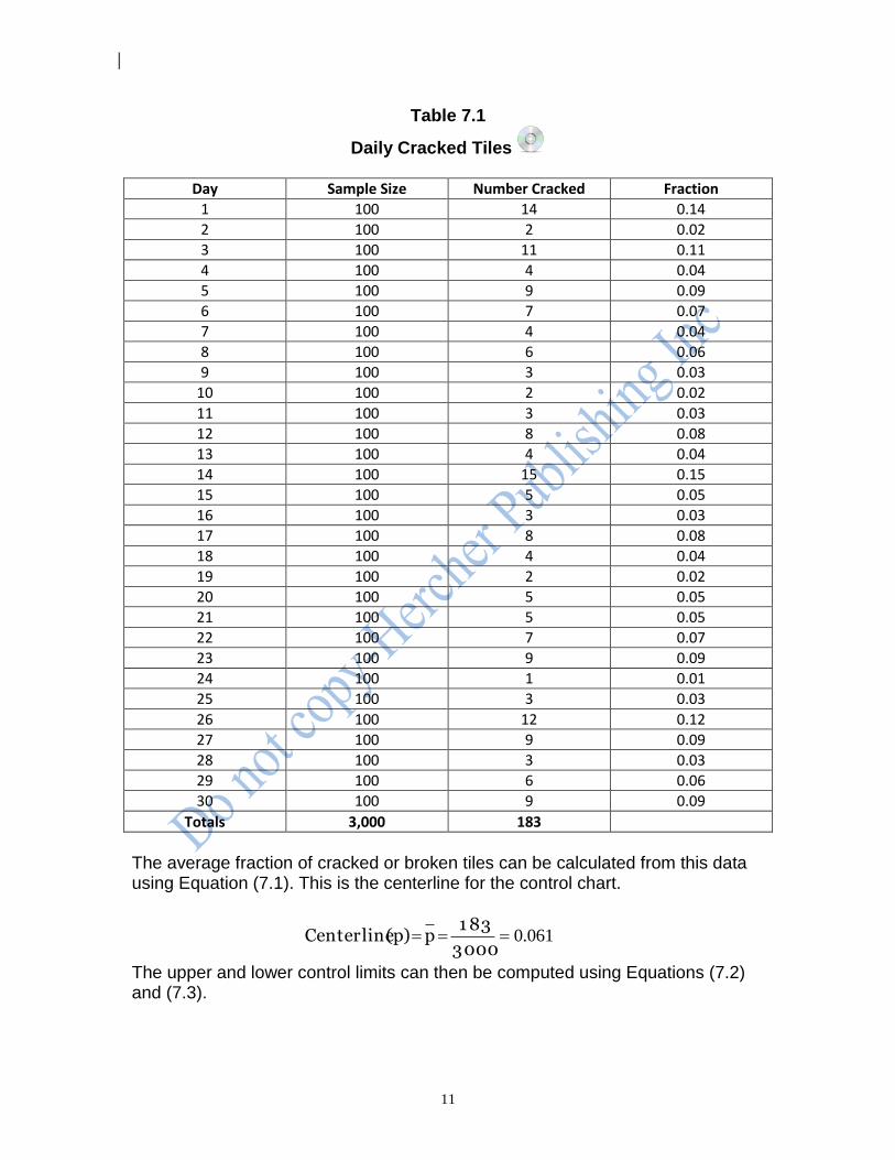
11
Table 7.1
Daily Cracked Tiles
Day Sample Size Number Cracked Fraction 1 100 14 0.14 2 100 2 0.02 3 100 11 0.11 4 100 4 0.04 5 100 9 0.09 6 100 7 0.07 7 100 4 0.04 8 100 6 0.06 9 100 3 0.03
10 100 2 0.02 11 100 3 0.03 12 100 8 0.08 13 100 4 0.04 14 100 15 0.15 15 100 5 0.05 16 100 3 0.03 17 100 8 0.08 18 100 4 0.04 19 100 2 0.02 20 100 5 0.05 21 100 5 0.05 22 100 7 0.07 23 100 9 0.09 24 100 1 0.01 25 100 3 0.03 26 100 12 0.12 27 100 9 0.09 28 100 3 0.03 29 100 6 0.06 30 100 9 0.09
Totals 3,000 183
The average fraction of cracked or broken tiles can be calculated from this data using Equation (7.1). This is the centerline for the control chart.
061.03000
1 83 p (p)Centerline
The upper and lower control limits can then be computed using Equations (7.2) and (7.3).
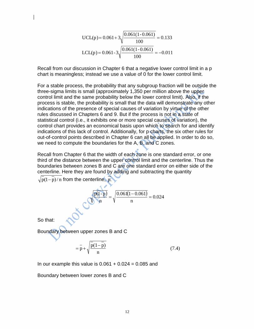
12
011.0100
0.061)-0.061(13-061.0LCL(p)
133.0100
0.061)-0.061(13061.0UCL(p)
Recall from our discussion in Chapter 6 that a negative lower control limit in a p chart is meaningless; instead we use a value of 0 for the lower control limit. For a stable process, the probability that any subgroup fraction will be outside the three-sigma limits is small (approximately 1,350 per million above the upper control limit and the same probability below the lower control limit). Also, if the process is stable, the probability is small that the data will demonstrate any other indications of the presence of special causes of variation by virtue of the other rules discussed in Chapters 6 and 9. But if the process is not in a state of statistical control (i.e., it exhibits one or more special causes of variation), the control chart provides an economical basis upon which to search for and identify indications of this lack of control. Additionally, for p charts, the six other rules for out-of-control points described in Chapter 6 can all be applied. In order to do so, we need to compute the boundaries for the A, B, and C zones. Recall from Chapter 6 that the width of each zone is one standard error, or one third of the distance between the upper control limit and the centerline. Thus the boundaries between zones B and C are one standard error on either side of the centerline. Here they are found by adding and subtracting the quantity
n/)p1(p from the centerline, .p
024.0
n
0.06110.061
n
p-1p
So that: Boundary between upper zones B and C
(7.4) n
)p(1pp
In our example this value is 0.061 + 0.024 = 0.085 and Boundary between lower zones B and C
13
(7.5) n
)p(1pp
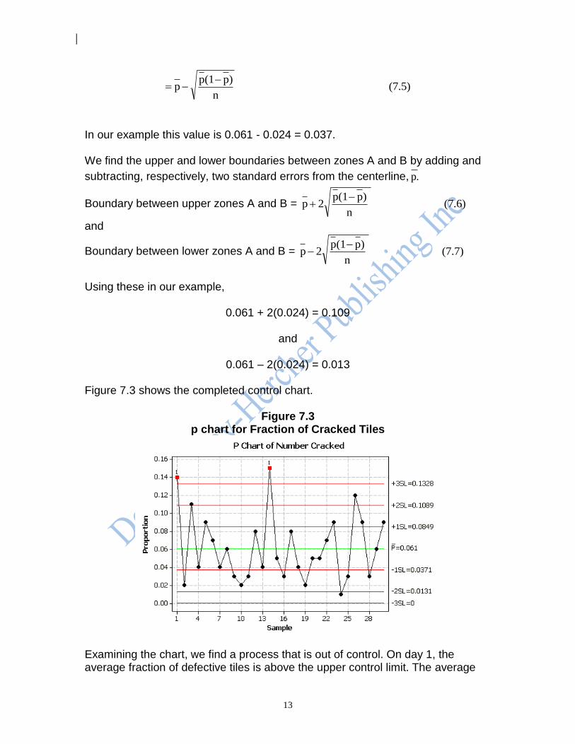
In our example this value is 0.061 - 0.024 = 0.037. We find the upper and lower boundaries between zones A and B by adding and
subtracting, respectively, two standard errors from the centerline, .p
Boundary between upper zones A and B = (7.6) n
)p(1p2p
and
Boundary between lower zones A and B = (7.7) n
)p(1p2p
Using these in our example,
0.061 + 2(0.024) = 0.109
and
0.061 – 2(0.024) = 0.013 Figure 7.3 shows the completed control chart.
Figure 7.3 p chart for Fraction of Cracked Tiles
Examining the chart, we find a process that is out of control. On day 1, the average fraction of defective tiles is above the upper control limit. The average
14
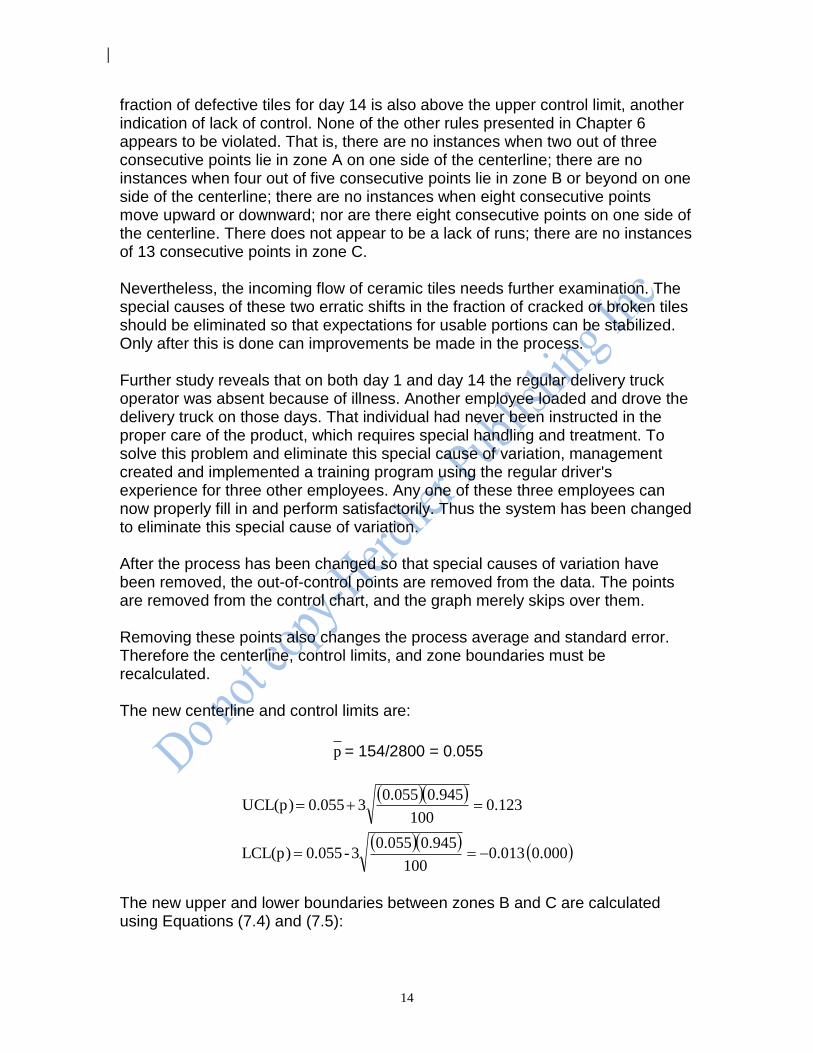
fraction of defective tiles for day 14 is also above the upper control limit, another indication of lack of control. None of the other rules presented in Chapter 6 appears to be violated. That is, there are no instances when two out of three consecutive points lie in zone A on one side of the centerline; there are no instances when four out of five consecutive points lie in zone B or beyond on one side of the centerline; there are no instances when eight consecutive points move upward or downward; nor are there eight consecutive points on one side of the centerline. There does not appear to be a lack of runs; there are no instances of 13 consecutive points in zone C. Nevertheless, the incoming flow of ceramic tiles needs further examination. The special causes of these two erratic shifts in the fraction of cracked or broken tiles should be eliminated so that expectations for usable portions can be stabilized. Only after this is done can improvements be made in the process. Further study reveals that on both day 1 and day 14 the regular delivery truck operator was absent because of illness. Another employee loaded and drove the delivery truck on those days. That individual had never been instructed in the proper care of the product, which requires special handling and treatment. To solve this problem and eliminate this special cause of variation, management created and implemented a training program using the regular driver's experience for three other employees. Any one of these three employees can now properly fill in and perform satisfactorily. Thus the system has been changed to eliminate this special cause of variation. After the process has been changed so that special causes of variation have been removed, the out-of-control points are removed from the data. The points are removed from the control chart, and the graph merely skips over them. Removing these points also changes the process average and standard error. Therefore the centerline, control limits, and zone boundaries must be recalculated. The new centerline and control limits are:
p = 154/2800 = 0.055
000.0 013.0
100
945.00.0553-0.055LCL(p)
123.0100
0.9450.05530.055UCL(p)
The new upper and lower boundaries between zones B and C are calculated using Equations (7.4) and (7.5):
15
Boundary between upper zones B and C = 078.0100
)945.0)(055.0(055.0
Boundary between lower zones B and C = 032.0100
)945.0)(055.0(055.0
The new upper and lower boundaries between zones A and B are calculated using Equations (7.6) and (7.7):
Boundary between upper zones A and B = 101.0100
)945.0)(055.0(2055.0
Boundary between lower zones A and B = 009.0100
)945.0)(055.0(2055.0
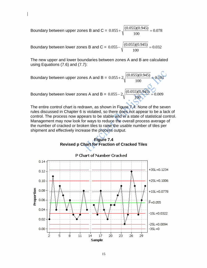
The entire control chart is redrawn, as shown in Figure 7.4. None of the seven rules discussed in Chapter 6 is violated, so there does not appear to be a lack of control. The process now appears to be stable and in a state of statistical control. Management may now look for ways to reduce the overall process average of the number of cracked or broken tiles to raise the usable number of tiles per shipment and effectively increase the process output.
Figure 7.4 Revised p Chart for Fraction of Cracked Tiles
16
7.4.3 Iterative Reevaluations It is possible -- and not at all uncommon -- that by changing the process, removing points that were out of control, and recomputing the control limits and zone boundaries, points that initially exhibited only common variation will now indicate a lack of control. If and when this happens, the system must again be reevaluated to eliminate the newly revealed special causes of variation. This may once again uncover even more indications of a lack of control, which also must be removed from the system. Analysis of the process will continue to iterate in this manner until there no longer appears to be a lack of control. Keep in mind that in the course of these iterations, some of the data will be discarded. Hence the data base will shrink, and the control chart will be based on fewer and fewer subgroups. Furthermore, as changes are made, the process may no longer resemble the original process. We must also keep in mind that if control limits are recalculated too frequently (as might be the temptation with automatic data processing available with many computer control routines), it becomes possible to mistake common variation for special variation. This effect parallels the over-steering many new drivers experience when first learning to drive a car. Knowledge and experience with the process are the best guides here. As a general rule, control chart statistics are recomputed whenever there is a change to the process. At some point a decision must be made to stop analyzing the original data and collect new data. There is no explicit rule for the point at which this should be done; only knowledge and experience with the process can dictate when to stop analyzing previous data and begin collecting and analyzing new data. 7.4.4 Subgroup Size When constructing a p chart, the subgroup size is much larger than that required for variables control charts. This is because the sample size must be large enough that some nonconforming items are likely to be included in the subgroup. If, for example, a process produces 1.0 percent defectives, sample subgroups of size 10 will only occasionally contain a nonconforming item. As a general rule of thumb, control charts based on classification count data should have sample sizes large enough so that the average count per subgroup is at least 2.00. This allows the A, B, and C zones to be wide enough to provide a reasonable working region into which data points may fall for analysis. This is true for both the p chart and the np chart, which we discuss later in this chapter. Consider, for example, a process producing 5 percent of its output with a
particular characteristic of interest (i.e., p = 0.05). Subgroups of size 20 yield an
average count of only 20(0.05) = 1.0. Further, each subgroup would have an integer number of counts, yielding fractions in increments of 5 percent. The

17
centerline would be at 0.050, the lower control limit would be at 0.000, and the upper control limit would be at
196.020
)05.01)(05.0(305.0
Only fractions of 0.00, 0.05, 0.10 and 0.15 would fall within the control limits. Examining patterns such as runs up or down would not be practical; finding eight points moving upward or downward would almost always be redundant because the beginning or end of the run would be beyond the upper control limit and would indicate a lack of control for that reason. Clearly we would not be able to learn too much from a p chart based on a subgroup size of 20 items with its centerline at 0.05. Similarly, samples taken from a process producing nonconforming items at a rate of only 1 percent would require samples of 200 to have an average count of 2.00. Even with samples of size 200, samples would provide counts of 0, 1, 2, and so on for subgroup fractions in increments of 0.005. With a centerline at 0.01, the p chart would not be very detailed and might not provide satisfactory indications of a lack of control. Average subgroup counts of fewer than 2.00 present problems that can become extreme, especially if the average count per subgroup falls below 1.00. Hence, subgroups must be made large enough so that the average count is at least 2.00. Ideally, subgroup sizes should remain the same for all subgroups, but occasionally circumstances require variations in subgroup size. Whether the subgroup size for a p chart varies or remains constant, the larger the subgroup size, the narrower the control limits will be. This is because the subgroup size, n, appears in the denominator of the expression for the standard error; the larger the value for n, the narrower the width of the control limits and zones A, B, and C around the process average will be. 7.4.5 Subgroup Frequency Every process goes through physical cycles, such as shifts and ordering sequences. p chart and np chart calculations must be based on a sufficient number of subgroups to encompass all of the cycles of a process to include all possible sources of variation. Subgroup data should be collected at a frequency greater than the frequency at which the process can change. This frequency is determined by a process expert. 7.4.6 Number of Subgroups As a rule of thumb, the number of subgroups should be at least 25 for p charts and np charts.
18
7.4.7 Subgroups Not Based on Time It is possible to construct control charts for rational subgroups that do not represent chronological events. For example, a p chart for the fraction defective produced by a battery of 100 machines performing the same task (such as spot welding) might be kept on a single control chart for a given month. In these situations, the number of subgroups must encompass all machines to encompass all possible sources of variation. Additionally, the rules concerning indications of a lack of control by virtue of trends over time in the data -- such as two out of three consecutive points in zone A or four out of five consecutive points in zone B or beyond -- should be ignored. 7.4.8 Construction of a p Chart: Another Example An injection molding process provides a bracket to be used on aircraft passenger seats. Daily samples of 500 brackets are selected from the production output and examined carefully for cracks, splits, or other imperfections that will render them defective. Table 7.2 lists the results.
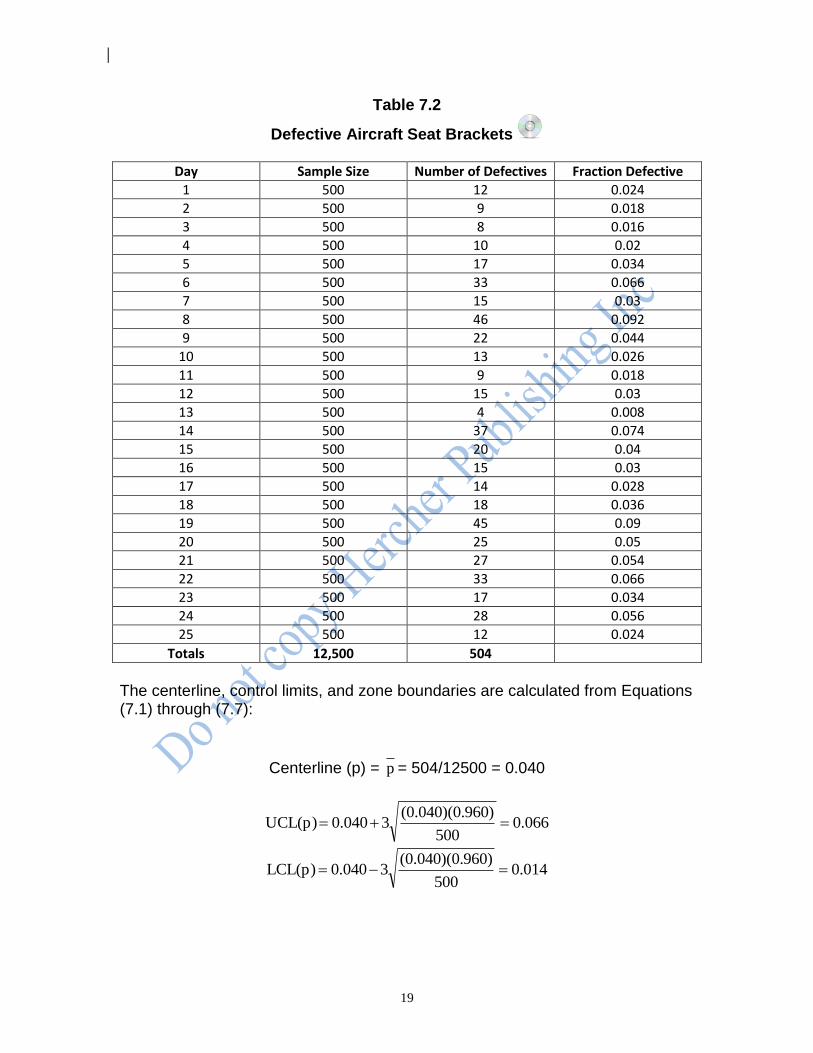
19
Table 7.2
Defective Aircraft Seat Brackets
Day Sample Size Number of Defectives Fraction Defective 1 500 12 0.024 2 500 9 0.018 3 500 8 0.016 4 500 10 0.02 5 500 17 0.034 6 500 33 0.066 7 500 15 0.03 8 500 46 0.092 9 500 22 0.044
10 500 13 0.026 11 500 9 0.018 12 500 15 0.03 13 500 4 0.008 14 500 37 0.074 15 500 20 0.04 16 500 15 0.03 17 500 14 0.028 18 500 18 0.036 19 500 45 0.09 20 500 25 0.05 21 500 27 0.054 22 500 33 0.066 23 500 17 0.034 24 500 28 0.056 25 500 12 0.024
Totals 12,500 504
The centerline, control limits, and zone boundaries are calculated from Equations (7.1) through (7.7):
Centerline (p) = p = 504/12500 = 0.040
0.066500
960)(0.040)(0.30.040UCL(p)
40.01500
960)(0.040)(0.30.040LCL(p)
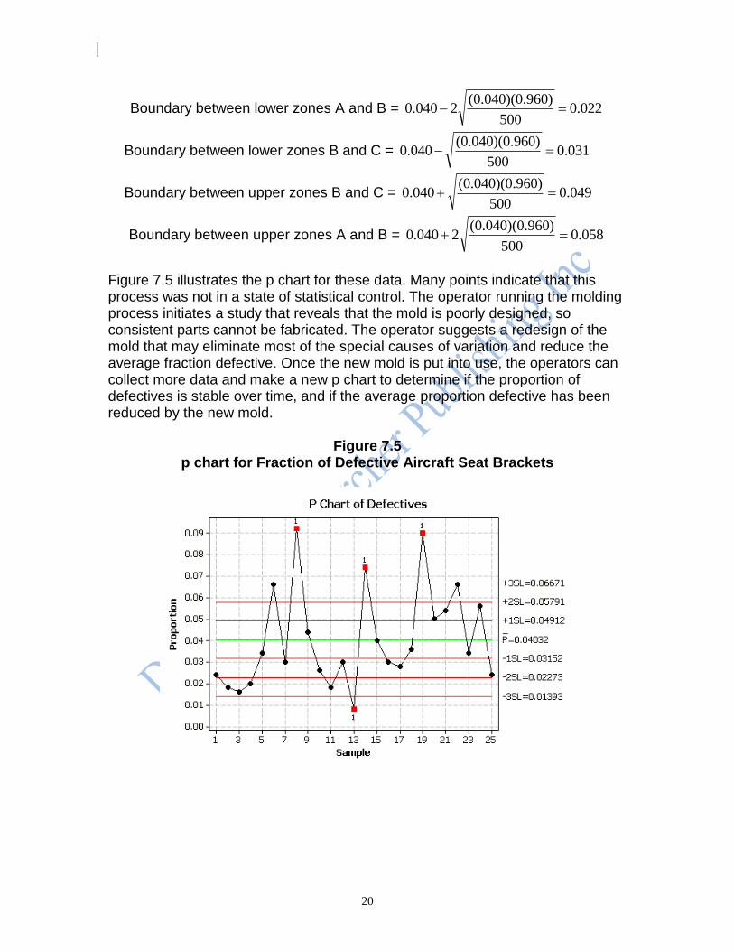
20
Boundary between lower zones A and B = 022.0500
)960.0)(040.0(2040.0
Boundary between lower zones B and C = 031.0500
)960.0)(040.0(040.0
Boundary between upper zones B and C = 049.0500
)960.0)(040.0(040.0
Boundary between upper zones A and B = 058.0500
)960.0)(040.0(2040.0
Figure 7.5 illustrates the p chart for these data. Many points indicate that this process was not in a state of statistical control. The operator running the molding process initiates a study that reveals that the mold is poorly designed, so consistent parts cannot be fabricated. The operator suggests a redesign of the mold that may eliminate most of the special causes of variation and reduce the average fraction defective. Once the new mold is put into use, the operators can collect more data and make a new p chart to determine if the proportion of defectives is stable over time, and if the average proportion defective has been reduced by the new mold.
Figure 7.5 p chart for Fraction of Defective Aircraft Seat Brackets

21
7.5 The p Chart for Variable Subgroup Sizes
Sometimes subgroups vary in size. This makes the manual construction of a p
chart somewhat more tedious. The standard error,n
)p-(1p, varies inversely with
the sample size. That is, as the sample size increases, the standard error decreases, and vice versa. Control limits and zone boundaries are calculated based on the standard error. Consequently, as the sample size changes so will the control limits and the zone boundaries. 7.5.1 Using Varying Control Limits: An Example When sample sizes vary from subgroup to subgroup, we calculate new zone boundaries and control limits for each subgroup. Consider, for example, the case of a highway toll barrier with two types of toll collection mechanisms: automatic and manned. The automatic lanes require exact change or a transponder while the manned lanes do not. The fraction of vehicles arriving with exact change or a transponder is examined using a control chart for a series of rush hour intervals on consecutive weekdays. As the number of vehicles passing through the toll barrier varies from day to day, the control limits change day to day. One-hour periods (7:30 to 8:30 am) for 20 consecutive weekdays yield the data in Table 7.3.
Table 7.3
Number of Vehicles Using Exact Change
Day n Number with
Exact Change
Day n Number with
Exact Change
1 465 180 11 406 186
2 123 38 12 415 149
3 309 142 13 379 90
4 83 20 14 341 148
5 116 35 15 258 107
6 306 108 16 270 84
7 333 190 17 480 185
8 265 106 18 350 184
9 354 94 19 433 210
10 256 116 20 479 197
Totals 6,421 2,569
Using these data, p , the centerline, can be calculated from Equation (7.1) as
Centerline(p)= p = 2569/6421=0.400
22
We can also calculate each UCL, LCL, and zone boundary using Equations (7.2) through (7.7). For example, for the first data point,
0.468465
0.40)-(0.40)(130.40UCL(p)
3320.465
0.40)-(0.40)(130.40LCL(p)
Boundary between lower zones A and B = 355.0465
)40.01)(040.0(240.0
Boundary between lower zones B and C = 0.377465
0.40)-(0.40)(1-0.40
Boundary between upper zones A and B = 0.423465
0.40)-(0.40)(120.40
Boundary between upper zones B and C = 0.423465
0.40)-(0.40)(10.40
Since subgroup sizes vary, these control limits and zone boundaries are only valid for the first observation, where n = 465. Each subgroup will have its own control limits and zone boundaries. Table 7.4 shows the results of calculating these in the same manner as for the first point.
23
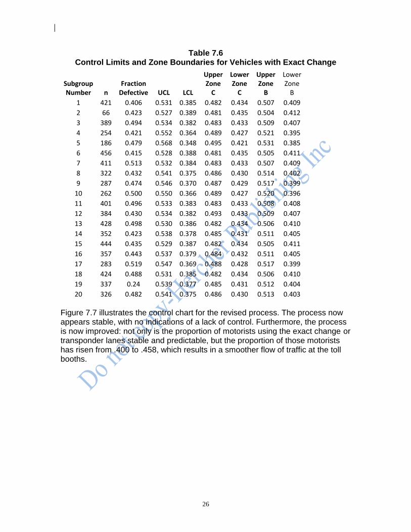
Table 7.4 Control Limits and Zone Boundaries for Vehicles with Exact Change
Subgroup Number n
Fraction Defective UCL LCL
Upper Zone
C
Lower Zone
C
Upper Zone
B
Lower Zone
B
1 465 0.387 0.468 0.332 0.423 0.377 0.446 0.354
2 123 0.309 0.533 0.267 0.444 0.356 0.488 0.312
3 309 0.460 0.484 0.316 0.428 0.372 0.456 0.344
4 83 0.241 0.561 0.239 0.454 0.345 0.508 0.292
5 116 0.302 0.536 0.264 0.445 0.355 0.491 0.309
6 306 0.353 0.484 0.316 0.428 0.372 0.456 0.344
7 333 0.571 0.481 0.319 0.427 0.373 0.454 0.346
8 265 0.400 0.490 0.310 0.430 0.370 0.460 0.340
9 354 0.266 0.478 0.322 0.426 0.374 0.452 0.348
10 256 0.453 0.492 0.308 0.431 0.369 0.461 0.339
11 406 0.458 0.473 0.327 0.424 0.376 0.449 0.351
12 415 0.359 0.472 0.328 0.424 0.376 0.448 0.352
13 379 0.237 0.475 0.325 0.425 0.375 0.450 0.350
14 341 0.434 0.480 0.320 0.427 0.373 0.453 0.347
15 258 0.415 0.491 0.309 0.430 0.370 0.461 0.339
16 270 0.311 0.489 0.311 0.430 0.370 0.46 0.340
17 480 0.385 0.467 0.333 0.422 0.378 0.445 0.355
18 350 0.526 0.479 0.321 0.426 0.374 0.452 0.348
19 433 0.485 0.471 0.329 0.424 0.376 0.447 0.353
20 479 0.411 0.467 0.333 0.422 0.378 0.445 0.355
24
We use these values to draw the control limits and zone boundaries in Figure 7.6. The process indicates many instances of a lack of control. Fully 25 percent of the subgroup proportions are out of control, and the data seem to be behaving in an extremely erratic pattern. Days 19, 18, 13, 9, and 7 are all beyond the control limits. Day 5 also indicates a lack of control because it is the second of three consecutive points falling in zone C or beyond on the same side of the centerline.
Figure 7.6 p Chart for Vehicles with Exact Change
Careful study is warranted to determine the cause or causes of this special variation. Removing the special causes of variation may require some fundamental changes in the way this system operates. Nevertheless, we must eliminate all of the special sources of variation before attempting to reduce the common causes of variation in the process. Changing the Process. Management decides it would be advantageous to remove the erratic patterns in the preceding process. They could better serve the public by having adequate toll lanes of either the automatic or manned type available during rush hours. As a result of brainstorming, management institutes a third option for motorists; the use of electronic toll collection. Motorists using these are rewarded with a discount to encourage their use. Because the process has now been changed, a new set of observations is made. After a period of two months, to allow for transient effects to die down, the same sample selection method is again employed. Results for those subgroups appear in Table 7.5.
25
Table 7.5
Number of Vehicles Using Exact Change, Transponders or Tokens
Day n Number with Exact
Change, Transponder
or Token
Day n Number with Exact
Change, Transponder
or Token
1 421 171 11 401 199
2 466 197 12 384 165
3 389 192 13 428 213
4 254 107 14 352 149
5 186 89 15 444 193
6 456 189 16 357 158
7 411 211 17 283 147
8 322 139 18 424 207
9 287 136 19 337 143
10 262 131 20 326 157
Totals 7,190 3,293
Their corresponding control limits and zone boundaries are shown in Table 7.6.
26
Table 7.6 Control Limits and Zone Boundaries for Vehicles with Exact Change
Subgroup Number n
Fraction Defective UCL LCL
Upper Zone
C
Lower Zone
C
Upper Zone
B
Lower Zone
B
1 421 0.406 0.531 0.385 0.482 0.434 0.507 0.409
2 66 0.423 0.527 0.389 0.481 0.435 0.504 0.412
3 389 0.494 0.534 0.382 0.483 0.433 0.509 0.407
4 254 0.421 0.552 0.364 0.489 0.427 0.521 0.395
5 186 0.479 0.568 0.348 0.495 0.421 0.531 0.385
6 456 0.415 0.528 0.388 0.481 0.435 0.505 0.411
7 411 0.513 0.532 0.384 0.483 0.433 0.507 0.409
8 322 0.432 0.541 0.375 0.486 0.430 0.514 0.402
9 287 0.474 0.546 0.370 0.487 0.429 0.517 0.399
10 262 0.500 0.550 0.366 0.489 0.427 0.520 0.396
11 401 0.496 0.533 0.383 0.483 0.433 0.508 0.408
12 384 0.430 0.534 0.382 0.493 0.433 0.509 0.407
13 428 0.498 0.530 0.386 0.482 0.434 0.506 0.410
14 352 0.423 0.538 0.378 0.485 0.431 0.511 0.405
15 444 0.435 0.529 0.387 0.482 0.434 0.505 0.411
16 357 0.443 0.537 0.379 0.484 0.432 0.511 0.405
17 283 0.519 0.547 0.369 0.488 0.428 0.517 0.399
18 424 0.488 0.531 0.385 0.482 0.434 0.506 0.410
19 337 0.24 0.539 0.377 0.485 0.431 0.512 0.404
20 326 0.482 0.541 0.375 0.486 0.430 0.513 0.403
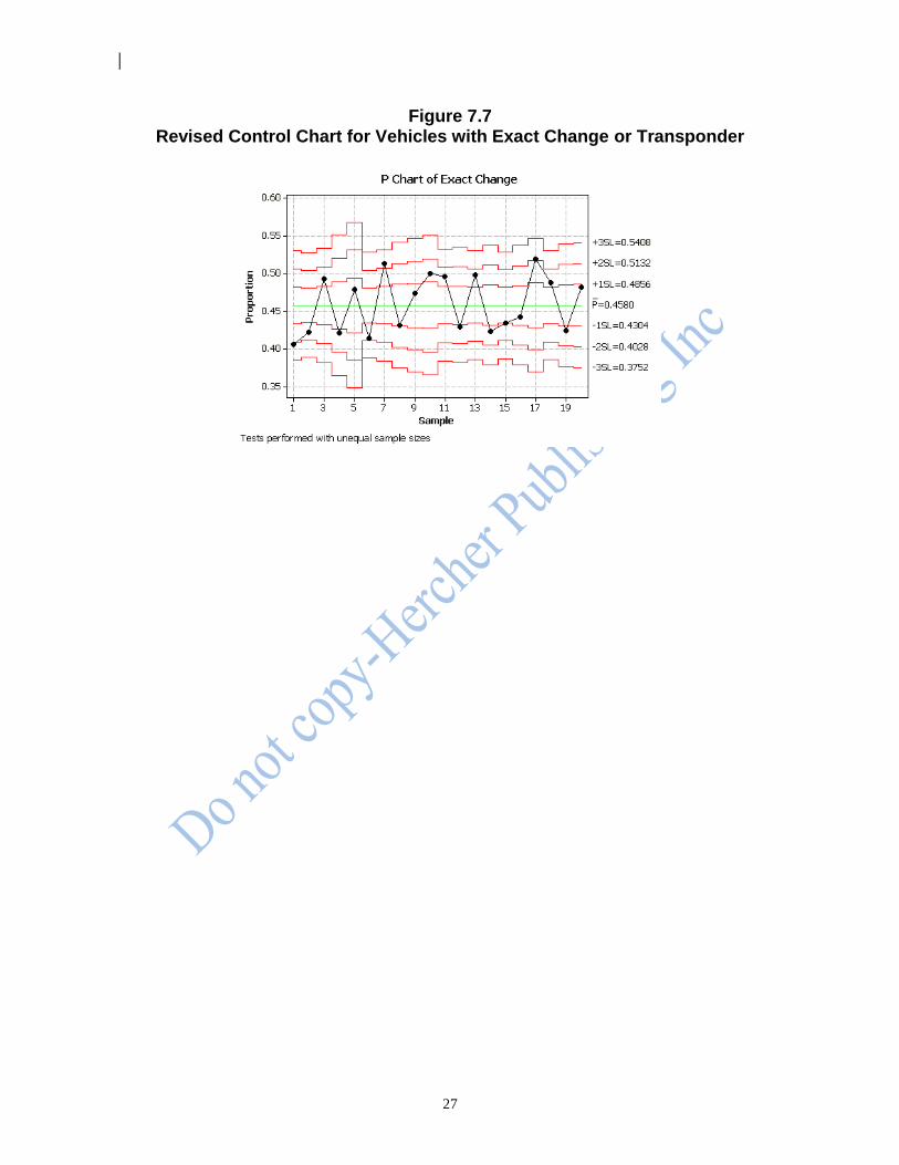
Figure 7.7 illustrates the control chart for the revised process. The process now appears stable, with no indications of a lack of control. Furthermore, the process is now improved: not only is the proportion of motorists using the exact change or transponder lanes stable and predictable, but the proportion of those motorists has risen from .400 to .458, which results in a smoother flow of traffic at the toll booths.
27
Figure 7.7 Revised Control Chart for Vehicles with Exact Change or Transponder
28
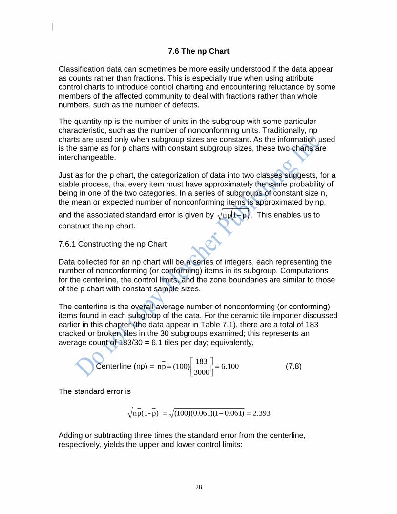
7.6 The np Chart Classification data can sometimes be more easily understood if the data appear as counts rather than fractions. This is especially true when using attribute control charts to introduce control charting and encountering reluctance by some members of the affected community to deal with fractions rather than whole numbers, such as the number of defects.
The quantity np is the number of units in the subgroup with some particular characteristic, such as the number of nonconforming units. Traditionally, np charts are used only when subgroup sizes are constant. As the information used is the same as for p charts with constant subgroup sizes, these two charts are interchangeable. Just as for the p chart, the categorization of data into two classes suggests, for a stable process, that every item must have approximately the same probability of being in one of the two categories. In a series of subgroups of constant size n, the mean or expected number of nonconforming items is approximated by np,
and the associated standard error is given by p1pn . This enables us to
construct the np chart. 7.6.1 Constructing the np Chart Data collected for an np chart will be a series of integers, each representing the number of nonconforming (or conforming) items in its subgroup. Computations for the centerline, the control limits, and the zone boundaries are similar to those of the p chart with constant sample sizes. The centerline is the overall average number of nonconforming (or conforming) items found in each subgroup of the data. For the ceramic tile importer discussed earlier in this chapter (the data appear in Table 7.1), there are a total of 183 cracked or broken tiles in the 30 subgroups examined; this represents an average count of 183/30 = 6.1 tiles per day; equivalently,
Centerline (np) = 100.63000
183(100) pn
(7.8)
The standard error is
393.2)061.01)(061.0)(100( )p-(1pn
Adding or subtracting three times the standard error from the centerline, respectively, yields the upper and lower control limits:
29
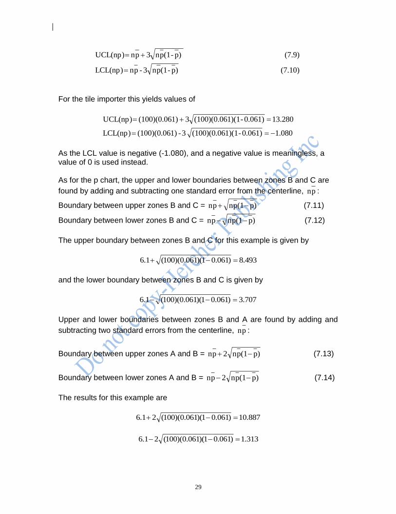
(7.10) )p-(1pn3 - pn LCL(np)
(7.9) )p-(1pn3 pn UCL(np)
For the tile importer this yields values of
080.10.061)-1)(1(100)(0.06 3- 1)(100)(0.06 LCL(np)
280.130.061)-1)(1(100)(0.063 1)(100)(0.06 UCL(np)
As the LCL value is negative (-1.080), and a negative value is meaningless, a value of 0 is used instead. As for the p chart, the upper and lower boundaries between zones B and C are
found by adding and subtracting one standard error from the centerline, pn :
Boundary between upper zones B and C = )p(1pnpn (7.11)
Boundary between lower zones B and C = )p(1pnpn (7.12)
The upper boundary between zones B and C for this example is given by
493.8)061.01)(061.0)(100(1.6
and the lower boundary between zones B and C is given by
707.3)061.01)(061.0)(100(1.6
Upper and lower boundaries between zones B and A are found by adding and
subtracting two standard errors from the centerline, pn :
Boundary between upper zones A and B = )p(1pn2pn (7.13)
Boundary between lower zones A and B = )p(1pn2pn (7.14)
The results for this example are
887.10)061.01)(061.0)(100(21.6
313.1)061.01)(061.0)(100(21.6
30
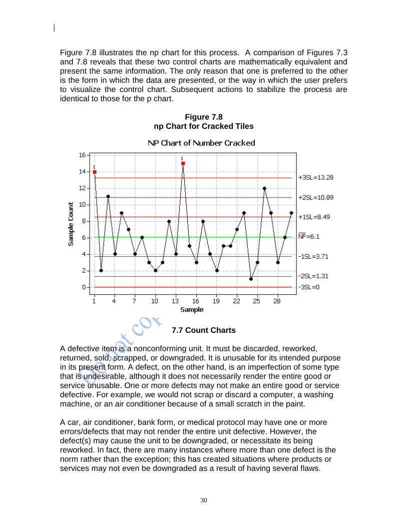
Figure 7.8 illustrates the np chart for this process. A comparison of Figures 7.3 and 7.8 reveals that these two control charts are mathematically equivalent and present the same information. The only reason that one is preferred to the other is the form in which the data are presented, or the way in which the user prefers to visualize the control chart. Subsequent actions to stabilize the process are identical to those for the p chart.
Figure 7.8 np Chart for Cracked Tiles
7.7 Count Charts A defective item is a nonconforming unit. It must be discarded, reworked, returned, sold, scrapped, or downgraded. It is unusable for its intended purpose in its present form. A defect, on the other hand, is an imperfection of some type that is undesirable, although it does not necessarily render the entire good or service unusable. One or more defects may not make an entire good or service defective. For example, we would not scrap or discard a computer, a washing machine, or an air conditioner because of a small scratch in the paint. A car, air conditioner, bank form, or medical protocol may have one or more errors/defects that may not render the entire unit defective. However, the defect(s) may cause the unit to be downgraded, or necessitate its being reworked. In fact, there are many instances where more than one defect is the norm rather than the exception; this has created situations where products or services may not even be downgraded as a result of having several flaws.
31
Naturally, in the quest for improvement, our goal is no defects in our output. Control charting is one of the tools to help achieve this end. When there are multiple opportunities for defects or imperfections in a given unit (such as a geographic area or a time period), we call each such unit an area of opportunity; each area of opportunity is a subgroup. When areas of opportunity are discrete units and a single defect will make the entire unit defective, a p chart or np chart is appropriate. But when areas of opportunity are continuous or very nearly so, and more than one defect may occur in a given area of opportunity, then a c chart or u chart should be used. The c chart is used when the areas of opportunity are of constant size, while the u chart is used when the areas of opportunity are not of constant size. 7.7.1 Conditions for Use Area of opportunity control charts have wide applicability. If we are counting defects, the enamel on an appliance represents a continuous area of opportunity; a roll of cloth or plastic film is a continuous area of opportunity. If we are measuring the number of accidents recorded per week, a week represents a continuous area of opportunity. Measurements of the number of errors per hour in data entry or the number of typographical errors made per page have areas of opportunity (an hour or a page) that present enough opportunities for multiple defects to be considered nearly continuous. Imperfections in a complex piece of machinery, such as a computer, have areas of opportunity that are not strictly continuous; but the large number of individual components involved make the areas of opportunity close enough to continuous to be considered continuous. If we are to use the c charts or u charts, the events we are studying must be describable as discrete events; these events must occur randomly within some well-defined area of opportunity; they should be relatively rare; and they should be independent of each other. Exact conformance to these conditions is not always easy to verify. Usually, it is not too difficult to tell whether the events are discrete and whether there is some well-defined area of opportunity. But whether the events are relatively rare is somewhat subjective and requires process knowledge and experience. The issue of independence is generally revealed by the control chart. That is, if the events are not random and independent, they will tend to form the identifiable special cause of variation patterns that we introduced in Chapter 6 and will discuss further in Chapter 9.
7.8 c Charts The number of events in a constant area of opportunity is denoted by c; the count for each area of opportunity. The sequence of successive c values, taken over subgroups, is used to construct the c chart.

32
The centerline for the chart is the average number of events observed. It is calculated as
(7.15) yopportunit of areas ofNumber
observed events ofnumber Total c (c)Centerline
The standard error is the square root of the mean, c . Adding and subtracting
three times the standard error from the centerline, c , yields the upper and lower control limits. Thus
(7.17) c3 c LCL(c)
(7.16) c3 c UCL(c)
7.8.1 Counts, Control Limits, and Zones As we have already seen with p charts and np charts, when a process is in a state of control, only very rarely will points fall beyond the control limits. Therefore, when a point does fall outside the control limits, we will consider it an indication of a lack of control and take appropriate action. When the lower control limit is calculated to be negative, we will use 0 as the lower control limit because, just as with p charts and np charts, negative numbers of events (such as -3 defects on a radio) are meaningless. Consider a firm that has decided to use a c chart to help keep track of the number of telephone requests received daily for information on a given product. Each day represents an area of opportunity. Over a 30-day period, 1,206
requests are received, or an average of 40.2 per day; that is, c = 40.2. The upper and lower control limits can be found using Equations (7.16) and (7.17):
2.2140.23 40.2 LCL(c)
2.5940.23 40.2 UCL(c)
Actual counts occurring in an area of opportunity will always be whole numbers. Thus a count of 59 is within the control limits, while a count of 60 is beyond the UCL. The A, B, and C zone boundaries are constructed at one and two standard errors from the centerline, respectively. The zone boundaries are:
Boundary between lower zones B and C = 33.9 40.2 - 40.2
Boundary between lower zones A and B = 27.5 40.22 - 40.2
Boundary between upper zones A and B = 52.9 40.22 40.2
Boundary between upper zones B and C = 46.5 40.2 40.2
33
Because the actual counts are whole numbers, the observations would fall into zones as follows:
Zone Counts
Upper A 53, 54, 55, 56, 57, 58, 59
Upper B 47, 48, 49, 50, 51, 52
Upper C 41, 42, 43, 44, 45, 46
Lower C 34, 35, 36, 37, 38, 39, 40
Lower B 28, 29, 30, 31, 32, 33
Lower A 22, 23, 24, 25, 26, 27
The zones each contain a reasonable number of whole numbers and are close enough in size to be workable. But consider the problem that would have been
encountered if the process average had been c = 2.4. Here we would get
0.0) (use 2.22.43 2.4 LCL(c)
0.72.43 2.4 UCL(c)
Boundary between lower zones B and C = 0.9 2.4 - 2.4
Boundary between lower zones A and B = 0.0) (use 0.7- 2.42 - 2.4
Boundary between upper zones A and B = 5.5 2.42 2.4
Boundary between upper zones B and C = 3.9 2.4 2.4
As before, because the counts are whole numbers, the observations will fall into zones as follows:
Zone Counts
Upper A 6, 7
Upper B 4, 5
Upper C 3
Lower C 1, 2
Lower B 0
Lower A 0
These zones are so small that they are practically meaningless. The upper zone C, for example, only has one possible count, 3. When the average count is small, we generally do not make use of the zones in seeking indications of a lack of control. Rather, we focus on points beyond the control limits, runs of points above or below the centerline, and runs upward or downward in the data as indicators of a lack of stability. The exact value of the centerline, below which the use of A, B, and C zones becomes impractical, requires knowledge of, and experience with, the particular process involved. As a rule of thumb, the zone boundaries should not be used for c charts with average counts of less than 20.0.
34
Once again, there is no substitute for process knowledge and experience; however, as the observable count shrinks, the use of variables control charts must be instituted for continued process improvement. Furthermore, keep in mind that when the average count is small, larger and larger areas of opportunity will be needed to detect imperfections. This will occur as a natural consequence of improved quality through the use of control charts. When the areas of opportunity needed to find imperfections grow unacceptably large, attribute control charts must be abandoned in favor of variables control charts which are discussed in Chapter 8. This usually solves the problem of small values for c and is another step on the ladder of quality consciousness. 7.8.2 Construction of a c Chart: An Example Consider the output of a paper mill: the product appears at the end of a web and is rolled onto a spool called a reel. Every reel is examined for blemishes, which are imperfections. Each reel is an area of opportunity. Results of these inspections produce the data in Table 7.7.
Table 7.7
Number of Blemishes Found in 25 Reels of Paper
Reel Number of Blemishes Reel Number of Blemishes
1 4 14 9
2 5 15 1
3 5 16 1
4 10 17 6
5 6 18 10
6 4 19 3
7 5 20 7
8 6 21 4
9 3 22 8
10 6 23 7
11 6 24 9
12 7 25 7
13 11 Total 150
The assumptions necessary for using the c chart are well met here, as the reels are large enough to be considered continuous areas of opportunity; imperfections are discrete events and seem to be independent of one another, and they are relatively rare. Even if these conditions are not precisely met, the c chart is fairly robust, or insensitive to small departures from the assumptions, so we may safely use it. In this example the average number of imperfections per reel is
Centerline(c) = 00.625
150 c
35
and the standard error is 45.200.6 .
Equations (7.16) and (7.17) yield upper and lower control limits:
0.00) (use 1.35 - 3(2.45) - 6.00 LCL(c)
13.35 3(2.45) 6.00 UCL(c)
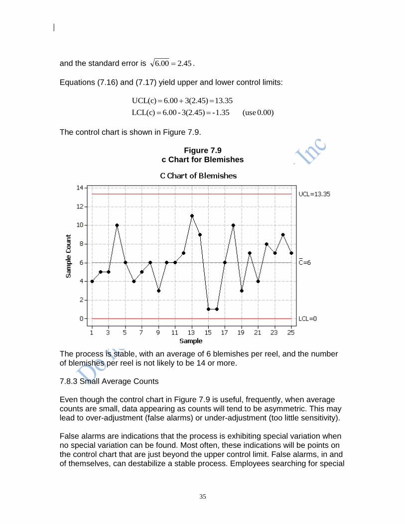
The control chart is shown in Figure 7.9.
Figure 7.9 c Chart for Blemishes
The process is stable, with an average of 6 blemishes per reel, and the number of blemishes per reel is not likely to be 14 or more. 7.8.3 Small Average Counts Even though the control chart in Figure 7.9 is useful, frequently, when average counts are small, data appearing as counts will tend to be asymmetric. This may lead to over-adjustment (false alarms) or under-adjustment (too little sensitivity). False alarms are indications that the process is exhibiting special variation when no special variation can be found. Most often, these indications will be points on the control chart that are just beyond the upper control limit. False alarms, in and of themselves, can destabilize a stable process. Employees searching for special

36
sources of variation will generally fix something that does not need fixing. That is, they will adjust the process to compensate for nonexistent special sources of variation. This may send the system into a complete state of chaos. Also, false alarms may demoralize employees who may begin to feel that many of their efforts do not result in process improvements. In some cases, control limits calculated using Equations (7.16) and (7.17) may not provide sufficient sensitivity to an indication of a special source of variation. This can result in a loss of opportunity for process improvement. To avoid both of these problems, we may use a set of fixed control limits for the c chart. These fixed control limits are sometimes called probability control limits and provide an excellent and economical rule for separating special and common variation when average counts are less than 20. Table 7.8 gives values for upper and lower control limits that can be used when average counts are less than 20.
Table 7.8 c chart Using Fixed Control Limits
Process Average
LCL UCL Process Average
LCL UCL
0 to 0.10 0 1.5 9.65 to 10.35 2.5 19.5
0.11 to 0.33 0 2.5 10.36 to 10.97 2.5 20.5
0.34 to 0.67 0 3.5 10.98 to 11.06 3.5 20.5
0.68 to 1.07 0 4.5 11.07 to 11.79 3.5 21.5
1.08 to 1.53 0 5.5 11.80 to 12.52 3.5 22.5
1.54 to 2.03 0 6.5 12.53 to 12.59 3.5 23.5
2.04 to 2.57 0 7.5 12.60 to 13.25 4.5 23.5
2.58 to 3.13 0 8.5 13.26 to 13.99 4.5 24.5
3.14 to 3.71 0 9.5 14.00 to 14.14 4.5 25.5
3.72 to 4.32 0 10.5 14.15 to 14.74 5.5 25.5
4.33 to 4.94 0 11.5 14.75 to 15.49 5.5 26.5
4.95 to 5.29 0 12.5 15.50 to 15.65 5.5 27.5
5.30 to 5.58 0.5 12.5 15.66 to 16.24 6.5 27.5
5.59 to 6.23 0.5 13.5 16.25 to 17.00 6.5 28.5
6.24 to 6.89 0.5 14.5 17.01 to 17.13 6.5 29.5
6.90 to 7.43 0.5 15.5 17.14 to 17.76 7.5 29.5
7.44 to 7.56 1.5 15.5 17.77 to 18.53 7.5 30.5
7.57 to 8.25 1.5 16.5 18.54 to 18.57 7.5 31.5
8.26 to 8.94 1.5 17.5 18.58 to 19.36 8.5 31.5
8.95 to 9.27 1.5 18.5 19.37 to 20.00 8.5 32.5
9.28 to 9.64 2.5 18.5
37
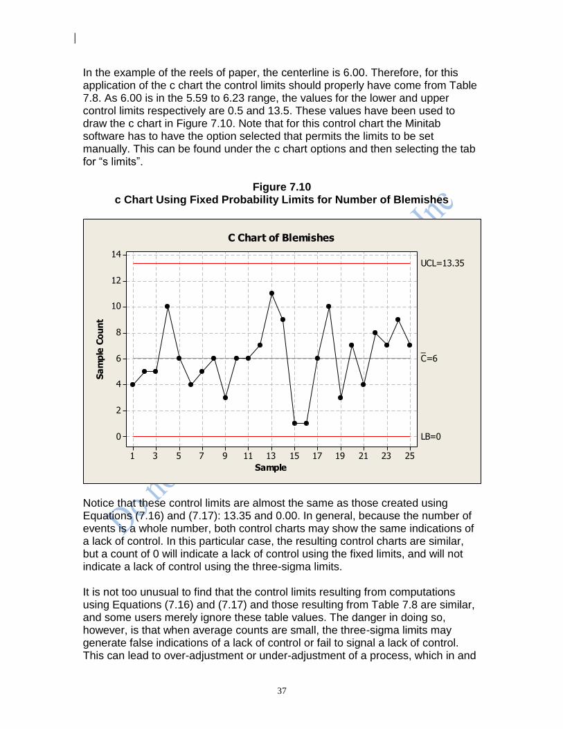
In the example of the reels of paper, the centerline is 6.00. Therefore, for this application of the c chart the control limits should properly have come from Table 7.8. As 6.00 is in the 5.59 to 6.23 range, the values for the lower and upper control limits respectively are 0.5 and 13.5. These values have been used to draw the c chart in Figure 7.10. Note that for this control chart the Minitab software has to have the option selected that permits the limits to be set manually. This can be found under the c chart options and then selecting the tab for “s limits”.
Figure 7.10 c Chart Using Fixed Probability Limits for Number of Blemishes
252321191715131197531
14
12
10
8
6
4
2
0
Sample
Sa
mp
le C
ou
nt
_C=6
UCL=13.35
LB=0
C Chart of Blemishes
Notice that these control limits are almost the same as those created using Equations (7.16) and (7.17): 13.35 and 0.00. In general, because the number of events is a whole number, both control charts may show the same indications of a lack of control. In this particular case, the resulting control charts are similar, but a count of 0 will indicate a lack of control using the fixed limits, and will not indicate a lack of control using the three-sigma limits. It is not too unusual to find that the control limits resulting from computations using Equations (7.16) and (7.17) and those resulting from Table 7.8 are similar, and some users merely ignore these table values. The danger in doing so, however, is that when average counts are small, the three-sigma limits may generate false indications of a lack of control or fail to signal a lack of control. This can lead to over-adjustment or under-adjustment of a process, which in and
38
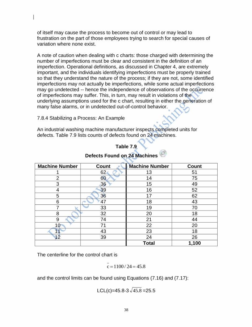
of itself may cause the process to become out of control or may lead to frustration on the part of those employees trying to search for special causes of variation where none exist. A note of caution when dealing with c charts: those charged with determining the number of imperfections must be clear and consistent in the definition of an imperfection. Operational definitions, as discussed in Chapter 4, are extremely important, and the individuals identifying imperfections must be properly trained so that they understand the nature of the process; if they are not, some identified imperfections may not actually be imperfections, while some actual imperfections may go undetected -- hence the independence of observations of the occurrence of imperfections may suffer. This, in turn, may result in violations of the underlying assumptions used for the c chart, resulting in either the generation of many false alarms, or in undetected out-of-control behavior. 7.8.4 Stabilizing a Process: An Example An industrial washing machine manufacturer inspects completed units for defects. Table 7.9 lists counts of defects found on 24 machines.
Table 7.9
Defects Found on 24 Machines
Machine Number Count Machine Number Count
1 62 13 51
2 60 14 75
3 36 15 49
4 39 16 52
5 36 17 62
6 47 18 43
7 33 19 70
8 32 20 18
9 74 21 44
10 71 22 20
11 43 23 18
12 39 24 26
Total 1,100
The centerline for the control chart is
8.4524/1100c
and the control limits can be found using Equations (7.16) and (7.17):
LCL(c)=45.8-3 8.45 =25.5
39
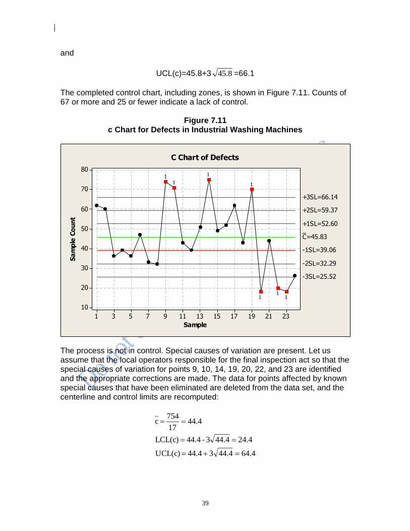
and
UCL(c)=45.8+3 8.45 =66.1
The completed control chart, including zones, is shown in Figure 7.11. Counts of 67 or more and 25 or fewer indicate a lack of control.
Figure 7.11 c Chart for Defects in Industrial Washing Machines
2321191715131197531
80
70
60
50
40
30
20
10
Sample
Sa
mp
le C
ou
nt
_C=45.83
+3SL=66.14
-3SL=25.52
+2SL=59.37
-2SL=32.29
+1SL=52.60
-1SL=39.06
11
1
1
1
11
C Chart of Defects
The process is not in control. Special causes of variation are present. Let us assume that the local operators responsible for the final inspection act so that the special causes of variation for points 9, 10, 14, 19, 20, 22, and 23 are identified and the appropriate corrections are made. The data for points affected by known special causes that have been eliminated are deleted from the data set, and the centerline and control limits are recomputed:
4.6444.43 44.4 UCL(c)
4.2444.43 - 44.4 LCL(c)
4.4417
754 c
40
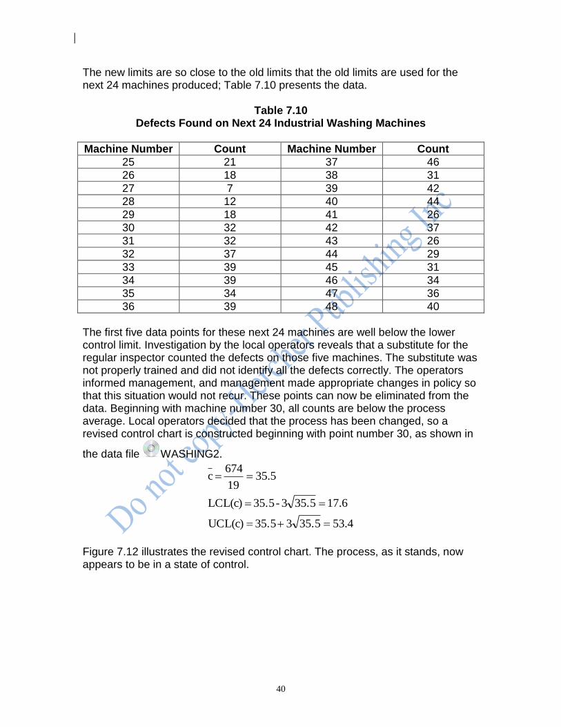
The new limits are so close to the old limits that the old limits are used for the next 24 machines produced; Table 7.10 presents the data.
Table 7.10 Defects Found on Next 24 Industrial Washing Machines
Machine Number Count Machine Number Count
25 21 37 46
26 18 38 31
27 7 39 42
28 12 40 44
29 18 41 26
30 32 42 37
31 32 43 26
32 37 44 29
33 39 45 31
34 39 46 34
35 34 47 36
36 39 48 40
The first five data points for these next 24 machines are well below the lower control limit. Investigation by the local operators reveals that a substitute for the regular inspector counted the defects on those five machines. The substitute was not properly trained and did not identify all the defects correctly. The operators informed management, and management made appropriate changes in policy so that this situation would not recur. These points can now be eliminated from the data. Beginning with machine number 30, all counts are below the process average. Local operators decided that the process has been changed, so a revised control chart is constructed beginning with point number 30, as shown in
the data file WASHING2.
4.5335.53 35.5 UCL(c)
6.1735.53 - 35.5 LCL(c)
5.3519
674 c
Figure 7.12 illustrates the revised control chart. The process, as it stands, now appears to be in a state of control.
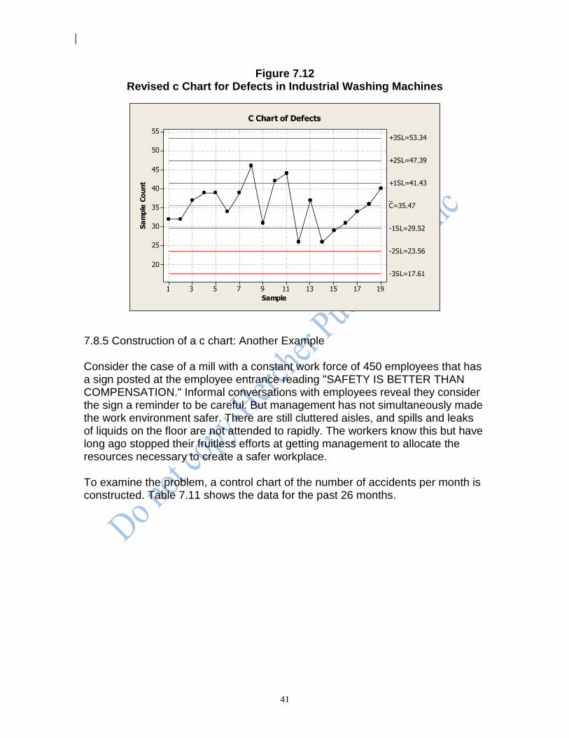
41
Figure 7.12 Revised c Chart for Defects in Industrial Washing Machines
191715131197531
55
50
45
40
35
30
25
20
Sample
Sa
mp
le C
ou
nt
_C=35.47
+3SL=53.34
-3SL=17.61
+2SL=47.39
-2SL=23.56
+1SL=41.43
-1SL=29.52
C Chart of Defects
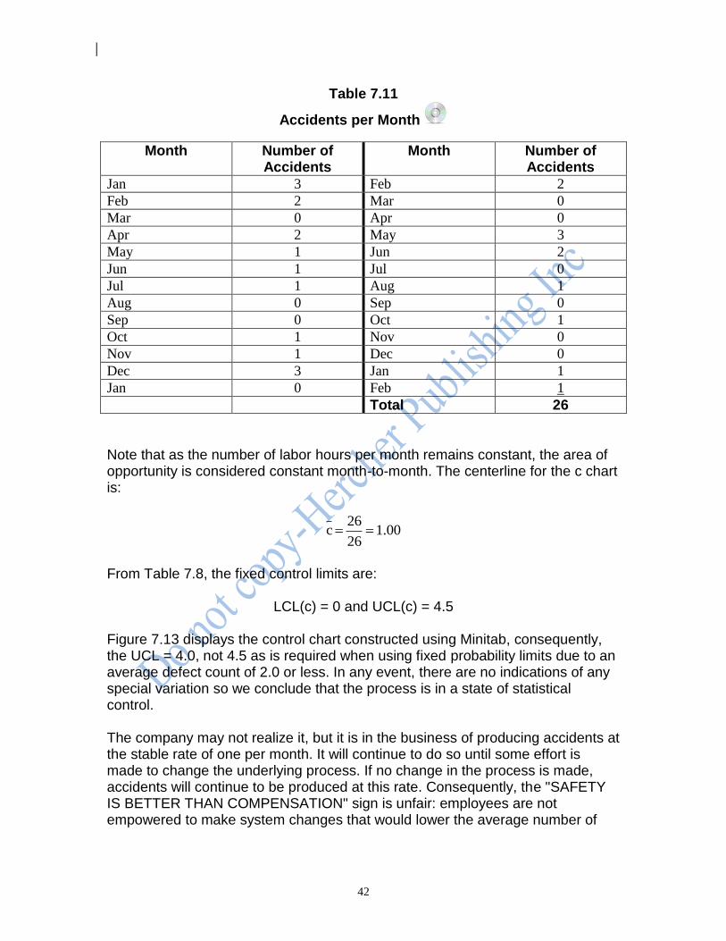
7.8.5 Construction of a c chart: Another Example Consider the case of a mill with a constant work force of 450 employees that has a sign posted at the employee entrance reading "SAFETY IS BETTER THAN COMPENSATION." Informal conversations with employees reveal they consider the sign a reminder to be careful. But management has not simultaneously made the work environment safer. There are still cluttered aisles, and spills and leaks of liquids on the floor are not attended to rapidly. The workers know this but have long ago stopped their fruitless efforts at getting management to allocate the resources necessary to create a safer workplace. To examine the problem, a control chart of the number of accidents per month is constructed. Table 7.11 shows the data for the past 26 months.
42
Table 7.11
Accidents per Month
Month Number of Accidents
Month Number of Accidents
Jan 3 Feb 2
Feb 2 Mar 0
Mar 0 Apr 0
Apr 2 May 3
May 1 Jun 2
Jun 1 Jul 0
Jul 1 Aug 1
Aug 0 Sep 0
Sep 0 Oct 1
Oct 1 Nov 0
Nov 1 Dec 0
Dec 3 Jan 1
Jan 0 Feb 1
Total 26
Note that as the number of labor hours per month remains constant, the area of opportunity is considered constant month-to-month. The centerline for the c chart is:
00.126
26 c
From Table 7.8, the fixed control limits are:
LCL(c) = 0 and UCL(c) = 4.5 Figure 7.13 displays the control chart constructed using Minitab, consequently, the UCL = 4.0, not 4.5 as is required when using fixed probability limits due to an average defect count of 2.0 or less. In any event, there are no indications of any special variation so we conclude that the process is in a state of statistical control. The company may not realize it, but it is in the business of producing accidents at the stable rate of one per month. It will continue to do so until some effort is made to change the underlying process. If no change in the process is made, accidents will continue to be produced at this rate. Consequently, the "SAFETY IS BETTER THAN COMPENSATION" sign is unfair: employees are not empowered to make system changes that would lower the average number of
43
accidents per month; the sign subtly and unjustly shifts the burden of responsibility for safety from management to the employees.
Figure 7.13 Control Chart for Accidents per Month
252219161310741
4
3
2
1
0
Sample
Sa
mp
le C
ou
nt
_C=1
UCL=4
LB=0
C Chart of Accidents
7.8.6 Construction of a c Chart: Another Example A national company opens a sales office with six salesmen in Cleveland, Ohio. [Gitlow and Gitlow, 1987, pp. 124-125] The office has been open for just over six months. All salesmen have the same responsibilities and opportunities. The number of new accounts generated by each salesman in the first six months of operation is recorded in Table 7.12.
Table 7.12 Number of New Accounts
Name of Salesperson Number of New Accounts
Allan 27
Fred 36
Mark 28
David 24
John 29
Phil 30
Total 174
The company’s policy calls for a semi-annual review of performance to determine who should be rewarded or punished. Based on traditional thinking, it appears that the company should reward Fred and punish David.
44
Examining the above data from the perspective of the System of Profound Knowledge and statistical thinking results in the following c chart statistics:
c = 174/6 = 29
UCL = 29 + 3[ 29 ] = 45.2 → 45
LCL = 29 - 3[ 29 ] = 12.8 → 13
According to the above calculations, the number of new accounts generated by a salesman in a six-month period can be predicted to be between 13 and 45 new accounts. This large amount of variation is attributable to random noise (common causes of variation) in the sales system. All salesmen are in the same sales system, and they all deserve the percentage pay raise. No one should be rewarded, and no one should be punished. Sales management should focus their attention on improvement of the sales system, not on rewarding and punishing salesmen. If Fred had generated 66 new accounts (instead of 36) the sales system’s statistics would be:
c = 204/6 = 34
UCL = 34 + 3[ 34 ] = 51.5 → 51
LCL = 34 - 3[ 34 ] = 16.5 → 17
In this scenario, Fred is outside the sales system on the high side (he is above 51). Investigation by Fred’s manager leads to the realization that Fred has developed a better telephone procedure for screening potential customers. Fred should receive special recognition because he is outside the sales system on the high side and because his efforts provide guidance for improvement for all salesmen all in the sales system.
7.9 u Charts In some applications of count charts, the areas of opportunity vary in size. Generally, the construction and interpretation of control charts are easier when the area of opportunity remains constant, but from time to time variation in the subgroup size, or area of opportunity, may be unavoidable. For example, samples taken from a roll of paper may need to be manually torn from rolls, so that the areas sampled -- the areas of opportunity -- will vary; continuous welds in heat exchangers will have varying areas of opportunity depending on the total number and lengths of the welds present in different units; and the number of
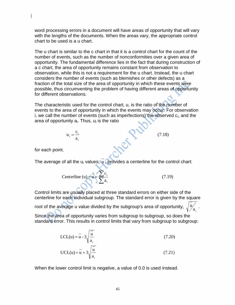
45
word processing errors in a document will have areas of opportunity that will vary with the lengths of the documents. When the areas vary, the appropriate control chart to be used is a u chart. The u chart is similar to the c chart in that it is a control chart for the count of the number of events, such as the number of nonconformities over a given area of opportunity. The fundamental difference lies in the fact that during construction of a c chart, the area of opportunity remains constant from observation to observation, while this is not a requirement for the u chart. Instead, the u chart considers the number of events (such as blemishes or other defects) as a fraction of the total size of the area of opportunity in which these events were possible, thus circumventing the problem of having different areas of opportunity for different observations. The characteristic used for the control chart, u, is the ratio of the number of events to the area of opportunity in which the events may occur. For observation i, we call the number of events (such as imperfections) the observed ci, and the area of opportunity ai. Thus, ui is the ratio
(7.18) a
cu
i
ii
for each point.
The average of all the ui values, u , provides a centerline for the control chart:
(7.19) a
c u (u) Centerline
i
i
Control limits are usually placed at three standard errors on either side of the centerline for each individual subgroup. The standard error is given by the square
root of the average u value divided by the subgroup's area of opportunity, ia
u .
Since the area of opportunity varies from subgroup to subgroup, so does the standard error. This results in control limits that vary from subgroup to subgroup:
(7.21) a
u3 u UCL(u)
(7.20) a
u3 - u LCL(u)
i
i
When the lower control limit is negative, a value of 0.0 is used instead.

46
7.9.1 Construction of a u Chart: An Example Consider the case of the manufacture of a certain grade of plastic. The plastic is produced in rolls, with samples taken five times daily. Because of the nature of the process, the square footage of each sample varies from inspection lot to inspection lot. Hence the u chart should be used here. Table 7.13 shows the data on the number of defects, ci, for the past 30 inspection lots. The number of defects per 100 square feet is calculated from Equation (7.18).
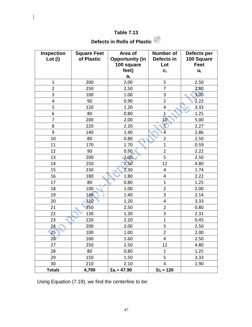
47
Table 7.13
Defects in Rolls of Plastic
Inspection Lot (i)
Square Feet of Plastic
Area of Opportunity (in
100 square feet)
ai
Number of Defects in
Lot ci
Defects per 100 Square
Feet ui
1 200 2.00 5 2.50
2 250 2.50 7 2.80
3 100 1.00 3 3.00
4 90 0.90 2 2.22
5 120 1.20 4 3.33
6 80 0.80 1 1.25
7 200 2.00 10 5.00
8 220 2.20 5 2.27
9 140 1.40 4 2.86
10 80 0.80 2 2.50
11 170 1.70 1 0.59
12 90 0.90 2 2.22
13 200 2.00 5 2.50
14 250 2.50 12 4.80
15 230 2.30 4 1.74
16 180 1.80 4 2.22
17 80 0.80 1 1.25
18 100 1.00 2 2.00
19 140 1.40 3 2.14
20 120 1.20 4 3.33
21 250 2.50 2 0.80
22 130 1.30 3 2.31
23 220 2.20 1 0.45
24 200 2.00 5 2.50
25 100 1.00 2 2.00
26 160 1.60 4 2.50
27 250 2.50 12 4.80
28 80 0.80 1 1.25
29 150 1.50 5 3.33
30 210 2.10 4 1.90
Totals 4,790 Σai = 47.90 Σci = 120
Using Equation (7.19), we find the centerline to be:
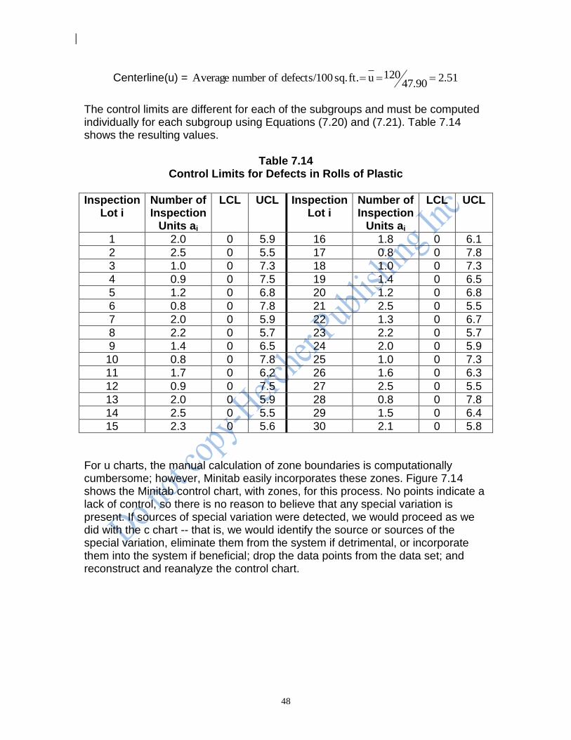
48
Centerline(u) = 51.247.90
120 u ft. sq. 0defects/10 ofnumber Average
The control limits are different for each of the subgroups and must be computed individually for each subgroup using Equations (7.20) and (7.21). Table 7.14 shows the resulting values.
Table 7.14 Control Limits for Defects in Rolls of Plastic
Inspection Lot i
Number of Inspection
Units ai
LCL UCL Inspection Lot i
Number of Inspection
Units ai
LCL UCL
1 2.0 0 5.9 16 1.8 0 6.1
2 2.5 0 5.5 17 0.8 0 7.8
3 1.0 0 7.3 18 1.0 0 7.3
4 0.9 0 7.5 19 1.4 0 6.5
5 1.2 0 6.8 20 1.2 0 6.8
6 0.8 0 7.8 21 2.5 0 5.5
7 2.0 0 5.9 22 1.3 0 6.7
8 2.2 0 5.7 23 2.2 0 5.7
9 1.4 0 6.5 24 2.0 0 5.9
10 0.8 0 7.8 25 1.0 0 7.3
11 1.7 0 6.2 26 1.6 0 6.3
12 0.9 0 7.5 27 2.5 0 5.5
13 2.0 0 5.9 28 0.8 0 7.8
14 2.5 0 5.5 29 1.5 0 6.4
15 2.3 0 5.6 30 2.1 0 5.8
For u charts, the manual calculation of zone boundaries is computationally cumbersome; however, Minitab easily incorporates these zones. Figure 7.14 shows the Minitab control chart, with zones, for this process. No points indicate a lack of control, so there is no reason to believe that any special variation is present. If sources of special variation were detected, we would proceed as we did with the c chart -- that is, we would identify the source or sources of the special variation, eliminate them from the system if detrimental, or incorporate them into the system if beneficial; drop the data points from the data set; and reconstruct and reanalyze the control chart.

49
Figure 7.14 u Chart for Number of Defectives in Rolls of Plastic
28252219161310741
8
7
6
5
4
3
2
1
0
Sample
Sa
mp
le C
ou
nt
Pe
r U
nit
_U=2.505
+3SL=5.782
-3SL=0
+2SL=4.690
-2SL=0.321
+1SL=3.597
-1SL=1.413
U Chart of Defects
Tests performed with unequal sample sizes
7.10 Limitations of Attribute Control Charts As processes improve and defects or defectives become rarer, the number of units that must be examined to find one or more of these events increases. If we consider a p chart where the average fraction of nonconforming items is 0.005 (0.5%), then on average we would need to examine 200 units to have an average count of just 1.00. In the extreme, to maintain a reasonable average count as the area of opportunity grows, 100 percent inspection becomes the rule. This implies inspecting all of the items and sorting those that conform to some specification from those that do not. Not only is this inspection costly, but it is equivalent to accepting the fact that the process is producing a constant fraction of its output as defective and will continue to do so. Hence, attribute control charts are limited in terms of the level of process improvement they enable. Additional process improvement, however, is possible with variables control charts, to be discussed in Chapter 8. Another disadvantage of using attribute control charts is that if special variation from several different sources is present, it is difficult to identify and isolate the special sources individually. One or more of these special sources may mask another, resulting in a process that appears to be stable but is really operating under the influence of several special sources of variation. As the number of special sources of variation increases, their tendency to mask one another can grow, resulting in further difficulties in the future. On the other hand, variables control charts use numerical measurements, which make them more revealing
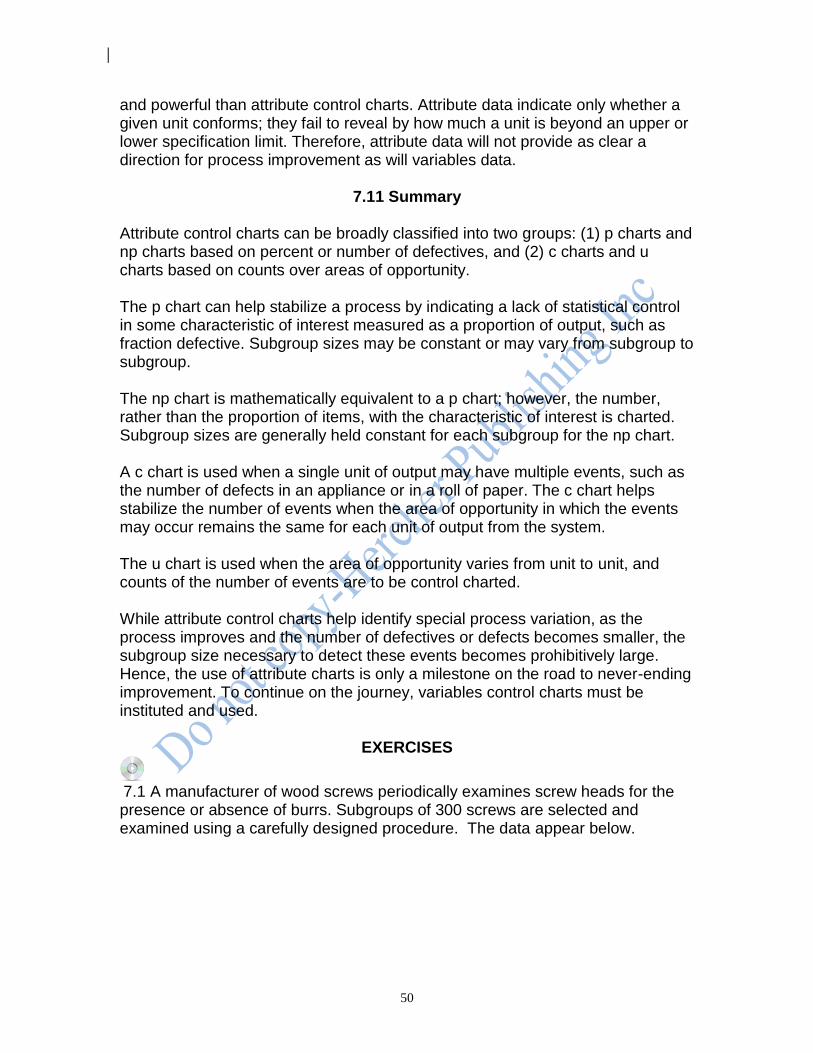
50
and powerful than attribute control charts. Attribute data indicate only whether a given unit conforms; they fail to reveal by how much a unit is beyond an upper or lower specification limit. Therefore, attribute data will not provide as clear a direction for process improvement as will variables data.
7.11 Summary Attribute control charts can be broadly classified into two groups: (1) p charts and np charts based on percent or number of defectives, and (2) c charts and u charts based on counts over areas of opportunity. The p chart can help stabilize a process by indicating a lack of statistical control in some characteristic of interest measured as a proportion of output, such as fraction defective. Subgroup sizes may be constant or may vary from subgroup to subgroup. The np chart is mathematically equivalent to a p chart; however, the number, rather than the proportion of items, with the characteristic of interest is charted. Subgroup sizes are generally held constant for each subgroup for the np chart. A c chart is used when a single unit of output may have multiple events, such as the number of defects in an appliance or in a roll of paper. The c chart helps stabilize the number of events when the area of opportunity in which the events may occur remains the same for each unit of output from the system. The u chart is used when the area of opportunity varies from unit to unit, and counts of the number of events are to be control charted. While attribute control charts help identify special process variation, as the process improves and the number of defectives or defects becomes smaller, the subgroup size necessary to detect these events becomes prohibitively large. Hence, the use of attribute charts is only a milestone on the road to never-ending improvement. To continue on the journey, variables control charts must be instituted and used.
EXERCISES
7.1 A manufacturer of wood screws periodically examines screw heads for the presence or absence of burrs. Subgroups of 300 screws are selected and examined using a carefully designed procedure. The data appear below.
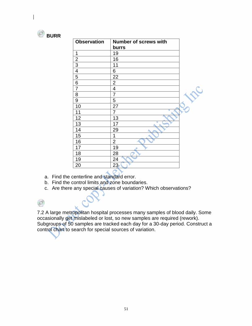
51
BURR
Observation Number of screws with burrs
1 19
2 16
3 11
4 6
5 22
6 2
7 4
8 7
9 5
10 27
11 7
12 13
13 17
14 29
15 1
16 2
17 19
18 28
19 24
20 23
a. Find the centerline and standard error. b. Find the control limits and zone boundaries. c. Are there any special causes of variation? Which observations?
7.2 A large metropolitan hospital processes many samples of blood daily. Some occasionally get mislabeled or lost, so new samples are required (rework). Subgroups of 50 samples are tracked each day for a 30-day period. Construct a control chart to search for special sources of variation.
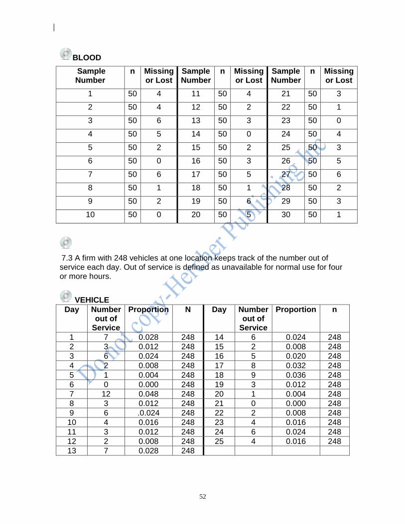
52
BLOOD
Sample Number
n Missing or Lost
Sample Number
n Missing or Lost
Sample Number
n Missing or Lost
1 50 4 11 50 4 21 50 3
2 50 4 12 50 2 22 50 1
3 50 6 13 50 3 23 50 0
4 50 5 14 50 0 24 50 4
5 50 2 15 50 2 25 50 3
6 50 0 16 50 3 26 50 5
7 50 6 17 50 5 27 50 6
8 50 1 18 50 1 28 50 2
9 50 2 19 50 6 29 50 3
10 50 0 20 50 5 30 50 1
7.3 A firm with 248 vehicles at one location keeps track of the number out of service each day. Out of service is defined as unavailable for normal use for four or more hours.
VEHICLE
Day Number out of
Service
Proportion N Day Number out of
Service
Proportion n
1 7 0.028 248 14 6 0.024 248
2 3 0.012 248 15 2 0.008 248
3 6 0.024 248 16 5 0.020 248
4 2 0.008 248 17 8 0.032 248
5 1 0.004 248 18 9 0.036 248
6 0 0.000 248 19 3 0.012 248
7 12 0.048 248 20 1 0.004 248
8 3 0.012 248 21 0 0.000 248
9 6 .0.024 248 22 2 0.008 248
10 4 0.016 248 23 4 0.016 248
11 3 0.012 248 24 6 0.024 248
12 2 0.008 248 25 4 0.016 248
13 7 0.028 248
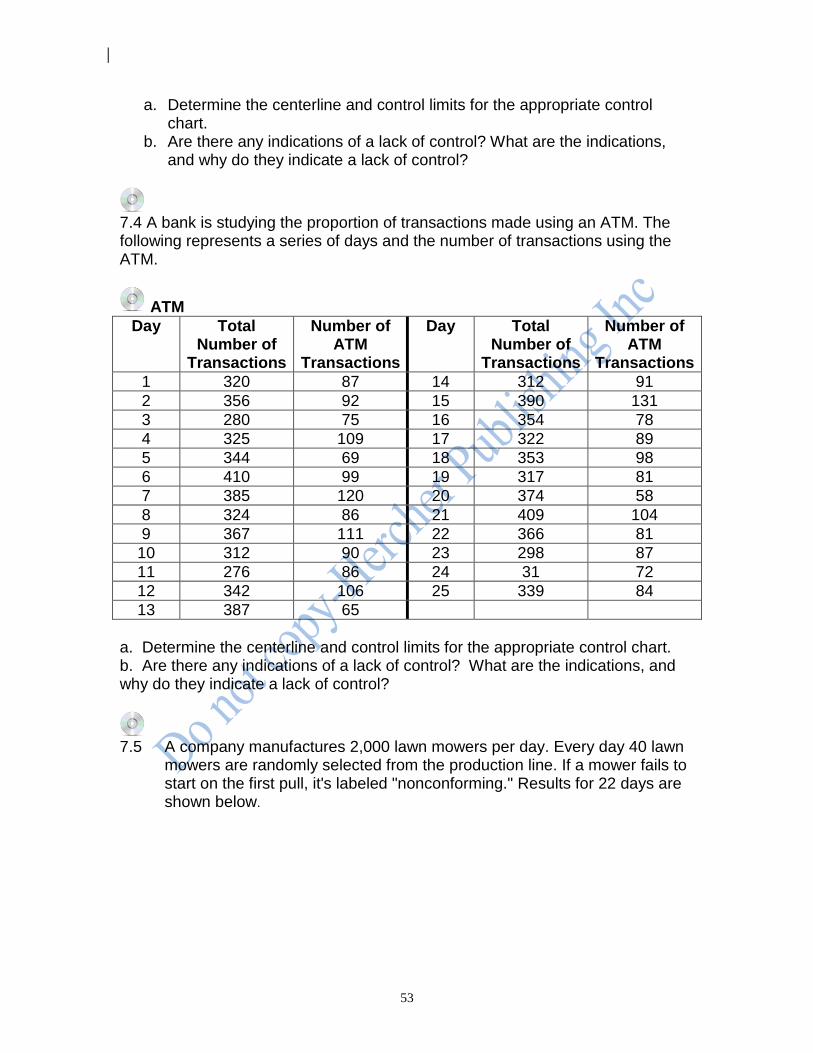
53
a. Determine the centerline and control limits for the appropriate control chart.
b. Are there any indications of a lack of control? What are the indications, and why do they indicate a lack of control?
7.4 A bank is studying the proportion of transactions made using an ATM. The following represents a series of days and the number of transactions using the ATM.
ATM
Day Total Number of
Transactions
Number of ATM
Transactions
Day Total Number of
Transactions
Number of ATM
Transactions
1 320 87 14 312 91
2 356 92 15 390 131
3 280 75 16 354 78
4 325 109 17 322 89
5 344 69 18 353 98
6 410 99 19 317 81
7 385 120 20 374 58
8 324 86 21 409 104
9 367 111 22 366 81
10 312 90 23 298 87
11 276 86 24 31 72
12 342 106 25 339 84
13 387 65
a. Determine the centerline and control limits for the appropriate control chart. b. Are there any indications of a lack of control? What are the indications, and why do they indicate a lack of control?
7.5 A company manufactures 2,000 lawn mowers per day. Every day 40 lawn
mowers are randomly selected from the production line. If a mower fails to start on the first pull, it's labeled "nonconforming." Results for 22 days are shown below.
54
MOWER
Day n Number Nonconforming
Day n Number Nonconforming
1 40 2 12 40 4
2 40 3 13 40 7
3 40 1 14 40 2
4 40 4 15 40 3
5 40 3 16 40 3
6 40 2 17 40 2
7 40 1 18 40 8
8 40 1 19 40 0
9 40 0 20 40 1
10 40 3 21 40 3
11 40 2 22 40 2
a. Find the centerline for the appropriate control chart. b. Determine the control limits and zone boundaries. c. Find any indications of a lack of control.
7.6 A given model of a large radar dish represents an area of opportunity in
which non-conformities may occur. Results for 25 such assemblies are shown below.
RADAR
Assembly Number
Number of Nonconformities
Assembly Number
Number of Nonconformities
Assembly Number
Number of Nonconformities
1 25 10 44 19 21
2 60 11 62 20 88
3 28 12 81 21 34
4 65 13 70 22 82
5 91 14 75 23 53
6 56 15 24 24 102
7 40 16 50 25 64
8 54 17 70
9 90 18 56
a. Determine the centerline and control limits for the appropriate
control chart. b. Are there any indications of a lack of control? What are the
indications, and why do they indicate a lack of control?
7.7 Samples of 90 retainer rings are examined for the number nonconforming. The results for 30 consecutive days are shown below.
55
COPPER Day Number
Nonconforming Day Number
Nonconforming Day Number
Nonconforming
1 11 11 14 21 11
2 8 12 13 22 11
3 3 13 12 23 8
4 7 14 1 24 7
5 13 15 8 25 1
6 5 16 14 26 4
7 15 17 16 27 14
8 13 18 6 28 11
9 14 19 2 29 15
10 15 20 10 30 12
a. Determine the centerline and control limits. b. Are there any indications of a lack of control? On which days?
7.8 A large publisher counts the number of keyboard errors that make their way into finished books. The number of errors and the number of pages in the past 26 publications are shown below.
BOOK
Book Number
Number of Errors
Number of Pages
Book Number
Number of Errors
Number of Pages
1 49 202 14 48 612
2 63 232 15 50 432
3 57 332 16 41 538
4 33 429 17 45 383
5 54 512 18 51 302
6 37 347 19 49 285
7 38 401 20 38 591
8 45 412 21 70 310
9 65 481 22 55 547
10 62 770 23 63 469
11 40 577 24 33 652
12 21 734 25 14 343
13 35 455 26 44 401
a. Determine the centerline and control limits for the appropriate control chart. b. Are there any indications of a lack of control? For which books?
56
7.9 Lots of cloth produced by a manufacturer are inspected for defects. Because of the nature of the inspection process, the size of the inspection sample varies from lot to lot.
CLOTH
Lot Number
100’s of Square Yards
Number of Defects
Lot Number
100’s of Square Yards
Number of Defects
1 2.0 5 9 1.9 3
2 2.5 7 10 1.5 0
3 1.0 3 11 1.7 2
4 0.9 2 12 1.7 3
5 1.2 4 13 2.0 1
6 0.8 1 14 1.6 2
7 1.4 0 15 1.9 4
8 1.6 2
a. Calculate the centerline and upper and lower control limits for the appropriate control chart. b. Are any special causes of variation present in the data? For which lots?
7.10 A firm manufactures high voltage capacitor film for the electronics industry. They are concerned with the yield on a slitter process which produces reels of film. Reels that are nonconforming must be scraped. Reels were sampled and inspected each week for 38 weeks., with the number of reels of film in each sample, number of scrap reels and proportion of scrap reels shown below.
57
REELS Proportion of Number of Number of Week Total Reels Scrap Reels Scrap Reels 1 1,145 142 0.1240 2 1,013 55 0.0543 3 1,275 125 0.0980 4 686 57 0.0831 5 984 58 0.0589 6 717 37 0.0516 7 1,408 57 0.0405 8 1,254 38 0.0303 9 890 60 0.0674 10 1,155 99 0.0857 11 969 121 0.1249 12 858 69 0.0804 13 832 100 0.1202 14 839 101 0.1204 15 1,230 123 0.1000 16 843 49 0.0581 17 1,102 99 0.0898 18 1,039 111 0.1068 19 1,385 125 0.0903 20 1,352 142 0.1050 21 903 43 0.0476 22 976 64 0.0656 23 695 81 0.1165 24 1,123 82 0.0730 25 1,252 102 0.0815 26 857 113 0.1319 27 1,277 74 0.0579 28 1,182 97 0.0821 29 440 41 0.0932 30 916 123 0.1343
a. Construct an appropriate control chart for this data. b. Is the process in a state of statistical control? Why?
7.11 A computer systems team is concerned about a data management system. Each day decisions need to be made that relate to the way in which records and data files are to be maintained. Some information is required to be maintained for one day, some for seven days, some for thirty days, some for a year, and some for perpetual storage. Data that is to be maintained for more than seven days must be stored remotely on disk cartridges off the production site. The data cartridges used for the remote off-site storage involve both an acquisition expense and the cost of
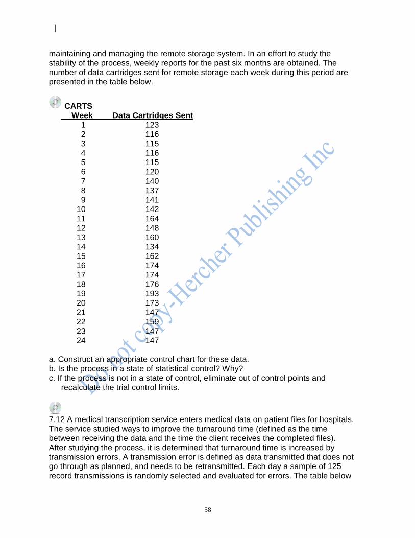
58
maintaining and managing the remote storage system. In an effort to study the stability of the process, weekly reports for the past six months are obtained. The number of data cartridges sent for remote storage each week during this period are presented in the table below.
CARTS Week Data Cartridges Sent 1 123 2 116 3 115 4 116 5 115 6 120 7 140 8 137 9 141 10 142 11 164 12 148 13 160 14 134 15 162 16 174 17 174 18 176 19 193 20 173 21 147 22 159 23 147 24 147
a. Construct an appropriate control chart for these data. b. Is the process in a state of statistical control? Why? c. If the process is not in a state of control, eliminate out of control points and
recalculate the trial control limits.
7.12 A medical transcription service enters medical data on patient files for hospitals. The service studied ways to improve the turnaround time (defined as the time between receiving the data and the time the client receives the completed files). After studying the process, it is determined that turnaround time is increased by transmission errors. A transmission error is defined as data transmitted that does not go through as planned, and needs to be retransmitted. Each day a sample of 125 record transmissions is randomly selected and evaluated for errors. The table below
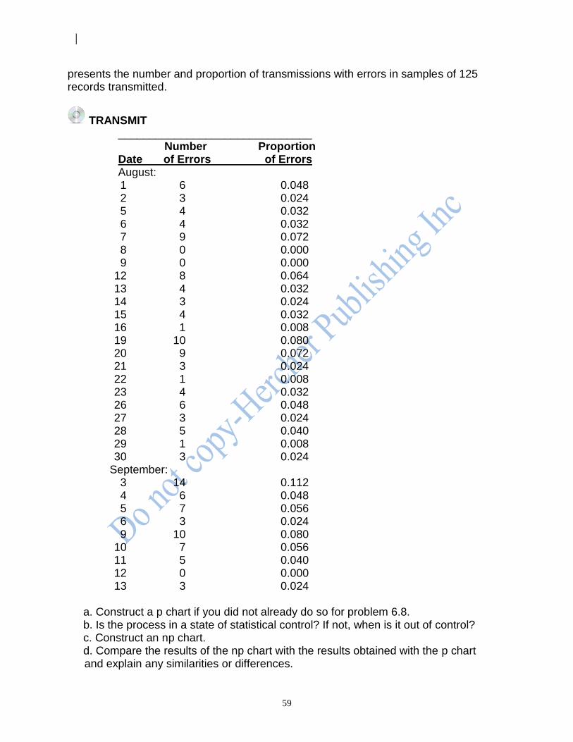
59
presents the number and proportion of transmissions with errors in samples of 125 records transmitted.
TRANSMIT _______________________________ Number Proportion Date of Errors of Errors August: 1 6 0.048 2 3 0.024 5 4 0.032 6 4 0.032 7 9 0.072 8 0 0.000 9 0 0.000 12 8 0.064 13 4 0.032 14 3 0.024 15 4 0.032 16 1 0.008 19 10 0.080 20 9 0.072 21 3 0.024 22 1 0.008 23 4 0.032 26 6 0.048 27 3 0.024 28 5 0.040 29 1 0.008 30 3 0.024 September: 3 14 0.112 4 6 0.048 5 7 0.056 6 3 0.024 9 10 0.080 10 7 0.056 11 5 0.040 12 0 0.000 13 3 0.024
a. Construct a p chart if you did not already do so for problem 6.8. b. Is the process in a state of statistical control? If not, when is it out of control? c. Construct an np chart. d. Compare the results of the np chart with the results obtained with the p chart
and explain any similarities or differences.
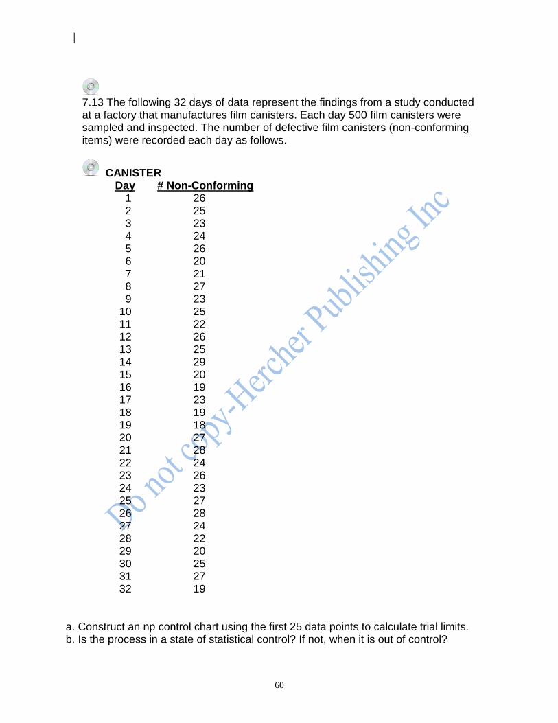
60
7.13 The following 32 days of data represent the findings from a study conducted at a factory that manufactures film canisters. Each day 500 film canisters were sampled and inspected. The number of defective film canisters (non-conforming items) were recorded each day as follows.
CANISTER Day # Non-Conforming 1 26 2 25 3 23 4 24 5 26 6 20 7 21 8 27 9 23 10 25 11 22 12 26 13 25 14 29 15 20 16 19 17 23 18 19 19 18 20 27 21 28 22 24 23 26 24 23 25 27 26 28 27 24 28 22 29 20 30 25 31 27 32 19
a. Construct an np control chart using the first 25 data points to calculate trial limits. b. Is the process in a state of statistical control? If not, when it is out of control?
61
c. If the process is in control, extend the limits and record data for days 26 through 32.
d. Is the process in control for days 26 through 32? If not, when it is out of control? e. Construct a p chart using the first 25 data points if you did not already do so in
problem 6.9. f. Compare the results of the np chart with the results obtained with the p chart and
explain any similarities or differences for the first 25 days.
7.14 The information systems department of a hospital is concerned with the time it takes for patients' medical records to be processed after discharge. They determine that all records should be processed within five days; any record not processed within five days of discharge is considered nonconforming. The number of patients discharged and the number and proportion of records not processed within the five day standard are recorded.
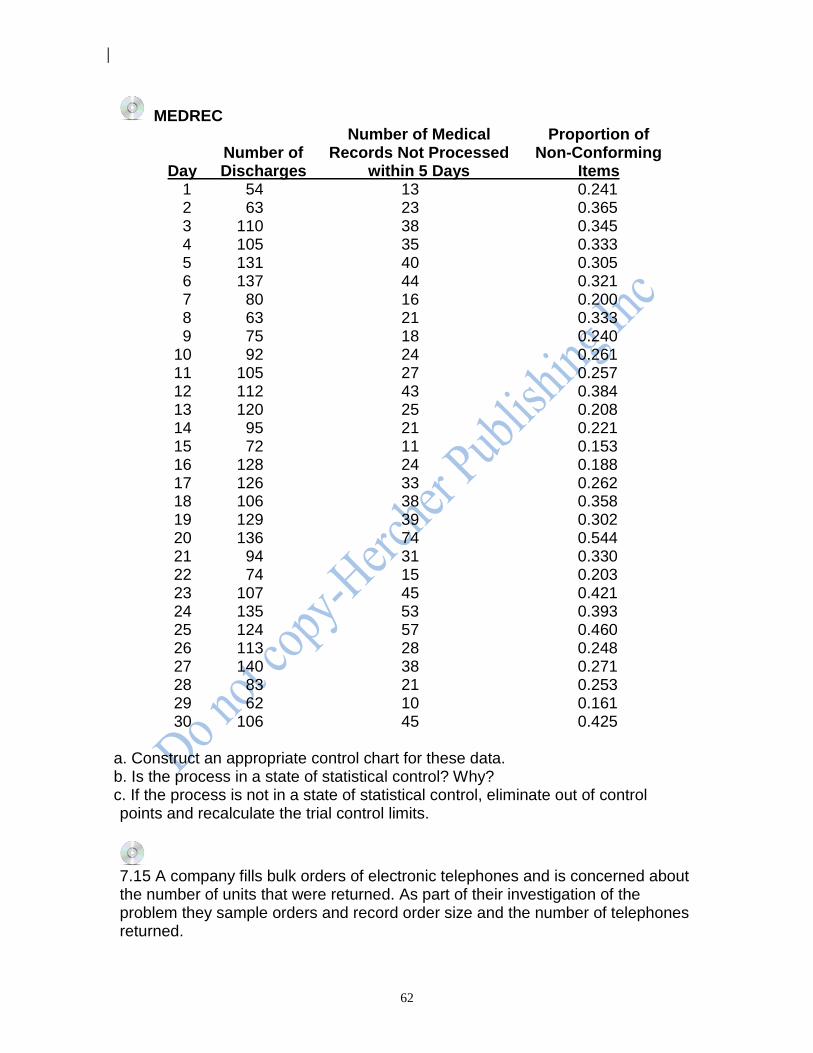
62
MEDREC Number of Medical Proportion of Number of Records Not Processed Non-Conforming Day Discharges within 5 Days Items 1 54 13 0.241 2 63 23 0.365 3 110 38 0.345 4 105 35 0.333 5 131 40 0.305 6 137 44 0.321 7 80 16 0.200 8 63 21 0.333 9 75 18 0.240 10 92 24 0.261 11 105 27 0.257 12 112 43 0.384 13 120 25 0.208 14 95 21 0.221 15 72 11 0.153 16 128 24 0.188 17 126 33 0.262 18 106 38 0.358 19 129 39 0.302 20 136 74 0.544 21 94 31 0.330 22 74 15 0.203 23 107 45 0.421 24 135 53 0.393 25 124 57 0.460 26 113 28 0.248 27 140 38 0.271 28 83 21 0.253 29 62 10 0.161 30 106 45 0.425
a. Construct an appropriate control chart for these data. b. Is the process in a state of statistical control? Why? c. If the process is not in a state of statistical control, eliminate out of control
points and recalculate the trial control limits.
7.15 A company fills bulk orders of electronic telephones and is concerned about the number of units that were returned. As part of their investigation of the problem they sample orders and record order size and the number of telephones returned.
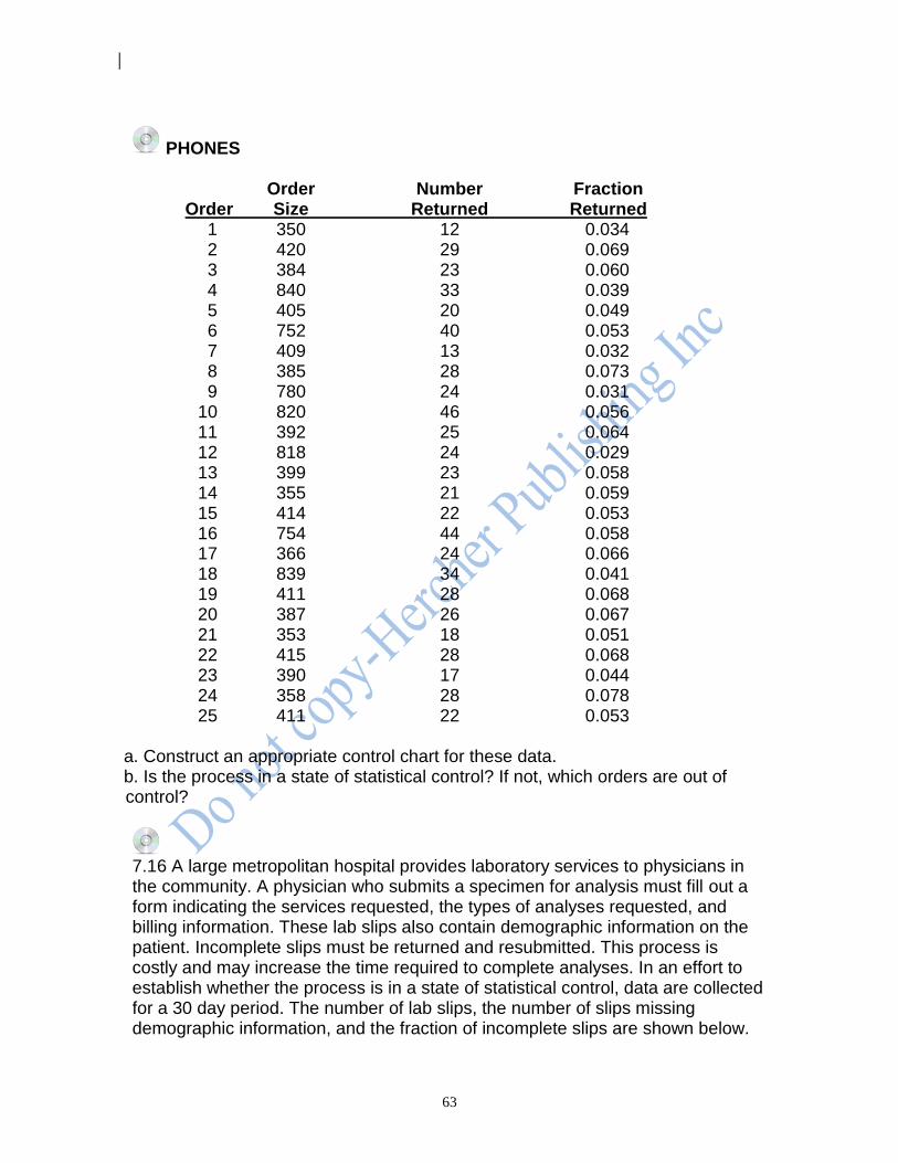
63
PHONES Order Number Fraction Order Size Returned Returned 1 350 12 0.034 2 420 29 0.069 3 384 23 0.060 4 840 33 0.039 5 405 20 0.049 6 752 40 0.053 7 409 13 0.032 8 385 28 0.073 9 780 24 0.031 10 820 46 0.056 11 392 25 0.064 12 818 24 0.029 13 399 23 0.058 14 355 21 0.059 15 414 22 0.053 16 754 44 0.058 17 366 24 0.066 18 839 34 0.041 19 411 28 0.068 20 387 26 0.067 21 353 18 0.051 22 415 28 0.068 23 390 17 0.044 24 358 28 0.078 25 411 22 0.053
a. Construct an appropriate control chart for these data. b. Is the process in a state of statistical control? If not, which orders are out of
control?
7.16 A large metropolitan hospital provides laboratory services to physicians in the community. A physician who submits a specimen for analysis must fill out a form indicating the services requested, the types of analyses requested, and billing information. These lab slips also contain demographic information on the patient. Incomplete slips must be returned and resubmitted. This process is costly and may increase the time required to complete analyses. In an effort to establish whether the process is in a state of statistical control, data are collected for a 30 day period. The number of lab slips, the number of slips missing demographic information, and the fraction of incomplete slips are shown below.
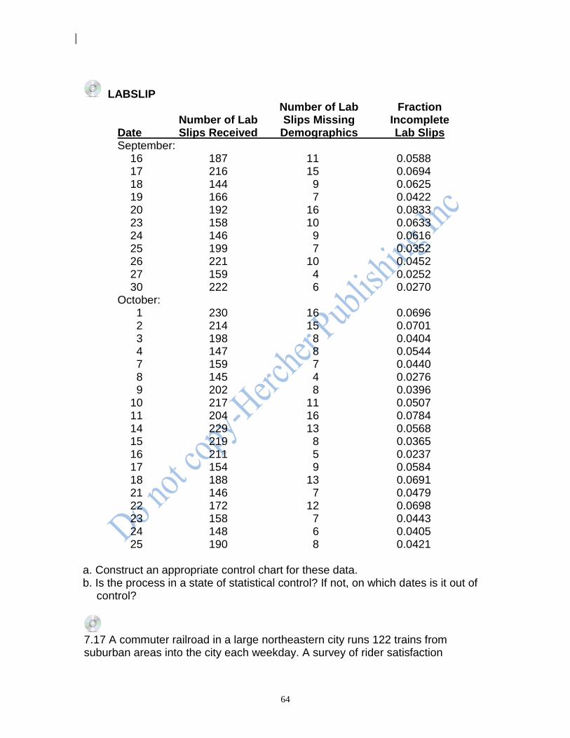
64
LABSLIP Number of Lab Fraction Number of Lab Slips Missing Incomplete Date Slips Received Demographics Lab Slips September: 16 187 11 0.0588 17 216 15 0.0694 18 144 9 0.0625 19 166 7 0.0422 20 192 16 0.0833 23 158 10 0.0633 24 146 9 0.0616 25 199 7 0.0352 26 221 10 0.0452 27 159 4 0.0252 30 222 6 0.0270 October: 1 230 16 0.0696 2 214 15 0.0701 3 198 8 0.0404 4 147 8 0.0544 7 159 7 0.0440 8 145 4 0.0276 9 202 8 0.0396 10 217 11 0.0507 11 204 16 0.0784 14 229 13 0.0568 15 219 8 0.0365 16 211 5 0.0237 17 154 9 0.0584 18 188 13 0.0691 21 146 7 0.0479 22 172 12 0.0698 23 158 7 0.0443 24 148 6 0.0405 25 190 8 0.0421
a. Construct an appropriate control chart for these data. b. Is the process in a state of statistical control? If not, on which dates is it out of
control?
7.17 A commuter railroad in a large northeastern city runs 122 trains from suburban areas into the city each weekday. A survey of rider satisfaction

65
indicates that commuters are very concerned with trains arriving on time. Before making changes to the system to increase the proportion of on-time arrivals, the railroad wants to know whether the proportion of on-time arrivals is in a state of statistical control. The number of late trains for 30 weekdays is shown below.
RRLATE Number Number Day Late Day Late 1 3 16 7 2 1 17 3 3 1 18 4 4 4 19 7 5 5 20 5 6 4 21 2 7 6 22 6 8 3 23 2 9 4 24 4 10 5 25 4 11 6 26 5 12 1 27 4 13 7 28 6 14 4 29 1 15 4 30 2
a. Construct an appropriate control chart for these data if you have not already done so in problem 6.11.
b. Is the process in a state of statistical control? If not, on which days is it out of control?
c. Construct an alternative control chart for these data. d. Is the process in a state of statistical control? If not, on which days is it out of
control?
7.18 The management of a city rapid transit system is concerned about the number of accidents reported and would like to know if the number of accidents is in a state of statistical control before instituting changes in procedure. The number of accidents reported each week for a 52 week period is shown below.
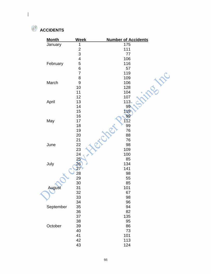
66
ACCIDENTS Month Week Number of Accidents January 1 175 2 111 3 77 4 106 February 5 116 6 57 7 119 8 109 March 9 106 10 128 11 104 12 107 April 13 113 14 99 15 119 16 99 May 17 112 18 99 19 76 20 88 21 76 June 22 98 23 109 24 100 25 85 July 26 134 27 141 28 98 29 55 30 85 August 31 101 32 67 33 98 34 96 September 35 94 36 82 37 135 38 95 October 39 86 40 73 41 101 42 113 43 124
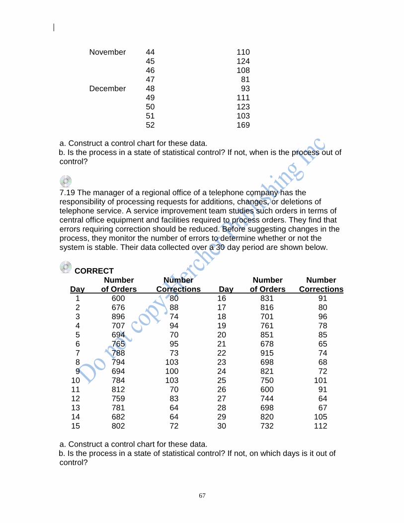
67
November 44 110 45 124 46 108 47 81 December 48 93 49 111 50 123 51 103 52 169 a. Construct a control chart for these data.
b. Is the process in a state of statistical control? If not, when is the process out of control?
7.19 The manager of a regional office of a telephone company has the responsibility of processing requests for additions, changes, or deletions of telephone service. A service improvement team studies such orders in terms of central office equipment and facilities required to process orders. They find that errors requiring correction should be reduced. Before suggesting changes in the process, they monitor the number of errors to determine whether or not the system is stable. Their data collected over a 30 day period are shown below.
CORRECT Number Number Number Number Day of Orders Corrections Day of Orders Corrections 1 600 80 16 831 91 2 676 88 17 816 80 3 896 74 18 701 96 4 707 94 19 761 78 5 694 70 20 851 85 6 765 95 21 678 65 7 788 73 22 915 74 8 794 103 23 698 68 9 694 100 24 821 72 10 784 103 25 750 101 11 812 70 26 600 91 12 759 83 27 744 64 13 781 64 28 698 67 14 682 64 29 820 105 15 802 72 30 732 112 a. Construct a control chart for these data.
b. Is the process in a state of statistical control? If not, on which days is it out of control?
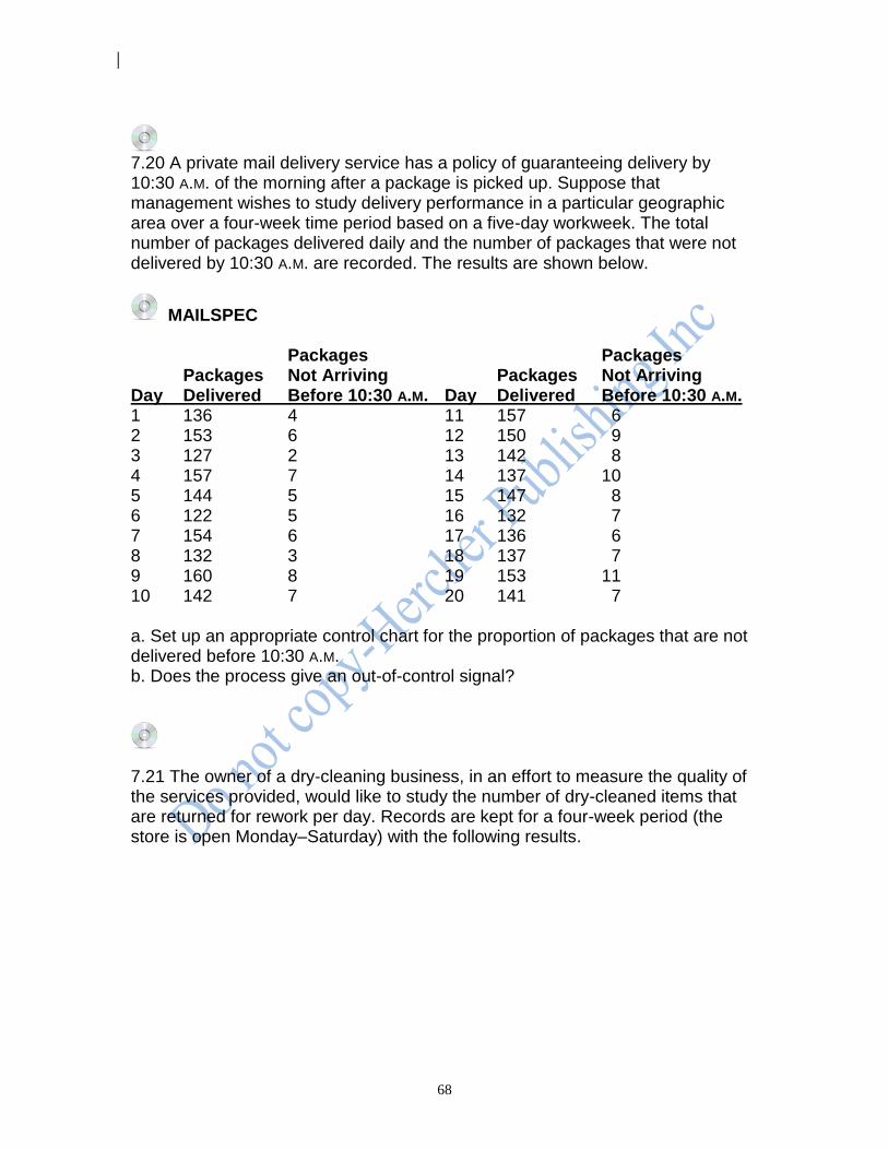
68
7.20 A private mail delivery service has a policy of guaranteeing delivery by 10:30 A.M. of the morning after a package is picked up. Suppose that management wishes to study delivery performance in a particular geographic area over a four-week time period based on a five-day workweek. The total number of packages delivered daily and the number of packages that were not delivered by 10:30 A.M. are recorded. The results are shown below.
MAILSPEC Packages Packages Packages Not Arriving Packages Not Arriving Day Delivered Before 10:30 A.M. Day Delivered Before 10:30 A.M. 1 136 4 11 157 6 2 153 6 12 150 9 3 127 2 13 142 8 4 157 7 14 137 10 5 144 5 15 147 8 6 122 5 16 132 7 7 154 6 17 136 6 8 132 3 18 137 7 9 160 8 19 153 11 10 142 7 20 141 7 a. Set up an appropriate control chart for the proportion of packages that are not delivered before 10:30 A.M. b. Does the process give an out-of-control signal?
7.21 The owner of a dry-cleaning business, in an effort to measure the quality of the services provided, would like to study the number of dry-cleaned items that are returned for rework per day. Records are kept for a four-week period (the store is open Monday–Saturday) with the following results.
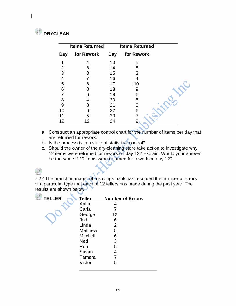
69
DRYCLEAN
Items Returned Items Returned
Day for Rework Day for Rework
1 4 13 5 2 6 14 8 3 3 15 3 4 7 16 4 5 6 17 10 6 8 18 9 7 6 19 6 8 4 20 5 9 8 21 8 10 6 22 6 11 5 23 7 12 12 24 9
a. Construct an appropriate control chart for the number of items per day that
are returned for rework. b. Is the process is in a state of statistical control? c. Should the owner of the dry-cleaning store take action to investigate why
12 items were returned for rework on day 12? Explain. Would your answer be the same if 20 items were returned for rework on day 12?
7.22 The branch manager of a savings bank has recorded the number of errors of a particular type that each of 12 tellers has made during the past year. The results are shown below.
TELLER Teller Number of Errors Anita 4 Carla 7 George 12 Jed 6 Linda 2 Matthew 5 Mitchell 6 Ned 3 Ron 5 Susan 4 Tamara 7 Victor 5
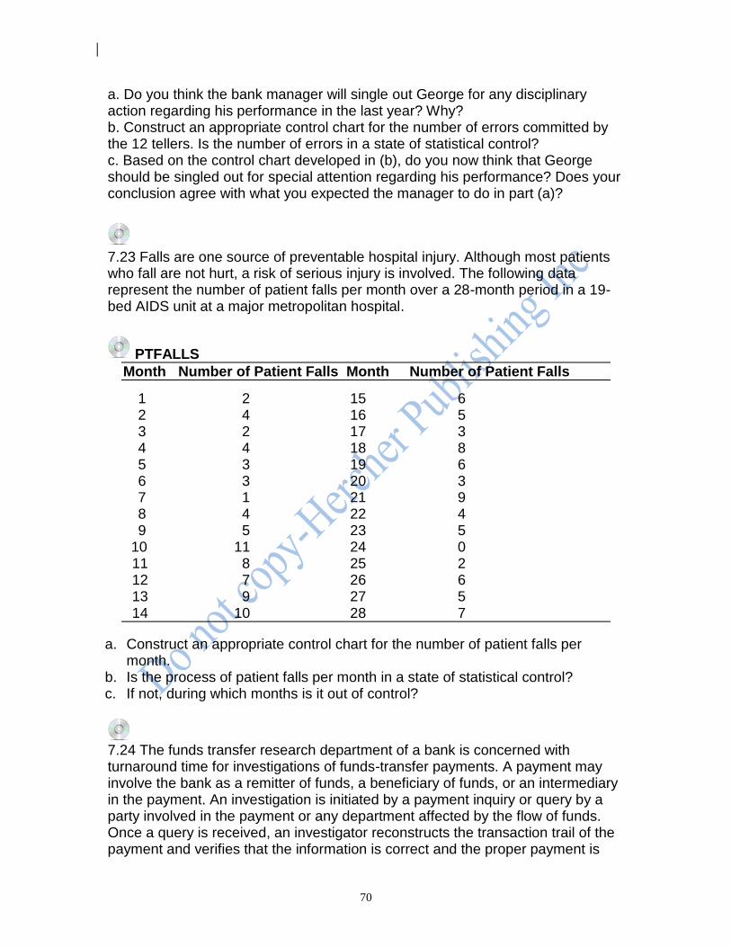
70
a. Do you think the bank manager will single out George for any disciplinary action regarding his performance in the last year? Why? b. Construct an appropriate control chart for the number of errors committed by the 12 tellers. Is the number of errors in a state of statistical control? c. Based on the control chart developed in (b), do you now think that George should be singled out for special attention regarding his performance? Does your conclusion agree with what you expected the manager to do in part (a)?
7.23 Falls are one source of preventable hospital injury. Although most patients who fall are not hurt, a risk of serious injury is involved. The following data represent the number of patient falls per month over a 28-month period in a 19-bed AIDS unit at a major metropolitan hospital.
PTFALLS
Month Number of Patient Falls Month Number of Patient Falls
1 2 15 6 2 4 16 5 3 2 17 3 4 4 18 8 5 3 19 6 6 3 20 3 7 1 21 9 8 4 22 4 9 5 23 5 10 11 24 0 11 8 25 2 12 7 26 6 13 9 27 5 14 10 28 7
a. Construct an appropriate control chart for the number of patient falls per month.
b. Is the process of patient falls per month in a state of statistical control? c. If not, during which months is it out of control?
7.24 The funds transfer research department of a bank is concerned with turnaround time for investigations of funds-transfer payments. A payment may involve the bank as a remitter of funds, a beneficiary of funds, or an intermediary in the payment. An investigation is initiated by a payment inquiry or query by a party involved in the payment or any department affected by the flow of funds. Once a query is received, an investigator reconstructs the transaction trail of the payment and verifies that the information is correct and the proper payment is
71
transmitted. The investigator then reports the results of the investigation and the transaction is considered closed. It is important that investigations are closed rapidly, preferably within the same day. The number of new investigations and the number and proportion closed on the same day that the inquiry was made are shown below.
FUNDTRAN New Number Day Investigations Closed
1 240 96 2 296 88 3 309 113 4 293 138 5 253 119 6 254 94 7 245 75 8 331 125 9 303 134 10 278 83 11 256 90 12 273 102 13 276 115 14 291 98 15 204 83 16 263 79 17 311 116 18 248 104 19 287 110 20 238 107 21 280 131 22 271 139 23 237 121 24 258 94 25 289 128 26 226 90 27 287 106 28 263 81 29 282 107 30 194 75 a. Construct an appropriate control chart for these data. b. Is the process in statistical control? If not, on which days is it out of control?

72
7.25 The manager of a retail sales branch of a brokerage office is concerned with the number of undesirable trades made by the sales staff. A trade is considered undesirable if there is an error on the trade ticket. Trades that are in error must to be cancelled and resubmitted. The cost of correcting errors is billed to the brokerage. In studying the problem, the manager wants to know whether the proportion of undesirable trades is in a state of statistical control so he can plan the next step in a quality improvement process. Data is collected for a 30-day period with the following results.
TRADE Undesirable Total Day Trades Trades 1 2 74 2 12 85 3 13 114 4 33 136 5 5 97 6 20 115 7 17 108 8 10 76 9 8 69 10 18 98 11 3 104 12 12 98 13 15 105 14 6 98 15 21 204 16 3 54 17 12 74 18 11 103 19 11 100 20 14 88 21 4 58 22 10 69 23 19 135 24 1 67 25 11 77 26 12 88 27 4 66 28 11 72 29 13 118 30 15 138 a. Construct an appropriate control chart for these data.
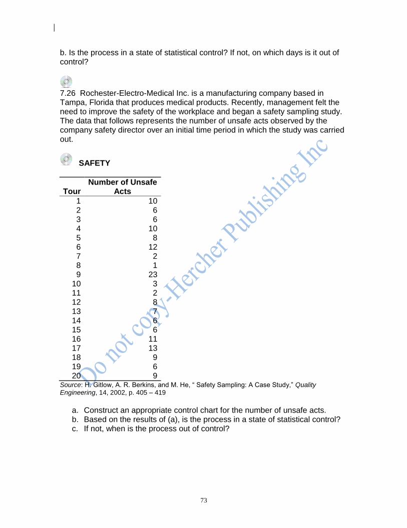
73
b. Is the process in a state of statistical control? If not, on which days is it out of control?
7.26 Rochester-Electro-Medical Inc. is a manufacturing company based in Tampa, Florida that produces medical products. Recently, management felt the need to improve the safety of the workplace and began a safety sampling study. The data that follows represents the number of unsafe acts observed by the company safety director over an initial time period in which the study was carried out.
SAFETY
Tour Number of Unsafe
Acts
1 10 2 6 3 6 4 10 5 8 6 12 7 2 8 1 9 23
10 3 11 2 12 8 13 7 14 6 15 6 16 11 17 13 18 9 19 6 20 9
Source: H. Gitlow, A. R. Berkins, and M. He, “ Safety Sampling: A Case Study,” Quality Engineering, 14, 2002, p. 405 – 419
a. Construct an appropriate control chart for the number of unsafe acts. b. Based on the results of (a), is the process in a state of statistical control? c. If not, when is the process out of control?

74
REFERENCES AND ADDITIONAL READINGS [1] American Society for Quality Control Inc., 310 West Wisconsin Ave., Milwaukee, Wis. 53203. [2] Gitlow, H. and Gitlow, S.(1987), The Deming Guide to Quality, Productivity and Competitive Position, Prentice-Hall Publishers (Englewood Cliffs, N.J.).
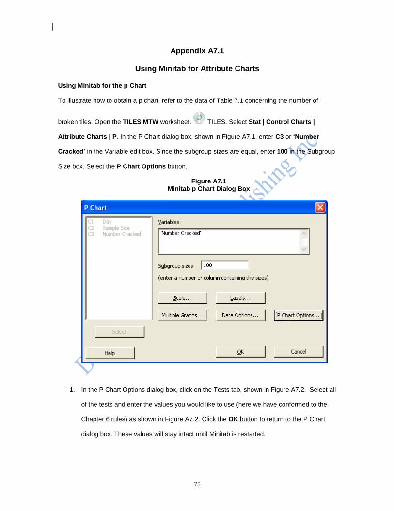
75
Appendix A7.1
Using Minitab for Attribute Charts
Using Minitab for the p Chart
To illustrate how to obtain a p chart, refer to the data of Table 7.1 concerning the number of
broken tiles. Open the TILES.MTW worksheet. TILES. Select Stat | Control Charts |
Attribute Charts | P. In the P Chart dialog box, shown in Figure A7.1, enter C3 or ‘Number
Cracked’ in the Variable edit box. Since the subgroup sizes are equal, enter 100 in the Subgroup
Size box. Select the P Chart Options button.
Figure A7.1 Minitab p Chart Dialog Box
1. In the P Chart Options dialog box, click on the Tests tab, shown in Figure A7.2. Select all
of the tests and enter the values you would like to use (here we have conformed to the
Chapter 6 rules) as shown in Figure A7.2. Click the OK button to return to the P Chart
dialog box. These values will stay intact until Minitab is restarted.
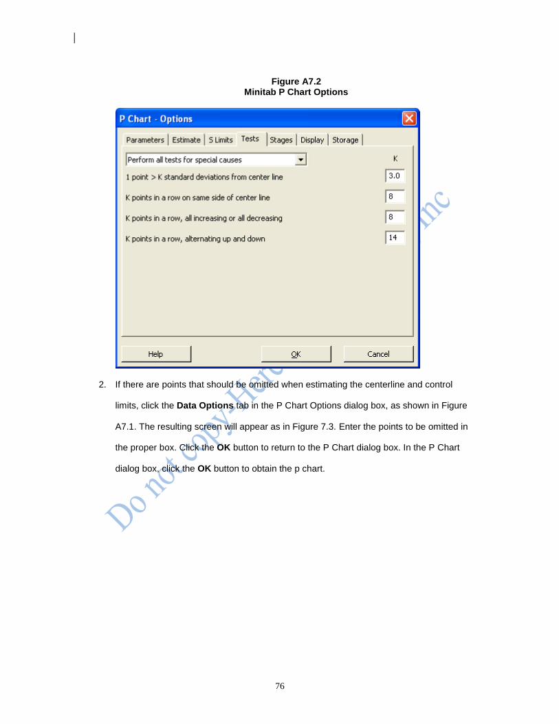
76
Figure A7.2
Minitab P Chart Options
2. If there are points that should be omitted when estimating the centerline and control
limits, click the Data Options tab in the P Chart Options dialog box, as shown in Figure
A7.1. The resulting screen will appear as in Figure 7.3. Enter the points to be omitted in
the proper box. Click the OK button to return to the P Chart dialog box. In the P Chart
dialog box, click the OK button to obtain the p chart.
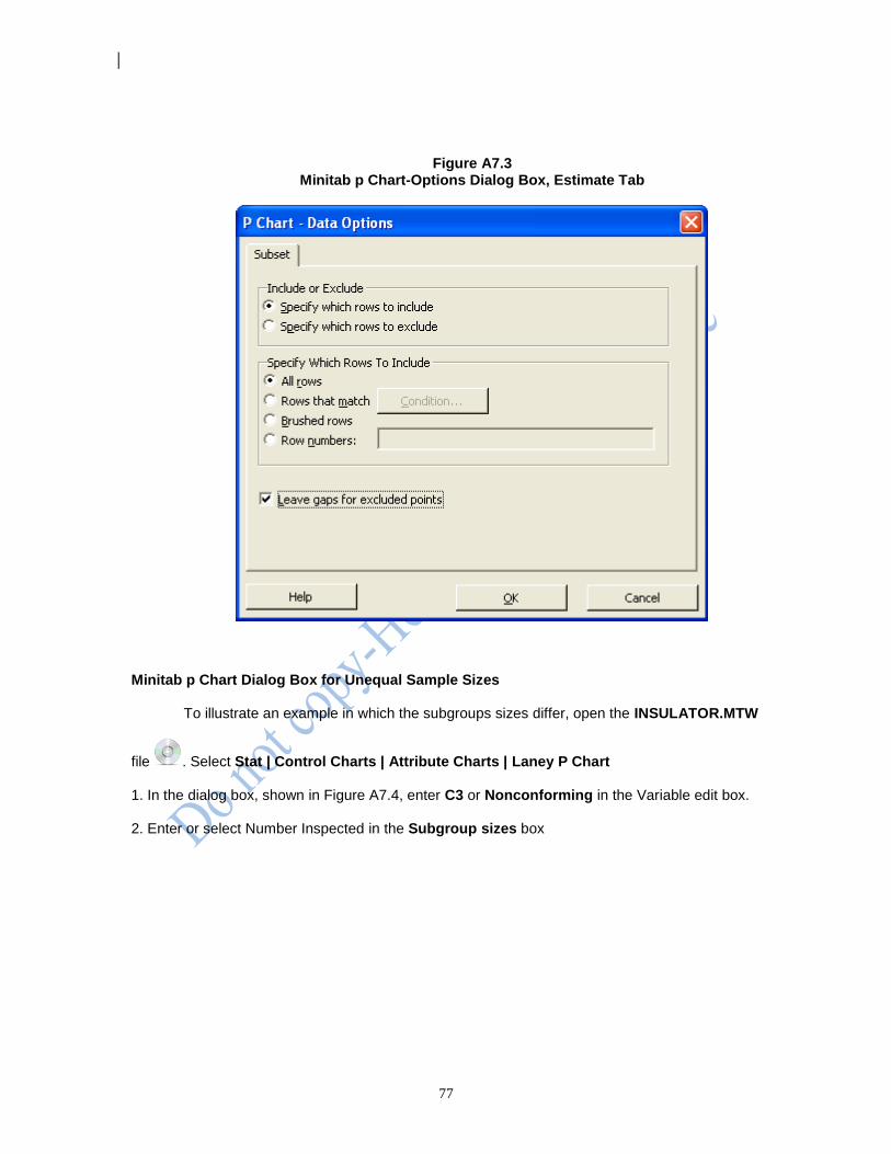
77
Figure A7.3
Minitab p Chart-Options Dialog Box, Estimate Tab
Minitab p Chart Dialog Box for Unequal Sample Sizes
To illustrate an example in which the subgroups sizes differ, open the INSULATOR.MTW
file . Select Stat | Control Charts | Attribute Charts | Laney P Chart
1. In the dialog box, shown in Figure A7.4, enter C3 or Nonconforming in the Variable edit box.
2. Enter or select Number Inspected in the Subgroup sizes box

78
Figure A7.4 Laney p Chart Dialog Box
3. Select the Laney P Chart Options button. In the P Chart Options dialog box, click on the
Tests tab, as shown in Figure A7.2. Select the all tests with the appropriate values entered
as in Figure A7.5. Click the OK button to return to the P Chart dialog box.
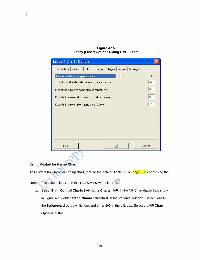
79
Figure A7.5 Laney p chart Options Dialog Box – Tests
Using Minitab for the np Chart
To illustrate how to obtain an np chart, refer to the data of Table 7.1 on page 000 concerning the
number of cracked tiles. Open the TILES.MTW worksheet .
1. Select Stat | Control Charts | Attribute Charts | NP. In the NP Chart dialog box, shown
in Figure A7.6, enter C3 or ‘Number Cracked’ in the Variable edit box. Select Size in
the Subgroup drop-down list box and enter 100 in the edit box. Select the NP Chart
Options button.
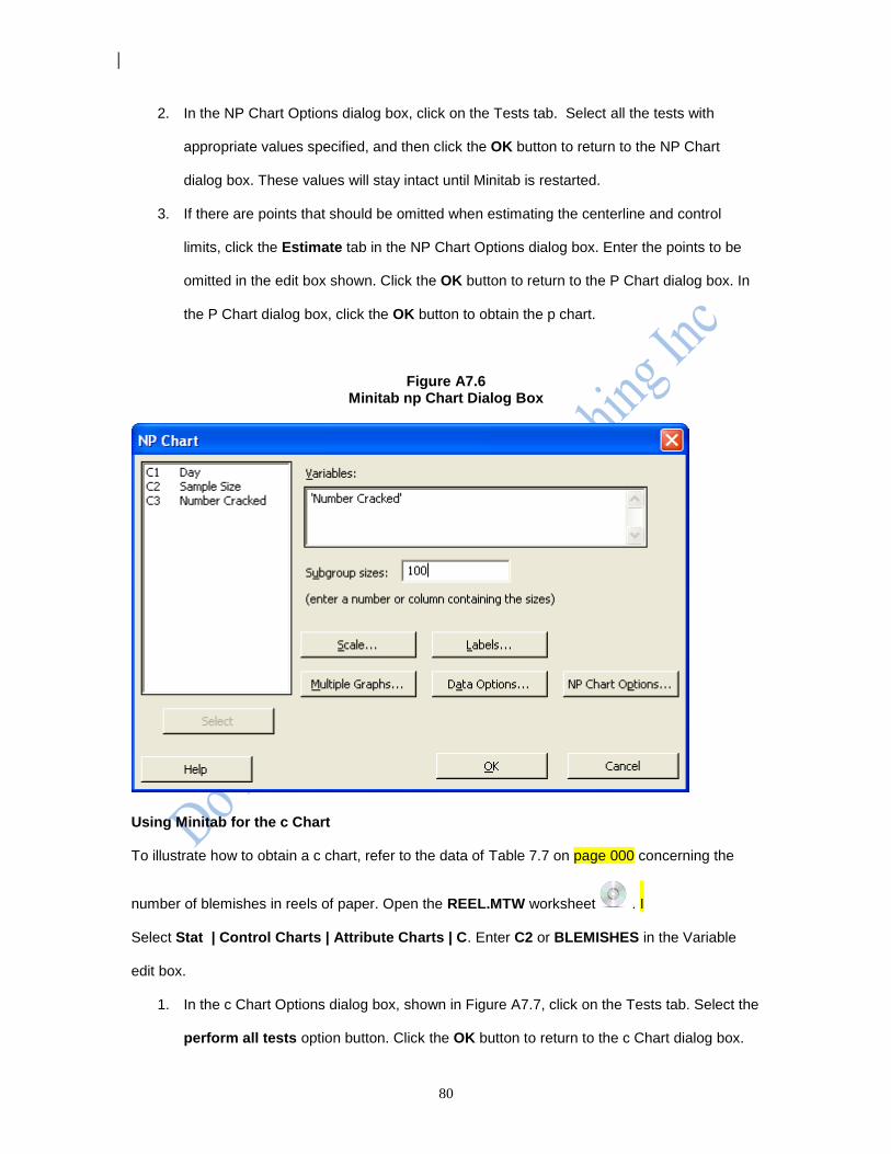
80
2. In the NP Chart Options dialog box, click on the Tests tab. Select all the tests with
appropriate values specified, and then click the OK button to return to the NP Chart
dialog box. These values will stay intact until Minitab is restarted.
3. If there are points that should be omitted when estimating the centerline and control
limits, click the Estimate tab in the NP Chart Options dialog box. Enter the points to be
omitted in the edit box shown. Click the OK button to return to the P Chart dialog box. In
the P Chart dialog box, click the OK button to obtain the p chart.
Figure A7.6 Minitab np Chart Dialog Box
Using Minitab for the c Chart
To illustrate how to obtain a c chart, refer to the data of Table 7.7 on page 000 concerning the
number of blemishes in reels of paper. Open the REEL.MTW worksheet . I
Select Stat | Control Charts | Attribute Charts | C. Enter C2 or BLEMISHES in the Variable
edit box.
1. In the c Chart Options dialog box, shown in Figure A7.7, click on the Tests tab. Select the
perform all tests option button. Click the OK button to return to the c Chart dialog box.
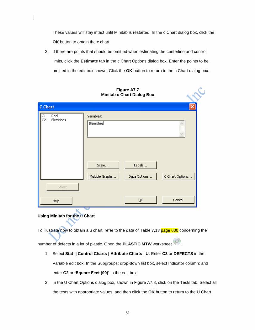
81
These values will stay intact until Minitab is restarted. In the c Chart dialog box, click the
OK button to obtain the c chart.
2. If there are points that should be omitted when estimating the centerline and control
limits, click the Estimate tab in the c Chart Options dialog box. Enter the points to be
omitted in the edit box shown. Click the OK button to return to the c Chart dialog box.
Figure A7.7 Minitab c Chart Dialog Box
Using Minitab for the u Chart
To illustrate how to obtain a u chart, refer to the data of Table 7.13 page 000 concerning the
number of defects in a lot of plastic. Open the PLASTIC.MTW worksheet .
1. Select Stat | Control Charts | Attribute Charts | U. Enter C3 or DEFECTS in the
Variable edit box. In the Subgroups: drop-down list box, select Indicator column: and
enter C2 or ‘Square Feet (00)’ in the edit box.
2. In the U Chart Options dialog box, shown in Figure A7.8, click on the Tests tab. Select all
the tests with appropriate values, and then click the OK button to return to the U Chart
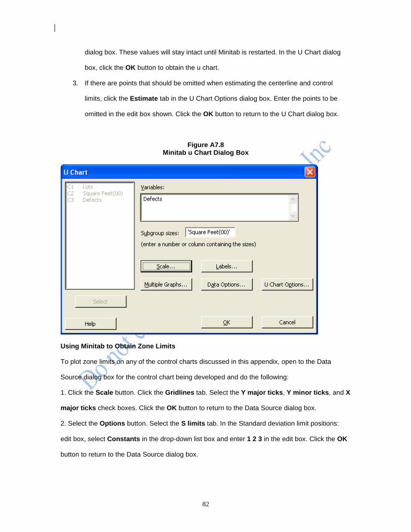
82
dialog box. These values will stay intact until Minitab is restarted. In the U Chart dialog
box, click the OK button to obtain the u chart.
3. If there are points that should be omitted when estimating the centerline and control
limits, click the Estimate tab in the U Chart Options dialog box. Enter the points to be
omitted in the edit box shown. Click the OK button to return to the U Chart dialog box.
Figure A7.8 Minitab u Chart Dialog Box
Using Minitab to Obtain Zone Limits
To plot zone limits on any of the control charts discussed in this appendix, open to the Data
Source dialog box for the control chart being developed and do the following:
1. Click the Scale button. Click the Gridlines tab. Select the Y major ticks, Y minor ticks, and X
major ticks check boxes. Click the OK button to return to the Data Source dialog box.
2. Select the Options button. Select the S limits tab. In the Standard deviation limit positions:
edit box, select Constants in the drop-down list box and enter 1 2 3 in the edit box. Click the OK
button to return to the Data Source dialog box.