Embed Size (px)
Citation preview
117
Copyright © 2009 Pearson Education, Inc. Publishing as Prentice Hall.
CHAPTER 2 2.1 (a) Category Frequency Percentage A 13 26% B 28 56 C 9 18 (b) The Bar Chart
18%
56%
26%
0% 10% 20% 30% 40% 50% 60%
C
B
A
Percentage of Category (c) The Pie Chart
C18%
B56%
A26%
Full file at http://TestbankCollege.eu/Solution-Manual-Basic-Business-Statistics-11th-Edition-Berenson
118 Chapter 2: Presenting Data in Tables and Charts
Copyright © 2009 Pearson Education, Inc. Publishing as Prentice Hall.
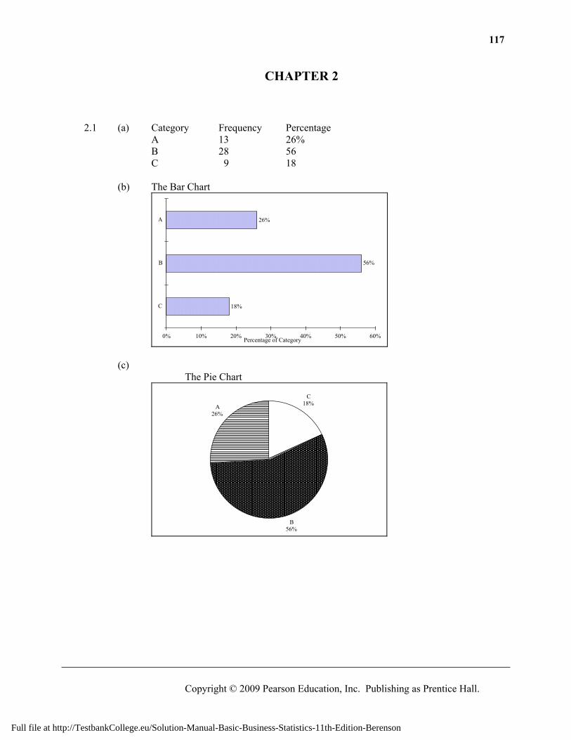
2.1 (d) cont. The Pareto Chart
0%
10%
20%
30%
40%
50%
60%
70%
80%
90%
100%
B A C
2.2 (a)
P erc en tage
12
29
35
24
0 10 20 30 40
A
B
C
D
Full file at http://TestbankCollege.eu/Solution-Manual-Basic-Business-Statistics-11th-Edition-Berenson
119
Copyright © 2009 Pearson Education, Inc. Publishing as Prentice Hall.
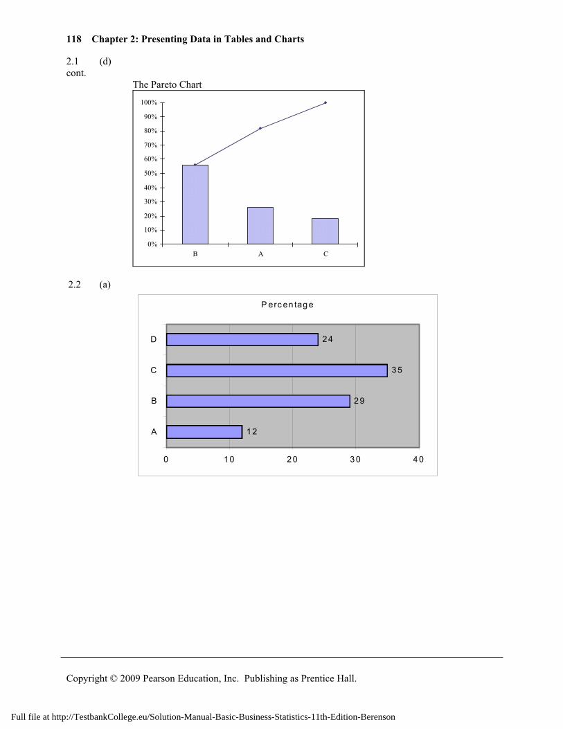
2.2 (b) cont.
Pie Chart
A12%
B29%
C35%
D24%
(c)
0%
5%
10%
15%
20%
25%
30%
35%
40%
C B D A
Category
%
0%10%20%30%40%50%60%70%80%90%100%
Cum
mul
ativ
e %
2.3 (a)
Bar Chart
0 5 10 15 20 25 30 35 40 45 50
Lack of eye contact
Limited enthusiasm
Little or no knowledge of company
Other reasons
Unprepared to discuss career plans
Unprepared to discussskills/experience
Rea
son
Full file at http://TestbankCollege.eu/Solution-Manual-Basic-Business-Statistics-11th-Edition-Berenson
120 Chapter 2: Presenting Data in Tables and Charts
Copyright © 2009 Pearson Education, Inc. Publishing as Prentice Hall.
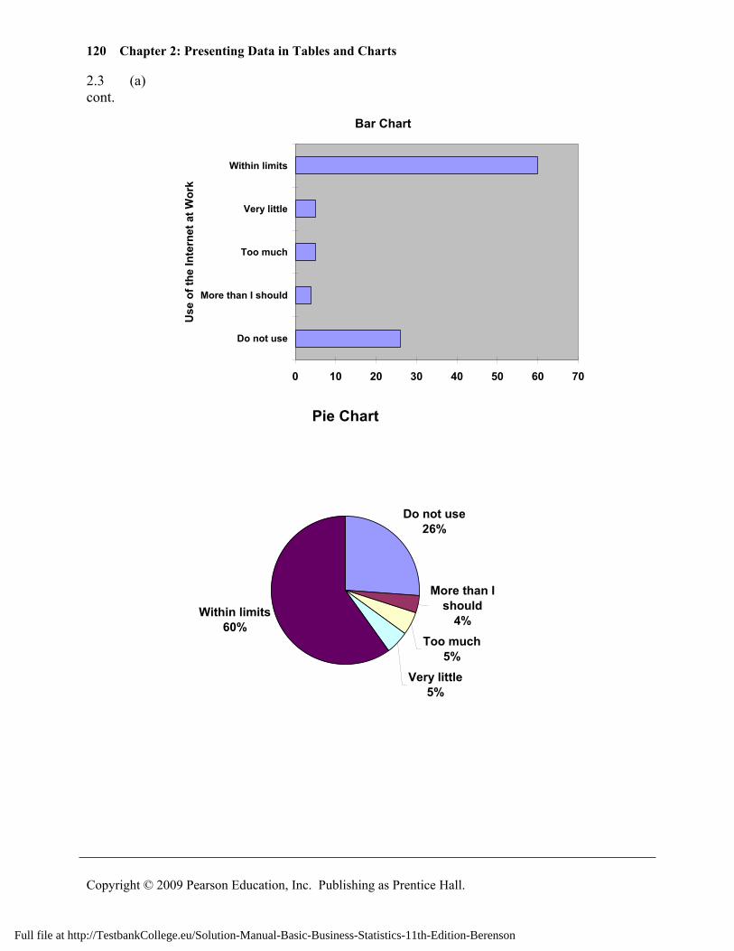
2.3 (a) cont.
Bar Chart
0 10 20 30 40 50 60 70
Do not use
More than I should
Too much
Very little
Within limits
Use
of t
he In
tern
et a
t Wor
k
Pie Chart
Do not use26%
More than I should
4%Too much
5%Very little
5%
Within limits60%
Full file at http://TestbankCollege.eu/Solution-Manual-Basic-Business-Statistics-11th-Edition-Berenson
121
Copyright © 2009 Pearson Education, Inc. Publishing as Prentice Hall.
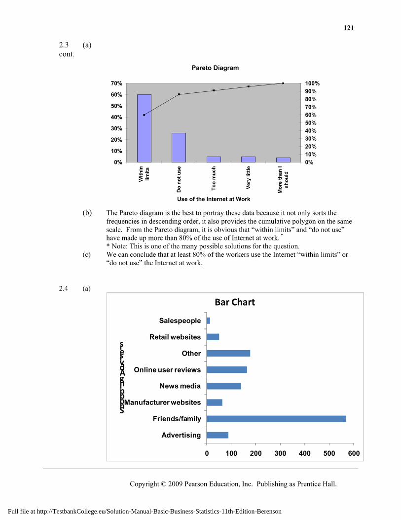
2.3 (a) cont.
Pareto Diagram
0%
10%
20%
30%
40%
50%
60%
70%
With
inlim
its
Do
not u
se
Too
muc
h
Very
littl
e
Mor
e th
an I
shou
ld
Use of the Internet at Work
0%10%20%30%40%50%60%70%80%90%100%
(b) The Pareto diagram is the best to portray these data because it not only sorts the
frequencies in descending order, it also provides the cumulative polygon on the same scale. From the Pareto diagram, it is obvious that “within limits” and “do not use” have made up more than 80% of the use of Internet at work. *
* Note: This is one of the many possible solutions for the question. (c) We can conclude that at least 80% of the workers use the Internet “within limits” or
“do not use” the Internet at work. 2.4 (a)
0 100 200 300 400 500 600
Advertising
Friends/family
Manufacturer websites
News media
Online user reviews
Other
Retail websites
Salespeople
Shopping Advisers
Bar Chart
Full file at http://TestbankCollege.eu/Solution-Manual-Basic-Business-Statistics-11th-Edition-Berenson
122 Chapter 2: Presenting Data in Tables and Charts
Copyright © 2009 Pearson Education, Inc. Publishing as Prentice Hall.
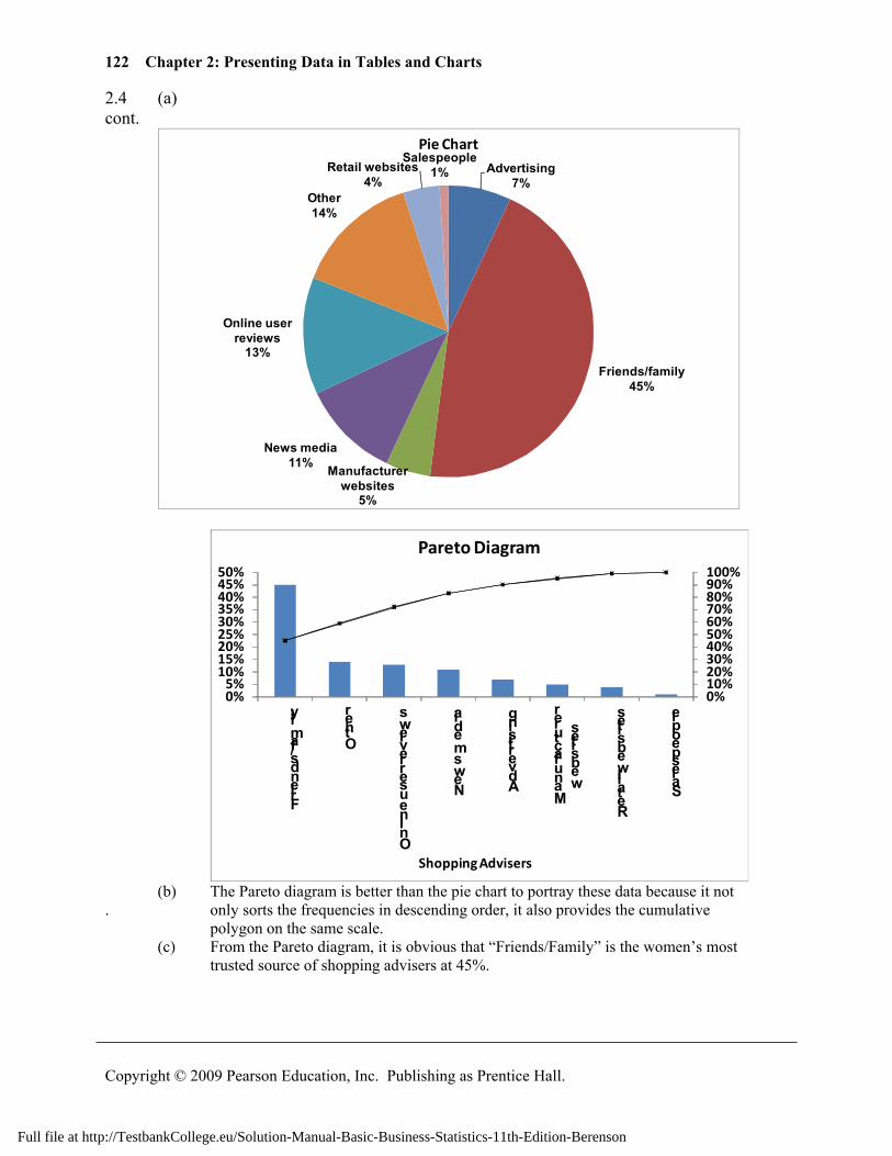
2.4 (a) cont.
Advertising7%
Friends/family45%
Manufacturer websites
5%
News media11%
Online user reviews
13%
Other14%
Retail websites4%
Salespeople1%
Pie Chart
0%10%20%30%40%50%60%70%80%90%100%
0%5%
10%15%20%25%30%35%40%45%50%
Friends/family
Other
Online user reviews
News media
Advertising
Manufacturer
websites
Retail websites
Salespeople
Shopping Advisers
Pareto Diagram
(b) The Pareto diagram is better than the pie chart to portray these data because it not . only sorts the frequencies in descending order, it also provides the cumulative
polygon on the same scale. (c) From the Pareto diagram, it is obvious that “Friends/Family” is the women’s most
trusted source of shopping advisers at 45%.
Full file at http://TestbankCollege.eu/Solution-Manual-Basic-Business-Statistics-11th-Edition-Berenson
123
Copyright © 2009 Pearson Education, Inc. Publishing as Prentice Hall.
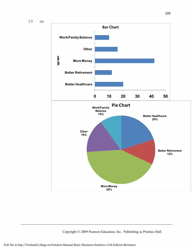
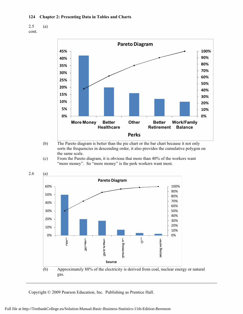
2.5 (a)
0 10 20 30 40 50
Better Healthcare
Better Retirement
More Money
Other
Work/Family Balance
Perks
Bar Chart
Better Healthcare20%
Better Retirement12%
More Money42%
Other16%
Work/Family Balance
10%
Pie Chart
Full file at http://TestbankCollege.eu/Solution-Manual-Basic-Business-Statistics-11th-Edition-Berenson
124 Chapter 2: Presenting Data in Tables and Charts
Copyright © 2009 Pearson Education, Inc. Publishing as Prentice Hall.
2.5 (a) cont.
0%
10%
20%
30%
40%
50%
60%
70%
80%
90%
100%
0%
5%
10%
15%
20%
25%
30%
35%
40%
45%
More Money Better Healthcare
Other Better Retirement
Work/Family Balance
Perks
Pareto Diagram
(b) The Pareto diagram is better than the pie chart or the bar chart because it not only
sorts the frequencies in descending order, it also provides the cumulative polygon on the same scale.
(c) From the Pareto diagram, it is obvious that more than 40% of the workers want “more money”. So “more money” is the perk workers want most.
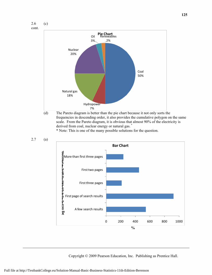
2.6 (a)
0%10%20%30%40%50%60%70%80%90%100%
0%
10%
20%
30%
40%
50%
60%
Coal
Nuclear
Natural gas
Hydropower O
il
Renewables
Source
Pareto Diagram
(b) Approximately 88% of the electricity is derived from coal, nuclear energy or natural
gas.
Full file at http://TestbankCollege.eu/Solution-Manual-Basic-Business-Statistics-11th-Edition-Berenson
125
Copyright © 2009 Pearson Education, Inc. Publishing as Prentice Hall.
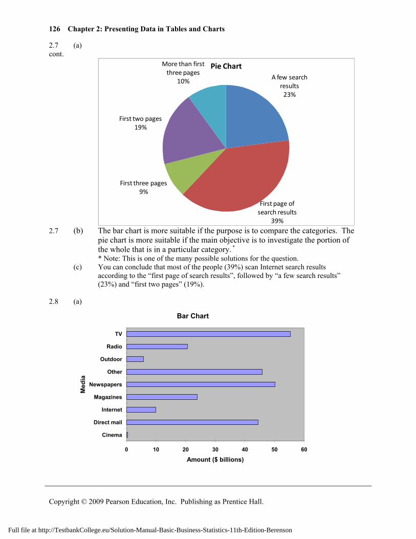
2.6 (c) cont.
Coal50%
Hydropower7%
Natural gas18%
Nuclear20%
Oil3%
Renewables2%
Pie Chart
(d) The Pareto diagram is better than the pie chart because it not only sorts the
frequencies in descending order, it also provides the cumulative polygon on the same scale. From the Pareto diagram, it is obvious that almost 90% of the electricity is derived from coal, nuclear energy or natural gas. *
* Note: This is one of the many possible solutions for the question.
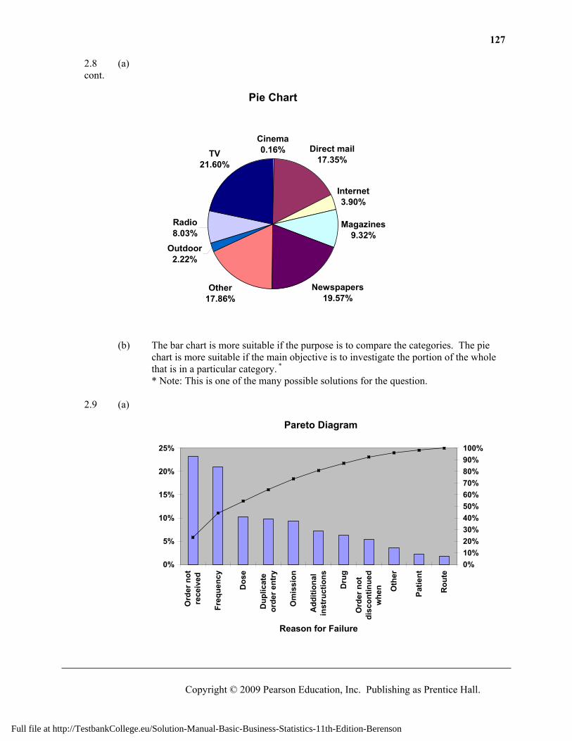
2.7 (a)
0 200 400 600 800 1000
A few search results
First page of search results
First three pages
First two pages
More than first three pages
Amount of Internet Search Results Scanned
Bar Chart
%
Full file at http://TestbankCollege.eu/Solution-Manual-Basic-Business-Statistics-11th-Edition-Berenson
126 Chapter 2: Presenting Data in Tables and Charts
Copyright © 2009 Pearson Education, Inc. Publishing as Prentice Hall.
2.7 (a) cont.
A few search results
23%
First page of search results
39%
First three pages9%
First two pages19%
More than first three pages
10%
Pie Chart
2.7 (b) The bar chart is more suitable if the purpose is to compare the categories. The
pie chart is more suitable if the main objective is to investigate the portion of the whole that is in a particular category. *
* Note: This is one of the many possible solutions for the question. (c) You can conclude that most of the people (39%) scan Internet search results
according to the “first page of search results”, followed by “a few search results” (23%) and “first two pages” (19%).
2.8 (a)
Bar Chart
0 10 20 30 40 50 60
Cinema
Direct mail
Internet
Magazines
Newspapers
Other
Outdoor
Radio
TV
Med
ia
Amount ($ billions)
Full file at http://TestbankCollege.eu/Solution-Manual-Basic-Business-Statistics-11th-Edition-Berenson
127
Copyright © 2009 Pearson Education, Inc. Publishing as Prentice Hall.
2.8 (a) cont.
Pie Chart
Cinema0.16% Direct mail
17.35%
Internet3.90%
Magazines9.32%
Newspapers19.57%
Other17.86%
Outdoor2.22%
Radio8.03%
TV21.60%
(b) The bar chart is more suitable if the purpose is to compare the categories. The pie
chart is more suitable if the main objective is to investigate the portion of the whole that is in a particular category. *
* Note: This is one of the many possible solutions for the question. 2.9 (a)
Pareto Diagram
0%
5%
10%
15%
20%
25%
Ord
er n
otre
ceiv
ed
Freq
uenc
y
Dos
e
Dup
licat
eor
der e
ntry
Om
issi
on
Add
ition
alin
stru
ctio
ns
Dru
g
Ord
er n
otdi
scon
tinue
dw
hen O
ther
Patie
nt
Rou
te
Reason for Failure
0%10%20%30%40%50%60%70%80%90%100%
Full file at http://TestbankCollege.eu/Solution-Manual-Basic-Business-Statistics-11th-Edition-Berenson
128 Chapter 2: Presenting Data in Tables and Charts
Copyright © 2009 Pearson Education, Inc. Publishing as Prentice Hall.
2.9 (b) The “vital few” are “Order not received” and “Frequency” which accounted for about cont. half of the failures. The remaining reasons constitute the “trivial many” which capture about
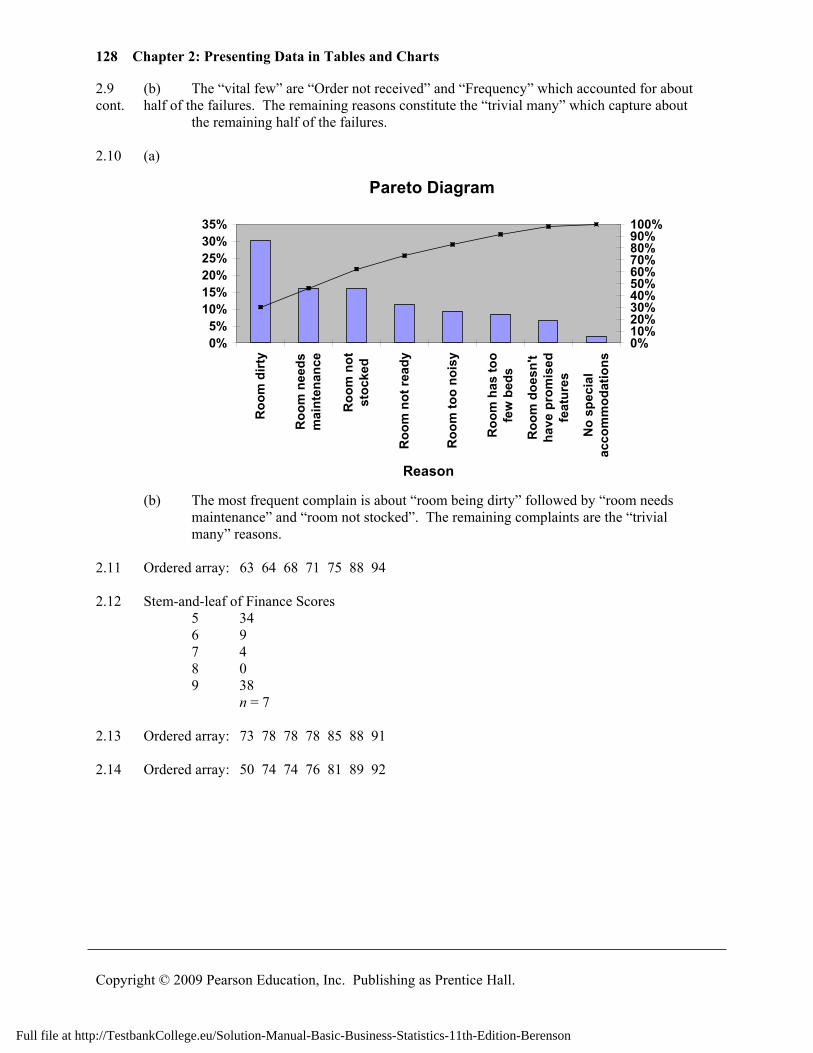
the remaining half of the failures. 2.10 (a)
Pareto Diagram
0%5%
10%15%20%25%30%35%
Roo
m d
irty
Roo
m n
eeds
mai
nten
ance
Roo
m n
otst
ocke
d
Roo
m n
ot re
ady
Roo
m to
o no
isy
Roo
m h
as to
ofe
w b
eds
Roo
m d
oesn
'tha
ve p
rom
ised
feat
ures
No
spec
ial
acco
mm
odat
ions
Reason
0%10%20%30%40%50%60%70%80%90%100%
(b) The most frequent complain is about “room being dirty” followed by “room needs maintenance” and “room not stocked”. The remaining complaints are the “trivial
many” reasons. 2.11 Ordered array: 63 64 68 71 75 88 94 2.12 Stem-and-leaf of Finance Scores 5 34 6 9 7 4 8 0 9 38 n = 7 2.13 Ordered array: 73 78 78 78 85 88 91 2.14 Ordered array: 50 74 74 76 81 89 92
Full file at http://TestbankCollege.eu/Solution-Manual-Basic-Business-Statistics-11th-Edition-Berenson
129
Copyright © 2009 Pearson Education, Inc. Publishing as Prentice Hall.
2.15 (a) Ordered array: 9.1 9.4 9.7 10.0 10.2 10.2 10.3 10.8 11.1 11.2 11.5 11.5 11.6 11.6 11.7 11.7 11.7 12.2 12.2 12.3 12.4 12.8 12.9 13.0 13.2
(b) The stem-and-leaf display conveys more information than the ordered array. We can more readily determine the arrangement of the data from the stem-and-leaf display than we can from the ordered array. We can also obtain a sense of the distribution of the data from the stem-and-leaf display.
(c) The most likely gasoline purchase is between 11 and 11.9 gallons. (d) Yes, the third row is the most frequently occurring stem in the display and it is located in
the center of the distribution. 2.16 (a) Ordered array: Cost($) 120, 130, 132, 134, 134, 139, 141, 146, 148, 149, 154, 157,
158, 159, 163, 170, 170, 175, 180, 183, 186, 191, 192, 194, 202, 207, 209, 209, 219, 288
(b) PHStat output: Stem-and-Leaf Display
Stem unit: 10
12 0 13 0 2 4 4 9 14 1 6 8 9 15 4 7 8 9 16 3 17 0 0 5 18 0 3 6 19 1 2 4 20 2 7 9 9 21 9 22 23 24 25 26 27 28 8
(c) The stem-and-leaf display provides more information because it not only orders observations from the smallest to the largest into stems and leaves, it also conveys information on how the values distribute and cluster over the range of the observations in the data set.
(d) The costs of attending a baseball game do not appear to be concentrating around any particular value. In fact, the costs appear to spread quite evenly between $130 and $210 with the exception of an outlier at $288 for Boston.
Full file at http://TestbankCollege.eu/Solution-Manual-Basic-Business-Statistics-11th-Edition-Berenson
130 Chapter 2: Presenting Data in Tables and Charts
Copyright © 2009 Pearson Education, Inc. Publishing as Prentice Hall.
2.17 (a) Ordered array: 31, 33.75, 35.05, 36.15, 40.25, 43 (b)
Stem-and-Leaf Display for Price Stem unit: 1
31 0 32 33 8 34 35 1 36 2 37 38 39 40 3 41 42 43 0
(c) The stem-and-leaf display conveys more information than the ordered array. We can more readily determine the arrangement of the data from the stem-and-leaf display than we can from the ordered array. We can also obtain a sense of the distribution of the data from the stem-and-leaf display.
(d) The price is not concentrated around any particular value. * Note that Excel rounds leaves up to the first decimal place. 2.18 (a) Ordered array: 4, 5, 7, 8, 16, 19, 19, 20, 20, 23, 24, 25, 29, 29, 30, 30, 30, 30, 40, 56 (b)
Stem-and-Leaf Display for Fat Stem unit: 10
0 4 5 7 8 1 6 9 9 2 0 0 3 4 5 9 9 3 0 0 0 0 4 0 5 6
(c) The stem-and-leaf display conveys more information than the ordered array. We can more readily determine the arrangement of the data from the stem-and-leaf display. We can also obtain a sense of the distribution of the data from the stem-and-leaf display.
(d) The total fat amounts are concentrated around 20 to 29.
Full file at http://TestbankCollege.eu/Solution-Manual-Basic-Business-Statistics-11th-Edition-Berenson
131
Copyright © 2009 Pearson Education, Inc. Publishing as Prentice Hall.
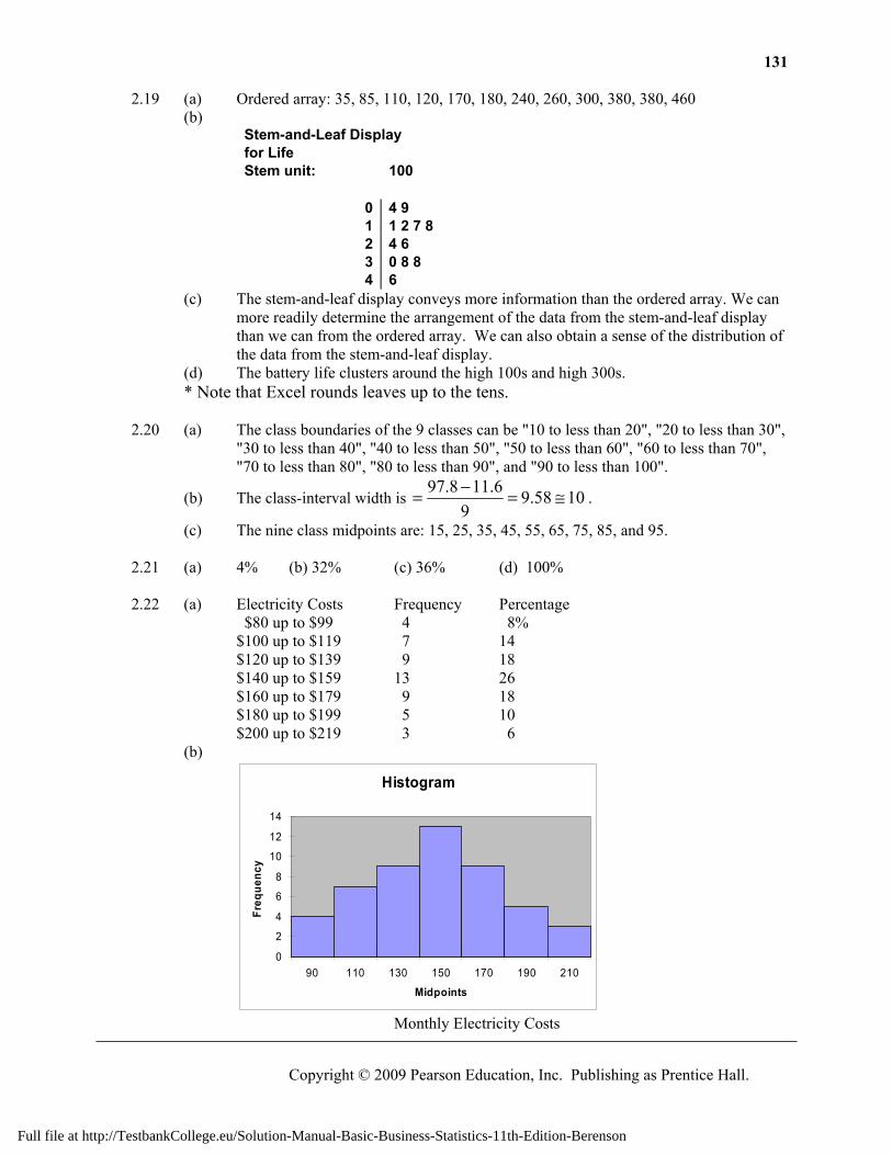
2.19 (a) Ordered array: 35, 85, 110, 120, 170, 180, 240, 260, 300, 380, 380, 460 (b)
Stem-and-Leaf Display for Life Stem unit: 100
0 4 9 1 1 2 7 8 2 4 6 3 0 8 8 4 6
(c) The stem-and-leaf display conveys more information than the ordered array. We can more readily determine the arrangement of the data from the stem-and-leaf display than we can from the ordered array. We can also obtain a sense of the distribution of the data from the stem-and-leaf display.
(d) The battery life clusters around the high 100s and high 300s. * Note that Excel rounds leaves up to the tens. 2.20 (a) The class boundaries of the 9 classes can be "10 to less than 20", "20 to less than 30",
"30 to less than 40", "40 to less than 50", "50 to less than 60", "60 to less than 70", "70 to less than 80", "80 to less than 90", and "90 to less than 100".
(b) The class-interval width is 97.8 11.6 9.58 10
9−= = ≅ .
(c) The nine class midpoints are: 15, 25, 35, 45, 55, 65, 75, 85, and 95. 2.21 (a) 4% (b) 32% (c) 36% (d) 100% 2.22 (a) Electricity Costs Frequency Percentage $80 up to $99 4 8% $100 up to $119 7 14 $120 up to $139 9 18 $140 up to $159 13 26 $160 up to $179 9 18 $180 up to $199 5 10 $200 up to $219 3 6 (b)
Histogram
0
2
4
6
8
10
12
14
90 110 130 150 170 190 210
Midpoints
Freq
uenc
y
Monthly Electricity Costs
Full file at http://TestbankCollege.eu/Solution-Manual-Basic-Business-Statistics-11th-Edition-Berenson
132 Chapter 2: Presenting Data in Tables and Charts
Copyright © 2009 Pearson Education, Inc. Publishing as Prentice Hall.
2.22 (b) cont.
Percentage Polygon
0%
5%
10%
15%
20%
25%
30%
70 90 110 130 150 170 190 210 230
Monthly Electricity Costs (c)
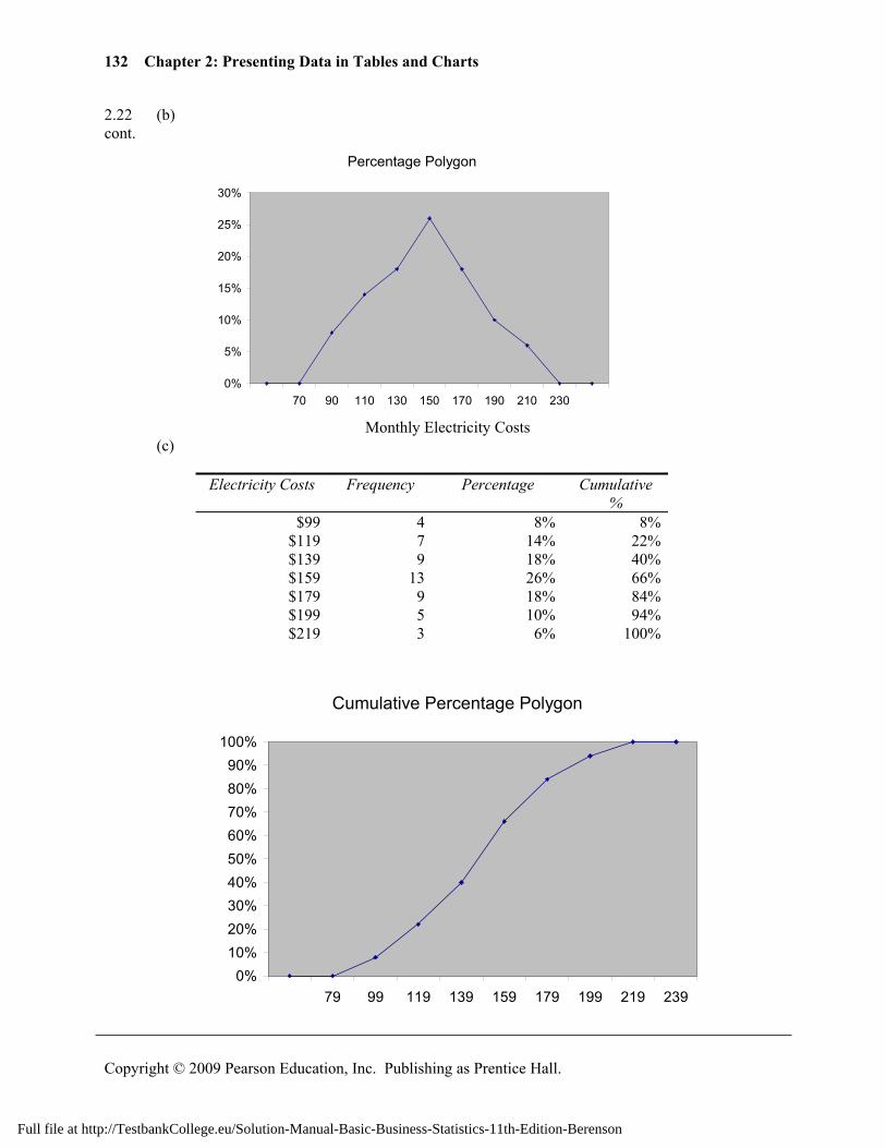
Electricity Costs Frequency Percentage Cumulative %
$99 4 8% 8% $119 7 14% 22% $139 9 18% 40% $159 13 26% 66% $179 9 18% 84% $199 5 10% 94% $219 3 6% 100%
Cumulative Percentage Polygon
0%10%20%30%40%50%60%70%80%90%
100%
79 99 119 139 159 179 199 219 239
Full file at http://TestbankCollege.eu/Solution-Manual-Basic-Business-Statistics-11th-Edition-Berenson
133
Copyright © 2009 Pearson Education, Inc. Publishing as Prentice Hall.
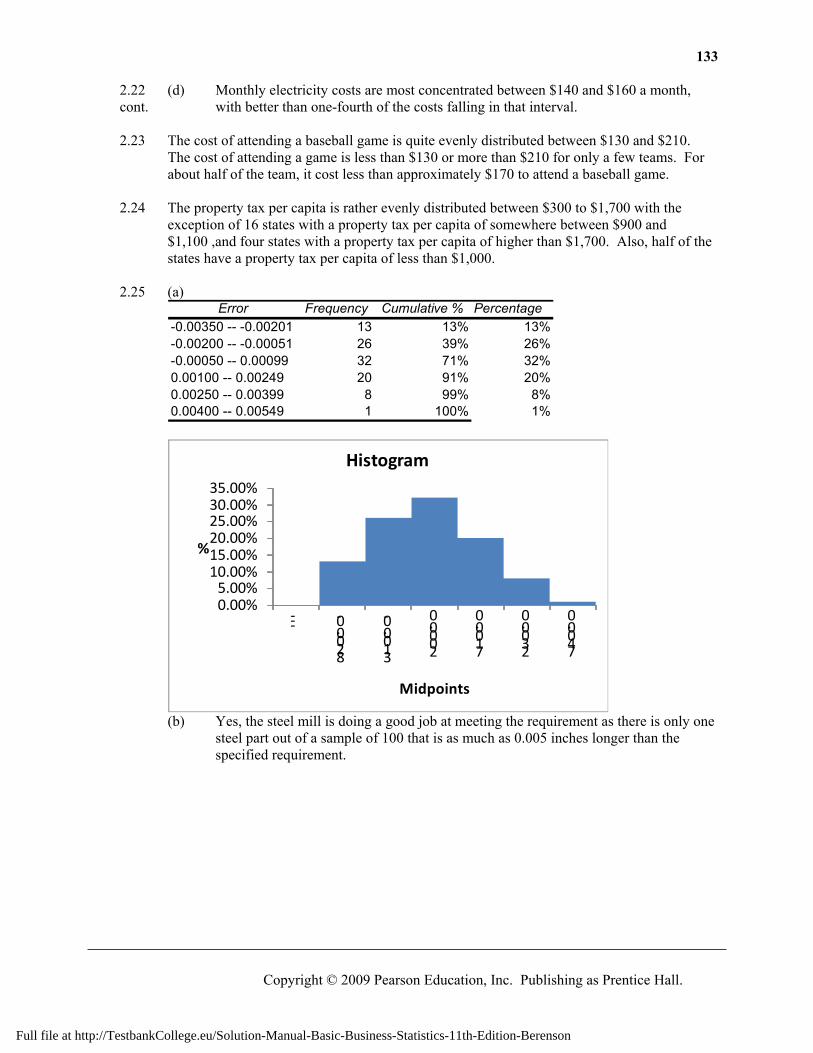
2.22 (d) Monthly electricity costs are most concentrated between $140 and $160 a month, cont. with better than one-fourth of the costs falling in that interval. 2.23 The cost of attending a baseball game is quite evenly distributed between $130 and $210.
The cost of attending a game is less than $130 or more than $210 for only a few teams. For about half of the team, it cost less than approximately $170 to attend a baseball game.
2.24 The property tax per capita is rather evenly distributed between $300 to $1,700 with the
exception of 16 states with a property tax per capita of somewhere between $900 and $1,100 ,and four states with a property tax per capita of higher than $1,700. Also, half of the states have a property tax per capita of less than $1,000.
2.25 (a)
Error Frequency Cumulative % Percentage-0.00350 -- -0.00201 13 13% 13%-0.00200 -- -0.00051 26 39% 26%-0.00050 -- 0.00099 32 71% 32%0.00100 -- 0.00249 20 91% 20%0.00250 -- 0.00399 8 99% 8%0.00400 -- 0.00549 1 100% 1%
0.00%5.00%
10.00%15.00%20.00%25.00%30.00%35.00%
--- -0.0028
-0.0013
0.0002
0.0017
0.0032
0.0047
%
Midpoints
Histogram
(b) Yes, the steel mill is doing a good job at meeting the requirement as there is only one
steel part out of a sample of 100 that is as much as 0.005 inches longer than the specified requirement.
Full file at http://TestbankCollege.eu/Solution-Manual-Basic-Business-Statistics-11th-Edition-Berenson
134 Chapter 2: Presenting Data in Tables and Charts
Copyright © 2009 Pearson Education, Inc. Publishing as Prentice Hall.
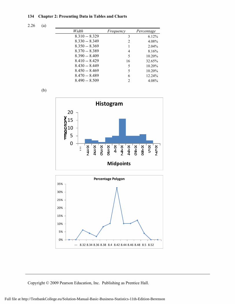
2.26 (a) Width Frequency Percentage 8.310 -- 8.329 3 6.12% 8.330 -- 8.349 2 4.08% 8.350 -- 8.369 1 2.04% 8.370 -- 8.389 4 8.16% 8.390 -- 8.409 5 10.20% 8.410 -- 8.429 16 32.65% 8.430 -- 8.449 5 10.20% 8.450 -- 8.469 5 10.20% 8.470 -- 8.489 6 12.24% 8.490 -- 8.509 2 4.08%
(b)
0
510
15
20
---8.32
8.348.36
8.388.4
8.428.44
8.468.48
8.58.52
Frequency
Midpoints
Histogram
0%
5%
10%
15%
20%
25%
30%
35%
--- 8.32 8.34 8.36 8.38 8.4 8.42 8.44 8.46 8.48 8.5 8.52
Percentage Polygon
Full file at http://TestbankCollege.eu/Solution-Manual-Basic-Business-Statistics-11th-Edition-Berenson
135
Copyright © 2009 Pearson Education, Inc. Publishing as Prentice Hall.
2.26 (c) cont.
0%
20%
40%
60%
80%
100%
120%
8.3099
8.3299
8.3499
8.3699
8.3899
8.4099
8.4299
8.4499
8.4699
8.4899
8.5099
8.5299
Cumulative Percentage Polygon
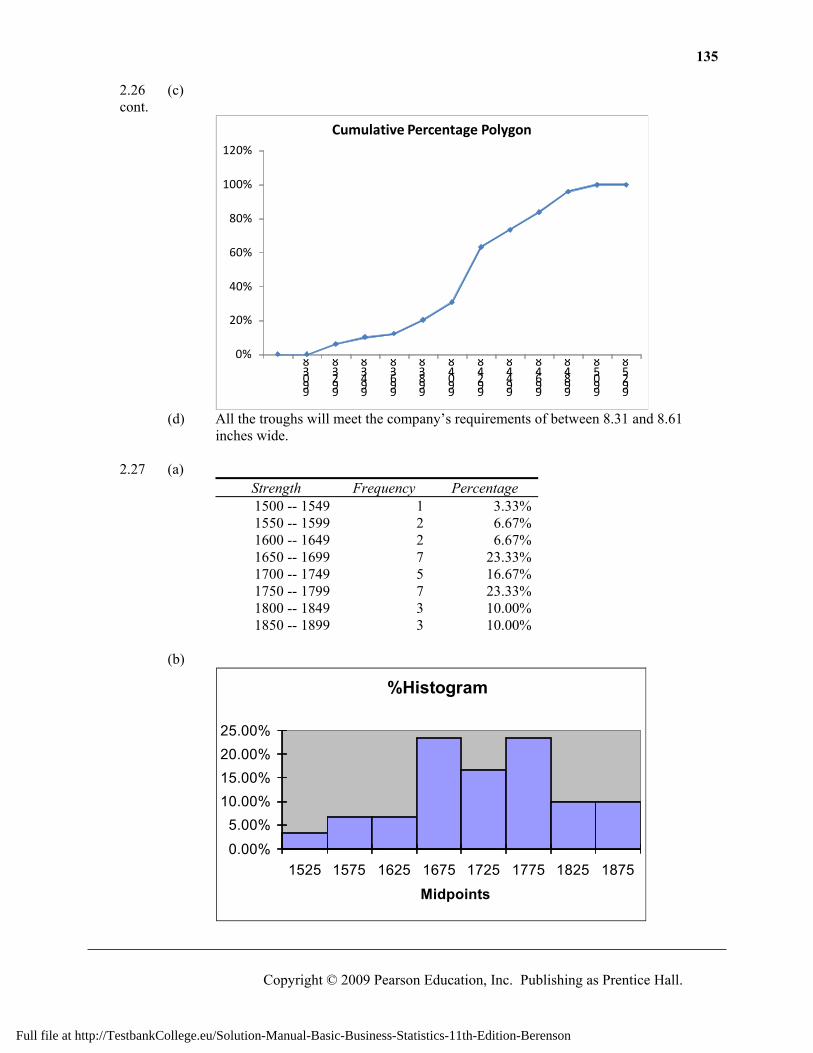
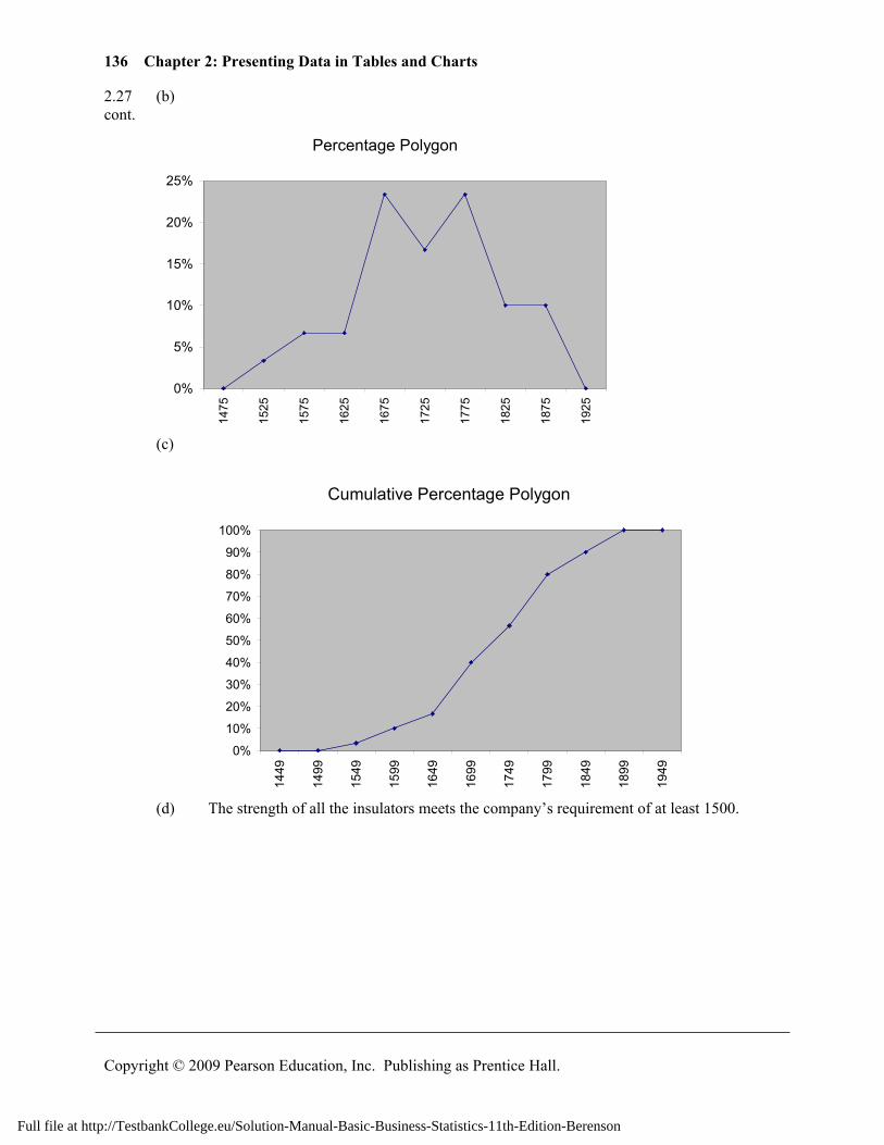
(d) All the troughs will meet the company’s requirements of between 8.31 and 8.61 inches wide. 2.27 (a)
Strength Frequency Percentage 1500 -- 1549 1 3.33%1550 -- 1599 2 6.67%1600 -- 1649 2 6.67%1650 -- 1699 7 23.33%1700 -- 1749 5 16.67%1750 -- 1799 7 23.33%1800 -- 1849 3 10.00%1850 -- 1899 3 10.00%
(b)
0.00%
5.00%10.00%15.00%20.00%25.00%
1525 1575 1625 1675 1725 1775 1825 1875
Midpoints
%Histogram
Full file at http://TestbankCollege.eu/Solution-Manual-Basic-Business-Statistics-11th-Edition-Berenson
136 Chapter 2: Presenting Data in Tables and Charts
Copyright © 2009 Pearson Education, Inc. Publishing as Prentice Hall.
2.27 (b) cont.
Percentage Polygon
0%
5%
10%
15%
20%
25%
1475
1525
1575
1625
1675
1725
1775
1825
1875
1925
(c)
Cumulative Percentage Polygon
0%
10%
20%
30%
40%
50%
60%
70%
80%
90%
100%
1449
1499
1549
1599
1649
1699
1749
1799
1849
1899
1949
(d) The strength of all the insulators meets the company’s requirement of at least 1500.
Full file at http://TestbankCollege.eu/Solution-Manual-Basic-Business-Statistics-11th-Edition-Berenson
137
Copyright © 2009 Pearson Education, Inc. Publishing as Prentice Hall.
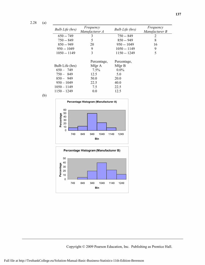
2.28 (a)
Bulb Life (hrs) Frequency Manufacturer A
Bulb Life (hrs) Frequency Manufacturer B
650 -- 749 3 750 -- 849 2 750 -- 849 5 850 -- 949 8 850 -- 949 20 950 -- 1049 16
950 -- 1049 9 1050 -- 1149 9 1050 -- 1149 3 1150 -- 1249 5
Percentage, Percentage, Bulb Life (hrs) Mfgr A Mfgr B
650 – 749 7.5% 0.0% 750 – 849 12.5 5.0 850 – 949 50.0 20.0 950 – 1049 22.5 40.0 1050 – 1149 7.5 22.5 1150 – 1249 0.0 12.5
(b)
Percentage Histogram (Manufacturer A)
0102030405060
749 849 949 1049 1149 1249
Bin
Perc
enta
ge
Percentage Histogram (Manufacturer B)
01020304050
749 849 949 1049 1149 1249
Bin
Perc
enta
ge
Full file at http://TestbankCollege.eu/Solution-Manual-Basic-Business-Statistics-11th-Edition-Berenson
138 Chapter 2: Presenting Data in Tables and Charts
Copyright © 2009 Pearson Education, Inc. Publishing as Prentice Hall.
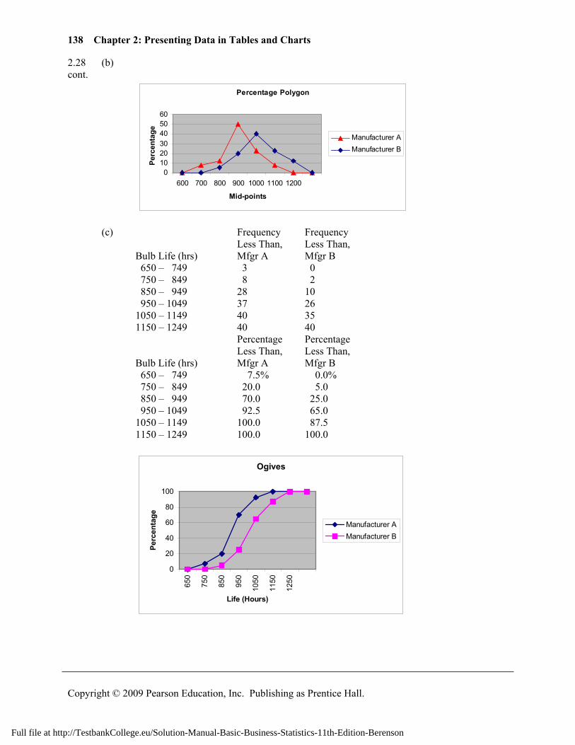
2.28 (b) cont.
Percentage Polygon
0102030405060
600 700 800 900 1000 1100 1200
Mid-points
Perc
enta
ge
Manufacturer AManufacturer B
(c) Frequency Frequency Less Than, Less Than, Bulb Life (hrs) Mfgr A Mfgr B
650 – 749 3 0 750 – 849 8 2 850 – 949 28 10 950 – 1049 37 26 1050 – 1149 40 35 1150 – 1249 40 40
Percentage Percentage Less Than, Less Than, Bulb Life (hrs) Mfgr A Mfgr B
650 – 749 7.5% 0.0% 750 – 849 20.0 5.0 850 – 949 70.0 25.0 950 – 1049 92.5 65.0 1050 – 1149 100.0 87.5 1150 – 1249 100.0 100.0
Ogives
0
20
40
60
80
100
650
750
850
950
1050
1150
1250
Life (Hours)
Perc
enta
ge
Manufacturer AManufacturer B
Full file at http://TestbankCollege.eu/Solution-Manual-Basic-Business-Statistics-11th-Edition-Berenson
139
Copyright © 2009 Pearson Education, Inc. Publishing as Prentice Hall.
2.28 (d) Manufacturer B produces bulbs with longer lives than Manufacturer A. The cont. cumulative percentage for Manufacturer B shows 65% of their bulbs lasted 1049
hours or less contrasted with 70% of Manufacturer A’s bulbs which lasted 949 hours or less. None of Manufacturer A’s bulbs lasted more than 1149 hours, but 12.5% of Manufacturer B’s bulbs lasted between 1150 and 1249 hours. At the same time, 7.5% of Manufacturer A’s bulbs lasted less than 750 hours, while all of Manufacturer B’s bulbs lasted at least 750 hours.
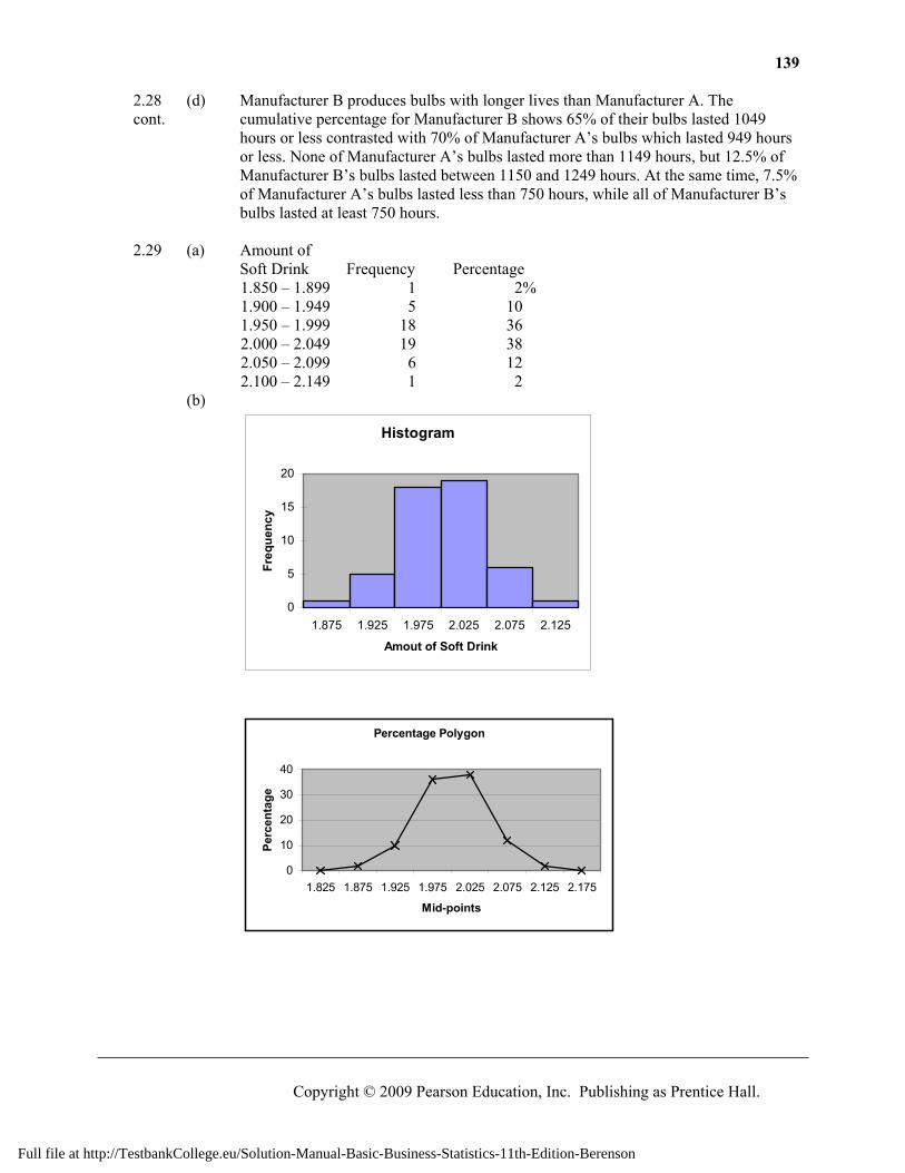
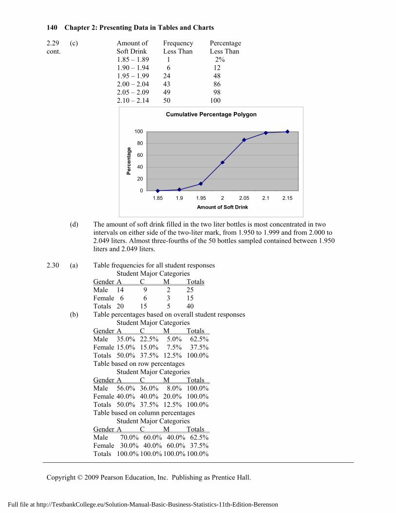
2.29 (a) Amount of
Soft Drink Frequency Percentage 1.850 – 1.899 1 2% 1.900 – 1.949 5 10 1.950 – 1.999 18 36 2.000 – 2.049 19 38 2.050 – 2.099 6 12 2.100 – 2.149 1 2
(b)
Histogram
0
5
10
15
20
1.875 1.925 1.975 2.025 2.075 2.125
Amout of Soft Drink
Freq
uenc
y
Percentage Polygon
0
10
20
30
40
1.825 1.875 1.925 1.975 2.025 2.075 2.125 2.175
Mid-points
Perc
enta
ge
Full file at http://TestbankCollege.eu/Solution-Manual-Basic-Business-Statistics-11th-Edition-Berenson
140 Chapter 2: Presenting Data in Tables and Charts
Copyright © 2009 Pearson Education, Inc. Publishing as Prentice Hall.
2.29 (c) Amount of Frequency Percentage cont. Soft Drink Less Than Less Than
1.85 – 1.89 1 2% 1.90 – 1.94 6 12 1.95 – 1.99 24 48 2.00 – 2.04 43 86 2.05 – 2.09 49 98 2.10 – 2.14 50 100
Cumulative Percentage Polygon
0
20
40
60
80
100
1.85 1.9 1.95 2 2.05 2.1 2.15
Amount of Soft Drink
Perc
enta
ge
(d) The amount of soft drink filled in the two liter bottles is most concentrated in two
intervals on either side of the two-liter mark, from 1.950 to 1.999 and from 2.000 to 2.049 liters. Almost three-fourths of the 50 bottles sampled contained between 1.950 liters and 2.049 liters.
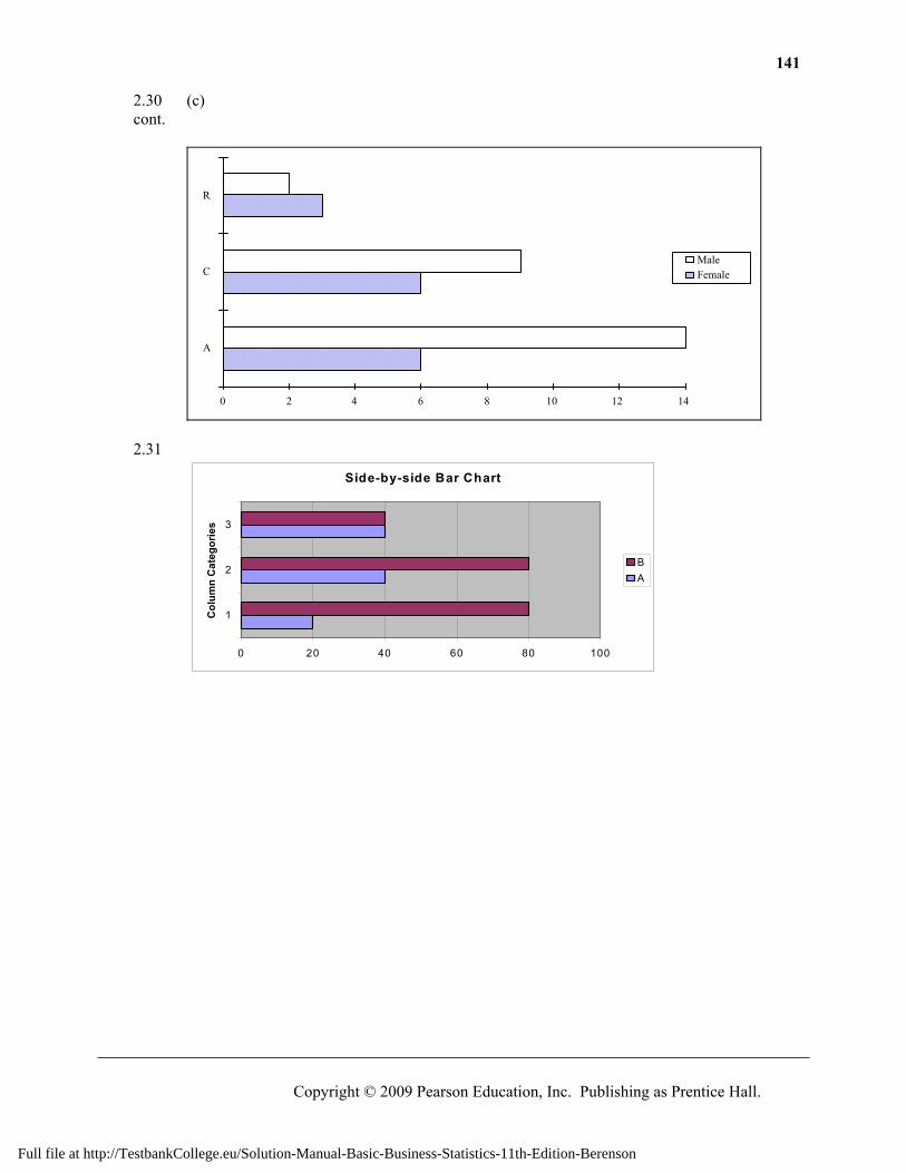
2.30 (a) Table frequencies for all student responses Student Major Categories Gender A C M Totals Male 14 9 2 25 Female 6 6 3 15 Totals 20 15 5 40 (b) Table percentages based on overall student responses Student Major Categories Gender A C M Totals Male 35.0% 22.5% 5.0% 62.5% Female 15.0% 15.0% 7.5% 37.5% Totals 50.0% 37.5% 12.5% 100.0% Table based on row percentages Student Major Categories Gender A C M Totals Male 56.0% 36.0% 8.0% 100.0% Female 40.0% 40.0% 20.0% 100.0% Totals 50.0% 37.5% 12.5% 100.0% Table based on column percentages Student Major Categories Gender A C M Totals Male 70.0% 60.0% 40.0% 62.5% Female 30.0% 40.0% 60.0% 37.5% Totals 100.0% 100.0% 100.0% 100.0%
Full file at http://TestbankCollege.eu/Solution-Manual-Basic-Business-Statistics-11th-Edition-Berenson
141
Copyright © 2009 Pearson Education, Inc. Publishing as Prentice Hall.
2.30 (c) cont.
0 2 4 6 8 10 12 14
A
C
R
MaleFemale
2.31
Side-by-side Bar Chart
0 20 40 60 80 100
1
2
3
Col
umn
Cat
egor
ies
BA
Full file at http://TestbankCollege.eu/Solution-Manual-Basic-Business-Statistics-11th-Edition-Berenson
142 Chapter 2: Presenting Data in Tables and Charts
Copyright © 2009 Pearson Education, Inc. Publishing as Prentice Hall.
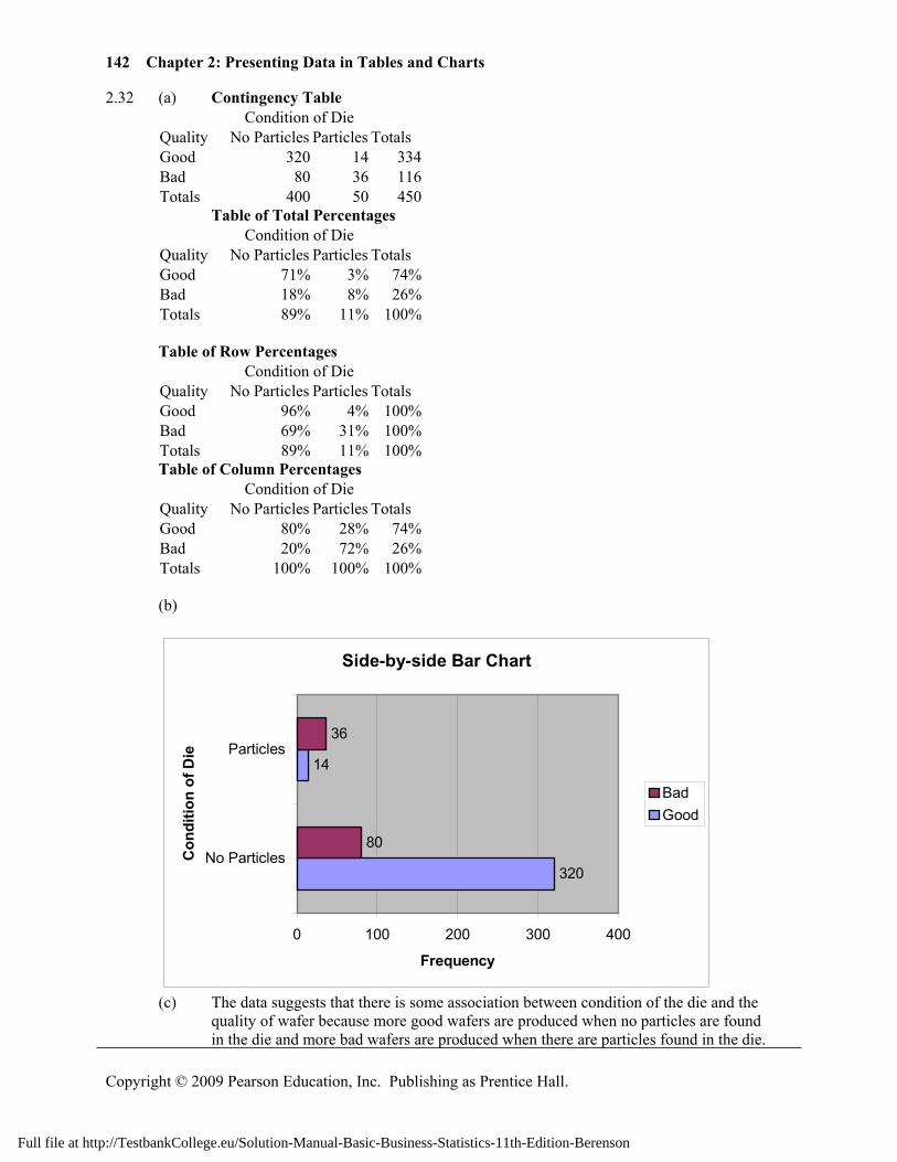
2.32 (a) Contingency Table Condition of Die Quality No Particles Particles Totals Good 320 14 334Bad 80 36 116Totals 400 50 450
Table of Total Percentages Condition of Die Quality No Particles Particles Totals Good 71% 3% 74%Bad 18% 8% 26%Totals 89% 11% 100%
Table of Row Percentages
Condition of Die Quality No Particles Particles Totals Good 96% 4% 100%Bad 69% 31% 100%Totals 89% 11% 100%
Table of Column Percentages Condition of Die Quality No Particles Particles Totals Good 80% 28% 74%Bad 20% 72% 26%Totals 100% 100% 100%
(b)
Side-by-side Bar Chart
320
14
80
36
0 100 200 300 400
No Particles
Particles
Con
ditio
n of
Die
Frequency
BadGood
(c) The data suggests that there is some association between condition of the die and the quality of wafer because more good wafers are produced when no particles are found
in the die and more bad wafers are produced when there are particles found in the die.
Full file at http://TestbankCollege.eu/Solution-Manual-Basic-Business-Statistics-11th-Edition-Berenson
143
Copyright © 2009 Pearson Education, Inc. Publishing as Prentice Hall.
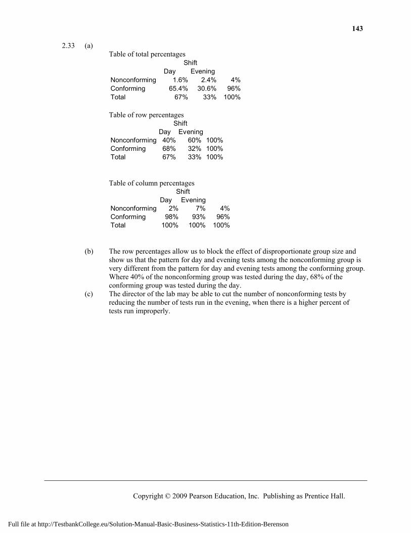
2.33 (a) Table of total percentages
Day EveningNonconforming 1.6% 2.4% 4%Conforming 65.4% 30.6% 96%Total 67% 33% 100%
Shift
Table of row percentages
Day EveningNonconforming 40% 60% 100%Conforming 68% 32% 100%Total 67% 33% 100%
Shift
Table of column percentages
Day EveningNonconforming 2% 7% 4%Conforming 98% 93% 96%Total 100% 100% 100%
Shift
(b) The row percentages allow us to block the effect of disproportionate group size and show us that the pattern for day and evening tests among the nonconforming group is very different from the pattern for day and evening tests among the conforming group. Where 40% of the nonconforming group was tested during the day, 68% of the conforming group was tested during the day.
(c) The director of the lab may be able to cut the number of nonconforming tests by reducing the number of tests run in the evening, when there is a higher percent of tests run improperly.
Full file at http://TestbankCollege.eu/Solution-Manual-Basic-Business-Statistics-11th-Edition-Berenson
144 Chapter 2: Presenting Data in Tables and Charts
Copyright © 2009 Pearson Education, Inc. Publishing as Prentice Hall.
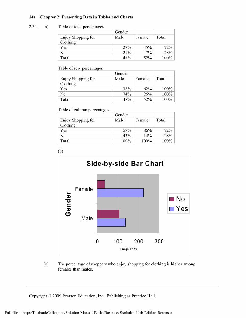
2.34 (a) Table of total percentages Gender
Enjoy Shopping for Clothing
Male Female Total
Yes 27% 45% 72%No 21% 7% 28%Total 48% 52% 100%
Table of row percentages
Gender Enjoy Shopping for Clothing
Male Female Total
Yes 38% 62% 100%No 74% 26% 100%Total 48% 52% 100%
Table of column percentages
Gender Enjoy Shopping for Clothing
Male Female Total
Yes 57% 86% 72%No 43% 14% 28%Total 100% 100% 100%
(b)
Side-by-side Bar Chart
0 100 200 300
Male
Female
Gen
der
Frequency
NoYes
(c) The percentage of shoppers who enjoy shopping for clothing is higher among females than males.
Full file at http://TestbankCollege.eu/Solution-Manual-Basic-Business-Statistics-11th-Edition-Berenson
145
Copyright © 2009 Pearson Education, Inc. Publishing as Prentice Hall.
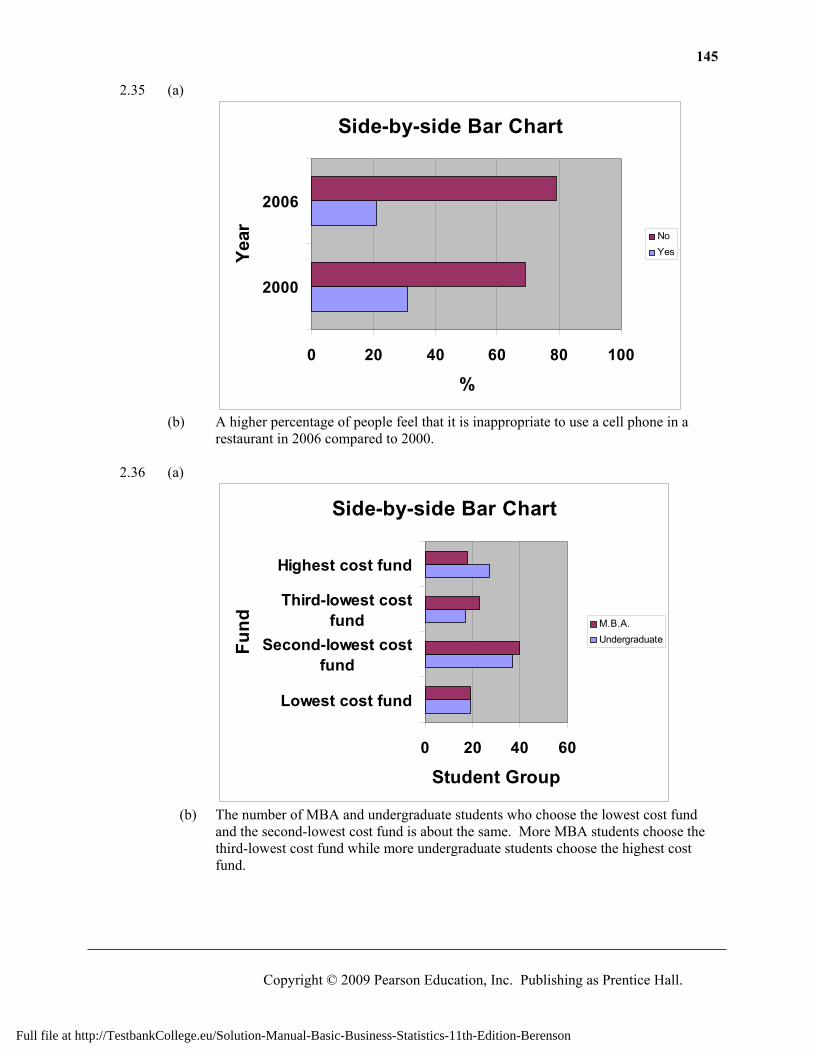
2.35 (a)
Side-by-side Bar Chart
0 20 40 60 80 100
2000
2006
Year
%
NoYes
(b) A higher percentage of people feel that it is inappropriate to use a cell phone in a
restaurant in 2006 compared to 2000. 2.36 (a)
Side-by-side Bar Chart
0 20 40 60
Lowest cost fund
Second-lowest costfund
Third-lowest costfund
Highest cost fund
Fund
Student Group
M.B.A.Undergraduate
(b) The number of MBA and undergraduate students who choose the lowest cost fund
and the second-lowest cost fund is about the same. More MBA students choose the third-lowest cost fund while more undergraduate students choose the highest cost fund.
Full file at http://TestbankCollege.eu/Solution-Manual-Basic-Business-Statistics-11th-Edition-Berenson
146 Chapter 2: Presenting Data in Tables and Charts
Copyright © 2009 Pearson Education, Inc. Publishing as Prentice Hall.
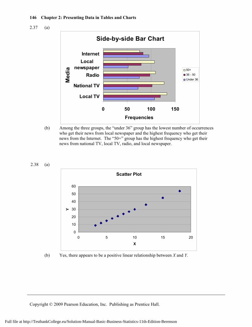
2.37 (a)
Side-by-side Bar Chart
0 50 100 150
Local TV
National TV
Radio
Localnewspaper
Internet
Med
ia
Frequencies
50+36 - 50Under 36
(b) Among the three groups, the “under 36” group has the lowest number of occurrences
who get their news from local newspaper and the highest frequency who get their news from the Internet. The “50+” group has the highest frequency who get their news from national TV, local TV, radio, and local newspaper.
2.38 (a)
Scatter Plot
0
10
20
30
40
50
60
0 5 10 15 20
X
Y
(b) Yes, there appears to be a positive linear relationship between X and Y.
Full file at http://TestbankCollege.eu/Solution-Manual-Basic-Business-Statistics-11th-Edition-Berenson
147
Copyright © 2009 Pearson Education, Inc. Publishing as Prentice Hall.
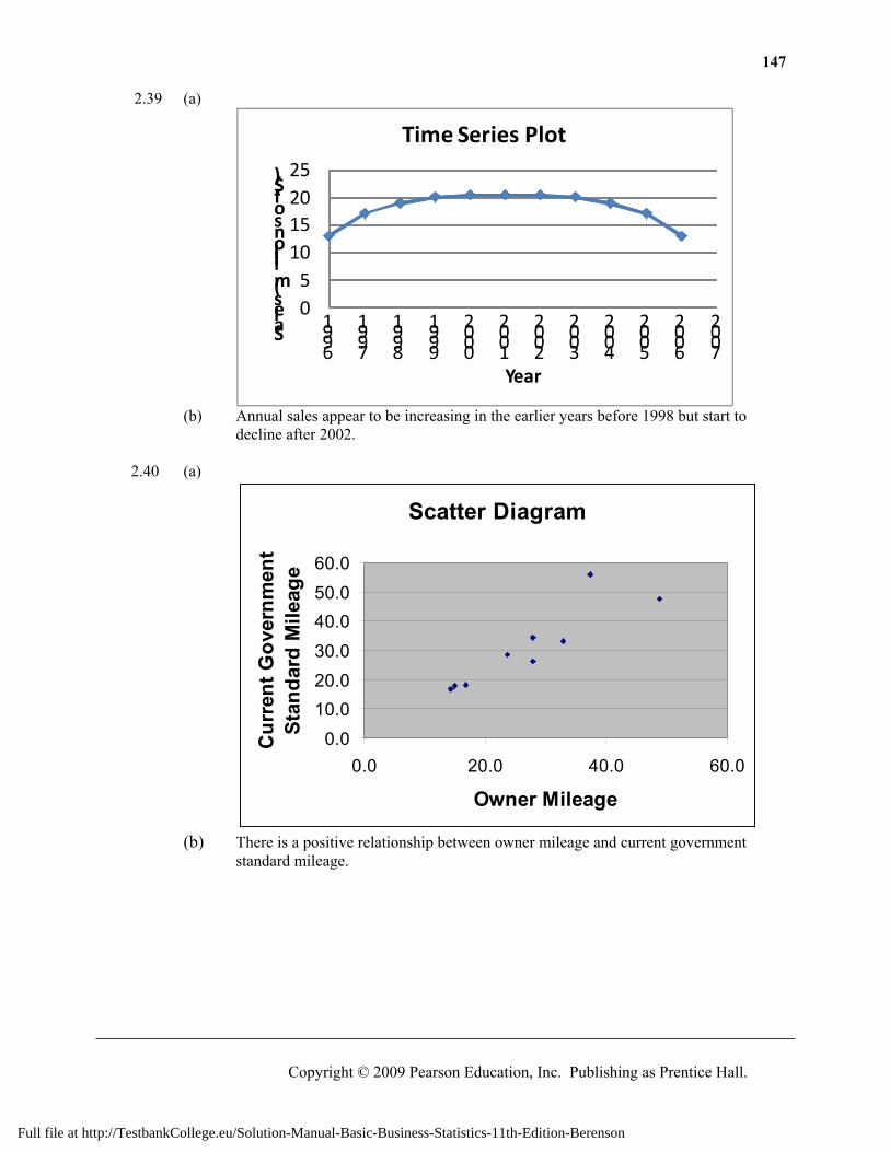
2.39 (a)
05
10152025
1996
1997
1998
1999
2000
2001
2002
2003
2004
2005
2006
2007Sales (millions of $)
Year
Time Series Plot
(b) Annual sales appear to be increasing in the earlier years before 1998 but start to
decline after 2002. 2.40 (a)
Scatter Diagram
0.0
10.020.0
30.0
40.050.0
60.0
0.0 20.0 40.0 60.0
Owner Mileage
Cur
rent
Gov
ernm
ent
Stan
dard
Mile
age
(b) There is a positive relationship between owner mileage and current government
standard mileage.
Full file at http://TestbankCollege.eu/Solution-Manual-Basic-Business-Statistics-11th-Edition-Berenson
148 Chapter 2: Presenting Data in Tables and Charts
Copyright © 2009 Pearson Education, Inc. Publishing as Prentice Hall.
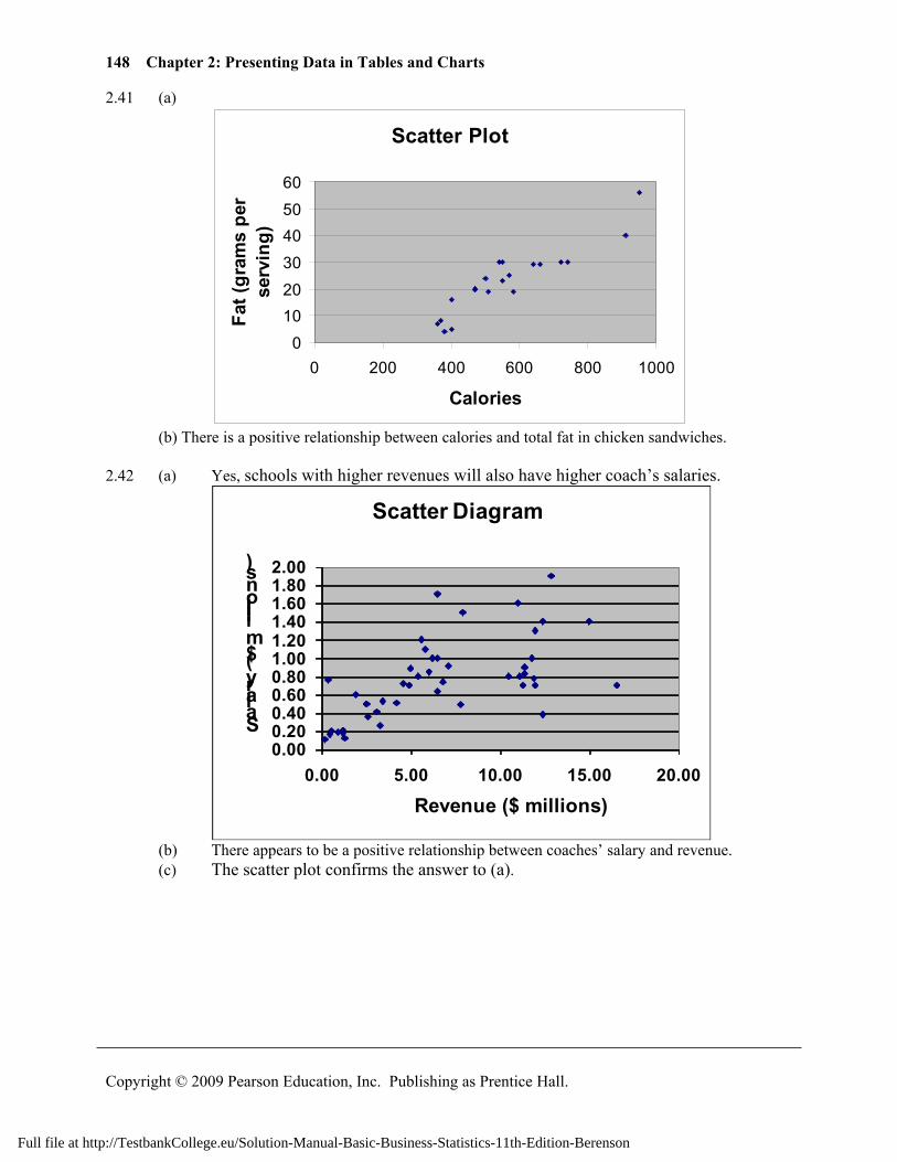
2.41 (a)
Scatter Plot
01020
304050
60
0 200 400 600 800 1000
Calories
Fat (
gram
s pe
r se
rvin
g)
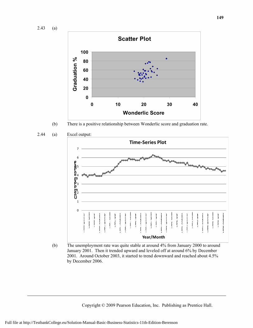
(b) There is a positive relationship between calories and total fat in chicken sandwiches. 2.42 (a) Yes, schools with higher revenues will also have higher coach’s salaries.
0.000.200.400.600.801.001.201.401.601.802.00
0.00 5.00 10.00 15.00 20.00
Salary ($ millions)
Revenue ($ millions)
Scatter Diagram
(b) There appears to be a positive relationship between coaches’ salary and revenue. (c) The scatter plot confirms the answer to (a).
Full file at http://TestbankCollege.eu/Solution-Manual-Basic-Business-Statistics-11th-Edition-Berenson
149
Copyright © 2009 Pearson Education, Inc. Publishing as Prentice Hall.
2.43 (a)
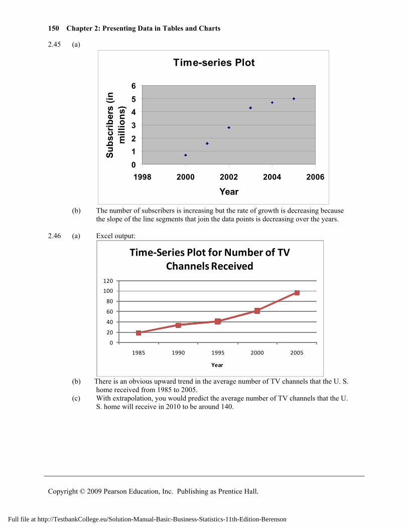
Scatter Plot
0
20
40
60
80
100
0 10 20 30 40
Wonderlic Score
Gra
duat
ion
%
(b) There is a positive relationship between Wonderlic score and graduation rate. 2.44 (a) Excel output:
0
1
2
3
4
5
6
7
2000 January
2000 April
2000 July
2000 October
2001 January
2001 April
2001 July
2001 October
2002 January
2002 April
2002 July
2002 October
2003 January
2003 April
2003 July
2003 October
2004 January
2004 April
2004 July
2004 October
2005 January
2005 April
2005 July
2005 October
2006 January
2006 April
2006 July
2006 October
Unemployment Rate
Year/Month
Time-Series Plot
(b) The unemployment rate was quite stable at around 4% from January 2000 to around
January 2001. Then it trended upward and leveled off at around 6% by December 2001. Around October 2003, it started to trend downward and reached about 4.5% by December 2006.
Full file at http://TestbankCollege.eu/Solution-Manual-Basic-Business-Statistics-11th-Edition-Berenson
150 Chapter 2: Presenting Data in Tables and Charts
Copyright © 2009 Pearson Education, Inc. Publishing as Prentice Hall.
2.45 (a)
Time-series Plot
0123456
1998 2000 2002 2004 2006
Year
Subs
crib
ers
(in
mill
ions
)
(b) The number of subscribers is increasing but the rate of growth is decreasing because
the slope of the line segments that join the data points is decreasing over the years. 2.46 (a) Excel output:
0
20
40
60
80
100
120
1985 1990 1995 2000 2005
Year
Time-Series Plot for Number of TV Channels Received
(b) There is an obvious upward trend in the average number of TV channels that the U. S.
home received from 1985 to 2005. (c) With extrapolation, you would predict the average number of TV channels that the U.
S. home will receive in 2010 to be around 140.
Full file at http://TestbankCollege.eu/Solution-Manual-Basic-Business-Statistics-11th-Edition-Berenson
151
Copyright © 2009 Pearson Education, Inc. Publishing as Prentice Hall.
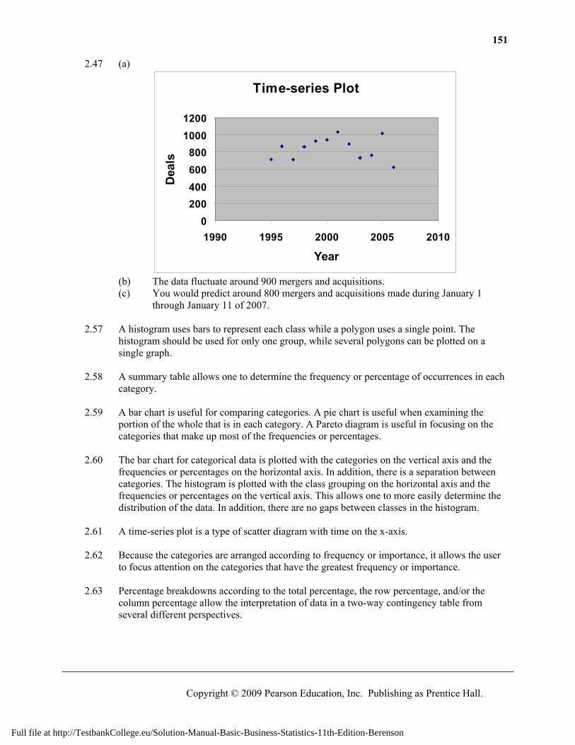
2.47 (a)
Time-series Plot
0200400600800
10001200
1990 1995 2000 2005 2010
Year
Dea
ls
(b) The data fluctuate around 900 mergers and acquisitions. (c) You would predict around 800 mergers and acquisitions made during January 1
through January 11 of 2007. 2.57 A histogram uses bars to represent each class while a polygon uses a single point. The
histogram should be used for only one group, while several polygons can be plotted on a single graph.
2.58 A summary table allows one to determine the frequency or percentage of occurrences in each
category. 2.59 A bar chart is useful for comparing categories. A pie chart is useful when examining the
portion of the whole that is in each category. A Pareto diagram is useful in focusing on the categories that make up most of the frequencies or percentages.
2.60 The bar chart for categorical data is plotted with the categories on the vertical axis and the
frequencies or percentages on the horizontal axis. In addition, there is a separation between categories. The histogram is plotted with the class grouping on the horizontal axis and the frequencies or percentages on the vertical axis. This allows one to more easily determine the distribution of the data. In addition, there are no gaps between classes in the histogram.
2.61 A time-series plot is a type of scatter diagram with time on the x-axis. 2.62 Because the categories are arranged according to frequency or importance, it allows the user
to focus attention on the categories that have the greatest frequency or importance. 2.63 Percentage breakdowns according to the total percentage, the row percentage, and/or the
column percentage allow the interpretation of data in a two-way contingency table from several different perspectives.
Full file at http://TestbankCollege.eu/Solution-Manual-Basic-Business-Statistics-11th-Edition-Berenson
152 Chapter 2: Presenting Data in Tables and Charts
Copyright © 2009 Pearson Education, Inc. Publishing as Prentice Hall.
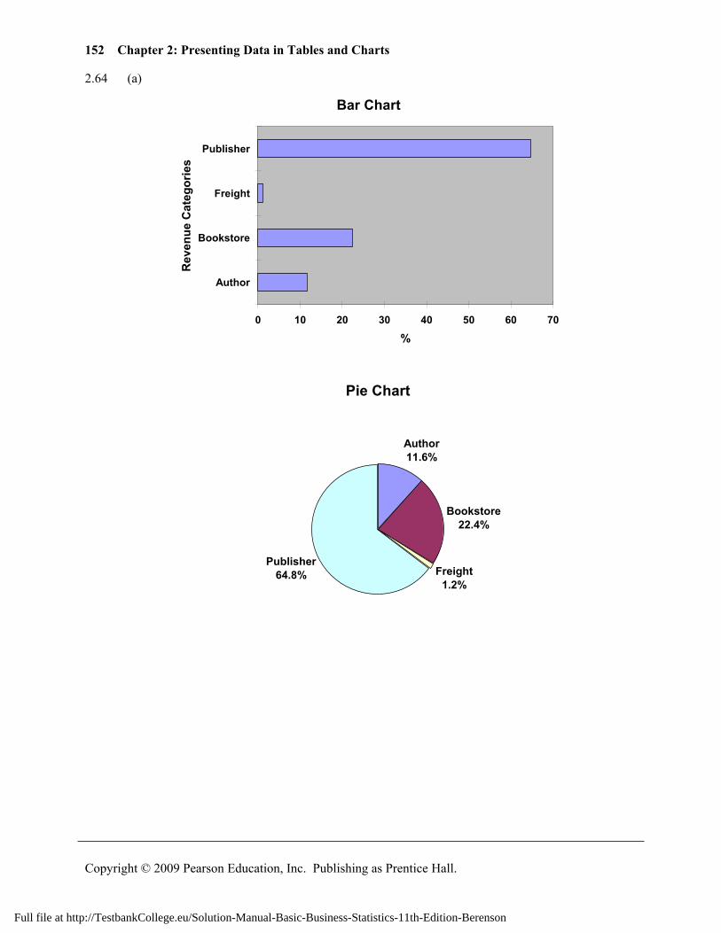
2.64 (a)
Bar Chart
0 10 20 30 40 50 60 70
Author
Bookstore
Freight
Publisher
Rev
enue
Cat
egor
ies
%
Pie Chart
Author11.6%
Bookstore22.4%
Freight1.2%
Publisher64.8%
Full file at http://TestbankCollege.eu/Solution-Manual-Basic-Business-Statistics-11th-Edition-Berenson
153
Copyright © 2009 Pearson Education, Inc. Publishing as Prentice Hall.
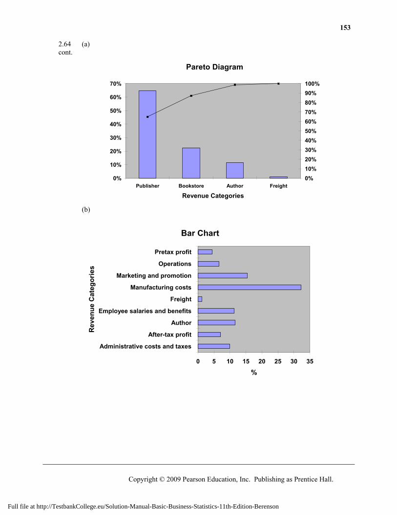
2.64 (a) cont.
Pareto Diagram
0%
10%
20%
30%
40%
50%
60%
70%
Publisher Bookstore Author Freight
Revenue Categories
0%10%20%30%40%50%60%70%80%90%100%
(b)
Bar Chart
0 5 10 15 20 25 30 35
Administrative costs and taxes
After-tax profit
Author
Employee salaries and benefits
Freight
Manufacturing costs
Marketing and promotion
Operations
Pretax profit
Rev
enue
Cat
egor
ies
%
Full file at http://TestbankCollege.eu/Solution-Manual-Basic-Business-Statistics-11th-Edition-Berenson
154 Chapter 2: Presenting Data in Tables and Charts
Copyright © 2009 Pearson Education, Inc. Publishing as Prentice Hall.
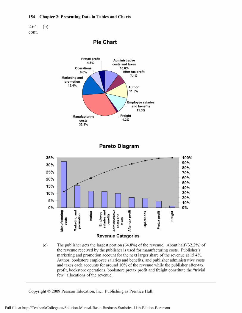
2.64 (b) cont.
Pie Chart
Administrative costs and taxes
10.0%After-tax profit
7.1%
Author 11.6%
Employee salaries and benefits
11.3%
Freight 1.2%
Manufacturing costs 32.3%
Marketing and promotion
15.4%
Operations 6.6%
Pretax profit 4.5%
Pareto Diagram
0%
5%
10%
15%
20%
25%
30%
35%
Man
ufac
turin
gco
sts
Mar
ketin
g an
dpr
omot
ion
Aut
hor
Empl
oyee
sala
ries
and
bene
fits
Adm
inis
trat
ive
cost
s an
dta
xes
Afte
r-ta
x pr
ofit
Ope
ratio
ns
Pret
ax p
rofit
Frei
ght
Revenue Categories
0%10%20%30%40%50%60%70%80%90%100%
(c) The publisher gets the largest portion (64.8%) of the revenue. About half (32.2%) of
the revenue received by the publisher is used for manufacturing costs. Publisher’s marketing and promotion account for the next larger share of the revenue at 15.4%. Author, bookstore employee salaries and benefits, and publisher administrative costs and taxes each accounts for around 10% of the revenue while the publisher after-tax profit, bookstore operations, bookstore pretax profit and freight constitute the “trivial few” allocations of the revenue.
Full file at http://TestbankCollege.eu/Solution-Manual-Basic-Business-Statistics-11th-Edition-Berenson
155
Copyright © 2009 Pearson Education, Inc. Publishing as Prentice Hall.
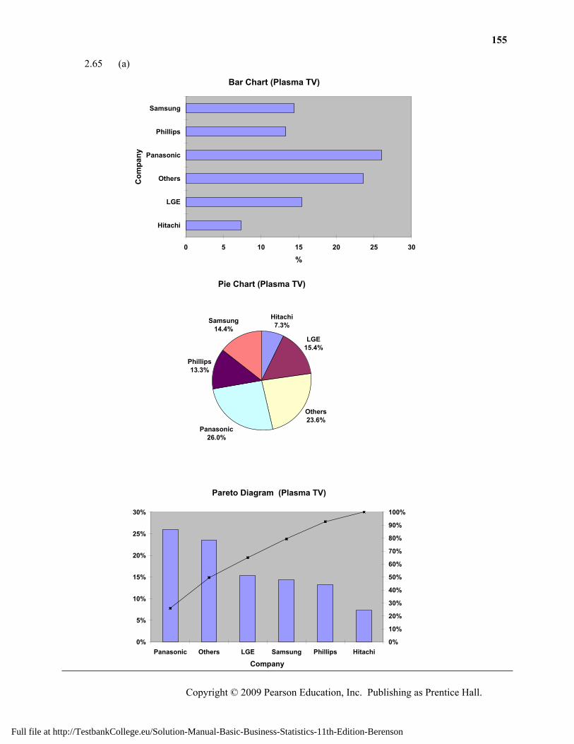
2.65 (a)
Bar Chart (Plasma TV)
0 5 10 15 20 25 30
Hitachi
LGE
Others
Panasonic
Phillips
Samsung
Com
pany
%
Pie Chart (Plasma TV)
Hitachi7.3%
LGE15.4%
Others23.6%
Panasonic26.0%
Phillips13.3%
Samsung14.4%
Pareto Diagram (Plasma TV)
0%
5%
10%
15%
20%
25%
30%
Panasonic Others LGE Samsung Phillips Hitachi
Company
0%
10%
20%
30%
40%
50%
60%
70%
80%
90%
100%
Full file at http://TestbankCollege.eu/Solution-Manual-Basic-Business-Statistics-11th-Edition-Berenson
156 Chapter 2: Presenting Data in Tables and Charts
Copyright © 2009 Pearson Education, Inc. Publishing as Prentice Hall.
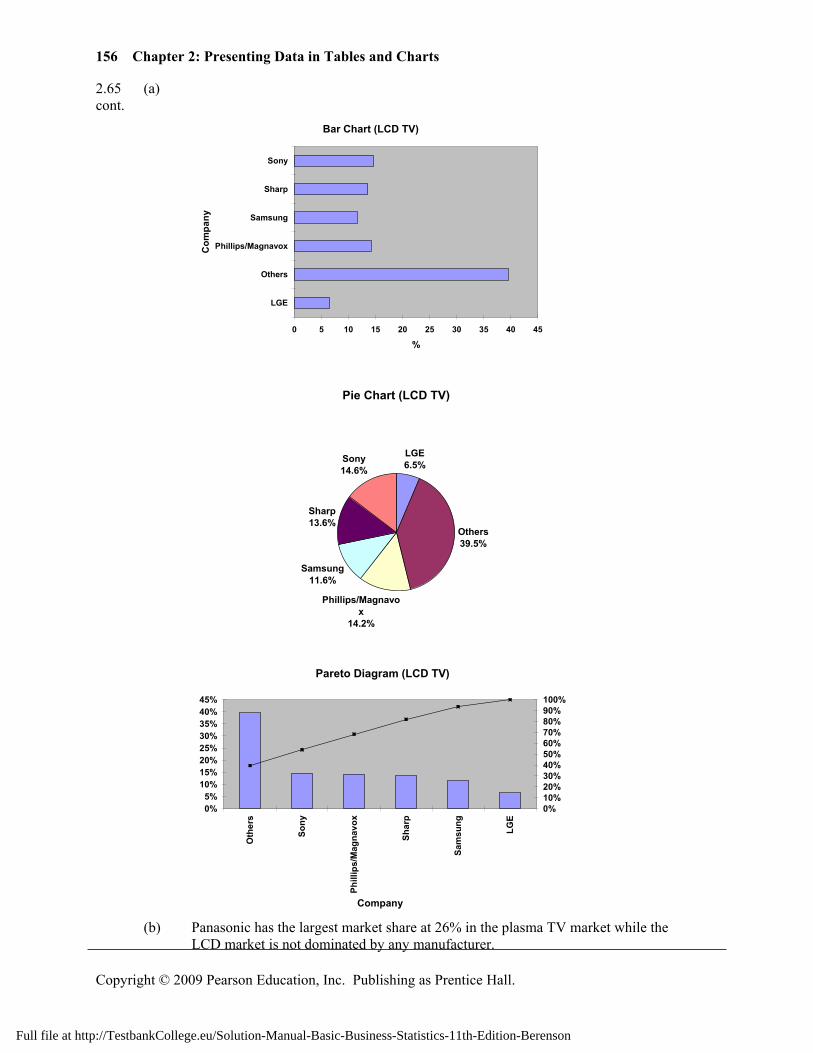
2.65 (a) cont.
Bar Chart (LCD TV)
0 5 10 15 20 25 30 35 40 45
LGE
Others
Phillips/Magnavox
Samsung
Sharp
Sony
Com
pany
%
Pie Chart (LCD TV)
LGE6.5%
Others39.5%
Phillips/Magnavox
14.2%
Samsung11.6%
Sharp13.6%
Sony14.6%
Pareto Diagram (LCD TV)
0%5%
10%15%20%25%30%35%40%45%
Oth
ers
Sony
Phill
ips/
Mag
navo
x
Shar
p
Sam
sung
LGE
Company
0%10%20%30%40%50%60%70%80%90%100%
(b) Panasonic has the largest market share at 26% in the plasma TV market while the
LCD market is not dominated by any manufacturer.
Full file at http://TestbankCollege.eu/Solution-Manual-Basic-Business-Statistics-11th-Edition-Berenson
157
Copyright © 2009 Pearson Education, Inc. Publishing as Prentice Hall.
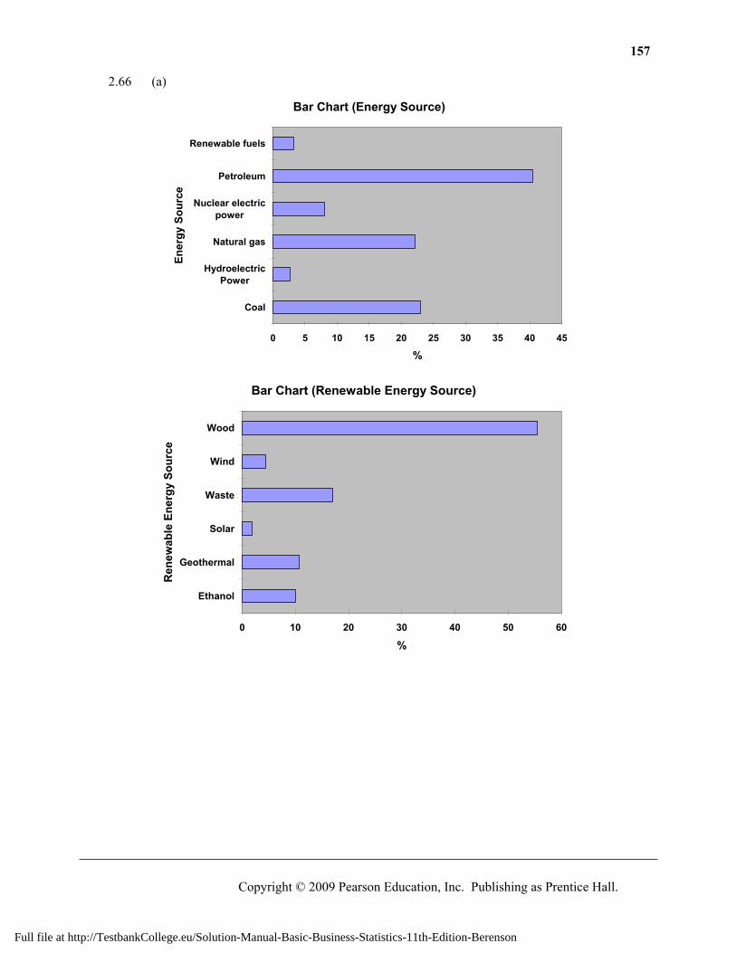
2.66 (a)
Bar Chart (Energy Source)
0 5 10 15 20 25 30 35 40 45
Coal
HydroelectricPower
Natural gas
Nuclear electricpower
Petroleum
Renewable fuels
Ener
gy S
ourc
e
%
Bar Chart (Renewable Energy Source)
0 10 20 30 40 50 60
Ethanol
Geothermal
Solar
Waste
Wind
Wood
Ren
ewab
le E
nerg
y So
urce
%
Full file at http://TestbankCollege.eu/Solution-Manual-Basic-Business-Statistics-11th-Edition-Berenson
158 Chapter 2: Presenting Data in Tables and Charts
Copyright © 2009 Pearson Education, Inc. Publishing as Prentice Hall.
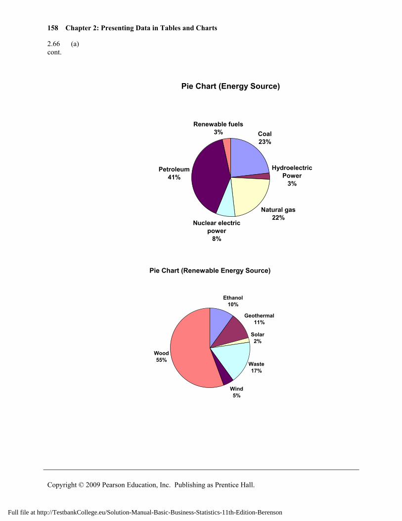
2.66 (a) cont.
Pie Chart (Energy Source)
Coal23%
Hydroelectric Power
3%
Natural gas22%
Nuclear electric power
8%
Petroleum41%
Renewable fuels3%
Pie Chart (Renewable Energy Source)
Ethanol10%
Geothermal11%
Solar2%
Waste17%
Wind5%
Wood55%
Full file at http://TestbankCollege.eu/Solution-Manual-Basic-Business-Statistics-11th-Edition-Berenson
159
Copyright © 2009 Pearson Education, Inc. Publishing as Prentice Hall.
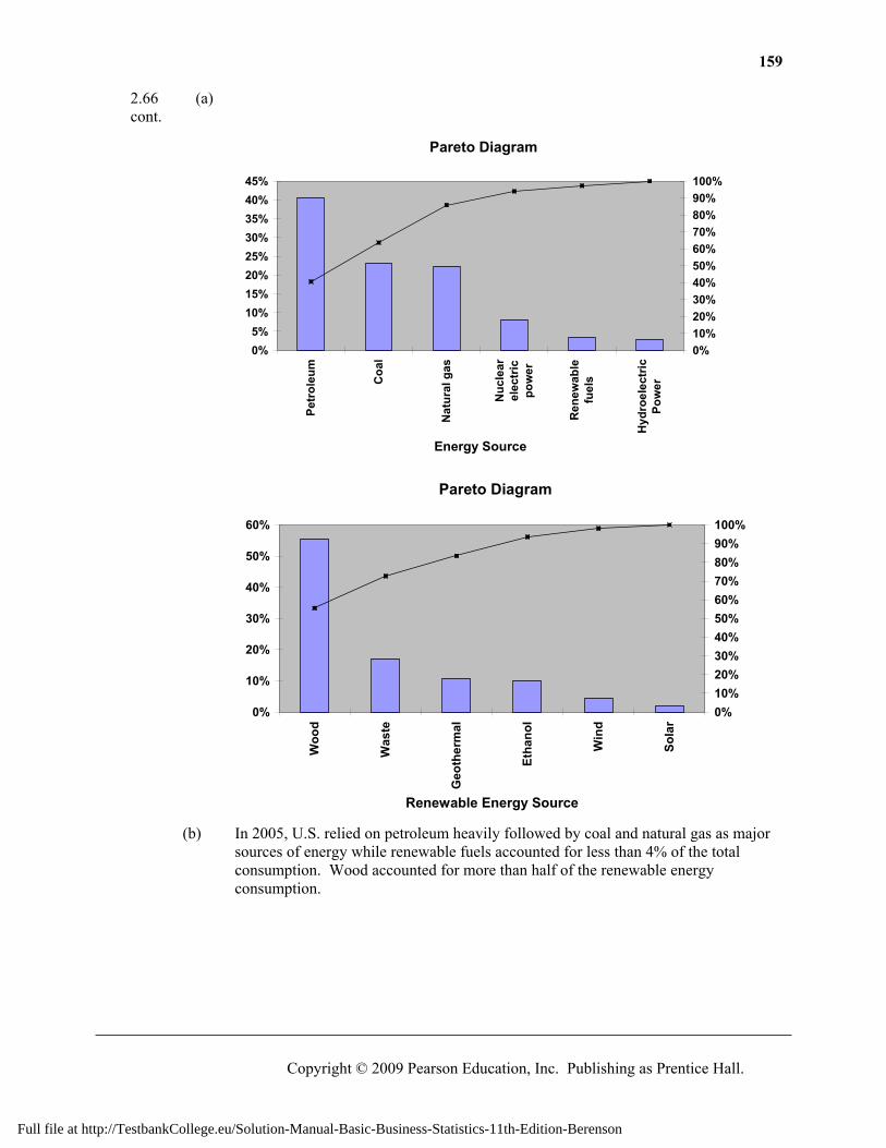
2.66 (a) cont.
Pareto Diagram
0%5%
10%15%20%25%30%35%40%45%
Petr
oleu
m
Coa
l
Nat
ural
gas
Nuc
lear
elec
tric
pow
er
Ren
ewab
lefu
els
Hyd
roel
ectr
icPo
wer
Energy Source
0%10%20%30%40%50%60%70%80%90%100%
Pareto Diagram
0%
10%
20%
30%
40%
50%
60%
Woo
d
Was
te
Geo
ther
mal
Etha
nol
Win
d
Sola
r
Renewable Energy Source
0%10%20%30%40%50%60%70%80%90%100%
(b) In 2005, U.S. relied on petroleum heavily followed by coal and natural gas as major
sources of energy while renewable fuels accounted for less than 4% of the total consumption. Wood accounted for more than half of the renewable energy consumption.
Full file at http://TestbankCollege.eu/Solution-Manual-Basic-Business-Statistics-11th-Edition-Berenson
160 Chapter 2: Presenting Data in Tables and Charts
Copyright © 2009 Pearson Education, Inc. Publishing as Prentice Hall.
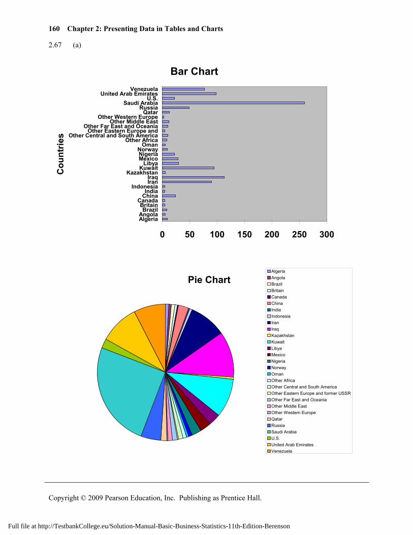
2.67 (a)
Bar Chart
0 50 100 150 200 250 300
AlgeriaAngola
BrazilBritain
CanadaChinaIndia
IndonesiaIranIraq
KazakhstanKuwait
LibyaMexicoNigeriaNorway
OmanOther Africa
Other Central and South AmericaOther Eastern Europe and
Other Far East and OceaniaOther Middle East
Other Western EuropeQatar
RussiaSaudi Arabia
U.S.United Arab Emirates
Venezuela
Cou
ntrie
s
Pie ChartAlgeriaAngolaBrazilBritainCanadaChinaIndiaIndonesiaIranIraqKazakhstanKuwaitLibyaMexicoNigeriaNorwayOmanOther AfricaOther Central and South AmericaOther Eastern Europe and former USSROther Far East and OceaniaOther Middle EastOther Western EuropeQatarRussiaSaudi ArabiaU.S.United Arab EmiratesVenezuela
Full file at http://TestbankCollege.eu/Solution-Manual-Basic-Business-Statistics-11th-Edition-Berenson
161
Copyright © 2009 Pearson Education, Inc. Publishing as Prentice Hall.
2.67 (a) cont.
Pareto Diagram
0%
5%
10%
15%
20%
25%
30%Sa
udi A
rabi
a
Iraq
Uni
ted
Ara
b Em
irate
s
Kuw
ait
Iran
Vene
zuel
a
Rus
sia
Liby
a
Mex
ico
Chi
na
Nig
eria
U.S
.
Qat
ar
Oth
er M
iddl
e Ea
st
Oth
er F
ar E
ast a
nd O
cean
iaO
ther
Cen
tral
and
Sou
thA
mer
ica
Nor
way
Alg
eria
Oth
er A
fric
a
Bra
zil
Om
an
Ang
ola
Kaz
akhs
tan
Brit
ain
Indo
nesi
aO
ther
Eas
tern
Eur
ope
and
form
er U
SSR C
anad
a
Indi
a
Oth
er W
este
rn E
urop
e
Countries
0%10%20%30%40%50%60%70%80%90%100%
(b)
Bar Chart
0 200 400 600 800
Africa
Central and South America
Eastern Europe and FormerUSSR
Far East and Oceania
Middle East
North America
Western Europe
Reg
ion
Full file at http://TestbankCollege.eu/Solution-Manual-Basic-Business-Statistics-11th-Edition-Berenson
162 Chapter 2: Presenting Data in Tables and Charts
Copyright © 2009 Pearson Education, Inc. Publishing as Prentice Hall.
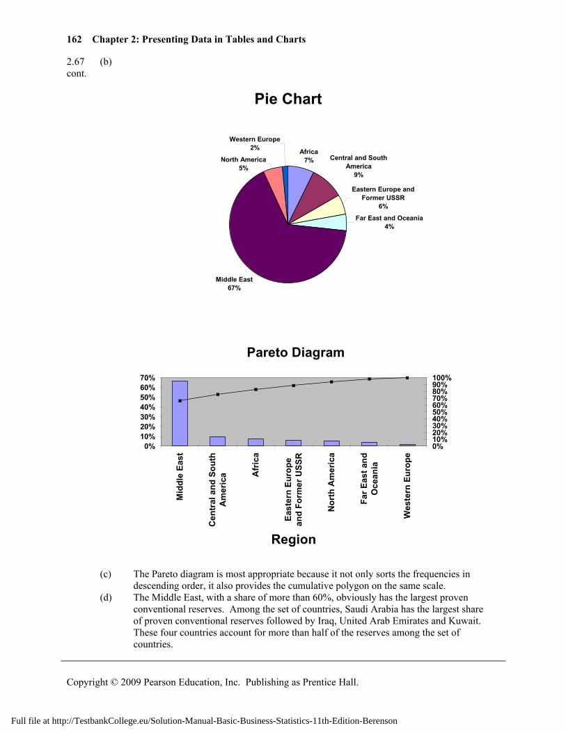
2.67 (b) cont.
Pie Chart
Africa7% Central and South
America9%
Eastern Europe and Former USSR
6%
Far East and Oceania4%
Middle East67%
North America5%
Western Europe2%
Pareto Diagram
0%10%20%30%40%50%60%70%
Mid
dle
East
Cen
tral
and
Sou
thA
mer
ica A
fric
a
East
ern
Euro
pean
d Fo
rmer
USS
R
Nor
th A
mer
ica
Far E
ast a
ndO
cean
ia
Wes
tern
Eur
ope
Region
0%10%20%30%40%50%60%70%80%90%100%
(c) The Pareto diagram is most appropriate because it not only sorts the frequencies in
descending order, it also provides the cumulative polygon on the same scale. (d) The Middle East, with a share of more than 60%, obviously has the largest proven
conventional reserves. Among the set of countries, Saudi Arabia has the largest share of proven conventional reserves followed by Iraq, United Arab Emirates and Kuwait. These four countries account for more than half of the reserves among the set of countries.
Full file at http://TestbankCollege.eu/Solution-Manual-Basic-Business-Statistics-11th-Edition-Berenson
163
Copyright © 2009 Pearson Education, Inc. Publishing as Prentice Hall.
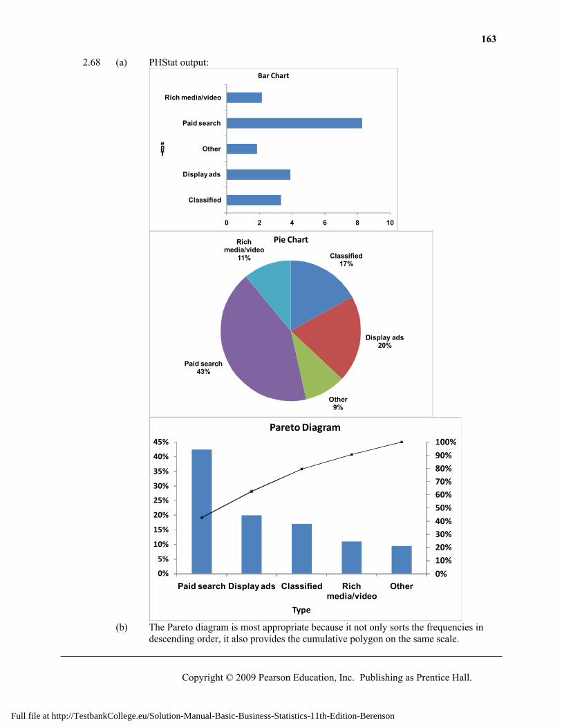
2.68 (a) PHStat output:
0 2 4 6 8 10
Classified
Display ads
Other
Paid search
Rich media/video
Type
Bar Chart
Classified17%
Display ads20%
Other9%
Paid search43%
Rich media/video
11%
Pie Chart
0%
10%20%30%40%
50%60%70%80%90%
100%
0%
5%
10%
15%
20%
25%
30%
35%
40%
45%
Paid search Display ads Classified Rich media/video
Other
Type
Pareto Diagram
(b) The Pareto diagram is most appropriate because it not only sorts the frequencies in
descending order, it also provides the cumulative polygon on the same scale.
Full file at http://TestbankCollege.eu/Solution-Manual-Basic-Business-Statistics-11th-Edition-Berenson
164 Chapter 2: Presenting Data in Tables and Charts
Copyright © 2009 Pearson Education, Inc. Publishing as Prentice Hall.
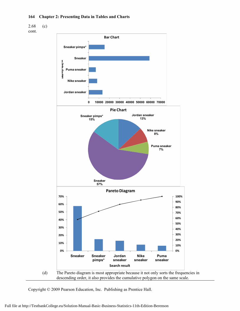
2.68 (c) cont.
0 10000 20000 30000 40000 50000 60000 70000
Jordan sneaker
Nike sneaker
Puma sneaker
Sneaker
Sneaker pimps*
Search result
Bar Chart
Jordan sneaker13%
Nike sneaker8%
Puma sneaker7%
Sneaker57%
Sneaker pimps*15%
Pie Chart
0%
10%
20%
30%
40%
50%
60%
70%
80%
90%
100%
0%
10%
20%
30%
40%
50%
60%
70%
Sneaker Sneaker pimps*
Jordan sneaker
Nike sneaker
Puma sneaker
Search result
Pareto Diagram
(d) The Pareto diagram is most appropriate because it not only sorts the frequencies in
descending order, it also provides the cumulative polygon on the same scale.
Full file at http://TestbankCollege.eu/Solution-Manual-Basic-Business-Statistics-11th-Edition-Berenson
165
Copyright © 2009 Pearson Education, Inc. Publishing as Prentice Hall.
2.68 (e) “Paid search” constitutes the largest category on US online ad spending at 43%. cont. Excluding the generic keyword “sneaker”, searches using the keywords “sneaker
pimps” and “Jordan sneaker” make up majority of the search for sneakers on specific brands.
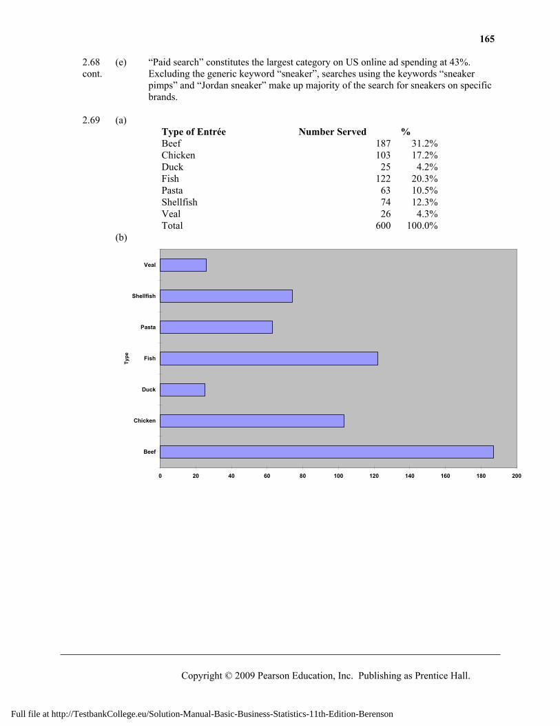
2.69 (a)
Type of Entrée Number Served % Beef 187 31.2% Chicken 103 17.2% Duck 25 4.2% Fish 122 20.3% Pasta 63 10.5% Shellfish 74 12.3% Veal 26 4.3% Total 600 100.0%
(b)
0 20 40 60 80 100 120 140 160 180 200
Beef
Chicken
Duck
Fish
Pasta
Shellfish
Veal
Type
Full file at http://TestbankCollege.eu/Solution-Manual-Basic-Business-Statistics-11th-Edition-Berenson
166 Chapter 2: Presenting Data in Tables and Charts
Copyright © 2009 Pearson Education, Inc. Publishing as Prentice Hall.
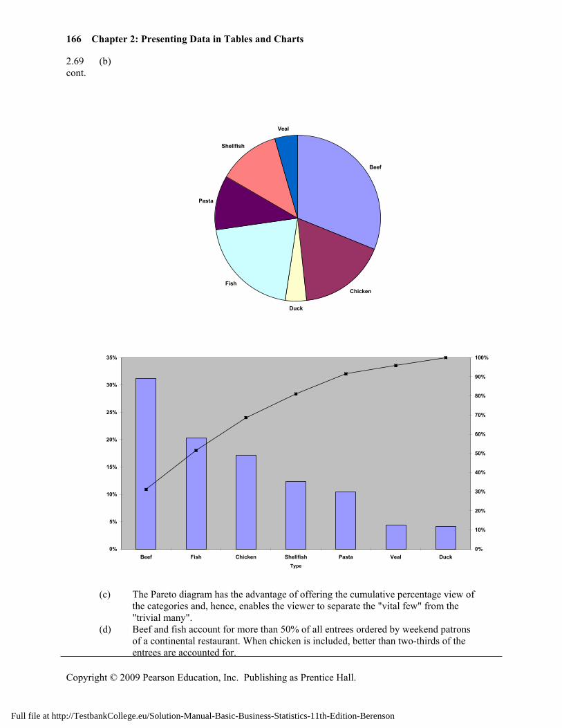
2.69 (b) cont.
Beef
Chicken
Duck
Fish
Pasta
Shellfish
Veal
0%
5%
10%
15%
20%
25%
30%
35%
Beef Fish Chicken Shellfish Pasta Veal DuckType
0%
10%
20%
30%
40%
50%
60%
70%
80%
90%
100%
(c) The Pareto diagram has the advantage of offering the cumulative percentage view of
the categories and, hence, enables the viewer to separate the "vital few" from the "trivial many".
(d) Beef and fish account for more than 50% of all entrees ordered by weekend patrons of a continental restaurant. When chicken is included, better than two-thirds of the entrees are accounted for.
Full file at http://TestbankCollege.eu/Solution-Manual-Basic-Business-Statistics-11th-Edition-Berenson
167
Copyright © 2009 Pearson Education, Inc. Publishing as Prentice Hall.
2.70 (a) Gender Beef Entrée Dessert Ordered Male Female Total Dessert Ordered Yes No Total Yes 71% 29% 100% Yes 52% 48% 100%No 48% 52% 100% No 25% 75% 100%Total 53% 47% 100% Total 31% 69% 100%
(g) Gender Beef Entrée Dessert Ordered Male Female Total Dessert Ordered Yes No Total Yes 30% 14% 23% Yes 38% 16% 23%No 70% 86% 77% No 62% 84% 77%Total 100% 100% 100% Total 100% 100% 100%
(h) Gender Beef Entrée Dessert Ordered Male Female Total Dessert Ordered Yes No Total Yes 16% 7% 23% Yes 12% 11% 23%No 37% 40% 77% No 19% 58% 77%Total 53% 47% 100% Total 31% 69% 100%
(b) If the owner is interested in finding out the percentage of joint occurrence of gender
and ordering of dessert or the percentage of joint occurrence of ordering a beef entrée and a dessert among all patrons, the table of total percentages is most informative. If the owner is interested in the effect of gender on ordering of dessert or the effect of ordering a beef entrée on the ordering of dessert, the table of column percentages will be most informative. Since dessert will usually be ordered after the main entree and the owner has no direct control over the gender of patrons, the table of row percentages is not very useful here.
(c) 30% of the men sampled ordered desserts compared to 14% of the women. Men are more than twice as likely to order desserts as women. Almost 38% of the patrons ordering a beef entree ordered dessert compared to less than 16% of patrons ordering all other entrees. Patrons ordering beef are better than 2.3 times as likely to order dessert as patrons ordering any other entree.
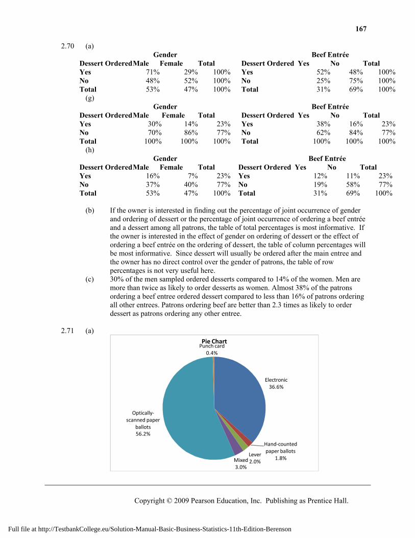
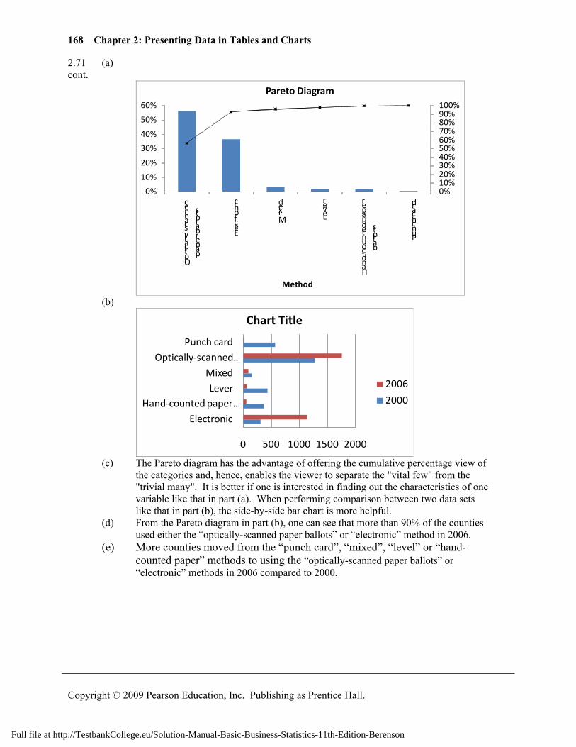
2.71 (a)
Electronic36.6%
Hand-counted paper ballots
1.8%Lever2.0%Mixed
3.0%
Optically-scanned paper
ballots56.2%
Punch card0.4%
Pie Chart
Full file at http://TestbankCollege.eu/Solution-Manual-Basic-Business-Statistics-11th-Edition-Berenson
168 Chapter 2: Presenting Data in Tables and Charts
Copyright © 2009 Pearson Education, Inc. Publishing as Prentice Hall.
2.71 (a) cont.
0%10%20%30%40%50%60%70%80%90%100%
0%
10%
20%
30%
40%
50%
60%
Optically-scanned
paper ballots
Electronic
Mixed
Lever
Hand-counted paper
ballots
Punch card
Method
Pareto Diagram
(b)
0 500 1000 1500 2000
ElectronicHand-counted paper …
LeverMixed
Optically-scanned …Punch card
Chart Title
2006
2000
(c) The Pareto diagram has the advantage of offering the cumulative percentage view of the categories and, hence, enables the viewer to separate the "vital few" from the
"trivial many". It is better if one is interested in finding out the characteristics of one variable like that in part (a). When performing comparison between two data sets like that in part (b), the side-by-side bar chart is more helpful.
(d) From the Pareto diagram in part (b), one can see that more than 90% of the counties used either the “optically-scanned paper ballots” or “electronic” method in 2006.
(e) More counties moved from the “punch card”, “mixed”, “level” or “hand-counted paper” methods to using the “optically-scanned paper ballots” or “electronic” methods in 2006 compared to 2000.
Full file at http://TestbankCollege.eu/Solution-Manual-Basic-Business-Statistics-11th-Edition-Berenson
169
Copyright © 2009 Pearson Education, Inc. Publishing as Prentice Hall.
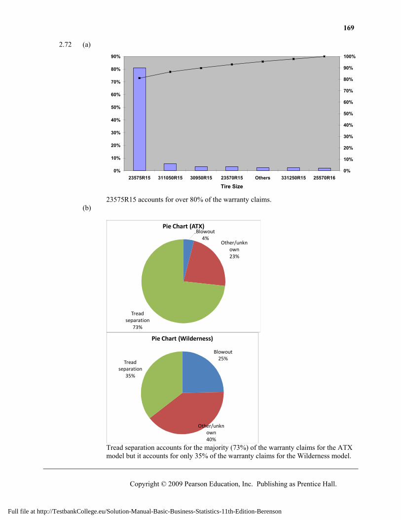
2.72 (a)
0%
10%
20%
30%
40%
50%
60%
70%
80%
90%
23575R15 311050R15 30950R15 23570R15 Others 331250R15 25570R16
Tire Size
0%
10%
20%
30%
40%
50%
60%
70%
80%
90%
100%
23575R15 accounts for over 80% of the warranty claims. (b)
Blowout4%
Other/unknown23%
Tread separation
73%
Pie Chart (ATX)
Blowout25%
Other/unknown40%
Tread separation
35%
Pie Chart (Wilderness)
Tread separation accounts for the majority (73%) of the warranty claims for the ATX
model but it accounts for only 35% of the warranty claims for the Wilderness model.
Full file at http://TestbankCollege.eu/Solution-Manual-Basic-Business-Statistics-11th-Edition-Berenson
170 Chapter 2: Presenting Data in Tables and Charts
Copyright © 2009 Pearson Education, Inc. Publishing as Prentice Hall.
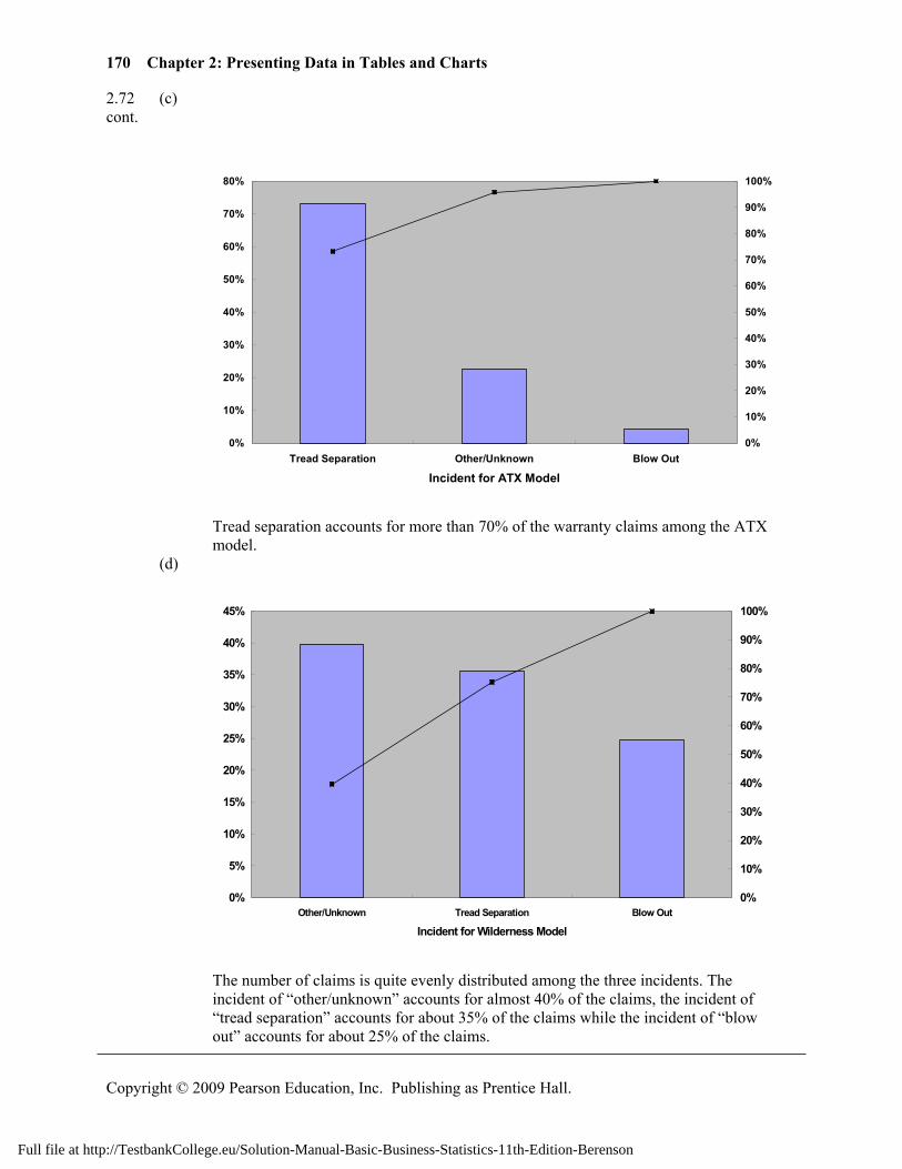
2.72 (c) cont.
0%
10%
20%
30%
40%
50%
60%
70%
80%
Tread Separation Other/Unknown Blow Out
Incident for ATX Model
0%
10%
20%
30%
40%
50%
60%
70%
80%
90%
100%
Tread separation accounts for more than 70% of the warranty claims among the ATX
model. (d)
0%
5%
10%
15%
20%
25%
30%
35%
40%
45%
Other/Unknown Tread Separation Blow Out
Incident for Wilderness Model
0%
10%
20%
30%
40%
50%
60%
70%
80%
90%
100%
The number of claims is quite evenly distributed among the three incidents. The
incident of “other/unknown” accounts for almost 40% of the claims, the incident of “tread separation” accounts for about 35% of the claims while the incident of “blow out” accounts for about 25% of the claims.
Full file at http://TestbankCollege.eu/Solution-Manual-Basic-Business-Statistics-11th-Edition-Berenson
171
Copyright © 2009 Pearson Education, Inc. Publishing as Prentice Hall.
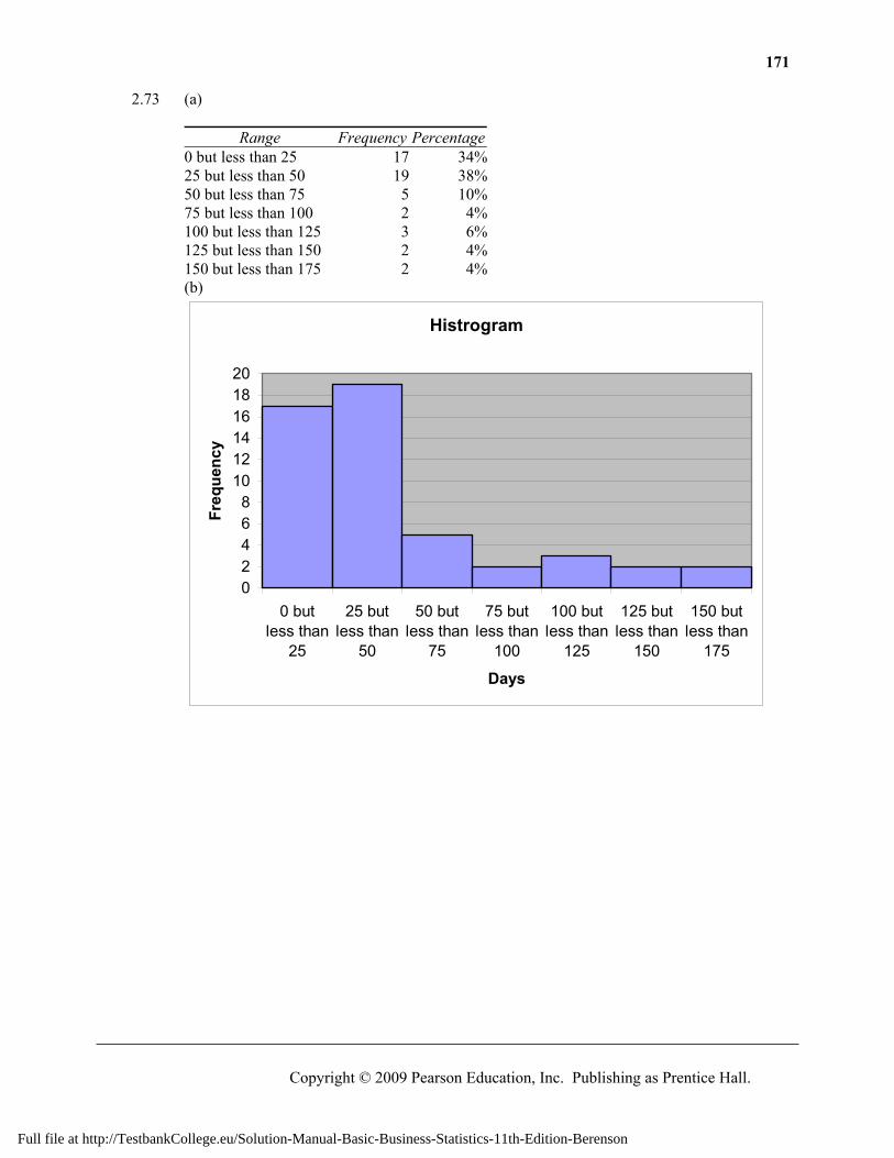
2.73 (a)
Range Frequency Percentage0 but less than 25 17 34%25 but less than 50 19 38%50 but less than 75 5 10%75 but less than 100 2 4%100 but less than 125 3 6%125 but less than 150 2 4%150 but less than 175 2 4%(b)
Histrogram
02468
101214161820
0 butless than
25
25 butless than
50
50 butless than
75
75 butless than
100
100 butless than
125
125 butless than
150
150 butless than
175
Days
Freq
uenc
y
Full file at http://TestbankCollege.eu/Solution-Manual-Basic-Business-Statistics-11th-Edition-Berenson
172 Chapter 2: Presenting Data in Tables and Charts
Copyright © 2009 Pearson Education, Inc. Publishing as Prentice Hall.
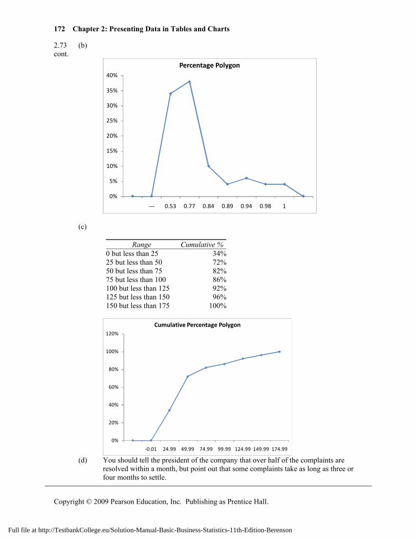
2.73 (b) cont.
0%
5%
10%
15%
20%
25%
30%
35%
40%
--- 0.53 0.77 0.84 0.89 0.94 0.98 1
Percentage Polygon
(c)
Range Cumulative %0 but less than 25 34%25 but less than 50 72%50 but less than 75 82%75 but less than 100 86%100 but less than 125 92%125 but less than 150 96%150 but less than 175 100%
0%
20%
40%
60%
80%
100%
120%
-0.01 24.99 49.99 74.99 99.99 124.99 149.99 174.99
Cumulative Percentage Polygon
(d) You should tell the president of the company that over half of the complaints are resolved within a month, but point out that some complaints take as long as three or
four months to settle.
Full file at http://TestbankCollege.eu/Solution-Manual-Basic-Business-Statistics-11th-Edition-Berenson
Solutions to End-of-Section and Chapter Review Problems 173
Copyright © 2009 Pearson Education, Inc. Publishing as Prentice Hall.
2.74 (a)
0.00%10.00%20.00%30.00%40.00%
---
0.35
0.85
1.35
1.85
2.35
2.85
3.35
3.85
4.35
4.85
5.35
5.85
6.35
6.85
Percentage
Midpoints
Percentage Histogram (Alcohol %)
0.00%
10.00%
20.00%
30.00%
---
70 80 90 100
110
120
130
140
150
160
170
180
190
200
Percentaage
Midpoints
Percentage Histogram (Calories)
0.00%
5.00%
10.00%
15.00%
20.00%
25.00%
--- 2 4 6 8 10 12 14 16 18 20 22 24
Percentage
Midpoints
Percentage Histogram (Carbohydrates)
Full file at http://TestbankCollege.eu/Solution-Manual-Basic-Business-Statistics-11th-Edition-Berenson
174 Chapter 2: Presenting Data in Tables and Charts
Copyright © 2009 Pearson Education, Inc. Publishing as Prentice Hall.
2.74 (b) cont.
0.0
1.0
2.0
3.0
4.0
5.0
6.0
7.0
0 50 100 150 200 250
Alcohol %
Calories
Scatter Plot (Alcohol % vs Calories)
0.0
1.0
2.0
3.0
4.0
5.0
6.0
7.0
0.0 5.0 10.0 15.0 20.0 25.0 30.0
Alcohol %
Carbohydrates
Scatter Plot (Alcohol % vs Carbohydrates)
0
50
100
150
200
250
0.0 5.0 10.0 15.0 20.0 25.0 30.0
Calories
Carbohydrates
Scatter Plot (Calories vs Carbohydrates)
Full file at http://TestbankCollege.eu/Solution-Manual-Basic-Business-Statistics-11th-Edition-Berenson
Solutions to End-of-Section and Chapter Review Problems 175
Copyright © 2009 Pearson Education, Inc. Publishing as Prentice Hall.
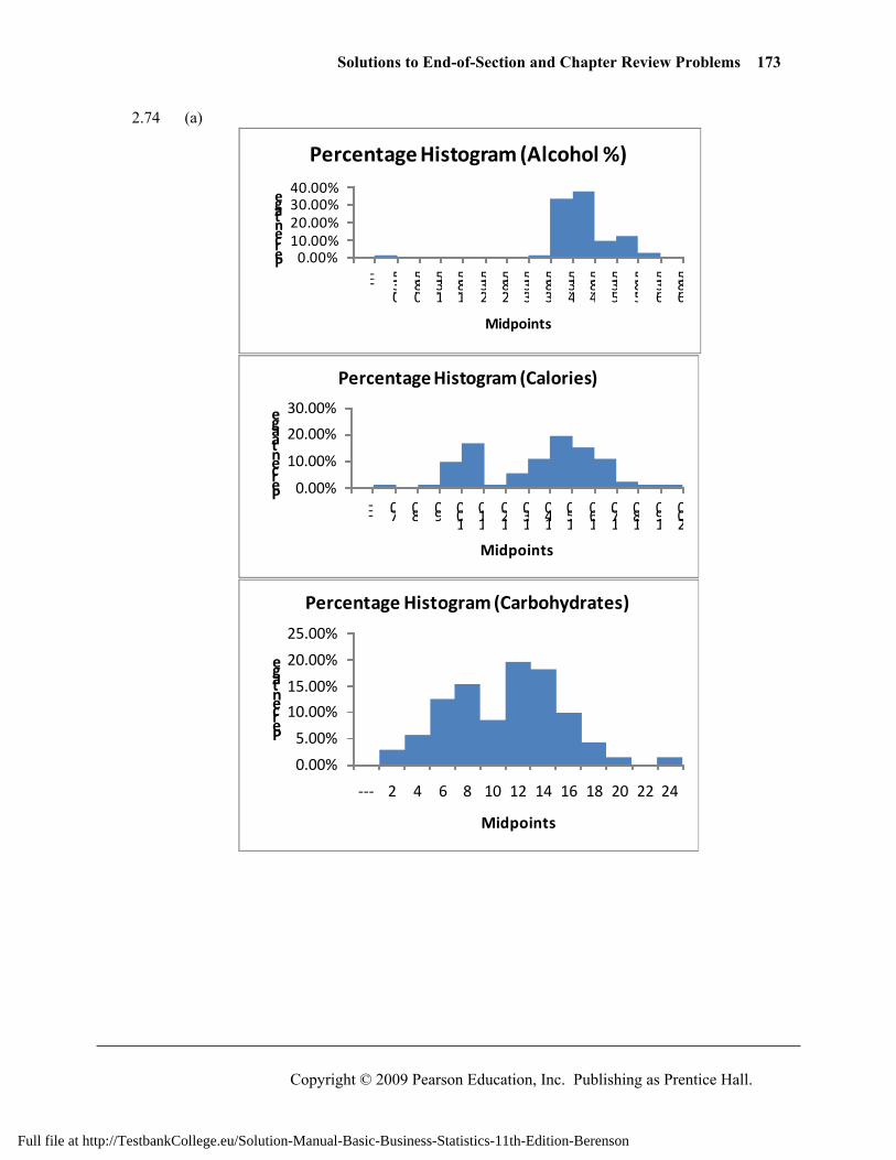
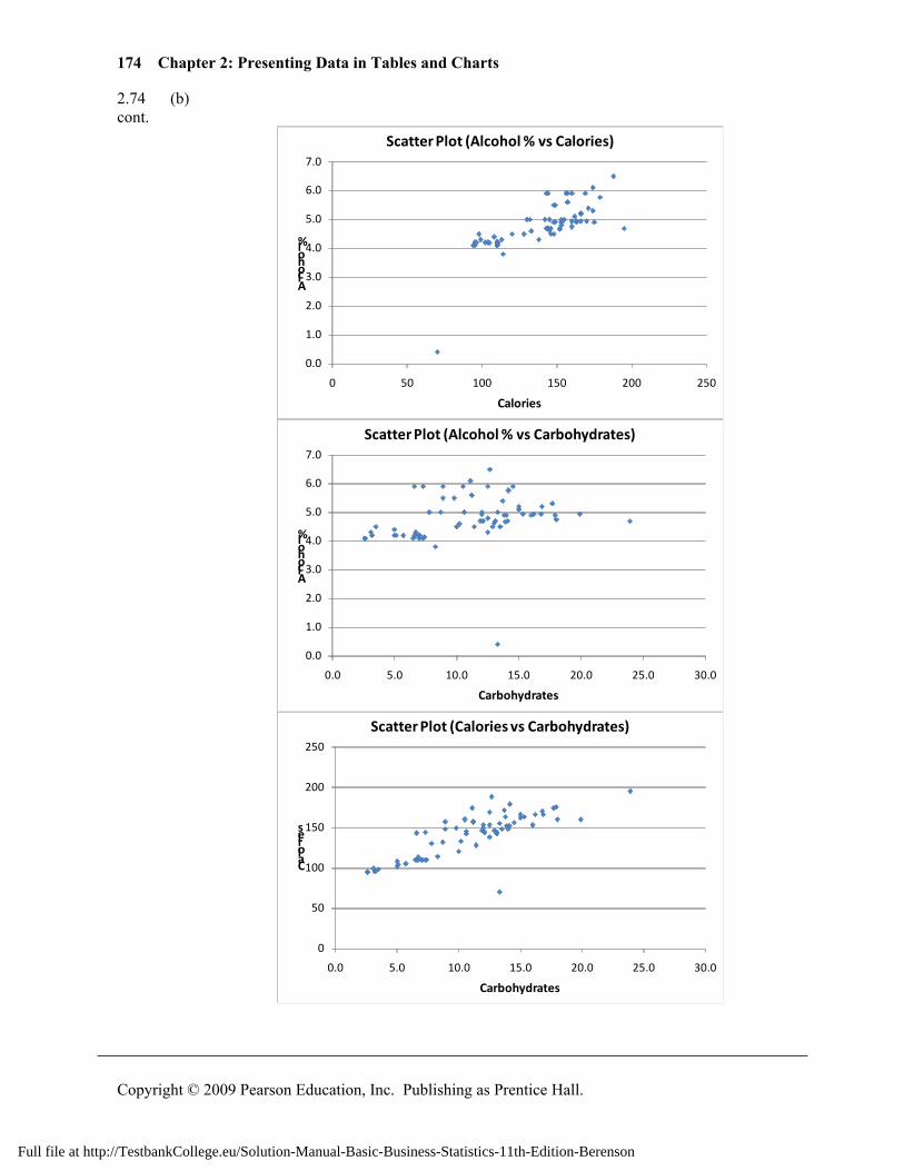
2.74 (c) Majority (about 71%) of the beers have percentage alcohol between 4.1% and 5.1% cont. with one beer (O’Douls) contains only 0.4% alcohol. There are two clusters in
calories distribution. About 60% of the beers have calories between 135 and 175 and another cluster of 25% has calories between 95 and 115. The distribution of carbohydrates is slightly right-skewed with Sam Adams Cream Stout having a carbohydrates value of 23.9. There appears to be a positive relationship between percentage alcohol in a beer and its calories content. There is also an obvious positive relationship between calories content and carbohydrates content. Percentage alcohol content and calories content do not appear to be related.
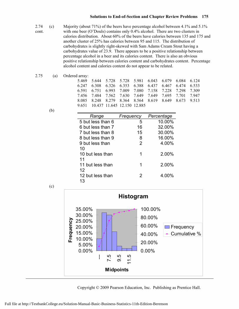
2.75 (a) Ordered array: 5.469 5.644 5.728 5.728 5.981 6.043 6.079 6.084 6.124
6.247 6.308 6.326 6.353 6.388 6.437 6.467 6.474 6.533 6.591 6.751 6.993 7.009 7.080 7.158 7.228 7.298 7.309 7.456 7.484 7.562 7.630 7.649 7.649 7.695 7.701 7.947 8.085 8.248 8.279 8.364 8.564 8.619 8.649 8.673 9.513 9.651 10.437 11.645 12.150 12.885
(b) Range Frequency Percentage
5 but less than 6 5 10.00% 6 but less than 7 16 32.00% 7 but less than 8 15 30.00% 8 but less than 9 8 16.00% 9 but less than 10
2 4.00%
10 but less than 11
1 2.00%
11 but less than 12
1 2.00%
12 but less than 13
2 4.00%
(c)
Histogram
0.00%5.00%
10.00%15.00%20.00%25.00%30.00%35.00%
--- 7.5
9.5
11.5
Midpoints
Freq
uenc
y
0.00%
20.00%
40.00%
60.00%
80.00%
100.00%
FrequencyCumulative %
Full file at http://TestbankCollege.eu/Solution-Manual-Basic-Business-Statistics-11th-Edition-Berenson
176 Chapter 2: Presenting Data in Tables and Charts
Copyright © 2009 Pearson Education, Inc. Publishing as Prentice Hall.
2.75 (d) About 78% of the states spend between 6 and 9 thousand dollars while 10% of the cont. states spend less than 6 thousand dollars and 12% of the states spend more than 9
thousand dollars per capita in 2004. 2.76 (a)
0.00%20.00%40.00%
--- 0.2 0.6 1 1.4 1.8 2.2 2.6Percentage
Midpoints
Percentage Histogram (Money Market)
0.00%
10.00%
20.00%
--- 2.8 3.2 3.6 4 4.4 4.8 5.2Percentage
Midpoints
Percentage Histogram (One-Year CD)
0.00%10.00%20.00%30.00%
--- 3.2 3.6 4 4.4 4.8 5.2Frequency
Midpoints
Percentage Histogram (Five-Year CD)
Full file at http://TestbankCollege.eu/Solution-Manual-Basic-Business-Statistics-11th-Edition-Berenson
Solutions to End-of-Section and Chapter Review Problems 177
Copyright © 2009 Pearson Education, Inc. Publishing as Prentice Hall.
2.76 (b) cont.
0.00
0.50
1.00
1.50
2.00
2.50
3.00
0.00 1.00 2.00 3.00 4.00 5.00 6.00
Money Market
One-Year CD
Scatter Plot (Money Market vs One-Year CD)
0.00
0.50
1.00
1.50
2.00
2.50
3.00
0.00 1.00 2.00 3.00 4.00 5.00 6.00
Money Market
Five-Year CD
Scatter Plot (Money Market vs Five-Year CD)
0.00
1.00
2.00
3.00
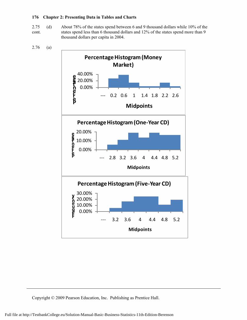
4.00
5.00
6.00
0.00 1.00 2.00 3.00 4.00 5.00 6.00
One-Year CD
Five-Year CD
Scatter Plot (One-Year vs Five-Year CD)
Full file at http://TestbankCollege.eu/Solution-Manual-Basic-Business-Statistics-11th-Edition-Berenson
178 Chapter 2: Presenting Data in Tables and Charts
Copyright © 2009 Pearson Education, Inc. Publishing as Prentice Hall.
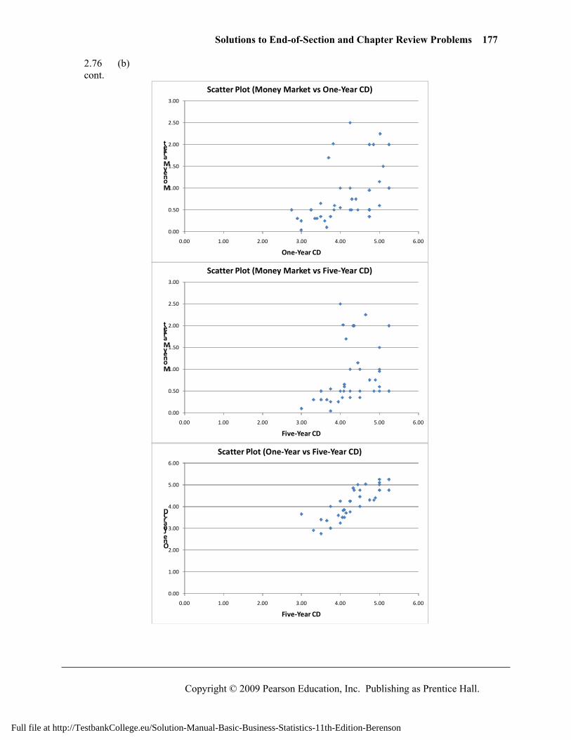
2.76 (c) The distribution of the yields of the money market accounts is right-skewed with cont. almost 80% of them having a return of less than 1.2% while only about 16% of them
have yields higher than 2.0%. The distribution of the yields of one-year CD is quite uniform between 3.4% and 5.4% with only about 16% of them having a yield of less than 3.4%. About 65% of the five-year CDs have yields that fall between 3.4% and 4.6%. Only 5% of them have yields that are lower than 3.4% and about 19% of them have yields higher than 5.0%. There appear to be positive relationships between all pairs of yields with one-year CD and five-year CD demonstrating the strongest positive relationship.
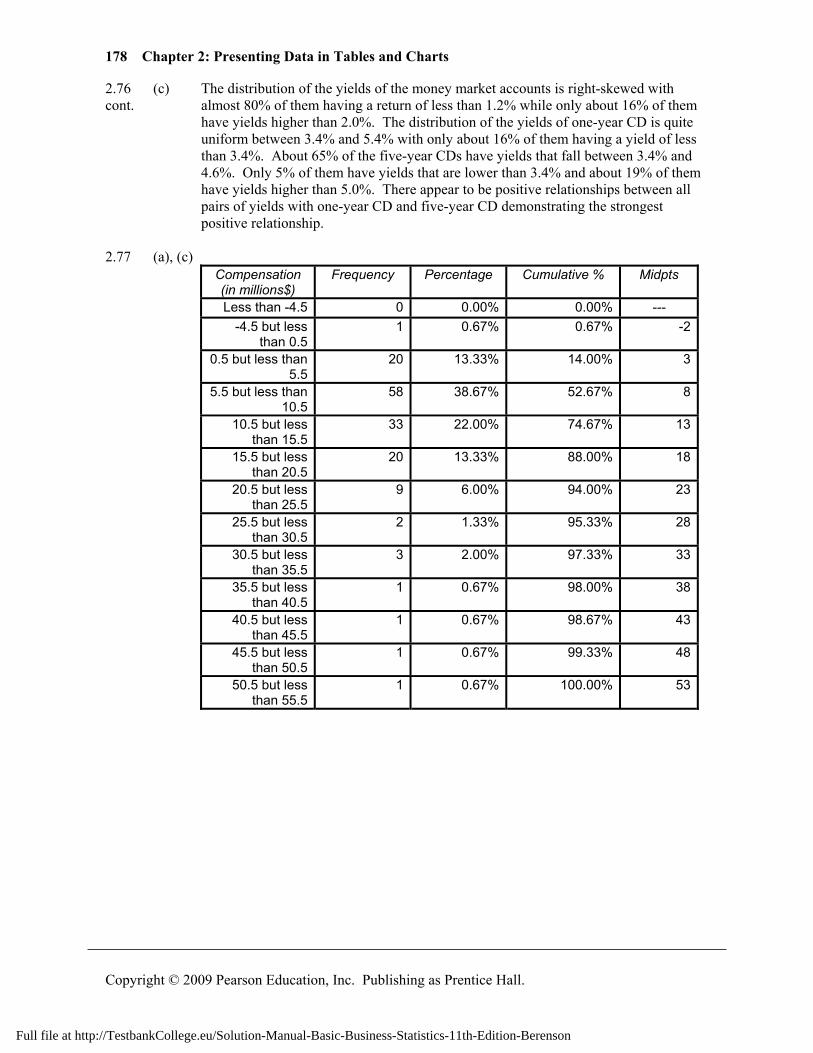
2.77 (a), (c)
Compensation (in millions$)
Frequency Percentage Cumulative % Midpts
Less than -4.5 0 0.00% 0.00% --- -4.5 but less
than 0.5 1 0.67% 0.67% -2
0.5 but less than 5.5
20 13.33% 14.00% 3
5.5 but less than 10.5
58 38.67% 52.67% 8
10.5 but less than 15.5
33 22.00% 74.67% 13
15.5 but less than 20.5
20 13.33% 88.00% 18
20.5 but less than 25.5
9 6.00% 94.00% 23
25.5 but less than 30.5
2 1.33% 95.33% 28
30.5 but less than 35.5
3 2.00% 97.33% 33
35.5 but less than 40.5
1 0.67% 98.00% 38
40.5 but less than 45.5
1 0.67% 98.67% 43
45.5 but less than 50.5
1 0.67% 99.33% 48
50.5 but less than 55.5
1 0.67% 100.00% 53
Full file at http://TestbankCollege.eu/Solution-Manual-Basic-Business-Statistics-11th-Edition-Berenson
Solutions to End-of-Section and Chapter Review Problems 179
Copyright © 2009 Pearson Education, Inc. Publishing as Prentice Hall.
2.77 (b) cont.
020406080
--- -2 3 8 13 18 23 28 33 38 43 48 53
Frequency
Midpoints
Histogram
0%
5%
10%
15%
20%
25%
30%
35%
40%
45%
--- -2 3 8 13 18 23 28 33 38 43 48 53 58
Percentage Polygon
(c)
0%
20%
40%
60%
80%
100%
120%
-4.501
0.499
5.499
10.499
15.499
20.499
25.499
30.499
35.499
40.499
45.499
50.499
55.499
Cumulative Percentage Polygon
(d) The total compensation is right-skewed. Slightly more than half (52.67%) of the
CEOs have total compensation below $10.5 millions. Only 6% of the CEOs have total compensation above $25.5 millions.
(e) Yes, Berkshire Hathaway is the only company whose CEO has a total compensation below $500,000. Warren E. Buffet, who is one of the wealthiest persons in the US and a famous philanthropher, is its CEO.
Full file at http://TestbankCollege.eu/Solution-Manual-Basic-Business-Statistics-11th-Edition-Berenson
180 Chapter 2: Presenting Data in Tables and Charts
Copyright © 2009 Pearson Education, Inc. Publishing as Prentice Hall.
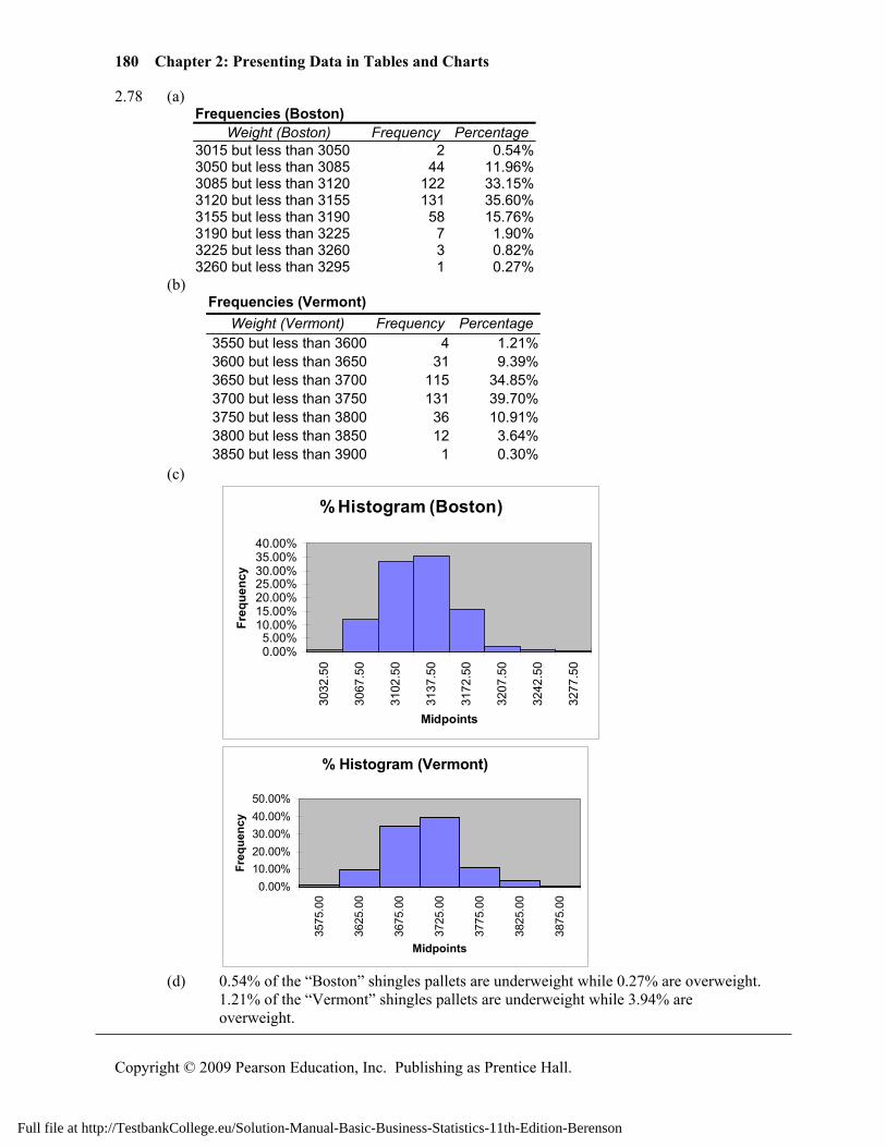
2.78 (a) Frequencies (Boston)
Weight (Boston) Frequency Percentage3015 but less than 3050 2 0.54%3050 but less than 3085 44 11.96%3085 but less than 3120 122 33.15%3120 but less than 3155 131 35.60%3155 but less than 3190 58 15.76%3190 but less than 3225 7 1.90%3225 but less than 3260 3 0.82%3260 but less than 3295 1 0.27%
(b) Frequencies (Vermont)
Weight (Vermont) Frequency Percentage3550 but less than 3600 4 1.21%3600 but less than 3650 31 9.39%3650 but less than 3700 115 34.85%3700 but less than 3750 131 39.70%3750 but less than 3800 36 10.91%3800 but less than 3850 12 3.64%3850 but less than 3900 1 0.30%
(c)
% Histogram (Boston)
0.00%5.00%
10.00%15.00%20.00%25.00%30.00%35.00%40.00%
3032
.50
3067
.50
3102
.50
3137
.50
3172
.50
3207
.50
3242
.50
3277
.50
Midpoints
Freq
uenc
y
% Histogram (Vermont)
0.00%10.00%20.00%30.00%40.00%50.00%
3575
.00
3625
.00
3675
.00
3725
.00
3775
.00
3825
.00
3875
.00
Midpoints
Freq
uenc
y
(d) 0.54% of the “Boston” shingles pallets are underweight while 0.27% are overweight.
1.21% of the “Vermont” shingles pallets are underweight while 3.94% are overweight.
Full file at http://TestbankCollege.eu/Solution-Manual-Basic-Business-Statistics-11th-Edition-Berenson
Solutions to End-of-Section and Chapter Review Problems 181
Copyright © 2009 Pearson Education, Inc. Publishing as Prentice Hall.
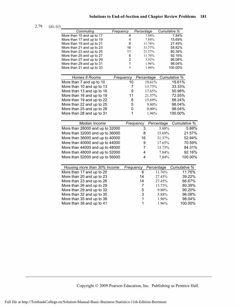
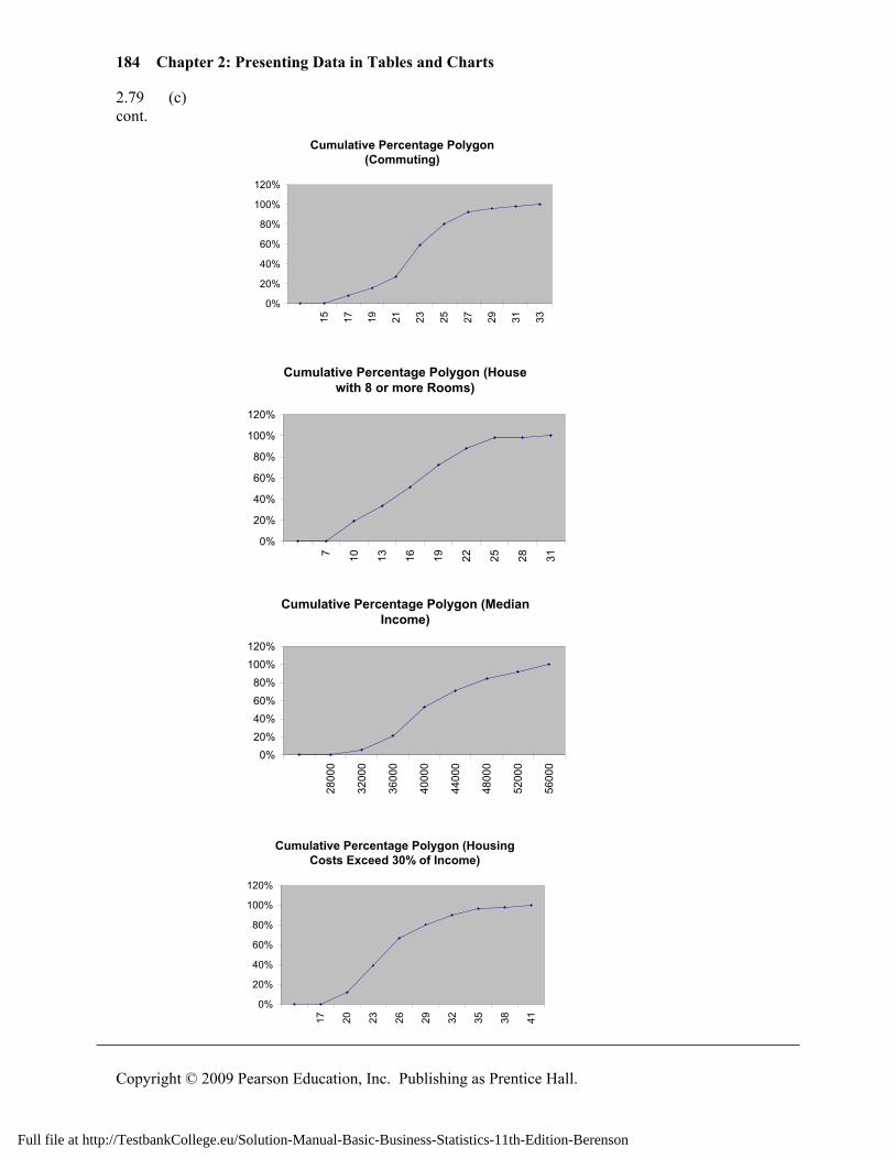
2.79 (a), (c) Commuting Frequency Percentage Cumulative %
More than 15 and up to 17 4 7.84% 7.84% More than 17 and up to 19 4 7.84% 15.69% More than 19 and up to 21 6 11.76% 27.45% More than 21 and up to 23 16 31.37% 58.82% More than 23 and up to 25 11 21.57% 80.39% More than 25 and up to 27 6 11.76% 92.16% More than 27 and up to 29 2 3.92% 96.08% More than 29 and up to 31 1 1.96% 98.04% More than 31 and up to 33 1 1.96% 100.00%
Homes 8 Rooms Frequency Percentage Cumulative %
More than 7 and up to 10 10 19.61% 19.61% More than 10 and up to 13 7 13.73% 33.33% More than 13 and up to 16 9 17.65% 50.98% More than 16 and up to 19 11 21.57% 72.55% More than 19 and up to 22 8 15.69% 88.24% More than 22 and up to 25 5 9.80% 98.04% More than 25 and up to 28 0 0.00% 98.04% More than 28 and up to 31 1 1.96% 100.00%
Median Income Frequency Percentage Cumulative %
More than 28000 and up to 32000 3 5.88% 5.88%More than 32000 and up to 36000 8 15.69% 21.57%More than 36000 and up to 40000 16 31.37% 52.94%More than 40000 and up to 44000 9 17.65% 70.59%More than 44000 and up to 48000 7 13.73% 84.31%More than 48000 and up to 52000 4 7.84% 92.16%More than 52000 and up to 56000 4 7.84% 100.00%
Housing more than 30% Income Frequency Percentage Cumulative %
More than 17 and up to 20 6 11.76% 11.76%More than 20 and up to 23 14 27.45% 39.22%More than 23 and up to 26 14 27.45% 66.67%More than 26 and up to 29 7 13.73% 80.39%More than 29 and up to 32 5 9.80% 90.20%More than 32 and up to 35 3 5.88% 96.08%More than 35 and up to 38 1 1.96% 98.04%More than 38 and up to 41 1 1.96% 100.00%
Full file at http://TestbankCollege.eu/Solution-Manual-Basic-Business-Statistics-11th-Edition-Berenson
182 Chapter 2: Presenting Data in Tables and Charts
Copyright © 2009 Pearson Education, Inc. Publishing as Prentice Hall.
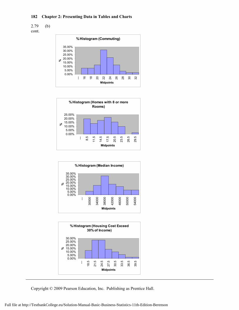
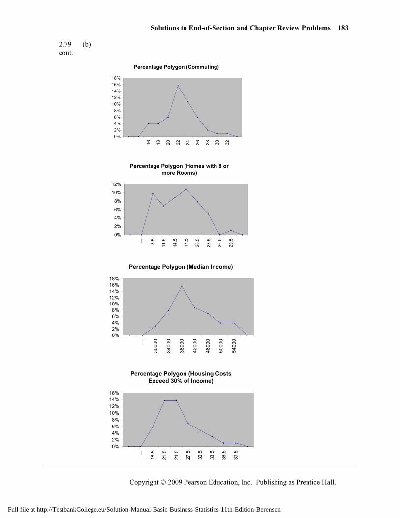
2.79 (b) cont.
% Histogram (Commuting)
0.00%5.00%
10.00%15.00%20.00%25.00%30.00%35.00%
---
16 18 20 22 24 26 28 30 32
Midpoints
%
% Histogram (Homes with 8 or more Rooms)
0.00%5.00%
10.00%15.00%20.00%25.00%
---
8.5
11.5
14.5
17.5
20.5
23.5
26.5
29.5
Midpoints
%
% Histogram (Median Income)
0.00%5.00%
10.00%15.00%20.00%25.00%30.00%35.00%
---
3000
0
3400
0
3800
0
4200
0
4600
0
5000
0
5400
0
Midpoints
%
% Histogram (Housing Cost Exceed 30% of Income)
0.00%5.00%
10.00%15.00%20.00%25.00%30.00%
---
18.5
21.5
24.5
27.5
30.5
33.5
36.5
39.5
Midpoints
%
Full file at http://TestbankCollege.eu/Solution-Manual-Basic-Business-Statistics-11th-Edition-Berenson
Solutions to End-of-Section and Chapter Review Problems 183
Copyright © 2009 Pearson Education, Inc. Publishing as Prentice Hall.
2.79 (b) cont.
Percentage Polygon (Commuting)
0%2%4%6%8%
10%12%14%16%18%
--- 16 18 20 22 24 26 28 30 32
Percentage Polygon (Homes with 8 or more Rooms)
0%
2%
4%
6%
8%
10%
12%
---
8.5
11.5
14.5
17.5
20.5
23.5
26.5
29.5
Percentage Polygon (Median Income)
0%2%4%6%8%
10%12%14%16%18%
---
3000
0
3400
0
3800
0
4200
0
4600
0
5000
0
5400
0
Percentage Polygon (Housing Costs Exceed 30% of Income)
0%2%4%6%8%
10%12%14%16%
---
18.5
21.5
24.5
27.5
30.5
33.5
36.5
39.5
Full file at http://TestbankCollege.eu/Solution-Manual-Basic-Business-Statistics-11th-Edition-Berenson
184 Chapter 2: Presenting Data in Tables and Charts
Copyright © 2009 Pearson Education, Inc. Publishing as Prentice Hall.
2.79 (c) cont.
Cumulative Percentage Polygon (Commuting)
0%
20%
40%
60%
80%
100%
120%
15 17 19 21 23 25 27 29 31 33
Cumulative Percentage Polygon (House with 8 or more Rooms)
0%
20%
40%
60%
80%
100%
120%
7 10 13 16 19 22 25 28 31
Cumulative Percentage Polygon (Median Income)
0%20%40%60%80%
100%120%
2800
0
3200
0
3600
0
4000
0
4400
0
4800
0
5200
0
5600
0
Cumulative Percentage Polygon (Housing Costs Exceed 30% of Income)
0%
20%
40%
60%
80%
100%
120%
17 20 23 26 29 32 35 38 41
Full file at http://TestbankCollege.eu/Solution-Manual-Basic-Business-Statistics-11th-Edition-Berenson
Solutions to End-of-Section and Chapter Review Problems 185
Copyright © 2009 Pearson Education, Inc. Publishing as Prentice Hall.
2.80 (a) Calories Frequency Percentage Percentage Less Than 50 up to 100 3 12% 12% 100 up to 150 3 12 24 150 up to 200 9 36 60 200 up to 250 6 24 84 250 up to 300 3 12 96 300 up to 350 0 0 96 350 up to 400 1 4 100
% Histogram (Calories)
05
10152025303540
50
upto
100
100
upto
150
150
upto
200
200
upto
250
250
upto
300
300
upto
350
350
upto
400
Calories
%
(b)
Cholesterol Frequency Percentage Percentage Less Than 0 up to 50 2 8 8% 50 up to 100 17 68 76 100 up to 150 4 16 92 150 up to 200 1 4 96 200 up to 250 0 0 96 250 up to 300 0 0 96 300 up to 350 0 0 96 350 up to 400 0 0 96 400 up to 450 0 0 96 450 up to 500 1 4 100
% Histogram (Cholesterol)
01020304050607080
0
up
to
50
50
up to
100
100
up to
150
150
up to
200
200
up to
250
250
up to
300
300
up to
350
350
up to
400
400
up to
450
450
up to
500
Cholesterol
%
Full file at http://TestbankCollege.eu/Solution-Manual-Basic-Business-Statistics-11th-Edition-Berenson
186 Chapter 2: Presenting Data in Tables and Charts
Copyright © 2009 Pearson Education, Inc. Publishing as Prentice Hall.
2.80 (c) The sampled fresh red meats, poultry, and fish vary from 98 to 397 calories per cont. serving with the highest concentration between 150 to 200 calories. One protein
source, spareribs with 397 calories, was over 100 calories beyond the next highest caloric food. Spareribs and fried liver are both very different from other foods sampled, the former on calories and the latter on cholesterol content.
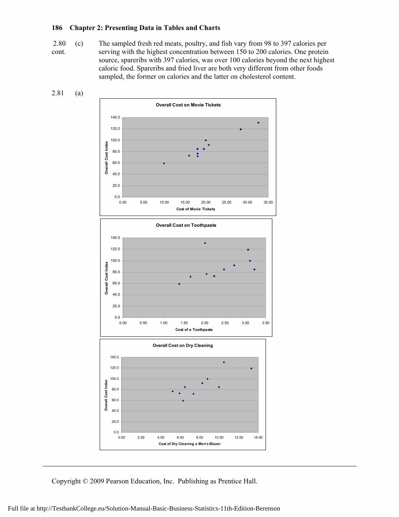
2.81 (a)
Overall Cost on Movie Tickets
0.0
20.0
40.0
60.0
80.0
100.0
120.0
140.0
0.00 5.00 10.00 15.00 20.00 25.00 30.00 35.00
Cost of Movie Tickets
Ove
rall
Cos
t Ind
ex
Overall Cost on Toothpaste
0.0
20.0
40.0
60.0
80.0
100.0
120.0
140.0
0.00 0.50 1.00 1.50 2.00 2.50 3.00 3.50
Cost of a Toothpaste
Ove
rall
Cos
t Ind
ex
Overall Cost on Dry Cleaning
0.0
20.0
40.0
60.0
80.0
100.0
120.0
140.0
0.00 2.00 4.00 6.00 8.00 10.00 12.00 14.00
Cost of Dry Cleaning a Men's Blazer
Ove
rall
Cos
t Ind
ex
Full file at http://TestbankCollege.eu/Solution-Manual-Basic-Business-Statistics-11th-Edition-Berenson
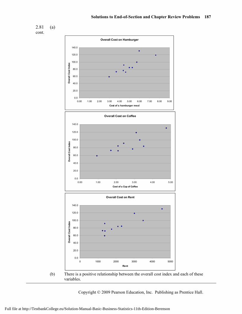
Solutions to End-of-Section and Chapter Review Problems 187
Copyright © 2009 Pearson Education, Inc. Publishing as Prentice Hall.
2.81 (a) cont.
Overall Cost on Hamburger
0.0
20.0
40.0
60.0
80.0
100.0
120.0
140.0
0.00 1.00 2.00 3.00 4.00 5.00 6.00 7.00 8.00 9.00
Cost of a hamburger meal
Ove
rall
Cost
Inde
x
Overall Cost on Coffee
0.0
20.0
40.0
60.0
80.0
100.0
120.0
140.0
0.00 1.00 2.00 3.00 4.00 5.00
Cost of a Cup of Coffee
Ove
rall
Cos
t Ind
ex
Overall Cost on Rent
0.0
20.0
40.0
60.0
80.0
100.0
120.0
140.0
0 1000 2000 3000 4000 5000
Rent
Ove
rall
Cost
Inde
x
(b) There is a positive relationship between the overall cost index and each of these
variables.
Full file at http://TestbankCollege.eu/Solution-Manual-Basic-Business-Statistics-11th-Edition-Berenson
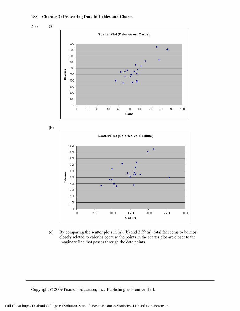
188 Chapter 2: Presenting Data in Tables and Charts
Copyright © 2009 Pearson Education, Inc. Publishing as Prentice Hall.
2.82 (a)
Scatter Plot (Calories vs. Carbs)
0
100
200
300
400
500
600
700
800
900
1000
0 10 20 30 40 50 60 70 80 90 100
Carbs
Calo
ries
(b)
(c) By comparing the scatter plots in (a), (b) and 2.39 (a), total fat seems to be most
closely related to calories because the points in the scatter plot are closer to the imaginary line that passes through the data points.
Full file at http://TestbankCollege.eu/Solution-Manual-Basic-Business-Statistics-11th-Edition-Berenson
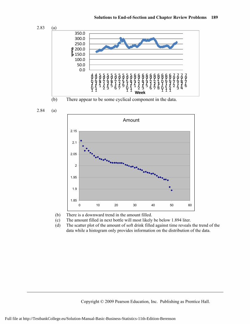
Solutions to End-of-Section and Chapter Review Problems 189
Copyright © 2009 Pearson Education, Inc. Publishing as Prentice Hall.
2.83 (a)
0.050.0
100.0150.0200.0250.0300.0350.0
10/20/04
11/29/04
1/8/05
2/17/05
3/29/05
5/8/05
6/17/05
7/27/05
9/5/05
10/15/05
11/24/05
1/3/06
2/12/06
3/24/06
5/3/06
6/12/06
7/22/06
8/31/06
10/10/06
11/19/06
12/29/06
2/7/07
3/19/07
4/28/07
6/7/07
Price
Week (b) There appear to be some cyclical component in the data. 2.84 (a)
Amount
1.85
1.9
1.95
2
2.05
2.1
2.15
0 10 20 30 40 50 60
(b) There is a downward trend in the amount filled. (c) The amount filled in next bottle will most likely be below 1.894 liter. (d) The scatter plot of the amount of soft drink filled against time reveals the trend of the
data while a histogram only provides information on the distribution of the data.
Full file at http://TestbankCollege.eu/Solution-Manual-Basic-Business-Statistics-11th-Edition-Berenson
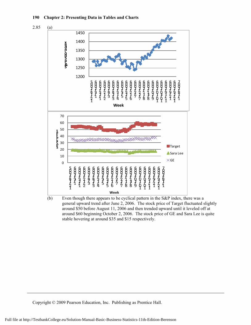
190 Chapter 2: Presenting Data in Tables and Charts
Copyright © 2009 Pearson Education, Inc. Publishing as Prentice Hall.
2.85 (a)
1200
1250
1300
1350
1400
1450
12/14/2005
1/3/2006
1/23/2006
2/12/2006
3/4/2006
3/24/2006
4/13/2006
5/3/2006
5/23/2006
6/12/2006
7/2/2006
7/22/2006
8/11/2006
8/31/2006
9/20/2006
10/10/2006
10/30/2006
11/19/2006
12/9/2006
12/29/2006
1/18/2007
S&P 500 Index
Week
0
10
20
30
40
50
60
70
12/14/2005
1/3/2006
1/23/2006
2/12/2006
3/4/2006
3/24/2006
4/13/2006
5/3/2006
5/23/2006
6/12/2006
7/2/2006
7/22/2006
8/11/2006
8/31/2006
9/20/2006
10/10/2006
10/30/2006
11/19/2006
12/9/2006
12/29/2006
1/18/2007
Stock Prices
Week
Target
Sara Lee
GE
(b) Even though there appears to be cyclical pattern in the S&P index, there was a
general upward trend after June 2, 2006. The stock price of Target fluctuated slightly around $50 before August 11, 2006 and then trended upward until it leveled off at around $60 beginning October 2, 2006. The stock price of GE and Sara Lee is quite stable hovering at around $35 and $15 respectively.
Full file at http://TestbankCollege.eu/Solution-Manual-Basic-Business-Statistics-11th-Edition-Berenson
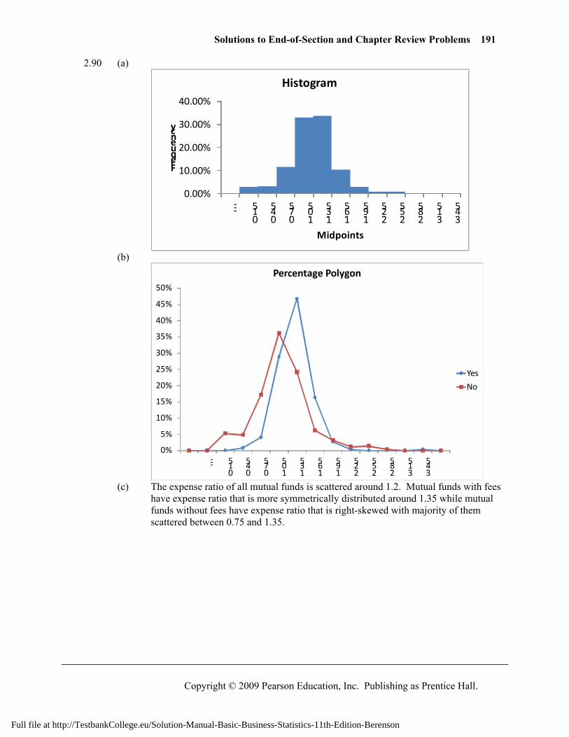
Solutions to End-of-Section and Chapter Review Problems 191
Copyright © 2009 Pearson Education, Inc. Publishing as Prentice Hall.
2.90 (a)
0.00%
10.00%
20.00%
30.00%
40.00%
---
0.15
0.45
0.75
1.05
1.35
1.65
1.95
2.25
2.55
2.85
3.15
3.45
Frequency
Midpoints
Histogram
(b)
0%
5%
10%
15%
20%
25%
30%
35%
40%
45%
50%
---
0.15
0.45
0.75
1.05
1.35
1.65
1.95
2.25
2.55
2.85
3.15
3.45
Percentage Polygon
Yes
No
(c) The expense ratio of all mutual funds is scattered around 1.2. Mutual funds with fees
have expense ratio that is more symmetrically distributed around 1.35 while mutual funds without fees have expense ratio that is right-skewed with majority of them scattered between 0.75 and 1.35.
Full file at http://TestbankCollege.eu/Solution-Manual-Basic-Business-Statistics-11th-Edition-Berenson
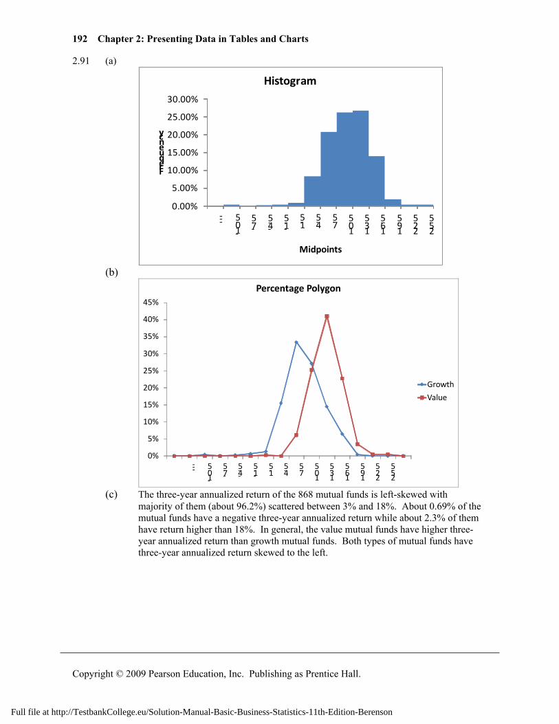
192 Chapter 2: Presenting Data in Tables and Charts
Copyright © 2009 Pearson Education, Inc. Publishing as Prentice Hall.
2.91 (a)
0.00%
5.00%
10.00%
15.00%
20.00%
25.00%
30.00%
---
-10.5
-7.5
-4.5
-1.5 1.
54.5
7.5
10.5
13.5
16.5
19.5
22.5
25.5
Frequency
Midpoints
Histogram
(b)
0%
5%
10%
15%
20%
25%
30%
35%
40%
45%
---
-10.5
-7.5
-4.5
-1.5 1.
54.5
7.5
10.5
13.5
16.5
19.5
22.5
25.5
Percentage Polygon
Growth
Value
(c) The three-year annualized return of the 868 mutual funds is left-skewed with
majority of them (about 96.2%) scattered between 3% and 18%. About 0.69% of the mutual funds have a negative three-year annualized return while about 2.3% of them have return higher than 18%. In general, the value mutual funds have higher three-year annualized return than growth mutual funds. Both types of mutual funds have three-year annualized return skewed to the left.
Full file at http://TestbankCollege.eu/Solution-Manual-Basic-Business-Statistics-11th-Edition-Berenson
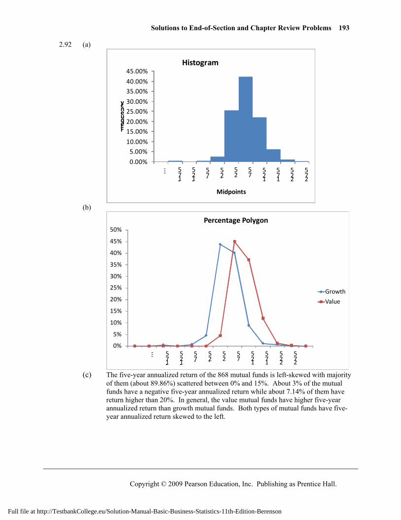
Solutions to End-of-Section and Chapter Review Problems 193
Copyright © 2009 Pearson Education, Inc. Publishing as Prentice Hall.
2.92 (a)
0.00%
5.00%10.00%
15.00%20.00%
25.00%30.00%
35.00%40.00%
45.00%
---
-17.5
-12.5
-7.5
-2.5 2.
57.5
12.5
17.5
22.5
27.5
Frequency
Midpoints
Histogram
(b)
0%
5%
10%
15%
20%
25%
30%
35%
40%
45%
50%
---
-17.5
-12.5
-7.5
-2.5 2.
57.5
12.5
17.5
22.5
27.5
Percentage Polygon
Growth
Value
(c) The five-year annualized return of the 868 mutual funds is left-skewed with majority
of them (about 89.86%) scattered between 0% and 15%. About 3% of the mutual funds have a negative five-year annualized return while about 7.14% of them have return higher than 20%. In general, the value mutual funds have higher five-year annualized return than growth mutual funds. Both types of mutual funds have five-year annualized return skewed to the left.
Full file at http://TestbankCollege.eu/Solution-Manual-Basic-Business-Statistics-11th-Edition-Berenson
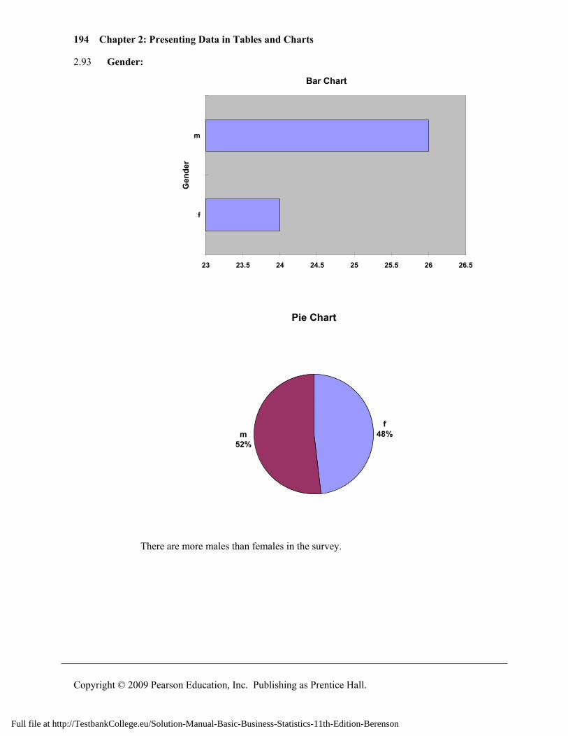
194 Chapter 2: Presenting Data in Tables and Charts
Copyright © 2009 Pearson Education, Inc. Publishing as Prentice Hall.
2.93 Gender:
Bar Chart
23 23.5 24 24.5 25 25.5 26 26.5
f
m
Gen
der
Pie Chart
f48%m
52%
There are more males than females in the survey.
Full file at http://TestbankCollege.eu/Solution-Manual-Basic-Business-Statistics-11th-Edition-Berenson
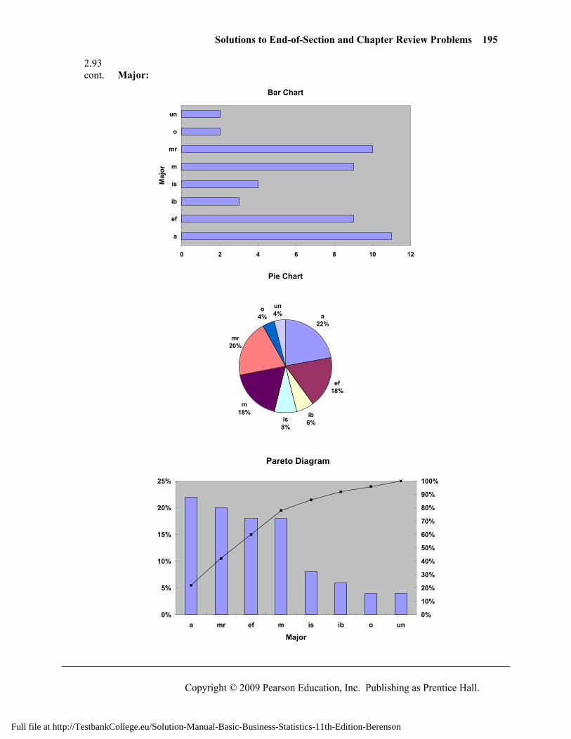
Solutions to End-of-Section and Chapter Review Problems 195
Copyright © 2009 Pearson Education, Inc. Publishing as Prentice Hall.
2.93 cont. Major:
Bar Chart
0 2 4 6 8 10 12
a
ef
ib
is
m
mr
o
un
Maj
or
Pie Chart
a22%
ef18%
ib6%is
8%
m18%
mr20%
o4%
un4%
Pareto Diagram
0%
5%
10%
15%
20%
25%
a mr ef m is ib o un
Major
0%
10%
20%
30%
40%
50%
60%
70%
80%
90%
100%
Full file at http://TestbankCollege.eu/Solution-Manual-Basic-Business-Statistics-11th-Edition-Berenson
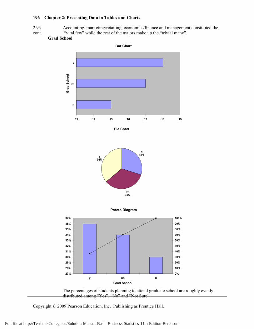
196 Chapter 2: Presenting Data in Tables and Charts
Copyright © 2009 Pearson Education, Inc. Publishing as Prentice Hall.
2.93 Accounting, marketing/retailing, economics/finance and management constituted the cont. “vital few” while the rest of the majors make up the “trivial many”. Grad School
Bar Chart
13 14 15 16 17 18 19
n
un
y
Gra
d Sc
hool
Pie Chart
n30%
un34%
y36%
Pareto Diagram
27%
28%
29%
30%
31%
32%
33%
34%
35%
36%
37%
y un n
Grad School
0%
10%
20%
30%
40%
50%
60%
70%
80%
90%
100%
The percentages of students planning to attend graduate school are roughly evenly
distributed among “Yes”, “No” and “Not Sure”.
Full file at http://TestbankCollege.eu/Solution-Manual-Basic-Business-Statistics-11th-Edition-Berenson
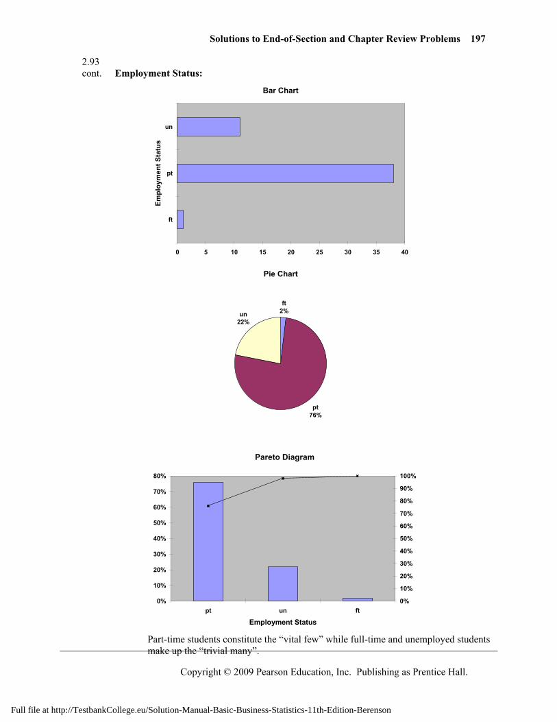
Solutions to End-of-Section and Chapter Review Problems 197
Copyright © 2009 Pearson Education, Inc. Publishing as Prentice Hall.
2.93 cont. Employment Status:
Bar Chart
0 5 10 15 20 25 30 35 40
ft
pt
un
Empl
oym
ent S
tatu
s
Pie Chart
ft2%
pt76%
un22%
Pareto Diagram
0%
10%
20%
30%
40%
50%
60%
70%
80%
pt un ft
Employment Status
0%
10%
20%
30%
40%
50%
60%
70%
80%
90%
100%
Part-time students constitute the “vital few” while full-time and unemployed students
make up the “trivial many”.
Full file at http://TestbankCollege.eu/Solution-Manual-Basic-Business-Statistics-11th-Edition-Berenson
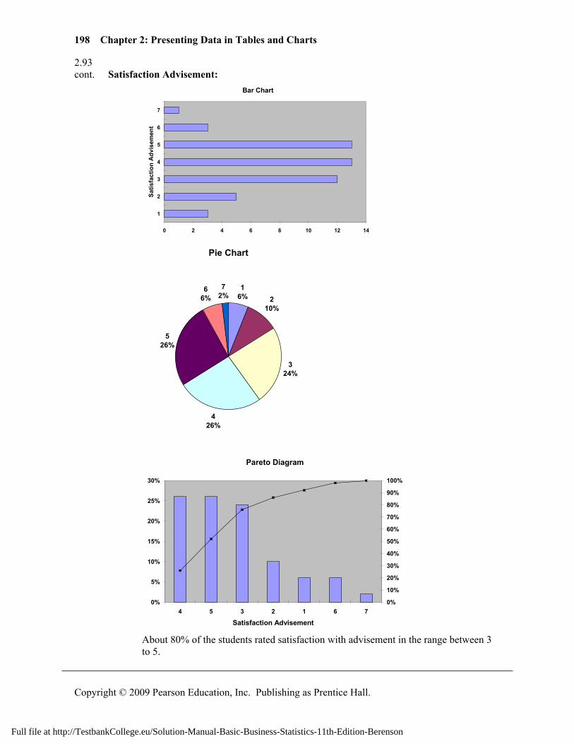
198 Chapter 2: Presenting Data in Tables and Charts
Copyright © 2009 Pearson Education, Inc. Publishing as Prentice Hall.
2.93 cont. Satisfaction Advisement:
Bar Chart
0 2 4 6 8 10 12 14
1
2
3
4
5
6
7
Satis
fact
ion
Adv
isem
ent
Pie Chart
16% 2
10%
324%
426%
526%
66%
72%
Pareto Diagram
0%
5%
10%
15%
20%
25%
30%
4 5 3 2 1 6 7
Satisfaction Advisement
0%
10%
20%
30%
40%
50%
60%
70%
80%
90%
100%
About 80% of the students rated satisfaction with advisement in the range between 3
to 5.
Full file at http://TestbankCollege.eu/Solution-Manual-Basic-Business-Statistics-11th-Edition-Berenson
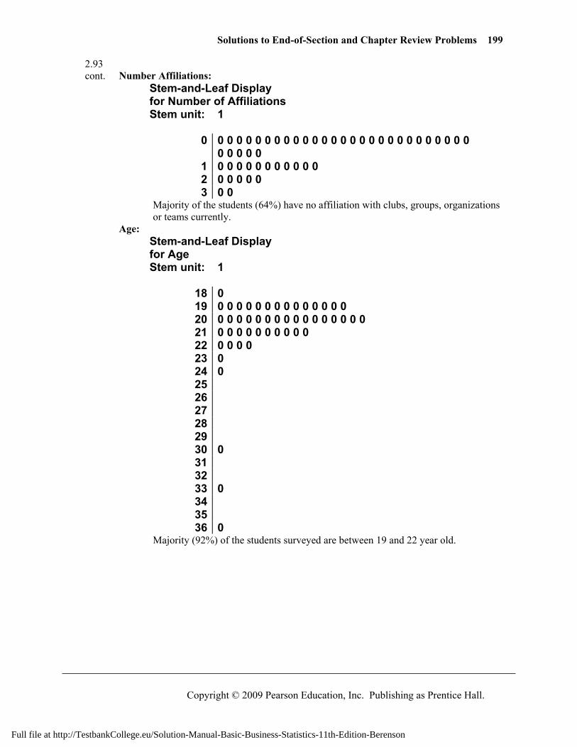
Solutions to End-of-Section and Chapter Review Problems 199
Copyright © 2009 Pearson Education, Inc. Publishing as Prentice Hall.
2.93 cont. Number Affiliations:
Stem-and-Leaf Display for Number of Affiliations Stem unit: 1
0 0 0 0 0 0 0 0 0 0 0 0 0 0 0 0 0 0 0 0 0 0 0 0 0 0 0 0
0 0 0 0 0 1 0 0 0 0 0 0 0 0 0 0 0 2 0 0 0 0 0 3 0 0
Majority of the students (64%) have no affiliation with clubs, groups, organizations or teams currently.
Age: Stem-and-Leaf Display for Age Stem unit: 1
18 0 19 0 0 0 0 0 0 0 0 0 0 0 0 0 0 20 0 0 0 0 0 0 0 0 0 0 0 0 0 0 0 0 21 0 0 0 0 0 0 0 0 0 0 22 0 0 0 0 23 0 24 0 25 26 27 28 29 30 0 31 32 33 0 34 35 36 0
Majority (92%) of the students surveyed are between 19 and 22 year old.
Full file at http://TestbankCollege.eu/Solution-Manual-Basic-Business-Statistics-11th-Edition-Berenson
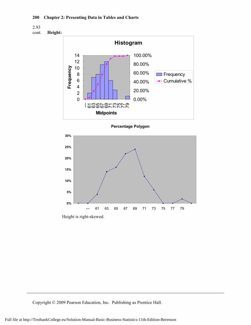
200 Chapter 2: Presenting Data in Tables and Charts
Copyright © 2009 Pearson Education, Inc. Publishing as Prentice Hall.
2.93 cont. Height:
Histogram
02468
101214
--- 61 63 65 67 69 71 73 75 77 79
Midpoints
Freq
uenc
y
0.00%
20.00%
40.00%
60.00%
80.00%
100.00%
FrequencyCumulative %
Percentage Polygon
0%
5%
10%
15%
20%
25%
30%
--- 61 63 65 67 69 71 73 75 77 79
Height is right-skewed.
Full file at http://TestbankCollege.eu/Solution-Manual-Basic-Business-Statistics-11th-Edition-Berenson
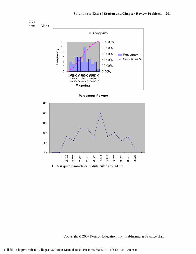
Solutions to End-of-Section and Chapter Review Problems 201
Copyright © 2009 Pearson Education, Inc. Publishing as Prentice Hall.
2.93 cont. GPA:
Histogram
02468
1012
---
2.42
52.
575
2.72
52.
875
3.02
53.
175
3.32
53.
475
3.62
53.
775
3.92
5
Midpoints
Freq
uenc
y
0.00%
20.00%
40.00%
60.00%
80.00%
100.00%
FrequencyCumulative %
Percentage Polygon
0%
5%
10%
15%
20%
25%
---
2.42
5
2.57
5
2.72
5
2.87
5
3.02
5
3.17
5
3.32
5
3.47
5
3.62
5
3.77
5
3.92
5
GPA is quite symmetrically distributed around 3.0.
Full file at http://TestbankCollege.eu/Solution-Manual-Basic-Business-Statistics-11th-Edition-Berenson
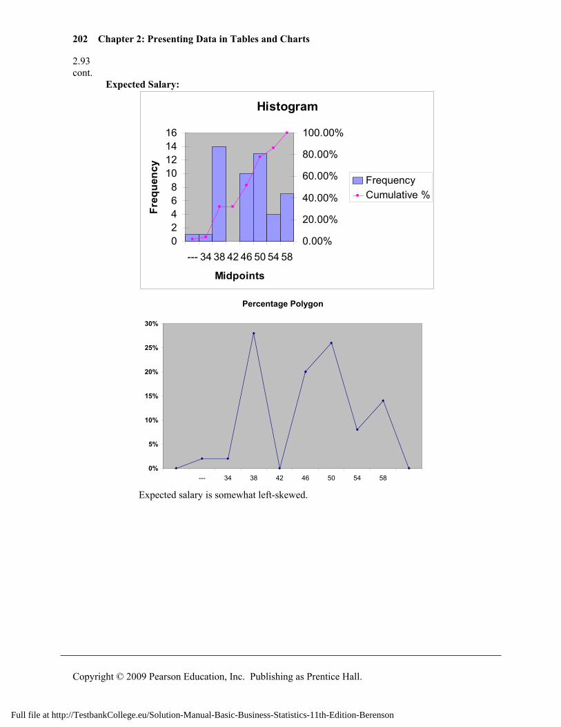
202 Chapter 2: Presenting Data in Tables and Charts
Copyright © 2009 Pearson Education, Inc. Publishing as Prentice Hall.
2.93 cont. Expected Salary:
Histogram
02468
10121416
--- 34 38 42 46 50 54 58
Midpoints
Freq
uenc
y
0.00%
20.00%
40.00%
60.00%
80.00%
100.00%
FrequencyCumulative %
Percentage Polygon
0%
5%
10%
15%
20%
25%
30%
--- 34 38 42 46 50 54 58
Expected salary is somewhat left-skewed.
Full file at http://TestbankCollege.eu/Solution-Manual-Basic-Business-Statistics-11th-Edition-Berenson
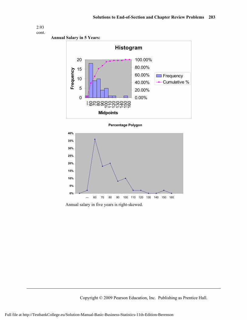
Solutions to End-of-Section and Chapter Review Problems 203
Copyright © 2009 Pearson Education, Inc. Publishing as Prentice Hall.
2.93 cont. Annual Salary in 5 Years:
Histogram
0
5
10
15
20
--- 60 70 80 90 100
110
120
130
140
150
160
Midpoints
Freq
uenc
y
0.00%
20.00%
40.00%
60.00%
80.00%
100.00%
FrequencyCumulative %
Percentage Polygon
0%
5%
10%
15%
20%
25%
30%
35%
40%
--- 60 70 80 90 100 110 120 130 140 150 160
Annual salary in five years is right-skewed.
Full file at http://TestbankCollege.eu/Solution-Manual-Basic-Business-Statistics-11th-Edition-Berenson
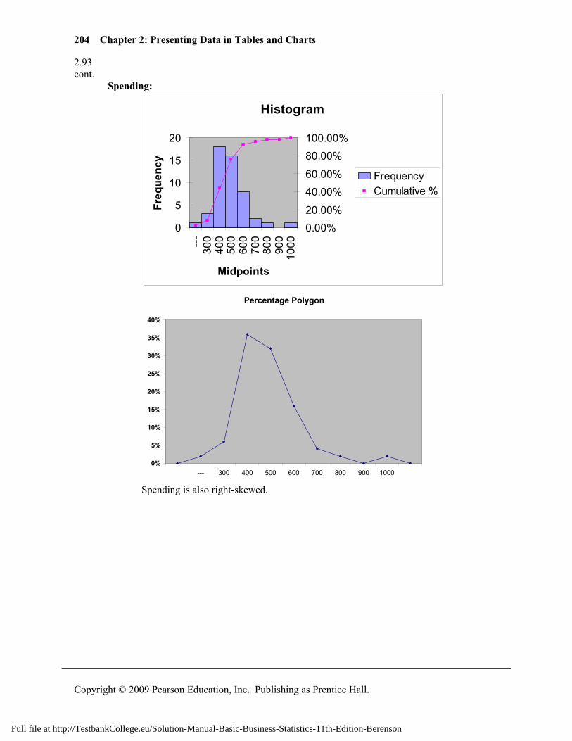
204 Chapter 2: Presenting Data in Tables and Charts
Copyright © 2009 Pearson Education, Inc. Publishing as Prentice Hall.
2.93 cont. Spending:
Histogram
0
5
10
15
20
---
300
400
500
600
700
800
900
1000
Midpoints
Freq
uenc
y
0.00%20.00%
40.00%60.00%
80.00%100.00%
FrequencyCumulative %
Percentage Polygon
0%
5%
10%
15%
20%
25%
30%
35%
40%
--- 300 400 500 600 700 800 900 1000
Spending is also right-skewed.
Full file at http://TestbankCollege.eu/Solution-Manual-Basic-Business-Statistics-11th-Edition-Berenson
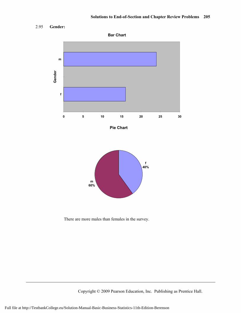
Solutions to End-of-Section and Chapter Review Problems 205
Copyright © 2009 Pearson Education, Inc. Publishing as Prentice Hall.
2.95 Gender:
Bar Chart
0 5 10 15 20 25 30
f
mG
ende
r
Pie Chart
f40%
m60%
There are more males than females in the survey.
Full file at http://TestbankCollege.eu/Solution-Manual-Basic-Business-Statistics-11th-Edition-Berenson
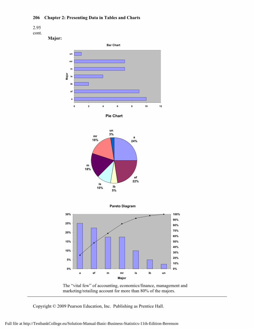
206 Chapter 2: Presenting Data in Tables and Charts
Copyright © 2009 Pearson Education, Inc. Publishing as Prentice Hall.
2.95 cont. Major:
Bar Chart
0 2 4 6 8 10 12
a
ef
ib
is
m
mr
un
Maj
or
Pie Chart
a24%
ef22%
ib5%
is10%
m18%
mr18%
un3%
Pareto Diagram
0%
5%
10%
15%
20%
25%
30%
a ef m mr is ib un
Major
0%
10%
20%
30%
40%
50%
60%
70%
80%
90%
100%
The “vital few” of accounting, economics/finance, management and
marketing/retailing account for more than 80% of the majors.
Full file at http://TestbankCollege.eu/Solution-Manual-Basic-Business-Statistics-11th-Edition-Berenson
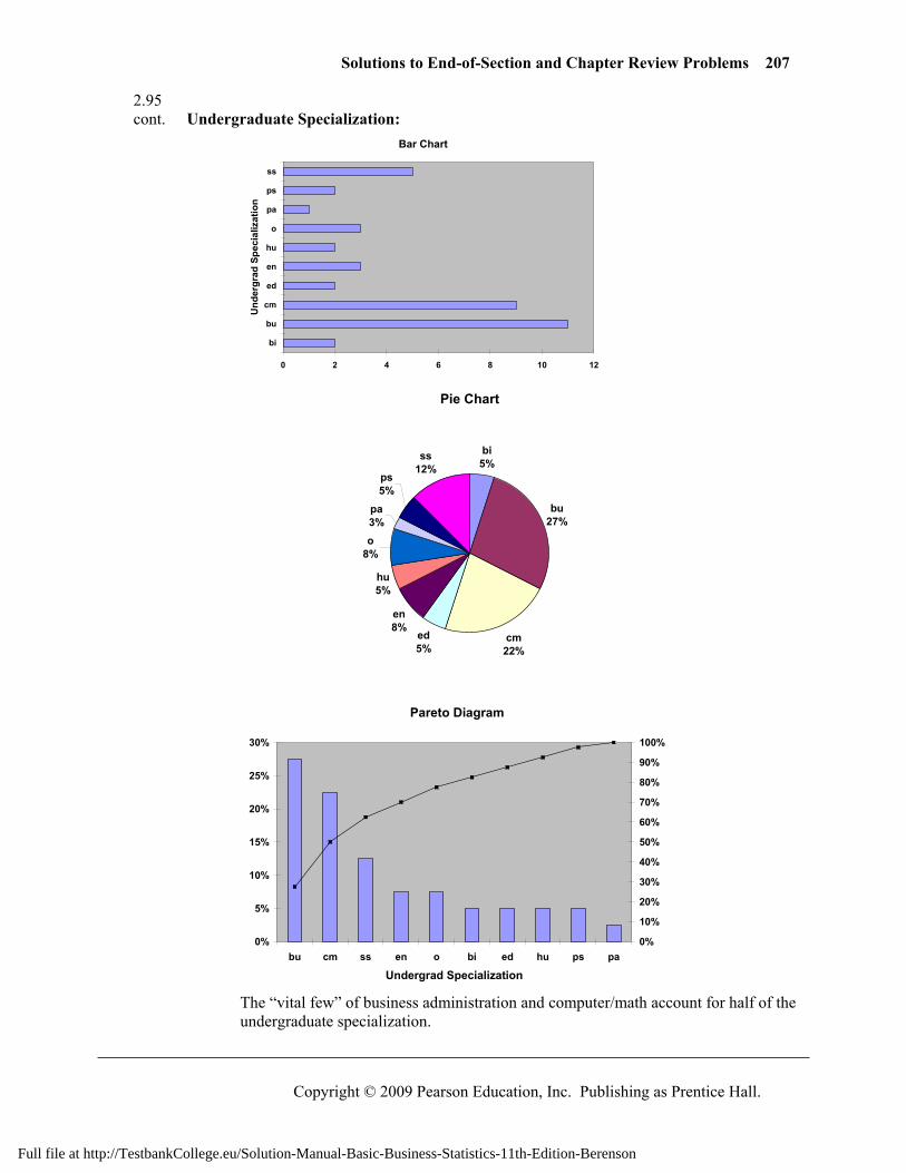
Solutions to End-of-Section and Chapter Review Problems 207
Copyright © 2009 Pearson Education, Inc. Publishing as Prentice Hall.
2.95 cont. Undergraduate Specialization:
Bar Chart
0 2 4 6 8 10 12
bi
bu
cm
ed
en
hu
o
pa
ps
ss
Und
ergr
ad S
peci
aliz
atio
n
Pie Chart
bi5%
bu27%
cm22%
ed5%
en8%
hu5%
o8%
pa3%
ps5%
ss12%
Pareto Diagram
0%
5%
10%
15%
20%
25%
30%
bu cm ss en o bi ed hu ps pa
Undergrad Specialization
0%
10%
20%
30%
40%
50%
60%
70%
80%
90%
100%
The “vital few” of business administration and computer/math account for half of the
undergraduate specialization.
Full file at http://TestbankCollege.eu/Solution-Manual-Basic-Business-Statistics-11th-Edition-Berenson
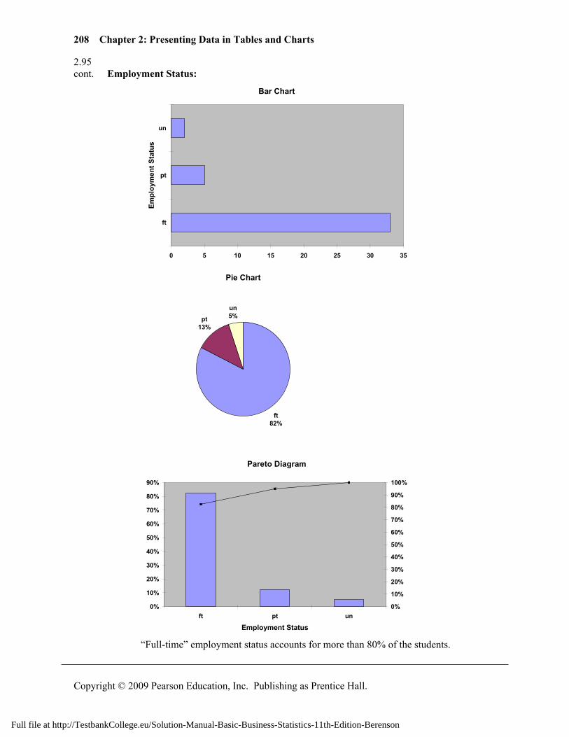
208 Chapter 2: Presenting Data in Tables and Charts
Copyright © 2009 Pearson Education, Inc. Publishing as Prentice Hall.
2.95 cont. Employment Status:
Bar Chart
0 5 10 15 20 25 30 35
ft
pt
un
Empl
oym
ent S
tatu
s
Pie Chart
ft82%
pt13%
un5%
Pareto Diagram
0%
10%
20%
30%
40%
50%
60%
70%
80%
90%
ft pt un
Employment Status
0%
10%
20%
30%
40%
50%
60%
70%
80%
90%
100%
“Full-time” employment status accounts for more than 80% of the students.
Full file at http://TestbankCollege.eu/Solution-Manual-Basic-Business-Statistics-11th-Edition-Berenson
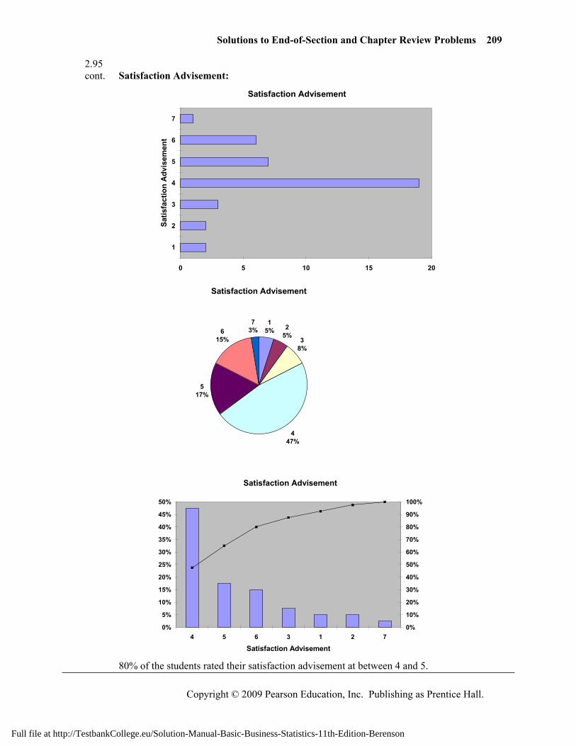
Solutions to End-of-Section and Chapter Review Problems 209
Copyright © 2009 Pearson Education, Inc. Publishing as Prentice Hall.
2.95 cont. Satisfaction Advisement:
Satisfaction Advisement
0 5 10 15 20
1
2
3
4
5
6
7
Satis
fact
ion
Adv
isem
ent
Satisfaction Advisement
15% 2
5%3
8%
447%
517%
615%
73%
Satisfaction Advisement
0%
5%
10%
15%
20%
25%
30%
35%
40%
45%
50%
4 5 6 3 1 2 7
Satisfaction Advisement
0%
10%
20%
30%
40%
50%
60%
70%
80%
90%
100%
80% of the students rated their satisfaction advisement at between 4 and 5.
Full file at http://TestbankCollege.eu/Solution-Manual-Basic-Business-Statistics-11th-Edition-Berenson
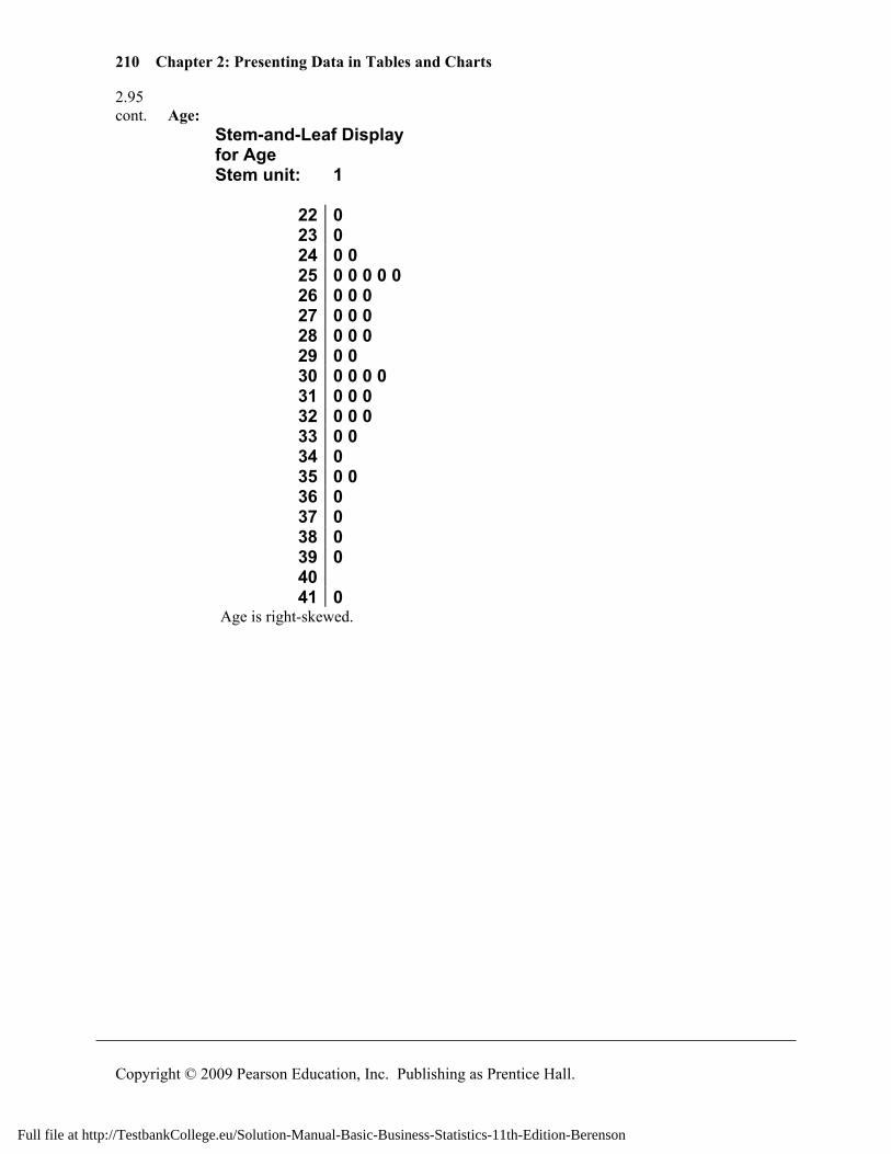
210 Chapter 2: Presenting Data in Tables and Charts
Copyright © 2009 Pearson Education, Inc. Publishing as Prentice Hall.
2.95 cont. Age:
Stem-and-Leaf Display for Age Stem unit: 1
22 0 23 0 24 0 0 25 0 0 0 0 0 26 0 0 0 27 0 0 0 28 0 0 0 29 0 0 30 0 0 0 0 31 0 0 0 32 0 0 0 33 0 0 34 0 35 0 0 36 0 37 0 38 0 39 0 40 41 0
Age is right-skewed.
Full file at http://TestbankCollege.eu/Solution-Manual-Basic-Business-Statistics-11th-Edition-Berenson
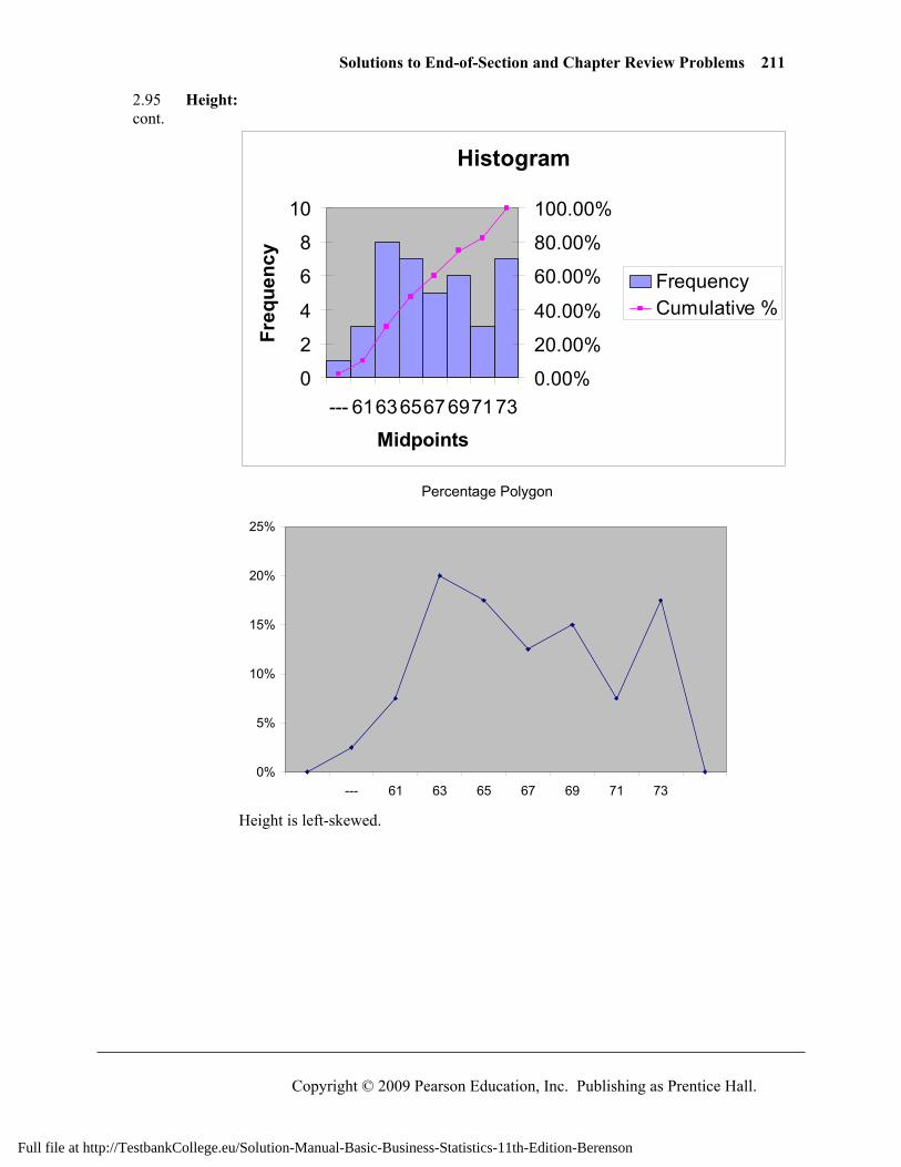
Solutions to End-of-Section and Chapter Review Problems 211
Copyright © 2009 Pearson Education, Inc. Publishing as Prentice Hall.
2.95 Height: cont.
Histogram
0
2
4
6
8
10
--- 61636567697173
Midpoints
Freq
uenc
y
0.00%
20.00%
40.00%
60.00%
80.00%
100.00%
FrequencyCumulative %
Percentage Polygon
0%
5%
10%
15%
20%
25%
--- 61 63 65 67 69 71 73
Height is left-skewed.
Full file at http://TestbankCollege.eu/Solution-Manual-Basic-Business-Statistics-11th-Edition-Berenson
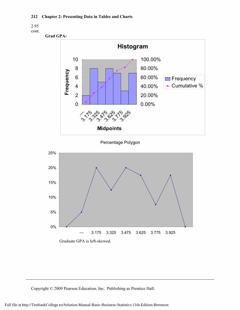
212 Chapter 2: Presenting Data in Tables and Charts
Copyright © 2009 Pearson Education, Inc. Publishing as Prentice Hall.
2.95 cont. Grad GPA:
Histogram
0
2
4
6
8
10
---3.1
753.3
253.4
753.6
253.7
753.9
25
Midpoints
Freq
uenc
y
0.00%
20.00%
40.00%
60.00%
80.00%
100.00%
FrequencyCumulative %
Percentage Polygon
0%
5%
10%
15%
20%
25%
--- 3.175 3.325 3.475 3.625 3.775 3.925
Graduate GPA is left-skewed.
Full file at http://TestbankCollege.eu/Solution-Manual-Basic-Business-Statistics-11th-Edition-Berenson
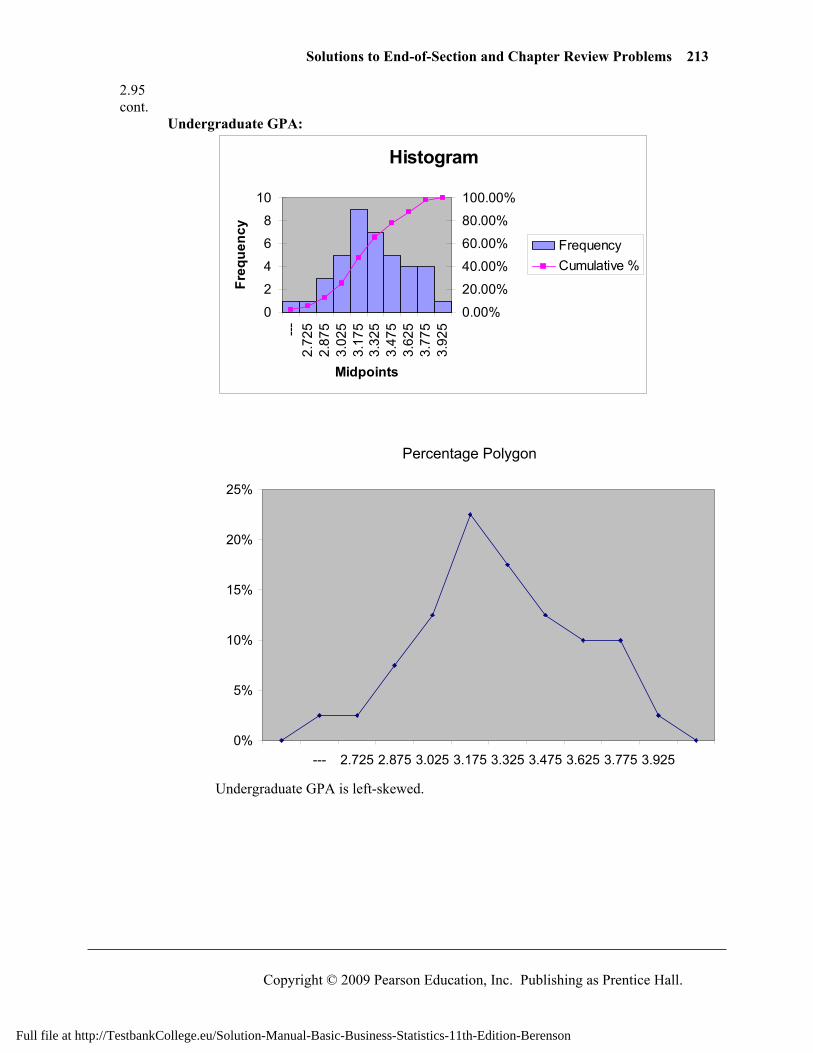
Solutions to End-of-Section and Chapter Review Problems 213
Copyright © 2009 Pearson Education, Inc. Publishing as Prentice Hall.
2.95 cont. Undergraduate GPA:
Histogram
0
2
4
6
8
10
---2.
725
2.87
53.
025
3.17
53.
325
3.47
53.
625
3.77
53.
925
Midpoints
Freq
uenc
y
0.00%
20.00%
40.00%
60.00%
80.00%
100.00%
FrequencyCumulative %
Percentage Polygon
0%
5%
10%
15%
20%
25%
--- 2.725 2.875 3.025 3.175 3.325 3.475 3.625 3.775 3.925
Undergraduate GPA is left-skewed.
Full file at http://TestbankCollege.eu/Solution-Manual-Basic-Business-Statistics-11th-Edition-Berenson
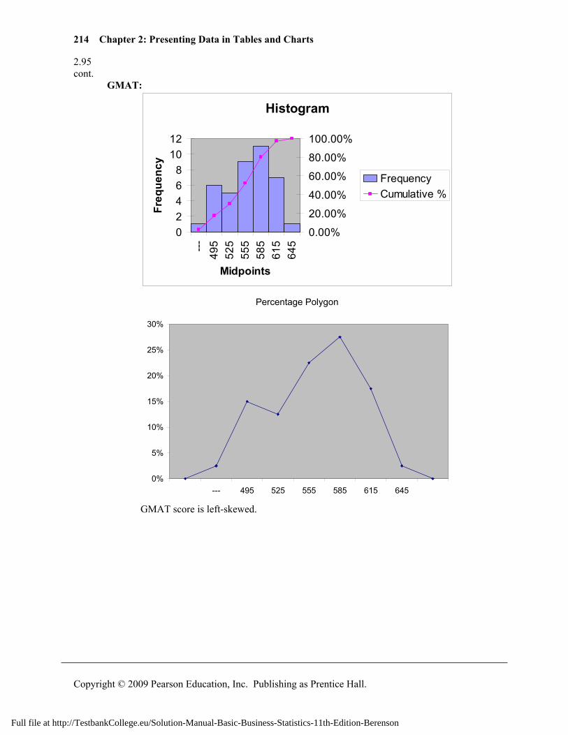
214 Chapter 2: Presenting Data in Tables and Charts
Copyright © 2009 Pearson Education, Inc. Publishing as Prentice Hall.
2.95 cont. GMAT:
Histogram
02468
1012
---49
552
555
558
561
564
5
Midpoints
Freq
uenc
y
0.00%
20.00%
40.00%
60.00%
80.00%
100.00%
FrequencyCumulative %
Percentage Polygon
0%
5%
10%
15%
20%
25%
30%
--- 495 525 555 585 615 645
GMAT score is left-skewed.
Full file at http://TestbankCollege.eu/Solution-Manual-Basic-Business-Statistics-11th-Edition-Berenson
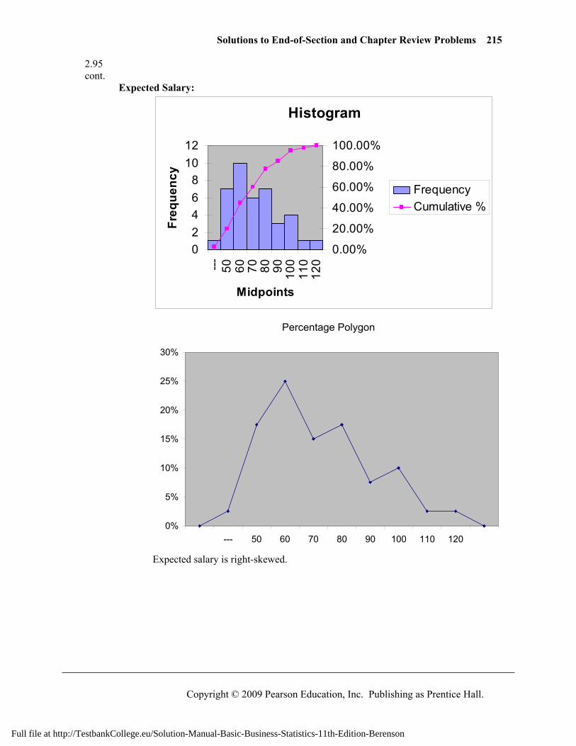
Solutions to End-of-Section and Chapter Review Problems 215
Copyright © 2009 Pearson Education, Inc. Publishing as Prentice Hall.
2.95 cont. Expected Salary:
Histogram
02468
1012
--- 50 60 70 80 90 100
110
120
Midpoints
Freq
uenc
y
0.00%
20.00%
40.00%
60.00%
80.00%
100.00%
FrequencyCumulative %
Percentage Polygon
0%
5%
10%
15%
20%
25%
30%
--- 50 60 70 80 90 100 110 120
Expected salary is right-skewed.
Full file at http://TestbankCollege.eu/Solution-Manual-Basic-Business-Statistics-11th-Edition-Berenson
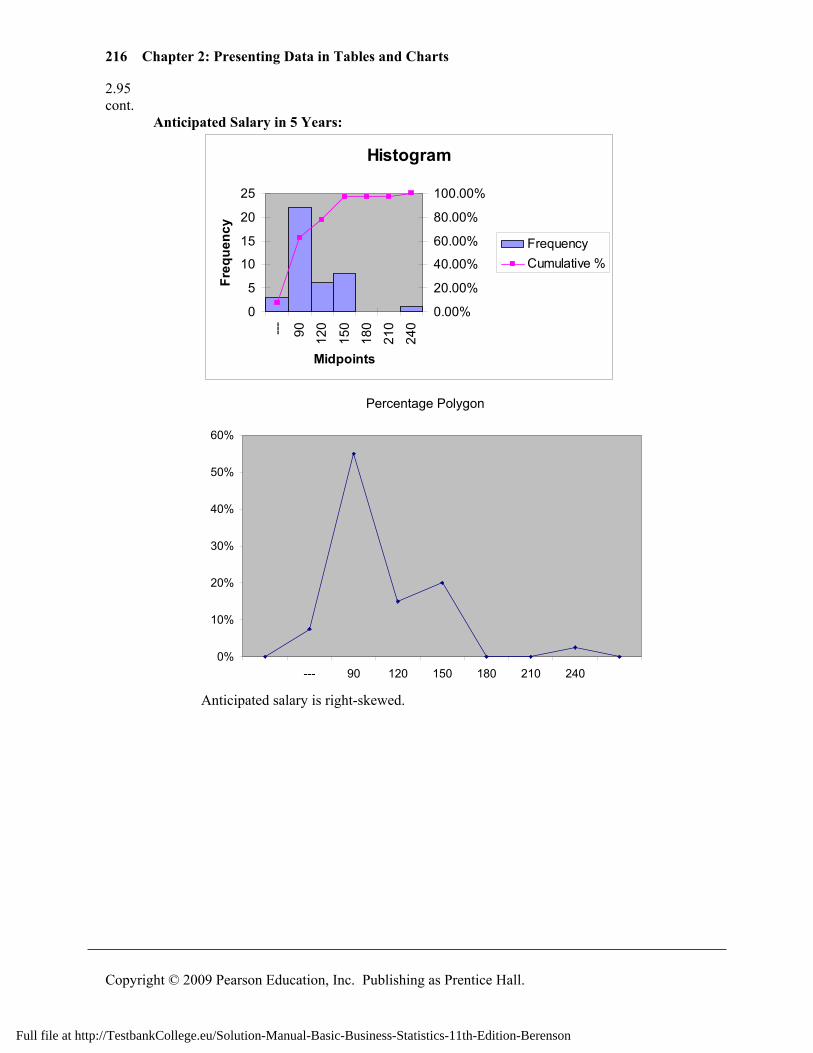
216 Chapter 2: Presenting Data in Tables and Charts
Copyright © 2009 Pearson Education, Inc. Publishing as Prentice Hall.
2.95 cont. Anticipated Salary in 5 Years:
Histogram
0
5
10
15
20
25
--- 90 120
150
180
210
240
Midpoints
Freq
uenc
y
0.00%
20.00%
40.00%
60.00%
80.00%
100.00%
FrequencyCumulative %
Percentage Polygon
0%
10%
20%
30%
40%
50%
60%
--- 90 120 150 180 210 240
Anticipated salary is right-skewed.
Full file at http://TestbankCollege.eu/Solution-Manual-Basic-Business-Statistics-11th-Edition-Berenson
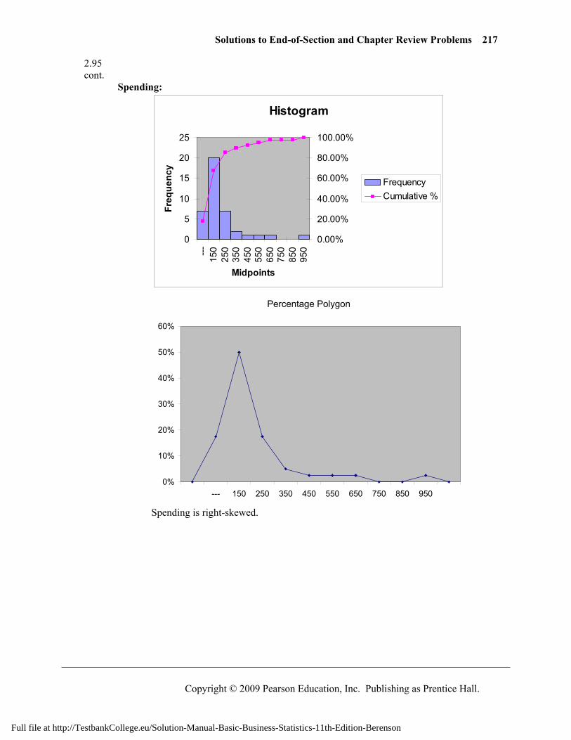
Solutions to End-of-Section and Chapter Review Problems 217
Copyright © 2009 Pearson Education, Inc. Publishing as Prentice Hall.
2.95 cont. Spending:
Histogram
0
5
10
15
20
25
---15
025
035
045
055
065
075
085
095
0
Midpoints
Freq
uenc
y
0.00%
20.00%
40.00%
60.00%
80.00%
100.00%
FrequencyCumulative %
Percentage Polygon
0%
10%
20%
30%
40%
50%
60%
--- 150 250 350 450 550 650 750 850 950
Spending is right-skewed.
Full file at http://TestbankCollege.eu/Solution-Manual-Basic-Business-Statistics-11th-Edition-Berenson