Embed Size (px)
Citation preview
Chapter 11 Laying Out Pages and Screens
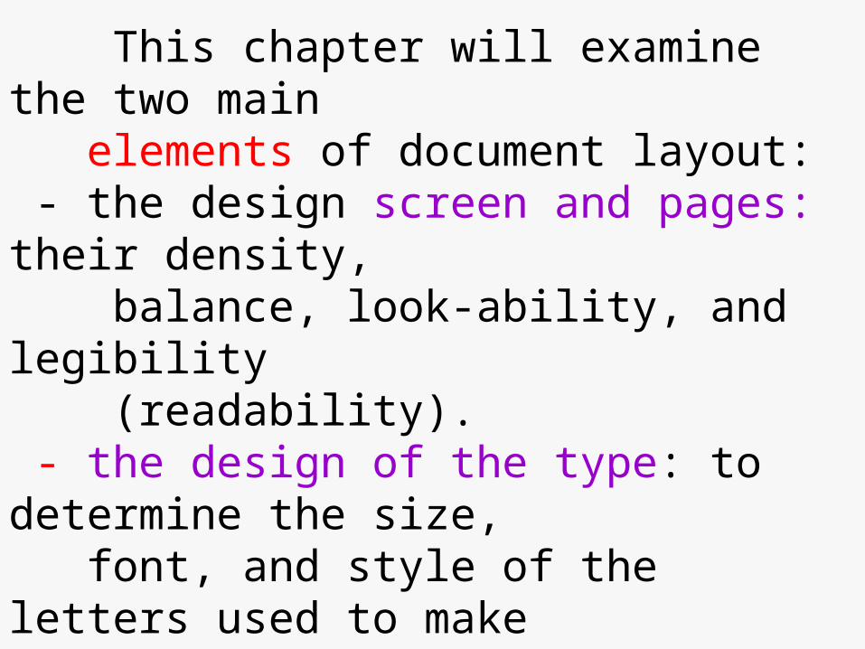
This chapter will examine the two main elements of document layout: - the design screen and pages: their density, balance, look-ability, and legibility (readability). - the design of the type: to determine the size, font, and style of the letters used to make words.
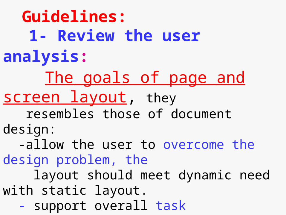
Guidelines: 1- Review the user analysis: The goals of page and screen layout, they resembles those of document design: -allow the user to overcome the design problem, the layout should meet dynamic need with static layout. - support overall task orientation. - Accommodate the visual needs of the user, the need
to learn and do through images rather than words.
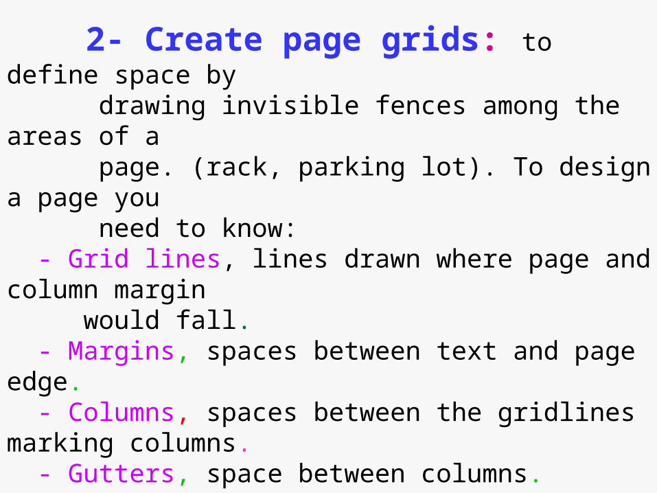
2- Create page grids: to define space by drawing invisible fences among the areas of a page. (rack, parking lot). To design a page you need to know: - Grid lines, lines drawn where page and column margin would fall. - Margins, spaces between text and page edge. - Columns, spaces between the gridlines marking columns. - Gutters, space between columns. - white spaces and baselines. - baseline, grid line at the bottom of the text and graphics area that define the bottom margin.
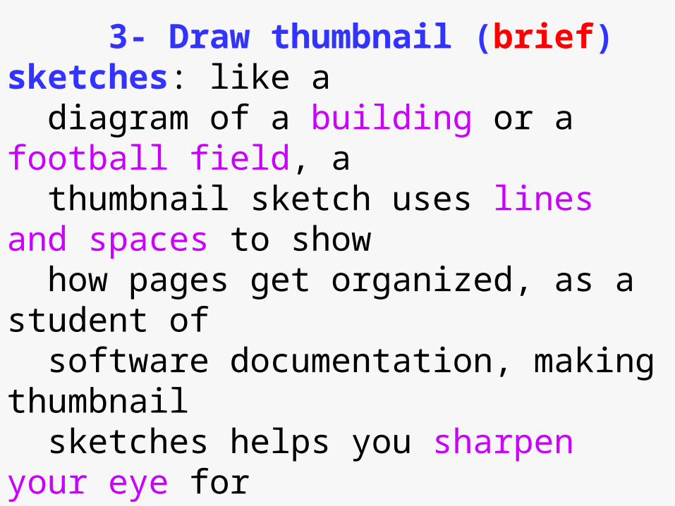
3- Draw thumbnail (brief) sketches: like a diagram of a building or a football field, a thumbnail sketch uses lines and spaces to show
how pages get organized, as a student of software documentation, making thumbnail sketches helps you sharpen your eye for effective page design that encourage usability.
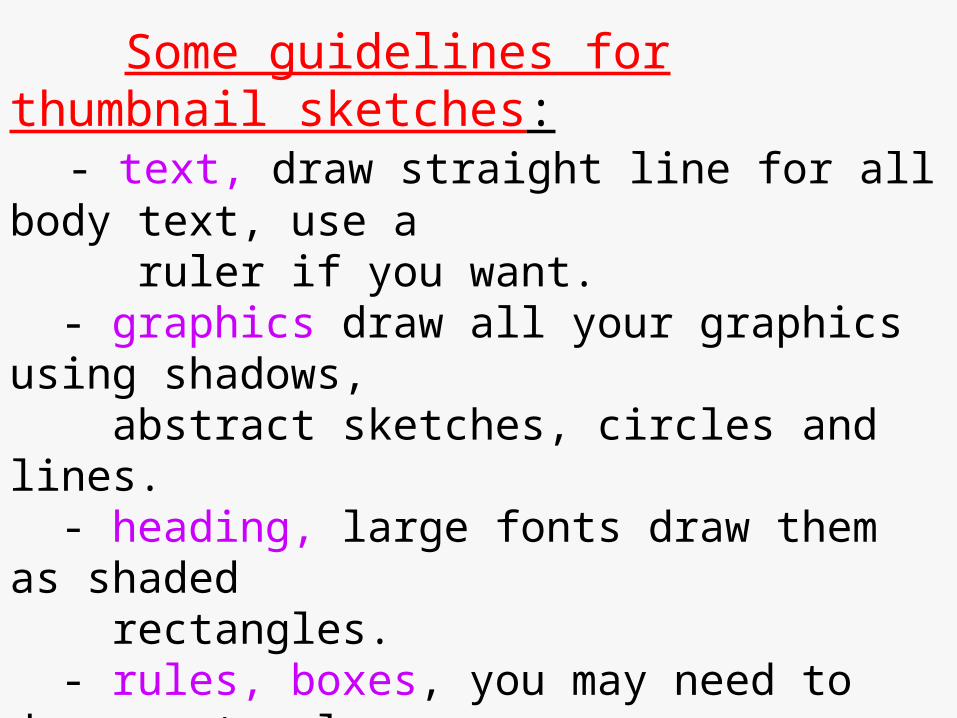
Some guidelines for thumbnail sketches: - text, draw straight line for all body text, use a ruler if you want. - graphics draw all your graphics using shadows, abstract sketches, circles and lines. - heading, large fonts draw them as shaded rectangles. - rules, boxes, you may need to draw rectangles around rules to give them the same value on your sketch as they have on the page. Tips: slow down, make it accurate, keep page items in proportion while trying to include everything, keep the value
of darkness, density, lightness same as in the original.
4- Define styles for pages and screens components your style for page and screen components should include margins top and bottom left and right, gutters, icons, tabs, page number, heading.
5-Set up pages and styles in your word processor, This will save you time in the long run: - you can change the style later, you do not have to change each instance of a certain text. - insures consistency.
6- Determine the layout of Help Documents You need to consider the differences between layouts of pages and screens, screen resolution and the choice of the font, you need to consider the features of screen which does not exist in the page such hypertext links. - some times you may want to include the same steps from the pages of a tutorial in the screens of your online help system in order to make it complete.
Designing communication spaces: the documentation writers need to decide on two important things, degree of modularity and degree of structure they need, both elements will determine the overall look of the communication space, regardless of the pattern of columns and words you choose:
1- degree of modularity, means breaking the information into chunks of text and graphic units to make them easier for the user to digest. Ask yourself if your page design contains all of the information needed by users to perform and fully understand the task. Online help documents can segment information more easily through the
use of pop-up windows, expandable text, and rollovers.
Sometimes you can not fit all info about one task in one page, often this mean doing the following: - repeat background info where necessary. - repeat screens when necessary. - keep all relevant steps on the same page. - minimize cross-reference.
Modularity accommodates both the experience and advance user because each may select only those modules that solves a particular problem, the modules they need.
The tradeoffs of modularity lie in the cost associated with producing modular documents. (some modules can take less than two pages, the resulting manual often has empty spaces).
Notice that modularity has less and less to do with online help systems, because of the physical constraints of the printed page, you have to put all the necessary info in one space, otherwise the user has to go to another page. However, in online help you can overcome this problem by pop ups, and hypertext.
2-degree of structure, which means that we place the info on the page according to patterns, with certain kinds of info only in certain places. The structured page has certain areas for headings, other areas for overviews, and others for screens. Highly structured page also use fence-like vertical and horizontal lines, called rules, to separate and help the reader keep track of info on the page
Researchers have determined that readers locate info by remembering the physical location of info on the page, rather than more abstract terms of chapter or section numbers. The following elements will contribute to the structure in your pages and manuals: length and thickness of rules, white spaces, bullets, chunks.
How to look at pages and screens:
To learn how to design pages for a software manual, you must learn how to look at pages, you should always give a manual the flip test. In studying layout, try to develop an eye for the following elements of page design: - page density, compare the pages of one manual to another,
which seems darker, more crowded. - balance white spaces and text. - legibility, the ease of reading of type, font, and style - look-ability, how easy you can get, at a glance, the main point of a page.
Common page design: - Two column format, allow the reader to distinguish between the guidance info (element on general level, icons, headings with which to navigate the document) and support info. This format works best with procedures, step by step, installations, getting started. It does good where readers read selectively when they read to do. But this type used more space of the one column format. It is not as dense as a one- column format.
- One column format, this will arrange both graphics and texts in the middle of the page. It helps the writer modularize a document because it makes it easy to keep task info together in a linear form. The task or module just keeps on going until the next one starts. This format keeps task information together in a linear form,
and can be a good way to present long sections of prose.
See figure 11.9 for one column format.
The elements of page design:
- left margin, which rule the page, so to speak, because most of the items on the page use the left margin as a starting place. - columns, newspaper column(snake text) or table columns (discrete item) - headers & footers, contains product name, version number. - icons and diagrams. - screens, full and partial. - rules, lines of varying width and length. - pagination, sequential and modular(2-10)
Common screen design:
- Windows screen format: it contains a non scrolling region,
usually it uses one column format, See figure 11.10 for an example.
- Manual pages format: it consists of a handy format for dumping print documentation, it has no left margin.
See figure 11.11 for an example.

The elements of screen design:
- a changeable space, - Multiple window management, don’t remove or destroy all the traces of user’s work- allow the help screen to cover part
of the screen, avoid window clutter. - color - Graphics, use simple graphics. - Screen grids, use narrow margins, less indentation - line spacing, single space will do it.
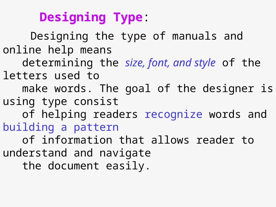
Designing Type:
Designing the type of manuals and online help means determining the size, font, and style of the letters used to make words. The goal of the designer is using type consist of helping readers recognize words and building a pattern of information that allows reader to understand and navigate the document easily.
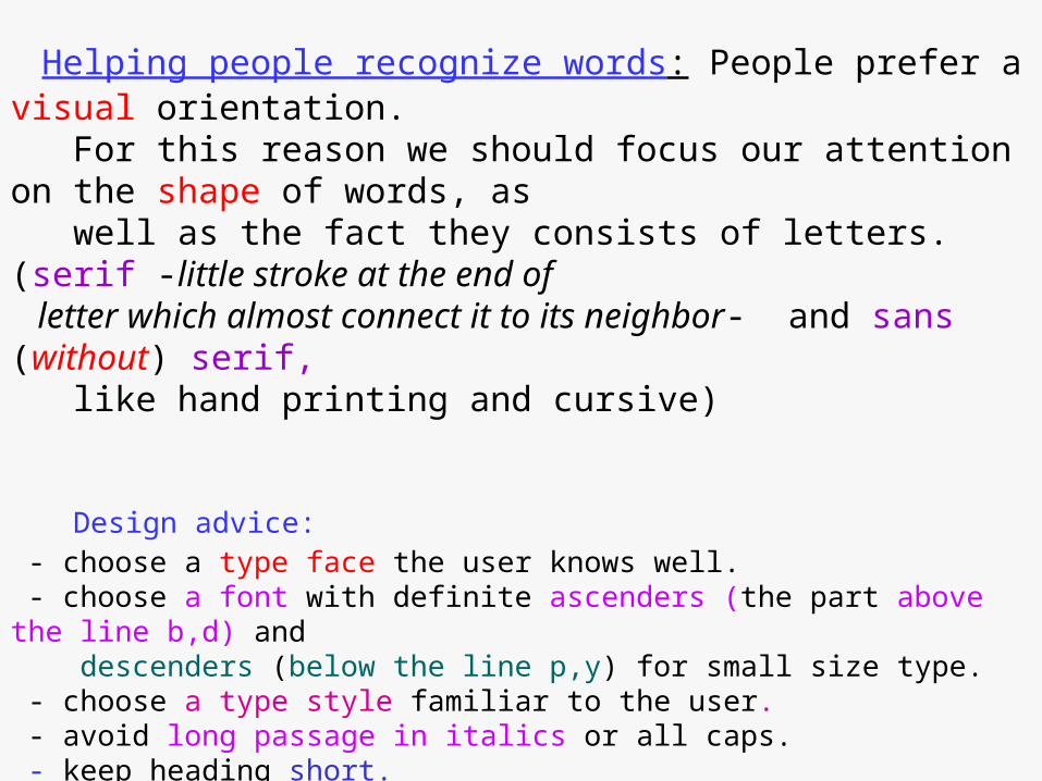
Helping people recognize words: People prefer a visual orientation. For this reason we should focus our attention on the shape of words, as
well as the fact they consists of letters. (serif -little stroke at the end of letter which almost connect it to its neighbor- and sans (without) serif, like hand printing and cursive)
Design advice: - choose a type face the user knows well. - choose a font with definite ascenders (the part above the line b,d) and descenders (below the line p,y) for small size type. - choose a type style familiar to the user. - avoid long passage in italics or all caps. - keep heading short. - use serif for body text, sans serif for headings, headings speak most boldly when they stand out and stay short.
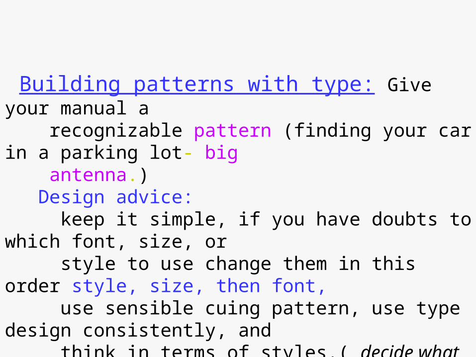
Building patterns with type: Give your manual a recognizable pattern (finding your car in a parking lot- big antenna.) Design advice: keep it simple, if you have doubts to which font, size, or style to use change them in this order style, size, then font, use sensible cuing pattern, use type design consistently, and think in terms of styles.( decide what you want your paragraphs to look like then specify your type style, font, and size, along with your indentation).
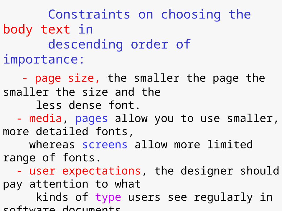
Constraints on choosing the body text in descending order of importance:
- page size, the smaller the page the smaller the size and the less dense font. - media, pages allow you to use smaller, more detailed fonts, whereas screens allow more limited range of fonts. - user expectations, the designer should pay attention to what kinds of type users see regularly in software documents.
Non body text: - Headings, to help reader locate important info., easily distinguished from the body text. For this reason we put them on separate line, in special columns, larger fonts. (different fonts larger size, same fonts larger size) - Hints, notes, and cautions, they must read easily and should
catch the reader’s eye.( fonts, type, size or cuing word) - User input, computer output: the writer does not write this information, the interface of the program dictates it, writers usually change the font of input and output messages
from that of body text. - Tables and lists, do not change size, font, or style for tables, instead make the tables different in indentation and column layout.