Embed Size (px)
Citation preview
Chapter 10 Optical fiber measuring instruments and testing single-mode fiber networks
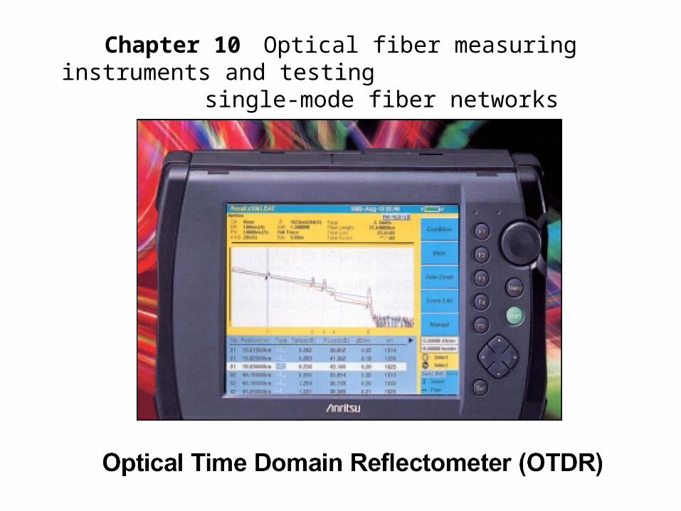
Schematic illustration of the main parts of an OTDR
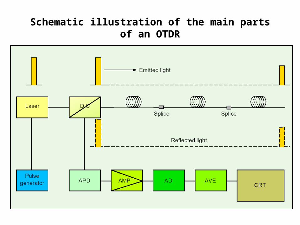
Simplified graph from an OTDR
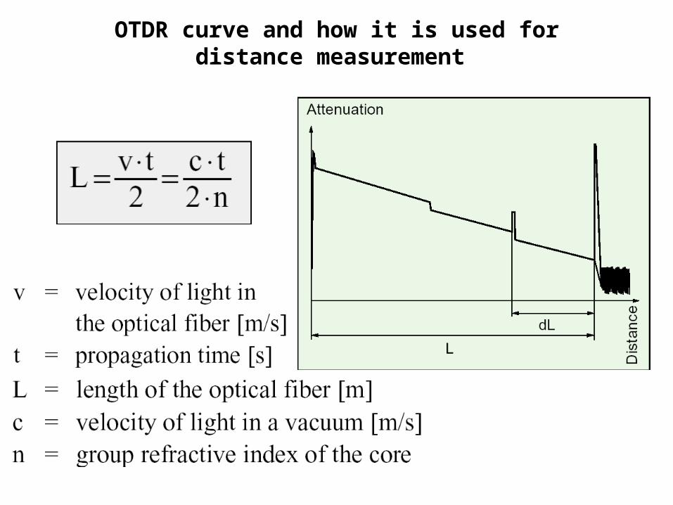
OTDR curve and how it is used for distance measurement
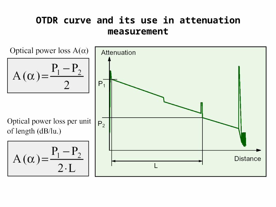
OTDR curve and its use in attenuation measurement
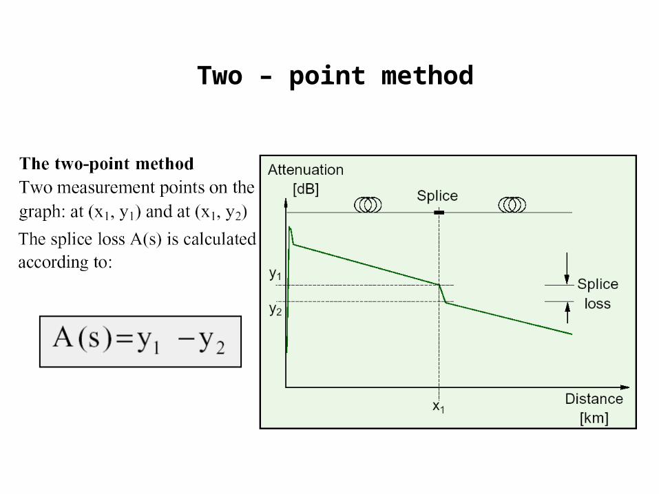
Two – point method
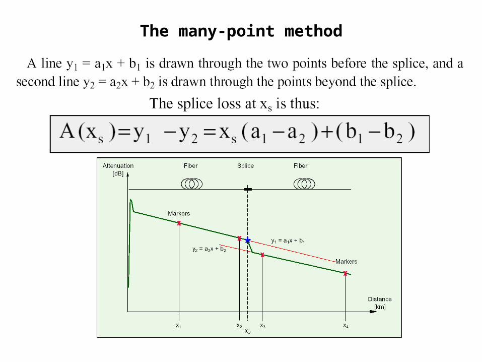
The many-point method
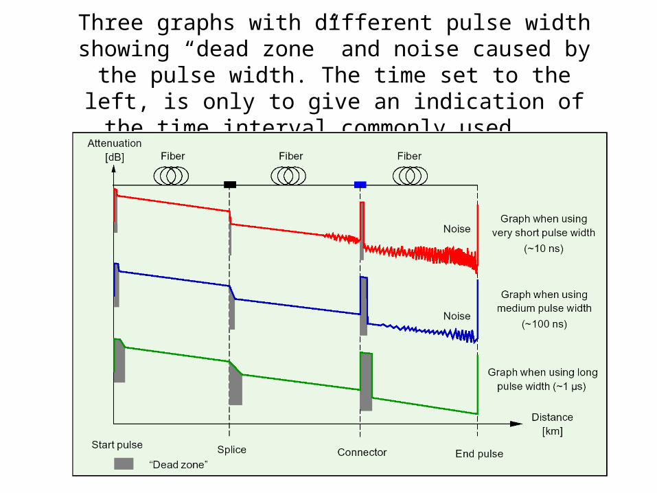
Three graphs with different pulse width showing “dead zone” and noise caused by the pulse width. The time set to the left, is only to give an indication of the time interval commonly
used.
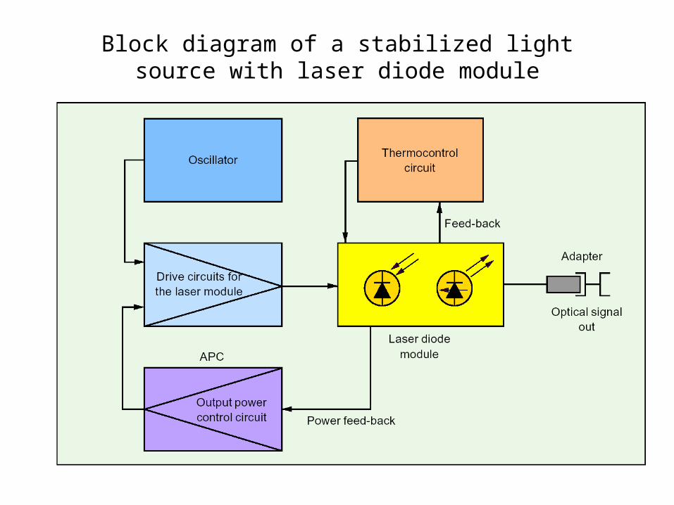
Block diagram of a stabilized light source with laser diode module
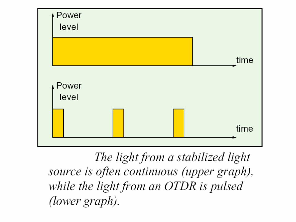
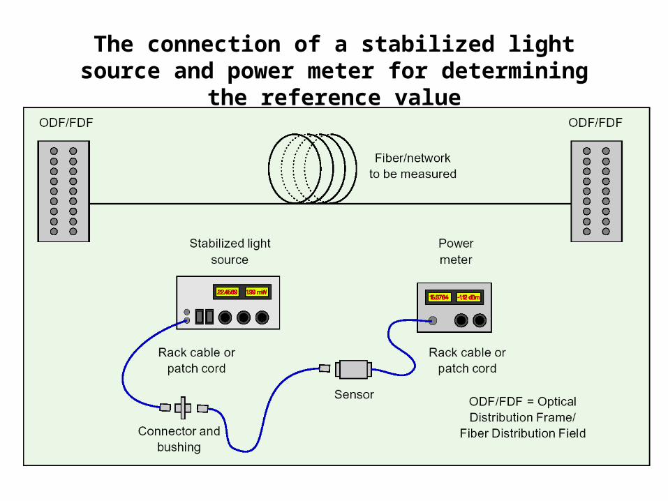
The connection of a stabilized light source and power meter for determining the reference value
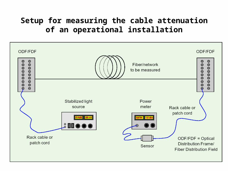
Setup for measuring the cable attenuation of an operational installation
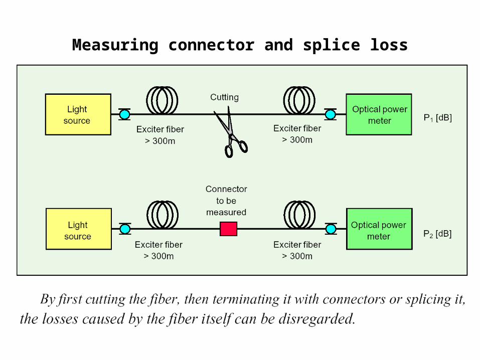
Measuring connector and splice loss
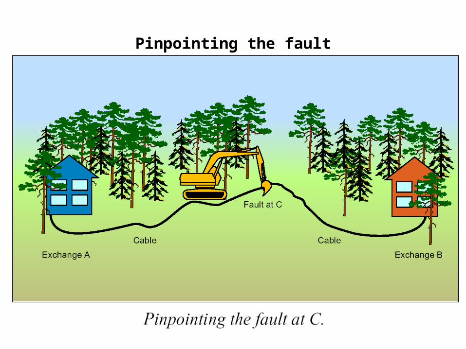
Pinpointing the fault