Embed Size (px)
Citation preview
10/5/2020 Chapter 10 Data visualization principles | Introduction to Data Science
https://rafalab.github.io/dsbook/data-visualization-principles.html 1/43
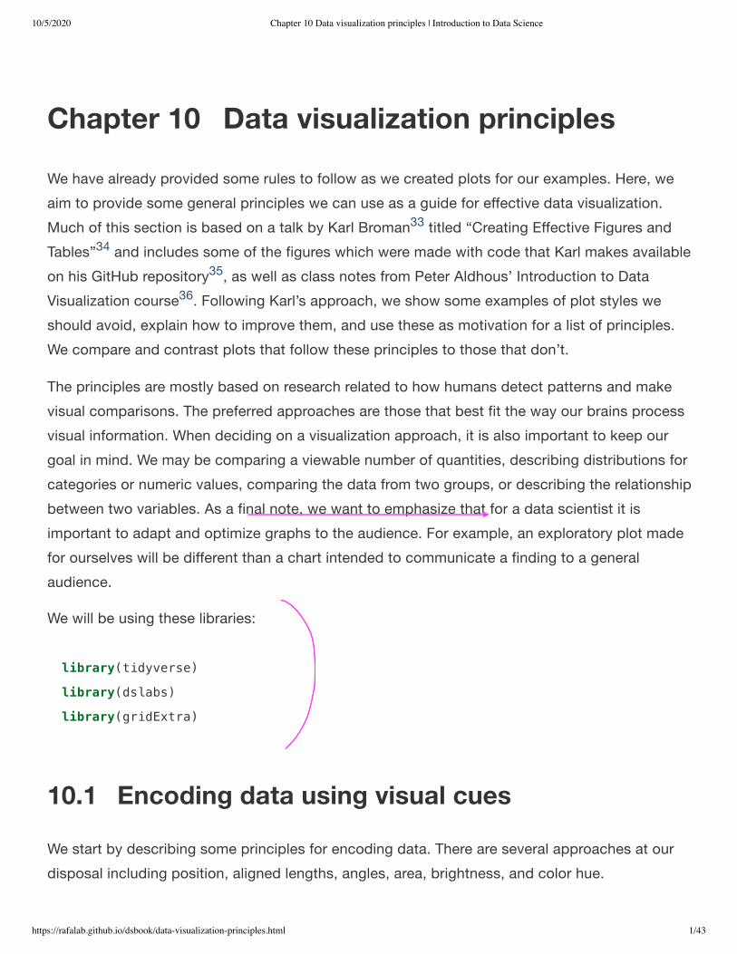
Chapter 10 Data visualization principlesWe have already provided some rules to follow as we created plots for our examples. Here, weaim to provide some general principles we can use as a guide for effective data visualization.Much of this section is based on a talk by Karl Broman titled “Creating Effective Figures andTables” and includes some of the figures which were made with code that Karl makes availableon his GitHub repository , as well as class notes from Peter Aldhous’ Introduction to DataVisualization course . Following Karl’s approach, we show some examples of plot styles weshould avoid, explain how to improve them, and use these as motivation for a list of principles.We compare and contrast plots that follow these principles to those that don’t.
The principles are mostly based on research related to how humans detect patterns and makevisual comparisons. The preferred approaches are those that best fit the way our brains processvisual information. When deciding on a visualization approach, it is also important to keep ourgoal in mind. We may be comparing a viewable number of quantities, describing distributions forcategories or numeric values, comparing the data from two groups, or describing the relationshipbetween two variables. As a final note, we want to emphasize that for a data scientist it isimportant to adapt and optimize graphs to the audience. For example, an exploratory plot madefor ourselves will be different than a chart intended to communicate a finding to a generalaudience.
We will be using these libraries:
10.1 Encoding data using visual cuesWe start by describing some principles for encoding data. There are several approaches at ourdisposal including position, aligned lengths, angles, area, brightness, and color hue.
33
34
35
36
library(tidyverse)
library(dslabs)
library(gridExtra)
10/5/2020 Chapter 10 Data visualization principles | Introduction to Data Science
https://rafalab.github.io/dsbook/data-visualization-principles.html 2/43
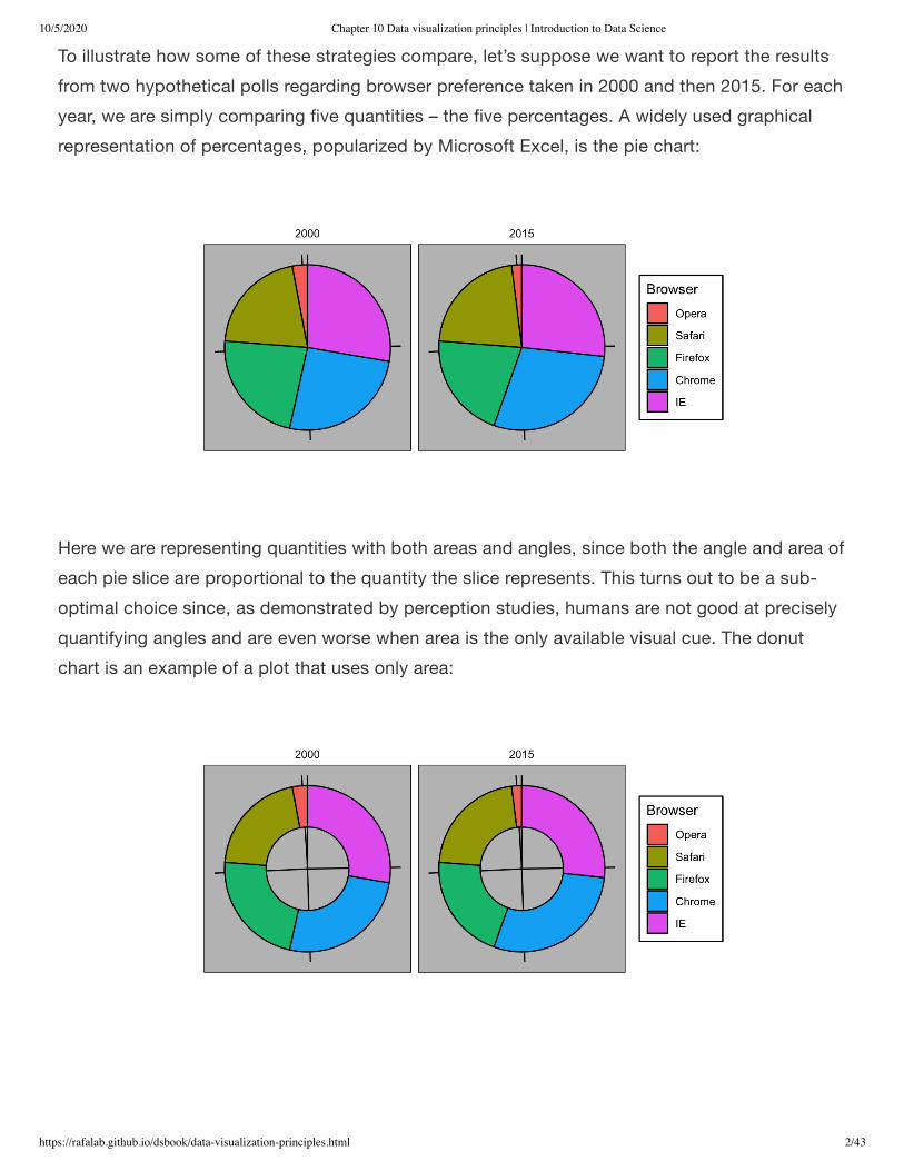
To illustrate how some of these strategies compare, let’s suppose we want to report the resultsfrom two hypothetical polls regarding browser preference taken in 2000 and then 2015. For eachyear, we are simply comparing five quantities – the five percentages. A widely used graphicalrepresentation of percentages, popularized by Microsoft Excel, is the pie chart:
Here we are representing quantities with both areas and angles, since both the angle and area ofeach pie slice are proportional to the quantity the slice represents. This turns out to be a sub-optimal choice since, as demonstrated by perception studies, humans are not good at preciselyquantifying angles and are even worse when area is the only available visual cue. The donutchart is an example of a plot that uses only area:

10/5/2020 Chapter 10 Data visualization principles | Introduction to Data Science
https://rafalab.github.io/dsbook/data-visualization-principles.html 3/43
To see how hard it is to quantify angles and area, note that the rankings and all the percentagesin the plots above changed from 2000 to 2015. Can you determine the actual percentages andrank the browsers’ popularity? Can you see how the percentages changed from 2000 to 2015? Itis not easy to tell from the plot. In fact, the pie R function help file states that:
In this case, simply showing the numbers is not only clearer, but would also save on printingcosts if printing a paper copy:
Browser 2000 2015
Opera 3 2
Safari 21 22
Firefox 23 21
Chrome 26 29
IE 28 27
The preferred way to plot these quantities is to use length and position as visual cues, sincehumans are much better at judging linear measures. The barplot uses this approach by usingbars of length proportional to the quantities of interest. By adding horizontal lines at strategicallychosen values, in this case at every multiple of 10, we ease the visual burden of quantifyingthrough the position of the top of the bars. Compare and contrast the information we can extractfrom the two figures.
Pie charts are a very bad way of displaying information. The eye is good at judging linearmeasures and bad at judging relative areas. A bar chart or dot chart is a preferable way ofdisplaying this type of data.

10/5/2020 Chapter 10 Data visualization principles | Introduction to Data Science
https://rafalab.github.io/dsbook/data-visualization-principles.html 4/43
Notice how much easier it is to see the differences in the barplot. In fact, we can now determinethe actual percentages by following a horizontal line to the x-axis.
If for some reason you need to make a pie chart, label each pie slice with its respectivepercentage so viewers do not have to infer them from the angles or area:

10/5/2020 Chapter 10 Data visualization principles | Introduction to Data Science
https://rafalab.github.io/dsbook/data-visualization-principles.html 5/43
In general, when displaying quantities, position and length are preferred over angles and/or area.Brightness and color are even harder to quantify than angles. But, as we will see later, they aresometimes useful when more than two dimensions must be displayed at once.
10.2 Know when to include 0When using barplots, it is misinformative not to start the bars at 0. This is because, by using abarplot, we are implying the length is proportional to the quantities being displayed. By avoiding0, relatively small differences can be made to look much bigger than they actually are. Thisapproach is often used by politicians or media organizations trying to exaggerate a difference.Below is an illustrative example used by Peter Aldhous in this lecture:http://paldhous.github.io/ucb/2016/dataviz/week2.html.

10/5/2020 Chapter 10 Data visualization principles | Introduction to Data Science
https://rafalab.github.io/dsbook/data-visualization-principles.html 6/43
(Source: Fox News, via Media Matters .)
From the plot above, it appears that apprehensions have almost tripled when, in fact, they haveonly increased by about 16%. Starting the graph at 0 illustrates this clearly:
Here is another example, described in detail in a Flowing Data blog post:
(Source: Fox News, via Flowing Data .)
This plot makes a 13% increase look like a five fold change. Here is the appropriate plot:
37
38

10/5/2020 Chapter 10 Data visualization principles | Introduction to Data Science
https://rafalab.github.io/dsbook/data-visualization-principles.html 7/43
Finally, here is an extreme example that makes a very small difference of under 2% look like a10-100 fold change:
(Source: Venezolana de Televisión via Pakistan Today and Diego Mariano.)
Here is the appropriate plot:
39

10/5/2020 Chapter 10 Data visualization principles | Introduction to Data Science
https://rafalab.github.io/dsbook/data-visualization-principles.html 8/43
When using position rather than length, it is then not necessary to include 0. This is particularlythe case when we want to compare differences between groups relative to the within-groupvariability. Here is an illustrative example showing country average life expectancy stratifiedacross continents in 2012:
Note that in the plot on the left, which includes 0, the space between 0 and 43 adds noinformation and makes it harder to compare the between and within group variability.
10.3 Do not distort quantities

10/5/2020 Chapter 10 Data visualization principles | Introduction to Data Science
https://rafalab.github.io/dsbook/data-visualization-principles.html 9/43
During President Barack Obama’s 2011 State of the Union Address, the following chart was usedto compare the US GDP to the GDP of four competing nations:
(Source: The 2011 State of the Union Address )
Judging by the area of the circles, the US appears to have an economy over five times largerthan China’s and over 30 times larger than France’s. However, if we look at the actual numbers,we see that this is not the case. The actual ratios are 2.6 and 5.8 times bigger than China andFrance, respectively. The reason for this distortion is that the radius, rather than the area, wasmade to be proportional to the quantity, which implies that the proportion between the areas issquared: 2.6 turns into 6.5 and 5.8 turns into 34.1. Here is a comparison of the circles we get ifwe make the value proportional to the radius and to the area:
Not surprisingly, ggplot2 defaults to using area rather than radius. Of course, in this case, wereally should not be using area at all since we can use position and length:
40

10/5/2020 Chapter 10 Data visualization principles | Introduction to Data Science
https://rafalab.github.io/dsbook/data-visualization-principles.html 10/43
10.4 Order categories by a meaningful value
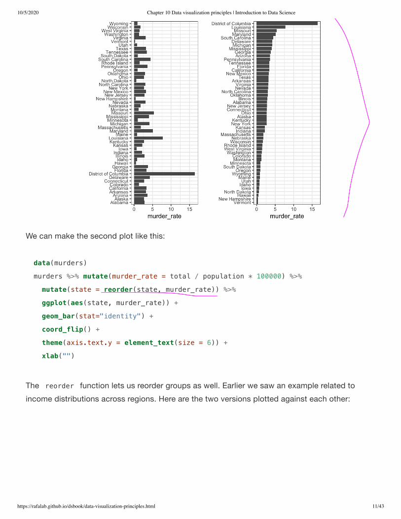
When one of the axes is used to show categories, as is done in barplots, the default ggplot2behavior is to order the categories alphabetically when they are defined by character strings. Ifthey are defined by factors, they are ordered by the factor levels. We rarely want to usealphabetical order. Instead, we should order by a meaningful quantity. In all the cases above, thebarplots were ordered by the values being displayed. The exception was the graph showingbarplots comparing browsers. In this case, we kept the order the same across the barplots toease the comparison. Specifically, instead of ordering the browsers separately in the two years,we ordered both years by the average value of 2000 and 2015.
We previously learned how to use the reorder function, which helps us achieve this goal. Toappreciate how the right order can help convey a message, suppose we want to create a plot tocompare the murder rate across states. We are particularly interested in the most dangerous andsafest states. Note the difference when we order alphabetically (the default) versus when weorder by the actual rate:
10/5/2020 Chapter 10 Data visualization principles | Introduction to Data Science
https://rafalab.github.io/dsbook/data-visualization-principles.html 11/43
We can make the second plot like this:
The reorder function lets us reorder groups as well. Earlier we saw an example related toincome distributions across regions. Here are the two versions plotted against each other:
data(murders)
murders %>% mutate(murder_rate = total / population * 100000) %>%
mutate(state = reorder(state, murder_rate)) %>%
ggplot(aes(state, murder_rate)) +
geom_bar(stat="identity") +
coord_flip() +
theme(axis.text.y = element_text(size = 6)) +
xlab("")

10/5/2020 Chapter 10 Data visualization principles | Introduction to Data Science
https://rafalab.github.io/dsbook/data-visualization-principles.html 12/43
The first orders the regions alphabetically, while the second orders them by the group’s median.
10.5 Show the dataWe have focused on displaying single quantities across categories. We now shift our attention todisplaying data, with a focus on comparing groups.
To motivate our first principle, “show the data”, we go back to our artificial example of describingheights to ET, an extraterrestrial. This time let’s assume ET is interested in the difference inheights between males and females. A commonly seen plot used for comparisons betweengroups, popularized by software such as Microsoft Excel, is the dynamite plot, which shows theaverage and standard errors (standard errors are defined in a later chapter, but do not confusethem with the standard deviation of the data). The plot looks like this:
#> `summarise()` ungrouping output (override with `.groups` argument)

10/5/2020 Chapter 10 Data visualization principles | Introduction to Data Science
https://rafalab.github.io/dsbook/data-visualization-principles.html 13/43
The average of each group is represented by the top of each bar and the antennae extend outfrom the average to the average plus two standard errors. If all ET receives is this plot, he willhave little information on what to expect if he meets a group of human males and females. Thebars go to 0: does this mean there are tiny humans measuring less than one foot? Are all malestaller than the tallest females? Is there a range of heights? ET can’t answer these questions sincewe have provided almost no information on the height distribution.
This brings us to our first principle: show the data. This simple ggplot2 code already generates amore informative plot than the barplot by simply showing all the data points:
heights %>%
ggplot(aes(sex, height)) +
geom_point()

10/5/2020 Chapter 10 Data visualization principles | Introduction to Data Science
https://rafalab.github.io/dsbook/data-visualization-principles.html 14/43
For example, this plot gives us an idea of the range of the data. However, this plot has limitationsas well, since we can’t really see all the 238 and 812 points plotted for females and males,respectively, and many points are plotted on top of each other. As we have previously described,visualizing the distribution is much more informative. But before doing this, we point out twoways we can improve a plot showing all the points.
The first is to add jitter, which adds a small random shift to each point. In this case, addinghorizontal jitter does not alter the interpretation, since the point heights do not change, but weminimize the number of points that fall on top of each other and, therefore, get a better visualsense of how the data is distributed. A second improvement comes from using alpha blending:making the points somewhat transparent. The more points fall on top of each other, the darkerthe plot, which also helps us get a sense of how the points are distributed. Here is the same plotwith jitter and alpha blending:
heights %>%
ggplot(aes(sex, height)) +
geom_jitter(width = 0.1, alpha = 0.2)

10/5/2020 Chapter 10 Data visualization principles | Introduction to Data Science
https://rafalab.github.io/dsbook/data-visualization-principles.html 15/43
Now we start getting a sense that, on average, males are taller than females. We also note darkhorizontal bands of points, demonstrating that many report values that are rounded to thenearest integer.
10.6 Ease comparisons
10.6.1 Use common axes
Since there are so many points, it is more effective to show distributions rather than individualpoints. We therefore show histograms for each group:

10/5/2020 Chapter 10 Data visualization principles | Introduction to Data Science
https://rafalab.github.io/dsbook/data-visualization-principles.html 16/43
However, from this plot it is not immediately obvious that males are, on average, taller thanfemales. We have to look carefully to notice that the x-axis has a higher range of values in themale histogram. An important principle here is to keep the axes the same when comparing dataacross two plots. Below we see how the comparison becomes easier:
10.6.2 Align plots vertically to see horizontal changes andhorizontally to see vertical changes
In these histograms, the visual cue related to decreases or increases in height are shifts to theleft or right, respectively: horizontal changes. Aligning the plots vertically helps us see thischange when the axes are fixed:

10/5/2020 Chapter 10 Data visualization principles | Introduction to Data Science
https://rafalab.github.io/dsbook/data-visualization-principles.html 17/43
This plot makes it much easier to notice that men are, on average, taller.
If , we want the more compact summary provided by boxplots, we then align them horizontallysince, by default, boxplots move up and down with changes in height. Following our show thedata principle, we then overlay all the data points:
Now contrast and compare these three plots, based on exactly the same data:
heights %>%
ggplot(aes(height, ..density..)) +
geom_histogram(binwidth = 1, color="black") +
facet_grid(sex~.)
heights %>%
ggplot(aes(sex, height)) +
geom_boxplot(coef=3) +
geom_jitter(width = 0.1, alpha = 0.2) +
ylab("Height in inches")

10/5/2020 Chapter 10 Data visualization principles | Introduction to Data Science
https://rafalab.github.io/dsbook/data-visualization-principles.html 18/43
Notice how much more we learn from the two plots on the right. Barplots are useful for showingone number, but not very useful when we want to describe distributions.
10.6.3 Consider transformations
We have motivated the use of the log transformation in cases where the changes aremultiplicative. Population size was an example in which we found a log transformation to yield amore informative transformation.
The combination of an incorrectly chosen barplot and a failure to use a log transformation whenone is merited can be particularly distorting. As an example, consider this barplot showing theaverage population sizes for each continent in 2015:
#> `summarise()` ungrouping output (override with `.groups` argument)

10/5/2020 Chapter 10 Data visualization principles | Introduction to Data Science
https://rafalab.github.io/dsbook/data-visualization-principles.html 19/43
From this plot, one would conclude that countries in Asia are much more populous than in othercontinents. Following the show the data principle, we quickly notice that this is due to two verylarge countries, which we assume are India and China:
Using a log transformation here provides a much more informative plot. We compare the originalbarplot to a boxplot using the log scale transformation for the y-axis:

10/5/2020 Chapter 10 Data visualization principles | Introduction to Data Science
https://rafalab.github.io/dsbook/data-visualization-principles.html 20/43
With the new plot, we realize that countries in Africa actually have a larger median populationsize than those in Asia.
Other transformations you should consider are the logistic transformation ( logit ), useful tobetter see fold changes in odds, and the square root transformation ( sqrt ), useful for countdata.
10.6.4 Visual cues to be compared should be adjacent
For each continent, let’s compare income in 1970 versus 2010. When comparing income dataacross regions between 1970 and 2010, we made a figure similar to the one below, but this timewe investigate continents rather than regions.

10/5/2020 Chapter 10 Data visualization principles | Introduction to Data Science
https://rafalab.github.io/dsbook/data-visualization-principles.html 21/43
The default in ggplot2 is to order labels alphabetically so the labels with 1970 come before thelabels with 2010, making the comparisons challenging because a continent’s distribution in 1970is visually far from its distribution in 2010. It is much easier to make the comparison between1970 and 2010 for each continent when the boxplots for that continent are next to each other:
10.6.5 Use color
The comparison becomes even easier to make if we use color to denote the two things we wantto compare:

10/5/2020 Chapter 10 Data visualization principles | Introduction to Data Science
https://rafalab.github.io/dsbook/data-visualization-principles.html 22/43
10.7 Think of the color blind
About 10% of the population is color blind. Unfortunately, the default colors used in ggplot2 arenot optimal for this group. However, ggplot2 does make it easy to change the color palette usedin the plots. An example of how we can use a color blind friendly palette is described here:http://www.cookbook-r.com/Graphs/Colors_(ggplot2)/#a-colorblind-friendly-palette:
Here are the colors
There are several resources that can help you select colors, for example this one:http://bconnelly.net/2013/10/creating-colorblind-friendly-figures/.
10.8 Plots for two variables
color_blind_friendly_cols <-
c("#999999", "#E69F00", "#56B4E9", "#009E73",
"#F0E442", "#0072B2", "#D55E00", "#CC79A7")

10/5/2020 Chapter 10 Data visualization principles | Introduction to Data Science
https://rafalab.github.io/dsbook/data-visualization-principles.html 23/43
In general, you should use scatterplots to visualize the relationship between two variables. Inevery single instance in which we have examined the relationship between two variables,including total murders versus population size, life expectancy versus fertility rates, and infantmortality versus income, we have used scatterplots. This is the plot we generally recommend.However, there are some exceptions and we describe two alternative plots here: the slope chartand the Bland-Altman plot.
10.8.1 Slope charts
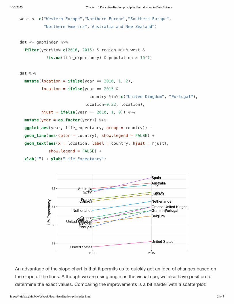
One exception where another type of plot may be more informative is when you are comparingvariables of the same type, but at different time points and for a relatively small number ofcomparisons. For example, comparing life expectancy between 2010 and 2015. In this case, wemight recommend a slope chart.
There is no geometry for slope charts in ggplot2, but we can construct one using geom_line .We need to do some tinkering to add labels. Below is an example comparing 2010 to 2015 forlarge western countries:
10/5/2020 Chapter 10 Data visualization principles | Introduction to Data Science
https://rafalab.github.io/dsbook/data-visualization-principles.html 24/43
An advantage of the slope chart is that it permits us to quickly get an idea of changes based onthe slope of the lines. Although we are using angle as the visual cue, we also have position todetermine the exact values. Comparing the improvements is a bit harder with a scatterplot:
west <- c("Western Europe","Northern Europe","Southern Europe",
"Northern America","Australia and New Zealand")
dat <- gapminder %>%
filter(year%in% c(2010, 2015) & region %in% west &
!is.na(life_expectancy) & population > 10^7)
dat %>%
mutate(location = ifelse(year == 2010, 1, 2),
location = ifelse(year == 2015 &
country %in% c("United Kingdom", "Portugal"),
location+0.22, location),
hjust = ifelse(year == 2010, 1, 0)) %>%
mutate(year = as.factor(year)) %>%
ggplot(aes(year, life_expectancy, group = country)) +
geom_line(aes(color = country), show.legend = FALSE) +
geom_text(aes(x = location, label = country, hjust = hjust),
show.legend = FALSE) +
xlab("") + ylab("Life Expectancy")
10/5/2020 Chapter 10 Data visualization principles | Introduction to Data Science
https://rafalab.github.io/dsbook/data-visualization-principles.html 25/43
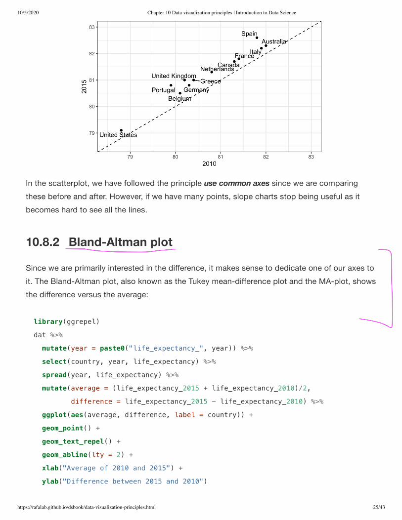
In the scatterplot, we have followed the principle use common axes since we are comparingthese before and after. However, if we have many points, slope charts stop being useful as itbecomes hard to see all the lines.
10.8.2 Bland-Altman plot
Since we are primarily interested in the difference, it makes sense to dedicate one of our axes toit. The Bland-Altman plot, also known as the Tukey mean-difference plot and the MA-plot, showsthe difference versus the average:
library(ggrepel)
dat %>%
mutate(year = paste0("life_expectancy_", year)) %>%
select(country, year, life_expectancy) %>%
spread(year, life_expectancy) %>%
mutate(average = (life_expectancy_2015 + life_expectancy_2010)/2,
difference = life_expectancy_2015 - life_expectancy_2010) %>%
ggplot(aes(average, difference, label = country)) +
geom_point() +
geom_text_repel() +
geom_abline(lty = 2) +
xlab("Average of 2010 and 2015") +
ylab("Difference between 2015 and 2010")

10/5/2020 Chapter 10 Data visualization principles | Introduction to Data Science
https://rafalab.github.io/dsbook/data-visualization-principles.html 26/43
Here, by simply looking at the y-axis, we quickly see which countries have shown the mostimprovement. We also get an idea of the overall value from the x-axis.
10.9 Encoding a third variableAn earlier scatterplot showed the relationship between infant survival and average income.Below is a version of this plot that encodes three variables: OPEC membership, region, andpopulation.
We encode categorical variables with color and shape. These shapes can be controlled with shape argument. Below are the shapes available for use in R. For the last five, the color goesinside.

10/5/2020 Chapter 10 Data visualization principles | Introduction to Data Science
https://rafalab.github.io/dsbook/data-visualization-principles.html 27/43
For continuous variables, we can use color, intensity, or size. We now show an example of howwe do this with a case study.
When selecting colors to quantify a numeric variable, we choose between two options:sequential and diverging. Sequential colors are suited for data that goes from high to low. Highvalues are clearly distinguished from low values. Here are some examples offered by thepackage RColorBrewer :
Diverging colors are used to represent values that diverge from a center. We put equal emphasison both ends of the data range: higher than the center and lower than the center. An example ofwhen we would use a divergent pattern would be if we were to show height in standarddeviations away from the average. Here are some examples of divergent patterns:
library(RColorBrewer)
display.brewer.all(type="seq")

10/5/2020 Chapter 10 Data visualization principles | Introduction to Data Science
https://rafalab.github.io/dsbook/data-visualization-principles.html 28/43
10.10 Avoid pseudo-three-dimensional plotsThe figure below, taken from the scientific literature , shows three variables: dose, drug typeand survival. Although your screen/book page is flat and two-dimensional, the plot tries toimitate three dimensions and assigned a dimension to each variable.
(Image courtesy of Karl Broman)
Humans are not good at seeing in three dimensions (which explains why it is hard to parallelpark) and our limitation is even worse with regard to pseudo-three-dimensions. To see this, try todetermine the values of the survival variable in the plot above. Can you tell when the purple
library(RColorBrewer)
display.brewer.all(type="div")
41

10/5/2020 Chapter 10 Data visualization principles | Introduction to Data Science
https://rafalab.github.io/dsbook/data-visualization-principles.html 29/43
ribbon intersects the red one? This is an example in which we can easily use color to representthe categorical variable instead of using a pseudo-3D:
Notice how much easier it is to determine the survival values.
Pseudo-3D is sometimes used completely gratuitously: plots are made to look 3D even when the3rd dimension does not represent a quantity. This only adds confusion and makes it harder torelay your message. Here are two examples:

10/5/2020 Chapter 10 Data visualization principles | Introduction to Data Science
https://rafalab.github.io/dsbook/data-visualization-principles.html 30/43
(Images courtesy of Karl Broman)
10.11 Avoid too many significant digitsBy default, statistical software like R returns many significant digits. The default behavior in R isto show 7 significant digits. That many digits often adds no information and the added visualclutter can make it hard for the viewer to understand the message. As an example, here are theper 10,000 disease rates, computed from totals and population in R, for California across the fivedecades:
state year Measles Pertussis Polio
California 1940 37.8826320 18.3397861 0.8266512
California 1950 13.9124205 4.7467350 1.9742639
California 1960 14.1386471 NA 0.2640419
California 1970 0.9767889 NA NA
California 1980 0.3743467 0.0515466 NA
We are reporting precision up to 0.00001 cases per 10,000, a very small value in the context ofthe changes that are occurring across the dates. In this case, two significant figures is more thanenough and clearly makes the point that rates are decreasing:
state year Measles Pertussis Polio
California 1940 37.9 18.3 0.8
California 1950 13.9 4.7 2.0
California 1960 14.1 NA 0.3
California 1970 1.0 NA NA
California 1980 0.4 0.1 NA
Useful ways to change the number of significant digits or to round numbers are signif and round . You can define the number of significant digits globally by setting options like this: options(digits = 3) .

10/5/2020 Chapter 10 Data visualization principles | Introduction to Data Science
https://rafalab.github.io/dsbook/data-visualization-principles.html 31/43
Another principle related to displaying tables is to place values being compared on columnsrather than rows. Note that our table above is easier to read than this one:
state disease 1940 1950 1960 1970 1980
California Measles 37.9 13.9 14.1 1 0.4
California Pertussis 18.3 4.7 NA NA 0.1
California Polio 0.8 2.0 0.3 NA NA
10.12 Know your audienceGraphs can be used for 1) our own exploratory data analysis, 2) to convey a message to experts,or 3) to help tell a story to a general audience. Make sure that the intended audienceunderstands each element of the plot.
As a simple example, consider that for your own exploration it may be more useful to log-transform data and then plot it. However, for a general audience that is unfamiliar with convertinglogged values back to the original measurements, using a log-scale for the axis instead of log-transformed values will be much easier to digest.
10.13 Exercises
For these exercises, we will be using the vaccines data in the dslabs package:
1. Pie charts are appropriate:
a. When we want to display percentages.b. When ggplot2 is not available.c. When I am in a bakery.d. Never. Barplots and tables are always better.
2. What is the problem with the plot below:
library(dslabs)
data(us_contagious_diseases)

10/5/2020 Chapter 10 Data visualization principles | Introduction to Data Science
https://rafalab.github.io/dsbook/data-visualization-principles.html 32/43
a. The values are wrong. The final vote was 306 to 232.b. The axis does not start at 0. Judging by the length, it appears Trump received 3 times as
many votes when, in fact, it was about 30% more.c. The colors should be the same.d. Percentages should be shown as a pie chart.
3. Take a look at the following two plots. They show the same information: 1928 rates of measlesacross the 50 states.

10/5/2020 Chapter 10 Data visualization principles | Introduction to Data Science
https://rafalab.github.io/dsbook/data-visualization-principles.html 33/43
Which plot is easier to read if you are interested in determining which are the best and worststates in terms of rates, and why?
a. They provide the same information, so they are both equally as good.b. The plot on the right is better because it orders the states alphabetically.c. The plot on the right is better because alphabetical order has nothing to do with the disease
and by ordering according to actual rate, we quickly see the states with most and leastrates.
d. Both plots should be a pie chart.
4. To make the plot on the left, we have to reorder the levels of the states’ variables.
Note what happens when we make a barplot:
dat <- us_contagious_diseases %>%
filter(year == 1967 & disease=="Measles" & !is.na(population)) %>%
mutate(rate = count / population * 10000 * 52 / weeks_reporting)
dat %>% ggplot(aes(state, rate)) +
geom_bar(stat="identity") +
coord_flip()

10/5/2020 Chapter 10 Data visualization principles | Introduction to Data Science
https://rafalab.github.io/dsbook/data-visualization-principles.html 34/43
Define these objects:
Redefine the state object so that the levels are re-ordered. Print the new object state andits levels so you can see that the vector is not re-ordered by the levels.
5. Now with one line of code, define the dat table as done above, but change the use mutateto create a rate variable and re-order the state variable so that the levels are re-ordered by thisvariable. Then make a barplot using the code above, but for this new dat .
6. Say we are interested in comparing gun homicide rates across regions of the US. We see thisplot:
state <- dat$state
rate <- dat$count/dat$population*10000*52/dat$weeks_reporting

10/5/2020 Chapter 10 Data visualization principles | Introduction to Data Science
https://rafalab.github.io/dsbook/data-visualization-principles.html 35/43
and decide to move to a state in the western region. What is the main problem with thisinterpretation?
a. The categories are ordered alphabetically.b. The graph does not show standarad errors.c. It does not show all the data. We do not see the variability within a region and it’s possible
that the safest states are not in the West.d. The Northeast has the lowest average.
7. Make a boxplot of the murder rates defined as
library(dslabs)
data("murders")
murders %>% mutate(rate = total/population*100000) %>%
group_by(region) %>%
summarize(avg = mean(rate)) %>%
mutate(region = factor(region)) %>%
ggplot(aes(region, avg)) +
geom_bar(stat="identity") +
ylab("Murder Rate Average")
#> `summarise()` ungrouping output (override with `.groups` argument)
data("murders")
murders %>% mutate(rate = total/population*100000)

10/5/2020 Chapter 10 Data visualization principles | Introduction to Data Science
https://rafalab.github.io/dsbook/data-visualization-principles.html 36/43
by region, showing all the points and ordering the regions by their median rate.
8. The plots below show three continuous variables.
The line appears to separate the points. But it is actually not the case, which we can seeby plotting the data in a couple of two-dimensional points.
Why is this happening?
a. Humans are not good at reading pseudo-3D plots.b. There must be an error in the code.c. The colors confuse us.d. Scatterplots should not be used to compare two variables when we have access to 3.
9. Reproduce the image plot we previously made but for smallpox. For this plot, do not includeyears in which cases were not reported in 10 or more weeks.
10. Now reproduce the time series plot we previously made, but this time following theinstructions of the previous question.

10/5/2020 Chapter 10 Data visualization principles | Introduction to Data Science
https://rafalab.github.io/dsbook/data-visualization-principles.html 37/43
11. For the state of California, make time series plots showing rates for all diseases. Include onlyyears with 10 or more weeks reporting. Use a different color for each disease.
12. Now do the same for the rates for the US. Hint: compute the US rate by using summarize,the total divided by total population.
10.14 Case study: vaccines and infectious diseasesVaccines have helped save millions of lives. In the 19th century, before herd immunization wasachieved through vaccination programs, deaths from infectious diseases, such as smallpox andpolio, were common. However, today vaccination programs have become somewhatcontroversial despite all the scientific evidence for their importance.
The controversy started with a paper published in 1988 and led by Andrew Wakefield claimingthere was a link between the administration of the measles, mumps, and rubella (MMR) vaccineand the appearance of autism and bowel disease. Despite much scientific evidencecontradicting this finding, sensationalist media reports and fear-mongering from conspiracytheorists led parts of the public into believing that vaccines were harmful. As a result, manyparents ceased to vaccinate their children. This dangerous practice can be potentially disastrousgiven that the Centers for Disease Control (CDC) estimates that vaccinations will prevent morethan 21 million hospitalizations and 732,000 deaths among children born in the last 20 years (seeBenefits from Immunization during the Vaccines for Children Program Era — United States,1994-2013, MMWR ). The 1988 paper has since been retracted and Andrew Wakefield waseventually “struck off the UK medical register, with a statement identifying deliberate falsificationin the research published in The Lancet, and was thereby barred from practicing medicine in theUK.” (source: Wikipedia ). Yet misconceptions persist, in part due to self-proclaimed activistswho continue to disseminate misinformation about vaccines.
Effective communication of data is a strong antidote to misinformation and fear-mongering.Earlier we used an example provided by a Wall Street Journal article showing data related tothe impact of vaccines on battling infectious diseases. Here we reconstruct that example.
The data used for these plots were collected, organized, and distributed by the Tycho Project .They include weekly reported counts for seven diseases from 1928 to 2011, from all fifty states.We include the yearly totals in the dslabs package:
42
43
44
45
46

10/5/2020 Chapter 10 Data visualization principles | Introduction to Data Science
https://rafalab.github.io/dsbook/data-visualization-principles.html 38/43
We create a temporary object dat that stores only the measles data, includes a per 100,000rate, orders states by average value of disease and removes Alaska and Hawaii since they onlybecame states in the late 1950s. Note that there is a weeks_reporting column that tells us forhow many weeks of the year data was reported. We have to adjust for that value whencomputing the rate.
We can now easily plot disease rates per year. Here are the measles data from California:
library(tidyverse)
library(RColorBrewer)
library(dslabs)
data(us_contagious_diseases)
names(us_contagious_diseases)
#> [1] "disease" "state" "year"
#> [4] "weeks_reporting" "count" "population"
the_disease <- "Measles"
dat <- us_contagious_diseases %>%
filter(!state%in%c("Hawaii","Alaska") & disease == the_disease) %>%
mutate(rate = count / population * 10000 * 52 / weeks_reporting) %>%
mutate(state = reorder(state, rate))
dat %>% filter(state == "California" & !is.na(rate)) %>%
ggplot(aes(year, rate)) +
geom_line() +
ylab("Cases per 10,000") +
geom_vline(xintercept=1963, col = "blue")

10/5/2020 Chapter 10 Data visualization principles | Introduction to Data Science
https://rafalab.github.io/dsbook/data-visualization-principles.html 39/43
We add a vertical line at 1963 since this is when the vaccine was introduced [Control, Centers forDisease; Prevention (2014). CDC health information for international travel 2014 (the yellowbook). p. 250. ISBN 9780199948505].
Now can we show data for all states in one plot? We have three variables to show: year, state,and rate. In the WSJ figure, they use the x-axis for year, the y-axis for state, and color hue torepresent rates. However, the color scale they use, which goes from yellow to blue to green toorange to red, can be improved.
In our example, we want to use a sequential palette since there is no meaningful center, just lowand high rates.
We use the geometry geom_tile to tile the region with colors representing disease rates. Weuse a square root transformation to avoid having the really high counts dominate the plot. Noticethat missing values are shown in grey. Note that once a disease was pretty much eradicated,some states stopped reporting cases all together. This is why we see so much grey after 1980.

10/5/2020 Chapter 10 Data visualization principles | Introduction to Data Science
https://rafalab.github.io/dsbook/data-visualization-principles.html 40/43
dat %>% ggplot(aes(year, state, fill = rate)) +
geom_tile(color = "grey50") +
scale_x_continuous(expand=c(0,0)) +
scale_fill_gradientn(colors = brewer.pal(9, "Reds"), trans = "sqrt") +
geom_vline(xintercept=1963, col = "blue") +
theme_minimal() +
theme(panel.grid = element_blank(),
legend.position="bottom",
text = element_text(size = 8)) +
ggtitle(the_disease) +
ylab("") + xlab("")

10/5/2020 Chapter 10 Data visualization principles | Introduction to Data Science
https://rafalab.github.io/dsbook/data-visualization-principles.html 41/43
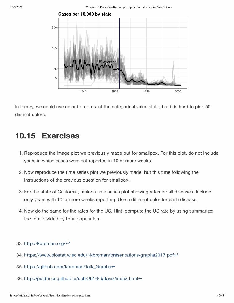
This plot makes a very striking argument for the contribution of vaccines. However, one limitationof this plot is that it uses color to represent quantity, which we earlier explained makes it harderto know exactly how high values are going. Position and lengths are better cues. If we are willingto lose state information, we can make a version of the plot that shows the values with position.We can also show the average for the US, which we compute like this:
Now to make the plot we simply use the geom_line geometry:
avg <- us_contagious_diseases %>%
filter(disease==the_disease) %>% group_by(year) %>%
summarize(us_rate = sum(count, na.rm = TRUE) /
sum(population, na.rm = TRUE) * 10000)
#> `summarise()` ungrouping output (override with `.groups` argument)
dat %>%
filter(!is.na(rate)) %>%
ggplot() +
geom_line(aes(year, rate, group = state), color = "grey50",
show.legend = FALSE, alpha = 0.2, size = 1) +
geom_line(mapping = aes(year, us_rate), data = avg, size = 1) +
scale_y_continuous(trans = "sqrt", breaks = c(5, 25, 125, 300)) +
ggtitle("Cases per 10,000 by state") +
xlab("") + ylab("") +
geom_text(data = data.frame(x = 1955, y = 50),
mapping = aes(x, y, label="US average"),
color="black") +
geom_vline(xintercept=1963, col = "blue")
10/5/2020 Chapter 10 Data visualization principles | Introduction to Data Science
https://rafalab.github.io/dsbook/data-visualization-principles.html 42/43
In theory, we could use color to represent the categorical value state, but it is hard to pick 50distinct colors.
10.15 Exercises1. Reproduce the image plot we previously made but for smallpox. For this plot, do not include
years in which cases were not reported in 10 or more weeks.
2. Now reproduce the time series plot we previously made, but this time following theinstructions of the previous question for smallpox.
3. For the state of California, make a time series plot showing rates for all diseases. Includeonly years with 10 or more weeks reporting. Use a different color for each disease.
4. Now do the same for the rates for the US. Hint: compute the US rate by using summarize:the total divided by total population.
33. http://kbroman.org/
34. https://www.biostat.wisc.edu/~kbroman/presentations/graphs2017.pdf
35. https://github.com/kbroman/Talk_Graphs
36. http://paldhous.github.io/ucb/2016/dataviz/index.html

10/5/2020 Chapter 10 Data visualization principles | Introduction to Data Science
https://rafalab.github.io/dsbook/data-visualization-principles.html 43/43
37. http://mediamatters.org/blog/2013/04/05/fox-news-newest-dishonest-chart-immigration-enf/193507
38. http://flowingdata.com/2012/08/06/fox-news-continues-charting-excellence/
39. https://www.pakistantoday.com.pk/2018/05/18/whats-at-stake-in-venezuelan-presidential-vote
40. https://www.youtube.com/watch?v=kl2g40GoRxg
41. https://projecteuclid.org/download/pdf_1/euclid.ss/1177010488
42. http://www.thelancet.com/journals/lancet/article/PIIS0140-6736(97)11096-0/abstract
43. https://www.cdc.gov/mmwr/preview/mmwrhtml/mm6316a4.htm
44. https://en.wikipedia.org/wiki/Andrew_Wakefield
45. http://graphics.wsj.com/infectious-diseases-and-vaccines/
46. http://www.tycho.pitt.edu/