Embed Size (px)
Citation preview
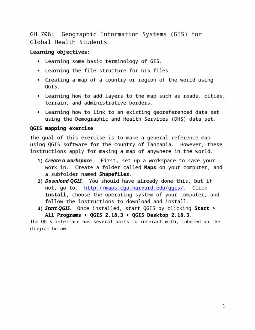
GH 706: Geographic Information Systems (GIS) for Global Health StudentsLearning objectives:
Learning some basic terminology of GIS.
Learning the file structure for GIS files.
Creating a map of a country or region of the world using QGIS.
Learning how to add layers to the map such as roads, cities, terrain, and administrative borders.
Learning how to link to an existing georeferenced data set using the Demographic and Health Services (DHS) data set.
QGIS mapping exercise
The goal of this exercise is to make a general reference map using QGIS software for the country of Tanzania. However, these instructions apply for making a map of anywhere in the world.
1) Create a workspace. First, set up a workspace to save your work in. Create a folder called Maps on your computer, and a subfolder named Shapefiles.
2) Download QGIS. You should have already done this, but if not, go to: http://maps.cga.harvard.edu/qgis/. Click Install, choose the operating system of your computer, and follow the instructions to download and install.
3) Start QGIS. Once installed, start QGIS by clicking Start > All Programs > QGIS 2.18.3 > QGIS Desktop 2.18.3.
The QGIS interface has several parts to interact with, labeled on the diagram below.
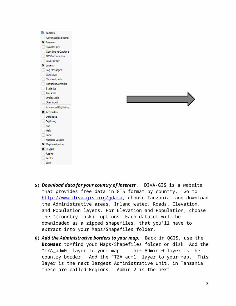
4) Configure the QGIS interface. First, you’ll want to turn off some of the default toolbars that are open. To do this, right click on the empty gray part of the toolbar (see below)
1
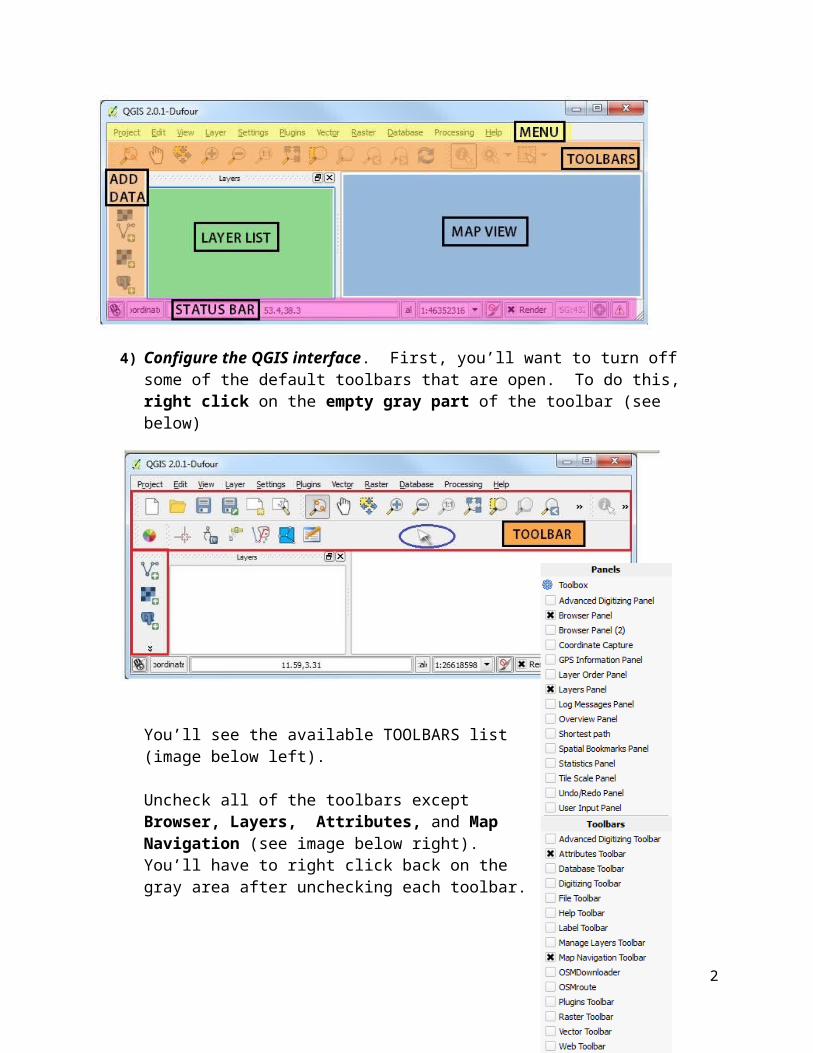
You’ll see the available TOOLBARS list (image below left).
Uncheck all of the toolbars except Browser, Layers, Attributes, and Map Navigation (see image below right). You’ll have to right click back on the gray area after unchecking each toolbar.
5) Download data for your country of interest. DIVA-GIS is a website that provides free data in GIS format by country. Go to http://www.diva-gis.org/gdata, choose Tanzania, and download the Administrative areas, Inland water, Roads, Elevation, and Population layers. For Elevation and Population, choose the “(country mask)” options. Each dataset will be downloaded as a zipped shapefiles, that you’ll have to extract into your Maps/Shapefiles folder.
6) Add the Administrative borders to your map. Back in QGIS, use the Browser to find your Maps/Shapefiles folder on disk. Add the “TZA_adm0” layer to your map. This Admin 0 layer is the country border. Add the “TZA_adm1” layer to your map. This layer is the next largest Administrative unit, in Tanzania these are called Regions. Admin 2 is the next administrative level down, and so on. Some countries may have only 2 admin units, some may have up to 5. Decide on the admin unit you want to display based on how detailed you want your map to be. For this map, we’ll use only Admin 1.
2
7) Practice navigating the map. Now that you’ve added a few layers to your map, take a few minutes to familiarize yourself with QGIS functionality and practice using the map Navigation tools:
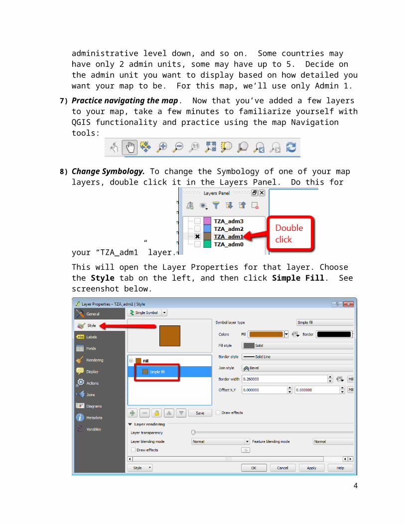
8) Change Symbology. To change the Symbology of one of your map layers, double click it in the Layers Panel. Do this for your “TZA_adm1” layer.
This will open the Layer Properties for that layer. Choose the Style tab on the left, and then click Simple Fill. See screenshot below.
Click Fill and choose Transparent fill. Change the Border style to “dash line”. Click Apply at the bottom of the window to see this change on your map. Before you hit “OK”, click the General tab in the upper left hand corner of the layer window, and rename your “TZA_adm1” layer to “Tanzania Regions” See below.
3
Click OK to close the Layer Properties window.
9) Save your work. To save your work thus far, click Project > Save. Name the map, and save into your Maps folder. This will create a “.qps” file. Save every few minutes so you don’t lose any work!
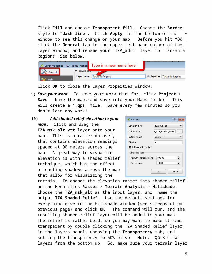
10) Add shaded relief elevation to your map. Click and drag the TZA_msk_alt.vrt layer onto your map. This is a raster dataset, that contains elevation readings spaced at 90 meters across the map. A great way to visualize elevation is with a shaded relief technique, which has the effect of casting shadows across the map that allow for visualizing the terrain. To change the elevation raster into shaded relief, on the Menu click Raster > Terrain Analysis > Hillshade. Choose the TZA_msk_alt as the input layer, and name the output TZA_Shaded_Relief. Use the default settings for everything else in the Hillshade window (see screenshot on previous page) and click OK. The command will run, and the resulting shaded relief layer will be added to your map. The relief is rather bold, so you may want to make it semi transparent by double clicking the TZA_Shaded_Relief layer in the layers panel, choosing the Transparency tab, and setting the transparency to 50% or so. Note: QGIS draws layers from the bottom up. So, make sure your terrain layer is at the bottom of your layer list by clicking and dragging it. Your map should now look similar to the one below:
4
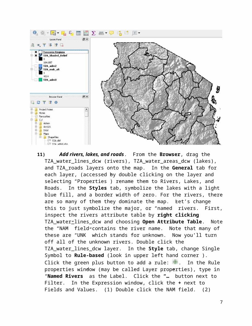
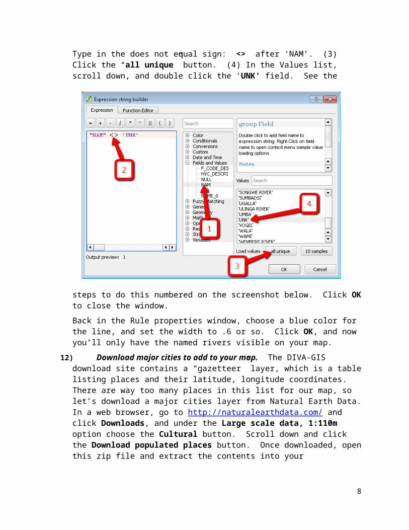
11) Add rivers, lakes, and roads. From the Browser, drag the TZA_water_lines_dcw (rivers), TZA_water_areas_dcw (lakes), and TZA_roads layers onto the map. In the General tab for each layer, (accessed by double clicking on the layer and selecting “Properties”) rename them to Rivers, Lakes, and Roads. In the Styles tab, symbolize the lakes with a light blue fill, and a border width of zero. For the rivers, there are so many of them they dominate the map. Let’s change this to just symbolize the major, or “named” rivers. First, inspect the rivers attribute table by right clicking TZA_water_lines_dcw and choosing Open Attribute Table. Note the “NAM” field contains the river name. Note that many of these are “UNK” which stands for unknown. Now you’ll turn off all of the unknown rivers. Double click the TZA_water_lines_dcw layer. In the Style tab, change Single Symbol to Rule-based (look in upper left hand corner ). Click the green plus button to add a rule: . In the Rule properties window (may be called Layer properties), type in “Named Rivers” as the Label. Click the “…” button next to Filter. In the Expression window, click the + next to Fields and Values. (1) Double click the NAM field. (2) Type in the does not equal sign: <> after ‘NAM’. (3) Click the “all unique” button. (4) In the Values list, scroll down, and double click the ‘UNK’ field. See the steps to do this numbered on the screenshot below. Click OK to close the window.
5

Back in the Rule properties window, choose a blue color for the line, and set the width to .6 or so. Click OK, and now you’ll only have the named rivers visible on your map.
12) Download major cities to add to your map. The DIVA-GIS download site contains a “gazetteer” layer, which is a table listing places and their latitude, longitude coordinates. There are way too many places in this list for our map, so let’s download a major cities layer from Natural Earth Data. In a web browser, go to http://naturalearthdata.com/ and click Downloads, and under the Large scale data, 1:110m option choose the Cultural button. Scroll down and click the Download populated places button. Once downloaded, open this zip file and extract the contents into your Maps/Shapefiles folder. Add this “ne_10m_populated_places” layer to your map.
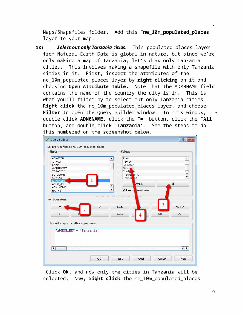
13) Select out only Tanzania cities. This populated places layer from Natural Earth Data is global in nature, but since we’re only making a map of Tanzania, let’s draw only Tanzania cities. This involves making a shapefile with only Tanzania cities in it. First, inspect the attributes of the ne_10m_populated_places layer by right clicking on it and choosing Open Attribute Table. Note that the ADM0NAME field contains the name of the country the city is in. This is what you’ll filter by to select out only Tanzania cities. Right click the ne_10m_populated_places layer, and choose Filter to open the Query Builder window. In this window, double click ADM0NAME, click the “=” button, click the “All” button, and double click ‘Tanzania’. See the steps to do this numbered on the
6
screenshot below.
Click OK, and now only the cities in Tanzania will be selected. Now, right click the ne_10m_populated_places layer, and choose Save As. For the Format, choose ESRI Shapefile. Enter “Tanzania_Cities” as the name of the new shapefile. Click the Browse button, and specify to save this into your Maps\Shapefiles folder. Click OK, and the layer will be added to your map.
14) Draw the Tanzania cities proportionally by population. By default, each city is symbolized with the same sized dot. The map would be much more informative if the dots were sized by population. To change to this proportional symbology, double click your Tanzania_Cities layer, and choose the Styles tab. Change Single Symbol to Graduated. For the Column, choose POP_MAX. Change “Color” to “Size” and click the Classify button. Your screen should look like the one below:
7
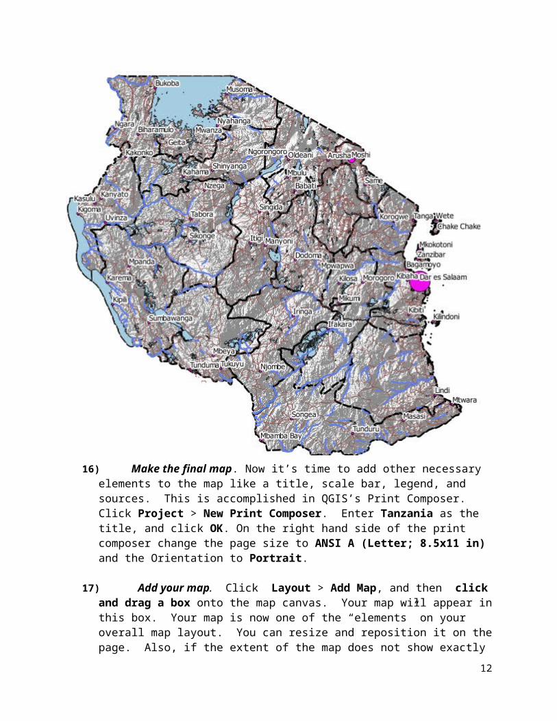
Click OK. Notice the dots are small, except for the large city of Dar es Salaam, in the far eastern part of the country. With your Tanzania_Cities layer, you don’t need your ne_10m_populated_places layer anymore, so right click it and choose Remove.
15) Label your cities. In the Tanzania_Cities Layer Properties window, click the Labels tab. Click No labels at the top, and choose Show labels for this layer. In the Label with window, choose the NAME field. Click Buffer, and check the box next to Draw text buffer, and click Apply. Now city labels should appear on your map. Click OK to close the window. Your map should now look similar to the one below:
8
16) Make the final map. Now it’s time to add other necessary elements to the map like a
title, scale bar, legend, and sources. This is accomplished in QGIS’s Print Composer. Click Project > New Print Composer. Enter Tanzania as the title, and click OK. On the right hand side of the print composer change the page size to ANSI A (Letter; 8.5x11 in) and the Orientation to Portrait.
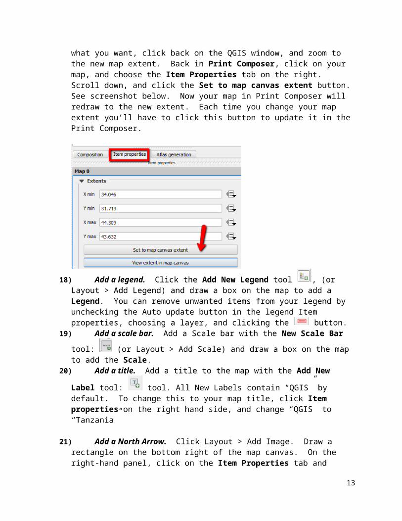
17) Add your map. Click Layout > Add Map, and then click and drag a box onto the map canvas. Your map will appear in this box. Your map is now one of the “elements” on your overall map layout. You can resize and reposition it on the page. Also, if the extent of the map does not show exactly what you want, click back on the QGIS window, and zoom to the new map extent. Back in Print Composer, click on your map, and choose the Item Properties tab on the right. Scroll down, and click the Set to map canvas extent button. See screenshot below. Now your map in Print Composer will redraw to
9

the new extent. Each time you change your map extent you’ll have to click this button to update it in the Print Composer.
18) Add a legend. Click the Add New Legend tool , (or Layout > Add Legend) and draw a box on the map to add a Legend. You can remove unwanted items from your legend by unchecking the Auto update button in the legend Item properties, choosing a layer, and clicking the button.
19) Add a scale bar. Add a Scale bar with the New Scale Bar tool: (or Layout > Add Scale) and draw a box on the map to add the Scale.
20) Add a title. Add a title to the map with the Add New Label tool: tool. All New Labels contain “QGIS” by default. To change this to your map title, click Item properties on the right hand side, and change “QGIS” to “Tanzania”
21) Add a North Arrow. Click Layout > Add Image. Draw a rectangle on the bottom right of the map canvas. On the right-hand panel, click on the Item Properties tab and expand the Search directories section and select the North Arrow image of your liking.
22) Add map sources and author. Add another label, this time put “Map by <Your Name>, <today’s Date> Data sources: DIVA-GIS and Natural Earth Data” Make this a smaller sized font, and put it on the very bottom of the map. Your map layout should now look similar to the one below:
10
23) Export your map to PDF or Image. In the Print Composer, click Composer, and you’ll see the Export as PDF, and Export as Image options. Choose one of these to export your map. You’re done! Next challenge: Make a map similar to this of another country.
11
Helpful QGIS links, and to explore further:
The Harvard Center for Geographic Analysis’s QGIS tutorial: http://maps.cga.harvard.edu/qgis/ . This includes many helpful QGIS functions, such as how to add a Google Basemap: http://maps.cga.harvard.edu/qgis/wkshop/basemap.php
The QGIS publication “A Gentle Introduction to GIS”: http://docs.qgis.org/testing/en/docs/gentle_gis_introduction/index.html
The QGIS users guide : http://docs.qgis.org/testing/en/docs/user_manual/index.html
Mapping DHS data
Many individual surveys are mapped to each DHS cluster GPS coordinate. Because of this co-location of surveys, aggregating by other geographic boundaries (such as districts, provinces, etc.) may be desired. This video: https://youtu.be/Dc14bva2SL8 explains how to aggregate DHS data based on non-DHS boundaries. Although it uses ArcGIS, the same can be done in QGIS.
Presented below are the steps to download and map a “Individual Recode” dataset using DHS cluster GPS coordinates for Tanzania, which Jeff Blossom will demonstrate.
1) Go to http://www.dhsprogram.com/Data/ and click DATA > DOWNLOAD DATASETS
2) Choose the country and survey year you are interested in by clicking on it in the list. For this example Tanzania 2011-12 was chosen. Make sure “Data Available” is listed under GPS Datasets.
3) At the bottom of the next page under “GPS Datasets”, click the “Data Available” link.
4) Click the “please login here” link if you are registered user, or “please go here to register” if you have not registered. After registering and logging in, you’ll have to fill out some information about your request for DHS to allow you to use the data, and they’ll send you an email granting access to the data.
Once you receive your confirmation email to download the data:
5) Go to the data download link, and choose the Project you requested, and the Country, and click the “View Surveys” button. Choose the survey you want to download.
6) At the bottom of the next page under “GPS Datasets”, click the “Data Available” link. Click the tzir6adt.zip and tzge6afl.zip files to download the Individual Recode data in Stata format, and the GPS data in Shapefile format. Unzip these files to your computer.
12
7)QGIS
needs the data in .csv format, so you’ll need to convert it in Stata. In Stata, open the TZIR6AFL.DTA file. Choose File > Export, and save the file as “text delimited”. This will create a .csv file.
8) In the QGIS Browser, add both the exported .csv file, and the downloaded shapefile, named TZGE6AFL, to your map. The TZGE6AFL shapefile represents cluster locations.
9) Double click the .csv file, and choose the Joins tab. Click the green plus button to add a join. In the “vector join” window, choose the TZGE6AFL as the Join layer, and DHSCLUST as the Join field. For the Target field, choose v001. This field represents the cluster location the individual survey data is in. Check the box next to “Cache join layer in virtual memory”, and “Create attribute index on join field”. Click OK to activate the join. Once joined, click OK to close the Layer Properties window. See below.
13
10) In the Layers Panel, right click your exported .csv file and choose Save As. Specify to save the new file as Comma Separated Value [CSV], and click OK.
11) Click the Add Delimited Text button: . In this dialog window, choose the file saved in step 10 above. Specify the X field as TZGE6AFL_LONGNUM, and the Y field as TZGE6AFL_LATNUM. These fields specify the latitude and longitude coordinates of the cluster locations. They will be near the end of the field list. Click OK to create this Layer. When prompted for a Coordinate Reference System, choose “WGS 84 EPSG:4326”, and click OK.
The new layer will be added to the map. Now you can symbolize the map using any of the DHS attributes, or perform spatial analysis with this data. Jeff will demonstrate some of this.
END OF EXERCISE
14