Embed Size (px)
Citation preview
Optimizing Color Assignment for Perception of Class Separabilityin Multiclass Scatterplots
Yunhai Wang, Xin Chen, Tong Ge, Chen Bao,Michael Sedlmair, Chi-Wing Fu, Oliver Deussen and Baoquan Chen
(a) low rank (b) medium rank (c) high rank
(d) low rank (e) medium rank (f) high rank
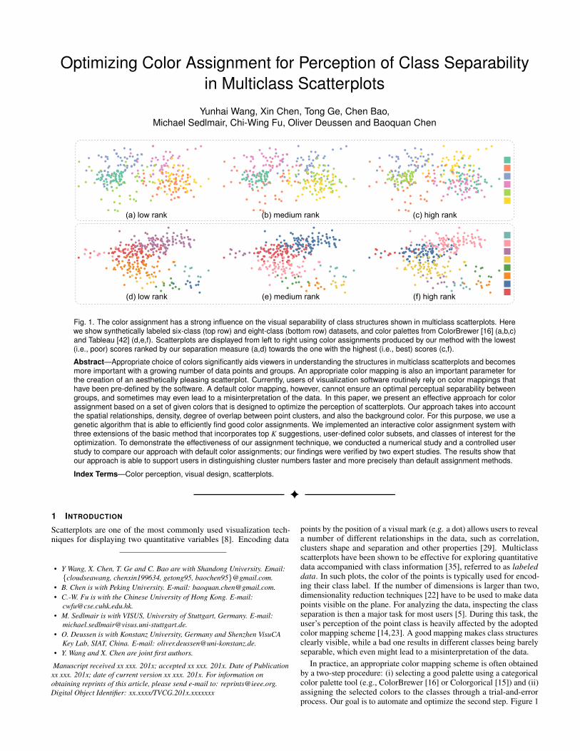
Fig. 1. The color assignment has a strong influence on the visual separability of class structures shown in multiclass scatterplots. Herewe show synthetically labeled six-class (top row) and eight-class (bottom row) datasets, and color palettes from ColorBrewer [16] (a,b,c)and Tableau [42] (d,e,f). Scatterplots are displayed from left to right using color assignments produced by our method with the lowest(i.e., poor) scores ranked by our separation measure (a,d) towards the one with the highest (i.e., best) scores (c,f).
Abstract—Appropriate choice of colors significantly aids viewers in understanding the structures in multiclass scatterplots and becomesmore important with a growing number of data points and groups. An appropriate color mapping is also an important parameter forthe creation of an aesthetically pleasing scatterplot. Currently, users of visualization software routinely rely on color mappings thathave been pre-defined by the software. A default color mapping, however, cannot ensure an optimal perceptual separability betweengroups, and sometimes may even lead to a misinterpretation of the data. In this paper, we present an effective approach for colorassignment based on a set of given colors that is designed to optimize the perception of scatterplots. Our approach takes into accountthe spatial relationships, density, degree of overlap between point clusters, and also the background color. For this purpose, we use agenetic algorithm that is able to efficiently find good color assignments. We implemented an interactive color assignment system withthree extensions of the basic method that incorporates top K suggestions, user-defined color subsets, and classes of interest for theoptimization. To demonstrate the effectiveness of our assignment technique, we conducted a numerical study and a controlled userstudy to compare our approach with default color assignments; our findings were verified by two expert studies. The results show thatour approach is able to support users in distinguishing cluster numbers faster and more precisely than default assignment methods.
Index Terms—Color perception, visual design, scatterplots.
1 INTRODUCTION
Scatterplots are one of the most commonly used visualization tech-niques for displaying two quantitative variables [8]. Encoding data
• Y Wang, X. Chen, T. Ge and C. Bao are with Shandong University. Email:cloudseawang, chenxin199634, getong95, [email protected].
• B. Chen is with Peking University. E-mail: [email protected].• C.-W. Fu is with the Chinese University of Hong Kong. E-mail:
[email protected].• M. Sedlmair is with VISUS, University of Stuttgart, Germany. E-mail:
[email protected].• O. Deussen is with Konstanz University, Germany and Shenzhen VisuCA
Key Lab, SIAT, China. E-mail: [email protected].• Y. Wang and X. Chen are joint first authors.
Manuscript received xx xxx. 201x; accepted xx xxx. 201x. Date of Publicationxx xxx. 201x; date of current version xx xxx. 201x. For information onobtaining reprints of this article, please send e-mail to: [email protected] Object Identifier: xx.xxxx/TVCG.201x.xxxxxxx
points by the position of a visual mark (e.g. a dot) allows users to reveala number of different relationships in the data, such as correlation,clusters shape and separation and other properties [29]. Multiclassscatterplots have been shown to be effective for exploring quantitativedata accompanied with class information [35], referred to as labeleddata. In such plots, the color of the points is typically used for encod-ing their class label. If the number of dimensions is larger than two,dimensionality reduction techniques [22] have to be used to make datapoints visible on the plane. For analyzing the data, inspecting the classseparation is then a major task for most users [5]. During this task, theuser’s perception of the point class is heavily affected by the adoptedcolor mapping scheme [14,23]. A good mapping makes class structuresclearly visible, while a bad one results in different classes being barelyseparable, which even might lead to a misinterpretation of the data.
In practice, an appropriate color mapping scheme is often obtainedby a two-step procedure: (i) selecting a good palette using a categoricalcolor palette tool (e.g., ColorBrewer [16] or Colorgorical [15]) and (ii)assigning the selected colors to the classes through a trial-and-errorprocess. Our goal is to automate and optimize the second step. Figure 1

shows some good and bad assignment examples generated by usingthe default Tableau color palette and the ColorBrewer template palette,which are both designed to be perceptually discriminable and legible.An un-optimized color assignment still results in barely discriminableclass structures (see Figures 1(a,b,d,e)), while an optimized color as-signment makes almost all the classes clearly visible (see Figures 1(c,f)).The few color assignment strategies that exist for scatterplots [24, 37]assume all classes to be associated with semantics and use these se-mantics to generate meaningful colors. In most cases, however, datasets do not come with such class semantics; for instance, when theystem from clustering algorithms [5]. In other cases, semantics cannotbe easily associated with colors. To the best of our knowledge, thereare no methods at present that allows a proper assignment of colors forgeneral multiclass scatterplots.
To fill this gap, we formulate an optimization approach to auto-matically generate a color assignment that maximizes the perceptualseparability between classes. To do so, we extend state-of-the-art visualclass separation measures [1, 40] to incorporate color factors to modelhuman perception of multiclass scatterplots, and use these measuresto guide the automatic search of proper color assignments. A varietyof visual separation measures exist, which imitate human perceptionin multiclass scatterplots. Almost all existing measures, however, donot consider the color assignment factors. Thus, their measured separa-tion values might not align with human perception, if the scatterplotis visualized using an improper color mapping scheme. Followingexisting color design guidelines [48], we extend these measures byincorporating color factors for visual class separation by quantifying (i)the color difference between neighboring classes and (ii) the color con-trast between each class and the background. By integrating these twofactors into state-of-the-art class separation measures [1], our measureresembles human class separation judgments for color-coded multiclassscatterplots quite well, as will be shown below.
One straightforward method for finding an optimal color assignmentis to evaluate all possible solutions and then rank the assignments bythe score of our perceptual separation measure. When n is small, thismethod is feasible, but there is an exponential increase of requiredcomputational costs with an increase of n. To address this issue, our ap-proach uses a customized genetic algorithm [27] to efficiently search fora color assignment scheme by maximizing the proposed class separa-tion measure. Using this approach, we are able to deal with scatterplotshaving 15 classes in less than 2.5 seconds.
We evaluated our approach using 27 multiclass scatterplots [4] andquantitatively measured the quality of our results using Lee et al.’s classvisibility measure [23]. For the tested datasets, our method is capableof producing results with high class visibility. We also ran two userstudies: the first study investigated how our selected color assignmenthelps users estimate class separation. The second one aimed at learningif users subjectively prefer our results, and if yes, why they prefer them.Both studies confirmed the capability of our method to produce resultsthat align well with human perceptual judgments.
We furthermore present an interactive color assignment system withthree extensions of our methods for the interactive exploration of mul-ticlass scatterplots. First, our system is able to suggest a set of goodand diverse color assignments for the user to select the preferred one.Second, in some cases, the user might prefer specific colors for someclasses, and accordingly, we extend our genetic algorithm to satisfysuch user-provided constraints. Lastly, when the user is interested insome specific classes, our approach allows the generation of a colorassignment that maximizes the class separation for such classes.
In summary, the main contributions of this paper are:
• We formulate an optimization approach to automatically generatea color assignment based on (i) incorporating color factors intostate-of-the-art visual separation measures, and (ii) devising acustomized genetic algorithm to rapidly generate proper colorassignments (Section 4).
• We quantitatively evaluate the resulting color assignments usinga class visibility measure [23], and conduct two user studies toshow the usefulness of our approach (Section 5).
• We present three extensions that show how our method can beused to help the exploration of multiclass scatterplots (Section 6).
2 RELATED WORK
Existing related work can be divided into two categories: visual classseparation measures and color design in visualization.
2.1 Visual Class Separation Measures
Scatterplots support a number of different analysis tasks such as cor-relation estimation and object clustering [33]. As mentioned above,for multiclass scatterplots, the main task is to investigate the visualseparability of classes in labeled data [5]. Sedlmair et al. [36] developeda taxonomy of factors that influence the human perception of visualclass separation, where most factors are derived from the positions ofthe data points. They suggested that the design of reliable separabilitymeasures should be guided by this taxonomy.
By combining different factors, some visual separation measureshave been proposed in the past. Distance Consistency [40] defines theclass separability as the proportion of data points whose closest classcenter has the same class label. The Class Density and HistogramDensity measures [43] are based on class density, which is describedby a density image and a histogram. Distribution Consistency [40] isalso based on class density but it computes the proportion of nearestdata points with the same class label directly in data space. Aupetit andSedlmair [1] generalized such neighborhood approaches by factorizingthem into two aspects: neighborhood graphs and class purity functions.By combining 143 neighborhood graphs and 14 class purity functions,they proposed a set of 2002 new visual separation measures.
In the machine learning community, there are some separation mea-sures developed for the qualitative evaluation of clustering and clas-sification algorithms, such as the Silhouette Index [32], Fisher’s dis-criminant ratio [18], and Dunn’s index [11]. All these measures arealso based on the factors summarized in the taxonomy of Sedlmair etal. [36], although they are not intended to work in visual space. There-fore, using them for measuring visual class separation might not wellalign with human judgment.
To learn how well the measures predict human judgments, Sedlmairand Aupetit [34] proposed a machine learning framework. They foundthat Distance Consistency (DSC) is better than others but its accuracyis still not perfect. Using their proposed 2002 new measures [1], a largescale evaluation was conducted using the same framework. The resultsshowed that their proposed “0.35-Observable Neighbors of each pointof the target class” (GONG) performs the best, much better than DSC.Meanwhile, they found that the “average Class-Proportion of the 2-Nearest-Neighbors of each point in the target class” (KNNG) performsslightly worse than GONG, but has a much lower computational cost.
Recently, Wang et al. [47] extended KNNG by incorporating thedensity information and used it to achieve a perception-driven dimen-sionality reduction (DR) technique, which performs better than thestate-of-the-art DR methods. Likewise, our work also extends KNNGbut with an additional factor, color, which is an essential element invisualization but overlooked by the current taxonomy [36].
2.2 Color Design in Visualization
Color is one of the most commonly used visual channels. Creating anappropriate color map for visualization has attracted much attention. Acomplete review of color map design is beyond the scope of this paper;we refer the reader to Silva et al. [39] and Zhou and Hansen [50]. There-fore, we restrict our discussion to techniques for finding categoricalcolor maps for visualizing labeled data.
Color palette creation. Creating a categorical color palette for maxi-mizing visual discrimination between classes is a demanding task forthe visualization of labeled data [45, 48]. A few guidelines for themanual design of color palettes have been provided in the past, such as“color should be well separated” [45] or “colors should cooperate witheach other” [49]. However, most visualization creators would like toavoid creating palettes from scratch.

Also a few automatic or semi-automatic tools have been provided.Bergman et al. [3] developed a rule-based approach that uses the varyingsensitivity of the human visual system for spatial frequencies as a basicrule for creating color palettes. Healey [17] proposed to create palettesby using colors named with the ten Munsell hues that maximize theperceptual distance between colors. Maxwell [26] further consideredthe spatial characteristics of classes to create color palettes for multi-variate data. Harrower and Brewer [16] developed ColorBrewer, awidely used tool, which provides a large number of pre-defined well-discriminable color palettes. Recently, Gramazio et al. [15] proposedColorgorical, a tool that not only incorporates aesthetics for colorpalette creation but also allows users to customize palettes. Our workassumes that a high-quality palette was already selected (or designed)for a labeled data visualization, such as the ones provided by the Tableaupalette library [42] and by ColorBrewer [16]. Our work then focuseson optimally assigning these colors to a multiclass scatterplot.
Color palette optimization. A selected color palette might furtherbe optimized for color harmony [46], energy consumption [7], classvisibility [23], and perceptual distance [12]. The last two tasks are theclosest to our work, which attempt to optimize the class discrimination.
Class visibility [23] is defined by the perceptual intensity of a class,and the perceptual intensity is based on the saliency of each pointagainst its neighborhood. Based on the class visibility, Lee et al. [23]presented a method that perceptually optimizes a given color paletteto better reveal all the class structures. Similar to this class visibil-ity method, our proposed color-based visual separation method alsoconsiders the spatial distribution of each class, but it additionally incor-porates the color contrast against the background, which could heavilyinfluence the perception of class structures [48]. Second, the class visi-bility does not consider the class density, whereas our measured colorcontrast with the background is weighted by the class density. Last,the class visibility is defined on the pixel, thus it might not accuratelycharacterize the data patterns. In contrast, our method works with thedata points in multiclass scatterplots of many intertwined points insteadof just maps and focuses on the search of good color assignments forimproving the visual separation between classes.
Rather than optimizing colors for a specific visualization, Fang etal. [12] proposed to maximize the perceptual distance among a setof given colors while incorporating a set of user-defined constraints.They further compared three optimization algorithms in solving thisproblem and found that a Genetic Algorithm (GA) can alleviate theissue of sticking to the local maxima. Similar to this work, our coloroptimization framework also enables users to define constraints anduses GA to solve the optimization. Moreover, we show that our colorassignment optimization can improve the visualization produced bythis method in terms of class discrimination (see Section 5).
Color assignment. Given a target color palette and a set of classlabels, color assignment aims to find a unique optimal color for eachclass, which has not been extensively studied so far. Most methodsfocus on associating colors with semantics, which are modeled bycollecting representative images from Google Image Search. Lin etal. [24] proposed a method to select such semantically resonant colorsand experimentally demonstrated the benefits of this method. Setluret al. [37] improved this method by using a co-occurrence measure ofcolor name frequencies from Google n-grams and showed better resultsthan Lin et al. [24]. Most classes shown in scatterplots, however, mightnot have clear semantics, especially the ones generated by clusteringalgorithms or customizable tools, thus such method cannot be directlyapplied to general multiclass scatterplots.
It should be noted that we are not the first to work on color assign-ment without semantics in visualization and computer graphics. Hurteret al. [19] proposed an optimization method for assigning colors tolines of a metro map that assigns close routes with the most distin-guishable colors. Kim et al. [21] proposed a perception-driven colorassignment method for assigning colors to unordered image segments,where color aesthetics as well as contrast are incorporated. Our methodcan be regarded as a task-driven color coding [44], where our task is tomaximize the perceived class separation in the scatterplots.
3 PRELIMINARIES: FORMAL DEFINITIONS
In this section, we provide formal definitions of some components ofour approach. We start by describing a state-of-the-art separation mea-sure and then introduce the color factors that influence the separabilityof color-coded classes. In general we suppose to have a multiclass (mclasses) scatterplot with 2D data points X = x1, · · · ,xn, where eachxi is associated with a class label l(xi) and the j-th class (with n j datapoints) consists of x j
1, · · · ,xjn j, j ∈ 1, · · · ,m.
3.1 Class Separation Measure: KNNGAupetit and Sedlmair [1] proposed the above-mentioned KNNG mea-sure and showed that it performs slightly worse than the best state-of-the-art measure but has lower computation complexity. Because ofthis characteristic, Wang et al. [47] extended the measure to guide theprocess of dimensionality reduction. Our method can be regarded as afurther extension of KNNG.
KNNG is built upon a k-nearest neighbor graph with k = 2, whereeach data point xi is connected to its two nearest neighbors, denoted asΩ(xi). For each xi, we compute its separation degree as
s(xi) =1
|Ω(xi)| ∑x j∈Ω(xi)
δ (l(xi), l(x j)) , (1)
where δ (l(xi), l(x j)) returns one if xi and x j have the same class label,else zero. The final KNNG value is then the average separation degreeover all data points of the same class in relation to the entire dataset.Since finding Ω(xi) for a data point requires us to test its nearby datapoints in X\xi, the overall time complexity is O(n logn), which isfeasible for most applications.
3.2 Color-based Separation FactorsSedlmair et al. [36] created a taxonomy of visual class separation factorsin scatterplots, which guided the recent development of class separationmeasures [1, 47]. Almost all existing measures that include KNNG [1,40, 43] are purely based on the position of the data points, whereasthe color associated with the data points is completely overlooked.However, human judgments for color-coded labeled data are influencedby a number of color factors, as summarized by Ware [48]. Here,we only briefly review two factors: distinctness and contrast with thebackground, which are most related to the design of color palettes formulticlass scatterplots.
Distinctness is one of the key factors in the human saliency detectionprocess [13], referring to how good an object can be discriminated fromothers. To achieve distinctness, Ware [48] suggested that choosing acolor set should consider the separation not only between the colorsthemselves but also between the colors and the background, the markersize as well as the distribution of the data points [33]. Margolin etal. [25] defined the color distinctness of a data point as its color dif-ference with the neighboring points, where the color difference can bemeasured by many metrics, such as the Euclidean RGB distance or bythe CIE76, CIE94 and CIEDE2000 distance measures [6, 38].
Contrast with background is an essential perceptual factor that dra-matically influences the readability of color-coded objects. For example,the yellow class in Figure 1(d) is hard to be recognized but is clearlyshown in Figure 1(f). By measuring the color difference with the back-ground in terms of luminance [20], Kim et al. [21] integrated this factorto optimize color assignments for showing image segments. Likewise,we also include this factor in our optimization for color assignment.
Although other factors such as unique hues, color blindness andcultural conventions might also influence the perception of multiclassscatterplots, they either should be considered by the design of thecolor palettes or are not of general interest. Thus, we base our colorassignment optimization on the above two factors.
4 CLASS SEPARABILITY DRIVEN COLOR ASSIGNMENT
To visualize a set of labeled 2D data points X of m classesM = 1, · · · ,m in a scatterplot, with a given color palette C =
C1, . . . ,Cp (p≥ m) and a background color Cb, we need a mappingτ : M 7→ C that assigns the colors to classes. Most existing visualiza-tion tools like Tableau [42] assume that classes as well as colors areordered and assign colors simply by following the order. However,most multiclass datasets shown in scatterplots do not inherently containsuch ordering information, so the assignment is just a random orderbased on the point ordering in the data file. This might not produceeffective visualizations. Figures 1(b,d) are generated in this way. It isobvious that some classes have a poor separation from the rest.
To address this issue, we first introduce some color-based classseparation measures that seek to imitate human perception of classseparability in color-coded multiclass scatterplots. Based on suchmeasures, we formulate color assignment as an optimization problem,by which we seek a color mapping that makes all the classes in thescatterplot easily recognizable to humans.
4.1 Class Separation guided Color Assignment
As reviewed in Section 3.2, we assume that distinctness and contrastwith the background are the two main factors in the design of a propercolor mapping. In the case of a multiclass scatterplot, each class willhave its own spatial distribution, which should also be considered. Toachieve this goal, we first construct a k-nearest neighbor graph andthen compute these two factors for each data point based on its localneighborhood.
Point distinctness. Suppose the set of k-nearest neighbors of datapoint xi is Ωi, the color distinctness of xi under the color mapping τ is:
α(xi) =1|Ωi| ∑
x j∈Ωi
∆ε(Cr,Cs) g(d(xi,x j)) , (2)
where Cr = τ(l(xi)), Cs = τ(l(x j)), ∆ε is the CIEDE2000 distance met-ric [38], and g(d(xi,x j)) is a distance-based function to assign largeweights to nearby points and small weights to far-away points. Thus,it can be regarded as the degree of influence of point x j to point xi,an appropriate function is g(d) = 1/d. A good color assignment aimsto assign colors, so that nearby points have larger color differencesthan points that are far away. Note that if we set g(d) = 1, this mea-sure is equivalent to the point saliency, which is the base of the classvisibility [23]. The larger the α(xi), the larger the point distinctness is.
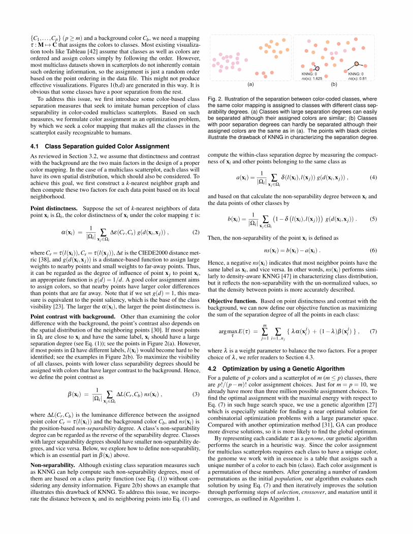
Point contrast with background. Other than examining the colordifference with the background, the point’s contrast also depends onthe spatial distribution of the neighboring points [30]. If most pointsin Ωi are close to xi and have the same label, xi should have a largeseparation degree (see Eq. (1)); see the points in Figure 2(a). However,if most points in Ω have different labels, l(xi) would become hard to beidentified; see the examples in Figure 2(b). To maximize the visibilityof all classes, points with lower class separability degrees should beassigned with colors that have larger contrast to the background. Hence,we define the point contrast as
β (xi) =1|Ωi| ∑
x j∈Ωi
∆L(Cr,Cb) ns(xi) , (3)
where ∆L(Cr,Cb) is the luminance difference between the assignedpoint color Cr = τ(l(xi)) and the background color Cb, and ns(xi) isthe position-based non-separability degree. A class’s non-separabilitydegree can be regarded as the reverse of the separability degree. Classeswith larger separability degrees should have smaller non-separability de-grees, and vice versa. Below, we explore how to define non-separability,which is an essential part in β (xi) above.
Non-separability. Although existing class separation measures suchas KNNG can help compute such non-separability degrees, most ofthem are based on a class purity function (see Eq. (1)) without con-sidering any density information. Figure 2(b) shows an example thatillustrates this drawback of KNNG. To address this issue, we incorpo-rate the distance between xi and its neighboring points into Eq. (1) and
KNNG: 0ns(xi): 1.625
KNNG: 0ns(xi): 0.81
(b)(a)
Fig. 2. Illustration of the separation between color-coded classes, wherethe same color mapping is assigned to classes with different class sep-arability degrees. (a) Classes with large separation degrees can easilybe separated although their assigned colors are similar; (b) Classeswith poor separation degrees can hardly be separated although theirassigned colors are the same as in (a). The points with black circlesillustrate the drawback of KNNG in characterizing the separation degree.
compute the within-class separation degree by measuring the compact-ness of xi and other points belonging to the same class as
a(xi) =1|Ωi| ∑
x j∈Ωi
δ (l(xi), l(x j)) g(d(xi,x j)) , (4)
and based on that calculate the non-separability degree between xi andthe data points of other classes by
b(xi) =1|Ωi| ∑
x j∈Ωi
(1−δ
(l(xi), l(x j)
))g(d(xi,x j)) . (5)
Then, the non-separability of the point xi is defined as
ns(xi) = b(xi)−a(xi) . (6)
Hence, a negative ns(xi) indicates that most neighbor points have thesame label as xi, and vice versa. In other words, ns(xi) performs simi-larly to density-aware KNNG [47] in characterizing class distribution,but it reflects the non-separability with the un-normalized values, sothat the density between points is more accurately described.
Objective function. Based on point distinctness and contrast with thebackground, we can now define our objective function as maximizingthe sum of the separation degree of all the points in each class:
argmaxτ
E(τ) =m
∑j=1
∑i=1..n j
λα(x ji ) + (1−λ )β (x j
i ) , (7)
where λ is a weight parameter to balance the two factors. For a properchoice of λ , we refer readers to Section 4.3.
4.2 Optimization by using a Genetic AlgorithmFor a palette of p colors and a scatterplot of m (m≤ p) classes, thereare p!/(p−m)! color assignment choices. Just for m = p = 10, wealready have more than three million possible assignment choices. Tofind the optimal assignment with the maximal energy with respect toEq. (7) in such huge search space, we use a genetic algorithm [27]which is especially suitable for finding a near optimal solution forcombinatorial optimization problems with a large parameter space.Compared with another optimization method [31], GA can producemore diverse solutions, so it is more likely to find the global optimum.
By representing each candidate τ as a genome, our genetic algorithmperforms the search in a heuristic way. Since the color assignmentfor multiclass scatterplots requires each class to have a unique color,the genome we work with in essence is a table that assigns such aunique number of a color to each bin (class). Each color assignment isa permutation of these numbers. After generating a number of randompermutations as the initial population, our algorithm evaluates eachsolution by using Eq. (7) and then iteratively improves the solutionthrough performing steps of selection, crossover, and mutation until itconverges, as outlined in Algorithm 1.

Algorithm 1 Genetic Algorithm for optimizing color assignment
Input: An initial population P = τ1, ...,τs, each τi being acolor assignment solution
Output: The fittest individual τ ′s1: repeat2: Perform selection on P3: Perform crossover on P4: Perform mutation on P5: until the fitness of the fittest individual cannot be improved
or reaching the maximum iteration6: return τ ′s
1
6
3
5
4
7
2
8
6
7
8
1
6
3
5
4
7
2
8
3
4
6
7
8
5
2
1
Parents
1
3
6
7
8
5
2
4
6
7
3
5
4
8
2
1
Children
(a) (b)
1
4
6
7
8
(c) (d)
5
2
3
iτ
iτ
τj
τj
iτ τj
process
process...
3
5
4
S T
Fig. 3. Illustration of the crossover process: (a) Two genomes τi andτ j with segments (boxed in black) are to be exchanged. (b) To replacesegment 3,5,4 in genome i by 6,7,8 from genome j, we first removeany 6,7,8 color number from i, and then (c) assign 3,5,4 randomly to thelocations where we have removed 6,7,8. (d) After that, we put 6,7,8into the genome i in the child population.
Selection. The idea here is to select individuals with high fitness scoresfrom the existing population and use them to breed a new generation.To balance between “exploitation” and “exploration,” many differentselection methods have been developed [2]. Here, we use the methodof a roulette wheel selection, which each time randomly selects anindividual with a sufficiently high fitness score.
Crossover. This is a significant step in our genetic algorithm. Witha certain probability, we combine two individuals to produce newoffsprings. We perform the crossover by using a two-point crossovermethod, which selects a point on the genome and then exchanges bconsecutive genes between the two genomes. However, when doing so,we have to ensure that the color permutation in each genome is onlyshuffled and any color number still appears only once.
Suppose we have genomes τi and τ j , each with a segment of b bins,say S = s1, . . . ,sb in τi and T = t1, . . . , tb in τ j , to be exchanged inthe crossover. We take the following steps to perform the operation:without loss of generality, we describe the steps to process τi, since τ jcan be processed in the same way (see the illustration in Figure 3): (i)find the bins with colors (short for color numbers) in τi that contain acolor in T and randomly replace them with colors in S, and (ii) thenreplace the colors of S with the colors of T .
Mutation. To increase the diversity within a population and toavoid being trapped in local optima, GA performs mutations on somerandomly-selected genomes from time to time. When an individual isselected for a mutation, the genes at two randomly selected positionsare simply swapped.
GA parameters. For a quick convergence, it is important to appro-priately set the algorithm’s parameters: population size, crossover and
0
4.5
5.0
E(τ)
/ 10
³
5.5
6.0
50 100 150Num. of iterations
200 250 300
Fig. 4. Value of the objective function E(τ) (Eq. (7)) versus the number ofiterations during the genetic optimization. The process converges after300 iterations.
(a) initialization (b) 4th iteration
(c) 110th iteration (d) finalFig. 5. Exploring the convergence of our genetic algorithm: (a) resultafter the random initialization; (b) result after 4 iterations; (c) result after110 iterations; and (d) final result after 280 iterations.
(a) λ=0
(d) λ=1
(b) λ=0.1
(c) λ=0.3Fig. 6. Exploring the influence of λ on the selected color assignment: (a)result generated by only considering the color contrast with background;(b) result generated with λ set to 0.1; (c) result generated with λ set to0.3; and (d) result generated by considering only the point distinctness.
mutation rate. There are, however, no general guidelines for setting upthese parameters for different situations. Following the empirical sug-gestions of Jong et al. [10], we set the population size to 50, crossoverrate to 0.6 and mutation rate to 0.01. These values are assumed to bethe best for most GA applications.
Figure 4 shows the convergence curve. Our method converges to areasonable solution, but then jumps through a number of smaller andbigger steps towards the final value. This is a reasonable behavior, sincemutations help us not to stuck in a local optimum. Figure 5 confirmsthis by showing intermediate results of the optimization for a multiclassscatterplot, the result of the 110th iteration already shows a clearlyvisible class separation.
0
5
10
15
20
scen
eJa
vier
Stat
logtse
300
Num
. of k
(a)
(b)
(c)
balan
cedig
its5_
8int
erlea
v-1
inter
leav-
2pr
oces
sed
world
_9d
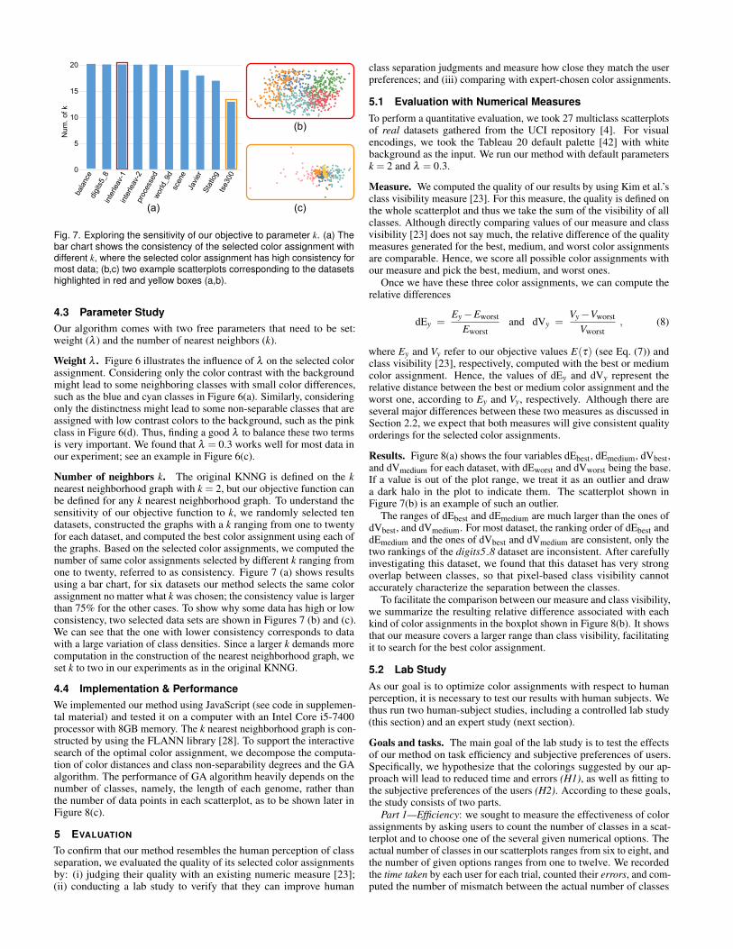
Fig. 7. Exploring the sensitivity of our objective to parameter k. (a) Thebar chart shows the consistency of the selected color assignment withdifferent k, where the selected color assignment has high consistency formost data; (b,c) two example scatterplots corresponding to the datasetshighlighted in red and yellow boxes (a,b).
4.3 Parameter StudyOur algorithm comes with two free parameters that need to be set:weight (λ ) and the number of nearest neighbors (k).
Weight λ . Figure 6 illustrates the influence of λ on the selected colorassignment. Considering only the color contrast with the backgroundmight lead to some neighboring classes with small color differences,such as the blue and cyan classes in Figure 6(a). Similarly, consideringonly the distinctness might lead to some non-separable classes that areassigned with low contrast colors to the background, such as the pinkclass in Figure 6(d). Thus, finding a good λ to balance these two termsis very important. We found that λ = 0.3 works well for most data inour experiment; see an example in Figure 6(c).
Number of neighbors k. The original KNNG is defined on the knearest neighborhood graph with k = 2, but our objective function canbe defined for any k nearest neighborhood graph. To understand thesensitivity of our objective function to k, we randomly selected tendatasets, constructed the graphs with a k ranging from one to twentyfor each dataset, and computed the best color assignment using each ofthe graphs. Based on the selected color assignments, we computed thenumber of same color assignments selected by different k ranging fromone to twenty, referred to as consistency. Figure 7 (a) shows resultsusing a bar chart, for six datasets our method selects the same colorassignment no matter what k was chosen; the consistency value is largerthan 75% for the other cases. To show why some data has high or lowconsistency, two selected data sets are shown in Figures 7 (b) and (c).We can see that the one with lower consistency corresponds to datawith a large variation of class densities. Since a larger k demands morecomputation in the construction of the nearest neighborhood graph, weset k to two in our experiments as in the original KNNG.
4.4 Implementation & PerformanceWe implemented our method using JavaScript (see code in supplemen-tal material) and tested it on a computer with an Intel Core i5-7400processor with 8GB memory. The k nearest neighborhood graph is con-structed by using the FLANN library [28]. To support the interactivesearch of the optimal color assignment, we decompose the computa-tion of color distances and class non-separability degrees and the GAalgorithm. The performance of GA algorithm heavily depends on thenumber of classes, namely, the length of each genome, rather thanthe number of data points in each scatterplot, as to be shown later inFigure 8(c).
5 EVALUATION
To confirm that our method resembles the human perception of classseparation, we evaluated the quality of its selected color assignmentsby: (i) judging their quality with an existing numeric measure [23];(ii) conducting a lab study to verify that they can improve human
class separation judgments and measure how close they match the userpreferences; and (iii) comparing with expert-chosen color assignments.
5.1 Evaluation with Numerical MeasuresTo perform a quantitative evaluation, we took 27 multiclass scatterplotsof real datasets gathered from the UCI repository [4]. For visualencodings, we took the Tableau 20 default palette [42] with whitebackground as the input. We run our method with default parametersk = 2 and λ = 0.3.
Measure. We computed the quality of our results by using Kim et al.’sclass visibility measure [23]. For this measure, the quality is defined onthe whole scatterplot and thus we take the sum of the visibility of allclasses. Although directly comparing values of our measure and classvisibility [23] does not say much, the relative difference of the qualitymeasures generated for the best, medium, and worst color assignmentsare comparable. Hence, we score all possible color assignments withour measure and pick the best, medium, and worst ones.
Once we have these three color assignments, we can compute therelative differences
dEy =Ey−Eworst
Eworstand dVy =
Vy−Vworst
Vworst, (8)
where Ey and Vy refer to our objective values E(τ) (see Eq. (7)) andclass visibility [23], respectively, computed with the best or mediumcolor assignment. Hence, the values of dEy and dVy represent therelative distance between the best or medium color assignment and theworst one, according to Ey and Vy, respectively. Although there areseveral major differences between these two measures as discussed inSection 2.2, we expect that both measures will give consistent qualityorderings for the selected color assignments.
Results. Figure 8(a) shows the four variables dEbest, dEmedium, dVbest,and dVmedium for each dataset, with dEworst and dVworst being the base.If a value is out of the plot range, we treat it as an outlier and drawa dark halo in the plot to indicate them. The scatterplot shown inFigure 7(b) is an example of such an outlier.
The ranges of dEbest and dEmedium are much larger than the ones ofdVbest, and dVmedium. For most dataset, the ranking order of dEbest anddEmedium and the ones of dVbest and dVmedium are consistent, only thetwo rankings of the digits5 8 dataset are inconsistent. After carefullyinvestigating this dataset, we found that this dataset has very strongoverlap between classes, so that pixel-based class visibility cannotaccurately characterize the separation between the classes.
To facilitate the comparison between our measure and class visibility,we summarize the resulting relative difference associated with eachkind of color assignments in the boxplot shown in Figure 8(b). It showsthat our measure covers a larger range than class visibility, facilitatingit to search for the best color assignment.
5.2 Lab StudyAs our goal is to optimize color assignments with respect to humanperception, it is necessary to test our results with human subjects. Wethus run two human-subject studies, including a controlled lab study(this section) and an expert study (next section).
Goals and tasks. The main goal of the lab study is to test the effectsof our method on task efficiency and subjective preferences of users.Specifically, we hypothesize that the colorings suggested by our ap-proach will lead to reduced time and errors (H1), as well as fitting tothe subjective preferences of the users (H2). According to these goals,the study consists of two parts.
Part 1—Efficiency: we sought to measure the effectiveness of colorassignments by asking users to count the number of classes in a scat-terplot and to choose one of the several given numerical options. Theactual number of classes in our scatterplots ranges from six to eight, andthe number of given options ranges from one to twelve. We recordedthe time taken by each user for each trial, counted their errors, and com-puted the number of mismatch between the actual number of classes

Rel
ativ
e D
ista
nce
0
0.5
1.0
1.5
2.0
2.5R
elat
ive
Dis
tanc
e
(a) (c)
(b)
bbdm
13ce
real
conn
ectio
n
derm
ato
digits
5_8
ecoli
pro
efash
ion
italia
nwine
sjav
ier
movem
entn1
00
proce
ssed
inerle
av-1
fishe
ries-2
fishe
ries-1
inerle
av-2
soyb
ean
tse30
0sc
ene
satim
age
statlo
g
world-2
world-1whit
e
balan
ce
bosto
n
inerle
av-3
3 4 5 6 7 8 9 10 11 12 13 14 15
0.4
1.2
2.0
2.8
Tim
e(se
c.)
Num. of Classes
dVbest dVmedium dVworst
dEbest dEmedium dEworst
dVbest dVmedium dEbest dEmedium
0
2.0
4.0
1.0
3.0
ClassVisibility
Ourmeasure
Fig. 8. (a) Comparison of our measure and class visibility using the values of dEbest, dEmedium, dVbest, and dVmedium for each dataset; (b) boxplotssummarizing the values of the four variables in (a); and (c) scatterplot with a red trend line, showing the relationship between computation time andthe number of classes.
(a) (b) (c)
(d) (e) (f)
Fig. 9. Illustrating the generation of our test datasets used in part 1of the user study. (a) The scatterplot with six classes is taken as thebase for the creation of the other datasets; (b)-(e) two seven-class andtwo eight-class scatterplots created by a few randomly-selected pointshighlighted by lassos from the base (a) as the new classes; and (f) thebackground color of the scatterplot shown in (e) is changed to black.
and their choice (dependent variables). Figure 9 shows several exam-ples of the scatterplots we used in this task. Each scatterplot stimulushas a different E(τ) score from our method (independent variable). Weexpect the participants to spend less time and produce fewer errors on“good” scatterplots (with large E(τ)).
Part 2—Subjective preference: in the second part, we offered userstwo scatterplots per trial, where one score is larger than the other.Participants were then asked to choose the plot they “perceptually”preferred. We expect that most people would choose the picture withthe higher E(τ) (independent variable), and that there would be only afew neutral selections; see Figure 10 for an example pair.
Pilot studies. We conducted a pilot study involving five students fromour university to quickly iterate on our study design. In this study, we
(a) (b)
Fig. 10. An example picture for part 2 of the lab study. Users were askedto choose the scatterplot they would “perceptually” preferred from (a)and (b), whose E(τ) are 2873 and 1021, respectively.
randomly selected five scatterplots used in Section 5.1, each scatterplotwas colorized with the best, medium, and worst color assignments.Since there are three kinds of combinations for each scatterplot, i.e.,“best” vs. “medium”, “medium” vs. “worst”, and “best” vs. “worst”, wethus have 5(scatterplots)×3(combinations) = 15 pairs for the studyin part 2. We showed the 15 scatterplots in random order to eachparticipant to perform part 1 of the pilot studies and then showed the15 scatterplot pairs in random order to perform part 2. In part 1, wefound the errors to be close to zero for almost all scatterplots, while theresult in part 2 showed some randomness. We performed a follow-upinterview with each participant and asked them why they were able toquickly and accurately count the number of classes in part 1 and whythey made a random choice for some scatterplots in part 2.
The answers hinted at two factors that influence the results in part1: strong learning effect and large point sizes. The learning effect wascaused by the five selected scatterplots with different distributions, sothat participants could easily remember the number of classes. Thelarge point size, on the other hand, reduced the task difficulty, evenfor the scatterplots with the worst color assignments. Such findingssuggested us to synthesize scatterplots with similar distributions andto assign a proper point size. Regarding part 2, we found that theparticipants randomly chose one plot, if they found the two plots to besimilar. Accordingly, we added the third option “No preference” in ourstudy interface.
Datasets. To reduce the learning effect as found in the pilot studies, weused different datasets in the two parts of our lab study. Hence, we firstcreate a synthetic scatterplot with six classes. Each class followed a

(b) Part 1: Time (seconds)80 90 100 110 120 1301 2 3 4 5 6
(a) Part 1: Error
Worst
Best
Medium Medium vs. Worst
0% 20% 40% 60% 80%
consistentneutralinconsistent
(c) Part 2: Consistency
Worst
Best
Medium
Best vs. Medium
Best vs. Worst
Fig. 11. Results of the lab studies. For part 1, we show mean values and deviation as 95% CIs of (a) user error, (b) time (lower values are better).For part 2, we display the consistency between people’s choice and the rating of our method (c). If the user chose the better scatterplot of a pair, thechoice was marked with “consistent,” otherwise “inconsistent.” If they choose “No preference,” the result was “neutral.”
Gaussian distribution with strong overlaps between some of the classes;see Figure 9(a). Taking this dataset as the base, we created the otherfour datasets (2x7 classes and 2x8 classes) by randomly selecting somepoints to form new classes. For example, the dataset with 7 classesshown in Figure 9(b) was created by randomly selecting some pointsfrom the orange and green classes and regarding them as a new class.Such points selected from the base were highlighted by a lasso in eachset, as shown in Figures 9 (b) to (e). Doing so, we generated fivesynthetic scatterplots (1x6 classes, 2x7 classes, and 2x8 classes), whereall the datasets consistently have 230 data points.
For our color palette, we chose the “Tableau 10” palette from theTableau software system [42]. Each sample was displayed twice overa white and a black background; see Figure 9(f). Each picture wascolored with three types of color assignments: large E(τ), medianE(τ), and small E(τ); see Figures 9 (a) to (e). The total number oftrials was 5(scatterplots)×2(backgrounds)×3(cases) = 30. All thepictures were scaled to 1048 × 1048px, with a point size of 2px. Weintentionally zoomed the scatterplots to half of their original size asour task was to count the number of classes, where a point size of 2pxseemed to be a good tradeoff between readability and complexity. Foreach sample, six trials were performed, we alleviated the learning effectby rotating each scatterplot by an angle of t ∗30 with randomized t.
In part 2 of the lab study, we randomly selected five different scat-terplot samples from the ones used in the numerical evaluation; seeSection 5.1. In addition, we used three different color palettes, “Tableau20” and two from ColorBrewer. Again, each dataset was displayedover a white and a black background. In part 2, the scatterplots wereshown in pairs. Hence, the total number of trials was 5(scatterplots)×3(color palettes)×2(backgrounds)×3(combinations) = 90. All theimages were shown in their original resolution of 1235× 666.6px, witha point size of 4px, since preference tasks (part 2) should be insensitiveto the point size.
Participants. We recruited 20 participants (13 males and 7 females).All were from the local university with a major in Computer Science.Their ages range from 21 to 31 (median 23). All participants passedour color deficiency test, had a normal or corrected-to-normal vision,and were used to using computing devices.
Device. The study was run on a quad-core PC with a 27” LCDwidescreen with a mouse and a keyboard as the input and a 3840×2160pixel display as the output. The monitor was calibrated using testimages for a faithful color reproduction. All participants were seated ataround 60cm from the display in a constantly illuminated room.
Procedure. We applied the following procedure in the lab study:(i) explaining the tasks by the researcher, followed by training; (ii)performing part 1 of the study; (iii) a ten-minute break; (iv) performingpart 2 of the study; and (v) a short interview about part 2. In theinterview, we were particularly interested in inconsistent choices madeby the participants, so we asked them why they did not choose the goodones assumed by our method and what are the factors that influencetheir choices. Overall, the participants need five minutes on average tofinish part 1 (min: 3 minutes and max: 12 minutes), and 13 minutes on
average to finish part 2 (min: 8 minutes and max: 20 minutes).
Results. We used an estimation-based approach with effect sizes andconfidence intervals [9]. Part 1 results are summarized in Figures 11(a)-(b). The results were consistent with our hypotheses. The error wastaken as the total number of errors made by a participant in this task.The result shows that the participants tend to make fewer mistakes incounting classes when E(τ) is high, in other words, when we optimizedthe color assignment. In terms of time, the results are less clear butstill show a tendency that our color assignment method makes it moreefficient for people to distinguish between classes. We assume thereason for the less apparent result is that the used color palettes arealready quite good, so that even the worst color assignment helps theparticipant quickly finish the task.
Part 2 results are summarized in Figure 11(c). We measured theconsistency of the participant’s choices to our ratings in percentage.When a participant chose the better color assignment from the twopictures (e.g., if the participant chose the “good” picture from a “bestvs. medium” pair), this trial was marked as “consistent;” otherwise as“inconsistent.” A value of “neutral” represented the percentage of op-tions with “no preference.” Figure 11 (c) shows that most participants’choices are consistent with our method’s ratings. This indicates thatour method aligns well with human perception.
Furthermore, we looked at the results from the interviews to un-derstand why the participants made inconsistent choices. Five of theparticipants mentioned that when they saw two similar pictures, theychose the one that is visually more pleasant. For example, one par-ticipant said that he did not like pictures that looked “half dark andhalf bright,” which he thought was “unbalanced.” The other four par-ticipants all mentioned that they did not like pictures in which “someneighboring classes have incompatible colors, for example, red andgreen.” This is reasonable because our algorithm does not take colorharmony into account, which will be part of our future work.
We summarize our lab study results as follows:
• our selected color assignments make the classes separation easyto be perceived;
• there are no significant benefits of our selected color assignmentsin terms of time; and
• our selected color assignments are typically preferred by users.
5.3 Expert StudiesTo compare the performance of our method with expert-chosen colorassignments, we invited two experts (1 male and 1 female) who havemore than 20 years of experience in color design. In this study, we askedthe experts to create their favorable color assignments for multiclassscatterplots, and then examined how close their results were to theresults generated by our method.
Study design. We used the two multiclass scatterplots and the colorpalettes shown in Figure 1 in this study. To help the experts judgethe class separabilities, we show the points of different classes indifferent gray levels. We also plot a convex hull of each class as aguidance for them to observe the class separability, once the expert

(a) (b)
(c) (d)
(e) (f)
class 1
class 3class 2
class 4class 5class 6
class 1
class 3class 2
class 4class 5class 6class 7class 8
Fig. 12. The inputs and results of two expert studies. (a,b) The grey-scalescatterplots used as the input; (c,d) results generated by one expert; (e,f)results generated by the other expert.
clicks on the corresponding class name; see Figures 12(a) & (b). Afterselecting a color from the palette, the expert can assign the selectedcolor to the class by brushing the corresponding points. We informedthe experts that a good color assignment would foster the separationbetween classes and that they were allowed to iteratively improve theassignment until they were satisfied with the results.
Results. The two experts spent about five minutes on each scatterplotand generated the results shown in Figures 12 (c) to (f), where allthe classes look well-separated like those generated by our method;see Figures 1 (c) and (f). To quantitatively compare the results, wecomputed the scores of the expert results according to Eq. (7) and deter-mined how this would rank among all the possible 40320 and 720 colorassignment permutations for the eight and six classes, respectively;note that 40320 = 8! and 720 = 6!. The results shown in Figures 12(c) and (d) are ranked 756th (top 1.8%) among the 40320 assignmentsand 19th among the 720 assignments (top 2.6%), respectively, whilethe ones shown in Figures 12(e) and (f) are ranked 4053rd (top 10.1%)and 96th (top 13.3%), respectively. These scores show that both resultsmade by the experts closely match with our measure. In particular,the results produced by the first expert are ranked within the top 3%.In summary, we believe that our method resembles and optimizes forhuman perception of class separation.
6 INTERACTIVE COLOR ASSIGNMENT SYSTEM
To further assist the users in selecting appropriate colors, we develop aninteractive color assignment system that allows the users to interactivelyfind desired color assignments for multiclass scatterplots. It runs in aweb-based environment, which is available as an online tool1. Afterthe user uploads a multiclass scatterplot, our system can automaticallysuggest color assignments by using the default color palette. The usersmay also select or design their desired color palettes. Besides thesebasic interactions, we provide three extensions to facilitate the user tointuitively find the desired color assignments.
Top K suggestions. Our basic GA optimization algorithm only reportsthe single optimal color assignment to the user. In many cases, however,users would like to have more diverse choices. To address this issue, weextend the GA algorithm by choosing the top K unique assignments ateach iteration besides recording the best fit. In our system, the defaultK is six; see the project web page for results.
1http://www.color-assignment.net/
(a) (b)
(c) (d)
Fig. 13. Two extensions of our approach. (a) a scatterplot where twoclasses are assigned pink and green indicated by the color of lasso; (b)the result generated by our method; (c) scatterplot with three classesof interest selected; and (d) result generated by our method, where theseparation between the two selected classes is maximized.
Pre-assignment of colors. In some cases, users want to assign specificcolors to certain classes due to their domain knowledge. Our GAalgorithm can easily support this extended function by fixing the pre-assigned colors on the corresponding genes. An example is shown inFigures 13 (a) to (b), where the user chooses the pink and purple classes,re-assigns them with red and green colors, respectively, and then letsthe system re-generate the color assignment for the other classes.
Classes of interest. Lastly, users may want to make certain classesmore distinguishable, especially for classes that are particularly interest-ing to the users. By applying the GA algorithm first to these classes, ourmethod finds colors with maximal separation for these classes. Afterfinding colors for these classes, our method searches for the colors ofthe other classes from the rest of the colors in the palette. In Figures 13(c) and (d), the user would like to enhance the separability of threeclasses on the right bottom of the screen, so these three classes are firstoptimized with maximized color differences. Then the system assignsthe remaining colors in the palette to the other classes.
7 CONCLUSION
We present a method for the color assignment of multiclass scatter-plots that takes into account the spatial relationship, density, degree ofoverlap between point clusters, as well as the background color. Theseaspects are combined to a new perceptual metric, which is used by anoptimization method based on a genetic algorithm to create good colorassignments automatically. We evaluated the approach numerically, per-formed a controlled user study as well as two expert studies. The studiesdemonstrate that our approach creates good correspondences betweenoptimization results and human preferences for color assignment.
There are various other analytical tasks in multiclass scatterplots [33],such as relative mean value judgments, correlation patterns, and outlierdetection. While our current evaluation only investigates the perceptionof class separability, in the future, we would like to conduct a more thor-ough evaluation to assess the effectiveness of the color assignments alsowith respect to these other tasks. Furthermore, we plan to incorporatepoint sizes of scatterplot dots to point distinctness, whose influence onthe color difference has been verified by Szafir et al. [41]. Finally, wewant to study color assignments for people with color vision deficiencywhere the color palette and color assignment might both need to beadapted.
ACKNOWLEDGMENTS
This work is supported by the grants of NSFC (61772315), ScienceChallenge Project (TZ2016002), Shandong Provincial Natural ScienceFoundation (ZR2016FM12), Leading Talents of Guangdong Program(00201509) and Fundamental Research Funds of Shandong University.
REFERENCES
[1] M. Aupetit and M. Sedlmair. SepMe: 2002 new visual separation measures.In IEEE Pacific Visualization Symposium, pp. 1–8, 2016. doi: 10.1109/pacificvis.2016.7465244
[2] J. E. Baker. Adaptive selection methods for genetic algorithms. In Proc.of the 1st International Conference on Genetic Algorithms, pp. 101–111.L. Erlbaum Associates Inc., 1985.
[3] L. D. Bergman, B. E. Rogowitz, and L. A. Treinish. A rule-based tool forassisting colormap selection. In Proc. IEEE Conf. on Visualization, pp.118–125, 1995. doi: 10.1109/visual.1995.480803
[4] C. Blake and C. J. Merz. UCI repository of machine learning databases.https://archive.ics.uci.edu/ml/datasets.html, 1998.
[5] M. Brehmer, M. Sedlmair, S. Ingram, and T. Munzner. Visualizingdimensionally-reduced data: Interviews with analysts and a character-ization of task sequences. In Proc. of the Fifth Workshop on Beyond Timeand Errors: Novel Evaluation Methods for Visualization, pp. 1–8, 2014.doi: 10.1145/2669557.2669559
[6] Central Bureau of the CIE. Improvement to industrial colour-differenceevaluation. Publications of the CIE, 2001.
[7] J. Chuang, D. Weiskopf, and T. Moller. Energy aware color sets. ComputerGraphics Forum, 28(2):203–211, 2009. doi: 10.1111/j.1467-8659.2009.01359.x
[8] W. S. Cleveland. Visualizing Data. Hobart Press, 1993.[9] G. Cumming. Understanding the new statistics: Effect sizes, confidence
intervals, and meta-analysis. Routledge, 2013. doi: 10.1037/e588422013-001
[10] K. A. De Jong. Analysis of the behavior of a class of genetic adaptivesystems. PhD Thesis, University of Michigan Ann Arbor, 1975.
[11] J. C. Dunn. Well-separated clusters and optimal fuzzy partitions. Journalof cybernetics, 4(1):95–104, 1974. doi: 10.1080/01969727408546059
[12] H. Fang, S. Walton, E. Delahaye, J. Harris, D. Storchak, and M. Chen.Categorical colormap optimization with visualization case studies. IEEETrans. Vis. & Comp. Graphics, 23(1):871–880, 2017. doi: 10.1109/tvcg.2016.2599214
[13] M. S. Gazzaniga. The cognitive neurosciences. MIT press, 2004.[14] M. Gleicher, M. Correll, C. Nothelfer, and S. Franconeri. Perception
of average value in multiclass scatterplots. IEEE Trans. Vis. & Comp.Graphics, 19(12):2316–2325, 2013. doi: 10.1109/tvcg.2013.183
[15] C. C. Gramazio, D. H. Laidlaw, and K. B. Schloss. Colorgorical: Creatingdiscriminable and preferable color palettes for information visualization.IEEE Trans. Vis. & Comp. Graphics, 23(1):521–530, 2017. doi: 10.1109/tvcg.2016.2598918
[16] M. Harrower and C. A. Brewer. ColorBrewer.org: an online tool forselecting colour schemes for maps. The Cartographic Journal, 40(1):27–37, 2003. doi: 10.4324/9781351191234-18
[17] C. G. Healey. Choosing effective colours for data visualization. In Proc.IEEE Conf. on Visualization, pp. 263–270, 1996. doi: 10.1109/visual.1996.568118
[18] T. K. Ho and M. Basu. Complexity measures of supervised classificationproblems. IEEE Trans. Pat. Ana. & Mach. Int., 24(3):289–300, 2002. doi:10.1109/34.990132
[19] C. Hurter, M. Serrurier, R. Alonso, G. Tabart, and J.-L. Vinot. An auto-matic generation of schematic maps to display flight routes for air traf-fic controllers: structure and color optimization. In Proc. Int. Conf. onadvanced visual interfaces, pp. 233–240, 2010. doi: 10.1145/1842993.1843034
[20] D. Jameson and L. M. Hurvich. Theory of brightness and color contrast inhuman vision. Vision Research, 4(1-2):135–154, 1964. doi: 10.1016/0042-6989(64)90037-9
[21] H.-R. Kim, M.-J. Yoo, H. Kang, and I.-K. Lee. Perceptually-based colorassignment. Computer Graphics Forum, 33(7):309–318, 2014. doi: 10.1111/cgf.12499
[22] J. A. Lee and M. Verleysen. Nonlinear dimensionality reduction. SpringerScience & Business Media, 2007. doi: 10.1007/978-0-387-39351-3
[23] S. Lee, M. Sips, and H.-P. Seidel. Perceptually driven visibility optimiza-tion for categorical data visualization. IEEE Trans. Vis. & Comp. Graphics,19(10):1746–1757, 2013. doi: 10.1109/tvcg.2012.315
[24] S. Lin, J. Fortuna, C. Kulkarni, M. Stone, and J. Heer. Selectingsemantically-resonant colors for data visualization. Computer Graph-ics Forum, 32(3pt4):401–410, 2013. doi: 10.1111/cgf.12127
[25] R. Margolin, A. Tal, and L. Zelnik-Manor. What makes a patch distinct?In Proc. IEEE Conf. on Comp. Vis. and Pat. Rec., pp. 1139–1146, 2013.
doi: 10.1109/cvpr.2013.151[26] B. A. Maxwell. Visualizing geographic classifications using color. The
Cartographic Journal, 37(2):93–99, 2000. doi: 10.1179/caj.2000.37.2.93[27] M. Mitchell. An Introduction to Genetic Algorithms. MIT press, 1998.[28] M. Muja and D. G. Lowe. FLANN, fast library for approximate nearest
neighbors. In Proc. Int. Conf. on Computer Vision Theory and Applications,2009.
[29] T. Munzner. Visualization analysis and design. CRC press, 2014.[30] F. Perazzi, P. Krahenbuhl, Y. Pritch, and A. Hornung. Saliency filters:
Contrast based filtering for salient region detection. In Proc. IEEE Conf.on Comp. Vis. and Pat. Rec., pp. 733–740, 2012. doi: 10.1109/cvpr.2012.6247743
[31] D. Pham and D. Karaboga. Intelligent optimisation techniques: genetic al-gorithms, tabu search, simulated annealing and neural networks. SpringerScience & Business Media, 2012.
[32] P. J. Rousseeuw. Silhouettes: a graphical aid to the interpretation andvalidation of cluster analysis. Journal of Computational and AppliedMathematics, 20:53–65, 1987. doi: 10.1016/0377-0427(87)
[33] A. Sarikaya and M. Gleicher. Scatterplots: Tasks, data, and designs. IEEETrans. Vis. & Comp. Graphics, 24(1):402–412, 2018. doi: 10.1109/tvcg.2017.2744184
[34] M. Sedlmair and M. Aupetit. Data-driven evaluation of visual qualitymeasures. Computer Graphics Forum, 34(3):201–210, 2015. doi: 10.1111/cgf.12632
[35] M. Sedlmair, T. Munzner, and M. Tory. Empirical guidance on scatterplotand dimension reduction technique choices. IEEE Trans. Vis. & Comp.Graphics, 19(12):2634–2643, 2013. doi: 10.1109/tvcg.2013.153
[36] M. Sedlmair, A. Tatu, T. Munzner, and M. Tory. A taxonomy of visualcluster separation factors. Computer Graphics Forum, 31(3pt4):1335–1344, 2012. doi: 10.1111/j.1467-8659.2012.03125.x
[37] V. Setlur and M. C. Stone. A linguistic approach to categorical colorassignment for data visualization. IEEE Trans. Vis. & Comp. Graphics,22(1):698–707, 2016. doi: 10.1109/tvcg.2015.2467471
[38] G. Sharma, W. Wu, and E. N. Dalal. The ciede2000 color-differenceformula: Implementation notes, supplementary test data, and mathematicalobservations. Color Research & Application, 30(1):21–30, 2005. doi: 10.1002/col.20070
[39] S. Silva, B. S. Santos, and J. Madeira. Using color in visualization: Asurvey. Computers & Graphics, 35(2):320–333, 2011. doi: 10.1016/j.cag.2010.11.015
[40] M. Sips, B. Neubert, J. P. Lewis, and P. Hanrahan. Selecting good viewsof high-dimensional data using class consistency. Computer GraphicsForum, 28(3):831–838, 2009. doi: 10.1111/j.1467-8659.2009.01467.x
[41] D. A. Szafir. Modeling color difference for visualization design. IEEETrans. Vis. & Comp. Graphics, 24(1):392–401, 2018. doi: 10.1109/tvcg.2017.2744359
[42] Tableau Software. The tableau visualization system. http://www.tableausoftware.com/.
[43] A. Tatu, G. Albuquerque, M. Eisemann, J. Schneidewind, H. Theisel,M. Magnork, and D. Keim. Combining automated analysis and visual-ization techniques for effective exploration of high-dimensional data. InProc. IEEE Symposium on Visual Analytics Science and Technology, pp.59–66, 2009. doi: 10.1109/vast.2009.5332628
[44] C. Tominski, G. Fuchs, and H. Schumann. Task-driven color coding. InProc. Int. Conf. on Information Visualisation, pp. 373–380, 2008. doi: 10.1109/iv.2008.24
[45] B. E. Trumbo. A theory for coloring bivariate statistical maps. TheAmerican Statistician, 35(4):220–226, 1981. doi: 10.2307/2683294
[46] L. Wang, J. Giesen, K. T. McDonnell, P. Zolliker, and K. Mueller. Colordesign for illustrative visualization. IEEE Trans. Vis. & Comp. Graphics,14(6):1739–1754, 2008. doi: 10.1109/tvcg.2008.118
[47] Y. Wang, K. Feng, X. Chu, J. Zhang, C.-W. Fu, M. Sedlmair, X. Yu,and B. Chen. A perception-driven approach to supervised dimension-ality reduction for visualization. IEEE Trans. Vis. & Comp. Graphics,24(5):1828–1840, 2018. doi: 10.1109/tvcg.2017.2701829
[48] C. Ware. Information visualization: perception for design. Elsevier, 2012.[49] A. Zeileis, K. Hornik, and P. Murrell. Escaping RGBland: selecting
colors for statistical graphics. Computational Statistics & Data Analysis,53(9):3259–3270, 2009. doi: 10.1016/j.csda.2008.11.033
[50] L. Zhou and C. D. Hansen. A survey of colormaps in visualization. IEEETrans. Vis. & Comp. Graphics, 22(8):2051–2069, 2016. doi: 10.1109/tvcg.2015.2489649