Embed Size (px)
Citation preview

0 | P a g e
1 | P a g e
1 | P a g e
Table of Contents
List of Tables .............................................................................................................................. 3
List of Figures ............................................................................................................................. 5
2.0 Storm Emma & The Beast from the East ............................................................................. 9
2.1 Timeline ......................................................................................................................... 10
2.2 Timeline of Weather Warnings ..................................................................................... 12
2.3 Impacts of Storm Emma ................................................................................................ 13
2.3.1 Travel .......................................................................................................................... 13
2.3.2 Power and Water Outages ......................................................................................... 13
2.3.3 Disruption to Other Services ...................................................................................... 14
2.3.4 Farming ....................................................................................................................... 14
3.0 Background Literature: Protection Motivation Theory ..................................................... 15
4.0 Methodology ...................................................................................................................... 18
4.1 Data Collection .............................................................................................................. 18
4.2 Quantitative Data Analysis ............................................................................................ 18
4.3 Analysis of Qualitative Data .......................................................................................... 19
5.0 Weather Risk Perception ................................................................................................... 21
5.1 Risk by Gender ............................................................................................................... 24
5.2 Risk by Age .................................................................................................................... 24
5.3 Risk by Settlement (Urbanicity) ..................................................................................... 25
5.4 Risk by County ............................................................................................................... 26
5.5 Risk Rating ..................................................................................................................... 27
6.0 Profile of Respondents ....................................................................................................... 28
7.0 The Public Response to the Storm ..................................................................................... 32
7.1 Worry about the Storm ................................................................................................. 32
7.2 Household Preparedness .............................................................................................. 52
7.3 Actions should have been taken to prepare for the Storm .......................................... 70
7.4 Actions taken following the Storm ................................................................................ 78
7.5 Community Response ................................................................................................... 79

2 | P a g e
7.6 Weather Warnings ...................................................................................................... 112
7.6.1 Preparedness Action Linked to the Met Éireann Weather Warnings ...................... 127
7.7 Satisfaction with the National Response .................................................................... 131
8.0 Regression Analysis: Protection Motivation Theory ........................................................ 134
8.1 Theoretical Framework ............................................................................................... 134
8.2 Determinants of Worry Before the Storm (Stage One) .............................................. 135
8.3 Determinants of Preparedness Actions Before the Storm Arrived (Stage Two) ........ 140
8.4 Determinants of the Reflective Coping Appraisal (Stage Three) ................................ 142
8.5 Determinants of After-Actions (Stage Four) ............................................................... 145
9.0 Conclusion: Through a PMT Lens ..................................................................................... 149
References ............................................................................................................................. 153
Appendix One......................................................................................................................... 158

3 | P a g e
List of Tables Table 1: Average Perceived Risk By County .......................................................................................................... 26
Table 2: Gender of Respondents .......................................................................................................................... 28
Table 3: Respondents by County .......................................................................................................................... 28
Table 4: Household Income Levels ....................................................................................................................... 28
Table 5: Emergency Related Expertise ................................................................................................................. 29
Table 6: Live in a House ........................................................................................................................................ 29
Table 7: Owns the Home ...................................................................................................................................... 29
Table 8: Children and Adults in the Household .................................................................................................... 29
Table 9: Settlement Type (Urbanicity) .................................................................................................................. 30
Table 10: Working full-time .................................................................................................................................. 30
Table 11: Race (White) ......................................................................................................................................... 30
Table 12: Number of responses by question ........................................................................................................ 31
Table 13: Comments by Sentiment ...................................................................................................................... 31
Table 14: Causes of Decreased Worry .................................................................................................................. 33
Table 15: Causes of Increased Worry ................................................................................................................... 36
Table 16: Trajectory of Worry by County (During The Storm) .............................................................................. 42
Table 17: Representation of Gender in Factors that Decreased Worry ............................................................... 46
Table 18: Representation of Gender in Factors that Increased Worry ................................................................. 47
Table 19: Representation of Household Income in Factors that Decreased Worry ............................................. 48
Table 20: Factors that Increased Worry by Household Income ........................................................................... 49
Table 21: Causes of Decreased Worry by Sentiment ............................................................................................ 50
Table 22: Causes of Increased Worry by Sentiment ............................................................................................. 51
Table 23: Number of Actions Before The Storm ................................................................................................... 53
Table 24 Average Worry by Actions Before The Storm ........................................................................................ 53
Table 25: Average Actions Taken Before The Storm, by Settlement .................................................................... 54
Table 26: Average number of Actions Before The Storm by County .................................................................... 56
Table 27: Household Preparedness Items (Before The Storm) ............................................................................ 57
Table 28: Additional Actions to Prepare for The Storm ........................................................................................ 58
Table 29: Additional Preparedness Actions by Gender ........................................................................................ 64
Table 30: Additional Actions to Prepare by Income ............................................................................................. 65
Table 31: Additional Actions to Prepare for The Storm by Sentiment ................................................................. 67
Table 32: Household Preparedness - Percentage with Recommended Water, Food and Medication Supplies
When The Storm Arrived ........................................................................................................................... 67
Table 33: Stated Coping Appraisal by County ....................................................................................................... 69
Table 34: Actions Should Have Taken ................................................................................................................... 70
Table 35: Actions that should have been taken by Gender .................................................................................. 74
Table 36: Actions that should have been taken by Income .................................................................................. 75
Table 37: Actions not taken by Sentiment ............................................................................................................ 77
Table 38: After-Action by Settlement Type (Urbanicity) ...................................................................................... 78
Table 39: Average Community Support – Provided by Settlement location at the time of The Storm (Urbanicity)
................................................................................................................................................................... 82
Table 40: Average Community Support Received by Settlement location at the time of The Storm (Urbanicity)
................................................................................................................................................................... 82
Table 41: Community Support Provided by County ............................................................................................. 83
Table 42: Community Support Received by County ............................................................................................. 84
Table 43: Nature of Assistance Provided to Others .............................................................................................. 86
Table 44: Type of Assistance Provided to Others by Gender ............................................................................... 89

4 | P a g e
Table 45: Assistance Provided to Others by Income Level ................................................................................... 90
Table 46: Assistance Provided to Others by Sentiment ........................................................................................ 92
Table 47: Assistance Received .............................................................................................................................. 94
Table 48: Assistance Received by Gender ............................................................................................................ 97
Table 49: Assistance Received by Income Level ................................................................................................... 98
Table 50: Assistance Received by Sentiment ...................................................................................................... 100
Table 51: Community Support Provided ............................................................................................................ 102
Table 52: Community Support Activities by Group/Actor .................................................................................. 107
Table 53: Witnessed Community Support by Gender ........................................................................................ 108
Table 54: Witnessed Community Support by Income Level ............................................................................... 109
Table 55: Witnessed Community Support by Sentiment ................................................................................... 111
Table 56: Average Satisfaction Met Éireann weather warning system by county ............................................. 114
Table 57: Belief in Weather Warnings ................................................................................................................ 116
Table 58: Weather Warning Assessment by Gender .......................................................................................... 124
Table 59: Weather Warning Assessment by Income Level ................................................................................. 125
Table 60: The 3 Most Cited Negative Comments by County .............................................................................. 126
Table 61: The 3 Most Cited Positive Comments by County ................................................................................ 127
Table 62: Taking action on weather warning by settlement type (urbanicity) ................................................... 129
Table 63: Taking action on weather warning by County .................................................................................... 130
Table 64: Satisfaction with the national response to The Storm by Settlement Type (Urbanicity) ................... 131
Table 65: Satisfaction with the national response to The Storm by County ...................................................... 132
Table 66: Satisfaction with the national response to The Storm by Individual Coping Appraisal ...................... 133
Table 67: Satisfaction with the national response to The Storm by Change in Worry ....................................... 133
Table 68: Worry Before The Storm – Stage One................................................................................................. 137
Table 69: Actions Before The Storm – Stage Two ............................................................................................... 141
Table 70: Coping Appraisal – Stage Three .......................................................................................................... 144
Table 71: After-Actions ....................................................................................................................................... 147
5 | P a g e
List of Figures Figure 1: Schema of The Protection Motivation Theory (Rogers, 1975, p. 99) .................................................... 15
Figure 2: Model of Protection Motivation Theory (Reproduced from Floyd et al., 2000, p.410) ......................... 16
Figure 3: Risk Matrices for Weather-Related Events ............................................................................................ 22
Figure 4: Mean Likelihood Ratings........................................................................................................................ 23
Figure 5: Mean Impact Ratings ............................................................................................................................. 23
Figure 6: Mean Risk Ratings .................................................................................................................................. 23
Figure 7: Risk Rating Boxplot ................................................................................................................................ 24
Figure 8: Average Risk Rating by Gender .............................................................................................................. 24
Figure 9: Average Perceived Risk by Age-Group ................................................................................................... 25
Figure 10: Average Risk by Settlement/Urbanicity ............................................................................................... 25
Figure 11: Weather-Related Risk Matrix (Mode) .................................................................................................. 27
Figure 12: Level of Worry Before The Storm Arrived ........................................................................................... 32
Figure 13: Trajectory of Worry ............................................................................................................................. 32
Figure 14: Word Patterns in Not as Bad as Expected ........................................................................................... 34
Figure 15: Language use in the discourse on 'Stocking Up'. ................................................................................. 35
Figure 16: Word Patterns in Worry about Getting to Work ................................................................................. 38
Figure 17: Overlap in Causes of Increased Worry ................................................................................................. 39
Figure 18: Average Worry Before The Storm by Settlement ................................................................................ 41
Figure 19: Trajectory of Worry by Settlement type (Urbanicity) at time of The Storm ........................................ 41
Figure 20: Most Cited Causes of Reduced Worry by County ................................................................................ 43
Figure 21: Most Cited Causes of Increased Worry by County .............................................................................. 44
Figure 22: Levels of Worry by Gender .................................................................................................................. 45
Figure 23: Trajectory of Worry by Gender ............................................................................................................ 45
Figure 24: Explanation for Increased Worry by Gender ....................................................................................... 46
Figure 25: Preparedness Actions Before The Storm ............................................................................................. 52
Figure 26: Actions Before The Storm by Worry .................................................................................................... 53
Figure 27: Number of Actions by Gender ............................................................................................................. 54
Figure 28: Number of Actions by Settlement ....................................................................................................... 55
Figure 29: Word Frequencies for Stockpiling to Prepare for the Storm. .............................................................. 59
Figure 30: Patterns of Language used Regarding Stockpiling ............................................................................... 60
Figure 31: Word Frequencies used by those who did not Prepare for The Storm ............................................... 61
Figure 32: Recurring Keywords in Battening Down the Hatches .......................................................................... 62
Figure 33: Preparatory Actions by Gender ........................................................................................................... 63
Figure 34: Most Cited Additional Preparations for the Storm by County ............................................................. 66
Figure 35: Individual Coping Appraisal ................................................................................................................. 68
Figure 36: Most Cited Supplies Should have Stocked ........................................................................................... 72
Figure 37: Keywords Most Cited by Well-Prepared Respondents ........................................................................ 73
Figure 38: Actions that Should have been Taken by Gender ................................................................................ 74
Figure 39: Top Three Actions by County ............................................................................................................... 76
Figure 40: After-Action by Change in Worry......................................................................................................... 78
Figure 41: Community Support – Provided .......................................................................................................... 79
Figure 42: Community Support – Received .......................................................................................................... 79
Figure 43: Assistance received was useful ............................................................................................................ 80
Figure 44: Percentage Support Provided By Gender ............................................................................................ 80
Figure 45: Percentage Support Received By Gender ............................................................................................ 81
Figure 46: Types of Assistance Provided – pre-defined categories ...................................................................... 85
Figure 47: Frequency of keywords describing the Provision of Supplies.............................................................. 87
6 | P a g e
Figure 48: Assistance offered by Gender .............................................................................................................. 89
Figure 49: Assistance Provided by County ............................................................................................................ 91
Figure 50: Types of Assistance Received – pre-defined categories ...................................................................... 93
Figure 51: Type of Supplies Received ................................................................................................................... 96
Figure 52: Assistance Received by Gender ........................................................................................................... 97
Figure 53: Assistance Received by County ............................................................................................................ 99
Figure 54: Community Support to clear snow .................................................................................................... 101
Figure 55: Recurring keywords for Clearing Roads ............................................................................................. 103
Figure 56: Recurring Keywords in Acts of Community Support.......................................................................... 104
Figure 57: Recurring Keywords for Transport-Related Community Support ...................................................... 105
Figure 58: Witnessed Community Support by Gender ....................................................................................... 108
Figure 59: Witnessed Community Support by County ....................................................................................... 110
Figure 60: Satisfaction Met Éireann weather warning system ........................................................................... 112
Figure 61: Average Satisfaction Met Éireann weather warning system by settlement type (urbanicity) .......... 113
Figure 62: Weather Warnings by Sentiment ...................................................................................................... 115
Figure 63: Recurring words Warnings too Frequent .......................................................................................... 117
Figure 64: Patterns of Language use Preceding and Following “Warning” ........................................................ 119
Figure 65: Overlap between Negative Comment Codes .................................................................................... 120
Figure 66: Recurring Keywords Acceptable Standard of Weather Warnings ..................................................... 121
Figure 67: Key Words Describing Weather Warnings as Not too Frequent ....................................................... 122
Figure 68: Key Words Describing Clarity of Weather Warnings ......................................................................... 123
Figure 69: Weather Warning Assessment by Gender ......................................................................................... 123
Figure 70: Number of actions taken before The Storm by Weather Warning First Inducing Response............ 129
Figure 71: Satisfaction with the national response to The Storm ...................................................................... 131
Figure 72: Response Process (Mileti 1995) ......................................................................................................... 134
Figure 73: PMT based theoretical framework: the response process and after-action to the Storm, 2018 ...... 135
Figure 74: Stage One of the PMT based theoretical framework ........................................................................ 136
Figure 75: Stage Two of the PMT based theoretical framework ........................................................................ 140
Figure 76: Stage Three of the PMT based theoretical framework...................................................................... 143
Figure 77: Stage Four of the PMT based theoretical framework ....................................................................... 145
Figure 78: PMT based theoretical framework: the response process and after-action to the Storm 2018
(summary of four stages of regression results). ...................................................................................... 149
7 | P a g e
1.0 Introduction
Modern emergency management theory recognises that it is often the public, not the
emergency services, who will execute the first response during many national emergencies.
“Adequate household emergency preparedness could significantly reduce the negative
consequences from disasters and ensure that people can care for themselves and their
families during the first 72 hours following a disaster” (Levac et al. 2012 p.725).
This report presents a case study of Storm Emma and the cold spell which struck Ireland
between the 28th of February and the 4th of March 2018 from a Protection Motivation
Theory perspective. The report covers:
• Respondents perception of weather and climate-related risk perception before Storm
Emma;
• An assessment of the cause, level and pattern of worry – before and during Storm
Emma;
• Household preparedness actions before and post Storm Emma;
• Respondents reflections on their household preparedness and actions that should
have been taken to prepare;
• The extent to which respondents perceived they coped during Storm Emma;
• Evidence of community and individuals providing support and assistance;
• Respondents satisfaction with the Met Éireann weather warning system and the link
between preparedness action and the Met Éireann weather warnings
• Satisfaction with the national response to Storm Emma;
• Respondents’ socio-demographic characteristics, with an emphasis on gender,
settlement (urbanicity) and county;
• An assessment of whether elements of protection motivation theory, worry and post-
event coping appraisal, influenced household preparedness before and following
Storm Emma.
The outline of the report is as follows:
Section 2.0 Storm Emma & The Beast from the East: presents an overview of The Storm and
a timeline of the events.
Section 3.0 Background Literature: Protection Motivation Theory: provides an overview of
Protection Motivation Theory and its key elements.
Section 4.0 Methodology: details the methodological choices adopted in this case study,
including the quantitative and qualitative data analysis used.
Section 5.0 Weather Risk Perception: examines public perception of the impact, likelihood
and overall risk rating for weather-related events. The weather-related risks considered were

8 | P a g e
drawn from the National Risk Register (2017): Flooding, Snow, Low Temperatures, High
Temperatures, Storm, and Drought.
Section 6.0 Profile of Respondents: describes the sample of respondents in terms of their
socio-demographic characteristics.
Section 7.0 The Public Response to the Storm: presents the findings from the case study of
Storm Emma. Which includes:
• Worry about the Storm – cause, level and pattern of worry – before and during Storm
Emma;
• Household Preparedness – actions taken before The Storm and household
preparedness items present within the home;
• Actions which should have been taken to prepare for the Storm – respondents
reflections of other actions they should have taken with the benefit of hindsight;
• Actions taken following the Storm to protect themselves or home against future
severe weather events;
• Community Response - examines the role played by the community during and
immediately after The Storm;
• Weather Warnings – respondents’ opinions of the current Met Éireann weather
warning system and the alerts they received about The Storm;
• Satisfaction with the National Response to Storm Emma.
Section 8.0 Regression Analysis: Protection Motivation Theory: presents regression analysis
results that investigate whether elements of protection motivation theory influenced
household preparedness actions before and following The Storm.
Section 9.0 Conclusion: Through a PMT Lens – which includes a final PMT model based on
Storm Emma.

9 | P a g e
2.0 Storm Emma & The Beast from the East
Storm Emma was a severe weather event during the winter of 2018, causing record low
temperatures, life-threatening blizzard conditions, massive countrywide disruption and the
issuance of a nationwide red level alert and curfew (Met Éireann, 2019; NDFEM, 2019). This
weather event resulted from the convergence of two discrete systems Storm Emma and the
so-called Beast from the East (henceforth referred to as The Storm) over Ireland from the 28th
February to the 4th March 2018 (Met Éireann, 2019; NDFEM, 2019).
Extremely cold air usually situated above the North Pole during wintertime is typically
confined by a protective stratospheric jet stream propagating around the Pole known as the
Polar Vortex (Met Éireann, 2019). A meteorological phenomenon called Sudden Stratospheric
Warming (SSW) can cause this jet stream to destabilize, releasing a cold air mass (Met Éireann,
2019). This phenomenon occurred during the winter of 2018, liberating the very cold air mass,
The Beast from the East, which was carried by the Easterly wind currents of a high-pressure
system towards Ireland from Siberia (Met Éireann, 2019; NDFEM, 2019). The Beast from the
East established itself over the country bringing with it unrelenting daytime temperatures of
one to two degrees Celsius and sub-zero overnight lows (Met Éireann, 2019; NDFEM, 2019).
Simultaneously, a low-pressure system, named Storm Emma by the Portuguese
Meteorological Service, developed in the North Atlantic (Met Éireann, 2019). Another result
of SSW is that high-pressure systems are pushed South and blocking low-pressure systems
are pushed North. Where they collide, they create a weather front that typically occurs at
global latitudes between 50-66 degrees North and results in very wet and unsettled weather
upon the landmass beneath (Met Éireann, 2019; Ryan, 2020). Ireland is situated at these
latitudes in the North-Western Hemisphere, which explains the country's unsettled, wet,
variable and difficult to predict weather (Ryan, 2020). This front brought together bitterly cold
dry air and a warm moisture-rich system resulting in large amounts of snowfalls, arctic
temperatures and, because of the converging systems, high winds. This combination resulted
in blizzard conditions on the night of 1 March (Met Éireann, 2019; Ryan, 2020). The weather
conditions Ireland experienced during The Storm had not been endured for almost 36 years -

10 | P a g e
since "The Big Snow" of January 1982 (DHPLG, 2018; NDFEM, 2019; Met Éireann, 2019; RTE,
2020).
2.1 Timeline
11th of February 2018: there was a split in the stratospheric polar vortex over the North Pole
just before the SSW occurred (Met Éireann, 2019a).
16th of February 2018: the European Centre for Medium-Range Weather Forecasts (ECMWF)
began deterministic modelling (with low certainty) of the potential path of the high-pressure
system carrying the polar air mass.
20th of February 2018: it was confirmed, with high probability, that the anticyclone emanating
from Siberia would establish itself over Ireland around the 27th/28th February (Met Éireann,
2019a; ECMWF, 2020).
22nd of February 2018: Met Éireann informed the Severe Weather Team in the National
Directorate for Fire and Emergency Management (NDFEM), Department of Housing, Planning
and Local Government, of the system's arrival over Ireland and confirmed it would bring
unseasonal low temperatures and significant snowfalls.
23rd of February 2018: Met Éireann issued the first weather advisory (WA) for the event - that
disruptive snow and exceptionally cold weather was expected from the 27th onwards (Met
Éireann, 2019a). The NDFEM severe weather team decided to convene a meeting of the
National Emergency Coordination Group (NECG) for Monday 26 February (Met Éireann,
2019a; NDFEM, 2019).
24th of February 2018: An update to the WA was issued. This WA warned of disruptive snow
showers, particularly in the East and South East, perhaps merging into more persistent bands
of snow. Met Éireann also began to monitor the development of a low-pressure system in the
Mid Atlantic over the Bay of Biscay which was named 'Emma' by the Portuguese
Meteorological Service. Met Éireann informed the NDFEM of the potential for mid-week
blizzard conditions should the systems merge (Met Éireann, 2019a; NDFEM, 2019).
25th of February 2018: Storm Emma is tracked moving towards the Azores and Portugal
bringing heavy rain and predicted to move northwards pushing up against the established
anticyclone air mass. Update on WA confirmed that ground temperatures would be 5 to 10
degrees below normal, with significant wind chill and penetrating severe frosts. Snow

11 | P a g e
showers would become more widespread with significant and disruptive accumulations (Met
Éireann, 2019a; NDFEM, 2019). "The Irish Times" began coverage of the event and used the
name "the Beast from The East" (McGreevy, 2018).
26th of February 2018: The first meeting of the NECG took place. All Local Authorities were
contacted and requested to activate their crisis management teams, local co-ordination
centres, and any other arrangements they deemed necessary. The objective was to keep the
country running, with an emphasis on public safety preparation (Clancy, 2019; NDFEM, 2019).
Update to WA: sustained night-time sub-zero temperatures with day-time lows of -1 to 2°C
(Met Éireann, 2019a).
27th of February 2018: Night-time snow showers fuelled by moisture picked up from the Irish
Sea began to affect the South and East, eventually moving West and bringing accumulation
of 5-10cms of snow in places. NECG advised that school closures are a matter for each School
Board of Management, food supplies, supply chains and other essential services are to remain
open (Clancy, 2019 DHPLG, 2018c). NECG urged the public to take preparatory mitigation
measures. Employers were asked to spend the day planning and making the necessary
arrangements for their employees, taking into account the forecasted weather and
anticipated travel conditions on Thursday evening into Friday (DHPLG, 2018c). The first
mention of Storm Emma by the NECG was printed by "The Irish Times" (Burns, 2018; DHPLG,
2018c).
28th of February 2018: Storm Emma began to move northwards and Met Éireann issued the
first red warning for Dublin, Kildare, Louth, Wicklow and Meath from 0500 28 February until
1200 on the 1 March (Met Éireann, 2019a NDFEM, 2019). NECG closed all state schools in
areas covered by the red alert on Thursday 1 and Friday 2 March. Bus Éireann services
provided under the Dept. of Education and Skills School Transport Schemes were cancelled
once a red status warning was announced. Schools in other areas not affected by red level
warning decided on a case-by-case basis (DHPLG, 2018d). 2300 Met Éireann issued a red
warning for the entire country (Met Éireann, 2019a).
1st of March 2018: NEGC issued a stay-at-home advisory stating that everyone must be
indoors by 1600 until 1500 on the 2 March. Instructions were issued that motorways should
remain open, and emergency services would respond as required. Dublin Bus and Bus Éireann
services were suspended, Irish Rail was operating with significant delays and cancellations,
12 | P a g e
and Dart services were suspended. Dublin Airport operated with significant delays and
cancellations, and ferry services were cancelled (DHPLG, 2018e; Met Éireann, 2019a). By 1800
Storm Emma moved northwards bringing persistent snow, sub-zero temperatures and strong
easterly winds to the South and South-East and, finally, to the rest of the country overnight
and into Friday 2 March.
2nd of March 2018: The shelter in place advisory was withdrawn at 0745. NECG urged no
unnecessary travel. Met Éireann red level snow warning remained in place on Friday morning
for Munster, Leinster and County Galway. An orange level warning was in place in the rest of
the country (NDFEM, 2019).
3rd of March 2018: Dublin Port reopens to tankers for oil distribution.
5th of March 2018: All major transport routes were open. There was a risk of flooding due to
thawing snow, and the NECG continued to issue community resilience and safety messages.
7th of March 2018: Final meeting of the NECG. Most Local Authorities stood down, some
backlog with oil deliveries, warning of possible flooding, and water shortages remained. No
press conference on this date, but a press release was issued. The NECG stood down (Clancy,
2019).
2.2 Timeline of Weather Warnings (Met Éireann, 2019a)
• Friday 23rd of February: Yellow warning, very cold weather forecast, severe wind chill,
frosts and snow.
• Saturday 24th of February: Yellow warning for snow showers merging into more
persistent bands of snow from midweek, particularly in the East and Southeast.
• Sunday 25th of February: Yellow warning for air and low ground temperatures, 5-10
degrees below normal, wind chill, and snow showers which will become heavier
through midweek, disruptive accumulations of snow.
• Monday 26th of February: Orange warning for Dublin, Carlow, Kildare, Laois, Louth,
Wicklow and Meath. 4-6cms of snow expected. A yellow warning for the rest of
Ireland.
• Tuesday 27th of February: Orange and Yellow warnings remain in place.
13 | P a g e
• Wednesday 28th of February: Red warning for Munster and Leinster @1100, orange
warning Connaught, Monaghan and Cavan. 2300 Red Warning covering all of Ireland,
snow showers, significant accumulations, blizzard conditions will develop.
• Thursday 1st of March: Red warning for Munster, Leinster, Connacht, Cavan,
Monaghan and Donegal. Sub-zero temp and icy conditions, strong Easterly winds, and
blizzard conditions with exceptionally high accumulations of snow.
• Friday 2nd of March: Red warning for Munster, Leinster, and Galway. Snow
accumulations continuing. End of Red warning.
• Saturday 3rd of March: Orange warning for Munster, Leinster Monaghan. Some snow
widespread, treacherous surfaces, and rain spreading from the South with the
potential for flooding.
• Sunday 4th of March: Orange warning for warning Munster, Leinster, Cavan and
Monaghan. Widespread snow (lying) and ice will continue to lead to hazardous
conditions. Risk of localized flooding.
• Monday 5th of March: Orange warning for Leinster. Deep snow remaining in places,
localized flooding risk.
• Tuesday 6th of March: Warnings lifted.
2.3 Impacts of Storm Emma (Met Éireann, 2019a)
2.3.1 Travel
Storm Emma caused severe disruption to the transport network with many cars abandoned
in many places. Air transport experienced many flight cancellations and airport closures with
over 70,000 passengers stranded. Many rural locations cut off for several days. Public
transport nationwide including bus, rail and Luas came to a standstill. Many ferry services
were cancelled.
2.3.2 Power and Water Outages
The ESB reported over 100,000 homes and businesses lost power. Eir reported more than
10,000 were without telephone or broadband and Irish water confirmed that 18,000 people
were without water across the country.
14 | P a g e
2.3.3 Disruption to Other Services
Critical HSE staff stayed overnight in hotels, in temporary accommodation in hospitals, or
were transported to work by the fire services, the defence forces, and civil defence. Colleges,
schools, businesses, leisure centres, public libraries, public offices and community centres
were shut down. Some coastal flooding was reported during high tides in towns along the
East and South coasts.
2.3.4 Farming
Some farmers, especially in the Southeast and East, suffered significant loss of crops,
machinery and livestock due to the cold and as a result of shed collapse. There were fodder
shortages and food shortages. Growers in the soft fruit and nursery stock sectors were also
badly hit by the heavy snowfall with tunnels and glasshouses collapsing.

15 | P a g e
3.0 Background Literature: Protection Motivation
Theory Protection Motivation Theory (PMT) originates from research into health psychology that
focused on explaining the impact fear can have on health-related behaviours (Rogers, 1975;
Floyd et al., 2000). Higbee (1969) explains that the basis of fear or threat appeals in health
risk communication is to associate an undesirable or unsafe practice (e.g., smoking) with
negative consequences (e.g., cancer). The fear appeal for the cessation of smoking relates the
negative consequences, the self-efficacy of the response (i.e., quitting smoking), and the
lessening the risk of the consequence becoming an actuality.
The motivation behind both health protection and disaster preparedness are encouraged by
the same principles; recognition and assessment of the danger and efficacious mitigation
options (Westcott et al., 2017). The core elements of Protection Motivation are outlined in
Figure 1 below.
Figure 1: Schema of The Protection Motivation Theory (Rogers, 1975, p. 99)
Figure 2 sets out the two key cognitive processes, threat appraisal and coping appraisal, that
together influence the decision to take protective action, or not (Rogers and Prentice-Dunn
1997; Floyd et al., 2000).
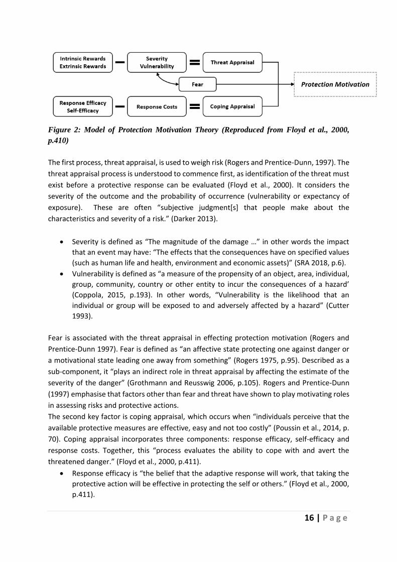
16 | P a g e
Figure 2: Model of Protection Motivation Theory (Reproduced from Floyd et al., 2000,
p.410)
The first process, threat appraisal, is used to weigh risk (Rogers and Prentice-Dunn, 1997). The
threat appraisal process is understood to commence first, as identification of the threat must
exist before a protective response can be evaluated (Floyd et al., 2000). It considers the
severity of the outcome and the probability of occurrence (vulnerability or expectancy of
exposure). These are often “subjective judgment[s] that people make about the
characteristics and severity of a risk.” (Darker 2013).
• Severity is defined as “The magnitude of the damage …” in other words the impact
that an event may have: “The effects that the consequences have on specified values
(such as human life and health, environment and economic assets)” (SRA 2018, p.6).
• Vulnerability is defined as “a measure of the propensity of an object, area, individual,
group, community, country or other entity to incur the consequences of a hazard’
(Coppola, 2015, p.193). In other words, “Vulnerability is the likelihood that an
individual or group will be exposed to and adversely affected by a hazard” (Cutter
1993).
Fear is associated with the threat appraisal in effecting protection motivation (Rogers and
Prentice-Dunn 1997). Fear is defined as “an affective state protecting one against danger or
a motivational state leading one away from something” (Rogers 1975, p.95). Described as a
sub-component, it “plays an indirect role in threat appraisal by affecting the estimate of the
severity of the danger” (Grothmann and Reusswig 2006, p.105). Rogers and Prentice-Dunn
(1997) emphasise that factors other than fear and threat have shown to play motivating roles
in assessing risks and protective actions.
The second key factor is coping appraisal, which occurs when “individuals perceive that the
available protective measures are effective, easy and not too costly” (Poussin et al., 2014, p.
70). Coping appraisal incorporates three components: response efficacy, self-efficacy and
response costs. Together, this “process evaluates the ability to cope with and avert the
threatened danger.” (Floyd et al., 2000, p.411).
• Response efficacy is “the belief that the adaptive response will work, that taking the
protective action will be effective in protecting the self or others.” (Floyd et al., 2000,
p.411).

17 | P a g e
• Self-efficacy “the person’s belief that he or she is or is not capable of performing the
requisite behavior” (Maddux and Rogers 1983, p.470).
• Response costs account for a person’s estimation of how costly it would be to
implement the protective response (Floyd et al., 2000). These costs can include
financial, personal, time and general effort (Floyd et al., 2000).
The PMT appraisal outcome can be categorised into three states: the decision (or intention)
to take protective action, continue taking action, or inhibit commencing an action.Rogers
(1975) and Maddux and Rogers (1983) emphasised that this decision-making process focuses
on adverse events and understanding the effect of fear. While PMT has been applied
extensively across the health sphere, it has also been applied to areas where risk messaging
is involved (Olson and Zanna, 1993, p. 139). For example, Grothmann and Patt (2005)
suggested that PMT can explore individuals’ behaviour regarding emergency preparedness.
Given that the motivation behind both health protection and emergency preparedness are
encouraged by the same principles, it recognises the threat and evaluates the mitigation
options (Westcott et al., 2017).

18 | P a g e
4.0 Methodology
4.1 Data Collection
A questionnaire was administered online (anonymously using Qualtrics) through May and
June 2018—approximately two months after The Storm—with participants voluntarily opting-
in on behalf of their household across the entire island of Ireland. Social networking sites
(Twitter; Facebook; LinkedIn) were used to promote the questionnaire—which included the
use of paid promoted links— and it was also promoted using official social media accounts,
such as the Met Éireann (the national meteorological service), County Councils (Local
Government), the Office of Emergency Planning, and Dublin Fire Brigade.
Data was collected from 4451 households. The household socio-demographic characteristics
of those surveyed (64.9% of households earned less than €70,000, and 70.1% owned their
home) matched closely the latest Irish census data from 2016: 62.6% had a gross income of
less than €60,000 (CSO, 2016); 67.6% homeownership (CSO, 2016). Furthermore, the CSO
reported 31.4% of people in Ireland lived in a rural area which also closely matched the survey
data (30%) (CSO, Urban and Rural Life in Ireland, 2019). However, the individual socio-
demographic characteristics of those who completed the survey did not perfectly align with
the population in the case of both gender (with an over-representation of females) and
respondent’s age (with an underrepresentation of older people within the age range 65+)
(CSO, 2016).
4.2 Quantitative Data Analysis
Before analyzing, the data was checked and cleaned to prevent errors in the dataset
impacting results (Van den Broeck et al., 2005). The data were screened to identify anomalies
such as missing values, outliers determined to be impossible values, and inconsistencies in
data. In the case of missing values, imputation for variables was carried out where possible,
based on the individuals' responses to other questions. This imputation was only completed
when inferences could be made with certainty. Impossible, obviously erroneous values for
variables were recoded as missing values.
The quantitative analysis was carried out using the statistical software package STATA
(StataCorp Release 16.1/SE). Descriptive statistics (frequencies and measures of central
tendency) were presented to provide an overview of all responses. Breakdowns of responses
by respondents' gender, county, and settlement type (urbanicity), were provided for items of
interest. Basic statistical tests were performed to check whether observed differences in
results are statistically significant. These included t-tests for differences in mean, Kruskal
Wallis tests which checked whether responses for different groups are drawn from the same
distribution, and Chi-square tests of independence between variables. The final section was

19 | P a g e
then assessed using various regression analysis techniques (see 8.0 Regression Analysis:
Protection Motivation Theory).
4.3 Analysis of Qualitative Data
The methodology adopted by this study is based on content analysis as defined by
Krippendorff (2004, 2013) who drew on the work of Lasswell (1946) in his development of
this methodological framework. Maykut and Morehouse (1994) point out: "words are the way
that most people come to understand their situations, we create our world with words, we
explain ourselves with words, we defend and hide ourselves with words", thus, in qualitative
data analysis and presentation: "the task of the researcher is to find patterns within those
words and to present those patterns for others to inspect (p18).
Framed by a focus-of-inquiry, data were collected using an online questionnaire that included
open-ended questions designed to allowed respondents to articulate their perceptions and
experiences freely. In analyzing data generated in this format, responses were not grouped
according to pre-defined categories, rather salient categories of meaning and relationships
between categories were derived from the data itself through a process of inductive
reasoning known as coding units (Stemler, 2001). This process involved breaking down the
data into discrete 'incidents' (Glaser and Strauss, 1967) or 'units' (Lincoln and Guba, 1985) and
coding them into categories.
NVivo software was used to organize and interpret the data. It must be stressed that in using
qualitative data analysis software, the researcher does not capitulate the hermeneutic task
to the logic of the computer; rather the computer is used as a tool for efficiency and not as a
tool which in and of itself conducts analysis and draws conclusions. As Fielding and Lee (1998)
explain, qualitative researchers "want tools which support analysis, but leave the analyst
firmly in charge" (p167). Importantly such software serves as a tool for transparency; logging
data movements and coding patterns, and mapping conceptual categories and thought
progression.
There were eight discrete cycles of analysis (see below and in Appendix One).
Phase 1 – Downloading qualitative comments and demographic and other profiling
information into a table for import into a computer-aided qualitative data analysis system
(CAQDAS) known as NVivo.
Phase 2 – Generating Initial Codes involved broad participant-driven initial coding of the
survey submissions to deconstruct the data from its original chronology into initial non-
hierarchical general codes.
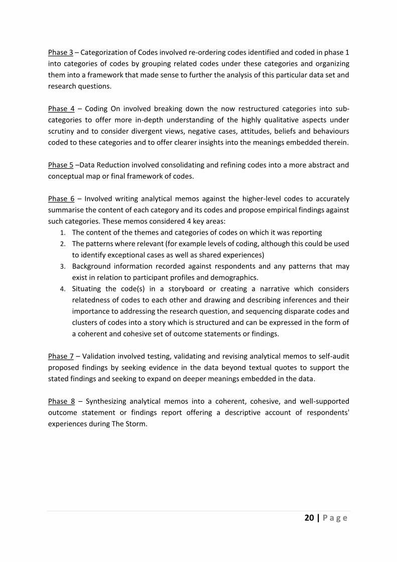
20 | P a g e
Phase 3 – Categorization of Codes involved re-ordering codes identified and coded in phase 1
into categories of codes by grouping related codes under these categories and organizing
them into a framework that made sense to further the analysis of this particular data set and
research questions.
Phase 4 – Coding On involved breaking down the now restructured categories into sub-
categories to offer more in-depth understanding of the highly qualitative aspects under
scrutiny and to consider divergent views, negative cases, attitudes, beliefs and behaviours
coded to these categories and to offer clearer insights into the meanings embedded therein.
Phase 5 –Data Reduction involved consolidating and refining codes into a more abstract and
conceptual map or final framework of codes.
Phase 6 – Involved writing analytical memos against the higher-level codes to accurately
summarise the content of each category and its codes and propose empirical findings against
such categories. These memos considered 4 key areas:
1. The content of the themes and categories of codes on which it was reporting
2. The patterns where relevant (for example levels of coding, although this could be used
to identify exceptional cases as well as shared experiences)
3. Background information recorded against respondents and any patterns that may
exist in relation to participant profiles and demographics.
4. Situating the code(s) in a storyboard or creating a narrative which considers
relatedness of codes to each other and drawing and describing inferences and their
importance to addressing the research question, and sequencing disparate codes and
clusters of codes into a story which is structured and can be expressed in the form of
a coherent and cohesive set of outcome statements or findings.
Phase 7 – Validation involved testing, validating and revising analytical memos to self-audit
proposed findings by seeking evidence in the data beyond textual quotes to support the
stated findings and seeking to expand on deeper meanings embedded in the data.
Phase 8 – Synthesizing analytical memos into a coherent, cohesive, and well-supported
outcome statement or findings report offering a descriptive account of respondents'
experiences during The Storm.

21 | P a g e
5.0 Weather Risk Perception
Three months before the Storm hit Ireland, the project team surveyed more than 6000
households in Ireland. The survey gathered information relevant to six weather-related
events: flooding, snow, low temperatures, high temperatures, storm, and drought.
Respondents assessed the likelihood of each affecting them or their home on a five-point
scale, where 1= extremely unlikely, 2 = very unlikely, 3 = unlikely, 4 = likely, and 5 = very likely.
They also identified the level of impact they believed each event would have on them or their
home, should it occur, on a five-point scale, with 1 = very low, 2 = low, 3 = moderate, 4 = high
and 5 = very high.
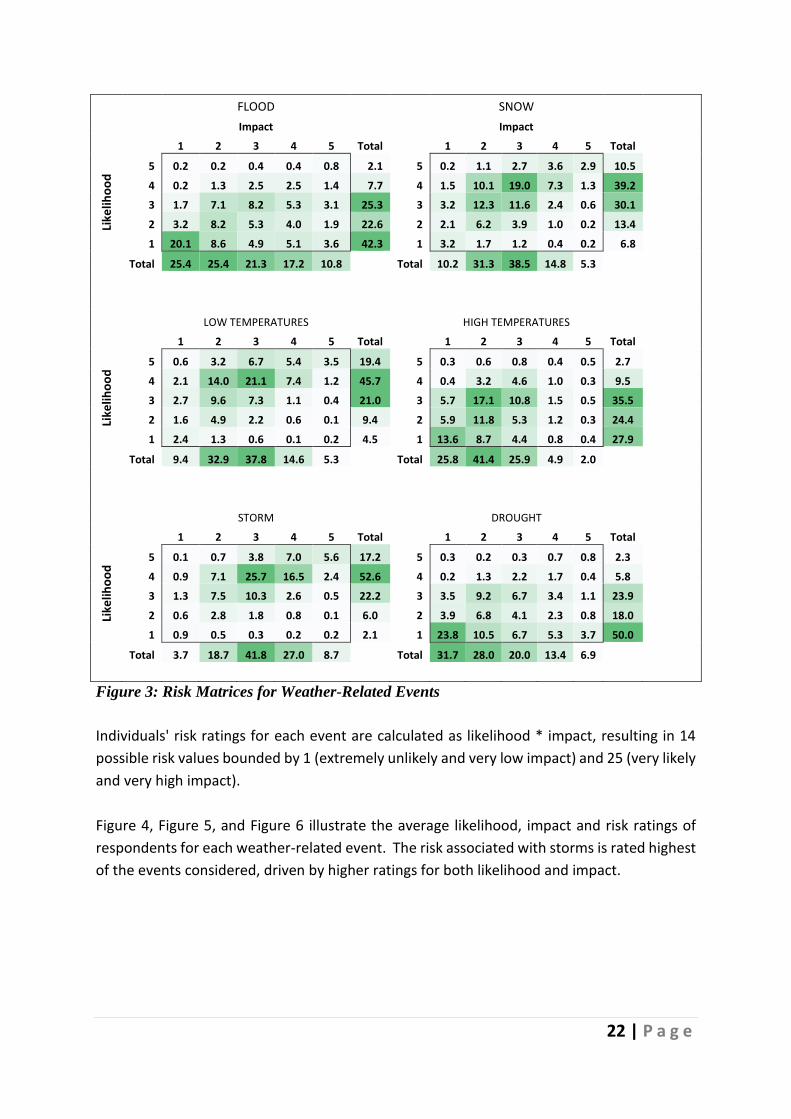
Figure 3 sets out the percentage of respondents who stated each possible likelihood-impact
combination for each of the weather-related events. In each panel, impact is measured on
the horizontal axis (i.e., perceived impact is higher moving rightwards in the table) and
likelihood is on the vertical axis (perceived likelihood is higher moving upwards in the table).
The values are colour-coded to identify readily the regions of the matrices where
respondents' responses are concentrated.
22 | P a g e
FLOOD SNOW
Impact Impact
1 2 3 4 5 Total 1 2 3 4 5 Total
Like
liho
od
5 0.2 0.2 0.4 0.4 0.8 2.1 5 0.2 1.1 2.7 3.6 2.9 10.5
4 0.2 1.3 2.5 2.5 1.4 7.7 4 1.5 10.1 19.0 7.3 1.3 39.2
3 1.7 7.1 8.2 5.3 3.1 25.3 3 3.2 12.3 11.6 2.4 0.6 30.1
2 3.2 8.2 5.3 4.0 1.9 22.6 2 2.1 6.2 3.9 1.0 0.2 13.4
1 20.1 8.6 4.9 5.1 3.6 42.3 1 3.2 1.7 1.2 0.4 0.2 6.8
Total 25.4 25.4 21.3 17.2 10.8 Total 10.2 31.3 38.5 14.8 5.3
LOW TEMPERATURES HIGH TEMPERATURES
1 2 3 4 5 Total 1 2 3 4 5 Total
Like
liho
od
5 0.6 3.2 6.7 5.4 3.5 19.4 5 0.3 0.6 0.8 0.4 0.5 2.7
4 2.1 14.0 21.1 7.4 1.2 45.7 4 0.4 3.2 4.6 1.0 0.3 9.5
3 2.7 9.6 7.3 1.1 0.4 21.0 3 5.7 17.1 10.8 1.5 0.5 35.5
2 1.6 4.9 2.2 0.6 0.1 9.4 2 5.9 11.8 5.3 1.2 0.3 24.4
1 2.4 1.3 0.6 0.1 0.2 4.5 1 13.6 8.7 4.4 0.8 0.4 27.9
Total 9.4 32.9 37.8 14.6 5.3 Total 25.8 41.4 25.9 4.9 2.0
STORM DROUGHT
1 2 3 4 5 Total 1 2 3 4 5 Total
Like
liho
od
5 0.1 0.7 3.8 7.0 5.6 17.2 5 0.3 0.2 0.3 0.7 0.8 2.3
4 0.9 7.1 25.7 16.5 2.4 52.6 4 0.2 1.3 2.2 1.7 0.4 5.8
3 1.3 7.5 10.3 2.6 0.5 22.2 3 3.5 9.2 6.7 3.4 1.1 23.9
2 0.6 2.8 1.8 0.8 0.1 6.0 2 3.9 6.8 4.1 2.3 0.8 18.0
1 0.9 0.5 0.3 0.2 0.2 2.1 1 23.8 10.5 6.7 5.3 3.7 50.0
Total 3.7 18.7 41.8 27.0 8.7 Total 31.7 28.0 20.0 13.4 6.9
Figure 3: Risk Matrices for Weather-Related Events
Individuals' risk ratings for each event are calculated as likelihood * impact, resulting in 14
possible risk values bounded by 1 (extremely unlikely and very low impact) and 25 (very likely
and very high impact).
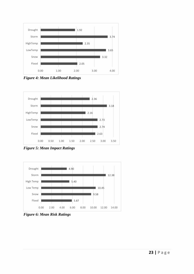
Figure 4, Figure 5, and Figure 6 illustrate the average likelihood, impact and risk ratings of
respondents for each weather-related event. The risk associated with storms is rated highest
of the events considered, driven by higher ratings for both likelihood and impact.
23 | P a g e
Figure 4: Mean Likelihood Ratings
Figure 5: Mean Impact Ratings
Figure 6: Mean Risk Ratings
2.05
3.32
3.65
2.35
3.74
1.92
0.00 1.00 2.00 3.00 4.00
Flood
Snow
LowTemp
HighTemp
Storm
Drought
2.63
2.74
2.73
2.16
3.18
2.36
0.00 0.50 1.00 1.50 2.00 2.50 3.00 3.50
Flood
Snow
LowTemp
HighTemp
Storm
Drought
5.87
9.58
10.45
5.40
12.38
4.90
0.00 2.00 4.00 6.00 8.00 10.00 12.00 14.00
Flood
Snow
Low Temp
High Temp
Storm
Drought
24 | P a g e
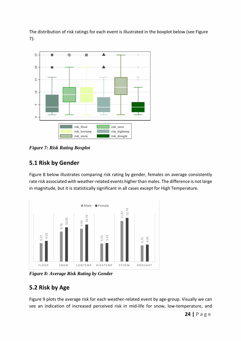
The distribution of risk ratings for each event is illustrated in the boxplot below (see Figure
7):
Figure 7: Risk Rating Boxplot
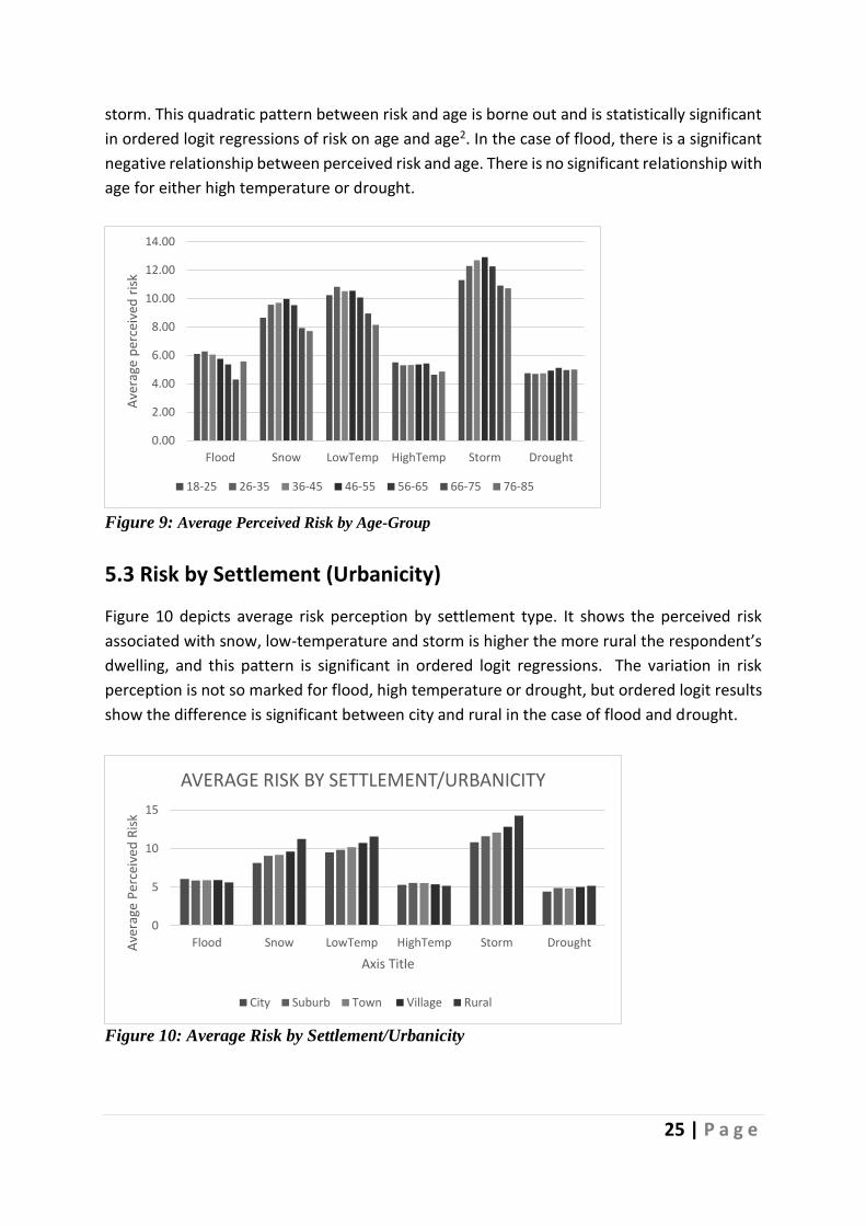
5.1 Risk by Gender
Figure 8 below illustrates comparing risk rating by gender, females on average consistently
rate risk associated with weather-related events higher than males. The difference is not large
in magnitude, but it is statistically significant in all cases except for High Temperature.
Figure 8: Average Risk Rating by Gender
5.2 Risk by Age
Figure 9 plots the average risk for each weather-related event by age-group. Visually we can
see an indication of increased perceived risk in mid-life for snow, low-temperature, and
5.3
7
8.7
6 9.5
9
5.2
5
11
.87
4.7
36.0
2
10
.00
10
.79
5.4
1
12
.74
4.9
5
F L O O D S N O W L O W T E M P H I G H T E M P S T O R M D R O U G H T
Male Female
25 | P a g e
storm. This quadratic pattern between risk and age is borne out and is statistically significant
in ordered logit regressions of risk on age and age2. In the case of flood, there is a significant
negative relationship between perceived risk and age. There is no significant relationship with
age for either high temperature or drought.
Figure 9: Average Perceived Risk by Age-Group
5.3 Risk by Settlement (Urbanicity)
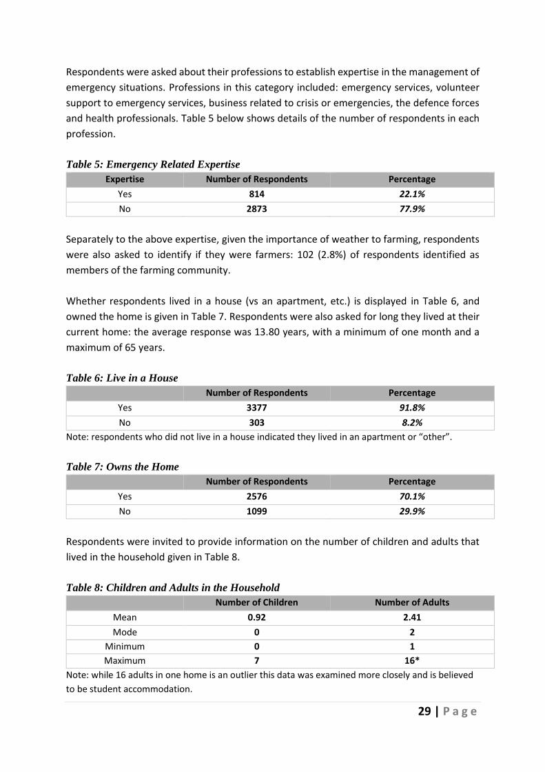
Figure 10 depicts average risk perception by settlement type. It shows the perceived risk
associated with snow, low-temperature and storm is higher the more rural the respondent’s
dwelling, and this pattern is significant in ordered logit regressions. The variation in risk
perception is not so marked for flood, high temperature or drought, but ordered logit results
show the difference is significant between city and rural in the case of flood and drought.
Figure 10: Average Risk by Settlement/Urbanicity
0.00
2.00
4.00
6.00
8.00
10.00
12.00
14.00
Flood Snow LowTemp HighTemp Storm Drought
Ave
rage
per
ceiv
ed r
isk
18-25 26-35 36-45 46-55 56-65 66-75 76-85
0
5
10
15
Flood Snow LowTemp HighTemp Storm DroughtAve
rage
Per
ceiv
ed R
isk
Axis Title
AVERAGE RISK BY SETTLEMENT/URBANICITY
City Suburb Town Village Rural

26 | P a g e
5.4 Risk by County
Table 1 sets out the average perceived risk associated with weather events by county. For
Southern Counties, the highest 10 in terms of risk perception are shaded for each event.
Table 1: Average Perceived Risk By County
County Flood Snow Low-Temp High-Temp Storm Drought
Northern Counties
Antrim 5.14 7.57 9.29 3.29 12.57 3.43
Armagh 5.00 10.00 7.00 3.50 9.00 5.00
Derry 7.00 11.50 12.00 4.13 13.00 2.25
Down 4.91 8.91 7.73 4.27 8.55 4.91
Fermanagh 7.00 11.00 13.11 3.67 12.33 4.22
Tyrone 4.20 14.00 11.60 3.20 14.60 2.60
Southern Counties
Carlow 4.78 11.88 12.40 5.95 13.83 4.48
Cavan 4.68 12.34 11.86 5.11 13.13 4.30
Clare 6.61 8.69 10.54 5.20 13.40 4.82
Cork 6.18 10.51 11.80 5.44 14.37 5.00
Donegal 5.38 13.15 12.97 4.39 14.36 4.41
Dublin 5.80 8.58 9.31 5.47 10.74 4.74
Galway 6.96 9.30 11.05 5.10 13.76 5.01
Kerry 6.20 9.30 10.70 4.43 15.73 4.36
Kildare 6.99 10.68 10.75 5.89 12.09 5.58
Kilkenny 4.29 9.98 10.58 5.51 13.16 5.32
Laois 6.52 11.58 12.91 6.40 13.63 6.48
Leitrim 5.52 11.66 11.52 4.03 13.93 4.28
Limerick 6.35 9.58 11.30 5.66 14.20 5.18
Longford 6.50 12.56 12.56 6.56 14.44 4.44
Louth 5.22 9.33 10.08 5.36 11.66 4.80
Mayo 5.26 10.22 10.79 5.12 14.18 4.81
Meath 5.55 9.09 9.78 5.30 11.52 4.85
Monaghan 5.10 11.47 11.86 5.02 11.80 3.90
Offaly 6.53 9.69 10.66 4.86 12.63 4.76
Roscommon 6.01 10.01 10.99 5.66 12.59 5.88
Sligo 4.87 11.38 11.74 4.89 13.56 4.52
Tipperary 5.82 9.65 10.59 5.69 13.33 5.21
Waterford 5.41 8.84 9.59 5.45 12.99 5.40
Westmeath 4.53 9.37 10.03 4.76 11.21 4.72
Wexford 4.72 10.87 10.24 5.51 13.69 4.98
Wicklow 4.83 11.18 10.36 5.63 13.12 4.69

27 | P a g e
5.5 Risk Rating
The data presented in Figure 3 permits the plotting of the modal values for each risk rating in
order to examine relative risk across the weather events (See Figure 11 below). It is
interesting to see that the three highest rated risks (by mode) are storm, snow, and low
temperatures - the three weather events which combined to form Storm Emma and The Beast
from the East.
Figure 11: Weather-Related Risk Matrix (Mode)

28 | P a g e
6.0 Profile of Respondents The study population comprised of 4,451 respondents, of which 3,503 returned complete
questionnaires. The average age of respondents was 41.97 with a minimum of 18 years and a
maximum of 100 years of age.
The gender of respondents is displayed in Table 2, and the geographic location, by County,
for each respondent is outlined in Table 3 below. Finally, household income is reported in
Table 4.
Table 2: Gender of Respondents
Number of Respondents Percentage
Female 2766 75.2%
Male 913 24.8%
Table 3: Respondents by County
County Respondents County Respondents
Armagh 6 Leitrim 27
Carlow 35 Limerick 145
Cavan 65 Longford 37
Clare 86 Louth 129
Cork 517 Mayo 148
Derry 1 Meath 223
Donegal 83 Monaghan 37
Down 12 Offaly 140
Dublin 1174 Roscommon 91
Fermanagh 3 Sligo 79
Galway 214 Tipperary 127
Kerry 63 Tyrone 2
Kildare 341 Waterford 128
Kilkenny 84 Westmeath 144
Laois 72 Wexford 144
Wicklow 94
Table 4: Household Income Levels
Income Bands Number of Respondents Percentage
Low (<30K) 444 12.7%
Medium (30->70K) 1827 52.2%
High (>70K) 1232 35.2%
29 | P a g e
Respondents were asked about their professions to establish expertise in the management of
emergency situations. Professions in this category included: emergency services, volunteer
support to emergency services, business related to crisis or emergencies, the defence forces
and health professionals. Table 5 below shows details of the number of respondents in each
profession.
Table 5: Emergency Related Expertise
Expertise Number of Respondents Percentage
Yes 814 22.1%
No 2873 77.9%
Separately to the above expertise, given the importance of weather to farming, respondents
were also asked to identify if they were farmers: 102 (2.8%) of respondents identified as
members of the farming community.
Whether respondents lived in a house (vs an apartment, etc.) is displayed in Table 6, and
owned the home is given in Table 7. Respondents were also asked for long they lived at their
current home: the average response was 13.80 years, with a minimum of one month and a
maximum of 65 years.
Table 6: Live in a House Number of Respondents Percentage
Yes 3377 91.8%
No 303 8.2%
Note: respondents who did not live in a house indicated they lived in an apartment or “other”.
Table 7: Owns the Home
Number of Respondents Percentage
Yes 2576 70.1%
No 1099 29.9%
Respondents were invited to provide information on the number of children and adults that
lived in the household given in Table 8.
Table 8: Children and Adults in the Household Number of Children Number of Adults
Mean 0.92 2.41
Mode 0 2
Minimum 0 1
Maximum 7 16*
Note: while 16 adults in one home is an outlier this data was examined more closely and is believed
to be student accommodation.

30 | P a g e
284 respondents were not at staying at their home for the duration of the Storm. For this
reason, both settlement type (urbanicity) for where respondents usually live, and where they
were located during the Storm is reported in Table 9.
Table 9: Settlement Type (Urbanicity) Usually Located Located During The Storm
A rural area 30% (1106n) 27.8% (1239n)
A village 12.4% (457n) 12% (532n)
A town 22.6% (834n) 23.9% (1063n)
The suburbs or outskirts of a city 22.2% (819n) 22.8% (1017n)
A city 12.8% (471n) 13.5% (600n)
The breakdown of respondents by whether they work full-time work is specified in Table 10,
and by race (white) is given in Table 11.
Table 10: Working full-time Number of Respondents Percentage
Yes 2760 74.9%
No 927 25.1%
Note: respondents who did not live in a house indicated they lived in an apartment or “other”.
Table 11: Race (White)
Number of Respondents Percentage
Yes 3567 97.8%
No 81 2.2%
The number of responses to different open-ended questions varied greatly. Table 12 below
shows the distribution of all 12,164 responses by open-ended question:
31 | P a g e
Table 12: Number of responses by question
Questions x Number of Responses n4552
1 - QQ - What caused your level of worry to decrease 808
2 - QQ - What caused your level of worry to increase 1314
3 - QQ - What other actions did you take to prepare for Storm Emma 2220
4 - QQ - On reflection, what else should you have done to prepare for Storm Emma 2460
5 - QQ - Please tell us more about how you gave assistance - Other, please specify 639
6 - QQ - Please tell us about the assistance you received - Other assistance, please specify
309
7 - QQ - During Storm Emma, did you witness any other positive examples of community support (Example farmers transporting locals to work)
2284
8 - QQ - Do you believe the weather warnings are... (Tick all that apply) - Other 818
9 - QQ - Please tell us if there is anything which prevents you from being more active in your community
1312
Total Responses 12164
Table 13 below shows the breakdown of comments by sentiment where sentiment could be
recorded:
Table 13: Comments by Sentiment
Sentiment of Comments Number of Comments
Positive Comments 5934
Negative Comments 5949
Total Comments where Sentiment was Recorded 11883
32 | P a g e
7.0 The Public Response to the Storm
7.1 Worry about the Storm
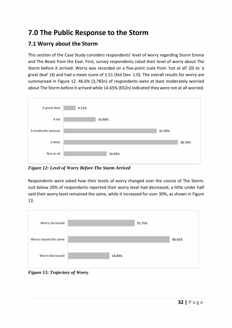
This section of the Case Study considers respondents' level of worry regarding Storm Emma
and The Beast from the East. First, survey respondents rated their level of worry about The
Storm before it arrived. Worry was recorded on a five-point scale from 'not at all' (0) to 'a
great deal' (4) and had a mean score of 1.51 (Std Dev: 1.0). The overall results for worry are
summarised in Figure 12. 46.6% (3,783n) of respondents were at least moderately worried
about The Storm before it arrived while 14.65% (652n) indicated they were not at all worried.
Figure 12: Level of Worry Before The Storm Arrived
Respondents were asked how their levels of worry changed over the course of The Storm.
Just below 20% of respondents reported their worry level had decreased, a little under half
said their worry level remained the same, while it increased for over 30%, as shown in Figure
13.
Figure 13: Trajectory of Worry
14.65%
38.76%
31.59%
10.90%
4.11%
Not at all
A little
A moderate amount
A lot
A great deal
19.84%
48.42%
31.75%
Worry decreased
Worry stayed the same
Worry increased
33 | P a g e
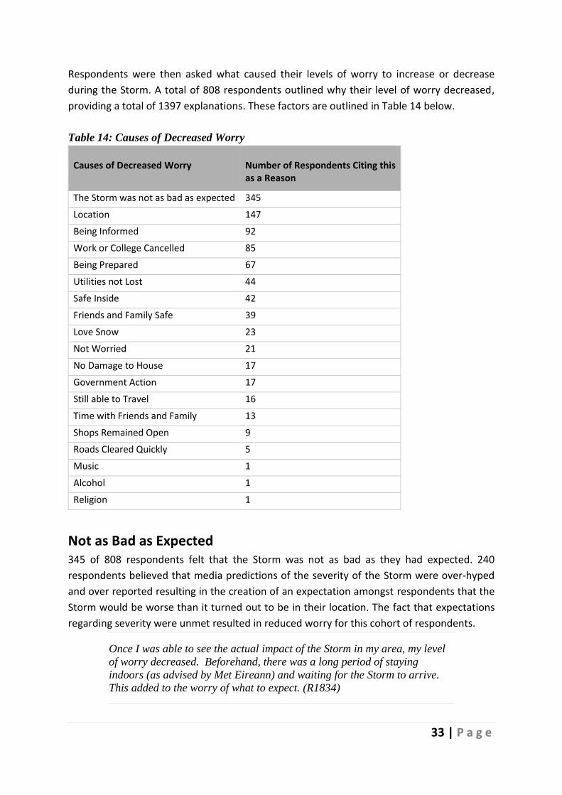
Respondents were then asked what caused their levels of worry to increase or decrease
during the Storm. A total of 808 respondents outlined why their level of worry decreased,
providing a total of 1397 explanations. These factors are outlined in Table 14 below.
Table 14: Causes of Decreased Worry
Causes of Decreased Worry
Number of Respondents Citing this as a Reason
The Storm was not as bad as expected 345
Location 147
Being Informed 92
Work or College Cancelled 85
Being Prepared 67
Utilities not Lost 44
Safe Inside 42
Friends and Family Safe 39
Love Snow 23
Not Worried 21
No Damage to House 17
Government Action 17
Still able to Travel 16
Time with Friends and Family 13
Shops Remained Open 9
Roads Cleared Quickly 5
Music 1
Alcohol 1
Religion 1
Not as Bad as Expected 345 of 808 respondents felt that the Storm was not as bad as they had expected. 240
respondents believed that media predictions of the severity of the Storm were over-hyped
and over reported resulting in the creation of an expectation amongst respondents that the
Storm would be worse than it turned out to be in their location. The fact that expectations
regarding severity were unmet resulted in reduced worry for this cohort of respondents.
Once I was able to see the actual impact of the Storm in my area, my level
of worry decreased. Beforehand, there was a long period of staying
indoors (as advised by Met Eireann) and waiting for the Storm to arrive.
This added to the worry of what to expect. (R1834)

34 | P a g e
Wasn't as bad as forecast. Could get out and enjoy fun in the snow with
kids. (R2038)
The actual impact of the storms in my area, blanket warnings caused the
stress and upset, and it should have been more specific. (R2358)
Figure 14 below shows the pattern of language use associated with the code "Not as bad as
expected".
Figure 14: Word Patterns in Not as Bad as Expected
A further 89 respondents cited the fact that the Storm was mild as the reason for reduced levels of worry but did not link their comments to expectations based on forecasting:
When it became apparent from outside that not much was happening. (R546)
Low impact on my life, shops open, played with the snow with my son, I knew
it would not last long. (R1700)
The fact that the Storm was not significant in my area. We did not experience
high winds and had only a moderate amount of snow fall. We did not lose
power. (R813)

35 | P a g e
Location 147 respondents cited their geographical location as a reason for a decrease in worry. This
factor impacted on both predictions and outcomes:
I was told my area would not be affected as much as other areas of Ireland.
(R446)
Storm did not directly affect my area, could see by weather updates they we
escaped the worst. (R1064)
Being Informed Having access to information both ahead of and during the Storm reduced worry levels for 92 respondents.
Sufficient media coverage resulting in the majority of people actually staying
inside and not going to work. I don't think the same can be said for Storm
Ophelia last year. There were better warnings this time around. (R254)
Level of coverage on broadcast mediums outlining any changes sin the
forecast model; advice on how to stay safe; what to expect in the coming
days etc. (R923)
Other causes of reduced worry included not having to travel because work or college was
cancelled (85 comments), being prepared (67 comments) and stocking up on supplies (61
comments). The language used in relation to stocking up is illustrated by frequency in Figure
15.
Figure 15: Language use in the discourse on 'Stocking Up'.

36 | P a g e
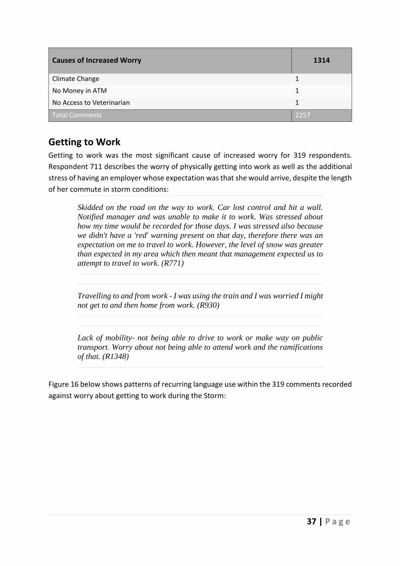
Causes of Increased Worry Where respondents reported an increase in worry during the Storm, they were asked to
describe what caused their level of worry to increase. A total of 1314 respondents contributed
2257 comments in answer to this question. Table 15 below shows the nature of these
responses:
Table 15: Causes of Increased Worry
Causes of Increased Worry 1314
Getting to Work 319
Volume of Snow 187
Worries about Friends and Family Safety 169
Travelling 162
Being Trapped in House 161
Not Being Prepared 138
Utilities being lost 135
Getting Home 110
Worse than Expected 104
Watching the News 84
Watching the Storm 77
Damage to House 76
No Access to Medical Services 44
Roads Not Cleared 38
Shops Out of Stock 37
The Unknown 35
No Public Transport 31
High Winds 29
Lack of Communication from HSE and management and support for staff 27
Livestock 26
Lack of Communication from Employer 25
Shops Closed 24
Poor Government Response 24
Cancelled Flight 16
Falling Trees 15
Going Outside 11
Childcare 6
Social Unrest 4
Driving Emergency Service Vehicles 4
37 | P a g e
Causes of Increased Worry 1314
Climate Change 1
No Money in ATM 1
No Access to Veterinarian 1
Total Comments 2257
Getting to Work Getting to work was the most significant cause of increased worry for 319 respondents.
Respondent 711 describes the worry of physically getting into work as well as the additional
stress of having an employer whose expectation was that she would arrive, despite the length
of her commute in storm conditions:
Skidded on the road on the way to work. Car lost control and hit a wall.
Notified manager and was unable to make it to work. Was stressed about
how my time would be recorded for those days. I was stressed also because
we didn't have a 'red' warning present on that day, therefore there was an
expectation on me to travel to work. However, the level of snow was greater
than expected in my area which then meant that management expected us to
attempt to travel to work. (R771)
Travelling to and from work - I was using the train and I was worried I might
not get to and then home from work. (R930)
Lack of mobility- not being able to drive to work or make way on public
transport. Worry about not being able to attend work and the ramifications
of that. (R1348)
Figure 16 below shows patterns of recurring language use within the 319 comments recorded
against worry about getting to work during the Storm:
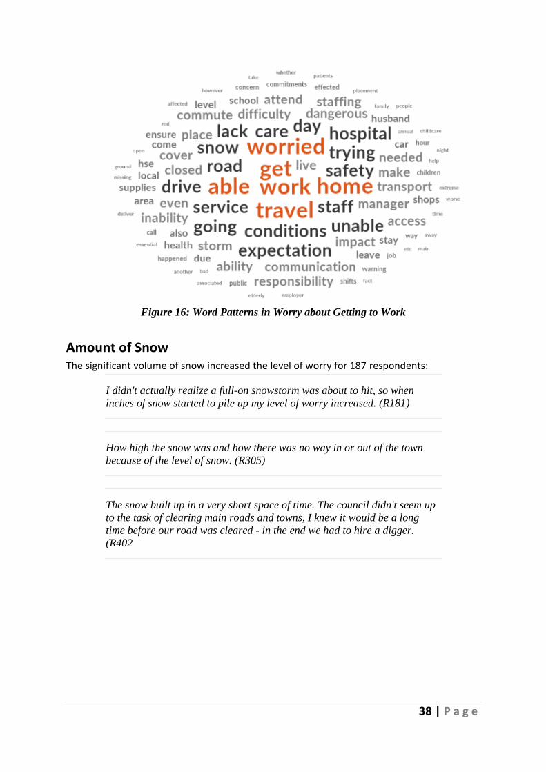
38 | P a g e
Figure 16: Word Patterns in Worry about Getting to Work
Amount of Snow The significant volume of snow increased the level of worry for 187 respondents:
I didn't actually realize a full-on snowstorm was about to hit, so when
inches of snow started to pile up my level of worry increased. (R181)
How high the snow was and how there was no way in or out of the town
because of the level of snow. (R305)
The snow built up in a very short space of time. The council didn't seem up
to the task of clearing main roads and towns, I knew it would be a long
time before our road was cleared - in the end we had to hire a digger.
(R402
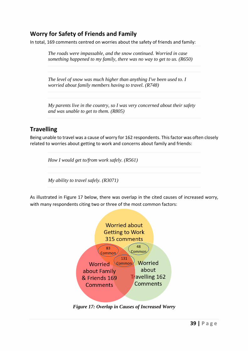
39 | P a g e
Worry for Safety of Friends and Family In total, 169 comments centred on worries about the safety of friends and family:
The roads were impassable, and the snow continued. Worried in case
something happened to my family, there was no way to get to us. (R650)
The level of snow was much higher than anything I've been used to. I
worried about family members having to travel. (R748)
My parents live in the country, so I was very concerned about their safety
and was unable to get to them. (R805)
Travelling Being unable to travel was a cause of worry for 162 respondents. This factor was often closely related to worries about getting to work and concerns about family and friends:
How I would get to/from work safely. (R561)
My ability to travel safely. (R3071)
As illustrated in Figure 17 below, there was overlap in the cited causes of increased worry,
with many respondents citing two or three of the most common factors:
Figure 17: Overlap in Causes of Increased Worry
40 | P a g e
Being unable to move car to get to work or visit mother living alone. (R1967)
Impact on family, husband had a previous fall/injury in snow, possibility of
another injury. afraid to drive, afraid to go to local shops, school closures,
childcare issues, responsibility to try to get into work. (R2253)
Being Trapped in the House 161 respondents said being trapped in the house was a cause for worry:
Being trapped in the house - fear the electricity would go leaving us without
water as well as electricity and heating. (R390)
Frustration with what will happen and feeling of being blocked and
inaccessible by emergency service. (R722)
Other factors leading to increased worry included not being prepared (138 comments); loss
of utilities (135 comments), getting home (110 comments), the Storm being worse than
expected (104 comments).
Worry by Settlement Type (Urbanicity) Figure 18 shows the average worry levels before The Storm arrived over the different
settlement (urbanicity) types where respondents live. Worry is measured on a five-point scale
from 'not at all' (0) to 'a great deal' (4). Respondents who lived in a city on average had the
lowest worry levels (1.310) while those who lived in a rural area had the highest (1.741). Only
9.8% of respondents living in a rural area did not worry about The Storm; while the equivalent
figure was 16.2% for those living in a City. On the basis of a chi-square test of independence
there is evidence that reported worry level is not independent of settlement type (χ2(16)
110.115, p<0.001).
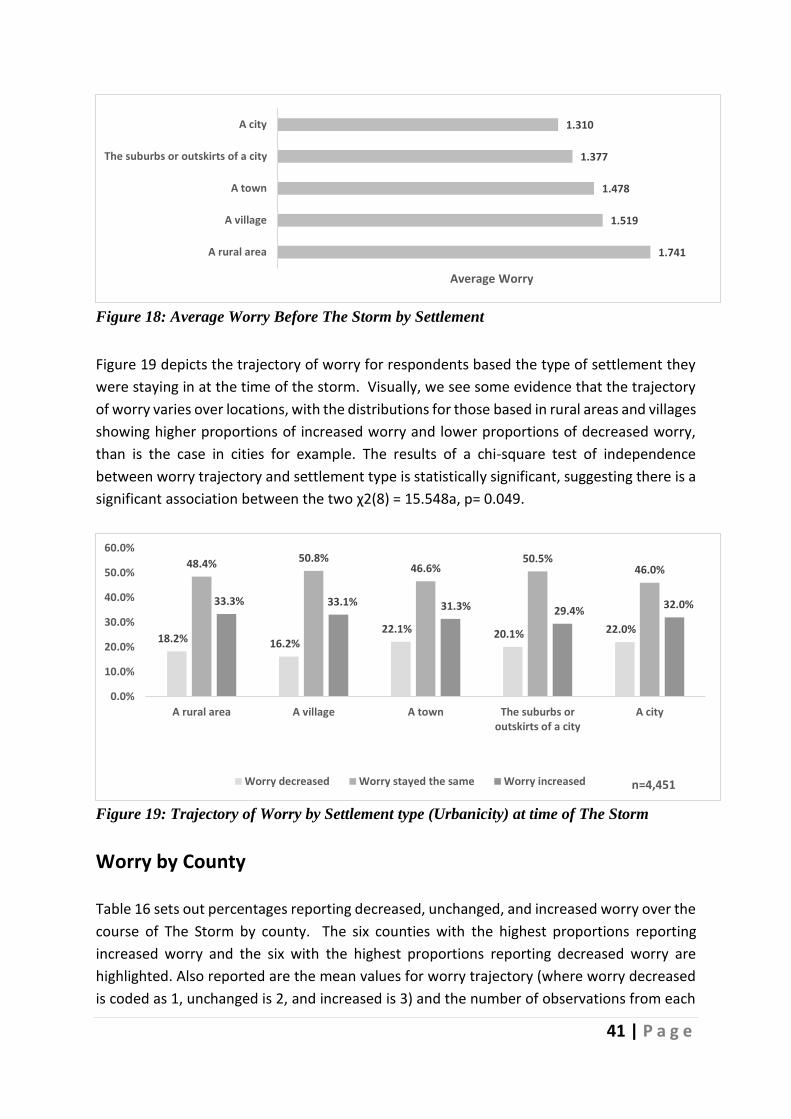
41 | P a g e
Figure 18: Average Worry Before The Storm by Settlement
Figure 19 depicts the trajectory of worry for respondents based the type of settlement they
were staying in at the time of the storm. Visually, we see some evidence that the trajectory
of worry varies over locations, with the distributions for those based in rural areas and villages
showing higher proportions of increased worry and lower proportions of decreased worry,
than is the case in cities for example. The results of a chi-square test of independence
between worry trajectory and settlement type is statistically significant, suggesting there is a
significant association between the two χ2(8) = 15.548a, p= 0.049.
Figure 19: Trajectory of Worry by Settlement type (Urbanicity) at time of The Storm
Worry by County
Table 16 sets out percentages reporting decreased, unchanged, and increased worry over the
course of The Storm by county. The six counties with the highest proportions reporting
increased worry and the six with the highest proportions reporting decreased worry are
highlighted. Also reported are the mean values for worry trajectory (where worry decreased
is coded as 1, unchanged is 2, and increased is 3) and the number of observations from each
1.741
1.519
1.478
1.377
1.310
A rural area
A village
A town
The suburbs or outskirts of a city
A city
Average Worry
18.2% 16.2%22.1% 20.1% 22.0%
48.4% 50.8%46.6%
50.5%46.0%
33.3% 33.1% 31.3% 29.4%32.0%
0.0%
10.0%
20.0%
30.0%
40.0%
50.0%
60.0%
A rural area A village A town The suburbs oroutskirts of a city
A city
n=4,451Worry decreased Worry stayed the same Worry increased
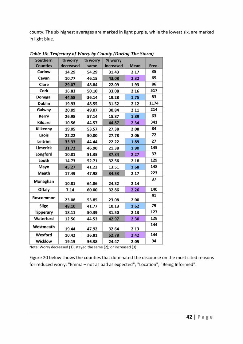
42 | P a g e
county. The six highest averages are marked in light purple, while the lowest six, are marked
in light blue.
Table 16: Trajectory of Worry by County (During The Storm)
Southern Counties
% worry decreased
% worry same
% worry increased Mean Freq.
Carlow 14.29 54.29 31.43 2.17 35
Cavan 10.77 46.15 43.08 2.32 65
Clare 29.07 48.84 22.09 1.93 86
Cork 16.83 50.10 33.08 2.16 517
Donegal 44.58 36.14 19.28 1.75 83
Dublin 19.93 48.55 31.52 2.12 1174
Galway 20.09 49.07 30.84 2.11 214
Kerry 26.98 57.14 15.87 1.89 63
Kildare 10.56 44.57 44.87 2.34 341
Kilkenny 19.05 53.57 27.38 2.08 84
Laois 22.22 50.00 27.78 2.06 72
Leitrim 33.33 44.44 22.22 1.89 27
Limerick 31.72 46.90 21.38 1.90 145
Longford 10.81 51.35 37.84 2.27 37
Louth 14.73 52.71 32.56 2.18 129
Mayo 45.27 41.22 13.51 1.68 148
Meath 17.49 47.98 34.53 2.17 223
Monaghan 10.81 64.86 24.32 2.14 37
Offaly 7.14 60.00 32.86 2.26 140
Roscommon 23.08 53.85 23.08 2.00 91
Sligo 48.10 41.77 10.13 1.62 79
Tipperary 18.11 50.39 31.50 2.13 127
Waterford 12.50 44.53 42.97 2.30 128
Westmeath 19.44 47.92 32.64 2.13 144
Wexford 10.42 36.81 52.78 2.42 144
Wicklow 19.15 56.38 24.47 2.05 94
Note: Worry decreased (1); stayed the same (2); or increased (3)
Figure 20 below shows the counties that dominated the discourse on the most cited reasons
for reduced worry: "Emma – not as bad as expected"; "Location"; "Being Informed".

43 | P a g e
Figure 20: Most Cited Causes of Reduced Worry by County
Figure 20 above has been differentiated by three colour ranges (high - low range) to signify
the percentage of reduced worry by each county. The results show that Dublin, Mayo, Sligo,
Galway Cork, and Limerick contributed most comments on the causes of reduced worry.
Figure 21 below shows the top three causes of increased worry by County. Whereas all
Counties worried about the safety of friends and family, worry about the volume of snow and
getting to work was most prevalent in counties Dublin, Kildare, Cork, Meath, Wexford,
Waterford, and Westmeath.

44 | P a g e
Figure 21: Most Cited Causes of Increased Worry by County
Worry by Gender
Comparing reported levels of worry before the storm over gender, females had a higher
average score (1.58) than males (1.35), where worry is measured on a five-point scale from
'not at all' (0) to 'a great deal' (4). Although not large in magnitude, the difference in means
is highly significant based on a t-test (t = 6.09, p<0.001).
The responses about worry levels for males and females are illustrated in Figure 22. Based
on a Kruskal-Wallis test, there is evidence that the distributions of responses over worry differ
significantly between males and females (χ2(1) = 35.490, p< 0.001).
The result of a chi-square test for independence between gender and worry, suggests a
statistically significant association: χ2(4) = 43.967, p< 0.001. The results showed that females
reported higher than expected levels of worry ranging from a moderate amount to a great
deal; however, the percentage point differences are seldom very large, see Figure 22.
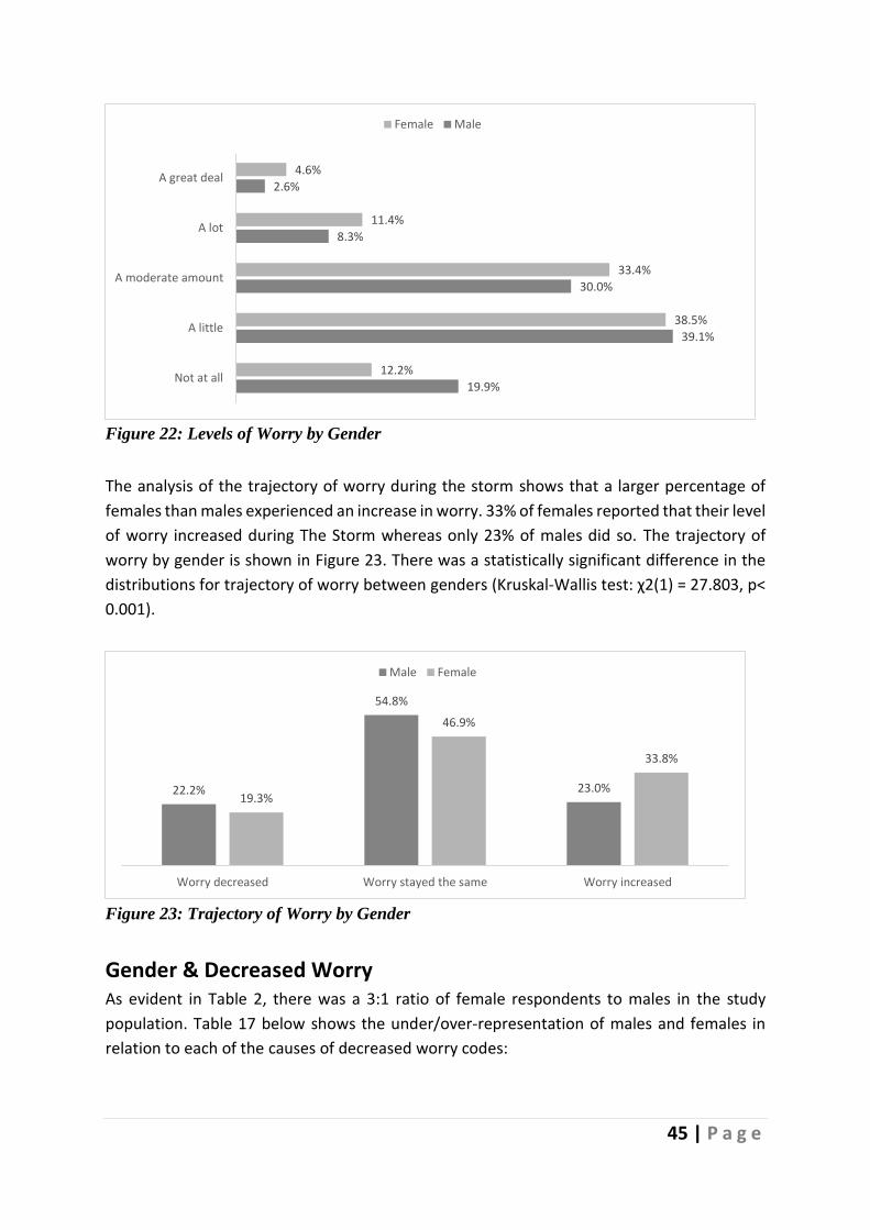
45 | P a g e
Figure 22: Levels of Worry by Gender
The analysis of the trajectory of worry during the storm shows that a larger percentage of
females than males experienced an increase in worry. 33% of females reported that their level
of worry increased during The Storm whereas only 23% of males did so. The trajectory of
worry by gender is shown in Figure 23. There was a statistically significant difference in the
distributions for trajectory of worry between genders (Kruskal-Wallis test: χ2(1) = 27.803, p<
0.001).
Figure 23: Trajectory of Worry by Gender
Gender & Decreased Worry As evident in Table 2, there was a 3:1 ratio of female respondents to males in the study
population. Table 17 below shows the under/over-representation of males and females in
relation to each of the causes of decreased worry codes:
19.9%
39.1%
30.0%
8.3%
2.6%
12.2%
38.5%
33.4%
11.4%
4.6%
Not at all
A little
A moderate amount
A lot
A great deal
Female Male
22.2%
54.8%
23.0%19.3%
46.9%
33.8%
Worry decreased Worry stayed the same Worry increased
Male Female
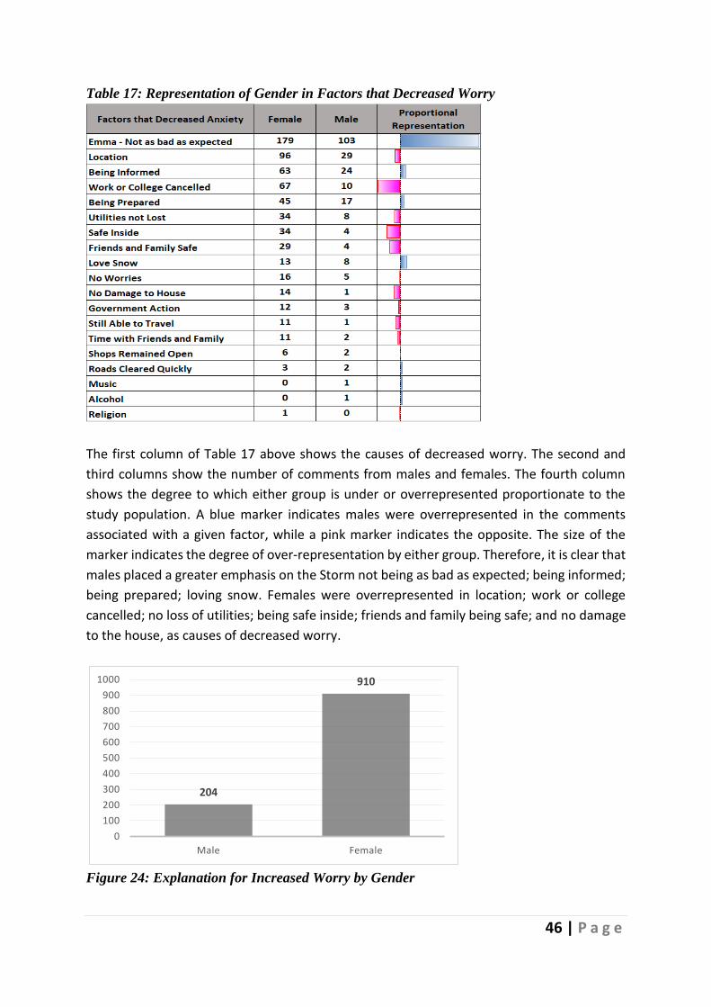
46 | P a g e
Table 17: Representation of Gender in Factors that Decreased Worry
The first column of Table 17 above shows the causes of decreased worry. The second and
third columns show the number of comments from males and females. The fourth column
shows the degree to which either group is under or overrepresented proportionate to the
study population. A blue marker indicates males were overrepresented in the comments
associated with a given factor, while a pink marker indicates the opposite. The size of the
marker indicates the degree of over-representation by either group. Therefore, it is clear that
males placed a greater emphasis on the Storm not being as bad as expected; being informed;
being prepared; loving snow. Females were overrepresented in location; work or college
cancelled; no loss of utilities; being safe inside; friends and family being safe; and no damage
to the house, as causes of decreased worry.
Figure 24: Explanation for Increased Worry by Gender
204
910
0
100
200
300
400
500
600
700
800
900
1000
Male Female

47 | P a g e
As shown in Figure 24, the discourse on increased worry was dominated by female
respondents. Table 18 below shows the emphasis across each heightened worry code by
gender. Female respondents dominated all increased worry codes except two, "High Winds"
and "The Unknown", where there was a minor proportionately increase towards males.
Table 18: Representation of Gender in Factors that Increased Worry
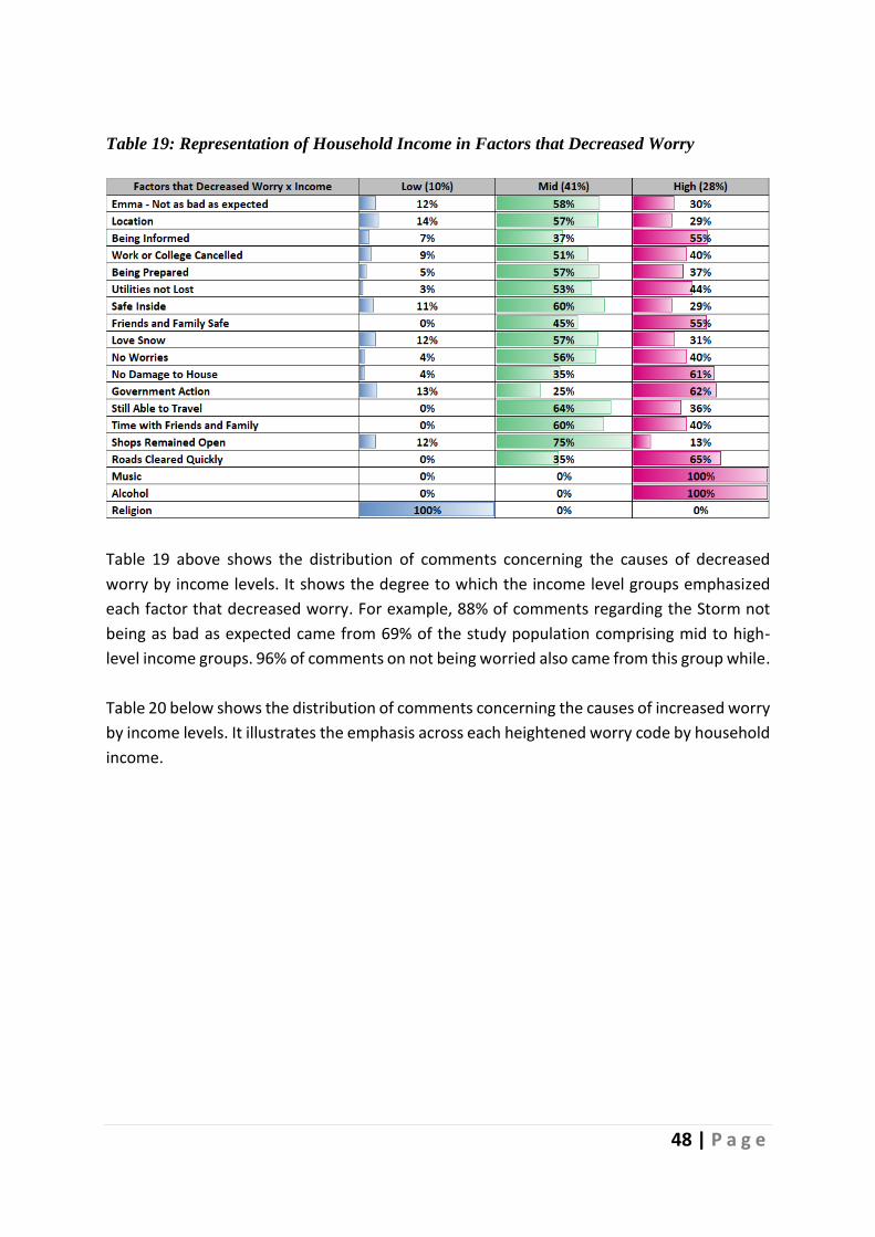
48 | P a g e
Table 19: Representation of Household Income in Factors that Decreased Worry
Table 19 above shows the distribution of comments concerning the causes of decreased
worry by income levels. It shows the degree to which the income level groups emphasized
each factor that decreased worry. For example, 88% of comments regarding the Storm not
being as bad as expected came from 69% of the study population comprising mid to high-
level income groups. 96% of comments on not being worried also came from this group while.
Table 20 below shows the distribution of comments concerning the causes of increased worry
by income levels. It illustrates the emphasis across each heightened worry code by household
income.
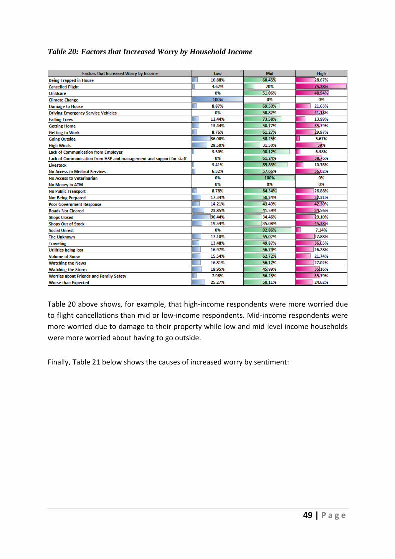
49 | P a g e
Table 20: Factors that Increased Worry by Household Income
Table 20 above shows, for example, that high-income respondents were more worried due
to flight cancellations than mid or low-income respondents. Mid-income respondents were
more worried due to damage to their property while low and mid-level income households
were more worried about having to go outside.
Finally, Table 21 below shows the causes of increased worry by sentiment:

50 | P a g e
Table 21: Causes of Decreased Worry by Sentiment
Table 21 below shows the sentiment of comments against each code. For example, the code
"Emma – not as bad as expected" contains 345 comments. When broken down by sentiment,
298 are positive, and 39 are negative totalling 337, with eight comments deemed to be
neutral. Some comments were broken into positive and negative, where a comment contains
both sentiments.
Table 21 shows the balance of comments in this category were positive, with some
respondents expressing negative comments about the Storm being not as bad as expected:
There were no major effects from the Storm, barely had any snow at all.
The warnings caused unnecessary fear. (R865)
Negative comments in this category often blamed the mainstream media for over-hyping the
Storm.
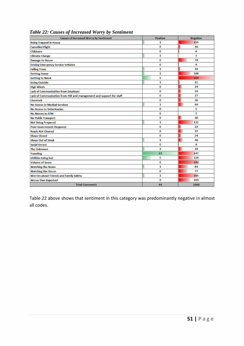
51 | P a g e
Table 22: Causes of Increased Worry by Sentiment
Table 22 above shows that sentiment in this category was predominantly negative in almost
all codes.
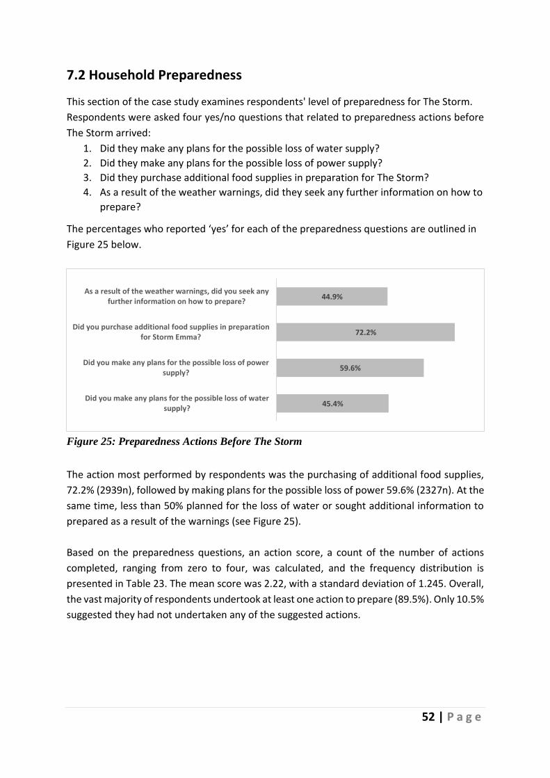
52 | P a g e
7.2 Household Preparedness
This section of the case study examines respondents' level of preparedness for The Storm.
Respondents were asked four yes/no questions that related to preparedness actions before
The Storm arrived:
1. Did they make any plans for the possible loss of water supply?
2. Did they make any plans for the possible loss of power supply?
3. Did they purchase additional food supplies in preparation for The Storm?
4. As a result of the weather warnings, did they seek any further information on how to
prepare?
The percentages who reported ‘yes’ for each of the preparedness questions are outlined in
Figure 25 below.
Figure 25: Preparedness Actions Before The Storm
The action most performed by respondents was the purchasing of additional food supplies,
72.2% (2939n), followed by making plans for the possible loss of power 59.6% (2327n). At the
same time, less than 50% planned for the loss of water or sought additional information to
prepared as a result of the warnings (see Figure 25).
Based on the preparedness questions, an action score, a count of the number of actions
completed, ranging from zero to four, was calculated, and the frequency distribution is
presented in Table 23. The mean score was 2.22, with a standard deviation of 1.245. Overall,
the vast majority of respondents undertook at least one action to prepare (89.5%). Only 10.5%
suggested they had not undertaken any of the suggested actions.
45.4%
59.6%
72.2%
44.9%
Did you make any plans for the possible loss of watersupply?
Did you make any plans for the possible loss of powersupply?
Did you purchase additional food supplies in preparationfor Storm Emma?
As a result of the weather warnings, did you seek anyfurther information on how to prepare?

53 | P a g e
Table 23: Number of Actions Before The Storm
Actions Percentage Zero Actions completed 10.5% (429n)
One Action completed 19.5% (794n)
Two Actions completed 24.8% (1010n)
Three Actions completed 27.5% (1117n)
Four Actions completed 17.7% (719n)
Note: 4069 responses
Figure 26 below provides a visualisation of the association between respondents’ worry levels
and their level of response, measured as the number of preparation actions taken. For each
stated worry level, the proportion who took 0 up to 4 actions is recorded. From the diagram
it appears that the number of actions taken is positively associated with the level of worry
stated. For example, this analysis suggests that 33.1% of respondents who worried a great
deal about the storm completed four actions completed, whereas only 5.6% of those who
were not at all worried did so. A chi-square test shows a statistically significant association
between respondents’ levels of worry about the Storm and the total number of actions
undertaken before its arrival (χ2(16) = 378.175, p< 0.001).
Table 24 provides the average number of actions for each reported worry level before The
Storm. Unsurprisingly, respondents who were not worried presented with an average action
score of 1.491 compared to 2.710 for those that worried a great deal. A Kruskal-Wallis test
indicated a statistically significant difference in the distribution of responses across levels of
worry in Table 24 (χ2(4) = 332.065, p< 0.001).
Figure 26: Actions Before The Storm by Worry
Table 24 Average Worry by
Actions Before The Storm
Mean
Not at all 1.491
A little 2.118
A moderate amount 2.468
A lot 2.652
A great deal 2.710
25.8%
10.8%
5.9%
4.8%
5.9%
28.0%
22.0%
15.9%
12.9%
11.8%
23.1%
26.5%
25.3%
21.4%
20.7%
17.5%
26.2%
31.1%
33.9%
28.4%
5.6%
14.6%
21.7%
27.0%
33.1%
Not at all
A little
A moderate amount
A lot
A great deal
Action (Before)
Wo
rry
(Be
fore
)
n=4,069
0
1
2
3
4

54 | P a g e
Comparing actions before The Storm by gender, females on average indicated a slightly larger
number of actions (2.325) than males (1.981). The difference is not large in magnitude but is
statistically significant based on a t-test (t = 7.31, p<0.001). For example, almost 15% of male
respondents reported completing zero actions before the storm arrived, whereas only 8.8%
of females reported the same. These differences between male and female responses are
represented in Figure 27.
Figure 27: Number of Actions by Gender
Examining differences in the distribution over actions before The Storm by the settlement
type in which respondents lived, the pattern displayed in Figure 28 shows the distribution is
more weighted to the right for lower levels of urbanicity. For example, around 15% of city
respondents took none of the four actions to prepare, while the corresponding figure was
only 7% for rural dwellers. A Kruskal-Wallis test rejects the hypothesis that the responses for
all settlement types are drawn from the same population distribution (p<0.001).
The mean number of actions taken before the Storm over settlement types is given in Table
25 and shows the average is increasing in the degree of urbanicity. An average of 2.448 actions
was taken by households in rural areas, compared to 1.996 for cities.
Table 25: Average Actions Taken Before The Storm, by Settlement Mean
A rural area 2.448
A village 2.263
A town 2.210
suburbs or outskirts of a city
2.109
A city 1.996
14.9%
22.5%25.5%
23.9%
13.3%
8.8%
17.8%
24.9%
29.0%
19.5%
0 1 2 3 4
Males Female
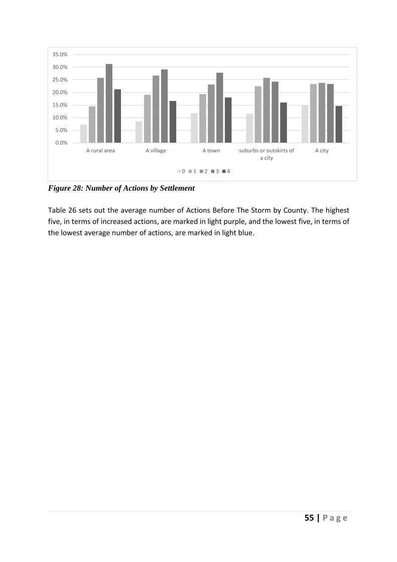
55 | P a g e
Figure 28: Number of Actions by Settlement
Table 26 sets out the average number of Actions Before The Storm by County. The highest
five, in terms of increased actions, are marked in light purple, and the lowest five, in terms of
the lowest average number of actions, are marked in light blue.
0.0%
5.0%
10.0%
15.0%
20.0%
25.0%
30.0%
35.0%
A rural area A village A town suburbs or outskirts ofa city
A city
0 1 2 3 4

56 | P a g e
Table 26: Average number of Actions Before The Storm by County
Southern Counties Mean Freq.
Carlow 2.276 29
Cavan 2.207 58
Clare 2.114 79
Cork 2.368 473
Donegal 2.000 70
Dublin 1.988 1056
Galway 2.045 199
Kerry 2.678 59
Kildare 2.417 321
Kilkenny 2.239 71
Laois 2.254 67
Leitrim 2.280 25
Limerick 2.432 125
Longford 2.727 33
Louth 2.260 123
Mayo 2.000 137
Meath 2.194 211
Monaghan 2.029 34
Offaly 2.301 133
Roscommon 2.381 84
Sligo 1.873 71
Tipperary 2.453 117
Waterford 2.564 117
Westmeath 2.281 135
Wexford 2.552 134
Wicklow 2.442 86
Respondents reported whether or not they owned each of the following 12 items: an
alternative means of heating; an emergency kit should they need to evacuate; a bag of salt
(clearing paths); a battery-powered or hand-crank radio; candles & matches/lighter;
emergency cash; emergency contact information (paper format); extra batteries; first aid kit;
large drinking water container; shovel; torch. The percentages who report having each of the
items are presented in Table 27, with the items in order of frequency of possession.
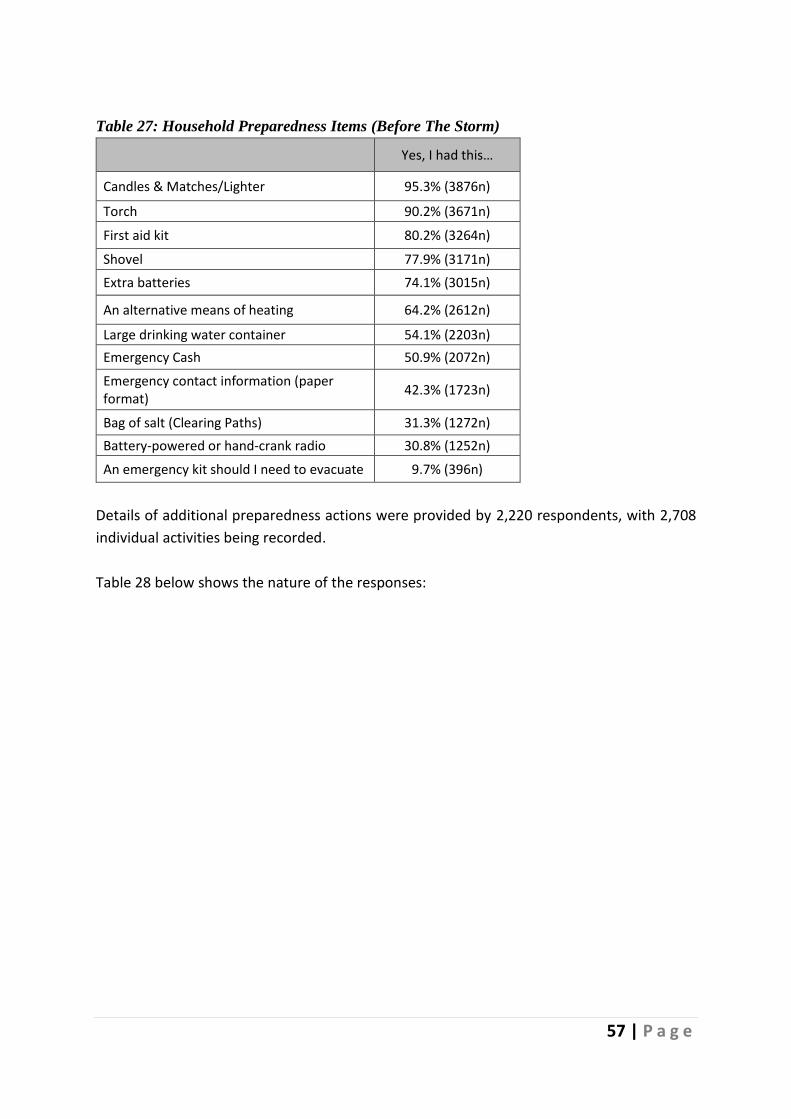
57 | P a g e
Table 27: Household Preparedness Items (Before The Storm)
Yes, I had this…
Candles & Matches/Lighter 95.3% (3876n)
Torch 90.2% (3671n)
First aid kit 80.2% (3264n)
Shovel 77.9% (3171n)
Extra batteries 74.1% (3015n)
An alternative means of heating 64.2% (2612n)
Large drinking water container 54.1% (2203n)
Emergency Cash 50.9% (2072n)
Emergency contact information (paper format)
42.3% (1723n)
Bag of salt (Clearing Paths) 31.3% (1272n)
Battery-powered or hand-crank radio 30.8% (1252n)
An emergency kit should I need to evacuate 9.7% (396n)
Details of additional preparedness actions were provided by 2,220 respondents, with 2,708
individual activities being recorded.
Table 28 below shows the nature of the responses:

58 | P a g e
Table 28: Additional Actions to Prepare for The Storm Freq.
Stocked up on Supplies 543
Nothing 459
Battened Down the Hatches 312
Helped Friends and Family 264
Stayed in House 179
Appropriate Clothing 163
Charged Batteries 99
Prepared to Work from Home 87
Watching the News 70
Kept Pets Safe 59
Moved Closer to Work 51
Protect Livestock 47
Alternative Transport 41
Stocking up on Tools 38
Travelled Home 34
Travel Bag 34
Removing Snow 33
Completed Work Before Storm 31
Already Prepared 31
Alternative Power Source 21
prepared Tyres 21
Alternative Heat Source 20
More Time for Travel 17
Entertainment 17
Alternative Cooking Source 12
Preparing for Emergency service Work 5
Emergency Contact Numbers 5
Melt Snow 4
Childcare 4
No Need to Prepare 4
Over Prepared 2
Prepared for Social Unrest 1
Total Comments 2708

59 | P a g e
Stocked up on Supplies The most cited form of preparation was stocking up on supplies, with 543 respondents (24.45%) making these arrangements.
Got heating repairs/ boiler service done. Got more turf for fire. Got more
bread + frozen food in deep freezer. (R112)
Brought extra clothing, torch, first aid kit and extra food supplies to work in
case I couldn't get home. Charged extra battery packs and my old phone in
case power went out. Took in loose garden furniture. Bought food that
wouldn't require cooking in case power went. (R494)
Extra food shopping including food that could be prepared in no
electricity/gas. Additional candles, torches. (R683)
Figure 29 shows keywords used based on frequency when discussing stocking up indicating
that fuel, water and food were mentioned most often:
Figure 29: Word Frequencies for Stockpiling to Prepare for the Storm.
Based on recurring patterns of language, Figure 30 below indicates that bread and milk were
high on the list of the items stockpiled:

60 | P a g e
Figure 30: Patterns of Language used Regarding Stockpiling
No Preparation 459 respondents said they did not make any specific preparations for The Storm. For some, this was because they did not think The Storm would not be as bad as it was, while for others it was because they believed the nationwide red weather alert was an over-reaction:
None at all. None needed. No snow fell in Sligo. The red weather alert
should NOT have been nationwide. (R1466)
Nothing. It's just a little snow. I'm from Canada. You guys can't handle
even the smallest bit of snow. (R97)
We did absolutely nothing. (R300)
For others, not preparing was a source of regret:
Not much as I wasn't expecting that my estate would be so bad as well as
roads and did not expect shops to close. (R1185)
Our family were really in transit at the time of Storm Emme but as a

61 | P a g e
motorist I was very poorly prepared. (R3548)
Didn't think it would be so bad so took no action. (R3662)
No other actions were taken. Didn't think it would get as bad as it did.
(T51)
The principal reasons for not preparing were a belief the warnings were overstated, the
warnings did not predict that the respondents' locations would be badly impacted, or general
apathy. For these reasons, one in every five respondents did not prepare in any way for the
impending Storm. Figure 31 below shows the recurrence of keywords across all 459
comments made in this context:
Figure 31: Word Frequencies used by those who did not Prepare for The Storm
Battened Down the Hatches A total of 312 respondents prepared their homes in anticipation of The Storm’s arrival. Many comments centred on securing objects that could become airborne during The Storm and cause additional damage to their homes.
Make sure everything in the garden that could be flipped over was moved
and secure. (R151)
On the Monday and Tuesday, we prepared by taking down anything that
could move in a blizzard in the garden so that it couldn't hit our windows.
(R453)
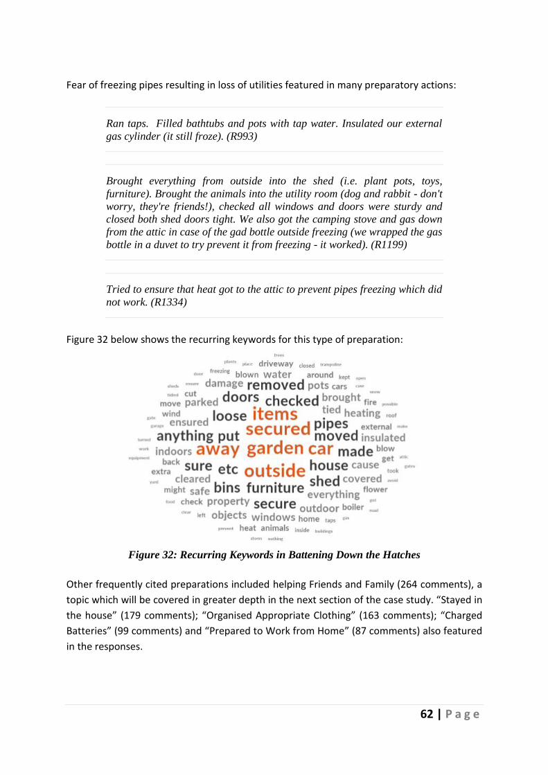
62 | P a g e
Fear of freezing pipes resulting in loss of utilities featured in many preparatory actions:
Ran taps. Filled bathtubs and pots with tap water. Insulated our external
gas cylinder (it still froze). (R993)
Brought everything from outside into the shed (i.e. plant pots, toys,
furniture). Brought the animals into the utility room (dog and rabbit - don't
worry, they're friends!), checked all windows and doors were sturdy and
closed both shed doors tight. We also got the camping stove and gas down
from the attic in case of the gad bottle outside freezing (we wrapped the gas
bottle in a duvet to try prevent it from freezing - it worked). (R1199)
Tried to ensure that heat got to the attic to prevent pipes freezing which did
not work. (R1334)
Figure 32 below shows the recurring keywords for this type of preparation:
Figure 32: Recurring Keywords in Battening Down the Hatches
Other frequently cited preparations included helping Friends and Family (264 comments), a
topic which will be covered in greater depth in the next section of the case study. “Stayed in
the house” (179 comments); “Organised Appropriate Clothing” (163 comments); “Charged
Batteries” (99 comments) and “Prepared to Work from Home” (87 comments) also featured
in the responses.
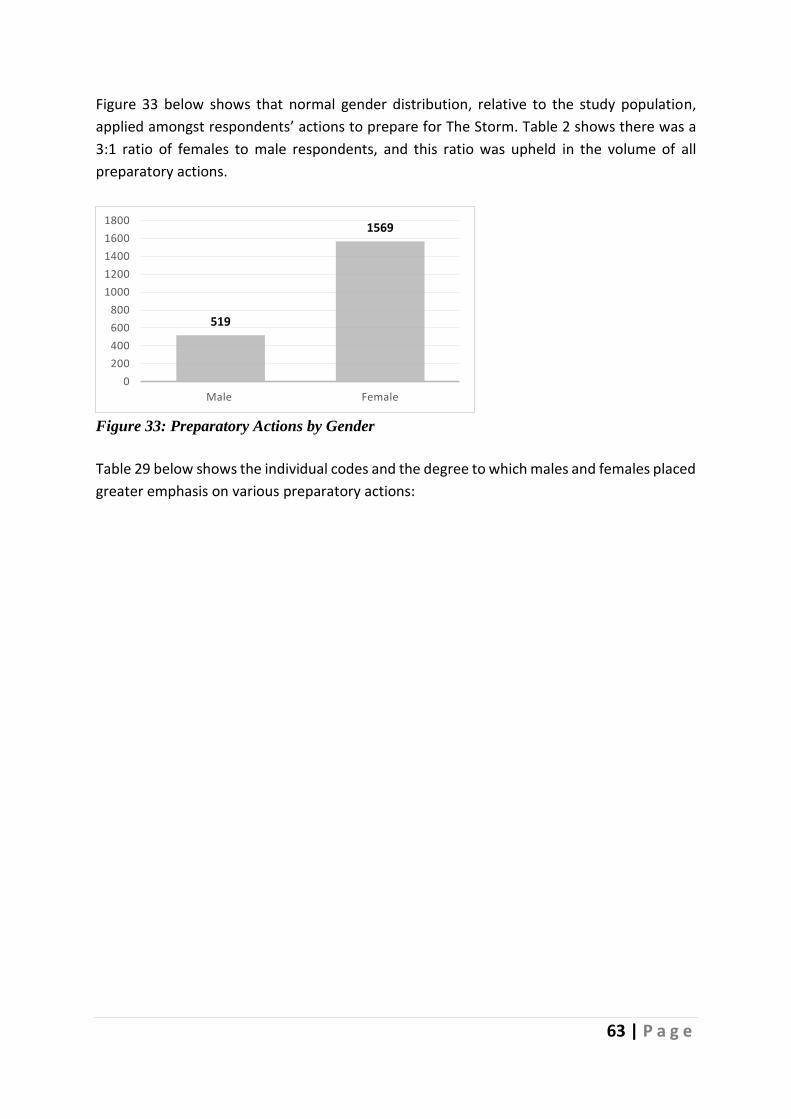
63 | P a g e
Figure 33 below shows that normal gender distribution, relative to the study population,
applied amongst respondents’ actions to prepare for The Storm. Table 2 shows there was a
3:1 ratio of females to male respondents, and this ratio was upheld in the volume of all
preparatory actions.
Figure 33: Preparatory Actions by Gender
Table 29 below shows the individual codes and the degree to which males and females placed
greater emphasis on various preparatory actions:
519
1569
0
200
400
600
800
1000
1200
1400
1600
1800
Male Female

64 | P a g e
Table 29: Additional Preparedness Actions by Gender
Table 29 shows that women placed greater emphasis on alternative transport; appropriate
clothing; charging batteries; childcare; entertainment; helping friends and families; keeping
pets safe; moving closer to work; preparing to work from home; stocking up on supplies and
watching the news. Males placed greater emphasis on being already prepared; having an
alternative cooking source; battening down the hatches; doing nothing to prepare; preparing
tyres; preparing for emergency service work; removing snow; and stocking up on tools.
Table 30 below shows the distribution of comments concerning actions taken to prepare for
The Storm by household income levels. It shows the degree to which each of the three income
level groups emphasized each preparedness action.

65 | P a g e
Table 30: Additional Actions to Prepare by Income
Table 30 above shows, for example, that high-income respondents made more preparations
for entertainment and working from home than their 28% of total respondents represents,
while actions related to childcare and needing more time for travel were given a greater
degree, proportionately, by mid-level earners. Preparing for emergency service work was
overrepresented in the low-income group.
Figure 34 below shows the distribution of comments regarding the three most cited actions
taken to prepare for The Storm by County:

66 | P a g e
Figure 34: Most Cited Additional Preparations for the Storm by County
Stocking up on supplies was most represented in urban centres such as Dublin, Galway,
Limerick, and Cork. Dublin, Galway and Cork, Mayo and Kildare were most represented
regarding doing nothing to prepare, while Dublin, Cork and Kildare were most represented in
comments concerning battening down the hatches. Table 31 shows that the sentiment in this
category was predominantly positive, with one exception – doing nothing to prepare.
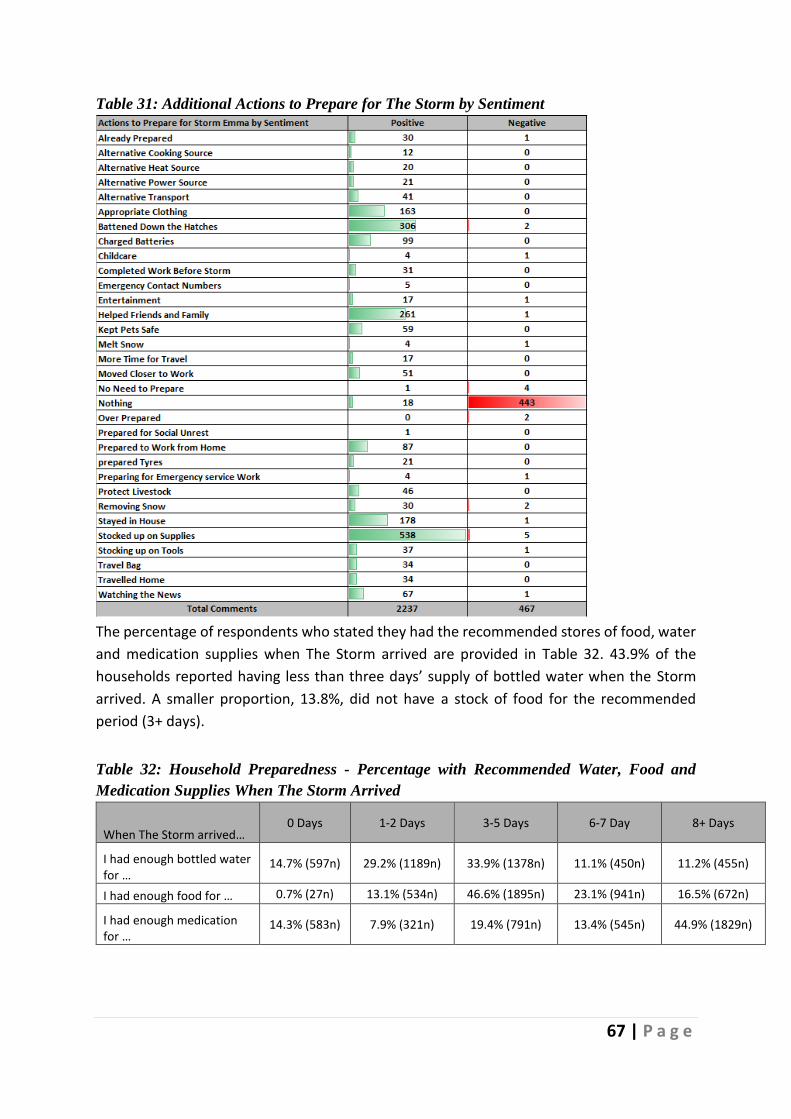
67 | P a g e
Table 31: Additional Actions to Prepare for The Storm by Sentiment
The percentage of respondents who stated they had the recommended stores of food, water
and medication supplies when The Storm arrived are provided in Table 32. 43.9% of the
households reported having less than three days’ supply of bottled water when the Storm
arrived. A smaller proportion, 13.8%, did not have a stock of food for the recommended
period (3+ days).
Table 32: Household Preparedness - Percentage with Recommended Water, Food and
Medication Supplies When The Storm Arrived
When The Storm arrived… 0 Days 1-2 Days 3-5 Days 6-7 Day 8+ Days
I had enough bottled water for …
14.7% (597n) 29.2% (1189n) 33.9% (1378n) 11.1% (450n) 11.2% (455n)
I had enough food for … 0.7% (27n) 13.1% (534n) 46.6% (1895n) 23.1% (941n) 16.5% (672n)
I had enough medication for …
14.3% (583n) 7.9% (321n) 19.4% (791n) 13.4% (545n) 44.9% (1829n)

68 | P a g e
Overall, it was important to gauge, on reflection, how respondents felt they coped with The
Storm. Their coping appraisal was reported on a scale from 0 to 100, see Figure 35, where 0
indicated not at all prepared, and 100 represented being totally prepared. Overall, the mean
response was 62.96. In total, 15% of respondents (595n) had a score of 30 or less, which
suggested they felt they were not prepared for The Storm. While on the opposite side, just
35% of respondents presented with a Coping Appraisal of 80 or above.
Figure 35: Individual Coping Appraisal
The average response for males was statistically significantly higher than that for females,
66.30 compared to 62.71. However, respondent’s reflective post-event coping appraisal,
indicating how well respondents felt they coped with The Storm, was not correlated with
settlement type (Urbanicity): correlation coefficient = -0.028 (p=0.094). This was also
confirmed by a chi-square test that showed no statistically significant association between
both factors (χ2(40) = 48.350, p=0.171).
Table 33 shows the average reported Coping Appraisal for each county. The six highest in
terms of Coping Appraisal are shaded purple while the lowest six are shared in light blue with
the difference between the highest (Mayo) and lowest (Carlow) ratings being 13.05
percentage points.
1.1%
3%4.1%
6.8%7.7%
12.7% 12.1%
17.6% 17%
10.8%
7.1%
0% 10% 20% 30% 40% 50% 60% 70% 80% 90% 100%
Coping Appraisal = 0% to 100%
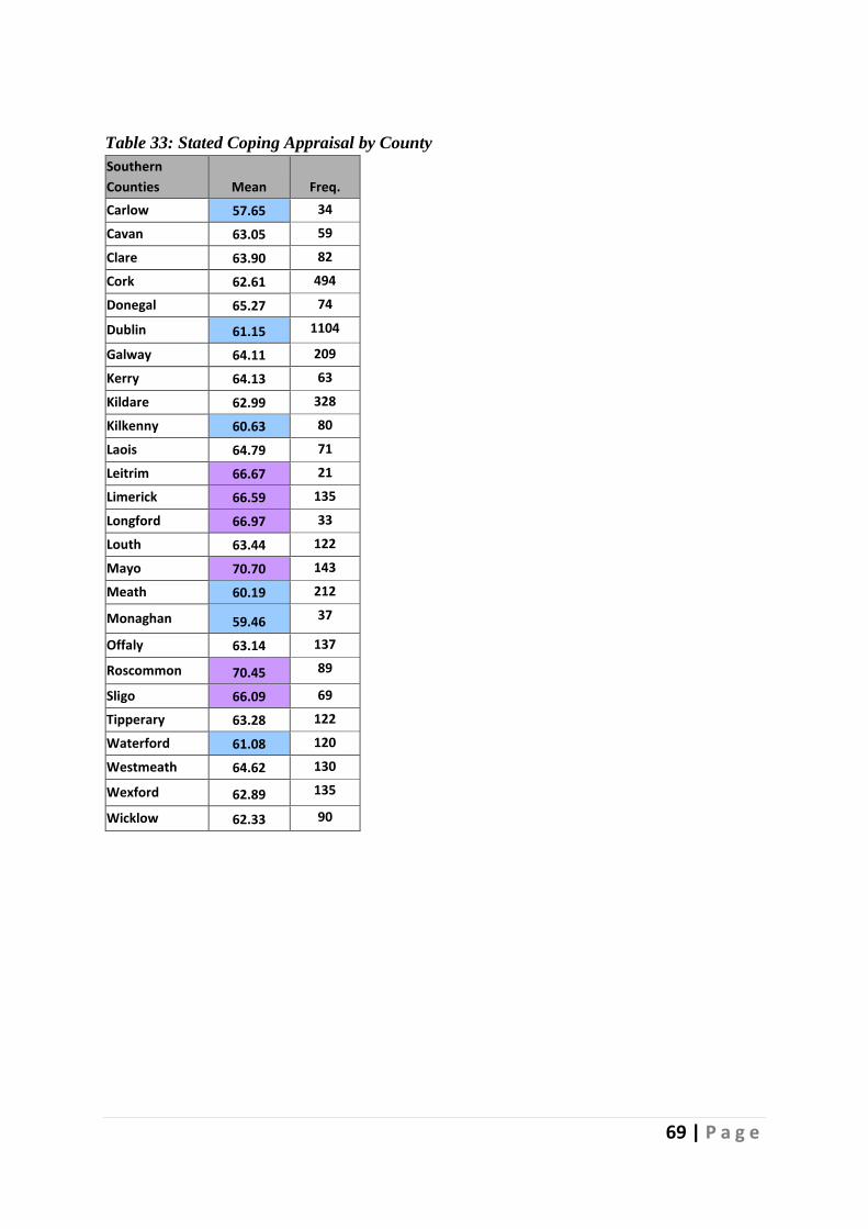
69 | P a g e
Table 33: Stated Coping Appraisal by County
Southern
Counties Mean Freq.
Carlow 57.65 34
Cavan 63.05 59
Clare 63.90 82
Cork 62.61 494
Donegal 65.27 74
Dublin 61.15 1104
Galway 64.11 209
Kerry 64.13 63
Kildare 62.99 328
Kilkenny 60.63 80
Laois 64.79 71
Leitrim 66.67 21
Limerick 66.59 135
Longford 66.97 33
Louth 63.44 122
Mayo 70.70 143
Meath 60.19 212
Monaghan 59.46 37
Offaly 63.14 137
Roscommon 70.45 89
Sligo 66.09 69
Tipperary 63.28 122
Waterford 61.08 120
Westmeath 64.62 130
Wexford 62.89 135
Wicklow 62.33 90
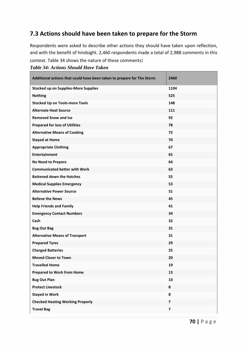
70 | P a g e
7.3 Actions should have been taken to prepare for the Storm
Respondents were asked to describe other actions they should have taken upon reflection,
and with the benefit of hindsight. 2,460 respondents made a total of 2,988 comments in this
context. Table 34 shows the nature of these comments: Table 34: Actions Should Have Taken
Additional actions that could have been taken to prepare for The Storm 2460
Stocked up on Supplies-More Supplies 1104
Nothing 525
Stocked Up on Tools-more Tools 148
Alternate Heat Source 111
Removed Snow and Ice 92
Prepared for loss of Utilities 78
Alternative Means of Cooking 72
Stayed at Home 70
Appropriate Clothing 67
Entertainment 65
No Need to Prepare 64
Communicated better with Work 63
Battened down the Hatches 55
Medical Supplies Emergency 53
Alternative Power Source 51
Believe the News 45
Help Friends and Family 41
Emergency Contact Numbers 34
Cash 32
Bug Out Bag 31
Alternative Means of Transport 31
Prepared Tyres 29
Charged Batteries 25
Moved Closer to Town 20
Travelled Home 19
Prepared to Work from Home 13
Bug Out Plan 10
Protect Livestock 8
Stayed in Work 8
Checked Heating Working Properly 7
Travel Bag 7

71 | P a g e
Additional actions that could have been taken to prepare for The Storm 2460
Access to Car 6
Kept Pets Safe 2
Cancelled Plans 1
Childcare 1
Total Comments 2988
Stocked up on Supplies 1,104 (45%) of respondents felt, on reflection, they did not stock up enough in preparation for The Storm:
Should have planned and prepared my getting extra food, water, back up
plans. (R29)
I should have been more worried and therefore filled up water bottles and
bought food that didn't require electricity to prepare. (R446)
I tried to buy some extra food for the storm however shops were sold out of
a lot of supplies. I was working in a hospital for two days; on reflection I
should have got some better footwear for wearing in and out of the
hospital. It didn’t occur to me to buy extra water. (R490)
Figure 36 below shows an analysis of the types of supplies most cited in comments:

72 | P a g e
Figure 36: Most Cited Supplies Should have Stocked
Nothing Needed A total of 525 respondents felt that they did not need to make any additional preparations for The Storm:
All that could be prepared was already done. (R54)
Not all that much, we survived pretty comfortably, the only real negative
effect was the cabin fever of not being able to leave. (R168)
There was nothing else we could have done - we could not do anything
about being snowed in for 5 days. (R390)
Figure 37 below shows the keywords most cited by those who felt they were well prepared
and did not wish, on reflection, they had done more:

73 | P a g e
Figure 37: Keywords Most Cited by Well-Prepared Respondents
Stocked up on Tools 148 respondents wished they had bought tools, primarily a shovel, before the arrival of The Storm:
I wish I’d gotten shovel and salt for potentially clearing paths outside
complex (R632)
A shovel to clear the car in case I really needed to get out on the Saturday.
(R1388)
Other items frequently listed as something that should have been purchased before The
Storm included: torches; salt, extra shovels so multiple people can help clear snow; grit;
candles; and snowshoes. Two in every three respondents who replied to this question
selected items in the top three categories (see Table 34). Other lost opportunities to prepare
included: not securing alternative heat sources (111 comments); not removing snow and ice
earlier (92 comments); being better prepared for the loss of utilities with flashlights,
generators, and stored bottled water (78 comments).
Female respondents were marginally overrepresented for comments made regarding things
they should have done to prepare for The Storm. Figure 38 below shows females submitted
a greater number of comments than their 3:1 ratio within the study population:
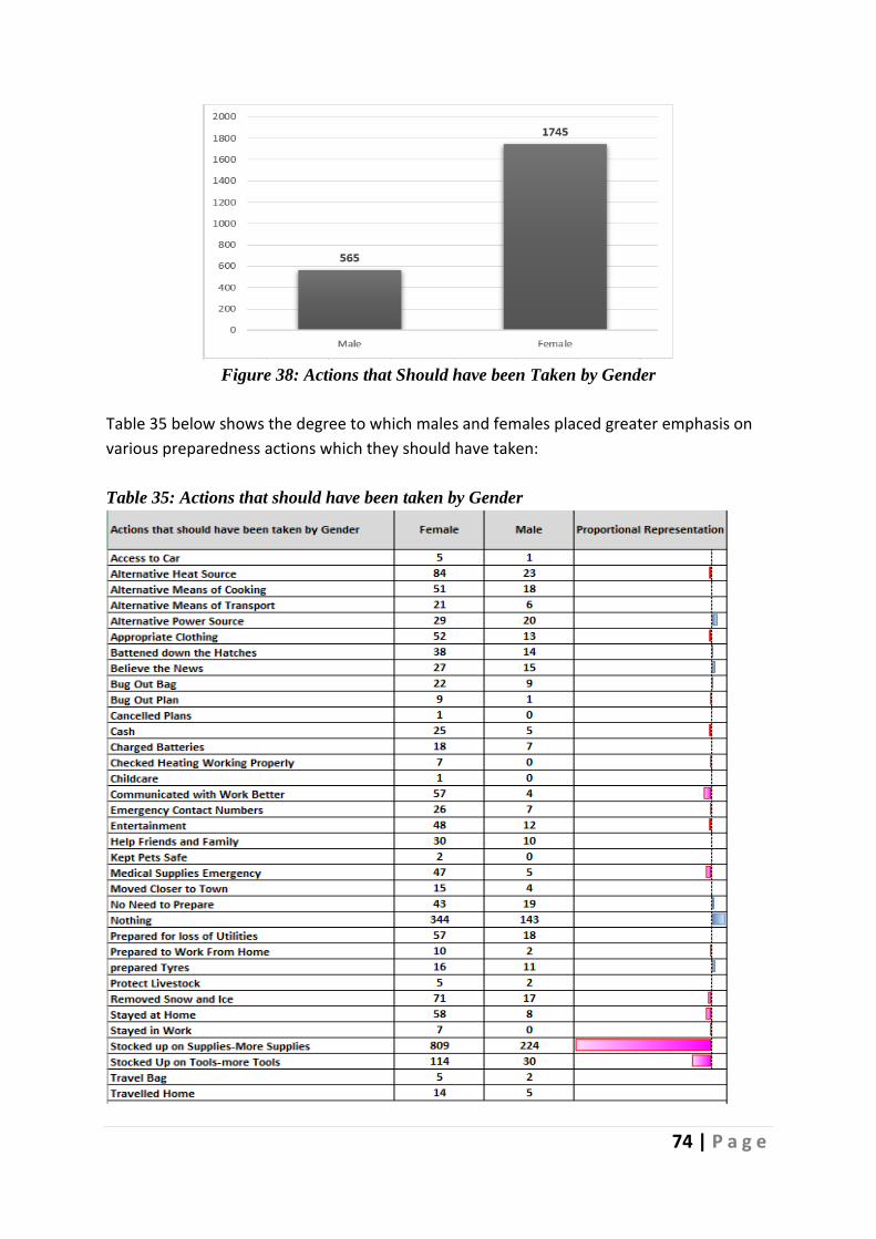
74 | P a g e
Figure 38: Actions that Should have been Taken by Gender
Table 35 below shows the degree to which males and females placed greater emphasis on
various preparedness actions which they should have taken:
Table 35: Actions that should have been taken by Gender

75 | P a g e
Distribution was normal for all codes in this category except one which was skewed mainly
towards female respondents. Males placed a marginally greater emphasis on putting in place
alternative power sources; believing the news; not needing to do any more than they did; and
preparing tyres. Females wished they had communicated better with work; and stayed at
home. However, the most significant difference related to stocking up with more supplies -
809 females to 224 males wished they had stocked up with more supplies.
Table 36 below shows the distribution of comments concerning actions that, on reflection,
could have been taken by household income level. It shows the degree to which each income
level group emphasized actions they should have taken.
Table 36: Actions that should have been taken by Income

76 | P a g e
Table 36 above shows, for example, that high-income respondents regretted not having made
more arrangements for childcare, while those in the mid-level income bracket regretted not
communicating better with work and not planning more to work from home. Low-income
respondents regretted not making more arrangements to keep pets safe.
Figure 39 below shows the distribution of comments relating to the top three most cited
actions which respondents wished they had taken to prepare for The Storm by County:
Figure 39: Top Three Actions by County
While Dublin and Cork respondents topped the list of those wishing they had stocked up
more, there were frequent contributions from Kildare, Waterford, Wexford, Meath, Louth,
Offaly, Tipperary, Galway, and Limerick. Those who believed they had done enough tended
to live in Cork, Kerry, Galway, Sligo, Mayo, Cavan, and Dublin. Those wishing they had invested
more in equipment were primarily from Dublin, Kildare, and Cork.
Below shows a sentiment analysis of comments in this category:
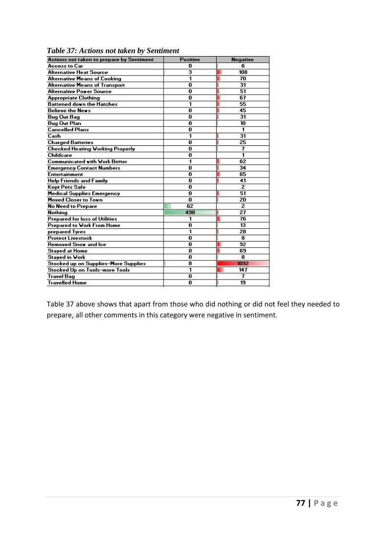
77 | P a g e
Table 37: Actions not taken by Sentiment
Table 37 above shows that apart from those who did nothing or did not feel they needed to
prepare, all other comments in this category were negative in sentiment.
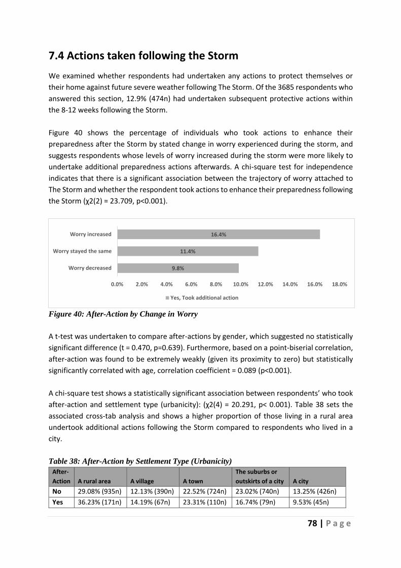
78 | P a g e
7.4 Actions taken following the Storm
We examined whether respondents had undertaken any actions to protect themselves or
their home against future severe weather following The Storm. Of the 3685 respondents who
answered this section, 12.9% (474n) had undertaken subsequent protective actions within
the 8-12 weeks following the Storm.
Figure 40 shows the percentage of individuals who took actions to enhance their
preparedness after the Storm by stated change in worry experienced during the storm, and
suggests respondents whose levels of worry increased during the storm were more likely to
undertake additional preparedness actions afterwards. A chi-square test for independence
indicates that there is a significant association between the trajectory of worry attached to
The Storm and whether the respondent took actions to enhance their preparedness following
the Storm (χ2(2) = 23.709, p<0.001).
Figure 40: After-Action by Change in Worry
A t-test was undertaken to compare after-actions by gender, which suggested no statistically
significant difference (t = 0.470, p=0.639). Furthermore, based on a point-biserial correlation,
after-action was found to be extremely weakly (given its proximity to zero) but statistically
significantly correlated with age, correlation coefficient = 0.089 (p<0.001).
A chi-square test shows a statistically significant association between respondents’ who took
after-action and settlement type (urbanicity): (χ2(4) = 20.291, p< 0.001). Table 38 sets the
associated cross-tab analysis and shows a higher proportion of those living in a rural area
undertook additional actions following the Storm compared to respondents who lived in a
city.
Table 38: After-Action by Settlement Type (Urbanicity)
After-
Action A rural area A village A town
The suburbs or
outskirts of a city A city
No 29.08% (935n) 12.13% (390n) 22.52% (724n) 23.02% (740n) 13.25% (426n)
Yes 36.23% (171n) 14.19% (67n) 23.31% (110n) 16.74% (79n) 9.53% (45n)
9.8%
11.4%
16.4%
0.0% 2.0% 4.0% 6.0% 8.0% 10.0% 12.0% 14.0% 16.0% 18.0%
Worry decreased
Worry stayed the same
Worry increased
Yes, Took additional action

79 | P a g e
7.5 Community Response
This section of the Case Study examines the role played by community at a time of an adverse
weather event. Respondents were asked whether they provided assistance and whether they
received assistance, from family members and neighbours, see Figure 41 and Figure 42. 50.4%
(2029n) indicated that they provided support to a neighbour in person while 31.1% (1253n)
of the respondents indicated that a neighbour had assisted them. Of those who received
assistance, 78.2% (675n) found it was either very useful or extremely useful, see Figure 43.
Figure 41: Community Support – Provided
Note, respondents could select multiple options.
Figure 42: Community Support – Received
Note, respondents could select multiple options.
50.4%
10.8%
38.4%
24.5%
Assisted neighbours in person
Assisted neighbours over the phone
Assisted family members in person
Assisted family members over the phone
31.1%
4.3%
26.7%
13.5%
Neighbours assisted me in person
Neighbours assisted me over the phone
Family members assisted me in person
Family members assisted me over the phone

80 | P a g e
Figure 43: Assistance received was useful
Comparing levels of support provided over the phone between genders (see Table 44)
females on average were more likely to have provided support. t-tests conducted show the
differences are highly statistically significant: assisting neighbours over the phone t-test (t =
3.76, p<0.001); assisting family members over the phone t-test (t = 4.77, p<0.001).
Examining the levels of support provided in person by gender (see Figure 44), males on
average were more likely to have provided support. Again, two t-tests were run to determine
if these differences statistically significant. The difference in means for assisting neighbours
in person by gender was significant based on a t-test (t = 1.92, p=0.055); however, assisting
family members in person was not statistically significant (t = 0.83, p=0.406).
Figure 44: Percentage Support Provided By Gender
0.5%
4.6%
16.7%
43.7%
34.5%
Not at all useful
Slightly useful
Moderately useful
Very useful
Extremely useful
53
.5%
7.4
%
39
.0%
18
.6%
49
.8%
11
.9%
37
.5%
26
.4%
A S S I S T E D N E I G H B O U R S I N
P E R S O N
A S S I S T E D N E I G H B O U R S O V E R
T H E P H O N E
A S S I S T E D F A M I L Y M E M B E R S I N P E R S O N
A S S I S T E D F A M I L Y M E M B E R S O V E R T H E
P H O N E
Male Female
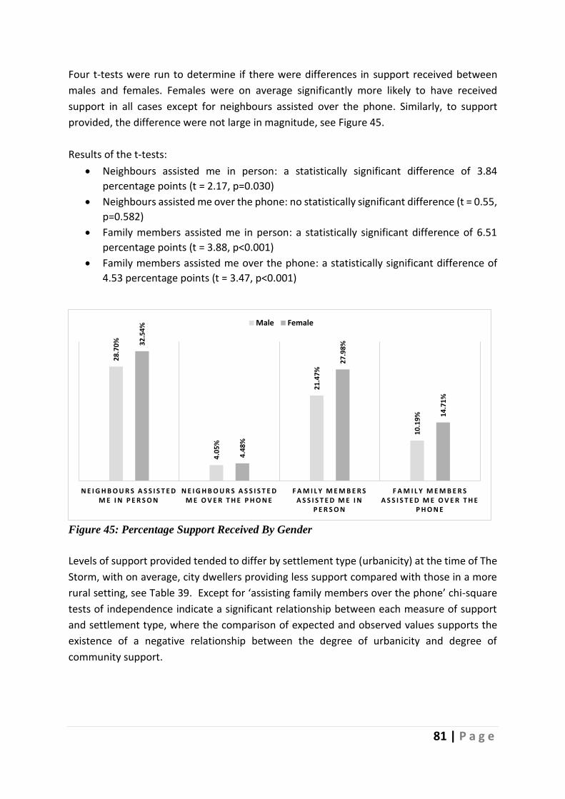
81 | P a g e
Four t-tests were run to determine if there were differences in support received between
males and females. Females were on average significantly more likely to have received
support in all cases except for neighbours assisted over the phone. Similarly, to support
provided, the difference were not large in magnitude, see Figure 45.
Results of the t-tests:
• Neighbours assisted me in person: a statistically significant difference of 3.84
percentage points (t = 2.17, p=0.030)
• Neighbours assisted me over the phone: no statistically significant difference (t = 0.55,
p=0.582)
• Family members assisted me in person: a statistically significant difference of 6.51
percentage points (t = 3.88, p<0.001)
• Family members assisted me over the phone: a statistically significant difference of
4.53 percentage points (t = 3.47, p<0.001)
Figure 45: Percentage Support Received By Gender
Levels of support provided tended to differ by settlement type (urbanicity) at the time of The
Storm, with on average, city dwellers providing less support compared with those in a more
rural setting, see Table 39. Except for ‘assisting family members over the phone’ chi-square
tests of independence indicate a significant relationship between each measure of support
and settlement type, where the comparison of expected and observed values supports the
existence of a negative relationship between the degree of urbanicity and degree of
community support.
28
.70
%
4.0
5%
21
.47
%
10
.19
%
32
.54
%
4.4
8%
27
.98
%
14
.71
%
N E I G H B O U R S A S S I S T E D M E I N P E R S O N
N E I G H B O U R S A S S I S T E D M E O V E R T H E P H O N E
F A M I L Y M E M B E R S A S S I S T E D M E I N
P E R S O N
F A M I L Y M E M B E R S A S S I S T E D M E O V E R T H E
P H O N E
Male Female

82 | P a g e
Table 39: Average Community Support – Provided by Settlement location at the time of The
Storm (Urbanicity)
Assisted neighbours in person
Assisted neighbours over the phone
Assisted family members in person
Assisted family members over the phone
A rural area 53.03% 15.89% 46.44% 23.79%
A village 57.26% 11.04% 39.47% 27.81%
A town 51.52% 10.05% 38.95% 25.24%
The suburbs or outskirts of a city
50.49% 8.34% 35.46% 24.81%
A city 36.48% 5.29% 23.82% 20.79%
Notes: Assisted neighbours in person: χ2(4) = 53.800, p<0.001
Assisted neighbours over the phone: χ2(4) = 53.524, p<0.001
Assisted family members in person: χ2(4) = 82.419, p<0.001
Assisted family members over the phone: non-significant.
Average levels of support received by settlement type are reported in Table 40. Table 40
highlights that respondents who lived in a rural setting were more likely to receive support in
person and from neighbours over the phone, compared to those in a city at the time of the
Storm. Only for the case ‘Family members assisted me over the phone’ do we accept
independence between settlement type and the support measure, based on chi-square tests.
Table 40: Average Community Support Received by Settlement location at the time of The
Storm (Urbanicity)
Neighbours assisted me in
person
Neighbours assisted me
over the phone
Family members assisted me in
person
Family members assisted me over
the phone
A rural area 35.03% 7.11% 34.77% 13.26%
A village 36.61% 3.89% 29.04% 14.72%
A town 31.62% 3.98% 26.49% 12.57%
The suburbs or outskirts of a city
29.97% 2.41% 21.30% 13.72%
A city 18.90% 2.84% 17.01% 13.99%
Notes: Neighbours assisted me in person: χ2(4) = 52.461, p<0.001
Neighbours assisted me over the phone: χ2(4) = 32.554, p<0.001
Family members assisted me in person: χ2(4) = 78.165, p<0.001
Family members assisted me over the phone: non-significant.
Table 41 sets out the percentages reporting they provided each type of community support
by county. The five counties with the highest percentages are marked in light purple, and the
lowest five are marked in light blue.

83 | P a g e
Table 41: Community Support Provided by County
Southern Counties
Assisted neighbours in person
Assisted neighbours over the phone
Assisted family members in person
Assisted family members over the phone
Carlow 24.14% 10.34% 44.83% 31.03%
Cavan 57.89% 10.53% 42.11% 28.07%
Clare 41.03% 15.38% 41.03% 24.36%
Cork 42.77% 8.30% 35.96% 24.89%
Donegal 17.65% 14.71% 41.18% 13.24%
Dublin 50.48% 6.73% 32.69% 23.46%
Galway 34.52% 13.20% 29.95% 26.90%
Kerry 45.76% 16.95% 38.98% 25.42%
Kildare 77.04% 11.64% 42.45% 31.13%
Kilkenny 47.14% 18.57% 38.57% 27.14%
Laois 53.73% 19.40% 44.78% 31.34%
Leitrim 41.67% 12.50% 37.50% 25.00%
Limerick 35.54% 15.70% 34.71% 19.83%
Longford 60.61% 18.18% 45.45% 27.27%
Louth 45.90% 13.11% 46.72% 24.59%
Mayo 36.57% 13.43% 35.82% 14.93%
Meath 62.86% 9.05% 44.29% 26.19%
Monaghan 44.12% 5.88% 52.94% 14.71%
Offaly 64.66% 12.03% 48.87% 30.83%
Roscommon 51.81% 10.84% 39.76% 22.89%
Sligo 25.35% 21.13% 30.99% 21.13%
Tipperary 43.97% 12.07% 48.28% 17.24%
Waterford 57.26% 8.55% 32.48% 27.35%
Westmeath 52.24% 11.19% 43.28% 23.13%
Wexford 67.42% 15.15% 48.48% 24.24%
Wicklow 60.00% 15.29% 42.35% 23.53%
Table 42 sets out the percentage who state they received support received by county. The
highest five are marked in light purple, and the lowest five are marked in light blue.
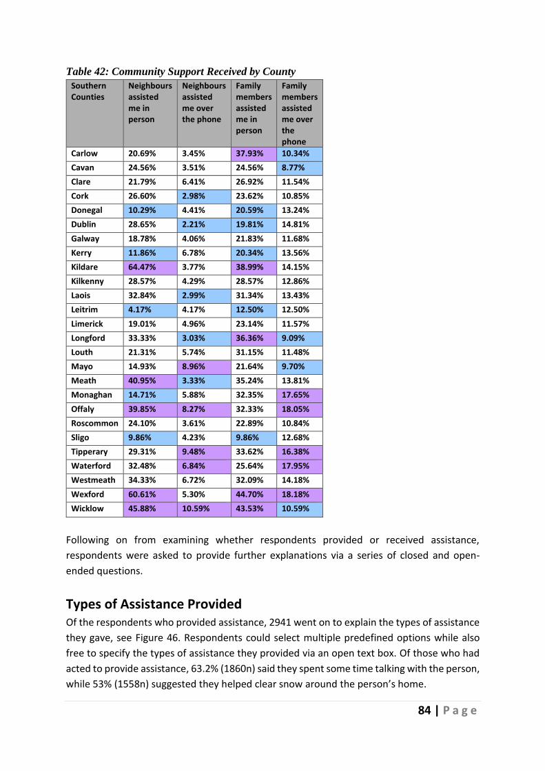
84 | P a g e
Table 42: Community Support Received by County
Southern Counties
Neighbours assisted me in person
Neighbours assisted me over the phone
Family members assisted me in person
Family members assisted me over the phone
Carlow 20.69% 3.45% 37.93% 10.34%
Cavan 24.56% 3.51% 24.56% 8.77%
Clare 21.79% 6.41% 26.92% 11.54%
Cork 26.60% 2.98% 23.62% 10.85%
Donegal 10.29% 4.41% 20.59% 13.24%
Dublin 28.65% 2.21% 19.81% 14.81%
Galway 18.78% 4.06% 21.83% 11.68%
Kerry 11.86% 6.78% 20.34% 13.56%
Kildare 64.47% 3.77% 38.99% 14.15%
Kilkenny 28.57% 4.29% 28.57% 12.86%
Laois 32.84% 2.99% 31.34% 13.43%
Leitrim 4.17% 4.17% 12.50% 12.50%
Limerick 19.01% 4.96% 23.14% 11.57%
Longford 33.33% 3.03% 36.36% 9.09%
Louth 21.31% 5.74% 31.15% 11.48%
Mayo 14.93% 8.96% 21.64% 9.70%
Meath 40.95% 3.33% 35.24% 13.81%
Monaghan 14.71% 5.88% 32.35% 17.65%
Offaly 39.85% 8.27% 32.33% 18.05%
Roscommon 24.10% 3.61% 22.89% 10.84%
Sligo 9.86% 4.23% 9.86% 12.68%
Tipperary 29.31% 9.48% 33.62% 16.38%
Waterford 32.48% 6.84% 25.64% 17.95%
Westmeath 34.33% 6.72% 32.09% 14.18%
Wexford 60.61% 5.30% 44.70% 18.18%
Wicklow 45.88% 10.59% 43.53% 10.59%
Following on from examining whether respondents provided or received assistance,
respondents were asked to provide further explanations via a series of closed and open-
ended questions.
Types of Assistance Provided Of the respondents who provided assistance, 2941 went on to explain the types of assistance
they gave, see Figure 46. Respondents could select multiple predefined options while also
free to specify the types of assistance they provided via an open text box. Of those who had
acted to provide assistance, 63.2% (1860n) said they spent some time talking with the person,
while 53% (1558n) suggested they helped clear snow around the person’s home.

85 | P a g e
Figure 46: Types of Assistance Provided – pre-defined categories
639 respondents responded to the “other, please specify” invitation and provided detailed
describing the assistance they provided to others during The Storm. Table 43 below shows
the nature of their responses.
40.8%
53.0%
63.2%
22.3%
Helped with their shopping
Helped clear snow around their home
I spent some time talking with them
Other, please specify
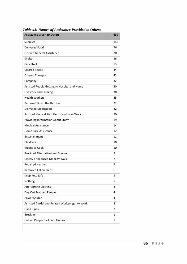
86 | P a g e
Table 43: Nature of Assistance Provided to Others
Assistance Given to Others 639
Supplies 145
Delivered Food 76
Offered General Assistance 70
Shelter 56
Cars Stuck 53
Cleared Roads 44
Offered Transport 42
Company 32
Assisted People Getting to Hospital and Home 30
Livestock and Farming 30
Health Workers 25
Battened Down the Hatches 22
Delivered Medication 22
Assisted Medical Staff Get to and from Work 20
Providing Information About Storm 19
Medical Assistance 14
Home Care Assistance 12
Entertainment 11
Childcare 10
Means to Cook 10
Provided Alternative Heat Source 9
Elderly or Reduced Mobility Walk 7
Repaired Heating 7
Removed Fallen Trees 6
Keep Pets Safe 5
Nothing 5
Appropriate Clothing 4
Dug Out Trapped People 4
Power Source 4
Assisted Gardai and Related Workers get to Work 2
Fixed Pipes 2
Break In 1
Helped People Back into Homes 1
Total Comments 825
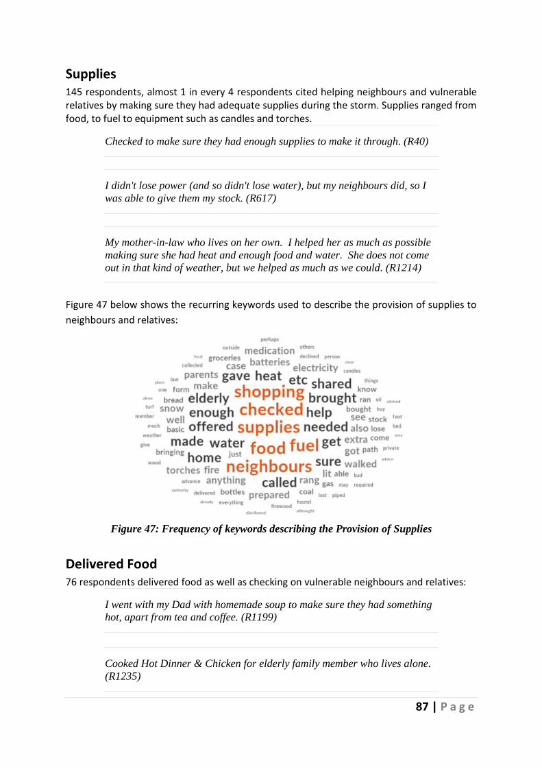
87 | P a g e
Supplies 145 respondents, almost 1 in every 4 respondents cited helping neighbours and vulnerable relatives by making sure they had adequate supplies during the storm. Supplies ranged from food, to fuel to equipment such as candles and torches.
Checked to make sure they had enough supplies to make it through. (R40)
I didn't lose power (and so didn't lose water), but my neighbours did, so I
was able to give them my stock. (R617)
My mother-in-law who lives on her own. I helped her as much as possible
making sure she had heat and enough food and water. She does not come
out in that kind of weather, but we helped as much as we could. (R1214)
Figure 47 below shows the recurring keywords used to describe the provision of supplies to
neighbours and relatives:
Figure 47: Frequency of keywords describing the Provision of Supplies
Delivered Food 76 respondents delivered food as well as checking on vulnerable neighbours and relatives:
I went with my Dad with homemade soup to make sure they had something
hot, apart from tea and coffee. (R1199)
Cooked Hot Dinner & Chicken for elderly family member who lives alone.
(R1235)

88 | P a g e
I brought hot meals where there was a loss of power. (R1888)
Offered General Assistance Other respondents offered more general assistance:
I checked on elderly neighbour to see if they needed food or any help.
(R587)
Offered assistance in case elderly neighbours did not want to venture out in
the snowy conditions to buy groceries etc. Generally checked on neighbours
in terms of their safety and well-being. (R1482)
Some used social media to keep in touch during The Storm. Respondent 1371 described a
localised community-based approach to communicate and offer advice and assistance across
the community:
Set up a Facebook page - Helping Each Other Out – [county name] where
locals offered help, gained and shared advice and just kept in touch with
each other with updates. (R1371)
A smaller number of respondents reported being members of community groups, where
offers of assistance were more formalised:
I am a member of the community association. We let people know if they
needed us, we were there to help. (R1573)
Other assistance offered included offering shelter to those without power, freeing cars that
were stuck in the snow, clearing roads, and offering transport. See Table 43 above for a full
list of all types of assistance offered.
Assistance by Gender The gender balance of respondents describing how they offered assistance was in line with
the study population (3:1 ratio female to males) as shown in below:

89 | P a g e
Figure 48: Assistance offered by Gender
Table 44 below shows the type of assistance provided and the breakdown between that
provided by males and females.
Table 44: Type of Assistance Provided to Others by Gender

90 | P a g e
Table 44 above shows that while the overall distribution was in line with the study population
at a macro level, there was nevertheless greater disparity at the level of individual codes.
Males were overrepresented when it came to helping with transport and getting people to
and from work; helping those who had cars stuck or clearing roads and footpaths; helping
with livestock and farming; and helping to repair heating systems. By comparison, females
provided assistance by ensuring neighbours and vulnerable people had adequate supplies;
provided shelter; offered generalised assistance; helped by keeping pets safe and delivering
food; and providing company and entertainment for others.
Assistance Provided by Income Level Table 45 below shows the distribution of comments concerning the assistance provided to
others by income level.
Table 45: Assistance Provided to Others by Income Level
Table 45 shows, for example, that higher-income respondents were more represented
proportionately when it came to helping with fallen trees, mid-level respondents had greater
involvement in fixing pipes, and lower-level income respondents were more involved in
helping people to get back into their homes.

91 | P a g e
Assistance Provided by County Figure 49 below shows the distribution of comments regarding the three most cited types of
assistance offered by County:
Figure 49: Assistance Provided by County
Offers to assist with supplies were recorded across the Counties, and the volume of assistance
was in line with the proportion of the study population. Similarly, offers to deliver food were
evident across the country with some overrepresentation in Counties Kildare, Tipperary,
Roscommon, Kilkenny, Galway, Dublin, Cork, and Limerick. More general assistance was

92 | P a g e
disproportionately represented in Kildare, Wexford, Meath, Cavan, Offaly, Tipperary, Mayo,
Clare, Cork, and Limerick.
Assistance Provided & Sentiment The table below provides sentiment analysis of the comments in this category and shows that
except for five of 797 comments, the sentiment expressed was positive:
Table 46: Assistance Provided to Others by Sentiment

93 | P a g e
Types of Assistance Received Of the respondents who received assistance, 2030n went on to explain the types of assistance
they received, see Figure 50. Respondents could select multiple pre-defined options and
could also specify other types of assistance they received using an open text box. Clearing
snow (54.9%, 1114n) and checking to see if they needed assistance (43.5%, 883n) was most
selected.
Figure 50: Types of Assistance Received – pre-defined categories
A total of 309 respondents provided details of additional assistance they received during The
Storm- providing a total of 340 comments. Table 47 below shows the type of help they
received.
16.0%
54.9%
43.5%
1.3%
15.4%
I was given help with shopping
I was given help clearing snow
Someone checked did I need assistance
I called for assistance from the emergency services
Other assistance, please specify

94 | P a g e
Table 47: Assistance Received
Assistance Received Incidence
Transport Assistance 73
Supplies 39
Cars Stuck 34
Cleared Roads 26
Emotional Support 21
Childcare 18
Help with Farm and Livestock 16
Batten Down the Hatches 14
None 14
Received Shelter 11
Keep Pets Safe 8
Accommodation for Work 8
Food Delivered 8
Heating Repair 7
Advice on Preparation 6
Dug Out Trapped People 6
Elderly or Reduced Mobility Walk 4
Offered Assistance 3
Removed Fallen Tree 3
Road Condition Tips 3
Help Getting a Doctor 3
Getting to Hospital 3
Provided Power Source 3
Tools Provided 2
Medicine Delivery 2
Preparing to Work from Home 1
Provided Alternative Heat Source 1
Palliative Care 1
Power Restored 1
Assistance from News and Media Outlets 1

95 | P a g e
Received Assistance with Transport Assistance with transport was reported by 73 respondents. They received help in a variety
of ways, including:
Our neighbour has a 4 x 4 and my husband asked for a lift on Day 3 so that
we could get some supplies from the shop. (R1712)
Assistance offered to my husband when his jeep broke down - difficulty
accessing the farm and looking after the animals. (R1786)
Neighbours with 4 x 4's and tractors called to houses bringing us to nearest
supermarkets as our local shop was closed after day 1- severe snowstorm
due to lack of supplies and ability to reach our village. (R2132)
Received Assistance with Supplies Supplies were offered or provided to 39 respondents:
Neighbour offered food if necessary. (R862)
Neighbours supplied 5 litre bottles of water so we could wash and cook with.
Our water supply was halted, and they were ok. (R1650)
Figure 51 below summarises the type of supplies received:

96 | P a g e
Figure 51: Type of Supplies Received
Received Assistance with Car A total of 34 respondents reported receiving help with cars that were stuck in the snow:
My husband’s car got stuck on one of the roads near us and neighbours
help dig him out. It took about an hour. (R993)
Neighbour pulled my car out of snowdrift with tractor. (R2567)
Other types of help received included: clearing roads (26 comments), emotional support (21
comments), assistance with childcare (18 comments), help with farm and livestock (16
comments), and help to batten down the hatches (14 comments).
Assistance Received by Gender Females were disproportionately represented in the number reporting that they received
assistance (see Figure 52).
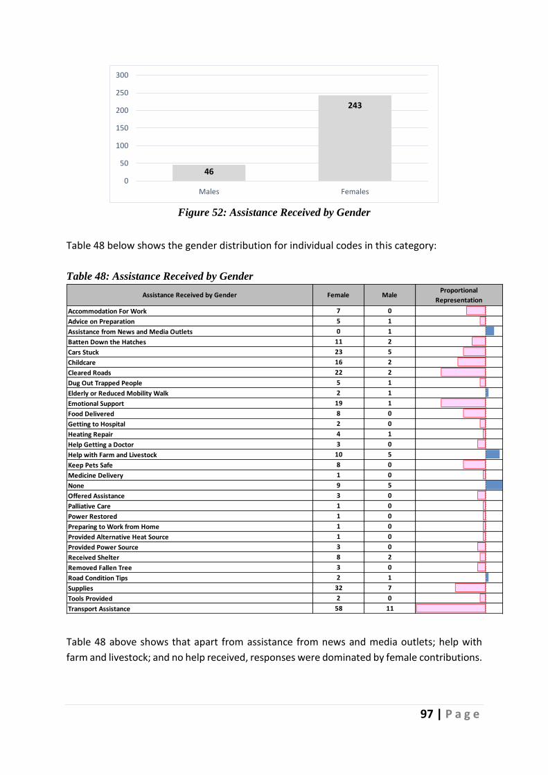
97 | P a g e
Figure 52: Assistance Received by Gender
Table 48 below shows the gender distribution for individual codes in this category:
Table 48: Assistance Received by Gender
Table 48 above shows that apart from assistance from news and media outlets; help with
farm and livestock; and no help received, responses were dominated by female contributions.
46
243
0
50
100
150
200
250
300
Males Females
Assistance Received by Gender Female MaleProportional
Representation
Accommodation For Work 7 0
Advice on Preparation 5 1
Assistance from News and Media Outlets 0 1
Batten Down the Hatches 11 2
Cars Stuck 23 5
Childcare 16 2
Cleared Roads 22 2
Dug Out Trapped People 5 1
Elderly or Reduced Mobility Walk 2 1
Emotional Support 19 1
Food Delivered 8 0
Getting to Hospital 2 0
Heating Repair 4 1
Help Getting a Doctor 3 0
Help with Farm and Livestock 10 5
Keep Pets Safe 8 0
Medicine Delivery 1 0
None 9 5
Offered Assistance 3 0
Palliative Care 1 0
Power Restored 1 0
Preparing to Work from Home 1 0
Provided Alternative Heat Source 1 0
Provided Power Source 3 0
Received Shelter 8 2
Removed Fallen Tree 3 0
Road Condition Tips 2 1
Supplies 32 7
Tools Provided 2 0
Transport Assistance 58 11

98 | P a g e
Assistance Received by Income Level
Table 49 below shows the distribution of comments concerning assistance received by
household income level. It shows the degree to which the income level groups received
various types of assistance.
Table 49: Assistance Received by Income Level
Table 49 above shows, for example, that respondents from higher-income households were
more represented proportionately when it came to getting help with freeing cars; childcare;
getting to a hospital; having power restored; and preparing to work from home. Respondents
from the middle-income households were over-represented in almost every category and
were the only group in receipt of assistance with tools; provision of alternate heat sources;
medical deliveries; palliative care; and reporting assistance from news and media outlets.
Lower-income respondents were proportionately overrepresented among those in receipt of
shelter; being offered assistance generally; gaining access to a doctor; getting to a hospital;
receiving emotional support; being dug out; having their homes secured; getting advice on
preparation; and being accommodated workwise.
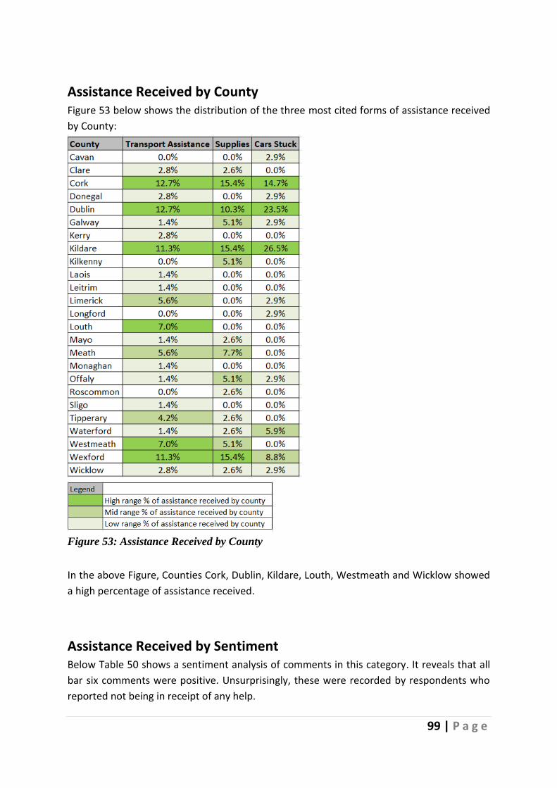
99 | P a g e
Assistance Received by County Figure 53 below shows the distribution of the three most cited forms of assistance received
by County:
Figure 53: Assistance Received by County
In the above Figure, Counties Cork, Dublin, Kildare, Louth, Westmeath and Wicklow showed
a high percentage of assistance received.
Assistance Received by Sentiment Below Table 50 shows a sentiment analysis of comments in this category. It reveals that all
bar six comments were positive. Unsurprisingly, these were recorded by respondents who
reported not being in receipt of any help.
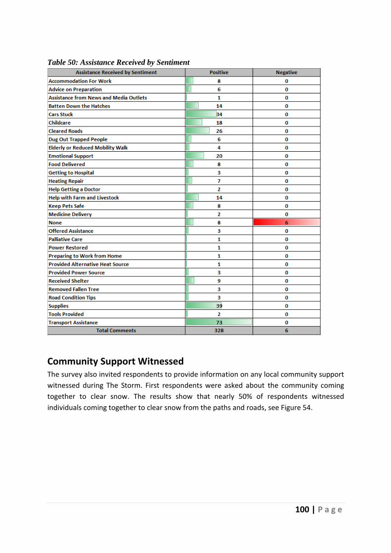
100 | P a g e
Table 50: Assistance Received by Sentiment
Community Support Witnessed The survey also invited respondents to provide information on any local community support
witnessed during The Storm. First respondents were asked about the community coming
together to clear snow. The results show that nearly 50% of respondents witnessed
individuals coming together to clear snow from the paths and roads, see Figure 54.

101 | P a g e
Figure 54: Community Support to clear snow
Respondents were also asked to describe other examples of community support which they
witnessed during The Storm. More than half of the respondents, 2,284, provided a total of
2,929 inputs in this regard.
Table 51 below shows the nature of the community supports witnessed.
35.4
26.6
16.8
21.6
46.1
49.8
Community organisations clearing snow from... Roads
Community organisations clearing snow from... Paths
The Residents' Committee clearing snow from... Roads
The Residents' Committee clearing snow from... Paths
Individuals coming together to clear the snow from... Roads
Individuals coming together to clear the snow from... Paths
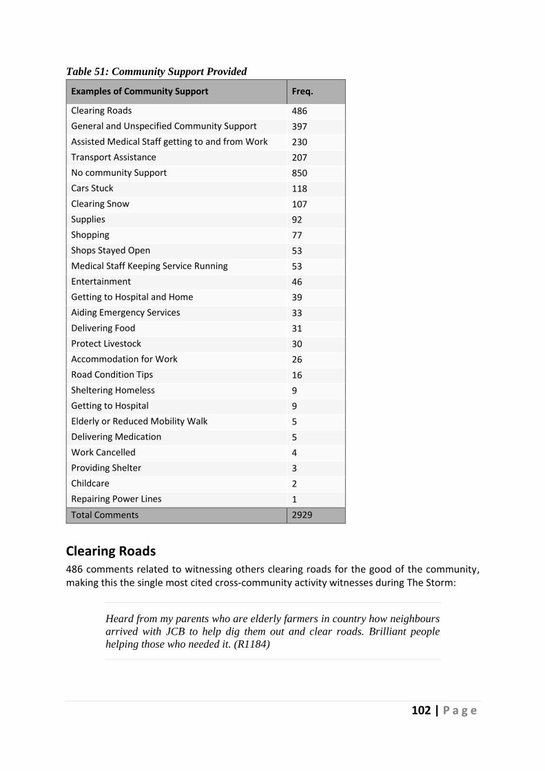
102 | P a g e
Table 51: Community Support Provided
Examples of Community Support Freq.
Clearing Roads 486
General and Unspecified Community Support 397
Assisted Medical Staff getting to and from Work 230
Transport Assistance 207
No community Support 850
Cars Stuck 118
Clearing Snow 107
Supplies 92
Shopping 77
Shops Stayed Open 53
Medical Staff Keeping Service Running 53
Entertainment 46
Getting to Hospital and Home 39
Aiding Emergency Services 33
Delivering Food 31
Protect Livestock 30
Accommodation for Work 26
Road Condition Tips 16
Sheltering Homeless 9
Getting to Hospital 9
Elderly or Reduced Mobility Walk 5
Delivering Medication 5
Work Cancelled 4
Providing Shelter 3
Childcare 2
Repairing Power Lines 1
Total Comments 2929
Clearing Roads 486 comments related to witnessing others clearing roads for the good of the community, making this the single most cited cross-community activity witnesses during The Storm:
Heard from my parents who are elderly farmers in country how neighbours
arrived with JCB to help dig them out and clear roads. Brilliant people
helping those who needed it. (R1184)

103 | P a g e
Locals were trying to clear roads to the main hospital on campus. (R1253)
My Dad and uncle are farmers and they cleared the local road all day with
the digger. (R1350)
Figure 55 below shows the recurring keywords used to describe this activity. The role played
by farmers was evident in many comments, a theme which will be explored further in the
case study.
Figure 55: Recurring keywords for Clearing Roads
General Community Support Almost 400 respondents (n397) reported witnessing selfless acts of community support while
not specifying the nature of this support.
As noted, we all helped out one another, which occurs on a regular basis in
rural Ireland. (R436)
Living in the city it's harder to tell. I certainly saw a lot online about people
offering and receiving help. There was definitely a nice community feeling
out and about. (R521)
Community got together, looked out for each other, community spirit was
alive. (R992)

104 | P a g e
Figure 56: below reflects the commonly recurring keywords used in these less defined acts of
community support:
Figure 56: Recurring Keywords in Acts of Community Support
Assisted Medical Staff getting to and from Work The community became quite involved in assisting health professionals who were having difficulty getting to and from their place of work. 230 respondents reported examples of this type of activity:
I am aware of people who work in the psychiatric hospital I work in being
brought to work etc (R801)
My husband brought my neighbour who is a doctor to work. (R984)
Some of these community support activities were organised through social media:
Yes. Locals driving care workers to their place of work organised through
Facebook (R1312)
Community Assistance with Transport Transport presented a significant challenge during The Storm, and 207 respondents witnessed
community assistance in this regard:
Farmers transporting people places. (R119)

105 | P a g e
A taxi driver didn't charge me for the ride since, as a student on any other
given day, I would have just taken a bus, had they been running. (R152)
There was a Dublin bus going up a road offering lifts to anyone walking in
the snow. (R297)
Figure 57 shows the recurring keywords used in the context of transport-related community
support:
Figure 57: Recurring Keywords for Transport-Related Community Support
No Community Support 850 respondents reported not being aware of any community support being provided in their area. Of these, 98 felt this was because The Storm was not severe enough to warrant such a response:
Not needed. I walked to and from work on dry roads, but patients did not
come as they had been terrified by the news despite there being NO snow in
Sligo. (R1466)
This didn't really apply to our area as the storm didn't really impact on us.
(R2213)
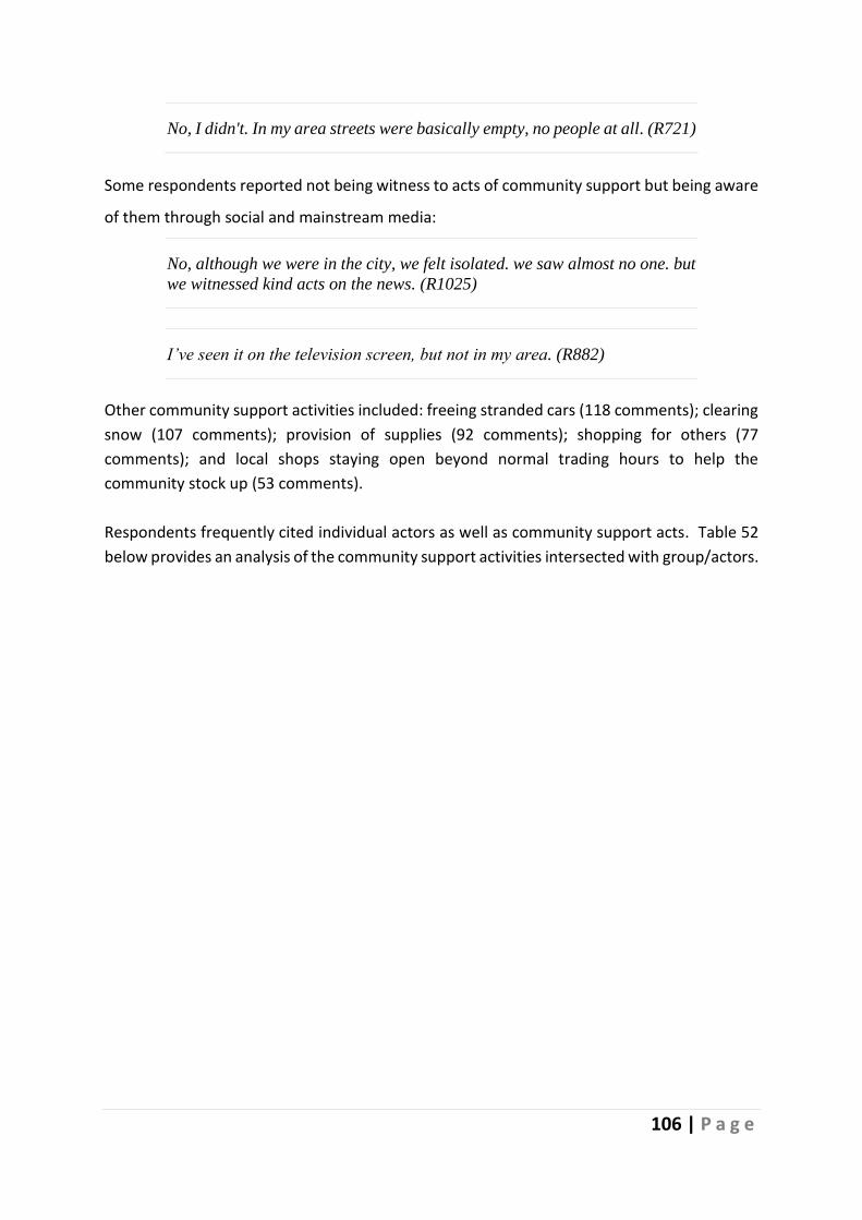
106 | P a g e
No, I didn't. In my area streets were basically empty, no people at all. (R721)
Some respondents reported not being witness to acts of community support but being aware
of them through social and mainstream media:
No, although we were in the city, we felt isolated. we saw almost no one. but
we witnessed kind acts on the news. (R1025)
I’ve seen it on the television screen, but not in my area. (R882)
Other community support activities included: freeing stranded cars (118 comments); clearing
snow (107 comments); provision of supplies (92 comments); shopping for others (77
comments); and local shops staying open beyond normal trading hours to help the
community stock up (53 comments).
Respondents frequently cited individual actors as well as community support acts. Table 52
below provides an analysis of the community support activities intersected with group/actors.
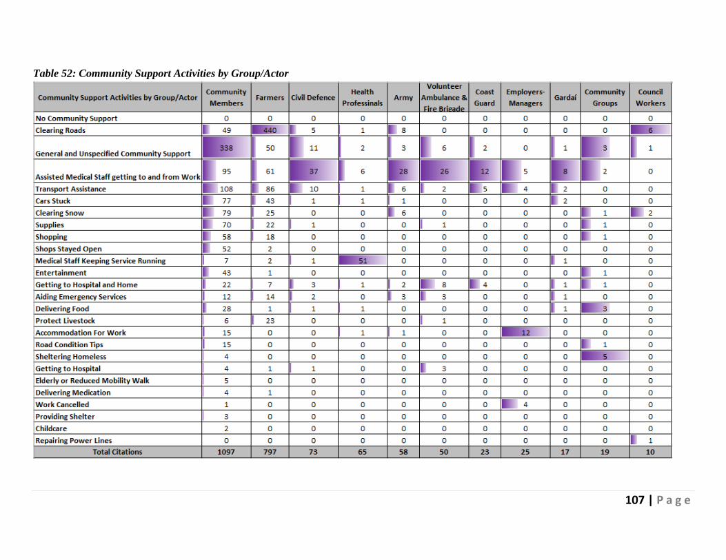
107 | P a g e
Table 52: Community Support Activities by Group/Actor
108 | P a g e
Table 52 above shows that individual members of the community and farmers were the most proactive
when it came to witnessed examples of positive community support.
Comments on witnessed acts of community support were marginally skewed in favour of females at
the macro level when the 3:1 ratio of the study population is considered (see Figure 58).
Figure 58: Witnessed Community Support by Gender
Table 53 below shows the distribution by types of activity witnessed:
Table 53: Witnessed Community Support by Gender
540
1845
0
500
1000
1500
2000
Males Females

109 | P a g e
Table 53 above shows that males were proportionately overrepresented when it came to witnessing
aid to emergency services; people getting help with cars that were stuck; and no community support
noticed or needed. Females disproportionately reported people being accommodated for work;
medical staff being assisted in getting to work; roads being cleared; clearing snow; delivering food;
entertainment; general acts of community support; medical staff keeping services running; protecting;
shopping for others; shops remaining open; and assistance with transport.
Table 54 below shows the distribution of codes for this category by income levels:
Table 54: Witnessed Community Support by Income Level
Table 54 above shows that respondents from higher-income households were overrepresented in
witnessing; being accommodated for work; childcare delivering food; entertainment; medical staff
keeping the services running; and road condition tips. Middle-income responders were more present
in aiding emergency services; delivering medication; and repairing power lines while lower-income
respondents witnessed clearing snow; getting people to a hospital; providing shelter; and shops staying
open beyond normal trading hours.
Figure 59 below shows the top 3 most cited witnessed acts of community support by county:

110 | P a g e
Figure 59: Witnessed Community Support by County
While contributions were received from almost all counties, respondents reporting acts of community
support involving clearing roads were overrepresented in Kildare and Meath. Many comments citing
general and unspecified acts of community support came from Dublin and Cork. Assisting medical staff
was dominated by Cork and Dublin.
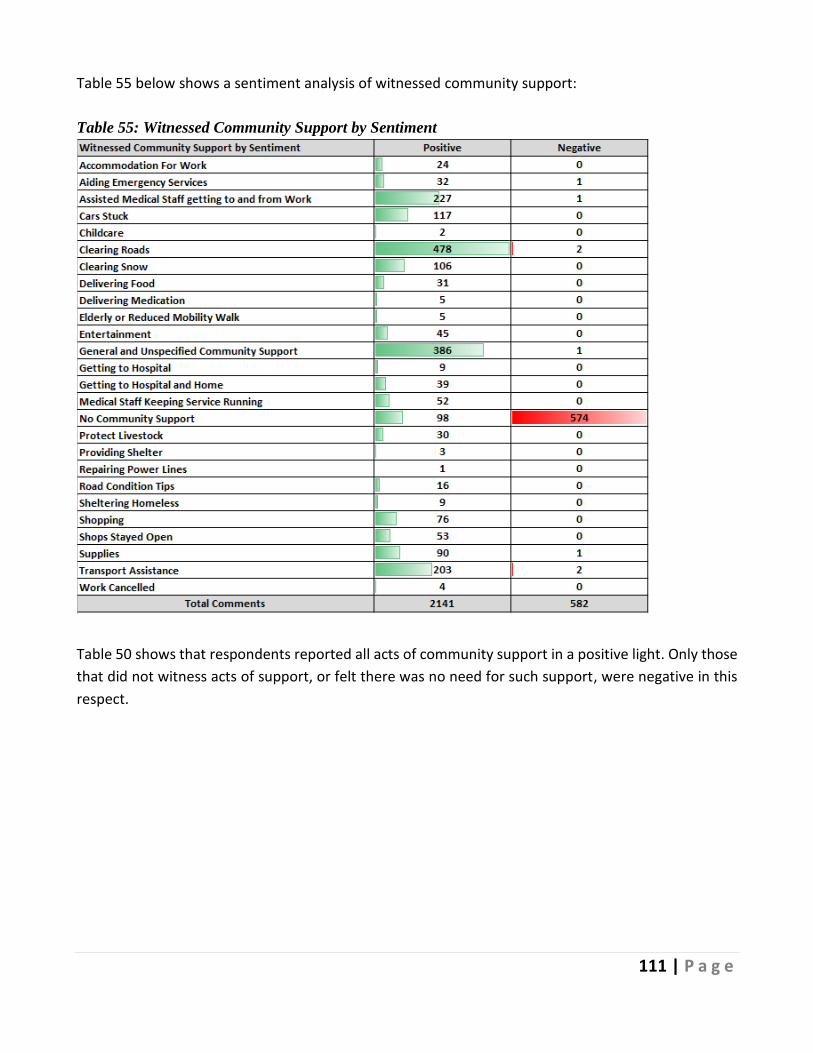
111 | P a g e
Table 55 below shows a sentiment analysis of witnessed community support:
Table 55: Witnessed Community Support by Sentiment
Table 50 shows that respondents reported all acts of community support in a positive light. Only those
that did not witness acts of support, or felt there was no need for such support, were negative in this
respect.
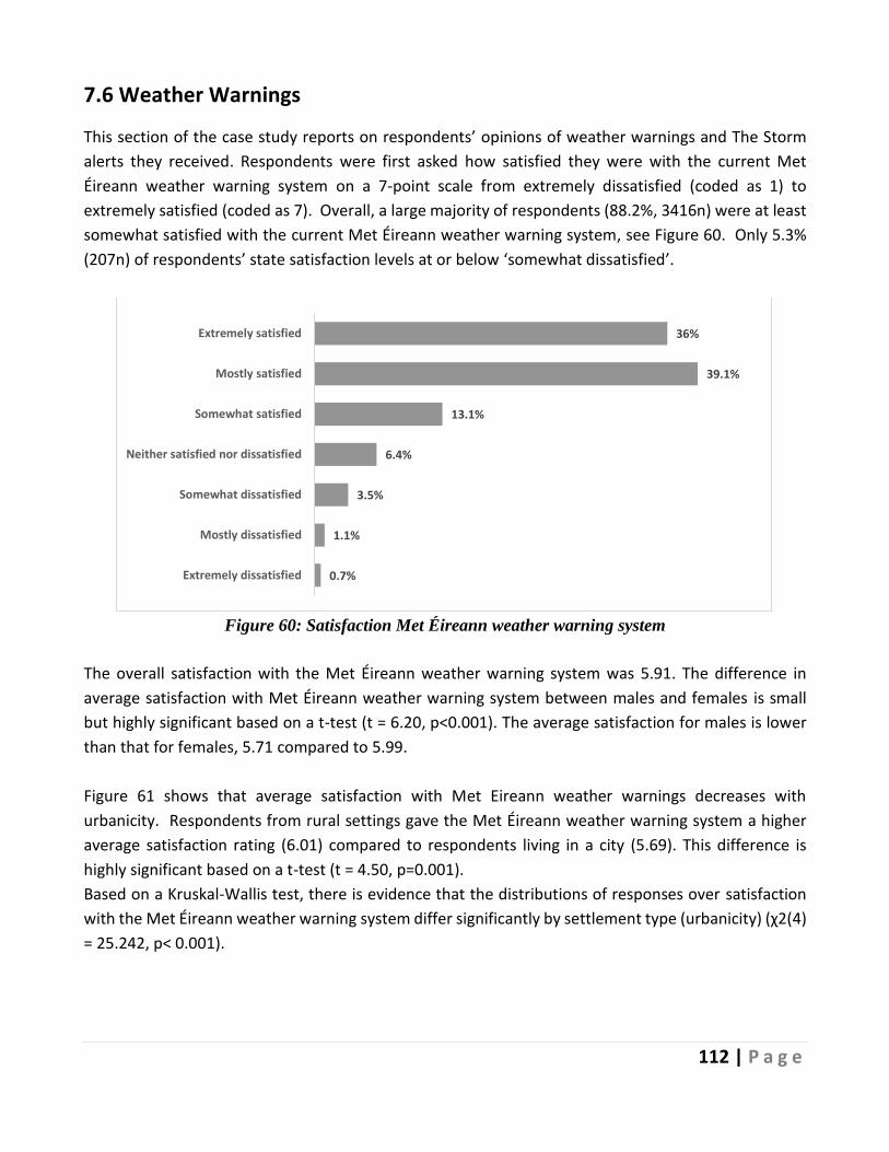
112 | P a g e
7.6 Weather Warnings
This section of the case study reports on respondents’ opinions of weather warnings and The Storm
alerts they received. Respondents were first asked how satisfied they were with the current Met
Éireann weather warning system on a 7-point scale from extremely dissatisfied (coded as 1) to
extremely satisfied (coded as 7). Overall, a large majority of respondents (88.2%, 3416n) were at least
somewhat satisfied with the current Met Éireann weather warning system, see Figure 60. Only 5.3%
(207n) of respondents’ state satisfaction levels at or below ‘somewhat dissatisfied’.
Figure 60: Satisfaction Met Éireann weather warning system
The overall satisfaction with the Met Éireann weather warning system was 5.91. The difference in
average satisfaction with Met Éireann weather warning system between males and females is small
but highly significant based on a t-test (t = 6.20, p<0.001). The average satisfaction for males is lower
than that for females, 5.71 compared to 5.99.
Figure 61 shows that average satisfaction with Met Eireann weather warnings decreases with
urbanicity. Respondents from rural settings gave the Met Éireann weather warning system a higher
average satisfaction rating (6.01) compared to respondents living in a city (5.69). This difference is
highly significant based on a t-test (t = 4.50, p=0.001).
Based on a Kruskal-Wallis test, there is evidence that the distributions of responses over satisfaction
with the Met Éireann weather warning system differ significantly by settlement type (urbanicity) (χ2(4)
= 25.242, p< 0.001).
0.7%
1.1%
3.5%
6.4%
13.1%
39.1%
36%
Extremely dissatisfied
Mostly dissatisfied
Somewhat dissatisfied
Neither satisfied nor dissatisfied
Somewhat satisfied
Mostly satisfied
Extremely satisfied

113 | P a g e
Figure 61: Average Satisfaction Met Éireann weather warning system by settlement type
(urbanicity)
Average satisfaction with Met Éireann weather warning system by county is given in Table 56. The
highest five, in terms of average satisfaction, are marked in light purple, and the lowest five are marked
in light blue. Again, the differences are not large, but they are significant.
6.0
1
5.9
5
5.9
7
5.8
6
5.6
9
A R U R A L A R E A A V I L L A G E A T O W N T H E S U B U R B S O R O U T S K I R T S O F A
C I T Y
A C I T Y

114 | P a g e
Table 56: Average Satisfaction Met Éireann weather warning system by county
Mean Freq.
Carlow 5.59 29
Cavan 5.71 55
Clare 5.72 75
Cork 5.73 445
Donegal 5.06 65
Dublin 5.45 996
Galway 5.79 194
Kerry 5.98 56
Kildare 5.70 303
Kilkenny 5.84 68
Laois 5.75 65
Leitrim 5.74 23
Limerick 5.77 116
Longford 5.87 31
Louth 5.74 115
Mayo 5.46 132
Meath 5.62 203
Monaghan 5.81 32
Offaly 5.88 129
Roscommon 5.68 81
Sligo 5.41 69
Tipperary 5.97 113
Waterford 5.82 113
Westmeath 5.77 130
Wexford 5.88 130
Wicklow 5.79 82
Respondents who did not select “Extremely Satisfied”, in Figure 60 above, were asked to provide
additional feedback on the weather warning system. 38.5% (953n) suggested that the warnings were
issued too frequently, while 14.7% (363n) indicated they were difficult to understand. Respondents
were also asked to expand on the data they provided in response to the quantitative questions, and
818 respondents provided 1,008 comments concerning weather warnings. It was evident from the
outset of the analysis that respondents were divided with 44.05% (444n) of the comments being
positive; Figure 62 below shows this divide weighted by sentiment.
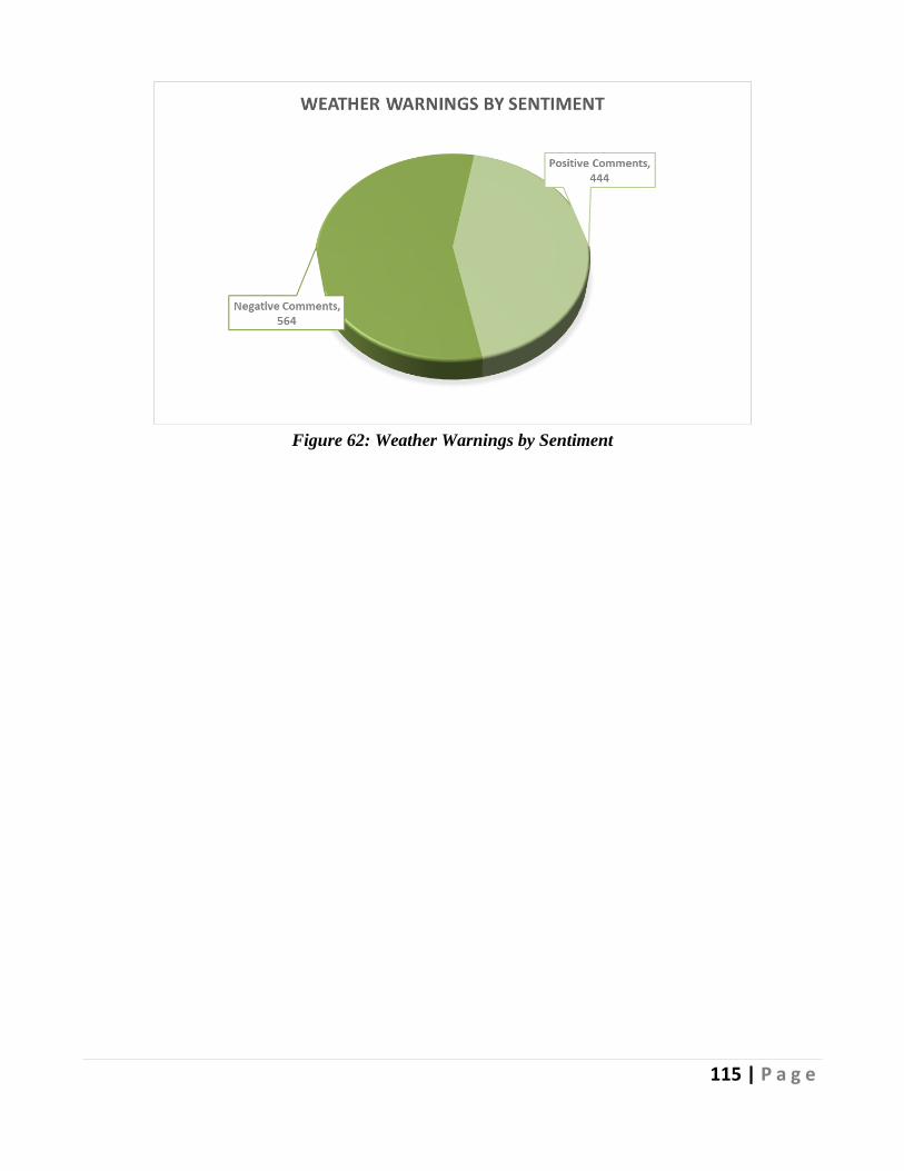
115 | P a g e
Figure 62: Weather Warnings by Sentiment
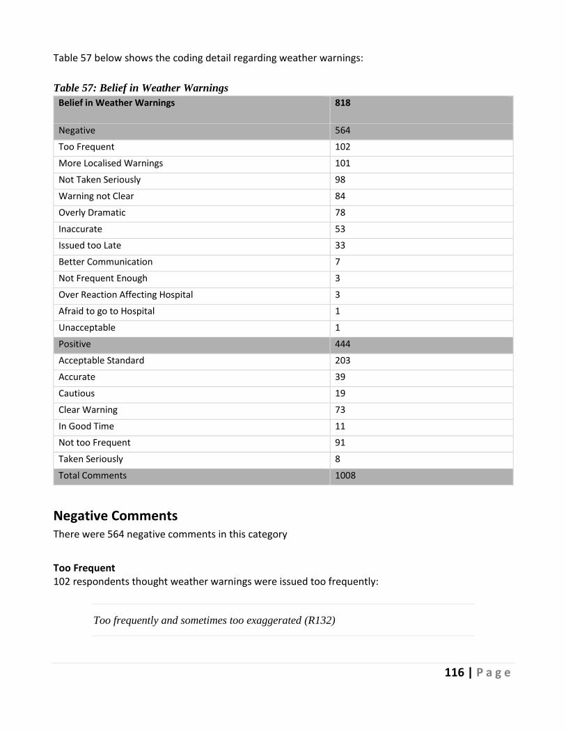
116 | P a g e
Table 57 below shows the coding detail regarding weather warnings:
Table 57: Belief in Weather Warnings
Belief in Weather Warnings 818
Negative 564
Too Frequent 102
More Localised Warnings 101
Not Taken Seriously 98
Warning not Clear 84
Overly Dramatic 78
Inaccurate 53
Issued too Late 33
Better Communication 7
Not Frequent Enough 3
Over Reaction Affecting Hospital 3
Afraid to go to Hospital 1
Unacceptable 1
Positive 444
Acceptable Standard 203
Accurate 39
Cautious 19
Clear Warning 73
In Good Time 11
Not too Frequent 91
Taken Seriously 8
Total Comments 1008
Negative Comments There were 564 negative comments in this category
Too Frequent 102 respondents thought weather warnings were issued too frequently:
Too frequently and sometimes too exaggerated (R132)

117 | P a g e
It seems as if there is a yellow/orange warning ever second week??? (R286)
Yellow warnings are issued very frequently, so I tend not to take note of them that
much. (R618)
Figure 63 below shows the recurring words in the 102 comments in this context:
Figure 63: Recurring words Warnings too Frequent
More Localised Warnings Many of the 102 comments reported under the “Too Frequent” code were qualified by a commentary concerned with localised warnings (101 comments). Respondents believed that weather warnings were often too broad and so lost credibility in areas not affected by the weather warning in question:
The issued too frequently is in relation to hearing different coloured weather warnings
on national news when they may only apply to a very local area. They lose strength
then. E.g., if an orange alert has been issued many times and you never have
experience of anything happening then you get somewhat immune to hearing orange
alert and neglect to hear it as the caution it is meant to be and may not take adequate
preparations. Feels a little bit like a boy who cried wolf scenario, and you could be
caught out if the warning is regional. (R1461)
I believe yellow warnings are not really needed and red warnings need to be more
tailored to specific areas. The whole country probably didn’t need to be on red for
Emma. (R2596)

118 | P a g e
Warnings are issued but not directed to specific areas which may be affected. Too
many warnings and people don't pay attention if there is no snow/wind. (R2361)
They are unreliable. With other warnings, the warnings were placed high (orange)
and did not affect us. It's hard to believe warnings when in the past they have been
issued and had no effect on us. (R348)
Figure 64 below shows common language preceding and following the word “warning”. When
respondents were speaking negatively about weather warnings, the word “yellow” frequently
preceded the word “warning”.

119 | P a g e
Figure 64: Patterns of Language use Preceding and Following “Warning”
Not Taken Seriously 98 respondents believed that because warnings were too frequent and insufficiently localised citizens
do not take warnings seriously, and sometimes to their detriment:
I feel like something needs to be done so people understand the emphasis behind the
severity of the warnings, I don't think people really took it seriously until the storm
actually hit and they saw first-hand how bad it was. If possible, I think the public

120 | P a g e
should be better educated about the warnings so when a Red Warning is announced
people aren't silly and disregarding it. (R244)
Seem to issue weather warnings for a bit of wind and then when an actual storm does
hit people haven't taken it seriously because previous warnings have led to nothing.
(R112)
There are weather warnings almost every day. On one occasion there were 9 weather
warning issued...ridiculous. As I pointed out to Met-Eireann, if they keep issuing
weather warnings then people will just ignore them. Red warning only should be
issued to highlight serious weather conditions. For the rest let’s just look out the
window because the warnings have become too much. (R2038)
Other comments included: clarity of warnings (84 comments), over-hyping and dramatization of
weather warnings by mainstream media (78 comments) and inaccurate warnings (53 comments).
Figure 65 shows the overlap between negative comment codes.
Figure 65: Overlap between Negative Comment Codes

121 | P a g e
Positive Comments There were 444 positive comments made in relation to weather warnings.
Acceptable Standard More than 200 respondents (n203) believed weather warnings were at an acceptable standard:
Meteorologists don't have all-knowing powers. I would rather receive a weather
warning that didn't end up being necessary, than being told, last minute, that very bad
weather is imminent. I believe they are well-explained and understandable, especially
during Emma. Great lengths were clearly taken to ensure everyone was aware of what
status orange and red warnings indicated and what weather to expect. (R128)
They make sense. The red warnings over the last 12 months seemed to have been issued
appropriately. (R583)
I believe they are adequate. (R667)
Figure 66 below illustrates the recurring keywords from the comments which described weather
warnings as being at an acceptable standard:
Figure 66: Recurring Keywords Acceptable Standard of Weather Warnings
Not too Frequent 91 respondents did not believe weather warnings were issued too frequently:
If we didn't have these warnings people would do stupid things. Despite the warnings
I did see a lot of people in the Phoenix park having to be rescued from the snow and

122 | P a g e
behaving foolish and irresponsible. (R1330)
It’s good to hear updates regularly. (R1776)
I don't think that they are issued too frequently or difficult to understand. (R2017)
Figure 67 below illustrates the recurring keywords from the comments which described weather
warnings as being not too frequent:
Figure 67: Key Words Describing Weather Warnings as Not too Frequent
Clear Warnings 73 respondents believed weather warnings were clear and easy to understand:
Useful and easy to understand. (R583)
In the case of Storm Emma, weather warnings were very easy to understand and were
given in good time of what was due to happen. (R3211)
They are easy to understand and issued when appropriate. (R1037)

123 | P a g e
Figure 68 illustrates the recurring keywords from the comments which described weather warnings as
being clear and easy to understand:
Figure 68: Key Words Describing Clarity of Weather Warnings
Other comments included a belief that weather warnings were accurate (39 comments); cautious (19
comments) and issued in good time (11 comments).
Figure 69 below shows that the 3:1 ratio of females to males was proportionately represented at a
macro level in comments about respondents’ assessment of weather warnings.
Figure 69: Weather Warning Assessment by Gender
Table 58 below shows the gender balance in both positive and negative individual codes related to
weather warnings:
190
603
0
100
200
300
400
500
600
700
Males Females
Weather Warning Assessment by Gender

124 | P a g e
Table 58: Weather Warning Assessment by Gender
Table 58 shows that females placed proportionately greater emphasis on warnings being issued too
late; warnings not being taken seriously; warnings being too frequent; and unclear in their negative
comments. However, in their positive comments, the opposite viewpoint was evident with females
also emphasizing that warnings were clear and not too frequent. Males placed greater emphasis on
reports being overly dramatized by mainstream media and standards being acceptable.
Table 59 below shows the weather warning comments distributed by income levels:
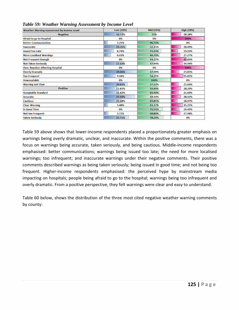
125 | P a g e
Table 59: Weather Warning Assessment by Income Level
Table 59 above shows that lower-income respondents placed a proportionately greater emphasis on
warnings being overly dramatic, unclear, and inaccurate. Within the positive comments, there was a
focus on warnings being accurate, taken seriously, and being cautious. Middle-income respondents
emphasised: better communications; warnings being issued too late; the need for more localised
warnings; too infrequent; and inaccurate warnings under their negative comments. Their positive
comments described warnings as being taken seriously; being issued in good time; and not being too
frequent. Higher-income respondents emphasised: the perceived hype by mainstream media
impacting on hospitals; people being afraid to go to the hospital; warnings being too infrequent and
overly dramatic. From a positive perspective, they felt warnings were clear and easy to understand.
Table 60 below, shows the distribution of the three most cited negative weather warning comments
by county:

126 | P a g e
Table 60: The 3 Most Cited Negative Comments by County
Table 60 above shows that comments from respondents in Dublin and Cork were most likely to suggest
that weather warnings were issued too frequently. Mayo, Sligo, and Cork were overrepresented in
comments calling for more localised warnings. Respondents from Dublin, Kildare and Cork placed
greater emphasis on warnings not being taken seriously as they were issued too frequently or were not
localised enough. Table 61 below shows the same information for the top three most cited positive
comments by county:

127 | P a g e
Table 61: The 3 Most Cited Positive Comments by County
Table 61 above shows that respondents from Dublin, Kildare, Meath, and Cork were most vocal in
commenting on weather warning standards being at an acceptable standard. Dublin, Cork, and Meath
were overrepresented in feeling warnings were not too frequent and Dublin, Kildare and Cork
respondents felt warnings were clear and easy to understand.
7.6.1 Preparedness Action Linked to the Met Éireann Weather Warnings
Met Éireann’s objective for the issuance of weather warnings is “To protect lives and livelihoods of all
of the nation’s citizens and to mitigate damage to property and disturbance to economic activity at
times of severe weather” (Met Éireann, 2018a). Implemented in 2013, Met Éireann’s weather warnings

128 | P a g e
employ a ‘threshold’ weather advisory system focusing on localised and national impacts with three
escalating categories:
• Status Yellow – Weather Alert – Be Aware
Status Yellow events do not threaten the general population, but they carry the potential for
hazardous conditions on a localised scale (Met Éireann, 2021). Hence, action may be required
at this stage for persons exposed to danger by the nature of their activity or specific location.
• Status Orange – Weather Warning – Be Prepared
Status Orange events are “Infrequent and dangerous weather conditions which may pose a
threat to life and property” (Met Éireann, 2021). This warning advises the population, within
the warning area, that people and assets in the warning areas may be significantly impacted
and they should now make the appropriate preparedness arrangements, depending on activity
and location (Met Éireann, 2021).
• Status Red – Severe Weather Warning – Take Action
Status Red events are “Rare and very dangerous weather conditions from intense
meteorological phenomena” (Met Éireann, 2021). Anyone in the warning is advised to take
preparedness action and follow the instructions and advice provided by the authorities.
Given these three weather warnings, we would anticipate the general population within the warning
area, revise or begin to prepare at the issuing of a status orange warning. However, the percentage of
respondents who stated they would take action to prepare at a status orange was 34.3% (1326n). A
further 6.3% (242n) suggested they would take action before this, at a status yellow. With 55.4%
(2143n) having indicated they only take action on a Status Red warning. Only 160 individuals (4.1%)
specified they would not take action at any of the three warnings.
Given that a series of weather warnings were issued before the Storm impacted Ireland, we examine
whether a statistically significant association existed between the number of recommended actions
completed before the Storm arrived (zero to four actions) and the weather warnings respondents
indicated they would first begin to prepare (e.g., Status Yellow or Status Orange, etc.). The results are
presented below the frequency chart, (Figure 72) and show a statistically significant association
between each warning respondents would first take on and the number of actions taken.
Moving from left to right in the chart, that is, from individuals stating they would take action on a yellow
warning through to those who state they would take action on none, we see behaviour patterns in line
with decreasing risk aversion. For example, for those who could be considered most risk averse (taking
action on a yellow warning) 36.36% had taken all four recommended actions, while only 3.75% of those
who stated they would not respond to any warning had.

129 | P a g e
Figure 70: Number of actions taken before The Storm by Weather Warning First Inducing Response
Note: χ2(12) = 318.702, p<0.001
The variable “Warning Acted On”, ranging from zero to three, summarises respondents’ answers about
which weather warnings they would react to. It is defined as zero for individuals who do not react to
any of the weather warnings, one for those who only act on the issue of a status red, two for those
who first react on a status orange and three for respondents who state that they begin to prepare at a
status yellow. A higher value therefore reflects that an individual will act in response to a less severe
weather warning, which could be interpreted as indicating a higher degree of risk aversion. The overall
average for this scale was 1.43.
A chi-square test was conducted to examine if any association existed between which weather warning
respondents first take action on and settlement type (urbanicity). It showed a statistically significant
association: χ2(12) = 34.819, p<0.001. Table 62 presents the averages for Warning Acted On. The
average is slightly higher for rural dwellers (1.50) compared with city dwellers (1.37), indicating that on
average rural dwellers will take action in response to less severe warnings. While this difference is not
large, an independent-samples t-test determined a statistically significant difference between both
means (t = 3.38, p=0.001).
Table 62: Taking action on weather warning by settlement type (urbanicity)
Mean Freq
A rural area 1.50 1106
A village 1.41 457
A town 1.44 834
suburbs or outskirts of a city 1.36 819
A city 1.37 471
6.2
5.5
8
12
.09
35
10
.33 1
4.4
8
22
.54
29
.38
16
.53
25
.41
25
.66
20
30
.58
31
.45
26
.22
11
.88
36
.36
23
.08
13
.49
3.7
5
Y E L L O W O R A N G E R E D N O N E
Zero One Two Three Four
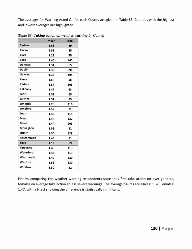
130 | P a g e
The averages for Warning Acted On for each County are given in Table 63. Counties with the highest
and lowest averages are highlighted.
Table 63: Taking action on weather warning by County
Mean Freq.
Carlow 1.66 29
Cavan 1.55 55
Clare 1.29 75
Cork 1.45 445
Donegal 1.31 65
Dublin 1.35 996
Galway 1.33 194
Kerry 1.54 56
Kildare 1.57 303
Kilkenny 1.47 68
Laois 1.52 65
Leitrim 1.57 23
Limerick 1.28 116
Longford 1.52 31
Louth 1.43 115
Mayo 1.44 132
Meath 1.44 203
Monaghan 1.53 32
Offaly 1.54 129
Roscommon 1.48 81
Sligo 1.19 69
Tipperary 1.40 113
Waterford 1.44 113
Westmeath 1.49 130
Wexford 1.58 130
Wicklow 1.50 82
Finally, comparing the weather warning respondents state they first take action on over genders,
females on average take action at less severe warnings. The average figures are Males: 1.32; Females:
1.47, with a t-test showing the difference is statistically significant.

131 | P a g e
7.7 Satisfaction with the National Response
This section reports on the level of satisfaction with the national response to The Storm; respondents’
satisfaction was measured on a 7-point scale with 1 = extremely dissatisfied up to 7 = extremely
satisfied. The mean response was 5.58, and Figure 71 shows the distribution of responses. Overall,
there was a positive sentiment towards the national response with 66.61% (2430n) stating they were
mostly or extremely satisfied with the overall response.
Figure 71: Satisfaction with the national response to The Storm
Examining satisfaction with the national response to the Storm across genders, average satisfaction for
females was statistically significantly higher than that for males, 5.65 compared to 5.41, though the
magnitude of difference was not large.
Table 64 shows the average satisfaction with the national response to The Storm across settlement
types. Based on a Kruskal-Wallis test, there is only weak evidence of differences in the distribution of
satisfaction across settlements.
Table 64: Satisfaction with the national response to The Storm by Settlement Type (Urbanicity)
Mean Freq.
A rural area 5.63 1106
A village 5.47 457
A town 5.68 833
Suburbs or outskirts of a city
5.59 818
A city 5.45 471
Each county’s average satisfaction rating for the national response to The Storm is set out in Table 65.
Kerry, Monaghan and Leitrim were the three counties with the highest levels of satisfaction about the
2.03% 3.07%5.07%
8.09%
15.13%
38.16%
28.45%
Extremelydissatisfied
Mostlydissatisfied
Somewhatdissatisfied
Neither satisfiednor dissatisfied
Somewhatsatisfied
Mostly satisfied Extremelysatisfied
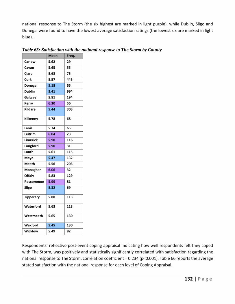
132 | P a g e
national response to The Storm (the six highest are marked in light purple), while Dublin, Sligo and
Donegal were found to have the lowest average satisfaction ratings (the lowest six are marked in light
blue).
Table 65: Satisfaction with the national response to The Storm by County
Mean Freq.
Carlow 5.62 29
Cavan 5.65 55
Clare 5.68 75
Cork 5.57 445
Donegal 5.18 65
Dublin 5.41 994
Galway 5.81 194
Kerry 6.30 56
Kildare 5.44 303
Kilkenny 5.78 68
Laois 5.74 65
Leitrim 6.04 23
Limerick 5.90 116
Longford 5.90 31
Louth 5.61 115
Mayo 5.47 132
Meath 5.56 203
Monaghan 6.06 32
Offaly 5.83 129
Roscommon 5.99 81
Sligo 5.32 69
Tipperary 5.88 113
Waterford 5.63 113
Westmeath 5.65 130
Wexford 5.45 130
Wicklow 5.49 82
Respondents’ reflective post-event coping appraisal indicating how well respondents felt they coped
with The Storm, was positively and statistically significantly correlated with satisfaction regarding the
national response to The Storm, correlation coefficient = 0.234 (p<0.001). Table 66 reports the average
stated satisfaction with the national response for each level of Coping Appraisal.

133 | P a g e
Table 66: Satisfaction with the national response to The Storm by Individual Coping Appraisal
Coping Appraisal: 0% to 100%
Mean Freq.
0 5.11 38
10 4.67 112
20 4.59 143
30 4.96 241
40 5.41 274
50 5.45 469
60 5.67 454
70 5.80 671
80 5.83 654
90 6.01 425
100 5.76 289
Average levels of satisfaction with the national response to The Storm were negatively associated with
the trajectory of worry during The Storm. That is, increased worry during The Storm is associated with
lower levels of satisfaction. Table 67 sets out the average satisfaction with the national response to The
Storm for each change in worry. Independence of the two variables is strongly rejected based on a chi-
squared test (χ2(12) = 122.81, p<0.001).
Table 67: Satisfaction with the national response to The Storm by Change in Worry
Mean Freq.
Worry decreased
5.85 776
Worry stayed the same
5.67 1894
Worry increased
5.29 1199
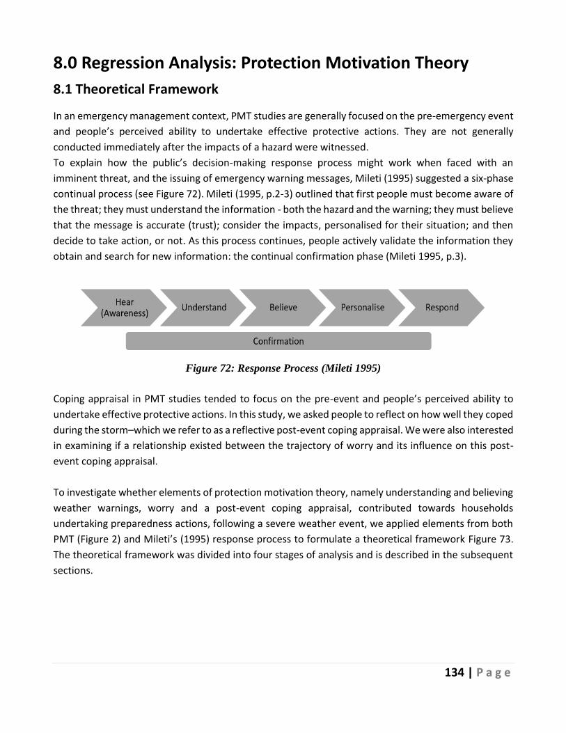
134 | P a g e
8.0 Regression Analysis: Protection Motivation Theory
8.1 Theoretical Framework
In an emergency management context, PMT studies are generally focused on the pre-emergency event
and people’s perceived ability to undertake effective protective actions. They are not generally
conducted immediately after the impacts of a hazard were witnessed.
To explain how the public’s decision-making response process might work when faced with an
imminent threat, and the issuing of emergency warning messages, Mileti (1995) suggested a six-phase
continual process (see Figure 72). Mileti (1995, p.2-3) outlined that first people must become aware of
the threat; they must understand the information - both the hazard and the warning; they must believe
that the message is accurate (trust); consider the impacts, personalised for their situation; and then
decide to take action, or not. As this process continues, people actively validate the information they
obtain and search for new information: the continual confirmation phase (Mileti 1995, p.3).
Figure 72: Response Process (Mileti 1995)
Coping appraisal in PMT studies tended to focus on the pre-event and people’s perceived ability to
undertake effective protective actions. In this study, we asked people to reflect on how well they coped
during the storm–which we refer to as a reflective post-event coping appraisal. We were also interested
in examining if a relationship existed between the trajectory of worry and its influence on this post-
event coping appraisal.
To investigate whether elements of protection motivation theory, namely understanding and believing
weather warnings, worry and a post-event coping appraisal, contributed towards households
undertaking preparedness actions, following a severe weather event, we applied elements from both
PMT (Figure 2) and Mileti’s (1995) response process to formulate a theoretical framework Figure 73.
The theoretical framework was divided into four stages of analysis and is described in the subsequent
sections.

135 | P a g e
Figure 73: PMT based theoretical framework: the response process and after-action to the Storm,
2018
Sections 5.8.1 to 5.8.4 summarise results from the analysis using various regression models: Probit,
Ordered Probit, and Ordinary Least Squares (OLS). Four levels of statistical significance were used
across all stages of analysis. 10% significance is indicated using the symbol: ‡, which we term as ‘weakly
significant’; 5% is indicated using the symbol: *, and 1% is indicated using the symbol: **. Both are
termed as ‘significant’. Finally, significance at 0.1%, as indicated by the symbol: ***, is termed as ‘highly
significant’. No symbol present indicates insignificance.
8.2 Determinants of Worry Before the Storm (Stage One)
In the case of this Storm, people were not left alone to form their threat appraisal. Instead, this was
informed by the Met Éireann weather warnings; namely, the countrywide status red severe weather
warning, along with the other warnings issued before the Storm. Inspired by both PMT (Figure 2) and Mileti (1995) response process, we theorised that the level of worry attributed to the Storm would be
influenced by people’s attitudes towards the weather warnings (stage one of the analysis). In essence,
we hypothesised that respondents’ prior understanding of weather warnings, their belief in the
warnings—their willingness to act on them, and satisfaction with the warnings would contribute
towards forming a fear appeal—in this case, measured as worry towards the Storm. This is visualised
in both Figure 74 and the general form for the “Stage One” regression below.

136 | P a g e
Figure 74: Stage One of the PMT based theoretical framework
Stage One: 𝑳𝒆𝒗𝒆𝒍 𝒐𝒇 𝑾𝒐𝒓𝒓𝒚 (𝑩𝒆𝒇𝒐𝒓𝒆) = 𝒇[𝒔𝒐𝒄𝒊𝒐 − 𝒅𝒆𝒎𝒐𝒈𝒓𝒂𝒑𝒉𝒊𝒄𝒔, 𝒂𝒄𝒕 𝒐𝒏 𝒘𝒆𝒂𝒕𝒉𝒆𝒓 𝒘𝒂𝒓𝒏𝒊𝒏𝒈𝒔,
𝒑𝒆𝒓𝒄𝒆𝒊𝒗𝒆𝒅 𝒖𝒏𝒅𝒆𝒓𝒔𝒕𝒂𝒏𝒅𝒊𝒏𝒈 𝒐𝒇 𝒕𝒉𝒆 𝒘𝒂𝒓𝒏𝒊𝒏𝒈𝒔, 𝒔𝒂𝒕𝒊𝒔𝒇𝒂𝒄𝒕𝒊𝒐𝒏 𝒘𝒊𝒕𝒉 𝒕𝒉𝒆 𝒘𝒂𝒓𝒏𝒊𝒏𝒈 𝒔𝒚𝒔𝒕𝒆𝒎]
Overview of the independent variables for stage one:
• Act on weather warnings was coded in three dummy variables: “Takes action on red” = 1 if the
respondent first takes action on a status red warning, 0 otherwise; “takes action on orange” =
1 if the respondent takes action first on a status orange warning, 0 otherwise; and “takes action
on yellow” = 1 if the respondent first takes action on a status yellow warning, 0 otherwise. The
base category was those who do not take action in response to any of the weather warnings.
• Satisfaction with the Met Éireann weather warning system was measured using a seven-point
Likert scale - extremely satisfied to extremely dissatisfied.
• Weather Warnings are too frequent was coded as a dummy variable: yes = 1, no = 0.
• Weather Warnings are difficult to understand was coded as a dummy variable: yes = 1, no = 0.
• Besides these explanatory variables, a selection of socio-demographic factors were included.
These are defined in section 4.0: Profile of Respondents.
The dependent variable for the stage one analysis was respondents’ reported levels of worry before
the Storm and was measured on a 5-point ordinal scale from not at all worried to worried a great deal.
Table 68 sets out the results of the analysis for stage one. The results are obtained from a generalised
ordered probit model, estimated using the gologit function in STATA with a probit link function
(Williams 2006). The coefficients on independent variables which violated the parallel regressions
assumption were permitted to vary, which results in four coefficients reported in the tables below for
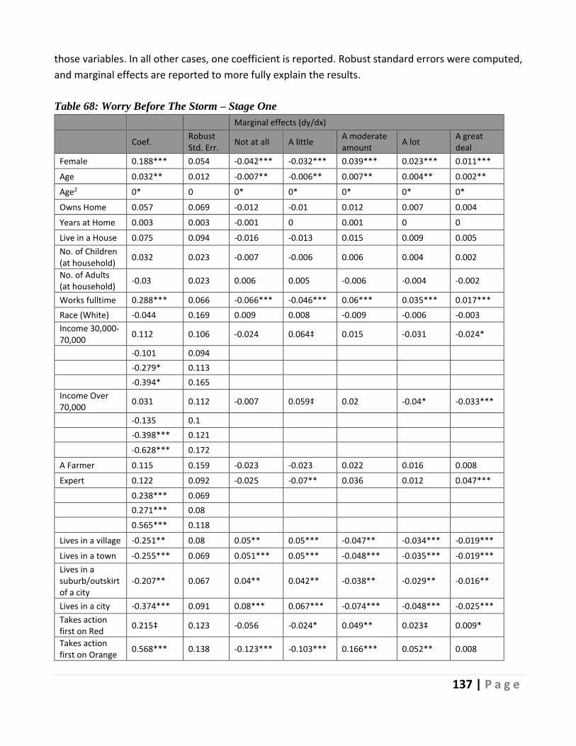
137 | P a g e
those variables. In all other cases, one coefficient is reported. Robust standard errors were computed,
and marginal effects are reported to more fully explain the results.
Table 68: Worry Before The Storm – Stage One
Marginal effects (dy/dx)
Coef. Robust Std. Err.
Not at all A little A moderate amount
A lot A great deal
Female 0.188*** 0.054 -0.042*** -0.032*** 0.039*** 0.023*** 0.011***
Age 0.032** 0.012 -0.007** -0.006** 0.007** 0.004** 0.002**
Age2 0* 0 0* 0* 0* 0* 0*
Owns Home 0.057 0.069 -0.012 -0.01 0.012 0.007 0.004
Years at Home 0.003 0.003 -0.001 0 0.001 0 0
Live in a House 0.075 0.094 -0.016 -0.013 0.015 0.009 0.005
No. of Children (at household)
0.032 0.023 -0.007 -0.006 0.006 0.004 0.002
No. of Adults (at household)
-0.03 0.023 0.006 0.005 -0.006 -0.004 -0.002
Works fulltime 0.288*** 0.066 -0.066*** -0.046*** 0.06*** 0.035*** 0.017***
Race (White) -0.044 0.169 0.009 0.008 -0.009 -0.006 -0.003
Income 30,000-70,000
0.112 0.106 -0.024 0.064‡ 0.015 -0.031 -0.024*
-0.101 0.094
-0.279* 0.113
-0.394* 0.165
Income Over 70,000
0.031 0.112 -0.007 0.059‡ 0.02 -0.04* -0.033***
-0.135 0.1
-0.398*** 0.121
-0.628*** 0.172
A Farmer 0.115 0.159 -0.023 -0.023 0.022 0.016 0.008
Expert 0.122 0.092 -0.025 -0.07** 0.036 0.012 0.047***
0.238*** 0.069
0.271*** 0.08
0.565*** 0.118
Lives in a village -0.251** 0.08 0.05** 0.05*** -0.047** -0.034*** -0.019***
Lives in a town -0.255*** 0.069 0.051*** 0.05*** -0.048*** -0.035*** -0.019***
Lives in a suburb/outskirt of a city
-0.207** 0.067 0.04** 0.042** -0.038** -0.029** -0.016**
Lives in a city -0.374*** 0.091 0.08*** 0.067*** -0.074*** -0.048*** -0.025***
Takes action first on Red
0.215‡ 0.123 -0.056 -0.024* 0.049** 0.023‡ 0.009*
Takes action first on Orange
0.568*** 0.138 -0.123*** -0.103*** 0.166*** 0.052** 0.008

138 | P a g e
0.583*** 0.125
0.337* 0.134
0.166 0.155
Takes action first on Yellow
0.193 0.199 -0.05 -0.211*** 0.118* 0.1* 0.043**
0.674*** 0.18
0.665*** 0.193
0.585** 0.228
Satisfied with weather warnings
0.09** 0.032 -0.019** 0.022* 0.005 -0.006 -0.002
-0.008 0.028
-0.04 0.037
-0.039 0.05
Weather Warnings Too Frequent
-0.135** 0.051 0.029** 0.024** -0.027** -0.017** -0.009**
Weather Warnings Difficult to Understand
0.268* 0.109 -0.05** 0.029 -0.04 0.034 0.027*
0.053 0.085
0.276** 0.103
0.349* 0.139
/cut1 0.133 0.322
/cut2 1.391 0.324
/cut3 2.448 0.328
/cut4 3.153 0.329
χ2 (Chi-squared) (df = 23)
227.32***
No. Obs 2,076
Notes ‡p<0.1, *p<0.05, **p<0.01, ***p<0.001
The regression model results show that those who stated they take action in response to weather
warnings (status yellow, orange or red) were more likely to worry about the Storm than those who
state they do not act on any warning. If we consider stated actions as reflecting risk aversion levels, the
more risk averse are more likely to report higher levels or worry.
The magnitude of the impact on worry was lower for those who state they only act on a red weather
warning, than for those who take action in response to orange or yellow warnings, and weakly
statistically significant.
Examining the marginal effects, it can be seen that, compared to those who state they would not act
in response to any warning, the probability of worrying “a great deal” about the Storm estimated as
139 | P a g e
0.9 percentage points higher for those who would only act on a red warning, whereas it is 4.8
percentage points for those who state they would act on a yellow warning.
Taking action on an orange warning has a stronger impact on worry levels at the lower end of the worry
scale, with the effect petering out at the upper end. This is reflected in the highly significant marginal
impacts on lower and mid-levels of worry. We see a reduction in the probability of stating low worry
levels and increases in the probability of mid-range worry levels, compared to those who do not act on
warnings. For example, the probability of stating ‘Not at all’ worried about the storm is estimated to
be 12.3pp lower and the probability of stating “a moderate amount” of worry is estimated as 16.6pp
higher for individuals who first act on orange warnings compared to those who do not react to any
warning.
The impact of action on a yellow warning is larger and statistically significant for higher levels of worry.
This is reflected in the significant marginal impacts on worry in the mid- and upper levels. Taking action
on a yellow warning, compared to not reacting to any warning, leads to an estimated decrease of
21.1pp in the probability that a respondent stated he “worried a little” about the Storm before its
arrival and increases of 11.8pp, 10pp and 4.3pp respectively in the probabilities a respondent stated
he worried “a moderate amount”, “a lot” and “a great deal”.
Satisfaction with the weather warnings had a significant impact on worry only at lower levels of the
scale. The marginal effects show that a one-point increase in the satisfaction scale reduced the
probability that respondents stated they were not at all worried by an estimated 1.9pp and increased
the probability they were a little worried about The Storm by 2.2pp. There is no significant impact on
higher levels of worry.
The results also showed that respondents who stated weather warnings were issued too frequently
were less likely to be worried about this Storm. For example, the probability that respondents worried
“a lot” about the Storm increased by 1.7pp if the respondents had suggested the weather warnings
were issued too frequently.
Those who suggested that weather warnings are difficult to understand were more likely to worry
about the Storm. For example, controlling for all other variables at their mean values, the probability
that a respondent stated they were “not at all” worried about the Storm is estimated to be 5pp lower
for those who reported that weather warnings are difficult to understand.
Summarising the impacts of socio-demographics: females, older respondents, those working full time,
those with lower incomes, and those living in rural areas (compared with all other settlement types)
were all more likely to report higher levels of worry about the Storm.
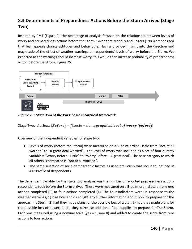
140 | P a g e
8.3 Determinants of Preparedness Actions Before the Storm Arrived (Stage Two)
Inspired by PMT (Figure 2), the next stage of analysis focused on the relationship between levels of
worry and preparedness actions before the Storm. Given that Maddux and Rogers (1983) emphasised
that fear appeals change attitudes and behaviours. Having provided insight into the direction and
magnitude of the effect of weather warnings on respondents’ levels of worry before the Storm. We
expected as the warnings should increase worry, this would then increase probability of preparedness
action before the Strom, Figure 75.
Figure 75: Stage Two of the PMT based theoretical framework
Stage Two: 𝑨𝒄𝒕𝒊𝒐𝒏𝒔 (𝑩𝒆𝒇𝒐𝒓𝒆) = 𝒇[𝒔𝒐𝒄𝒊𝒐 − 𝒅𝒆𝒎𝒐𝒈𝒓𝒂𝒑𝒉𝒊𝒄𝒔, 𝒍𝒆𝒗𝒆𝒍 𝒐𝒇 𝒘𝒐𝒓𝒓𝒚 (𝒃𝒆𝒇𝒐𝒓𝒆)]
Overview of the independent variables for stage two:
• Levels of worry (before the Storm) were measured on a 5-point ordinal scale from “not at all
worried” to “a great deal worried”. The level of worry was included as a set of four dummy
variables: “Worry Before - Little” to “Worry Before – A great deal”. The base category to which
all others is compared is “not at all worried”.
• The same selection of socio-demographic factors as used previously was included, defined in
4.0: Profile of Respondents.
The dependent variable for the stage two analysis was the number of reported preparedness actions
respondents took before the Storm arrived. These were measured on a 5-point ordinal scale from zero
actions completed (0) to four actions completed (4). The four indicators were: in response to the
weather warnings, 1) had households sought any further information about how to prepare for the
approaching Storm; 2) had they made plans for the possible loss of water; 3) had they made plans for
the possible loss of power; 4) did they purchase additional food supplies to prepare for The Storm.
Each was measured using a nominal scale (yes = 1, no= 0) and added to create the score from zero
actions to four actions.
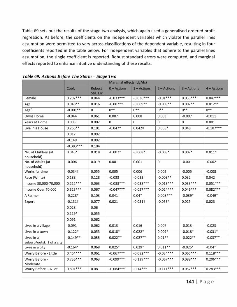
141 | P a g e
Table 69 sets out the results of the stage two analysis, which again used a generalised ordered profit
regression. As before, the coefficients on the independent variables which violate the parallel lines
assumption were permitted to vary across classifications of the dependent variable, resulting in four
coefficients reported in the table below. For independent variables that adhere to the parallel lines
assumption, the single coefficient is reported. Robust standard errors were computed, and marginal
effects reported to enhance intuitive understanding of these results.
Table 69: Actions Before The Storm – Stage Two
Marginal effects (dy/dx)
Coef. Robust Std. Err.
0 – Actions 1 – Actions 2 – Actions 3 – Actions 4 – Actions
Female 0.202*** 0.044 -0.033*** -0.036*** -0.01*** 0.033*** 0.047***
Age 0.048** 0.016 -0.007** -0.009** -0.003** 0.007** 0.012**
Age2 -0.001** 0 0** 0** 0** 0** 0**
Owns Home -0.044 0.061 0.007 0.008 0.003 -0.007 -0.011
Years at Home 0.003 0.002 0 0 0 0 0.001
Live in a House 0.265** 0.101 -0.047* 0.042‡ 0.065* 0.048 -0.107***
0.017 0.092
-0.149 0.092
-0.383*** 0.104
No. of Children (at household)
0.045* 0.018 -0.007* -0.008* -0.003* 0.007* 0.011*
No. of Adults (at household)
-0.006 0.019 0.001 0.001 0 -0.001 -0.002
Works fulltime -0.034‡ 0.055 0.005 0.006 0.002 -0.005 -0.008
Race (White) 0.188 0.128 -0.033 -0.033 -0.008** 0.032 0.042
Income 30,000-70,000 0.212*** 0.063 -0.033*** -0.038*** -0.013*** 0.033*** 0.051***
Income Over 70,000 0.323*** 0.067 -0.047*** -0.057*** -0.024*** 0.046*** 0.082***
A Farmer -0.228* 0.103 0.041‡ 0.04* 0.008*** -0.039* -0.049*
Expert -0.131‡ 0.077 0.021 -0.031‡ -0.038* 0.025 0.023
0.028 0.06
0.119* 0.055
0.091 0.062
Lives in a village -0.091 0.062 0.013 0.016 0.007 -0.013 -0.023
Lives in a town -0.122* 0.053 0.018* 0.022* 0.009* -0.018* -0.031*
Lives in a suburb/outskirt of a city
-0.149** 0.055 0.022** 0.027** 0.01** -0.022** -0.037**
Lives in a city -0.164* 0.068 0.025* 0.029* 0.011** -0.025* -0.04*
Worry Before - Little 0.464*** 0.061 -0.067*** -0.082*** -0.034*** 0.065*** 0.118***
Worry Before - Moderate
0.756*** 0.063 -0.099*** -0.129*** -0.067*** 0.089*** 0.206***
Worry Before – A Lot 0.891*** 0.08 -0.084*** -0.14*** -0.111*** 0.052*** 0.283***

142 | P a g e
Worry Before – A Great Deal
1.02*** 0.113 -0.081*** -0.149*** -0.138*** 0.025‡ 0.343***
/cut1 0.627 0.309
/cut2 1.406 0.310
/cut3 2.124 0.311
/cut4 3.006 0.313
χ2 (Chi-squared) (df = 22)
422.3 ***
No. Obs 3,228
Notes ‡p<0.1, *p<0.05, **p<0.01, ***p<0.001
The results of the regression showed that, controlling for the set of socio-demographic factors, a
statistically significant positive relationship exists between worry about the Storm and the number of
actions taken action before the Storm. This is evident in the increasing magnitude of the regression
coefficients corresponding to higher worry levels.
The marginal effect values reflect this. For example, the probability that a respondent stated they
completed all four preparedness actions is estimated to be 11.8pp higher if they worried a little before
the Storm arrived, compared to those who did not worry at all. This figure increases to 34.3pp for those
who worried a great deal about the Storm. These results support the contention that, while high levels
of worry are not always associated with protective action for every household, worry can act as a strong
motivator to undertake preparedness action.
Being female, having a larger number of children in the household, and having a higher household
income (of over 30,000) increases the likelihood of taking actions before The Storm. For example, the
marginal effect suggested that the probability that a respondent stated they completed all four actions
increases by 4.7pp if they were female compared to male. The impact of age on actions taken is
quadratic, showing an inverted u-shape relation.
Working full-time, being a farmer, an expert, and living in a town, suburbs, or city decreased the
likelihood of taking actions before The Storm. For example, living in a city translates into a decrease of
4pp in the probability that a respondent says they had completed all four actions.
The effect of living in a house, as opposed to an apartment or other, is to reduce the probabilities of
extremes in terms of action, either taking no action or completing all four, and increasing the
probability of the mid-range number of actions.
8.4 Determinants of the Reflective Coping Appraisal (Stage Three)
Rogers and Prentice‐Dunn (1997) highlighted that the Coping Appraisal of PMT has rich meaning and
can be conceptualised in various ways. As noted before, we examined the concept of a reflective post-
event Coping Appraisal as part of our PMT framework. However, Mileti (1995) emphasised that people
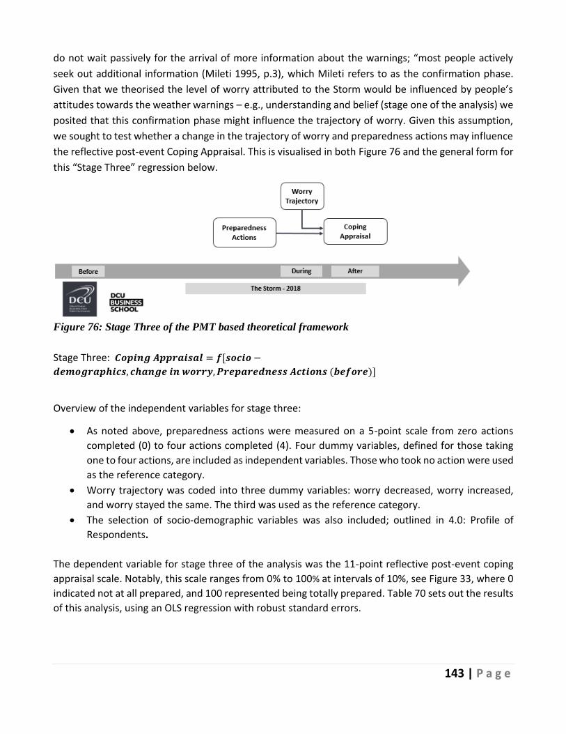
143 | P a g e
do not wait passively for the arrival of more information about the warnings; “most people actively
seek out additional information (Mileti 1995, p.3), which Mileti refers to as the confirmation phase.
Given that we theorised the level of worry attributed to the Storm would be influenced by people’s
attitudes towards the weather warnings – e.g., understanding and belief (stage one of the analysis) we
posited that this confirmation phase might influence the trajectory of worry. Given this assumption,
we sought to test whether a change in the trajectory of worry and preparedness actions may influence
the reflective post-event Coping Appraisal. This is visualised in both Figure 76 and the general form for
this “Stage Three” regression below.
Figure 76: Stage Three of the PMT based theoretical framework
Stage Three: 𝑪𝒐𝒑𝒊𝒏𝒈 𝑨𝒑𝒑𝒓𝒂𝒊𝒔𝒂𝒍 = 𝒇[𝒔𝒐𝒄𝒊𝒐 −
𝒅𝒆𝒎𝒐𝒈𝒓𝒂𝒑𝒉𝒊𝒄𝒔, 𝒄𝒉𝒂𝒏𝒈𝒆 𝒊𝒏 𝒘𝒐𝒓𝒓𝒚, 𝑷𝒓𝒆𝒑𝒂𝒓𝒆𝒅𝒏𝒆𝒔𝒔 𝑨𝒄𝒕𝒊𝒐𝒏𝒔 (𝒃𝒆𝒇𝒐𝒓𝒆)]
Overview of the independent variables for stage three:
• As noted above, preparedness actions were measured on a 5-point scale from zero actions
completed (0) to four actions completed (4). Four dummy variables, defined for those taking
one to four actions, are included as independent variables. Those who took no action were used
as the reference category.
• Worry trajectory was coded into three dummy variables: worry decreased, worry increased,
and worry stayed the same. The third was used as the reference category.
• The selection of socio-demographic variables was also included; outlined in 4.0: Profile of
Respondents.
The dependent variable for stage three of the analysis was the 11-point reflective post-event coping
appraisal scale. Notably, this scale ranges from 0% to 100% at intervals of 10%, see Figure 33, where 0
indicated not at all prepared, and 100 represented being totally prepared. Table 70 sets out the results
of this analysis, using an OLS regression with robust standard errors.

144 | P a g e
Table 70: Coping Appraisal – Stage Three
Coef. Robust Std. Err
95% Conf. Interval
Female -3.734*** 0.899 -5.496 -1.972
Age 0.762** 0.244 0.284 1.24
Age2 -0.006** 0.003 -0.011 0
Owns Home -0.577 1.256 -3.039 1.886
Years at Home -0.058 0.045 -0.148 0.031
Live in a House -4.04* 1.645 -7.265 -0.816
No. of Children (at household) 0.136 0.364 -0.579 0.85
No. of Adults (at household) -0.694 0.417 -1.511 0.123
Works fulltime -4.136*** 1.075 -6.244 -2.028
Race (White) 5.075 3.047 -0.9 11.049
Income 30,000-70,000 1.472 1.465 -1.401 4.344
Income Over 70,000 3.295* 1.535 0.287 6.304
A farmer 0.935 2.449 -3.867 5.737
Expert -3.382*** 0.954 -5.253 -1.51
Lives in a village -1.04 1.267 -3.525 1.444
Lives in a town -0.658 1.091 -2.798 1.482
Lives in a suburb/outskirt of a city -1.208 1.123 -3.41 0.995
Lives in a city -1.498 1.433 -4.307 1.311
Worry Decreased 5.448*** 1.012 3.463 7.433
Worry Increased -13.24*** 0.896 -14.997 -11.483
Actions Before – 1 4.317* 1.798 0.791 7.843
Actions Before – 2 7.278*** 1.711 3.922 10.633
Actions Before – 3 12.282*** 1.687 8.974 15.589
Actions Before – 4 14.137*** 1.762 10.682 17.592
Constant 43.757*** 5.925 32.139 55.375
Adjusted R2 0.174
F 30.87***
No. Obs 3,164
Notes *p<0.05, **p<0.01, ***p<0.001
The OLS results suggest that the number of actions taken before the Storm arrived had a strong positive
relationship with reported post-event coping appraisal, as the reported coefficients on “Actions
Before” variables increase in magnitude from β=4.317 (for one action completed) up to β=14.137 (for
four actions completed). That is, the more actions completed, the higher post-event coping appraisal
is predicted to be. For instance, the coefficient for respondents who completed all four actions before
the Storm suggests that having four actions completed is estimated to change the coping appraisal by
β=14.137 compared to someone who had taken no actions. The differences between consecutive
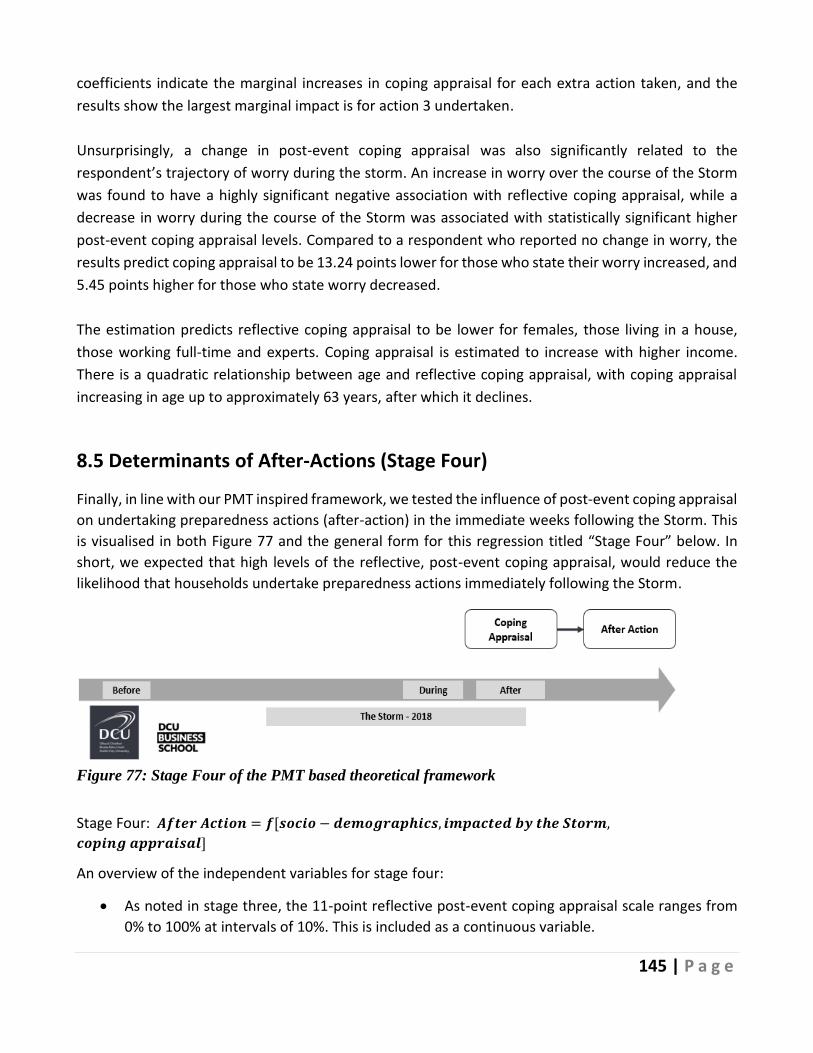
145 | P a g e
coefficients indicate the marginal increases in coping appraisal for each extra action taken, and the
results show the largest marginal impact is for action 3 undertaken.
Unsurprisingly, a change in post-event coping appraisal was also significantly related to the respondent’s trajectory of worry during the storm. An increase in worry over the course of the Storm
was found to have a highly significant negative association with reflective coping appraisal, while a
decrease in worry during the course of the Storm was associated with statistically significant higher
post-event coping appraisal levels. Compared to a respondent who reported no change in worry, the
results predict coping appraisal to be 13.24 points lower for those who state their worry increased, and
5.45 points higher for those who state worry decreased.
The estimation predicts reflective coping appraisal to be lower for females, those living in a house,
those working full-time and experts. Coping appraisal is estimated to increase with higher income.
There is a quadratic relationship between age and reflective coping appraisal, with coping appraisal
increasing in age up to approximately 63 years, after which it declines.
8.5 Determinants of After-Actions (Stage Four)
Finally, in line with our PMT inspired framework, we tested the influence of post-event coping appraisal
on undertaking preparedness actions (after-action) in the immediate weeks following the Storm. This
is visualised in both Figure 77 and the general form for this regression titled “Stage Four” below. In
short, we expected that high levels of the reflective, post-event coping appraisal, would reduce the
likelihood that households undertake preparedness actions immediately following the Storm.
Figure 77: Stage Four of the PMT based theoretical framework
Stage Four: 𝑨𝒇𝒕𝒆𝒓 𝑨𝒄𝒕𝒊𝒐𝒏 = 𝒇[𝒔𝒐𝒄𝒊𝒐 − 𝒅𝒆𝒎𝒐𝒈𝒓𝒂𝒑𝒉𝒊𝒄𝒔, 𝒊𝒎𝒑𝒂𝒄𝒕𝒆𝒅 𝒃𝒚 𝒕𝒉𝒆 𝑺𝒕𝒐𝒓𝒎,
𝒄𝒐𝒑𝒊𝒏𝒈 𝒂𝒑𝒑𝒓𝒂𝒊𝒔𝒂𝒍]
An overview of the independent variables for stage four:
• As noted in stage three, the 11-point reflective post-event coping appraisal scale ranges from
0% to 100% at intervals of 10%. This is included as a continuous variable.
146 | P a g e
• “Impacted by the Storm” is a dummy variable set equal to 1 if the respondent reports being
adversely impacted by the Storm, 0 otherwise.
• The same selection of socio-demographic factors was also included. As before these are defined
in section 4.0: Profile of Respondents.
The dependent variable, After-Action, is a binary variable indicating whether respondents undertook
any further actions in the 8-weeks following The Storm. Of the 3685 applicable respondents, 12.9%
(474n) had undertaken subsequent protective actions and were coded as Yes (1); the remainder were
coded as No (0).
After-Action was modelled using probit regression with robust standard errors. Results are in Table 71,
where profit regression coefficients and marginal effects are reported. The latter show the change in
the predicted probability of having taken action after the storm, resulting from a one-unit change in
the explanatory variable, setting all other explanatory variables to their mean values.

147 | P a g e
Table 71: After-Actions
Coef. Robust Std. Err.
Marginal effects (dy/dx)
Female -0.087 0.067 -0.017
Age 0.01 0.020 0.002
Age2 0 0.000 0
Owns Home 0.334*** 0.098 0.06***
Years at Home 0.002 0.003 0
Live in a House 0.066 0.124 0.012
No. of Children (at household)
-0.025 0.028
-0.005
No. of Adults (at household)
-0.04 0.031
-0.008
Works fulltime 0.112 0.086 0.021
Race (White) -0.364* 0.184 -0.086^
Income 30,000-70,000 -0.282** 0.099 -0.055**
Income Over 70,000 -0.351*** 0.108 -0.065***
A Farmer -0.013 0.169 -0.002
Expert 0.226*** 0.068 0.048**
Lives in a village 0.029 0.095 0.006
Lives in a town -0.041 0.081 -0.008
Lives in a suburb/outskirt of a city
-0.176* 0.087
-0.033*
Lives in a city -0.144 0.109 -0.028
Coping Appraisal -0.004*** 0.001 -0.001***
Impacted by the Storm 0.22 0.148 0.038^
Constant -0.986 0.445
Chi-squared (df = 20) 90.86***
Log Likelihood -1148.57
Correctly classified 87.48%
No. Obs 3,164
Notes *p<0.05, **p<0.01, ***p<0.001
The analysis shows a highly significant negative relationship existed between the reflective coping
appraisal and the tendency to take protective actions after the Storm. The estimated marginal effect
shows for every one-point decrease in the post-event coping appraisal, the probability of taking action
after the Storm increases by 0.001 (0.1pp). Thus, the worse a household felt they had coped with the
Storm, the more likely they were to undertake further preparedness actions immediately following this
Storm.

148 | P a g e
Owning their home, and identifying as an Emergency Management Expert, significantly increased the
likelihood respondents took actions to prepare the home in the weeks following the Storm. For
example, owning the home led to a 6pp rise in the probability a respondent stated they undertook
after-actions.
Being white, having a household income of over 30,000 and living in the suburbs/ outskirt of a city
compared with a rural area significantly reduced the likelihood of taking actions after the Storm. For
example, the marginal effects revealed that the probability a respondent stated they had undertaken
after-actions decreased by 3.3pp if they lived in the suburbs. All other socio-demographic
characteristics were non-significant.
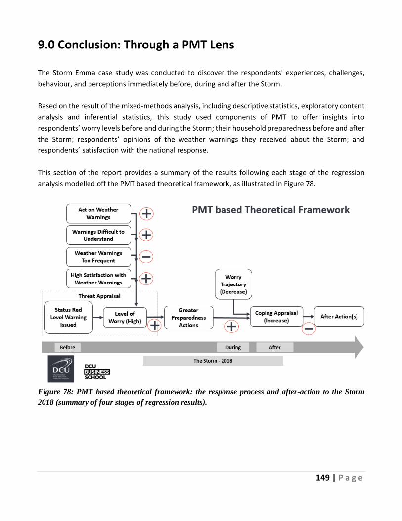
149 | P a g e
9.0 Conclusion: Through a PMT Lens
The Storm Emma case study was conducted to discover the respondents' experiences, challenges,
behaviour, and perceptions immediately before, during and after the Storm.
Based on the result of the mixed-methods analysis, including descriptive statistics, exploratory content
analysis and inferential statistics, this study used components of PMT to offer insights into
respondents’ worry levels before and during the Storm; their household preparedness before and after
the Storm; respondents’ opinions of the weather warnings they received about the Storm; and
respondents’ satisfaction with the national response.
This section of the report provides a summary of the results following each stage of the regression
analysis modelled off the PMT based theoretical framework, as illustrated in Figure 78.
Figure 78: PMT based theoretical framework: the response process and after-action to the Storm
2018 (summary of four stages of regression results).

150 | P a g e
Stage 1: Worry Before the Storm
The large majority (88.2%, 3416n) of respondents were at least somewhat satisfied to extremely
satisfied with the current Met Éireann weather warning system. However, respondents were divided
on weather warning credibility. Some believed they were too frequent and not localized enough to be
taken seriously, while others believed the opposite to be true.
The regression analysis results provided further insight into the direction and magnitude of the effect
of the response process, understanding and believing weather warnings (Figure 72, Mileti 1995), on
respondents’ levels of worry before The Storm.
• Respondents who indicated that they took action on weather warnings and those who
suggested that warnings were difficult to understand were more likely to report a high level of
worry about the Storm.
• Respondents were less likely to worry about The Storm if they stated weather warnings were
issued too frequently.
• Satisfaction with weather warnings impacted worry only at lower worry levels.
Stage 2: Actions taken before the Storm
Respondents' levels of preparedness before the Storm varied, but the action most performed was
purchasing additional food supplies, 72.2% (2939n), followed by making plans for the possible loss of
power 59.6% (2327n). Details of additional preparedness actions, or lack of, were provided by 2,220
respondents. However, 459 of these stated they did not make any specific preparations for The Storm.
For some, this was because they did not think The Storm would not be as bad as it was, while for others,
it was because they believed the nationwide red weather alert was an over-reaction. For others, not
preparing was a source of regret.
The regression analysis findings suggested that a positive association existed between the level of
worry before The Storm and the number of preparedness actions taken. For instance, the probability
of completing all four actions before The Storm was estimated to be 11pp higher for those who worried
only a little about The Storm compared to those who were not at all worried, and 34.3pp higher for
those who worried a great deal about the Storm.
Worry about a natural hazard has not always been shown to inspire preparedness action. However, in
this case, worry about The Storm (the threat appraisal having been informed by understanding and
believing the weather warnings) prompted immediate action.

151 | P a g e
Stage 3: Reflective Coping Appraisal
The study found that worry was heightened by The Storm's severity, worries about getting to and from
work, and concerns for family and friends. Worry was mitigated by geographic location, where the
impact was less severe, and by keeping informed. PMT suggests that taking preparedness action may
be explained by exhibiting a high threat appraisal and a high coping appraisal. To better understand
the process, stage three examined how actions before The Storm impacted respondents’ reflections
on their coping appraisal. The regression analysis suggested that in the case of The Storm:
• The reflective post-event coping appraisal was negatively related to changes in worry during
the Storm, i.e., a decrease in worry during the storm led to an increase in the post-event coping
appraisal.
• Preparedness action and reflective coping appraisal were positively related. Having completed
a greater number of preparedness actions beforehand increased how well people felt they had
coped during this event.
These results suggest that following the national guidance and taking action before The Storm
enhanced respondents coping appraisal.
Stage 4: Actions after the Storm
A total of 3685 respondents, 12.9% (474n), undertook protective actions in the weeks following The
Storm. Respondents were asked if, on reflection, they should have done more to prepare for The Storm.
2,460 suggestions were made but, of these, 525 felt they did not need to make any additional
preparations to cope with The Storm.
Regression analysis examined the relationship between respondents’ post-event coping appraisal and
taking additional preparedness actions following The Storm. A statistically significant, negative
relationship was found between the reflective post-event coping appraisal and the tendency to take
protective actions after The Storm. This finding indicates that the worse a household felt they coped
during The Storm, the more likely they were to have undertaken further preparedness actions
immediately afterwards—thus confirming the PMT model (Figure 78).
Summary
In summary, these findings make three contributions to our understanding of preparedness related to
The Storm. Weather warnings are an important antecedent in forming threat appraisal and influencing
worry. Such warnings are a critical driver of subsequent preparedness action as part of a PMT
framework. Secondly, worry plays a vital role in affecting protection motivation before and during a

152 | P a g e
severe weather event such as The Storm. Lastly, the evidence suggests that respondents' ability to cope
during The Storm significantly impacted after actions to prepare for future weather events.
The importance of the national weather warning system and how these warnings are interpreted must
not be overlooked. The analysis presented within this case study suggests that these warnings play a
crucial role in determining how weather information is perceived and acted upon – they are a critical
element of PMT.

153 | P a g e
References Abunyewah, M., Gajendran, T. & Maund, K., 2018. Conceptual Framework for Motivating Actions
towards Disaster Preparedness Through Risk Communication. Procedia Engineering, Issue 212(2017),
p. 246–253.
Adhikari, M. et al., 2018. Modelling predictors of earthquake hazard preparedness in Nepal. Procedia
Engineering, Issue 212, p. 910–917.
Babcicky, P. & Seebauer, S., 2019. Unpacking Protection Motivation Theory: evidence for a separate
protective and non-protective route in private flood mitigation behavior. Journal of Risk Research,
22(12), p. 1503–1521.
Bazeley, P., 2009. Analysing qualitative data: More than ‘identifying themes. Malaysian J. Qualitative
Research, Volume 2:, pp. 6-22.
Begg, C., Ueberham, M., Masson, T. & Kuhlicke, C., 2017. Interactions between citizen
responsibilization, flood experience and household resilience: insights from the 2013 flood in Germany.
International Journal of Water Resources Development, Volume 33(4), p. 591–608.
Birkholz, S., Muro, M., Jeffrey, P. & Smith, H. M., 2014. Rethinking the relationship between flood risk
perception and flood management. Science of the Total Environment, Issue 478, p. 12–20.
Birkholz, S., Muro, M., Jeffrey, P. & Smith, H. M., 2014. Rethinking the relationship between flood risk
perception and flood management. Science of the Total Environment, Issue 478, p. 12–20.
Botzen, W. J. W., Kunreuther, H., Czajkowski, J. & de Moel, H., 2019. Adoption of Individual Flood
Damage Mitigation Measures in New York City: An Extension of Protection Motivation Theory. Risk
Analysis, 39(10), p. 2143–2159.
Bourque, L. B. et al., 2013. An Examination of the Effect of Perceived Risk on Preparedness Behavior.
Environment and Behavior, Volume 45.
Bradford, R. A. et al., 2012. Risk perception - Issues for flood management in Europe. Natural Hazards
and Earth System Science, 12(7), p. 2299–2309.
Bubeck, P., Botzen, W. J. W. & Aerts, J. C. J. H., 2012. A Review of Risk Perceptions and Other Factors
that Influence Flood Mitigation Behavior. Risk Analysis, 32(9), p. 1481–1495.
Bubeck, P., Botzen, W., Kreibich, H. & Aerts, J., 2013. Detailed Insights into the influence of flood-
coping appraisals on mitigation behaviour. Global Environmental Change, 23(5), pp. 1327-1338.
Bubeck, P. et al., 2018. Insights into flood‐coping appraisals of protection motivation theory: Empirical
evidence from Germany and France. Risk Analysis, 38(6), pp. 1239-1257.
Budhathoki, N. K., Paton, D., A. Lassa, J. & Zander, K. K., 2020. Assessing farmers’ preparedness to
cope with the impacts of multiple climate change-related hazards in the Terai lowlands of Nepal.
International Journal of Disaster Risk Reduction, 49(101656).
Burns, S., 2018. The Irish Times. [Online]
Available at: https://www.irishtimes.com/news/environment/significant-snow-event-forecast-for-
thursday-after-6cm-of-snowfall-today-1.3407179
[Accessed 28 Jan 2021].
C., D., 2013. Risk Perception. In: Gellman M.D., Turner J.R. (eds) Encyclopedia of Behavioral
Medicine. Springer, New York, NY.

154 | P a g e
Corwin, K. A., Brand, B. D., Hubbard, M. L. & Johnston, D. M., 2017. Household preparedness
motivation in lahar hazard zones: assessing the adoption of preparedness behaviors among laypeople
and response professionals in communities downstream from Mount Baker and Glacier Peak (USA)
volcanoes. Journal of Applied Volcanology, 6(1).
CSO, 2016. Census 2016 Summary Results - Part 1. [Online]
Available at:
https://www.cso.ie/en/media/csoie/newsevents/documents/census2016summaryresultspart1/Census201
6SummaryPart1.pdf
CSO, 2016. Census of Population 2016 - Profile 1 Housing in Ireland. [Online]
Available at:
https://www.cso.ie/en/csolatestnews/pressreleases/2017pressreleases/pressstatementcensus2016results
profile1-housinginireland/
CSO, 2016. Geographical Profiles of Income in Ireland 2016. [Online]
Available at: https://www.cso.ie/en/releasesandpublications/ep/p-
gpii/geographicalprofilesofincomeinireland2016/incomeinireland/
CSO, 2019. Urban and Rural Life in Ireland. [Online]
Available at: https://www.cso.ie/en/releasesandpublications/ep/p-
urli/urbanandrurallifeinireland2019/introduction/#d.en.211130
Cummings, C. L., Rosenthal, S. & Kong, W. Y., 2020. Secondary Risk Theory: Validation of a Novel
Model of Protection Motivation. Risk Analysis.
Cutter, S., 1993. Living with Risk. Edward Arnold, London.
Darker, C., 2013. Risk Perception. In: Gellman M.D., Turner J.R. (eds) Encyclopedia of Behavioral
Medicine. Springer.
de Boer, J., Botzen, W. & Terpstra, T., 2013. Improving flood risk communication by focusing on
prevention-focused motivation. Risk Analysis, 34(2), pp. 309-322.
Dittrich, R., Wreford, A., Butler, A. & Moran, D., 2016. The impact of flood action groups on the uptake
of flood management measures. Climatic Change, 138(2-4), p. 471–489.
ECMWF, 2020. The European Centre for Medium-Range Weather Forecasts (ECMWF)- Who we are.
[Online]
Available at: https://www.ecmwf.int/en/about/who-we-are
[Accessed 27 January 2021].
Fielding, N. & Lee, R. M., 1998. Computer Analysis and Qualitative Research. London: Sage
Publication Ltd.
Floyd, D., Prentice-Dunn, S. & Rogers, R., 2000. A Meta-Analysis of Research of Protection Motivation
Theory. Journal of Applied Social Psychology, 30(2), pp. 407- 429.
Gebrehiwot, T. & van der Veen, A., 2015. Farmers Prone to Drought Risk: Why Some Farmers
Undertake Farm-Level Risk-Reduction Measures While Others Not?. Environmental Management,
55(3), p. 588–602.
Glaser, B. & Stauss, A., 1967. The Discovery of Grounded Theory. Chicago: Aldine.
Government, D. o. H. P. a. L., 2018. Statement from the National Emergency Coordination Group on
Severe Weather. [Online]
155 | P a g e
Available at: https://www.housing.gov.ie/local-government/fire-and-emergency-management/severe-
weather/statement-national-emergency-2
[Accessed 27 January 2021].
Grothmann, T. & Reusswig, F., 2006. People at risk of flooding: why some residents take precautionary
action while others do not. Natural hazards, 38(1-2).
housing.gov.ie, 2019. National Directorate for Fire and Emergency Management - Review Report on
Severe Weather Events 2017 - 2018. [Online]
Available at: https://www.gov.ie/en/publication/0c2e4-review-report-on-severe-weather-events-2017-
2018/?referrer=http://www.housing.gov.ie/sites/default/files/publications/files/severe_weather_review
_report_-_final.pdf
[Accessed 27 January 2021].
Kellens, W., Terpstra, T. & De Maeyer, P., 2013. Perception and communication of flood risks: a
systematic review of empirical research. Risk Analysis, 33(1), p. 24‐49.
Krippendorff, K., 2004. Content Analysis: An Introduction to Its Methodology 2nd Edition. In: London:
Sage.
Lasswell, H. & Casey, D., 1946. Describing the Content of Communication: Propaganda,
Communication and Public Opinion. In: NJ: Princeton University Press.
Lincoln, Y. & Guba, E., 1985. Naturalistic Inquiry. In: Beverly Hills, CA: Sage Publications .
Maddux, J. E. & Rogers, R. W., 1983. Protection motivation and self-efficacy: A revised theory of fear
appeals and attitude change. Journal of experimental social psychology, 19(5), pp. 469-479.
Martin, I. M., Bender, H. & Raish, C., 2007. What motivates individuals to protect themselves from
risks: The case of wildland fires. Risk Analysis: An International Journal, 27(4).
Martin, P. & Bateson, P., 1993. Measuring behaviour: An introductory guide. 2nd ed. s.l.:Cambridge
University Press.
Maykut, P. & Morehouse, R., 1994. Beginning Qualitative Research: A Philosophic and Practical
Guide. London: The Falmer Press.
McGreevy, R., 2018. 'Beast from the East' could see country's heaviest snowfall since 1982, The Irish
Times. [Online]
Available at: https://www.irishtimes.com/news/ireland/irish-news/beast-from-the-east-could-see-
country-s-heaviest-snowfall-since-1982-1.3404985
[Accessed 27 January 2021].
Melia, P., Doyle, K. & Larkin, L., 2018. independent.ie. [Online]
Available at: independent.ie/irish-news/storm-emma/status-red-just-hours-until-nationwide-lockdown-
as-taoiseach-warns-people-not-to-underestimate-storm-emma-36656471.html
[Accessed 27 January 2021].
Mertens, K. et al., 2018. Disaster risk reduction among households exposed to landslide hazard: A crucial
role for self-efficacy?. Land Use Policy, 75(September 2017), p. 77–91.
MetÉireann, 2019. An Analysis of Storm Emma and the cold spell which struck Ireland between the 28th
of February and the 4th of March 2018. [Online]
Available at: https://www.met.ie/cms/assets/uploads/2019/02/EmmaReport2019.pdf
[Accessed 27 January 2021].
156 | P a g e
Mileti, D., 1995. FACTORS RELATED TO FLOOD WARNING RESPONSE. U.S.- Italy Research
Workshop on the Hydrometeorology, Impacts, and Management of Extreme Floods, pp. 1-17.
Neuwirth, K., Dunwoody, S. & Griffin, R. J., 2000. Protection motivation and risk communication. Risk
Analysis, 20(5), p. 721–734.
Nosek, B. A. et al., 2015. Promoting an open research culture. Science, 348(6242), pp. 1422-1425.
O’Brien, R. M., 2007. A caution regarding rules of thumb for variance inflation factors. Quality and
Quantity, 41(5), p. 673–690.
Oakley, M., Himmelweit, S. M., Leinster, P. & Casado, M. R., 2020. Protection motivation theory: A
proposed theoretical extension and moving beyond rationality-the case of flooding. Water, 12(7).
Odidi, S., Tantanee, S., Nusit, K. & Buranajarukorn, P., 2020. FACTORS INFLUENCING THE
UPTAKE OF FLOOD MITIGATION MEASURED IN BUDALANGI, KENYA. Geographia
Technica, 15(1), p. 80–90.
Papagiannaki, K., Kotroni, V., Lagouvardos, K. & Papagiannakis, G., 2019. How awareness and
confidence affect flood-risk precautionary behavior of Greek citizens: The role of perceptual and
emotional mechanisms. Natural Hazards and Earth System Sciences, 19(7), p. 1329–1346.
Paton, D., 2019. Disaster risk reduction: Psychological perspectives on preparedness. Australian Journal
of Psychology, 71(4), p. 327–341.
Paton, D. et al., 2003. Responding to earthquake hazards : promoting household resilience and
preparedness. Pacific Conference on Earthquake Engineering, Issue 166.
Poussin, J. K., Botzen, W. J. W. & Aerts, J. C. J. H., 2014. Factors of influence on flood damage
mitigation behaviour by households. Environmental Science and Policy, Volume 40, pp. 69-77.
Prentice-Dunn, S. & Rogers, R., 1986. Protection motivation theory and preventive health: Beyond the
health belief model. Health Education Research, 1(3), pp. 153-161.
Reynaud, A., Aubert, C. & Nguyen, M. H., 2013. Living with floods: Protective behaviours and risk
perception of vietnamese households. Geneva Papers on Risk and Insurance: Issues and Practice, 38(3),
p. 547–579.
Richards, L., 2005. Handling Qualitative Data – A Practical Guide. London, Sage, 7(2).
Rippetoe, P. & Rogers, R., 1987. Effects of components of protection motivation theory on adaptive and
maladaptive coping with a health threat. Journal of Personality and Social Psychology, Volume 52, pp.
596-604.
Rogers, R., 1975. A Protection Motivation Theory of Fear Appeals and Attitude Change. The Journal of
Psychology, 91(1), pp. 93-114.
Rogers, R. & Prentice Dunn, S., 1997. ‘Protection motivation Theory.’ In D. Gochman (Ed.) Handbook
of health behaviour research. 1 ed. New York, Plenum: Personal and Social Determinants.
Ryan, N., 2020. The Explainer: How does Met Éireann decide on weather warnings?[Podcast]. [Online]
Available at: https://www.thejournal.ie/met-eireann-weather-warnings-4938204-Jan2020/
[Accessed 27 January 2021].
Samaddar, S., Chatterjee, R., Misra, B. & Tatano, H., 2014. Outcome-expectancy and self-efficacy:
Reasons or results of flood preparedness intention?. International Journal of Disaster Risk Reduction,
Volume 8, pp. 91-99.
Samaddar, S., Misra, B. A., Chatterjee, R. & Tatano, H., 2012. Understanding Community’s Evacuation

157 | P a g e
Intention Development Process in a Flood Prone Micro-hotspot, Mumbai. Journal of Integrated Disaster
Risk Management,, 2(2), p. 89–107.
Schlef, K. E. et al., 2018. Relating perceptions of flood risk and coping ability to mitigation behavior in
West Africa: Case study of Burkina Faso. Environmental Science and Policy, Volume 89, p. 254–265.
Seebauer, S. & Babcicky, P., 2020. The Sources of Belief in Personal Capability: Antecedents of Self-
Efficacy in Private Adaptation to Flood Risk. Risk Analysis, 40(10), p. 1967–1982.
SRA, 2018. Society for Risk Analysis Glossary. [Online]
Available at: https://www.sra.org/wp-content/uploads/2020/04/SRA-Glossary-FINAL.pdf
[Accessed 27 January 2021].
Stemler, S., 2001. An overview of content analysis. Practical Assessment, Research & Evaluation, 7(17).
Tang, J. S. & Feng, J. Y., 2018. Residents’ disaster preparedness after the meinong taiwan earthquake:
A test of protection motivation theory. International Journal of Environmental Research and Public
Health, 15(7).
Taylor, S. & Bogdan, R., 1984. Introduction to Qualitative Research Methods: The Search for Meanings.
New Jersey, USA: Wiley.
Twerefou, D. K., Adu-Danso, E., Abbey, E. & Dovie, B. D., 2019. Choice of household adaptation
strategies to flood risk management in Accra, Ghana. City and Environment Interactions, Volume 3.
Williams, R., 2006. Generalized Ordered Logit/Partial Proportional Odds Models for Ordinal Dependent
Variables. Sage.
Wirtz, P. W., Rohrbeck, C. A. & Burns, K. M., 2019. Anxiety effects on disaster precautionary
behaviors: A multi-path cognitive model. Journal of Health Psychology, 24(10), p. 1401–1411.

158 | P a g e
Appendix One Analytical Process Application in NVivo Strategic Objective The iterative
process throughout the analysis
What data are analyzed How are they defined What is the population from which they are drawn? (Source)
Phase 1: Downloading submissions and formatting demographic and other profiling information into a single table for import into a computer-aided qualitative data analysis system (NVivo)
Data Management (Open and hierarchal coding through NINVO) Descriptive Accounts (Reordering, 'coding on' and annotating through NVIVO) Explanatory Accounts (Extrapolating deeper meaning, drafting summary statements and analytical memos through NVIVO)
Who said what? Why did they say it? How did they say it? What inferences may be drawn? To whom did they say it With what effect?
What are the contexts relative to which the data are analyzed? (Encoding Process)
Phase 2 – Open Coding Phase 3 – Categorization of Codes Phase 4 – Coding on Phase 5 – Data Reduction/Consolidation
Exploring relationships and patterns across categories (Channel, Message, Recipient)
Phase 6: Generating Analytical Memos
Integrating data to write findings (Decoding Process)
Phase 7 – Validating analytical memos Phase 8– Synthesizing analytical memos
Stages and processes deployed in qualitative data analysis
Adapted from Krippendorff (2004)
159 | P a g e