Embed Size (px)
Citation preview
date: 10†∞ november 2004
submitted by
ANDREAS STÖTZNERSignographic Research
corinthstraße 15 ÷ 04157 leipzig ÷ germany
telephone, fax: +49+341 -2 111 926
PROPOSAL TO THE UNICODE CONSORTIUM
proposal 2/2004
>
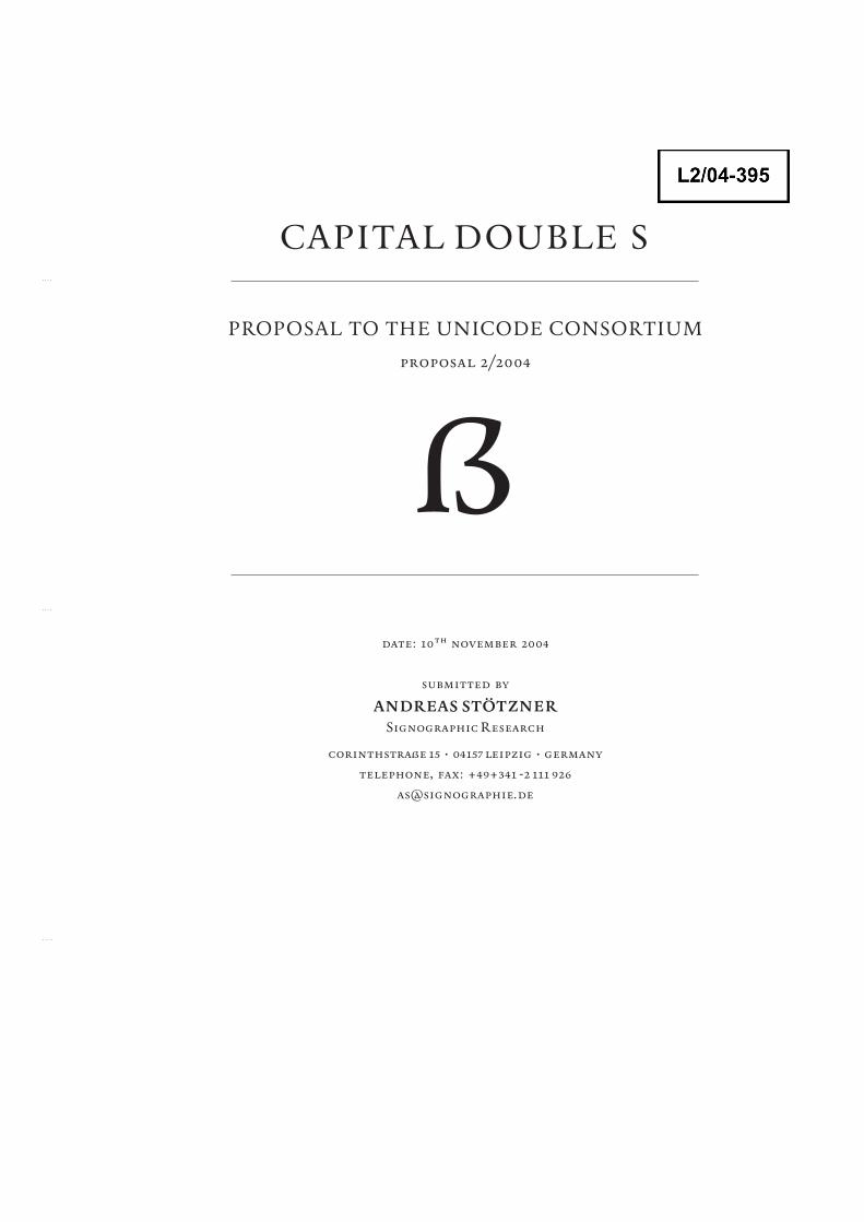
CAPITAL DOUBLE S
A. Administrative
1. Title: Latin Capital Letter Double S2. Requester’s name: Andreas Stötzner3. Requester’s ¥pe: Expert request4. Submission date: 10 November 20045. Ref.: 2/20046. This is a complete proposal.
B. Technical – General
1. The proposal is for addition of one character to an existing block.Name of the existing block: »Latin Extended-B« (u+0180 ƒ.)
2. Number of proposed characters: 1 3. Proposed category: –4. Proposed level of implementation: L. 1
A rationale is provided on p. 3f5. ˜ a. Character name: see p. 3
˜ Character name in accordance with guidelines˜ b. Character shapes: see p. 3
6. ˜ A Postscript-font will be provided by the author of this proposal on request.7. ˜ a. References are a∫ached, see p. 5f
˜ b. Published examples are attached, see p. 5f8. Yes, see p. 3f9. ˜ Additional information is provided, see following pages.
C. Technical – Justification
1. This proposal has not been submi∫ed before.2. Contact to user communities: yes.3. User communi¥: mainly German speaking public.4. Context of usage: the Latin alphabet. > is used when words containing a “ß” (u+00df)
become capitalised. There is no uppercase character matching the lowercase ß encoded yet, like it is with any other Latin character.
5. Current use: yes.6. Yes.7. –8. Presentation form of a character sequence: no.
Rationale: see p. 3f9. No.10. No. 11. No.12. No.13. No.
ANDREAS STÖTZNER Signographic Research ÷ corinthstraße 15 ÷ 04157 leipzig ÷ germany
Proposal to The Unicode Consortium Proposal 2/2004 ÷ page 2/18
ANDREAS STÖTZNER Signographic Research ÷ corinthstraße 15 ÷ 04157 leipzig ÷ germany
Proposal to The Unicode Consortium Proposal 2/2004 ÷ page 3/18
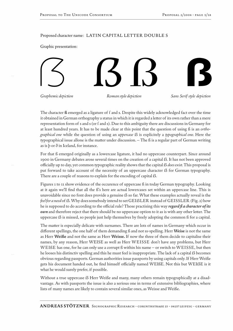
Proposed character name: LATIN CAPITAL LETTER DOUBLE S
Graphic presentation:
Graphemic depic√on Roman s¥le depic√on Sans Serif s¥le depic√on
The character ß emerged as a ligature of ¿ and s. Despite this widely acknowledged fact over the timeit obtained in German orthography a status in which it is regarded a le∫er of its own rather than a mererepresentation form of s and s (or ¿ and s). Due to this ambigui¥ there are discussions in Germany forat least hundred years. It has to be made clear at this point that the question of using ß is an ortho-graphical one while the question of using an uppercase > is explicitely a ¥pographical one. Here the¥pographical issue allone is the ma∫er under discussion. – The ß is a regular part of German writingas is π or ∂ in Iceland, for instance.
For that ß emerged originally as a lowercase ligature, it had no uppercase counterpart. Since around1900 in Germany debates arose several times on the creation of a capital >. It has not been approvedo⁄cially up to day, yet common ¥pographic reali¥ shows that the capital > does exist. This proposal isput forward to take account of the necessi¥ of an uppercase character > for German ¥pography.There are a couple of reasons to explain for the encoding of capital >.
Figures 1 to 11 show evidence of the occurence of uppercase ß in today German ¥pography. Lookingat it again we’ll find that all the ß’s here are actual lowercases set within an uppercase line. This isunavoidable since no font does provide a genuine > so far. What these examples actually reveal is thefeel for a need of >. Why doessomebody intend to set GEI>LER instead of GEISSLER (Fig. 2) howhe is supposed to do according to the o⁄cial rule? Those practising this way regard ß a character of itsown and therefore reject that there should be no uppercase option to it as is with any other le∫er. Theuppercase > is missed, so people just help themselves by freely adopting the common ß for a capital.
The ma∫er is especially delicate with surnames. There are lots of names in Germany which occur indiƒerent spellings, the one half of them demanding ß and not ss-spelling. Herr Weise is not the sameas Herr Weiße and not the same as Herr Weisse. If now the three of them decide to capitalise theirnames, by any reason, Herr WEISE as well as Herr WEISSE don’t have any problems, but HerrWEIßE has one, for he can only use a corrupt ß within his name – or switch to WEISSE, but thenhe looses his distinctiv spelling and this he must feel is inappropriate. The lack of a capital > becomesobvious regarding passports. German authorities issue passports by using capitals only. If Herr Weißegets his document handed out, he find himself o⁄cially named WEIßE. Not this but WEI>E is itwhat he would surely prefer, if possible.
Without a true uppercase > Herr Weiße and many, many others remain ¥pographically at a disad-vantage. As with passports the issue is also a serious one in terms of extensive bibliographies, wherelists of many names are likely to contain several similar ones, as Weisse and Weiße.
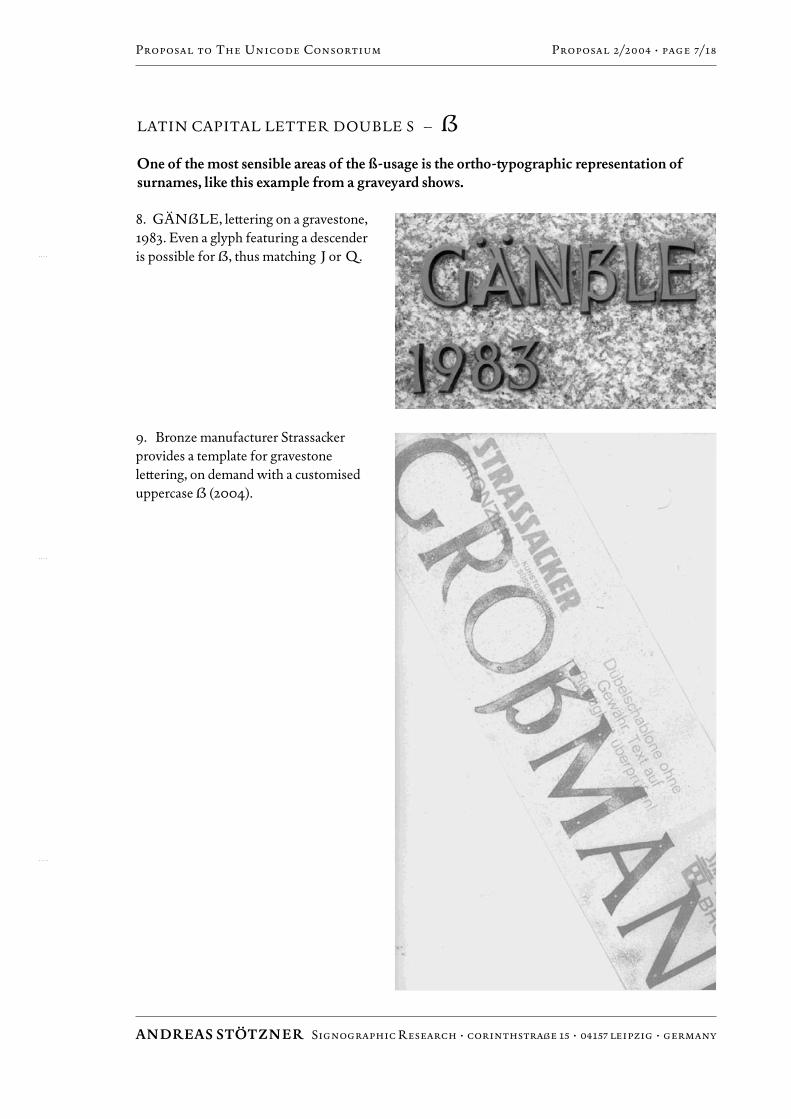
There are many names in existence occurring with diƒerent spellings: Geissler/Geißler, Gross-mann/Großmann, Gessner/Geßner, Hässler/Häßler, Meissner/Meißner, Nussbaum/Nußbaum,Rössler/Rößler, Wissmann/Wißmann, Weissflog/Weißflog, Schossig/Schoßig and many others.The GÄN˛LE gravestone (Fig. 8) is a striking example for the need of > as is GEI>LER’s foodstore (Fig. 2). – As ß is widely regarded a le∫er of its own right, in capitalisation neither SS nor the cor-rupt ß usage is satisfactory. Therefore the possibili¥ of a capital > is needed.
Surname capitalisation is one of the main reasons to provide an uppercase >, another one is the capi-talisation of compound words which German language makes frequent use of. If the ß happens to beat the end of the first part (Nuß-, Faß-, Biß-, Fluß-) and the initial of the second part happens to be a s,then capitalisation causes the problem of a triple uppercase S – which looks bad and therefore usuallybecomes replaced by just a double S: Nußschale (nutshell) becomes NUSSSCHALE, which is reject-ed by many because it looks terrific, then it turns to NUSSCHALE, which is just a compromise. Yetin our example (Fig. 5), the cover of a Steven Hawking edition by a well-established German publisher,neither the first nor the second version applies: NU>SCHALE has been ¥ped instead. The designerpreferred a corrupt lowercase ß among the capitals, although this costum is not o⁄cially approved. Atthe end this version was felt being more appropriate to the reader. Also well-known German ¥pogra-pher F. H. Ehmcke choose to set STO>SEUFZER instead of STOSSEUFZER (Fig. 21), likeothers did as well. The distinction is important in terms of legibili¥. Between the ß of Nuß- and the sof -schale there is a semantic boundary. In NUSSSCHALE as well as in NUSSCHALE this bound-ary becomes blurred, but not so in NU>SCHALE. – A lots of words contain such a ß-s junction:
Nußschale – NU>SCHALE Baßsaite – BA>SAITE
Flußscho∫er – FLU>SCHOTTER Großstadt – GRO>STADT
Naßschliƒ – NA>SCHLIFF Flußschiƒahrt – FLU>SCHIFFAHRT
Maßstab – MA>STAB Mißstand – MI>STAND
Stoßseufzer – STO>SEUFZER Rißstelle – RI>STELLE
Roßschlächter – RO>SCHLÄCHTER Rußschleier – RU>SCHLEIER
Stoßstange – STO>STANGE Schloßschenke – SCHLO>SCHENKE
and others.
Although a capital > has been considered by the public for more than 100 years it did not happen up today to become actually confirmed or even realised in font production, with few exceptions. A mainreason for this is a certain di⁄cul¥ or uncertain¥ about how the le∫er should actually look like. Manyproposals have been made adressing this problem (see p. 16). However, it is demonstrated in this pro-posal that there are su⁄cient possibilities to shape the character > in an appropriate manner (see p. 17).
As recent Internet discussions revealed the request for an uppercase > is regarded an open questiontoday more than ever. Even more interesting it seems that the recent mood among users towards anincreased application of capital > proves to develop independently from o⁄cial or professional eƒorts.
ConclusionThe proposed Latin Capital Letter Double S – > should become encoded to enable a hithertounsolved bug in German ¥pography become fixed. Surnames containing a ß and compound wordswith a ß-s junction in particular raise the need of an uppercase >, as ¥pographical custom of todayshows.
ANDREAS STÖTZNER Signographic Research ÷ corinthstraße 15 ÷ 04157 leipzig ÷ germany
Proposal to The Unicode Consortium Proposal 2/2004 ÷ page 4/18
LATIN CAPITAL LETTER DOUBLE S – >
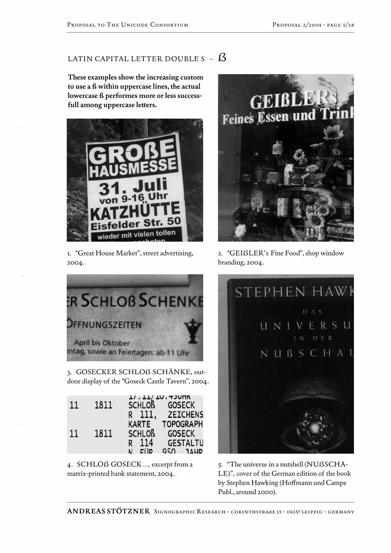
These examples show the increasing customto use a ß within uppercase lines, the actuallowercase ß performes more or less success-full among uppercase le∫ers.
ANDREAS STÖTZNER Signographic Research ÷ corinthstraße 15 ÷ 04157 leipzig ÷ germany
Proposal to The Unicode Consortium Proposal 2/2004 ÷ page 5/18
1. “Great House Market”, street advertising,2004.
2. “GEI>LER’s Fine Food”, shop windowbranding, 2004.
3. GOSECKER SCHLO> SCHÄNKE, out-door display of the “Goseck Castle Tavern”, 2004.
4. SCHLO> GOSECK …, excerpt from amatrix-printed bank statement, 2004.
5. “The universe in a nutshell (NU>SCHA-
LE)”, cover of the German edition of the bookby Stephen Hawking (Hoƒmann und CampePubl., around 2000).

LATIN CAPITAL LETTER DOUBLE S – >
More examples of current usage of a “corrupt” ß in German ¥pography, as seen in 2004.
ANDREAS STÖTZNER Signographic Research ÷ corinthstraße 15 ÷ 04157 leipzig ÷ germany
Proposal to The Unicode Consortium Proposal 2/2004 ÷ page 6/18
6.a, b Seen on equipment of a cast asphalt floorsupplier (GU>ASPHALTESTRICHE). The“false” (lowercase) ß proves to fit quite well in theline of capitals.
7. Logo¥pe of a roofer, 2004.
LATIN CAPITAL LETTER DOUBLE S – >
One of the most sensible areas of the ß-usage is the ortho-¥pographic representation ofsurnames, like this example from a graveyard shows.
ANDREAS STÖTZNER Signographic Research ÷ corinthstraße 15 ÷ 04157 leipzig ÷ germany
Proposal to The Unicode Consortium Proposal 2/2004 ÷ page 7/18
8. GÄN>LE, le∫ering on a gravestone,1983. Even a glyph featuring a descenderis possible for >, thus matching J or Q.
9. Bronze manufacturer Strassackerprovides a template for gravestonele∫ering, on demand with a customiseduppercase > (2004).
LATIN CAPITAL LETTER DOUBLE S – >
ANDREAS STÖTZNER Signographic Research ÷ corinthstraße 15 ÷ 04157 leipzig ÷ germany
Proposal to The Unicode Consortium Proposal 2/2004 ÷ page 8/18
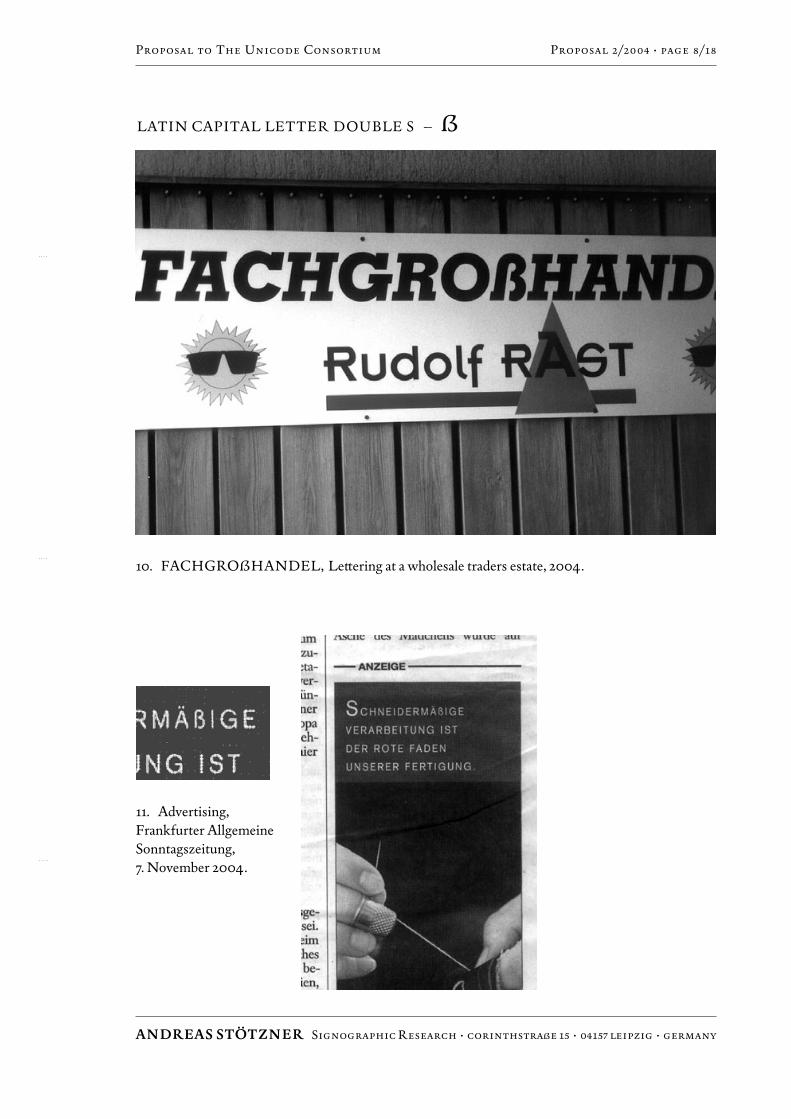
11. Advertising, Frankfurter AllgemeineSonntagszeitung, 7. November 2004.
10. FACHGRO>HANDEL, Le∫ering at a wholesale traders estate, 2004.
LATIN CAPITAL LETTER DOUBLE S – >
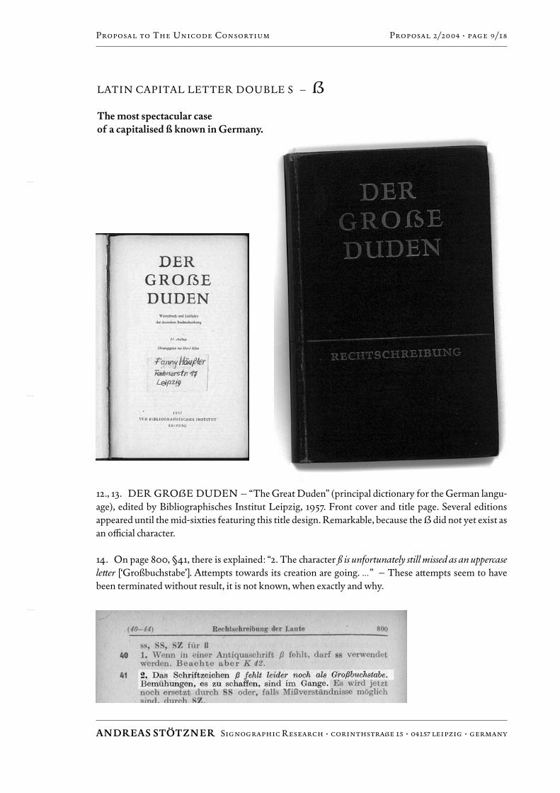
The most spectacular case of a capitalised ß known in Germany.
ANDREAS STÖTZNER Signographic Research ÷ corinthstraße 15 ÷ 04157 leipzig ÷ germany
Proposal to The Unicode Consortium Proposal 2/2004 ÷ page 9/18
12., 13. DER GRO>E DUDEN – “The Great Duden” (principal dictionary for the German langu-age), edited by Bibliographisches Institut Leipzig, 1957. Front cover and title page. Several editionsappeared until the mid-sixties featuring this title design. Remarkable, because the > did not yet exist asan o⁄cial character.
14. On page 800, §41, there is explained: “2. The character ß is unfortunately still missed as an uppercasele∫er [‘Großbuchstabe’]. A∫empts towards its creation are going. …” – These a∫empts seem to havebeen terminated without result, it is not known, when exactly and why.

LATIN CAPITAL LETTER DOUBLE S – >
Some German ¥pefaces from the beginning of the 20th century feature a genuine capital ß.
ANDREAS STÖTZNER Signographic Research ÷ corinthstraße 15 ÷ 04157 leipzig ÷ germany
Proposal to The Unicode Consortium Proposal 2/2004 ÷ page 10/18
15. Schelter-Kursiv, Schelter & Giesecke, 1906.
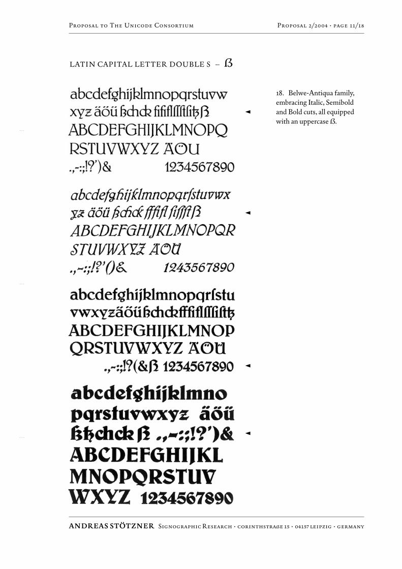
16. Belwe-Antiqua by Georg Belwe,Schelter & Giesecke, 1913.
�
�
17. Koralle,Schelter & Giesecke,1915.
�
LATIN CAPITAL LETTER DOUBLE S – >
ANDREAS STÖTZNER Signographic Research ÷ corinthstraße 15 ÷ 04157 leipzig ÷ germany
Proposal to The Unicode Consortium Proposal 2/2004 ÷ page 11/18
18. Belwe-Antiqua family,embracing Italic, Semiboldand Bold cuts, all equippedwith an uppercase >.
�
�
�
�
LATIN CAPITAL LETTER DOUBLE S – >
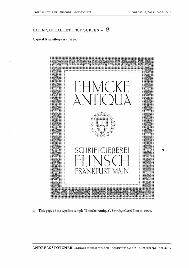
Capital ß in le∫erpress usage.
ANDREAS STÖTZNER Signographic Research ÷ corinthstraße 15 ÷ 04157 leipzig ÷ germany
Proposal to The Unicode Consortium Proposal 2/2004 ÷ page 12/18
19. Title page of the ¥peface sample “Ehmcke-Antiqua”, Schri˝gießerei Flinsch, 1909.
�
LATIN CAPITAL LETTER DOUBLE S – >
ANDREAS STÖTZNER Signographic Research ÷ corinthstraße 15 ÷ 04157 leipzig ÷ germany
Proposal to The Unicode Consortium Proposal 2/2004 ÷ page 13/18
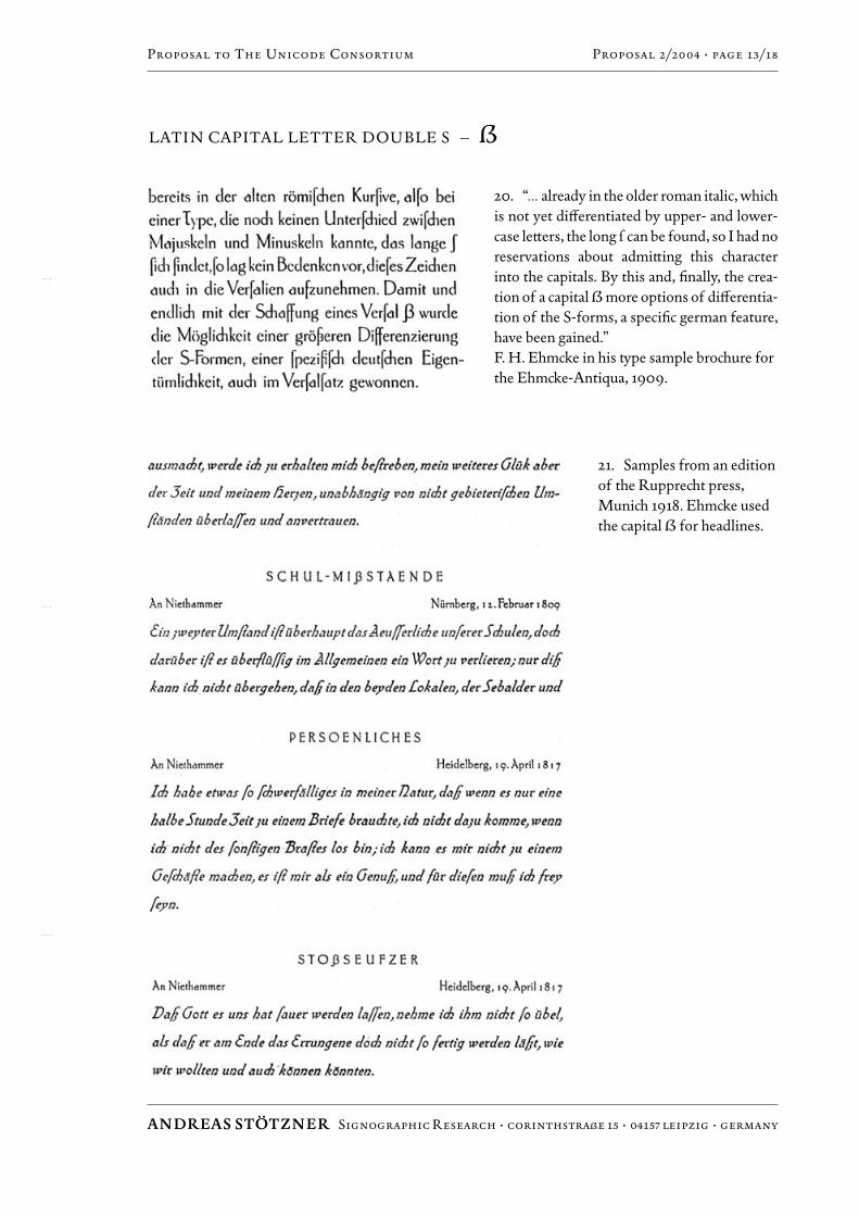
20. “…already in the older roman italic, whichis not yet diƒerentiated by upper- and lower-case le∫ers, the long ¿ can be found, so I had noreservations about admi∫ing this characterinto the capitals. By this and, finally, the crea-tion of a capital > more options of diƒerentia-tion of the S-forms, a specific german feature,have been gained.”F. H. Ehmcke in his ¥pe sample brochure forthe Ehmcke-Antiqua, 1909.
21. Samples from an editionof the Rupprecht press,Munich 1918. Ehmcke usedthe capital > for headlines.
LATIN CAPITAL LETTER DOUBLE S – >
ANDREAS STÖTZNER Signographic Research ÷ corinthstraße 15 ÷ 04157 leipzig ÷ germany
Proposal to The Unicode Consortium Proposal 2/2004 ÷ page 14/18
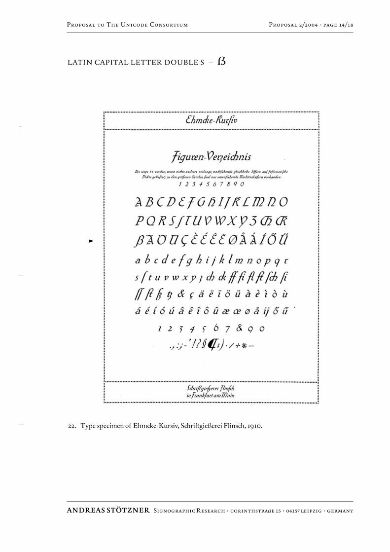
22. Type specimen of Ehmcke-Kursiv, Schri˝gießerei Flinsch, 1910.
�
LATIN CAPITAL LETTER DOUBLE S – >
ANDREAS STÖTZNER Signographic Research ÷ corinthstraße 15 ÷ 04157 leipzig ÷ germany
Proposal to The Unicode Consortium Proposal 2/2004 ÷ page 15/18
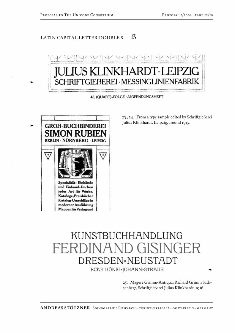
23., 24. From a ¥pe sample edited by Schri˝gießereiJulius Klinkhardt, Leipzig, around 1915.
25. Magere Grimm-Antiqua, Richard Grimm Sach-senberg, Schri˝gießerei Julius Klinkhardt, 1916.
�
�
�
LATIN CAPITAL LETTER DOUBLE S – >
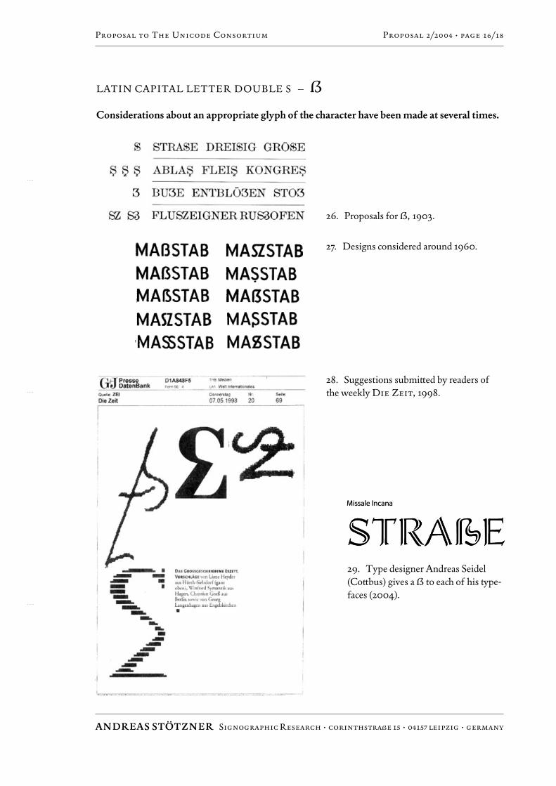
Considerations about an appropriate glyph of the character have been made at several times.
ANDREAS STÖTZNER Signographic Research ÷ corinthstraße 15 ÷ 04157 leipzig ÷ germany
Proposal to The Unicode Consortium Proposal 2/2004 ÷ page 16/18
26. Proposals for >, 1903.
27. Designs considered around 1960.
29. Type designer Andreas Seidel(Co∫bus) gives a > to each of his ¥pe-faces (2004).
28. Suggestions submi∫ed by readers ofthe weekly Die Zeit, 1998.
LATIN CAPITAL LETTER DOUBLE S – >
ANDREAS STÖTZNER Signographic Research ÷ corinthstraße 15 ÷ 04157 leipzig ÷ germany
Proposal to The Unicode Consortium Proposal 2/2004 ÷ page 17/18
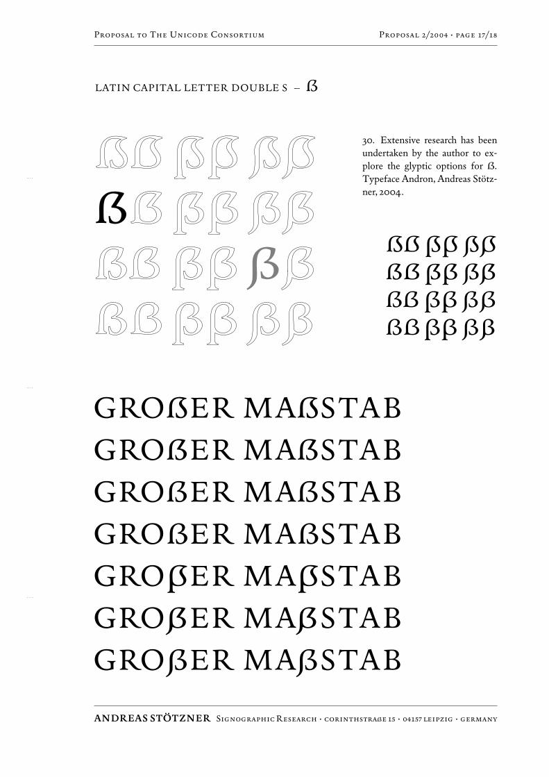
30. Extensive research has beenundertaken by the author to ex-plore the glyptic options for >.
Typeface Andron, Andreas Stötz-ner, 2004.
LATIN CAPITAL LETTER DOUBLE S – >
ANDREAS STÖTZNER Signographic Research ÷ corinthstraße 15 ÷ 04157 leipzig ÷ germany
Proposal to The Unicode Consortium Proposal 2/2004 ÷ page 18/18
Picture Credits
Photography by Andreas Stötzner (1, 2, 3, 6, 7, 10)Signographic Collection Andreas Stötzner (4, 5, 11,
12, 13, 14)Provided by Ingo Preuß (8)Ernst Strassacker GmbH & Co. KG (9)From: Georg Kandler, Alphabete. Erinnerungen an
den Bleisatz. Bd.e 1 u. 2; Minner–Verlag Korn-westheim 1995 (15, 16, 17, 18, 26)
From originals preserved in the Deutsches Buch-und Schri˝museum, Deutsche Bücherei Leipzig(19, 20, 21, 22, 23, 24)
Provided by Andreas Seidel (25, 29)Provided by Hans Jürgen Willuhn (27)Gruner + Jahr (Publ.), Hamburg (28)