Embed Size (px)
Citation preview

8/6/2019 Candlestick Charting Book
http://slidepdf.com/reader/full/candlestick-charting-book 1/49

8/6/2019 Candlestick Charting Book
http://slidepdf.com/reader/full/candlestick-charting-book 2/49
2
EARNINGS DISCLAIMER
EVERY EFFORT HAS BEEN MADE TO ACCURATELY REPRESENT THISPRODUCT AND IT'S POTENTIAL. EVEN THOUGH THIS INDUSTRY IS ONEOF THE FEW WHERE ONE CAN WRITE THEIR OWN CHECK IN TERMS OFEARNINGS, THERE IS NO GUARANTEE THAT YOU WILL EARN ANYMONEY USING THE TECHNIQUES AND IDEAS IN THESE MATERIALS.EXAMPLES IN THESE MATERIALS ARE NOT TO BE INTERPRETED AS APROMISE OR GUARANTEE OF EARNINGS. EARNING POTENTIAL ISENTIRELY DEPENDENT ON THE PERSON USING OUR PRODUCT, THEIRIDEAS AND TECHNIQUES. WE DO NOT PURPORT THIS AS A "GET RICHSCHEME."
ANY CLAIMS MADE OF ACTUAL EARNINGS OR EXAMPLES OF ACTUALRESULTS ARE NOT TYPICAL. YOUR LEVEL OF SUCCESS IN ATTAINING
THE RESULTS CLAIMED IN OUR MATERIALS DEPENDS ON THE TIMEYOU DEVOTE TO THE PROGRAM, IDEAS AND TECHNIQUES MENTIONED,YOUR FINANCES, KNOWLEDGE AND VARIOUS SKILLS. SINCE THESEFACTORS DIFFER ACCORDING TO INDIVIDUALS, WE CANNOTGUARANTEE YOUR SUCCESS OR INCOME LEVEL. NOR ARE WERESPONSIBLE FOR ANY OF YOUR ACTIONS.
MATERIALS IN OUR PRODUCT AND OUR WEBSITE MAY CONTAININFORMATION THAT INCLUDES OR IS BASED UPON FORWARD-LOOKING STATEMENTS WITHIN THE MEANING OF THE SECURITIES
LITIGATION REFORM ACT OF 1995. FORWARD-LOOKING STATEMENTSGIVE OUR EXPECTATIONS OR FORECASTS OF FUTURE EVENTS. YOU CANIDENTIFY THESE STATEMENTS BY THE FACT THAT THEY DO NOTRELATE STRICTLY TO HISTORICAL OR CURRENT FACTS. THEY USEWORDS SUCH AS "ANTICIPATE," "ESTIMATE," "EXPECT," "PROJECT,""INTEND," "PLAN," "BELIEVE," AND OTHER WORDS AND TERMS OFSIMILAR MEANING IN CONNECTION WITH A DESCRIPTION OFPOTENTIAL EARNINGS OR FINANCIAL PERFORMANCE.
ANY AND ALL FORWARD LOOKING STATEMENTS HERE OR ON ANY OFOUR SALES MATERIAL ARE INTENDED TO EXPRESS OUR OPINION OFEARNINGS POTENTIAL. MANY FACTORS WILL BE IMPORTANT INDETERMINING YOUR ACTUAL RESULTS AND NO GUARANTEES AREMADE THAT YOU WILL ACHIEVE RESULTS SIMILAR TO OURS ORANYBODY ELSE'S, IN FACT NO GUARANTEES ARE MADE THAT YOUWILL ACHIEVE ANY RESULTS FROM OUR IDEAS AND TECHNIQUES INOUR MATERIAL.
8/6/2019 Candlestick Charting Book
http://slidepdf.com/reader/full/candlestick-charting-book 3/49
3
Candlestick Charting
Candlestick charting was developed by Japanese rice traders over four centuriesago and could quite possibly be the oldest form of technical analysis. Sincetechnical analysis is not only predicting probable price moves but also assessingmarket psychology, candlestick charting is probably the best tool to give thetrader these answers in the shortest amount of time. Once a trader becomesfamiliar with candlestick charting, he or she can get a quick and highly visualsignal because of the story candlesticks tell. Strict adherers to candlestick
methodology take positions based on very short term patterns given bycandlestick tradition. While candlestick charting is relatively unknown, andtherefore unpracticed by the common investor, their use among active traders isgrowing. The greatest benefit candlestick charts provide the technical analyst isthe ease of use and interpretation. The same price action, quickly seen usingcandlestick charts, may go unnoticed while scrolling through bar charts.
While analysis of chart patterns takes experience and some practice, so too willcandlesticks. However, after learning the basic signals, candlesticks can providethe novice trader a shorter learning curve and also shorten the learning curve to
chart reading in general. I like using bar charts to find chart patterns, and thenswitch to candlesticks for a closer look. Candlestick charts are especially usefulwhen analyzing areas of consolidation such as triangles and flags for signs ofreversal or continuation. The major signals in candlestick theory are reversalsignals. Some of these signals are considered so strong by serious candlestickpractitioners; they will enter a trade based on its signal alone, without the needfor conformation. Since our trading style is to confirm everything, we won’t acton the signal alone, although we will pay close attention.
Our goal will be to teach you candlestick methods in their purest form, so wewill alert you to the signals in which no conformation is said to be necessary. Wewill also break down each signal, expanding on its psychological implications onthe chart. Our objective will be to not only educate you in the proper use ofcandlesticks, but also give plenty of examples of their improper use within achart formation or pattern.
8/6/2019 Candlestick Charting Book
http://slidepdf.com/reader/full/candlestick-charting-book 4/49
4
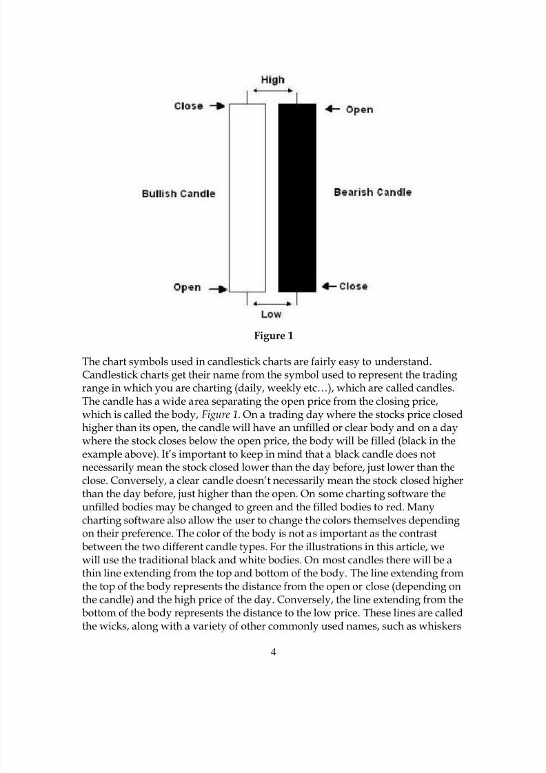
Figure 1
The chart symbols used in candlestick charts are fairly easy to understand.Candlestick charts get their name from the symbol used to represent the tradingrange in which you are charting (daily, weekly etc…), which are called candles.
The candle has a wide area separating the open price from the closing price,which is called the body, Figure 1. On a trading day where the stocks price closedhigher than its open, the candle will have an unfilled or clear body and on a daywhere the stock closes below the open price, the body will be filled (black in theexample above). It’s important to keep in mind that a black candle does notnecessarily mean the stock closed lower than the day before, just lower than theclose. Conversely, a clear candle doesn’t necessarily mean the stock closed higherthan the day before, just higher than the open. On some charting software theunfilled bodies may be changed to green and the filled bodies to red. Manycharting software also allow the user to change the colors themselves dependingon their preference. The color of the body is not as important as the contrastbetween the two different candle types. For the illustrations in this article, wewill use the traditional black and white bodies. On most candles there will be athin line extending from the top and bottom of the body. The line extending fromthe top of the body represents the distance from the open or close (depending onthe candle) and the high price of the day. Conversely, the line extending from thebottom of the body represents the distance to the low price. These lines are calledthe wicks, along with a variety of other commonly used names, such as whiskers

8/6/2019 Candlestick Charting Book
http://slidepdf.com/reader/full/candlestick-charting-book 5/49
5
or hairs. Since candlestick theory puts its emphasis on the relationship of theopen price, as compared to the closing price, the wicks rarely carry any technicalsignificance. However, there are a few candles and patterns you will want to payclose attention to not only the wick, but also to the length of the wick.
The Basic CandlesTo understand candlestick patterns, one first has to familiarize themselves withthe basic candle types. In Figure 1, we saw a basic example of a black and whitecandle and most often these, or variations of the candles will be seen on the chartand will have no significant meaning whatsoever. These candles will be nothingmore than random price movements without any clear signal for trading.
However, there are some other variations of daily candles that you shouldfamiliarize yourself with before we go on to patterns. Some of these candles maycarry important reversal implications when seen at the end of a long trend or atpoints of support and resistance. Many of these candles can give you an insightto the strength of a trend or a weakening trend. As we go through these candleswe’ll explain the psychological implications of each and what may be happeningas the buyers and sellers (Bulls and Bears) fight it out to move the price of astock. Remember that all price movement is due to supply and demand. Try andvisualize these candles as an indication of the daily battle between the Bulls andBears so you can look at the larger picture of the price chart and assess who iswinning the war. If you find yourself becoming confused between dark and lightcandle bodies, try to remember to look at each as if we were talking about theweather. A dark body has a stormy or bearish overtone and a clear body has abright or bullish outlook. Enough analogies, lets move on to the candles.
The Doji
The Doji is one of the most important signals in Candlestick analysis. A Doji hasthe appearance of a cross, with the opening price the same as the close. Itsignifies indecision in the market (Figure 2).

8/6/2019 Candlestick Charting Book
http://slidepdf.com/reader/full/candlestick-charting-book 6/49
6
Figure 2
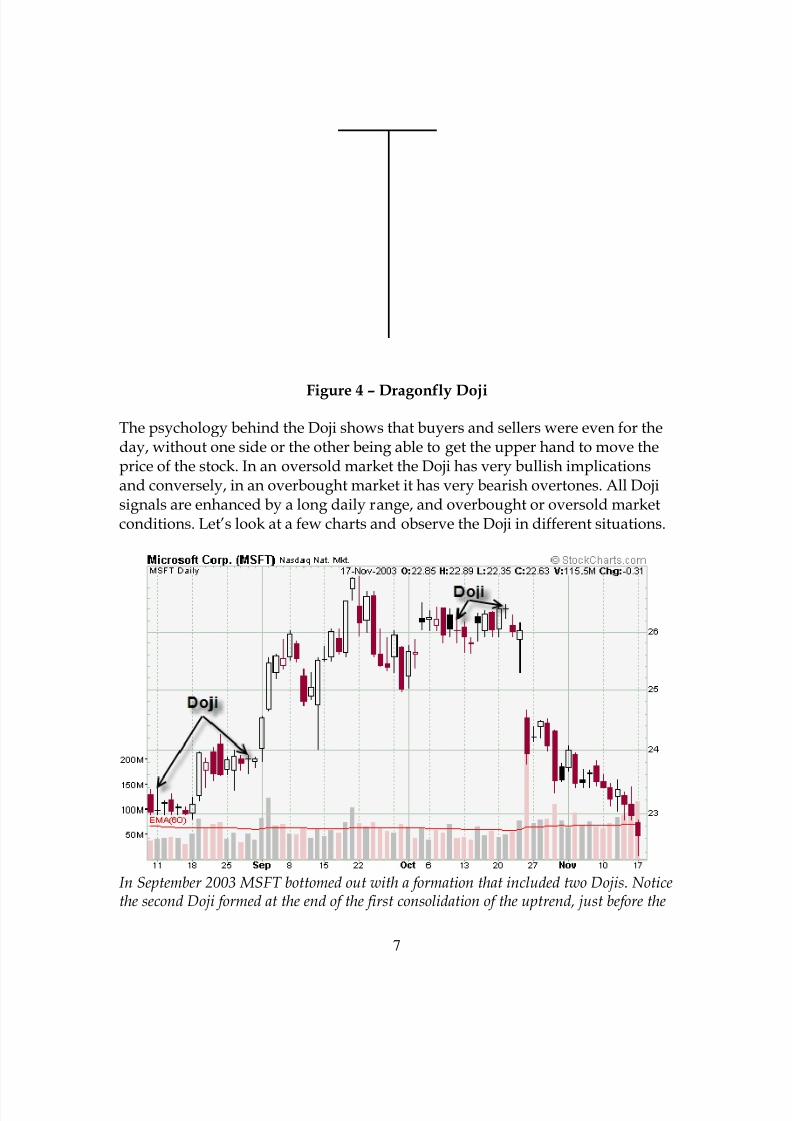
Other variations of the Doji are the Gravestone Doji and the Dragonfly Doji(Figure 3& 4). The Gravestone Doji shows price action that opens and closed atthe bottom of its daily range, giving the bears a slight upper hand for the dayand can be considered very bearish at a top. The Dragonfly Doji opens andclosed at the top of its daily range and can be considered very bullish.
Figure 3 – Gravestone Doji
8/6/2019 Candlestick Charting Book
http://slidepdf.com/reader/full/candlestick-charting-book 7/49
7
Figure 4 – Dragonfly Doji
The psychology behind the Doji shows that buyers and sellers were even for theday, without one side or the other being able to get the upper hand to move theprice of the stock. In an oversold market the Doji has very bullish implicationsand conversely, in an overbought market it has very bearish overtones. All Dojisignals are enhanced by a long daily range, and overbought or oversold marketconditions. Let’s look at a few charts and observe the Doji in different situations.
In September 2003 MSFT bottomed out with a formation that included two Dojis. Noticethe second Doji formed at the end of the first consolidation of the uptrend, just before the

8/6/2019 Candlestick Charting Book
http://slidepdf.com/reader/full/candlestick-charting-book 8/49
8
broke out and made its biggest gain of the new uptrend. Two months later, the uptrendended with two more Dojis before gapping down into a new downtrend.
After a fairly good downtrend, NCR ended it with a bottom containing two Dojis. A Dojidoesn’t have to be at the exact bottom, as in this chart to have reversal implications. Many times indecision shows itself a week or more before a bottom formation is complete.
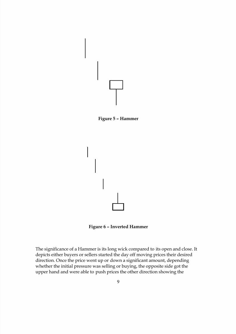
Hammers
The Hammer, which is similar to the Doji, is a single candle that represents apossible change in trend direction. Also similar to the Doji, the Hammer has a
few different variations. A hammer has a long daily range compared to thedifference between the closing and opening price. Unlike the Doji, The Hammerwill have either a white or black body, with the white body being somewhatmore bullish or a dark body being slightly more bearish. Below are twovariations of the Hammer candle (Figures 5 & 6)
8/6/2019 Candlestick Charting Book
http://slidepdf.com/reader/full/candlestick-charting-book 9/49
9
Figure 5 – Hammer
Figure 6 – Inverted Hammer
The significance of a Hammer is its long wick compared to its open and close. Itdepicts either buyers or sellers started the day off moving prices their desireddirection. Once the price went up or down a significant amount, dependingwhether the initial pressure was selling or buying, the opposite side got theupper hand and were able to push prices the other direction showing the

8/6/2019 Candlestick Charting Book
http://slidepdf.com/reader/full/candlestick-charting-book 10/49
10
pressure of the trend was lessoning. On the day of a hammer, the signal will beimproved by higher volume and the length of the prior trend. A Hammer canhave either bullish or bearish overtones depending were it forms. If the trendwas an up trend, the length of the wick warns of selling pressure. Even thoughthe bulls were able to push prices back to the top of the daily range, the fact that
they had to tells us the trend may be weakening.
Figure 7
On the Dow chart in Figure 7 we can see an example of both a clear and darkbodied hammer at two different minor bottoms in an uptrend. Also we have anexample of an inverted Hammer during the last week of October, 2003. At thisminor bottom the wick of an inverted hammer shows us that buyers werestarting to step in and with some strength. The clear body tells us that they wereable to hold off the sellers and close the day above its close, even though a darkbodied inverted Hammer would still have been bullish in this position.
Long and Short Days
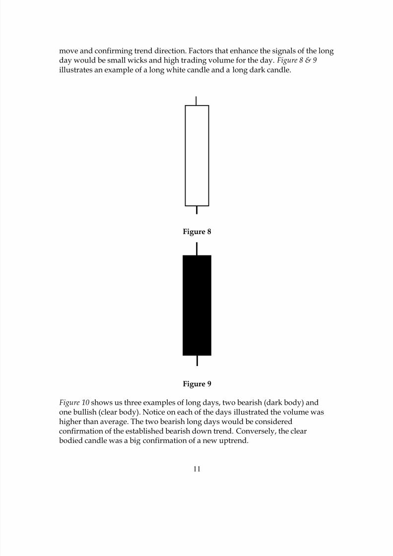
Long days are simply candles with a long body that represents a large pricemove from open to close. Long days can be found in many places on acandlestick chart. To determine if a candle is a long day it has to be compared tothe average daily move in the stock chart you are studying. Some stocks have anormal daily range of $2 – $4, while other stocks move much less. To determineif a candle is a long day it has to be compared with the average size of the othercandles on the chart. A long day is most useful in determining the strength of a
8/6/2019 Candlestick Charting Book
http://slidepdf.com/reader/full/candlestick-charting-book 11/49
11
move and confirming trend direction. Factors that enhance the signals of the longday would be small wicks and high trading volume for the day. Figure 8 & 9 illustrates an example of a long white candle and a long dark candle.
Figure 8
Figure 9
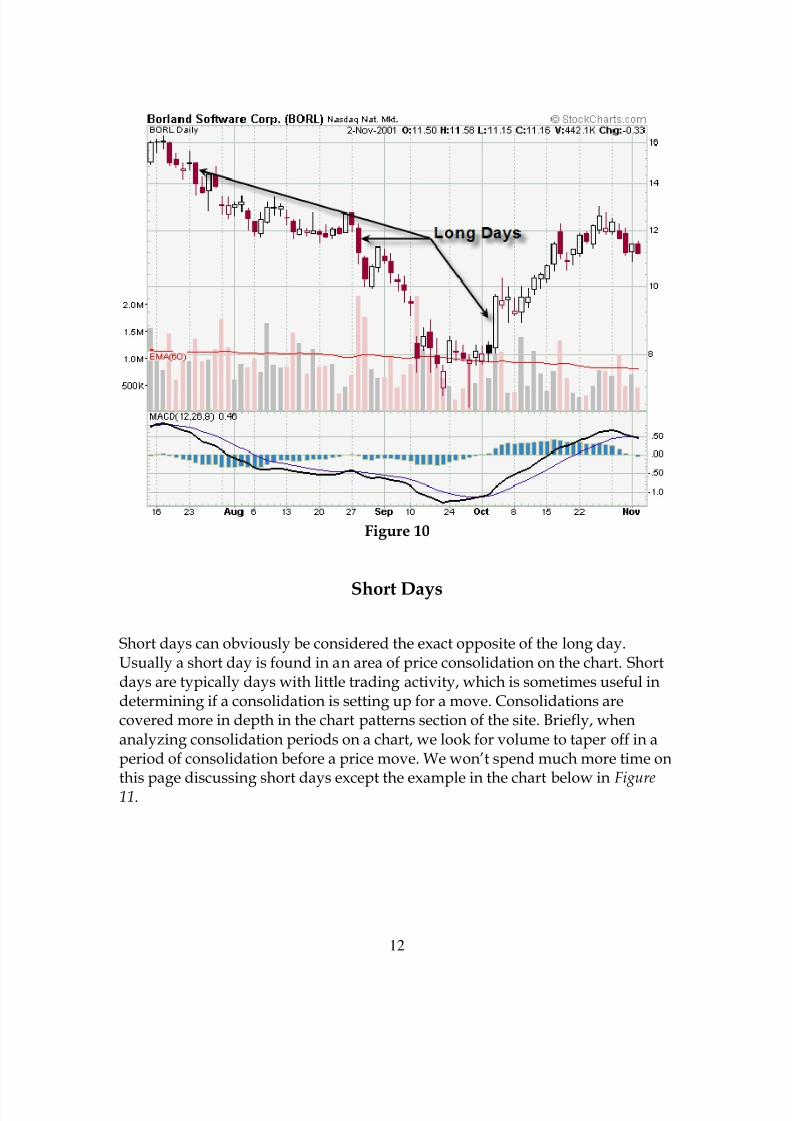
Figure 10 shows us three examples of long days, two bearish (dark body) andone bullish (clear body). Notice on each of the days illustrated the volume washigher than average. The two bearish long days would be consideredconfirmation of the established bearish down trend. Conversely, the clearbodied candle was a big confirmation of a new uptrend.
8/6/2019 Candlestick Charting Book
http://slidepdf.com/reader/full/candlestick-charting-book 12/49
12
Figure 10
Short Days
Short days can obviously be considered the exact opposite of the long day.Usually a short day is found in an area of price consolidation on the chart. Shortdays are typically days with little trading activity, which is sometimes useful indetermining if a consolidation is setting up for a move. Consolidations arecovered more in depth in the chart patterns section of the site. Briefly, whenanalyzing consolidation periods on a chart, we look for volume to taper off in aperiod of consolidation before a price move. We won’t spend much more time on
this page discussing short days except the example in the chart below in Figure11.

8/6/2019 Candlestick Charting Book
http://slidepdf.com/reader/full/candlestick-charting-book 13/49
13
Figure 11
Spinning Tops
Figure 12

8/6/2019 Candlestick Charting Book
http://slidepdf.com/reader/full/candlestick-charting-book 14/49
14
Spinning tops a re candles that have a small body compared to the size of thewicks. For a candle to be defined as a spinning top it must not only have longwicks, but must have wicks at both ends of the body. Spinning tops may or maynot offer information depending on their place on a stock chart. In a market that
is trending sideways a spinning top can usually be considered neutral. However,after a big move in price in either direction a spinning top can have the samereversal implications as the doji, especially if it is accompanied by a spike involume or forms within a few days of a doji.
Figure 13
In Figure 13 you can see spinning tops at reversal points in the price of BORL.Examining this chart will reveal more spinning top candles assuming a more
neutral roll.
Marubozu Variations
8/6/2019 Candlestick Charting Book
http://slidepdf.com/reader/full/candlestick-charting-book 15/49
15
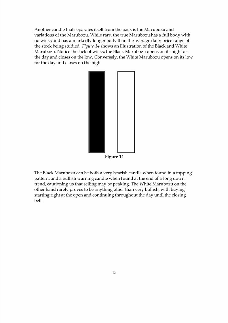
Another candle that separates itself from the pack is the Marubozu andvariations of the Marubozu. While rare, the true Marubozu has a full body withno wicks and has a markedly longer body than the average daily price range ofthe stock being studied. Figure 14 shows an illustration of the Black and WhiteMarubozu. Notice the lack of wicks; the Black Marubozu opens on its high for
the day and closes on the low. Conversely, the White Marubozu opens on its lowfor the day and closes on the high.
Figure 14
The Black Marubozu can be both a very bearish candle when found in a toppingpattern, and a bullish warning candle when found at the end of a long downtrend, cautioning us that selling may be peaking. The White Marubozu on theother hand rarely proves to be anything other than very bullish, with buyingstarting right at the open and continuing throughout the day until the closingbell.

8/6/2019 Candlestick Charting Book
http://slidepdf.com/reader/full/candlestick-charting-book 16/49
16
Figure 15
Above we have an illustration of a Black and White Closing Marubozu (Figure15), which are more common than the true Marubozu. A Closing Marubozu willclose with no wick; meaning that a White Closing Marubozu will close on itshigh and the Black Closing Marubozu will close on its low. The opening end ofboth the White and Black Marubozu can have wicks of variously lengths but theshorter the better.
Figure 16
8/6/2019 Candlestick Charting Book
http://slidepdf.com/reader/full/candlestick-charting-book 17/49
17
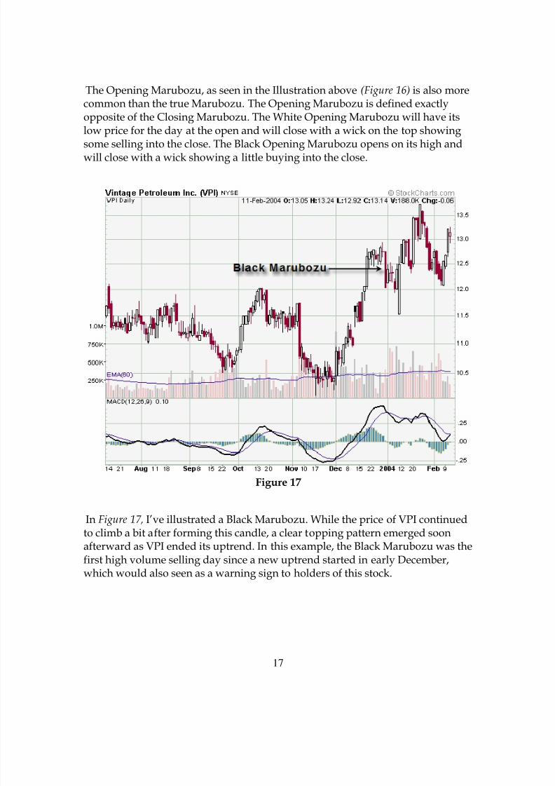
The Opening Marubozu, as seen in the Illustration above (Figure 16) is also morecommon than the true Marubozu. The Opening Marubozu is defined exactlyopposite of the Closing Marubozu. The White Opening Marubozu will have itslow price for the day at the open and will close with a wick on the top showingsome selling into the close. The Black Opening Marubozu opens on its high andwill close with a wick showing a little buying into the close.
Figure 17
In Figure 17, I’ve illustrated a Black Marubozu. While the price of VPI continuedto climb a bit after forming this candle, a clear topping pattern emerged soon
afterward as VPI ended its uptrend. In this example, the Black Marubozu was thefirst high volume selling day since a new uptrend started in early December,which would also seen as a warning sign to holders of this stock.
8/6/2019 Candlestick Charting Book
http://slidepdf.com/reader/full/candlestick-charting-book 18/49
18
Figure 18
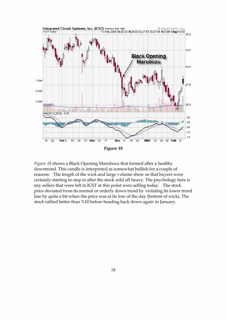
Figure 18 shows a Black Opening Marubozu that formed after a healthy
downtrend. This candle is interpreted as somewhat bullish for a couple ofreasons: · The length of the wick and large volume show us that buyers werecertainly starting to step in after the stock sold off heavy. The psychology here isany sellers that were left in ICST at this point were selling today. · The stockprice deviated from its normal or orderly down trend by violating its lower trendline by quite a bit when the price was at its low of the day (bottom of wick). Thestock rallied better than %10 before heading back down again in January.
8/6/2019 Candlestick Charting Book
http://slidepdf.com/reader/full/candlestick-charting-book 19/49
19
Figure 19
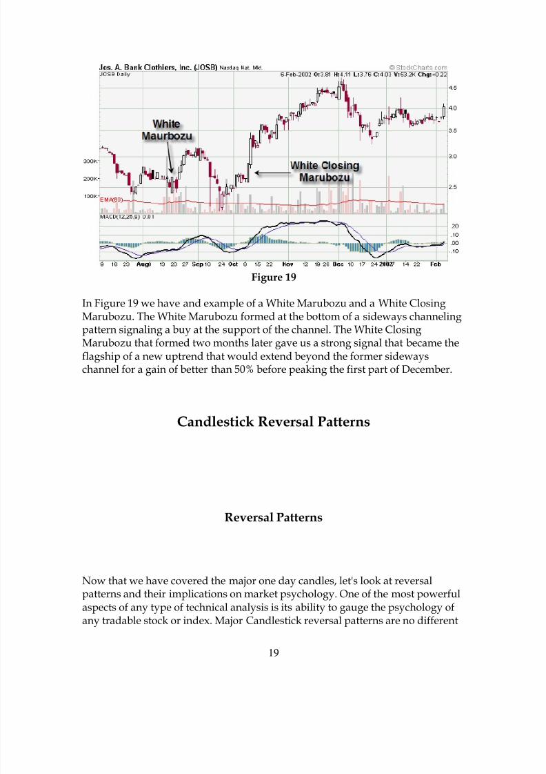
In Figure 19 we have and example of a White Marubozu and a White ClosingMarubozu. The White Marubozu formed at the bottom of a sideways channelingpattern signaling a buy at the support of the channel. The White ClosingMarubozu that formed two months later gave us a strong signal that became theflagship of a new uptrend that would extend beyond the former sidewayschannel for a gain of better than 50% before peaking the first part of December.
Candlestick Reversal Patterns
Reversal Patterns
Now that we have covered the major one day candles, let's look at reversalpatterns and their implications on market psychology. One of the most powerfulaspects of any type of technical analysis is its ability to gauge the psychology ofany tradable stock or index. Major Candlestick reversal patterns are no different

8/6/2019 Candlestick Charting Book
http://slidepdf.com/reader/full/candlestick-charting-book 20/49
20
and can tell us the psychology in as little as two days, or at least warn theinvestor of an impending change. It’s important to remember that a wellestablished trend will usually not turn on a dime and reverse itself in theopposite direction. Candlestick reversal signals tell us when the trend is losingsteam. The prices may go higher, but not with the same vigor as they had before.
With so many tradable stocks, the investor can decide to put his funds elsewhereor ride it out and wait for the next sell signal. The major reversal patterns are asfollows:
• Bearish Engulfing• Bullish Engulfing• Hanging Man• Bullish Piercing• Dark Cloud• Harami Pattern
• Shooting Star• Morning Star• Evening Star• Bullish Kicker• Bearish Kicker
Bearish Engulfing
Figure 1 illustrates the Bearish Engulfing reversal pattern, a major reversalpattern that is made up of a clear body the first day and a dark body on thesecond. On the first day a white body forms and the price on the second daygaps up and opens higher than the close of the first day, the price on the secondday then drops and closes lower than the open of the first day, completelyengulfing the body of the first day’s candle. We look for this formation in anoversold market to signal us of a major change in investor psychology. After agood strong uptrend, the engulfing candle of the second day shows heavy sellingin a larger proportion to the buying of the first day. To make this signal strongerwe would look for:
• Heavy Volume on the second day.• A large body engulfing a small body.• A large body engulfing the body and the wicks of the first day.• A temporary run-up in price that was greater than the angle of the
uptrend that proceeded it.• Either candle hitting a point of price resistance, such as an upper trend
line, major moving average, or other technical resistance.

8/6/2019 Candlestick Charting Book
http://slidepdf.com/reader/full/candlestick-charting-book 21/49
21
Figure 1
Figure 2

8/6/2019 Candlestick Charting Book
http://slidepdf.com/reader/full/candlestick-charting-book 22/49
22
Figure 2 illustrates a nice Bearish Engulfing formation in HANS. This candleengulfed two of the previous days making the signal that much stronger.Notice also that the second day had a strong increase in volume and thepattern formed near the resistance of the previous high a few weeks earlier.
While the price of HANS tried to rally during the next week, the BearishEngulfing signal forewarned the impending downtrend.
Figure 3
In Figure 3, EAGL formed a Bearish Engulfing pattern that began a topping
formation that lasted a month, with a second Bearish Engulfing pattern threeweeks later that finished off the uptrend. Notice the price action for about a weekbefore the first Bearish Engulfing signal deviating from the normal ascent of itsprior uptrend.
8/6/2019 Candlestick Charting Book
http://slidepdf.com/reader/full/candlestick-charting-book 23/49
23
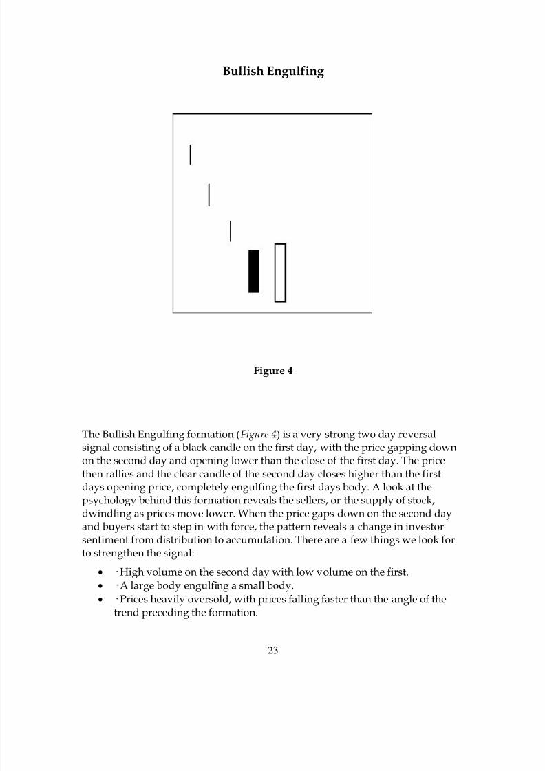
Bullish Engulfing
Figure 4
The Bullish Engulfing formation (Figure 4) is a very strong two day reversalsignal consisting of a black candle on the first day, with the price gapping downon the second day and opening lower than the close of the first day. The pricethen rallies and the clear candle of the second day closes higher than the firstdays opening price, completely engulfing the first days body. A look at thepsychology behind this formation reveals the sellers, or the supply of stock,dwindling as prices move lower. When the price gaps down on the second dayand buyers start to step in with force, the pattern reveals a change in investor
sentiment from distribution to accumulation. There are a few things we look forto strengthen the signal:
• · High volume on the second day with low volume on the first.• · A large body engulfing a small body.• · Prices heavily oversold, with prices falling faster than the angle of the
trend preceding the formation.
8/6/2019 Candlestick Charting Book
http://slidepdf.com/reader/full/candlestick-charting-book 24/49
24
• · The body of the second day engulfing the body and the wicks of the firstday.
• · The pattern forms on any technical price support area such as, a trendline, major moving average, or horizontal support.
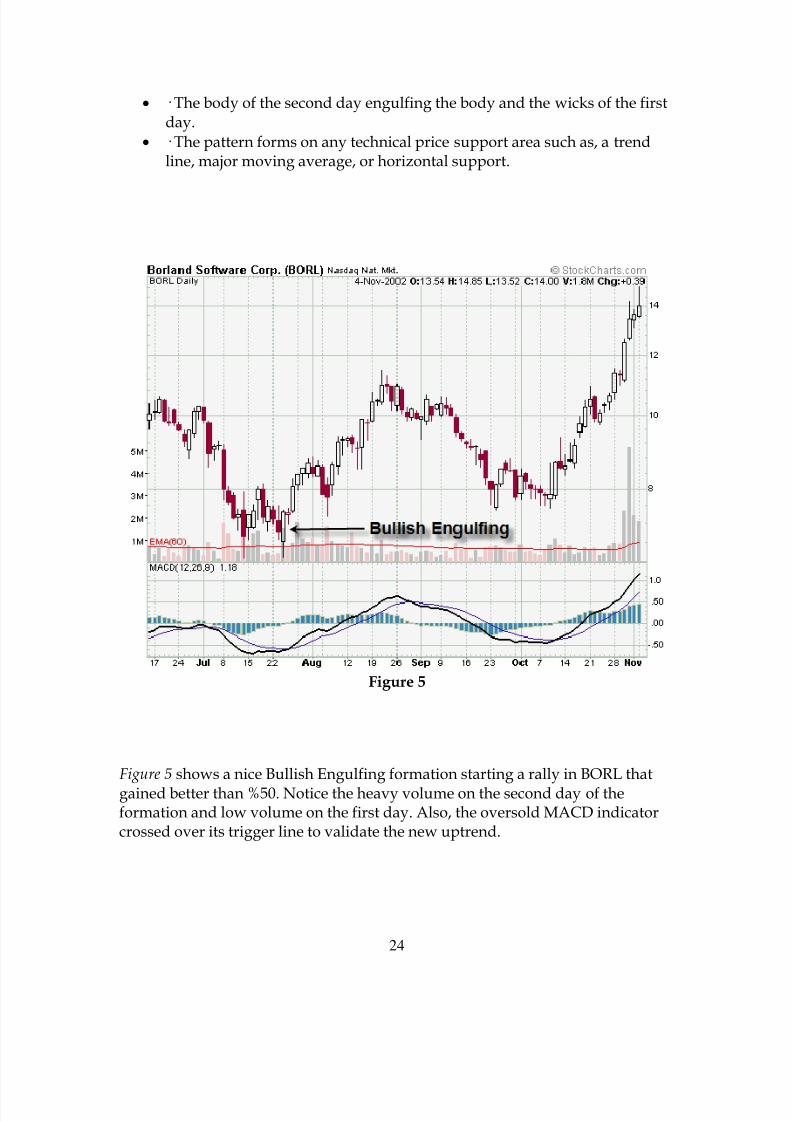
Figure 5
Figure 5 shows a nice Bullish Engulfing formation starting a rally in BORL thatgained better than %50. Notice the heavy volume on the second day of theformation and low volume on the first day. Also, the oversold MACD indicatorcrossed over its trigger line to validate the new uptrend.

8/6/2019 Candlestick Charting Book
http://slidepdf.com/reader/full/candlestick-charting-book 25/49
25
Figure 6
Figure 6 shows a Bullish Engulfing formation after a gap down in price on thefirst day indicating panic selling was beginning to peak. Notice the nice gapdown on the second day and the short wick below the body indicating the last ofthe panic selling ended soon after the opening bell and buyers came into thestock and moved prices higher throughout the day.
Hanging Man
Figure 7
8/6/2019 Candlestick Charting Book
http://slidepdf.com/reader/full/candlestick-charting-book 26/49
26
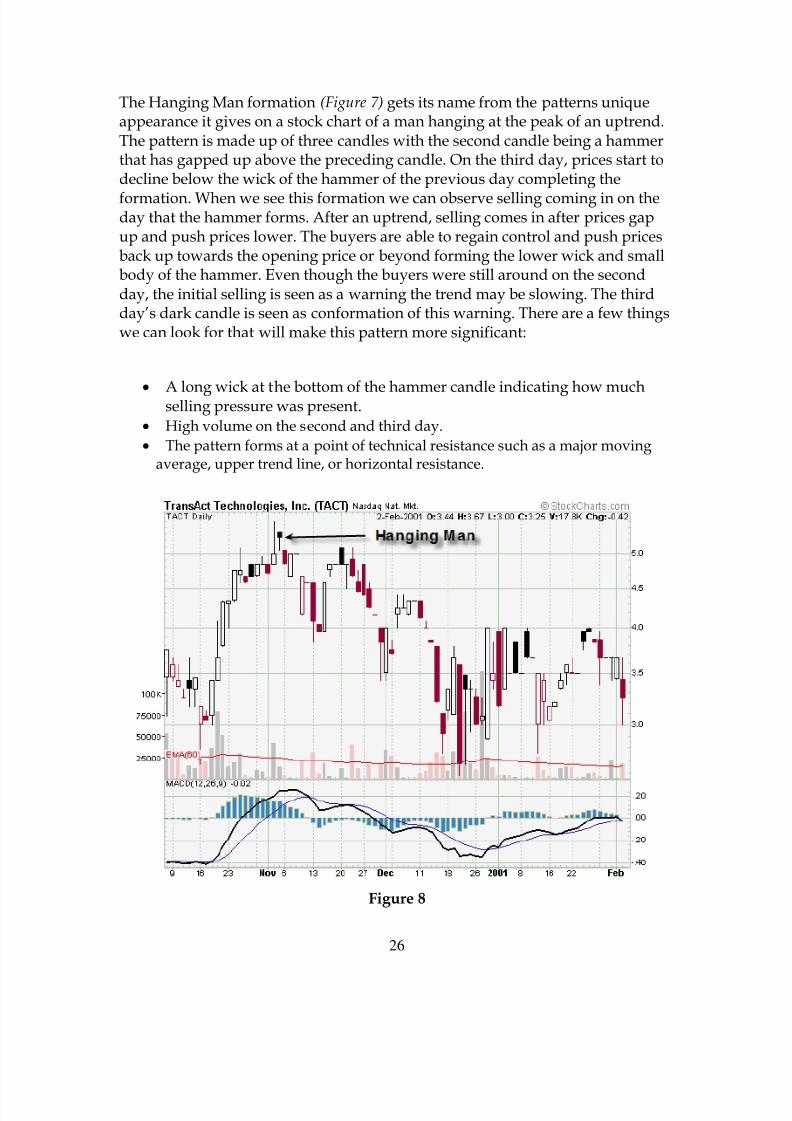
The Hanging Man formation (Figure 7) gets its name from the patterns uniqueappearance it gives on a stock chart of a man hanging at the peak of an uptrend.The pattern is made up of three candles with the second candle being a hammerthat has gapped up above the preceding candle. On the third day, prices start todecline below the wick of the hammer of the previous day completing the
formation. When we see this formation we can observe selling coming in on theday that the hammer forms. After an uptrend, selling comes in after prices gapup and push prices lower. The buyers are able to regain control and push pricesback up towards the opening price or beyond forming the lower wick and smallbody of the hammer. Even though the buyers were still around on the secondday, the initial selling is seen as a warning the trend may be slowing. The thirdday’s dark candle is seen as conformation of this warning. There are a few thingswe can look for that will make this pattern more significant:
• A long wick at the bottom of the hammer candle indicating how muchselling pressure was present.
• High volume on the second and third day. • The pattern forms at a point of technical resistance such as a major moving
average, upper trend line, or horizontal resistance.
Figure 8
8/6/2019 Candlestick Charting Book
http://slidepdf.com/reader/full/candlestick-charting-book 27/49
27
In Figure 8 we have an illustration of a Hanging Man formation in TACT thatgave the first warning of an impending downtrend. Notice the overboughtMACD indicator and declining histogram as the pattern formed which alsohelped validate the signal.
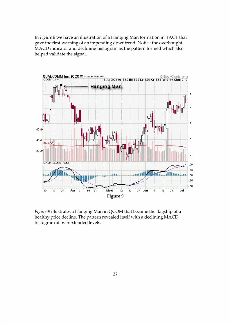
Figure 9
Figure 9 illustrates a Hanging Man in QCOM that became the flagship of ahealthy price decline. The pattern revealed itself with a declining MACDhistogram at overextended levels.
8/6/2019 Candlestick Charting Book
http://slidepdf.com/reader/full/candlestick-charting-book 28/49
28
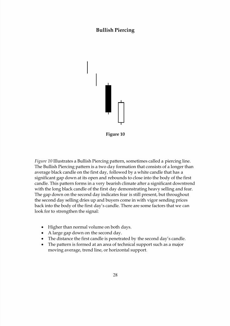
Bullish Piercing
Figure 10
Figure 10 Illustrates a Bullish Piercing pattern, sometimes called a piercing line.The Bullish Piercing pattern is a two day formation that consists of a longer than
average black candle on the first day, followed by a white candle that has asignificant gap down at its open and rebounds to close into the body of the firstcandle. This pattern forms in a very bearish climate after a significant downtrendwith the long black candle of the first day demonstrating heavy selling and fear.The gap down on the second day indicates fear is still present, but throughoutthe second day selling dries up and buyers come in with vigor sending pricesback into the body of the first day’s candle. There are some factors that we canlook for to strengthen the signal:
• Higher than normal volume on both days.
• A large gap down on the second day.• The distance the first candle is penetrated by the second day’s candle.• The pattern is formed at an area of technical support such as a major
moving average, trend line, or horizontal support.

8/6/2019 Candlestick Charting Book
http://slidepdf.com/reader/full/candlestick-charting-book 29/49
29
Figure 11
Figure 11 shows a Bullish Piercing formation in the price of FON. Notice thedramatic change in trend that followed this pattern. Conformation of the BullishPiercing pattern is recommended and this chart illustrates a confirmed signal onthe long white candle following the pattern.
8/6/2019 Candlestick Charting Book
http://slidepdf.com/reader/full/candlestick-charting-book 30/49
30
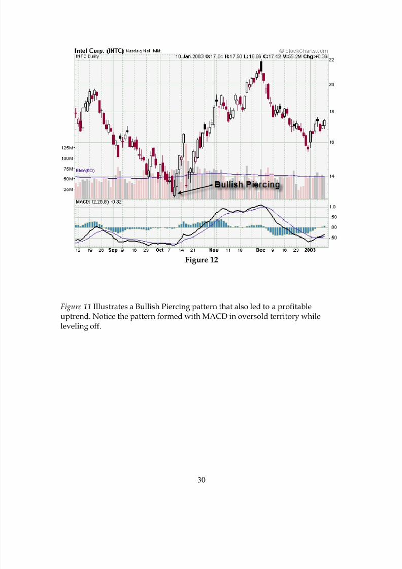
Figure 12
Figure 11 Illustrates a Bullish Piercing pattern that also led to a profitableuptrend. Notice the pattern formed with MACD in oversold territory whileleveling off.

8/6/2019 Candlestick Charting Book
http://slidepdf.com/reader/full/candlestick-charting-book 31/49
31
Dark Cloud Cover
Figure 13
Figure 13 represents a Dark Cloud Cover formation. This two day reversalformation is made up of a white (or clear) body on the first day, followed by adark candle on the second day that gaps up and comes back down into the bodyof the first day’s candle. While the Dark Cloud is a strong reversal signal,conformation is required by the next days candle to determine if it will be usedas a reversal signal. The Dark Cloud pattern forms after a substantial uptrendhas been in place. On the first day’s white candle buying has peaked. The smallnumber of buyers that are left the next morning cause the price to gap up abovethe close of the first day and sellers begin to step in, bringing prices back downinto the body of the first day’s candle. We can watch for a couple of indications
that will help us determine the strength of the Dark Cloud Cover formation:
• High volume on both trading days of the candle formation.• The size of the gap up in price on the second day.• The distance the second day’s dark candle penetrates the white body of
the first day.• The bigger the candles on both days, the better.
8/6/2019 Candlestick Charting Book
http://slidepdf.com/reader/full/candlestick-charting-book 32/49
32
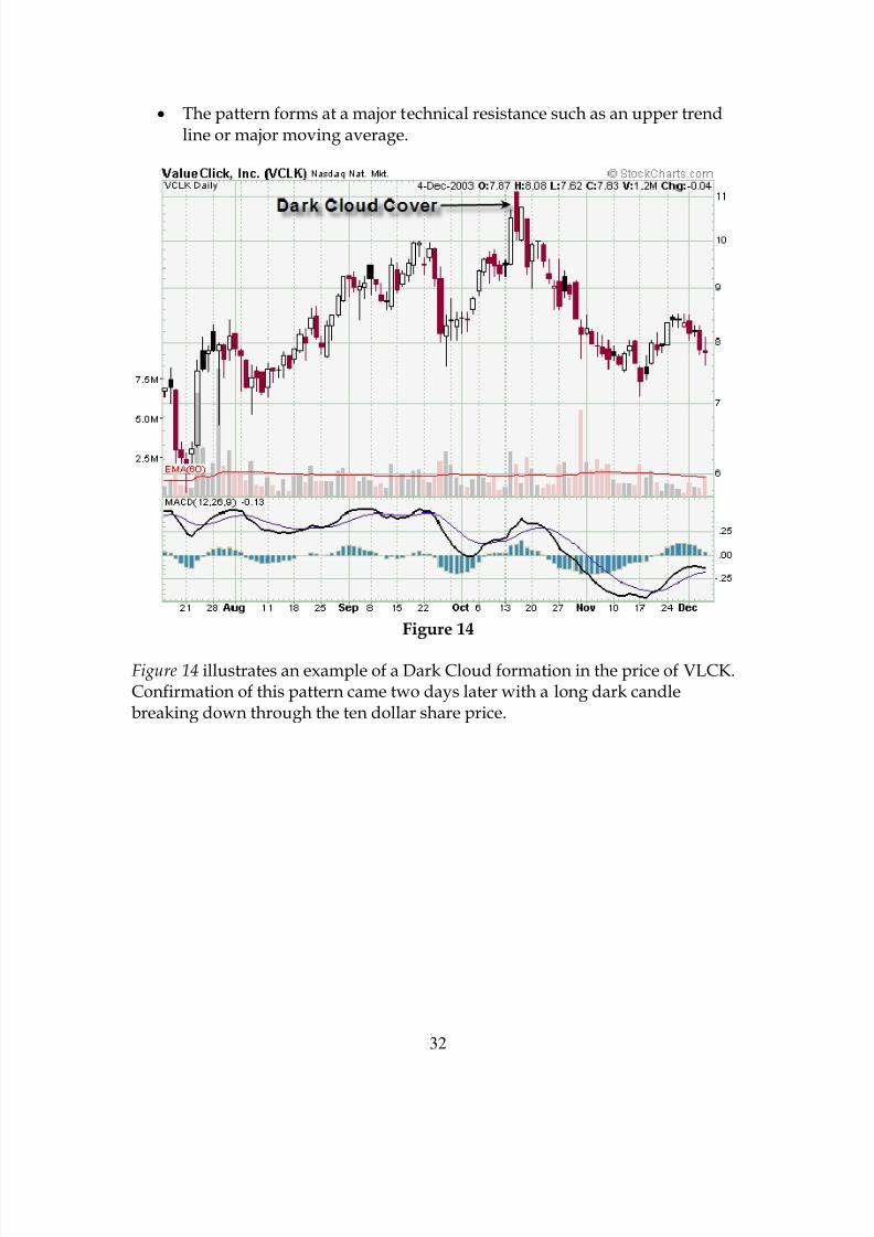
• The pattern forms at a major technical resistance such as an upper trendline or major moving average.
Figure 14
Figure 14 illustrates an example of a Dark Cloud formation in the price of VLCK.Confirmation of this pattern came two days later with a long dark candlebreaking down through the ten dollar share price.
8/6/2019 Candlestick Charting Book
http://slidepdf.com/reader/full/candlestick-charting-book 33/49
33
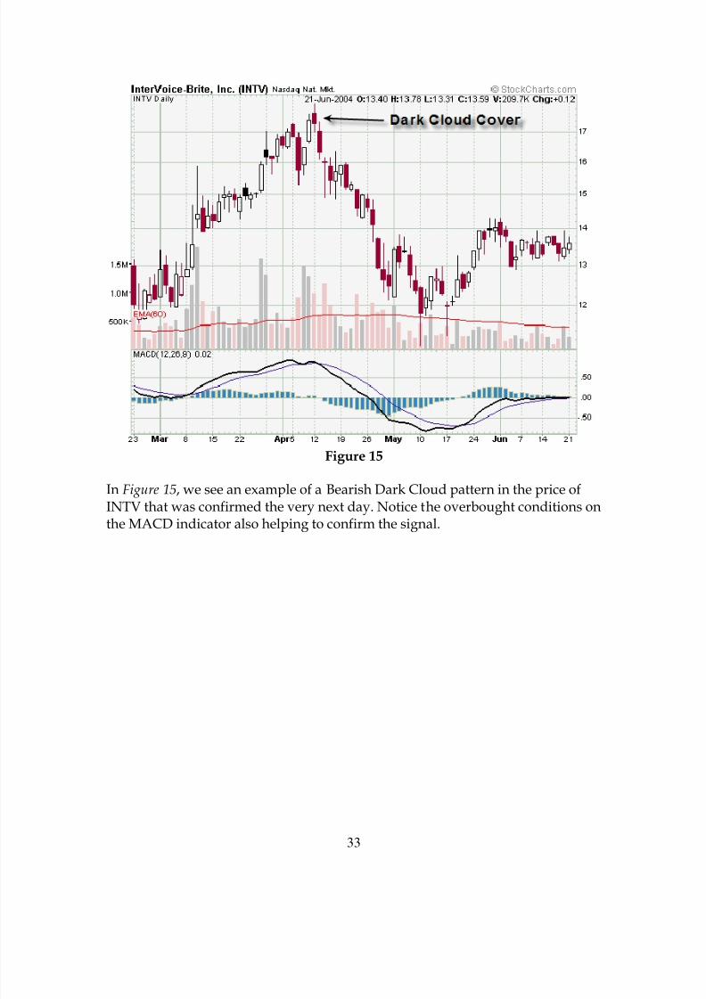
Figure 15
In Figure 15, we see an example of a Bearish Dark Cloud pattern in the price ofINTV that was confirmed the very next day. Notice the overbought conditions on
the MACD indicator also helping to confirm the signal.
8/6/2019 Candlestick Charting Book
http://slidepdf.com/reader/full/candlestick-charting-book 34/49
34
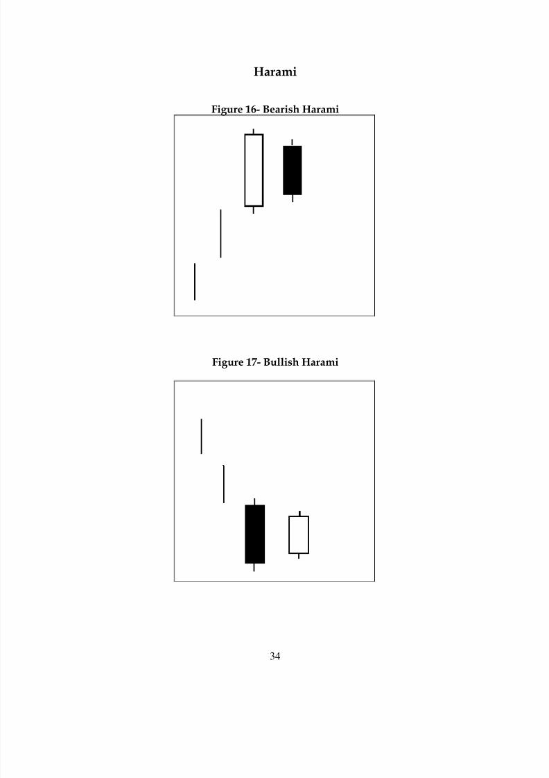
Harami
Figure 16- Bearish Harami
Figure 17- Bullish Harami
8/6/2019 Candlestick Charting Book
http://slidepdf.com/reader/full/candlestick-charting-book 35/49
35
The Harami pattern can be both bullish and bearish. Figure 16 illustrates aBearish Harami and a Bullish Harami is seen in Figure 17. Both Harami patternsare two day reversal signals made up of a long candle on the first day with asmaller bodied candle on the second day forming within the body of the firstday’s candle. Although the Harami is a strong reversal signal, conformation of
the signal is required. The Bearish Harami reversal signal is seen after asignificant rise in price. With a white candle forming on the first day, the pricegaps down on the second day to open below the close of the first. The price fallsthroughout the day, closing lower, but still above previous day’s opening price.The Bullish Harami reversal signal occurs after a sizeable downtrend. A largeblack candle forms on the first day, the price gaps up the next morning as buyersstep in. They are able to move prices higher all day, but not high enough toovertake the opening price of the previous day’s candle. There are a couple ofthings we can watch for to make the Harami pattern stronger:
• High volume on the second day.• The longer both days’ candles are the better.• The higher the second day’s candle closes up into the body of the first, the
more strength the signal shows.• The pattern forms at a major technical resistance (Bearish) or support
(Bullish).

8/6/2019 Candlestick Charting Book
http://slidepdf.com/reader/full/candlestick-charting-book 36/49
36
Figure 18
A Bearish Harami pattern, in Figure 18, kicks off a significant reversal in theprice of LTD. The signal was confirmed the next day and MACD indicator was in
overbought territory.
8/6/2019 Candlestick Charting Book
http://slidepdf.com/reader/full/candlestick-charting-book 37/49
37
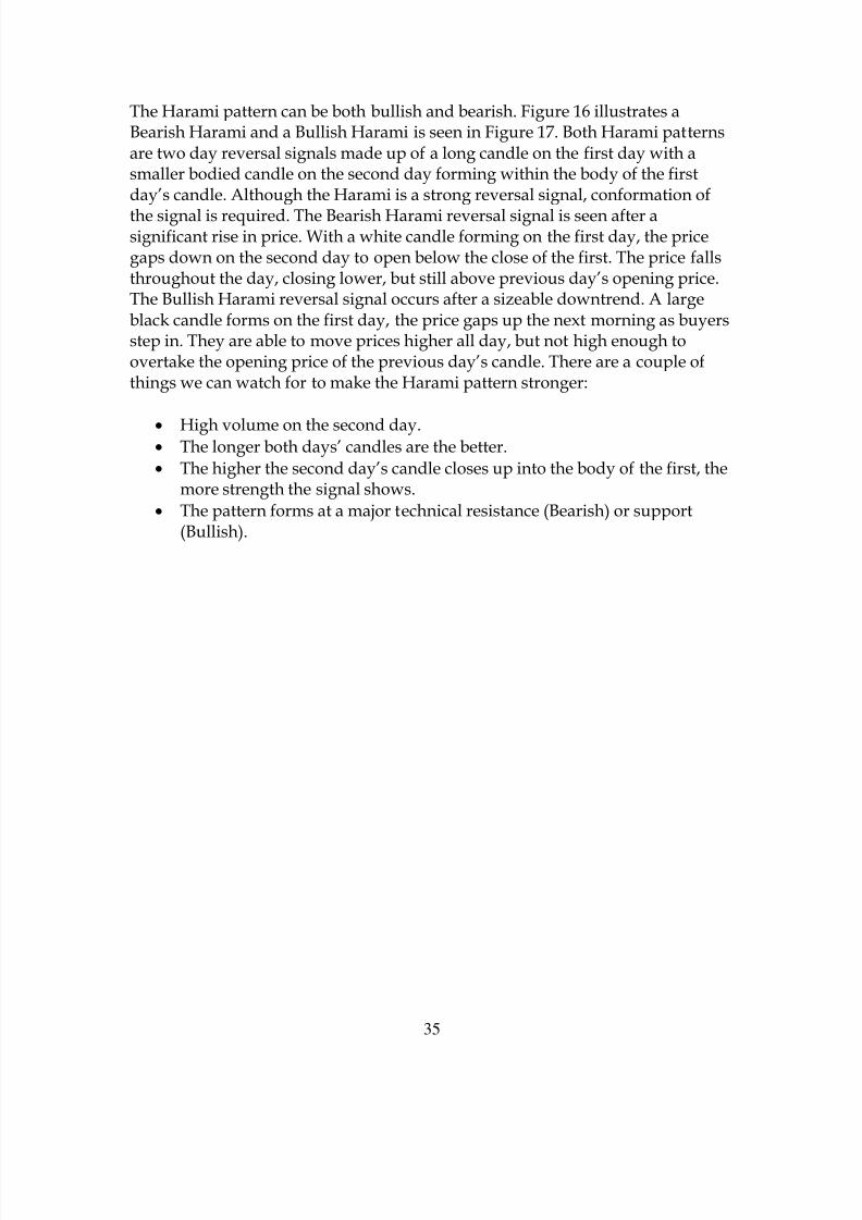
Figure 19
Figure 19 illustrates a Bullish Harami which formed at the support of theprevious low six weeks earlier. This signal was confirmed three days later and
the price of MACR gained over 90% before beginning to roll over again.
8/6/2019 Candlestick Charting Book
http://slidepdf.com/reader/full/candlestick-charting-book 38/49
38
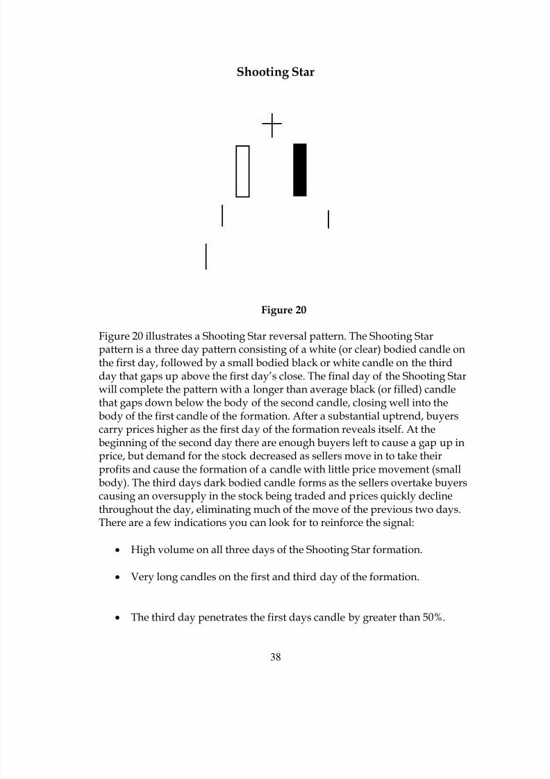
Shooting Star
Figure 20
Figure 20 illustrates a Shooting Star reversal pattern. The Shooting Starpattern is a three day pattern consisting of a white (or clear) bodied candle onthe first day, followed by a small bodied black or white candle on the thirdday that gaps up above the first day’s close. The final day of the Shooting Starwill complete the pattern with a longer than average black (or filled) candlethat gaps down below the body of the second candle, closing well into thebody of the first candle of the formation. After a substantial uptrend, buyerscarry prices higher as the first day of the formation reveals itself. At thebeginning of the second day there are enough buyers left to cause a gap up inprice, but demand for the stock decreased as sellers move in to take theirprofits and cause the formation of a candle with little price movement (smallbody). The third days dark bodied candle forms as the sellers overtake buyerscausing an oversupply in the stock being traded and prices quickly declinethroughout the day, eliminating much of the move of the previous two days.There are a few indications you can look for to reinforce the signal:
• High volume on all three days of the Shooting Star formation.
• Very long candles on the first and third day of the formation.
• The third day penetrates the first days candle by greater than 50%.

8/6/2019 Candlestick Charting Book
http://slidepdf.com/reader/full/candlestick-charting-book 39/49
39
• The pattern forms at a point of technical resistance such as an uppertrend line, major moving average, or horizontal price resistance.
Figure 21
Figure 21 illustrates a Shooting Star formation in the price of LTD that formedat horizontal resistance as the price of the stock was channeling sideways.
8/6/2019 Candlestick Charting Book
http://slidepdf.com/reader/full/candlestick-charting-book 40/49
40
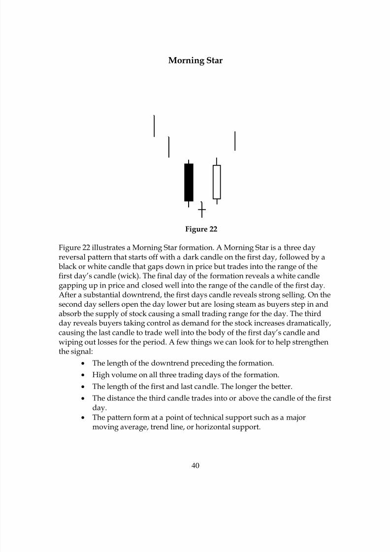
Morning Star
Figure 22
Figure 22 illustrates a Morning Star formation. A Morning Star is a three dayreversal pattern that starts off with a dark candle on the first day, followed by ablack or white candle that gaps down in price but trades into the range of thefirst day’s candle (wick). The final day of the formation reveals a white candlegapping up in price and closed well into the range of the candle of the first day.After a substantial downtrend, the first days candle reveals strong selling. On thesecond day sellers open the day lower but are losing steam as buyers step in andabsorb the supply of stock causing a small trading range for the day. The thirdday reveals buyers taking control as demand for the stock increases dramatically,causing the last candle to trade well into the body of the first day’s candle andwiping out losses for the period. A few things we can look for to help strengthenthe signal:
• The length of the downtrend preceding the formation.
• High volume on all three trading days of the formation.
• The length of the first and last candle. The longer the better.• The distance the third candle trades into or above the candle of the first
day.• The pattern form at a point of technical support such as a major
moving average, trend line, or horizontal support.

8/6/2019 Candlestick Charting Book
http://slidepdf.com/reader/full/candlestick-charting-book 41/49
41
Figure 23
Figure 23 illustrates an example of a Morning Star formation in the price ofTWI, leading to gains well above 150%.

8/6/2019 Candlestick Charting Book
http://slidepdf.com/reader/full/candlestick-charting-book 42/49
42
Figure 24
Figure 24 illustrates a Morning Star formation in the price of LTD that led tosubstantial gains during the next two months. Notice the over sold MACD
and the divergent histogram while prices were falling, also validating thesignal.

8/6/2019 Candlestick Charting Book
http://slidepdf.com/reader/full/candlestick-charting-book 43/49
43
Figure 25
Figure 25 illustrates a stronger, but less common, variation of the MorningStar pattern called an Abandoned Baby bottom formation. The differencebetween the two reversal patterns is the candle of the second day. AnAbandoned Baby’s second day will trade below day one and three includingthe wicks.
Evening Star
8/6/2019 Candlestick Charting Book
http://slidepdf.com/reader/full/candlestick-charting-book 44/49
8/6/2019 Candlestick Charting Book
http://slidepdf.com/reader/full/candlestick-charting-book 45/49
45
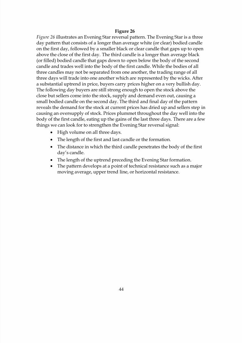
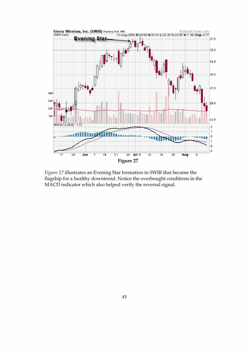
Figure 27
Figure 27 illustrates an Evening Star formation in SWIR that became theflagship for a healthy downtrend. Notice the overbought conditions in the
MACD indicator which also helped verify the reversal signal.
8/6/2019 Candlestick Charting Book
http://slidepdf.com/reader/full/candlestick-charting-book 46/49
46
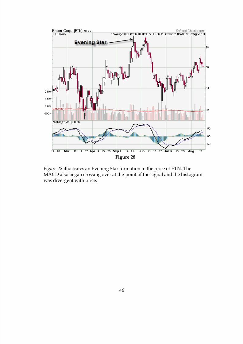
Figure 28
Figure 28 illustrates an Evening Star formation in the price of ETN. TheMACD also began crossing over at the point of the signal and the histogram
was divergent with price.
8/6/2019 Candlestick Charting Book
http://slidepdf.com/reader/full/candlestick-charting-book 47/49
47
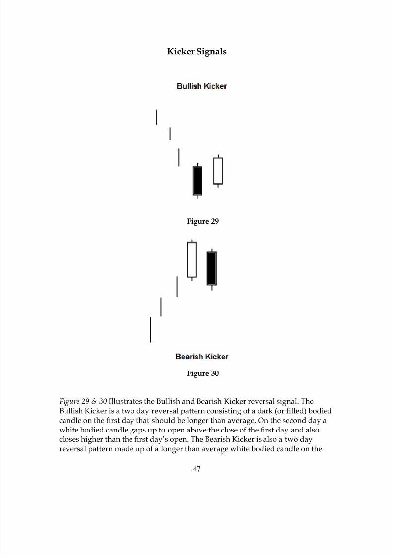
Kicker Signals
Figure 29
Figure 30
Figure 29 & 30 Illustrates the Bullish and Bearish Kicker reversal signal. TheBullish Kicker is a two day reversal pattern consisting of a dark (or filled) bodiedcandle on the first day that should be longer than average. On the second day awhite bodied candle gaps up to open above the close of the first day and alsocloses higher than the first day’s open. The Bearish Kicker is also a two dayreversal pattern made up of a longer than average white bodied candle on the

8/6/2019 Candlestick Charting Book
http://slidepdf.com/reader/full/candlestick-charting-book 48/49
48
first day. The second day forms a dark bodied candle that gaps down below theclose and then closes below the open of the first day’s candle. There are a fewcriteria we can look for to strengthen the Kicker signal:
• The length of the second day’s candle. z High volume on the second day.•
The distance from the close of the first day to the open of the second day.• The pattern forms at a point of technical support or resistance such as a
major moving average, trend line, or horizontal support or resistance.
Figure 31
Figure 31 illustrates a huge Bullish Kicker reversal signal in the price of QLGCthat kicked off a very large rally that led to gains of over 200%.

8/6/2019 Candlestick Charting Book
http://slidepdf.com/reader/full/candlestick-charting-book 49/49
Figure 32
Figure 32 illustrates a Bearish Kicker in the price of PMCS that led to a 30%decline in price.