Embed Size (px)
DESCRIPTION
Signage system proposal for the Cambridge Museum of Technology
Citation preview
1
Signage system proposal for the Cambridge Museum of Technology
Ben Attenborough

Signage system proposal for the Cambridge Museum of Technology
A project for the Typographic Enquiry module for an MA in Graphic Design and Typography at Anglia Ruskin University in Cambridge
Ben Attenborough

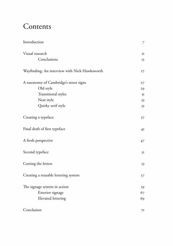
Contents
Introduction 7
Visual research 11 Conclusions 15
Wayfinding: An interview with Nick Hawksworth 17
A taxonomy of Cambridge’s street signs 27 Old style 29 Transitional styles 31 Neat style 33 Quirky serif style 35
Creating a typeface 37
Final draft of first typeface 45
A fresh perspective 47
Second typeface 51
Cutting the letters 53
Creating a reusable lettering system 57
The signage system in action 59 Exterior signage 67 Elevated lettering 69
Conclusion 71
7
IntroductionThe aim of this book is to propose a signage system for the Cambridge Museum of Technology, a site of historic and scientific interest on the riverbank in the northern end of the city. I propose testing the signs in the museum itself.
I intend to show the research I have put into finding an appropriate style of sign which reflects the architecture and content of the museum, as well as helping visitors get the most out of a trip to the site.
I will be explaining my decision to work with the museum, the considerations the project placed me under and how I developed my ideas.
The scope of the task has enabled me to investigate typeface design from an architectural perspective rather than for the page or the screen. The booklet contains many images of the typeface as it evolved, but ultimately the success of the design can only be judged when it is produced in its three-dimensional form. For this reason I am also including photographs of full size laser cut mock-ups of the design, and images showing how the system would look if it were implemented.
A central theme for this project has been to design a typeface that is appropriate for the site. The museum is based in a former pumping station constructed in 1894. It has many examples of beautiful industry engineering including a huge steam engine, a gas engine and other technologies.
My signage proposal draws on this era of technology by using a typeface I have designed based on 19th century street signs unique to Cambridge. My aim has been to create a harmony between the signs and the museum in terms of both architecture and content.
Much type design, when it is for the page or screen especially, is designed to be universal. That is to say it is designed to work in a variety of circumstances and this flexibility is built into the design. In my project the
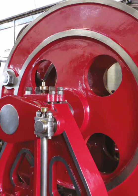
Opposite: One of the giant wheels within the main engine room at the Cambridge Museum of Technology
9
design is site specific, which means it is designed to work specifically at the museum site.
Nicolete Gray in her 1960 study Lettering on Buildings put great emphasis on the appropriateness of architectural lettering to its location:
The scope of lettering, as I have found it, ranges from the free work of a creative artist, to the intelligent and fit use of norms, designed by professional letterers but used by builders and architects just as typographers use standard type-faces. Throughout the book I have found myself moving between these poles. From beginning to end, however, it seems to me that the letterer, whoever he is, needs to be in direct contact with the architecture (Nicolete Gray, Lettering on Buildings, 1960, page 10, my emphasis)
With this is mind I have tried throughout this project to create lettering which is appropriate to the site in terms of architecture, but also in terms of history and culture.
The project has enabled me to research 19th century street sign design in Cambridge and by resurrecting this style I hope to have created a style appropriate for a museum about Victorian technology.
This project has been completed for an MA in Graphic Design and Typography at Anglia Ruskin University. But I hope one day my research and design work could be developed and used by the museum.
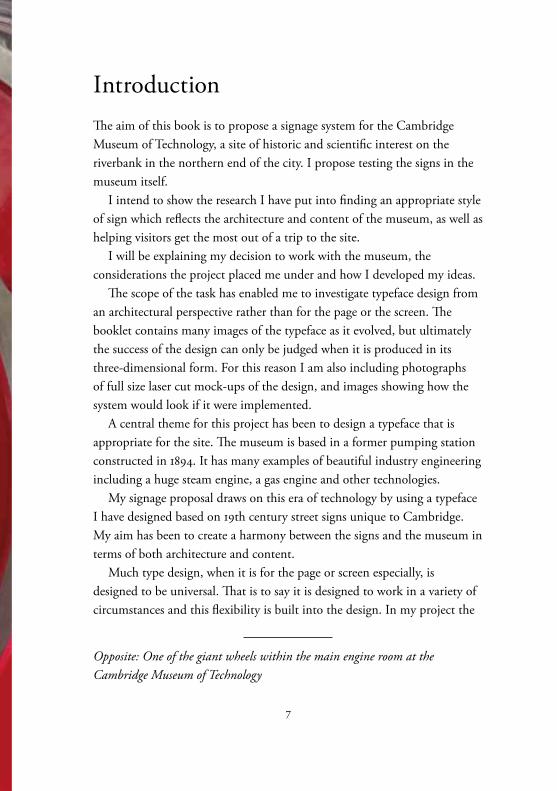
Opposite: The gas powered engine in action during one of the museum’s steam days. The fact visitors can see the engines in action is part of the museum’s appeal
10
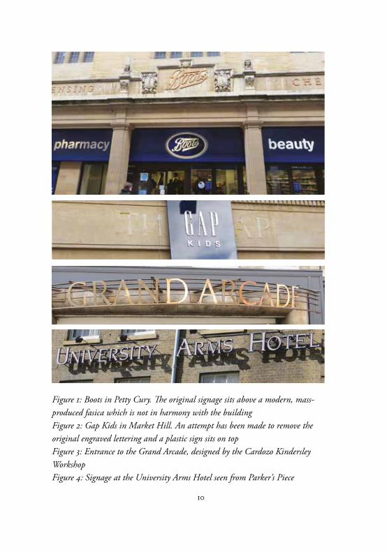
Figure 1: Boots in Petty Cury. The original signage sits above a modern, mass-produced fasica which is not in harmony with the buildingFigure 2: Gap Kids in Market Hill. An attempt has been made to remove the original engraved lettering and a plastic sign sits on topFigure 3: Entrance to the Grand Arcade, designed by the Cardozo Kindersley WorkshopFigure 4: Signage at the University Arms Hotel seen from Parker’s Piece
11
Visual researchBefore making any decisions on typeface choices for the museum signs I decided to undertake a visual survey of street and shop signs around Cambridge.
There is a great variety of design styles in the town. Unfortunately the shop chains tend to use mass produced fascias rather than signs made specifically for the buildings which house them.
In these cases not only is the signage no longer appropriate for the architecture which it sits in, but has also led to high streets up and down the country becoming indistinguishable from each other.
Figure 1 shows the original Boots lettering and the new fascia design below. Although the original design is elegant, if all shops used a similar system it would be hard to pick out one shop from another.
Rather than lamenting a lack of uniformity in shop signage it is necessary to acknowledge the need shops have to distinguish themselves in order to attract customers. Even in a non-commercial world there would still be a need for buildings with different uses to be visually distinct.
What is less acceptable is the unthinking use of pre-made designs in inappropriate settings. Figure 2 shows a particularly egregious pre-made sign sitting above an engraved sign for the same shop.
Fortunately there is a lot of interesting lettering in town. Highlights include the entrance to the Grand Arcade (figure 3). The type was designed by the Cardozo Kindersley Workshop in Cambridge and is based on Kindersley MOT, orginally designed by David Kindersley.
The letters have been attached to horizontal bars. To my mind this usage makes it difficult to read, especially as the overall effect is gold lettering on brown bars against a brown background. But the use of lettering on a curved structure adds visual drama to the sign.
Another approach to attaching individual letters to a building is the University Arms Hotel. Here the letters have been attached away from the building in such a way as to produce a shadow (figure 4). The letterforms appear a bit weedy with small serifs which do not work with a free standing
12
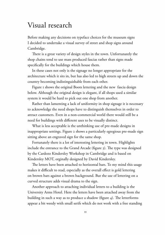
Figure 5: Chocolat Chocolat shop in St Andrew’s StreetFigure 6: Farrow & Ball in Regent StreetFigure 7: An unfortunately named shop in High Street, ChestertonFigure 8: Saint Columba’s Church in Downing Street
13
design. A more definite slab serif would give it a more architectural feel. I would also question the distance between the lettering and the wall as the shadow appears too far away from the letters and so rather than reinforcing them it just looks like an obscured shadow. The horizontal bars that support the letters also harm the shadow effect.
The next three images (figures 5, 6 and 7) show lettering attached directly to shop fronts. This approach allows use of space to frame a shop’s name. By attaching three dimensional letters a shadow can be cast to emphasise the name. Figure 6 is a good example of how the shadow effect can work. The serifs on this typeface have a good effect, they give motion to the letters as well as establishing harmony with the horizontal lines of the box which frames them. The lettering is set ultra tight, as seems usual in shop signs. The name is more of a logo than something to be read.
Figure 7 shows incorrect use of two apostrophes, which detracts from an otherwise fun design. Again the letters are set slightly away from the surface in order to cast a slight shadow.
For really unusual letterforms look at Saint Columba’s United Reformed Church in Downing Street (figure 8). It’s certainly eye-catching but it’s dubious if it’s appropriate to the architecture or function of the building.
San serif letterforms also commonly feature on signs. Figures 9, 10 and 11 show some examples. Figure 10 shows Cambridge Fire Station. The lettering has been designed to fit in the space provided for it, although the final N looks a little to far from the O. The intent is not to advertise but rather to inform people about the building’s use.
Figure 11 shows lettering which is lit from behind to give it added emphasis. Although this form of lettering appears on these stores throughout the country it does have a good architectural feel.
Finally there are still examples of carved lettering in Cambridge, although often this work is on municipal buildings, churches or a legacy of shop signs superseded by plastic fascias (see figures 1 and 2).
Figure 14 shows an attempt to add grandeur to the magistrates’ court, rather spoiled by the incorrect use of a prime mark rather than an apostrophe. It also makes use of Times New Roman, a typeface designed for
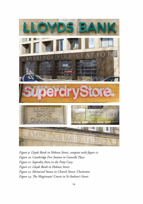
14
Figure 9: Lloyds Bank in Hobson Street, compare with figure 12Figure 10: Cambridge Fire Station in Gonville PlaceFigure 11: Superdry Store in the Petty CuryFigure 12: Lloyds Bank in Hobson Street Figure 13: Memorial Stones in Church Street, ChestertonFigure 14: The Magistrates’ Courts in St Andrew’s Street
15
newsprint, not for monumental lettering. The cut is also not very pleasing, it is not deep enough to create the shadow required to give the lettering enough emphasis. It is also cut in a square section rather than a V cut, which would have helped the shadow emphasis.
Visual research: ConclusionsMy objective has been to create an architectural lettering system which is appropriate to the architecture of the building as well as its purpose.
The research has shown a great variety of approaches to architectural lettering, but the forms that interest me the most are the three dimensional letters which are integrated into the form of the building itself.
The lettering on Cambridge Fire Station has a modern face which is spaced to fill the space provided. Its lightweight form with thin strokes harmonises with the striking building.
In other cases, notably figures 5, 6 and 7 shadows have been used to add emphasis to the lettering and to help give it that architectural feel, although if the letters are set too far from the wall this effect no longer works as effectively (see figure 4).
The lettering on the Superdry Store (figure 11) uses back-lighting as an alternative way to achieve emphasis. This has the additional advantage of working in both daylight and at night.
Stone carving still exists in the city although because the effect is subtle many shops have chosen to use other approaches, either instead of the carving (as in Gap, figure 2) or in addition to it (as in Boots, figure 2, and Lloyds Bank, figures 9 and 12).
My aim in this project has been to learn from these styles and to try to develop my own sign system which achieves two things, the first is being in harmony with the architecture and content of the museum and the second is to be clear enough to function as a signage system.
17
Wayfinding: An interview with Nick HawksworthNick Hawksworth runs a Cambridge based consultancy on wayfinding and he kindly agreed to be interviewed by me in relation to my plans for a wayfinding project at the Museum of Technology.
Nick used to work for a sign making company but he soon realised that there was very little interest in the experience people had in finding their way to a building and around it once they had arrived.
He said: ‘Most places just wanted to put up signs with no thought as to how people would use them to navigate.
‘In America the culture is much more litigious and market orientated so they have always been a lot more aware of the importance of signage and user experience.
‘In our country 15-20 years ago there was very little research going on into wayfinding – people didn’t know what “wayfinding” even meant. So I started studying the subject and started promoting my work in trade journals. I went to clients to show them what was possible and how it would help them.’
Nick used to run a company in Great Shelford, but now works as a freelance consultant.
He said: ‘Making buildings fully intuitive is almost impossible. Buildings evolve, with extensions changing their dynamic and the use of individual rooms changing to fit new needs.
‘Also many buildings have been bought and sold and are no longer designed for their original purpose. All that graphic design can do is give as clear a guide to the building as possible and be flexible enough to deal with changes.’
I explained to Nick about my project for the Museum of Technology
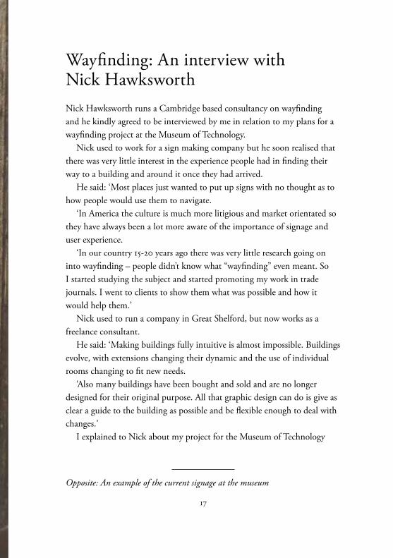
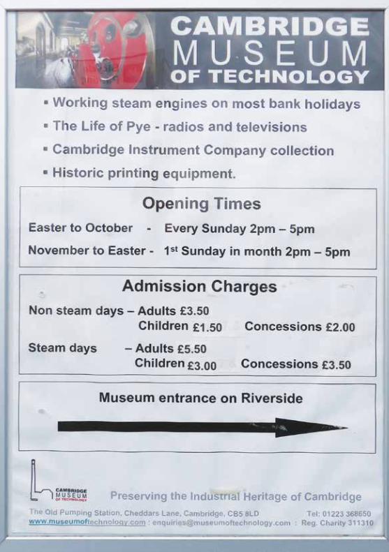
Opposite: An example of the current signage at the museum
19
and by chance he had actually worked there previously as a volunteer so he knows the site well.
Nick said: ‘The pump house is a cathedral to technology. It is a functional civic design, very much designed for its time and rapidly became obsolete with the coming of new technology. So in a way it mirrors to story of all tech.’
I asked Nick about his thoughts on designing for buildings like this. He said: ‘We are only ever the custodians of buildings. It is important that any design doesn’t interfere with the building too much. For example if you were to drill bolts into the wall and caused the Victorian brickwork to crack that would be bad design.’
We talked about David Kindersley’s work on street name plate designs (these modern designs have been used in Cambridge). Nick said: ‘He worked hard to keep a sense of responsibility to the past, but also had an eye on function. He designed a typeface that would work over an extended parallax so that signs could be understood for different angles. We seldom see signs straight on, so this was an important feature of the design. His work was very well thought out.’ See examples on page 36.
We also discussed branding and visual identification schemes. Nick said: ‘Brands work well for a place for a while, but usually they are not maintained and they can quickly fall apart once the original designer goes away. Buildings really need a communications person who ensures that any additional design work sticks to the aesthetic and design parameters set out by the original designer.
‘If you look at a big organisation like British Airways you will find they are ruthless on branding. But a lot of smaller organisations struggle to maintain it.
‘I have revisited buildings where I have previously done wayfinding
Opposite: One of the current advertisements / directional signs to the museum. It is hidden next to other adverts outside a Tesco store. The sign itself does little to visually attract visitors or help them find the site
21
projects and it can be dispiriting to see how the good work you have done has been let down over time.’
We then discussed different types of signage. Nick differentiates between ‘hard’ and ‘soft’ signs. Hard signs are permanent location signs, such as the entrance signage and signs telling visitors what room they are in. Soft signage includes the things that are likely to change, such as information boards. They have different requirements. Nick said that as the museum changes volunteers are likely to want to update the information boards so they need a flexible design which will allow them to update information on boards and to create new ones.
We then discuss an approach to wayfinding called ‘the journey’. Nick said: ‘You are looking at a visitor’s experience of finding the building and getting around it. You start with the website, because that is how most people find where places are these days. You check locations are clearly listed and addresses and postcodes are correct. You can use Google maps to pinpoint the location and access, plus car parks.
‘Then you need to consider the approaches to the museum. Is there any signage that lets people know they are headed in the right direction? Signage should build anticipation for the museum and attract people who might otherwise not have heard of it. In America they are very good at providing signs which say: “You are 300 steps from the museum of technology”.’
Nick suggested it would be good to go down to the streets outside the museum wearing a hi-vis jacket and clipboard and ask people if they know where the museum is. This would be a good indication of how well the current signage system works.
He said: ‘With this museum you need to consider how you can get a flavour of the history of the site, but doing it with a sense of modernity.
‘You would be looking at developing a suite of signs that have different functions. Direction signs are so important. We are always having to think
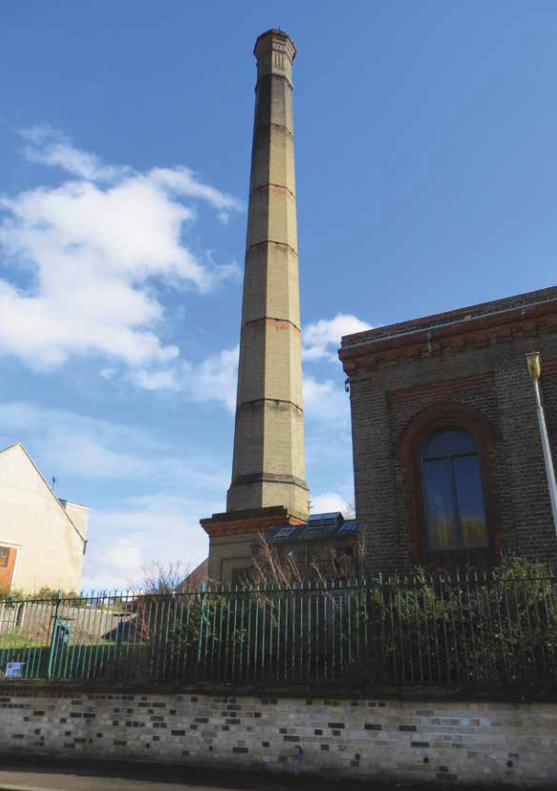
Opposite: This huge industrial chimney is the museum’s most recognisable features. It could be used to help people to find the place
23
about toilet signs, it sounds silly but people really need to know where these facilities are. You would then you look to present a visualisation of the visitors experience, the signs they see en-route to the museum. The main signage and then the signs they see as they progress through the museum. You need to demonstrate an awareness of where signage needs to go and how it functions.
‘You should also consider if you want to provide a route visitors can follow which will lead them through the site and ensure they see everything. Visitors might want to find their own way through the site and miss the bits they are uninterested in. But if you have a route you give visitors the option.’
At this point I suggested another advantage of a linear route is that it allows you to tell a chronological story on the information boards. Nick agreed and added the Museum of Technology could lend itself to this approach as it has displays from several different eras of history, so a route could start with the oldest technology and move visitors through time, perhaps starting with the destructor room (which was the basis of the plant and it provided the basic steam power to turn the steam-powered pumps) and then lead people to the gas-powered engine before finally leading them to electric technology room.
Nick mentioned there are quite a few temporary exhibitions at the site, with enthusiasts hosting hobby shows there. This would be another consideration for the signage and route planning.
Nick said: ‘We did a project at Duxford and found out the museum gets a lot of requests from people wanting to see specific things. For example an American ex-serviceman once wanted to visit to see a very specific bolt which was used on a fighter plane. The challenge was to design a system which would allow people to find these very specific things but also cater for
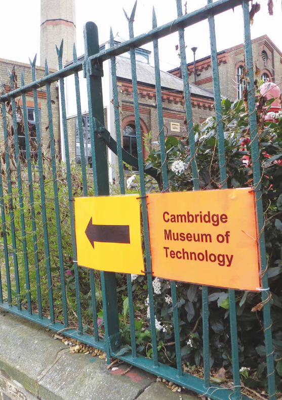
Opposite: Orange signs certainly attract the eye, but they are not in harmony with the railings or the building. The use of a modern typeface and orange suggests the museum will feature modern, rather than Victorian, technology
25
a family who want to get ice creams at the café and watch planes fly over.’We discussed ideas I had for information boards and the examples I
had of the current signage in the museum. Nick said it looked as if I had concentrated a lot of effort on the minutiae of the information board design, which is important, but said I also need to look at the ‘hard’ signage as the ability for people to find their way around is crucial.
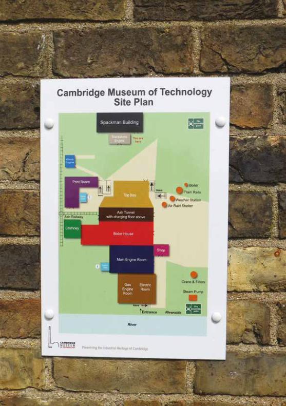
Maps came up next and I showed Nick a photo I had taken of the current museum map which is located on the wall at the entrance to the museum (see opposite). Nick said that maps are only really useful if they are repeated throughout the museum and give people a sense of where they are and how to get to other areas of interest. A single map does not do much. (I since discovered there are other maps at the museum).
We discussed the colours used on the map and colouring as a general concept for wayfinding.
To my surprise Nick said that use of colours can be very confusing because people quickly forget what the colours mean unless it is reinforced.
He said once you use more than about three colours people struggle to follow the system. I mentioned the problems raised by colour blindness and Nick agreed that this was an issue pointing out that on the current map red and green are used next to each other which would be hard for colour blind people to distinguish.
He talked about the importance of creating 1:1 mockups of signage because until you get signs in place you will never know how factors such as lighting and positioning in relation to doors and windows will work.
He also said it is important to consider Disability Discrimination Act as there is a legal responsibility for the people who run public buildings to provide means for disabled people to visit.
He said the project could even make proposals on how disabled access could be improved, so that if money is available later it can be considered.
Opposite: A map of the site which appears in numerous locations at the museum
27
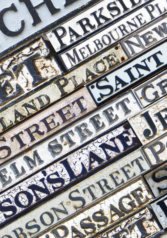
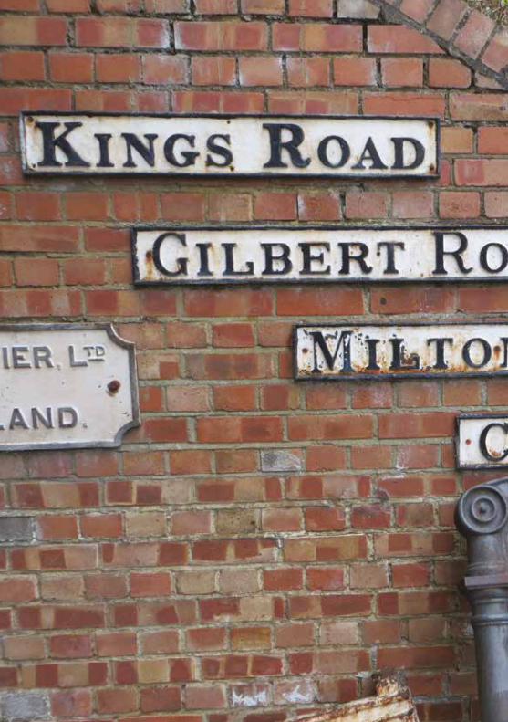
A taxonomy of Cambridge’s street signsI decided to base my sign designs on the 19th century (and later) street signs found throughout Cambridge, but especially in the city centre. The museum has several of these old signs which it is helping to preserve (see the picture opposite).
It made logical sense to me to use these street signs as a basis for my signage system because they are from the correct period of time and convey the message of conserving Cambridge’s past, which ties in with the work of the museum. I also hope that using these designs will be in harmony with the architecture of the building as well as its function.
Prompted by this I conducted a photographic survey of street signs in Cambridge with a view to establishing a taxonomy of signs. In the following pages I have attempted to categorise the street signs. I do not pretend this is a definitive categorization of the signs, but it gave me some insights into the changing styles of sign found around the town.
I have named the different classes old style, transitional style, small caps style, neat style and quirky serif style. It must be noted that I do not know what the chronological order of these styles was.
It seems logical (based on the condition of the signs and improvements to the designs) that the signs I have designated old style were succeeded by the transitional style which seems to sit before the neat style, however I cannot say for sure if this was the case. When the quirky serif style was introduced and how long it was around for is a mystery I have not resolved.
Opposite: Some of the 19th century signs at the museum
28
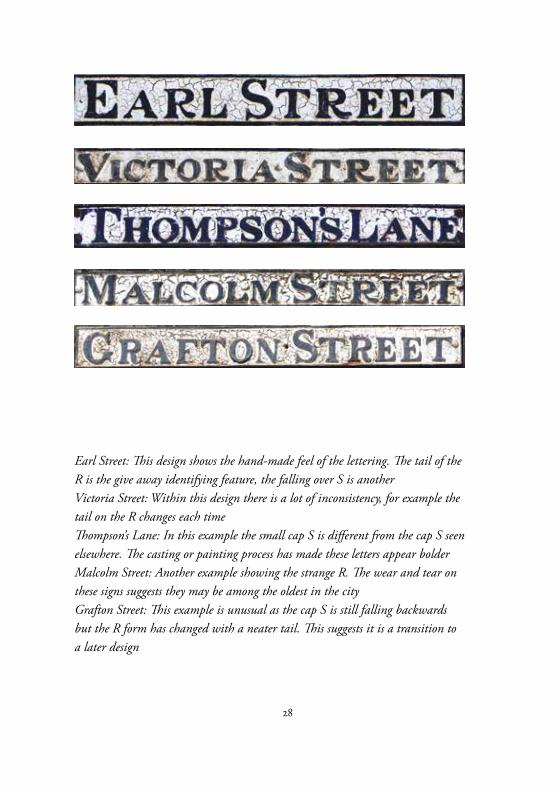
Earl Street: This design shows the hand-made feel of the lettering. The tail of the R is the give away identifying feature, the falling over S is anotherVictoria Street: Within this design there is a lot of inconsistency, for example the tail on the R changes each timeThompson’s Lane: In this example the small cap S is different from the cap S seen elsewhere. The casting or painting process has made these letters appear bolderMalcolm Street: Another example showing the strange R. The wear and tear on these signs suggests they may be among the oldest in the cityGrafton Street: This example is unusual as the cap S is still falling backwards but the R form has changed with a neater tail. This suggests it is a transition to a later design
29
Old styleI have labelled this style of sign old style because it appears the most hand-made (in terms of the variation of letters and the imprecise casting leading to an unevenness of form). This leads me to believe it probably pre-dates the other designs before the system was improved.
Characteristics of this class includes a larger initial letter for each word, exaggerated serifs, particularly on the E and L and an extremely quirky tail to the R. The capital S as it appears in the word ‘Street’ appears unbalanced, with the weight of the letter tipping it to the left.
The overall impression is a heavy weight with a marked contrast between the thick and thin strokes. The wear and tear on these signs also suggests they could be the oldest forms.
30
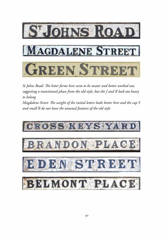
St Johns Road: The letter forms here seem to be neater and better worked out, suggesting a transitional phase from the old style, but the J and R look too heavy to belongMagdalene Street: The weight of the initial letters looks better here and the cap S and small R do not have the unusual features of the old style
31
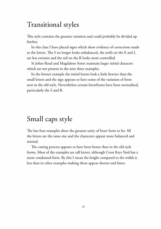
Transitional stylesThis style contains the greatest variation and could probably be divided up further.
In this class I have placed signs which show evidence of corrections made to the letters. The S no longer looks unbalanced, the serifs on the E and L are less extreme and the tail on the R looks more controlled.
St Johns Road and Magdalene Street maintain larger initial character which are not present in the next three examples.
In the former example the initial letters look a little heavier than the small letters and the sign appears to have some of the variation of form seen in the old style. Nevertheless certain letterforms have been normalised, particularly the S and R.
Small caps styleThe last four examples show the greatest unity of letter form so far. All the letters are the same size and the characters appear more balanced and normal.
The casting process appears to have been better than in the old style forms. Most of the examples are tall letters, although Cross Keys Yard has a more condensed form. By this I mean the height compared to the width is less than in other examples making them appear shorter and fatter.
32
33
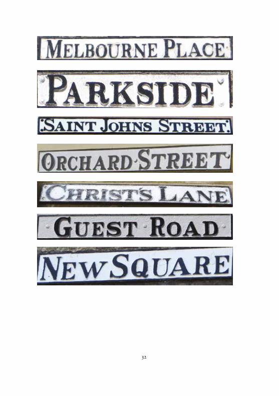
Neat styleThis style of lettering appears to be the most uniform so far and the casting and painting of the signs also appears to be the best.
The signs show less evidence of wear and tear which suggests they are more recent.
The examples all have a larger initial letter, as in the old style and transitional styles but the letter forms are retain the orderliness of the small cap style. Essentially this is similar to the small cap style but with large initial cap letters.
Even so there is variation in this class as the S in Orchard Street seems to have reverted to the unbalanced form seen in the old style.
There is also a big contrast between the small cap S in Saint Johns Street and the one in Guest Road. In fact Guest Road has similarities with St Johns Road, which I put into the transitional style.
Perhaps whoever made these signs was picking and choosing letter forms from a mixture of older examples.
Some of the signs in this style look a lot more recent, particularly Parkside and Guest Road.
If my chronology is correct the other styles of street sign letters evolved to this settled format. However it still leaves a mystery as to where the last category fits in...
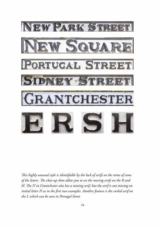
34
This highly unusual style is identifiable by the lack of serifs on the stems of some of the letters. The close-up shots allow you to see the missing serifs on the R and H. The N in Grantchester also has a missing serif, but the serif is not missing on initial letter N as in the first two examples. Another feature is the curled serif on the L which can be seen in Portugal Street
35
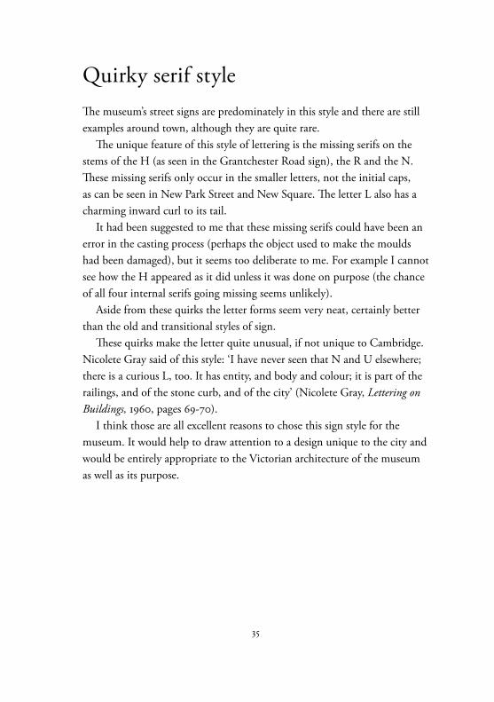
Quirky serif styleThe museum’s street signs are predominately in this style and there are still examples around town, although they are quite rare.
The unique feature of this style of lettering is the missing serifs on the stems of the H (as seen in the Grantchester Road sign), the R and the N. These missing serifs only occur in the smaller letters, not the initial caps, as can be seen in New Park Street and New Square. The letter L also has a charming inward curl to its tail.
It had been suggested to me that these missing serifs could have been an error in the casting process (perhaps the object used to make the moulds had been damaged), but it seems too deliberate to me. For example I cannot see how the H appeared as it did unless it was done on purpose (the chance of all four internal serifs going missing seems unlikely).
Aside from these quirks the letter forms seem very neat, certainly better than the old and transitional styles of sign.
These quirks make the letter quite unusual, if not unique to Cambridge. Nicolete Gray said of this style: ‘I have never seen that N and U elsewhere; there is a curious L, too. It has entity, and body and colour; it is part of the railings, and of the stone curb, and of the city’ (Nicolete Gray, Lettering on Buildings, 1960, pages 69-70).
I think those are all excellent reasons to chose this sign style for the museum. It would help to draw attention to a design unique to the city and would be entirely appropriate to the Victorian architecture of the museum as well as its purpose.
36
37
Other stylesFor completeness it is worth looking at the other styles of street sign in Cambridge.
The first examples are ceramic tiles which are inlaid into the brickwork. Each tile is designed to be two bricks high in order to work with the brick pattern. A fuller discussion on these tiles can be found on page 58.
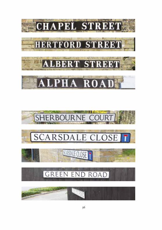
The other examples are of David Kindersley’s design of street sign. This style was designed to be functional and uniform and is used all around the country.
It has been criticised by Nicolete Gray, who compared the signs with the quirky style. She said: ‘The virtue of the modern one [David Kindersley’s] lies entirely in the letter-design, which is exceptionally good, but it is an example of a norm to be seen all over the country, without personal character, and as near as it can be to being disembodied.’ (Nicolete Gray, Lettering on Buildings, 1960, pages 69).
Phil Baines and Catherine Dixon went further: ‘Kindersley’s letters, derived from carved Roman forms, seem far too civilised (not to mention cramped in the space) for that treatment [manufacture in pressed steel].’ (Phil Baines and Catherine Dixon, Signs: Lettering in the Environment, 2003, page 105).
In its defence the sign has been designed for modern times. It was created to be seen from cars and the tall letters have been set that way so they are still readable from extreme angles, as the examples opposite demonstrate.
In an ironic twist there was a plan in the 1990s to replace the older street signs with Kindersley’s new design. Kindersley was appalled and lead a campaign which saved them from being replaced with his own design.
See page 19 for a discussion of these signs with Nick Hawksworth.
39
Creating a typefaceHaving decided on a style of design for my lettering the next phase was to design it.
Initially I worked with photographs of the lettering which I decided to use as inspiration for my own typeface.
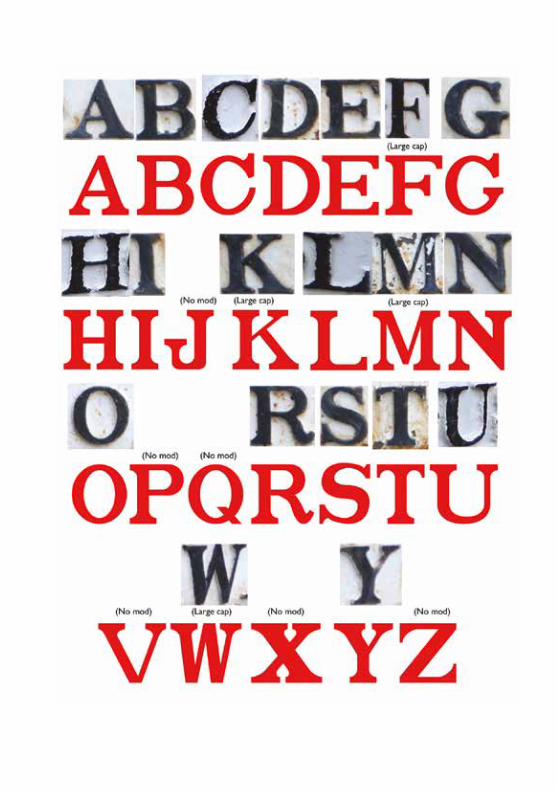
The image opposite shows my first draft of the ‘typeface’. I put quote marks around typeface because this design is not really type. Although I have designed it digitally and converted it into a font, its intended use is for signage, not for printing or on screen.
When I created this first draft of letters I was working from images taken at the museum. I had limited models to work from and some of these were taken at an angle which hampered me further.
Another problem was that I had started this before I had properly identified the different street sign styles. So for example the C, F, G, H, L, N, S and U are all from the incorrect style of sign.
I constructed the typeface on a grid in Adobe Illustrator. This enabled me to create a letters with exact uniformity between relationships like the thin and thick strokes, the dimensions of the serifs and the style of brackets.
The images on the next two pages show how I examined different thin/thick relationships. The following pages show how I experimented with different relationships and my approach to finding a good style for the brackets.
The images that follow are taken from the notes I made as I went along.
Opposite: The first draft of my letter design with photographs of signs taken at the museum. At this stage I had not created a taxonomy of the sign designs and different design styles have crept in
40
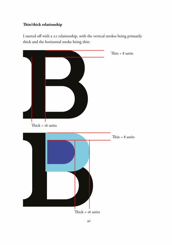
Thin/thick relationship
I started off with a 2:1 relationship, with the vertical strokes being primarily thick and the horizontal stroke being thin:
Thin = 8 units
Thick = 16 units
Thin = 8 units
Thick = 16 units
41
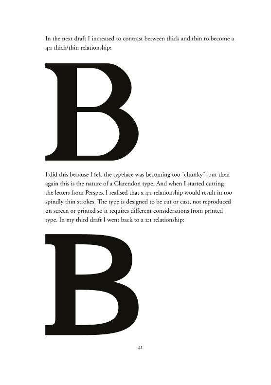
I did this because I felt the typeface was becoming too “chunky”, but then again this is the nature of a Clarendon type. And when I started cutting the letters from Perspex I realised that a 4:1 relationship would result in too spindly thin strokes. The type is designed to be cut or cast, not reproduced on screen or printed so it requires different considerations from printed type. In my third draft I went back to a 2:1 relationship:
In the next draft I increased to contrast between thick and thin to become a4:1 thick/thin relationship:
42
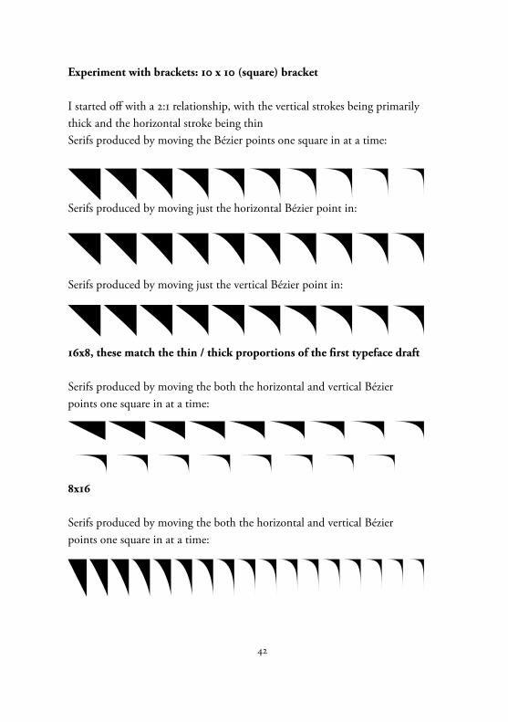
Experiment with brackets: 10 x 10 (square) bracket
I started off with a 2:1 relationship, with the vertical strokes being primarily thick and the horizontal stroke being thinSerifs produced by moving the Bézier points one square in at a time:
Serifs produced by moving just the horizontal Bézier point in:
Serifs produced by moving just the vertical Bézier point in:
16x8, these match the thin / thick proportions of the first typeface draft
Serifs produced by moving the both the horizontal and vertical Bézier points one square in at a time:
8x16
Serifs produced by moving the both the horizontal and vertical Bézier points one square in at a time:
43
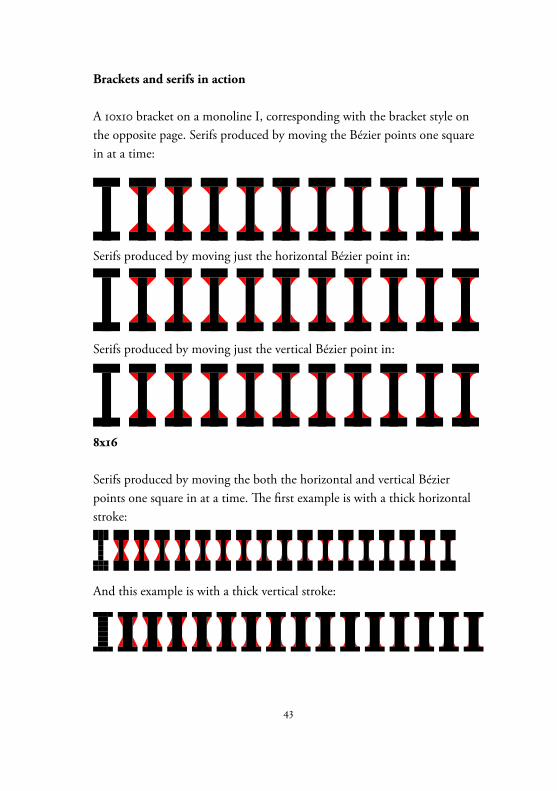
Brackets and serifs in action
A 10x10 bracket on a monoline I, corresponding with the bracket style on the opposite page. Serifs produced by moving the Bézier points one square in at a time:
Serifs produced by moving just the horizontal Bézier point in:
Serifs produced by moving just the vertical Bézier point in:
8x16
Serifs produced by moving the both the horizontal and vertical Bézier points one square in at a time. The first example is with a thick horizontal stroke:
And this example is with a thick vertical stroke:
44
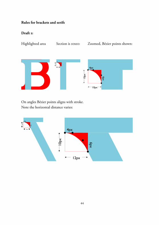
Rules for brackets and serifs
Draft 1:
Highlighted area Section is 10x10: Zoomed, Bézier points shown:
10px
10px
4px
6px
10px10
px
4px
6px
On angles Bézier points aligns with stroke. Note the horizontal distance varies:
12px
10px
4px
6px
12px
10px
4px
6px
45
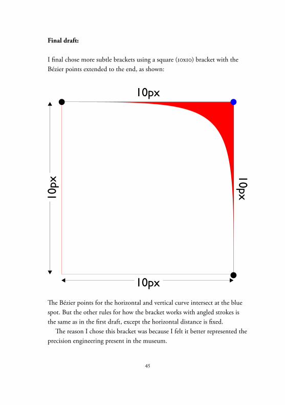
Final draft:
I final chose more subtle brackets using a square (10x10) bracket with the Bézier points extended to the end, as shown:
10px
10px
10px
10px
The Bézier points for the horizontal and vertical curve intersect at the blue spot. But the other rules for how the bracket works with angled strokes is the same as in the first draft, except the horizontal distance is fixed.
The reason I chose this bracket was because I felt it better represented the precision engineering present in the museum.
46
47
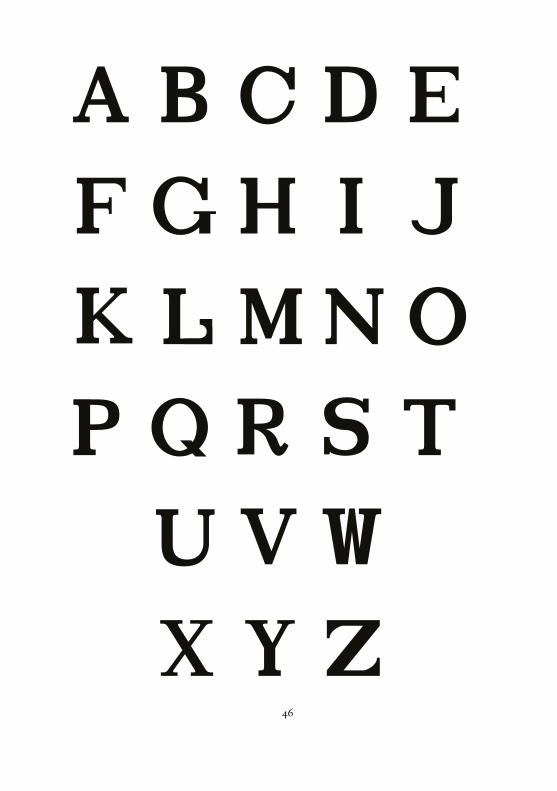
Final draft of first typefaceHaving established a set of rules for how to create the typeface I created and tweaked each letter until I was happy with the final result.
I had established strict rules for how each element of the design worked. As I have documented on the previous pages I established rules for the size of serifs and how the brackets work, including how brackets work where angled strokes meet horizontal or vertical strokes.
This produced quite a formal typeface, inspired by the street signs but not beholden to them.
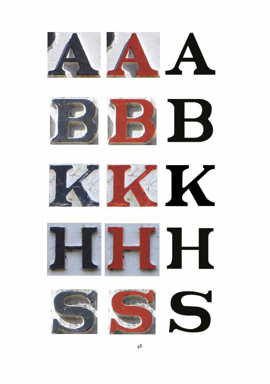
It was at this point that I conducted a more formal taxonomy of the street signs and with better photography I was able to trace the letters with more accuracy.
This process led me to re-evaluate my designs and caused me to try to create a face which was closer to the original including some of the quirks and inconsistencies present in it. I shall detail this process in the forthcoming pages.
Opposite: The final design of the first version of the lettering system. This design was created on a grid and obeyed strict rules regarding stroke thickness, serif lengths and bracketing.
48
49
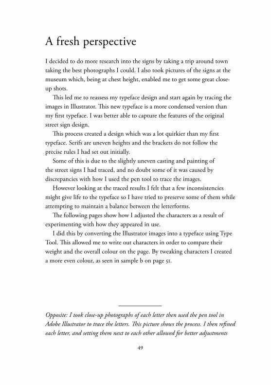
A fresh perspectiveI decided to do more research into the signs by taking a trip around town taking the best photographs I could. I also took pictures of the signs at the museum which, being at chest height, enabled me to get some great close-up shots.
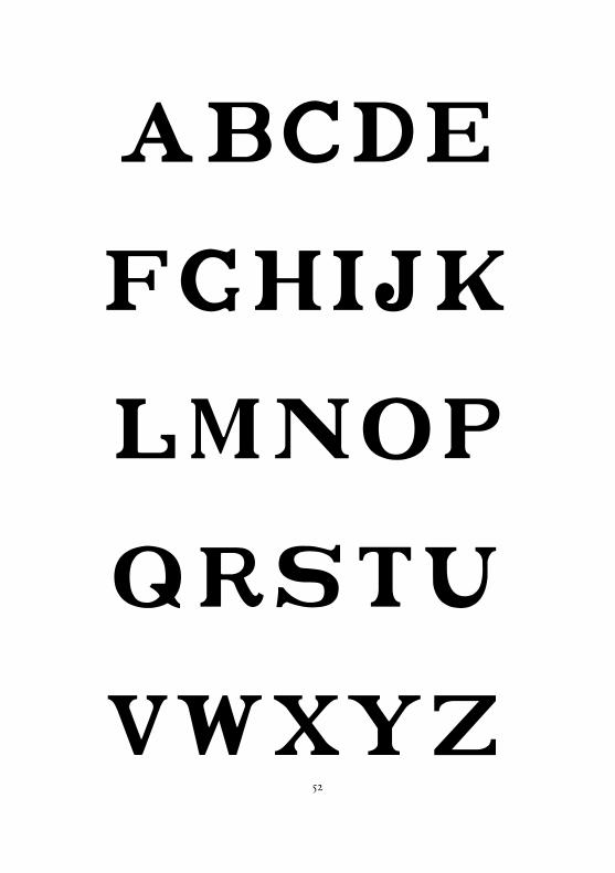
This led me to reassess my typeface design and start again by tracing the images in Illustrator. This new typeface is a more condensed version than my first typeface. I was better able to capture the features of the original street sign design.
This process created a design which was a lot quirkier than my first typeface. Serifs are uneven heights and the brackets do not follow the precise rules I had set out initially.
Some of this is due to the slightly uneven casting and painting of the street signs I had traced, and no doubt some of it was caused by discrepancies with how I used the pen tool to trace the images.
However looking at the traced results I felt that a few inconsistencies might give life to the typeface so I have tried to preserve some of them while attempting to maintain a balance between the letterforms.
The following pages show how I adjusted the characters as a result of experimenting with how they appeared in use.
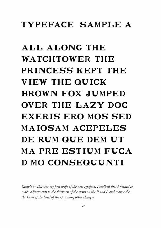
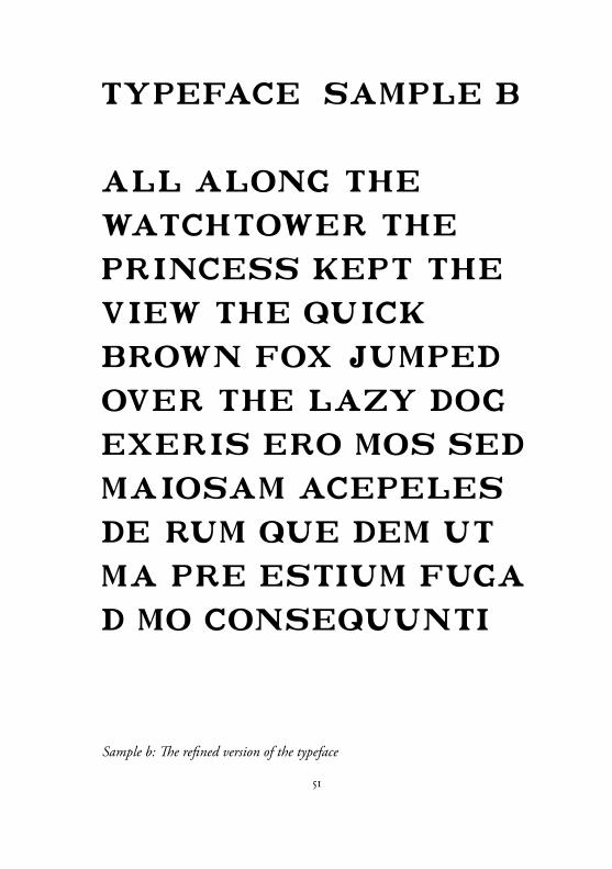
I did this by converting the Illustrator images into a typeface using Type Tool. This allowed me to write out characters in order to compare their weight and the overall colour on the page. By tweaking characters I created a more even colour, as seen in sample b on page 51.
Opposite: I took close-up photographs of each letter then used the pen tool in Adobe Illustrator to trace the letters. This picture shows the process. I then refined each letter, and setting them next to each other allowed for better adjustments
50
Sample a: This was my first draft of the new typeface. I realised that I needed to make adjustments to the thickness of the stems on the R and P and reduce the thickness of the bowl of the U, among other changes
51
Sample b: The refined version of the typeface
52
abcde
fghijk
lmnop
qrstu
vwxyz
53
Second typefaceThis typeface was developed as a result of tracing the letters from the actual signs, it is therefore closer to the original designs including some of the quirky aspects
Once I had completed the tracing process I converted the type into a font by using Type Tool. This then enabled me to write out sentences in order to compare the colour of the letters when used together. You can see this on pages 50 and 51.
The main test of how well this typeface works is, of course, to cut it and use it for real and I shall be discussing this on the following pages.
Opposite: My final design of the second typeface
55
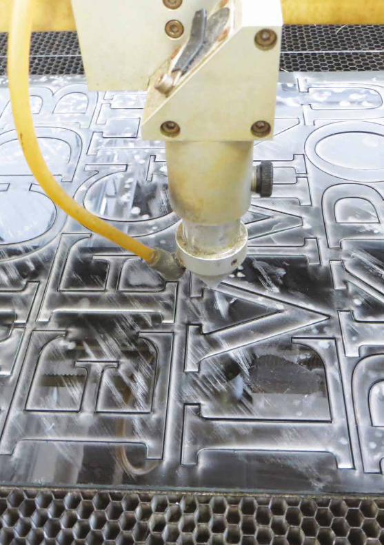
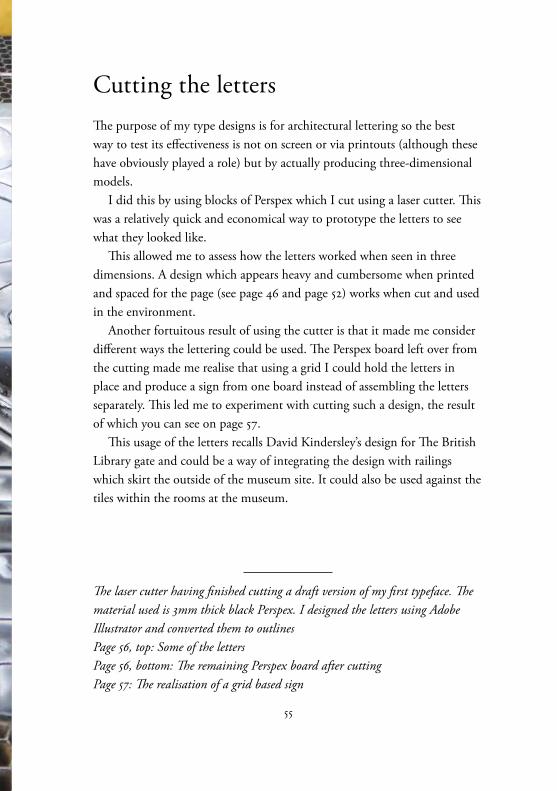
Cutting the lettersThe purpose of my type designs is for architectural lettering so the best way to test its effectiveness is not on screen or via printouts (although these have obviously played a role) but by actually producing three-dimensional models.
I did this by using blocks of Perspex which I cut using a laser cutter. This was a relatively quick and economical way to prototype the letters to see what they looked like.
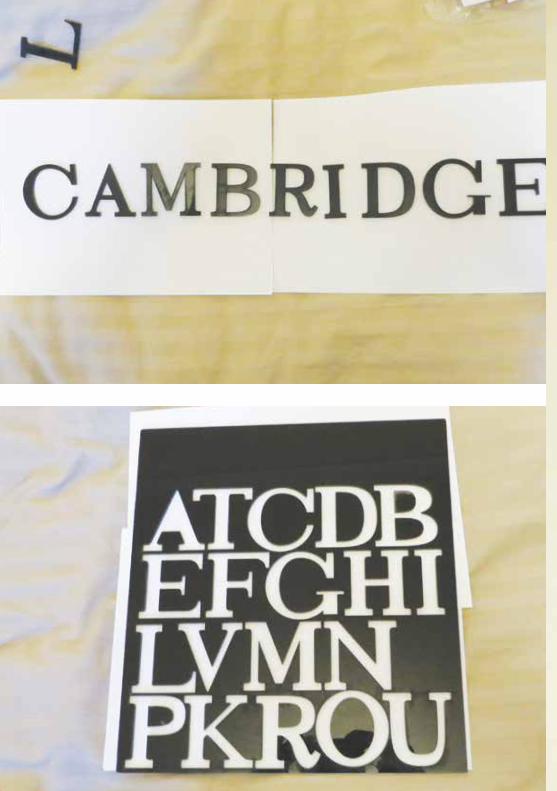
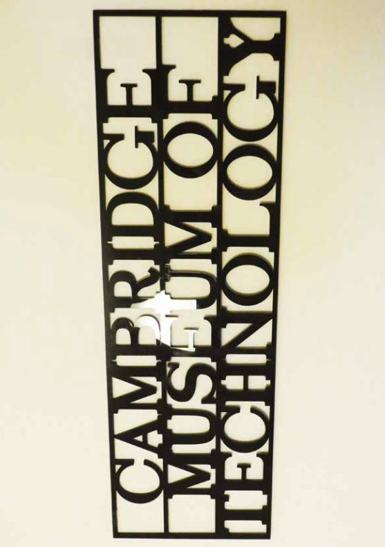
This allowed me to assess how the letters worked when seen in three dimensions. A design which appears heavy and cumbersome when printed and spaced for the page (see page 46 and page 52) works when cut and used in the environment.
Another fortuitous result of using the cutter is that it made me consider different ways the lettering could be used. The Perspex board left over from the cutting made me realise that using a grid I could hold the letters in place and produce a sign from one board instead of assembling the letters separately. This led me to experiment with cutting such a design, the result of which you can see on page 57.
This usage of the letters recalls David Kindersley’s design for The British Library gate and could be a way of integrating the design with railings which skirt the outside of the museum site. It could also be used against the tiles within the rooms at the museum.
The laser cutter having finished cutting a draft version of my first typeface. The material used is 3mm thick black Perspex. I designed the letters using Adobe Illustrator and converted them to outlines Page 56, top: Some of the letters Page 56, bottom: The remaining Perspex board after cutting Page 57: The realisation of a grid based sign
59
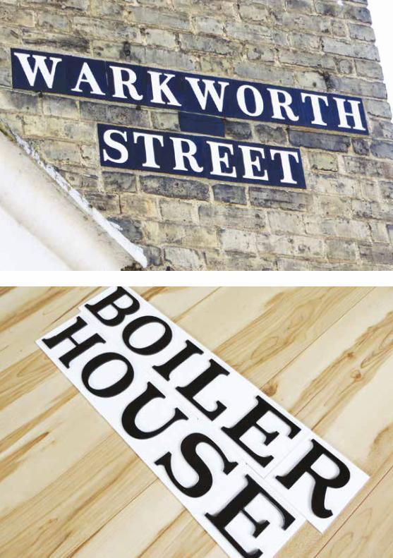
Creating a reusable lettering systemAs an alternative I considered how I could make a reusable system which would allow both the easy and economic replacement of signs and the creation of new ones.
It is possible the museum may decide to rename rooms, and the site also hosts events put on by various groups and societies, so it would be useful if they could make use of alternative signs.
With this in mind I was inspired by the tile lettering system which is still used around Cambridge. I have noticed that while this system is very rare in the centre of town it can be seen quite commonly north of the River Cam.
I decided to experiment by creating white tiles and attaching black letters to them (although the Cambridge tile system has the opposite colour scheme). In order to do this I arranged letters on a digital page and placed a box around each figure. I instructed the laser cutter to cut the boxes and engrave the figures. I could then use the engraved marks as a guide for gluing the figures in place.
A tile system allows me to specify the spacing between letters, although the drawback is that certain letter combination will always be difficult to work with. The W and A in Warkworth Street opposite is an example of one such problem. A solution to this could be to create letter pairs, although this would complicate the system for anyone trying to use it.
Another interesting feature of the original tile system is that it seems to have been designed to harmonise with the size of the brickwork. The ideal solution for my signage would also be to have something that works with the brickwork or the tiles inside the museum rooms.
Opposite top: An example of the old tile system in Cambridge Opposite bottom: Laser cut tiles using version two of the letter design
61
The signage system in actionIn order to visualise how the signage system might work in the museum I have used Adobe Photoshop to mock up images.
My hope is to demonstrate to museum volunteers how my proposed system would look and hopefully get some feedback on improvements.
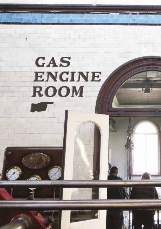
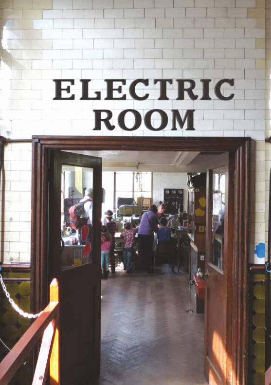
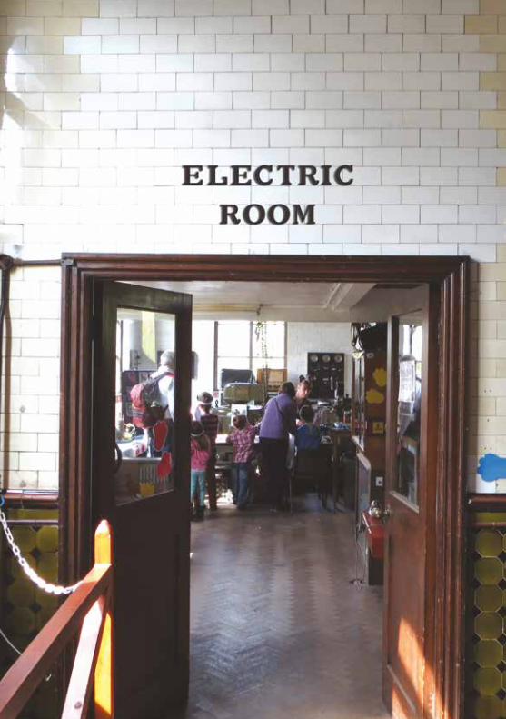
On visiting the museum I noticed the wonderful Victorian tiles found in the main three rooms (the main engine room, electric room and gas engine room, as well as the connecting corridor to the rest of the site).
My idea for these rooms is to use the white tiles rather than obscuring them. The wall tiles could be used as a grid for the letters.
Initially I sized the letters to be two tiles high with one tile of leading (line spacing) between them (as in the example opposite).
Obviously in such a system spacing would need to be done by hand, but as these are ‘hard’ (permanent) signs they would only need to be put up once.
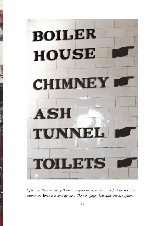
I have also created ‘pointing hands’ which were referred to as ‘fists’ in the trade. These add some fun to the system as well as being part of the Victorian aesthetic which I hope the example opposite shows.
Black letters on white tiles gives a high contrast to the signs, making them highly visible. There may be a question over how dominant they are. The system should not detract or otherwise distract from the museum architecture itself.
There is also a question as to where the signs should be placed. Too high up and they could be overlooked, but there is less space for signs of this size lower down.
The best solution seems to be one tile high letters at close to eye level. Because of this I decided to try using the letters just one tile high.
In the examples on these pages you can see can see how the different
Opposite: The entrance to the Gas Engine Room. The tiles are used as a grid for the letters. Black figures on a white background creates a high contrast.
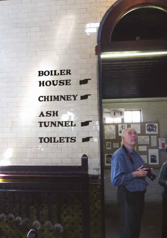
approaches work. I believe a small one tile high approach is less distracting, and having the signs at eye level is more useful than having them high up where visitors might not even notice them.
The high contrast between the black letters and white tiles should help keep them legible even from a distance, as the example on page 64 shows.
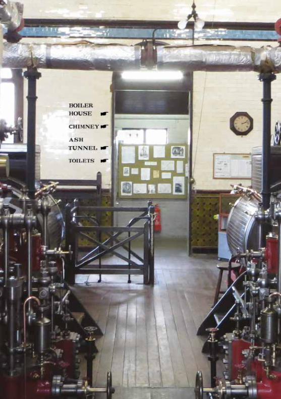
Opposite: Multiple choices, several rooms lead on from this room. There is a question about how much information should appear
65
Opposite: The view along the main engine room, which is the first room visitors encounter. Above is a close-up view. The next pages show different size options
67
69
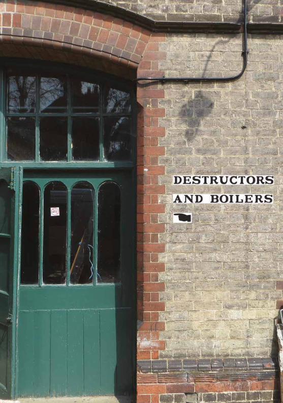
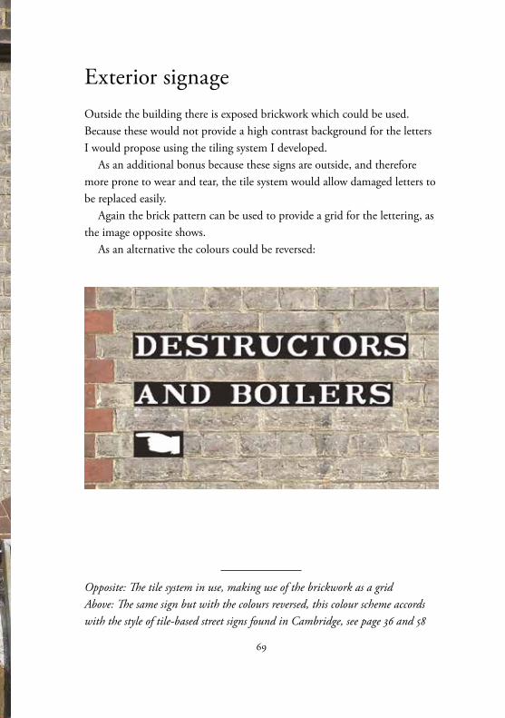
Exterior signageOutside the building there is exposed brickwork which could be used. Because these would not provide a high contrast background for the letters I would propose using the tiling system I developed.
As an additional bonus because these signs are outside, and therefore more prone to wear and tear, the tile system would allow damaged letters to be replaced easily.
Again the brick pattern can be used to provide a grid for the lettering, as the image opposite shows.
As an alternative the colours could be reversed:
Opposite: The tile system in use, making use of the brickwork as a grid Above: The same sign but with the colours reversed, this colour scheme accords with the style of tile-based street signs found in Cambridge, see page 36 and 58
71
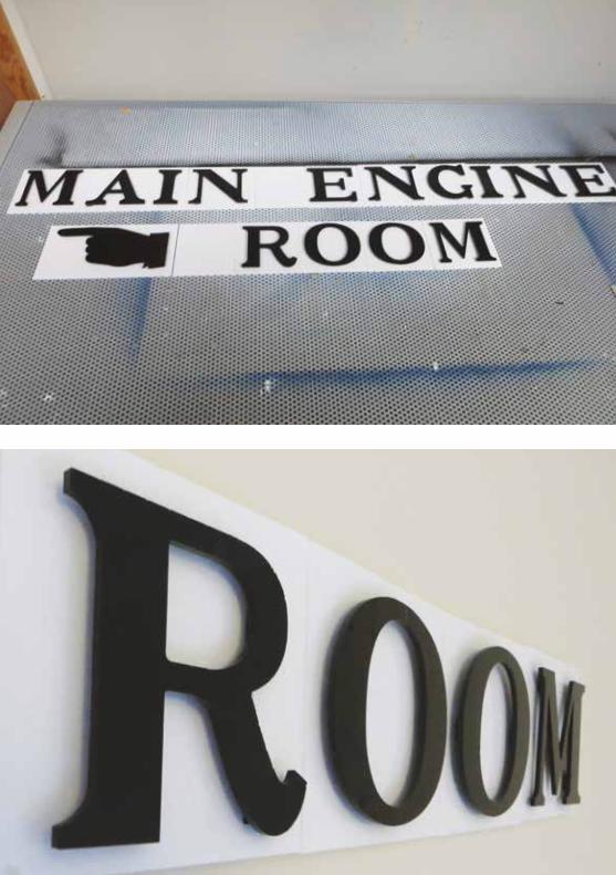
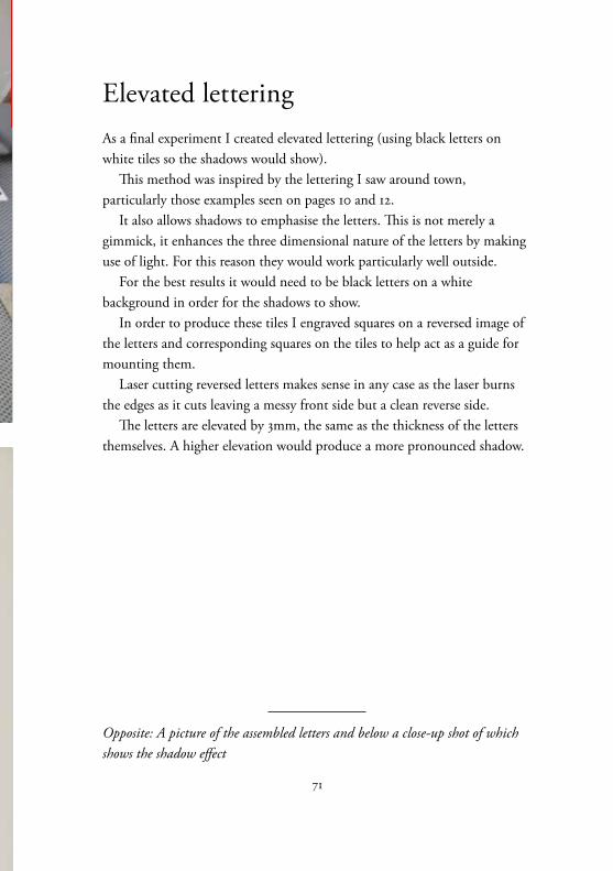
Elevated letteringAs a final experiment I created elevated lettering (using black letters on white tiles so the shadows would show).
This method was inspired by the lettering I saw around town, particularly those examples seen on pages 10 and 12.
It also allows shadows to emphasise the letters. This is not merely a gimmick, it enhances the three dimensional nature of the letters by making use of light. For this reason they would work particularly well outside.
For the best results it would need to be black letters on a white background in order for the shadows to show.
In order to produce these tiles I engraved squares on a reversed image of the letters and corresponding squares on the tiles to help act as a guide for mounting them.
Laser cutting reversed letters makes sense in any case as the laser burns the edges as it cuts leaving a messy front side but a clean reverse side.
The letters are elevated by 3mm, the same as the thickness of the letters themselves. A higher elevation would produce a more pronounced shadow.
Opposite: A picture of the assembled letters and below a close-up shot of which shows the shadow effect
73
ConclusionI hope that in creating signs based in the ‘quirky serif ’ style of street signage that I have helped highlight this part of Cambridge’s history and culture.
My aim has been to create a signage system that pays respect to the architecture and content of the museum. This unusual lettering design appears to be unique to Cambridge and is worth preserving. I believe the signs harmonise with the building and help shed a little light on this history.
The aim of any signage system is to help visitors find their way around a site and get the maximum enjoyment from their visit. By keeping the lettering reasonably small, but using a high contrast between figure and background colour I believe I have found a system that is useful but not distracting from the museum’s architecture.
The tile system I have developed could be designed for a 3D printer which would mean new letters could be made to order and appear the same as older letters. A feature of the old signs in Cambridge is that they show inconsistencies which may have occurred as signs decayed and were replaced with new designs, different from the older ones.
By having a digital design with which to make new tiles these inconsistencies could be eliminated, even if different materials are used.
Further consideration would need to be made as to how these letters could be attached to the walls without causing any damage.
The focus of my study has been the type design and prototyping. Obviously there is still some way to go in creating a visitor journey and deciding which signs should go where. This is something I hope to offer to the museum in the coming months.
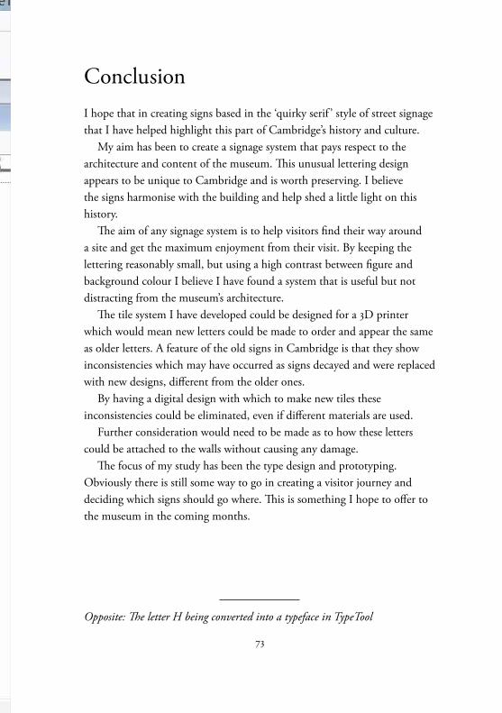
Opposite: The letter H being converted into a typeface in TypeTool