Embed Size (px)
Citation preview

CA 272 - Professional Web Site Development
Intro to Web Graphics & Design
Design Issues for Web Sites
1. Page Layout
2. Color palette
3. UI elements and background images
4. Graphics and photos

Web design process
Wireframes - visual organization of content (page layout) with NO design elements or color
Page mockups - static graphic rendering of Web page(s)
Prototype - working model of page (links and buttons work; text is real text, etc.)
… on to Site construction - mark up HTML, code CSS, ‘slice up’ and optimize graphics, etc.
Page Layout
Page layout decisions are driven by• Content needs - what groups/categories of related
content should be presented together?• Priority - what content needs to be given the most
visibility and prominence?• Usability - how can we make it easy for the user to find
the content they are looking for (and where do they expect to find it)?
• Flow - how does one content item lead to another?• Aesthetics - what would be a pleasing, compelling,
interesting design?

Content Issues
(review) Content Inventory - exhaustive list of all types of content to be included in site
Group related content - very subjective process Card sorting Benefit of multiple perspectives
Create site outline Identify building blocks of Web pages

Web Page Building Blocks
Web pages have elements that communicate information: e.g., product descriptions, company profiles,
encylopedia entries, how-to guides, etc. Structured text (headings, paragraphs, lists, etc.) Images Multimedia

Web Page Building Blocks
Web pages have elements that facilitate interactivity: Allow users to search and navigate site content
Forms Navigation buttons Links
Collect info from user Forms
Play media (for entertainment, informational purposes, etc.) Plug-ins for audio, video, animation
Blogs, forums, calendars, bookmarking, document sharing, various Web applications - assorted elements
Web Page Building Blocks
Web pages have elements that visually reinforce site objectives: Create a mood/tone Reinforce branding and marketing
Images Color Fonts Multimedia
Web Page Building Blocks
Web pages have elements that support site administration, business and legal issues, search engine optimization and accessibility Advertising Copyright statement, privacy policy, terms of use Skip to main nav links, alternate content, etc. Etc.
Page Layout Elements
Branding - logo, masthead graphics, stock photos, etc.
Navigation - nav bars and menus, secondary navigation, footer navigation
Main content area - bulk of informational content Sidebar(s) - supplemental content (examples) Site tools - search bar, login, adjust text size, tag
page, etc. Footer - copyright statement, other info Other - contact info, forms, media plugins

Wireframing
Wireframing is an excellent tool for working out page layout independent of design
Box outlines, bubbles, grey boxes Black & white / grayscale Focus on priority and flow of content
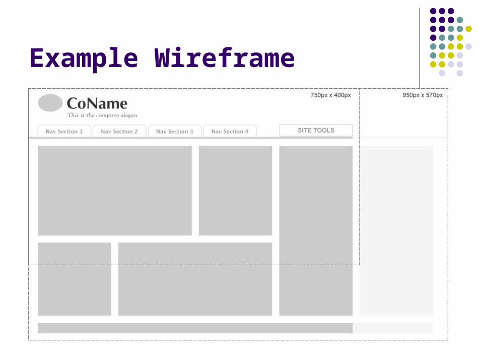
Example Wireframe

Page Layout Schemes
Fixed width - width set to fixed px value Most designers use fixed width because easiest
to design for PRO: easier to design graphics for, can set
readable line lengths of text CON: doesn’t take advantage of screen width for
users with large monitors; users with smaller monitors may have to scroll horizontally
Page Layout Schemes
Fluid - width set to % value, adjusts to width of browser window PRO: makes full use of browser window; user can
resize CON: may lead to very long lines of text; harder to
design for See: http://www.drexel.edu/

Page Layout Schemes (continued)
Elastic - width set in relative units (ems) Page elements grow proportionately as user
resizes text size PRO: ideal for accessibility - users can view at
whatever scale is comfortable for them CON: very difficult to code; can lead to very large
widths as user increases font size Rarely used

Page Layout Schemes (continued)
Hybrid Fixed/Fluid Some column(s) fixed, other(s) fluid Optional ‘third’ column
Page Layout Dimensions
Fixed design for pixel widths - must account for browser ‘chrome’, scrollbars
800 x 600 monitor: 750px (or 760px) width Safest width, but only 12% of users
1024 x 800 monitor: 950px+ width Most users have this resolution now (53%)
1280 x 1024 is gaining (~23%) Don’t worry about 640 x 480 anymore

Grids for Page Layout
“Grids help designers create arrangements and patterns that ‘feel right’ and that people find comfortable to use” – Andy Clarke
Even grids - e.g., 4-column See: http://www.subtraction.com/archives/2004/1231_grid_computi.php
Divine proportion - 1:1.62 (a:b = a+b:a) See: http://www.quickanddirtyinternational.com/pages/proportion.html
Can bridge columns to create ‘supercolumns’ - not just fit all content in rigid layout

Breaking Out of the Grid
Grid layout doesn’t need to be ‘boxy’ layout With CSS it is possible to position elements
so they overlap columns or break out of columns - or float independently of other content
See: http://www.csszengarden.com/?cssfile=005/005.css http://www.csszengarden.com/?cssfile=201/201.csshttp://www.csszengarden.com/?cssfile=194/194.css http://www.csszengarden.com/?cssfile=189/189.css http://www.csszengarden.com/?cssfile=188/188.css
Design Principles
Proximity - group related elements; separate distinct elements
Alignment - creates visual cohesion and ‘orderliness’ - use grids
Balance - layout should achieve visual balance through: Symmetric balance (horizontal, bilateral, radial) Asymmetric balance (using different forms of
visual weight: size, shape, tone, placement)
Design Principles (continued)
Repetition - consistent use of repeated design elements (e.g., color, fonts, imagery) ties everything together
Emphasis - draw attention to high-value content: Placement - give high-value content highest visibility (see
below) Continuance - draw user’s eyes along path to content Isolation - white space draws attention to content Contrast - content with different color, size, weight will stick
out Proportion - perceived scale relative to surrounding content
See: http://coe.sdsu.edu/eet/articles/Designprin1/start.htm

Web Design Principles
Design enhances content - does not compete with it Usability - practice good user interface design
principles Ensure readability and ‘scanability’ (easy to find desired
content) Meet user expectations Affordance: make UI controls obvious and understandable Clear task flow Minimize clicks (applies to entire site organization)

Web Design Principles
White space - enhances readability and reduces visual ‘stress’
Put most important content ‘above the fold’ Consider how users scan Web pages:

Web Design Best Practices
Keep KB size small to minimize load time (images are most of file size)
Avoid both horizontal and vertical scrolling (together)

Design Inspiration
Identify desired mood/tone based on content, audience, and the personality of you or your brand
Find inspiration in … nature industrial imagery geometric/abstract forms cartoons vintage graphic design/art movements magazines, industrial and product design
importance of magazines for interface, layout, typography design

Design Elements gradients (create with graphics program) patterns/textures
online sources photos/scans
photos your photos stock photos (e.g., istockphoto or flickr)
scans of objects textures (e.g., old paper) from nature magazine clippings, etc.
mood boards (collection of objects, photos, clippings, color swatches, etc., that evoke mood/feeling)

Color Palettes
consistent with mood, aesthetic often good to pick from photo usually at least 3 main colors tools for creating palettes
eyedropper on photo http://www.colormatch.dk/ or http://colormatch5k.com/
(and other online tools) try different shades and tints (see
http://slayeroffice.com/tools/color_palette/ ) start with greys to achieve good balance, then add color

Color Schemes
Monochromatic - e.g.,http://www.okb.es/
Analogous - e.g.,http://shoneys.cabedge.com/http://regines.net.au/ http://www.blinksale.com/home
Complementary - e.g., http://www.ufl.edu/
Split-complementaryhttp://www.neuemedia.com/
Triadic Tetradic
complementary split-complementary
triadic tetradic
analogous

Web Colors
Web colors typically written in hexadecimal format: #000000 is black, #FFFFFF
This corresponds to R, G, B values of 0 to 255: 255 in hex is FF
“Web-safe” colors limited to 256 colors - holdover from when browsers had limited color depth
Now can use 16 million colors (theoretically) Colors do display differently between monitors,
computers and operating systems Web-smart palette: ‘paired’ values, e.g., AA, BB, CC

Web graphics
2 main graphic file formats: JPEG (.jpg) - for photos, gradients GIF (.gif) - for solid colors or limited color range
JPEG
GIF
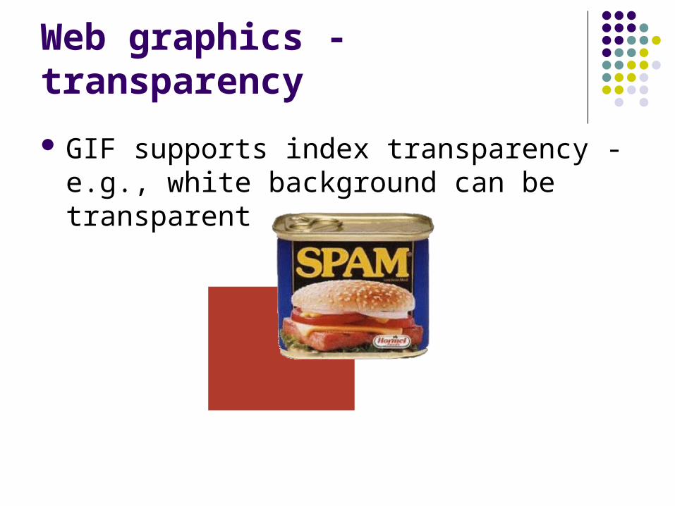
Web graphics - transparency
GIF supports index transparency - e.g., white background can be transparent
Web graphics - PNG and SVG
Other main graphic format: PNG PNGs support alpha transparency - e.g., image
could be 50% transparent Typically larger files IE 6 and under do not support PNG transparency!
Also, SVG - scalable vector graphics Bitmap vs. vector graphics
Web Graphics Applications
Adobe Photoshop - most fully featured app for creating bitmap graphics, editing photos
Adobe Illustrator - excellent for creating vector graphics
Adobe (formerly Macromedia) Fireworks - specifically for Web graphics - combines features of Photoshop and Illustrator
MS Paint -
Intro to Fireworks
Open Adobe CS3 > Fireworks File > New 500px width, 300px height, transparent
canvas color Workspace:
Document window Properties Toolbar Panels
Fireworks Tools
Select - select, crop, resize Bitmap - bitmap selections, draw, erase Vector - lines, shapes, text and pen tool Web - creating slices and hotspots Colors - setting foreground and background
colors

Fireworks - Tools (continued)
Draw rectangle: Change colors in Properties Set width and height, x,y coordinates Change opacity Add filter - drop shadow
Choose pointer tool: Click on canvas (unselects rectangle) Click on rectangle to select Drag to move

Fireworks - Tools (continued)
Choose Text tool: Click to insert text Type something Highlight text (by dragging cursor) in Properties:
Change font, font-size, color
Add more text - drag text box Constrains text Change alignment

Fireworks - Layers
Look at Layers palette: Every vector object you create is separate layer New objects on top Can drag layers to reorder Can delete and copy layers
Fireworks - Image Preview
File > Image Preview - use to optimize your graphics/images for Web
Choose appropriate file format (jpeg, gif, png) Set quality/palette to minimum necessary for
adequate display

Fireworks
Other things to try: Resize and rotate rectangle with Scale Tool Crop document Change canvas color, size Create bitmap layer
use pencil, paintbrush tools select part of bitmap layer with marquee and lasso tools erase part of bitmap layer
Use line, pen tools Experiment with paths (pen tool, vector path tool, redraw
path tool, subselection tool)

More Fireworks
Other things to try (continued): Create gradient fill in Properties, edit colors Change line properties Experiment with different filters Align objects using Align panel Edit colors in Colors panel using different sliders Create text on a path Try various image export settings
Homework
Create masthead graphic for a site about you Incorporate text, colors, and imagery that personify
who you are (like a graphic business card)e.g., http://www.ca272.com/images/masthead-ex.jpg
750px x 100px Export in format optimized for Web Place at top of your homepage on Web4Students Upload file and e-mail me by midnight, Wed. 11/6


![07 Graphics [Web Style Guide]](https://img.pdfslide.us/doc/110x75/577cc6821a28aba7119e7289/07-graphics-web-style-guide.jpg)