Embed Size (px)
Citation preview
CASCADING STYLE SHEETS™ (CSS)
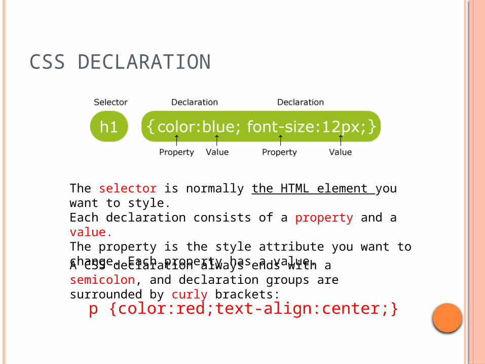
CSS DECLARATION
The selector is normally the HTML element you want to style.Each declaration consists of a property and a value.The property is the style attribute you want to change. Each property has a value.
A CSS declaration always ends with a semicolon, and declaration groups are surrounded by curly brackets:
p {color:red;text-align:center;}
CSS COMMENTS
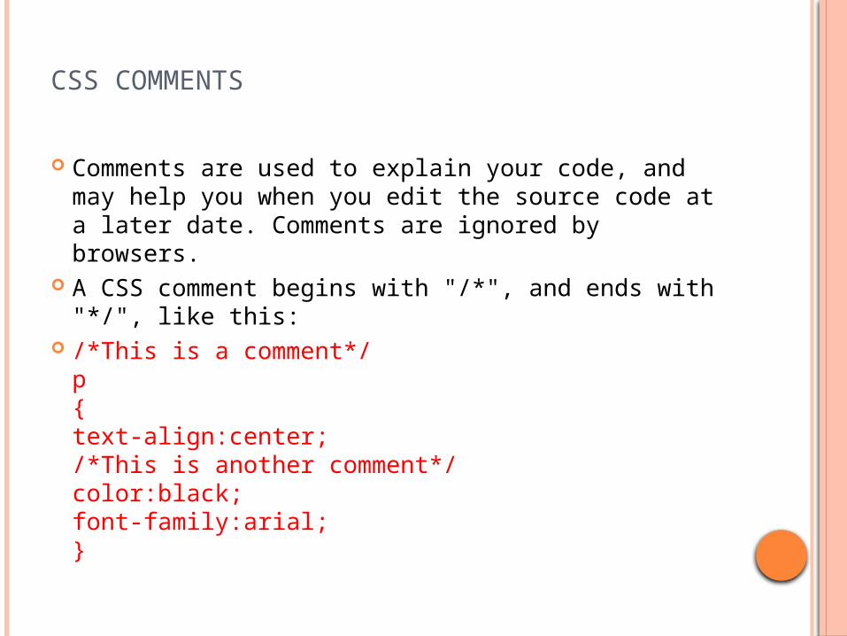
Comments are used to explain your code, and may help you when you edit the source code at a later date. Comments are ignored by browsers.
A CSS comment begins with "/*", and ends with "*/", like this:
/*This is a comment*/p{text-align:center;/*This is another comment*/color:black;font-family:arial;}
THREE WAYS TO INSERT CSS
There are three ways of inserting a style sheet:
External style sheetInternal style sheetInline style
External Style Sheet
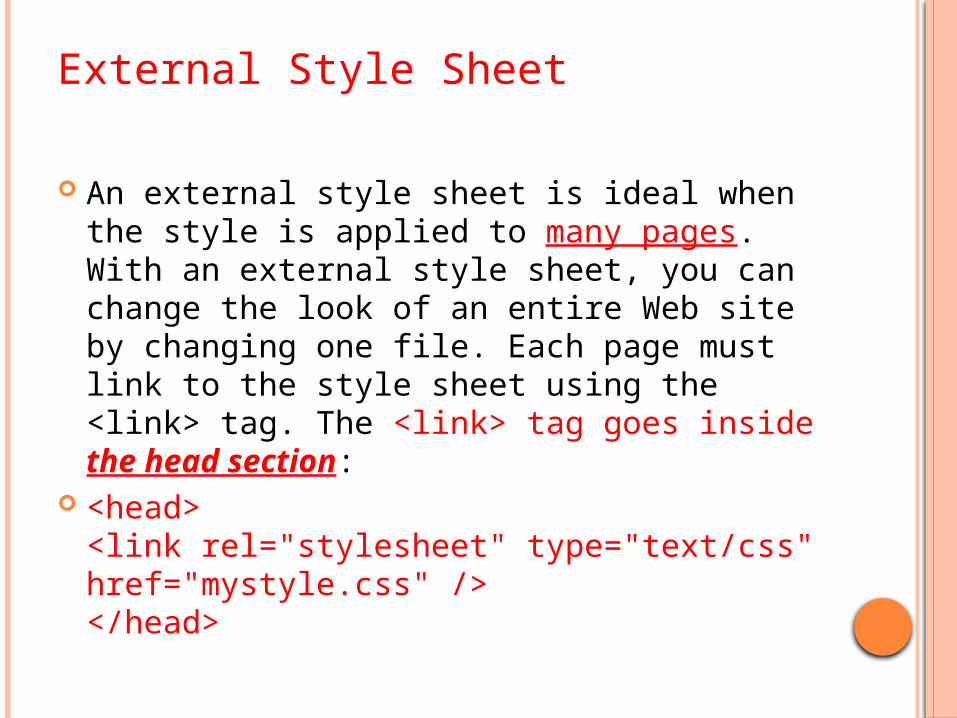
An external style sheet is ideal when the style is applied to many pages. With an external style sheet, you can change the look of an entire Web site by changing one file. Each page must link to the style sheet using the <link> tag. The <link> tag goes inside the head section:
<head><link rel="stylesheet" type="text/css" href="mystyle.css" /></head>
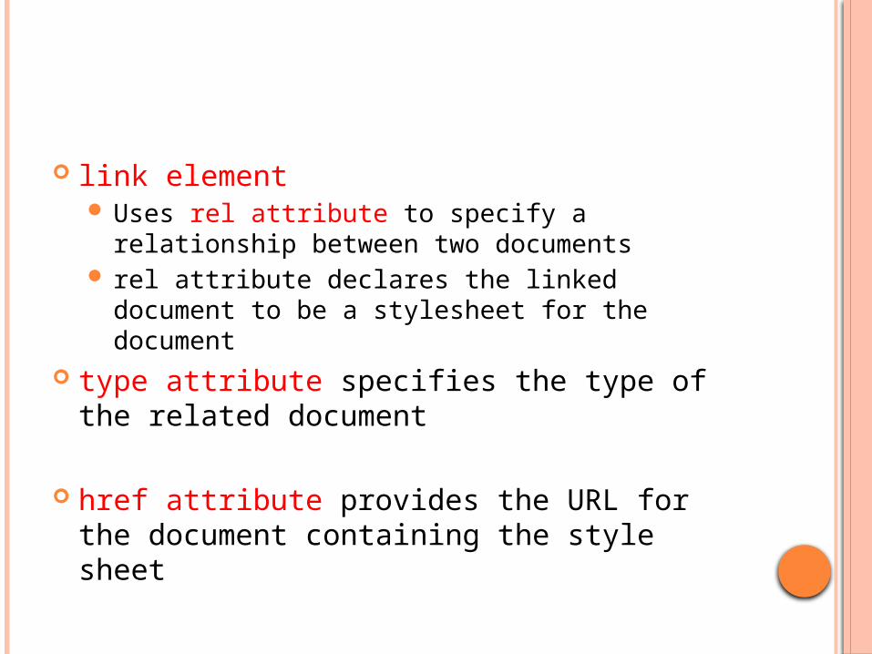
link element Uses rel attribute to specify a relationship
between two documents rel attribute declares the linked document to be
a stylesheet for the document type attribute specifies the type of the
related document
href attribute provides the URL for the document containing the style sheet
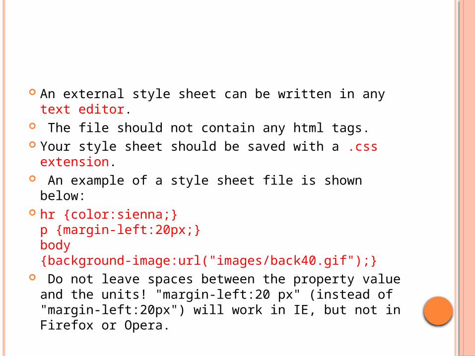
An external style sheet can be written in any text editor.
The file should not contain any html tags. Your style sheet should be saved with a .css
extension. An example of a style sheet file is shown below: hr {color:sienna;}
p {margin-left:20px;}body {background-image:url("images/back40.gif");}
Do not leave spaces between the property value and the units! "margin-left:20 px" (instead of "margin-left:20px") will work in IE, but not in Firefox or Opera.
INTERNAL STYLE SHEET
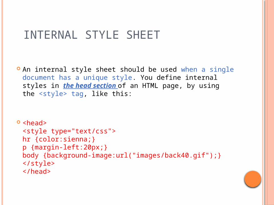
An internal style sheet should be used when a single document has a unique style. You define internal styles in the head section of an HTML page, by using the <style> tag, like this:
<head><style type="text/css">hr {color:sienna;}p {margin-left:20px;}body {background-image:url("images/back40.gif");}</style></head>
INLINE STYLES
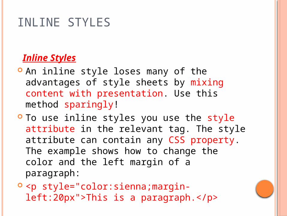
Inline Styles An inline style loses many of the advantages
of style sheets by mixing content with presentation. Use this method sparingly!
To use inline styles you use the style attribute in the relevant tag. The style attribute can contain any CSS property. The example shows how to change the color and the left margin of a paragraph:
<p style="color:sienna;margin-left:20px">This is a paragraph.</p>

1 <?xml version = "1.0" encoding = "utf-8"?>
2 <!DOCTYPE html PUBLIC "-//W3C//DTD XHTML 1.0 Strict//EN"
3 "http://www.w3.org/TR/xhtml1/DTD/xhtml1-strict.dtd">
4
5 <!-- Fig. 5.1: inline.html -->
6 <!-- Using inline styles -->
7 <html xmlns = "http://www.w3.org/1999/xhtml">
8 <head>
9 <title>Inline Styles</title>
10 </head>
11 <body>
12 <p>This text does not have any style applied to it.</p>
13
14 <!-- The style attribute allows you to declare -->
15 <!-- inline styles. Separate multiple style properties -->
16 <!-- with a semicolon. -->
17 <p style = "font-size: 20pt">This text has the
18 <em>font-size</em> style applied to it, making it 20pt.
19 </p>
20
21 <p style = "font-size: 20pt; color: #6666ff">
22 This text has the <em>font-size</em> and
23 <em>color</em> styles applied to it, making it
24 20pt. and light blue.</p>
25 </body>
26 </html>
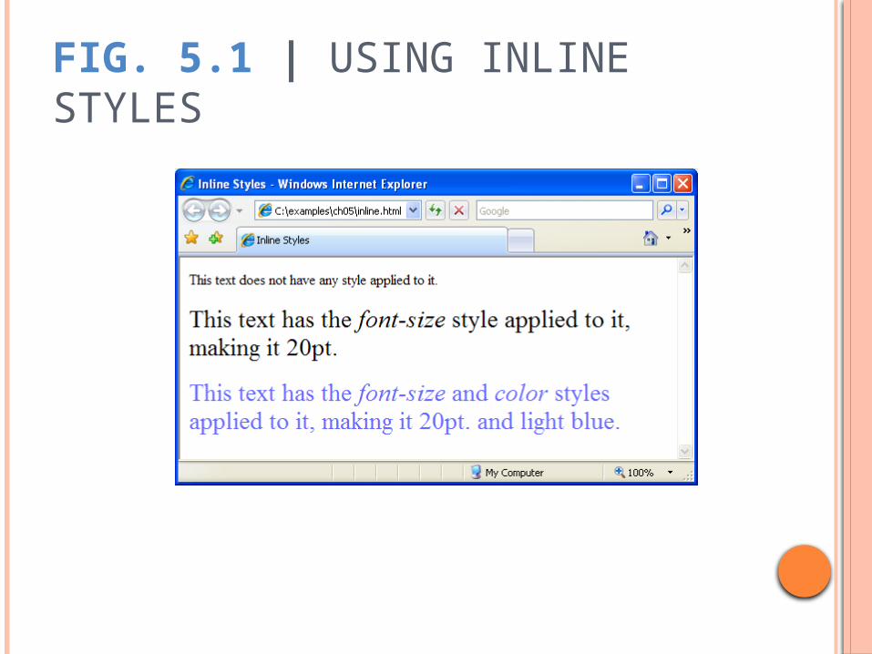
FIG. 5.1 | USING INLINE STYLES
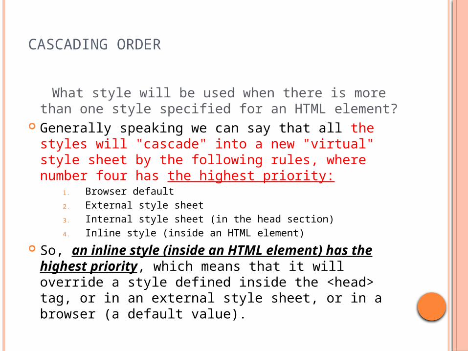
CASCADING ORDER
What style will be used when there is more than one style specified for an HTML element?
Generally speaking we can say that all the styles will "cascade" into a new "virtual" style sheet by the following rules, where number four has the highest priority:
1. Browser default2. External style sheet3. Internal style sheet (in the head section)4. Inline style (inside an HTML element)
So, an inline style (inside an HTML element) has the highest priority, which means that it will override a style defined inside the <head> tag, or in an external style sheet, or in a browser (a default value).
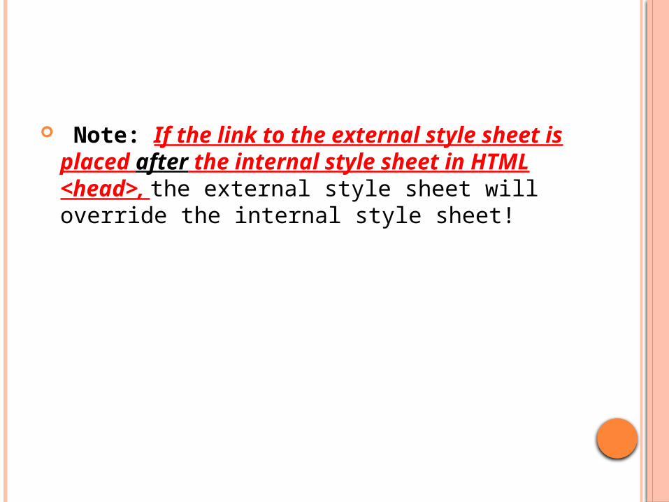
Note: If the link to the external style sheet is placed after the internal style sheet in HTML <head>, the external style sheet will override the internal style sheet!
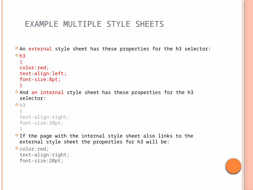
EXAMPLE MULTIPLE STYLE SHEETS
An external style sheet has these properties for the h3 selector: h3
{color:red;text-align:left;font-size:8pt;}
And an internal style sheet has these properties for the h3 selector: h3
{text-align:right;font-size:20pt;}
If the page with the internal style sheet also links to the external style sheet the properties for h3 will be:
color:red;text-align:right;font-size:20pt;
The color is inherited from the external style sheet and the text-alignment and the font-size is replaced by the internal style sheet.
CSS BACKGROUND
CSS background properties are used to define the background effects of an element.
CSS properties used for background effects: background-color background-image background-repeat background-attachment background-position
BACKGROUND COLOR
The background-color property specifies the background color of an element.
The background color of a page is defined in the body selector:
Example
body {background-color:#b0c4de;}
With CSS, a color is most often specified by: a HEX value - like "#ff0000" an RGB value - like "rgb(255,0,0)" a color name - like "red“ Example h1 {background-color:#6495ed;}
p {background-color:#e0ffff;}
BACKGROUND IMAGE
The background-image property specifies an image to use as the background of an element.
By default, the image is repeated so it covers the entire element.
Example body {background-image:url('paper.gif');}
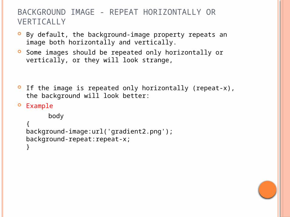
BACKGROUND IMAGE - REPEAT HORIZONTALLY OR VERTICALLY By default, the background-image property repeats an image both
horizontally and vertically. Some images should be repeated only horizontally or vertically, or
they will look strange,
If the image is repeated only horizontally (repeat-x), the background will look better:
Example
body{background-image:url('gradient2.png');background-repeat:repeat-x;}
BACKGROUND IMAGE - SET POSITION AND NO-REPEAT
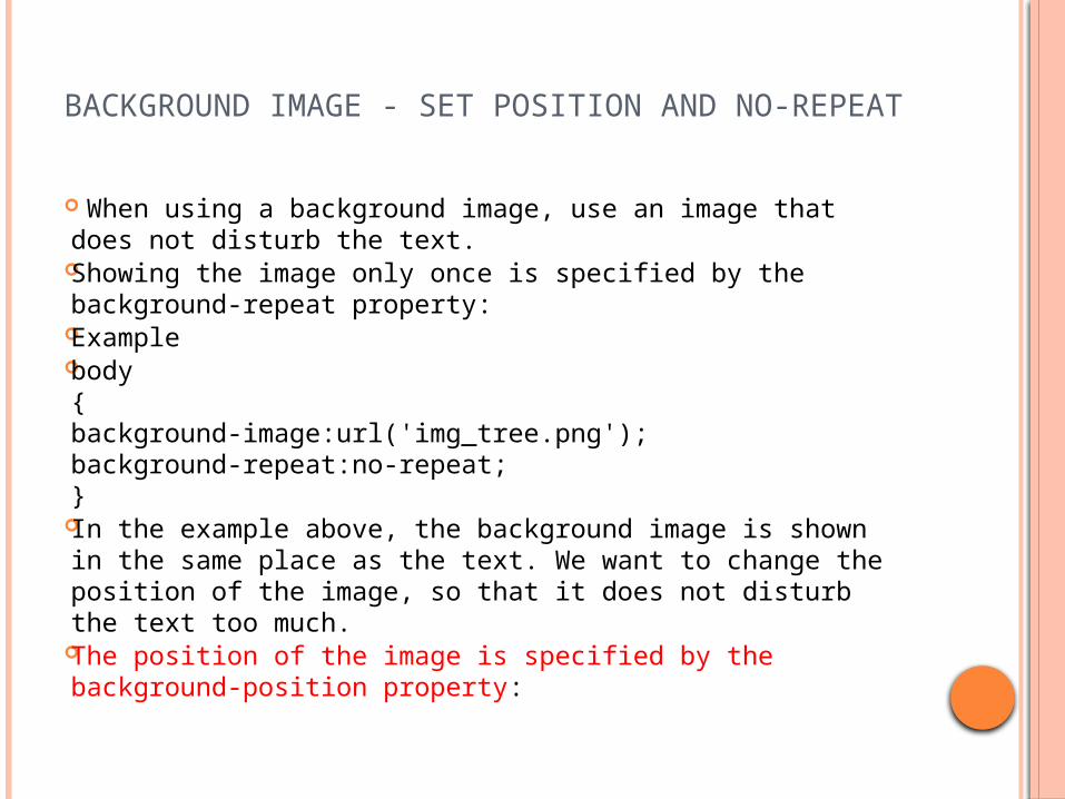
When using a background image, use an image that does not disturb the text.
Showing the image only once is specified by the background-repeat property:
Example body
{background-image:url('img_tree.png');background-repeat:no-repeat;}
In the example above, the background image is shown in the same place as the text. We want to change the position of the image, so that it does not disturb the text too much.
The position of the image is specified by the background-position property:
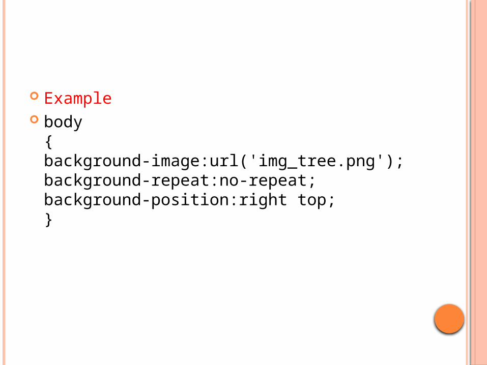
Example body
{background-image:url('img_tree.png');background-repeat:no-repeat;background-position:right top;}
CSS BACKGROUND-ATTACHMENT PROPERTY
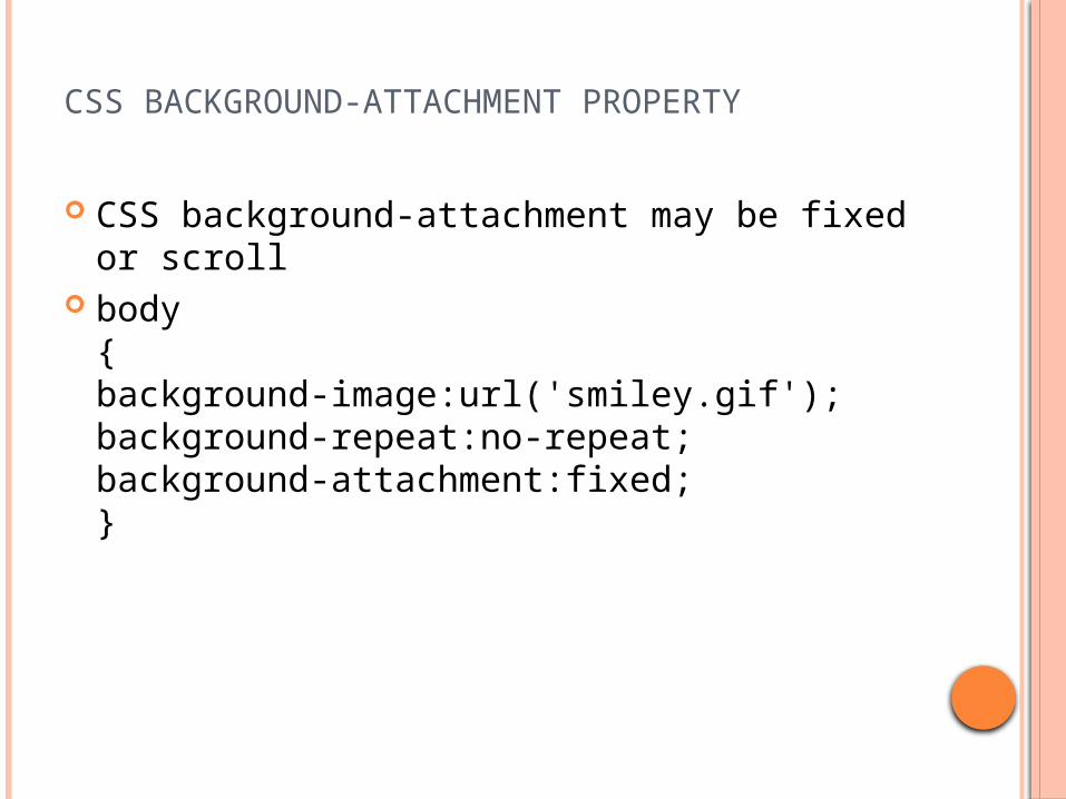
CSS background-attachment may be fixed or scroll
body{ background-image:url('smiley.gif');background-repeat:no-repeat;background-attachment:fixed;}
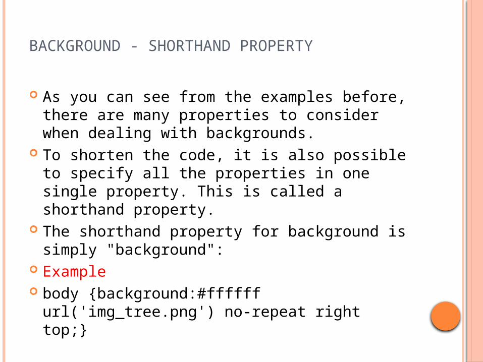
BACKGROUND - SHORTHAND PROPERTY
As you can see from the examples before, there are many properties to consider when dealing with backgrounds.
To shorten the code, it is also possible to specify all the properties in one single property. This is called a shorthand property.
The shorthand property for background is simply "background":
Example body {background:#ffffff url('img_tree.png')
no-repeat right top;}
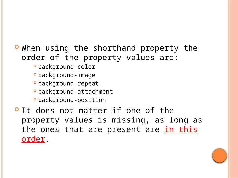
When using the shorthand property the order of the property values are:
background-color background-image background-repeat background-attachment background-position
It does not matter if one of the property values is missing, as long as the ones that are present are in this order.
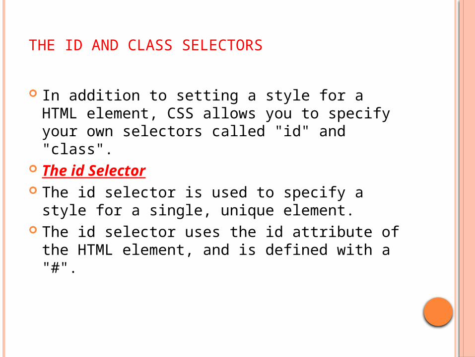
THE ID AND CLASS SELECTORS
In addition to setting a style for a HTML element, CSS allows you to specify your own selectors called "id" and "class".
The id Selector The id selector is used to specify a style for a
single, unique element. The id selector uses the id attribute of the
HTML element, and is defined with a "#".
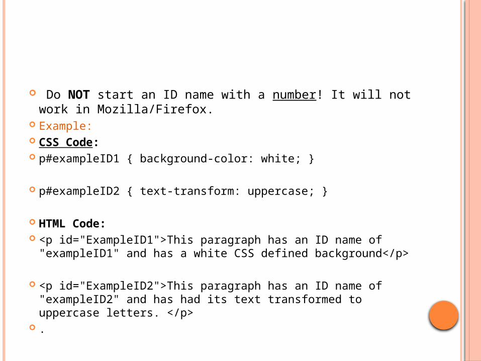
Do NOT start an ID name with a number! It will not work in Mozilla/Firefox.
Example: CSS Code: p#exampleID1 { background-color: white; }
p#exampleID2 { text-transform: uppercase; }
HTML Code: <p id="ExampleID1">This paragraph has an ID name of
"exampleID1" and has a white CSS defined background</p> <p id="ExampleID2">This paragraph has an ID name of
"exampleID2" and has had its text transformed to uppercase letters. </p>
.
Notice that an ID's CSS is an HTML element, followed by a "#", and finally ID's name. The end result looks something like "element#idname"
THE CLASS SELECTOR
The class Selector The class selector is used to specify a style for a
group of elements. Unlike the id selector, the class selector is most often used on several elements.
This allows you to set a particular style for many HTML elements with the same class.
The class selector uses the HTML class attribute, and is defined with a "."
In the example below, all HTML elements with class="center" will be center-aligned:
Example .center {text-align:center;}
You can also specify that only specific HTML elements should be affected by a class.
In the example below, all p elements with class="center" will be center-aligned:
Example p.center {text-align:center;} Do NOT start a class name with a number!
This is only supported in Internet Explorer.
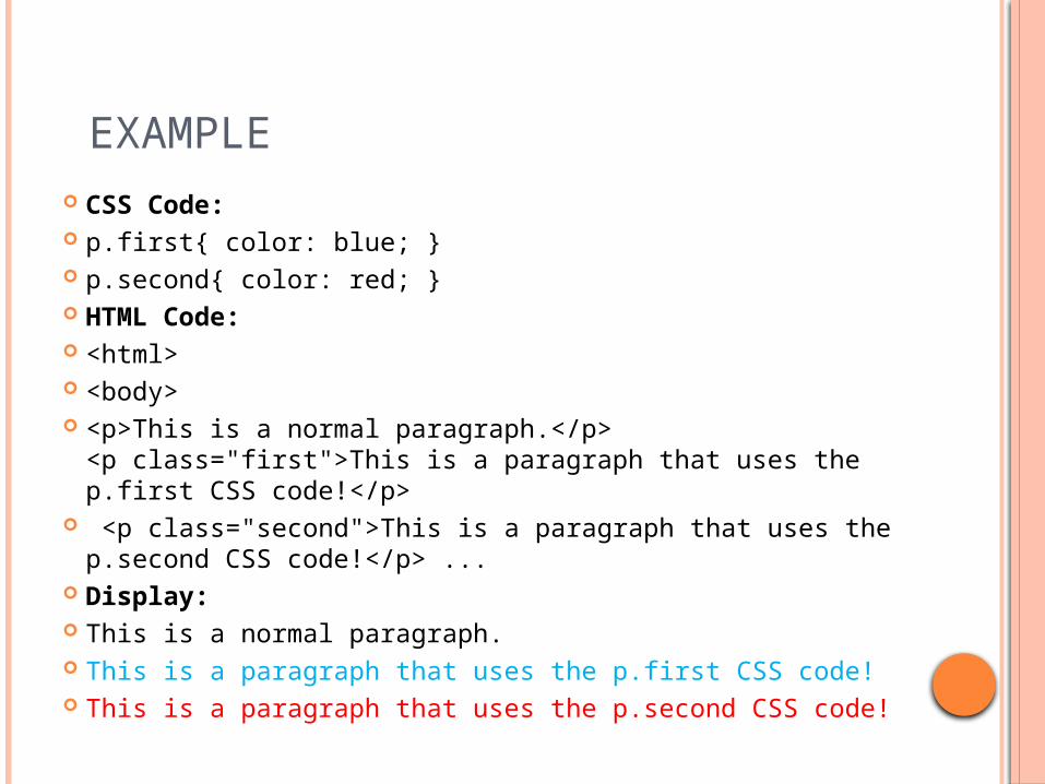
EXAMPLE CSS Code: p.first{ color: blue; } p.second{ color: red; } HTML Code: <html> <body> <p>This is a normal paragraph.</p>
<p class="first">This is a paragraph that uses the p.first CSS code!</p>
<p class="second">This is a paragraph that uses the p.second CSS code!</p> ...
Display: This is a normal paragraph. This is a paragraph that uses the p.first CSS code! This is a paragraph that uses the p.second CSS code!

CSS TEXT
Text Color The color property is used to set the color of the text. With CSS, a color is most often specified by: a HEX value - like "#ff0000" an RGB value - like "rgb(255,0,0)" a color name - like "red“ The default color for a page is defined in the body
selector. Example body {color:blue;}
h1 {color:#00ff00;}h2 {color:rgb(255,0,0);}
For W3C compliant CSS: If you define the color property, you must also define the background-color property.
Text Alignment The text-align property is used to set the
horizontal alignment of a text. Text can be centered, or aligned to the left or
right, or justified. When text-align is set to "justify", each line is
stretched so that every line has equal width, and the left and right margins are straight (like in magazines and newspapers).
Example h1 {text-align:center;}
p.date {text-align:right;}p.main {text-align:justify;}
Text Decoration The text-decoration property is used to set or remove decorations
from text. The text-decoration property is mostly used to remove underlines
from links for design purposes: Example a {text-decoration:none;}
It can also be used to decorate text: Example h1 {text-decoration:overline;}
h2 {text-decoration:line-through;}h3 {text-decoration:underline;}h4 {text-decoration:blink;}
Text Transformation The text-transform property is used to specify uppercase
and lowercase letters in a text. It can be used to turn everything into uppercase or
lowercase letters, or capitalize the first letter of each word. Example p.uppercase {text-transform:uppercase;}
p.lowercase {text-transform:lowercase;}p.capitalize {text-transform:capitalize;}
Text Indentation The text-indentation property is used to specify the
indentation of the first line of a text. Example p {text-indent:50px;}
35
5.8 ELEMENT DIMENSIONS
Dimensions of elements on a page can be set with CSS by using properties height and width Their values can be relative or absolute
36
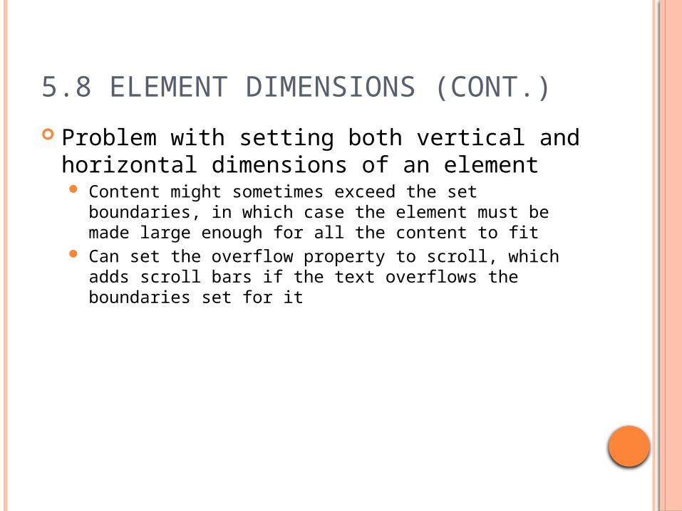
5.8 ELEMENT DIMENSIONS (CONT.)
Problem with setting both vertical and horizontal dimensions of an element Content might sometimes exceed the set boundaries, in
which case the element must be made large enough for all the content to fit
Can set the overflow property to scroll, which adds scroll bars if the text overflows the boundaries set for it
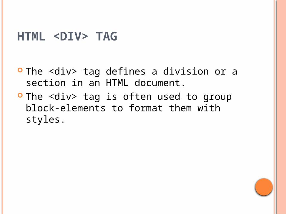
HTML <DIV> TAG
The <div> tag defines a division or a section in an HTML document.
The <div> tag is often used to group block-elements to format them with styles.
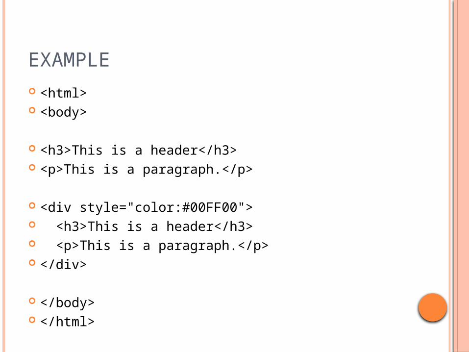
EXAMPLE <html> <body>
<h3>This is a header</h3> <p>This is a paragraph.</p>
<div style="color:#00FF00"> <h3>This is a header</h3> <p>This is a paragraph.</p> </div>
</body> </html>
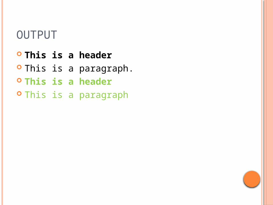
OUTPUT
This is a header This is a paragraph. This is a header This is a paragraph
CSS FONT
CSS Font Families In CSS, there are two types of font family
names: generic family - a group of font families
with a similar look (like "Serif" or "Monospace")
font family - a specific font family (like "Times New Roman" or "Arial“)
FONT FAMILY
The font family of a text is set with the font-family property.
The font-family property should hold several font names as a "fallback" system. If the browser does not support the first font, it tries the next font.
Start with the font you want, and end with a generic family, to let the browser pick a similar font in the generic family, if no other fonts are available.
Note: If the name of a font family is more than one word, it must be in quotation marks, like font-family: "Times New Roman".
Example p{font-family:"Times New Roman", Times, serif;}
FONT STYLE
The font-style property is mostly used to specify italic text.
This property has three values: normal - The text is shown normally italic - The text is shown in italics oblique - The text is "leaning" (oblique is very
similar to italic, but less supported) Example p.normal {font-style:normal;}
p.italic {font-style:italic;}p.oblique {font-style:oblique;}
FONT SIZE
The font-size property sets the size of the text. Being able to manage the text size is important in web
design. However, you should not use font size adjustments to make paragraphs look like headings, or headings look like paragraphs.
Always use the proper HTML tags, like <h1> - <h6> for headings and <p> for paragraphs.
The font-size value can be an absolute, or relative size. Absolute size: Sets the text to a specified size Does not allow a user to change the text size in all
browsers (bad for accessibility reasons) Absolute size is useful when the physical size of the
output is known
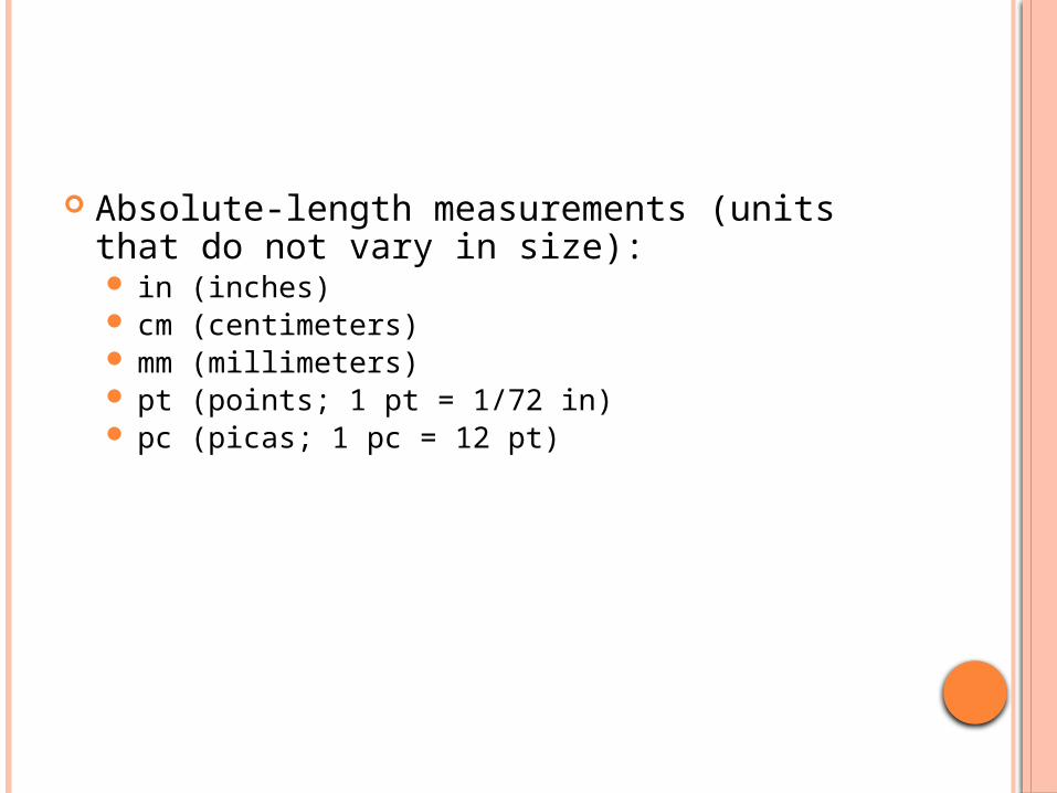
Absolute-length measurements (units that do
not vary in size): in (inches) cm (centimeters) mm (millimeters) pt (points; 1 pt = 1/72 in) pc (picas; 1 pc = 12 pt)
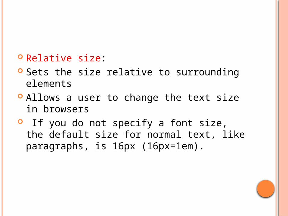
Relative size: Sets the size relative to surrounding
elements Allows a user to change the text size in
browsers If you do not specify a font size, the default
size for normal text, like paragraphs, is 16px (16px=1em).

em (usually the height of a font’s uppercase M) ex (usually the height of a font’s lowercase x) Percentages (of the font’s default size)
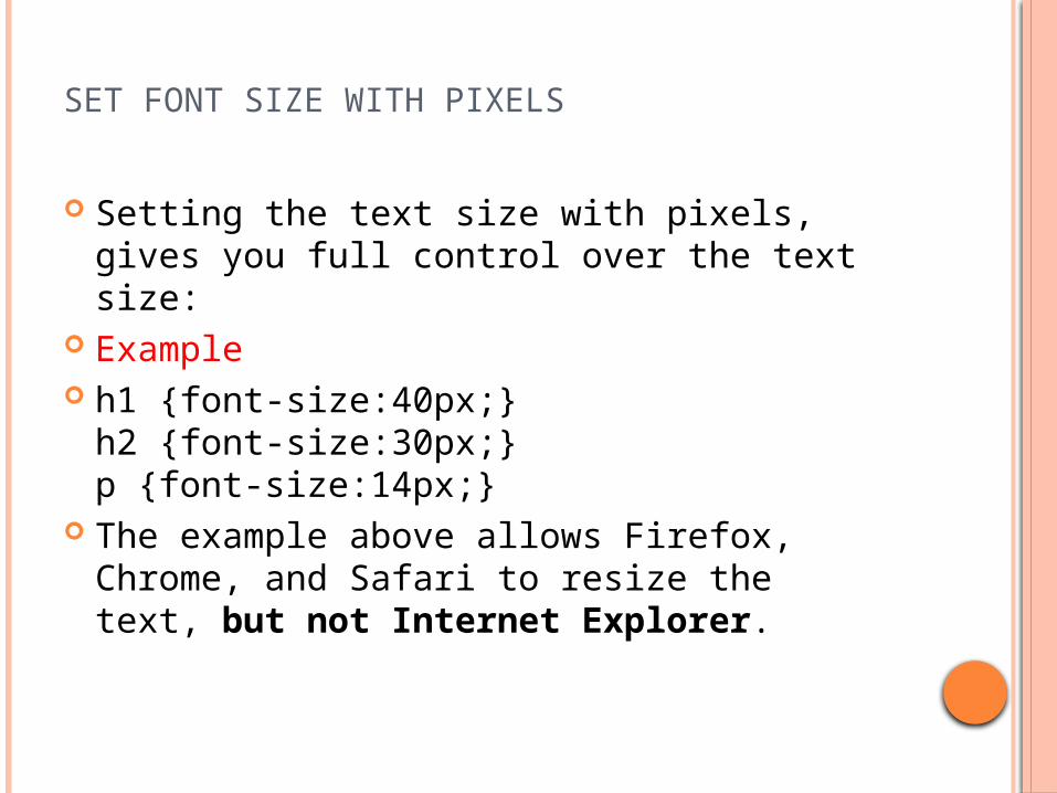
SET FONT SIZE WITH PIXELS
Setting the text size with pixels, gives you full control over the text size:
Example h1 {font-size:40px;}
h2 {font-size:30px;}p {font-size:14px;}
The example above allows Firefox, Chrome, and Safari to resize the text, but not Internet Explorer.
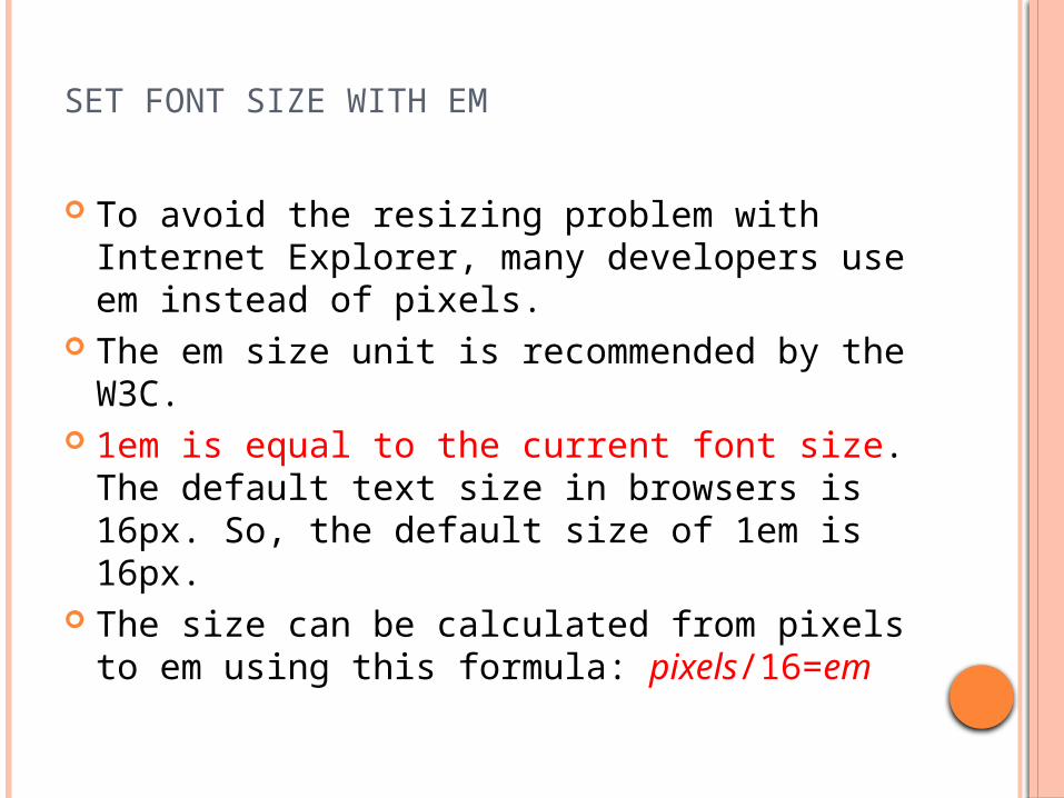
SET FONT SIZE WITH EM
To avoid the resizing problem with Internet Explorer, many developers use em instead of pixels.
The em size unit is recommended by the W3C.
1em is equal to the current font size. The default text size in browsers is 16px. So, the default size of 1em is 16px.
The size can be calculated from pixels to em using this formula: pixels/16=em

Example h1 {font-size:2.5em;} /* 40px/16=2.5em */
h2 {font-size:1.875em;} /* 30px/16=1.875em */p {font-size:0.875em;} /* 14px/16=0.875em */
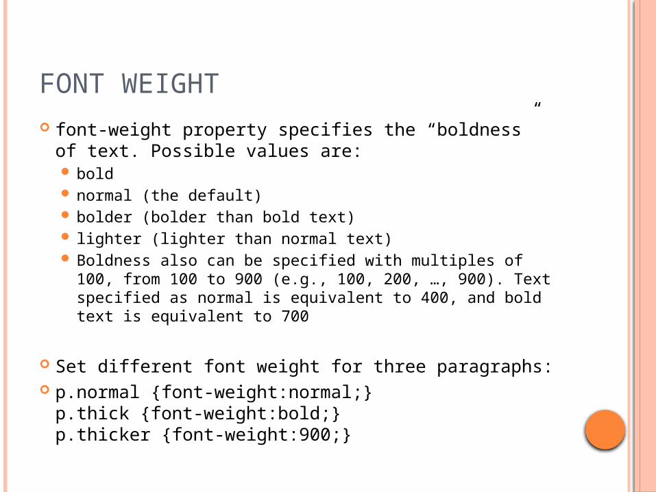
FONT WEIGHT font-weight property specifies the “boldness” of
text. Possible values are: bold normal (the default) bolder (bolder than bold text) lighter (lighter than normal text) Boldness also can be specified with multiples of 100,
from 100 to 900 (e.g., 100, 200, …, 900). Text specified as normal is equivalent to 400, and bold text is equivalent to 700
Set different font weight for three paragraphs: p.normal {font-weight:normal;}
p.thick {font-weight:bold;}p.thicker {font-weight:900;}
1 <?xml version = "1.0" encoding = "utf-8"?>
2 <!DOCTYPE html PUBLIC "-//W3C//DTD XHTML 1.0 Strict//EN"
3 "http://www.w3.org/TR/xhtml1/DTD/xhtml1-strict.dtd">
4
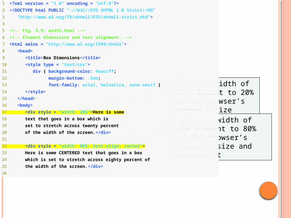
5 <!-- Fig. 5.9: width.html -->
6 <!-- Element dimensions and text alignment. -->
7 <html xmlns = "http://www.w3.org/1999/xhtml">
8 <head>
9 <title>Box Dimensions</title>
10 <style type = "text/css">
11 div { background-color: #aaccff;
12 margin-bottom: .5em;
13 font-family: arial, helvetica, sans-serif }
14 </style>
15 </head>
16 <body>
17 <div style = "width: 20%">Here is some
18 text that goes in a box which is
19 set to stretch across twenty percent
20 of the width of the screen.</div>
21
22 <div style = "width: 80%; text-align: center">
23 Here is some CENTERED text that goes in a box
24 which is set to stretch across eighty percent of
25 the width of the screen.</div>
26
Sets the width of the element to 20% of the browser’s screen’s size
Sets the width of the element to 80% of the browser’s screen’s size and centers it
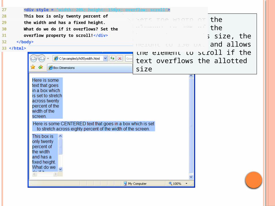
27 <div style = "width: 20%; height: 150px; overflow: scroll">
28 This box is only twenty percent of
29 the width and has a fixed height.
30 What do we do if it overflows? Set the
31 overflow property to scroll!</div>
32 </body>
33 </html>
Sets the width of the element to 20% of the browser’s screen’s size, the height to 150 px, and allows the element to scroll if the text overflows the allotted size
1 <?xml version = "1.0" encoding = "utf-8"?>
2 <!DOCTYPE html PUBLIC "-//W3C//DTD XHTML 1.0 Strict//EN"
3 "http://www.w3.org/TR/xhtml1/DTD/xhtml1-strict.dtd">
4
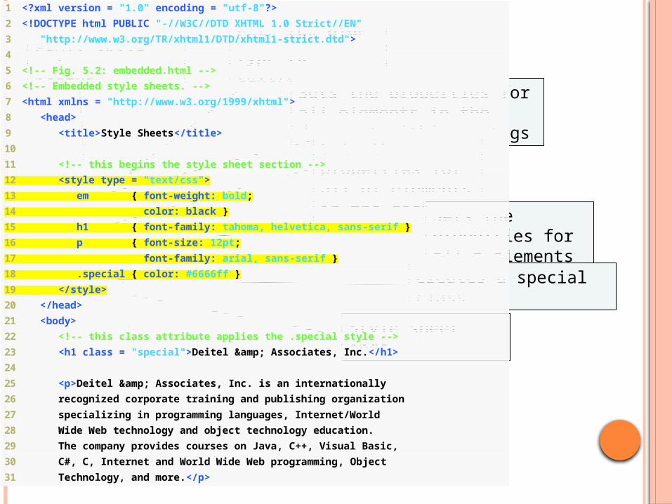
5 <!-- Fig. 5.2: embedded.html -->
6 <!-- Embedded style sheets. -->
7 <html xmlns = "http://www.w3.org/1999/xhtml">
8 <head>
9 <title>Style Sheets</title>
10
11 <!-- this begins the style sheet section -->
12 <style type = "text/css">
13 em { font-weight: bold;
14 color: black }
15 h1 { font-family: tahoma, helvetica, sans-serif }
16 p { font-size: 12pt;
17 font-family: arial, sans-serif }
18 .special { color: #6666ff }
19 </style>
20 </head>
21 <body>
22 <!-- this class attribute applies the .special style -->
23 <h1 class = "special">Deitel & Associates, Inc.</h1>
24
25 <p>Deitel & Associates, Inc. is an internationally
26 recognized corporate training and publishing organization
27 specializing in programming languages, Internet/World
28 Wide Web technology and object technology education.
29 The company provides courses on Java, C++, Visual Basic,
30 C#, C, Internet and World Wide Web programming, Object
31 Technology, and more.</p>
Sets the MIME type to text/css
Sets the properties for all elements in the document within em tags
Style sheet begins
Sets the properties for all h1 elements in the document
Sets the properties for all p elements in the document
Creates a special class
Style sheet ends
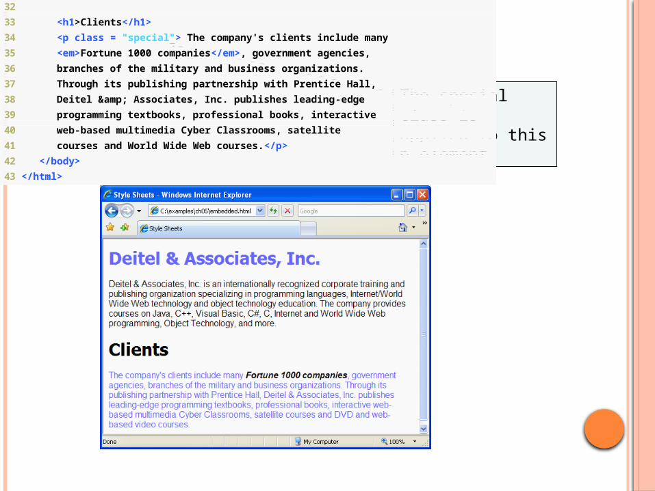
32
33 <h1>Clients</h1>
34 <p class = "special"> The company's clients include many
35 <em>Fortune 1000 companies</em>, government agencies,
36 branches of the military and business organizations.
37 Through its publishing partnership with Prentice Hall,
38 Deitel & Associates, Inc. publishes leading-edge
39 programming textbooks, professional books, interactive
40 web-based multimedia Cyber Classrooms, satellite
41 courses and World Wide Web courses.</p>
42 </body>
43 </html>
The special class is applied to this p element
PORTABILITY TIP 5.1
To ensure that your style sheets work in various web browsers, test them on all the client web browsers that will render documents using your styles, as well as using the W3C CSS Validator.
Note :MIME (Multi-purpose Internet Mail Extension)

GOOD PROGRAMMING PRACTICE 5.2
Whenever possible, use relative-length measurements. If you use absolute-length measurements, your document may not be readable on some client browsers (e.g., wireless phones).
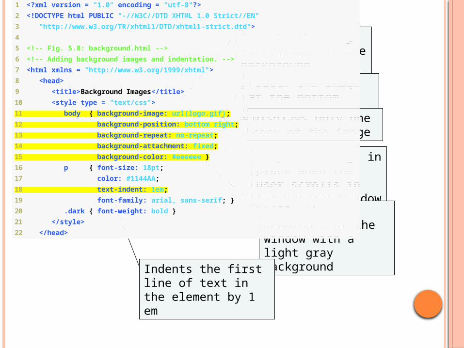
1 <?xml version = "1.0" encoding = "utf-8"?>
2 <!DOCTYPE html PUBLIC "-//W3C//DTD XHTML 1.0 Strict//EN"
3 "http://www.w3.org/TR/xhtml1/DTD/xhtml1-strict.dtd">
4
5 <!-- Fig. 5.8: background.html -->
6 <!-- Adding background images and indentation. -->
7 <html xmlns = "http://www.w3.org/1999/xhtml">
8 <head>
9 <title>Background Images</title>
10 <style type = "text/css">
11 body { background-image: url(logo.gif);
12 background-position: bottom right;
13 background-repeat: no-repeat;
14 background-attachment: fixed;
15 background-color: #eeeeee }
16 p { font-size: 18pt;
17 color: #1144AA;
18 text-indent: 1em;
19 font-family: arial, sans-serif; }
20 .dark { font-weight: bold }
21 </style>
22 </head>
Inserts the image at logo.gif as the background
Places the image at the bottom right of the page
Displays only one copy of the image
Keeps the image in place when the user scrolls in the browser window
Fills the remainder of the window with a light gray background
Indents the first line of text in the element by 1 em
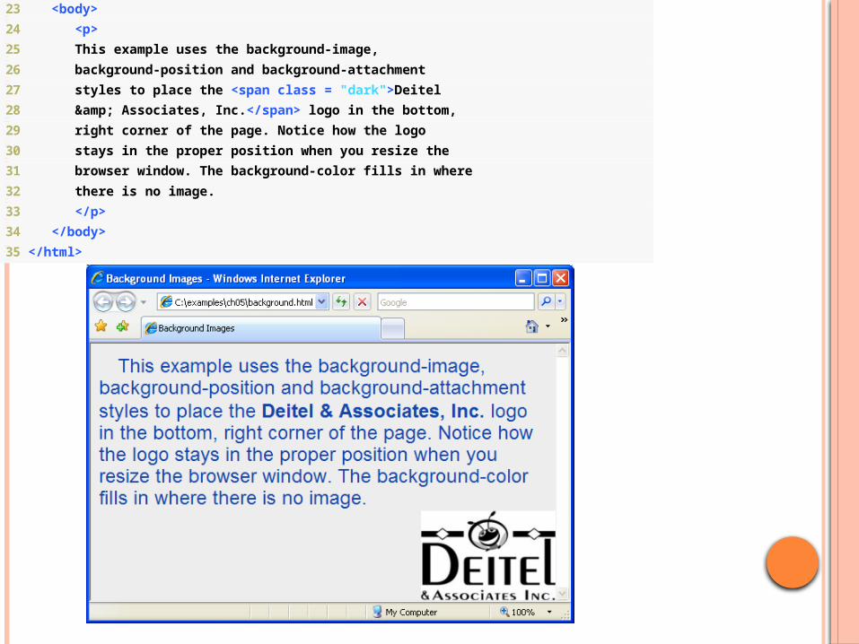
23 <body>
24 <p>
25 This example uses the background-image,
26 background-position and background-attachment
27 styles to place the <span class = "dark">Deitel
28 & Associates, Inc.</span> logo in the bottom,
29 right corner of the page. Notice how the logo
30 stays in the proper position when you resize the
31 browser window. The background-color fills in where
32 there is no image.
33 </p>
34 </body>
35 </html>
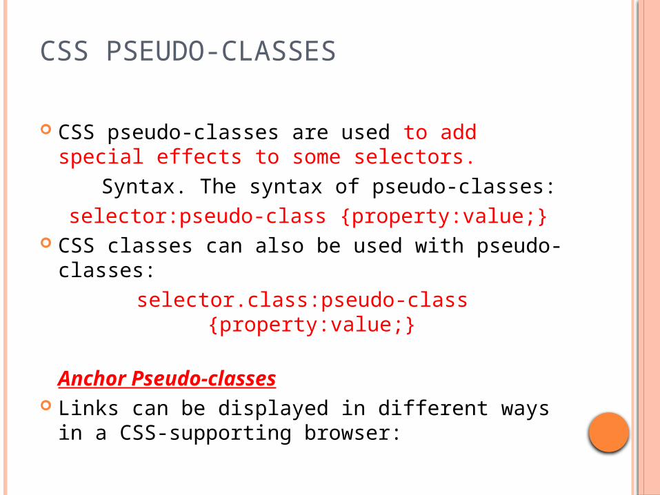
CSS PSEUDO-CLASSES
CSS pseudo-classes are used to add special effects to some selectors.
Syntax. The syntax of pseudo-classes: selector:pseudo-class {property:value;}
CSS classes can also be used with pseudo-classes:
selector.class:pseudo-class {property:value;}
Anchor Pseudo-classes Links can be displayed in different ways in a
CSS-supporting browser:
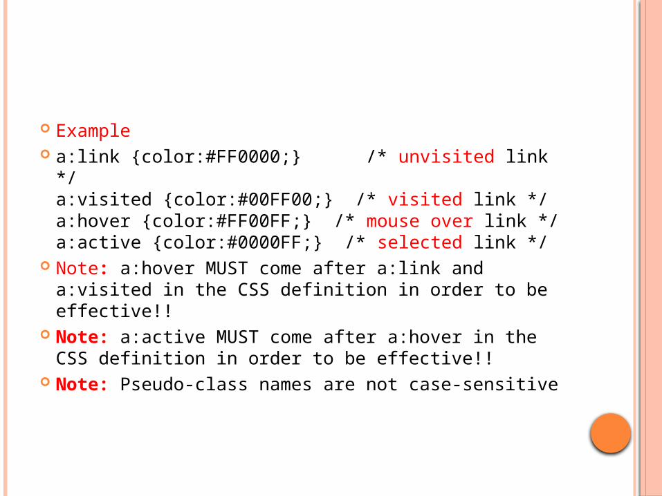
Example a:link {color:#FF0000;} /* unvisited link */
a:visited {color:#00FF00;} /* visited link */a:hover {color:#FF00FF;} /* mouse over link */a:active {color:#0000FF;} /* selected link */
Note: a:hover MUST come after a:link and a:visited in the CSS definition in order to be effective!!
Note: a:active MUST come after a:hover in the CSS definition in order to be effective!!
Note: Pseudo-class names are not case-sensitive
PSEUDO-CLASSES AND CSS CLASSES
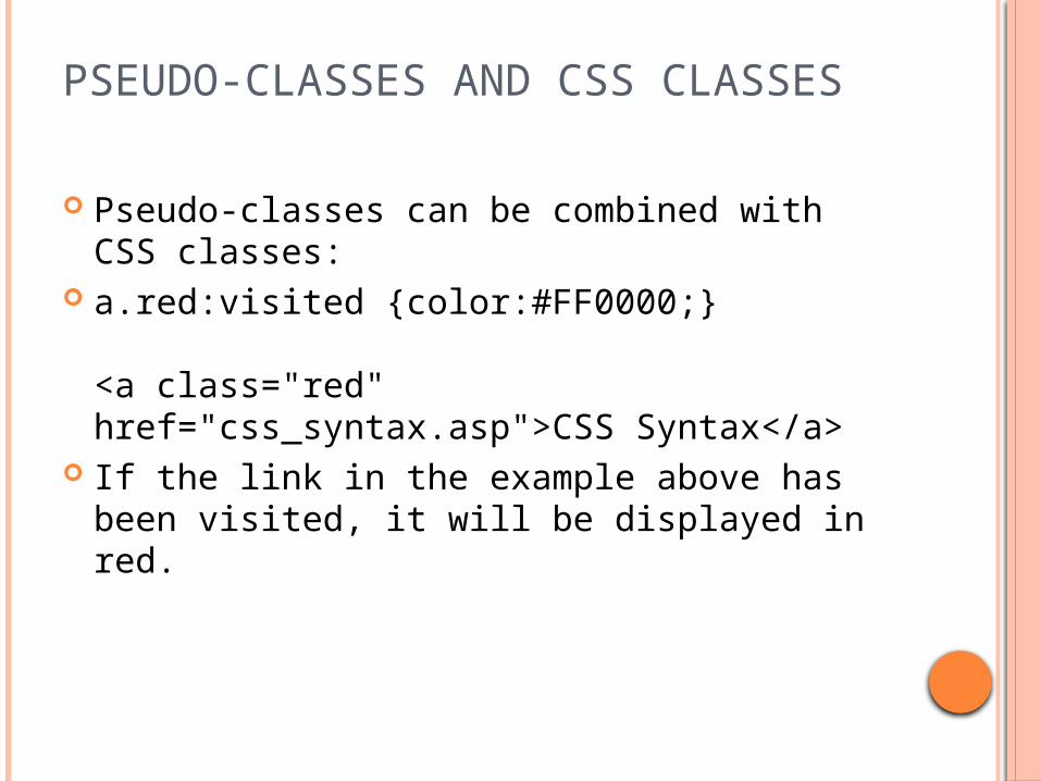
Pseudo-classes can be combined with CSS classes:
a.red:visited {color:#FF0000;}
<a class="red" href="css_syntax.asp">CSS Syntax</a>
If the link in the example above has been visited, it will be displayed in red.
NOTES:
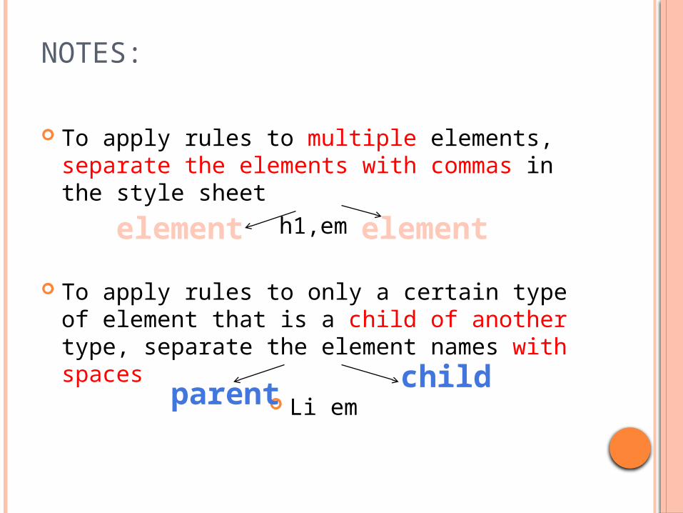
To apply rules to multiple elements, separate the elements with commas in the style sheet
h1,em
To apply rules to only a certain type of element that is a child of another type, separate the element names with spaces
Li emchildparent
element element
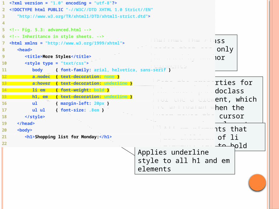
1 <?xml version = "1.0" encoding = "utf-8"?>
2 <!DOCTYPE html PUBLIC "-//W3C//DTD XHTML 1.0 Strict//EN"
3 "http://www.w3.org/TR/xhtml1/DTD/xhtml1-strict.dtd">
4
5 <!-- Fig. 5.3: advanced.html -->
6 <!-- Inheritance in style sheets. -->
7 <html xmlns = "http://www.w3.org/1999/xhtml">
8 <head>
9 <title>More Styles</title>
10 <style type = "text/css">
11 body { font-family: arial, helvetica, sans-serif }
12 a.nodec { text-decoration: none }
13 a:hover { text-decoration: underline }
14 li em { font-weight: bold }
15 h1, em { text-decoration: underline }
16 ul { margin-left: 20px }
17 ul ul { font-size: .8em }
18 </style>
19 </head>
20 <body>
21 <h1>Shopping list for Monday:</h1>
22
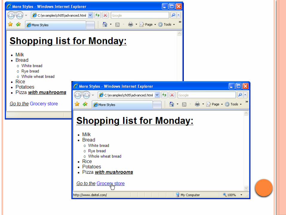
Defines the class nodec that can only be used by anchor elements
Sets the properties for the hover pseudoclass for the a element, which is activated when the user moves the cursor over an anchor element
All em elements that are children of li elements set to bold
Applies underline style to all h1 and em elements
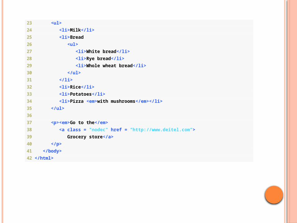
23 <ul>
24 <li>Milk</li>
25 <li>Bread
26 <ul>
27 <li>White bread</li>
28 <li>Rye bread</li>
29 <li>Whole wheat bread</li>
30 </ul>
31 </li>
32 <li>Rice</li>
33 <li>Potatoes</li>
34 <li>Pizza <em>with mushrooms</em></li>
35 </ul>
36
37 <p><em>Go to the</em>
38 <a class = "nodec" href = "http://www.deitel.com">
39 Grocery store</a>
40 </p>
41 </body>
42 </html>
66
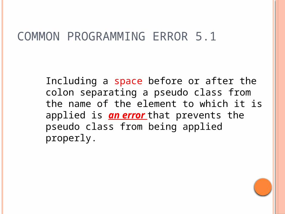
COMMON PROGRAMMING ERROR 5.1
Including a space before or after the colon separating a pseudo class from the name of the element to which it is applied is an error that prevents the pseudo class from being applied properly.

1 /* Fig. 5.4: styles.css */
2 /* External stylesheet */
3
4 body { font-family: arial, helvetica, sans-serif }
5
6 a.nodec { text-decoration: none }
7
8 a:hover { text-decoration: underline }
9
10 li em { font-weight: bold }
11
12 h1, em { text-decoration: underline }
13
14 ul { margin-left: 20px }
15
16 ul ul { font-size: .8em; }
Example
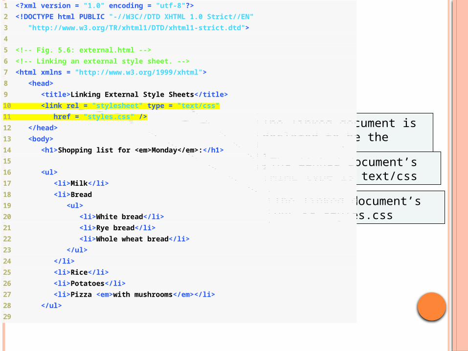
1 <?xml version = "1.0" encoding = "utf-8"?>
2 <!DOCTYPE html PUBLIC "-//W3C//DTD XHTML 1.0 Strict//EN"
3 "http://www.w3.org/TR/xhtml1/DTD/xhtml1-strict.dtd">
4
5 <!-- Fig. 5.6: external.html -->
6 <!-- Linking an external style sheet. -->
7 <html xmlns = "http://www.w3.org/1999/xhtml">
8 <head>
9 <title>Linking External Style Sheets</title>
10 <link rel = "stylesheet" type = "text/css"
11 href = "styles.css" />
12 </head>
13 <body>
14 <h1>Shopping list for <em>Monday</em>:</h1>
15
16 <ul>
17 <li>Milk</li>
18 <li>Bread
19 <ul>
20 <li>White bread</li>
21 <li>Rye bread</li>
22 <li>Whole wheat bread</li>
23 </ul>
24 </li>
25 <li>Rice</li>
26 <li>Potatoes</li>
27 <li>Pizza <em>with mushrooms</em></li>
28 </ul>
29
The linked document is declared to be the current one’s stylesheet
The linked document’s MIME type is text/css
The linked document’s URL is styles.css
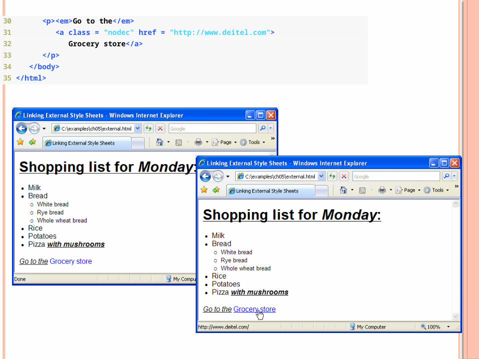
30 <p><em>Go to the</em>
31 <a class = "nodec" href = "http://www.deitel.com">
32 Grocery store</a>
33 </p>
34 </body>
35 </html>
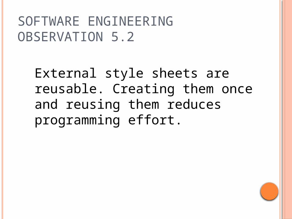
SOFTWARE ENGINEERING OBSERVATION 5.2
External style sheets are reusable. Creating them once and reusing them reduces programming effort.

PERFORMANCE TIP 5.1
Reusing external style sheets reduces load time and bandwidth usage on a server, since the style sheet can be downloaded once, stored by the web browser, and applied to all pages on a website.

POSITIONING
The CSS positioning properties allow you to position an element. It can also place an element behind another, and specify what should happen when an element's content is too big.
Elements can be positioned using the top, bottom, left, and right properties. However, these properties will not work unless the position property is set first. They also work differently depending on the positioning method.
There are four different positioning methods.
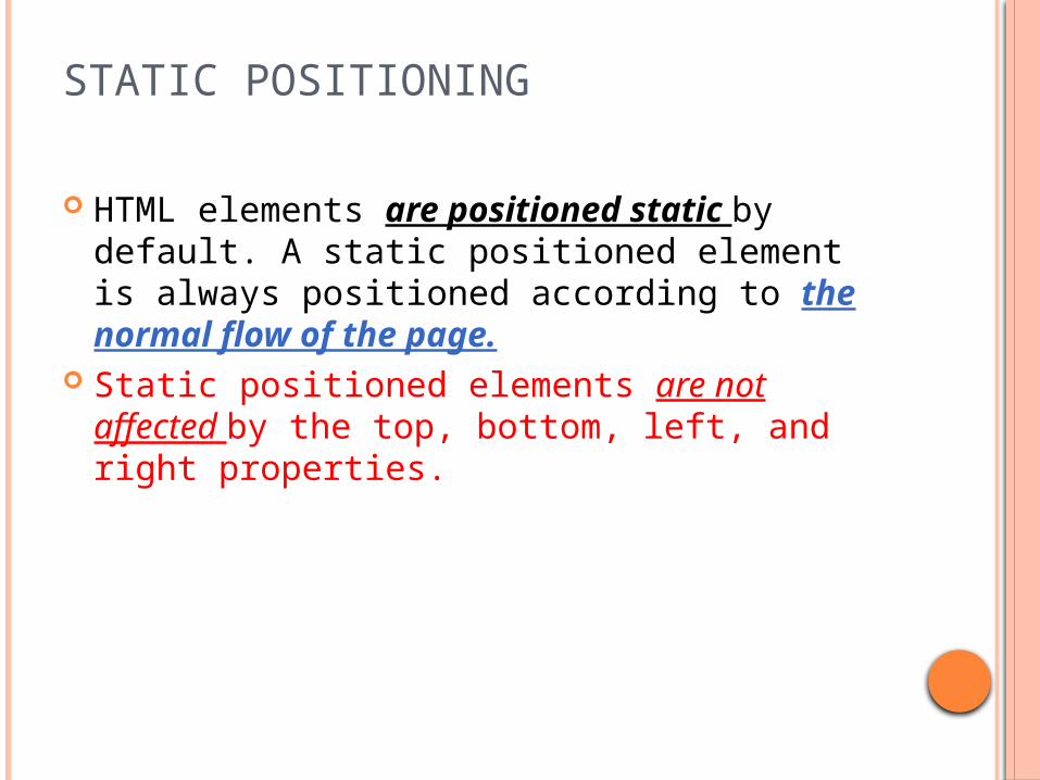
STATIC POSITIONING
HTML elements are positioned static by default. A static positioned element is always positioned according to the normal flow of the page.
Static positioned elements are not affected by the top, bottom, left, and right properties.
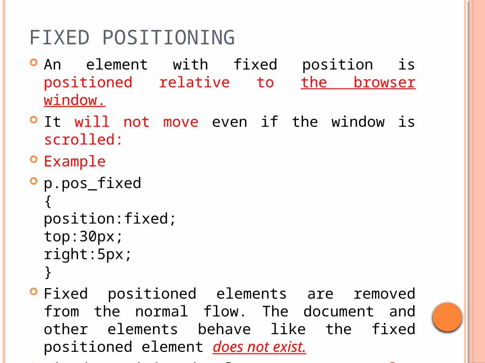
FIXED POSITIONING An element with fixed position is positioned
relative to the browser window. It will not move even if the window is scrolled: Example p.pos_fixed
{position:fixed;top:30px;right:5px;}
Fixed positioned elements are removed from the normal flow. The document and other elements behave like the fixed positioned element does not exist.
Fixed positioned elements can overlap other elements.

RELATIVE POSITIONING A relative positioned element is positioned relative to its normal
position. Example h2.pos_left
{position:relative;left:-20px;}h2.pos_right{position:relative;left:20px;}
The content of relatively positioned elements can be moved and overlap other elements, but the reserved space for the element is still preserved in the normal flow.
Example h2.pos_top
{position:relative;top:-50px;}
ABSOLUTE POSITIONING
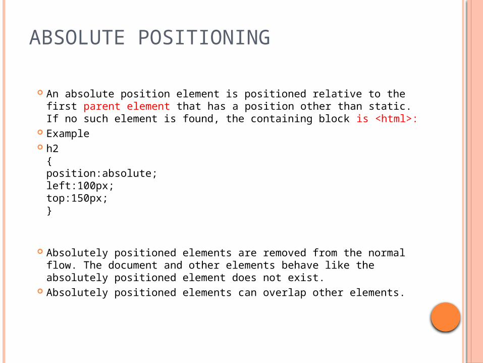
An absolute position element is positioned relative to the first parent element that has a position other than static. If no such element is found, the containing block is <html>:
Example h2
{position:absolute;left:100px;top:150px;}
Absolutely positioned elements are removed from the normal flow. The document and other elements behave like the absolutely positioned element does not exist.
Absolutely positioned elements can overlap other elements.
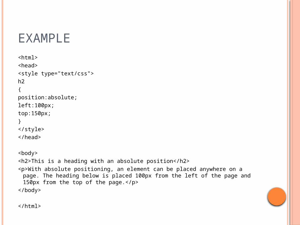
EXAMPLE <html><head><style type="text/css">h2{position:absolute;left:100px;top:150px;}</style></head>
<body><h2>This is a heading with an absolute position</h2><p>With absolute positioning, an element can be placed anywhere on a page. The
heading below is placed 100px from the left of the page and 150px from the top of the page.</p>
</body>
</html>

OUTPUT
With absolute positioning, an element can be placed anywhere on a page. The heading below is placed 100px from the left of the page and 150px from the top of the page.
This is a heading with an absolute position
OVERLAPPING ELEMENTS
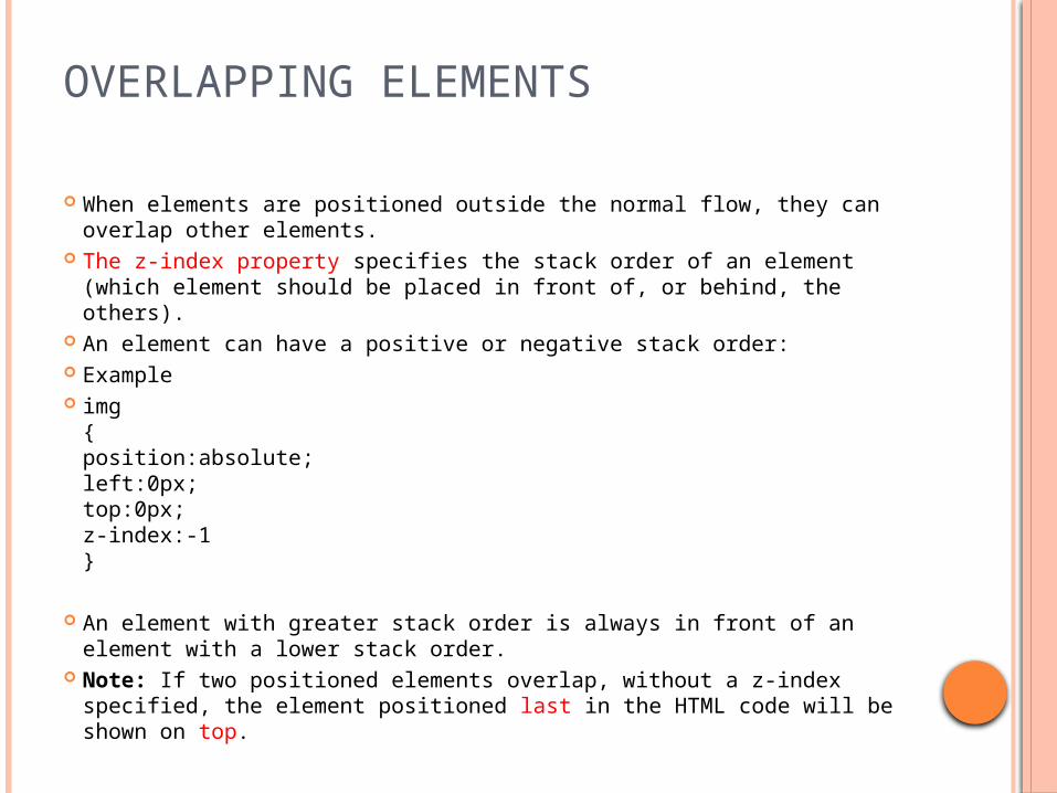
When elements are positioned outside the normal flow, they can overlap other elements.
The z-index property specifies the stack order of an element (which element should be placed in front of, or behind, the others).
An element can have a positive or negative stack order: Example img
{position:absolute;left:0px;top:0px;z-index:-1}
An element with greater stack order is always in front of an element with a lower stack order.
Note: If two positioned elements overlap, without a z-index specified, the element positioned last in the HTML code will be shown on top.
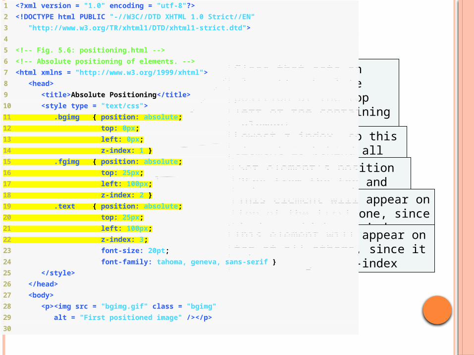
80 1 <?xml version = "1.0" encoding = "utf-8"?>
2 <!DOCTYPE html PUBLIC "-//W3C//DTD XHTML 1.0 Strict//EN"
3 "http://www.w3.org/TR/xhtml1/DTD/xhtml1-strict.dtd">
4
5 <!-- Fig. 5.6: positioning.html -->
6 <!-- Absolute positioning of elements. -->
7 <html xmlns = "http://www.w3.org/1999/xhtml">
8 <head>
9 <title>Absolute Positioning</title>
10 <style type = "text/css">
11 .bgimg { position: absolute;
12 top: 0px;
13 left: 0px;
14 z-index: 1 }
15 .fgimg { position: absolute;
16 top: 25px;
17 left: 100px;
18 z-index: 2 }
19 .text { position: absolute;
20 top: 25px;
21 left: 100px;
22 z-index: 3;
23 font-size: 20pt;
24 font-family: tahoma, geneva, sans-serif }
25 </style>
26 </head>
27 <body>
28 <p><img src = "bgimg.gif" class = "bgimg"
29 alt = "First positioned image" /></p>
30
Class that sets an element’s absolute position at the top left of the containing element
Lowest z-index, so this element is behind all the others
Set element’s position 25px from the top and 100 from the left
This element will appear on top of the first one, since it has a higher z-index
This element will appear on top of all others, since it has the highest z-index
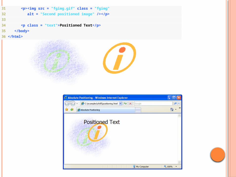
31 <p><img src = "fgimg.gif" class = "fgimg"
32 alt = "Second positioned image" /></p>
33
34 <p class = "text">Positioned Text</p>
35 </body>
36 </html>
CSS DISPLAY AND VISIBILITY
Hiding an Element - display:none or visibility:hidden Hiding an element can be done by setting the display property to
"none" or the visibility property to "hidden". However, notice that these two methods produce different results:
visibility:hidden hides an element, but it will still take up the same space as before. The element will be hidden, but still affect the layout.
Example h1.hidden {visibility:hidden;}
display:none hides an element, and it will not take up any space. The element will be hidden, and the page will be displayed as the element is not there:
Example h1.hidden {display:none;}
CSS DISPLAY - BLOCK AND INLINE ELEMENTS
A block element is an element that takes up the full width available, and has a line break before and after it. Have virtual boxes around them
Examples of block elements: all headings (h1 through h6) <p> <div> An inline element only takes up as much width
as necessary, and does not force line breaks. Examples of inline elements: <span> <a>
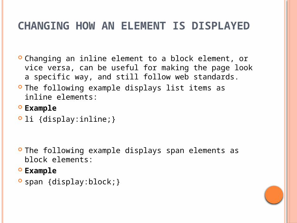
CHANGING HOW AN ELEMENT IS DISPLAYED
Changing an inline element to a block element, or vice versa, can be useful for making the page look a specific way, and still follow web standards.
The following example displays list items as inline elements:
Example li {display:inline;}
The following example displays span elements as block elements:
Example span {display:block;}
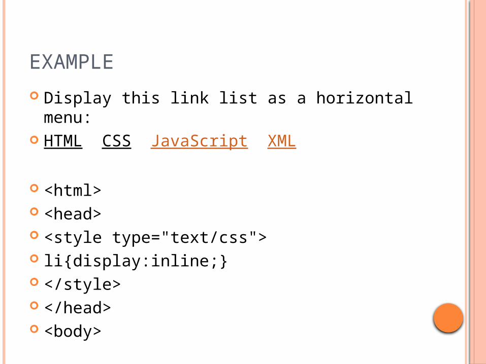
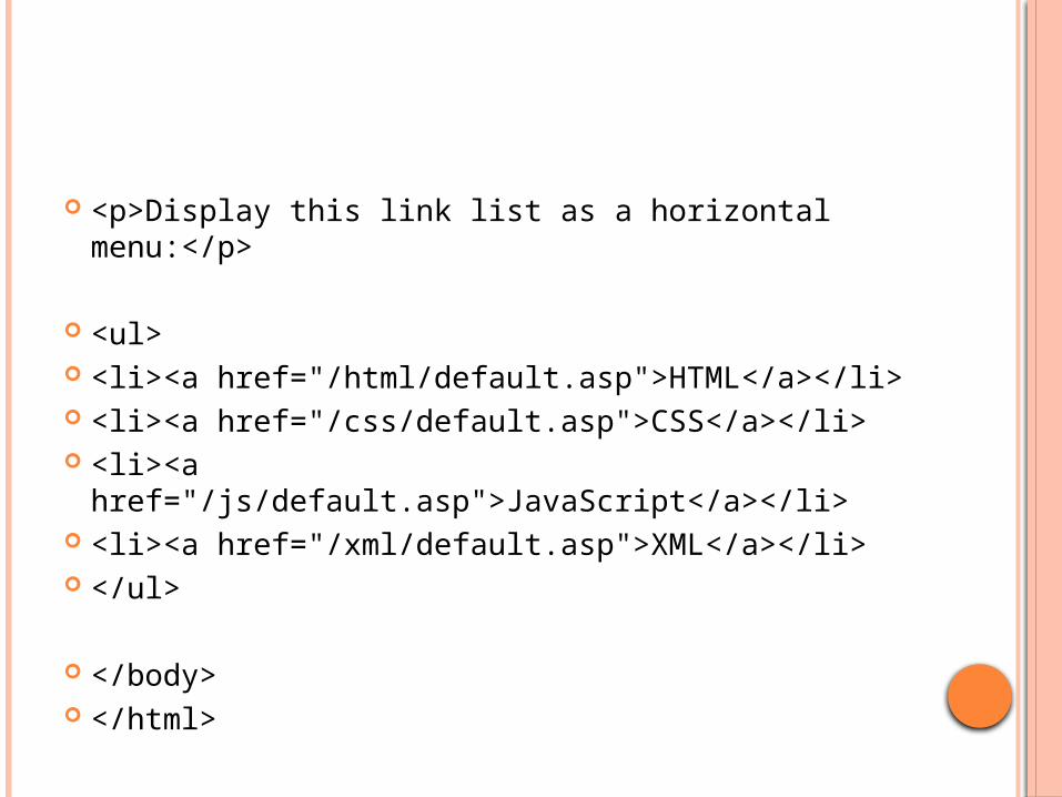
EXAMPLE
Display this link list as a horizontal menu: HTML CSS JavaScript XML
<html> <head> <style type="text/css"> li{display:inline;} </style> </head> <body>
<p>Display this link list as a horizontal menu:</p>
<ul> <li><a href="/html/default.asp">HTML</a></li> <li><a href="/css/default.asp">CSS</a></li> <li><a href="/js/default.asp">JavaScript</a></li> <li><a href="/xml/default.asp">XML</a></li> </ul>
</body> </html>

HTML <SPAN> TAG
The <span> tag is used to group inline-elements in a document.
The <span> tag provides no visual change by itself.

EXAMPLE (IN LINE ELEMENT) <html> <head> <style type="text/css"> span.blue {color:lightskyblue;font-weight:bold} span.green {color:darkolivegreen;font-weight:bold} </style> </head> <body> <p>My mother has <span class="blue">light
blue</span> eyes and my father has <span class="green">dark green</span> eyes.</p>
</body> </html>
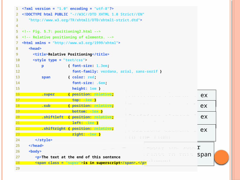
1 <?xml version = "1.0" encoding = "utf-8"?>
2 <!DOCTYPE html PUBLIC "-//W3C//DTD XHTML 1.0 Strict//EN"
3 "http://www.w3.org/TR/xhtml1/DTD/xhtml1-strict.dtd">
4
5 <!-- Fig. 5.7: positioning2.html -->
6 <!-- Relative positioning of elements. -->
7 <html xmlns = "http://www.w3.org/1999/xhtml">
8 <head>
9 <title>Relative Positioning</title>
10 <style type = "text/css">
11 p { font-size: 1.3em;
12 font-family: verdana, arial, sans-serif }
13 span { color: red;
14 font-size: .6em;
15 height: 1em }
16 .super { position: relative;
17 top: -1ex }
18 .sub { position: relative;
19 bottom: -1ex }
20 .shiftleft { position: relative;
21 left: -1ex }
22 .shiftright { position: relative;
23 right: -1ex }
24 </style>
25 </head>
26 <body>
27 <p>The text at the end of this sentence
28 <span class = "super">is in superscript</span>.</p>
29
Positions element 1 ex upwards
Positions element 1 ex downwards
Positions element 1 ex to the left
Positions element 1 ex to the right
Apply the super class to this span element

30 <p>The text at the end of this sentence
31 <span class = "sub">is in subscript</span>.</p>
32
33 <p>The text at the end of this sentence
34 <span class = "shiftleft">is shifted left</span>.</p>
35
36 <p>The text at the end of this sentence
37 <span class = "shiftright">is shifted right</span>.</p>
38 </body>
39 </html>
Apply the sub class to this span element
Apply the shiftleft class to this span element
Apply the shiftright class to this span element
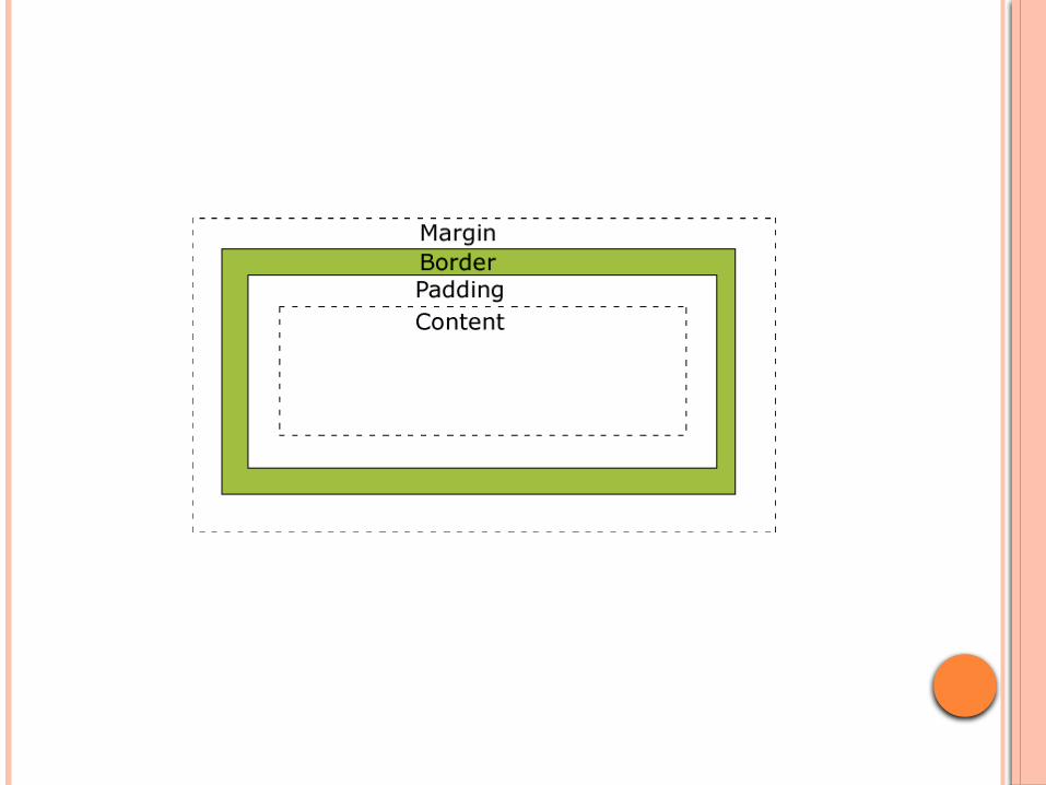
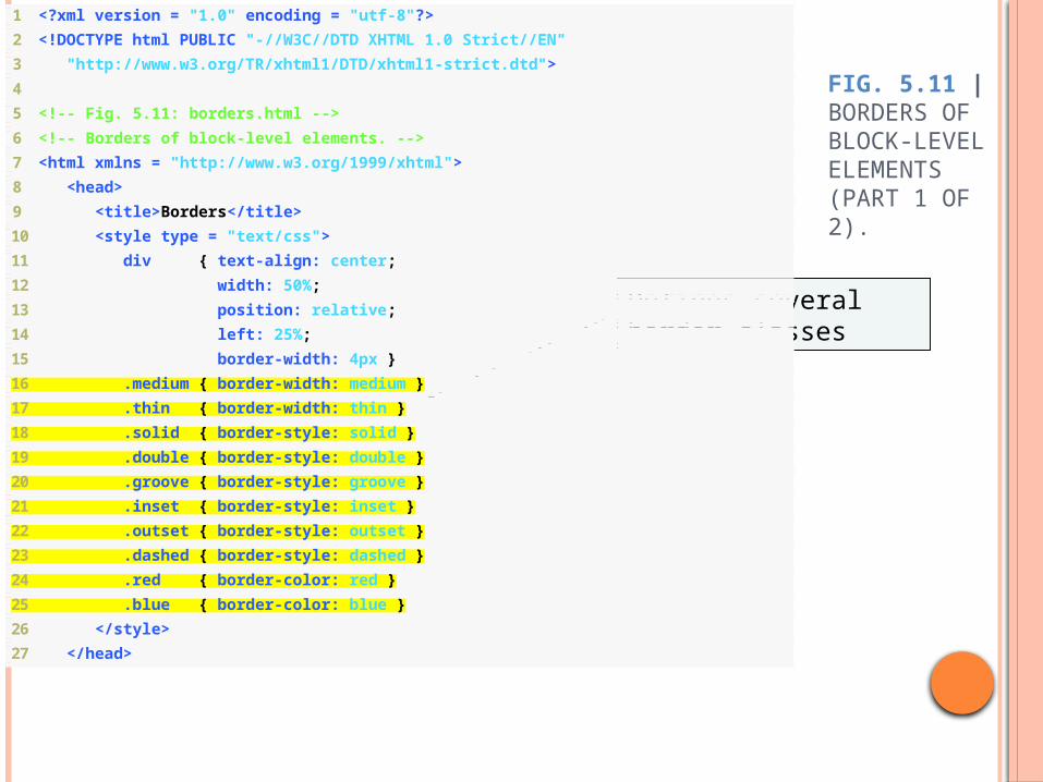
THE CSS BOX MODEL
All HTML elements can be considered as boxes. In CSS, the term "box model" is used when talking about design and layout.
The CSS box model is essentially a box that wraps around HTML elements, and it consists of: margins, borders, padding, and the actual content.
The box model allows us to place a border around elements and space elements in relation to other elements.
The image below illustrates the box model:.
Block-level XHTML elements have a virtual box drawn around them based on the box model
When the browser renders using the box model, each element is surrounded by: Padding
The padding property determines the distance between the content inside an element and the edge of the element
Padding be set for each side of the box by using padding-top, padding-right, padding-left and padding-bottom
Margin Determines the distance between the element’s edge and any
outside text Margins for individual sides of an element can be specified by
using margin-top, margin-right, margin-left and margin-bottom
Border The border is controlled using the properties:
border-width May be set to any of the CSS lengths or to the
predefined value of thin, medium or thick border-color
Sets the color used for the border border-style
Options are: none, hidden, dotted, dashed, solid, double, groove, ridge, inset and outset
95
FIG. 5.11 | BORDERS OF BLOCK-LEVEL ELEMENTS (PART 1 OF 2).
1 <?xml version = "1.0" encoding = "utf-8"?>
2 <!DOCTYPE html PUBLIC "-//W3C//DTD XHTML 1.0 Strict//EN"
3 "http://www.w3.org/TR/xhtml1/DTD/xhtml1-strict.dtd">
4
5 <!-- Fig. 5.11: borders.html -->
6 <!-- Borders of block-level elements. -->
7 <html xmlns = "http://www.w3.org/1999/xhtml">
8 <head>
9 <title>Borders</title>
10 <style type = "text/css">
11 div { text-align: center;
12 width: 50%;
13 position: relative;
14 left: 25%;
15 border-width: 4px }
16 .medium { border-width: medium }
17 .thin { border-width: thin }
18 .solid { border-style: solid }
19 .double { border-style: double }
20 .groove { border-style: groove }
21 .inset { border-style: inset }
22 .outset { border-style: outset }
23 .dashed { border-style: dashed }
24 .red { border-color: red }
25 .blue { border-color: blue }
26 </style>
27 </head>
Defines several border classes
96
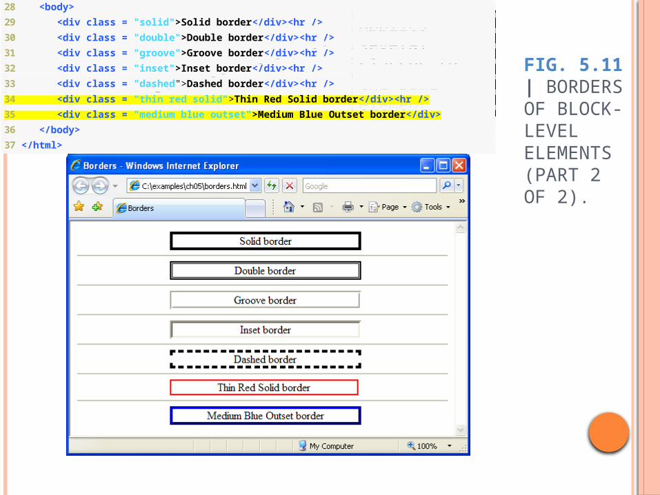
FIG. 5.11 | BORDERS OF BLOCK-LEVEL ELEMENTS (PART 2 OF 2).
28 <body>
29 <div class = "solid">Solid border</div><hr />
30 <div class = "double">Double border</div><hr />
31 <div class = "groove">Groove border</div><hr />
32 <div class = "inset">Inset border</div><hr />
33 <div class = "dashed">Dashed border</div><hr />
34 <div class = "thin red solid">Thin Red Solid border</div><hr />
35 <div class = "medium blue outset">Medium Blue Outset border</div>
36 </body>
37 </html>
Applies several classes to the same element
97
5.9 BOX MODEL AND TEXT FLOW (CONT.)
Browsers normally place text and elements on screen in the order in which they appear in the XHTML file.
Elements can be removed from the normal flow of text.
Floating allows you to move an element to one side of the screen; other content in the document will then flow around the floated element
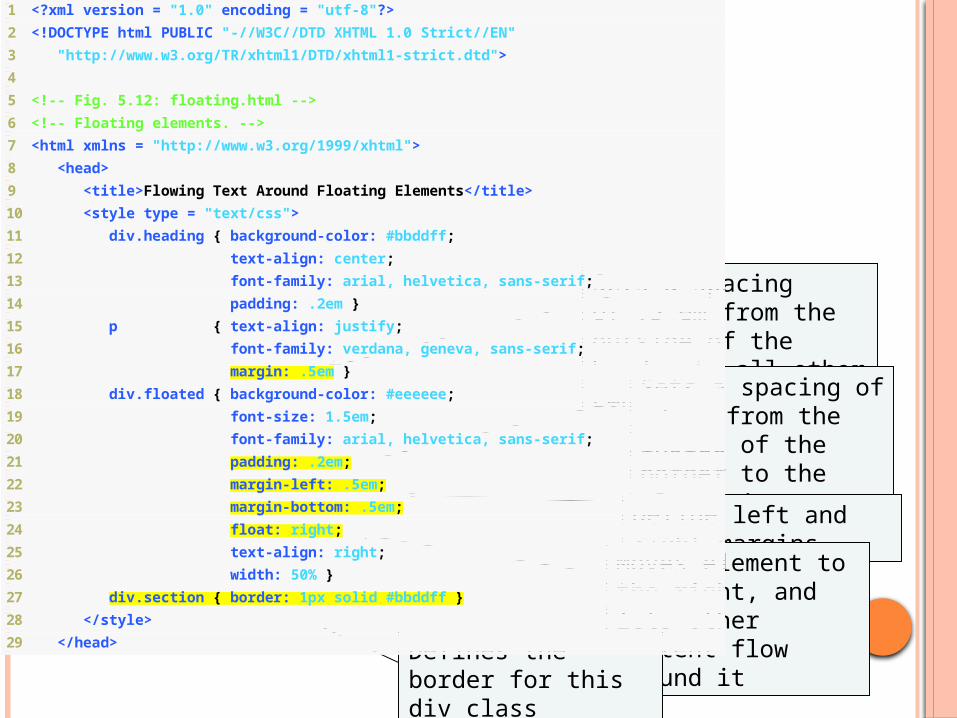
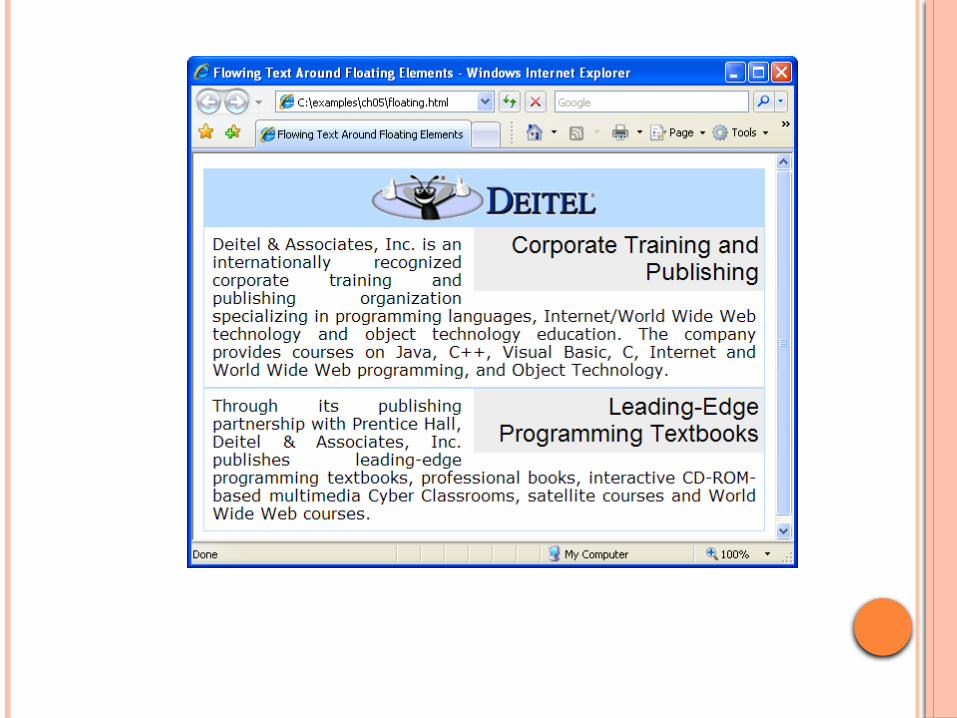
1 <?xml version = "1.0" encoding = "utf-8"?>
2 <!DOCTYPE html PUBLIC "-//W3C//DTD XHTML 1.0 Strict//EN"
3 "http://www.w3.org/TR/xhtml1/DTD/xhtml1-strict.dtd">
4
5 <!-- Fig. 5.12: floating.html -->
6 <!-- Floating elements. -->
7 <html xmlns = "http://www.w3.org/1999/xhtml">
8 <head>
9 <title>Flowing Text Around Floating Elements</title>
10 <style type = "text/css">
11 div.heading { background-color: #bbddff;
12 text-align: center;
13 font-family: arial, helvetica, sans-serif;
14 padding: .2em }
15 p { text-align: justify;
16 font-family: verdana, geneva, sans-serif;
17 margin: .5em }
18 div.floated { background-color: #eeeeee;
19 font-size: 1.5em;
20 font-family: arial, helvetica, sans-serif;
21 padding: .2em;
22 margin-left: .5em;
23 margin-bottom: .5em;
24 float: right;
25 text-align: right;
26 width: 50% }
27 div.section { border: 1px solid #bbddff }
28 </style>
29 </head>
Sets a spacing of .5 em from the outside of the border to all other content
Sets a spacing of .2 em from the inside of the border to the element’s content
Define left and right margins
Moves element to the right, and lets other content flow around it
Defines the border for this div class
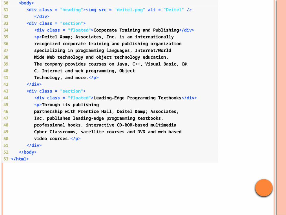
30 <body>
31 <div class = "heading"><img src = "deitel.png" alt = "Deitel" />
32 </div>
33 <div class = "section">
34 <div class = "floated">Corporate Training and Publishing</div>
35 <p>Deitel & Associates, Inc. is an internationally
36 recognized corporate training and publishing organization
37 specializing in programming languages, Internet/World
38 Wide Web technology and object technology education.
39 The company provides courses on Java, C++, Visual Basic, C#,
40 C, Internet and web programming, Object
41 Technology, and more.</p>
42 </div>
43 <div class = "section">
44 <div class = "floated">Leading-Edge Programming Textbooks</div>
45 <p>Through its publishing
46 partnership with Prentice Hall, Deitel & Associates,
47 Inc. publishes leading-edge programming textbooks,
48 professional books, interactive CD-ROM-based multimedia
49 Cyber Classrooms, satellite courses and DVD and web-based
50 video courses.</p>
51 </div>
52 </body>
53 </html>
101
5.10 MEDIA TYPES
CSS media types allow a programmer to decide what a page
should look like depending on the kind of media being used to display the page
Most common media type for a web page is the screen media type, which is a standard computer screen
102
5.10 MEDIA TYPES (CONT.)
A block of styles that applies to all media types is declared by @media all and enclosed in curly braces
To create a block of styles that apply to a single media type such as print, use @media print and enclose the style rules in curly braces

103
5.10 MEDIA TYPES (CONT.)
Other media types in CSS 2 include: handheld
Designed for mobile Internet devices braille
For machines that can read or print web pages in braille
aural Allow the programmer to give a speech-synthesizing
web browser more information about the content of the web page
print Affects a web page’s appearance when it is printed
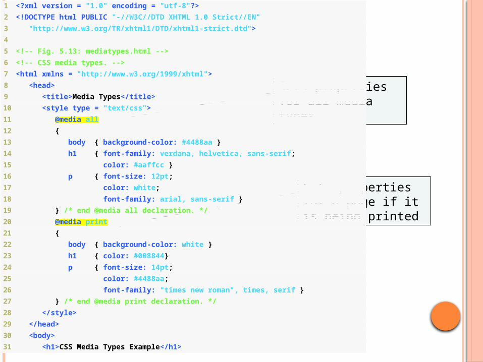
1 <?xml version = "1.0" encoding = "utf-8"?>
2 <!DOCTYPE html PUBLIC "-//W3C//DTD XHTML 1.0 Strict//EN"
3 "http://www.w3.org/TR/xhtml1/DTD/xhtml1-strict.dtd">
4
5 <!-- Fig. 5.13: mediatypes.html -->
6 <!-- CSS media types. -->
7 <html xmlns = "http://www.w3.org/1999/xhtml">
8 <head>
9 <title>Media Types</title>
10 <style type = "text/css">
11 @media all
12 {
13 body { background-color: #4488aa }
14 h1 { font-family: verdana, helvetica, sans-serif;
15 color: #aaffcc }
16 p { font-size: 12pt;
17 color: white;
18 font-family: arial, sans-serif }
19 } /* end @media all declaration. */
20 @media print
21 {
22 body { background-color: white }
23 h1 { color: #008844}
24 p { font-size: 14pt;
25 color: #4488aa;
26 font-family: "times new roman", times, serif }
27 } /* end @media print declaration. */
28 </style>
29 </head>
30 <body>
31 <h1>CSS Media Types Example</h1>
Sets properties for all media types
Sets properties for a page if it is being printed

32
33 <p>
34 This example uses CSS media types to vary how the page
35 appears in print and how it appears on any other media.
36 This text will appear one font on the screen and a
37 different font on paper or in a print preview. To see
38 the difference in Internet Explorer, go to the Print
39 menu and select Print Preview. In Firefox, select Print
40 Preview from the File menu.
41 </p>
42 </body>
43 </html>
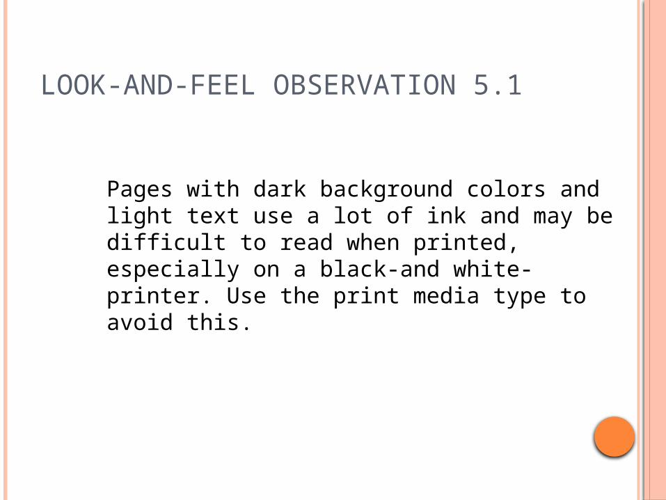
LOOK-AND-FEEL OBSERVATION 5.1
Pages with dark background colors and light text use a lot of ink and may be difficult to read when printed, especially on a black-and white-printer. Use the print media type to avoid this.
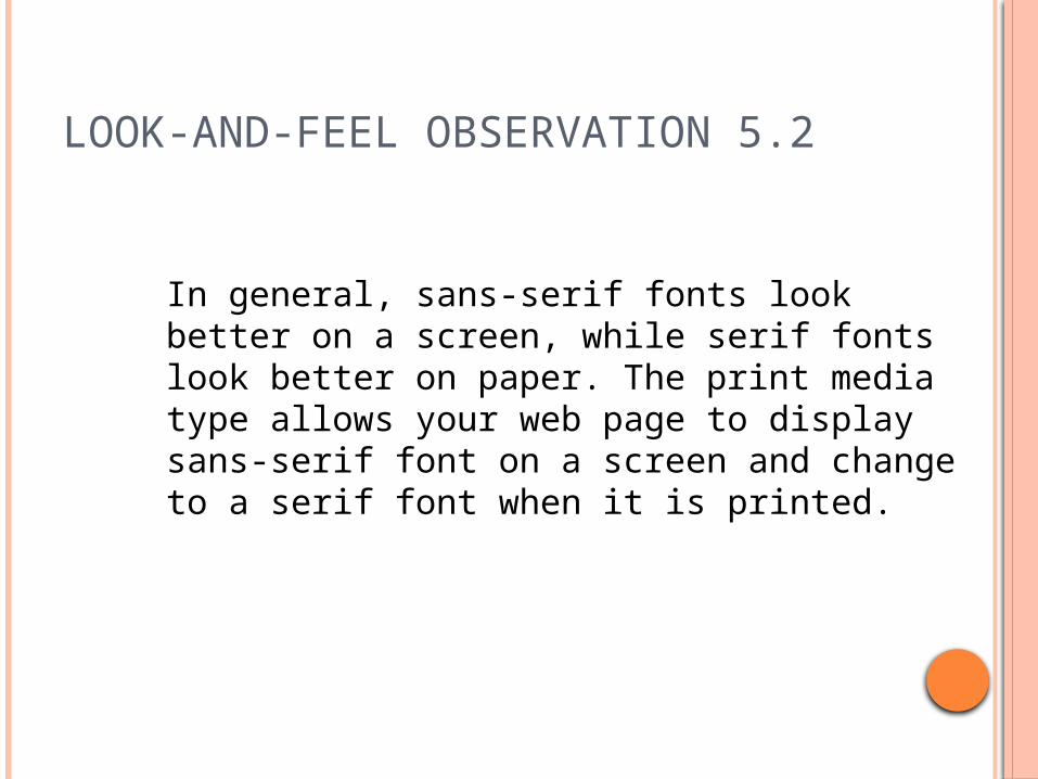
LOOK-AND-FEEL OBSERVATION 5.2
In general, sans-serif fonts look better on a screen, while serif fonts look better on paper. The print media type allows your web page to display sans-serif font on a screen and change to a serif font when it is printed.
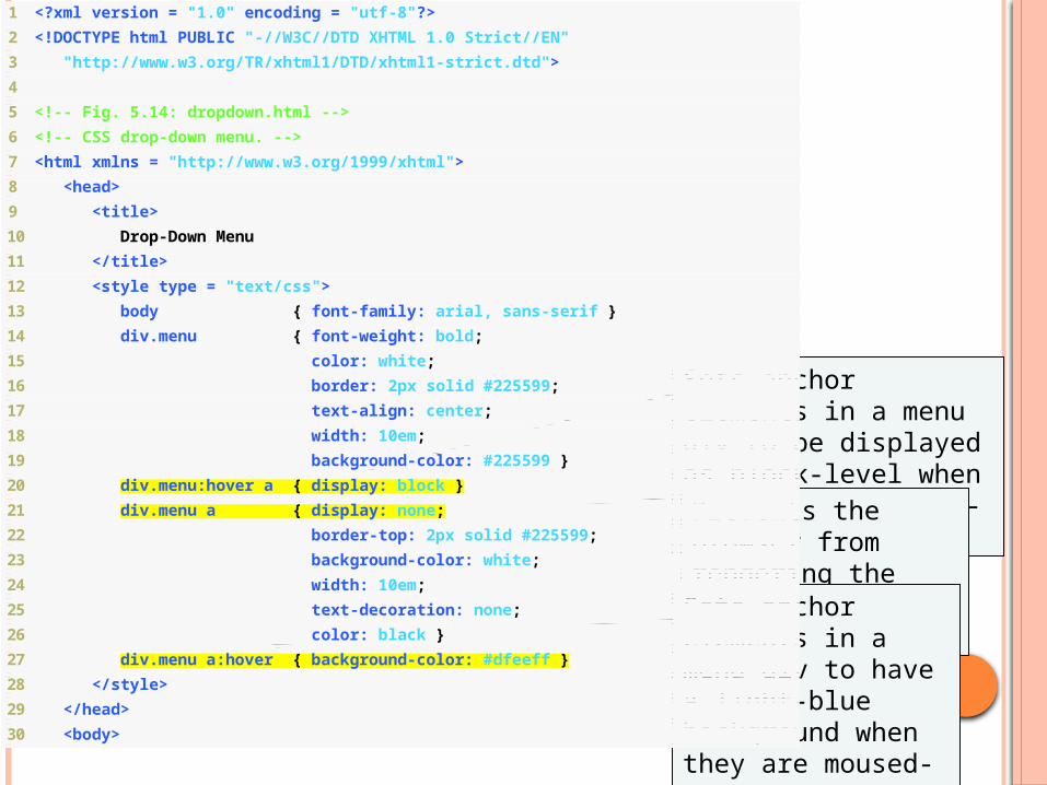
1 <?xml version = "1.0" encoding = "utf-8"?>
2 <!DOCTYPE html PUBLIC "-//W3C//DTD XHTML 1.0 Strict//EN"
3 "http://www.w3.org/TR/xhtml1/DTD/xhtml1-strict.dtd">
4
5 <!-- Fig. 5.14: dropdown.html -->
6 <!-- CSS drop-down menu. -->
7 <html xmlns = "http://www.w3.org/1999/xhtml">
8 <head>
9 <title>
10 Drop-Down Menu
11 </title>
12 <style type = "text/css">
13 body { font-family: arial, sans-serif }
14 div.menu { font-weight: bold;
15 color: white;
16 border: 2px solid #225599;
17 text-align: center;
18 width: 10em;
19 background-color: #225599 }
20 div.menu:hover a { display: block }
21 div.menu a { display: none;
22 border-top: 2px solid #225599;
23 background-color: white;
24 width: 10em;
25 text-decoration: none;
26 color: black }
27 div.menu a:hover { background-color: #dfeeff }
28 </style>
29 </head>
30 <body>
Sets anchor elements in a menu div to be displayed as block-level when the menu is moused-over
Prevents the browser from rendering the links inside the menu div
Sets anchor elements in a menu div to have a light-blue background when they are moused-over
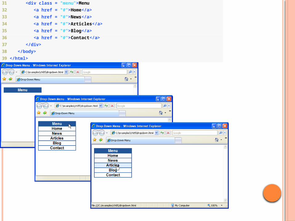
31 <div class = "menu">Menu
32 <a href = "#">Home</a>
33 <a href = "#">News</a>
34 <a href = "#">Articles</a>
35 <a href = "#">Blog</a>
36 <a href = "#">Contact</a>
37 </div>
38 </body>
39 </html>
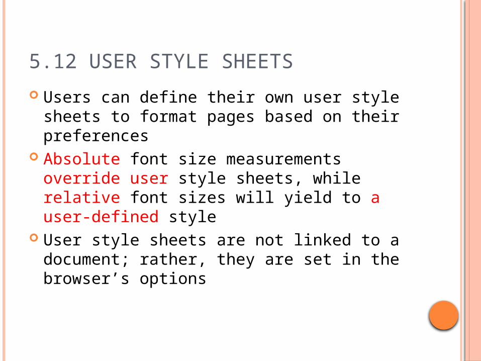
5.12 USER STYLE SHEETS
Users can define their own user style sheets to format pages based on their preferences
Absolute font size measurements override user style sheets, while relative font sizes will yield to a user-defined style
User style sheets are not linked to a document; rather, they are set in the browser’s options
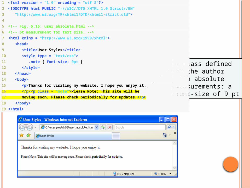
1 <?xml version = "1.0" encoding = "utf-8"?>
2 <!DOCTYPE html PUBLIC "-//W3C//DTD XHTML 1.0 Strict//EN"
3 "http://www.w3.org/TR/xhtml1/DTD/xhtml1-strict.dtd">
4
5 <!-- Fig. 5.15: user_absolute.html -->
6 <!-- pt measurement for text size. -->
7 <html xmlns = "http://www.w3.org/1999/xhtml">
8 <head>
9 <title>User Styles</title>
10 <style type = "text/css">
11 .note { font-size: 9pt }
12 </style>
13 </head>
14 <body>
15 <p>Thanks for visiting my website. I hope you enjoy it.
16 </p><p class = "note">Please Note: This site will be
17 moving soon. Please check periodically for updates.</p>
18 </body>
19 </html>
A class defined by the author with absolute measurements: a font-size of 9 pt
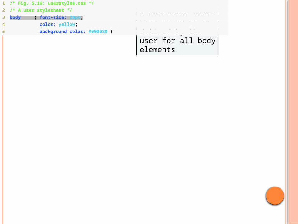
1 /* Fig. 5.16: userstyles.css */
2 /* A user stylesheet */
3 body { font-size: 20pt;
4 color: yellow;
5 background-color: #000080 }
A different font-size of 20 pt is defined by the user for all body elements
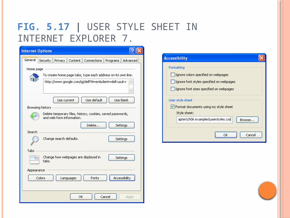
FIG. 5.17 | USER STYLE SHEET IN INTERNET EXPLORER 7.

The author’s style has higher precedence than the user’s, so the font is 9 pt

1 <?xml version = "1.0" encoding = "utf-8"?>
2 <!DOCTYPE html PUBLIC "-//W3C//DTD XHTML 1.0 Strict//EN"
3 "http://www.w3.org/TR/xhtml1/DTD/xhtml1-strict.dtd">
4
5 <!-- Fig. 5.19: user_relative.html -->
6 <!-- em measurement for text size. -->
7 <html xmlns = "http://www.w3.org/1999/xhtml">
8 <head>
9 <title>User Styles</title>
10 <style type = "text/css">
11 .note { font-size: .75em }
12 </style>
13 </head>
14 <body>
15 <p>Thanks for visiting my website. I hope you enjoy it.
16 </p><p class = "note">Please Note: This site will be
17 moving soon. Please check periodically for updates.</p>
18 </body>
19 </html>
A relative measurement of .75 em is used by the author for the font size
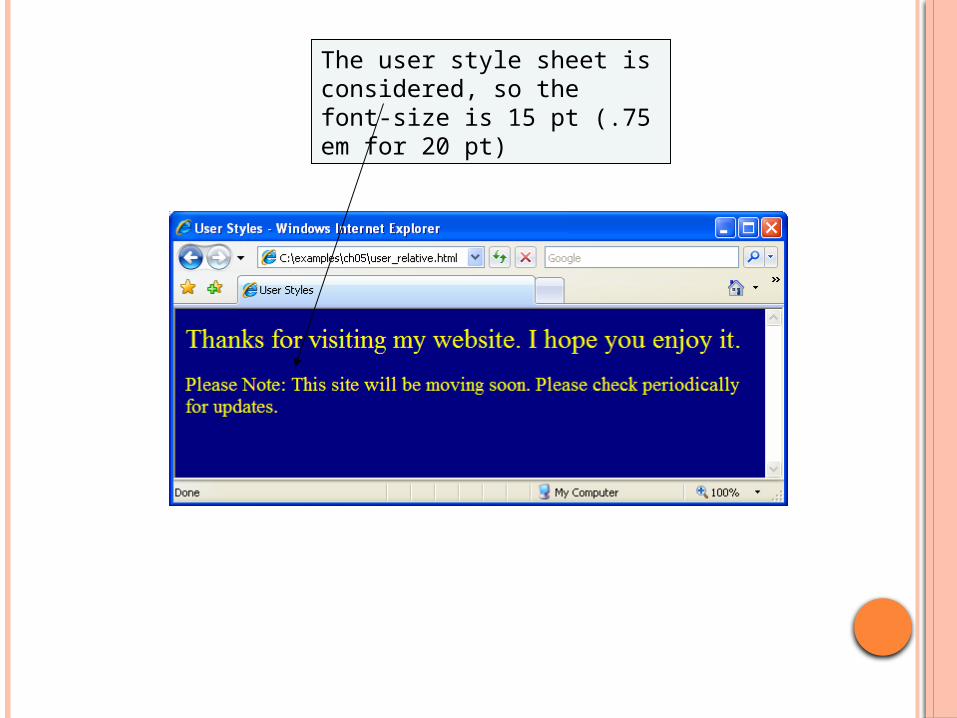
The user style sheet is considered, so the font-size is 15 pt (.75 em for 20 pt)
117
5.13 CSS 3
While CSS 2 is the current W3C Recommendation, CSS 3 is in development, and some browsers are beginning to implement some of the new features that will be in the CSS 3 specification
CSS 3 will introduce new features related to borders, backgrounds, text effects, layout, and more
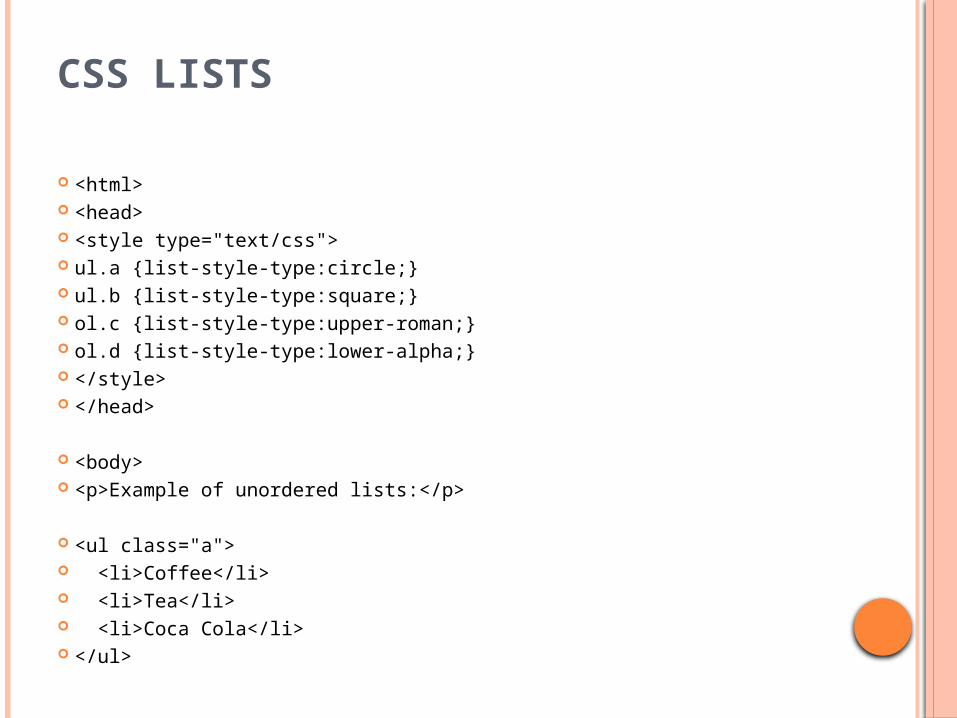
CSS LISTS
<html> <head> <style type="text/css"> ul.a {list-style-type:circle;} ul.b {list-style-type:square;} ol.c {list-style-type:upper-roman;} ol.d {list-style-type:lower-alpha;} </style> </head>
<body> <p>Example of unordered lists:</p>
<ul class="a"> <li>Coffee</li> <li>Tea</li> <li>Coca Cola</li> </ul>
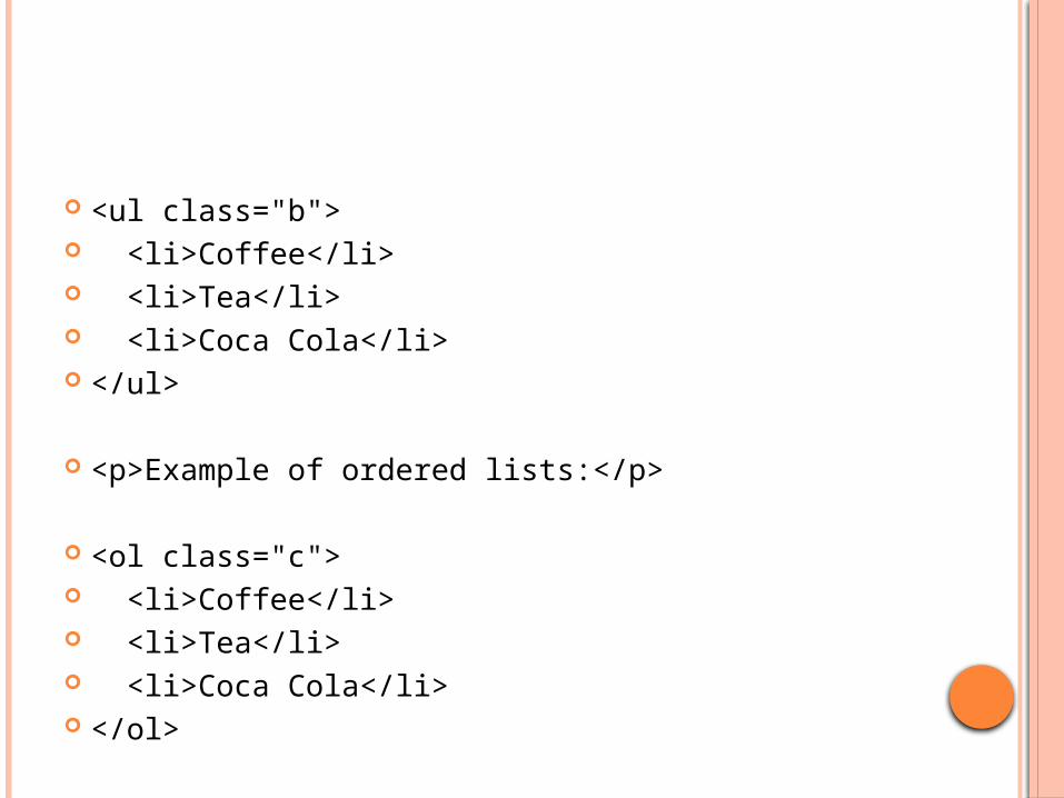
<ul class="b"> <li>Coffee</li> <li>Tea</li> <li>Coca Cola</li> </ul>
<p>Example of ordered lists:</p>
<ol class="c"> <li>Coffee</li> <li>Tea</li> <li>Coca Cola</li> </ol>
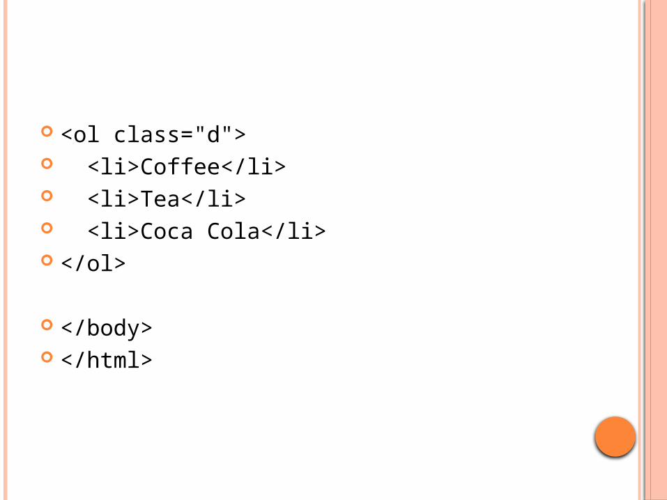
<ol class="d"> <li>Coffee</li> <li>Tea</li> <li>Coca Cola</li> </ol>
</body> </html>
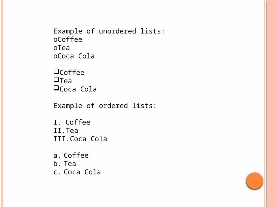
Example of unordered lists:oCoffee oTea oCoca Cola
Coffee Tea Coca Cola
Example of ordered lists:
I. Coffee II. Tea III. Coca Cola
a. Coffee b. Tea c. Coca Cola
AN IMAGE AS THE LIST ITEM MARKER
To specify an image as the list item marker, use the list-style-image property:
Example ul
{list-style-image: url('sqpurple.gif');}
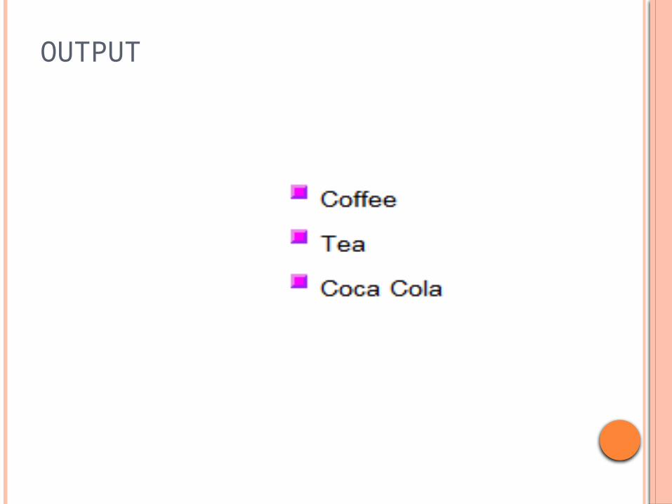
OUTPUT
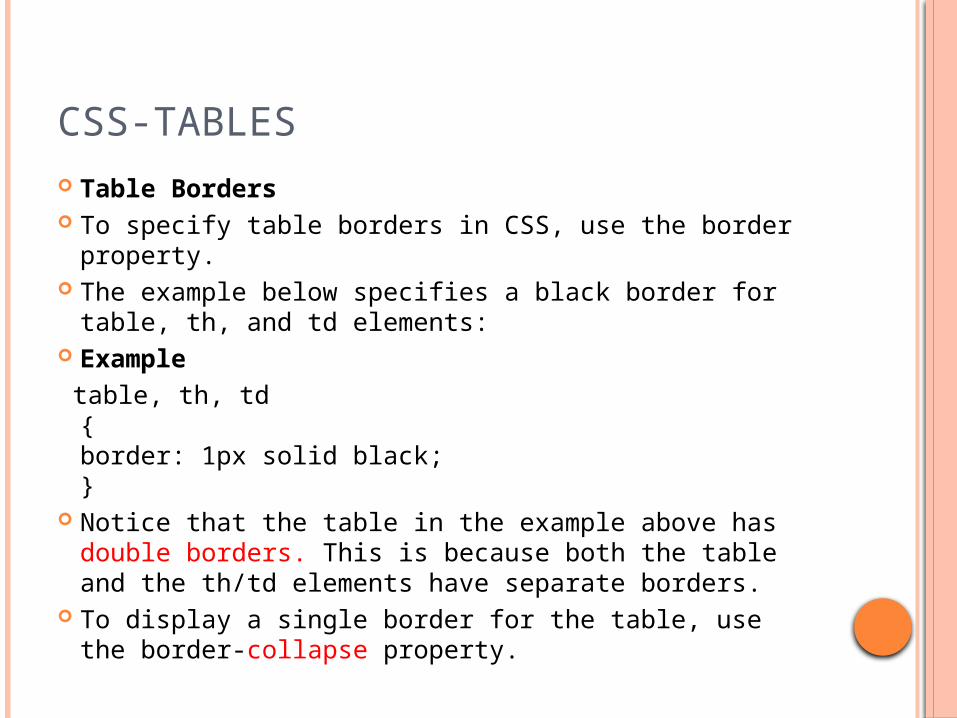
CSS-TABLES Table Borders To specify table borders in CSS, use the border
property. The example below specifies a black border for table,
th, and td elements: Example table, th, td
{border: 1px solid black;}
Notice that the table in the example above has double borders. This is because both the table and the th/td elements have separate borders.
To display a single border for the table, use the border-collapse property.
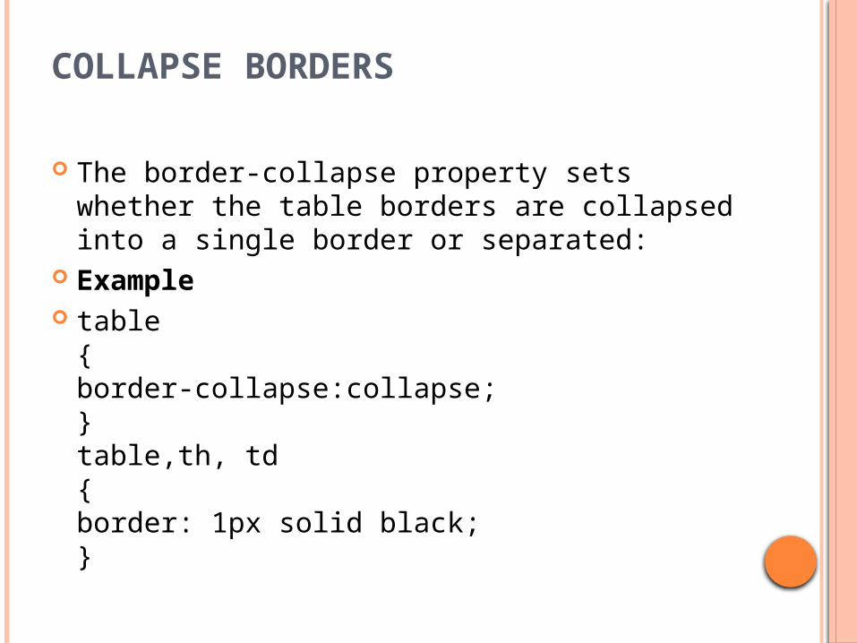
COLLAPSE BORDERS
The border-collapse property sets whether the table borders are collapsed into a single border or separated:
Example table
{border-collapse:collapse;}table,th, td{border: 1px solid black;}
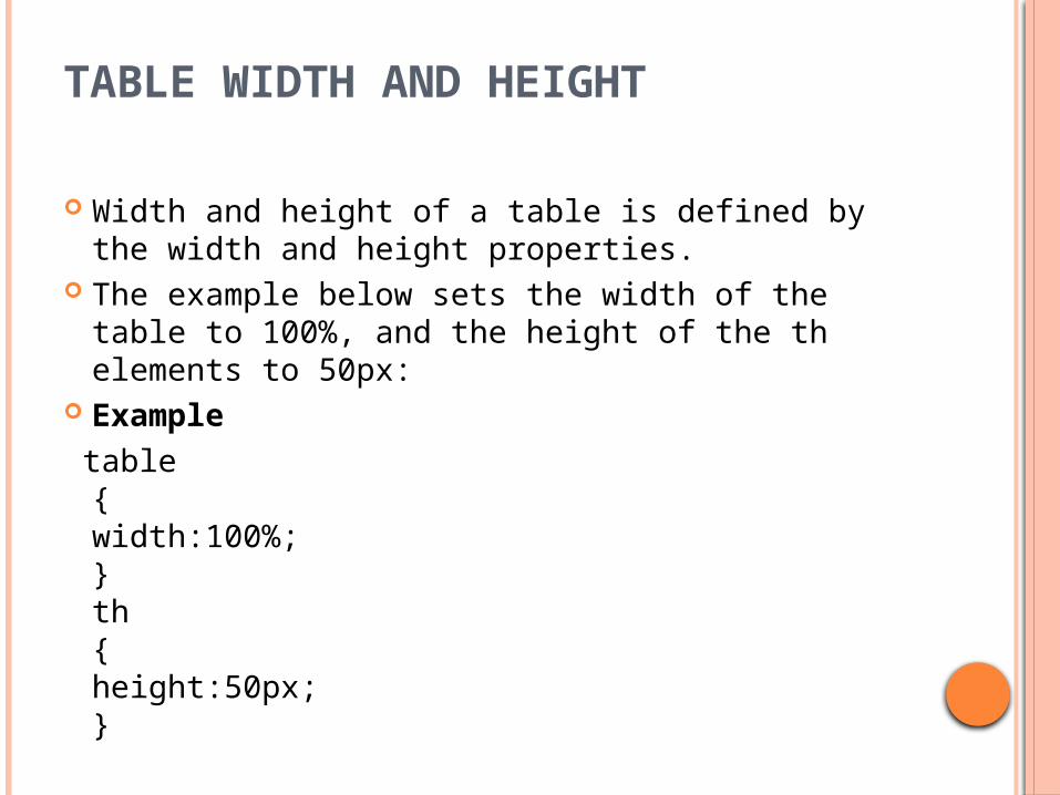
TABLE WIDTH AND HEIGHT
Width and height of a table is defined by the width and height properties.
The example below sets the width of the table to 100%, and the height of the th elements to 50px:
Example table
{width:100%;}th{height:50px;}
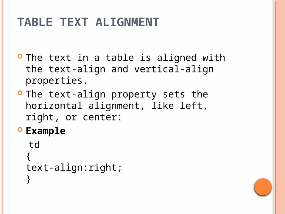
TABLE TEXT ALIGNMENT
The text in a table is aligned with the text-align and vertical-align properties.
The text-align property sets the horizontal alignment, like left, right, or center:
Example td
{text-align:right;}

The vertical-align property sets the vertical alignment, like top,
bottom, or middle: Example td
{height:50px;vertical-align:bottom;}
Table Padding To control the space between the border and content in a table,
use the padding property on td and th elements: Example td
{padding:15px;}

TABLE COLOR
The example below specifies the color of the borders, and the text and background color of th elements:
Exampletable, td, th{border:1px solid green;}th{background-color:green;color:white;}

EXAMPLE
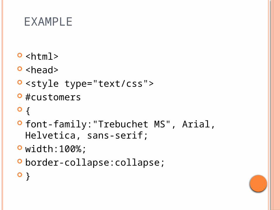
<html> <head> <style type="text/css"> #customers { font-family:"Trebuchet MS", Arial, Helvetica,
sans-serif; width:100%; border-collapse:collapse; }

#customers td { font-size:1em; border:1px solid #98bf21; padding:3px 7px 2px 7px; }
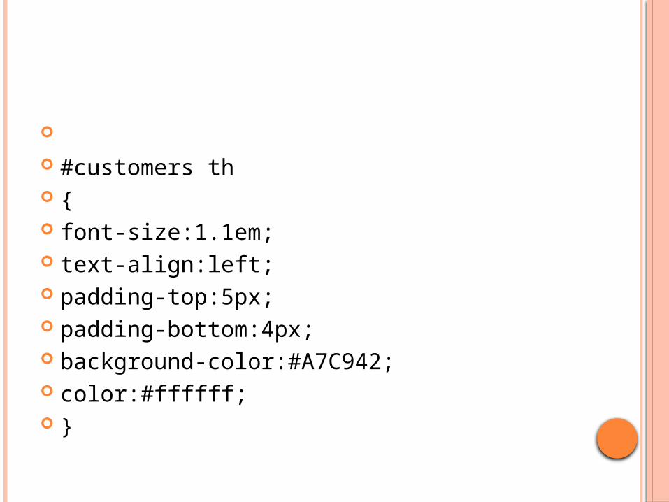
#customers th { font-size:1.1em; text-align:left; padding-top:5px; padding-bottom:4px; background-color:#A7C942; color:#ffffff; }
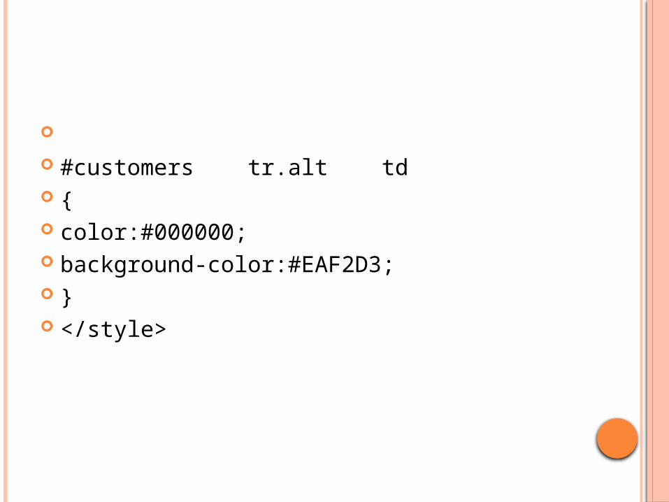
#customers tr.alt td { color:#000000; background-color:#EAF2D3; } </style>

</head> <body> <table id="customers"> <tr> <th>Company</th> <th>Contact</th> <th>Country</th> </tr> <tr> <td>Alfreds Futterkiste</td> <td>Maria Anders</td> <td>Germany</td> </tr>
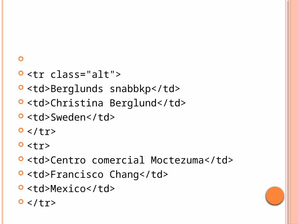
<tr class="alt"> <td>Berglunds snabbkِp</td> <td>Christina Berglund</td> <td>Sweden</td> </tr> <tr> <td>Centro comercial Moctezuma</td> <td>Francisco Chang</td> <td>Mexico</td> </tr>

<tr class="alt"> <td>Ernst Handel</td> <td>Roland Mendel</td> <td>Austria</td> </tr> <tr> <td>Island Trading</td> <td>Helen Bennett</td> <td>UK</td> </tr>
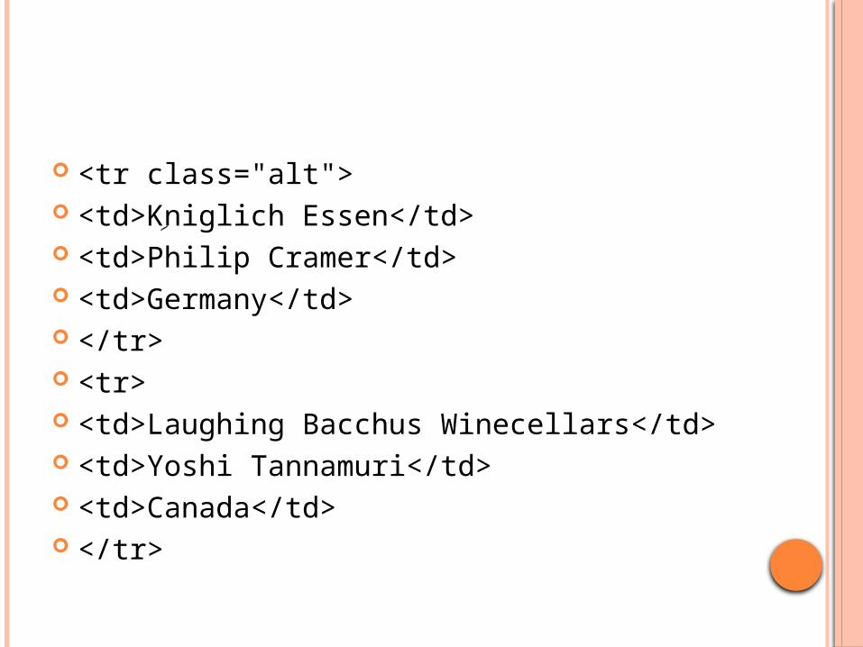
<tr class="alt"> <td>Kِniglich Essen</td> <td>Philip Cramer</td> <td>Germany</td> </tr> <tr> <td>Laughing Bacchus Winecellars</td> <td>Yoshi Tannamuri</td> <td>Canada</td> </tr>
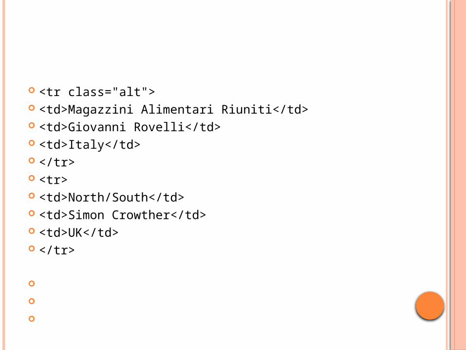
<tr class="alt"> <td>Magazzini Alimentari Riuniti</td> <td>Giovanni Rovelli</td> <td>Italy</td> </tr> <tr> <td>North/South</td> <td>Simon Crowther</td> <td>UK</td> </tr>
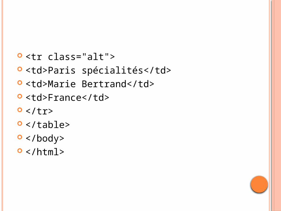
<tr class="alt"> <td>Paris spécialités</td> <td>Marie Bertrand</td> <td>France</td> </tr> </table> </body> </html>
REFERENCES
http://www.w3schools.com/css


![CSS & eCSStender [CSS Summit 2011]](https://img.pdfslide.us/doc/110x75/54c70c6e4a79593f288b4656/css-ecsstender-css-summit-2011.jpg)