Embed Size (px)
Citation preview

University of PortlandPilot ScholarsCommunication Studies UndergraduatePublications, Presentations and Projects Communication Studies
2009
Building the American Dream: Skyscrapers andAdvertising in the 1920sChristine C. Hanson
Follow this and additional works at: http://pilotscholars.up.edu/cst_studpubs
Part of the Communication Commons
This Student Project is brought to you for free and open access by the Communication Studies at Pilot Scholars. It has been accepted for inclusion inCommunication Studies Undergraduate Publications, Presentations and Projects by an authorized administrator of Pilot Scholars. For moreinformation, please contact [email protected].
Citation: Pilot Scholars Version (Modified MLA Style)Hanson, Christine C., "Building the American Dream: Skyscrapers and Advertising in the 1920s" (2009). Communication StudiesUndergraduate Publications, Presentations and Projects. 52.http://pilotscholars.up.edu/cst_studpubs/52
Building the American Dream: Skyscrapers and Advertising in the 1920s
Submitted by
Christine C. Hanson
I understand that in the interest of shared scholarship the University of Portland and its agents have the non-exclusive license to archive and make accessible my work in whole or in part in all forms of media in perpetuity. Further, I understand that my work, in addition to its bibliographic record and abstract, may be available to a wider community of scholars and researchers through electronic access.
CST 435: Advanced Visual Persuasion
Capstone Project
15 December 2009
2
Introduction
Buzzing sidewalks, gargantuan buildings, traffic
filled streets. These are all common sights in today’s
cities, and are things we have grown accustomed to.
However, in the 1920’s the idea of the skyscraper city was
fairly new and introduced American’s to a modern and
contemporary landscape. The birth of the big city changed
America’s identity from a quaint, rural country, to a
bustling hub of business and industry. This newfound love
of grandiose buildings changed American ideals, and these
new cultural tenets were clearly depicted in the
advertisements of the time.
This study will address the presence and importance of
images of skyscraper-cities in advertisements in The
Saturday Evening Post from 1926 to 1927. For the purpose
of this study, a city is depicted if the advertisement
contains skyscrapers, industrial buildings, traffic or
numerous cars on the street, or large amounts of people. In
an age of progressive urbanization, it is not surprising
that images of these large idealized cities were widely
popular. According to Marchard, “Such a vision [of cities]
has been popular even in some rural societies and in eras
with very different conceptions of the city,” so it follows
3
that skyscraper cities would be the iconic images of the
1920s (258). They were larger than life depictions of what
could be expected in the future, and those expectations
were great indeed.
Advertisements for this study were taken from the 1926
and 1927 issues of The Saturday Evening Post. The Post was
chosen in part because of the large amount of
advertisements in each issue. The Post is widely regarded
as one of the most popular weekly publications of the early
20th century. According to David Abrahamson, “George Horace
Lorimer turned the previously moribund Saturday Evening
Post into the largest weekly magazine in the world” (340).
In 1926, 2,420,175 people read the Post and in 1927 that
number increased by about 300,000, reaching 2,724,876
readers (N.W. Ayers and Son’s 1926; N.W. Ayers and Son’s
1927). The time period from 1900 to 1930 “saw the
emergence of modern magazine publishing” (Abrahamson 340).
Magazines began to focus on advertising rather than more
substantial content such as current events. James Playsted
Wood emphasizes the importance of The Saturday Evening Post
as a cultural icon. He states:
The Post became both a powerful and continuing social force and almost a sign and symbol of the country itself… [The Post] reflected the United States of the first half of the 20th century to

4
itself – its brilliance and its mediocrity, its materialism and its ideals, its energy, confusion, complacency, its weaknesses, and its strength (155).
For a scholar examining issues from this time period, this
means the Post can provide a window into the culture of the
past. Through the examination of these advertisements, one
can gain insight into the ideals that governed the early
20th century. Marchard says:
That the future should appear as a source of light seems exceptional in a society confident of progress. Seen either from an interior view or from afar, the city of the future connoted prosperity, cleanliness, order, efficiency, and inspiration – conventional values, all (258).
Prior Pertinent Research Review
Previous studies in the visual rhetoric field stretch
across a plethora of categories. Literature ranging from
film studies to examinations of memorial statues can be
easily attained. The research in advertisements is no
exception.
In Olson’s 1983 study of Norman Rockwell’s “Four
Freedoms,” he examines the cultural potency of the images
and how they represented an idealized view of American
culture at the time. Olson points out that effectiveness of
the images came “largely through productive ambiguities

5
that broadened the poster’s appeal for unity” (16). Olson
argues that since the viewer could not pinpoint the exact
location of the image, they could imagine it as their own
church or home or school. By doing this, viewers could
relate to the advertisements on a more personal level.
This is important to realize in the current study when
looking at images of cities. Are readers able to observe
distinguishing landmarks that give a name to the city, or
is it left up to the imagination? Furthermore, Rockwell
was able to represent multiple institutions within each
image, expanding the mental involvement of the viewer even
further (16). This is yet another factor Olson provides to
which I will pay close attention in this study.
In a 2006 examination of Rosie the Riveter, Olson and
Kimble look at the real story behind the famous poster.
They state, “Almost everything today’s viewers think they
know about Miller’s poster is in error. These errors are
shockingly prevalent in modern culture, even in published
scholarship” (560). This revelation is a vital addition to
this study. When looking at images from past eras the
viewer must realize that current interpretations likely
differ greatly from the original understanding. Since this
study will use images from 1926 and 1927, extra care must
6
be taken when making inferences about the content and
underlying meaning.
More recently, Spears and Germaine reviewed
advertisements from 1900 to 2000. For their study they
developed the Visual Imagery Progressions Model (VIPM),
which “proposes a framework for understanding the changing
and evolving nature of visual images . . . and how [the]
executions relate to societal changes at the time” (19).
The VIPM states that images are “repositories of cultural
meaning” and that readers have assumptions that give a view
into the conventions of the time period (Spears & Germaine
19). Furthermore, the assumptions tied to the
advertisements change over time – they are in no way
static. Spears and Germaine point out that five dynamic
societal elements are present in any time period:
(1) Economic factors (agrarian economy, economic
downturns, prosperity, etc.);
(2) Political climate (reform efforts and
initiatives, wars, etc.);
(3) Social factors such as ideological forces (i.e.,
antiestablishment sentiments, gender and race
issues, etc.), generalized social anxieties,
7
social chaos and change, transitioning from rural
to urban life, and so forth;
(4) Institutional forces, such as families and the
institution of advertising; and
(5) Contingencies in a given time period that include
the availability of consumer goods and the
widespread ability of consumers to buy these
goods (Marwick 1998; O’Guinn and Belk 1989;
Oxoby, 2003).
These societal elements are extremely important to keep in
mind when examining images from any time period. The
advertisements from the 1920’s carry with them insights
into the economic, social, and political climate of the
era. Also, researchers must remember that these factors
greatly influenced the images that appear in advertisements
from the period in time. Spears and Germaine concluded
that images in advertisements from 1920-1929 “centered on
economic power, rapid acceleration of consumption of a
great variety of goods and calls for restraint” (26).
Research Problem
After reviewing previous studies in this area of
rhetoric, a few raised questions became the main research
problems addressed in this study. First, this study seeks

8
to find recurring themes in the advertisements from the
Post. What do these themes tell us about the societal and
social values of the 1920s and are the findings valuable to
current advertising tactics? Are there any sorts of
structures within the ads that remain unchanged today?
Furthermore, this study is searching for visual design
elements that can be observed frequently in 1926 and 1927.
Will these elements remain pertinent in today’s culture?
Methods
The first step in beginning this examination of
advertisements was choosing a periodical and time frame at
which to look. The Saturday Evening Post was chosen after
examining the periodicals available from the 1920’s. Next,
the years 1926 and 1927 were chosen by examining volumes of
the Post located in the archives at the University of
Portland Clark Memorial Library. Thus, 21 advertisements
depicting cities were identified and selected of over 300
total ads. Next, these ads were examined using Herbert
Zettl’s forces within the screen as discussed in Sight
Sound Motion. In addition, Robin Williams’ four basic
principles of design (contrast, repetition, alignment, and
proximity) were employed (Williams 13).

9
According to Zettl, several factors or forces operate
within the screen on which one should focus. Specifically,
this paper examines horizontal versus vertical orientation,
tilting of the horizontal plane, magnetism of the frame,
and vectors. The orientation of an image has a large
impact on the viewer’s interpretation. Zettl states,
“horizontal arrangement seems to suggest calm, tranquil and
rest,” whereas vertical space “is harder to manage . . .
vertical lines seem more dynamic, powerful, and exciting
than horizontal ones” (Zettl 101). The use of horizontally
or vertically orientated images in advertisements featuring
cities can respectively make the scene appear more composed
and relaxed or create an illusion of grandeur that
ultimately changes a reader’s perception. Furthermore,
tilting the horizontal frame causes a distortion and
disorientation that “can easily destabilize a scene or make
an otherwise uninteresting building or object look dynamic”
(Zettl 103). The borders of the image are also important
in shaping the overall message of the advertisement. “The
borders of a picture field act as magnets: they have a
tendency to attract objects near them,” says Zettl, and
when used correctly, one can use the magnetism of the frame
to his or her benefit (104-106). The magnetism of the
frame also gives the illusion of an up or down slant to the
10
diagonals of the frame. Zettl says, “We seem to ‘read’
diagonals from left to right. Although any movement along
either slant can override this graphic up/down sensation,
you can nevertheless use the up/down slants to intensify
motion along the diagonals” (110). Images that employ
diagonals use the lines to their advantage in leading the
reader’s eye to the focus of the advertisement.
Zettl points out that the strongest forces within an
image are the vectors, or “directional forces that lead our
eyes from one point to another within, or even outside of,
the picture field” (119). These are vital when directing
the reader’s attention to the main focus of the ad. There
are five main vector types that Zettl identifies. The
first are graphic vectors, or vectors that are created by a
stationary element of the image that draw the readers’ eye
in a certain direction. The direction of the vector is
somewhat ambiguous, however, for the readers’ attention
could be drawn up or down, or left or right (Zettl 119).
Next are index vectors, or those that are “created by
something that points unquestionably in a specific
direction,” such as an arrow or finger (Zettl 119).
Graphic and index vectors are the two major forms, but
there are continuing, converging, and diverging vectors as
11
well. Continuing vectors are two or more index vectors
that point in the same direction, converging vectors point
toward each other, and diverging vectors point away from
each other (Zettl 120).
As for the design elements defined by Williams, this
examination will look at all four basic design principles.
Williams states, “Contrast is one of the most effective
ways to add visual interest to [a] page – a striking
interest that makes a reader want to look at the page – and
to create an organizational hierarchy among different
elements” (Williams 63). If an image is lacking in
contrast, according to Williams, it will not intrigue the
reader and will be overlooked. Repetition within a design
strengthens the unity of an image by “[repeating] some
aspect of the design throughout the entire piece” (Williams
49). The reader visually recognizes repetition, whether
consciously or subconsciously, and the cohesive look of the
advertisement draws in the reader. Next, alignment is the
concept that nothing on the page can be placed arbitrarily
(Williams 13). Keeping this in mind, one must understand
that the creator of the advertisement placed each item
carefully and for a particular reason. Every element in
the image is somehow connected with another element on the

12
page. Last, proximity is used to organize information in
such a way that the reader has a clear structure (Williams
13). The organization of the ad creates a path for the
reader to follow, maintaining interest in the ad.
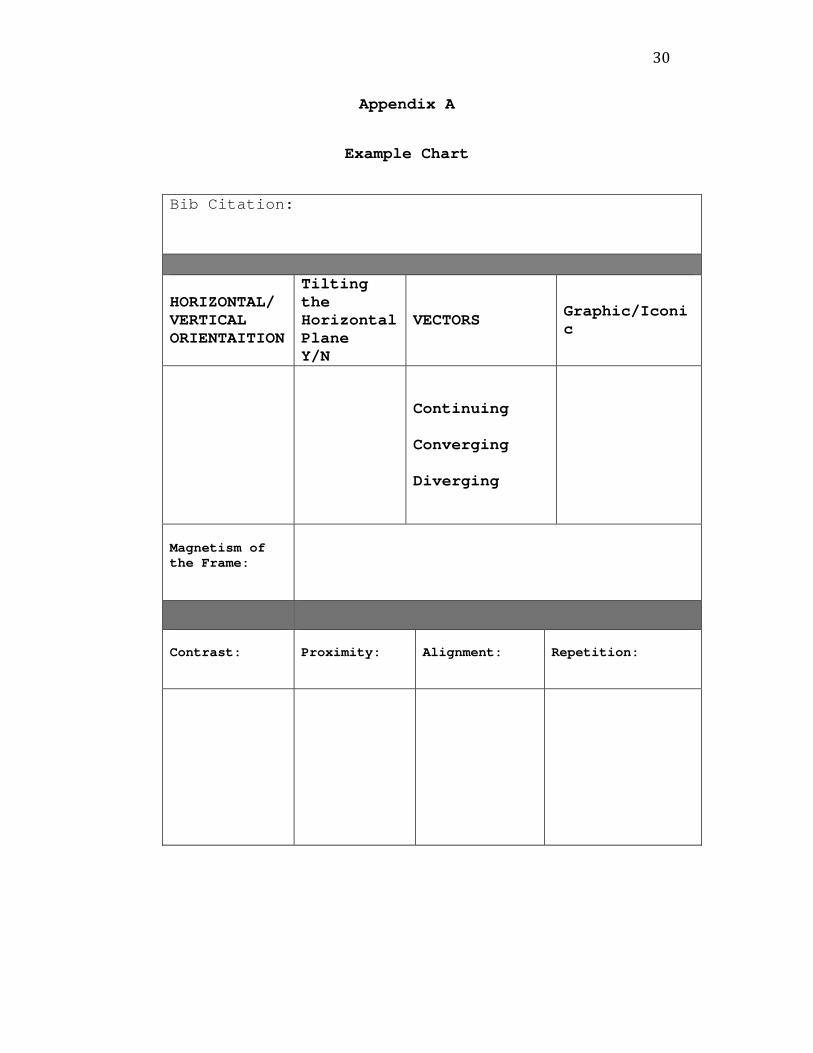
Finally, each image was catalogued and charted using
the previously mentioned terms (See Appendix A). After
artifact characteristics were charted, themes appeared that
aided in categorizing the advertisements. Next,
observations noted in the charts were analyzed to provide
information as to how often each type of design element
occurred and the significance of each in the history of
advertising in the Saturday Evening Post.
Analysis
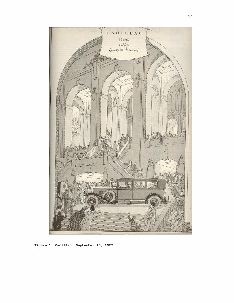
In a Cadillac advertisement from September 9, 1927
many of the more frequently used design aspects can be
observed (See Figure 1). First, the image is oriented
vertically, which, according to Zettl, conveys power and
excitement. The bustling groups of people flooding the
scene further add to this excitement. Also, the arches at
the top of the image are pulled upward as a result of the
magnetism of the frame, adding to the powerful nature of
the vertical orientation. Furthermore, both graphic and
index vectors are employed in this advertisement. The
13
three archways at the top of the screen create a graphic
vector, or line that seems to lead the eye to the text on
the left-hand page, but they could just as easily be
pointing to the right. This is where the index vector
comes in to ensure that the reader’s eye will go to the
left. The car, or index vector, in this case, is facing
from right to left, contrary to the widely accepted left-
to-right convention of the western world. Furthermore, the
people in the ad create multiple index vectors with
pointing hands and eyes. Near the bottom of the image the
hands and eyes of the figures are clearly pointing in the
direction of the automobile, pushing the viewers focus in
that direction. On the other hand, some of the people are
looking in different directions or walking away from the
car, however, these figures are not as dominant so the main
focus remains on the car. Also, if we look at this image
with Williams’ design elements in mind, even more comes to
the surface. First, the image is very high in contrast.
The arches at the top of the frame appear well lit, whereas
the rest of the image is more in the shadows. The contrast
between light and dark serves to pique the readers’
interest in the advertisement. Also, the arches are
repeated throughout the advertisement, creating a sense of
cohesion that holds the readers’ interest.
14
Figure 1: Cadillac. September 10, 1927
15
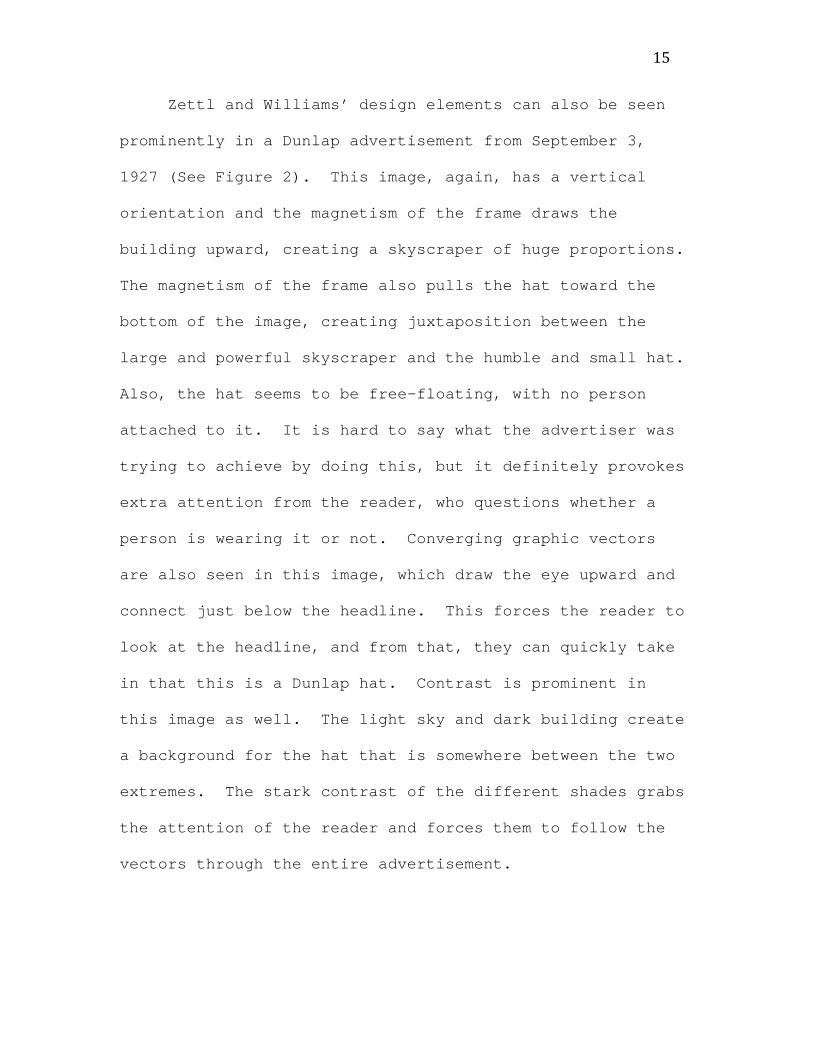
Zettl and Williams’ design elements can also be seen
prominently in a Dunlap advertisement from September 3,
1927 (See Figure 2). This image, again, has a vertical
orientation and the magnetism of the frame draws the
building upward, creating a skyscraper of huge proportions.
The magnetism of the frame also pulls the hat toward the
bottom of the image, creating juxtaposition between the
large and powerful skyscraper and the humble and small hat.
Also, the hat seems to be free-floating, with no person
attached to it. It is hard to say what the advertiser was
trying to achieve by doing this, but it definitely provokes
extra attention from the reader, who questions whether a
person is wearing it or not. Converging graphic vectors
are also seen in this image, which draw the eye upward and
connect just below the headline. This forces the reader to
look at the headline, and from that, they can quickly take
in that this is a Dunlap hat. Contrast is prominent in
this image as well. The light sky and dark building create
a background for the hat that is somewhere between the two
extremes. The stark contrast of the different shades grabs
the attention of the reader and forces them to follow the
vectors through the entire advertisement.
16
Figure 2: Dunlap. September 3, 1927
17
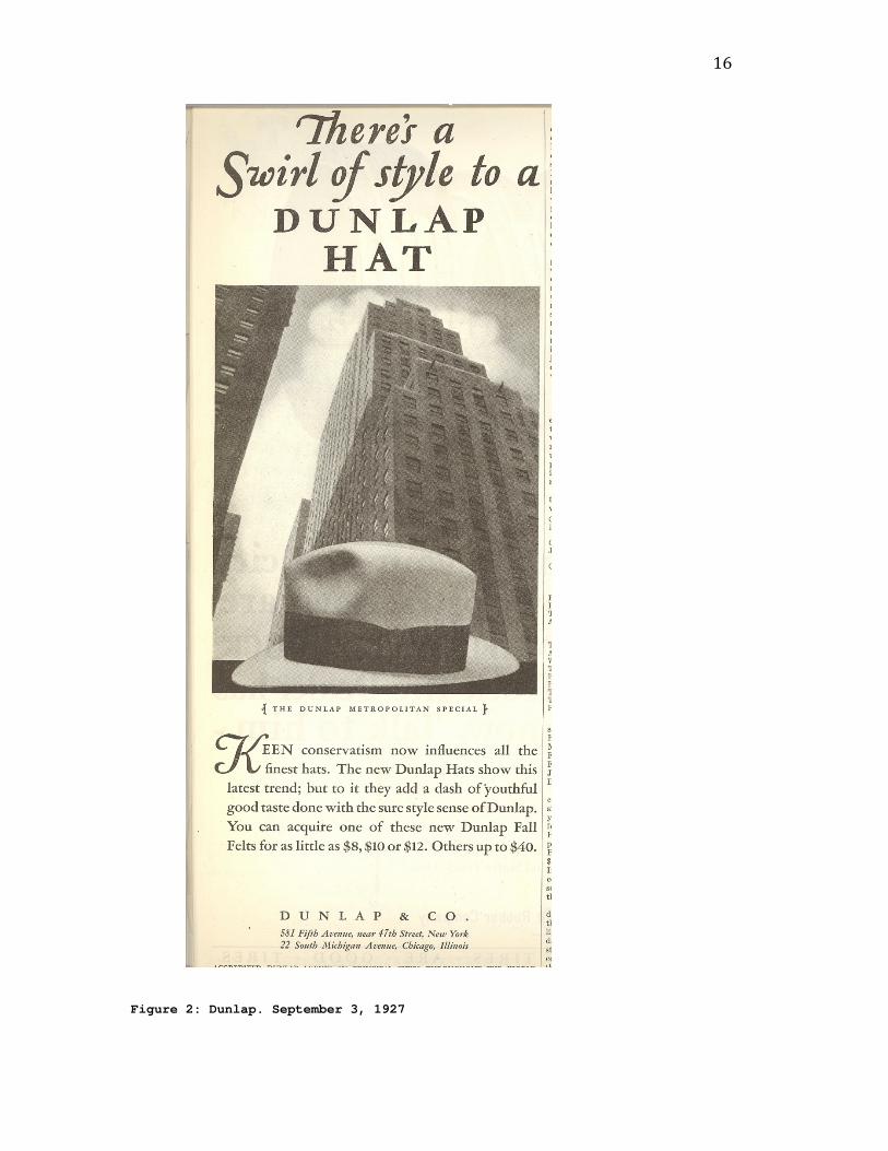
Finally, a Portland Cement advertisement from
September 10, 1927 shows us how continuous vectors can be
employed in images (See Figure 3). The cars in this ad
serve as continuous index vectors that lead the eye through
the image. The cars, again, face from right to left, going
against the traditional grain. This vector, because it is
continuous, has no real start or stop point, and the
readers’ eye keeps going outside the image. The road
serves as another vector, but in this case is graphic. It
goes along the same path as the cars, pulling the eye
through the entire advertisement.
Figure 3: Portland Cement. September 10, 1927.

18
A December 2009 Yves Saint Laurent advertisement was
examined to gain context for the images from the 1920s and
to observe any differences or similarities in design
elements between the two eras (See Figure 4). First,
images containing cities seem to be much less common today,
with only two of the 65 advertisements featuring any
depictions of cities. This could be due, however, to the
difference in the amount of advertisements featured in the
magazine. Allure had fewer advertisements overall than the
Post. The Yves Saint Laurent advertisement that was
examined also differed in regard to design elements. The
image employed tilting of the horizontal plane, which was
not seen in any of the ads from the Post. According to
Zettl, this gives the image a sense of unrest or
disruption. Since the Eiffel Tower is such a commonly used
image, tilting the horizontal plane creates a new interest
in the structure. Also, alignment and repetition, which
were not observed in any of the ads from the Post, were
used in the advertisement. The figure in the foreground of
the image is situated to slant the same direction and to
the same degree as the Eiffel Tower, creating continuity
within the image. Also, repetition is used, which was not
commonly found in the examined advertisements from the
Post. The color black is found throughout the entire
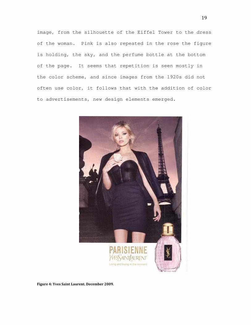
19
image, from the silhouette of the Eiffel Tower to the dress
of the woman. Pink is also repeated in the rose the figure
is holding, the sky, and the perfume bottle at the bottom
of the page. It seems that repetition is seen mostly in
the color scheme, and since images from the 1920s did not
often use color, it follows that with the addition of color
to advertisements, new design elements emerged.
Figure 4: Yves Saint Laurent. December 2009.
20
Despite all the differences between current and past
advertisements, there are still common design traits that
can be seen. First, this image is vertically oriented,
which was very common with advertisements featuring
skyscraper cities. Also, continuing graphic vectors can be
seen in this image, in the Eiffel Tower and the figure.
They both draw the eye up and down the advertisement.
Magnetism of the frame is also used to exaggerate the
height of both the tower and the woman. Contrast is also
employed to create interest in the ad. The image is mostly
black, but there is also light pink in key spots in the ad,
which both holds the readers’ interest and directs their
eyes to important elements.
Discoveries
Several themes emerged in the advertisements of the
Post that are important to look at in order to understand
the culture of advertising in the 1920s. First, four main
categories of content appeared within the selected
artifacts. Automobiles, building and industrial materials,
clothing and toiletries, and other surfaced as the most
prominent categories. Automobiles included advertisements
for cars, trucks, and auto parts. Building and industrial
materials included those for cement, pipes, batteries and
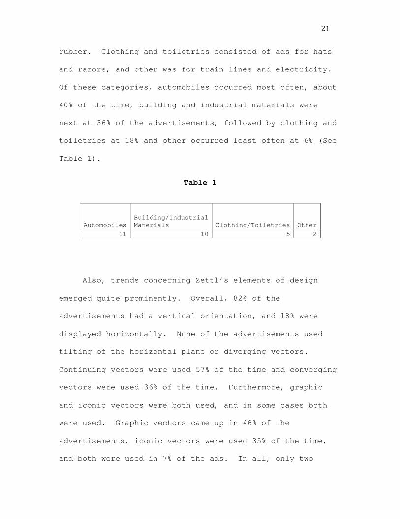
21
rubber. Clothing and toiletries consisted of ads for hats
and razors, and other was for train lines and electricity.
Of these categories, automobiles occurred most often, about
40% of the time, building and industrial materials were
next at 36% of the advertisements, followed by clothing and
toiletries at 18% and other occurred least often at 6% (See
Table 1).
Table 1
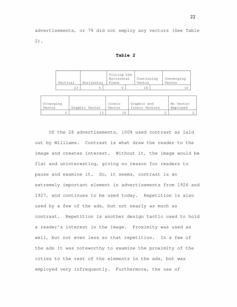
Also, trends concerning Zettl’s elements of design
emerged quite prominently. Overall, 82% of the
advertisements had a vertical orientation, and 18% were
displayed horizontally. None of the advertisements used
tilting of the horizontal plane or diverging vectors.
Continuing vectors were used 57% of the time and converging
vectors were used 36% of the time. Furthermore, graphic
and iconic vectors were both used, and in some cases both
were used. Graphic vectors came up in 46% of the
advertisements, iconic vectors were used 35% of the time,
and both were used in 7% of the ads. In all, only two
Automobiles Building/Industrial Materials Clothing/Toiletries Other
11 10 5 2
22
advertisements, or 7% did not employ any vectors (See Table
2).
Table 2
Of the 28 advertisements, 100% used contrast as laid
out by Williams. Contrast is what draw the reader to the
image and creates interest. Without it, the image would be
flat and uninteresting, giving no reason for readers to
pause and examine it. So, it seems, contrast is an
extremely important element in advertisements from 1926 and
1927, and continues to be used today. Repetition is also
used by a few of the ads, but not nearly as much as
contrast. Repetition is another design tactic used to hold
a reader’s interest in the image. Proximity was used as
well, but not even less so that repetition. In a few of
the ads it was noteworthy to examine the proximity of the
cities to the rest of the elements in the ads, but was
employed very infrequently. Furthermore, the use of
Vertical Horizontal
Tilting the Horizontal Plane
Continuing Vector
Converging Vector
23 5 0 16 10
Diverging Vector Graphic Vector
Iconic Vector
Graphic and Iconic Vectors
No Vector Employed
0 13 10 2 2
23
alignment as a design element was only observed in one
advertisement, leading one to believe is was not often used
in the 20s, although this may be attributed to the fairly
small number of advertisements examined.
Overall, this study discovered that several content
categories appear when looking specifically at
advertisements containing images of cities. Also, most of
the images are oriented vertically, which may be attributed
to the vertical nature of skyscrapers and the push to out
build the tallest buildings. Marchard says, “By general
consensus, the true image of the future was the skyscraper
city . . . . The future was not merely a skyscraper city;
it was a super-city that thrust itself into the heavens”
(256-257). Vectors are almost always employed, although
diverging vectors do not often occur. Furthermore,
contrast appeared in every single one of the examined
images, which may have been used as an attention getting
device. Also, in the context of current advertisements,
all of the key design elements can still be seen, although
images of skyscraper cities are far less common. There
are, however, elements employed that were not used during
the 1920s. This may be attributed to the advancement of
technology, as well as constantly changing cultural values.

24
As for discoveries about the culture, it seems many of
the advertisements emphasized the height of the buildings,
which could be a reflection of the values of the time.
Judging from the advertisements, 1920s culture probably
valued the advancement of technology and great feats of
mankind’s ability to build taller and more grandiose
cities.
Future studies may want to examine the relationship
between advertisements of the 1920’s and current ad
techniques. Also, it may be important to understand the
ways in which advertisements have changed over the last 80
years, and why these changes have occurred. An examination
of the culture of the 20s and its relation to the types of
advertisements would also be interesting in understanding
how advertising shapes culture and vice versa.
25
Works Cited
Abrahamson, David. "Magazines in the Twentieth Century." In
Blanchard, Margaret A., ed. History of Mass Media in
the United States: An Encyclopedia. New York: Garland
Publishing, 1997.
Budd. Advertisement. Saturday Evening Post. August 14,
1926. Print.
The Burlington Route. Advertisement. Saturday Evening Post.
July 3, 1926. Print.
Byers Pipe. Advertisement. Saturday Evening Post. September
3, 1927. Print.
Byers Pipe. Advertisement. Saturday Evening Post. October
1, 1927. Print.
Cadillac. Advertisement. Saturday Evening Post. September
10, 1927. Print.
Cadillac. Advertisement. Saturday Evening Post. September
17, 1927. Print.
Certain-teed. Advertisement. Saturday Evening Post. July
17, 1926. Print.
Chevrolet. Advertisement. Saturday Evening Post. July 24,
1926. Print.

26
Cities Service Company. Advertisement. Saturday Evening
Post. September 24, 1927. Print.
Dunlap & Co. Advertisement. Saturday Evening Post.
September 3, 1927. Print.
Dunlap & Co. Advertisement. Saturday Evening Post.
September 10, 1927. Print.
Dunlap & Co. Advertisement. Saturday Evening Post.
September 17, 1927. Print.
Exide Batteries. Advertisement. Saturday Evening Post. July
3, 1926. Print.
Gardner. Advertisement. Saturday Evening Post. September 3,
1927. Print.
Gillette. Advertisement. Saturday Evening Post. August 21,
1926. Print.
Graybar Electric. Advertisement. Saturday Evening Post.
October 1, 1926. Print.
The Iron Fireman. Advertisement. Saturday Evening Post.
September 17, 1927. Print.

27
Kimble, James J.; and Lester C. Olson. “Visual Rhetoric
Representing Rosie the Riveter: Myth and Misconception
in J. Howard Miller’s ‘We Can Do It!’ Poster.”
Rhetoric and Public Affairs 9.4 (2006): 533-569.
Lehigh Cement. Advertisement. Saturday Evening Post.
September 3, 1927. Print.
Marchard, Roland. Advertising the American Dream: Making
Way for Modernity, 1920-1940. Berkeley, CA: University
of California Press, 1985.
Marmon. Advertisement. Saturday Evening Post. August 7,
1926. Print.
Miller. Advertisement. Saturday Evening Post. July 31,
1926. Print.
Miller. Advertisement. Saturday Evening Post. August 28,
1926. Print.
N.W. Ayer & Son's American Newspaper Annual and Directory.
Philadelphia: N.W. Ayer and Sons, 1926.
N.W. Ayer and Son’s American Newspaper Annual and
Directory. Philadelphia: N.W. Ayer and Sons, 1927.

28
O’Guinn, Thomas C., and Russel W. Belk. “Heaven on Earth:
Consumption at Heritage Village, USA.” Journal of
Consumer Research 16.2 (1989): 227-238.
Olson, Lester C. “Intellectual and Conceptual Resources for
Visual Rhetoric: A Re-examination of Scholarship since
1950.” The Review of Communication 7.1 (2007): 1-20.
Olson, Lester C. “Portraits in Praise of a People: A
Rhetorical Analysis of Norman Rockwell’s Icons in
Franklin D. Roosevelt’s ‘Four Freedoms’ Campaign.”
Quarterly Journal of Speech 69.1 (1983): 15-24.
Oxoby, Marc. American Popular Culture Through History: The
1990s. Westport, CT: Greenwood Press, 2003.
Portland Cement. Advertisement. Saturday Evening Post.
September 10, 1927. Print.
Spears, Nancy & Richard Germaine. “1900-2000 in Review.”
Journal of Advertising 36.3 (2007): 19-33.
Stetson Hats. Advertisement. Saturday Evening Post.
September 10, 1927. Print.
Studebaker. Advertisement. Saturday Evening Post. August 7,
1926. Print.
29
Studebaker. Advertisement. Saturday Evening Post. August
14, 1926. Print.
Studebaker. Advertisement. Saturday Evening Post. August
21, 1926. Print.
Union Metal. Advertisement. Saturday Evening Post. October
22, 1927. Print.
United States Rubber Company. Advertisement. Saturday
Evening Post. July 31, 1926. Print.
Williams, Robin. The Non-Designer’s Design Book: Design and
Typographic Principles for the Visual Novice.
Berkeley, CA: Peachpit Press, 2004.
Wood, James Playsted. Magazines in the United States. New
York: The Ronald Press Co., 1971. Print.
Yves Saint Laurent. Advertisement. Allure. December 2009:
109. Print.
Zettl, Herbert. Sight Sound Motion: Applied Media
Aesthetics. Belmont, CA: Thomson Wadsworth, 2008.
30
Appendix A
Example Chart
Bib Citation:
HORIZONTAL/ VERTICAL ORIENTAITION
Tilting the Horizontal Plane Y/N
VECTORS Graphic/Iconic
Continuing Converging Diverging
Magnetism of the Frame:
Contrast: Proximity: Alignment: Repetition:

31
Appendix B
Bib Citation: Budd. Advertisement. Saturday Evening
Post. August 14, 1926. Print.
HORIZONTAL/ VERTICAL
ORIENTAITION
Tilting the
Horizontal Plane Y/N
VECTORS Graphic/Iconic
Vertical N
Continuing
Converging
Diverging
Cars on sides point to
middle one. Partitions up
and down
Magnetism of the Frame: n/a
Contrast: Proximity: Alignment: Repetition:
Cars darker than buildings
Squares in dividers and windows in buildings
32
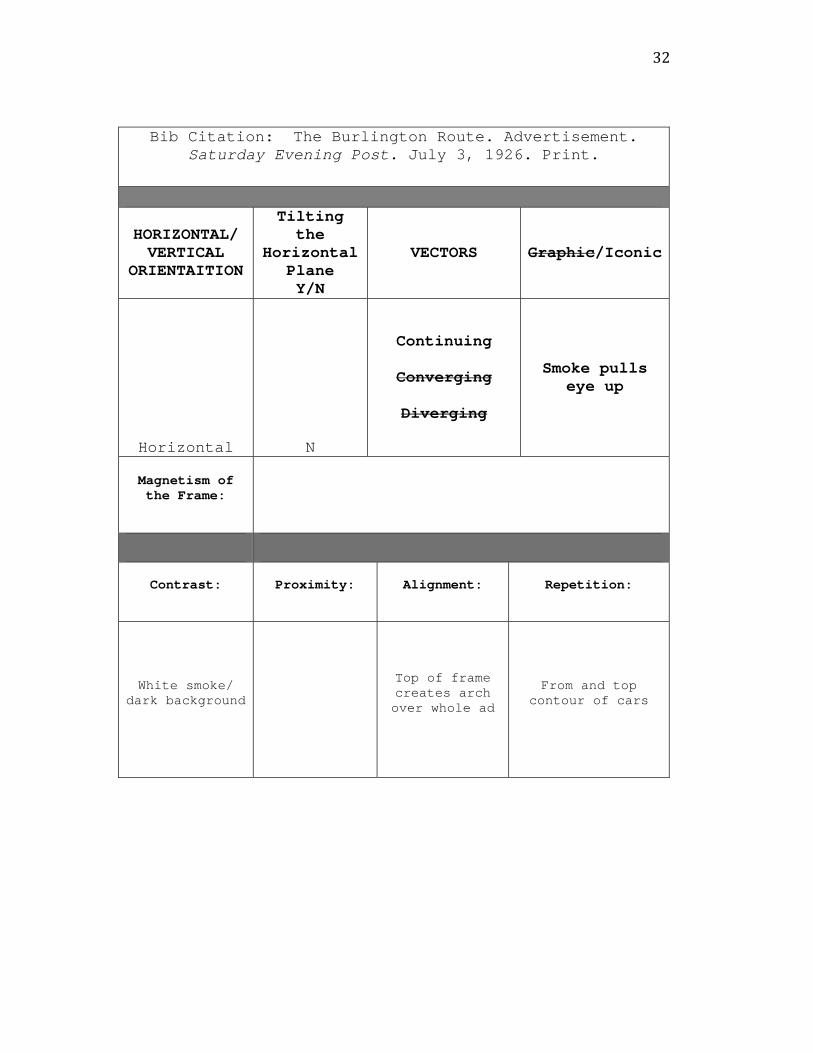
Bib Citation: The Burlington Route. Advertisement. Saturday Evening Post. July 3, 1926. Print.
HORIZONTAL/ VERTICAL
ORIENTAITION
Tilting the
Horizontal Plane Y/N
VECTORS Graphic/Iconic
Horizontal N
Continuing
Converging
Diverging
Smoke pulls eye up
Magnetism of the Frame:
Contrast: Proximity: Alignment: Repetition:
White smoke/ dark background
Top of frame creates arch over whole ad
From and top contour of cars
33
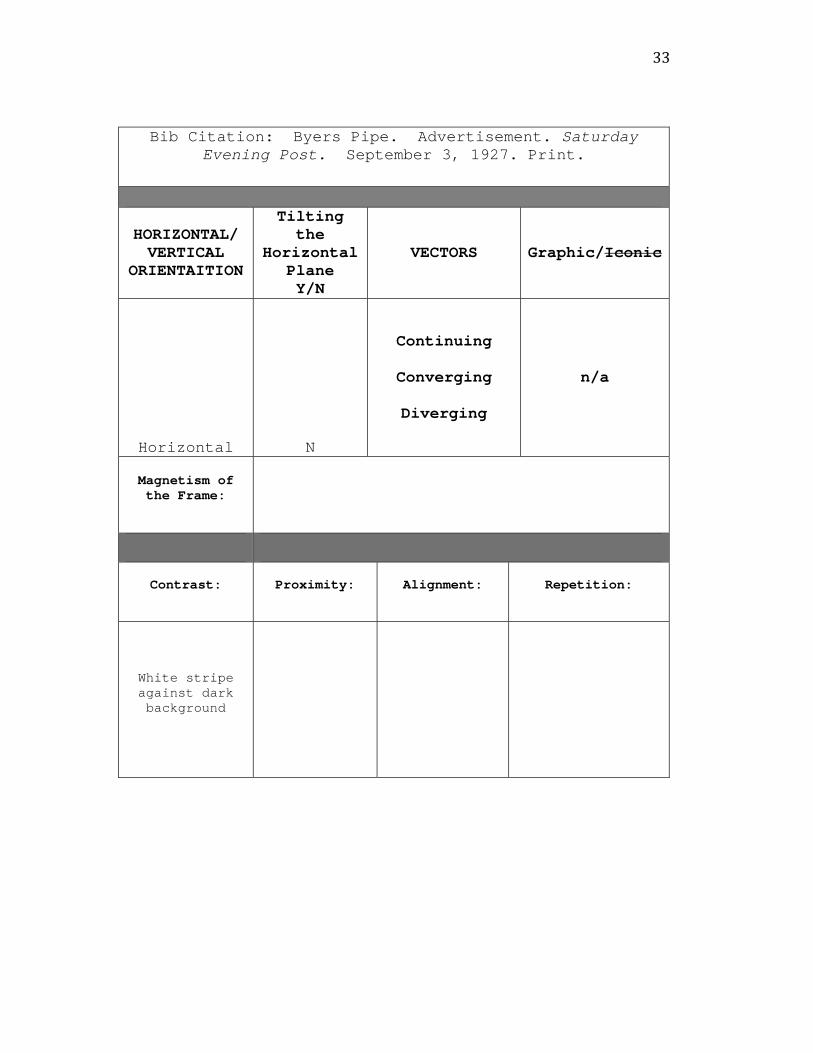
Bib Citation: Byers Pipe. Advertisement. Saturday Evening Post. September 3, 1927. Print.
HORIZONTAL/ VERTICAL
ORIENTAITION
Tilting the
Horizontal Plane Y/N
VECTORS Graphic/Iconic
Horizontal N
Continuing
Converging
Diverging
n/a
Magnetism of the Frame:
Contrast: Proximity: Alignment: Repetition:
White stripe against dark background

34
Bib Citation: Byers Pipe. Advertisement. Saturday Evening Post. October 1, 1927. Print.
HORIZONTAL/ VERTICAL
ORIENTAITION
Tilting the
Horizontal Plane Y/N
VECTORS Graphic/Iconic
Vertical N
Continuing
Converging
Diverging
Street L to R or R to L
Magnetism of the Frame: n/a
Contrast: Proximity: Alignment: Repetition:
Dark stripes against light
sky Column building
and column text

35
Bib Citation: Cadillac. Advertisement. Saturday Evening Post. September 10, 1927. Print.
HORIZONTAL/ VERTICAL
ORIENTAITION
Tilting the
Horizontal Plane Y/N
VECTORS Graphic/Iconic
Vertical N
Continuing
Converging
Diverging
Stairs and hallways lead to car. Car points R to L
Magnetism of the Frame:
Contrast: Proximity: Alignment: Repetition:
Light vs. shadow Arch of frame and
arches in image
36
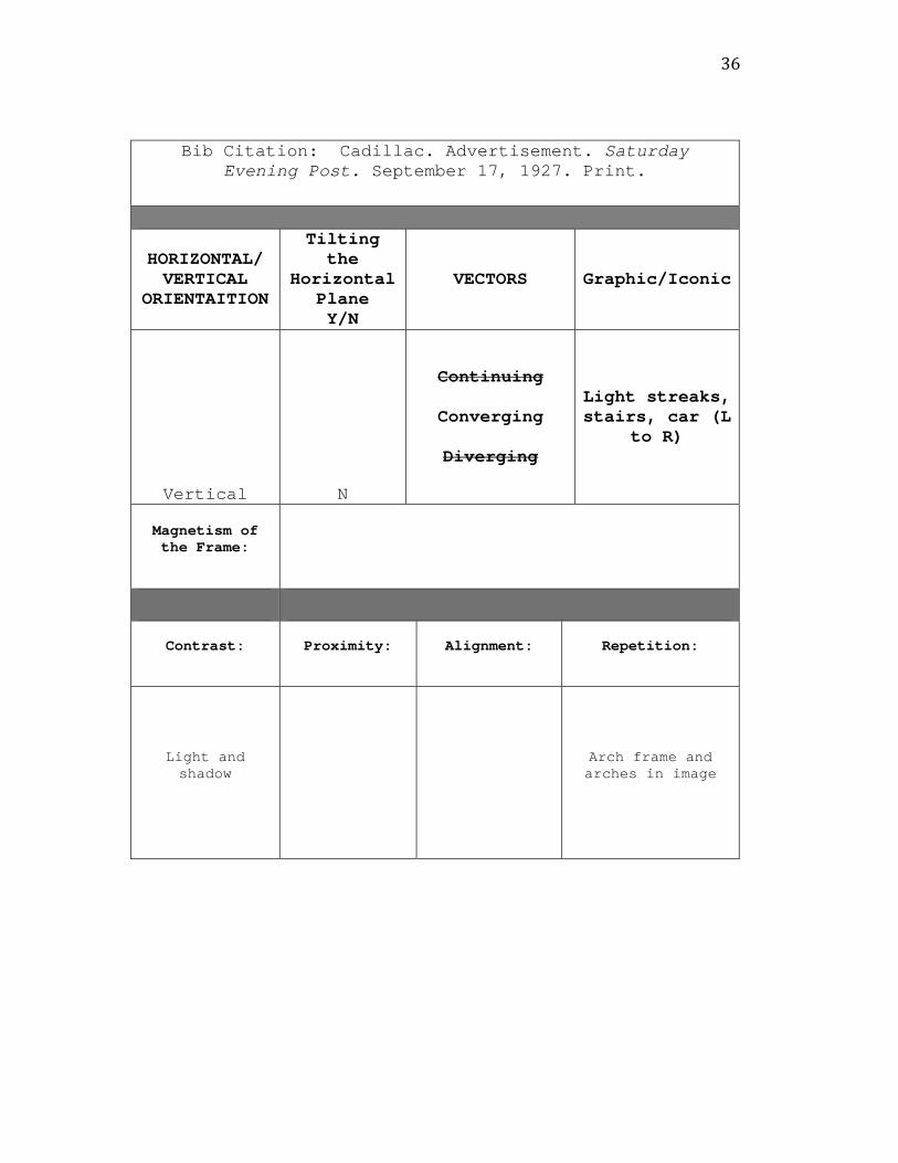
Bib Citation: Cadillac. Advertisement. Saturday Evening Post. September 17, 1927. Print.
HORIZONTAL/ VERTICAL
ORIENTAITION
Tilting the
Horizontal Plane Y/N
VECTORS Graphic/Iconic
Vertical N
Continuing
Converging
Diverging
Light streaks, stairs, car (L
to R)
Magnetism of the Frame:
Contrast: Proximity: Alignment: Repetition:
Light and shadow Arch frame and
arches in image
37
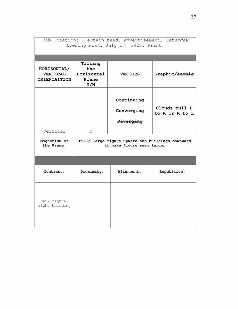
Bib Citation: Certain-teed. Advertisement. Saturday Evening Post. July 17, 1926. Print.
HORIZONTAL/ VERTICAL
ORIENTAITION
Tilting the
Horizontal Plane Y/N
VECTORS Graphic/Iconic
Vertical N
Continuing
Converging
Diverging
Clouds pull L to R or R to L
Magnetism of the Frame:
Pulls large figure upward and buildings downward to make figure seem larger
Contrast: Proximity: Alignment: Repetition:
Dark figure, light building
38
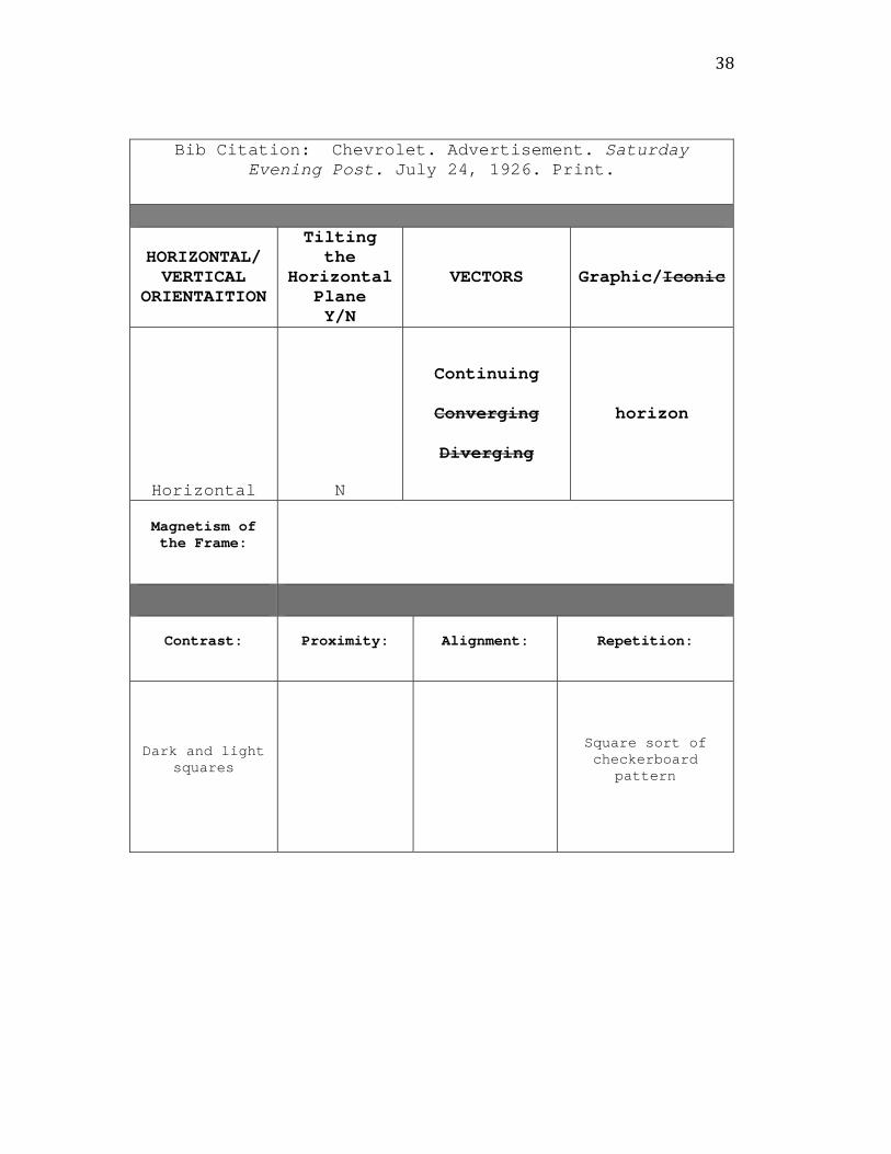
Bib Citation: Chevrolet. Advertisement. Saturday Evening Post. July 24, 1926. Print.
HORIZONTAL/ VERTICAL
ORIENTAITION
Tilting the
Horizontal Plane Y/N
VECTORS Graphic/Iconic
Horizontal N
Continuing
Converging
Diverging
horizon
Magnetism of the Frame:
Contrast: Proximity: Alignment: Repetition:
Dark and light squares
Square sort of checkerboard
pattern
39
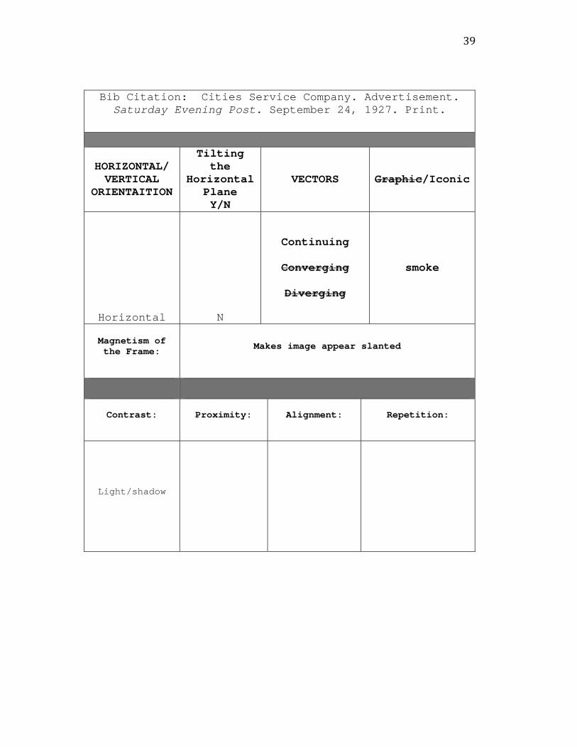
Bib Citation: Cities Service Company. Advertisement. Saturday Evening Post. September 24, 1927. Print.
HORIZONTAL/ VERTICAL
ORIENTAITION
Tilting the
Horizontal Plane Y/N
VECTORS Graphic/Iconic
Horizontal N
Continuing
Converging
Diverging
smoke
Magnetism of the Frame: Makes image appear slanted
Contrast: Proximity: Alignment: Repetition:
Light/shadow

40
Bib Citation: Dunlap & Co. Advertisement. Saturday Evening Post. September 3, 1927. Print.
HORIZONTAL/ VERTICAL
ORIENTAITION
Tilting the
Horizontal Plane Y/N
VECTORS Graphic/Iconic
Vertical N
Continuing
Converging
Diverging
Sky between buildings – draws eye to headline
Magnetism of the Frame: Pulls building up and makes image appear slanted
Contrast: Proximity: Alignment: Repetition:
Light sky, dark building
41
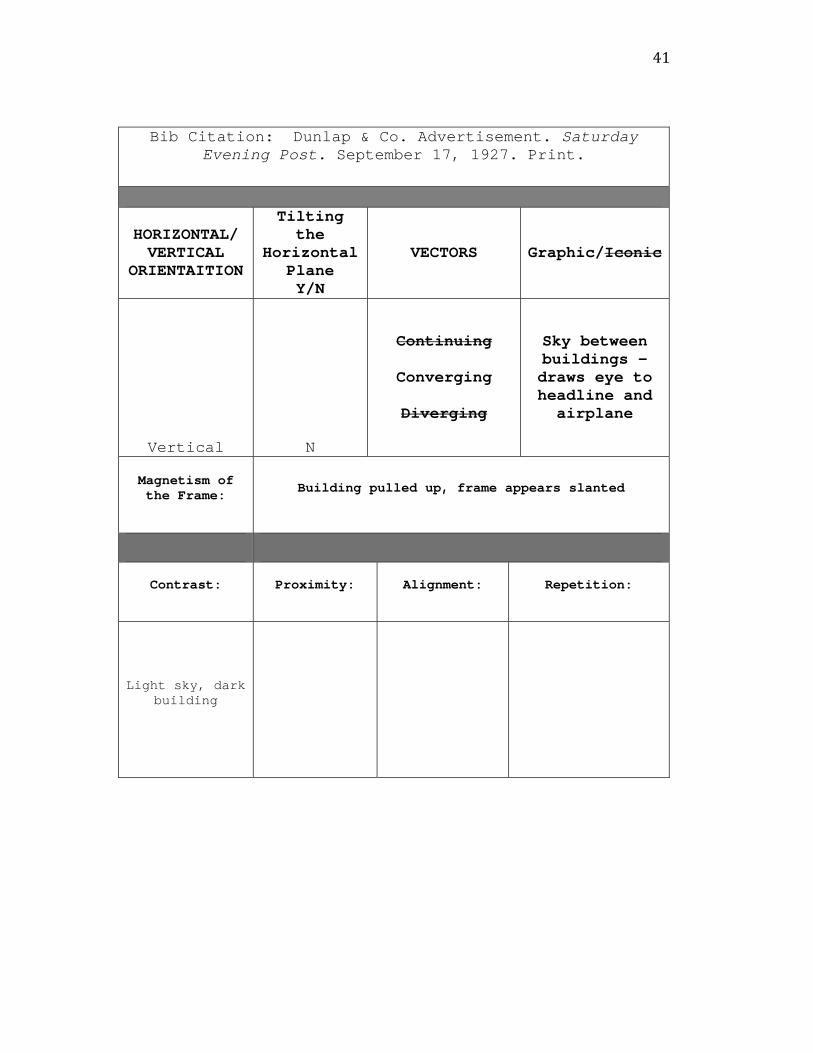
Bib Citation: Dunlap & Co. Advertisement. Saturday Evening Post. September 17, 1927. Print.
HORIZONTAL/ VERTICAL
ORIENTAITION
Tilting the
Horizontal Plane Y/N
VECTORS Graphic/Iconic
Vertical N
Continuing
Converging
Diverging
Sky between buildings – draws eye to headline and airplane
Magnetism of the Frame: Building pulled up, frame appears slanted
Contrast: Proximity: Alignment: Repetition:
Light sky, dark building
42
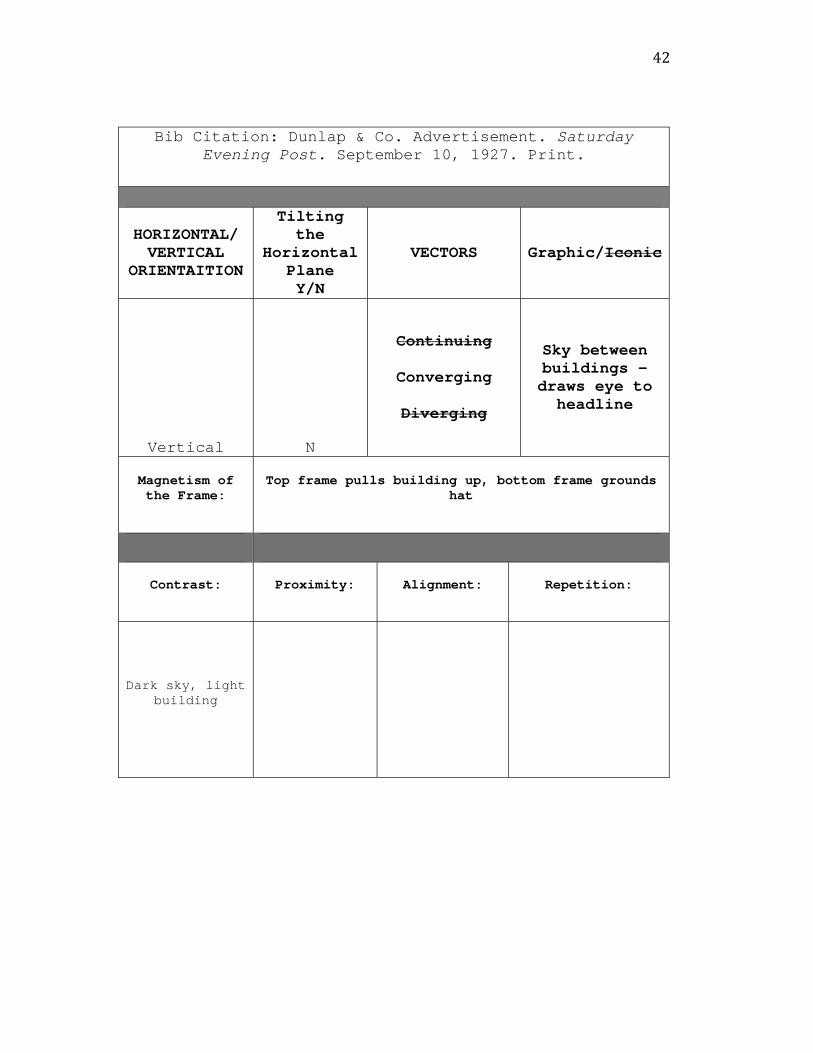
Bib Citation: Dunlap & Co. Advertisement. Saturday Evening Post. September 10, 1927. Print.
HORIZONTAL/ VERTICAL
ORIENTAITION
Tilting the
Horizontal Plane Y/N
VECTORS Graphic/Iconic
Vertical N
Continuing
Converging
Diverging
Sky between buildings – draws eye to headline
Magnetism of the Frame:
Top frame pulls building up, bottom frame grounds hat
Contrast: Proximity: Alignment: Repetition:
Dark sky, light building
43
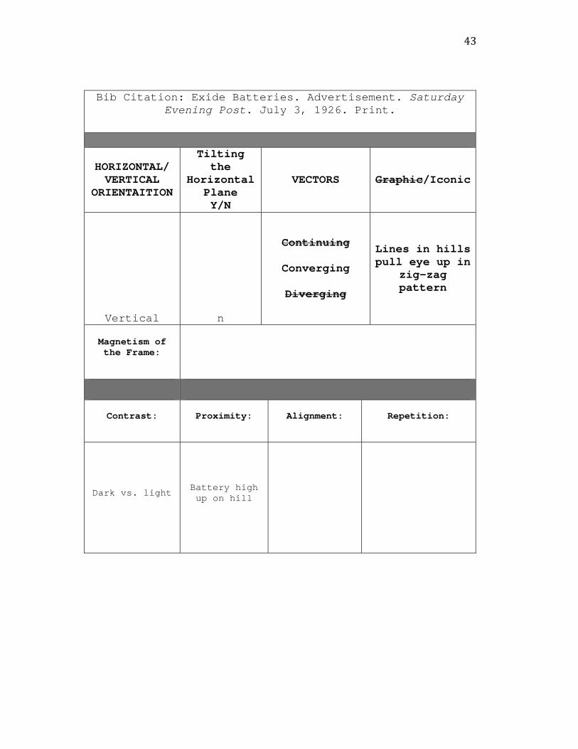
Bib Citation: Exide Batteries. Advertisement. Saturday Evening Post. July 3, 1926. Print.
HORIZONTAL/ VERTICAL
ORIENTAITION
Tilting the
Horizontal Plane Y/N
VECTORS Graphic/Iconic
Vertical n
Continuing
Converging
Diverging
Lines in hills pull eye up in
zig-zag pattern
Magnetism of the Frame:
Contrast: Proximity: Alignment: Repetition:
Dark vs. light Battery high up on hill

44
Bib Citation: Gardner. Advertisement. Saturday Evening Post. September 3, 1927. Print.
HORIZONTAL/ VERTICAL
ORIENTAITION
Tilting the
Horizontal Plane Y/N
VECTORS Graphic/Iconic
Vertical N
Continuing
Converging
Diverging
cars
Magnetism of the Frame:
Contrast: Proximity: Alignment: Repetition:
Dark cars, light
background
Cities off in distance
45
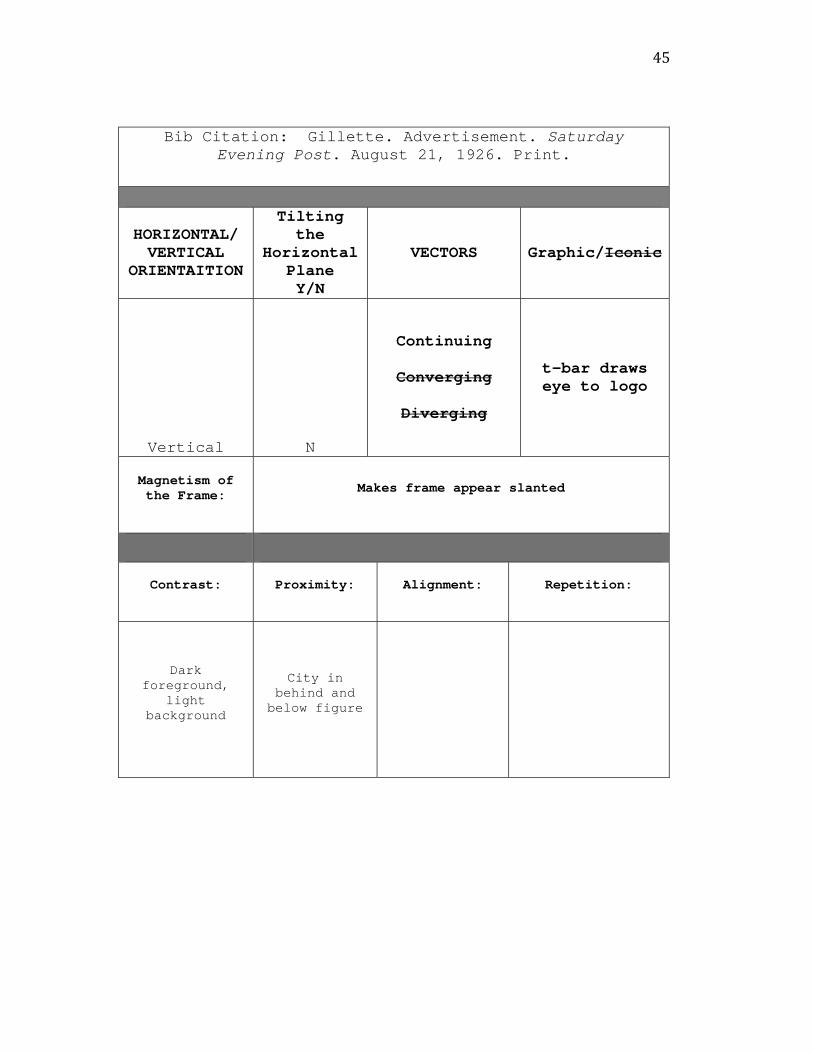
Bib Citation: Gillette. Advertisement. Saturday Evening Post. August 21, 1926. Print.
HORIZONTAL/ VERTICAL
ORIENTAITION
Tilting the
Horizontal Plane Y/N
VECTORS Graphic/Iconic
Vertical N
Continuing
Converging
Diverging
t-bar draws eye to logo
Magnetism of the Frame: Makes frame appear slanted
Contrast: Proximity: Alignment: Repetition:
Dark foreground,
light background
City in behind and below figure

46
Bib Citation: Graybar Electric. Advertisement. Saturday Evening Post. October 1, 1927. Print.
HORIZONTAL/ VERTICAL
ORIENTAITION
Tilting the
Horizontal Plane Y/N
VECTORS Graphic/Iconic
Vertical N
Continuing
Converging
Diverging
Buildings pull eye up and
down
Magnetism of the Frame:
Contrast: Proximity: Alignment: Repetition:
Light city, dark background
City is depicted in distance
Shape of frame mirrors shape of
tag
47
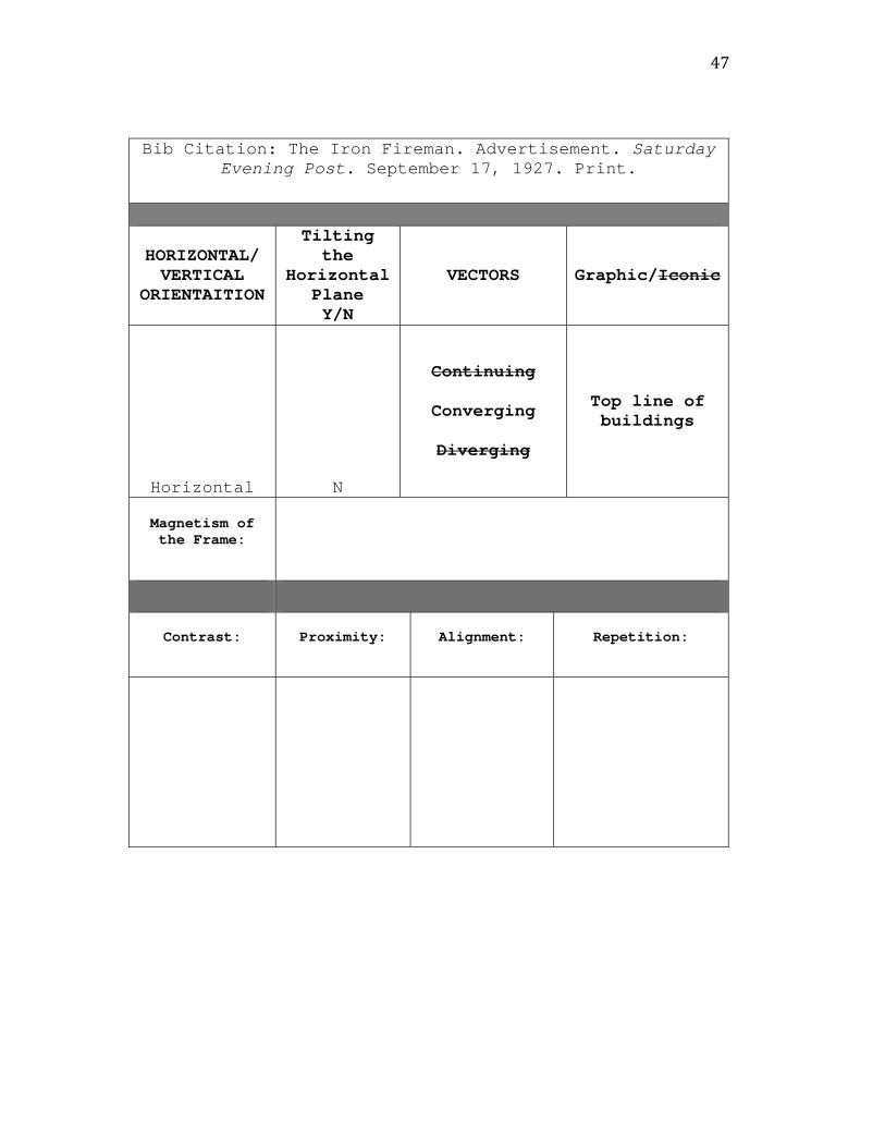
Bib Citation: The Iron Fireman. Advertisement. Saturday Evening Post. September 17, 1927. Print.
HORIZONTAL/ VERTICAL
ORIENTAITION
Tilting the
Horizontal Plane Y/N
VECTORS Graphic/Iconic
Horizontal N
Continuing
Converging
Diverging
Top line of buildings
Magnetism of the Frame:
Contrast: Proximity: Alignment: Repetition:

48
Bib Citation: Lehigh Cement. Advertisement. Saturday Evening Post. September 3, 1927. Print.
HORIZONTAL/ VERTICAL
ORIENTAITION
Tilting the
Horizontal Plane Y/N
VECTORS Graphic/Iconic
Vertical n
Continuing
Converging
Diverging
Bridges and road intersect in middle of
frame
Magnetism of the Frame: Makes frame appear slanted
Contrast: Proximity: Alignment: Repetition:
Very low
49
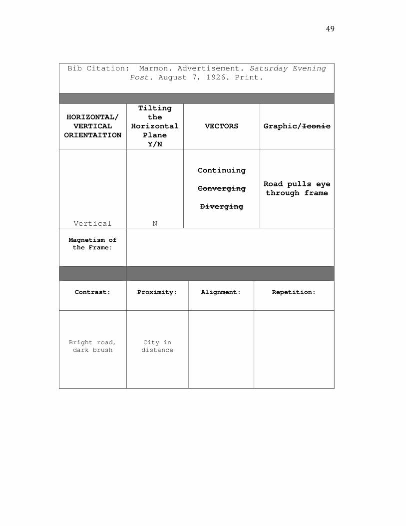
Bib Citation: Marmon. Advertisement. Saturday Evening Post. August 7, 1926. Print.
HORIZONTAL/ VERTICAL
ORIENTAITION
Tilting the
Horizontal Plane Y/N
VECTORS Graphic/Iconic
Vertical N
Continuing
Converging
Diverging
Road pulls eye through frame
Magnetism of the Frame:
Contrast: Proximity: Alignment: Repetition:
Bright road, dark brush
City in distance

50
Bib Citation: Miller. Advertisement. Saturday Evening Post. July 31, 1926. Print.
HORIZONTAL/ VERTICAL
ORIENTAITION
Tilting the
Horizontal Plane Y/N
VECTORS Graphic/Iconic
Vertical n
Continuing
Converging
Diverging
car
Magnetism of the Frame: n/a
Contrast: Proximity: Alignment: Repetition:
Dark tires, everything else
light
City in distance
51
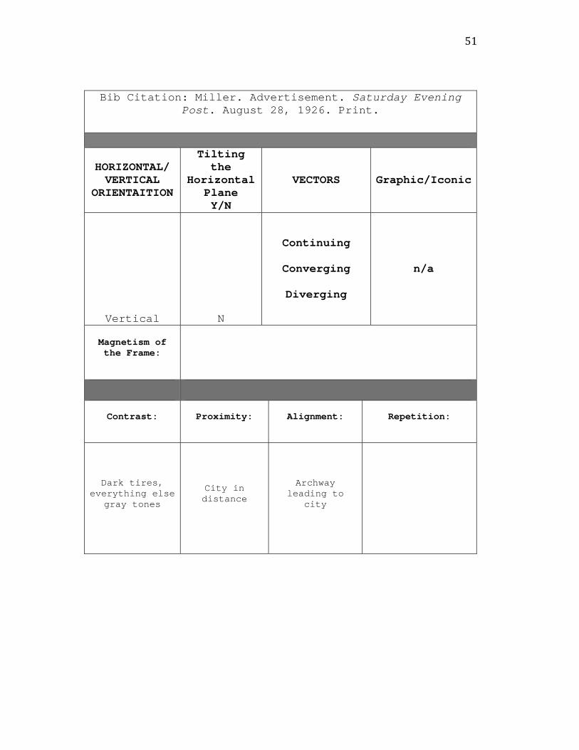
Bib Citation: Miller. Advertisement. Saturday Evening Post. August 28, 1926. Print.
HORIZONTAL/ VERTICAL
ORIENTAITION
Tilting the
Horizontal Plane Y/N
VECTORS Graphic/Iconic
Vertical N
Continuing
Converging
Diverging
n/a
Magnetism of the Frame:
Contrast: Proximity: Alignment: Repetition:
Dark tires, everything else
gray tones
City in distance
Archway leading to
city

52
Bib Citation: Portland Cement. Advertisement. Saturday Evening Post. September 10, 1927. Print.
HORIZONTAL/ VERTICAL
ORIENTAITION
Tilting the
Horizontal Plane Y/N
VECTORS Graphic/Iconic
Horizontal N
Continuing
Converging
Diverging
Cars driving down street, street. L to R, cars go opposite of way our eyes normally go
Magnetism of the Frame: Pulls buildings up
Contrast: Proximity: Alignment: Repetition:
Light road, dark cars
53
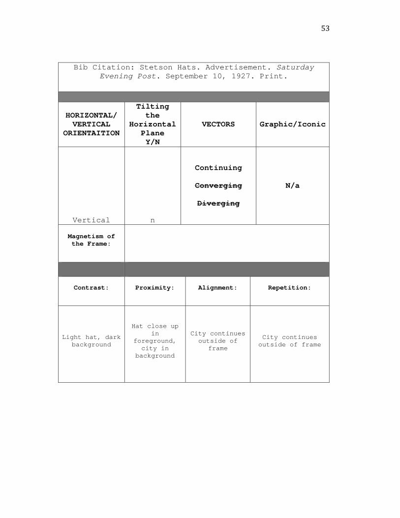
Bib Citation: Stetson Hats. Advertisement. Saturday Evening Post. September 10, 1927. Print.
HORIZONTAL/ VERTICAL
ORIENTAITION
Tilting the
Horizontal Plane Y/N
VECTORS Graphic/Iconic
Vertical n
Continuing
Converging
Diverging
N/a
Magnetism of the Frame:
Contrast: Proximity: Alignment: Repetition:
Light hat, dark background
Hat close up in
foreground, city in
background
City continues outside of
frame
City continues outside of frame

54
Bib Citation: Studebaker. Advertisement. Saturday Evening Post. August 21, 1926. Print.
HORIZONTAL/ VERTICAL
ORIENTAITION
Tilting the
Horizontal Plane Y/N
VECTORS Graphic/Iconic
Vertical N
Continuing
Converging
Diverging
Car points R to L
Magnetism of the Frame: Pulls buildings up
Contrast: Proximity: Alignment: Repetition:
Dark car, light background
City in distance
Car facing R to L
55
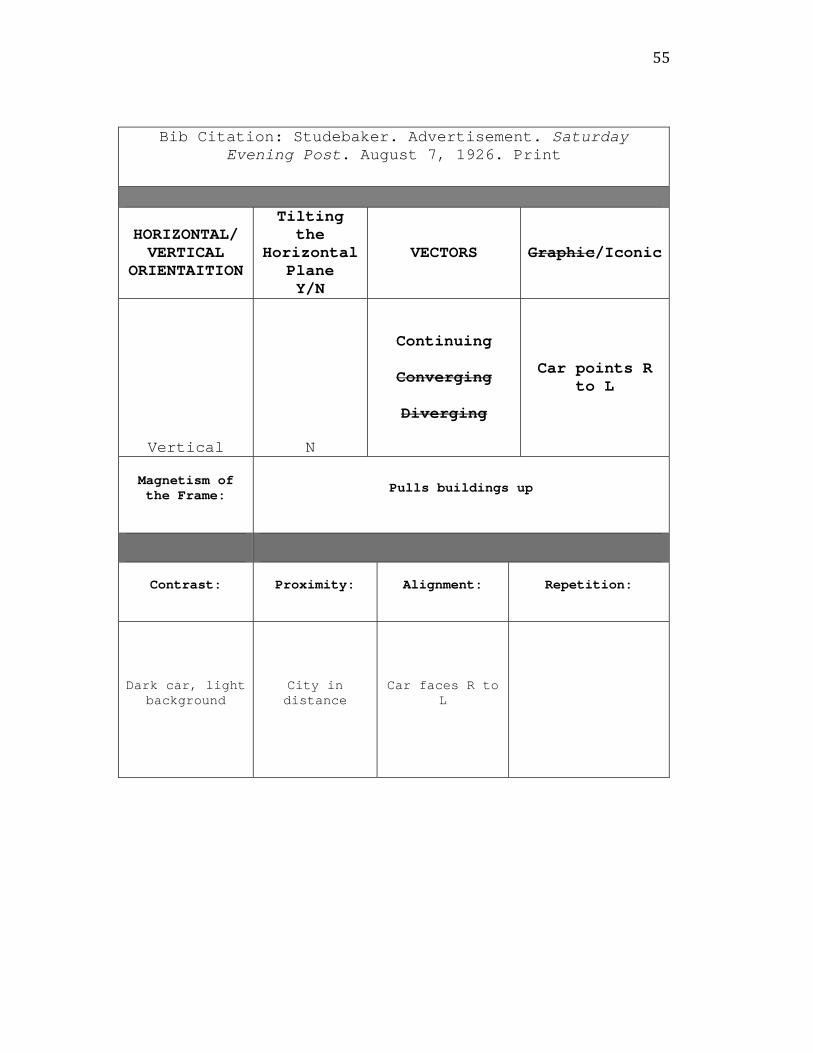
Bib Citation: Studebaker. Advertisement. Saturday Evening Post. August 7, 1926. Print
HORIZONTAL/ VERTICAL
ORIENTAITION
Tilting the
Horizontal Plane Y/N
VECTORS Graphic/Iconic
Vertical N
Continuing
Converging
Diverging
Car points R to L
Magnetism of the Frame: Pulls buildings up
Contrast: Proximity: Alignment: Repetition:
Dark car, light background
City in distance
Car faces R to L

56
Bib Citation: Studebaker. Advertisement. Saturday Evening Post. August 14, 1926. Print.
HORIZONTAL/ VERTICAL
ORIENTAITION
Tilting the
Horizontal Plane Y/N
VECTORS Graphic/Iconic
Vertical N
Continuing
Converging
Diverging
Car points R to L
Magnetism of the Frame:
Contrast: Proximity: Alignment: Repetition:
Dark car, light background
City in distance
Car points R to L

57
Bib Citation: Union Metal. Advertisement. Saturday Evening Post. October 22, 1927. Print.
HORIZONTAL/ VERTICAL
ORIENTAITION
Tilting the
Horizontal Plane Y/N
VECTORS Graphic/Iconic
Vertical N
Continuing
Converging
Diverging
Intersecting roads
Magnetism of the Frame:
Contrast: Proximity: Alignment: Repetition:
Light buildings, dark
background
City up close and in distance
58
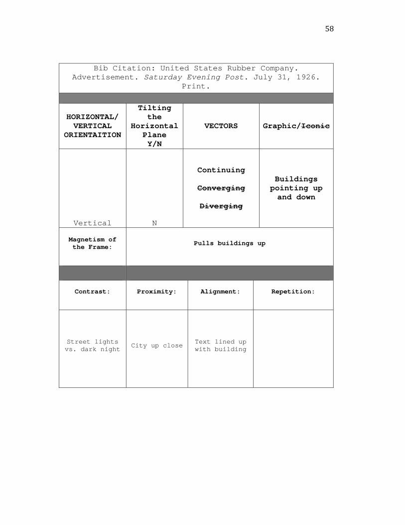
Bib Citation: United States Rubber Company. Advertisement. Saturday Evening Post. July 31, 1926.
Print.
HORIZONTAL/ VERTICAL
ORIENTAITION
Tilting the
Horizontal Plane Y/N
VECTORS Graphic/Iconic
Vertical N
Continuing
Converging
Diverging
Buildings pointing up and down
Magnetism of the Frame: Pulls buildings up
Contrast: Proximity: Alignment: Repetition:
Street lights vs. dark night City up close Text lined up
with building

59
Bib Citation: Yves Saint Laurent. Advertisement. Allure. December 2009: 109. Print.
HORIZONTAL/ VERTICAL
ORIENTAITION
Tilting the Horizontal Plane Y/N
VECTORS Graphic/Iconic
Vertical Y
Continuing
Converging
Diverging
Eiffel tower, figure in
foreground
Magnetism of the Frame:
Pulls Eiffel tower and figure upwards
Contrast: Proximity: Alignment: Repetition:
Very little. Mostly dark
except for rose and figure’s skin
Figure in foreground, city in background
Figure has same slant as Eiffel
tower
Color: black and pink