Embed Size (px)
DESCRIPTION
Â
Citation preview

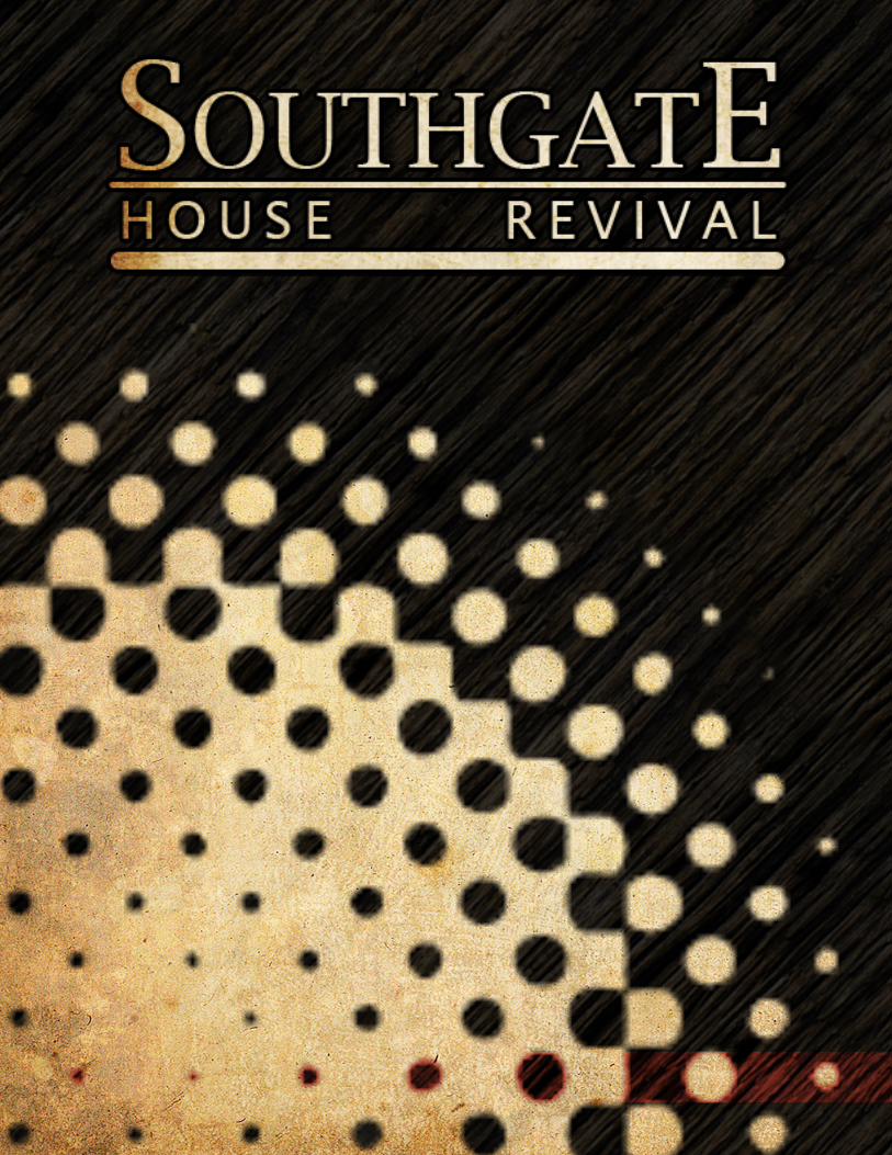

is an original music venue specializing in bluegrass, indie and rock music, located in Northern KY. They have recently moved to a renovated church after nearly 40 years of business at another location. The following is my plan for re-branding, focusing on a reinvented look and a fully integrated multi-media marketing campaign including web, mobile and print.
The Southgate House Revival

Research
Development
1.1 - Research Paper 1.5 - S.W.O.T.1.2 - Target 1.6 - Brand Mission1.3 - Client Brief 1.7 - Creative Brief1.4 - Brand Features
2.1 - Logo 2.5 - Print2.2 - Moodboards2.3 - Web & Mobile2.4 - Promotional

Standards
Final Designs
3.1 - Logo 3.5 - Textures3.2 - Guidelines 3.6 - Web Guide3.3 - Color Palette 3.7 - Print Guide3.4 - Font 3.8 - Brand Voice
4.1 - Web4.2 - Mobile4.3 - Promotional4.4 - Print

Research1.1 - Research Paper 1.5 - S.W.O.T.1.2 - Target 1.6 - Brand Mission1.3 - Client Brief 1.7 - Creative Brief1.4 - Brand Features

The Southgate House Reviv-
al is a small, live music venue
with big personality and an im-
mersive, intimate environment
located inside of a renovated
church, complete with much of
it’s original flair and elegance,
including the original stained-
glass windows. Despite the
venue’s unique and inviting vi-
sual and musical atmosphere, it
is still relatively unknown due
to its overall lack of branding
and poor web presence. With
a proper rebranding campaign,
Southgate House Revival could
position itself at the top of the
music venue food chain in the
Northern KY/ Cincinnati area
and possibly set itself up to
open branch locations through-
out the surrounding cities. This
rebranding campaign would in-
clude the creation of a new logo
to be used consistently through-
out the campaign as well as
t-shirts, stickers, posters, and
other merchandise that the fans
of the location itself could take
home and help spread the word.
The Southgate House
Revival is a small, live
music venue with big
personality...
Southgate House RevivalResearch Paper
by: Nick Brummer
Research Paper

The second part of this rebrand-
ing campaign would be to im-
prove the web presence through
a new web design as well as
links to the major social net-
works such as Facebook, Twit-
ter and Myspace. The potential
and heart of this establishment
is strong and the fan base is in
need of a business of this na-
ture. The next step is to get
the word out so that Southgate
House Revival is a household
name for all live music enthusi-
asts.
One of the biggest issues
facing Southgate House Reviv-
al (SHR) at this point is their
overall lack of quality branding.
Presently, SHR, has a weak web-
page that and what is passing
for a logo which is a represen-
tation of pipe organs. This can
be improved greatly. Not only
does the logo and webpage need
a redesign but they need con-
sistency and the ability to reach
the masses. People need to be
able to find out when the big
events are happening and once
they show up, they should be af-
fected not only by the event but
the atmosphere. The goal that
SHR is faced with at this point
is create a branding campaign
that focuses on and promotes
the existing environment and
atmosphere. SHR needs to be
an experience unto itself. With
proper branding and brand rec-
ognition SHB will begin to stand
for its product, stand for a good
time, a cool atmosphere and
great live music. SHR will be-
come a household name in enter-
tainment… in ‘cool’.
Research Paper

The first major issue that
needs to be solved is Brand-
ing. SHR is in serious need of a
new, hip, iconic logo that tells
the world how ‘cool’ SHR is.
This logo needs to be spread to
the website as well as to newly
branded merchandise that can
be sold to the customers as a
way for them to remember the
venue as much, if not more, than
the live acts that they came to
see. This logo should consist
of elements that are seen in the
location. Presently, they are us-
ing the pipe organs which are a
very iconic symbol and element
in the building, but the design
lacks pop or style. Other ele-
ments that could be included
are the stained glass windows
or the gothic arches. This logo
should be spread to a large ar-
ray of merchandise including
tshirts, posters, stickers and
mugs that the customer can take
home, give as gifts, spread the
word and remember how great
of a time they had at SHR. This
is a key factor. The customer
has to not only remember SHR
but relate it to a great time in a
great environment. When this is
achieved they are far more likely
to return and bring friends.
In the modern era, people
search for what they are going
to do and where they are going
to go online before they look
anywhere else. With this being
the way of the times, the lack of
an effective and convincing web
presence becomes the first and
most obvious problem to solve.
The first thing to do would be to
reconsider the construction of
Southgate House RevivalResearch Paper
Continued...
Research Paper

the webpage’s layout followed
by imagery, color palette and
fonts. Presently, The Southgate
House Revival’s webpage is an
over glorified blog with a very
simple line drawing logo and an
unattractive pink background.
The present state of the web-
page does not instill high hopes
for a good time and it certain-
ly doesn’t convey that this is a
unique, hip environment that
provides a great musical experi-
ence.
For the general layout of
the new designed webpage, the
most important two pages to
design will be the homepage and
the events page as these will be
the most visited pages on the
site and will contain the most
important information to the
customer. The user experience
will largely depend on the layout
and organization of the informa-
tion.
The homepage needs to set
the mood, give the customer
an idea of the environment and
provide them with an easy to un-
derstand layout so that they can
navigate to the information they
are looking for easily. It should
include a top navigation bar as
well as a bottom navigation bar,
depending on the height of the
page. Linkable images could
also be used in the body of the
page in order to give the view-
er a more visual approach to
navigating the site than the tra-
ditional navigation bar and tab
system. The imagery for the
homepage, as I’ve stated, needs
to set the mood and capture the
atmosphere of the unique ven-
ue. This, aside from the great
Research Paper

music, is one The Southgate
House Revival’s biggest assets
and therefore one of the most
important things to capitalize
on. Pictures of the stained glass
window, brick exterior, vaulted
ceilings, the choir loft, the orig-
inal pipe organs and shots from
live shows are all fair game. The
key is to select images that tell
a story and convey excitement.
The customer needs to under-
stand that this is a hip, unique
musical venue at a glance and
be intrigued enough to continue
deeper into the website.
The events page present-
ly is not differentiated from
the homepage. This needs to
change. In its present form it
is an endless blog style list of
dates and shows that leave the
customer a touch overwhelmed
Southgate House RevivalResearch Paper
Continued...
...now is the time to get
out the word and let the
fans feel the hand of
ROCK .
Research Paper

and doesn’t provide any way
to search for a particular date,
band or show aside from scroll-
ing and scanning tirelessly. The
new design needs to include
some form of calendar feature
that gives the customer a quick
reference as to who is playing
and when while still allowing
them to gain further informa-
tion by clicking on the date or
show that interests them. If
done properly the information
will appear either below the cal-
endar allowing for simultaneous
navigation and reading of infor-
mation or the information will
appear in a pop up layer simi-
lar to the way Facebook works
when clicking on an image. This
will provide the customer with
a much clearer and friendlier
interface. If they ever miss an
upcoming show or their favorite
band, it wont be due to a terrible
webpage, but simply a lack of
checking the website.
Other pages that could
prove interesting for customer
as well as helpful to the venue
would be an info page, an imag-
es page, a social media or blog
page and a merchandise page.
The info page would provide the
customer with a brief bit of his-
tory concerning The Southgate
House Revival. The images page
could include photos of the ven-
ue’s architecture, shows and the
overall environment as well as
possible short videos that would
function as brief commercials.
The blog page would function
more as a comment page where
customers could upload their
comments to an administrator
who could then post the com-
ments on the page for the world
to see. This page could also
feature a function that allows
customers to link directly to and
‘like’ SHR’s Facebook or Myspace
pages. This functions as a great
form of free, word-of-mouth ad-
vertising. The merchandise page
Research Paper

Research Paper
would give the venue a place
to sell items such as branded
t-shirts, sticker, mugs, beer co-
zies, key chains, posters (all of
which would have to be designed
since SHR presently has no
branded merchandise) and more
to help reinforce that The South-
gate House Revival is more than
just a music venue; it is an expe-
rience, it is a destination, it is a
way of life.
Another problem yet to be
solved for The Southgate House
Revival is color and font for
their print and web advertising.
Color and font style play an im-
portant role in setting mood as
well as influencing the way we
think about the product or or-
ganization that is involved with
the color or font used.
For Southgate House Reviv-
al’s web and print ads I want to
include bold colors that go with
the theme of the stained glass
windows. The windows contain
a large about of red, blue and
purples providing a very rich
color palette accented with yel-
lows and framed in black. The
red is bold and aggressive while
the “dark blue is dignified and
authoritative”.(Colormatters.
com) This is a very bold pal-
ette that demands attention but
could certainly be toned down
selectively depending on the ad.

Research Paper
The present font family
that I’m considering is Lucida.
“Over the years they extended
the font family which now in-
cludes serif, sans-serif, blacklet-
ter, calligraphic, mono-spaced,
handwritten, casual and fax-op-
timized variants.”(www.Prepres-
sure.com) The range of this font
family will give me a lot of room
in my design. This family is also
very easy to read in its more
basic forms at very small point
sizes in print. This is always a
good quality to take into consid-
eration when designing advertis-
ing.
The true key to a success-
ful design according to AIGA is
“is to find human-centered solu-
tions that will really work to ad-
dress a problem and to do so in
the context of existing cultures”.
(AIGA) This aspect is no dif-
ferent for the Southgate House
Revival rebranding. This pro-
posal will make a strong start
in connecting with the fans and
musicians of the local area and
help to invigorate the local mu-
sic scene. The venue exists and
provides a successful product,
now is the time to get out the
word and let the fans feel the
hand of ROCK.

Target
John is an a old-school, grun-ge and metal rocker from the 90’s. He grew up listening to Nirvana, Metallica, Motorhead, Bush, Collective Soul and Soundgarden. As John grew older his taste in mu-sic broadened into classical, blues and bluegrass. By day John works as a graphic designer for a hip new agency in town, designing web pages and mobile apps for other local companies. At night he still likes to go out and see live bands and have a few beers with his friends to unwind from the day. In John’s youth the heavier and crazi-er the music and venue the better. Now days John likes an environ-ment with character and music to match. He likes craft beers and a good conversation, both of which can be found at his favorite venue,Southgate House Revival.
John35 years oldWhiteMaleSingleGraphic Designer
The demographic for Southgate House
Revival is 18+ year olds who live and love
rock, blues and bluegrass. The following are
considered to be the two most prevalent
customer bases for this venue.

Target
Tara works at the local used book store and goes to college. Her parents want her to go to law school but she prefers biology and photography classes. She isn’t old enough to drink but still enjoys the bar scenes if it has live music.Not being 21 however limits her options. Also, she like to go to places that have a laid back, safe but edgy environment. She is sin-gle and not really looking. Tara has never been a fan of ‘heavy’ music but really enjoys the kind of rock that she can move and sing along to. In particular she has fallen inlove with indi rock for its sound as well as its fashion. Tara is big into fashion, shopping at all the local thrift shops fro retro clothes and shoes. She wants the world to know that she is an individual, and intellectual and cool. Southgate House Revival is a place she likes to go on Saturday nights to winddown from a long week a work and school with one or two of her friends while listening to some live music and enjoying the atmo-sphere.
Tara20 years oldWhiteFemaleSingleBook Store ClerkStudent

Client Brief
This business is part of the entertainment sector. It is a live music venue located in a newly renovated church in downtown Newport, KY. Opening in 1976, Southgate House was located down the street in what was aslo known as the Thompson house, known for being the home of the inventor of the Thompson Machine Gun. In December 2011 they closed their doors, much to the surprise of the local music scene that had depended on it for entertainment and as a place to play.
Late in 2012 The Southgate House Revival opened in the renovated church featuring a large open room with bar and stage for national acts, a smaller lounge with bar for local and national free acts and a smaller upstairs room with stage and bar for local acts. This venue seems to have taken off from the start, partly because of its former status in the local and national scene and also because of the gaping hole it left in the music scene that needed to be filled.
Late in 2012 The Southgate House Revival
opened in the renovatedchurch...

Client Brief

Brand Features
Stages 3
CraftBeers
Days a Week 7
UniqueImmersiveIntimateEnvironment
Days a Year 364
Blues, Bluegrass & ROCK
Local and National Acts

S.W.O.T. Analysis
Strength Weakness
Opportunity Threat
Central Location Poor Web Presence Unique Environment No real advertising Multiple Stages No logo Low Price No swag
Create a better web presence Several music venues locally Mobile interaction Music Downloads Swag, shirts, hats, stickers etc

Brand Mission
To provide a Unique,
Intimate and Immersive
ROCK experience,
featuring live local and
national acts.

Creative Brief
The multimedia campaign
for Southgate House Revival is
based around six principle words;
immersive, destination, intimate,
grunge, elegance and life. These
words describe the look and feel
of the experience provided by
Southgate House Revival.
In order to bring these el-
ements into a fully functional
multi-media marketing campaign,
samples were collected and test
assets created in order to find a
direction that communicated the
brand in a clear and cohesive
manner.
The challenge with the
design for SHR is to incorporate
the history of a venue that has
been entertaining for nearly 40
years as well as the look of the
newly environment, located in
a newly renovated church with
the original stained glass win-
dows and organ still in tack.
Through organized simple
layouts, a combination of bold
and desaturated colors, emo-
tive imagery and texturing this
brand now stands out from its
competition and clearly commu-
nicates it unique identity.
Development2.1 - Logo 2.2 - Moodboards2.3 - Web & Mobile2.4 - Infographic


Logo
In designing the new logo for
Southgate House Revival I considered
several aspect. Not only did the new
logo have to represent a music venue
but it had to be able to represent the
unique environment that SHR pro-
vides, the renovated church. The logo
had to be able to function in multi-
ple sizes, as large as a billboard, to
less than one inch. It had to function
in print, digital, screen printing and
embroidery. The new logo design had
to be able to fuction in solid colors as
wells textured or as an overlay. Also,
because Southgate is an established
venue in the local and national scene,
it had to represent the history, be
recognizable and be able to stand the
test of time for the next 15-20 years.
To achieve this list of demands
I started with an array of sketches
exploring the use of different shapes
and text layouts. Keeping the design
limited to strong positive and negative
space, made up from larger shapes
incorporated with strong textual ele-
ments allowed for these demands to
be realized in a convincing fashion.
The basic shapes used represent
the stained glass windows which are a
prevelant element of the environment,
a newly renovated church. The bottom
structure of the logo design is to func-
tion two fold, as an abstract represen-
tation of both the stairs to the upper
stages and as the original pipe organ,
now located behind the bar. The hand
in the center is a well known sign of
appreciation in the rock music world.

Logo

Mood Boards
immersive
intimate
destination
grunge
elegance
life
The development process of the three moodboards was to represent the two extremes of possible design for Southgate House Revival and then a middle ground incor-porating elements from the first two boards to create a
more cohesive, communcative design.

Mood Boards
The focus of this board was to
find a middle ground from boards
1 & 2, one that could convey the
feelings of both and still represent
the vast array of rock music as well
as the environment it takes place
in. This board incorporates many
of the same images from the previ-
ous boards but the layout is more
organic than 2 and more organized
and subtle than 1. I’ve chosen
bright colors mixed a lot of blacks
and grays for contrast and energy.
The black and white images help to
evoke a sense of nastalgia and inti-
macy that doesn’t exist in board 1.
I used a large amount of halftone
textures again to help show a sense
of energy as well as some of the
indie-rock spirit. The wood back-
ground and arching design give
this board a warm, relaxed, inviting
feel.

Web & Mobile
The design of the web and
mobile campaign would rely heavily
on ease of use and user experience.
Southgate House Revival’s original
web page was a continuous blog
based site. This site was hard to
navigate and provided little
information.
The new design is a more
modern layout, giving the customer
a place to view images, a detailed
schedule and download music clips
from the upcoming bands. With a
simple, engaging site, the
customer will be apt to spend more
time involved with its content.

Web & Mobile
The QR Code
would play a
major role in the
new multi media
campaign.
The mobile appli-cation is meant to give the customer access to information about Southgate House Revival as well as the bands that are playing at the venue while they are on the go.
The app will also allow customers to interact with QR codes that will be located on print ads, stickers, tshirts and posters.

Infographic
An infographic was formed before
beginning the layout of the final
project book. This valuable piece of
design helped to finalize many of the
design choices made in the presentation
of the multi-media campaign as well as
serve as a way to organize my thoughts.

Infographic
The purpose of the infographic was
to tell a story of how the multi-media
campaign would function as well as a
brief understanding of why it was
needed and how it was developed. In
order to make this design compatible
with both print and digital outlets I
chose to keep it in a standard size with
a clean layout.


Standards3.1 - Logo 3.5 - Textures3.2 - Guidelines 3.3 - Color Palette 3.4 - Font

Base logo design
The base design is comprised of two main parts, the emblem and the text. Both are representative of Southgate House Revival. Both can be used on their own or in conjunction with one another. When used in conjunction the tex-tual logo must be used with the bottom underline. When used alone there is no underline.
Live, Love, Rock
Live
LoveRock
The subtext to the left may be used in either shown form, vertical or horizon-tal. If used horizontal the text must include comas as shown as well as the prop-er font type for each word. If used vertically, the text must use the proper font type as well as grow in size and be centered.
Logo Standards

The Southgate House Revival logo may also be used with varying approved textures. These textures are shown below, including wood planks, wood grain and aged pa-per. These textures can be used in both print and digital settings. The texture must be used on both the text and emblem to ensure cohesiveness.
Logo Standards

Guidelines
Used with the
emblem and
wordmark stacked.
Used with the emblem and wordmark side
by side. The wordmark will not be
underlined and will be shorter than the
emblem.

Guidelines
Emblem on its
own.
As the wordmark alone. No underline
will be used under the words House
Revival.

Color Pallete
Hex
- 0
00000
RG
B -
o,o
,o
CM
YK
- 7
5,6
8,6
7,9
0
Hex
- 9
59595
RG
B -
14
9,1
49
,14
9
CM
YK
- 4
4,3
6,3
7,0
2
Hex
- 9
90b
0d
R
GB
- 1
53
,11
,13
C
MY
K -
25
,10
0,1
00
,24
Hex
- e
35541
RG
B -
22
7,8
5,6
5
CM
YK
- 0
6,8
2,8
0,0
1
Hex
- 0
00099
RG
B -
0,0
,15
3
CM
YK
- 1
00
,98
,05
,06
Hex
- 4
58cc
c R
GB
- 6
9,1
40
,20
4
CM
YK
- 7
2,3
6,0
,0
Hex
- 9
9724b
R
GB
- 1
53
,11
4,7
4
CM
YK
- 3
5,5
2,7
6,1
5
Hex
- e
0c2
82
RG
B -
22
4,1
94
,13
0
CM
YK
-1
3,2
2,5
7,0
Hex
- c
c0077
RG
B -
20
4,0
,11
9
CM
YK
- 1
8,1
00
,20
,0
Hex
- f
391b
d
RG
B -
24
3,1
45
,18
9
CM
YK
- 0
1,5
4,0
,0

Color Pallete
These colors were chosen for the
purpose of giving a sense of energy
as well as echoing the colors that
exist in the original stained glass
windows located throughout
Southgate House Revival’s
rich environment. These colors
represent the atmosphere of SHR.
The colors may be used in
their traditional solid form to
accent images in print and
digital mediums, act as a fill for
the logo or be used as a color
dodge layer as displayed below
the solid color lines for accents.

Font
Lucida BrightA B C D E F G H I J K L M N O P Q R S T U V W X Y Za b c d e f g h i j k l m n o p q r s t u v w x y z1 2 3 4 5 6 7 8 9 0
The Lucida family offers a clear, easy to read font
for both print and web use. All uses of Lucida will
require a tracking of 75. The leading should be
close to double the font size. Use Bright for body
text, Blackletter for callouts and page titles and
Casual for accents and subtext. Bold and italics
should be used sparringly and only with Bright.
Lucida CasualA B C D E F G H I J K L M N O P Q R S T U V W X Y Za b c d e f g h i j k l m n o p q r s t u v w x y z1 2 3 4 5 6 7 8 9 0
Lucida BlackletterA B C D E F G H I J K L M N O P Q R S T U V W X Y Za b c d e f g h i j k l m n o p q r s t u v w x y z1 2 3 4 5 6 7 8 9 0

Textures
Below are the two approved textures for Southgate House Revival. The texture on the left is a weathured wood grain texture. It is to be used as a background in both digital and print mediums. The texture on the right is a custom paper texture. It is to be used as a background for both digital and print mediums as well as a fill for the logo. When used as a fill it should be ideally be used over-top of the wood grain texture or another dark color that can emphasize the details.
Both textures can be
used alone or in tandum
and may have effects
such as color dodge
applied to add richness
and detail.

Final Designs4.1 - Web4.2 - Mobile4.3 - Promotional4.4 - Print
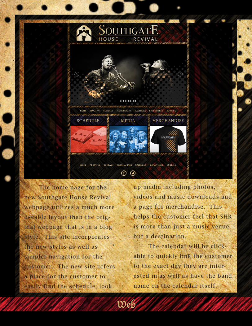
The home page for the
new Southgate House Revival
webpage utilizes a much more
useable layout than the orig-
inal webpage that is in a blog
style. This site incorporates
the new styles as well as
simpler navigation for the
customer. The new site offers
a place for the customer to
easily find the schedule, look
Web
up media including photos,
videos and music downloads and
a page for merchandise. This
helps the customer feel that SHR
is more than just a music venue
but a destination.
The calendar will be click-
able to quickly link the customer
to the exact day they are inter-
ested in as well as have the band
name on the calendar itself.
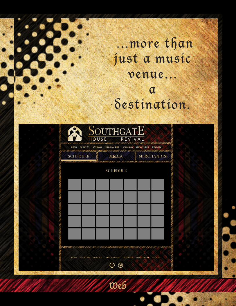
...more than just a music
venue...a
destination.
Web

Mobile
QR
Cod
e

Mobile
A sleak, simple design made
to be the hub for customers to link
into Southgate House Revival’s
schedule and media. The
customer will be able to gain
access to samples and downloads
from the upcoming bands as well
as plan ahead for the following
weeks. When scanned, the QR
codes printed on flyers, stickers
and tshirts will bring customers
directly to the schedule page of
the app allowing them to
immediately gain access to all of
Southgate House Revival’s exciting
content.

Promotional

Promotional
T-shirts and stickers offer a great
way to advertise and generate
income through merchandising.
They are inexpensive to print and
can be easily customized for
special events.

Through the use of a sticker bombing campaign and flyers,
Southgate House Revival
will become more visible throughout the local and
surrounding areas.
Providing QR codes on
the printed materials
will allow the
customers to access
information about the
upcoming shows as well
as music samples from
the bands.

The use of posters allows for
not only additional revenue, but it
offers the customer a way to bring
home a little piece of Southgate
House Revival. Posters are easily
customized to fit special events
or seasons and are inexpensive to
have printed. Much like the tshirts
and stickers, they crowd source
your marketing, allowing your
customers to advertise for you.

Reference
http://fennerphotography.com
http://www.aceweekly.com/wp-content/uploads/2012/08/South-
gate-ace-weekly.jpg
http://outgoingsignals.files.wordpress.com/2013/08/south-
gate-house-revival.jpg
http://stephenbabcockmusic.files.wordpress.com/2013/
www.flikr.com , 5436987782_81eaa60bf6_b.jpg, 507905638_39d4a-
be0c4_b.jpg, 1184787668_d02a59dfc3_o.jpg, 7896968114_
eb642d2732_b.jpg, 2678982201_85b5acda12_o.
jpg, 8112362581_63b87cb52c_o.jpg, 2679801614_e8f2567a7d_o.
jpg, 8689337038_0a066f21f1_b.jpg, 2679801738_471facd78c_o.
jpg, 8707012454_ccd3d87cf7_b.jpg, 5251586392_2ecf685b92_b.
jpg, 5403031487_f752b8b47c_b.jpg
http://www.prepressure.com/fonts/interesting/lucida
http://www.colormatters.com/red
http://www.colormatters.com/color-symbolism/color-symbolism-influ-
ences
http://www.southgatehouse.com/
http://www.aiga.org/why-design/
http://www.aiga.org/landing.aspx?pageid=10361&id=54


![1 4:40 16:10 16:10 4—1 4 1 6:45 (ACP) - Care Show …...16:10 4—1 4 1 6:45 (ACP) 1 1 6:30 4—1 1 1 3:30 1 4—1 2 14:10 1 5:00 —Y DAYS] 2021 Yaw DAYS] ! 1 1-3a 1 1 0:30 11:15](https://img.pdfslide.us/doc/110x75/5fd372ced16fe43b045f5884/1-440-1610-1610-4a1-4-1-645-acp-care-show-1610-4a1-4-1-645-acp.jpg)