Embed Size (px)
Citation preview
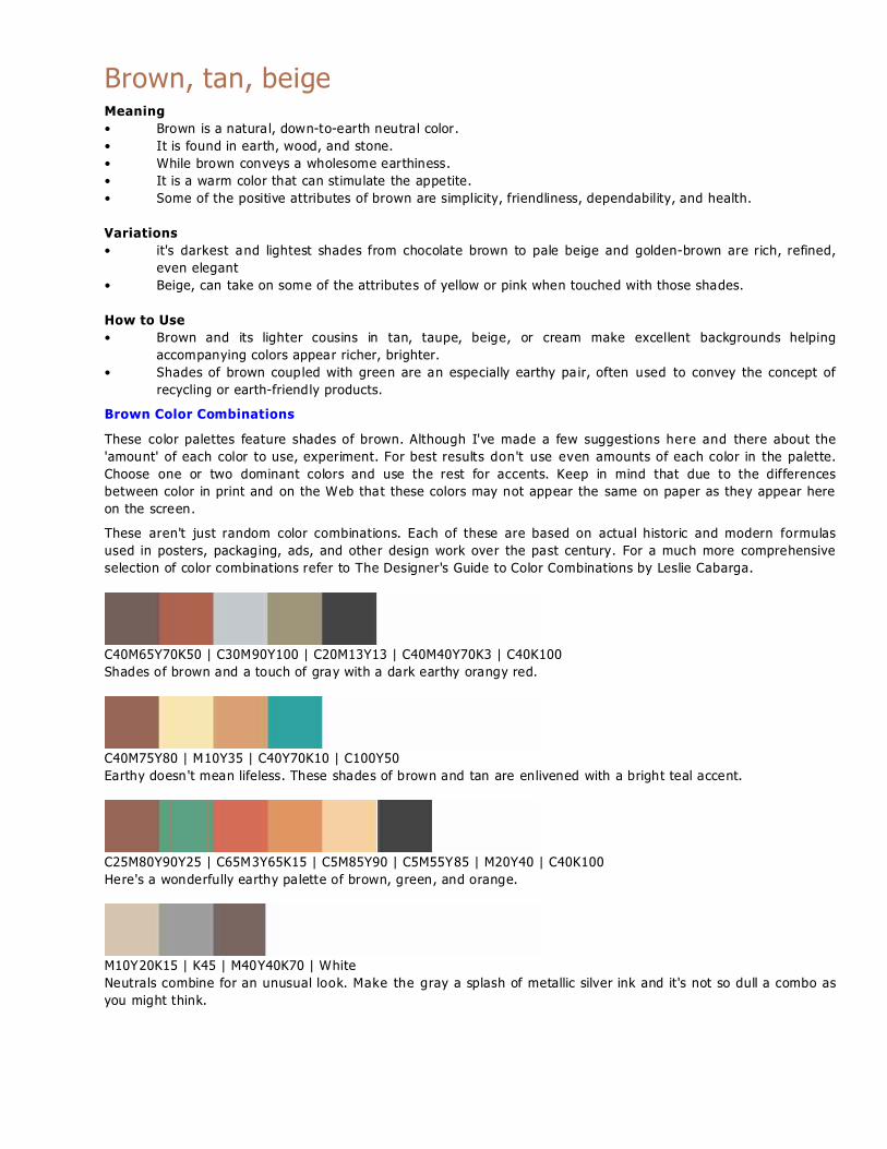
Brown, tan, beigeMeaning
• Brown is a natura l, down-to-earth neutral color.
• It is found in earth, wood, and stone.
• While brown conveys a wholesome earthiness.
• It is a warm color that can stimulate the appetite.
• Some of the positive attributes of brown are simplicity, friendliness, dependability, and health.
Variations
• it's darkest and lightest shades from chocolate brown to pale beige and golden-brown are rich, refined,
even elegant
• Beige, can take on some of the attributes of yellow or pink when touched with those shades.
How to Use
• Brown and its lighter cousins in tan, taupe, beige, or cream make excellent backgrounds helping
accompanying colors appear richer, brighter.
• Shades of brown coupled with green are an especially earthy pa ir, often used to convey the concept of
recycling or earth-friendly products.
Brown Color Combinations
These color palettes feature shades of brown. Although I've made a few suggestions here and there about the
'amount' of each color to use, experiment. For best results don't use even amounts of each color in the palette.
Choose one or two dominant colors and use the rest for accents. Keep in mind that due to the differences
between color in print and on the Web that these colors may not appear the same on paper as they appear here
on the screen.
These aren't just random color combinations. Each of these are based on actual historic and modern formulas
used in posters, packaging, ads, and other design work over the past century. For a much more comprehensive
selection of color combinations refer to The Designer's Guide to Color Combinations by Leslie Cabarga.
C40M65Y70K50 | C30M90Y100 | C20M13Y13 | C40M40Y70K3 | C40K100
Shades of brown and a touch of gray with a dark earthy orangy red.
C40M75Y80 | M10Y35 | C40Y70K10 | C100Y50
Earthy doesn 't mean lifeless. These shades of brown and tan are enlivened with a bright teal accent.
C25M80Y90Y25 | C65M3Y65K15 | C5M85Y90 | C5M55Y85 | M20Y40 | C40K100
Here's a wonderfully earthy pa lette of brown, green, and orange.
M10Y20K15 | K45 | M40Y40K70 | White
Neutrals combine for an unusual look. Make the gray a splash of metallic silver ink and it's not so dull a combo as
you might think.

M90Y100 | C15M35Y60K3 | C30M55Y100K30 | C40K100 | White
Black and brown create a strong neutral background for a splash of orange-red. Use a touch of white to provide
light and contrast.
C7M5Y15 | M40Y25 | C30M55Y60K15 | C50K100
A pale pink and light brown work nicely together with a beige and black for this neutral art deco color scheme.
Use more of the pink to wake it up a bit.
M30Y80 | M50Y100 | C15M40Y60K20 | C50K100 | White
A light brown brings out the earthiness of these citrus orange shades. Lighten with a touch of white for accent.
C80M100Y100K15 | M60Y80K10 | M35Y100 | M15Y35K25 | C40K100
A dark chocolate brown as a background works nicely with this orangey brown and ye llow. The gray adds a touch
of lightness.

Seven colors in shades of yellow, brown, and green combine for this Victorian era color scheme

Gray, SilverMeaning
• Gray is a neutral, balanced color.
• It is a cool, conservative color that seldom evokes strong emotion although it can be seen as a cloudy or
moody color.
• Silver, especially a shiny, metallic silver, is cool like gray but livelier, more playful.
• Silver can also denote riches, just as gold does.
• Silver can be earthy, natura l or sleek and elegant.
Variations
• Dark, charcoal gray carries with it some of the strength and mystery of black. It is a sophisticated color
without some of the negative attributes of black.
• Taupe, a grayish brown neutral is a conservative, slightly earthy color.
How to Use
• Silver coupled with turquoise evokes the Southwest (U.S.).
• Gray and silver work well with other cool colors such as blue or tea l.
These color palettes feature shades of gray. Although I've made a few suggestions here and there about the
'amount' of each color to use, exper iment. For best results don't use even amounts of each color in the palette.
Choose one or two dominant colors and use the rest for accents. Keep in mind that due to the differences
between color in print and on the Web that these colors may not appear the same on paper as they appear here
on the screen.
These aren't just random color combinations. Each of these are based on actual historic and modern formulas
used in posters, packaging, ads, and other design work over the past century.
C30M10Y5K20 | C10M10Y50 | M30Y70 | C10M35Y15K25 | M85Y85K10 | C40K100
Try these orange and yellows against a background of bluish gray.
C80M50Y15K15 | C25M15Y5Y5 | White
A grayish blue with a bluish gray on a background of white.
C65Y35K15 | M90Y100 | M35Y100 | Y70 | C10K35 | C40K100
The orange and yellows of sunflowers with light green are the centerp iece of this palette. Put them all on a
backdrop of medium gray.
C7M5Y10 | C7M90Y100 | C100M85Y10K6 | C40M25Y25K7 | C40K100
Bold blue and orange are tamed by shades of gray from silvery to charcoal.
M10Y20K15 | K45 | M40Y40K70 | White

Neutrals combine for an unusual look. Make the gray a splash of metallic silver ink and it's not so dull a combo as
you might think.
M50Y85K25 | C25M15Y20K9 | M10Y20K17 | C40K100
Another neutral palette with gray, brown, and a dose of black.
M30Y30K90 | M20Y20K75 | M10Y10K40 | M5Y5K20 | White
You could call this monochromatic pa lette shades of gray or tints of black. All with a dash of white to brighten.
M40Y100 | C100M65Y10K6 | C80Y40K20 | C10M30Y60K10 | C5M5Y10K5
Where white might overwhelm this bright blue and tea l try a pale gray.

Black and White. Meaning
• Black and White are opposites that share the attribute of neutrality.
• Considered the negation of color, black is conservative, goes well with almost any color except the very
dark.
• It also has conflicting connotations. It can be serious and conventional.
• Black can also be mysterious, sexy, and sophisticated.
• In most Western countries black is the color of mourning.
• Among young people, black is often seen as a color of rebellion.
• Black is both positive and negative.
• White is purity, cleanliness, and innocence.
• In most Western countries white is the color for brides.
• In the East, it's the color for funerals.
• White is often associated with hospitals, especially doctors, nurses, and dentists.
How to Use
• Black is the ultimate dark color and makes lighter colors such as yellow really pop out.
• Photographs often look brighter against a black background.
• Like black, white goes well with almost any color. It especially contrasts well with dark colors such as
red, blue, or purple.
• In most cases white is seen as a neutral background color and other colors, even when used in smaller
proportion, are the colors that convey the most meaning in a design.
• To the human eye, white is a brilliant color that can cause headaches for some. Too much white can be
'blinding.'
• Some neutra l light be iges and creams carry the same attributes as white but are more subdued, less
brilliant than plain white.
These color palettes feature black and white and almost-black and almost-white shades. Although I've made a
few suggestions here and there about the 'amount' of each color to use, experiment. For best results don't use
even amounts of each color in the palette. Choose one or two dominant colors and use the rest for accents. Keep
in mind that due to the differences between color in print and on the Web that these colors may not appear the
same on paper as they appear here on the screen.
These aren't just random color combinations. Each of these are based on actual historic and modern formulas
used in posters, packaging, ads, and other design work over the past century.
Y70 | C5M20Y100 | C40K100
It's no mellow yellow when you add black. Put it between the two yellows to make them each stand out.
M45Y100 | C40K100 | M3Y15
A charcoal black and a pale yellow, almost ivory shade team up with orange.
C65Y100 | White | C40K100
Team black and white with just about any color, such as this grassy green. And don't just relegate black to accent
- try a black background with several doses of green then touches of white as highlights.

C12M95Y60 | C75M6Y20 | C4M5Y2 | C40K100
The palest pink stands in for white in this palette with a 50s flavor.
M40Y10 | C50Y10 | C40K100
Another red/blue/black look uses light red (pink) and light blue as highlights and accents with lots of black.
M75Y100 | C22M30Y55K5 | C15M70Y75K20 | White | C40K100
Black with brown and earthy orange? Sure! And don't just relegate black to small doses either.
M65Y25 | M30Y10 | C65M10 | M50Y45 | White | C40K100
Your pastels won't be washed out with a judicial dose of black to make those pinks pop.
M30Y30K90 | M20Y20K75 | M10Y10K40 | M5Y5K20 | White
You could call this monochromatic pa lette shades of gray or tints of black. All with a dash of white to brighten.

Black and white with pink and red in a Sixties-inspired color palette.