Embed Size (px)
Citation preview
7/31/2019 Brief 6 One Day Brief
http://slidepdf.com/reader/full/brief-6-one-day-brief 1/7
SAI UENNATORNWARANGGOON OUGD303 S-UENNATORN0912.BLOGSPOT.COM BRIEF 6 : 1 DAY BRIEFS
NAME MODULE CODE BLOG ADDRESS BRIEF TITLE BOARD NUMBER
BRIEF DESCRIPTION WHAT THEY WANTED
The logo must include the letter BCFA, The full name of the association
‘The British Contract Furnishing Association’ may
need to be included on occasions, The term The BCFA can be
considered , The colour of the logo does not need to be blue.
1/7
This was a pitch for a live brief to design a new logo for a BCFA (British
Contract Furnishing Association).
THE S0LUTION
I decided to send them 2 different designs with 2 different possible
colour ways. I wanted to create something that is simple and
typographic. Something that is quite clean cut and modern but still is
quote commercially viable.
7/31/2019 Brief 6 One Day Brief
http://slidepdf.com/reader/full/brief-6-one-day-brief 2/7
SAI UENNATORNWARANGGOON OUGD303 S-UENNATORN0912.BLOGSPOT.COM BRIEF 6 : 1 DAY BRIEFS
NAME MODULE CODE BLOG ADDRESS BRIEF TITLE BOARD NUMBER
2/7
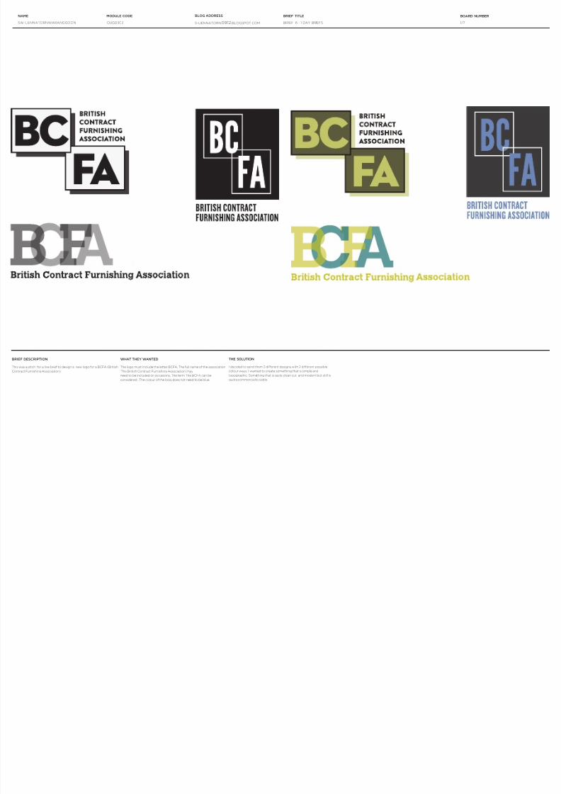
Opacity 50%
C 39 M 100 Y 22 K 29
Possible Colour Palette
Opacity 70%
C 91 M 93 Y 3 K 0.1
Opacity 100%
C 71 M 47 Y 0 K 47
Type
Helvetica Bold
Helvetica Regular
Helvetica Light
Brand Guidelines
BRIEF DESCRIPTION WHAT THEY WANTED
They were uncertain themselves of what they wanted. But there was
a general theme which they wanted in the logo. Firstly, they didn’t
want to come across as clinical but as something that is friendly and
approachable. It should represent the importance of the relationship
To create a brand identity for The St. Matins G.P in Chapel Town. The
G.P is moving into a new building and currently they do not have a
branding. This was a collaborative pitch with Robyn Russell where we
worked together on the rst pitch but unfortunately did not win.
between doctor and patient. The logo should signify a sense of
community within Chapel Town.
THE SOLUTION
Robyn and I worked separately at rst to come up with a few ideas and
then both tweaked both of our designs together. We came up with a
brand guidelines with the chosen typeface of Helvetica and also the
colour ways as shown
7/31/2019 Brief 6 One Day Brief
http://slidepdf.com/reader/full/brief-6-one-day-brief 3/7
SAI UENNATORNWARANGGOON OUGD303 S-UENNATORN0912.BLOGSPOT.COM BRIEF 6 : 1 DAY BRIEFS
NAME MODULE CODE BLOG ADDRESS BRIEF TITLE BOARD NUMBER
3/7
BRIEF DESCRIPTION
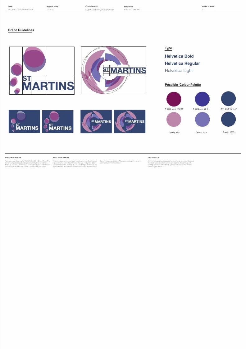
A poster competition to design a typographic poster using the saying ‘
It’s not what you win its how you conquer it’
7/31/2019 Brief 6 One Day Brief
http://slidepdf.com/reader/full/brief-6-one-day-brief 4/7
SAI UENNATORNWARANGGOON OUGD303 S-UENNATORN0912.BLOGSPOT.COM BRIEF 6 : 1 DAY BRIEFS
NAME MODULE CODE BLOG ADDRESS BRIEF TITLE BOARD NUMBER
4/7
BBQ CATERING SERVICES
B B Q C A T ERING SE R V I C E S
BBQ CATERING SERVICES
BBQ CATERING SERVICES
BBQ CATERING SERVICES BBQ CATERING SERVICES
FRESH QUALITY PRODUCE READY TO BBQ
STRAIGHT TO YOUR DOOR.
You no longer have to spend half youday scouring the
supermarket, and the other half chopping and slicing,
we do that for you.
Bringing you an array of salads and side dishes to
accompany beautifully marinated meats and fish.
CALL US ON +44 (0) 7774330618
BRIEF DESCRIPTION WHAT THEY WANTED
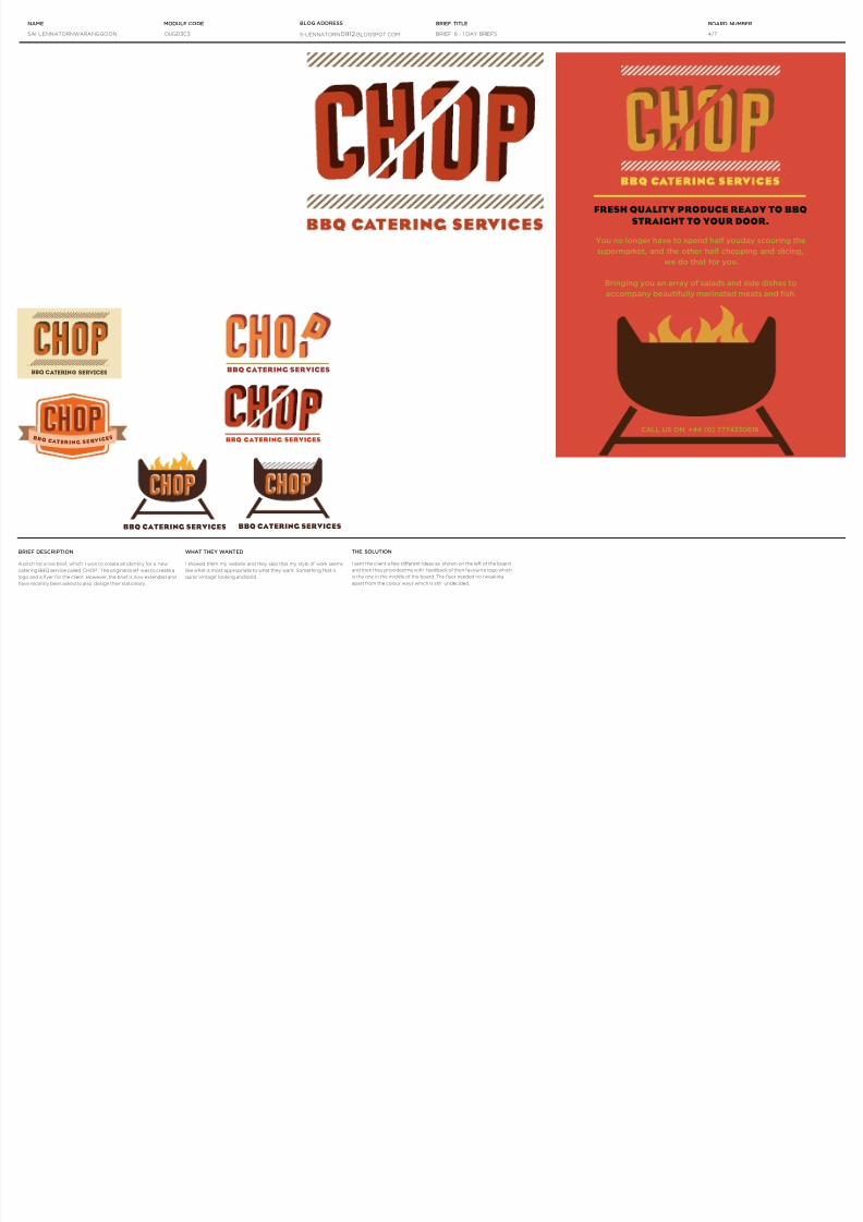
I showed them my website and they said that my style of work seems
like what is most appropriate to what they want. Something that is
quite ‘vintage’ looking and bold.
A pitch for a live brief, which I won to create an identity for a new
catering BBQ service called ‘CHOP’. The original brief was to create a
logo and a yer for the client. However, the brief is now extended and I
have recently been asked to also design their stationary.
THE SOLUTION
I sent the client a few different ideas as shown on the left of the board
and then they provided me with feedback of their favourite logo which
is the one in the middle of the board. The yer needed no tweaking
apart from the colour ways which is still undecided.
7/31/2019 Brief 6 One Day Brief
http://slidepdf.com/reader/full/brief-6-one-day-brief 5/7
SAI UENNATORNWARANGGOON OUGD303 S-UENNATORN0912.BLOGSPOT.COM BRIEF 6 : 1 DAY BRIEFS
NAME MODULE CODE BLOG ADDRESS BRIEF TITLE BOARD NUMBER
5/7
BRIEF DESCRIPTION
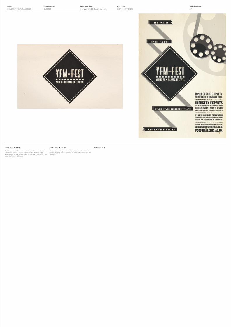
A pitch for a live brief to create an identity and poster for the Young
Film Makers Festival. This was originally just a 1 day brief but got
extended into my main brief and was actually altered into a black and
white lm festival ( 16 Frames)
WHAT THEY WANTED
There wasn’t anything specic that the client wanted so the design
concept, direction, tone of voice and etc were pretty much up to the
designers.
THE SOLUTION
7/31/2019 Brief 6 One Day Brief
http://slidepdf.com/reader/full/brief-6-one-day-brief 6/7
SAI UENNATORNWARANGGOON OUGD303 S-UENNATORN0912.BLOGSPOT.COM BRIEF 6 : 1 DAY BRIEFS
NAME MODULE CODE BLOG ADDRESS BRIEF TITLE BOARD NUMBER
6/7
‘An attack on all forms of authority
and a celebration of the free spirit’
Guardian
ONE F L E W
O V E R T H E C U C K O O’ S NE S T
B y K en
K e s e y
‘A roar of protest against
middlebrow society’s Rules and theRulers who enforce them’
TimeTyrannical Nurse Ratched rules her ward
in an Oregon State mental hospital with
a strict and unbending routine,
unopposed by her patients, who remain
cowed by mind-numbing medication
and the threat of electric shock therapy.
But her regime is disrupted by the arrival
of McMurphy – the swaggering,
fun-loving trickster with a devilish grin
who resolves to oppose her rules on
behalf of his fellow inmates. His struggle
is seen through the eyes of Chief
Bromden, a seemingly mute half-Indian
patient who understands McMurphy’s
heroic attempt to do battle with the
powers that keep them imprisoned. Ken
Kesey’s extraordinary first novel is an
exuberant, ribald and devastatinglyhonest portrayal of the boundaries
between sanity and madness.
ISBN 978-0-141-04942-7
9 7 8 01 4 1 0 4 94 2 7
Coverdesign U.K.: £00.00
CAN.: $00.00U.S.: $00.00
PENGUIN Fiction
NEW B FORMAT.indd 1 22/09/2011 14:41
ONE FLEW OVER THE CUCKOO’S NEST
by Ken Kesey
ONE FLEW
OVER
A CUCKOO’S
NEST
ONE FLEW
OVER
A CUCKOO’S
NEST
By Ken Kesey
BRIEF DESCRIPTION WHAT THEY WANTED
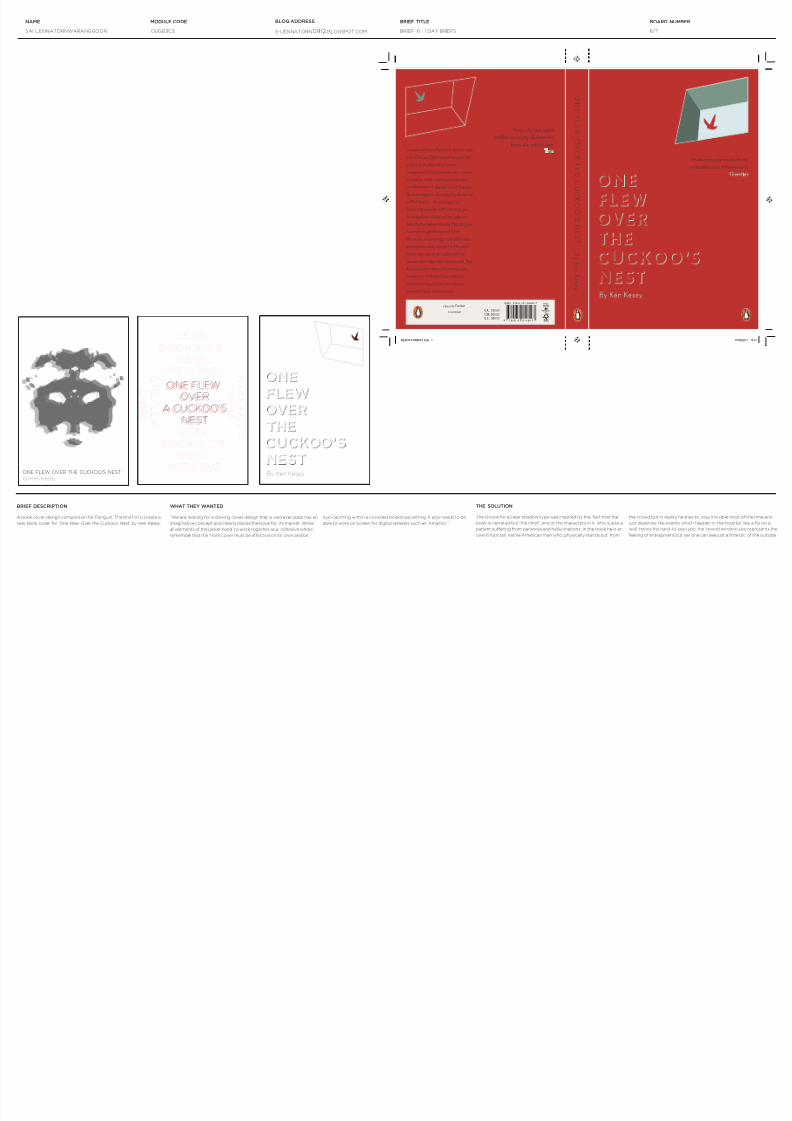
“We are looking for a striking cover design that is well executed, has an
imaginative concept and clearly places the book for its market. While
all elements of the jacket need to work together as a cohesive whole,
remember that the front cover must be effective on its own and be
A book cover design competition for Penguin. The brief is to create a
new book cover for ‘One Flew Over the Cuckoo’s Nest’ by Ken Kesey.
eye-catching within a crowded bookshop setting. It also needs to be
able to work on screen for digital retailers such as Amazon.“
THE SOLUTION
The choice for a clear shadow type was inspired by the fact that the
book is narrated but ‘the chief’, one of the characters in it who is also a
patient suffering from paranoia and hallucinations. In the book he is an
over 6 foot tall native American man who, physically stands out from
the crowd but in reality he tries to stay invisible most of the time and
just observes the events which happen in the hospital, like a y on a
wall, hence the hard-to-see type. the boxed window also represents the
feeling of entrapment but yet one can see just a little bit of the outside.
7/31/2019 Brief 6 One Day Brief
http://slidepdf.com/reader/full/brief-6-one-day-brief 7/7
SAI UENNATORNWARANGGOON OUGD303 S-UENNATORN0912.BLOGSPOT.COM BRIEF 6 : 1 DAY BRIEFS
NAME MODULE CODE BLOG ADDRESS BRIEF TITLE BOARD NUMBER
7/7
100% NATURAL TEA
1 0 0 % N A T U R A L J U I C E
100% natural juice
ATO L LO
BRIEF DESCRIPTION WHAT THEY WANTED
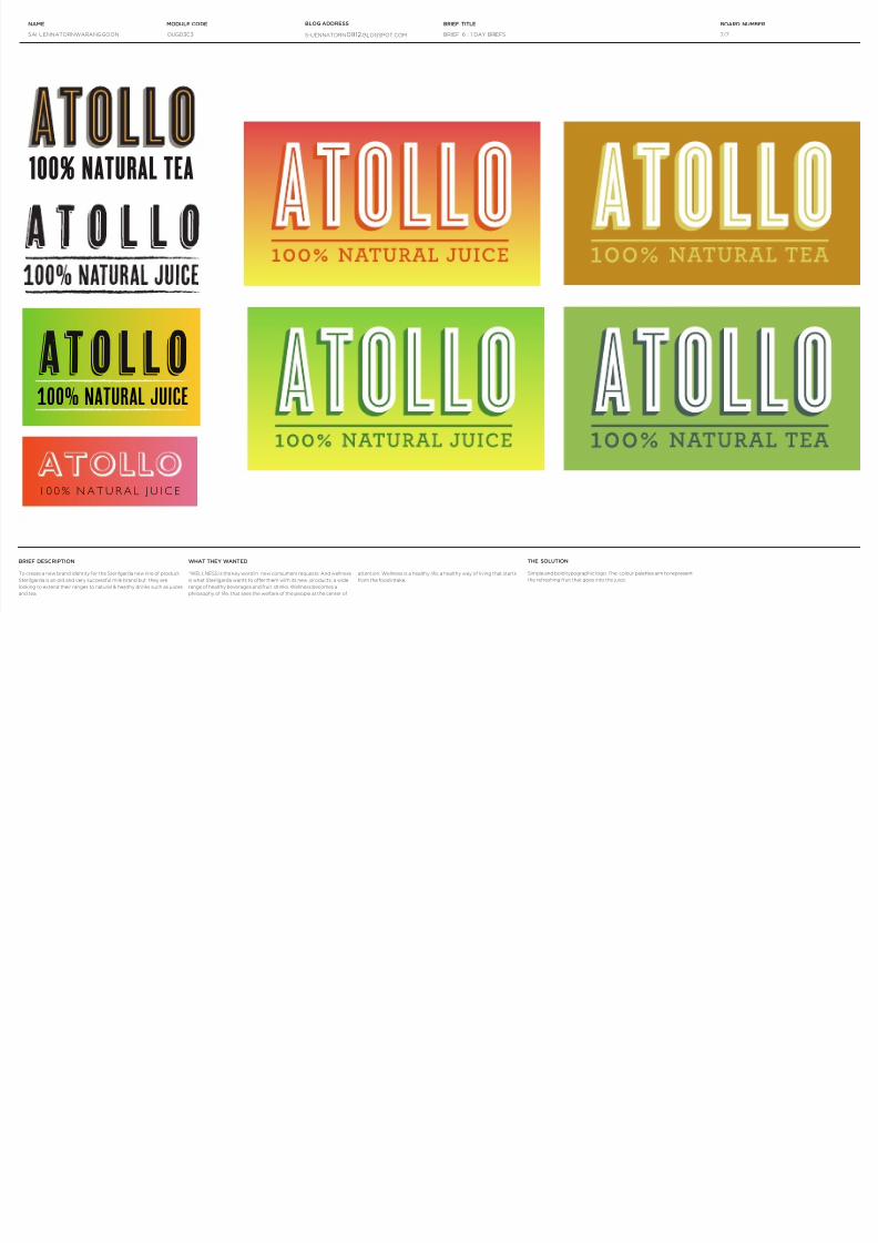
“WELLNESS is the key word in new consumers requests. And wellness
is what Sterilgarda wants to offer them with its new products: a wide
range of healthy beverages and fruit drinks. Wellness becomes a
philosophy of life, that sees the welfare of the people at the center of
To create a new brand identity for the Sterilgarda new line of product.
Sterilgarda is an old and very successful milk brand but they are
looking to extend their ranges to natural & healthy drinks such as juices
and tea.
attention. Wellness is a healthy life; a healthy way of living that starts
from the food intake.
THE SOLUTION
Simple and bold typographic logo. The colour palettes aim to represent
the refreshing fruit that goes into the juice.