Embed Size (px)
Citation preview

Brand Guidelines

Contents
03
The Vegan Society Brand Guidelines V1 02
Introduction
Masterbrand logo & mark
Additional logos & marks
Trademark
Colour palette
Typography
Image styles
Tone of voice
In application
Contact
Introduction

Who we are
The Vegan Society Brand Guidelines V1 04
The Vegan SocietyWe are an educational charity, established in 1944 that promotes and supports the vegan lifestyle. We still hold true to the vision of our founding members today – a world in which humans do not exploit other animals. We’re as determined as ever to encourage vegan lifestyles for the benefit of people, other animals, and the environment.
We set out to do this through meaningful, peaceful, and factual dialogue with individuals, groups, organisations, and companies by:
• Promoting veganism as a mainstream wayof life
• Highlighting the moral status of nonhuman animals
• Addressing issues of global food security and social justice
• Expanding the sunflower trademark internationally
• Advocating on behalf of vegans in vulnerable situations
• Furthering knowledge of plant-basednutrition and health
• Influencing public policy and giving vegans a stronger voice
Our valuesIn over 70 years, our commitment to achieving our vision of a vegan world hasn’t wavered. We see our values as our strength, as well as our responsibility. It is important that everyone who engages with the Society understands these values when communicating with our audiences.
What we believe in• We have respect for all life
• We use a positive approach
• We continue in the spirit of our founders
• We provide facts our audiences can trust
• We empower people to make a difference
• We collaborate with partners who share similar aims
• We maintain transparency at work

The new look
The Vegan Society Brand Guidelines V1 05
The new visual identity Our new visual identity is about changing the experience, showing the vegan way of life from a fresh perspective, and inspiring all of our audiences to see the Society and veganism in a positive way.
Our visual identity now demonstrates that we are welcoming and warm while being proactive and dynamic at the same time. It aims to overcome negative views of veganism by showing that veganism is something to be admired, it can be sustained, it is a rational choice and that it is about caring; not just for non-human animals but for ourselves and the environment.
Why a visual identity is importantA strong, consistent image will enhance the Society’s reputation as the leading authority on veganism and related issues; allow the organisation to have an impact in campaigning, policy and advocacy work; develop beneficial partnerships and attract and retain a greater number of members, supporters, volunteers and trademark holders.
Why we need these guidelinesOur new identity is an extremely valuable asset to our organisation and must be taken care of. Everyone who is responsible for communications, both externally and internally, including staff, volunteers and trustees should follow these guidelines to ensure that The Vegan Society presents a clear, consistent image which reflects our values.

Key words
The Vegan Society Brand Guidelines V1 06
Open to communication
Professional
An authority
Dynamic
Educational
Engaged
Welcoming
Inspirational
Ethical
Forward thinking
Health-conscious
Compassionate
Warm
Modern
Inclusive
Open-minded
The Vegan Society is...

ABCABC
Logo Colour palette Typography Imagery Tone of voice
Core elements
Positive
Inclusive
Inspiring
The Vegan Society Brand Guidelines V1 07
These are the five main core elements that make up our new identity: logo, colour palette, typography, imagery and tone of voice. When used in combination they create an identity which is both distinctive and adaptable.
The following pages will give a more detailed explanation of correct and effective use.
+ + + +
Masterbrand logo

Masterbrand logo with strapline
The Vegan Society Brand Guidelines V1 09

Masterbrand logo with strapline Exclusion zone
X
X
X
The Vegan Society Brand Guidelines V1.1 10
In order for the logo and strapline to stand out and be clear and consistent, an exclusion zone around the logo has been created. It is equivalent to half the size of the letter ‘e’ in the word Vegan. The dotted lines in the diagram to the right indicate the exclusion zone area.
No type or graphic elements should encroach on the exclusion zone. This is a minimum amount of space. More space placed around the logo is encouraged if possible.

Masterbrand logo with strapline Colour variations
The Vegan Society Brand Guidelines V1.1 11
The masterbrand logo with strapline can be reproduced in only three colourways:
Green and orange (two-colour logo)
(Please see page 59 for colour references to Pantone, four-colour process & RGB.)
The two-colour logo with strapline must always be on a white background.
BlackThe logo in black can be used on a variety of background colours as long as there is sufficient contrast for the logo to stand out.
WhiteThe logo in white can be used on photographs and on a variety of background colours as long as there is sufficient contrast for the logo to stand out. It must be produced at 100% white with no transparency.
Please note that the white version of the masterbrand logo with strapline has been optimised. Do not convert any colour logo file to white but use the vegan_society_logo_strap_white2014.ai file.

Masterbrand logo White logo on photography
The Vegan Society Brand Guidelines V1.1 12
The white logo with and without the strapline can be placed over photography. The elements of the photo must not be too light or complicated. A simple photographic background or a background that creates sufficient contrast is required to ensure legibility and maximum standout.

Masterbrand logo
The Vegan Society Brand Guidelines V1.1 13
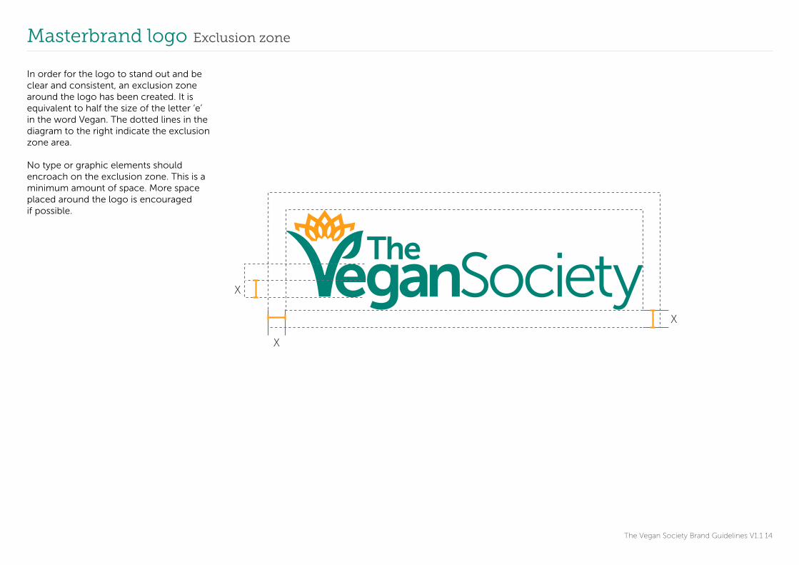
Masterbrand logo Exclusion zone
X
X
X
The Vegan Society Brand Guidelines V1.1 14
In order for the logo to stand out and be clear and consistent, an exclusion zone around the logo has been created. It is equivalent to half the size of the letter ‘e’ in the word Vegan. The dotted lines in the diagram to the right indicate the exclusion zone area.
No type or graphic elements should encroach on the exclusion zone. This is a minimum amount of space. More space placed around the logo is encouraged if possible.

Masterbrand logo Colour variations
The Vegan Society Brand Guidelines V1.1 15
The masterbrand logo can be reproduced in only three colourways:
Green and orange (two-colour logo)
(Please see page 59 for colour references to Pantone, four-colour process & RGB.)
The two-colour logo must always be on a white background.
BlackThe logo in black can be used on a variety of background colours as long as there is sufficient contrast for the logo to stand out.
WhiteThe logo in white can be used on photographs and on a variety of background colours as long as there is sufficient contrast for the logo to stand out. It must be produced at 100% white with no transparency.
Please note that the white version of the masterbrand logo has been optimised. Do not convert any colour logo file to white but use the vegan_society_logo_white.ai file.

Masterbrand logo Minimum sizes
The Vegan Society Brand Guidelines V1.1 16
minimum width 29mm
To maintain impact and legibility, a minimum size has been defined.
The recommended minimum size of the colour and black logo is a width of 29mm for print applications and 120 pixels for online applications.
The recommended minimum size of the white logo is a width of 32mm for print applications and 130 pixels for online applications.
The recommended minimum size of the logo with the strapline is a width of 46mm for print and 185 pixels for online use.
Please note that these are minimum sizes and larger sizes are recommended for maximum impact.
When changing the size of the logo always keep the same proportions and do not distort it in any way.
minimum width 32mm
minimum width 46mm
minimum width 46mm

Masterbrand logo Logo usage do nots
egan Society
X X
X
X
X
X
X
X
The Vegan Society Brand Guidelines V1.1 17
1 Do not rotate the logo.
2 Do not distort the logo.
3 Do not place the two-colour logo on a coloured background. It is only to be viewed on a white background.
4 Do not put the colour logo on a photograph.
5 Do not add effects to the logo (e.g. drop shadows).
6 Do not reproduce the logo in any other colour combination.
7 Do not change the typeface.
8 Do not delete elements of the logo.The words ‘Vegan’ and ‘Society’ must always be together.
Always use the provided logo files to maintain the correct usage and dimensions.
These guides apply to the logo with and without the strapline.
The same principles apply to all The Vegan Society colour logos.
1 5
2 6
3 7
4 8

Masterbrand logo with strapline Strapline usage do nots
One world. Many lives. Our choice.One world. Many lives. Our choice.
One world. Many lives. Our choice.
One world. Many lives. Our choice.
The Vegan Society Brand Guidelines V1.1 18
When the logo and the strapline are used together the strapline must always be in the same position under the logo.
1 Do not move the strapline or alter the relationship between the logo and the strapline
2 Do not break up the strapline
3 Do not change the colour of the strapline
4 Do not change the font of the strapline
Always use the provided logo files to maintain the correct usage and dimensions.
There is a minimum size with the strapline under the logo (see p16). When the strapline is too small to be read next to the logo, it must be placed apart from the logo.
X
X
X
X
1
2
3
4

V mark
The Vegan Society Brand Guidelines V1.1 19
The V with the sunflower can be reproduced as a standalone mark.

V mark Exclusion zone
The Vegan Society Brand Guidelines V1.1 20
When the V mark is not placed in a circle the exclusion zone is the width between the petal as shown. No typographic or graphic elements can encroach on this space. This is the minimum amount of space but more is advisable.
X
X
X

V mark Circle
The Vegan Society Brand Guidelines V1.1 21
The V mark can also be placed in a circle.
V mark Circle. Exclusion zone
X
X
X
The Vegan Society Brand Guidelines V1.1 22
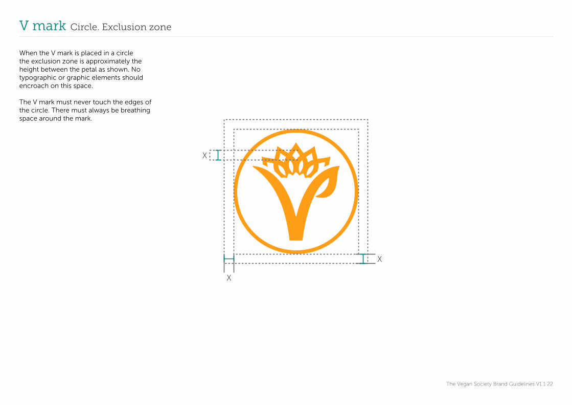
When the V mark is placed in a circle the exclusion zone is approximately the height between the petal as shown. No typographic or graphic elements should encroach on this space.
The V mark must never touch the edges of the circle. There must always be breathing space around the mark.
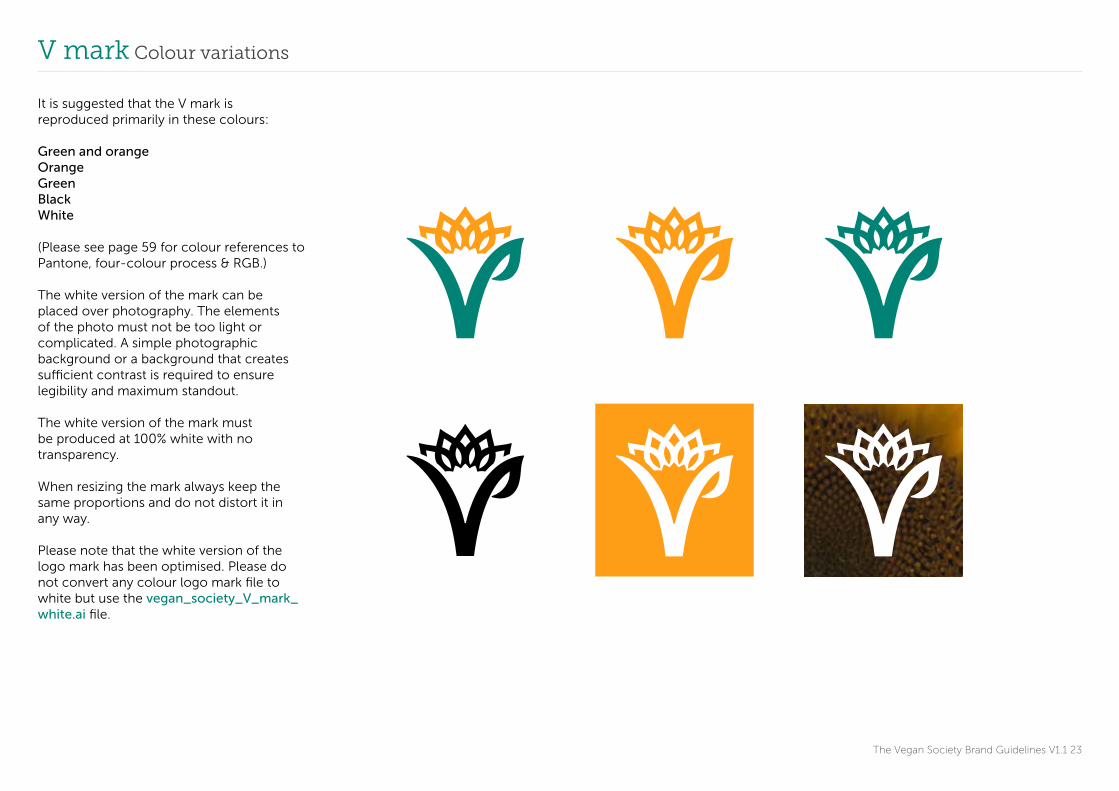
V mark Colour variations
The Vegan Society Brand Guidelines V1.1 23
It is suggested that the V mark is reproduced primarily in these colours:
Green and orangeOrangeGreenBlackWhite
(Please see page 59 for colour references to Pantone, four-colour process & RGB.)
The white version of the mark can be placed over photography. The elements of the photo must not be too light or complicated. A simple photographic background or a background that creates sufficient contrast is required to ensure legibility and maximum standout.
The white version of the mark must be produced at 100% white with no transparency.
When resizing the mark always keep the same proportions and do not distort it in any way.
Please note that the white version of the logo mark has been optimised. Please do not convert any colour logo mark file to white but use the vegan_society_V_mark_white.ai file.

V mark Mark usage do nots
The Vegan Society Brand Guidelines V1.1 24
1 Do not rotate the mark.
2 Do not place any colour mark on a coloured background. Marks in colour are only to be viewed on a white background.
3 Do not put any colour mark on a photograph.
4 Do not distort the mark.
5 Do not add effects to the mark (e.g. drop shadows).
6 Do not flip the mark.
Always use the provided files to maintain the correct usage and dimensions.
The same principles apply to all the colour marks that the Society uses.
X1 X4
X2 X5
X3 X6

The Vegan Society Brand Guidelines V1.1 25
Additional logos
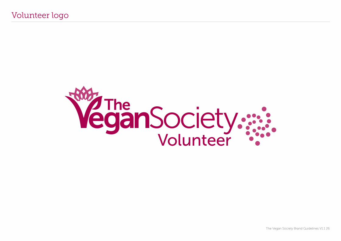
Volunteer logo
The Vegan Society Brand Guidelines V1.1 26

Volunteer logo Exclusion zone & minimum size
X
X
X
The Vegan Society Brand Guidelines V1.1 27
Exclusion ZoneIn order for the Volunteer logo to stand out and be clear and consistent, an exclusion zone around the logo has been created. It is equivalent to half the size of the letter ‘e’ in the word Vegan.
No type or graphic elements should encroach on the exclusion zone. This is a minimum amount of space. More space placed around the logo is encouraged if possible.
Minimum sizeThe recommended minimum size of the logo is a width of 55mm for print applications and 220 pixels for online applications.
Please note that these are minimum sizes and larger sizes are recommended for maximum impact.
When changing the size of the logo always keep the same proportions and do not distort it in any way.
Please see p17 logo usage do nots. This will demonstrate how not to use the logo as the same principles apply for all The Vegan Society logos.
minimum width
55 mm
Volunteer logo Colour variations
The Vegan Society Brand Guidelines V1.1 28
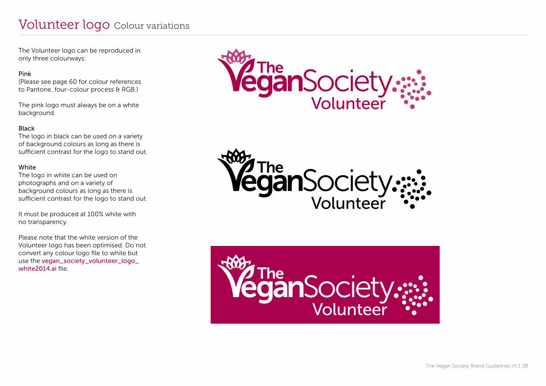
The Volunteer logo can be reproduced in only three colourways:
Pink(Please see page 60 for colour references to Pantone, four-colour process & RGB.)
The pink logo must always be on a white background.
BlackThe logo in black can be used on a variety of background colours as long as there is sufficient contrast for the logo to stand out.
WhiteThe logo in white can be used on photographs and on a variety of background colours as long as there is sufficient contrast for the logo to stand out. It must be produced at 100% white with no transparency.
Please note that the white version of the Volunteer logo has been optimised. Do not convert any colour logo file to white but use the vegan_society_volunteer_logo_white2014.ai file.

Volunteer mark
The Vegan Society Brand Guidelines V1.1 29
The volunteer mark can be reproduced as a standalone mark.

Volunteer mark Colour variations
The Vegan Society Brand Guidelines V1.1 30
It is recommended that the mark is reproduced in these colours:
PinkBlackWhite
(Please see page 60 for colour references to Pantone, four-colour process & RGB.)
The white version of the mark can be placed over photography. The elements of the photo must not be too light or complicated. A simple photographic background or a background that creates sufficient contrast is required to ensure legibility and maximum stand out.
The white version of the mark must be produced at 100% white with no transparency.
When resizing the mark always keep the same proportions and do not distort it in any way.

Volunteer mark Exclusion zone
The Vegan Society Brand Guidelines V1.1 31
The exclusion zone is the width between the circles as shown. No typographic or graphic elements can encroach on this space. This is the minimum amount of space but more is advisable.
X
X
X

Learning logo
The Vegan Society Brand Guidelines V1.1 32
Learning logo Exclusion zone & minimum size
X
X
X
The Vegan Society Brand Guidelines V1.1 33
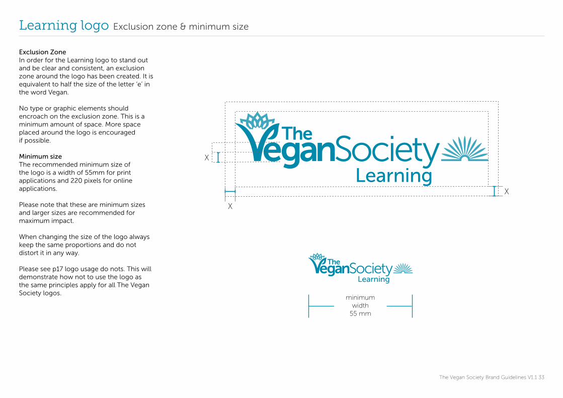
Exclusion ZoneIn order for the Learning logo to stand out and be clear and consistent, an exclusion zone around the logo has been created. It is equivalent to half the size of the letter ‘e’ in the word Vegan.
No type or graphic elements should encroach on the exclusion zone. This is a minimum amount of space. More space placed around the logo is encouraged if possible.
Minimum sizeThe recommended minimum size of the logo is a width of 55mm for print applications and 220 pixels for online applications.
Please note that these are minimum sizes and larger sizes are recommended for maximum impact.
When changing the size of the logo always keep the same proportions and do not distort it in any way.
Please see p17 logo usage do nots. This will demonstrate how not to use the logo as the same principles apply for all The Vegan Society logos.
minimum width
55 mm

Learning logo Colour variations
The Vegan Society Brand Guidelines V1.1 34
The Learning logo can be reproduced in only three colourways:
Blue(Please see page 60 for colour references to Pantone, four-colour process & RGB.)
The blue logo must always be on a white background.
BlackThe logo in black can be used on a variety of background colours as long as there is sufficient contrast for the logo to stand out.
WhiteThe logo in white can be used on photographs and on a variety of background colours as long as there is sufficient contrast for the logo to stand out. It must be produced at 100% white with no transparency.
Please note that the white version of the Volunteer logo has been optimised. Do not convert any colour logo file to white but use the vegan_society_learning_logo_white2014.ai file.

Learning mark
The Vegan Society Brand Guidelines V1.1 35
The learning mark can be reproduced as a standalone mark.

Learning mark Colour variations
The Vegan Society Brand Guidelines V1.1 36
It is recommended that the mark is reproduced in these colours:
BlueBlack White
(Please see page 60 for colour references to Pantone, four-colour process & RGB.)
The white version of the mark can be placed over photography. The elements of the photo must not be too light or complicated. A simple photographic background or a background that creates sufficient contrast is required to ensure legibility and maximum standout.
The white version of the mark must be produced at 100% white with no transparency.
When resizing the mark always keep the same proportions and do not distort it in any way.

Learning mark Exclusion zone
The Vegan Society Brand Guidelines V1.1 37
The exclusion zone is the width between the lines as shown. No typographic or graphic elements can encroach on this space. This is the minimum amount of space but more is advisable.
X
X
X
Supporter logo
The Vegan Society Brand Guidelines V1 38
Supporter logoThe Supporter logo allows supporters of the Society to use the logo on their website or publications. It does not allow them to speak on behalf of The Vegan Society.
The Vegan Society Supporter logo must be used in a context where it is clear which organisation is supporting The Society. The preferred colour is the two-colour logo which is always to be placed on a white background. The logo in black is only to be used in exceptional circumstances. The logo must appear in isolation and comply with the guidelines in the following pages. It should not be combined with any non-related elements and should stand out as much as possible. The user is required to use authorised artwork that is provided by The Vegan Society and on no account is the logo permitted to be hand drawn, re-created by any other organisation or person or incorporated into another organisation’s logo.
Signing off logo usageThe use of these logos must be approved by our Communications team. Please send your layouts to: [email protected]

Supporter logo
The Vegan Society Brand Guidelines V1.1 39

Supporter logo Exclusion zone & minimum size
SupporterX
X
X
The Vegan Society Brand Guidelines V1.1 40
Exclusion ZoneIn order for the Supporter logo to stand out and be clear and consistent, an exclusion zone around the logo has been created. It is equivalent to half the size of the letter ‘e’ in the word Vegan.
No type or graphic elements should encroach on the exclusion zone. This is a minimum amount of space. More space placed around the logo is encouraged if possible.
Minimum sizeThe recommended minimum size of the logo is a width of 40mm for print applications and 130 pixels for online applications.
Please note that these are minimum sizes and larger sizes are recommended for maximum impact.
When changing the size of the logo always keep the same proportions and do not distort it in any way.
minimum width 40mm

Supporter logo Colour variations
The Vegan Society Brand Guidelines V1.1 41
The Supporter logo can be reproduced in two colourways:
Green and orange (two-colour logo)
(Please see page 59 for colour references to Pantone, four-colour process & RGB.)
The two-colour logo must always be on a white background.
The two-colour logo is preferred and is to be used whenever possible.
BlackThe Supporter logo in black can be used on a variety of background colours as long as there is sufficient contrast for the logo to stand out.
Supporter logo Logo usage do nots
X X
X
X
X
X
X
X
The Vegan Society Brand Guidelines V1.1 42
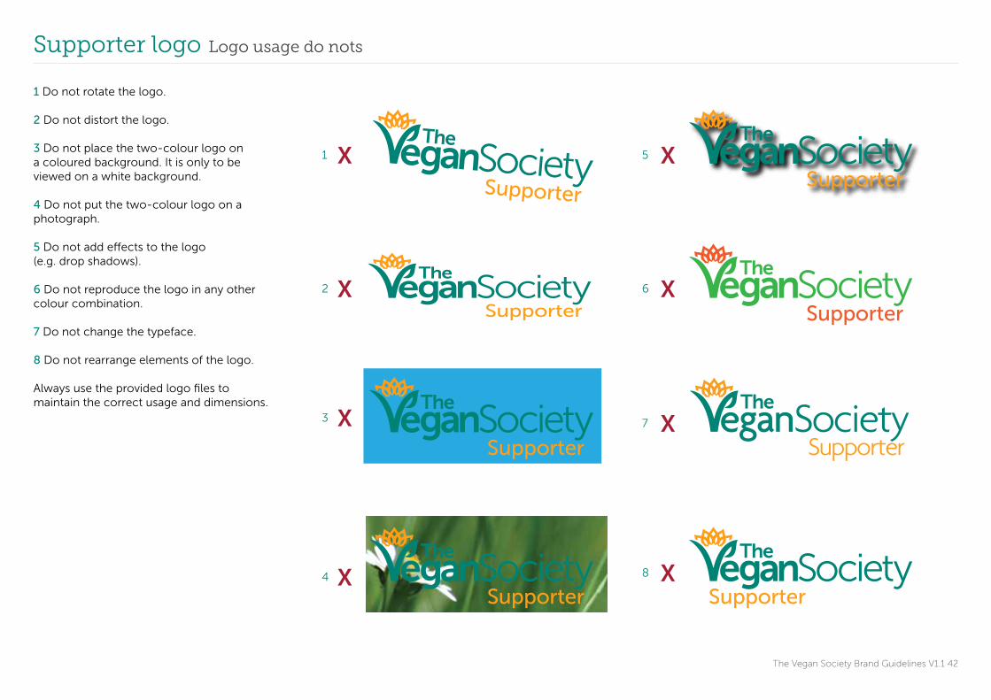
1 Do not rotate the logo.
2 Do not distort the logo.
3 Do not place the two-colour logo on a coloured background. It is only to be viewed on a white background.
4 Do not put the two-colour logo on a photograph.
5 Do not add effects to the logo (e.g. drop shadows).
6 Do not reproduce the logo in any other colour combination.
7 Do not change the typeface.
8 Do not rearrange elements of the logo.
Always use the provided logo files to maintain the correct usage and dimensions.
1 5
2 6
3 7
4 8

Partner logo
The Vegan Society Brand Guidelines V1 43
Partner logoVegan Society partners can demonstrate their relationship with us by using this specific logo. Organisations that qualify may use the logos as specified in their partner agreement. The preferred colour is the two-colour logo which is always to be placed on a white background. The logo in black is only to be used in exceptional circumstances. The logo must appear in isolation and comply with the guidelines in the following pages. It should not be combined with any non-related elements and should stand out as much as possible. The user is required to use authorised artwork that is provided by The Vegan Society and on no account is the logo permitted to be hand drawn, re-created by any other organisation or person or incorporated into another organisation’s logo.
Signing off logo usageThe use of these logos must be approved by our Communications team. Please send your layouts to: [email protected]

Partner logo
The Vegan Society Brand Guidelines V1.1 44

Partner logo Exclusion zone & minimum size
X
X
X
The Vegan Society Brand Guidelines V1.1 45
Exclusion ZoneIn order for the Partner logo to stand out and be clear and consistent, an exclusion zone around the logo has been created. It is equivalent to half the size of the letter ‘e’ in the word Vegan.
No type or graphic elements should encroach on the exclusion zone. This is a minimum amount of space. More space placed around the logo is encouraged if possible.
Minimum sizeThe recommended minimum size of the logo is a width of 40mm for print applications and 130 pixels for online applications.
Please note that these are minimum sizes and larger sizes are recommended for maximum impact.
When changing the size of the logo always keep the same proportions and do not distort it in any way.
minimum width 40mm

Partner logo Colour variations
The Vegan Society Brand Guidelines V1.1 46
The Partner logo can be reproduced in two colourways:
Green and orange (two-colour logo)
(Please see page 59 for colour references to Pantone, four-colour process & RGB.)
The two-colour logo must always be on a white background.
The two-colour logo is preferred and is to be used whenever possible.
BlackThe Partner logo in black can be used on a variety of background colours as long as there is sufficient contrast for the logo to stand out.

Partner logo Logo usage do nots
egan SocietyPartner
X X
X
X
X
X
X
X
The Vegan Society Brand Guidelines V1.1 47
1 Do not rotate the logo.
2 Do not distort the logo .
3 Do not place the two-colour logo on a coloured background. It is only to be viewed on a white background.
4 Do not put the two-colour logo on a photograph.
5 Do not add effects to the logo (e.g. drop shadows).
6 Do not reproduce the logo in any other colour combination.
7 Do not change the typeface.
8 Do not rearrange elements of the logo.
Always use the provided logo files to maintain the correct usage and dimensions.
1 5
2 6
3 7
4 8

Masterbrand logo Secondary text
The Vegan Society Brand Guidelines V1.1 48
Trademark
Trademark
The Vegan Society Brand Guidelines V1 49
Vegan trademarkThe Vegan trademark, introduced in 1990 is the leading symbol of vegan-friendly products and services worldwide. With over 14,000 products currently registered with us, our trademark team have worked with more businesses than any other vegan registration body.
The charity brand and the trademark work togetherThe trademark represents the international standard for authentic vegan products and services which are free from animal testing and animal ingredients. The new charity logo and branding will reach out to new audiences and help them to consider veganism from a fresh perspective and as a desirable lifestyle that is easy to maintain. They will complement each other, supporting each other in their areas of expertise.
Placement of the masterbrand logo and the trademark togetherIt is essential that the charity and business brands work in harmony. Any communications from the charity to trademark clients must have the masterbrand logo placed top left. At events where the trademark is being promoted, the trademark must be more prominent but the two elements must always be together.
WordingIt is important that we refer to our registered trademark as the Trademark and The Vegan Society logo as the logo to avoid unnecessary confusion. The Trademark can also be referred to as ‘the international Vegan Trademark’, ‘Vegan Trademark’, or ‘Trademark’. When the words, ‘logo’, ‘the logo’, or ‘our logo’ are used, they refer to the new charity logo.

Trademark Colour. Minimum size. Exclusion zone.
The Vegan Society Brand Guidelines V1.1 50
min width
12 mm
ColourIt is recommended that the trademark is produced in three colours for publications created by The Vegan Society:
GreenBlackWhite
(Please see page 59 for colour references to Pantone, four-colour process & RGB.)
The preferred colour is green. When the trademark is in green is should be placed on a white background.
Trademark holders may change the colour to fit the design of their packaging. It should always be one solid colour and adhere to the minimum size and exclusion zones shown in these guidelines.
The Vegan Society trademark should include the registered trademark sign.
Minimum sizeThe recommended minimum size of the trademark is a width of 12mm for print applications and 70 pixels for online applications.
Exclusion zoneThe exclusion zone is the width between the top of the trademark ® and the baseline of the letter ‘n’. No typographic or graphic elements can encroach on this space. This is the minimum amount of space but more is advisable.
X
X
X

Principal colours
The Vegan Society Brand Guidelines V1.1 51
Pantone327
10023580
CMYK
0131117
RGB
25515822
RGB
000
RGB
255255255
RGB
0471000
CMYK
000100
CMYK
0000
CMYK
CMYK
RGB RGB RGB RGB
CMYK CMYK CMYK
Pantone1375
100%Black
White
These are the principal colours to use:
The Vegan Society green The Vegan Society orangeBlack White
Please note that the CMYK values have been optimised. Please do not convert the Pantone colours directly to CMYK. Whenever possible the Pantone colours should be used for print.
Additional logo colours
The Vegan Society Brand Guidelines V1.1 52
Pantone220
261005011
CMYK
171078
RGB
0138171
RGB
10023301
CMYK
CMYK
RGB RGB
CMYK
Pantone3135
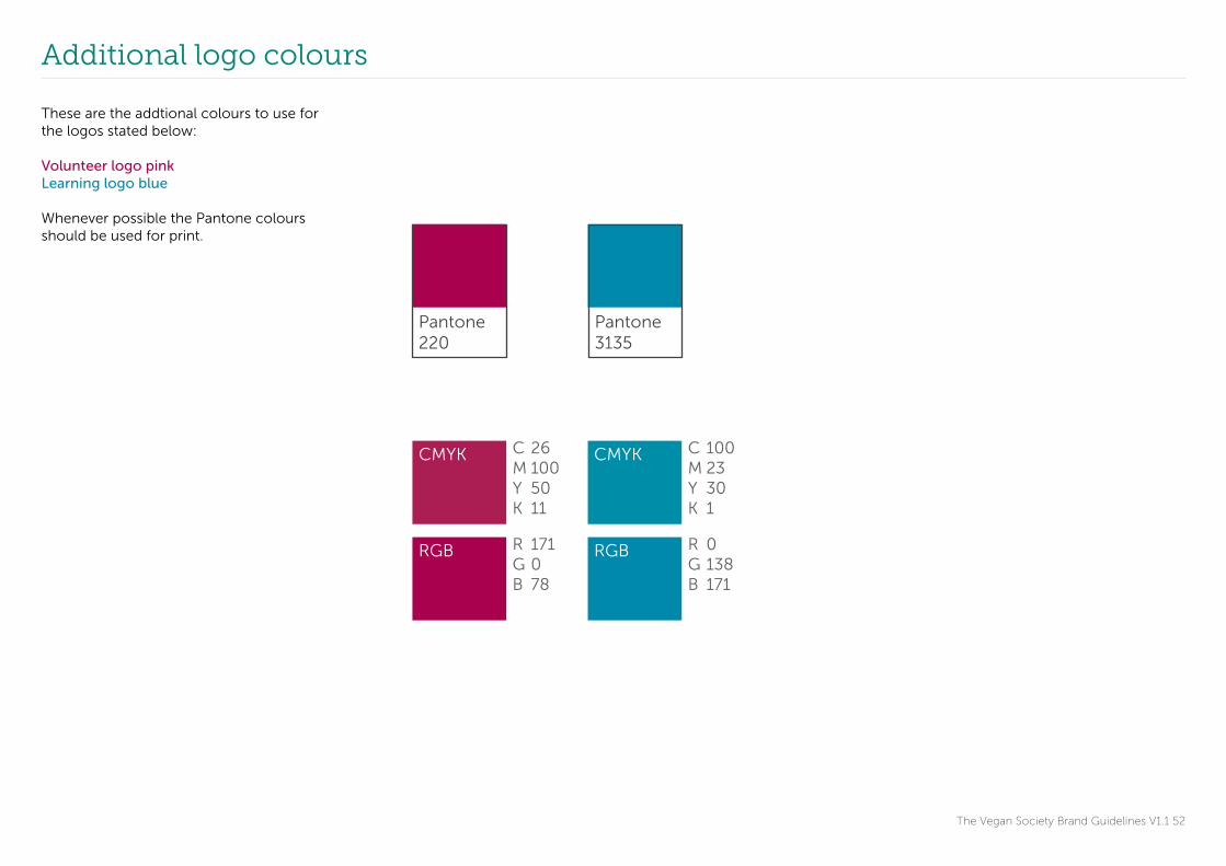
These are the addtional colours to use for the logos stated below:
Volunteer logo pinkLearning logo blue Whenever possible the Pantone colours should be used for print.

Typography Primary typeface
Primary typefaceMuseo Sans
AaBbCc0123100 300 500 700 900
abcdefghijklmnopqrstuvwxyzABCDEFGHIJKLMNOPQRSTUVWXYZ1234567890!@£$%^&*()
Museo SansEbis ipidebitate quate volectotatus ut assuntium quam ra dolore, tet venimin cipsameniat lab ipictiumquid et harum reptaec aborenis am de serore non pliqui id et enet laut pero quasperro mint porenim fugitat urerempos esci verspit dios sed modi rehene nonsequi doluptius renditi osapicient earum sita comni ommod eum volum ea nime sequam is velibus simporepudi dolore solupta dignam quia am raerro illorer spelici liquis doluptam, ut andam amus, oditiosam dolorit fugia nobit alia dolorerum num velicaeped quatum unt vent parum experi cuptatus volenet autatus.
The Vegan Society Brand Guidelines V1.1 53
The primary typeface is Museo Sans.
It comes in five weights and all italicised versions of these weights can be used.
Museo Sans can be used for body copy, sub headings and if desired, titles. It is recommended to use Museo Sans 300 for body copy and for longer passages of text. Museo Sans 500 can be used for shorter passages of text in standard sized publications (for example A4 and A5).
It is preferable that body text is left aligned.
Typography Secondary typeface
Secondary typefaceMuseo Slab
AaBbCc0123100 300 500 700 900
abcdefghijklmnopqrstuvwxyzABCDEFGHIJKLMNOPQRSTUVWXYZ1234567890!@£$%^&*()
Museo SlabEbis ipidebitate quate volectotatus ut assuntium quam ra dolore, tet venimin cipsameniat lab ipictiumquid et harum reptaec aborenis am de serore non pliqui id et enet laut pero quasperro mint porenim fugitat urerempos esci verspit dios sed modi rehene nonsequi doluptius renditi osapicient earum sita comni ommod eum volum ea nime sequam is velibus simporepudi dolore solupta dignam quia am raerro illorer spelici liquis doluptam, ut andam amus, oditiosam dolorit fugia nobit alia dolorerum num velicaeped quatum unt vent parum experi cuptatus volenet autatus.
The Vegan Society Brand Guidelines V1.1 54
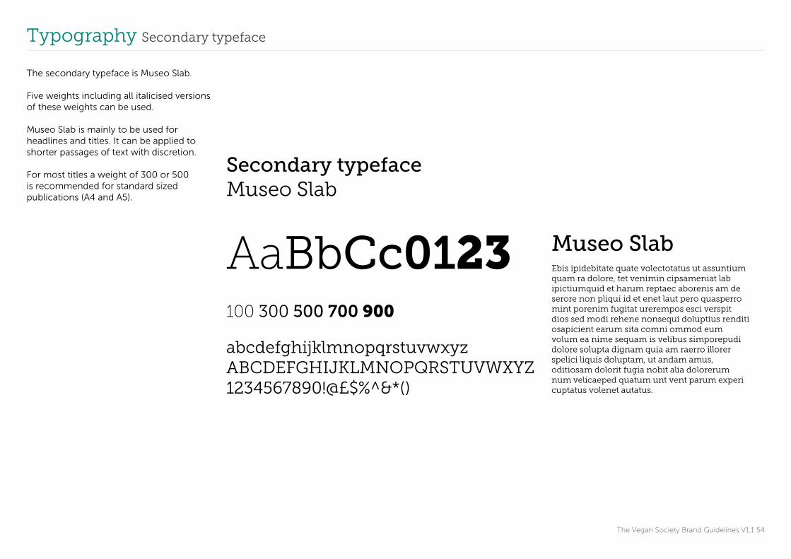
The secondary typeface is Museo Slab.
Five weights including all italicised versions of these weights can be used.
Museo Slab is mainly to be used for headlines and titles. It can be applied to shorter passages of text with discretion.
For most titles a weight of 300 or 500 is recommended for standard sized publications (A4 and A5).
The Vegan Society Brand Guidelines V1.1 55
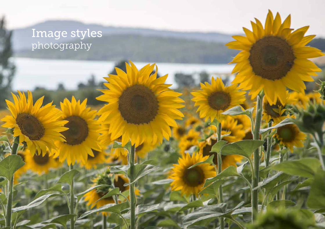
Image styles photography

Image styles People
The Vegan Society Brand Guidelines V1.1 56
The wide demographic that is targeted needs to be shown. Modern, lively images should be used, when possible with different age ranges and cultural backgrounds represented, showing that the vegan diet is accessible to all.
Favoured styles
• Lifestyle photography
• Approachable
• Relaxed
• Healthy
• Natural situations
• Active
• Positive

Image styles Prepared food
The Vegan Society Brand Guidelines V1.1 57
Focus should be on food in a real home environment. Both natural lighting and flash can be used but the emphasis is on natural, healthy, wholesome food.
Favoured styles
• Lifestyle setting
• Appetising
• Healthy
• Inviting
• Natural or home setting

Image styles Growing food
The Vegan Society Brand Guidelines V1.1 58
Food and plants that are growing or recently harvested show the connection to the earth.
Favoured styles
• Connection to nature
• Ripe
• Fresh

Image styles Close-up food photography
The Vegan Society Brand Guidelines V1.1 59
Close-up and macro photography can be used to highlight the colour and form of the food. These images can also be used as a background with logos reversed in white over them.
Favoured styles
• Modern
• Abstract
• Colourful
• Appetising

Image styles Natural world
The Vegan Society Brand Guidelines V1.1 60
Images should highlight veganism’s connection to nature. Photographs show a celebration of the continuation of life and a respect for the environment. A range of imagery can be used varying from macro to wide-angle photography.
Favoured styles • Natural
• Fresh
• Beautiful
• Inspiring
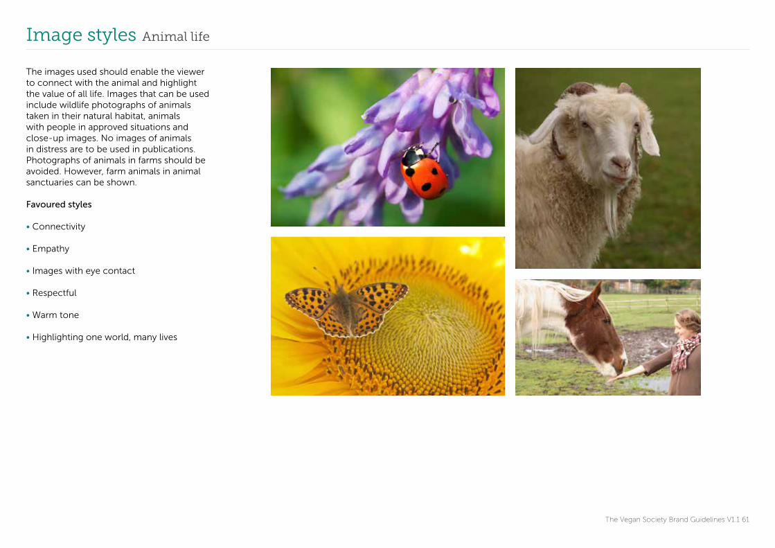
Image styles Animal life
The Vegan Society Brand Guidelines V1.1 61
The images used should enable the viewer to connect with the animal and highlight the value of all life. Images that can be used include wildlife photographs of animals taken in their natural habitat, animals with people in approved situations and close-up images. No images of animals in distress are to be used in publications. Photographs of animals in farms should be avoided. However, farm animals in animal sanctuaries can be shown.
Favoured styles
• Connectivity
• Empathy
• Images with eye contact
• Respectful
• Warm tone
• Highlighting one world, many lives

The Vegan Society Brand Guidelines V1.1 62
Tone of voice

The brand in words
The Vegan Society Brand Guidelines V1 63
Our tone of voice is:
Positive
Inclusive
Inspiring
These are human characteristics and should be expressed in all communications. If the Vegan Society was a person, what would they be like? What would their voice be? In order for our brand to have depth, we need to ensure that our communications are authentic and interesting, and also reflects and inspires our target audiences.
Our tone of voice communicates the personality of our brand in written form and is developed to create consistency throughout all written communications both internally and externally. Our writing focuses on making veganism more accessible and mainstream, emphasising that veganism is a positive, inclusive and inspiring lifestyle choice.
A clear, consistent writing style reflects a unified body and shows our organisation to be both recognisable and trustworthy.
How we talk about what we do and who we are
We are positiveOur language is never predictable or standardised, rather it is smart, savvy and clear, so we can promote a fresher, understanding of veganism and the work that we do. Sugarcoating everything and over claiming how brilliant we are quickly becomes tiring so focus on making the actual message unique and special.
We are inclusiveWe use language to open up possibilities, not close boundaries. We help people understand veganism a little better than they did before. While our messages can be serious we should convey them in a way that demonstrates our good nature. Nobody wants to be talked at – they want to join in the conversation. We do have a sense of humour and it’s OK to use it where appropriate. Imagine you are having a conversation with a good friend and relax a little and be enthusiastic about what you are writing about.
We are inspiringWe believe our knowledge and experience is most valuable when it is shared. Say something new, avoid clichés and overused messages. If you’ve written something that sounds familiar, try rewriting it from a different angle, as it could make long established messages sound more compelling.
Tone of voice Example 01
The Vegan Society Brand Guidelines V1.1 64
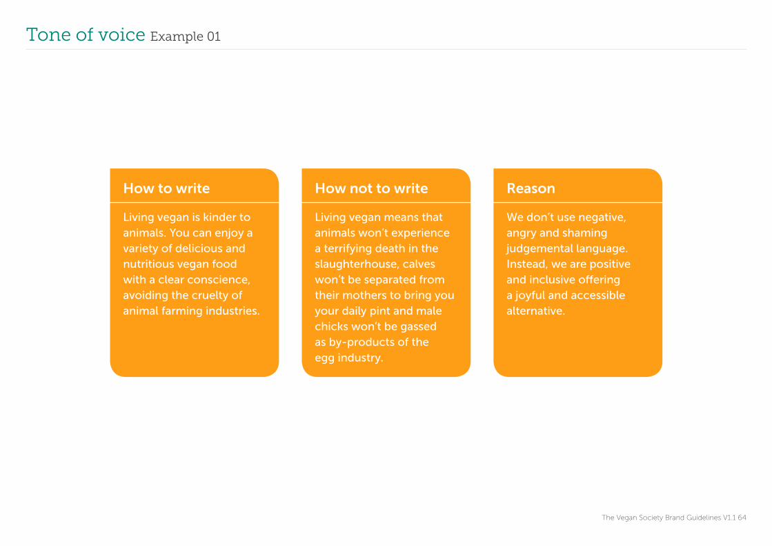
How to write
Living vegan is kinder to animals. You can enjoy a variety of delicious and nutritious vegan food with a clear conscience, avoiding the cruelty of animal farming industries.
How not to write
Living vegan means that animals won’t experience a terrifying death in the slaughterhouse, calves won’t be separated from their mothers to bring you your daily pint and male chicks won’t be gassed as by-products of the egg industry.
Reason
We don’t use negative, angry and shaming judgemental language. Instead, we are positive and inclusive offering a joyful and accessible alternative.

Tone of voice Example 02
The Vegan Society Brand Guidelines V1.1 65
How to write
With so many varieties of delicious plant milks available it is easier than ever to become and remain vegan.
How not to write
A “dairy-free” lifestyle can seem tricky to maintain.
Reason
It is negative, uninspiring and undermining to say that veganism is difficult to maintain. We are solution-focused and inclusive.
Tone of voice Example 03
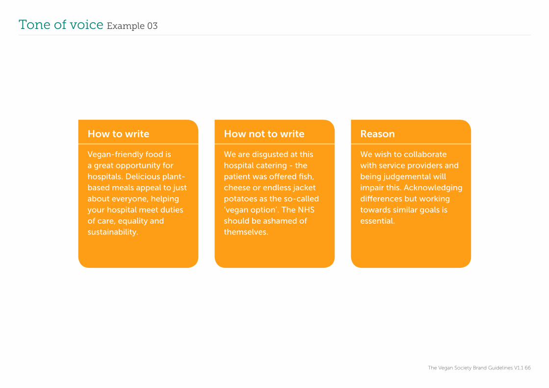
The Vegan Society Brand Guidelines V1.1 66
How to write
Vegan-friendly food is a great opportunity for hospitals. Delicious plant-based meals appeal to just about everyone, helping your hospital meet duties of care, equality and sustainability.
How not to write
We are disgusted at this hospital catering - the patient was offered fish, cheese or endless jacket potatoes as the so-called ‘vegan option’. The NHS should be ashamed of themselves.
Reason
We wish to collaborate with service providers and being judgemental will impair this. Acknowledging differences but working towards similar goals is essential.

The Vegan Society Brand Guidelines V1.1 67
In application
Application Placement of logo
The Vegan Society Brand Guidelines V1.1 68
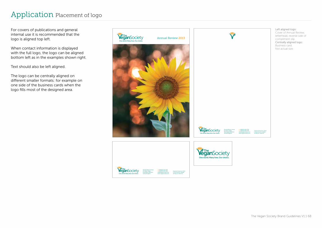
For covers of publications and general internal use it is recommended that the logo is aligned top left.
When contact information is displayed with the full logo, the logo can be aligned bottom left as in the examples shown right.
Text should also be left aligned.
The logo can be centrally aligned on different smaller formats: for example on one side of the business cards when the logo fills most of the designed area.
Donald Watson House 21 Hylton Street Birmingham B18 6HJUnited Kingdom
Registered Charity No. 279228
Company Reg. No. 1468880
VAT Reg. No. 448597395
t +44(0)121 523 1730 f +44(0)121 523 1749 [email protected]
Donald Watson House 21 Hylton Street Birmingham B18 6HJUnited Kingdom
Registered Charity No. 279228
Company Reg. No. 1468880
VAT Reg. No. 448597395
t +44(0)121 523 1730 f +44(0)121 523 1749 [email protected]
Annual Review 2013
Left aligned logo: Cover of Annual Review, letterhead, reverse side of compliment slip.Centrally aligned logo: Business card.Not actual size

Application Alignment of text under the logo
The Vegan Society Brand Guidelines V1.1 69
www.vegansociety.com
One world.Many lives.Our choice.
www.vegansociety.com
It is not every day that
a movement is born,
which in its general
application could
revolutionise mankind.
Donald Watson Founding Member
of The Vegan Society
When text sits below the logo it should be aligned under the strapline or taken from the bottom left hand corner of the letter V in Vegan.
Text should not be aligned to the top left of the V shape in the logo.
Aligning text with the logo: Banner standsNot actual size
Application Placement of V mark
The Vegan Society Brand Guidelines V1.1 70
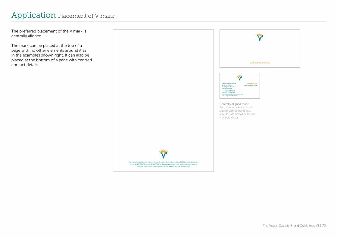
The preferred placement of the V mark is centrally aligned.
The mark can be placed at the top of a page with no other elements around it as in the examples shown right. It can also be placed at the bottom of a page with centred contact details.
The Vegan Society, Donald Watson House, 21 Hylton Street, Birmingham, B18 6HJ, United Kingdom
t +44 (0)121 523 1730 f +44 (0)121 523 1749 [email protected] www.vegansociety.com
Registered Charity No. 279228 Company Reg. No. 1468880 VAT Reg. No. 448597395
with compliments
Donald Watson House 21 Hylton Street Birmingham B18 6HJUnited Kingdom
t +44(0)121 523 1741 f +44(0)121 523 1749 [email protected]
Jasmijn de BooChief Executive Officer
Centrally aligned mark: With contact details, front side of compliments slip,reverse side of business card.Not actual size
Application V mark with contact details
The Vegan Society Brand Guidelines V1.1 71
The Vegan Society, Donald Watson House, 21 Hylton Street, Birmingham, B18 6HJ, United Kingdom
t +44 (0)121 523 1730 f +44 (0)121 523 1749 [email protected] www.vegansociety.com
Registered Charity No. 279228 Company Reg. No. 1468880 VAT Reg. No. 448597395
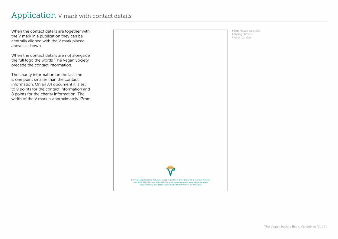
When the contact details are together with the V mark in a publication they can be centrally aligned with the V mark placed above as shown.
When the contact details are not alongside the full logo the words ‘The Vegan Society’ precede the contact information.
The charity information on the last line is one point smaller than the contact information. On an A4 document it is set to 9 points for the contact information and 8 points for the charity information. The width of the V mark is approximately 17mm.
Font: Museo Sans 500Leading: 12.5ptsNot actual size

Application Business letter
The Vegan Society Brand Guidelines V1.1 72
Donald Watson House 21 Hylton Street Birmingham B18 6HJUnited Kingdom
Registered Charity No. 279228
Company Reg. No. 1468880
VAT Reg. No. 448597395
t +44(0)121 523 1730 f +44(0)121 523 1749 [email protected]
Bertie Love7 Wood Horse LaneBirminghamB1 2JP
9 April 2014
Dear Bertie
Omniet dipis dellore saesequ idenecusdam nonsequaeped qui to eturectur? Eserumet officias quia sa pa iuri cum esciendis veria doluptium quam ipsam comnimus, occupta porecte quunditi rectem aborrum is andi dent quatem re volupta temperibus, que as quaepel laniet audis dent asitiur?
Picid ma venecab orpore, optisin verempos sa et, a iusciis et periam ad ut que num fugit es et modis sam volesed unt et ipsunt velecto te cus eum rerempo reptatur seque ea quodit est recturi buscilliam atia ad quos volor apel mint rem. Cea quisqui doluptat.
Aquid qui rem nos eossi quist, optur si occaesto iur sum vidus, tem. Ut fuga. Nam voloritium es escid quia nonest volores tinvelique niet as maionseque doluptatur, quunt qui blabor atem fugit, commod qui tota volum velenimendam quis invenis sequi ut lam inulpa dolest esci tes mos nis accum et omnimagnatis earit as aut magnima quia con cumqui volore net quiandi onestemo ium auta que volor amusdae porest, occaerum incid ullist, ullabore porrumet rem con rerios eic totate la vollaute aut adit, ut audiosam voluptas elit mod ea velles est am quissi ut res as consediatur aut quodis as modit, ut ommolor eperes maiorest ab is ut dolupta parumqui quodiae ritesti repel et fugit quatissimet laccus, sed quisti se acia con expliquiam impos doluptatem endel ma sam, ut
hiligenihit, cor am fuga. Gent, a di audam ducil ium rae. Biscidu saecab. Itatust, quiaturit od quodit et ommodi omnimin con plabor senderum, coria incias ute volum inus, voluptas ea periorio enis accum et omnimagnatis earit as aut magnima quia con cumqui volore net quiandi onestemo iumsa pa iuri cum esciendis veria doluptium quam ipsam comnimus, occupta porecte quunditi rectemaspel idel magnate liandandit occate pos
Aquid qui rem nos eossi quist, optur si occaesto iur sum vidus, tem. Ut fuga. Nam voloritium es escid quia nonest volores tinvelique niet as maionseque doluptatur, quunt qui blabor atem fugit, commod qui tota volum velenimendam quis invenis sequi ut lam inulpa dolest esci tes mos nis accum et omnimagnatis earit as aut magnima quia con cumqui volore net quiandi onestemo ium auta que volor amusdae porest, occaerum incid ullist, ullabore porrumet rem con rerios eic totate la vollaute aut adit, ut audiosam voluptas elit mod ea velles est am impos doluptatem endel ma sam, ut
Kind regards
Spencer HarrisSales & Membership [email protected]
When writing a business letter the margins should be set to:
Top 43mmBottom 45mmLeft 25mmRight 25mm
Font: Museo Sans 300Size: 10 ptsNot actual size
43mm
25mm 25mm
45mm

The Vegan Society Brand Guidelines V1.1 73
Contact

Contact
The Vegan Society Brand Guidelines V1 74
If you have any questions or require further assistance please contact:
Samantha Calvert0121 523 [email protected]
Elena Orde0121 523 [email protected]
www.vegansociety.com