Embed Size (px)
Citation preview
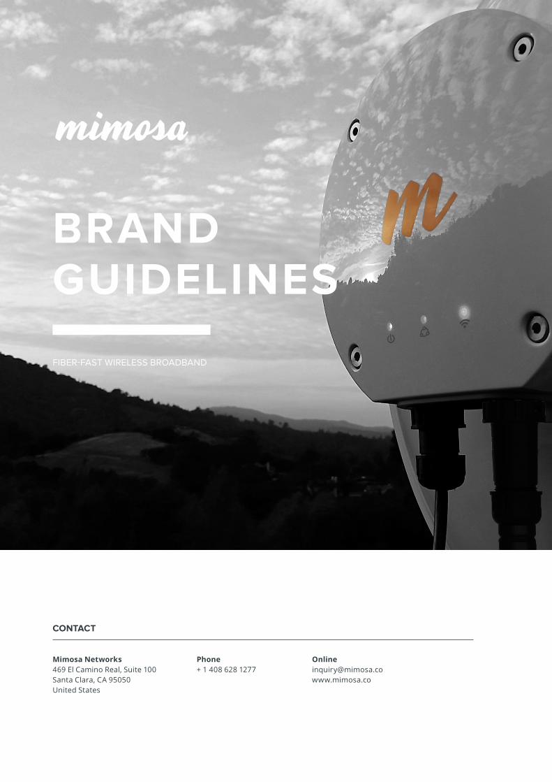
CONTACT
Mimosa Networks469 El Camino Real, Suite 100Santa Clara, CA 95050United States
Phone+ 1 408 628 1277
[email protected] www.mimosa.co
FIBER-FAST WIRELESS BROADBAND
BRAND GUIDELINES
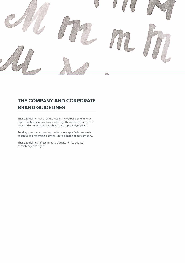
THE COMPANY AND CORPORATE
BRAND GUIDELINES
These guidelines describe the visual and verbal elements that represent Mimosa's corporate identity. This includes our name, logo, and other elements such as color, type, and graphics.
Sending a consistent and controlled message of who we are is essential to presenting a strong, unified image of our company.
These guidelines reflect Mimosa's dedication to quality, consistency, and style.
CORPORATE LOGO
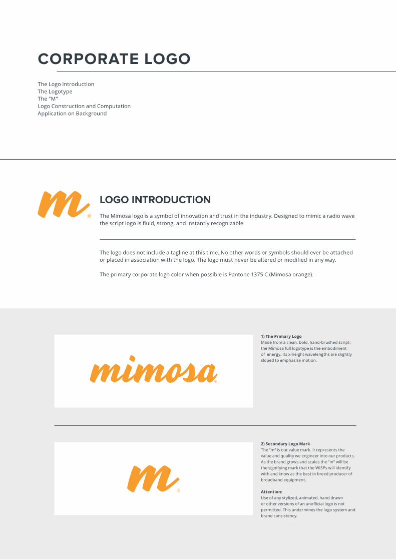
The Logo IntroductionThe LogotypeThe "M"Logo Construction and ComputationApplication on Background
LOGO INTRODUCTION
The Mimosa logo is a symbol of innovation and trust in the industry. Designed to mimic a radio wave the script logo is fluid, strong, and instantly recognizable.
The logo does not include a tagline at this time. No other words or symbols should ever be attached or placed in association with the logo. The logo must never be altered or modified in any way.
The primary corporate logo color when possible is Pantone 1375 C (Mimosa orange).
2) Secondary Logo MarkThe “m” is our value mark. It represents the value and quality we engineer into our products. As the brand grows and scales the “m” will be the signifying mark that the WISPs will identify with and know as the best in breed producer of broadband equipment.
Attention:Use of any stylized, animated, hand drawn or other versions of an unofficial logo is not permitted. This undermines the logo system and brand consistency.
1) The Primary Logo Made from a clean, bold, hand-brushed script, the Mimosa full logotype is the embodiment of energy. Its x-height wavelengths are slightly sloped to emphasize motion.
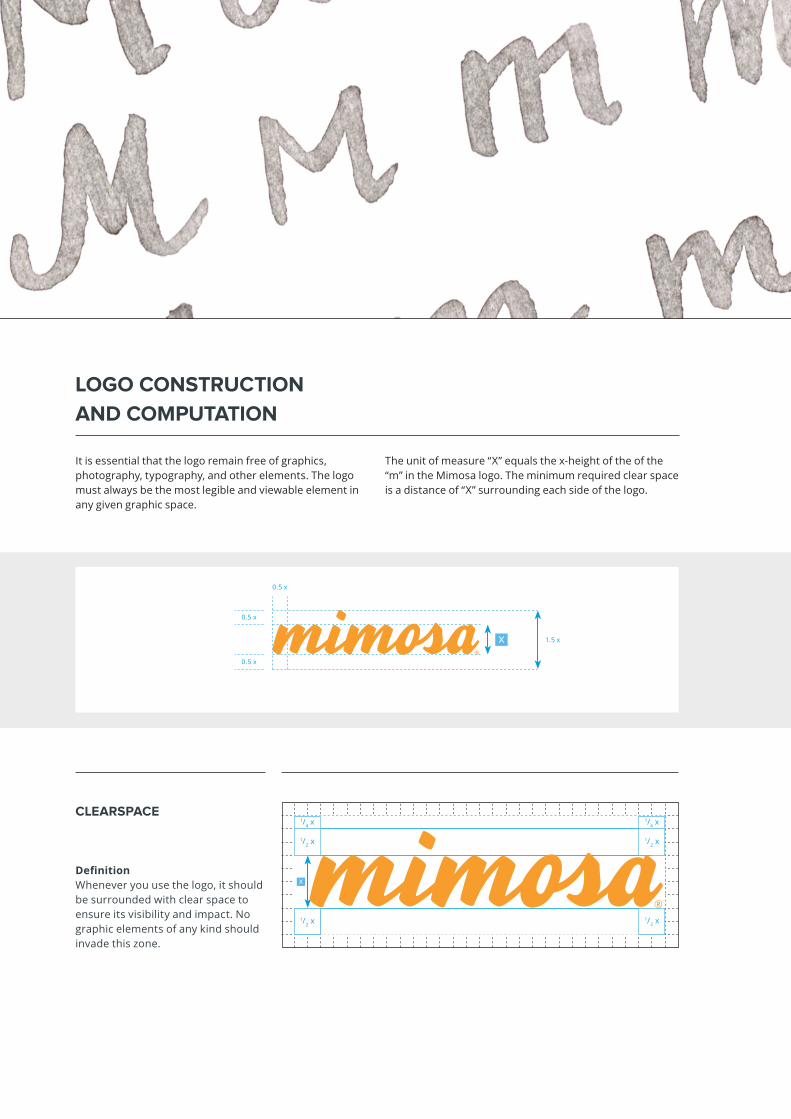
x
x
1/2 x1/2 x1/2 x
1/2 x1/2 x
1/4 x1/4 x
It is essential that the logo remain free of graphics, photography, typography, and other elements. The logo must always be the most legible and viewable element in any given graphic space.
The unit of measure “X” equals the x-height of the of the “m” in the Mimosa logo. The minimum required clear space is a distance of “X” surrounding each side of the logo.
CLEARSPACE
LOGO CONSTRUCTION
AND COMPUTATION
DefinitionWhenever you use the logo, it should be surrounded with clear space to ensure its visibility and impact. No graphic elements of any kind should invade this zone.
1.5 x
0.5 x
0.5 x
0.5 x
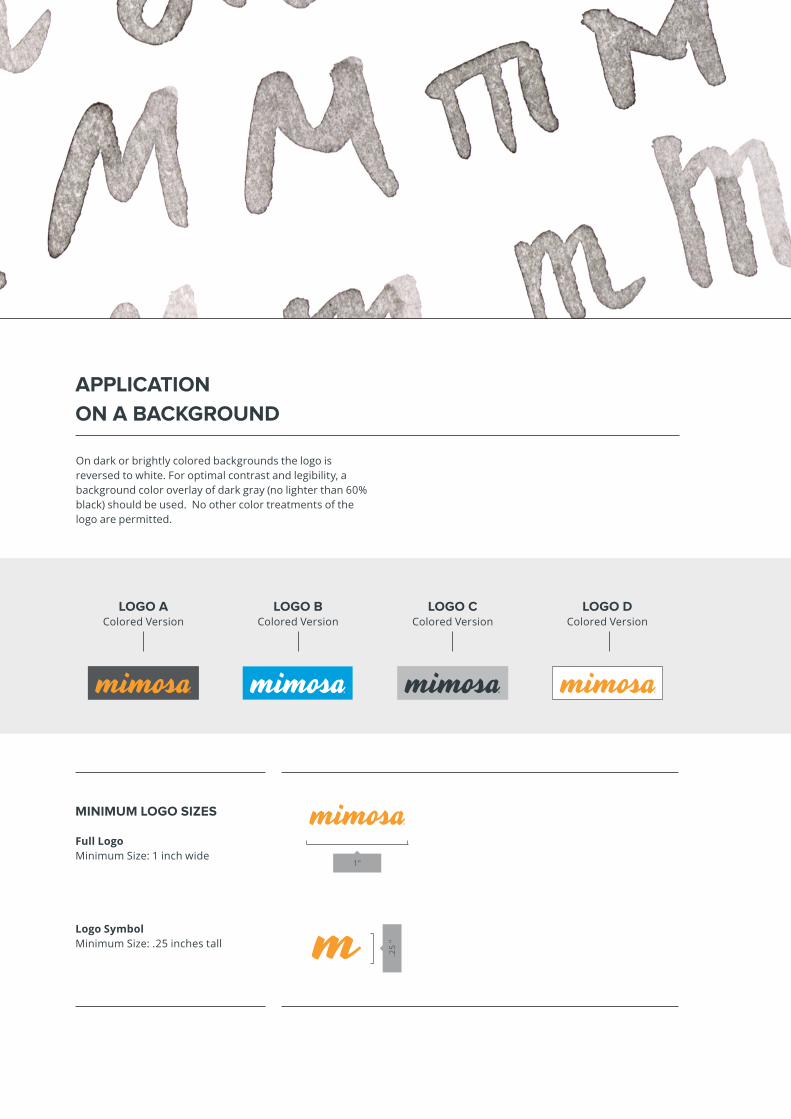
1"
.25
"APPLICATION
ON A BACKGROUND
LOGO AColored Version
LOGO BColored Version
LOGO CColored Version
LOGO DColored Version
MINIMUM LOGO SIZES
Full LogoMinimum Size: 1 inch wide
Logo SymbolMinimum Size: .25 inches tall
On dark or brightly colored backgrounds the logo is reversed to white. For optimal contrast and legibility, a background color overlay of dark gray (no lighter than 60% black) should be used. No other color treatments of the logo are permitted.
CORPORATE COLOR SYSTEM
The Corporate ColorsPrimary Color SystemSecondary Color System
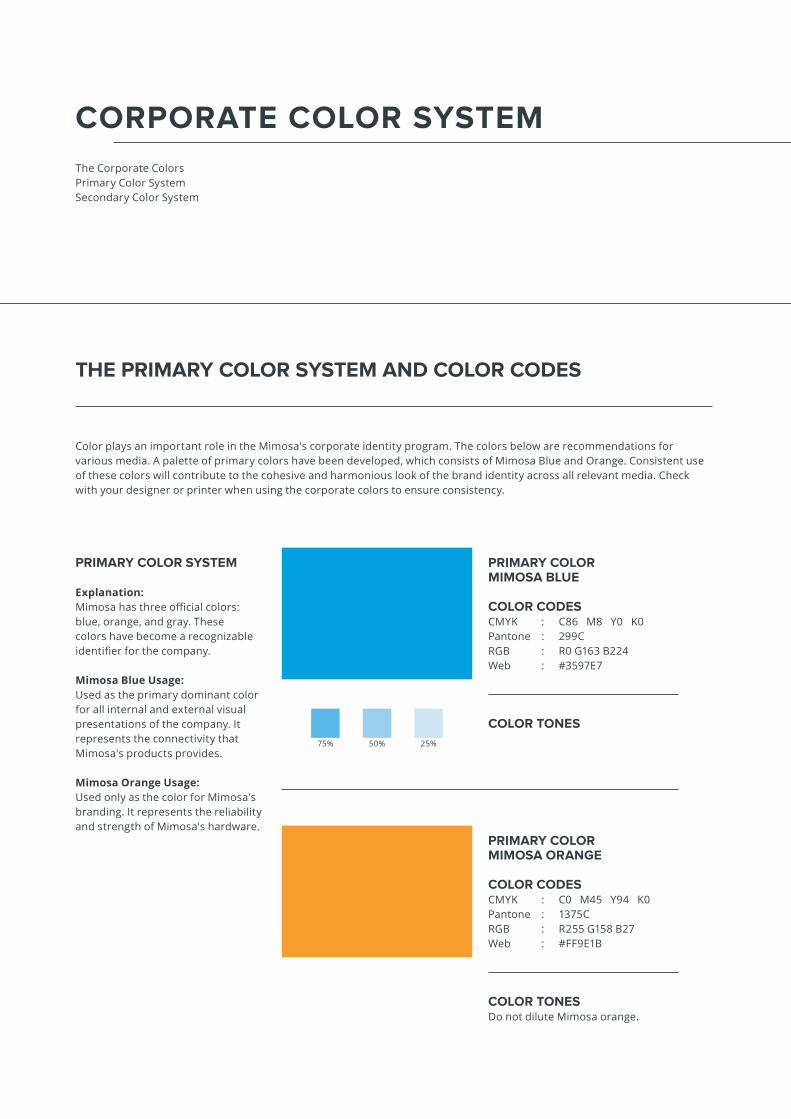
THE PRIMARY COLOR SYSTEM AND COLOR CODES
Color plays an important role in the Mimosa's corporate identity program. The colors below are recommendations for various media. A palette of primary colors have been developed, which consists of Mimosa Blue and Orange. Consistent use of these colors will contribute to the cohesive and harmonious look of the brand identity across all relevant media. Check with your designer or printer when using the corporate colors to ensure consistency.
PRIMARY COLORMIMOSA BLUE
COLOR CODESCMYK : C86 M8 Y0 K0Pantone : 299C RGB : R0 G163 B224Web : #3597E7
PRIMARY COLORMIMOSA ORANGE
COLOR CODESCMYK : C0 M45 Y94 K0Pantone : 1375C RGB : R255 G158 B27 Web : #FF9E1B
PRIMARY COLOR SYSTEM
Explanation: Mimosa has three official colors: blue, orange, and gray. These colors have become a recognizable identifier for the company.
Mimosa Blue Usage:Used as the primary dominant color for all internal and external visual presentations of the company. It represents the connectivity that Mimosa's products provides.
Mimosa Orange Usage:Used only as the color for Mimosa's branding. It represents the reliability and strength of Mimosa's hardware.
COLOR TONES
COLOR TONESDo not dilute Mimosa orange.
75% 50% 25%

THE SECONDARY COLOR SYSTEM
AND COLOR CODES
SECONDARY COLOR SYSTEM
Explanation: The secondary colors are complementary to our official colors, but are not recognizable identifiers for Mimosa. Secondary colors should be used sparingly, that is, in less than 10% of the palette in one piece.
Usage:Use them to accent and support the primary color palette.
Tones
Tones
Tones
COLOR CODESCMYK : C38 M4 Y0 K0Pantone : 291C RGB : R53 G151 B231 Web : #9BCBEB
COLOR CODESCMYK : C6 M4 Y17 K13Pantone : 420C RGB : R199 G201 B199Web : #C7C9C7
COLOR CODESCMYK : C19 M12 Y13 K34Pantone : 422C RGB : R158 G162 B162 Web : #9EA2A2
COLOR CODESCMYK : C48 M29 Y26 K76Pantone : 425C RGB : R84 G88 B90 Web : #54585A
Tones
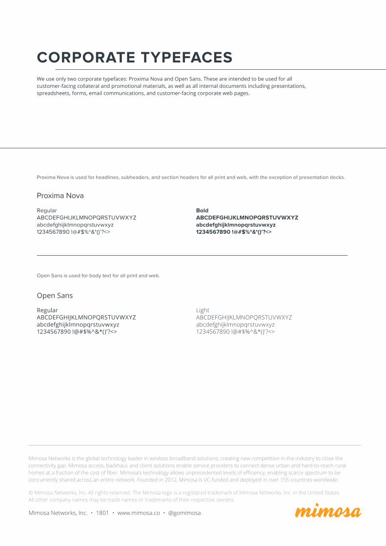
CORPORATE TYPEFACESWe use only two corporate typefaces: Proxima Nova and Open Sans. These are intended to be used for all customer-facing collateral and promotional materials, as well as all internal documents including presentations, spreadsheets, forms, email communications, and customer-facing corporate web pages.
© Mimosa Networks, Inc. All rights reserved. The Mimosa logo is a registered trademark of Mimosa Networks, Inc. in the United States. All other company names may be trade names or trademarks of their respective owners.
Mimosa Networks, Inc. • 1801 • www.mimosa.co • @gomimosa
Mimosa Networks is the global technology leader in wireless broadband solutions, creating new competition in the industry to close the connectivity gap. Mimosa access, backhaul, and client solutions enable service providers to connect dense urban and hard-to-reach rural homes at a fraction of the cost of fiber. Mimosa’s technology allows unprecedented levels of efficiency, enabling scarce spectrum to be concurrently shared across an entire network. Founded in 2012, Mimosa is VC-funded and deployed in over 155 countries worldwide.
RegularABCDEFGHIJKLMNOPQRSTUVWXYZabcdefghijklmnopqrstuvwxyz1234567890 !@#$%^&*()’?<>
BoldABCDEFGHIJKLMNOPQRSTUVWXYZabcdefghijklmnopqrstuvwxyz1234567890 !@#$%^&*()’?<>
Proxima Nova
RegularABCDEFGHIJKLMNOPQRSTUVWXYZabcdefghijklmnopqrstuvwxyz1234567890 !@#$%^&*()’?<>
LightABCDEFGHIJKLMNOPQRSTUVWXYZabcdefghijklmnopqrstuvwxyz1234567890 !@#$%^&*()’?<>
Open Sans
Proxima Nova is used for headlines, subheaders, and section headers for all print and web, with the exception of presentation decks.
Open Sans is used for body text for all print and web.