Embed Size (px)
Citation preview
BRAND GUIDELINES
U P D AT E D 8 . 5 . 1 6
2
HD SUPPLY BRANDMARK
Brand Promise 4
Master Brandmark 5
Master Brandmark with Tagline 6
Badge Version 7
Clear Space 8
Incorrect Usage 9
Retired Brandmarks 10
Trademark Guidelines 10
Brandmark Legal Usage 11
Endorsement Guidelines 12
BUSINESS UNIT BRANDMARKS
Brand Architecture 14
Business Unit Brandmark with Tagline 15
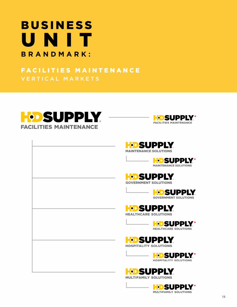
Facilities Maintenance 16
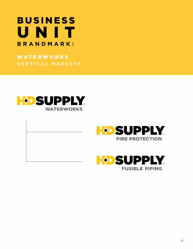
Waterworks 19
Construction & Industrial – White Cap 22
Home Improvement Solutions 24
Canada versions 26
Clear Space 28
Incorrect Usage 30
SPECIFICATIONS
Color Palette 31
Typography 34
WRITING GUIDELINES
Writing Guidelines 39
Punctuation 43
Formatting 44
T A B L E O F C O N T E N T S

3
H D S U P P LYM A S T E RB R A N D M A R K
4
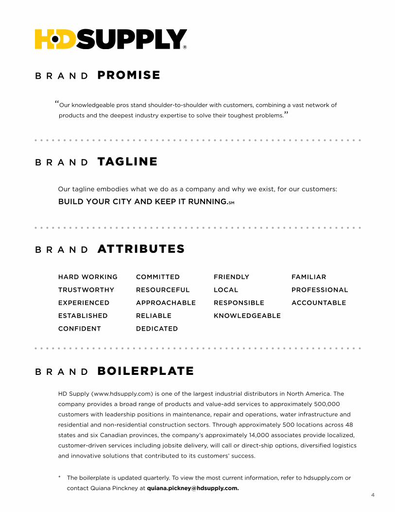
“Our knowledgeable pros stand shoulder-to-shoulder with customers, combining a vast network of
products and the deepest industry expertise to solve their toughest problems.”
Our tagline embodies what we do as a company and why we exist, for our customers:
BUILD YOUR CITY AND KEEP IT RUNNING.SM
HARD WORKING
TRUSTWORTHY
EXPERIENCED
ESTABLISHED
CONFIDENT
COMMITTED
RESOURCEFUL
APPROACHABLE
RELIABLE
DEDICATED
FRIENDLY
LOCAL
RESPONSIBLE
KNOWLEDGEABLE
FAMILIAR
PROFESSIONAL
ACCOUNTABLE
HD Supply (www.hdsupply.com) is one of the largest industrial distributors in North America. The
company provides a broad range of products and value-add services to approximately 500,000
customers with leadership positions in maintenance, repair and operations, water infrastructure and
residential and non-residential construction sectors. Through approximately 500 locations across 48
states and six Canadian provinces, the company’s approximately 14,000 associates provide localized,
customer-driven services including jobsite delivery, will call or direct-ship options, diversified logistics
and innovative solutions that contributed to its customers’ success.
* The boilerplate is updated quarterly. To view the most current information, refer to hdsupply.com or
contact Quiana Pinckney at [email protected].
B R A N D PROMISE
B R A N D TAGLINE
B R A N D ATTRIBUTES
B R A N D BOILERPLATE
5
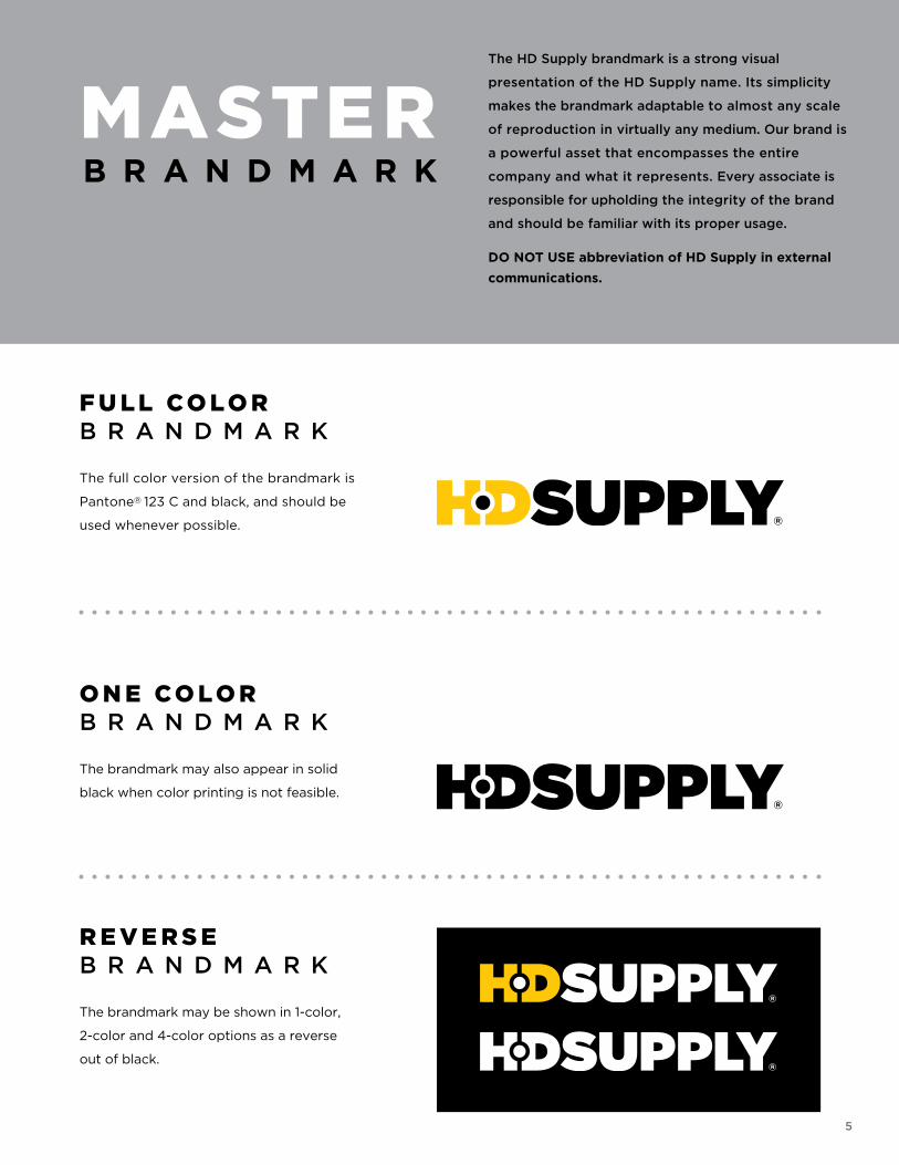
MASTER B R A N D M A R K
The HD Supply brandmark is a strong visual
presentation of the HD Supply name. Its simplicity
makes the brandmark adaptable to almost any scale
of reproduction in virtually any medium. Our brand is
a powerful asset that encompasses the entire
company and what it represents. Every associate is
responsible for upholding the integrity of the brand
and should be familiar with its proper usage.
DO NOT USE abbreviation of HD Supply in external
communications.
F U L L CO L O RB R A N D M A R K
The full color version of the brandmark is
Pantone® 123 C and black, and should be
used whenever possible.
O N E CO L O RB R A N D M A R K
The brandmark may also appear in solid
black when color printing is not feasible.
R E V E R S EB R A N D M A R K
The brandmark may be shown in 1-color,
2-color and 4-color options as a reverse
out of black.
6
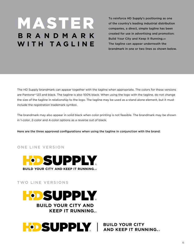
The HD Supply brandmark can appear together with the tagline when appropriate. The colors for these versions
are Pantone® 123 and black. The tagline is also 100% black. When using the logo with the tagline, do not change
the size of the tagline in relationship to the logo. The tagline may be used as a stand alone element, but it must
include the registration trademark symbol.
The brandmark may also appear in solid black when color printing is not feasible. The brandmark may be shown
in 1-color, 2-color and 4-color options as a reverse out of black.
Here are the three approved configurations when using the tagline in conjunction with the brand:
To reinforce HD Supply’s positioning as one
of the country’s leading industrial distribution
companies, a direct, simple tagline has been
created for use in advertising and promotion:
Build Your City and Keep It Running.SM
The tagline can appear underneath the
brandmark in one or two lines as shown below.
MASTER B R A N D M A R KW I T H T A G L I N E
O N E L I N E VE RS I O N
T WO L I N E VE RS I O N S
7
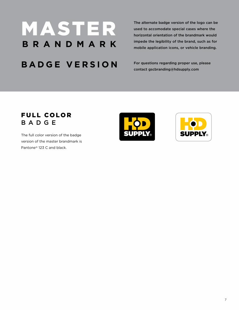
The alternate badge version of the logo can be
used to accomodate special cases where the
horizontal orientation of the brandmark would
impede the legibility of the brand, such as for
mobile application icons, or vehicle branding.
For questions regarding proper use, please
contact [email protected]
MASTER B R A N D M A R K
B A D G E V E R S I O N
F U L L CO L O RB A D G E
The full color version of the badge
version of the master brandmark is
Pantone® 123 C and black.
8
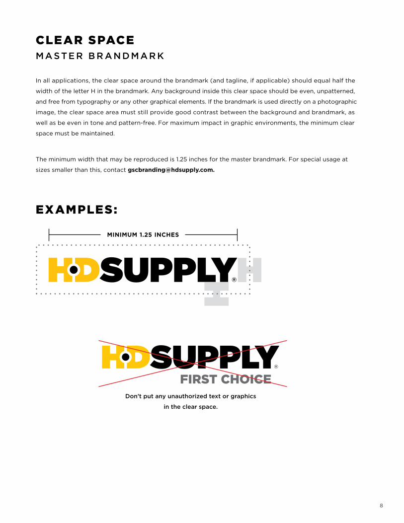
CLEAR SPACEMA STE R B R AN D MAR K
In all applications, the clear space around the brandmark (and tagline, if applicable) should equal half the
width of the letter H in the brandmark. Any background inside this clear space should be even, unpatterned,
and free from typography or any other graphical elements. If the brandmark is used directly on a photographic
image, the clear space area must still provide good contrast between the background and brandmark, as
well as be even in tone and pattern-free. For maximum impact in graphic environments, the minimum clear
space must be maintained.
The minimum width that may be reproduced is 1.25 inches for the master brandmark. For special usage at
sizes smaller than this, contact [email protected].
EXAMPLES:
FIRST CHOICEDon’t put any unauthorized text or graphics
in the clear space.
9
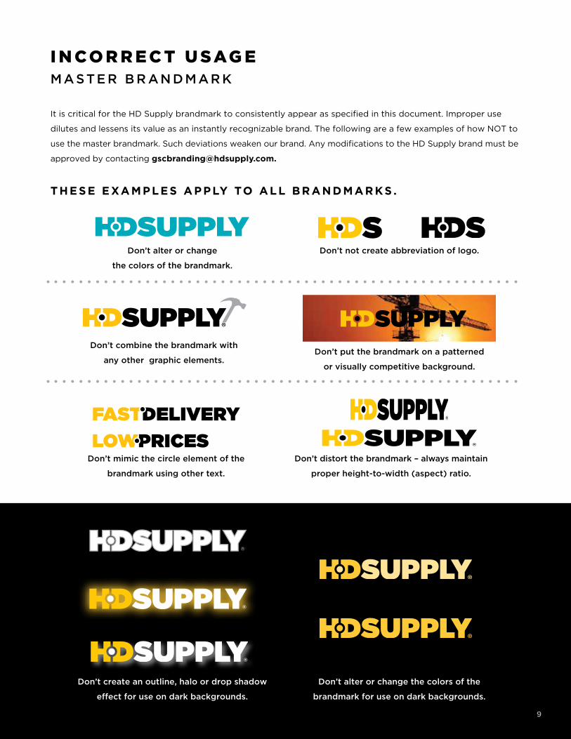
SMART GRID SOLUTIONSDon’t alter or change
the colors of the brandmark.
Don’t not create abbreviation of logo.
Don’t combine the brandmark with
any other graphic elements.Don’t put the brandmark on a patterned
or visually competitive background.
I N CO R R E C T U SAG EMA STE R B R AN D MAR K
It is critical for the HD Supply brandmark to consistently appear as specified in this document. Improper use
dilutes and lessens its value as an instantly recognizable brand. The following are a few examples of how NOT to
use the master brandmark. Such deviations weaken our brand. Any modifications to the HD Supply brand must be
approved by contacting [email protected].
THESE EXAMPLES APPLY TO ALL BR ANDM AR KS .
Don’t mimic the circle element of the
brandmark using other text.
FASTDELIVERY
LOWPRICESDon’t distort the brandmark – always maintain
proper height-to-width (aspect) ratio.
9
Don’t create an outline, halo or drop shadow
effect for use on dark backgrounds.
Don’t alter or change the colors of the
brandmark for use on dark backgrounds.
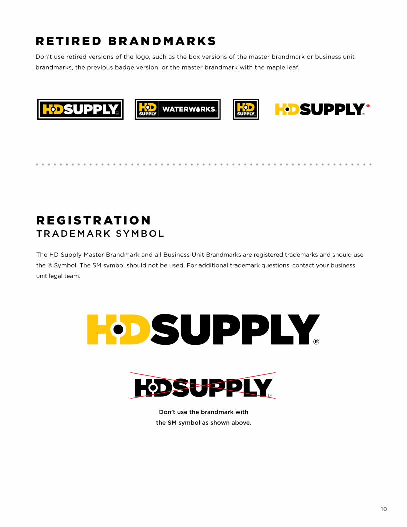
R E T I R E D B R A N D M A R K SDon’t use retired versions of the logo, such as the box versions of the master brandmark or business unit
brandmarks, the previous badge version, or the master brandmark with the maple leaf.
Don’t use the brandmark with
the SM symbol as shown above.
R E G I S T R AT I O NTR AD E MAR K SY M B O L
The HD Supply Master Brandmark and all Business Unit Brandmarks are registered trademarks and should use
the ® Symbol. The SM symbol should not be used. For additional trademark questions, contact your business
unit legal team.
10
11
As a general rule, third parties may not use the HD Supply brandmarks (“Logos”). Below are limited
circumstances under which third parties may use the Logos without a license. Any use that falls outside
of these specifications is strictly prohibited.
LEGAL CO M P LIAN CE
Third parties may only use the Logo without a license under the following limited circumstances:
• In advertising or marketing collateral that references a third party’s connection with HD Supply
(such as a group purchasing organization promoting HD Supply to members; an authorized seller;
a vendor creating approved promotional items, etc.)
• When authorized in developing approved private label packaging
• In accordance with the Endorsement Guidelines on the following page
Third parties are not permitted to use the Logos in products, product packaging or other business services
for which a formal license is required.
HD Supply reserves the right in its sole discretion to terminate or modify permission to display Logos, and
may request that third parties modify or delete any use of the Logos that, in HD Supply’s sole judgment,
does not comply with these Guidelines or might otherwise harm HD Supply. HD Supply further reserves the
right to object to unfair uses or misuses of its trademark and constrain it whenever it, in its sole discretion,
deems it necessary to do so.
The trademarks and Logos of HD Supply are the exclusive property of HD Supply and must be used and
displayed as shown in these Guidelines unless otherwise stated in writing from an authorizer officer of
HD Supply.
An attribution statement must be placed at the bottom of any advertisement collateral that clearly identifies
trademarks or design marks of HD Supply, such as: “HD Supply is a registered trademark of HD Supply.”
U NAUTH O R IZE D U S E
Unauthorized use of HD Supply’s brandmarks and trademarks may expose us to potential misuse and erosion
of brand value. Please contact your manager if you have questions about the Brandmark Legal Usage.
B R A N D M A R K LEGAL USAGE
12
HD Supply’s suppliers and other third parties may occasionally ask to use the HD Supply name and/or
brandmark (logo) to endorse their product, service or charitable organization. For example, this could include
using it in a press release, on a website, or referencing HD Supply in sales and marketing collateral.
G U I D E LI N E S
To protect our brand integrity, HD Supply generally prohibits the use of its name for commercial endorsement
purposes. Exceptions may occur if there is significant advantage to HD Supply demonstrated under the
following approval criteria:
• The endorsement will align our brand with a highly respected, well-known and/or reputable business,
and such alignment is important to us at the time of the request;
or
• The endorsement is the result of a business agreement in which HD Supply will receive a financial
benefit, or some other significant value, and such use of our name is a key to obtaining that benefit or
value.
Examples:
• Company-paid sponsorships
• Signage for a specific, pre-approved event
• Approved case studies or other research materials
• Joint press releases, reviewed and approved by authorized agents of HD Supply
P ROCE D U R E
All requests for external use of the HD Supply name and/or brandmark (logo) must be forwarded to the
Director of Marketing and Brand Management for consideration. Please provide the request in writing with an
example of how the brand (logo) is to be used. In each case, the request must address the above criteria and
be endorsed by an HD Supply vice president. Please allow five (5) business days for review and response.
CO NTAC T
U NAUTH O R IZE D U S E
Unauthorized use of HD Supply’s brandmarks and trademarks may expose us to potential misuse and erosion
of brand value. Please contact your manager if you have questions about the submittal process.
E N D O R S E M E N T GUIDELINES

13
B U S I N E S S U N I TB R A N D M A R K S
14
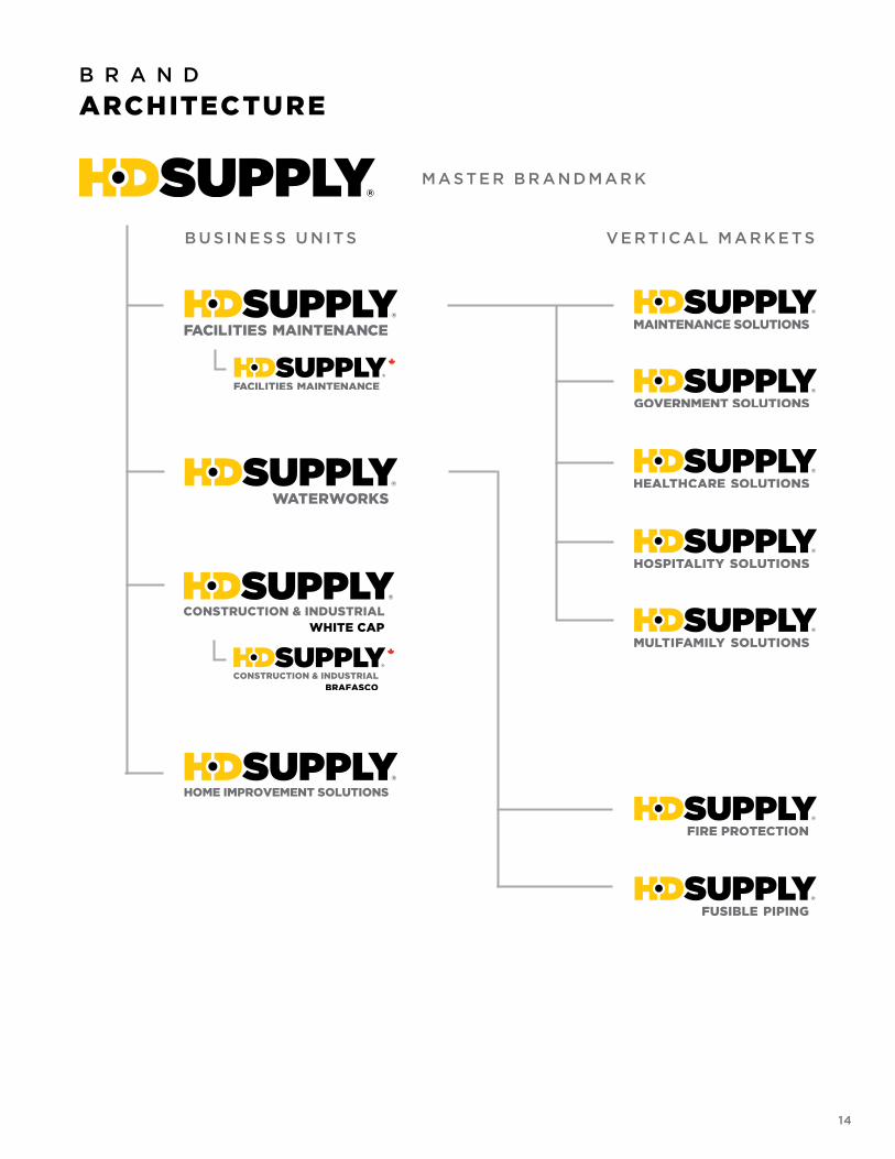
M A S TE R B R A N D M A R K
B U S I N E S S U N IT S V E R TI C A L M A R K E T S
B R A N D
ARCHITECTURE
15
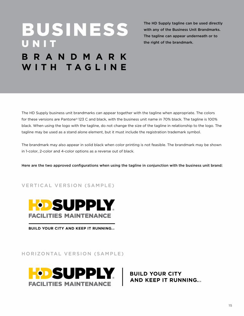
BUSINESSU N I TB R A N D M A R KW I T H T A G L I N E
The HD Supply tagline can be used directly
with any of the Business Unit Brandmarks.
The tagline can appear underneath or to
the right of the brandmark.
The HD Supply business unit brandmarks can appear together with the tagline when appropriate. The colors
for these versions are Pantone® 123 C and black, with the business unit name in 70% black. The tagline is 100%
black. When using the logo with the tagline, do not change the size of the tagline in relationship to the logo. The
tagline may be used as a stand alone element, but it must include the registration trademark symbol.
The brandmark may also appear in solid black when color printing is not feasible. The brandmark may be shown
in 1-color, 2-color and 4-color options as a reverse out of black.
Here are the two approved configurations when using the tagline in conjunction with the business unit brand:
VE RTI C AL VE RS I O N (SAM P LE )
H O R IZO NTAL VE RS I O N (SAM P LE )
B U S I N E S S
U N I TB R A N D M A R K :
16
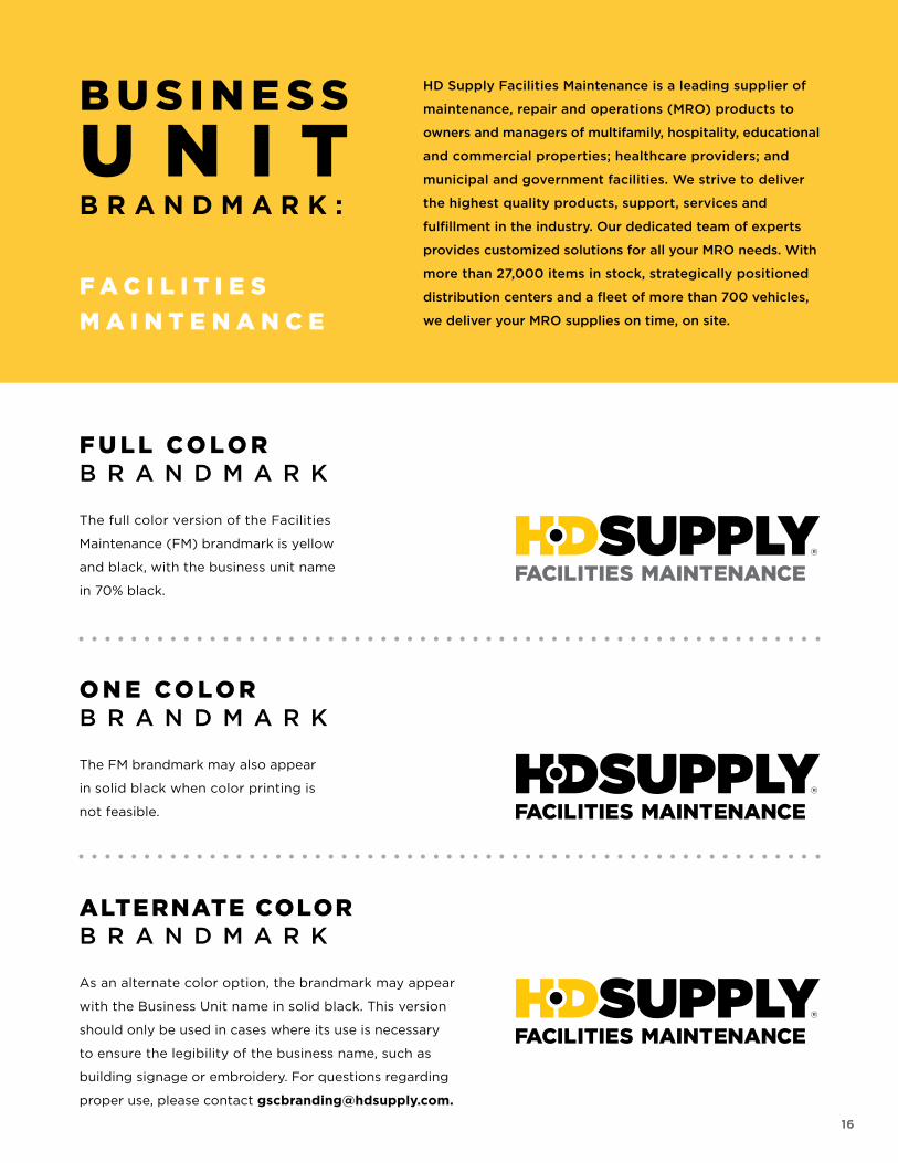
ALTERNATE COLORB R A N D M A R K
As an alternate color option, the brandmark may appear
with the Business Unit name in solid black. This version
should only be used in cases where its use is necessary
to ensure the legibility of the business name, such as
building signage or embroidery. For questions regarding
proper use, please contact [email protected].
O N E CO L O RB R A N D M A R K
The FM brandmark may also appear
in solid black when color printing is
not feasible.
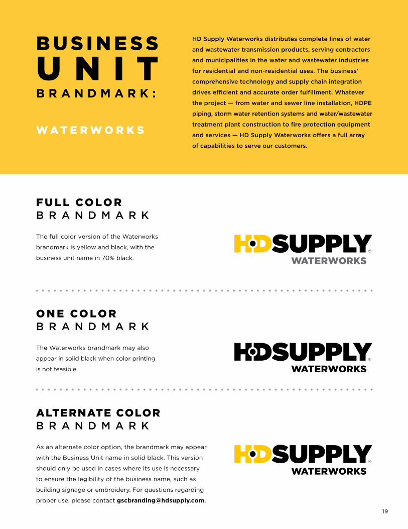
F U L L CO L O RB R A N D M A R K
The full color version of the Facilities
Maintenance (FM) brandmark is yellow
and black, with the business unit name
in 70% black.
HD Supply Facilities Maintenance is a leading supplier of
maintenance, repair and operations (MRO) products to
owners and managers of multifamily, hospitality, educational
and commercial properties; healthcare providers; and
municipal and government facilities. We strive to deliver
the highest quality products, support, services and
fulfillment in the industry. Our dedicated team of experts
provides customized solutions for all your MRO needs. With
more than 27,000 items in stock, strategically positioned
distribution centers and a fleet of more than 700 vehicles,
we deliver your MRO supplies on time, on site.
F A C I L I T I E S
M A I N T E N A N C E
16
B U S I N E S S
U N I TB R A N D M A R K :
17
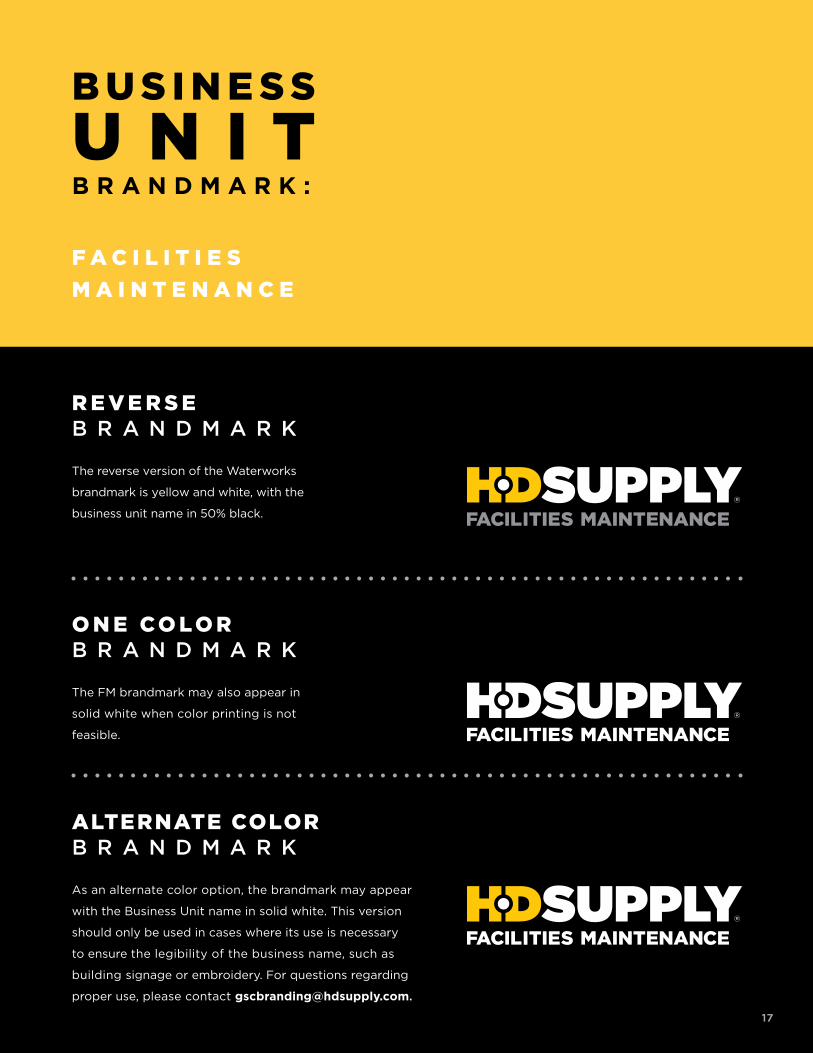
ALTERNATE COLORB R A N D M A R K
As an alternate color option, the brandmark may appear
with the Business Unit name in solid white. This version
should only be used in cases where its use is necessary
to ensure the legibility of the business name, such as
building signage or embroidery. For questions regarding
proper use, please contact [email protected].
O N E CO L O RB R A N D M A R K
The FM brandmark may also appear in
solid white when color printing is not
feasible.
F A C I L I T I E S
M A I N T E N A N C E
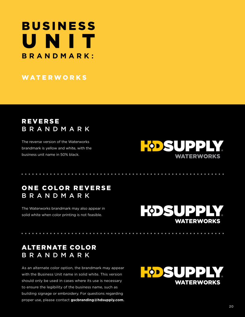
R E V E R S EB R A N D M A R K
The reverse version of the Waterworks
brandmark is yellow and white, with the
business unit name in 50% black.
17
18
B U S I N E S S
U N I TB R A N D M A R K :
F A C I L I T I E S M A I N T E N A N C EV E R T I C A L M A R K E T S
B U S I N E S S
U N I TB R A N D M A R K :
19
ALTERNATE COLORB R A N D M A R K
As an alternate color option, the brandmark may appear
with the Business Unit name in solid black. This version
should only be used in cases where its use is necessary
to ensure the legibility of the business name, such as
building signage or embroidery. For questions regarding
proper use, please contact [email protected].
O N E CO L O RB R A N D M A R K
The Waterworks brandmark may also
appear in solid black when color printing
is not feasible.
F U L L CO L O RB R A N D M A R K
The full color version of the Waterworks
brandmark is yellow and black, with the
business unit name in 70% black.
HD Supply Waterworks distributes complete lines of water
and wastewater transmission products, serving contractors
and municipalities in the water and wastewater industries
for residential and non-residential uses. The business’
comprehensive technology and supply chain integration
drives efficient and accurate order fulfillment. Whatever
the project — from water and sewer line installation, HDPE
piping, storm water retention systems and water/wastewater
treatment plant construction to fire protection equipment
and services — HD Supply Waterworks offers a full array
of capabilities to serve our customers.
W A T E R W O R K S
19
B U S I N E S S
U N I TB R A N D M A R K :
20
ALTERNATE COLORB R A N D M A R K
As an alternate color option, the brandmark may appear
with the Business Unit name in solid white. This version
should only be used in cases where its use is necessary
to ensure the legibility of the business name, such as
building signage or embroidery. For questions regarding
proper use, please contact [email protected].
O N E CO L O R R E V E R S EB R A N D M A R K
The Waterworks brandmark may also appear in
solid white when color printing is not feasible.
R E V E R S EB R A N D M A R K
The reverse version of the Waterworks
brandmark is yellow and white, with the
business unit name in 50% black.
W A T E R W O R K S
20
21
B U S I N E S S
U N I TB R A N D M A R K :
W A T E R W O R K SV E R T I C A L M A R K E T S
B U S I N E S S
U N I TB R A N D M A R K :
22
ALTERNATE COLORB R A N D M A R K
As an alternate color option, the brandmark may appear
with the Business Unit name in solid black. This version
should only be used in cases where its use is necessary
to ensure the legibility of the business name, such as
building signage or embroidery. For questions regarding
proper use, please contact [email protected].
O N E CO L O RB R A N D M A R K
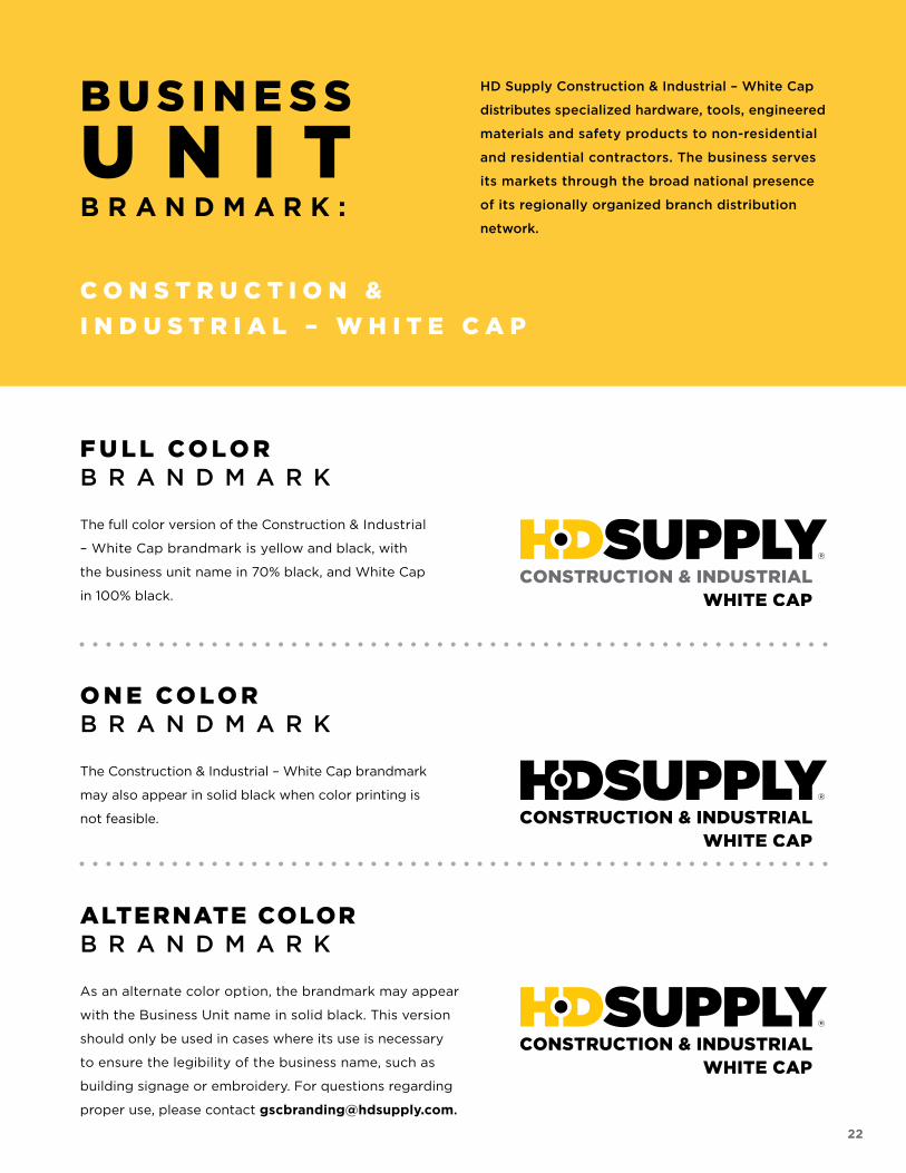
The Construction & Industrial – White Cap brandmark
may also appear in solid black when color printing is
not feasible.
F U L L CO L O RB R A N D M A R K
The full color version of the Construction & Industrial
– White Cap brandmark is yellow and black, with
the business unit name in 70% black, and White Cap
in 100% black.
HD Supply Construction & Industrial – White Cap
distributes specialized hardware, tools, engineered
materials and safety products to non-residential
and residential contractors. The business serves
its markets through the broad national presence
of its regionally organized branch distribution
network.
C O N S T R U C T I O N &
I N D U S T R I A L – W H I T E C A P
22
B U S I N E S S
U N I TB R A N D M A R K :
23
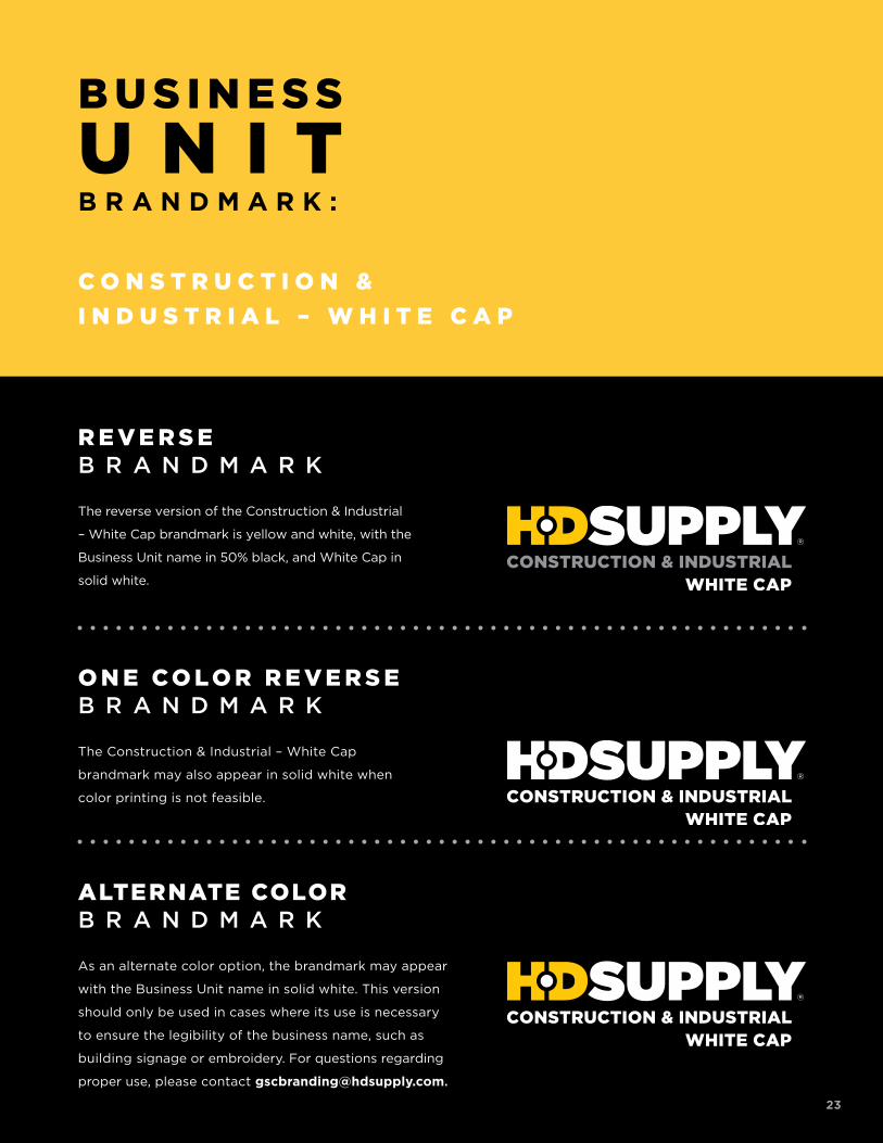
ALTERNATE COLORB R A N D M A R K
As an alternate color option, the brandmark may appear
with the Business Unit name in solid white. This version
should only be used in cases where its use is necessary
to ensure the legibility of the business name, such as
building signage or embroidery. For questions regarding
proper use, please contact [email protected].
O N E CO L O R R E V E R S EB R A N D M A R K
The Construction & Industrial – White Cap
brandmark may also appear in solid white when
color printing is not feasible.
R E V E R S EB R A N D M A R K
The reverse version of the Construction & Industrial
– White Cap brandmark is yellow and white, with the
Business Unit name in 50% black, and White Cap in
solid white.
C O N S T R U C T I O N &
I N D U S T R I A L – W H I T E C A P
23
B U S I N E S S
U N I TB R A N D M A R K :
24
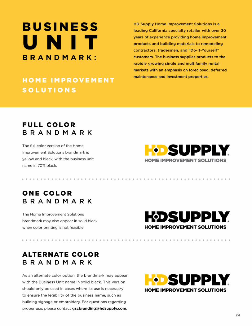
ALTERNATE COLORB R A N D M A R K
As an alternate color option, the brandmark may appear
with the Business Unit name in solid black. This version
should only be used in cases where its use is necessary
to ensure the legibility of the business name, such as
building signage or embroidery. For questions regarding
proper use, please contact [email protected].
O N E CO L O RB R A N D M A R K
The Home Improvement Solutions
brandmark may also appear in solid black
when color printing is not feasible.
F U L L CO L O RB R A N D M A R K
The full color version of the Home
Improvement Solutions brandmark is
yellow and black, with the business unit
name in 70% black.
H O M E I M P R O V E M E N T
S O L U T I O N S
HD Supply Home Improvement Solutions is a
leading California specialty retailer with over 30
years of experience providing home improvement
products and building materials to remodeling
contractors, tradesmen, and “Do-It-Yourself”
customers. The business supplies products to the
rapidly growing single and multifamily rental
markets with an emphasis on foreclosed, deferred
maintenance and investment properties.
24
B U S I N E S S
U N I TB R A N D M A R K :
25
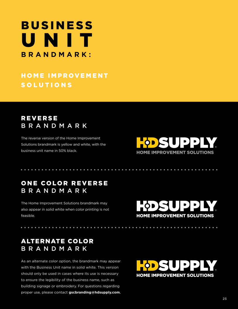
ALTERNATE COLORB R A N D M A R K
As an alternate color option, the brandmark may appear
with the Business Unit name in solid white. This version
should only be used in cases where its use is necessary
to ensure the legibility of the business name, such as
building signage or embroidery. For questions regarding
proper use, please contact [email protected].
O N E CO L O R R E V E R S EB R A N D M A R K
The Home Improvement Solutions brandmark may
also appear in solid white when color printing is not
feasible.
R E V E R S EB R A N D M A R K
The reverse version of the Home Improvement
Solutions brandmark is yellow and white, with the
business unit name in 50% black.
H O M E I M P R O V E M E N T
S O L U T I O N S
25
B U S I N E S S
U N I TB R A N D M A R K :
26
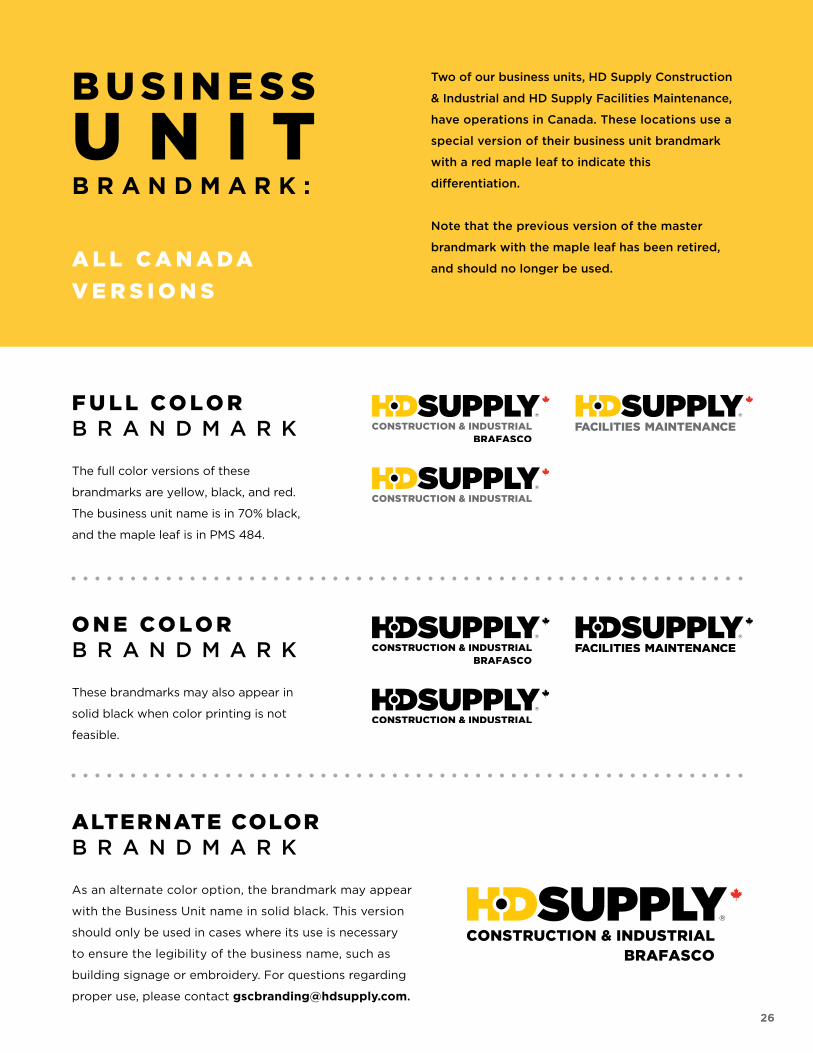
ALTERNATE COLORB R A N D M A R K
As an alternate color option, the brandmark may appear
with the Business Unit name in solid black. This version
should only be used in cases where its use is necessary
to ensure the legibility of the business name, such as
building signage or embroidery. For questions regarding
proper use, please contact [email protected].
O N E CO L O RB R A N D M A R K
These brandmarks may also appear in
solid black when color printing is not
feasible.
F U L L CO L O RB R A N D M A R K
The full color versions of these
brandmarks are yellow, black, and red.
The business unit name is in 70% black,
and the maple leaf is in PMS 484.
A L L C A N A DA
V E R S I O N S
Two of our business units, HD Supply Construction
& Industrial and HD Supply Facilities Maintenance,
have operations in Canada. These locations use a
special version of their business unit brandmark
with a red maple leaf to indicate this
differentiation.
Note that the previous version of the master
brandmark with the maple leaf has been retired,
and should no longer be used.
26
B U S I N E S S
U N I TB R A N D M A R K :
27
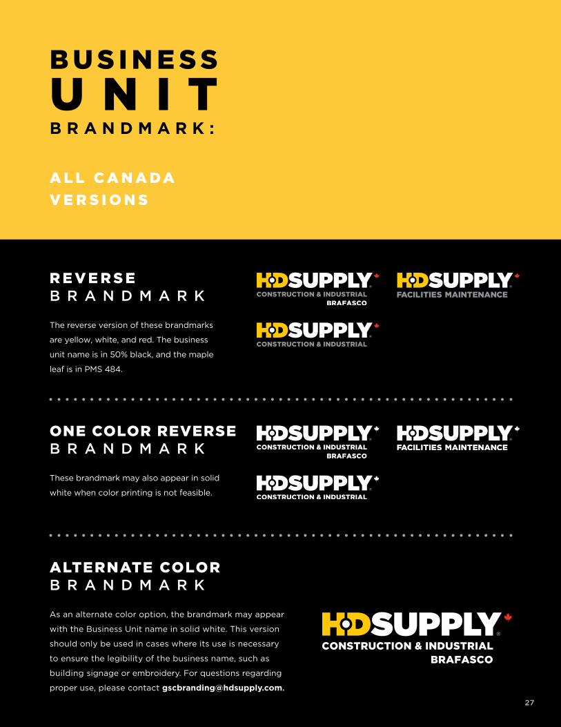
ALTERNATE COLORB R A N D M A R K
As an alternate color option, the brandmark may appear
with the Business Unit name in solid white. This version
should only be used in cases where its use is necessary
to ensure the legibility of the business name, such as
building signage or embroidery. For questions regarding
proper use, please contact [email protected].
R E V E R S EB R A N D M A R K
The reverse version of these brandmarks
are yellow, white, and red. The business
unit name is in 50% black, and the maple
leaf is in PMS 484.
A L L C A N A DA
V E R S I O N S
27
ONE COLOR REVERSEB R A N D M A R K
These brandmark may also appear in solid
white when color printing is not feasible.
28
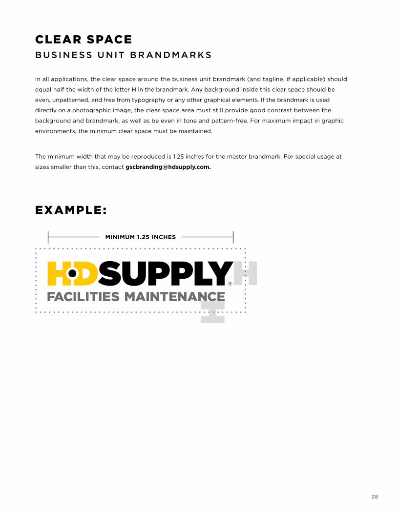
CLEAR SPACEB U S I N E S S U N IT B R AN D MAR KS
In all applications, the clear space around the business unit brandmark (and tagline, if applicable) should
equal half the width of the letter H in the brandmark. Any background inside this clear space should be
even, unpatterned, and free from typography or any other graphical elements. If the brandmark is used
directly on a photographic image, the clear space area must still provide good contrast between the
background and brandmark, as well as be even in tone and pattern-free. For maximum impact in graphic
environments, the minimum clear space must be maintained.
The minimum width that may be reproduced is 1.25 inches for the master brandmark. For special usage at
sizes smaller than this, contact [email protected].
EXAMPLE:
29
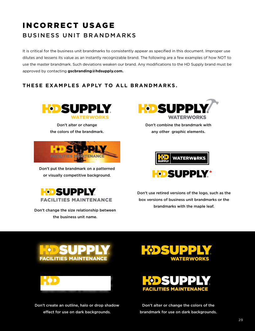
Don’t create an outline, halo or drop shadow
effect for use on dark backgrounds.
Don’t alter or change the colors of the
brandmark for use on dark backgrounds.
FACILITIES MAINTENANCE
Don’t alter or change
the colors of the brandmark.
Don’t combine the brandmark with
any other graphic elements.
Don’t put the brandmark on a patterned
or visually competitive background.
I N CO R R E C T U SAG EB U S I N E S S U N IT B R AN D MAR KS
It is critical for the business unit brandmarks to consistently appear as specified in this document. Improper use
dilutes and lessens its value as an instantly recognizable brand. The following are a few examples of how NOT to
use the master brandmark. Such deviations weaken our brand. Any modifications to the HD Supply brand must be
approved by contacting [email protected].
THESE EXAMPLES APPLY TO ALL BR ANDM AR KS .
WATERWORKS
FACILITIES MAINTENANCE
Don’t change the size relationship between
the business unit name.
29
Don’t use retired versions of the logo, such as the
box versions of business unit brandmarks or the
brandmarks with the maple leaf.

30
C O L O R P A L E T T E
31
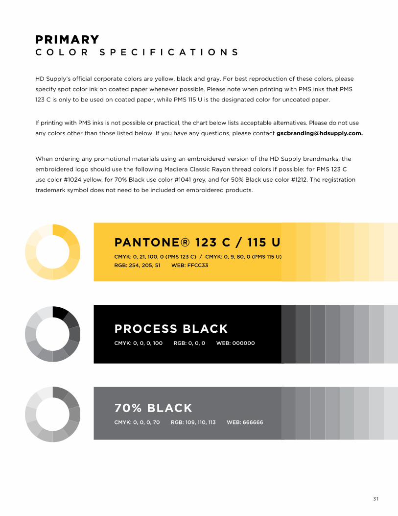
HD Supply’s official corporate colors are yellow, black and gray. For best reproduction of these colors, please
specify spot color ink on coated paper whenever possible. Please note when printing with PMS inks that PMS
123 C is only to be used on coated paper, while PMS 115 U is the designated color for uncoated paper.
If printing with PMS inks is not possible or practical, the chart below lists acceptable alternatives. Please do not use
any colors other than those listed below. If you have any questions, please contact [email protected].
When ordering any promotional materials using an embroidered version of the HD Supply brandmarks, the
embroidered logo should use the following Madiera Classic Rayon thread colors if possible: for PMS 123 C
use color #1024 yellow, for 70% Black use color #1041 grey, and for 50% Black use color #1212. The registration
trademark symbol does not need to be included on embroidered products.
PRIMARY C O L O R S P E C I F I C A T I O N S
PANTONE® 123 C / 115 UCMYK: 0, 21, 100, 0 (PMS 123 C) / CMYK: 0, 9, 80, 0 (PMS 115 U)
RGB: 254, 205, 51 WEB: FFCC33
PROCESS BLACKCMYK: 0, 0, 0, 100 RGB: 0, 0, 0 WEB: 000000
70% BLACKCMYK: 0, 0, 0, 70 RGB: 109, 110, 113 WEB: 666666
32
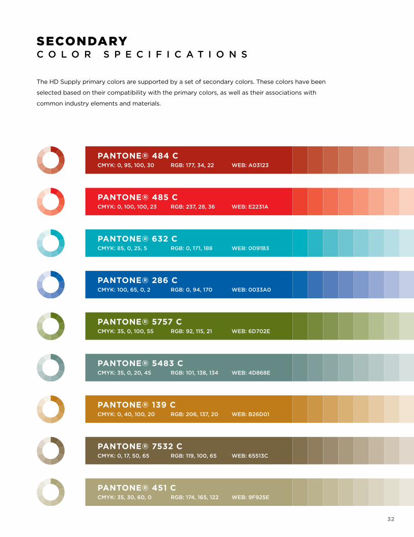
The HD Supply primary colors are supported by a set of secondary colors. These colors have been
selected based on their compatibility with the primary colors, as well as their associations with
common industry elements and materials.
SECONDARY C O L O R S P E C I F I C A T I O N S
PANTONE® 484 CCMYK: 0, 95, 100, 30 RGB: 177, 34, 22 WEB: A03123
PANTONE® 485 CCMYK: 0, 100, 100, 23 RGB: 237, 28, 36 WEB: E2231A
PANTONE® 632 CCMYK: 85, 0, 25, 5 RGB: 0, 171, 188 WEB: 0091B3
PANTONE® 286 CCMYK: 100, 65, 0, 2 RGB: 0, 94, 170 WEB: 0033A0
PANTONE® 5757 CCMYK: 35, 0, 100, 55 RGB: 92, 115, 21 WEB: 6D702E
PANTONE® 5483 CCMYK: 35, 0, 20, 45 RGB: 101, 138, 134 WEB: 4D868E
PANTONE® 139 CCMYK: 0, 40, 100, 20 RGB: 206, 137, 20 WEB: B26D01
PANTONE® 7532 CCMYK: 0, 17, 50, 65 RGB: 119, 100, 65 WEB: 65513C
PANTONE® 451 CCMYK: 35, 30, 60, 0 RGB: 174, 165, 122 WEB: 9F925E

33
T Y P O G R A P H Y
34
P R I M A R Y F O N T U S A G E :
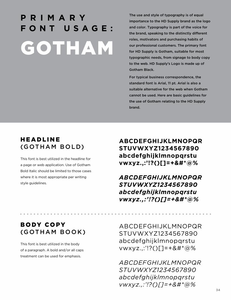
GOTHAM
The use and style of typography is of equal
importance to the HD Supply brand as the logo
and color. Typography is part of the voice for
the brand, speaking to the distinctly different
roles, motivators and purchasing habits of
our professional customers. The primary font
for HD Supply is Gotham, suitable for most
typographic needs, from signage to body copy
to the web. HD Supply’s Logo is made up of
Gotham Black.
For typical business correspondence, the
standard font is Arial, 11 pt. Arial is also a
suitable alternative for the web when Gotham
cannot be used. Here are basic guidelines for
the use of Gotham relating to the HD Supply
brand.
H E A D L I N E(G OTHAM BO LD)
This font is best utilized in the headline for
a page or web application. Use of Gotham
Bold Italic should be limited to those cases
where it is most appropriate per writing
style guidelines.
B O DY CO PY(G OTHAM BOO K )
This font is best utilized in the body
of a paragraph. A bold and/or all caps
treatment can be used for emphasis.
ABCDEFGHIJKLMNOPQR STUVWXYZ1234567890 abcdefghijklmnopqrstu vwxyz.,:’!?()[]=+&#*@% ABCDEFGHIJKLMNOPQR STUVWXYZ1234567890 abcdefghijklmnopqrstu vwxyz.,:’!?()[]=+&#*@%
ABCDEFGHIJKLMNOPQR STUVWXYZ1234567890 abcdefghijklmnopqrstu vwxyz.,:’!?()[]=+&#*@% ABCDEFGHIJKLMNOPQR STUVWXYZ1234567890 abcdefghijklmnopqrstu vwxyz.,:’!?()[]=+&#*@%
35
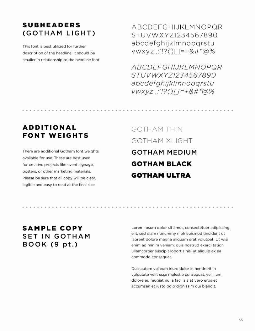
S U B H E A D E R S(G OTHAM L I G HT )
This font is best utilized for further
description of the headline. It should be
smaller in relationship to the headline font.
A D D I T I O N A L F O N T W E I G H T S There are additional Gotham font weights
available for use. These are best used
for creative projects like event signage,
posters, or other marketing materials.
Please be sure that all copy will be clear,
legible and easy to read at the final size.
SA M P L E CO PY S E T I N G OTHAM BOO K (9 pt .)
ABCDEFGHIJKLMNOPQR STUVWXYZ1234567890 abcdefghijklmnopqrstu vwxyz.,:’!?()[]=+&#*@% ABCDEFGHIJKLMNOPQR STUVWXYZ1234567890 abcdefghijklmnopqrstu vwxyz.,:’!?()[]=+&#*@%
GOTHAM THIN
GOTHAM XLIGHT
GOTHAM MEDIUM
GOTHAM BLACK
GOTHAM ULTRA
Lorem ipsum dolor sit amet, consectetuer adipiscing
elit, sed diam nonummy nibh euismod tincidunt ut
laoreet dolore magna aliquam erat volutpat. Ut wisi
enim ad minim veniam, quis nostrud exerci tation
ullamcorper suscipit lobortis nisl ut aliquip ex ea
commodo consequat.
Duis autem vel eum iriure dolor in hendrerit in
vulputate velit esse molestie consequat, vel illum
dolore eu feugiat nulla facilisis at vero eros et
accumsan et iusto odio dignissim qui blandit.
36
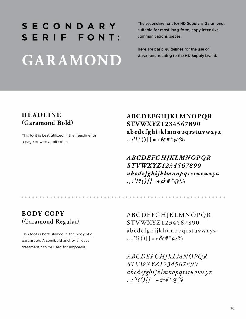
S E C O N D A R Y S E R I F F O N T :
GAR AMOND
The secondary font for HD Supply is Garamond,
suitable for most long-form, copy intensive
communications pieces.
Here are basic guidelines for the use of
Garamond relating to the HD Supply brand.
H E A DL I N E(Garamond Bold)
This font is best utilized in the headline for
a page or web application.
BODY COPY(Garamond Regular)
This font is best utilized in the body of a
paragraph. A semibold and/or all caps
treatment can be used for emphasis.
ABCDEFGHJKLMNOPQR STVWXYZ1234567890 abcdefghijklmnopqrstuvwxyz . , : ’ ! ? ( )[]=+&#*@%
ABCDEFGHJKLMNOPQR STVWXYZ1234567890 abcdefghijklmnopqrstuvwxyz . , : ’ ! ? ( )[]=+&#*@%
ABCDEFGHJKLMNOPQR STVWXYZ1234567890 abcdefghi jk lmnopqrstuvwxyz . , : ’ ! ? ( ) [ ]=+&#*@%
ABCDEFGHJKLMNOPQR STVWXYZ1234567890 abcde fghi jk lmnopqr s tuvwxyz . , : ’ ! ? ( ) [ ]=+&#*@%
37
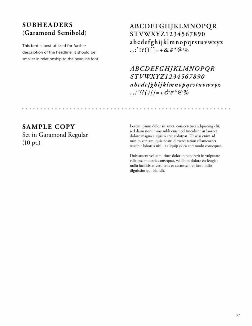
SU BH E A DE R S(Garamond Semibold)
This font is best utilized for further
description of the headline. It should be
smaller in relationship to the headline font.
S A M PL E COPY Set in Garamond Regular (10 pt.)
ABCDEFGHJKLMNOPQR STVWXYZ1234567890 abcdefghi jk lmnopqrstuvwxyz . , : ’ ! ? ( ) [ ]=+&#*@%
ABCDEFGHJKLMNOPQR STVWXYZ1234567890 abcdefghi jk lmnopqrs tuvwxyz . , : ’ ! ? ( ) [ ]=+&#*@%
Lorem ipsum dolor sit amet, consectetuer adipiscing elit, sed diam nonummy nibh euismod tincidunt ut laoreet dolore magna aliquam erat volutpat. Ut wisi enim ad minim veniam, quis nostrud exerci tation ullamcorper suscipit lobortis nisl ut aliquip ex ea commodo consequat. Duis autem vel eum iriure dolor in hendrerit in vulputate velit esse molestie consequat, vel illum dolore eu feugiat nulla facilisis at vero eros et accumsan et iusto odio dignissim qui blandit.
38
W R I T I N GG U I D E L I N E S
39
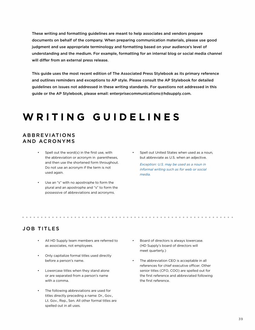
These writing and formatting guidelines are meant to help associates and vendors prepare
documents on behalf of the company. When preparing communication materials, please use good
judgment and use appropriate terminology and formatting based on your audience’s level of
understanding and the medium. For example, formatting for an internal blog or social media channel
will differ from an external press release.
This guide uses the most recent edition of The Associated Press Stylebook as its primary reference
and outlines reminders and exceptions to AP style. Please consult the AP Stylebook for detailed
guidelines on issues not addressed in these writing standards. For questions not addressed in this
guide or the AP Stylebook, please email: [email protected].
W R I T I N G G U I D E L I N E S
• Spell out the word(s) in the first use, with
the abbreviation or acronym in parentheses,
and then use the shortened form throughout.
Do not use an acronym if the term is not
used again.
• Use an “s” with no apostrophe to form the
plural and an apostrophe and “s” to form the
possessive of abbreviations and acronyms.
• Spell out United States when used as a noun,
but abbreviate as U.S. when an adjective.
Exception: U.S. may be used as a noun in
informal writing such as for web or social
media.
AB B R E VIATI O N S AN D ACRO N Y M S
J O B T ITLE S
• All HD Supply team members are referred to
as associates, not employees.
• Only capitalize formal titles used directly
before a person’s name.
• Lowercase titles when they stand alone
or are separated from a person’s name
with a comma.
• The following abbreviations are used for
titles directly preceding a name: Dr., Gov.,
Lt. Gov., Rep., Sen. All other formal titles are
spelled out in all uses.
• Board of directors is always lowercase.
(HD Supply’s board of directors will
meet quarterly.)
• The abbreviation CEO is acceptable in all
references for chief executive officer. Other
senior titles (CFO, COO) are spelled out for
the first reference and abbreviated following
the first reference.
40
I NTE R N E T FO R MAT TI N G
• Do not italicize URL addresses.
• Do not capitalize any letters in a web address, URL
or email address.
• Do not add “www” or “http” in a web address when
they are not necessary.
• Use a hyperlink when possible to avoid excessively
long web addresses.
Example:
Click here to complete the online survey.
M O NTH S AN D DATE S
• Spell out the names of months when used alone or
with only the year.
• Abbreviate Jan., Feb., Aug., Sept., Oct., Nov. and
Dec. when used with a specific date.
Exception: Months may be spelled out in formal
printed invitations.
• Use a comma before and after the year following
the date of a month.
Example: The enhancements are scheduled for
February through August 2010. Jan. 30, 2010,
marked the end of the company’s fiscal year.
TI M E N OTATI O N
• a.m./p.m. -- Never capitalize; always use periods
with no space between.
• Use ET to indicate Eastern Standard Time and
Eastern Daylight Time.
• Do not use colons if the time is on the hour.
Examples: 8 p.m., 6:30 a.m.
• Use local time zone reference for geographically
specific copy.
• Always use words instead of numerals for noon
and midnight.
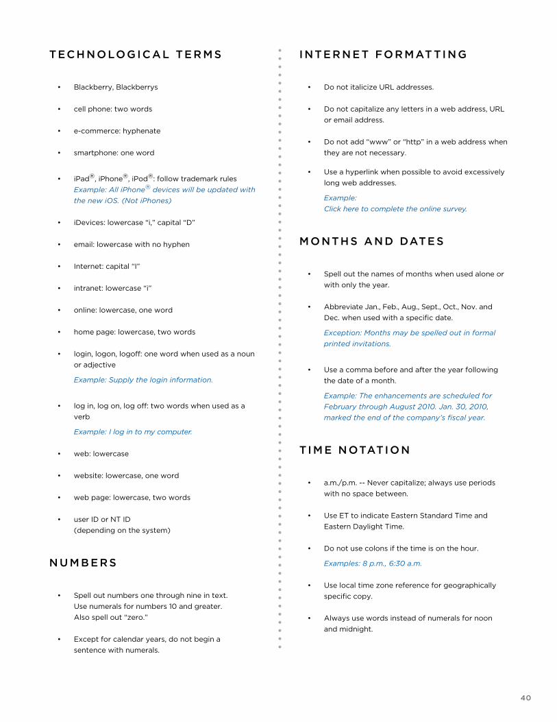
TECH N O LOG I C AL TE R M S
• Blackberry, Blackberrys
• cell phone: two words
• e-commerce: hyphenate
• smartphone: one word
• iPad®, iPhone®, iPod®: follow trademark rules
Example: All iPhone® devices will be updated with
the new iOS. (Not iPhones)
• iDevices: lowercase “i,” capital “D”
• email: lowercase with no hyphen
• Internet: capital “I”
• intranet: lowercase “i”
• online: lowercase, one word
• home page: lowercase, two words
• login, logon, logoff: one word when used as a noun
or adjective
Example: Supply the login information.
• log in, log on, log off: two words when used as a
verb
Example: I log in to my computer.
• web: lowercase
• website: lowercase, one word
• web page: lowercase, two words
• user ID or NT ID
(depending on the system)
N U M B E RS
• Spell out numbers one through nine in text.
Use numerals for numbers 10 and greater.
Also spell out “zero.”
• Except for calendar years, do not begin a
sentence with numerals.
41
TR AD E MAR KS
• In text, include a registration trademark symbol ®
in the superscript position with the first reference
of HD Supply.
Example: HD Supply® Facilities Maintenance has
locations across the United States
D I M E N S I O N S
• Use figures to spell out inches, feet, yards, etc., to
note depth, height, length and width.
• Hyphenate adjectival forms before nouns.
Example: He is 5 feet 9 inches tall. The 5-foot-7-
inch woman. The 6-foot man.
TE LE P H O N E
• Use periods to separate spaces in telephone and
fax numbers.
Exception: Alternate telephone formats may be
used on web pages.
• Do not use a 1 in front of phone numbers.
• Voice mail should be written as two words
lowercase.
• When posting telephone numbers on a web page,
use dashes to separate spaces or parentheses and
dashes as appropriate. Be consistent.
Example: 888-555-5555 or (888) 555-5555
• For extensions, use a comma;
lowercase “ext.”
Example: Leave him a voice mail at 800.555.5555,
ext. 12345.
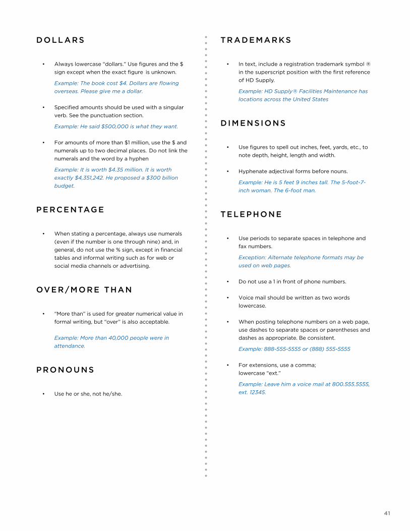
DO LL ARS
• Always lowercase “dollars.” Use figures and the $
sign except when the exact figure is unknown.
Example: The book cost $4. Dollars are flowing
overseas. Please give me a dollar.
• Specified amounts should be used with a singular
verb. See the punctuation section.
Example: He said $500,000 is what they want.
• For amounts of more than $1 million, use the $ and
numerals up to two decimal places. Do not link the
numerals and the word by a hyphen
Example: It is worth $4.35 million. It is worth
exactly $4,351,242. He proposed a $300 billion
budget.
P E RCE NTAG E
• When stating a percentage, always use numerals
(even if the number is one through nine) and, in
general, do not use the % sign, except in financial
tables and informal writing such as for web or
social media channels or advertising.
OVE R /M O R E THAN
• “More than” is used for greater numerical value in
formal writing, but “over” is also acceptable.
Example: More than 40,000 people were in
attendance.
P RO N O U N S
• Use he or she, not he/she.
42
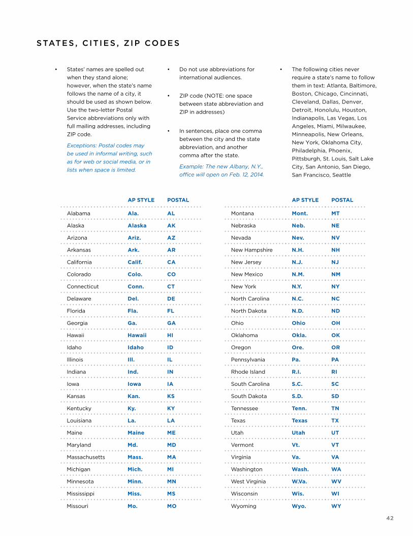
STATE S , C IT I E S , Z I P CO D E S
• States’ names are spelled out
when they stand alone;
however, when the state’s name
follows the name of a city, it
should be used as shown below.
Use the two-letter Postal
Service abbreviations only with
full mailing addresses, including
ZIP code.
Exceptions: Postal codes may
be used in informal writing, such
as for web or social media, or in
lists when space is limited.
• Do not use abbreviations for
international audiences.
• ZIP code (NOTE: one space
between state abbreviation and
ZIP in addresses)
• In sentences, place one comma
between the city and the state
abbreviation, and another
comma after the state.
Example: The new Albany, N.Y.,
office will open on Feb. 12, 2014.
• The following cities never
require a state’s name to follow
them in text: Atlanta, Baltimore,
Boston, Chicago, Cincinnati,
Cleveland, Dallas, Denver,
Detroit, Honolulu, Houston,
Indianapolis, Las Vegas, Los
Angeles, Miami, Milwaukee,
Minneapolis, New Orleans,
New York, Oklahoma City,
Philadelphia, Phoenix,
Pittsburgh, St. Louis, Salt Lake
City, San Antonio, San Diego,
San Francisco, Seattle
AP STYLE POSTAL AP STYLE POSTAL
Alabama Ala. AL Montana Mont. MT
Alaska Alaska AK Nebraska Neb. NE
Arizona Ariz. AZ Nevada Nev. NV
Arkansas Ark. AR New Hampshire N.H. NH
California Calif. CA New Jersey N.J. NJ
Colorado Colo. CO New Mexico N.M. NM
Connecticut Conn. CT New York N.Y. NY
Delaware Del. DE North Carolina N.C. NC
Florida Fla. FL North Dakota N.D. ND
Georgia Ga. GA Ohio Ohio OH
Hawaii Hawaii HI Oklahoma Okla. OK
Idaho Idaho ID Oregon Ore. OR
Illinois Ill. IL Pennsylvania Pa. PA
Indiana Ind. IN Rhode Island R.I. RI
Iowa Iowa IA South Carolina S.C. SC
Kansas Kan. KS South Dakota S.D. SD
Kentucky Ky. KY Tennessee Tenn. TN
Louisiana La. LA Texas Texas TX
Maine Maine ME Utah Utah UT
Maryland Md. MD Vermont Vt. VT
Massachusetts Mass. MA Virginia Va. VA
Michigan Mich. MI Washington Wash. WA
Minnesota Minn. MN West Virginia W.Va. WV
Mississippi Miss. MS Wisconsin Wis. WI
Missouri Mo. MO Wyoming Wyo. WY
43
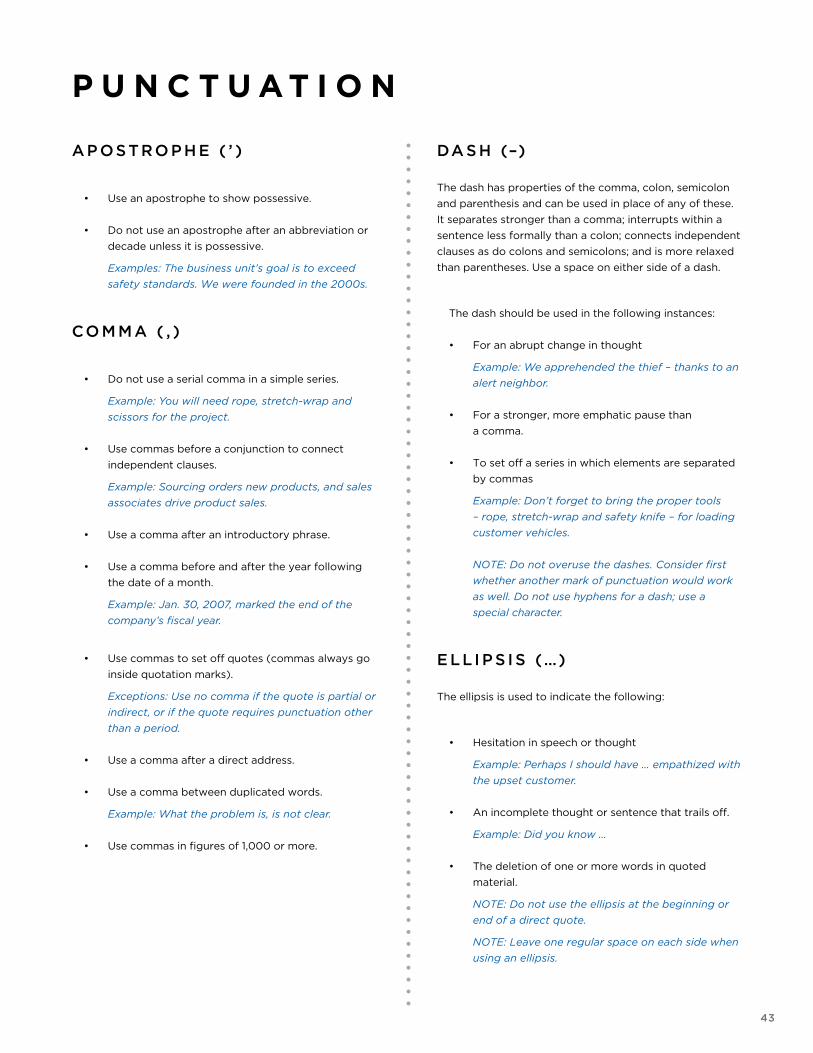
AP OSTRO P H E ( ’ )
• Use an apostrophe to show possessive.
• Do not use an apostrophe after an abbreviation or
decade unless it is possessive.
Examples: The business unit’s goal is to exceed
safety standards. We were founded in the 2000s.
CO M MA ( , )
• Do not use a serial comma in a simple series.
Example: You will need rope, stretch-wrap and
scissors for the project.
• Use commas before a conjunction to connect
independent clauses.
Example: Sourcing orders new products, and sales
associates drive product sales.
• Use a comma after an introductory phrase.
• Use a comma before and after the year following
the date of a month.
Example: Jan. 30, 2007, marked the end of the
company’s fiscal year.
• Use commas to set off quotes (commas always go
inside quotation marks).
Exceptions: Use no comma if the quote is partial or
indirect, or if the quote requires punctuation other
than a period.
• Use a comma after a direct address.
• Use a comma between duplicated words.
Example: What the problem is, is not clear.
• Use commas in figures of 1,000 or more.
P U N C T U A T I O N
DA S H (–) The dash has properties of the comma, colon, semicolon
and parenthesis and can be used in place of any of these.
It separates stronger than a comma; interrupts within a
sentence less formally than a colon; connects independent
clauses as do colons and semicolons; and is more relaxed
than parentheses. Use a space on either side of a dash.
The dash should be used in the following instances:
• For an abrupt change in thought
Example: We apprehended the thief – thanks to an
alert neighbor.
• For a stronger, more emphatic pause than
a comma.
• To set off a series in which elements are separated
by commas
Example: Don’t forget to bring the proper tools
– rope, stretch-wrap and safety knife – for loading
customer vehicles.
NOTE: Do not overuse the dashes. Consider first
whether another mark of punctuation would work
as well. Do not use hyphens for a dash; use a
special character.
E LLI P S I S (…) The ellipsis is used to indicate the following:
• Hesitation in speech or thought
Example: Perhaps I should have … empathized with
the upset customer.
• An incomplete thought or sentence that trails off.
Example: Did you know …
• The deletion of one or more words in quoted
material.
NOTE: Do not use the ellipsis at the beginning or
end of a direct quote.
NOTE: Leave one regular space on each side when
using an ellipsis.
44
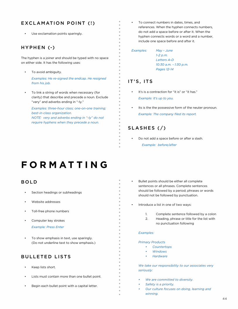
E XCL AMATI O N P O I NT ( ! )
• Use exclamation points sparingly.
H Y P H E N (-)
The hyphen is a joiner and should be typed with no space
on either side. It has the following uses:
• To avoid ambiguity.
Examples: He re-signed the endcap. He resigned
from his job.
• To link a string of words when necessary (for
clarity) that describe and precede a noun. Exclude
“very” and adverbs ending in “-ly.”
Examples: three-hour class; one-on-one training;
best-in-class organization.
NOTE: very and adverbs ending in “-ly” do not
require hyphens when they precede a noun.
• To connect numbers in dates, times, and
references. When the hyphen connects numbers,
do not add a space before or after it. When the
hyphen connects words or a word and a number,
include one space before and after it.
Examples: May - June
1-2 p.m.
Letters A-D
10:30 a.m. - 1:30 p.m.
Pages 12-14
IT ’ S , ITS
• It’s is a contraction for “it is” or “it has.”
Example: It’s up to you.
• Its is the the possessive form of the neuter pronoun.
Example: The company filed its report.
S L A S H E S ( / )
• Do not add a space before or after a slash.
Example: before/after
F O R M A T T I N G
B O LD
• Section headings or subheadings
• Website addresses
• Toll-free phone numbers
• Computer key strokes
Example: Press Enter
• To show emphasis in text, use sparingly.
(Do not underline text to show emphasis.)
B U LLE TE D L I STS
• Keep lists short.
• Lists must contain more than one bullet point.
• Begin each bullet point with a capital letter.
• Bullet points should be either all complete
sentences or all phrases. Complete sentences
should be followed by a period; phrases or words
should not be followed by punctuation.
• Introduce a list in one of two ways:
1. Complete sentence followed by a colon
2. Heading, phrase or title for the list with
no punctuation following
Examples:
Primary Products
• Countertops
• Windows
• Hardware
We take our responsibility to our associates very
seriously:
• We are committed to diversity.
• Safety is a priority.
• Our culture focuses on doing, learning and
winning.
45
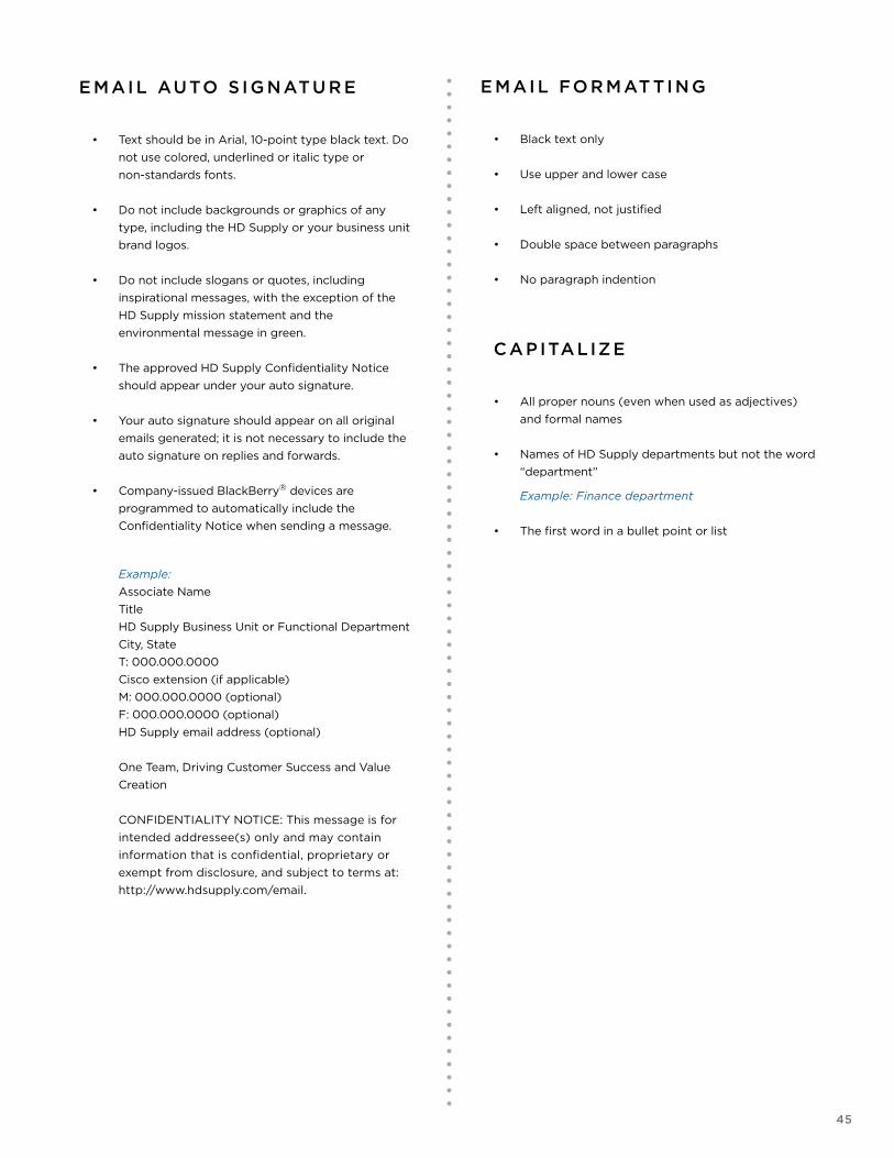
E MAI L AUTO S I G NATU R E
• Text should be in Arial, 10-point type black text. Do
not use colored, underlined or italic type or
non-standards fonts.
• Do not include backgrounds or graphics of any
type, including the HD Supply or your business unit
brand logos.
• Do not include slogans or quotes, including
inspirational messages, with the exception of the
HD Supply mission statement and the
environmental message in green.
• The approved HD Supply Confidentiality Notice
should appear under your auto signature.
• Your auto signature should appear on all original
emails generated; it is not necessary to include the
auto signature on replies and forwards.
• Company-issued BlackBerry® devices are
programmed to automatically include the
Confidentiality Notice when sending a message.
Example:
Associate Name
Title
HD Supply Business Unit or Functional Department
City, State
T: 000.000.0000
Cisco extension (if applicable)
M: 000.000.0000 (optional)
F: 000.000.0000 (optional)
HD Supply email address (optional)
One Team, Driving Customer Success and Value
Creation
CONFIDENTIALITY NOTICE: This message is for
intended addressee(s) only and may contain
information that is confidential, proprietary or
exempt from disclosure, and subject to terms at:
http://www.hdsupply.com/email.
E MAI L FO R MAT TI N G
• Black text only
• Use upper and lower case
• Left aligned, not justified
• Double space between paragraphs
• No paragraph indention
C APITALIZE
• All proper nouns (even when used as adjectives)
and formal names
• Names of HD Supply departments but not the word
“department”
Example: Finance department
• The first word in a bullet point or list
46
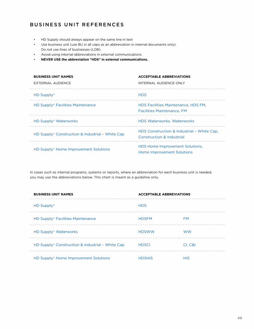
BUSINESS UNIT NAMES
EXTERNAL AUDIENCE
ACCEPTABLE ABBREVIATIONS
INTERNAL AUDIENCE ONLY
HD Supply® HDS
HD Supply® Facilities Maintenance HDS Facilities Maintenance, HDS FM,
Facilities Maintenance, FM
HD Supply® Waterworks HDS Waterworks, Waterworks
HD Supply® Construction & Industrial – White CapHDS Construction & Industrial – White Cap,
Construction & Industrial
HD Supply® Home Improvement SolutionsHDS Home Improvement Solutions,
Home Improvement Solutions
BUSINESS UNIT NAMES ACCEPTABLE ABBREVIATIONS
HD Supply® HDS
HD Supply® Facilities Maintenance HDSFM FM
HD Supply® Waterworks HDSWW WW
HD Supply® Construction & Industrial – White Cap HDSCI CI, C&I
HD Supply® Home Improvement Solutions HDSHIS HIS
B U S I N E S S U N IT R E FE R E N C E S
• HD Supply should always appear on the same line in text
• Use business unit (use BU in all caps as an abbreviation in internal documents only).
Do not use lines of businesses (LOB).
• Avoid using internal abbreviations in external communications.
• NEVER USE the abbreviation “HDS” in external communications.
In cases such as internal programs, systems or reports, where an abbreviation for each business unit is needed,
you may use the abbreviations below. This chart is meant as a guideline only.