Embed Size (px)
Citation preview

1.0 Section Secondary line Section title
Brand GuidelinesVersion 3.4 | October 2018

Introduction
iiDestination Canada Brand Guidelines – October 2018 – Version 3.4
Hi.Welcome to our brand guidelines. This is us: Explorers. Adventurers. Storytellers. Canadians. Our personality will spark the curiousity of travellers everywhere and inspire them to visit Canada.

Contents
iiiDestination Canada Brand Guidelines – October 2018 – Version 3.4
1.0 Our story 1Our personality 2
Uniquely Canadian 3
2.0 Our toolkit 4Overview of elements 5
Logos overview 6
Language versions 7
Choosing the right logos 8
Marketing logo: colour versions 9
Marketing logo: minimum size and clear space 10
Marketing logo: things to avoid 11
Corporate logo: colour versions 12
Corporate logo: minimum size and clear space 13
Corporate logo: things to avoid 14
Canada wordmark: colour versions 15
Canada wordmark: minimum size, clear space and relative scale 16
Colour overview 18
Colour palette 19
Colour applied 20
Typography 21
Primary typefaces 22
Secondary typeface 23
Websites: typography 24
Photography overview 25
Photography style 26
Photography style: things to avoid 27
Photography credits 28
Writing overview 29
Writing style 30
Writing tone 31
Writing for travellers 32
Writing checklist 33
Map 34
Our brand checklist 35
3.0 Our Brand in Action 36Marketing logo in action: online advertising 37
Marketing logo in action: video 38
Corporate logo in action: stationery 39
PowerPoint presentations 40
Reports 41
Websites 42
Animation and video 43
Tradeshows and events 44
Tradeshow example: RVC 2018 45
RVC wordmark guidelines 47
Tradeshow and event checklist 48
Contacts 49
Glossary 50

1.0 Section Secondary line Section title
Our Story
© T
undr
a N
orth
Tou
rs
1
1.0Our story
Our personality 1.0 Our story
2Destination Canada Brand Guidelines – October 2018 – Version 3.4
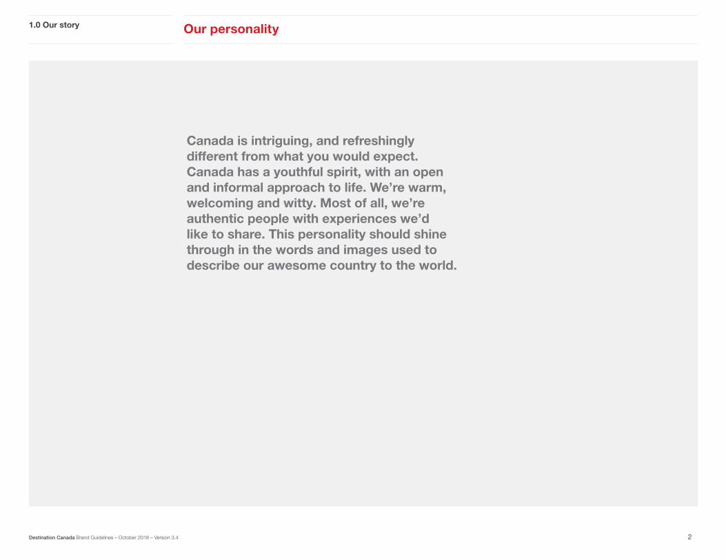
Canada is intriguing, and refreshingly different from what you would expect. Canada has a youthful spirit, with an open and informal approach to life. We’re warm, welcoming and witty. Most of all, we’re authentic people with experiences we’d like to share. This personality should shine through in the words and images used to describe our awesome country to the world.

Canada can be many different things depending on who you talk to. We’ve identified six broad categories that help connect travellers with Canadian experiences.
1.0 Our story Uniquely Canadian
3Destination Canada Brand Guidelines – October 2018 – Version 3.4
Vibrant CitiesCanadian cities are second to none. From craft breweries to high-end fashion boutiques to culinary hot spots, extraordinary experiences await across the country.
AdventureCome to Canada for adventures big and small: world-class skiing, zip lining, white-water rafting and whale watching; culinary extravaganzas; festivals that will blow your mind – the list is endless.
Attractions & EntertainmentCanada creates some of the best entertainment on the planet. We also attract the biggest acts from around the world. There is always something that will inspire you to keep exploring.
Food & DrinkCanada is one big tasting menu with unparalleled culinary experiences from coast to coast to coast. Shuck oysters on Prince Edward Island. Discover Ontario’s icewines. Savour seafood you just caught in Haida Gwaii. The flavours are endless.
Natural WondersNatural wonders are kind of our thing. Whether you want to get close to unique wildlife, be inspired by breathtaking landscapes or see some of the most incredible places on the planet, Canada is your playground.
CultureCanada is a mosaic of cultures from around the world. Thanks to our aboriginal, French and English heritage, we welcome different perspectives with open arms.

© B
anff
Lake
Lou
ise
Tour
ism
/ D
arre
n R
ober
ts
4
2.0Our toolkit

Here’s an overview of the individual elements that make up our brand. Think of them as tools in your brand toolkit.
2.0 Our toolkit Overview of elements
5Destination Canada Brand Guidelines – October 2018 – Version 3.4
Logos
Photography
Colours
Writing
Typography
ABCDEFGHIJKLMN OPQRSTUVWXYZ abcdefghijklmn opqrstuvwxyz 10234567890
“ My windshield wasn’t nearly big enough for the view.”

2.0 Our toolkit Logos overview
Our communication makes use of four distinct logos. These appear in different combinations depending on our audience and the type of communication.
6
Marketing logo We use the marketing logo in consumer materials and when referencing our consumer brand to industry and media.
Business Events logoThis logo should be used on communications that promote Canada as a destination for business events.
Corporate logoWe use this logo in corporate materials intended for internal, industry or government communications, as well as in our office signage.
Canada wordmarkThis wordmark is part of the Government of Canada’s Federal Identity Program, which allows for clear and consistent identification of government institutions. We use this logo in combination with the other logos on this page.
Destination Canada Brand Guidelines – October 2018 – Version 3.4

Our logos are available in several language versions.
2.0 Our toolkit Language versions
7
Marketing logo
Business Events logo
Corporate logo
English For use in all Destination Canada markets other than France. In Canada this logo can be used when there is a French equivalent.
English Use when the primary language is English.
Bilingual (English and French)It reads the same in English and French.
French For use in France. In Canada this logo can be used when there is an English equivalent.
French Use when the primary language is French.
Bilingual (English and French)For use in Canada or when complying with the Official Languages Act.
Destination Canada Brand Guidelines – October 2018 – Version 3.4

The following table shows how to choose the right logos for your communication. To comply with Federal Identity Program standards, the Canada wordmark is mandatory when indicated.
Logo usage falls into two main categories: corporate and marketing. All corporate applications use the corporate logo and the Canada wordmark. For marketing, different logos apply according to the media they appear in. Refer to the attached chart for guidelines on which logos apply in which situations.
2.0 Our toolkit Choosing the right logos
8Destination Canada Brand Guidelines – October 2018 – Version 3.4
CORPORATE APPLICATIONS
Corporate communications
Corporate website
Videos
Reports and official documents
MARKETING APPLICATIONS
Websites
Advertisements (print/online/TV)
Videos
Owned content
Sponsored content
Swag
TRADESHOWS AND EVENTS
Booth
Event signage
BUSINESS EVENTS APPLICATIONS
Website
Brochure
Swag

Four distinct colour variations of our logo are available, allowing for flexibility with different types of backgrounds and media. Each variation is available in the language variations described on page 7, as well as in CMYK, RGB and spot-colour formats. No other colour variations can be used.
2.0 Our toolkit Marketing logo: colour versions
9Destination Canada Brand Guidelines – October 2018 – Version 3.4
Full colourUse against white or light backgrounds (available in CMYK, RGB and spot-colour formats).
Black and white Use in black-and-white applications against white or light backgrounds.
Reverse full colourUse in colour applications against medium-to-dark backgrounds (available in CMYK, RGB and spot-colour formats).
Reverse black and whiteUse in black-and-white applications against medium-to-dark backgrounds or images.

To ensure legibility we have established a minimum size for our marketing logos. To determine the minimum clear space (or exclusion zone), use the height and width of the maple leaf within the logo.
These guidelines also apply to the Business Events Canada logo:
2.0 Our toolkit Marketing logo: minimum size and clear space
10Destination Canada Brand Guidelines – October 2018 – Version 3.4
Minimum sizeThe logo should never appear smaller than 1.9 cm or 0.75 in.
Minimum sizeThe logo should never appear smaller than 1.9 cm or 0.75 in.
Exclusion zoneThe clear space is the same height and width as the maple leaf.
Exclusion zoneThe clear space is the same height and width as the maple leaf.
1.9 cm (0.75 in)
1.9 cm (0.75 in)

We want our logos to look good and be used consistently. Here are a few things to avoid.
2.0 Our toolkit Marketing logo: things to avoid
11Destination Canada Brand Guidelines – October 2018 – Version 3.4
Logo colourDo not change the colour of any of the elements.
C
M
Y
CM
MY
CY
CMY
K
GF10.pdf 1 2016-10-24 9:31 AM
Relative positioningDo not reposition any of the elements within the logo.
Skew, distort or rotateDo not skew the logos—scale them proportionally.
Busy areas of textureDo not use the logo over busy backgrounds.
Logo elementsDo not use pieces of the logo on their own.
White or coloured boxesDo not isolate the logo in a white or coloured box.
Text and typefaceDo not replace any of the typefaces.
Replacing copyDo not replace any of the copy within the logo.
Hue and toneDo not use the logo on colours that will hide or clash with the colours in the logo.
Keep exploring Explorez sans fin
CELEBRATING 150 YEARS
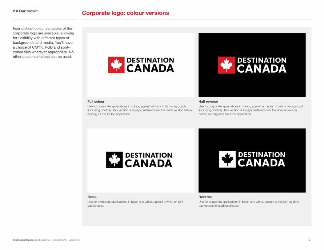
Four distinct colour variations of the corporate logo are available, allowing for flexibility with different types of backgrounds and media. You’ll have a choice of CMYK, RGB and spot- colour files wherever appropriate. No other colour variations can be used.
Full colourUse for corporate applications in colour, against white or light backgrounds (including photos). This version is always preferred over the black version below, as long as it suits the application.
ReverseUse for corporate applications in black and white, against a medium-to-dark background (including photos).
Half reverseUse for corporate applications in colour, against a medium-to-dark background (including photos). This version is always preferred over the reverse version below, as long as it suits the application.
BlackUse for corporate applications in black and white, against a white or light background.
Corporate logo: colour versions 2.0 Our toolkit
12Destination Canada Brand Guidelines – October 2018 – Version 3.4

For legibility, the logo should always be at least 2.5 cm (1 in) across or larger. To determine the clear space (or exclusion zone) at any given size, use the height of the ‘D’ within ‘DESTINATION’.
2.0 Our toolkit Corporate logo: minimum size and clear space
13Destination Canada Brand Guidelines – October 2018 – Version 3.4
Exclusion zoneThe minimum clear space is the same as the height of the ‘D’ in ‘DESTINATION’.
Minimum width (print)For legibility, the width should always be 2.5 cm (1 in) or more.
Minimum width (online)For legibility, the width should always be 175 px or more.
2.5 cm (1 in) 175 px

We want our logos to look good and be used consistently. Here are a few things to avoid.
2.0 Our toolkit Corporate logo: things to avoid
14Destination Canada Brand Guidelines – October 2018 – Version 3.4
Hue and toneDo not use the logo on colours that will hide or clash with the colours in the logo.
Relative positioningDo not reposition any of the elements within the logo. such as moving the leaf icon to the right.
Logo colourDo not change the colour of any of the elements.
Text and typefaceDo not replace any of the text or typefaces.
White or coloured boxesDo not isolate the logo in a white or coloured box.
Skew, distort or rotateDo not skew the logos — scale them proportionally.
Busy areas of textureDo not use the logo over busy backgrounds.
Destination

For flexibility with different backgrounds and media, two distinct colour variations of the Canada wordmark are available. No other colour variations can be used.
2.0 Our toolkit Canada wordmark: colour versions
15Destination Canada Brand Guidelines – October 2018 – Version 3.4
ReverseUse for any applications on a medium-to-dark background (including photos).
Black and whiteUse in marketing applications in colour or black and white, as well as in corporate applications in black and white, or against a white or light background.

For legibility, the Canada wordmark shouldn’t be scaled down to less than 2 cm (0.79 in) across. Also, give the wordmark plenty of room with a clear space (or exclusion zone) equal to the height and width of the “C” in “Canada”. In cases where the Canada wordmark is used with the marketing logo, the Canada wordmark should be the same height as “KEEP EXPLORING” in the marketing logo.
2.0 Our Toolkit Canada wordmark: minimum size, clear space and relative scale
16Destination Canada Brand Guidelines – October 2018 – Version 3.4
Exclusion zoneThe clear space is the same height and width as the “C” in “Canada.”
Minimum widthTo keep the elements legible, the width should always be 2 cm (0.79 in) or more.
RatioA simple measurement has been developed to ensure proper sizing ratio when used in combination with the marketing logo. The height of the Canada wordmark should be equal to the height of ‘KEEP EXPLORING’ or ‘EXPLOREZ SANS FIN’ in the marketing logo.
2 cm (0.79 in)
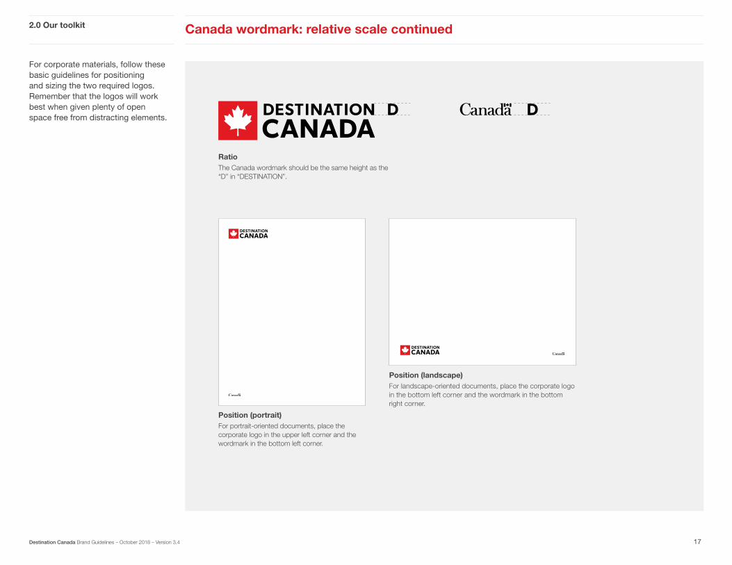
For corporate materials, follow these basic guidelines for positioning and sizing the two required logos. Remember that the logos will work best when given plenty of open space free from distracting elements.
2.0 Our toolkit Canada wordmark: relative scale continued
17Destination Canada Brand Guidelines – October 2018 – Version 3.4
RatioThe Canada wordmark should be the same height as the “D” in “DESTINATION”.
Position (portrait)For portrait-oriented documents, place the corporate logo in the upper left corner and the wordmark in the bottom left corner.
Position (landscape)For landscape-oriented documents, place the corporate logo in the bottom left corner and the wordmark in the bottom right corner.

2.0 Our toolkit Colour overview
18Destination Canada Brand Guidelines – October 2018 – Version 3.4
For our brand communications we chose to employ a simple yet bold colour palette. Colour contributes to the tone and mood of a layout, whether it’s applied to graphics and type or paired with photography.

Our colour palette consists of red, black, white and grey. This colour palette gives everything an iconic Canadian feel. Red represents Canada in consumers’ minds. White and black add a neutral base to balance out the red and provide good contrast. Grey, dark red and cyan are used as secondary colours for subheads, less important text, charts and diagrams.
2.0 Our toolkit Colour palette
19
Logos
Destination Canada Brand Guidelines – October 2018 – Version 3.4
Print spot colour Pantone 1795Use this Pantone colour as the basis for colour matching through all print applications.
Print process colour C:0 M:100 Y:99 K:4Use this CMYK process colour only when spot colour isn’t an option.
On-screen RGB R:224 G:30 B:43This red has been custom optimized for on-screen applications.
On-screen Hex #E01E2BThis is an exact conversion of the RGB values.
BlackPantone process black C:0 M:0 Y:0 K:100 R:0 G:0 B:0
WhiteC:0 M:0 Y:0 K:0 R:255 G:255 B:255
Dark RedC:0 M:100 Y:99 K:40 R:154 G:17 B:23
Open Grey (20K-90K)Colours codes will vary depending on grey chosen. Note: Grey should be made exclusively from black without the use of cyan, magenta or yellow.
CyanThis is a secondary colour that can be used in moderation when you require an alternate option for things like charts, diagrams or special highlights. It is not to be used as a primary colour.
20KC:0 M:0 Y:0 K: 20 R: 209 G: 211 B: 212
C:70 M:0 Y:20 K: 0 R: 22 G: 190 B: 207
30KC:0 M:0 Y:0 K: 30 R: 188 G: 190 B: 192
40KC:0 M:0 Y:0 K: 40 R: 167 G: 169 B: 172
50KC:0 M:0 Y:0 K: 50 R: 147 G: 149 B: 152
60KC:0 M:0 Y:0 K: 60 R: 128 G: 130 B: 133
70KC:0 M:0 Y:0 K: 70 R: 109 G: 111 B: 113
80KC:0 M:0 Y:0 K: 80 R: 88 G: 89 B: 91
90KC:0 M:0 Y:0 K: 90 R: 65 G: 64 B: 66
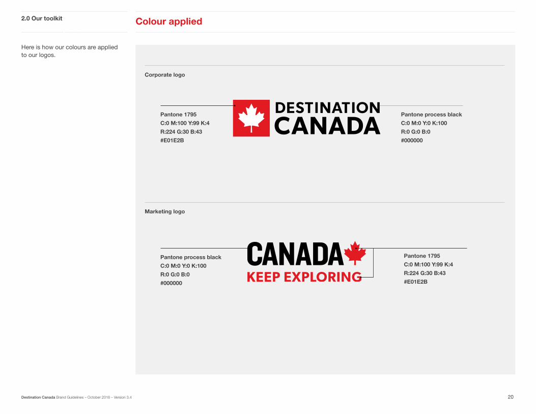
Here is how our colours are applied to our logos.
2.0 Our toolkit Colour applied
20
Logos
Corporate logo
Marketing logo
Destination Canada Brand Guidelines – October 2018 – Version 3.4
Pantone 1795
C:0 M:100 Y:99 K:4
R:224 G:30 B:43
#E01E2B
Pantone process black
C:0 M:0 Y:0 K:100
R:0 G:0 B:0
#000000
Pantone 1795
C:0 M:100 Y:99 K:4
R:224 G:30 B:43
#E01E2B
Pantone process black
C:0 M:0 Y:0 K:100
R:0 G:0 B:0
#000000

2.0 Our toolkit Typography
21Destination Canada Brand Guidelines – October 2018 – Version 3.4
Our typography helps to set the contemporary and clear tone of our communications. From the layout of the headlines to the format of URLs, every detail plays an important role in establishing our voice. The standards that follow have been designed to provide consistency while still allowing for plenty of flexibility.
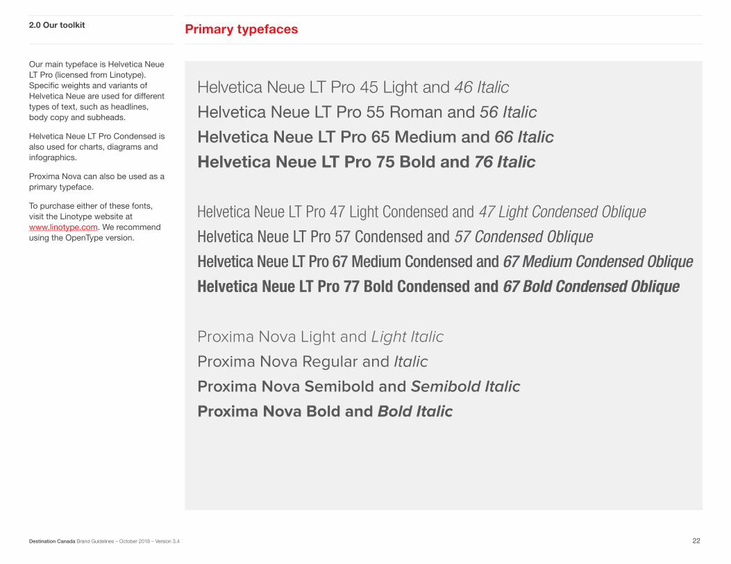
Our main typeface is Helvetica Neue LT Pro (licensed from Linotype). Specific weights and variants of Helvetica Neue are used for different types of text, such as headlines, body copy and subheads.
Helvetica Neue LT Pro Condensed is also used for charts, diagrams and infographics.
Proxima Nova can also be used as a primary typeface.
To purchase either of these fonts, visit the Linotype website at www.linotype.com. We recommend using the OpenType version.
2.0 Our toolkit Primary typefaces
22Destination Canada Brand Guidelines – October 2018 – Version 3.4
Helvetica Neue LT Pro 45 Light and 46 Italic
Helvetica Neue LT Pro 55 Roman and 56 Italic
Helvetica Neue LT Pro 65 Medium and 66 Italic
Helvetica Neue LT Pro 75 Bold and 76 Italic
Helvetica Neue LT Pro 47 Light Condensed and 47 Light Condensed Oblique
Helvetica Neue LT Pro 57 Condensed and 57 Condensed ObliqueHelvetica Neue LT Pro 67 Medium Condensed and 67 Medium Condensed Oblique
Helvetica Neue LT Pro 77 Bold Condensed and 67 Bold Condensed Oblique
Proxima Nova Light and Light ItalicProxima Nova Regular and ItalicProxima Nova Semibold and Semibold ItalicProxima Nova Bold and Bold Italic
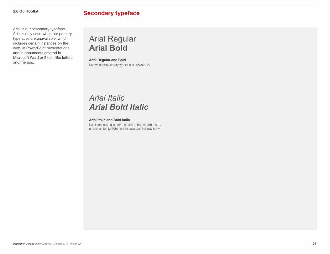
Arial is our secondary typeface. Arial is only used when our primary typefaces are unavailable, which includes certain instances on the web, in PowerPoint presentations, and in documents created in Microsoft Word or Excel, like letters and memos.
2.0 Our toolkit Secondary typeface
23Destination Canada Brand Guidelines – October 2018 – Version 3.4
Arial RegularArial Bold
Arial ItalicArial Bold Italic
Arial Regular and BoldUse when the primary typeface is unavailable.
Arial Italic and Bold ItalicUse in special cases for the titles of books, films, etc., as well as to highlight certain passages in body copy.

Our websites use a mixutre of Brandon Grotesque Bold and Black for headlines, and Proxima Nova Light and Regular for body copy.
Websites: typography2.0 Our toolkit
24Destination Canada Brand Guidelines – October 2018 – Version 3.4
Brandon Grotesque BoldBrandon Grotesque Black Brandon Grotesque Bold and BlackPrimarily used for headlines. Headlines in all caps are used sparingly.
Proxima Nova Light Proxima Nova Regular
Proxima Nova Light and RegularPrimarily used for body copy.

2.0 Our toolkit Photography overview
25Destination Canada Brand Guidelines – October 2018 – Version 3.4
Our photography is always authentic and never staged. Whenever possible we use images shot by travellers who are living in the incredible moment they have just captured. We aim to show a breadth of experiences that are attainable for real people to enjoy themselves.
Photos can be found in the Brand Canada library at www.brandcanadalibrary.ca.

Our photography features real people and authentic experiences, always depicted with warmth and personality. Photos should look as though a traveller has actually taken them, rather than feeling staged by a professional photographer.
CHOOSING GREAT PHOTOS• Are the travellers engaged in the
moment?
• Is the image taken from a traveller’s perspective?
• Do the people and the action look natural and unposed?
• Is the lighting warm and natural?
• Can you get a sense of the location?
• Are you leveraging Canadian perceptions or creating new ones?
• Is there plenty of clear space for a headline (if needed)?
2.0 Our toolkit Photography style
26Destination Canada Brand Guidelines – October 2018 – Version 3.4
First person
Shots are from a traveller’s point of view so that people can easily imagine themselves in the scene.
Natural light
Natural light helps to reinforce an overall sense of emotional warmth.
Colour and Tone
Colours are not overly saturated and there is a good balance of light and dark tones.
Authentic
We want real, intimate and candid moments in time, with subjects who look unposed and natural.
© T
ouris
m S
aska
tche
wan
/ G
reg
Hus
zar
Pho
togr
aphy
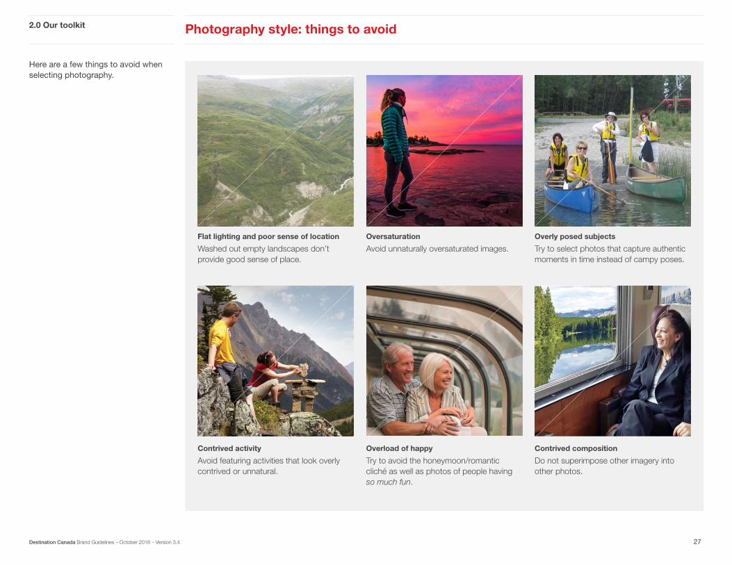
Here are a few things to avoid when selecting photography.
Photography style: things to avoid2.0 Our toolkit
27Destination Canada Brand Guidelines – October 2018 – Version 3.4
Flat lighting and poor sense of location
Washed out empty landscapes don’t provide good sense of place.
Oversaturation
Avoid unnaturally oversaturated images.
Overly posed subjects
Try to select photos that capture authentic moments in time instead of campy poses.
Contrived activity
Avoid featuring activities that look overly contrived or unnatural.
Overload of happy
Try to avoid the honeymoon/romantic cliché as well as photos of people having so much fun.
Contrived composition
Do not superimpose other imagery into other photos.

When using photos, our convention is to credit the photographer or organization. If you only have room for one, credit the organization. When placing a credit, run it vertically in a bottom corner, either reversed out over a dark area, or in black over a light area.
To find credit information, refer to the “Attributes” tab of the image in the Brand Canada Library. If there is a Credit / Source listed, you must include that information on the photo. If it simply reads “Destination Canada,” and the communication is driven by Destination Canada, then a credit is not necessary.
Photography credits 2.0 Our toolkit
28Destination Canada Brand Guidelines – October 2018 – Version 3.4
ROLL STOCK
SHEET STOCK
CUT VINYL
CUSTOM
SUPPLIED STOCK
LAMINATE: 1st: 2nd:MOUNTING: 1st: 2nd:
Finish:Fasterner:Other:
HARDWARE:
FINISHING
LJ
EFI
Dye
Acuity
Latex
GS
SC
Arizona
ZUND
ICUT
Tiling
Mirror Image
Spot Req.
Outsource
Pre Fabrication
Test Print Req.
SPECIAL INSTRUCTIONS:
PRODUCTION
CLIENT: DATE: :TSITRA:REGANAM TNUOCCAQC: QC:
v2.12.29.2015
PROOF STATUS:
DATE:
REQ#:ELEMENT:QTY:SIZE:
ATTENTION CLIENT: PLEASE SELECT OPTION FROM DROP DOWN MENU IN PROOF STATUS AND INCLUDE DESCRIPTION IF REQUIRED. PLEASE RETURN DOCUMENT VIA EMAIL TO SENDER. THANK YOU.
DESCRIPTION:
FOR OFFICE USE ONLY
88"
34.75"
Solo 34.75
27 April 06
88"
34.75"
Solo 34.75
27 April 06
88"
34.75"
Solo 34.75
27 April 06
3631811c
1ea35 x 88
�
�
35.4" FGM Decolit (Black)
SOLO
Destination Canada Nov 8 Jeff Dalgarno 604.232.3351 01
On applications larger than 30 cm (12 in), set the credit in 7 pt Helvetica Neue LT Pro 45 Light or larger.
© T
ouris
m S
aska
toon
/ C
arey
Sha
w
© T
ouris
m S
aska
tche
wan
/ G
reg
Hus
zar
Pho
togr
aphy
ROLL STOCK
SHEET STOCK
CUT VINYL
CUSTOM
SUPPLIED STOCK
LAMINATE: 1st: 2nd:MOUNTING: 1st: 2nd:
Finish:Fasterner:Other:
HARDWARE:
FINISHING
LJ
EFI
Dye
Acuity
Latex
GS
SC
Arizona
ZUND
ICUT
Tiling
Mirror Image
Spot Req.
Outsource
Pre Fabrication
Test Print Req.
SPECIAL INSTRUCTIONS:
PRODUCTION
CLIENT: DATE: :TSITRA:REGANAM TNUOCCAQC: QC:
v2.12.29.2015
PROOF STATUS:
DATE:
REQ#:ELEMENT:QTY:SIZE:
ATTENTION CLIENT: PLEASE SELECT OPTION FROM DROP DOWN MENU IN PROOF STATUS AND INCLUDE DESCRIPTION IF REQUIRED. PLEASE RETURN DOCUMENT VIA EMAIL TO SENDER. THANK YOU.
DESCRIPTION:
FOR OFFICE USE ONLY
88"
34.75"
Solo 34.75
27 April 06
88"
34.75"
Solo 34.75
27 April 06
88"
34.75"
Solo 34.75
27 April 06
3631811c
1ea35 x 88
�
�
35.4" FGM Decolit (Black)
SOLO
Destination Canada Nov 8 Jeff Dalgarno 604.232.3351 01
© T
ouris
m S
aska
tche
wan
/ G
reg
Hus
zar
Pho
togr
aphy
Large application
(detail)
Small application
On applications smaller than 30 cm (12 in), set the credit in 5 pt Helvetica Neue LT Pro 45 Light.

Writing overview 2.0 Our toolkit
29Destination Canada Brand Guidelines – October 2018 – Version 3.4
The way we write directly influences our brand personality. Whether we’re speaking to consumers, businesses or internally, our voice must come through consistently. Our tone may change as needed but it is always the same personality speaking.

We speak as friends speak. Our writing is casual, personal and genuine. We don’t shy away from emotion. We tell it like it is because we honestly care about you having a great experience.
When describing an experience we go deeper by focusing on how it feels to be there. What you see, smell, how it tastes, what it sounds like – no senses are left out. We aren’t going to forget the details, but drawing real emotion from our audience is critical when we’re looking to create a connection.
Writing style 2.0 Our toolkit
30Destination Canada Brand Guidelines – October 2018 – Version 3.4
“My windshield wasn’t nearly big enough for the view.”
“My trip to the world’s original amusement park.”
“Our tour guides were the sun and the waves.”

Our writing always tries to use an active voice. Phrasing and wording are targeted for usefulness, brevity and clarity. We emphasize plain, straightforward vocabulary and avoid jargon.
Writing tone 2.0 Our toolkit
31Destination Canada Brand Guidelines – October 2018 – Version 3.4
Global copy goals:
1. Resourceful but not overwhelming
2. Helpful but not condescending
3. Friendly but not overly intimate
4. Concise but clear
Consumer copy goals:
1. Witty but not sarcastic
2. Relatable but without “inside jokes”
3. Friendly but not chatty
4. Conversationally casual but not aloof
Corporate copy goals:
1. Professional but not stuffy
2. Authoritative but not elitist
3. Sharp and to the point but not witty
4. Corporate but not unapproachable

Our promise to travellers is that when they visit Canada they can create their own unique and extraordinary experiences. Our writing captures an intimate moment in time and evokes the feelings you’ve felt when travelling the country – excitement, peace, elation and wonder. Here are a few tips for telling these stories.
Writing for travellers 2.0 Our toolkit
32Destination Canada Brand Guidelines – October 2018 – Version 3.4
Take us there with you
Like one traveller talking to another, you want to sound as though you are telling a good friend about your unique experiences in Canada. Don’t just relate a bunch of facts – make it personal. Convey the feeling of being in our country and how that distinguishes us from every other place. We want travellers to be able to see themselves in the narrative, to understand that they could be the heroes of the story.
Celebrate our favourite explorers
We want to talk to Learners about the things they care about in a voice that appeals specifically to them. Ask yourself these questions when writing for prospective travellers:
Does it offer a connection to the place?
Does it sound personal? Natural? Intimate?
Does the experience feel unique and authentic?
Does the experience sound exciting? Exotic?
Will it create a movie in their heads?

Here are a few tips to keep in mind while creating our voice.
2.0 Our toolkit Writing checklist
33Destination Canada Brand Guidelines – October 2018 – Version 3.4
Make it genuine
Pretend you’re telling your best friend about this experience and how much you think they’ll enjoy it.
Remember what makes us unique
Think about the things we do differently from any other destination and highlight them in a conversational way.
Keep it simple
Shorter sentences that sound the way people talk are key. Make sure titles and subheads clearly state what you’re describing without getting bogged down by obscure colloquial expressions or cultural references.
Say it with feeling
Choose colourful nouns and active verbs that offer real emotion. Don’t be afraid to make generous use of personal pronouns like “you” and “we.”

We have a Canada map available for download that can be used in print and online applications. It has multiple layers and is fully editable.
If you would like a copy of our Canada map, you can download it from the Brand Canada Library.
Map 2.0 Our toolkit
34Destination Canada Brand Guidelines – October 2018 – Version 3.4
Atlantic Ocean
Hudson Bay
Arctic Ocean
Pacific Ocean
Yukon
NorthwestTerritories
Nunavut
BritishColumbia Alberta
Saskatchewan Manitoba
Ontario
Québec
Newfoundlandand Labrador
New Brunswick
PrinceEdwardIsland
Nova Scotia
United States of America
Alaska
Greenland
Iceland
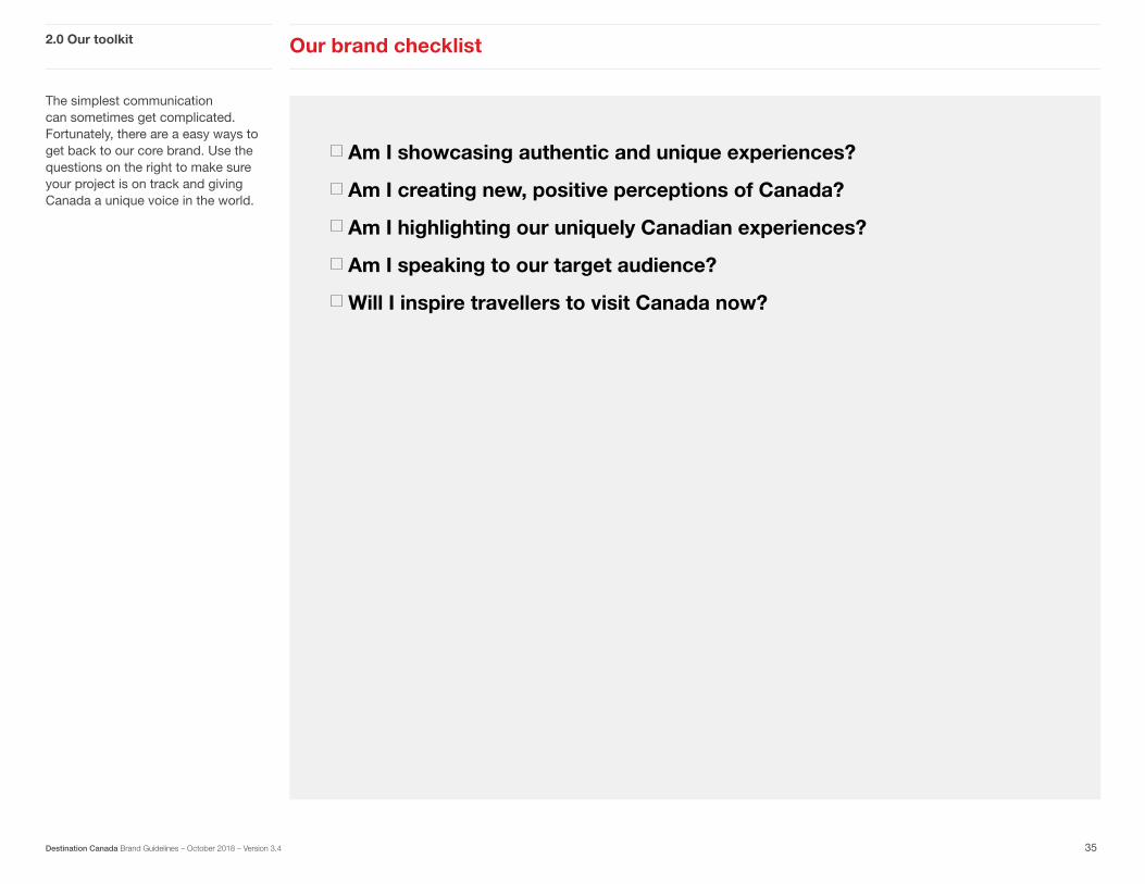
The simplest communication can sometimes get complicated. Fortunately, there are a easy ways to get back to our core brand. Use the questions on the right to make sure your project is on track and giving Canada a unique voice in the world.
2.0 Our toolkit Our brand checklist
35Destination Canada Brand Guidelines – October 2018 – Version 3.4
Am I showcasing authentic and unique experiences?
Am I creating new, positive perceptions of Canada?
Am I highlighting our uniquely Canadian experiences?
Am I speaking to our target audience?
Will I inspire travellers to visit Canada now?

Section title
36
3.0Our Brand in Action

Here are a few sample marketing materials showing slightly different uses of the logos.
For the latest examples of our online advertising, visit our Book of Inspiration.
3.0 Our brand in action Marketing logo in action: online advertising
37
Online advertising
Destination Canada Brand Guidelines – October 2018 – Version 3.4
Leaderboard728 x 90px
Wide skyscraper160 x 600 px
Half page300 x 600 px
Medium rectangle300 x 250 px

Here is the how the logo appears at the end of videos. The end slates can be downloaded from the Brand Canada Library.
3.0 Our brand in action Marketing logo in action: video
38
End slates
Destination Canada Brand Guidelines – October 2018 – Version 3.4
VersionsThere is also an end slate designed specifically for use on YouTube.

Our stationery templates have been created with fixed and editable regions, allowing you to customize contact details. You can download the editable letterhead and mailing label templates from the Intranet.
3.0 Our brand in action Corporate logo in action: stationery
BC
800-1045, rue Howe St.Vancouver BC V6Z 2A9Canada
800-1045, rue Howe St.Vancouver BC V6Z 2A9Canada
800-1045, rue Howe St.Vancouver BC V6Z 2A9Canada
800-1045, rue Howe St.Vancouver BC V6Z 2A9Canada
800-1045, rue Howe St.Vancouver BC V6Z 2A9Canada
800-1045, rue Howe St.Vancouver BC V6Z 2A9Canada
800-1045, rue Howe St.Vancouver BC V6Z 2A9Canada
800-1045, rue Howe St.Vancouver BC V6Z 2A9Canada
800-1045, rue Howe St.Vancouver BC V6Z 2A9Canada
800-1045, rue Howe St.Vancouver BC V6Z 2A9Canada
800-1045, rue Howe St.Vancouver BC V6Z 2A9Canada
800-1045, rue Howe St.Vancouver BC V6Z 2A9Canada
800-1045, rue Howe St.Vancouver BC V6Z 2A9Canada
800-1045, rue Howe St.Vancouver BC V6Z 2A9Canada
800-1045, rue Howe St.Vancouver BC V6Z 2A9Canada
800-1045, rue Howe St.Vancouver BC V6Z 2A9Canada
800-1045, rue Howe St.Vancouver BC V6Z 2A9Canada
800-1045, rue Howe St.Vancouver BC V6Z 2A9Canada
800-1045, rue Howe St.Vancouver BC V6Z 2A9Canada
800-1045, rue Howe St.Vancouver BC V6Z 2A9Canada
800-1045, rue Howe St.Vancouver BC V6Z 2A9Canada
800-1045, rue Howe St.Vancouver BC V6Z 2A9Canada
800-1045, rue Howe St.Vancouver BC V6Z 2A9Canada
800-1045, rue Howe St.Vancouver BC V6Z 2A9Canada
800-1045, rue Howe St.Vancouver BC V6Z 2A9Canada
800-1045, rue Howe St.Vancouver BC V6Z 2A9Canada
800-1045, rue Howe St.Vancouver BC V6Z 2A9Canada
800-1045, rue Howe St.Vancouver BC V6Z 2A9Canada
800-1045, rue Howe St.Vancouver BC V6Z 2A9Canada
800-1045, rue Howe St.Vancouver BC V6Z 2A9Canada
Letterhead
Business cardAll business cards are bilingual, with English and French printed on one side and a branded photo and logo on the other.
Mailing label
No.10 envelope (front and back)
DIE #015SHEET SIZE: 9.75” x 12”
Name HereTitle in English Goes HereTitle in French Goes Here
604-638-8000 [email protected]
DestinationCAN | DestinationCAFR800-1045, rue Howe St., Vancouver BC, Canada V6Z 2A9destinationcanada.com
39Destination Canada Brand Guidelines – October 2018 – Version 3.4
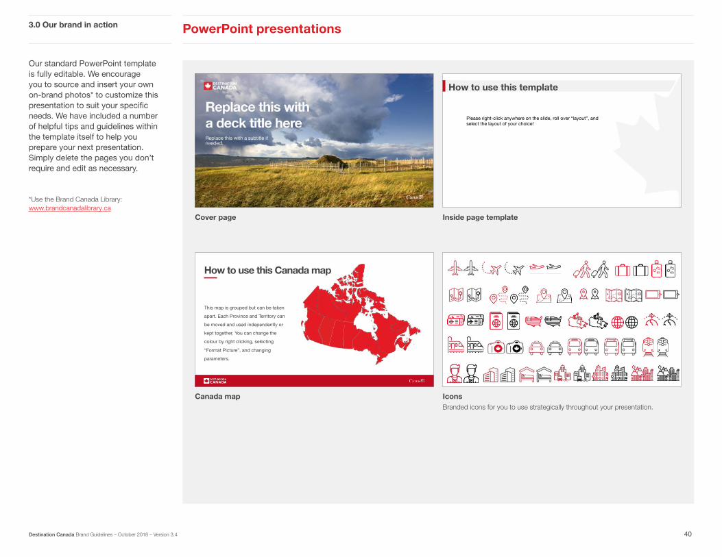
Our standard PowerPoint template is fully editable. We encourage you to source and insert your own on-brand photos* to customize this presentation to suit your specific needs. We have included a number of helpful tips and guidelines within the template itself to help you prepare your next presentation. Simply delete the pages you don’t require and edit as necessary.
*Use the Brand Canada Library: www.brandcanadalibrary.ca
PowerPoint presentations 3.0 Our brand in action
Cover page
Canada map
Inside page template
IconsBranded icons for you to use strategically throughout your presentation.
UNITED STATES
How to use this Canada map UNITED STATES
This map is grouped but can be taken
apart. Each Province and Territory can
be moved and used independently or
kept together. You can change the
colour by right clicking, selecting
“Format Picture”, and changing
parameters.
How to use this template
Please right-click anywhere on the slide, roll over “layout”, and select the layout of your choice!
40Destination Canada Brand Guidelines – October 2018 – Version 3.4

Our reports are formatted to allow for flexibility depending on the orientation as well as whether there are photos vs. plain backgrounds being used.
Destination Canada 1
Destination Canada
Content Playbook – Partner Edition
Canada Culinary Positioning Research – UK Travellers
Portrait-oriented report cover with photo
Landscape-oriented report cover with solid red background
Landscape-oriented report cover with photo background
Tourism Snapshot May 2018 | 1
Tourism SnapshotA Monthly Monitor of the Performance of Canada’s Tourism Industry
May 2018Volume 14, Issue 4
www.destinationcanada.com© G
reg
Funn
ell
Reports 3.0 Our brand in action
41Destination Canada Brand Guidelines – October 2018 – Version 3.4

For our websites, the primary logo appears in the upper left corner and the Canada wordmark in the lower footer bar.
3.0 Our brand in action Websites
Corporate website homepage Consumer website homepage
Corporate website homepage - footer bar Consumer website homepage - footer bar
42Destination Canada Brand Guidelines – October 2018 – Version 3.4

Animation is a great way to add emphasis or bring life to a project.
For the latest examples of animation and video, visit our Book of Inspiration.
Animation and video3.0 Our brand in action
Annual Report Recap VideoB-roll was combined with animated typography and icons for a lively and engaging video.
2018 Headlines Video Energetic animated iconography was paired with typography for a fresh look at the best headlines from the past year.
43Destination Canada Brand Guidelines – October 2018 – Version 3.4

Tradeshows and events 3.0 Our brand in action
44Destination Canada Brand Guidelines – October 2018 – Version 3.4
Tradeshows and special events are excellent opportunities to bring our brand to life in an immersive way. Guests at our events should feel that they’ve had a taste of uniquely Canadian experiences, and that their curiosity has been rewarded from the invitation through to the finale.
For the latest examples of our tradeshow creative, visit our Book of Inspiration.

At Rendez-vous Canada (RVC) 2018, we were challenged with branding the newly-opened Halifax Convention Centre. Pulling from our “One Canada” creative approach, we made big and bold graphic choices to celebrate all that Canada has to offer. From vinyl glass applications to bright red stairway graphics to floor decals and trans-Canada highway-inspired way finding signs… everything worked together to create a strong brand presence for DC and help attendees feel welcome.
3.0 Our brand in action Tradeshow example: RVC 2018
45Destination Canada Brand Guidelines – October 2018 – Version 3.4
Destination Canada Booth
Wayfinding Signage
Destination Canada Booth
Wall Mural Back Drop

Tradeshow example: RVC 2018
Branded Registration Counters
Exterior Welcoming Graphics
Authentic Canadian Entertainment
Authentic Canadian Cuisine
3.0 Our brand in action
46Destination Canada Brand Guidelines – October 2018 – Version 3.4
Entrance Stairway Decals
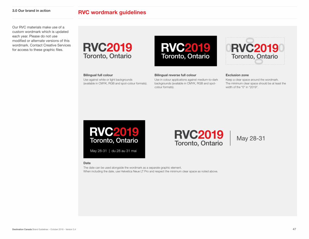
Our RVC materials make use of a custom wordmark which is updated each year. Please do not use modified or alternate versions of this wordmark. Contact Creative Services for access to these graphic files.
Exclusion zoneKeep a clear space around the wordmark. The minimum clear space should be at least the width of the “0” in “2019”.
Date The date can be used alongside the wordmark as a separate graphic element. When including the date, use Helvetica Neue LT Pro and respect the minimum clear space as noted above.
May 28-31 | du 28 au 31 mai
May 28-31
RVC wordmark guidelines3.0 Our brand in action
47Destination Canada Brand Guidelines – October 2018 – Version 3.4
Bilingual full colourUse against white or light backgrounds (available in CMYK, RGB and spot-colour formats).
Bilingual reverse full colourUse in colour applications against medium-to-dark backgrounds (available in CMYK, RGB and spot-colour formats).

Use this checklist to help you produce a memorable event and give Canadian tourism a unique voice in the world.
3.0 Our brand in action Tradeshow and event checklist
48Destination Canada Brand Guidelines – October 2018 – Version 3.4
Photography and video tells our story instantly. Assess your venue for prime photo/video real estate and choose content strategically.
Be big and bold with using our primary colours of red, white and black.
Use the Canada wordmark at least once in each ‘zone’ of your tradeshow footprint.
Use the Destination Canada logo at least once in a prominent location.
Natural hardwood flooring is preferred, but grey or neutral-coloured carpeting is acceptable.
Who is your audience? Make choices that speak clearly to them.

Contacts
49Destination Canada Brand Guidelines – September 2018 – Version 3.4
FOR QUESTIONS ABOUT THE DESTINATION CANADA BRAND IDENTITY, CONTENT AND BRAND CANADA LIBRARY, CONTACT US AT: Adam Brownfield, Digital and Creative Services Coordinator [email protected] 604 638 8369
FOR SPECIFIC TEMPLATES OR FILES, CONTACT US AT:
Antoine Scotto, Senior Graphic Designer [email protected] 604 638 8413
FOR IDEAS AND INSPIRATION:
www.bookofinspiration.com

Glossary
50Destination Canada Brand Guidelines – January 2017 – Version 3.3
BRAND CANADA LIBRARY Destination Canada’s online library of downloadable images, video footage, graphics, logos, media packages and reports. You must register as a new user before you can access our system at www.brandcanadalibrary.ca.
CLEAR SPACE / EXCLUSION ZONEThe amount of space around a logo within which no other graphic elements are allowed. This ensures legibility and protects the integrity of the logo.
CMYK Often referred to as process colour or four colour, this is a subtractive colour model and printing process that uses cyan, magenta, yellow and black. CMYK is the preferred method for all of our print materials (with the exception of corporate stationery).
DISPLAY TEXTAny text that is more prominent than the body copy on the page, such as headlines, quotes and callouts.
FULL BLEEDA full bleed image extends over the edge of the page, so that there are no borders or white space.
LEADINGIn typography, this refers to the amount of vertical space added between lines of text.
OPENTYPE A format for computer fonts that works consistently on both PCs and Macs.
REVERSE LOGOLogo variations that use white or light colours so that they can be read clearly on medium-to-dark backgrounds.
REVERSE OUTIn typography, this usually refers to setting text in white so that it can be read against a medium-to-dark background.
RGB An additive colour model in which red, green and blue are combined to produce an array of colours. This model is used most often for on-screen applications, such as websites, presentations and video.
X-HEIGHTIn typography, this refers to the height of a typeface when the ascending and descending letters are not included. In most cases, the x-height is the same as the height of a lowercase letter x.