Embed Size (px)
Citation preview
Brand GuidelinesVersion 15 | Update: July 13, 2021
College of the Mainland Official Brand Guidelines
© Copyright of College of the Mainland Office of Marketing and Public Affairs 1200 N. Amburn Road, Texas City, Texas 77591
Message from the President 3
Our Brand and Overview 4
The COM Logo 6
Clear space 9
College Name 10
Brand Colors 11
Incorrect usage 20
Department and Other Logos 21
Advertising Types 29
Institutional-based 30
Official Fonts 31
Fonts 32
Imagery 33
Address 34
Letterhead and Envelopes 35
Email Signature 36
Business Cards 37
Indoor Retractables 39
Signage and Wayfinding 40
Promotional Items 43
Event-based 50
Co-existing identities 53
Clubs 54
A Cohesive Experience 55
Table of Contents
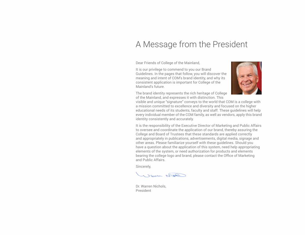
Dear Friends of College of the Mainland,
It is our privilege to commend to you our Brand Guidelines. In the pages that follow, you will discover the meaning and intent of COM’s brand identity, and why its consistent application is important for College of the Mainland’s future.
The brand identity represents the rich heritage of College of the Mainland, and expresses it with distinction. This visible and unique “signature” conveys to the world that COM is a college with a mission committed to excellence and diversity and focused on the higher educational needs of its students, faculty and staff. These guidelines will help every individual member of the COM family, as well as vendors, apply this brand identity consistently and accurately.
It is the responsibility of the Executive Director of Marketing and Public Affairs to oversee and coordinate the application of our brand, thereby assuring the College and Board of Trustees that these standards are applied correctly and appropriately in publications, advertisements, digital media, signage and other areas. Please familiarize yourself with these guidelines. Should you have a question about the application of this system, need help appropriating elements of the system, or need authorization for products and elements bearing the college logo and brand, please contact the Office of Marketing and Public Affairs.
Sincerely,
Dr. Warren Nichols, President
A Message from the President
More than just a logoCollege of the Mainland’s brand encompasses more than just a logo. It is the friendly, caring people. It is our facilities and their appearance. It is the on hold message, the website, or an ad. It is the process of enrolling. It is the experience a student has online and on campus. Our brand is ultimately the public’s perception at any one touch point.
Our brand is who we are.
4 | College of the Mainland Brand Guidelines
5 | College of the Mainland Brand Guidelines
OverviewThe COM logo is a visual symbol representing the COM brand which collectively encompasses all aspects of our image, our mission, our quality and who we are. These Brand Guidelines express the rich heritage of College of the Mainland conveying to the world that COM is committed to excellence and diversity and is focused on the higher educational needs of its students.
These guidelines will help all members of the COM family, including vendors, apply this brand identity system consistently and accurately.
The Marketing and Public Affairs Office is charged with the responsibility to oversee and coordinate the application of the brand identity system, thereby assuring the Board of Trustees that these standards are applied correctly and appropriately in publications, advertisements and products used throughout the college and its learning centers.
Purpose of these Brand GuidelinesThese Brand Guidelines provide specifications for the use and presentation of the COM logo, department logos, Horizons, Texas Stars and the Fighting Ducks mascot logo. This manual includes examples of how and how not to use the logos in a variety of materials and situations. It is important that these standards are applied when COM identities are incorporated across all communications to create familiarity and maintain consistency and continuity. The COM logo must be treated consistently to visually embody a cornerstone that supports the COM message and identity across the entire organization and throughout its service area, in all college programs, services and activities.
Core Standards of UsageThe Branding Guidelines apply to all print and digital college communications both for internal and commercial use including, but not limited to website, social media, publications, documentation, invitations, signage, flyers, promo pieces, and advertising materials. The common standards are adherence to typography, style, color, proportion, placement, clear space and size relationships determined per application.
In all situations where guidelines have not been previously determined, the Office of Marketing and Public Affairs must be contacted for policy regarding usage.
The COM Internet AddressThe website address for the college is www.com.edu. However, in marketing materials the preferred written format for visual communications and publications is simply “com.edu”.
College District and Service AreaCollege of the Mainland’s taxing district consists of residents in Dickinson, Hitchcock, La Marque, Texas City, and Santa Fe school districts. Service areas include League City, Friendswood, Kemah, Bacliff and San Leon.
For More InformationThe Office of Marketing and Public Affairs monitors and maintains the COM brand identity. Questions about this Brand Guidelines manual, brand approvals, use of the logo and other visual identification elements, should be addressed to the Marketing and Public Affairs Office at 409-933-8437 or [email protected]
6 | College of the Mainland Brand Guidelines
The COM Logo
7 | College of the Mainland Brand Guidelines
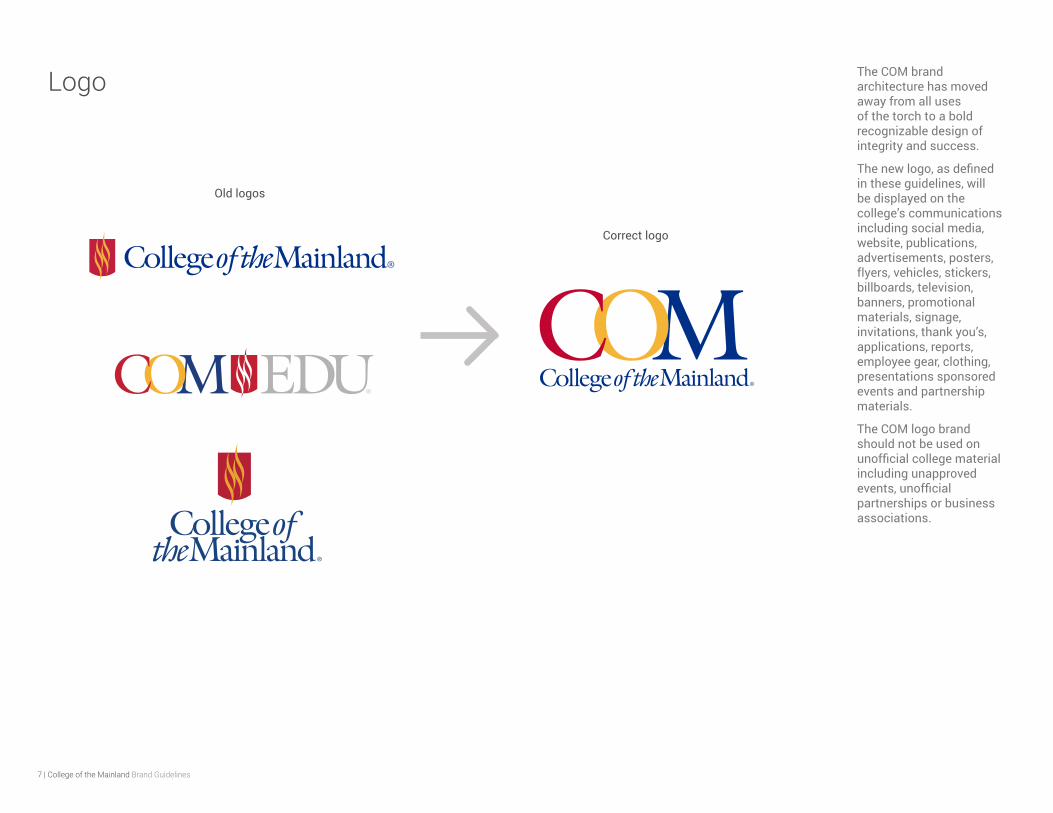
Logo The COM brand architecture has moved away from all uses of the torch to a bold recognizable design of integrity and success.
The new logo, as defined in these guidelines, will be displayed on the college’s communications including social media, website, publications, advertisements, posters, flyers, vehicles, stickers, billboards, television, banners, promotional materials, signage, invitations, thank you’s, applications, reports, employee gear, clothing, presentations sponsored events and partnership materials.
The COM logo brand should not be used on unofficial college material including unapproved events, unofficial partnerships or business associations.
Old logos
Correct logo
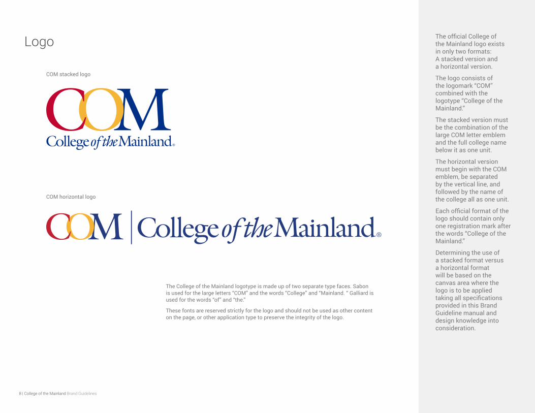
The College of the Mainland logotype is made up of two separate type faces. Sabon is used for the large letters “COM” and the words “College” and “Mainland. “ Galliard is used for the words “of” and “the.”
These fonts are reserved strictly for the logo and should not be used as other content on the page, or other application type to preserve the integrity of the logo.
8 | College of the Mainland Brand Guidelines
Logo The official College of the Mainland logo exists in only two formats: A stacked version and a horizontal version.
The logo consists of the logomark “COM” combined with the logotype “College of the Mainland.”
The stacked version must be the combination of the large COM letter emblem and the full college name below it as one unit.
The horizontal version must begin with the COM emblem, be separated by the vertical line, and followed by the name of the college all as one unit.
Each official format of the logo should contain only one registration mark after the words “College of the Mainland.”
Determining the use of a stacked format versus a horizontal format will be based on the canvas area where the logo is to be applied taking all specifications provided in this Brand Guideline manual and design knowledge into consideration.
COM stacked logo
COM horizontal logo
9 | College of the Mainland Brand Guidelines
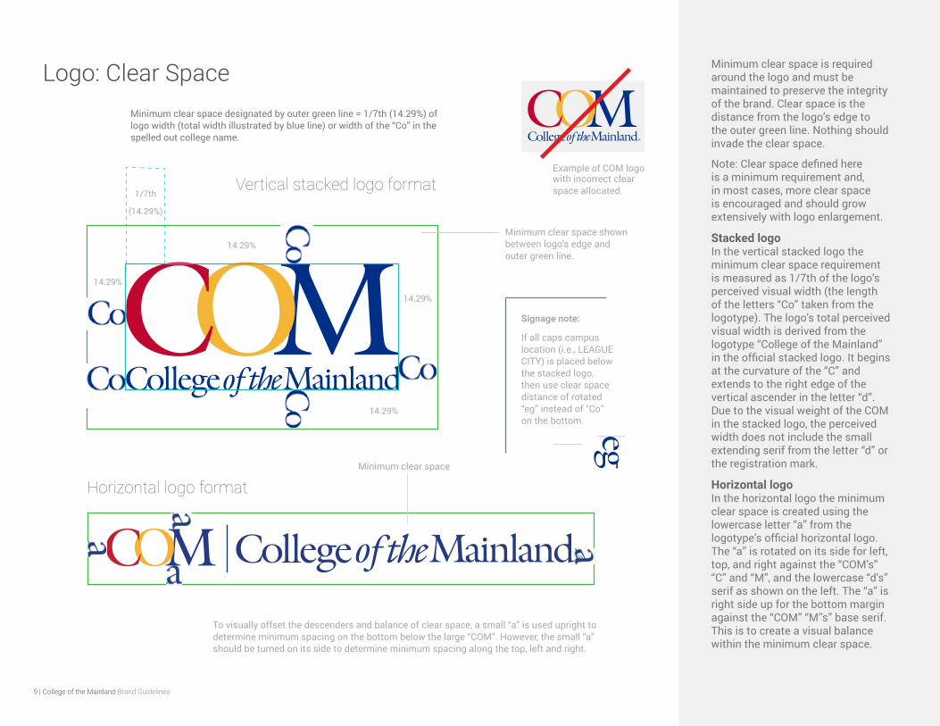
Minimum clear space designated by outer green line = 1/7th (14.29%) of logo width (total width illustrated by blue line) or width of the “Co” in the spelled out college name.
Logo: Clear Space
14.29%
14.29%
14.29%
14.29%
Minimum clear space is required around the logo and must be maintained to preserve the integrity of the brand. Clear space is the distance from the logo’s edge to the outer green line. Nothing should invade the clear space.
Note: Clear space defined here is a minimum requirement and, in most cases, more clear space is encouraged and should grow extensively with logo enlargement.
Stacked logo In the vertical stacked logo the minimum clear space requirement is measured as 1/7th of the logo’s perceived visual width (the length of the letters “Co” taken from the logotype). The logo’s total perceived visual width is derived from the logotype “College of the Mainland” in the official stacked logo. It begins at the curvature of the “C” and extends to the right edge of the vertical ascender in the letter “d”. Due to the visual weight of the COM in the stacked logo, the perceived width does not include the small extending serif from the letter “d” or the registration mark.
Horizontal logo In the horizontal logo the minimum clear space is created using the lowercase letter “a” from the logotype’s official horizontal logo. The “a” is rotated on its side for left, top, and right against the “COM’s” “C” and “M”, and the lowercase “d’s” serif as shown on the left. The “a” is right side up for the bottom margin against the “COM” “M’’s” base serif. This is to create a visual balance within the minimum clear space.
1/7th
(14.29%)
Minimum clear space shown between logo’s edge and outer green line.
Minimum clear space
Vertical stacked logo format
Horizontal logo format
Signage note:
If all caps campus location (i.e., LEAGUE CITY) is placed below the stacked logo, then use clear space distance of rotated “eg” instead of “Co” on the bottom.
To visually offset the descenders and balance of clear space, a small “a” is used upright to determine minimum spacing on the bottom below the large “COM”. However, the small “a” should be turned on its side to determine minimum spacing along the top, left and right.
Example of COM logo with incorrect clear space allocated.
10 | College of the Mainland Brand Guidelines
College Name In addition to the COM logo, the official name of the college, “College of the Mainland” and its corresponding acronym “COM”, are key identifiers of the institution.
These key identifiers equally represent all that our college embodies from our resilient goal of student success to our relentless mission for excellence. The quality and consistency of all written, visual, and audio contexts where the college name appears are a critical area of importance as they contribute significantly to the college’s brand perception.
In written instances, the complete name “College of the Mainland” should be used on any first reference with subsequent references written as COM (with no periods). Do not use any other variation such as “C.O.M.” or “COTM.” To preserve the integrity of the brand, please refrain using “COM” as part of a play on words (i.e., “COMing”, “COMplete”, etc).
All external and public facing usage of the college name, college acronym, or official college logos require a brand approval from the Office of Marketing and Public Affairs before use, printing or distribution.
Use of the college name requiring approval include, but is not limited to: digital flyers, printed or physical materials, promotional items both giveaway or for sale, student clubs, signage, college department initiatives, media relations, vehicles, events, and advertisements.
College of the Mainland
COM
The college name and acronym should never be written in fonts that could be described as script, cute, child-like, cartoonish, or other fonts displaying heavy decorative effects without Marketing’s prior approval.

11 | College of the Mainland Brand Guidelines
Brand Colors: Primary and Secondary The primary official brand color palette for College of the Mainland consists of COM red, yellow and blue as defined on the left.
The secondary color palette used in conjunction with the COM logo may be used to enhance and create a more robust and vibrant external message. It introduces flexibility in conveying tone and expression while strengthening and elevating the COM brand.
Secondary colors may not replace full or partial colors in the official logo without approval from the Office of Marketing and Public Affairs.
“COM Red” PANTONE 200 C
CMYK: 16, 100, 86, 7
RGB: 194, 4, 48
HEX: C20430
“COM Yellow” PANTONE 143 C
CMYK: 2, 32, 91, 0
RGB: 246, 180, 54
HEX: F6B436
“COM Blue” PANTONE 287 C
CMYK: 100, 87, 20, 11
RGB: 0, 47, 135
HEX: 002F87
Primary color palette
Secondary color palette
PANTONE: 3005 C
C: 100 M: 46 Y: 2 K: 0
PANTONE: Orange 021 CC: 0 M: 82 Y: 100 K: 0
PANTONE: 2995 C
C: 73 M: 16 Y: 0 K: 0
PANTONE: 715 C
C: 0 M: 54 Y: 93 K: 0
PANTONE: 297 C
C: 52 M: 4 Y: 3 K: 0
PANTONE: 120 C
C: 1 M: 12 Y: 72 K: 0
PANTONE: 317 C
C: 29 M: 0 Y: 11 K: 0
PANTONE: 600 C
C: 7 M: 2 Y: 48 K: 0
PANTONE: 7731 C
C: 85 M: 23 Y: 93 K: 9
PANTONE: 360 C
C: 61 M: 0 Y: 95 K: 0
PANTONE: 367 C
C: 40 M: 0 Y: 81 K: 0
PANTONE: 7485 C
C: 19 M: 4 Y: 30 K: 0
PANTONE: 7540 C
C: 69 M: 59 Y: 52 K: 33
PANTONE: Cool Gray 6 CC: 36 M: 29 Y: 28 K: 0
PANTONE: Cool Gray 3 C C: 21 M: 16 Y: 17 K: 0
PANTONE: Cool Gray 1 C C: 13 M: 10 Y: 12 K: 0
12 | College of the Mainland Brand Guidelines
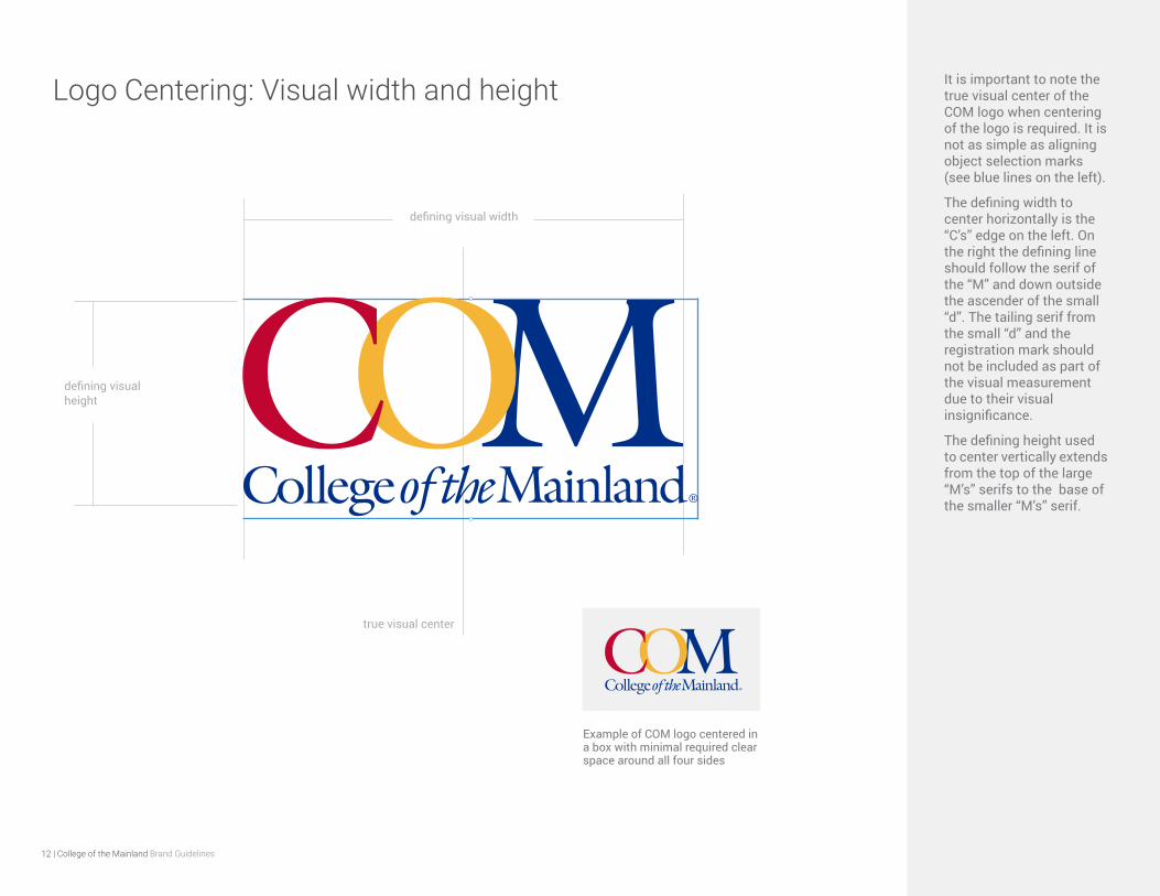
Logo Centering: Visual width and height It is important to note the true visual center of the COM logo when centering of the logo is required. It is not as simple as aligning object selection marks (see blue lines on the left).
The defining width to center horizontally is the “C’s” edge on the left. On the right the defining line should follow the serif of the “M” and down outside the ascender of the small “d”. The tailing serif from the small “d” and the registration mark should not be included as part of the visual measurement due to their visual insignificance.
The defining height used to center vertically extends from the top of the large “M’s” serifs to the base of the smaller “M’s” serif.
defining visual width
true visual center
defining visual height
Example of COM logo centered in a box with minimal required clear space around all four sides
13 | College of the Mainland Brand Guidelines
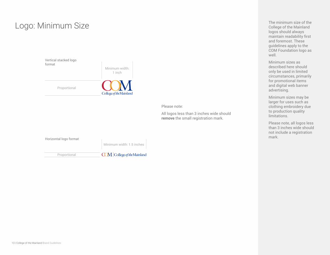
Minimum width: 1.5 inches
Logo: Minimum Size The minimum size of the College of the Mainland logos should always maintain readability first and foremost. These guidelines apply to the COM Foundation logo as well.
Minimum sizes as described here should only be used in limited circumstances, primarily for promotional items and digital web banner advertising.
Minimum sizes may be larger for uses such as clothing embroidery due to production quality limitations.
Please note, all logos less than 3 inches wide should not include a registration mark.
Minimum width: 1 inch
Vertical stacked logo format
Horizontal logo format
Proportional
Proportional
Please note:
All logos less than 3 inches wide should remove the small registration mark.
14 | College of the Mainland Brand Guidelines
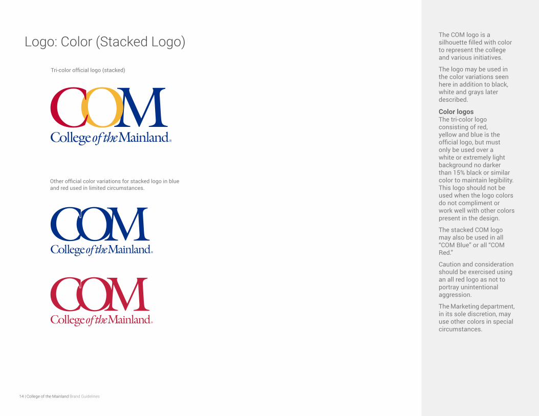
Logo: Color (Stacked Logo)The COM logo is a silhouette filled with color to represent the college and various initiatives.
The logo may be used in the color variations seen here in addition to black, white and grays later described.
Color logos The tri-color logo consisting of red, yellow and blue is the official logo, but must only be used over a white or extremely light background no darker than 15% black or similar color to maintain legibility. This logo should not be used when the logo colors do not compliment or work well with other colors present in the design.
The stacked COM logo may also be used in all “COM Blue” or all “COM Red.”
Caution and consideration should be exercised using an all red logo as not to portray unintentional aggression.
The Marketing department, in its sole discretion, may use other colors in special circumstances.
Tri-color official logo (stacked)
Other official color variations for stacked logo in blue and red used in limited circumstances.
15 | College of the Mainland Brand Guidelines
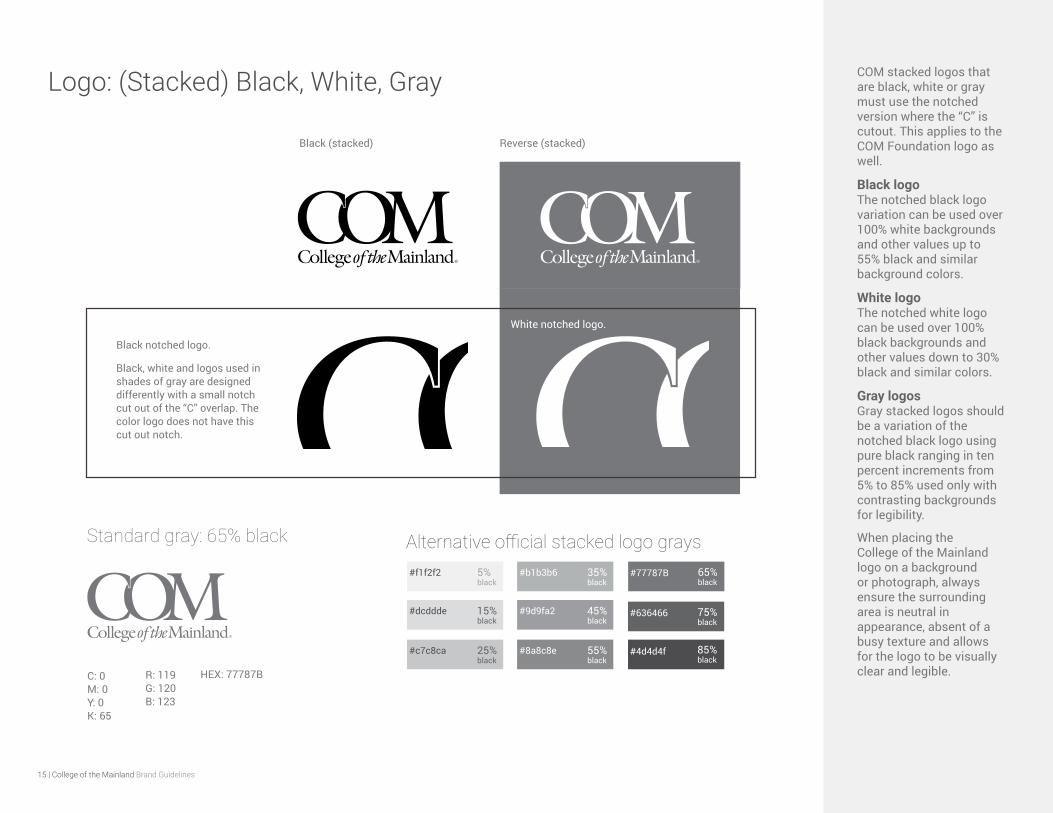
Logo: (Stacked) Black, White, Gray COM stacked logos that are black, white or gray must use the notched version where the “C” is cutout. This applies to the COM Foundation logo as well.
Black logo The notched black logo variation can be used over 100% white backgrounds and other values up to 55% black and similar background colors.
White logo The notched white logo can be used over 100% black backgrounds and other values down to 30% black and similar colors.
Gray logos Gray stacked logos should be a variation of the notched black logo using pure black ranging in ten percent increments from 5% to 85% used only with contrasting backgrounds for legibility.
When placing the College of the Mainland logo on a background or photograph, always ensure the surrounding area is neutral in appearance, absent of a busy texture and allows for the logo to be visually clear and legible.
Black (stacked) Reverse (stacked)
Black, white and logos used in shades of gray are designed differently with a small notch cut out of the “C” overlap. The color logo does not have this cut out notch.
White notched logo.
Black notched logo.
Standard gray: 65% black
C: 0 M: 0 Y: 0 K: 65
Alternative official stacked logo grays
#636466
#4d4d4f
#f1f2f2
85%black
75%black
5%black
#dcddde 15%black
#c7c8ca 25%black
HEX: 77787BR: 119 G: 120 B: 123
#b1b3b6 35%black
#9d9fa2 45%black
#8a8c8e 55%black
#77787B 65%black
16 | College of the Mainland Brand Guidelines
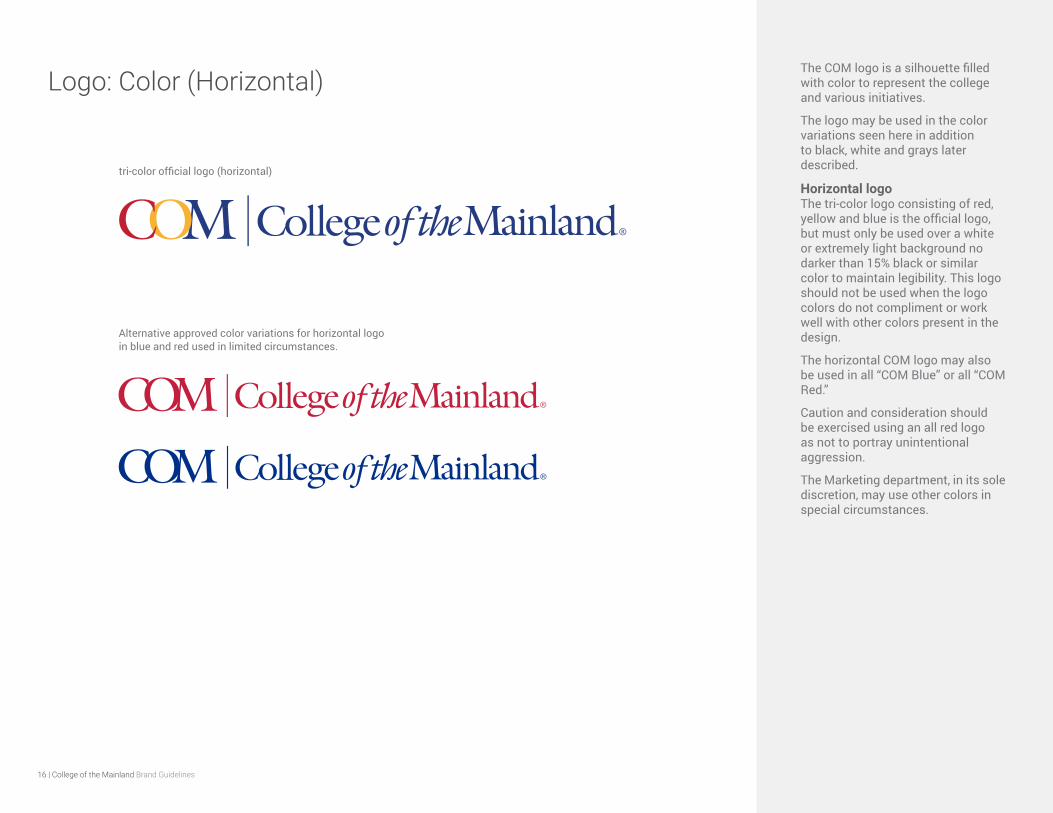
Logo: Color (Horizontal)The COM logo is a silhouette filled with color to represent the college and various initiatives.
The logo may be used in the color variations seen here in addition to black, white and grays later described.
Horizontal logo The tri-color logo consisting of red, yellow and blue is the official logo, but must only be used over a white or extremely light background no darker than 15% black or similar color to maintain legibility. This logo should not be used when the logo colors do not compliment or work well with other colors present in the design.
The horizontal COM logo may also be used in all “COM Blue” or all “COM Red.”
Caution and consideration should be exercised using an all red logo as not to portray unintentional aggression.
The Marketing department, in its sole discretion, may use other colors in special circumstances.
tri-color official logo (horizontal)
Alternative approved color variations for horizontal logo in blue and red used in limited circumstances.
17 | College of the Mainland Brand Guidelines
Black (horizontal)
Black, white and logos used in shades of gray are designed differently with a small notch cut out of the “C” overlap. The color logo does not have this cut out notch.
White notched logo.
Black notched logo.
Standard gray: 65% black
C: 0 M: 0 Y: 0 K: 65
HEX: 77787BR: 119 G: 120 B: 123
Alternative official horizontal logo grays
#636466
#4d4d4f
#f1f2f2
85%black
75%black
5%black
#dcddde 15%black
#c7c8ca 25%black
#b1b3b6 35%black
#9d9fa2 45%black
#8a8c8e 55%black
#77787B 65%black
Logo: (Horizontal) Black, White, Gray The COM logo can be used in one of 4 color designs based on the application.
Color logo This is the official logo style, but must only be used over a white or extremely light background no darker than 15% value of black or similar color to maintain legibility. This logo should not be used when logo colors do not compliment other colors present in the overall design.
Black logo The notched black logo variation can be used over 100% white backgrounds and other values up to 55% black and similar background colors.
Gray logos Gray logos should be a variation of the notched black logo used in 10% increments of pure black from 5% to 85% used only with contrasting backgrounds for legibility.
White logo The notched white logo can be used over 100% black backgrounds and other values down to 30% black and similar colors.
When placing the College of the Mainland logo on a background or photograph, always ensure the surrounding area is neutral in appearance and allows for the logo to be visually clear and legible.
18 | College of the Mainland Brand Guidelines
Logo: Color Green The green COM logo is reserved for environmentally-related usage only.
Appropriate use case examples include Recycling, Sustainability, Earth Day, Save the Planet and other measures to beautify, protect life, animals, nature and our environment.
This logo should only be used over a white background. If background elements are present, such as the leaf background seen here, the background should not exceed 17% opacity.
PANTONE 360 C
C: 61 M: 0 Y: 95 K: 0
R: 110 G: 190 B: 76
HEX: 6EBE4C
19 | College of the Mainland Brand Guidelines
Logo: Color Pink The pink COM logo is reserved for Breast Cancer related usage only and exhibits COM’s awareness and support of this cause.
This pink logo should only be used over a white background or light gray not to exceed 10% value of black.
PANTONE: 212 C
C: 0 M: 83 Y: 5 K: 0
R: 245 G: 81 B: 151
HEX: F55197
20 | College of the Mainland Brand Guidelines
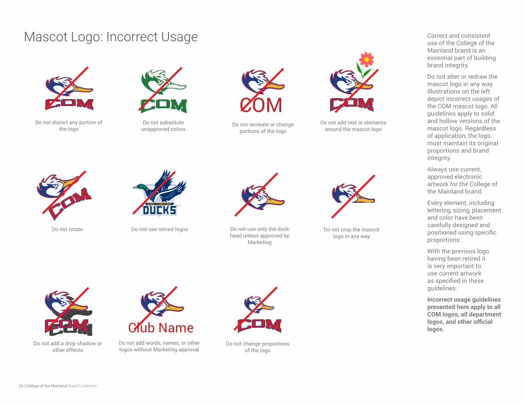
Do not distort any portion of the logo
Do not substitute unapproved colors
Do not use any form of “COM” as part of a play on
words
Do not recreate the logo or alter the fonts
Do not use retired logo versions
Do not use “COM” as a standalone element
without Marketing approval
Do not blend with other logos or text elements
Do not rotate
Do not add a drop shadow or other effects
Do not add unapproved words or titles near the logo
Do not crop the logo
Do not use an extra registration mark after
“COM”
Logo: Incorrect Usage Correct and consistent use of the College of the Mainland brand is an essential part of building brand integrity.
Do not alter or redraw the logo in any way. Illustrations on the left depict incorrect usages of the COM logo. Regardless of application, the logo must maintain its integrity.
Always use current, approved electronic artwork for the College of the Mainland brand.
Every element, including lettering, sizing, placement and color have been carefully designed and positioned using specific proportions.
With previous logos having been retired it is very important to use current artwork as specified in these guidelines.
Note: Incorrect usage guidelines presented here also apply to all COM department logos, and the COM Foundation logo.
ing
SCHOLARS
21 | College of the Mainland Brand Guidelines
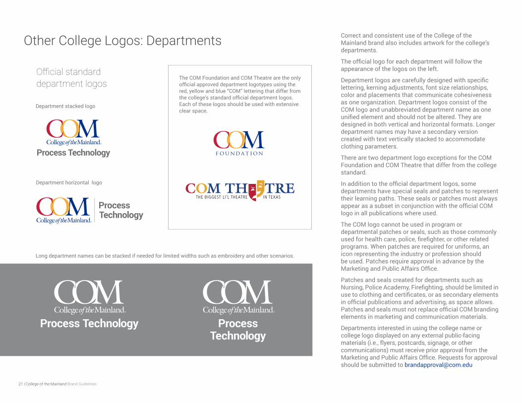
Other College Logos: Departments Correct and consistent use of the College of the Mainland brand also includes artwork for the college’s departments.
The official logo for each department will follow the appearance of the logos on the left.
Department logos are carefully designed with specific lettering, kerning adjustments, font size relationships, color and placements that communicate cohesiveness as one organization. Department logos consist of the COM logo and unabbreviated department name as one unified element and should not be altered. They are designed in both vertical and horizontal formats. Longer department names may have a secondary version created with text vertically stacked to accommodate clothing parameters.
There are two department logo exceptions for the COM Foundation and COM Theatre that differ from the college standard.
In addition to the official department logos, some departments have special seals and patches to represent their learning paths. These seals or patches must always appear as a subset in conjunction with the official COM logo in all publications where used.
The COM logo cannot be used in program or departmental patches or seals, such as those commonly used for health care, police, firefighter, or other related programs. When patches are required for uniforms, an icon representing the industry or profession should be used. Patches require approval in advance by the Marketing and Public Affairs Office.
Patches and seals created for departments such as Nursing, Police Academy, Firefighting, should be limited in use to clothing and certificates, or as secondary elements in official publications and advertising, as space allows. Patches and seals must not replace official COM branding elements in marketing and communication materials.
Departments interested in using the college name or college logo displayed on any external public-facing materials (i.e., flyers, postcards, signage, or other communications) must receive prior approval from the Marketing and Public Affairs Office. Requests for approval should be submitted to [email protected]
Process Technology
Process Technology
The COM Foundation and COM Theatre are the only official approved department logotypes using the red, yellow and blue “COM” lettering that differ from the college’s standard official department logos. Each of these logos should be used with extensive clear space.
Official standard department logos
Long department names can be stacked if needed for limited widths such as embroidery and other scenarios.
Department stacked logo
Department horizontal logo

22 | College of the Mainland Brand Guidelines
Other College Logos: Club Sports – Fighting Ducks The College of the Mainland athletic identity elements — or mascot — are for use by the College of the Mainland’s athletic divisions, departments and college-sanctioned sports and student organizations.
The mascot logos should never be used in place of the College of the Mainland logo in any academic application.
All official athletic material of any kind must display the primary or secondary mascot logo.
The mascot logos must be displayed using the official colors seen to the left. No other colors may be used unless approved by the Marketing Department.
The flying duck with word mark is the primary
Official mascot logo with blue head and red lettering
COM’s Club Sports and Recreation mascot duck head logo embodies the school’s spirit as it represents the mascot tagline “Fighting Ducks.”
It illustrates a fighting spirit evoking a strong sense of determination, perseverance and confidence. This iconic element expresses the notion of what it means to be part of the COM student body (a Fighting Duck) instilling an inner drive to endure and succeed.
The duck head logo design proudly holds its own amongst other colleges across the U.S. elevating COM as a reputable force in higher education. The logo is designed in such a way that it is recognizable by it’s unique look versus a specific color allowing the COM sports brand flexibility in its promotion.
The core mascot logo is defined as the blue head, red outline and yellow bill. It is displayed in conjunction with the curved “COM” design element shown on the left. These elements must exist as one element, unseparated and remain proportionate.
Additional variations are defined on the next page.
Note: This Club Sports logo has been retired and is no longer in use.
Official mascot logo in black, gray and white
The COM duck head mascot logo is one element consisting of the duck head and curved design text element as seen on the left.
All forms of the duck head mascot logo are trademark of College of the Mainland and may only be used with official college events, sponsorships, partnerships, official branded merchandise and initiatives determined by COM’s Office of Marketing and Public Affairs. Unauthorized use is forbidden.
All requests to use the duck head separately from the curved COM design element must receive brand approval from the Office of Marketing and Public Affairs.
“COM Red” PANTONE 200 C
CMYK: 16, 100, 86, 7
RGB: 194, 4, 48
HEX: C20430
“COM Yellow” PANTONE 143 C
CMYK: 2, 32, 91, 0
RGB: 246, 180, 54
HEX: F6B436
“COM Blue” PANTONE 287 C
CMYK: 100, 87, 20, 11
RGB: 0, 47, 135
HEX: 002F87
Official mascot logo colors follow COM’s core colors:
23 | College of the Mainland Brand Guidelines
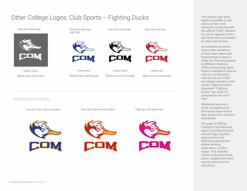
Other College Logos: Club Sports – Fighting Ducks The mascot logo duck head is available in one color and two-color variations combined with the official “COM” element for use on apparel, promo and other items as needed in colors shown here.
As professional sports teams offer variations of their team name and brand design to draw a wider fan base and appeal to different interests, COM’s mascot logo duck head is available in several colors in combination with the curved “COM” text design element or the words “Fighting Ducks”. Important: “Fighting Ducks” can never be preceded by the word “the.”
Marketing requires a proof and approval of all mascot logos before they are printed, used and distributed.
All usage of official College of the Mainland logos, including the duck mascot logo, requires approval from the Marketing department before printing, publication, or other usage. This includes t-shirts and promotional items. Unapproved items may be removed from circulation.
One-color white logo One-color blue logo: PMS 280
One-color black logo One-color red logo
Two-color logo: blue and yellow Pink logo with yellow billTwo-color logo: red and yellow
Additional variations:
Hollow white
(White areas solid color)
Hollow blue
(White areas see-through)
Hollow black
(White areas see-through)
Hollow red
(White areas see-through)
24 | College of the Mainland Brand Guidelines
COMDo not distort any portion of
the logoDo not substitute
unapproved colors
Do not use only the duck head unless approved by
Marketing
Do not recreate or change portions of the logo
Do not use retired logos
Do not change proportions of the logo
Do not add words, names, or other logos without Marketing approval
Do not rotate
Do not add a drop shadow or other effects
Club Name
Do not add text or elements around the mascot logo
Do not crop the mascot logo in any way
Mascot Logo: Incorrect Usage Correct and consistent use of the College of the Mainland brand is an essential part of building brand integrity.
Do not alter or redraw the mascot logo in any way. Illustrations on the left depict incorrect usages of the COM mascot logo. All guidelines apply to solid and hollow versions of the mascot logo. Regardless of application, the logo must maintain its original proportions and brand integrity.
Always use current, approved electronic artwork for the College of the Mainland brand.
Every element, including lettering, sizing, placement and color have been carefully designed and positioned using specific proportions.
With the previous logo having been retired it is very important to use current artwork as specified in these guidelines.
Incorrect usage guidelines presented here apply to all COM logos, all department logos, and other official logos.
25 | College of the Mainland Brand Guidelines
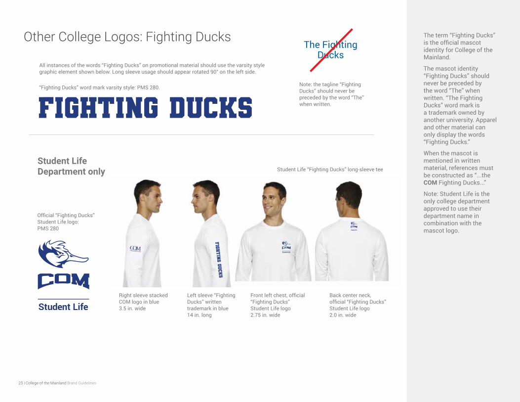
Other College Logos: Fighting Ducks The term “Fighting Ducks” is the official mascot identity for College of the Mainland.
The mascot identity “Fighting Ducks” should never be preceded by the word “The” when written. “The Fighting Ducks” word mark is a trademark owned by another university. Apparel and other material can only display the words “Fighting Ducks.”
When the mascot is mentioned in written material, references must be constructed as “...the COM Fighting Ducks...”
Note: Student Life is the only college department approved to use their department name in combination with the mascot logo.
Official “Fighting Ducks” Student Life logo: PMS 280
Right sleeve stacked COM logo in blue 3.5 in. wide
Left sleeve “Fighting Ducks” written trademark in blue 14 in. long
Front left chest, official “Fighting Ducks” Student Life logo 2.75 in. wide
Back center neck, official “Fighting Ducks” Student Life logo 2.0 in. wide
Student Life “Fighting Ducks” long-sleeve teeStudent Life Department only
“Fighting Ducks” word mark varsity style: PMS 280. Note: the tagline “Fighting Ducks” should never be preceded by the word “The” when written.
The Fighting Ducks
All instances of the words “Fighting Ducks” on promotional material should use the varsity style graphic element shown below. Long sleeve usage should appear rotated 90° on the left side.
26 | College of the Mainland Brand Guidelines
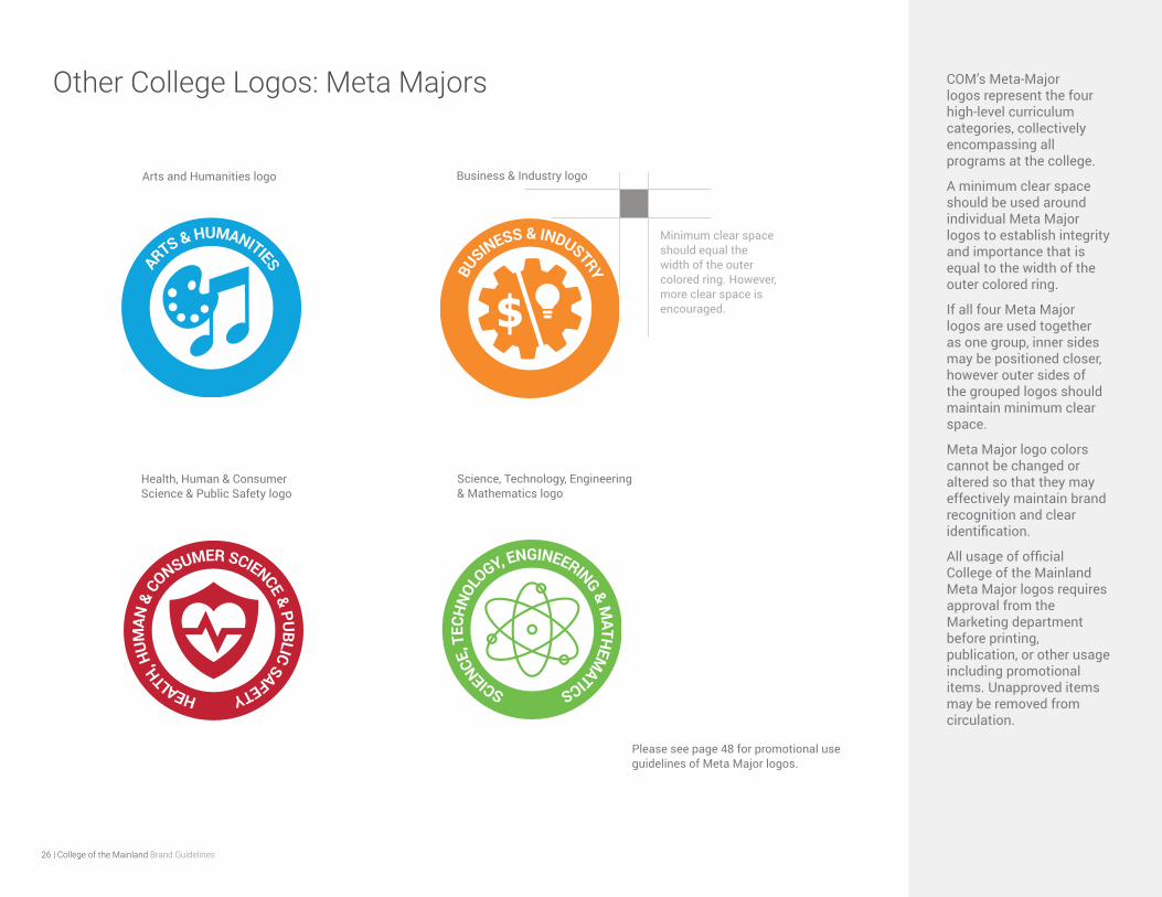
Other College Logos: Meta Majors COM’s Meta-Major logos represent the four high-level curriculum categories, collectively encompassing all programs at the college.
A minimum clear space should be used around individual Meta Major logos to establish integrity and importance that is equal to the width of the outer colored ring.
If all four Meta Major logos are used together as one group, inner sides may be positioned closer, however outer sides of the grouped logos should maintain minimum clear space.
Meta Major logo colors cannot be changed or altered so that they may effectively maintain brand recognition and clear identification.
All usage of official College of the Mainland Meta Major logos requires approval from the Marketing department before printing, publication, or other usage including promotional items. Unapproved items may be removed from circulation.
Arts and Humanities logo
Health, Human & Consumer Science & Public Safety logo
Business & Industry logo
Science, Technology, Engineering & Mathematics logo
Please see page 48 for promotional use guidelines of Meta Major logos.
Minimum clear space should equal the width of the outer colored ring. However, more clear space is encouraged.
27 | College of the Mainland Brand Guidelines
Other College Logos: Horizons Magazine The college’s official magazine is titled Horizons.
The Horizons masthead logo is used to aid and promote public identification and recognition.
The logotype Horizons and swoosh mark must always be the same color which can fluctuate with the college’s primary or secondary color palettes depending on the overall design of the cover. The title color selection must have a color that compliments the colors in the cover artwork with strong contrast and clear legibility.
The three small horizontal color bars below the “H” and “o” must always remain the primary colors of the college — red, yellow and blue.
The word “Magazine” must remain its relative size and proportions, however its color can be adjusted to enhance the design with consideration of legibility and contrast to the “Horizons” title and background imagery.
APPLY TO COM NOW!
H O R I ZO N S ( H O R I ZO NT E S ) E S TÁ D I S P O N I B L E E N E S PA Ñ O L @ H O R I ZO N S . C O M . E D U / E S PA N O L
N O W AC C E P T I N G A P P L I C AT I O N S F O R S U M M E R A N D FA L L 2 0 2 1 | V I S IT C O M.E D U/R E G I S T E R
Attend College with Tuition and Fees Covered – See Page 22
ENROLLMENT ISSUE
SPRING 2021
8.375 in.
10.625 in.
Bleed: 0.125 inches for all sides.
All artwork 300 dpi.
COM Horizons masthead logo
28 | College of the Mainland Brand Guidelines
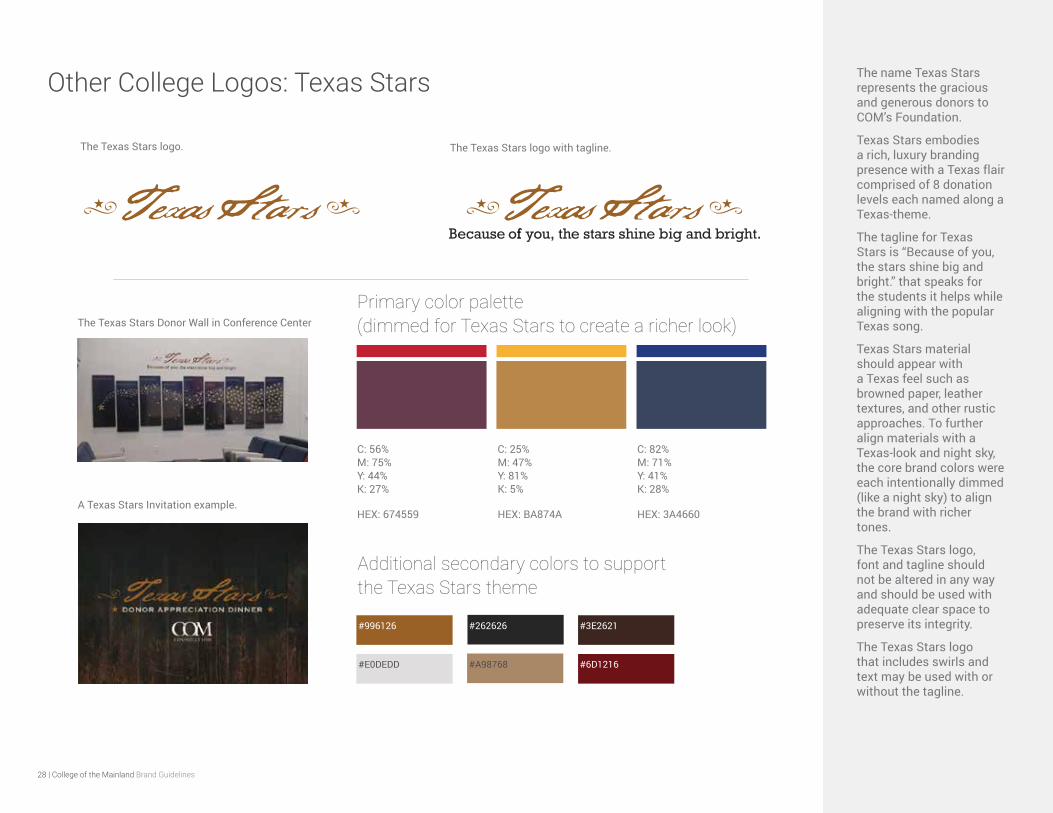
Other College Logos: Texas Stars The name Texas Stars represents the gracious and generous donors to COM’s Foundation.
Texas Stars embodies a rich, luxury branding presence with a Texas flair comprised of 8 donation levels each named along a Texas-theme.
The tagline for Texas Stars is “Because of you, the stars shine big and bright.” that speaks for the students it helps while aligning with the popular Texas song.
Texas Stars material should appear with a Texas feel such as browned paper, leather textures, and other rustic approaches. To further align materials with a Texas-look and night sky, the core brand colors were each intentionally dimmed (like a night sky) to align the brand with richer tones.
The Texas Stars logo, font and tagline should not be altered in any way and should be used with adequate clear space to preserve its integrity.
The Texas Stars logo that includes swirls and text may be used with or without the tagline.
C: 56% M: 75% Y: 44% K: 27%
HEX: 674559
C: 25% M: 47% Y: 81% K: 5%
HEX: BA874A
C: 82% M: 71% Y: 41% K: 28%
HEX: 3A4660
Primary color palette (dimmed for Texas Stars to create a richer look)
#996126
#E0DEDD
#262626
#6D1216#A98768
#3E2621
Additional secondary colors to support the Texas Stars theme
The Texas Stars Donor Wall in Conference Center
A Texas Stars Invitation example.
The Texas Stars logo. The Texas Stars logo with tagline.
29 | College of the Mainland Brand Guidelines
Advertising Types: Institution-based and Event-based

30 | College of the Mainland Brand Guidelines
Institution-based vs. Event-based AdvertisingThere are two main advertising categories for the college: Institution-based materials intended for the community and event-based materials primarily for events taking place on the college’s main campus.
Institution-based advertisements are materials that take brand focus to its highest level as they are created for the public.
Therefore, institution-based advertising should only be produced by the Marketing and Public Affairs staff or their designates.
Event-based advertisements are on-campus activities advertised on some or all of the following: TVs, kiosks, website, social media, posters, flyers and postcards. With a goal of engaging students, event materials maintain design freedom allowing alignment with specific interests, culture, diversity, while promoting a fabric of visual richness across campaigns. Considerations must always be taken into account how the brand will be received cohesively while generating event material.
The COM logo guidelines remain applicable in all material where the logo appears. Event-based advertising examples:
Institution-based advertising examples:
Campus signage
Vehicle signage
Highway billboards
Digital marketing campaigns
Email signature
Letterhead
Business cards
Envelopes
Promotional items
Digital displays (campus TVs)
Kiosks
Social media (extension of event)
Flyers
Posters
Event postcards
COM website rotation
Horizons magazine
External magazine ads
Newspaper ads
Brochures
Invitations
COM Clothing
COM Website
31 | College of the Mainland Brand Guidelines
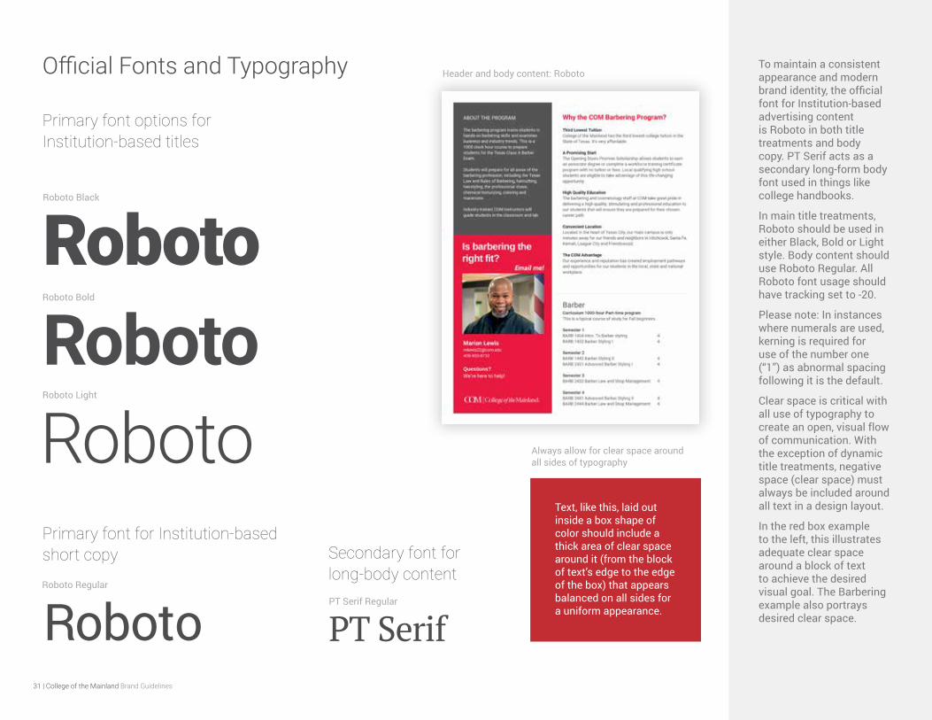
Official Fonts and Typography To maintain a consistent appearance and modern brand identity, the official font for Institution-based advertising content is Roboto in both title treatments and body copy. PT Serif acts as a secondary long-form body font used in things like college handbooks.
In main title treatments, Roboto should be used in either Black, Bold or Light style. Body content should use Roboto Regular. All Roboto font usage should have tracking set to -20.
Please note: In instances where numerals are used, kerning is required for use of the number one (“1”) as abnormal spacing following it is the default.
Clear space is critical with all use of typography to create an open, visual flow of communication. With the exception of dynamic title treatments, negative space (clear space) must always be included around all text in a design layout.
In the red box example to the left, this illustrates adequate clear space around a block of text to achieve the desired visual goal. The Barbering example also portrays desired clear space.
Roboto Bold
Text, like this, laid out inside a box shape of color should include a thick area of clear space around it (from the block of text’s edge to the edge of the box) that appears balanced on all sides for a uniform appearance.
Always allow for clear space around all sides of typography
RobotoRoboto Light
Roboto
PT Serif Regular
PT SerifRoboto Regular
RobotoSecondary font for long-body content
Primary font options for Institution-based titles
Primary font for Institution-based short copy
Roboto Black
Roboto
Header and body content: Roboto
32 | College of the Mainland Brand Guidelines
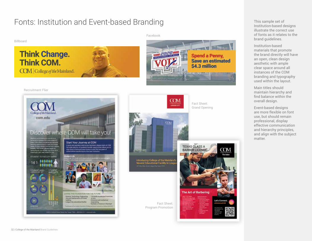
Fonts: Institution and Event-based Branding This sample set of Institution-based designs illustrate the correct use of fonts as it relates to the brand guidelines.
Institution-based materials that promote the brand directly will have an open, clean design aesthetic with ample clear space around all instances of the COM branding and typography used within the layout.
Main titles should maintain hierarchy and find balance within the overall design.
Event-based designs are more flexible on font use, but should remain professional, display effective communication and hierarchy principles, and align with the subject matter.
Billboard
Recruitment Flier
Fact Sheet: Grand Opening
Fact Sheet: Program Promotion
33 | College of the Mainland Brand Guidelines
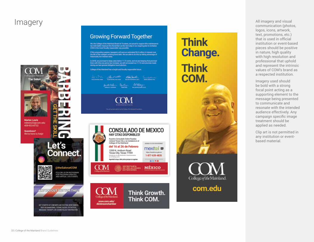
Imagery All imagery and visual communication (photos, logos, icons, artwork, text, promotions, etc.) that is used in official institution or event-based pieces should be positive in nature, high quality with high resolution and professional that uphold and represent the intrinsic values of COM’s brand as a respected institution.
Imagery used should be bold with a strong focal point acting as a supporting element to the message being presented to communicate and resonate with the intended audience effectively. Any campaign specific image treatment should be applied as needed.
Clip art is not permitted in any institution or event-based material.
34 | College of the Mainland Brand Guidelines
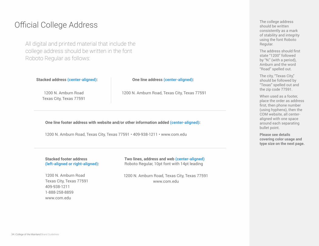
Official College Address The college address should be written consistently as a mark of stability and integrity using the font Roboto Regular.
The address should first state “1200” followed by “N.” (with a period), Amburn and the word “Road” spelled out.
The city, “Texas City,” should be followed by “Texas” spelled out and the zip code 77591.
When used as a footer, place the order as address first, then phone number (using hyphens), then the COM website, all center-aligned with one space around each separating bullet point.
Please see details covering color usage and type size on the next page.
1200 N. Amburn RoadTexas City, Texas 77591
All digital and printed material that include the college address should be written in the font Roboto Regular as follows:
1200 N. Amburn Road, Texas City, Texas 77591
1200 N. Amburn Road, Texas City, Texas 77591 • 409-938-1211 • www.com.edu
Stacked address (center-aligned): One line address (center-aligned):
One line footer address with website and/or other information added (center-aligned):
1200 N. Amburn RoadTexas City, Texas 77591409-938-12111-888-258-8859www.com.edu
Stacked footer address (left-aligned or right-aligned):
1200 N. Amburn Road, Texas City, Texas 77591 www.com.edu
Two lines, address and web (center-aligned) Roboto Regular, 10pt font with 14pt leading
35 | College of the Mainland Brand Guidelines
ROBOTO REGULAR, one line of text Font size: 9pt, leading 13pt – Center alignment
C: 25% M: 20% Y: 20% K: 0%
HEX: 8a8c8e
ROBOTO REGULAR: Font size: 8pt, Leading 10pt – Center alignment
C: 0% M: 0% Y: 0% K: 60%
HEX: 808285
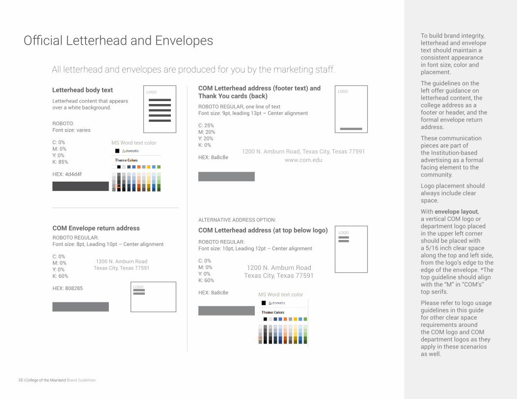
Official Letterhead and Envelopes To build brand integrity, letterhead and envelope text should maintain a consistent appearance in font size, color and placement.
The guidelines on the left offer guidance on letterhead content, the college address as a footer or header, and the formal envelope return address.
These communication pieces are part of the Institution-based advertising as a formal facing element to the community.
Logo placement should always include clear space.
With envelope layout, a vertical COM logo or department logo placed in the upper left corner should be placed with a 5/16 inch clear space along the top and left side, from the logo’s edge to the edge of the envelope. *The top guideline should align with the “M” in “COM’s” top serifs.
Please refer to logo usage guidelines in this guide for other clear space requirements around the COM logo and COM department logos as they apply in these scenarios as well.
Letterhead body text
COM Envelope return address COM Letterhead address (at top below logo)
Letterhead content that appears over a white background.
ROBOTO: Font size: varies
C: 0% M: 0% Y: 0% K: 85%
HEX: 4d4d4f
ROBOTO REGULAR: Font size: 10pt, Leading 12pt – Center alignment
C: 0% M: 0% Y: 0% K: 60%
HEX: 8a8c8e
COM Letterhead address (footer text) and Thank You cards (back)
1200 N. Amburn Road Texas City, Texas 77591
1200 N. Amburn Road, Texas City, Texas 77591 www.com.edu
1200 N. Amburn Road Texas City, Texas 77591
MS Word text color
MS Word text color
ALTERNATIVE ADDRESS OPTION:
LOGO
LOGOLOGO
LOGO
All letterhead and envelopes are produced for you by the marketing staff.
36 | College of the Mainland Brand Guidelines
Official Email Signature With email as a primary tool of communication, its appearance and signature is one of the first impressions of the college. Working together and using a consistent format for our email signatures portrays a sense of professionalism and integrity for College of the Mainland as a cohesive institution of excellence.
To insure consistency across various email clients, COM’s email signatures use Arial Regular with your name and the college name in Arial Bold. Color the college name in red. All other text is Arial Regular in black with your phone number (using hyphens) and your COM email address. Add a blank return and insert the official COM logo from the network folder.
All college departments, with the exception of the COM Foundation, use the official COM logo in the email signature.
Setup your email signature: Complete how-to steps can be found in the network’s Marketing folder.
First Last NameOfficial position title College of the MainlandName of your department 1200 N. Amburn RoadTexas City, Texas [email protected]
Create your email signature using Arial. Bold your name and the college’s name.
Download and insert the official college logo to include in your email signature.
Complete how-to steps can be found in the network’s Marketing folder.
All departments, with the exception of the COM Foundation (logo below), use the official COM logo in the email signature.
ARIAL BOLD, 11PT TYPE
ARIAL REGULAR, 10 PT TYPE
ARIAL BOLD, 11PT TYPE
ARIAL REGULAR, 10 PT TYPE

37 | College of the Mainland Brand Guidelines
Official Business cards Business cards are an integral part of the institutional-based advertising category shared amongst partners, media, businesses and the community.
The COM logo is represented with a large amount of clear space with the COM website at a distance emphasizing the integrity of the brand.
Professional employee information is written 85% black for richer, more approachable appearance.
The employee name is written in Roboto Bold as well as “o:” and “f:” for office and fax numbers.
Other information is written in Roboto Regular with the exception of the department name written in Merriweather Regular.
Need a new business card? Submit a request through the Marketing and Public Affairs Marketing Request System at www.com.edu/marketing.
Note: Business cards are ordered in bulk with other orders and will not be processed immediately.
All business cards are produced for you by the marketing staff.
38 | College of the Mainland Brand Guidelines
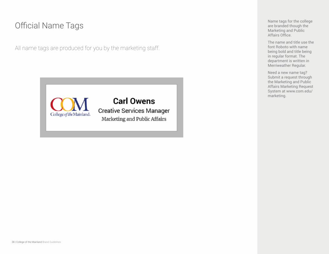
Official Name TagsName tags for the college are branded though the Marketing and Public Affairs Office.
The name and title use the font Roboto with name being bold and title being in regular format. The department is written in Merriweather Regular.
Need a new name tag? Submit a request through the Marketing and Public Affairs Marketing Request System at www.com.edu/marketing.
All name tags are produced for you by the marketing staff.
39 | College of the Mainland Brand Guidelines
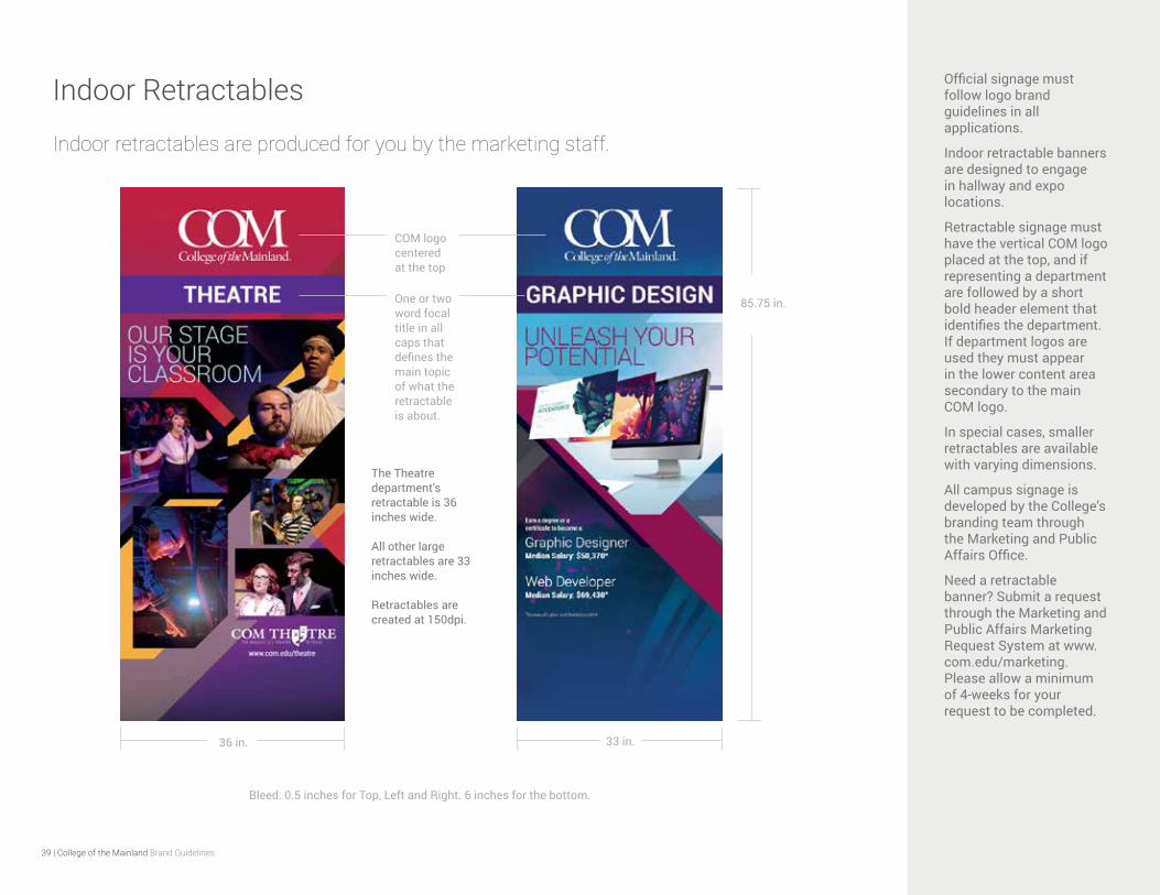
Indoor Retractables Official signage must follow logo brand guidelines in all applications.
Indoor retractable banners are designed to engage in hallway and expo locations.
Retractable signage must have the vertical COM logo placed at the top, and if representing a department are followed by a short bold header element that identifies the department. If department logos are used they must appear in the lower content area secondary to the main COM logo.
In special cases, smaller retractables are available with varying dimensions.
All campus signage is developed by the College’s branding team through the Marketing and Public Affairs Office.
Need a retractable banner? Submit a request through the Marketing and Public Affairs Marketing Request System at www.com.edu/marketing. Please allow a minimum of 4-weeks for your request to be completed.
COM logo centeredat the top
One or two word focal title in all caps that defines the main topic of what the retractable is about.
The Theatre department’s retractable is 36 inches wide.
All other large retractables are 33 inches wide.
Retractables are created at 150dpi.
36 in. 33 in.
85.75 in.
Bleed: 0.5 inches for Top, Left and Right. 6 inches for the bottom.
Indoor retractables are produced for you by the marketing staff.

40 | College of the Mainland Brand Guidelines
Campus Signage: Main Campus College of the Mainland’s main campus is located at 1200 N. Amburn Road, Texas City, Texas 77591.
All college signage (exterior and interior), and wayfinding must maintain a clean, cohesive appearance for a consistent user experience campus-wide, that maintains legibility and clarity.
When in use, the college’s name (in written or logo form) should appear with hierarchy to show visual dominance to sublevel information.
The COM logo should appear with excessive clear space when possible to establish maximum integrity of the brand.
Note: COM is currently in the process of updating the main campus signage and wayfinding.
All building signage and wayfinding (including interior, exterior, permanent or temporary) created by internal staff or external parties must be submitted as proofs to the Office of Marketing and Public Affairs for brand approval prior to printing, production, distribution and installation:
The COM main campus signage and wayfinding is currently undergoing a major transformation process.
All building signage and wayfinding (including interior, exterior, permanent or temporary) created by internal staff or external parties must be submitted as proofs to the Office of Marketing and Public Affairs for brand approval prior to printing, production, distribution and installation:
41 | College of the Mainland Brand Guidelines
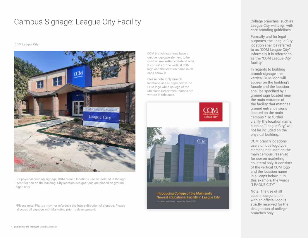
Campus Signage: League City Facility College branches, such as League City, will align with core branding guidelines.
Formally and for legal purposes, the League City location shall be referred to as “COM League City.” Informally it is referred to as the “COM League City facility.”
In regards to building branch signage, the vertical COM logo will appear on the building’s facade and the location shall be specified by a ground sign located near the main entrance of the facility that matches ground entrance signs located on the main campus.* To further clarify, the location name, such as “League City,” will not be included on the physical building.
COM branch locations use a unique logotype element, not used on the main campus, reserved for use on marketing collateral only. It consists of the vertical COM logo and the location name in all caps below it. In this example, the words “LEAGUE CITY.”
Note: The use of all caps in conjunction with an official logo is strictly reserved for the designation of college branches only.
COM League City
COM branch locations have a unique logotype element to be used on marketing collateral only. It consists of the vertical COM logo and the location name in all caps below it.
Please note: Only branch locations use all caps below the COM logo while College of the Mainland Department names are written in title case.
For physical building signage, COM branch locations use an isolated COM logo identification on the building. City location designations are placed on ground signs only.
*Please note: Photos may not reference the future direction of signage. Please discuss all signage with Marketing prior to development.

42 | College of the Mainland Brand Guidelines
Official Vehicle Signage Campus vehicles bearing the college brand must also follow logo usage requirements in these guidelines.
Vehicles requiring the college name or a COM logo must have a request submitted to [email protected]
Logo placement should include clear space around the logo without any automotive design elements (both vehicle indentions/extrusions, or other visual elements) encroaching or invading the logo’s clear space. Careful consideration should be exercised to determine the most effective placement.
The color choice of the COM logo used should compliment and visually align with the color of the vehicle.
Produced by the marketing staff.
43 | College of the Mainland Brand Guidelines
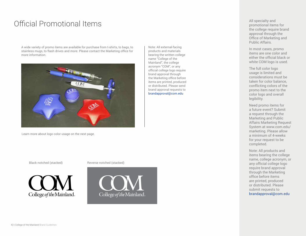
Official Promotional Items All specialty and promotional items for the college require brand approval through the Office of Marketing and Public Affairs.
In most cases, promo items are one color and either the official black or white COM logo is used.
The full color logo usage is limited and considerations must be taken for color balance, conflicting colors of the promo item next to the color logo and overall legibility.
Need promo items for a future event? Submit a request through the Marketing and Public Affairs Marketing Request System at www.com.edu/marketing. Please allow a minimum of 4-weeks for your request to be completed.
Note: All products and items bearing the college name, college acronym, or any official college logo require brand approval through the Marketing office before items are printed, produced or distributed. Please submit requests to [email protected]
Black notched (stacked) Reverse notched (stacked)
A wide variety of promo items are available for purchase from t-shirts, to bags, to stainless mugs, to flash drives and more. Please contact the Marketing office for more information.
Learn more about logo color usage on the next page.
Note: All external-facing products and materials bearing the written college name “College of the Mainland”, the college acronym “COM”, or any official college logo require brand approval through the Marketing office before items are printed, produced or distributed. Please send brand approval requests to [email protected]
44 | College of the Mainland Brand Guidelines
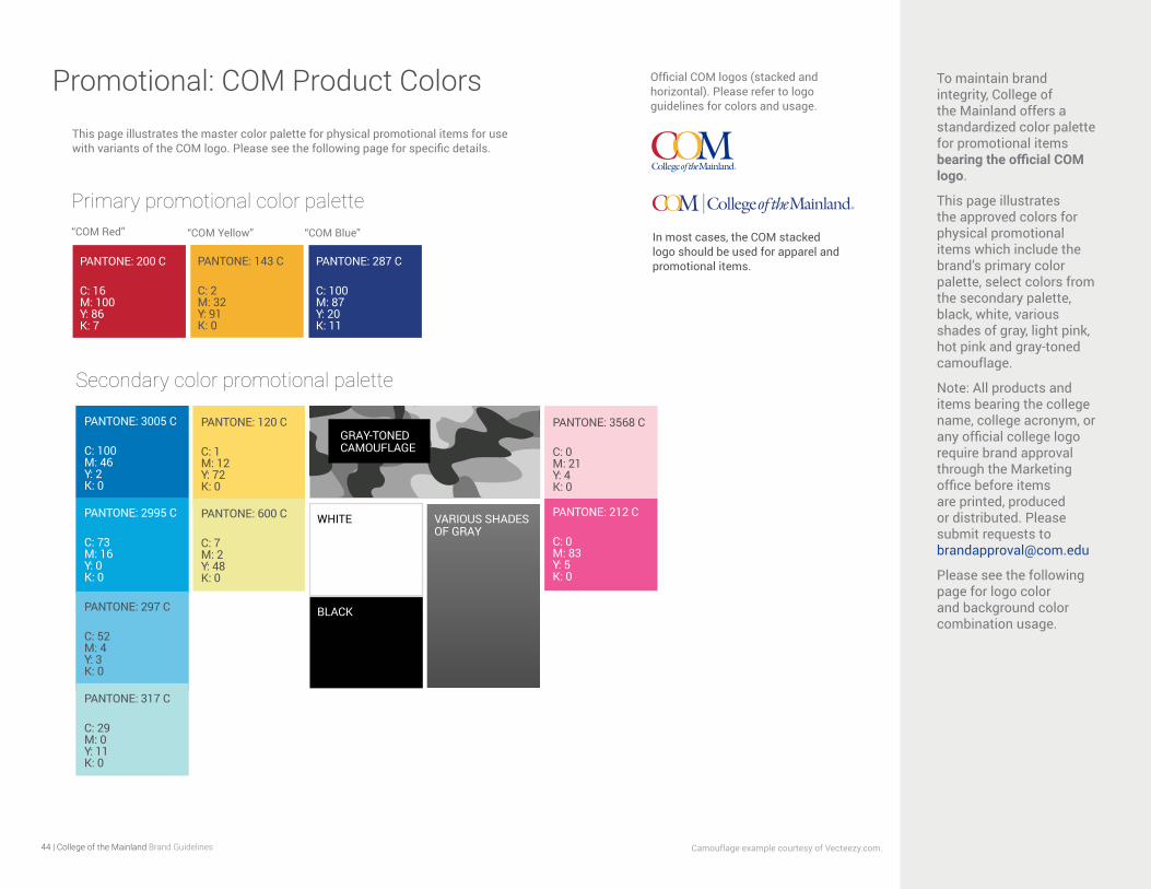
Promotional: COM Product Colors To maintain brand integrity, College of the Mainland offers a standardized color palette for promotional items bearing the official COM logo.
This page illustrates the approved colors for physical promotional items which include the brand’s primary color palette, select colors from the secondary palette, black, white, various shades of gray, light pink, hot pink and gray-toned camouflage.
Note: All products and items bearing the college name, college acronym, or any official college logo require brand approval through the Marketing office before items are printed, produced or distributed. Please submit requests to [email protected]
Please see the following page for logo color and background color combination usage.
This page illustrates the master color palette for physical promotional items for use with variants of the COM logo. Please see the following page for specific details.
Camouflage example courtesy of Vecteezy.com.
Official COM logos (stacked and horizontal). Please refer to logo guidelines for colors and usage.
“COM Red” “COM Yellow” “COM Blue”
Primary promotional color palette
Secondary color promotional palette
PANTONE: 3005 C
C: 100 M: 46 Y: 2 K: 0
PANTONE: 2995 C
C: 73 M: 16 Y: 0 K: 0
PANTONE: 297 C
C: 52 M: 4 Y: 3 K: 0
PANTONE: 120 C
C: 1 M: 12 Y: 72 K: 0
PANTONE: 317 C
C: 29 M: 0 Y: 11 K: 0
PANTONE: 600 C
C: 7 M: 2 Y: 48 K: 0
VARIOUS SHADES OF GRAY
BLACK
WHITE
GRAY-TONED CAMOUFLAGE
PANTONE: 200 C
C: 16 M: 100 Y: 86 K: 7
PANTONE: 143 C
C: 2 M: 32 Y: 91 K: 0
PANTONE: 287 C
C: 100 M: 87 Y: 20 K: 11
In most cases, the COM stacked logo should be used for apparel and promotional items.
PANTONE: 3568 C
C: 0 M: 21 Y: 4 K: 0
PANTONE: 212 C
C: 0 M: 83 Y: 5 K: 0

45 | College of the Mainland Brand Guidelines
Promotional: COM Logo Color Combinations Due to printing restrictions most promotional items are printed with either a black or white logo. Sufficient contrast between the logo and item color must always be considered for legibility.
Background colors are shown with appropriate COM logo color combinations.
Color exception: In cases where Pantone colors are not possible, navy products may be substituted in place of the COM Blue when using the white COM logo.
The full color COM logo may only be used over a solid white background or light gray with the gray not exceeding a 15% value of black to maintain legibility.
Camouflage example courtesy of Vecteezy.com.
Product colors and corresponding COM logo color use.
Please note: Gray-toned camouflage requires a white notched COM logo over a black box for legibility. All logos contained in box shapes must follow minimum clear space proportions as shown in example above. The logo should not encroach the edge of the box, but rather have balanced clear space around it.
White COM logo over color Black COM logo over color “COM Blue” logo over color Full color COM logo over white
Full color logo over light gray not to exceed 15% value of black.
5% value of black
10% value of black
MAXIMUM GRAY DARKNESS: 15% value of black
46 | College of the Mainland Brand Guidelines
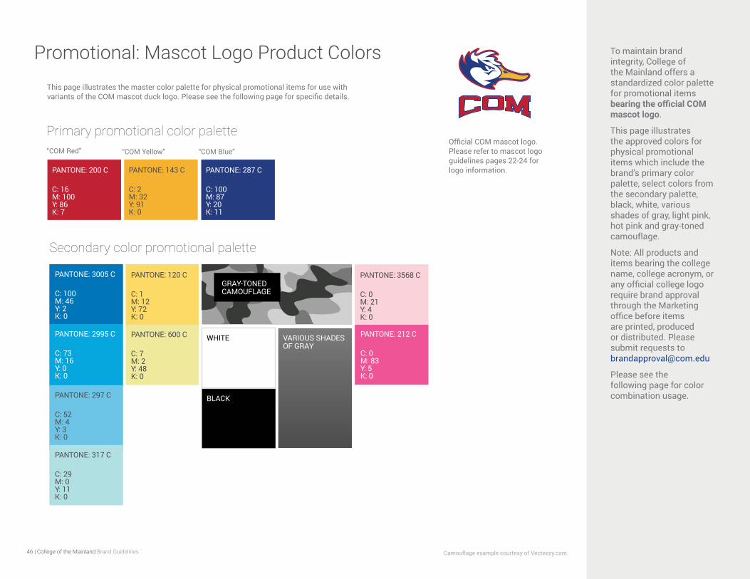
Promotional: Mascot Logo Product Colors To maintain brand integrity, College of the Mainland offers a standardized color palette for promotional items bearing the official COM mascot logo.
This page illustrates the approved colors for physical promotional items which include the brand’s primary color palette, select colors from the secondary palette, black, white, various shades of gray, light pink, hot pink and gray-toned camouflage.
Note: All products and items bearing the college name, college acronym, or any official college logo require brand approval through the Marketing office before items are printed, produced or distributed. Please submit requests to [email protected]
Please see the following page for color combination usage.
This page illustrates the master color palette for physical promotional items for use with variants of the COM mascot duck logo. Please see the following page for specific details.
“COM Red” “COM Yellow” “COM Blue”
Primary promotional color palette
Secondary color promotional palette
PANTONE: 3005 C
C: 100 M: 46 Y: 2 K: 0
PANTONE: 2995 C
C: 73 M: 16 Y: 0 K: 0
PANTONE: 297 C
C: 52 M: 4 Y: 3 K: 0
PANTONE: 120 C
C: 1 M: 12 Y: 72 K: 0
PANTONE: 317 C
C: 29 M: 0 Y: 11 K: 0
PANTONE: 600 C
C: 7 M: 2 Y: 48 K: 0
Camouflage example courtesy of Vecteezy.com.
VARIOUS SHADES OF GRAY
BLACK
WHITE
GRAY-TONED CAMOUFLAGE
Official COM mascot logo. Please refer to mascot logo guidelines pages 22-24 for logo information.PANTONE: 200 C
C: 16 M: 100 Y: 86 K: 7
PANTONE: 143 C
C: 2 M: 32 Y: 91 K: 0
PANTONE: 287 C
C: 100 M: 87 Y: 20 K: 11
PANTONE: 3568 C
C: 0 M: 21 Y: 4 K: 0
PANTONE: 212 C
C: 0 M: 83 Y: 5 K: 0
47 | College of the Mainland Brand Guidelines
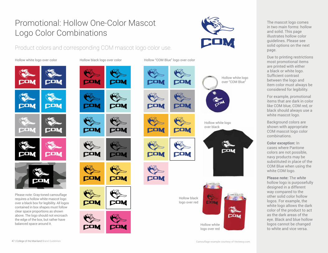
Promotional: Hollow One-Color Mascot Logo Color Combinations
The mascot logo comes in two main forms: hollow and solid. This page illustrates hollow color guidelines. Please see solid options on the next page.
Due to printing restrictions most promotional items are printed with either a black or white logo. Sufficient contrast between the logo and item color must always be considered for legibility.
For example, promotional items that are dark in color like COM blue, COM red, or black should always use a white mascot logo.
Background colors are shown with appropriate COM mascot logo color combinations.
Color exception: In cases where Pantone colors are not possible, navy products may be substituted in place of the COM Blue when using the white COM logo.
Please note: The white hollow logo is purposefully designed in a different way compared to the other solid color hollow logos. For example, the white logo allows the dark color of the product to act as the dark areas of the eye. Black and blue hollow logos cannot be changed to white and vice versa.
Product colors and corresponding COM mascot logo color use.
Please note: Gray-toned camouflage requires a hollow white mascot logo over a black box for legibility. All logos contained in box shapes must follow clear space proportions as shown above. The logo should not encroach the edge of the box, but rather have balanced space around it.
Camouflage example courtesy of Vecteezy.com.
Hollow white logo over color Hollow black logo over color Hollow “COM Blue” logo over color
Hollow black logo over red
Hollow white logo over red
Hollow white logo over black
Hollow white logo over “COM Blue”
48 | College of the Mainland Brand Guidelines
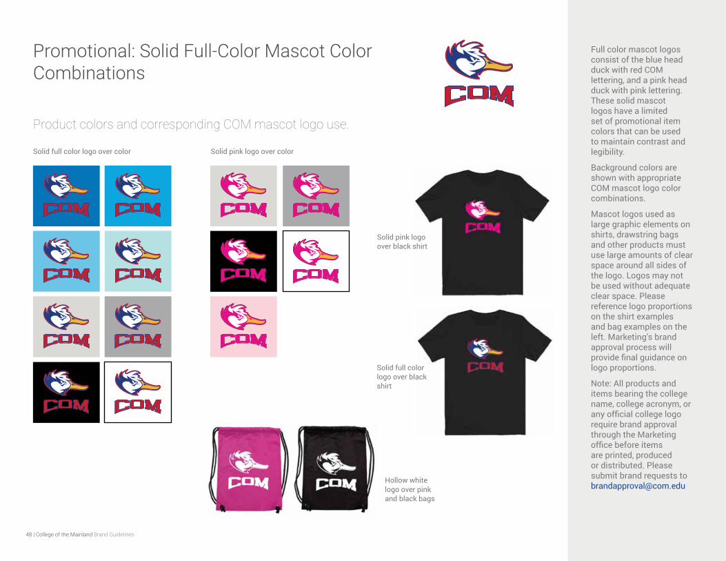
Promotional: Solid Full-Color Mascot Color Combinations
Full color mascot logos consist of the blue head duck with red COM lettering, and a pink head duck with pink lettering. These solid mascot logos have a limited set of promotional item colors that can be used to maintain contrast and legibility.
Background colors are shown with appropriate COM mascot logo color combinations.
Mascot logos used as large graphic elements on shirts, drawstring bags and other products must use large amounts of clear space around all sides of the logo. Logos may not be used without adequate clear space. Please reference logo proportions on the shirt examples and bag examples on the left. Marketing’s brand approval process will provide final guidance on logo proportions.
Note: All products and items bearing the college name, college acronym, or any official college logo require brand approval through the Marketing office before items are printed, produced or distributed. Please submit brand requests to [email protected]
Solid full color logo over color Solid pink logo over color
Product colors and corresponding COM mascot logo use.
Solid full color logo over black shirt
Solid pink logo over black shirt
Hollow white logo over pink and black bags
49 | College of the Mainland Brand Guidelines
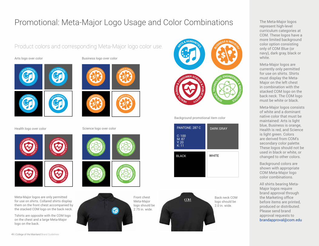
Promotional: Meta-Major Logo Usage and Color Combinations The Meta-Major logos represent high-level curriculum categories at COM. These logos have a more limited background color option consisting only of COM Blue (or navy), dark gray, black or white.
Meta-Major logos are currently only permitted for use on shirts. Shirts must display the Meta-Major on the left chest in combination with the stacked COM logo on the back neck. The COM logo must be white or black.
Meta-Major logos consists of white and a dominant native color that must be maintained: Arts is light blue, Business is orange, Health is red, and Science is light green. Colors are derived from COM’s secondary color palette. These logos should not be used in black or white, or changed to other colors.
Background colors are shown with appropriate COM Meta-Major logo color combinations.
All shirts bearing Meta-Major logos require brand approval through the Marketing office before items are printed, produced or distributed. Please send brand approval requests to [email protected]
Product colors and corresponding Meta-Major logo color use.
Arts logo over color Business logo over color
Meta-Major logos are only permitted for use on shirts. Collared shirts display them on the front chest accompanied by the stacked COM logo on the back neck.
Tshirts are opposite with the COM logo on the chest and a large Meta-Major logo on the back.
Health logo over color Science logo over color DARK GRAY
BLACK WHITE
PANTONE: 287 C
C: 100 M: 87 Y: 20 K: 11
Background promotional item color
Back neck COM logo should be 2.0 in. wide.
Front chest Meta-Major logo should be 2.75 in. wide.
50 | College of the Mainland Brand Guidelines
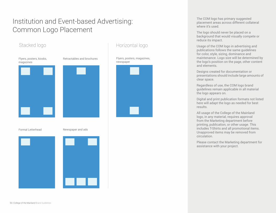
Institution and Event-based Advertising: Common Logo Placement
The COM logo has primary suggested placement areas across different collateral where it’s used.
The logo should never be placed on a background that would visually compete or reduce its impact.
Usage of the COM logo in advertising and publications follows the same guidelines for color, style, sizing, dominance and maintenance. Logo size will be determined by the logo’s position on the page, other content and elements.
Designs created for documentation or presentations should include large amounts of clear space.
Regardless of use, the COM logo brand guidelines remain applicable in all material the logo appears on.
Digital and print publication formats not listed here will adapt the logo as needed for best results.
All usage of the College of the Mainland logo, in any material, requires approval from the Marketing department before printing, publication, or other usage. This includes T-Shirts and all promotional items. Unapproved items may be removed from circulation.
Please contact the Marketing department for assistance with your project.
Flyers, posters, kiosks, magazines
Retractables and brochures
Newspaper and adsFormal Letterhead
Stacked logo Horizontal logo
Flyers, posters, magazines, newspaper
51 | College of the Mainland Brand Guidelines
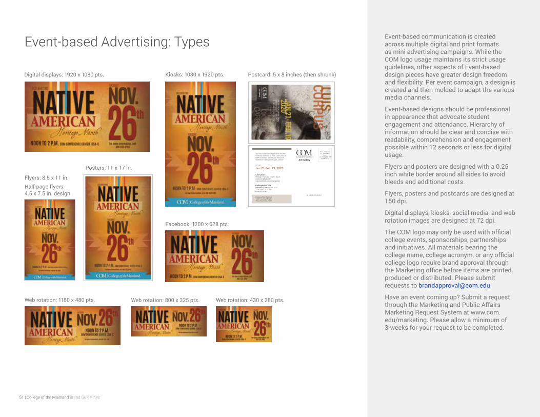
Event-based Advertising: Types Event-based communication is created across multiple digital and print formats as mini advertising campaigns. While the COM logo usage maintains its strict usage guidelines, other aspects of Event-based design pieces have greater design freedom and flexibility. Per event campaign, a design is created and then molded to adapt the various media channels.
Event-based designs should be professional in appearance that advocate student engagement and attendance. Hierarchy of information should be clear and concise with readability, comprehension and engagement possible within 12 seconds or less for digital usage.
Flyers and posters are designed with a 0.25 inch white border around all sides to avoid bleeds and additional costs.
Flyers, posters and postcards are designed at 150 dpi.
Digital displays, kiosks, social media, and web rotation images are designed at 72 dpi.
The COM logo may only be used with official college events, sponsorships, partnerships and initiatives. All materials bearing the college name, college acronym, or any official college logo require brand approval through the Marketing office before items are printed, produced or distributed. Please submit requests to [email protected]
Have an event coming up? Submit a request through the Marketing and Public Affairs Marketing Request System at www.com.edu/marketing. Please allow a minimum of 3-weeks for your request to be completed.
Flyers: 8.5 x 11 in. Half-page flyers: 4.5 x 7.5 in. design
Posters: 11 x 17 in.
Digital displays: 1920 x 1080 pts. Kiosks: 1080 x 1920 pts.
Web rotation: 1180 x 480 pts. Web rotation: 800 x 325 pts. Web rotation: 430 x 280 pts.
Facebook: 1200 x 628 pts.
N O N - P R O F I TU S P O S T A G E
P A I DL A M A R Q U E , T X
P E R M I T 5 4
OR CURRENT RESIDENT
You are cordially invited to delve into the vivacious elements of artist Luis Corpus as COM Art Gallery presents the first 2020 exhibition “Hydrogen, Oxygen, Carbon.”
ON VIEW
Jan. 21-Feb. 19, 2020
Gallery hours: Monday - Thursday, 10 a.m. - 4 p.m. www.com.edu/gallerywww.facebook.com/comartgallery
Gallery Artist TalkWednesday, February 19, 202011:30 a.m. - 12:20 p.m.COM Art Gallery
College of the Mainland1200 N. Amburn RoadTexas City, Texas 77591
Postcard: 5 x 8 inches (then shrunk)
52 | College of the Mainland Brand Guidelines
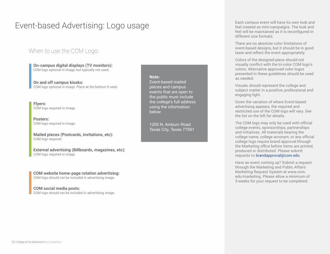
Event-based Advertising: Logo usage Each campus event will have its own look and feel created as mini-campaigns. The look and feel will be maintained as it is reconfigured in different size formats.
There are no absolute color limitations of event-based designs, but it should be in good taste and reflect the event appropriately.
Colors of the designed piece should not visually conflict with the tri-color COM logo’s colors. Alternative approved color logos presented in these guidelines should be used as needed.
Visuals should represent the college and subject matter in a positive, professional and engaging light.
Given the variation of where Event-based advertising appears, the required and restricted use of the COM logo will vary. See the list on the left for details.
The COM logo may only be used with official college events, sponsorships, partnerships and initiatives. All materials bearing the college name, college acronym, or any official college logo require brand approval through the Marketing office before items are printed, produced or distributed. Please submit requests to [email protected]
Have an event coming up? Submit a request through the Marketing and Public Affairs Marketing Request System at www.com.edu/marketing. Please allow a minimum of 3-weeks for your request to be completed.
COM social media posts: COM logo should not be included in advertising image.
Flyers: COM logo required in image.
Posters: COM logo required in image.
On-campus digital displays (TV monitors): COM logo optional in image, but typically not used.
On and off campus kiosks: COM logo optional in image. Place at the bottom if used.
COM website home-page rotation advertising: COM logo should not be included in advertising image.
Mailed pieces (Postcards, invitations, etc): COM logo required.
When to use the COM Logo:
External advertising (Billboards, magazines, etc): COM logo required in image.
Note: Event-based mailed pieces and campus events that are open to the public must include the college’s full address using the information below:
1200 N. Amburn Road Texas City, Texas 77591
53 | College of the Mainland Brand Guidelines
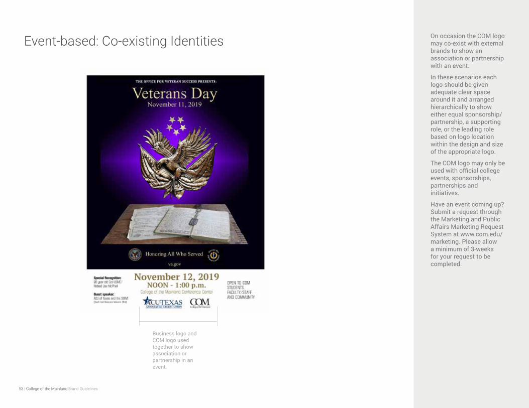
Event-based: Co-existing Identities On occasion the COM logo may co-exist with external brands to show an association or partnership with an event.
In these scenarios each logo should be given adequate clear space around it and arranged hierarchically to show either equal sponsorship/partnership, a supporting role, or the leading role based on logo location within the design and size of the appropriate logo.
The COM logo may only be used with official college events, sponsorships, partnerships and initiatives.
Have an event coming up? Submit a request through the Marketing and Public Affairs Marketing Request System at www.com.edu/marketing. Please allow a minimum of 3-weeks for your request to be completed.
Business logo and COM logo used together to show association or partnership in an event.

54 | College of the Mainland Brand Guidelines
Clubs and Student Organizations Visual identification for college-sponsored clubs and organizations are allowed, so long as they are not used in conjunction with the College’s logotype. If an organization’s name is needed to appear with the official logotype, it must confirm to these guidelines.
Logos for clubs and organizations must not be a modification of the official college logo.
Visual graphics for clubs and student organizations require approval in advance by the Marketing and Public Affairs Office.
The COM logo may only be used with official college events, sponsorships, partnerships and initiatives.
Please contact the Marketing and Public Affairs Office for more information.
Student organizations may include the college’s name in written form, but they cannot use the official College of the Mainland logo.
55 | College of the Mainland Brand Guidelines
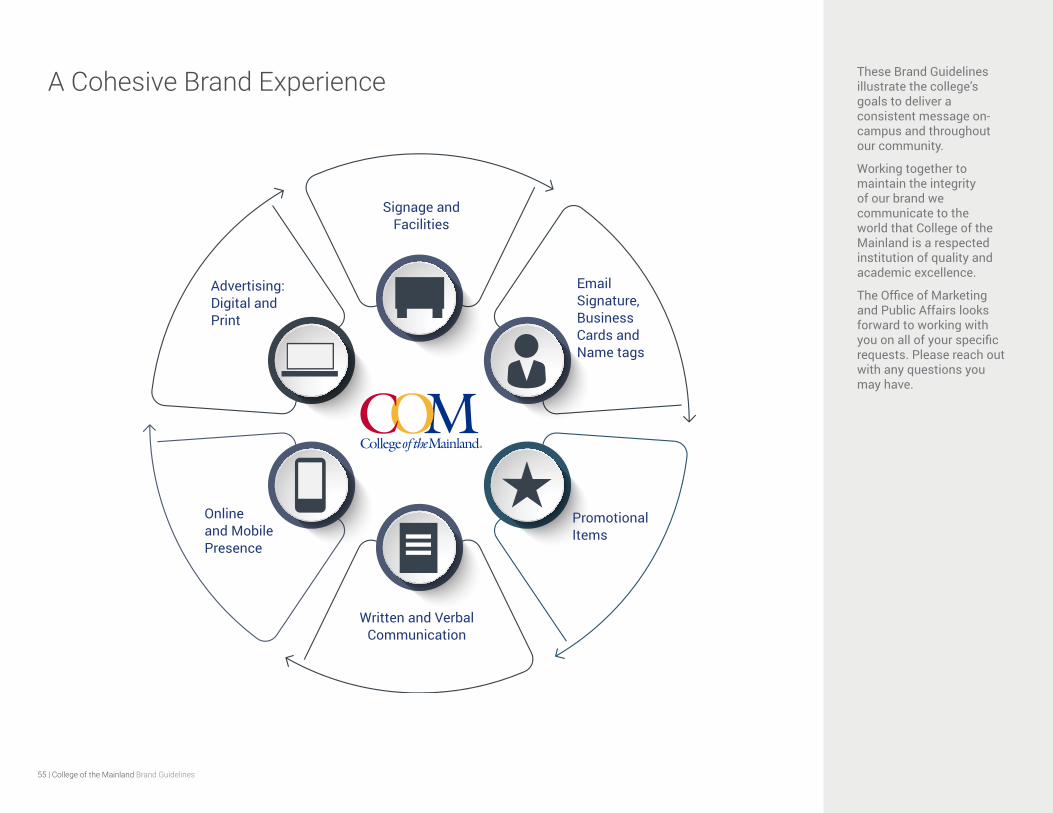
A Cohesive Brand Experience These Brand Guidelines illustrate the college’s goals to deliver a consistent message on-campus and throughout our community.
Working together to maintain the integrity of our brand we communicate to the world that College of the Mainland is a respected institution of quality and academic excellence.
The Office of Marketing and Public Affairs looks forward to working with you on all of your specific requests. Please reach out with any questions you may have.
Advertising: Digital and Print
Signage and Facilities
Email Signature, Business Cards and Name tags
Promotional Items
Written and Verbal Communication
Online and Mobile Presence
For more information contact:
College of the Mainland
Office of Marketing and Public Affairs
409-933-8437