Embed Size (px)
Citation preview

B R A N D B O O KVERSION 3.0

W H O W E A R E
W H AT W E S O U N D L I K E
W H AT W E LO O K L I K E
6
5 O ur M ission
W hat M akes Us D iffe re nt
O ur 100% P romise
O ur Philosophy
Brand P romise
Founding P rinciples
W hat We D o
Brand Tone
Brand Pe rsonality Attributes
Call to Action
Ke y Te rminology
Buzzwords
He ro Logo
D esign Ele me nts
Core Palette
Resources & A ssets
Exte nded Palette
Typography
Iconography
Photography
15
14
22
31
20
30
7
16
23
8
17
24
9
18
26
10
12
28

W hy we need a brand book
Who is Pencils of Promise? By definition, we are a nonprofit.
But we are so much more than the 501(c)(3) label could ever
encompass.
Pencils of Promise is a for-purpose organization made up
of driven individuals committed to changing the world. We
are builders, dreamers and doers who genuinely believe
that every child, everywhere, deserves access to a quality,
sustainable education.
We are also a brand. As such, we have some brand standards
that help people immediately recognize PoP whenever they
hear, see or interact with us. We’ve built this brand book to
speak to our voice and our vision. Our goal is not to restrict
you from only thinking about PoP in one manner, but rather to
arm you with the tools to truly represent and embody Pencils
of Promise in the best way possible.
We’ll use this guide to present PoP with a unified voice and
image. After all , the world can’t help but hear us if we’re all
shouting the same message.
W H O W E A R EA ge ne ral o ve rvie w of Pe ncils of P romise through our mission, philosophy and impact
Who We Are | 5
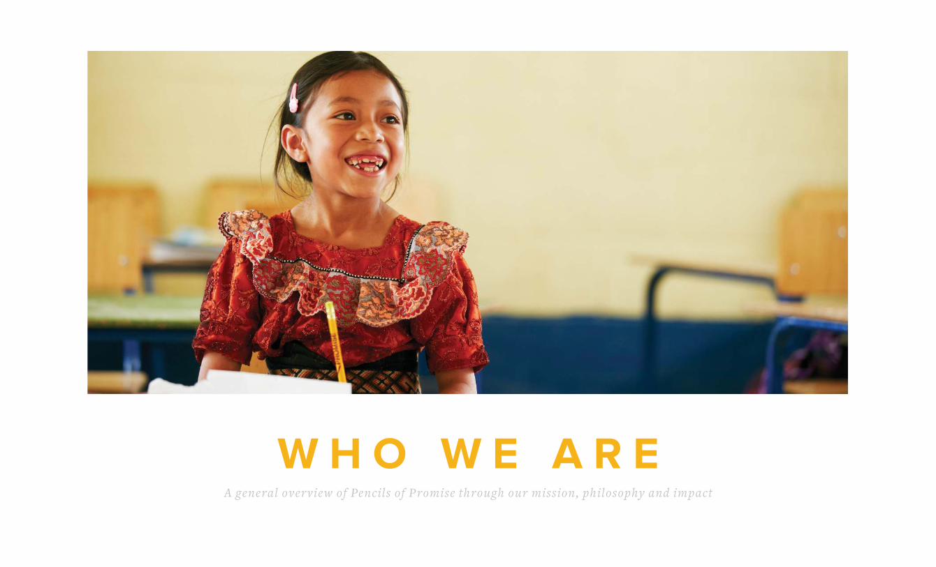
OUR MISSION
Note: This copy is locked and nonnegotiable.
We believe every child should have access to quality education.
We create schools, programs and global communities around
the common goal of education for all.

6 | PoP Brand Book 3.0
WHAT WE DOPencils of Promise is known as a school building organization that provides access to education, but we are evolving
into a learning organization focused on quality education outcomes. Within our schools, we’re implementing a
dynamic, comprehensive approach to ensure quality education. Through our key and supplementary programs,
we provide the means, methods and materials necessary to increase literacy and numeracy rates in developing
nations, genuinely changing what a learning experience can be for a child anywhere in the world.
We’re building schools to ensure that our
students have access to a quality learning
environment.
School Builds Teache r Support
We’re changing the way teachers are trained
and supported to ensure that students are
learning effectively.
We’re providing secondary school
scholarships to equip students with
the resources they need to attend a
full year of school.
We’re teaching kids about WATER,
SANITATION and HYGIENE to keep
them healthy and in school.
Scholarships
WASH
Key Programs: Supplementary Programs:
Who We Are | 7
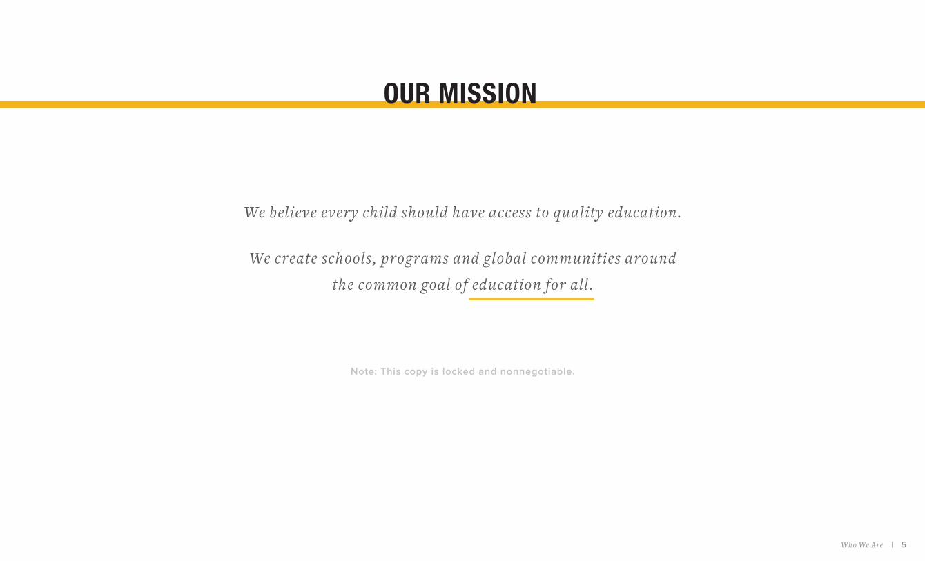
WHAT MAKES US DIFFERENTWe don’t do charity work. We make long-term investments. We take a collaborative approach
and work alongside each community to train and empower locals to increase access to
education and to create self-sustaining schools and projects. We believe in helping others help
themselves, rather than building a school and then leaving communities to their own devices.
We believe in the power of collective, small acts of many. PoP was founded on the belief
that even a small gesture, like handing a pencil to a child, is an important act and that every
individual has something meaningful to contribute to the greater good.

8 | PoP Brand Book 3.0
100% For-P urposePoP is guided by our revolutionary “for-
purpose” approach. Blending the head
of a for-prof it business with the heart of
a humanitarian nonprof it , we rigorously
measure the return on investment of every
donor dollar we spend. Joy and passion are
great, but results are what we’re all about.
100% D irect GivingDonors rarely know where their money
goes, so we set out to change this. By
covering our operat ional costs through
private donors, events and companies,
100% of every dollar donated online goes
direct ly into our programs to educate
more children.
100% Success Rate We don’t just build a school and move on,
we monitor and evaluate every project we
undertake. Thus far, every school we’ve
opened is fully operational and educating
students daily.
OUR 100% PROMISE

Who We Are | 9
OUR PHILOSOPHYWe truly believe that a generation empowered will empower the
world. Over the past six years, we’ve grown into an intercontinental
organization that is not just improving infrastructure, but genuinely
changing what a learning experience can be for a child anywhere in
the world. Our philosophy is deeply rooted in our belief in the life-
altering impact that an education can have on a child, community
and even nation.
PoP is known as a school building organization that provides access
to education, but we are evolving into a learning organization
focused on quality education outcomes. A physical structure is
just the f irst step; what’s happening inside the classroom is just
as important as ensuring that students have a place to learn. With
our dynamic approach to ensure quality education through our
programs, we are going to reshape the landscape of education in
the developing world.
As our organization evolves, our philosophy is that our goals and
strategies should not remain static. We consistently evaluate our
methodologies to ensure students achieve the best possible
results and make changes to our programming if we don’t see
progress. We rely on measurable data to qualify our success and
remain willing to change our goals or in-classroom methods to
establish the long-term effectiveness of our schools.
We believe that every child has the basic right to education and
are invested in making that philosophy into a global reality.

10 | PoP Brand Book 3.0
Who We Are | 11
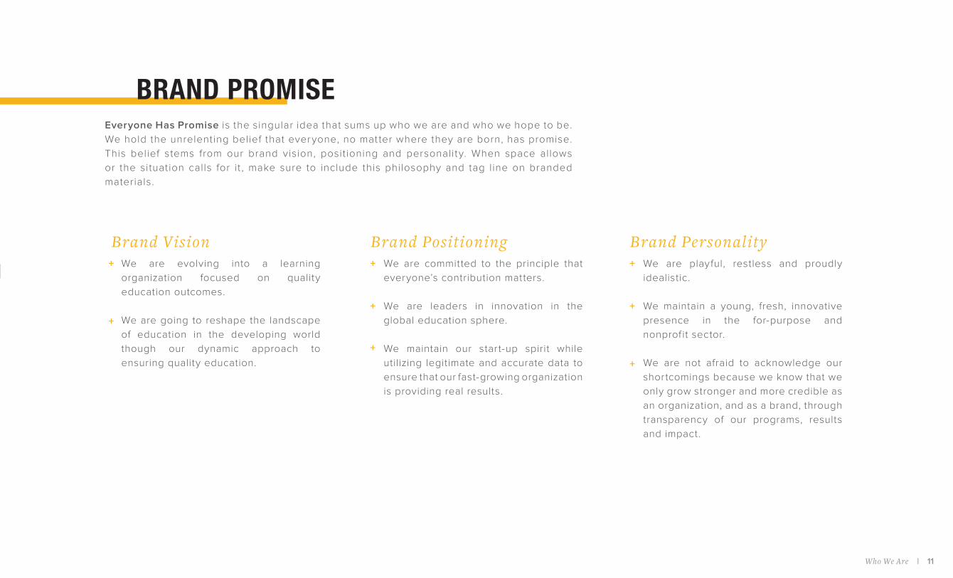
Brand Vision Brand Positioning Brand Pe rsonality We are evolving into a learning
organization focused on quality
education outcomes.
We are going to reshape the landscape
of education in the developing world
though our dynamic approach to
ensuring quality education.
We are committed to the principle that
everyone’s contribution matters.
We are leaders in innovation in the
global education sphere.
We maintain our start-up spirit while
utilizing legitimate and accurate data to
ensure that our fast-growing organization
is providing real results.
We are playful, restless and proudly
idealistic.
We maintain a young, fresh, innovative
presence in the for-purpose and
nonprof it sector.
We are not afraid to acknowledge our
shortcomings because we know that we
only grow stronger and more credible as
an organization, and as a brand, through
transparency of our programs, results
and impact.
++ +
+
+
+
+
+
BRAND PROMISEEveryone Has Promise is the singular idea that sums up who we are and who we hope to be.
We hold the unrelenting belief that everyone, no mat ter where they are born, has promise.
This belief stems from our brand vision, posit ioning and personality. When space allows
or the situation calls for it , make sure to include this philosophy and tag line on branded
materials.

12 | PoP Brand Book 3.0
OUR FOUNDING PRINCIPLES

W H A T W E S O U N D L I K EHo w we talk about Pe ncils of P romise and an o ve rvie w of our brand tone

14 | PoP Brand Book 3.0
+
+
+
+
+
+
+
We are relentlessly optimistic
We are passionate about making a dif ference
We are innovative, collaborative and creative
We are energetic, but not too perky
We are conf ident and bold, but not cocky
We are tirelessly and audaciously ambitious
We are always a “we” and wholeheartedly believe in the power of the collective
BRAND TONEWhen we talk or write about PoP, it’s critical that we maintain a consistent voice. This consistency
will allow people to immediately recognize PoP whenever they hear, see or interact with our
organization. Best represented by our PoP mantra “Everyone Has Promise,” please keep the
following tone and voice in mind when building PoP messaging:
Because you made a diffe re nce, so can she.
Eve ryone dese rves an education. Pe riod.
Their future is our future.
Change begins with YOU.
Some of the best ideas started with a pe ncil and a dream. #NationalPe ncilD ay

What We Sound Like | 15
PL AY FUL: posit ive at t itude, warm, welcoming, fun
MEANS THAT WE always f ind the upside, balance serious issues with a youthful,
conf ident spirit and invite others along with us
R ESTLESS: hungry, always improving, continuously reaching higher
MEANS THAT WE never back down, are t irelessly and audaciously ambitious
and are never satisf ied with what we’ve already accomplished
PROUDLY IDEALISTIC: brave believer, determined, positively undeterred
MEANS THAT WE picture a bet ter future and set goals to get there; we see
idealism as a belief and commitment to the ideal state, not naivety
These are the traits that set PoP apart. They stem from the founding principles
of our organization and embody the qualities that distinguish us from other for-
purpose brands. Whenever crafting anything on behalf of PoP, remember to
channel the following characteristics:
BRAND PERSONALITY ATTRIBUTES

16 | PoP Brand Book 3.0
CALL TO ACTIONWhat do you say to people who want to get involved? We always tell people
to think about what they love doing and do it for PoP - we encourage people
to get creative, include others and have fun promoting the cause. The best
place to direct prospective supporters is pencilsofpromise.org, where they
can sign up to join the #PoPFam and take the following immediate actions:
Follo w UsFollow our social media accounts on Facebook, Twitter,
Snapchat and Instagram and continue to spread the word.
D onateMake an individual or recurring donation to support
the work we do around the world.
CampaignDonate your bir thday, run a marathon, get creative
and rally friends and family to support you as you raise
money and awareness for PoP.
Take Ac t ionHost an event to support PoP and join/support a local
Leadership Council or PoP Club.
D onate Your VoiceUse your social media networks to spread the word
about PoP.

What We Sound Like | 17
P rofitable P urposeWHAT IT MEANS: The intersection of for-purpose and for-prof it idealism, in
which companies maximize value for themselves and society as a whole.
PoP Family (#PoPFam)WHAT IT MEANS: A term used to encompass the incredible community
involved with PoP. This includes our staff and interns, Board of Directors
and Advisory Board, PoP clubs, leadership councils, donors, inf luencers,
corporate sponsors, Twitter followers, etc. – really, anyone who has had an
impact on or supported our organization in some way. Anyone associated
with our #PoPFam should embody our messaging of positive social change,
made possible by the collaboration of open-minded and inspired individuals
determined to make the world a better place.
For-P urposeWHAT IT MEANS: PoP doesn’t believe in the term “non-prof it.” Instead, we
consider ourselves a “for-purpose” organization, which refers to the blending
of non-prof it idealism with for-prof it business acumen. Our adaptation of the
term “for-purpose” epitomizes PoP’s outlook on helping others. We are driven
by our results on the ground, which is the key to any successful organization
looking to make a sustainable, lasting impact. “For-purpose” is a PoP coined
approach focusing on structure, results and adherence to long-term strategic
goals. We have a mission-driven commitment to solving a societal problem,
which ensures that we’re giving back on a global scale.
Campaigne rWHAT IT MEANS: We are transitioning from using the phrase “fundraiser”
to “campaigner” — all individuals who create online fundraising pages will
be referred to as “campaigners” (instead of “fundraisers”). In reality, PoP
supporters do so much more than just fundraise for us - they advocate for our
mission, they plan events and they spread awareness. The word “campaign”
is more ref lective of all the amazing things they’re doing!
KEY TERMINOLOGY

18 | PoP Brand Book 3.0
BUZZWORDSWhen we think about PoP, here are some key words that come to mind:
Inno vate
Sustainable
Effective
Invest
Support
Change
Community
Transform
Engage
Collaborate
Enable
Po we rful
Creative
Results
M onitor
Evaluate
O ptimistic
Positive
+ +
+ +
+ +
+ +
+ +
+ +
+ +
+ +
+ +

W H A T W E L O O K L I K EA n o v e r v i e w o f o u r b r a n d a e s t h e t i c s & d e s i g n p r i n c i p l e s
20 | PoP Brand Book 3.0
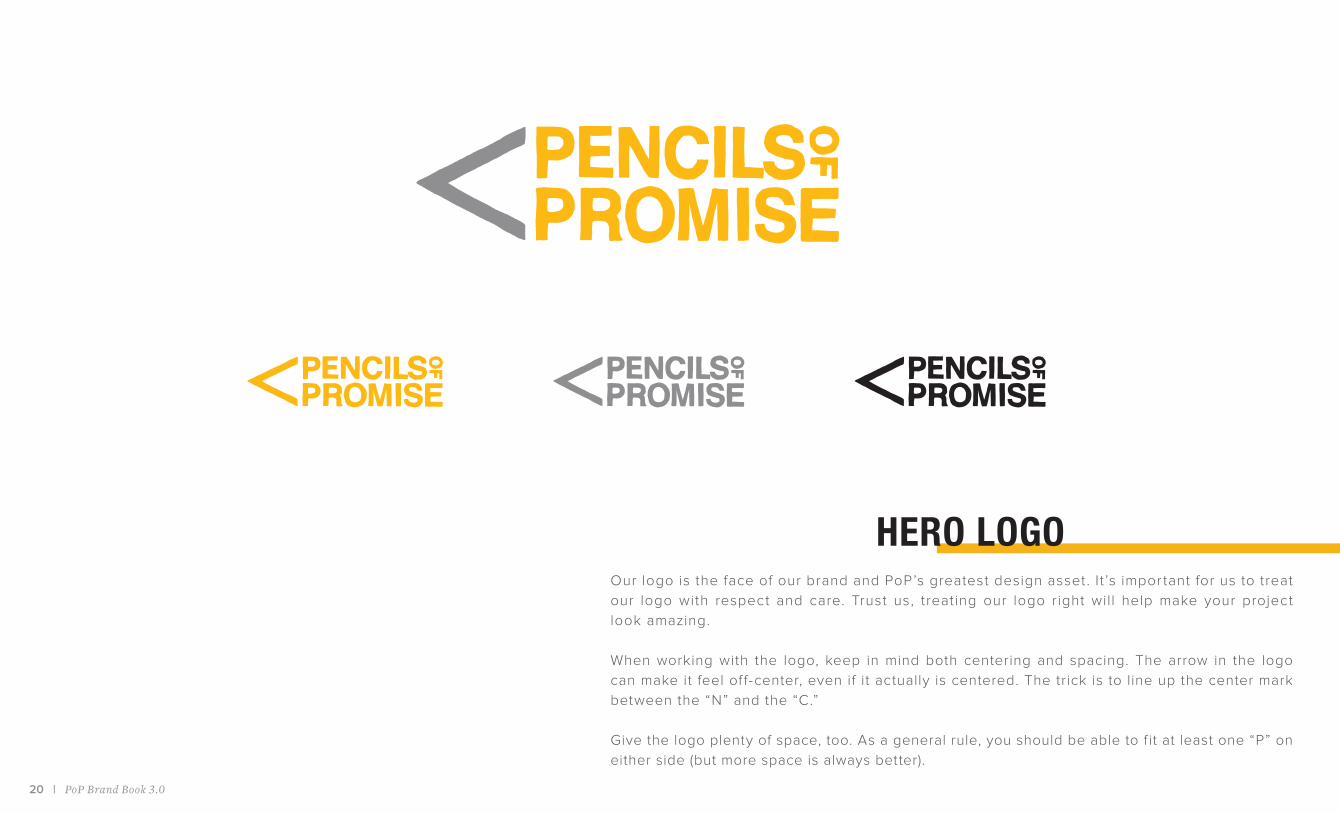
HERO LOGOOur logo is the face of our brand and PoP’s greatest design asset . I t ’s impor tant for us to treat
our logo with respect and care. Trust us, treating our logo right will help make your project
look amazing.
When working with the logo, keep in mind both centering and spacing. The arrow in the logo
can make it feel of f-center, even if it actually is centered. The trick is to line up the center mark
between the “N” and the “C.”
Give the logo plenty of space, too. As a general rule, you should be able to f it at least one “P” on
either side (but more space is always better).

What We Look Like | 21
We love our logo and want to show it off. The best way to do that is to just let it be. Simplicity is powerful. In case
you f ind yourself with an urge to switch things up, here are some major logo dont’s:
D on’t use our retired logo D on’t e mbellish our logo D on’t manipulate our logo This is not our logo. There was a time that
our logo featured sketched letters, but that
time has passed. You can keep the old logo
in your heart, but please leave it off the page.
We think our logo looks great just as it is.
Please steer clear of adding overt drop
shadows, changing up our color combo or
embossing, etc.
No shmushing. No stretching. No tilting.
Leaving the logo in its original form is how
we maintain consistency, keeping the PoP
brand strong and proud.

22 | PoP Brand Book 3.0
1 2
43
CORE PALETTE
PoP M arigoldPantone 124C
CMYK 0, 28, 100, 0
RGB 238, 171, 0
#EEAB00
Light Gre yCMYK 23, 18, 18, 0
RGB 196, 196, 196
#C4C4C4
GraphiteCMYK 63, 55, 54, 29
RGB 89, 89, 89
#595959
BlackCMYK 0, 0, 0, 100
RGB 0, 0, 0
#000000
1.
2.
3.
4.
Colors can create emotion, trigger memory and communicate
the values of an organization. Our core colors ref lect the
Pencils of Promise spirit. PoP marigold represents our bold
optimism while the greys keep us grounded in the work we
do. For every project, it’s best to keep these the colors,
along with a fair amount of whitespace, in mind.

What We Look Like | 23
EXTENDED PALETTE
RedCMYK 0, 28, 100, 0
RGB 238, 171, 0
#EEAB00
D ark BlueCMYK 77, 43, 26, 2
RGB 68, 125, 156
#437D9C
Fundraise r BluePantone 311C
CMYK 68, 2, 5, 0
RGB 31, 188, 228
#1EBCE4
D onate Gree nPantone 7740C
CMYK 81, 20, 100, 6
RGB 51, 145, 68
#329033
Bright Gree nPantone 7488C
CMYK 56, 0, 93, 0
RGB 114, 213, 74
#72D54A
The extended palette is only used as a base for designing campaign-specif ic branding. These
colors have been carefully chosen to work well with our core palette and also showcase our
brand personality. In simple terms, the core palette is a pencil that we use everyday; the
extended palette is a box of Crayola markers that we utilize only when its time for arts and
crafts. Most of the time the extended palette colors take a backseat to the core palette, but it’s
good to be aware of them.
24 | PoP Brand Book 3.0
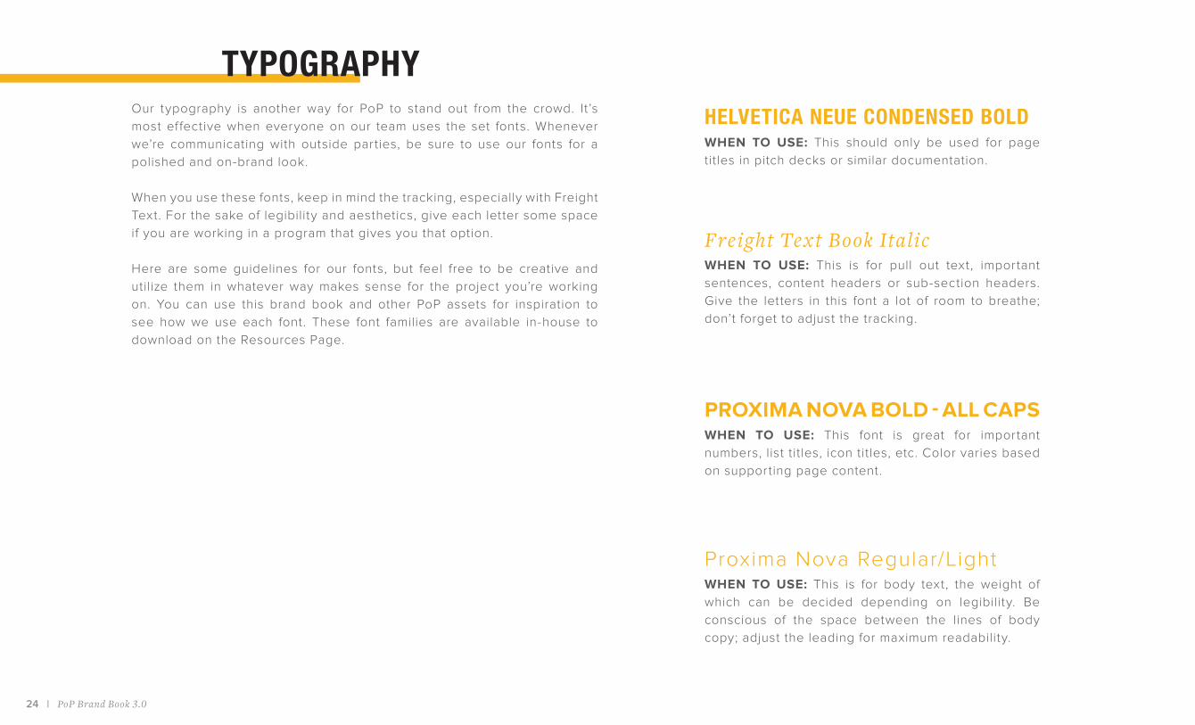
TYPOGRAPHYOur typography is another way for PoP to stand out from the crowd. It’s
most effective when everyone on our team uses the set fonts. Whenever
we’re communicating with outside parties, be sure to use our fonts for a
polished and on-brand look.
When you use these fonts, keep in mind the tracking, especially with Freight
Text. For the sake of legibility and aesthetics, give each letter some space
if you are working in a program that gives you that option.
Here are some guidelines for our fonts, but feel free to be creative and
utilize them in whatever way makes sense for the project you’re working
on. You can use this brand book and other PoP assets for inspiration to
see how we use each font. These font families are available in-house to
download on the Resources Page.
HELVETICA NEUE CONDENSED BOLDWHEN TO USE: This should only be used for page
titles in pitch decks or similar documentation.
Fre i ght Te x t Book Ita li cWHEN TO USE: This is for pull out text, important
sentences, content headers or sub-section headers.
Give the letters in this font a lot of room to breathe;
don’t forget to adjust the tracking.
PROXIMA NOVA BOLD - ALL CAPS
WHEN TO USE: This font is great for important
numbers, list titles, icon titles, etc. Color varies based
on supporting page content.
Proxima Nova Regular/LightWHEN TO USE: This is for body text, the weight of
which can be decided depending on legibility. Be
conscious of the space between the lines of body
copy; adjust the leading for maximum readability.

What We Look Like | 25
ABCDEFGHIJKLMNOPQRSTUVWXYZ
1234567890!?%#$
Helvetica Neue Condensed Bold
ABCDEFGHIJKLMNOPQRSTUVWXYZ
abcdefghijklmnopqrstuvwxyz
1234567890!?%#$
Proxima Nova Light
ABCDEFGHIJKLMNOPQRST UVWXYZ
abcdefghijklmnopqrstuvwxyz
1234567890!?%#$
Freight Text Book Italic

26 | PoP Brand Book 3.0
ICONOGRAPHYOur icons are a simple way to visually represent concepts, break up the monotony of text and
draw attention to important sections. They can exist within a circle frame or without. If you use the
dotted outline, please be conscious of size and spacing of the dashes when resized. Our website
is a great place to view our icons and familiarize yourself with their context.
School Builds
Birthday
Teacher Support
Recognition Ribbon
Scholarships
Recognition Trophy
WASH
Date
Identify
Innovation
Monitor & Evaluate
Tablet / E-Reader

What We Look Like | 27
Desktop
Health & Sanitation
Smartphone
Camera
Infrastructure
Open Box
Partnership
Economics
Line Chart
Pie Graph
Lack of Qualif ied
Teachers
Pencil
Globe
Gender Inequality
Community

28 | PoP Brand Book 3.0

What We Look Like | 29
PHOTOGRAPHYWe are so lucky to have extremely talented people on our PoP team, including top-notch photographers
that bring our work to life. How we use photography is very intentional: we aim to be authentic in the way
we showcase each country by telling an honest story while celebrating the communities we work in. This
allows us to transport genuine, meaningful images across oceans to share with our supporters. When
working with photography, here are some things to consider:
CreditingMake sure to give credit where credit is due. When sending our pictures
for use in outside materials like magazines or even Instagram, be sure to
include a short credit line. This is a small way to thank our photographers
for the wonderful work they do.
Using your o wn shotsThere may be occasions when you want to feature your own PoP shots.
Whether you’re using photos from your own PoP event or pictures from
a trip to one of our build sites, use the pointers below to help keep our
image consistent:
Color vs. B&WThe communities in which we work are vibrant and colorful. We always want
to make sure that those traits shine through in our photography. That’s why
we prefer to use color photos rather than black and white. There are times
when black and white is the right choice, but we usually defer to color photos.
Text & O ve rlaysPutting text or an overlay on top of an image can be tricky business. Using
white, bold text or overlays of solid white or black (no crazy colors) with
around 60% - 70% opacity is best. Never cover up someone’s face. Always
make sure the text is still easy to read and doesn’t get lost in the image.
Capture natural moments (think: moments that tell stories). There’s
no need to make your subjects pose or look straight into the camera.
Make sure to set your camera to a high-resolution so you can use the
shots for a variety of creative needs, from print to snapchat.
Take your shots in full-color and without a f ilter. You can always
adjust the color and balance later.
Keep in mind the personality of the PoP brand and take photos that
are uplif ting, genuine and most importantly, respectful. Always ask
permission before taking photos of someone.
+
+
+
+

30 | PoP Brand Book 3.0
DESIGN ELEMENTSTo help create a consistent feel throughout our collateral, while still allowing for creativity, we
utilize a few key design elements. These elements should be applied to general formatting and
creating assets. It’s the lit tle things that can make a BIG dif ference in our branding.
D ots & Lines Bullet Styles Full Stops & Ampe rsands We like to use yellow or grey lines to
provide structure to our marketing
materials, separate certain elements when
needed and emphasize key points. If the
asset calls for a more playful feel we will
sometimes use a dotted line.
One unique element of our materials
is how we style bullet points. A simple,
yellow, semi-bolded “plus-sign” can really
make a section pop. Be sure to leave a lot
of space around the actual bullet point so
it doesn’t get confused with the letter “t”.
When formatting headers and sub-headers
— even if the copy is a full sentence —
don’t use a period. We prefer to use the
“&” symbol instead of writing out the word
“and” or using another symbol, like “ + ”
(save that one for bullet points).
+ Of what our bullet points
+ Should look like
+ When you use them
+ To stay on brand
+ Here is an example
THIS & THAT

So that’s our brand. Your brand.
I f you’re ever in doubt about our branding, please refer
back to this document. It ’s important to love and respect our
brand, as it ’s the most effective way of uniting our work and
providing a voice that we should all use to talk about PoP.
Our branding is a flexible system that allows for creativity —
give it your best shot! Always feel free to reach out to the
Marketing Team with any questions.
Together, let’s write a better future.