Embed Size (px)
Citation preview
272 TUGboat, Volume 40 (2019), No. 3
Book review: Hermann Zapfand the World He Designed: A Biography,by Jerry Kelly
Barbara Beeton
Jerry Kelly, Hermann Zapf and the World HeDesigned: A Biography. The Grolier Club,New York, 2019, hardcover, 364 pp., US$48.00,ISBN 978-1605830827.
This book, the first comprehensive biography of Her-mann Zapf (1918–2015), was published to accom-pany the Grolier Club exhibition “Alphabet Magic:A Centennial Exhibition of the Work of Hermann &Gudrun Zapf”, curated by Jerry Kelly and StevenGalbraith. The exhibition (February 20 – April 27,2019 [1]) celebrated the centenary of Zapf’s birth.
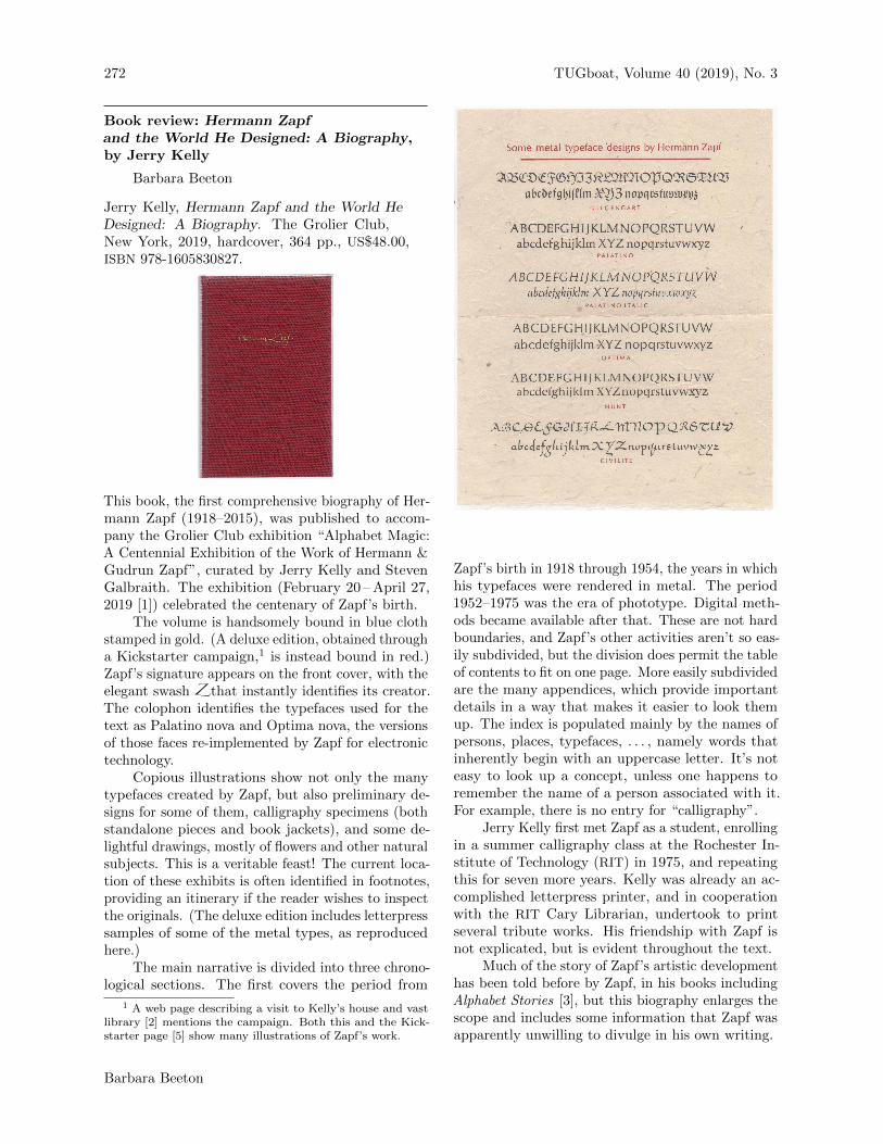
The volume is handsomely bound in blue clothstamped in gold. (A deluxe edition, obtained througha Kickstarter campaign,1 is instead bound in red.)Zapf’s signature appears on the front cover, with theelegant swash Z that instantly identifies its creator.The colophon identifies the typefaces used for thetext as Palatino nova and Optima nova, the versionsof those faces re-implemented by Zapf for electronictechnology.
Copious illustrations show not only the manytypefaces created by Zapf, but also preliminary de-signs for some of them, calligraphy specimens (bothstandalone pieces and book jackets), and some de-lightful drawings, mostly of flowers and other naturalsubjects. This is a veritable feast! The current loca-tion of these exhibits is often identified in footnotes,providing an itinerary if the reader wishes to inspectthe originals. (The deluxe edition includes letterpresssamples of some of the metal types, as reproducedhere.)
The main narrative is divided into three chrono-logical sections. The first covers the period from
1 A web page describing a visit to Kelly’s house and vastlibrary [2] mentions the campaign. Both this and the Kick-starter page [5] show many illustrations of Zapf’s work.
Zapf’s birth in 1918 through 1954, the years in whichhis typefaces were rendered in metal. The period1952–1975 was the era of phototype. Digital meth-ods became available after that. These are not hardboundaries, and Zapf’s other activities aren’t so eas-ily subdivided, but the division does permit the tableof contents to fit on one page. More easily subdividedare the many appendices, which provide importantdetails in a way that makes it easier to look themup. The index is populated mainly by the names ofpersons, places, typefaces, . . . , namely words thatinherently begin with an uppercase letter. It’s noteasy to look up a concept, unless one happens toremember the name of a person associated with it.For example, there is no entry for “calligraphy”.
Jerry Kelly first met Zapf as a student, enrollingin a summer calligraphy class at the Rochester In-stitute of Technology (RIT) in 1975, and repeatingthis for seven more years. Kelly was already an ac-complished letterpress printer, and in cooperationwith the RIT Cary Librarian, undertook to printseveral tribute works. His friendship with Zapf isnot explicated, but is evident throughout the text.
Much of the story of Zapf’s artistic developmenthas been told before by Zapf, in his books includingAlphabet Stories [3], but this biography enlarges thescope and includes some information that Zapf wasapparently unwilling to divulge in his own writing.
Barbara Beeton
TUGboat, Volume 40 (2019), No. 3 273
During the second period, 1952–1975, a greatdeal of Zapf’s design work was commissioned bythe Stempel foundry. This period saw the creationof many of his best known typefaces: extensionsto the Palatino family, Janson (a revival of a typeoriginally designed by Nicolas Kis, in titling sizes tocomplement the original text types), Melior (whichintroduced the shape of Piet Hein’s superellipse),and Optima (a revolutionary sans serif with taperedstrokes more characteristic of serif types), amongothers. The initial platform for which these typeswere designed was the Linotype, which imposed verystringent physical limitations, such as that the sameletter in parallel upright and italic fonts must havethe same metrics. The later freedom of phototypewould permit a rethinking of the consequences ofthese limitations, and subsequent redesign.
During this period, Zapf also designed numerousbooks. Although most were published by major Ger-man trade publishers, some, in particular his workson typographic subjects, were produced at Stempel’sin-house printing office. Zapf developed many con-tacts among the skilled craftsmen at Stempel, andwhen several of these craftsmen went out on theirown, Zapf turned to his former colleagues to producework at the highest level of quality. Although theproduction of the second volume of his Manuale Ty-pographicum was an artistic masterpiece, it was nota commercial success, and Zapf would come to regrettaking on the role of publisher. Later works on sub-jects related to type and calligraphy were managedby other publishers.
The third period, 1975–2015, deals with the post-metal era, during which Zapf continued to designbooks, revised his existing typefaces and developednew ones for new technology, and got more involvedwith teaching, for a time holding a professorship atthe Rochester Institute of Technology. During thisperiod he also, with Peter Karow, developed the hz -program, which uses a per-paragraph justificationsystem and carefully modifies the shapes of lettersto achieve uniform interword spacing and optimizethe consistent appearance of text.
Of particular interest to the present audienceis the information regarding Zapf’s relation to theTEX world. The principal focus here is on the Eulerfont (pp. 236–239), illustrated by an early drawingof the Latin and Greek alphabets. Several of theletters are more angular in this drawing than in thealphabets we see today, and the “u”-like shape ofthe “y” is said to be a particular request of Knuth.Kelly remarks,
Personally, I feel Euler would have looked bet-ter if they would have stuck with Zapf’s original
sharper entry and exit strokes, but Zapf acqui-esced to Knuth’s wishes in this matter. (p. 238)
This overlooks the fact that, in a mathematical con-text, it is essential that each letter be unambiguouslyrecognizable. In the early showing, it is difficult todistinguish the Latin “v” from the “ν” (nu); theseand other similar shapes have been adjusted in thefinal version.
Also noted is the recognition by DANTE, attheir 1999 annual meeting in Heidelberg, when Zapfwas named an honorary member. At the 2000 an-nual meeting Zapf responded with remarks publishedin Die TEXnische Komodie [4]; these remarks weretranslated for TUGboat with an addendum illustrat-ing the proper traditional page layout for a book [6,7].(The biography inexplicably lists this a second time(p. 323) for 2010: “Honorary Member of the GermanTeX Users Group (Heidelberg)”.)
References
[1] Zapf Centennial Symposium at The GrolierClub, March 20, 2019, accessed 1 Sept. 2019,www.tdc.org/event/zapf-centennial-symposium-
at-the-grolier-club/
[2] Pradeep Sebastian, “The master of beautifulletters”, The Hindu, October 27, 2018, accessed1 Sept. 2019, thehindu.com/books/the-master-of-beautiful-letters/article25357866.ece
[3] Hermann Zapf, Alphabet Stories, MergenthalerEdition, Linotype GmbH, Bad HomburgGermany / Cary Graphic Arts Press, RIT,Rochester, NY, 2007.Review by Hans Hagen and Taco Hoekwater,TUGboat 28:2 (2007), 174–176,tug.org/TUGboat/tb28-2/tb89hagen.pdf
[4] Frank Mittelbach, “Laudatio auf ProfessorHermann Zapf”; Hermann Zapf, “MeineZusammenarbeit mit Don Knuth und meineSchriftentwurfe”, Die TEXnische Komodie 2000:1,31–44, archiv.dante.de/DTK/PDF/komoedie_2000_1.pdf
[5] “Hermann Zapf & the World He Designed”,Kickstarter, accessed 1 Sept. 2019,www.kickstarter.com/projects/1307403978/
hermann-zapf-and-the-world-he-designed
[6] Frank Mittelbach, “Laudatio for ProfessorHermann Zapf”, TUGboat 22:1/2 (2001), 24–26,tug.org/TUGboat/tb22-1-2/tb70laud-
revised.pdf
[7] Hermann Zapf, “My collaboration with Don Knuthand my font design work”, TUGboat 22:1/2(2001), 26–30,tug.org/TUGboat/tb22-1-2/tb70zapf.pdf
� Barbara BeetonProvidence, RIbnb (at) tug dot org
Book review: Hermann Zapf and the World He Designed: A Biography, by Jerry Kelly