Embed Size (px)
Citation preview
WHITEPAPER
Dr. James Bednar, Open Source Tech Lead & Solutions Architect, Continuum Analytics August 2016
BIG DATA VISUALIZATION WITH DATASHADER
2 Whitepaper • BIG DATA VISUALIZATION WITH DATASHADER
Visualization in the Era of Big Data: Getting It Right Is Not Always Easy
Some of the problems related to the abundance of data can be
overcome simply by using more or better hardware. For instance,
larger data sets can be processed in a given amount of time by
increasing the amount of computer memory, CPU cores or network
bandwidth. But, other problems are much less tractable, such as
what might be called the ‘points-per-pixel problem’—which is
anything but trivially easy to solve and requires fundamentally
different approaches.
The ‘points-per-pixel’ problem is having more data points than is
possible to represent as pixels on a computer monitor. If your data
set has hundreds of millions or billions of data points—easily
imaginable for Big Data—there are far more than can be displayed
on a typical high-end 1920x1080 monitor with 2 million pixels, or
even on a bleeding edge 8K monitor, which can display only 33
million pixels. And yet, data scientists must accurately convey, if not
all the data, at least the shape or scope of the Big Data, despite these
hard limitations.
Very small data sets do not have this problem. For a scatterplot with
only ten or a hundred points, it is easy to display all points, and
observers can instantly perceive an outlier off to the side of the data’s
cluster. But as you increase the data set’s size or sampling density,
you begin to experience difficulties. With as few as 500 data points, it
is much more likely that there will be a large cluster of points that
mostly overlap each other, known as ‘overplotting’, and obscure the
structure of the data within the cluster. Also, as they grow, data sets
can quickly approach the points-per-pixel problem, either overall or
in specific dense clusters of data points.
Technical ‘solutions’ are frequently proposed to head off these issues,
but too often these are misapplied. One example is downsampling,
where the number of data points is algorithmically reduced, but
which can result in missing important aspects of your data. Another
approach is to make data points partially transparent, so that they
add up, rather than overplot. However, setting the amount of
transparency correctly is difficult, error-prone and leaves
unavoidable tradeoffs between visibility of isolated samples and
overplotting of dense clusters. Neither approach properly addresses
the key problem in visualization of large data sets: systematically
and objectively displaying large amounts of data in a way that can be
presented effectively to the human visual system.
• The complexity of visualizing large amounts of data
• How datashading helps tame this complexity
• The power of adding interactivity to your visualization
In this paper, you’ll learn why Open Data Science is the foundation to modernizing data analytics, and:
In This WhitepaperData science is about using data to provide insight and evidence that can lead business, government and academic leaders to make better decisions. However, making sense of the large data sets now becoming ubiquitous is difficult, and it is crucial to use appropriate tools that will drive smart decisions.
The beginning and end of nearly any problem in data science is a visualization—first, for understanding the shape and structure of the raw data and, second, for communicating the final results to drive decision making. In either case, the goal is to expose the essential properties of the data in a way that can be perceived and understood by the human visual system.
Traditional visualization systems and techniques were designed in an era of data scarcity, but in today’s Big Data world of an incredible abundance of information, understanding is the key commodity. Older approaches focused on rendering individual data points faithfully, which was appropriate for the small data sets previously available. However, when inappropriately applied to large data sets, these techniques suffer from systematic problems like overplotting, oversaturation, undersaturation, undersampling and underutilized dynamic range, all of which obscure the true properties of large data sets and lead to incorrect data-driven decisions. Fortunately, Anaconda is here to help with datashading technology that is designed to solve these problems head-on.
The ‘points-per-pixel’ problem is having more
data points than is possible to represent
as pixels on a computer monitor.
Whitepaper • BIG DATA VISUALIZATION WITH DATASHADER 3
Let’s take a deeper dive into five major ‘plotting pitfalls’ and how they
are typically addressed, focusing on problems that are minor
inconveniences with small data sets but very serious problems with
larger ones:
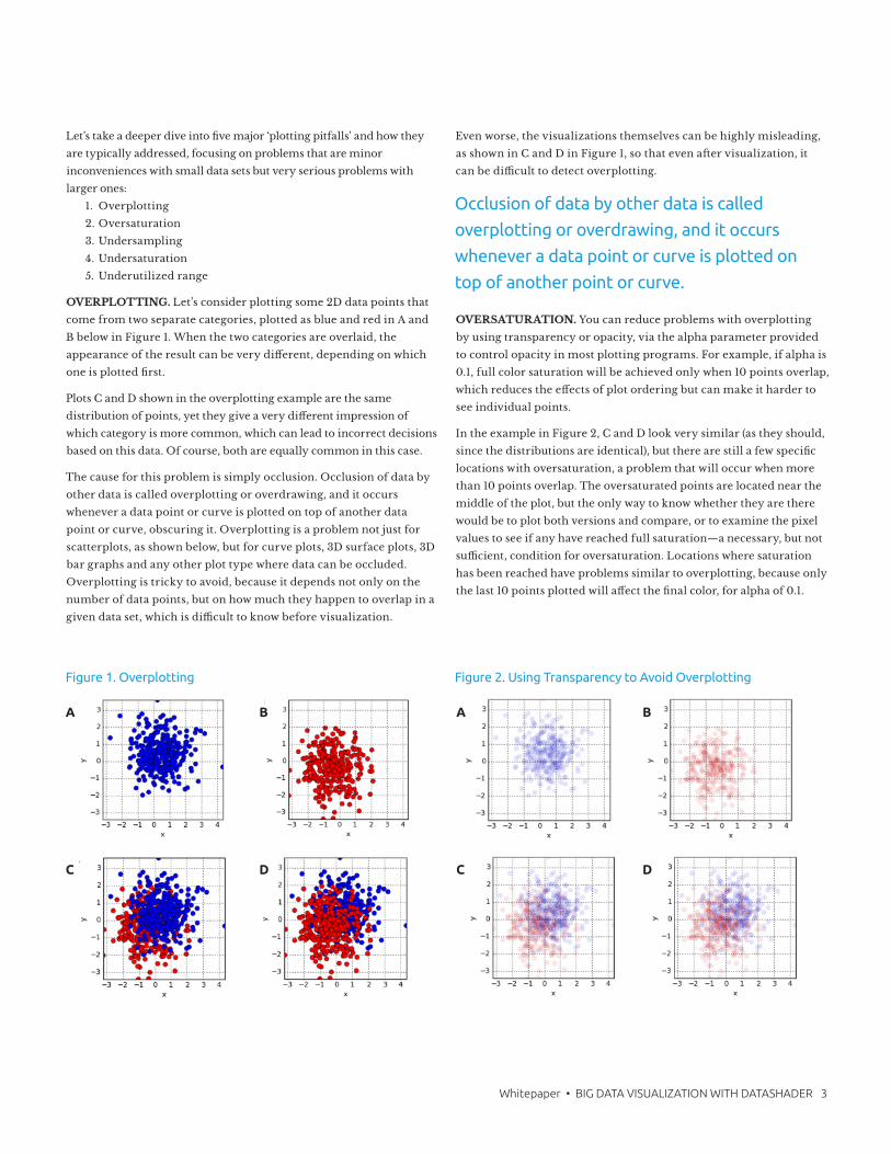
OVERPLOTTING. Let’s consider plotting some 2D data points that
come from two separate categories, plotted as blue and red in A and
B below in Figure 1. When the two categories are overlaid, the
appearance of the result can be very different, depending on which
one is plotted first.
Plots C and D shown in the overplotting example are the same
distribution of points, yet they give a very different impression of
which category is more common, which can lead to incorrect decisions
based on this data. Of course, both are equally common in this case.
The cause for this problem is simply occlusion. Occlusion of data by
other data is called overplotting or overdrawing, and it occurs
whenever a data point or curve is plotted on top of another data
point or curve, obscuring it. Overplotting is a problem not just for
scatterplots, as shown below, but for curve plots, 3D surface plots, 3D
bar graphs and any other plot type where data can be occluded.
Overplotting is tricky to avoid, because it depends not only on the
number of data points, but on how much they happen to overlap in a
given data set, which is difficult to know before visualization.
Even worse, the visualizations themselves can be highly misleading,
as shown in C and D in Figure 1, so that even after visualization, it
can be difficult to detect overplotting.
OVERSATURATION. You can reduce problems with overplotting
by using transparency or opacity, via the alpha parameter provided
to control opacity in most plotting programs. For example, if alpha is
0.1, full color saturation will be achieved only when 10 points overlap,
which reduces the effects of plot ordering but can make it harder to
see individual points.
In the example in Figure 2, C and D look very similar (as they should,
since the distributions are identical), but there are still a few specific
locations with oversaturation, a problem that will occur when more
than 10 points overlap. The oversaturated points are located near the
middle of the plot, but the only way to know whether they are there
would be to plot both versions and compare, or to examine the pixel
values to see if any have reached full saturation—a necessary, but not
sufficient, condition for oversaturation. Locations where saturation
has been reached have problems similar to overplotting, because only
the last 10 points plotted will affect the final color, for alpha of 0.1.
Occlusion of data by other data is called
overplotting or overdrawing, and it occurs
whenever a data point or curve is plotted on
top of another point or curve.
1. Overplotting
2. Oversaturation
3. Undersampling
4. Undersaturation
5. Underutilized range
Figure 2. Using Transparency to Avoid OverplottingFigure 1. Overplotting
A B
C D
A B
C D
4 Whitepaper • BIG DATA VISUALIZATION WITH DATASHADER
Even worse, if just one has set the alpha value to approximately or
usually avoid oversaturation, as in the previous plot, the correct value
still depends on the data set. If there are more points overlapping in
that particular region, a manually adjusted alpha setting that worked
well for a previous data set will systematically misrepresent the new
data set.
In the example in Figure 3, C and D again look qualitatively different,
yet still represent the same distributions, just with more points. Since
we are assuming that the goal of the visualization is to faithfully
reveal the underlying distributions, having to tune visualization
parameters manually based on the properties of the data set itself is a
fundamental problem that wastes time and leads to errors in
judgment that could be very costly.
To make it even more complicated, the correct alpha also depends
on the dot size, because smaller dots have less overlap for the same
data set. With smaller dots, as shown in Figure 4, C and D look more
similar, as desired, but the color of the dots is now difficult to see in
all cases, because the dots are too transparent for this size.
As you can see in Figure 4, it is very difficult to find settings for the
dot size and alpha parameters that correctly reveal the data, even for
relatively small and obvious data sets like these. With larger data sets
with unknown content, it is often impossible to detect that such
problems are occurring, leading to false conclusions based on
inappropriately visualized data.
UNDERSAMPLING. With a single category instead of the multiple
categories shown previously, oversaturation simply obscures spatial
differences in density. For instance, 10, 20 and 2000 single-category
points overlapping will all look the same visually, for alpha=0.1.
In Figure 5, on the next page, let’s first look at another example that
has a sum of two normal distributions slightly offset from one
another but no longer uses color to separate them into categories.
As shown in the examples in the previous sections, finding settings to
avoid overplotting and oversaturation is difficult. The ‘small dots’
parameters used in the A and B (size 0.1, full alpha) of the
undersampling vs overplotting example work fairly well for a sample
of 600 points (A), but those parameters lead to serious overplotting
issues for larger data sets, obscuring the shape and density of the
distribution (B). Switching to 10 times smaller dots with alpha 0.1 to
allow overlap (‘tiny dots’) works well for the larger data set D, but not
at all for the 600 point data set C. Clearly, not all of these settings are
accurately conveying the underlying distribution, as they all appear
quite different from one another, but in each case they are plotting
samples from the same distribution. Similar problems occur for the
same size data set, but with greater or lesser levels of overlap
between points, which varies with every new data set.
In any case, as data set size increases, at some point plotting a full
scatterplot like any of these will become impractical with current
plotting technology. At this point, people often simply subsample
their data set, plotting 10,000 or perhaps 100,000 randomly selected
data points. But, as Figure 5 panel A shows, the shape of an
undersampled distribution can be very difficult or impossible to
make out, leading to incorrect conclusions about the distribution.
Such problems can occur even when taking very large numbers of
samples and examining sparsely populated regions of the space,
which will approximate panel A for some plot settings and panel C
for others. The actual shape of the distribution is only visible if
sufficient data points are available in that region and appropriate
plot settings are used, as in D, but ensuring that both conditions are
Figure 3. Oversaturation Due to More Overlapping Points Figure 4. Reducing Oversaturation by Decreasing Dot Size
Oversaturation obscures spatial
differences in density.
A B
C D
A B
C D
Whitepaper • BIG DATA VISUALIZATION WITH DATASHADER 5
true is quite a difficult process of trial and error, making it very
likely that important features of the data set will be missed.
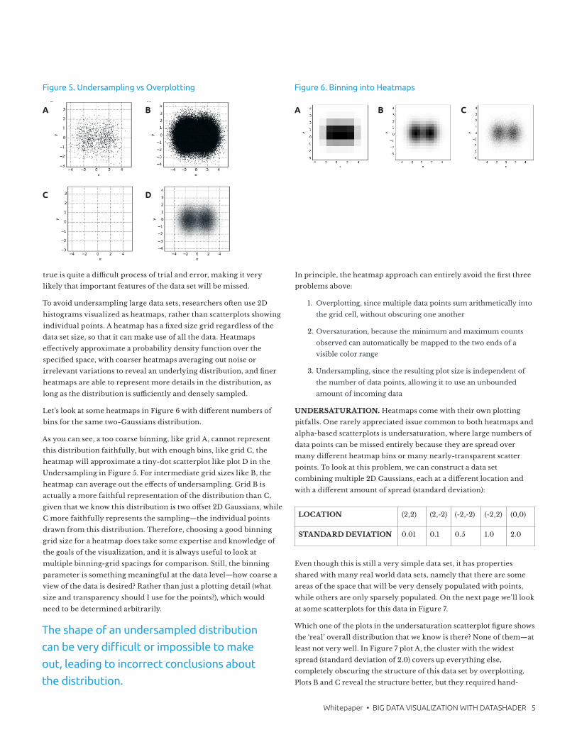
To avoid undersampling large data sets, researchers often use 2D
histograms visualized as heatmaps, rather than scatterplots showing
individual points. A heatmap has a fixed size grid regardless of the
data set size, so that it can make use of all the data. Heatmaps
effectively approximate a probability density function over the
specified space, with coarser heatmaps averaging out noise or
irrelevant variations to reveal an underlying distribution, and finer
heatmaps are able to represent more details in the distribution, as
long as the distribution is sufficiently and densely sampled.
Let’s look at some heatmaps in Figure 6 with different numbers of
bins for the same two-Gaussians distribution.
As you can see, a too coarse binning, like grid A, cannot represent
this distribution faithfully, but with enough bins, like grid C, the
heatmap will approximate a tiny-dot scatterplot like plot D in the
Undersampling in Figure 5. For intermediate grid sizes like B, the
heatmap can average out the effects of undersampling. Grid B is
actually a more faithful representation of the distribution than C,
given that we know this distribution is two offset 2D Gaussians, while
C more faithfully represents the sampling—the individual points
drawn from this distribution. Therefore, choosing a good binning
grid size for a heatmap does take some expertise and knowledge of
the goals of the visualization, and it is always useful to look at
multiple binning-grid spacings for comparison. Still, the binning
parameter is something meaningful at the data level—how coarse a
view of the data is desired? Rather than just a plotting detail (what
size and transparency should I use for the points?), which would
need to be determined arbitrarily.
In principle, the heatmap approach can entirely avoid the first three
problems above:
1. Overplotting, since multiple data points sum arithmetically into
the grid cell, without obscuring one another
2. Oversaturation, because the minimum and maximum counts
observed can automatically be mapped to the two ends of a
visible color range
3. Undersampling, since the resulting plot size is independent of
the number of data points, allowing it to use an unbounded
amount of incoming data
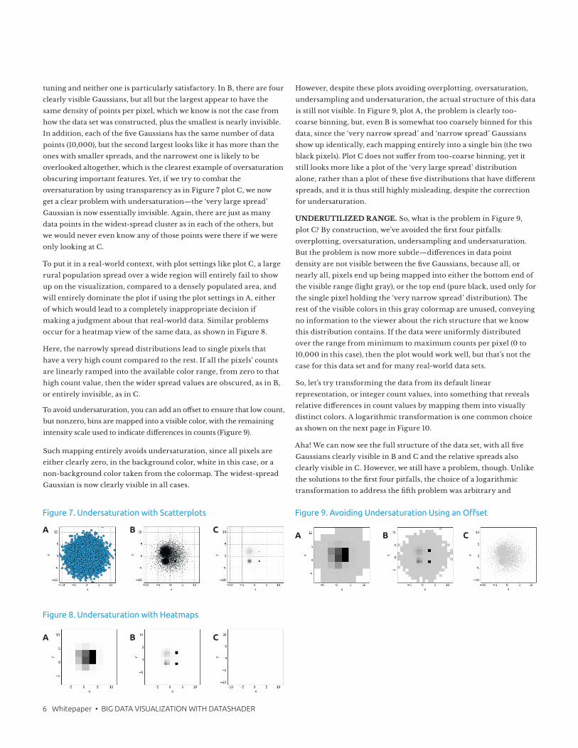
UNDERSATURATION. Heatmaps come with their own plotting
pitfalls. One rarely appreciated issue common to both heatmaps and
alpha-based scatterplots is undersaturation, where large numbers of
data points can be missed entirely because they are spread over
many different heatmap bins or many nearly-transparent scatter
points. To look at this problem, we can construct a data set
combining multiple 2D Gaussians, each at a different location and
with a different amount of spread (standard deviation):
Even though this is still a very simple data set, it has properties
shared with many real world data sets, namely that there are some
areas of the space that will be very densely populated with points,
while others are only sparsely populated. On the next page we’ll look
at some scatterplots for this data in Figure 7.
Which one of the plots in the undersaturation scatterplot figure shows
the ‘real’ overall distribution that we know is there? None of them—at
least not very well. In Figure 7 plot A, the cluster with the widest
spread (standard deviation of 2.0) covers up everything else,
completely obscuring the structure of this data set by overplotting.
Plots B and C reveal the structure better, but they required hand-
Figure 5. Undersampling vs Overplotting Figure 6. Binning into Heatmaps
The shape of an undersampled distribution
can be very difficult or impossible to make
out, leading to incorrect conclusions about
the distribution.
LOCATION (2,2) (2,-2) (-2,-2) (-2,2) (0,0)
STANDARD DEVIATION 0.01 0.1 0.5 1.0 2.0
A B
C D
A B C
6 Whitepaper • BIG DATA VISUALIZATION WITH DATASHADER
tuning and neither one is particularly satisfactory. In B, there are four
clearly visible Gaussians, but all but the largest appear to have the
same density of points per pixel, which we know is not the case from
how the data set was constructed, plus the smallest is nearly invisible.
In addition, each of the five Gaussians has the same number of data
points (10,000), but the second largest looks like it has more than the
ones with smaller spreads, and the narrowest one is likely to be
overlooked altogether, which is the clearest example of oversaturation
obscuring important features. Yet, if we try to combat the
oversaturation by using transparency as in Figure 7 plot C, we now
get a clear problem with undersaturation—the ‘very large spread’
Gaussian is now essentially invisible. Again, there are just as many
data points in the widest-spread cluster as in each of the others, but
we would never even know any of those points were there if we were
only looking at C.
To put it in a real-world context, with plot settings like plot C, a large
rural population spread over a wide region will entirely fail to show
up on the visualization, compared to a densely populated area, and
will entirely dominate the plot if using the plot settings in A, either
of which would lead to a completely inappropriate decision if
making a judgment about that real-world data. Similar problems
occur for a heatmap view of the same data, as shown in Figure 8.
Here, the narrowly spread distributions lead to single pixels that
have a very high count compared to the rest. If all the pixels’ counts
are linearly ramped into the available color range, from zero to that
high count value, then the wider spread values are obscured, as in B,
or entirely invisible, as in C.
To avoid undersaturation, you can add an offset to ensure that low count,
but nonzero, bins are mapped into a visible color, with the remaining
intensity scale used to indicate differences in counts (Figure 9).
Such mapping entirely avoids undersaturation, since all pixels are
either clearly zero, in the background color, white in this case, or a
non-background color taken from the colormap. The widest-spread
Gaussian is now clearly visible in all cases.
However, despite these plots avoiding overplotting, oversaturation,
undersampling and undersaturation, the actual structure of this data
is still not visible. In Figure 9, plot A, the problem is clearly too-
coarse binning, but, even B is somewhat too coarsely binned for this
data, since the ‘very narrow spread’ and ‘narrow spread’ Gaussians
show up identically, each mapping entirely into a single bin (the two
black pixels). Plot C does not suffer from too-coarse binning, yet it
still looks more like a plot of the ‘very large spread’ distribution
alone, rather than a plot of these five distributions that have different
spreads, and it is thus still highly misleading, despite the correction
for undersaturation.
UNDERUTILIZED RANGE. So, what is the problem in Figure 9,
plot C? By construction, we’ve avoided the first four pitfalls:
overplotting, oversaturation, undersampling and undersaturation.
But the problem is now more subtle—differences in data point
density are not visible between the five Gaussians, because all, or
nearly all, pixels end up being mapped into either the bottom end of
the visible range (light gray), or the top end (pure black, used only for
the single pixel holding the ‘very narrow spread’ distribution). The
rest of the visible colors in this gray colormap are unused, conveying
no information to the viewer about the rich structure that we know
this distribution contains. If the data were uniformly distributed
over the range from minimum to maximum counts per pixel (0 to
10,000 in this case), then the plot would work well, but that’s not the
case for this data set and for many real-world data sets.
So, let’s try transforming the data from its default linear
representation, or integer count values, into something that reveals
relative differences in count values by mapping them into visually
distinct colors. A logarithmic transformation is one common choice
as shown on the next page in Figure 10.
Aha! We can now see the full structure of the data set, with all five
Gaussians clearly visible in B and C and the relative spreads also
clearly visible in C. However, we still have a problem, though. Unlike
the solutions to the first four pitfalls, the choice of a logarithmic
transformation to address the fifth problem was arbitrary and
Figure 9. Avoiding Undersaturation Using an Offset
A B C
Figure 8. Undersaturation with Heatmaps
Figure 7. Undersaturation with Scatterplots
A
A
B
B
C
C
Whitepaper • BIG DATA VISUALIZATION WITH DATASHADER 7
dependent on the specifics of this data set. The logarithmic
transformation mainly works well because we happened to have
used an approximately geometric progression of spread sizes when
constructing the example. For large data sets with truly unknown
structure, can we have a more principled approach to mapping the
data set values into a visible range that will work across data sets?
Yes, if we think of the visualization problem in a different way. The
underlying difficulty in plotting this data set, as for many real-world
data sets, is that the values in each bin are numerically very different,
ranging from 10,000 in the bin for the ‘very narrow spread’
Gaussian to 0 or 1 for single data points from the ‘very large spread’
Gaussian. Given the 256 gray levels available in a normal monitor
and the similarly limited human ability to detect differences in gray
values, numerically mapping the data values into the visible range
linearly is clearly not going to work well. But, given that we are
already backing off from a direct numerical mapping in the above
approaches for correcting undersaturation and for doing log
transformations, what if we entirely abandon the numerical
mapping approach, using the numbers only to form an ordering of
the data values and plotting that rather than the magnitudes? Such
an approach would be a rank-order plot, preserving relative order
while discarding specific magnitudes. For 100 gray values, you can
think of it as a percentile based plot, with the lowest 1% of the data
values mapping to the first visible gray value, the next 1% mapping to
the next visible gray value, and so on to the top 1% of the data values
mapping to the highest gray value 255 (black, in this case). The actual
data values would be ignored in such plots, but their relative
magnitudes would still determine how they map onto colors on the
screen, preserving the structure of the distribution, rather than the
numerical values.
We can approximate such a rank-order or percentile encoding using
the histogram equalization function from an image processing
package, which makes sure that each gray level is used for about the
same number of pixels in the plot as shown in Figure 11.
Figure 11 plot C , the rank-order plotting example, now reveals the
full structure that we know was in this data set, i.e. five Gaussians
with different spreads, with no arbitrary parameter choices. The
differences in counts between pixels are now very clearly visible,
across the full and very wide range of counts in the original data.
Of course, we’ve lost the actual counts themselves, so we can no
longer tell just how many data points are in the ‘very narrow spread’
pixel in this case. So, plot C is accurately conveying the structure, but
additional information would need to be provided to show the actual
counts, by adding a color key mapping from the visible gray values
into the actual counts and/or by providing hovering value
information. Interactive approaches also work well at this point, with
the initial view showing where to investigate, at which point the
numerical values can be examined in each area of interest; actually
showing the full range in a single plot will not work well, but in each
local area it can be useful.
At this point, one could also consider explicitly highlighting hotspots
so that they cannot be overlooked. In plots B and C in Figure 11, the
two highest density pixels are mapped to the two darkest pixel colors,
and with many monitor settings chosen to make black text ‘look
better,’ those values may not be clearly distinguishable from each
other or from nearby grey values. Once the data is reliably and
automatically mapped into a good range for display, making explicit
adjustments—based on wanting to make hotspots particularly
clear—can be done in a principled way that does not depend on the
actual data distribution or by just making the top few pixel values
into a different color, highlighting the top few percentile ranges of
the data.
If we step back a bit, we can see that by starting with plots of specific
data points, we showed how typical visualization techniques will
systematically misrepresent the distribution of those points. With
Big Data, these problems are incredibly serious for businesses,
because the visualization is often the only way that we can
understand the properties of the data set, leading to potentially costly
missed opportunities and incorrect decisions based on the data.
Figure 11. Parameter-Free Visualization Using Rank Order PlottingFigure 10. Dynamic Range with a Logarithmic Transformation
A B C A B C
8 Whitepaper • BIG DATA VISUALIZATION WITH DATASHADER
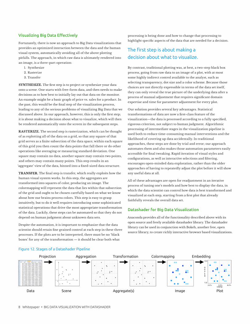
Visualizing Big Data Effectively
Fortunately, there is now an approach to Big Data visualizations that
provides an optimized interaction between the data and the human
visual system, automatically avoiding all of the above plotting
pitfalls. The approach, in which raw data is ultimately rendered into
an image, is a three-part operation:
1. Synthesize
2. Rasterize
3. Transfer
SYNTHESIZE. The first step is to project or synthesize your data
onto a scene. One starts with free-form data, and then needs to make
decisions as to how best to initially lay out that data on the monitor.
An example might be a basic graph of price vs. sales for a product. In
the past, this would be the final step of the visualization process,
leading to any of the serious problems of visualizing Big Data that we
discussed above. In our approach, however, this is only the first step;
it is about making a decision about what to visualize, which will then
be rendered automatically onto the screen in the subsequent steps.
RASTERIZE. The second step is rasterization, which can be thought
of as replotting all of the data on a grid, so that any square of that
grid serves as a finite subsection of the data space; within each square
of this grid you then count the data points that fall there or do other
operations like averaging or measuring standard deviation. One
square may contain no data, another square may contain two points,
and others may contain many points. This step results in an
‘aggregate’ view of the data, binned into a fixed-sized data structure.
TRANSFER. The final step is transfer, which really exploits how the
human visual system works. In this step, the aggregates are
transformed into squares of color, producing an image. The
colormapping will represent the data that lies within that subsection
of the grid and ought to be chosen carefully based on what we know
about how our brains process colors. This step is easy to grasp
intuitively, but to do it well requires introducing some sophisticated
statistical operations that drive the most appropriate transformation
of the data. Luckily, these steps can be automated so that they do not
depend on human judgment about unknown data sets.
Despite the automation, it is important to emphasize that the data
scientist should retain fine grained control at each step in these three
processes. If the plots are to be interpreted, there must be no ‘black
boxes’ for any of the transformation — it should be clear both what
processing is being done and how to change that processing to
highlight specific aspects of the data that are needed for a decision.
By contrast, traditional plotting was, at best, a two-step black box
process, going from raw data to an image of a plot, with at most
some highly indirect control available to the analyst, such as
selecting transparency, dot size and a color scheme. Because those
choices are not directly expressible in terms of the data set itself,
they can only reveal the true picture of the underlying data after a
process of manual adjustment that requires significant domain
expertise and time for parameter adjustment for every plot.
Our solution provides several key advantages. Statistical
transformations of data are now a first-class feature of the
visualization—the data is processed according to a fully specified,
rigorous criterion, not subject to human judgment. Algorithmic
processing of intermediate stages in the visualization pipeline is
used both to reduce time-consuming manual interventions and the
likelihood of covering up data accidentally. In traditional
approaches, these steps are done by trial and error; our approach
automates them and also makes those automation parameters easily
accessible for final tweaking. Rapid iteration of visual styles and
configurations, as well as interactive selections and filtering,
encourages open-minded data exploration, rather than the older
approaches of having to repeatedly adjust the plot before it will show
any useful data at all.
All of these advantages are open for readjustment in an iterative
process of tuning one’s models and how best to display the data, in
which the data scientist can control how data is best transformed and
visualized at each step, starting from a first plot that already
faithfully reveals the overall data set.
Datashader for Big Data Visualization
Anaconda provides all of the functionality described above with its
open source and freely available datashader library. The datashader
library can be used in conjunction with Bokeh, another free, open
source library, to create richly interactive browser based visualizations.
The first step is about making a
decision about what to visualize.
Figure 12. Stages of a Datashader Pipeline
Data
Projection
Aggregate(s)Scene
Transformation Colormapping EmbeddingAggregation
Image Plot
Whitepaper • BIG DATA VISUALIZATION WITH DATASHADER 9
The datashader library overcomes all of the pitfalls above, both by
automatically calculating appropriate parameters based on the data
itself and by allowing interactive visualizations of truly large data
sets with millions or billions of data points so that their structure can
be revealed. The above techniques can be applied ‘by hand’, but
datashader lets you do this easily, by providing a high performance
and flexible modular visualization pipeline, making it simple to do
automatic processing, such as auto-ranging and histogram
equalization, to faithfully reveal the properties of the data.
The datashader library has been designed to expose the stages
involved in generating a visualization. These stages can then be
automated, configured, customized or replaced wherever
appropriate for a data analysis task. The five main stages in a
datashader pipeline are an elaboration of the three main stages
above, after allowing for user control in between processing steps as
shown in Figure 12.
Figure 12 illustrates a datashader pipeline with computational steps
listed across the top of the diagram, while the data structures, or
objects, are listed along the bottom. Breaking up the computation
into this set of stages is what gives datashader its power, because only
the first couple of stages require the full data set while the remaining
stages use a fixed-size data structure regardless of the input data set,
making it practical to work with on even extremely large data sets.
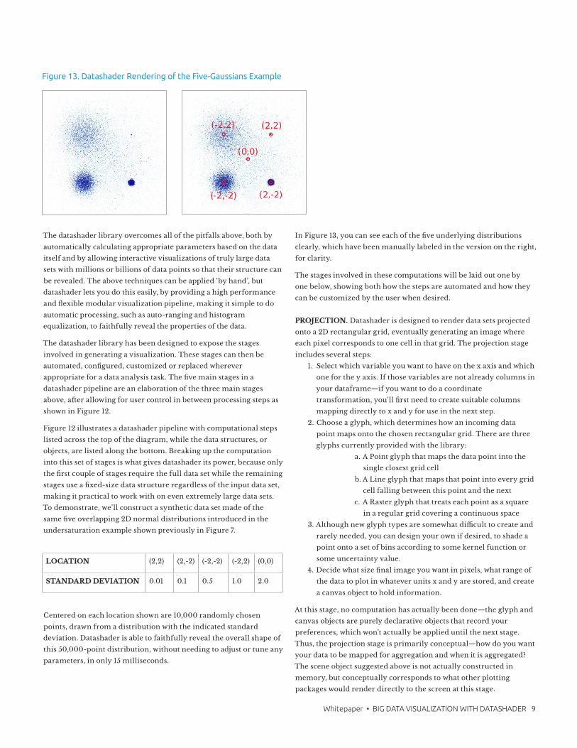
To demonstrate, we’ll construct a synthetic data set made of the
same five overlapping 2D normal distributions introduced in the
undersaturation example shown previously in Figure 7.
Centered on each location shown are 10,000 randomly chosen
points, drawn from a distribution with the indicated standard
deviation. Datashader is able to faithfully reveal the overall shape of
this 50,000-point distribution, without needing to adjust or tune any
parameters, in only 15 milliseconds.
In Figure 13, you can see each of the five underlying distributions
clearly, which have been manually labeled in the version on the right,
for clarity.
The stages involved in these computations will be laid out one by
one below, showing both how the steps are automated and how they
can be customized by the user when desired.
PROJECTION. Datashader is designed to render data sets projected
onto a 2D rectangular grid, eventually generating an image where
each pixel corresponds to one cell in that grid. The projection stage
includes several steps:
1. Select which variable you want to have on the x axis and which
one for the y axis. If those variables are not already columns in
your dataframe—if you want to do a coordinate
transformation, you’ll first need to create suitable columns
mapping directly to x and y for use in the next step.
2. Choose a glyph, which determines how an incoming data
point maps onto the chosen rectangular grid. There are three
glyphs currently provided with the library:
a. A Point glyph that maps the data point into the
single closest grid cell
b. A Line glyph that maps that point into every grid
cell falling between this point and the next
c. A Raster glyph that treats each point as a square
in a regular grid covering a continuous space
3. Although new glyph types are somewhat difficult to create and
rarely needed, you can design your own if desired, to shade a
point onto a set of bins according to some kernel function or
some uncertainty value.
4. Decide what size final image you want in pixels, what range of
the data to plot in whatever units x and y are stored, and create
a canvas object to hold information.
At this stage, no computation has actually been done—the glyph and
canvas objects are purely declarative objects that record your
preferences, which won’t actually be applied until the next stage.
Thus, the projection stage is primarily conceptual—how do you want
your data to be mapped for aggregation and when it is aggregated?
The scene object suggested above is not actually constructed in
memory, but conceptually corresponds to what other plotting
packages would render directly to the screen at this stage.
LOCATION (2,2) (2,-2) (-2,-2) (-2,2) (0,0)
STANDARD DEVIATION 0.01 0.1 0.5 1.0 2.0
Figure 13. Datashader Rendering of the Five-Gaussians Example
10 Whitepaper • BIG DATA VISUALIZATION WITH DATASHADER
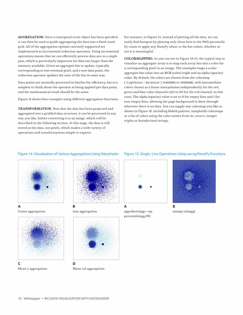
AGGREGATION. Once a conceptual scene object has been specified,
it can then be used to guide aggregating the data into a fixed-sized
grid. All of the aggregation options currently supported are
implemented as incremental reduction operators. Using incremental
operations means that we can efficiently process data sets in a single
pass, which is particularly important for data sets larger than the
memory available. Given an aggregate bin to update, typically
corresponding to one eventual pixel, and a new data point, the
reduction operator updates the state of the bin in some way.
Data points are normally processed in batches for efficiency, but it is
simplest to think about the operator as being applied per data point,
and the mathematical result should be the same.
Figure 14 shows four examples using different aggregation functions.
TRANSFORMATION. Now that the data has been projected and
aggregated into a gridded data structure, it can be processed in any
way you like, before converting it to an image, which will be
described in the following section. At this stage, the data is still
stored as bin data, not pixels, which makes a wide variety of
operations and transformations simple to express.
For instance, in Figure 15, instead of plotting all the data, we can
easily find hotspots by plotting only those bins in the 99th percentile
by count or apply any NumPy ufunc to the bin values, whether or
not it is meaningful.
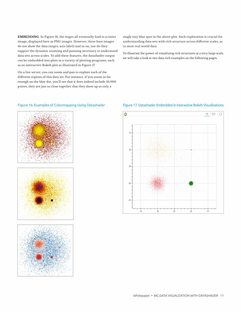
COLORMAPPING. As you can see in Figure 13-15, the typical way to
visualize an aggregate array is to map each array bin into a color for
a corresponding pixel in an image. The examples maps a scalar
aggregate bin value into an RGB (color) triple and an alpha (opacity)
value. By default, the colors are chosen from the colormap
[‘lightblue’,’darkblue’] (#ADD8E6 to #00008B), with intermediate
colors chosen as a linear interpolation independently for the red,
green and blue color channels (AD to 00 for the red channel, in this
case). The alpha (opacity) value is set to 0 for empty bins and 1 for
non-empty bins, allowing the page background to show through
wherever there is no data. You can supply any colormap you like as
shown in Figure 16, including Bokeh palettes, matplotlib colormaps
or a list of colors using the color names from ds.colors, integer
triples or hexadecimal strings.
Figure 14. Visualization of Various Aggregations Using Datashader
A Count aggregation
C Mean y aggregation
D Mean val aggregation
B Any aggregation
Figure 15. Single- Line Operations Using xarray/NumPy Functions
A agg.where(agg>=np.
percentile(agg,99)
B numpy.sin(agg)
Whitepaper • BIG DATA VISUALIZATION WITH DATASHADER 11
EMBEDDING. In Figure 16, the stages all eventually lead to a raster
image, displayed here as PNG images. However, these bare images
do not show the data ranges, axis labels and so on, nor do they
support the dynamic zooming and panning necessary to understand
data sets across scales. To add these features, the datashader output
can be embedded into plots in a variety of plotting programs, such
as an interactive Bokeh plot as illustrated in Figure 17.
On a live server, you can zoom and pan to explore each of the
different regions of this data set. For instance, if you zoom in far
enough on the blue dot, you’ll see that it does indeed include 10,000
points, they are just so close together that they show up as only a
single tiny blue spot in the above plot. Such exploration is crucial for
understanding data sets with rich structure across different scales, as
in most real world data.
To illustrate the power of visualizing rich structures at a very large scale,
we will take a look at two data rich examples on the following pages.
Figure 16. Examples of Colormapping Using Datashader Figure 17. Datashader Embedded in Interactive Bokeh Visualizations
12 Whitepaper • BIG DATA VISUALIZATION WITH DATASHADER
EXAMPLE 1: 2010 CENSUS DATA. The 2010 Census collected a
variety of demographic information for all of the more than 300
million people in the United States. Here, we’ll focus on the subset of
the data selected by the Cooper Center, who produced a map of the
population density and the racial/ethnic makeup of the USA
(http://www.coopercenter.org/demographics/Racial-Dot-Map). Each
dot in this map corresponds to a specific person counted in the
census, located approximately at their residence. To protect privacy,
the precise locations have been randomized at the block level, so that
the racial category can only be determined to within a rough
geographic precision. In this map, we show the results of running
novel analyses focusing on various aspects of the data, rendered
dynamically as requested, using the datashader library, rather than
precomputed and pre-rendered, as in the above URL link.
For instance, we can look at the population density by plotting the
x,y locations of each person, using all the default plotting values,
apart from selecting a more colorful colormap in Figure 18.
Patterns relating to geography like mountain ranges, infrastructure
like roads in the Midwest and history such as high population density
along the East coast, are all clearly visible and additional structures
are interactively visible when zooming into any local region.
For this data set, we can add additional information by colorizing
each pixel by the racial/ethnic category reported on the census data
for that person, using a key of:
• Purple: Hispanic/Latino
• Cyan: Caucasian/White
• Green: African American/Black
• Red: Asian/Pacific Islander
• Yellow: Other including Native American
Datashader will then merge all the categories present in each pixel to
show the average racial/ethnic makeup of that pixel, showing clear
levels of segregation at the national level, again using only the
default parameter settings with no custom tuning or adjustment as
shown in Figure 19.
Here, “segregation” means only that persons of different races or
ethnicities are grouped differently geographically, which could have
a very wide variety of underlying historical, social or political causes.
Even greater levels of segregation are visible when zooming into any
major population center, such as those shown in Figure 20.
In the examples, we can see that Chicago and Manhattan’s historic
Chinatown neighborhoods are clearly visible (colored in red), and
other neighborhoods are very clearly segregated by race/ethnicity.
Datashader supports interactive zooming all the way in to see
individual data points, so that the amount of segregation can be seen
very clearly at a local level, such as in Chicago’s Chinatown and
nearby neighborhoods.
Here, datashader has been told to automatically increase the size of
each point when zooming in so far that data points become sparse,
making individual points more visible.
Figure 19. Visualizing US Population by Race with Datashader
Figure 18. Visualizing US Population Density with Datashader Figure 20. Race & Ethnicity with Datashader
A Zooming in to view race/
ethnicity data in Chicago
B
Zooming in to view race/
ethnicity data in NYC
C Zooming in to view race/
ethnicity data in Los Angeles
D Zooming in to view race/
ethnicity data in Chicago
Whitepaper • BIG DATA VISUALIZATION WITH DATASHADER 13
Figure 21. Plotting NYC Taxi Dropoffs with Bokeh
Figure 22. Plotting NYC Taxi Dropoffs with Datashader
Figure 23. NYC Taxi Pickup Times
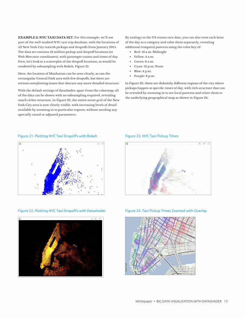
EXAMPLE 2: NYC TAXI DATA SET. For this example, we’ll use
part of the well-studied NYC taxi trip database, with the locations of
all New York City taxicab pickups and dropoffs from January 2015.
The data set contains 12 million pickup and dropoff locations (in
Web Mercator coordinates), with passenger counts and times of day.
First, let’s look at a scatterplot of the dropoff locations, as would be
rendered by subsampling with Bokeh, Figure 21.
Here, the location of Manhattan can be seen clearly, as can the
rectangular Central Park area with few dropoffs, but there are
serious overplotting issues that obscure any more detailed structure.
With the default settings of datashader, apart from the colormap, all
of the data can be shown with no subsampling required, revealing
much richer structure. In Figure 22, the entire street grid of the New
York City area is now clearly visible, with increasing levels of detail
available by zooming in to particular regions, without needing any
specially tuned or adjusted parameters.
By analogy to the US census race data, you can also treat each hour
of the day as a category and color them separately, revealing
additional temporal patterns using the color key of:
• Red: 12 a.m. Midnight
• Yellow: 4 a.m.
• Green: 8 a.m.
• Cyan: 12 p.m. Noon
• Blue: 4 p.m.
• Purple: 8 p.m.
In Figure 23, there are definitely different regions of the city where
pickups happen at specific times of day, with rich structure that can
be revealed by zooming in to see local patterns and relate them to
the underlying geographical map as shown in Figure 24.
Figure 24. Taxi Pickup Times Zoomed with Overlay
14 Whitepaper • BIG DATA VISUALIZATION WITH DATASHADER
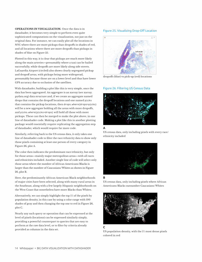
OPERATIONS IN VISUALIZATION. Once the data is in
datashader, it becomes very simple to perform even quite
sophisticated computations on the visualization, not just on the
original data. For instance, we can easily plot all the locations in
NYC where there are more pickups than dropoffs in shades of red,
and all locations where there are more dropoffs than pickups in
shades of blue on Figure 25.
Plotted in this way, it is clear that pickups are much more likely
along the main arteries—presumably where a taxi can be hailed
successfully, while dropoffs are more likely along side streets.
LaGuardia Airport (circled) also shows clearly segregated pickup
and dropoff areas, with pickups being more widespread,
presumably because those are on a lower level and thus have lower
GPS accuracy due to occlusion of the satellites.
With datashader, building a plot like this is very simple, once the
data has been aggregated. An aggregate is an xarray (see xarray.
pydata.org) data structure and, if we create an aggregate named
drops that contains the dropoff locations and one named picks
that contains the pickup locations, then drops.where(drops>picks)
will be a new aggregate holding all the areas with more dropoffs,
and picks.where(picks>drops) will hold all those with more
pickups. These can then be merged to make the plot above, in one
line of datashader code. Making a plot like this in another plotting
package would essentially require replicating the aggregation step
of datashader, which would require far more code.
Similarly, referring back to the US census data, it only takes one
line of datashader code to filter the race/ethnicity data to show only
those pixels containing at least one person of every category in
Figure.26, plot A.
The color then indicates the predominant race/ethnicity, but only
for those areas—mainly major metropolitan areas—with all races
and ethnicities included. Another single line of code will select only
those areas where the number of African Americans/Blacks is
larger than the number of Caucasians/Whites as shown in Figure
26, plot B.
Here, the predominantly African American/Black neighborhoods
of major cities have been selected, along with many rural areas in
the Southeast, along with a few largely Hispanic neighborhoods on
the West Coast that nonetheless have more Blacks than Whites.
Alternatively, we can simply highlight the top 1% of the pixels by
population density, in this case by using a color range with 100
shades of gray and then changing the top one to red in Figure 26,
plot C.
Nearly any such query or operation that can be expressed at the
level of pixels (locations) can be expressed similarly simply,
providing a powerful counterpart to queries that are easy to
perform at the raw data level, or to filter by criteria already
provided as columns in the data set.
Figure 25. Visualizing Drop-Off Location
dropoffs (blue) vs pick-up (red) locations
Figure 26. Filtering US Census Data
US census data, only including pixels with every race/
ethnicity included
A
BUS census data, only including pixels where African
Americans/Blacks outnumber Caucasians/Whites
US population density, with the 1% most dense pixels
colored in red
C
Whitepaper • BIG DATA VISUALIZATION WITH DATASHADER 15
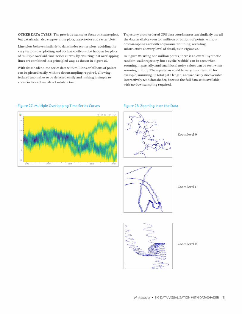
OTHER DATA TYPES. The previous examples focus on scatterplots,
but datashader also supports line plots, trajectories and raster plots.
Line plots behave similarly to datashader scatter plots, avoiding the
very serious overplotting and occlusion effects that happen for plots
of multiple overlaid time-series curves, by ensuring that overlapping
lines are combined in a principled way, as shown in Figure 27.
With datashader, time series data with millions or billions of points
can be plotted easily, with no downsampling required, allowing
isolated anomalies to be detected easily and making it simple to
zoom in to see lower-level substructure.
Trajectory plots (ordered GPS data coordinates) can similarly use all
the data available even for millions or billions of points, without
downsampling and with no parameter tuning, revealing
substructure at every level of detail, as in Figure 28.
In Figure 28, using one million points, there is an overall synthetic
random-walk trajectory, but a cyclic ‘wobble’ can be seen when
zooming in partially, and small local noisy values can be seen when
zooming in fully. These patterns could be very important, if, for
example, summing up total path length, and are easily discoverable
interactively with datashader, because the full data set is available,
with no downsampling required.
Figure 27. Multiple Overlapping Time Series Curves Figure 28. Zooming in on the Data
Zoom level 0
Zoom level 1
Zoom level 2

About Continuum Analytics
Continuum Analytics’ Anaconda is the leading open data science platform powered by Python. We put superpowers into the hands of people who are changing the world. Anaconda is trusted by leading businesses worldwide and across industries – financial services, government, health and life sciences, technology, retail & CPG, oil & gas – to solve the world’s most challenging problems. Anaconda helps data science teams discover, analyze, and collaborate by connecting their curiosity and experience with data. With Anaconda, teams manage open data science environments and harness the power of the latest open source analytic and technology innovations. Visit www.continuum.io.
SummaryIn this paper, we have shown some of the major challenges in
presenting Big Data visualizations, the failures of traditional
approaches to overcome these challenges and how a new approach
surmounts them. This new approach is a three-step process that:
optimizes the display of the data to fit how the human visual system
works, employs statistical sophistication to ensure that data is
transformed and scaled appropriately, encourages exploration of data
with ease of iteration by providing defaults that reveal the data
automatically and allows full customization that lets data scientists
adjust every step of the process between data and visualization.
We have also introduced the datashader library available with
Anaconda, which supports all of this functionality. Datashader uses
Python code to build visualizations and powers the plotting
capabilities of Anaconda Mosaic, which explores, visualizes and
transforms heterogeneous data and lets you make datashader plots
out-of-the-box, without the need for custom coding.
The serious limitations of traditional approaches to visualizing Big
Data are no longer an issue. The datashader library is now available
to usher in a new era of seeing the truth in your data, to help you
make smart, data-driven decisions.