Embed Size (px)
DESCRIPTION
Beyond the Brochure: Honing Your Web Strategy. Donica Mensing Reynolds School of Journalism University of Nevada, Reno Talk given to the American Marketing Association July 2004, Reno, Nevada. Why wouldn’t you put your company brochure on television?. Boring Can’t read much on the screen - PowerPoint PPT Presentation
Citation preview
Beyond the Brochure:Honing Your Web Strategy
Donica MensingReynolds School of Journalism
University of Nevada, RenoTalk given to the American Marketing Association
July 2004, Reno, Nevada
Why wouldn’t you put your company brochure
on television? Boring
Can’t read much on the screen
Pictures are static; no sound
Then why would you put your brochure online?
• It seems easy• It seems fast• It is cheap• You’ll do more later…
But online media can do much more…
• It’s a marketing, sales and service tool all in one
• Facilitates communication between you and your customers
• Provides timely updates• Makes customer service more efficient• Enables personalized service and information• Engages new and repeat customers over time
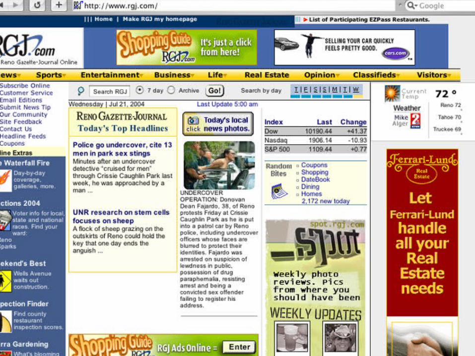
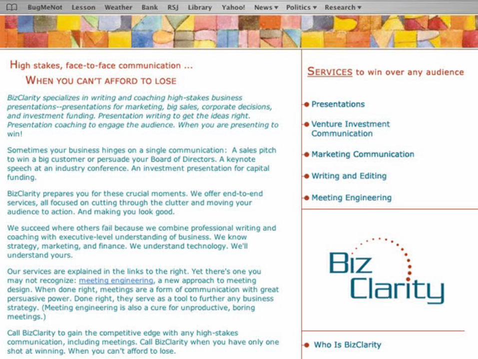
Example 1: The online brochure
• Static• Hard to read• Not Web friendly• Written in marketese
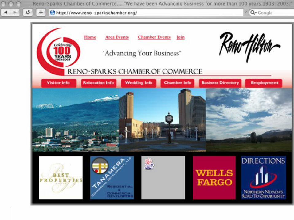
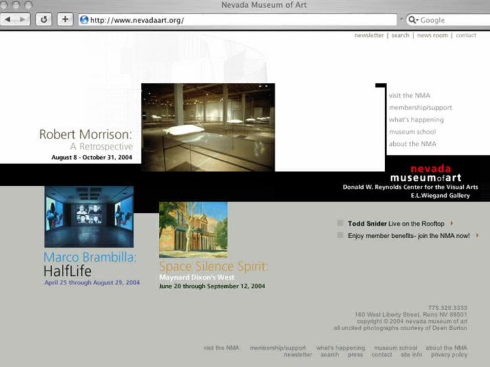
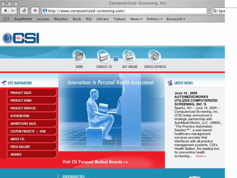
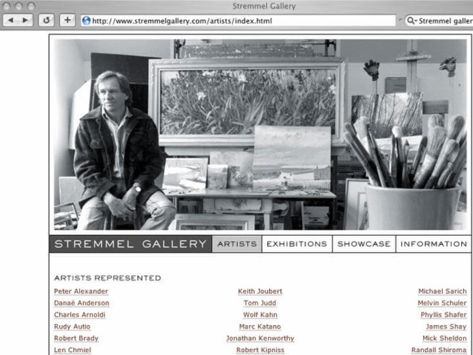
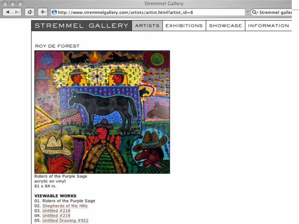
Examples 2 & 3: Interactive Web Sites
• Focused on the purpose of the company
• Specific services are easy to find• Updated frequently• Navigation easy to find and follow• Balanced, colorful layout
Good Web design is focused and purposeful• The Web has infinite space• People do not have infinite time• Be clear and concise • Know what your customer wants and deliver it
quickly
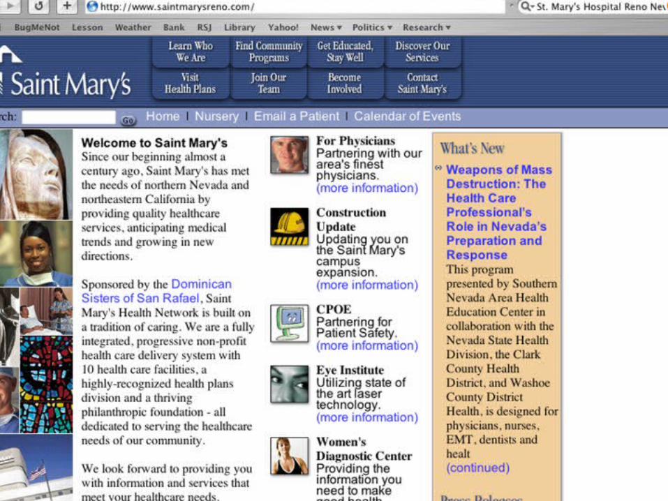
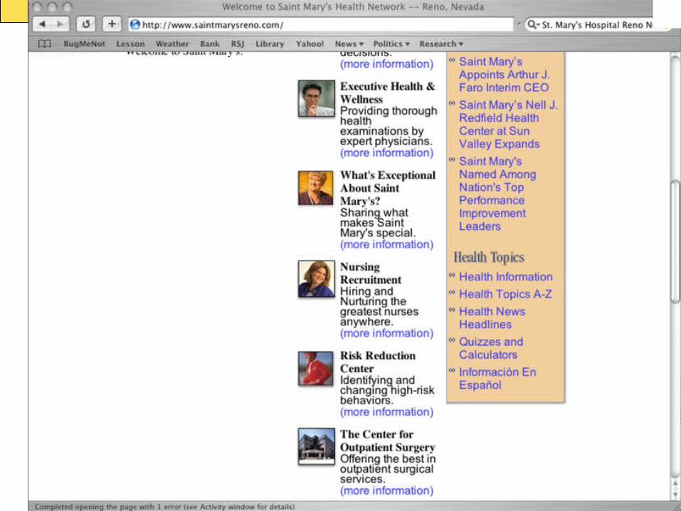
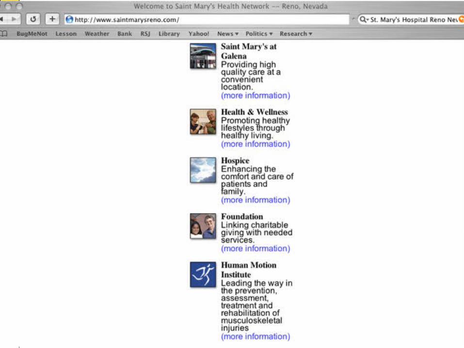
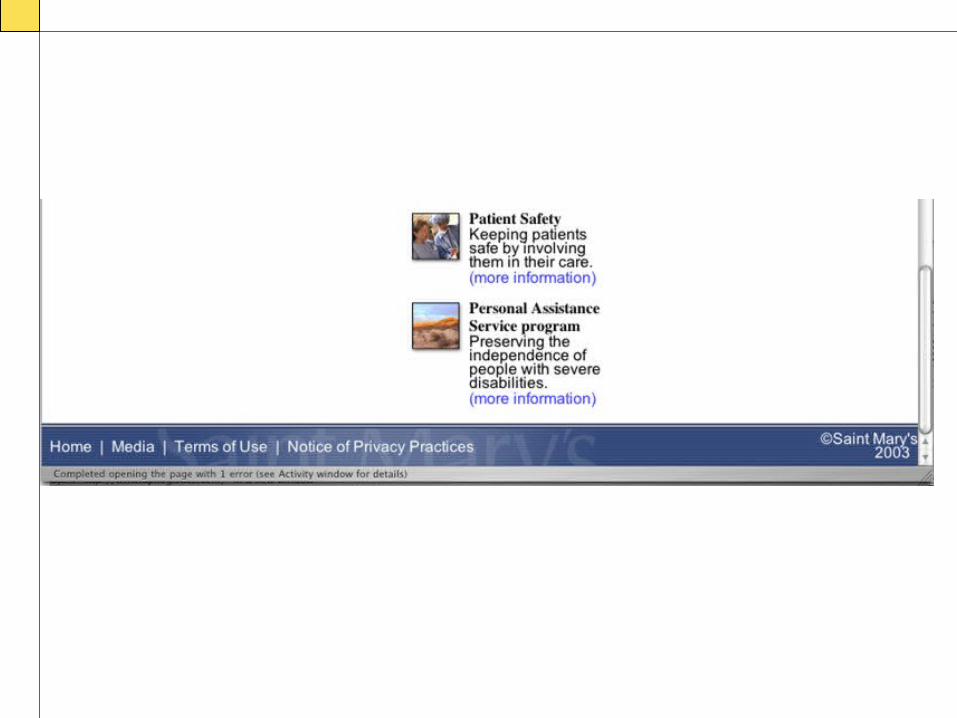
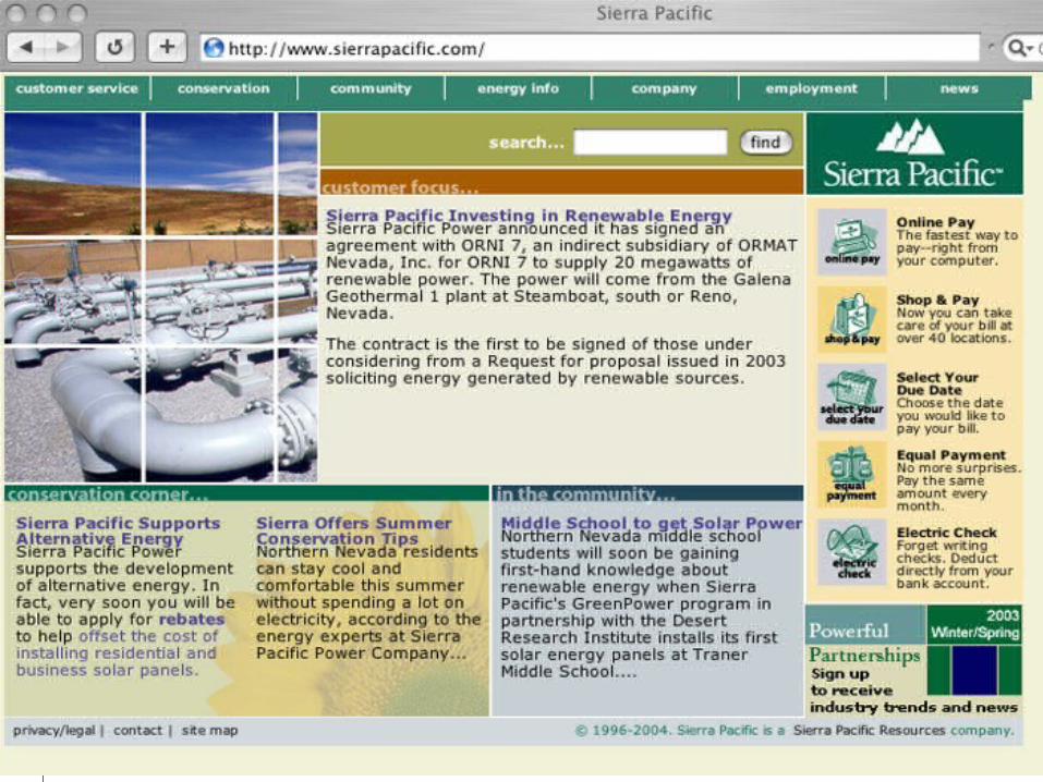
Examples 4 & 5:Two large organizations
• Cluttered, redundant, verbose• Simple, focused, well-
organized
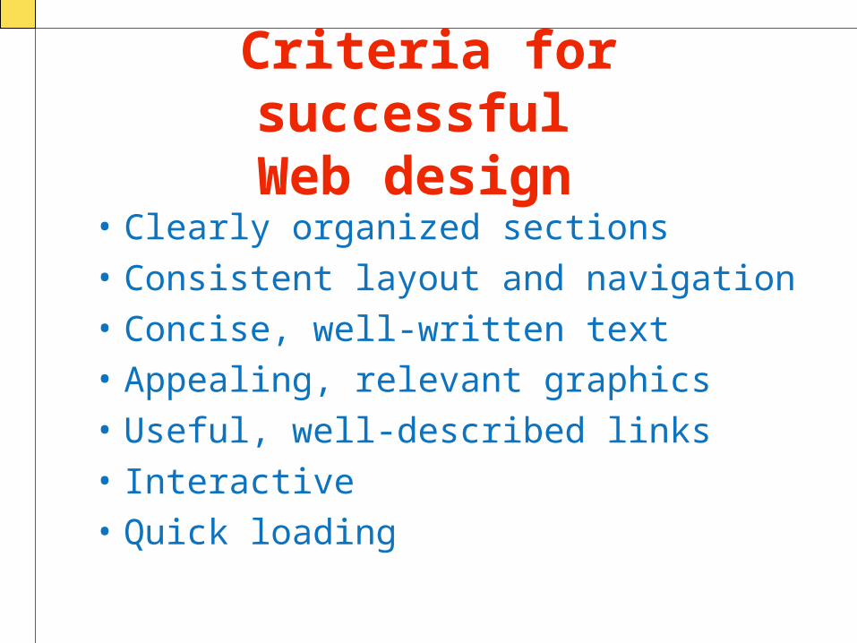
Criteria for successful Web design
• Clearly organized sections• Consistent layout and navigation• Concise, well-written text• Appealing, relevant graphics• Useful, well-described links• Interactive• Quick loading
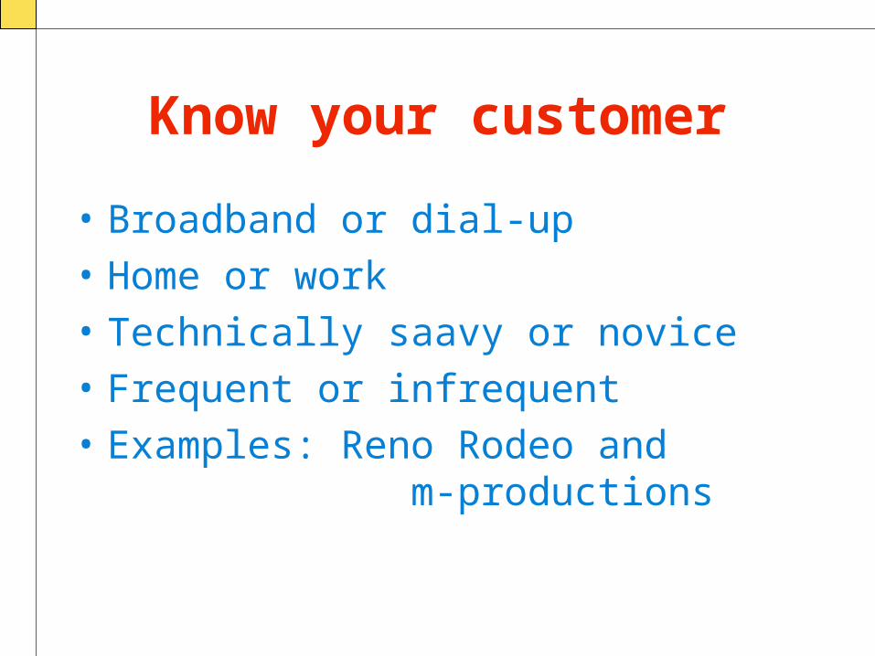
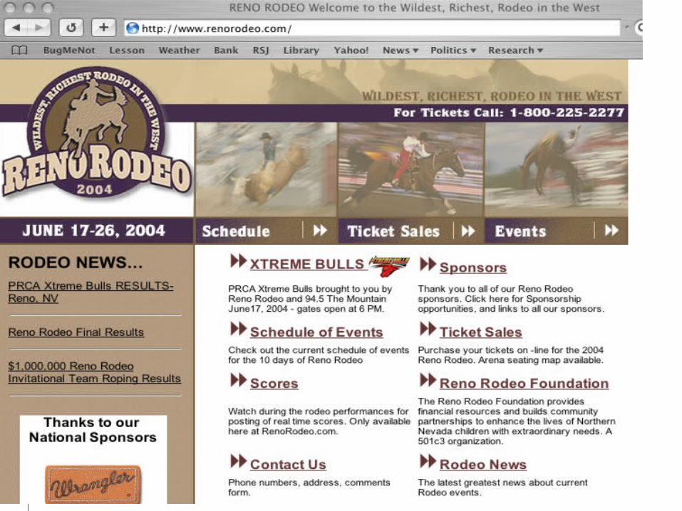
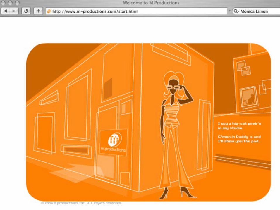
Know your customer
• Broadband or dial-up• Home or work• Technically saavy or novice• Frequent or infrequent• Examples: Reno Rodeo and
m-productions
How do you know if your site is well
designed?• Test it!
If your visitors can’t find the information they want, the
product they want, the page they want
-- quickly -- they will leave. Period.
The Good News
• User testing is effective, even if you only test with five randomly selected customers
For more information see Jakob Nielsen:http://www.useit.com
Components of usability testing
• Learnability: How easy is it for users to accomplish basic tasks the first time they encounter the design?
• Efficiency : Once users have learned the design, how quickly can they perform tasks?
• Memorability : When users return to the design after a period of not using it, how easily can they reestablish proficiency?
• Errors: How many errors do users make, how severe are these errors, and how easily can they recover from the errors?
• Satisfaction: How pleasant is it to use the design?
• Utility: Does it do what users need?
From Jakob Nielsen 's Alertbox, August 25, 2003 Usability 101http://www.useit.com/alertbox/20030825.html
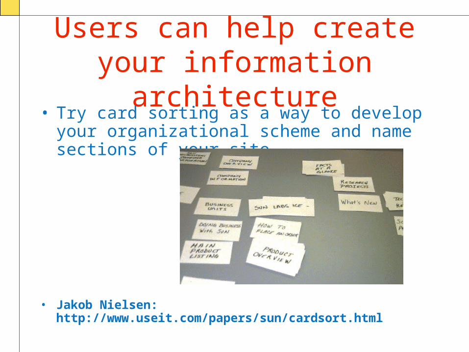
Users can help create your information
architecture• Try card sorting as a way to develop your
organizational scheme and name sections of your site
• Jakob Nielsen: http://www.useit.com/papers/sun/cardsort.html
Finally…
• Start simply• Pay attention to your user logs• Focus on functionality for your
users• Use databases and dynamic
architecture where possible• Keep refining!
More examples…
Reno Gazette-JournalReno-Sparks Chamber of
CommerceNevada Museum of Art