Embed Size (px)
Citation preview
Some tips to make your presentations presentable
Basic Power Point Guidelines
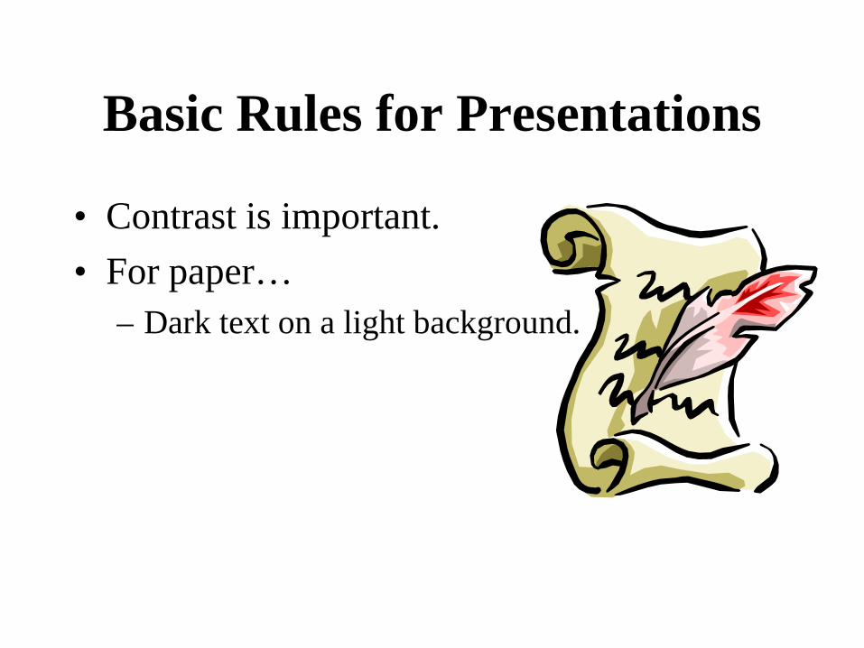
Basic Rules for Presentations
• Contrast is important. • For paper…
– Dark text on a light background.
Basic Rules for Presentations
• For projection… – Light text on a semi-dark
background. – The eye is attracted to the light
on the screen.
Basic Rules for Presentations
• Stick with a single background. – The background is the stage for
your information. – Set the stage and leave it alone!
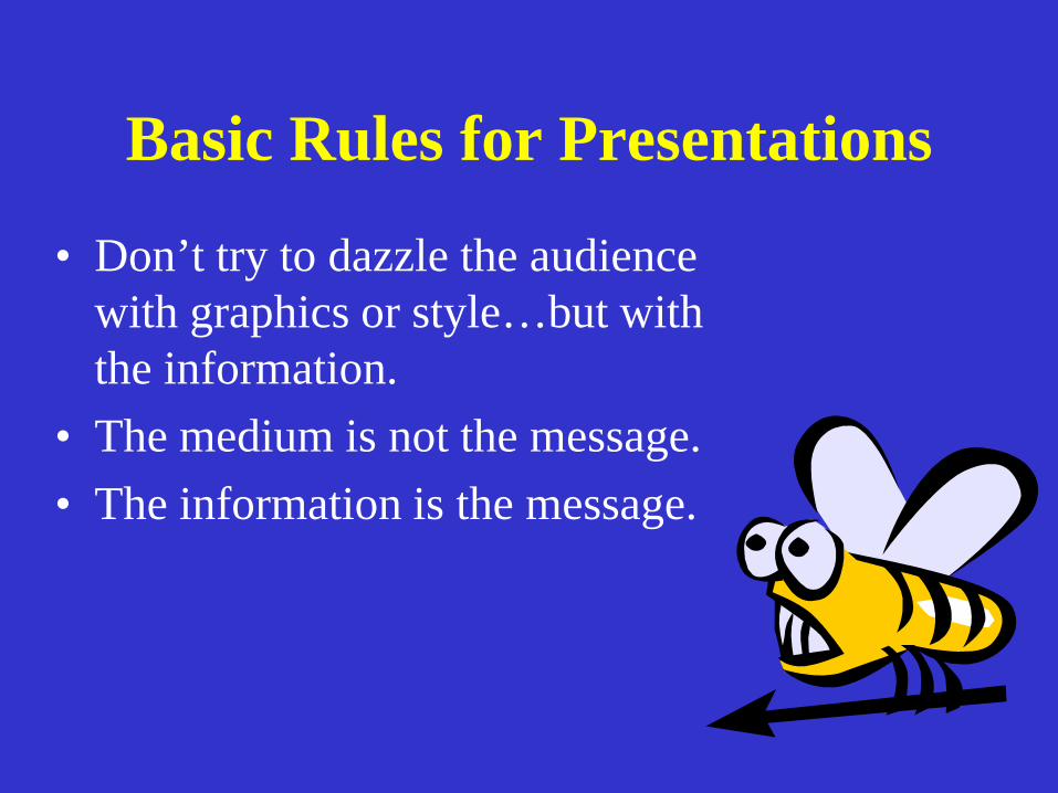
Basic Rules for Presentations
• Don’t try to dazzle the audience with graphics or style…but with the information.
• The medium is not the message. • The information is the message.
Basic Rules for Presentations
Balance.
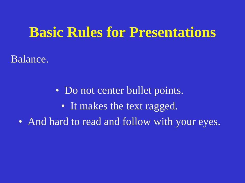
• Do not center bullet points. • It makes the text ragged.
• And hard to read and follow with your eyes.
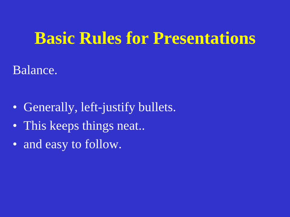
Basic Rules for Presentations
Balance.
• Generally, left-justify bullets. • This keeps things neat.. • and easy to follow.
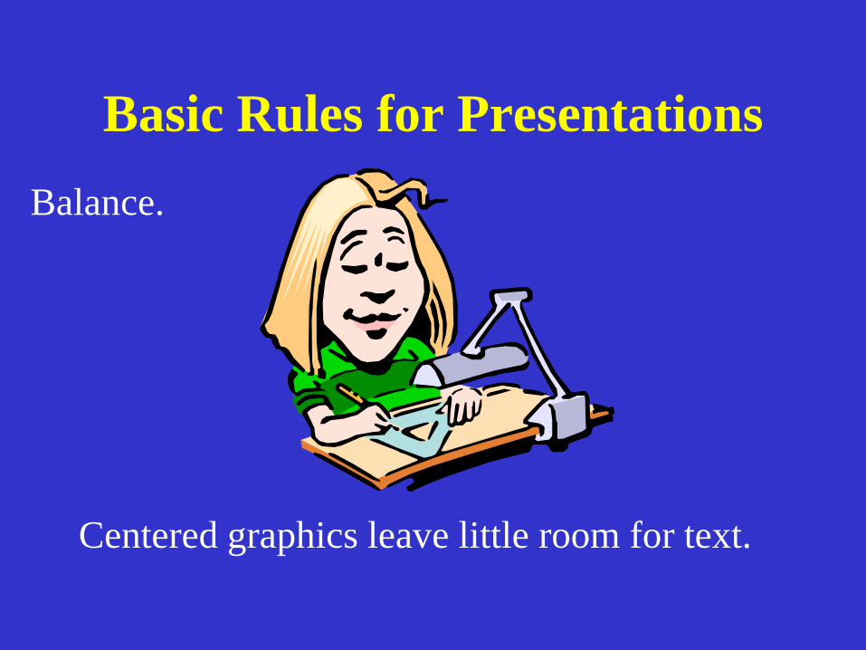
Basic Rules for Presentations Balance.
Centered graphics leave little room for text.
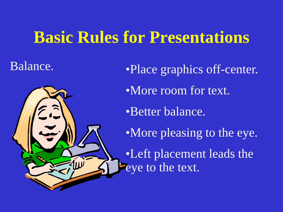
Basic Rules for Presentations Balance.
•Place graphics off-center.
•More room for text.
•Better balance.
•More pleasing to the eye.
•Left placement leads the eye to the text.
Basic Rules- Capitalization •AVOID ALL CAPS – VERY HARD TO READ.
•First Cap - More Formal.
•Harder To Type And More Decisions.
•This is an example of capitalizing the first word.
•Less formal.
•Easier to type and fewer decisions.
Use Restraint With Fonts
• Employ only a few..stick to familiar fonts • Stay away from gimmicky fonts unless for a
theme.
• Keep type sizes consistent. • Serif vs San Serif. • DON’T USE ALL CAPS.
Choose Fonts Wisely
• Italics are more difficult to read. • Use bold when you want some words to
stand out. • Font size
– Easy to read (18 pt)
– Easy to read (24 pt)
– Easy to read (32 pt)
–Easy to read (48 pt)
Avoid Text Overload
Having too much text on the screen can defeat the purpose of using PowerPoint. The slides begin to look like a jumble of text, making slides difficult to read and unrecognizable from each other. People will either try to read everything or copy everything down or they will lose interest. List only the key points. If you have more info to include use more slides or create handouts.
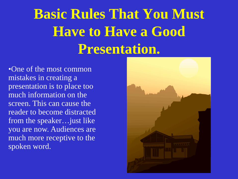
Basic Rules That You Must Have to Have a Good
Presentation. •One of the most common mistakes in creating a presentation is to place too much information on the screen. This can cause the reader to become distracted from the speaker…just like you are now. Audiences are much more receptive to the spoken word.
Basic Presentation Mistakes. •Too much information.
• Reader gets distracted
• Audiences are much more receptive to the spoken word.
Basic Rules Keep it simple.. • Make bulleted points easy to read. • Keep text easy to understand. • Use concise wording. • Bullets are focal points. • Presenter provides elaboration. • Keep font size large.
Basic Power Point Guidelines
• Use builds…don’t give them too much info at once.
• Stick with the same transition. • Be creative but leave some
color choices to professionals. • Six words per line. • Six lines per page.
Choosing a Color Scheme
• Stick with power point defaults. • What may look good on your computer may
be unreadable in the classroom. • Remember to use strong, contrasting colors.
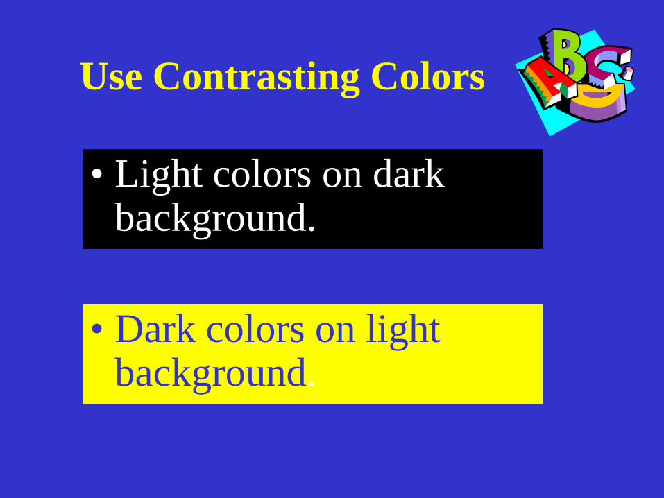
Use Contrasting Colors
• Light colors on dark background.
• Dark colors on light background.
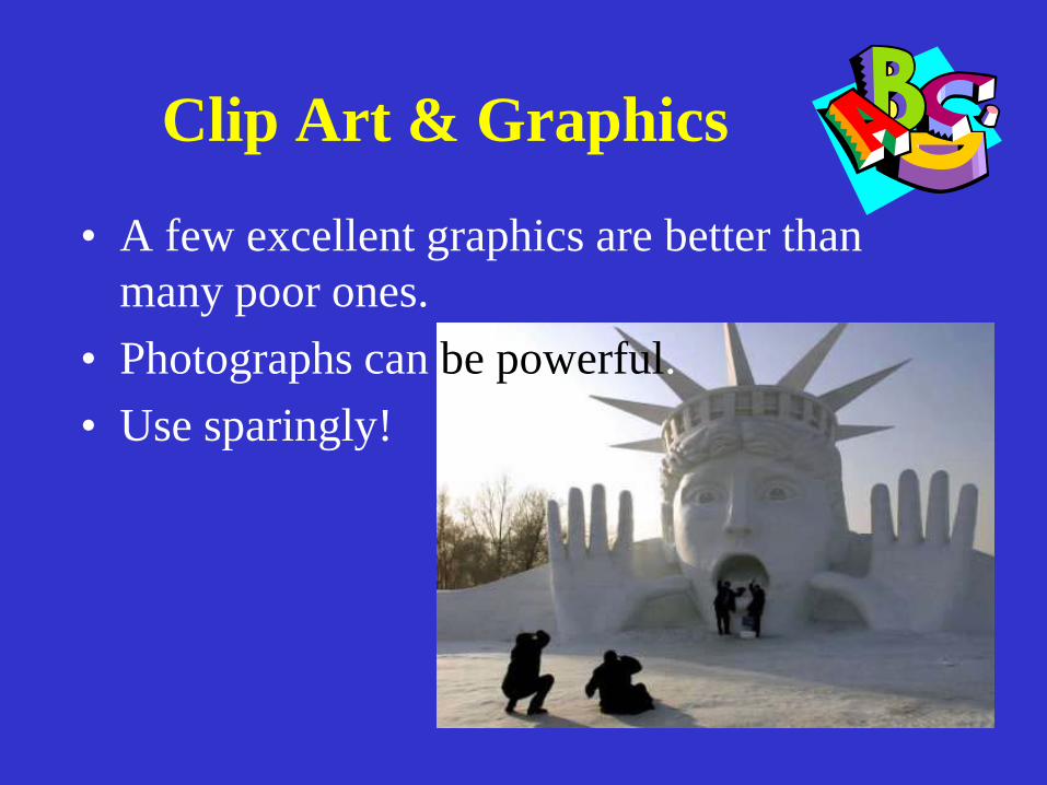
Clip Art & Graphics
• A few excellent graphics are better than many poor ones.
• Photographs can be powerful. • Use sparingly!

•Religious leader •Civil rights activist •Author/poet •Labor activist •Minister •Antiwar activist

Martin Luther King Jr.
•Religious leader
•Civil rights activist
•Author/poet
•Labor activist
•Minister
•Antiwar activist