Embed Size (px)
Citation preview

T Y P O G RA P H I C A LHIERARCHY
Basic Layout Concepts
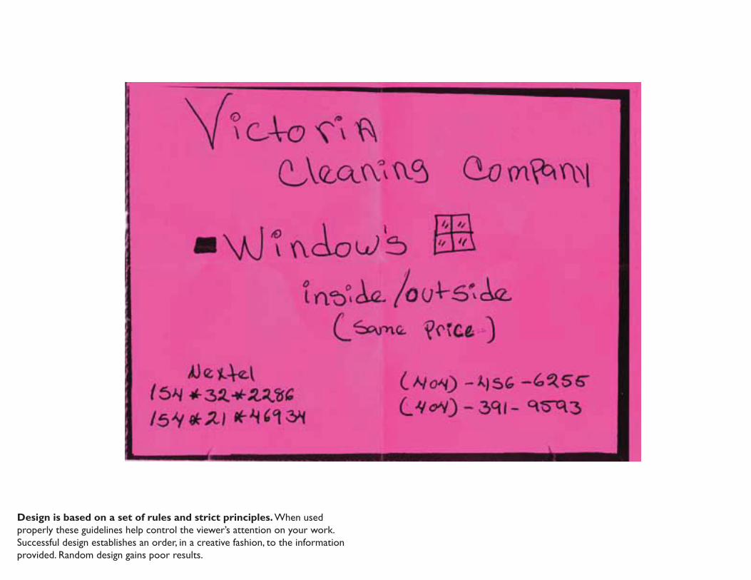
Design is based on a set of rules and strict principles. When used properly these guidelines help control the viewer’s attention on your work.Successful design establishes an order, in a creative fashion, to the information provided. Random design gains poor results.

Achieving successful order to your layout designs requires:
utilizing formal design principles & primary design elements.
4 Basic Design Principles:
Balance
Contrast
Value / Color
Unity
1
2
3
4
Notice David Dabner establishes 8 Design Principles in the textbook. You will fi nd every reference book on this subject rearranges the concept to suit their theories.
Balance controls the information fl ow and enhances the atmosphere of a project.
A conservative product would use a formal sense of balance, with less movement around the dimensions page.
In the top example the negative space balances outthe acrobat’s fi gure, and controls the movement of the viewer to the text below.
Likewise the negative energy balances out the size of the text; both are equal in dimen-sions.
The bottom example showsthe same concept with the two main divisions of the page equally balanced with placement of elements. White space strategically balances the awkward size of the right hand paragraph.

Contrast adds impact to a design. Combining polar opposites on the page surprises the viewer, keeps their attention.
Color conveys mood and emphasis.

Unity is provided when the order of the page and the different elements work together.
In addition unity is provided in the manner your elements are assembled within invisible guidelines or grid. Everything should line up exactly on an etablished grid.
Notice how everything on the quarter page ad connects with the invisible grid. In a promotional series of same-sized ads for the coffeehouse, each would utilize the same grid and same alingment within the dimensions. A page layout system is established.
A page layout system includes:• drafting a grid for the elements used on the page/ad• developing consistency for headlines, subheads, body copy (and if necessary: captions, page numbers, navigation bar)
orem ipsum dolor sit amet, consec-tetuer adipiscing elit. Morbi hendrerit quam sit amet massa. Cras tellus quam, luc-tus in, cursus sit amet, lobortis nec, lorem. Aliquam pharetra. Aliquam erat volutpat. In eu ligula eget odio iaculis ultricies. Proin sagittis mi id massa. Cras vel pede vitae tur-pis vehicula consequat. Cum sociis natoque penatibus et magnis dis parturient montes, nascetur ridiculus. Aliquam pharetra. Ali-quam erat volutpat. Ars longa vita brevis. Cras tellus quam, luctus in, cursus sit amet, lobortis nec, lorem. Aliquam pharetra.
JavahL
108 West Durham, New Orleans. LA 70461 • www.coffeeisking.com

Achieving successful order to your layout requires:
utilizing formal design principles & primary design elements.
4 Basic Design Elements:
Line: controls elements, organizes dimensions
Texture: creates mood; physical paper/printed text
Shape: creates motion, organizes elements
Type: creates mood, displays shape, adds energy
orem ipsum dolor sit amet, consec-tetuer adipiscing elit. Morbi hendrerit quam sit amet massa. Cras tellus quam, luc-tus in, cursus sit amet, lobortis nec, lorem. Aliquam pharetra. Aliquam erat volutpat. In eu ligula eget odio iaculis ultricies. Proin sagittis mi id massa. Cras vel pede vitae tur-pis vehicula consequat. Cum sociis natoque penatibus et magnis dis parturient montes, nascetur ridiculus. Aliquam pharetra. Ali-quam erat volutpat. Ars longa vita brevis. Cras tellus quam, luctus in, cursus sit amet, lobortis nec, lorem. Aliquam pharetra.
JavahL
108 West Durham, New Orleans. LA 70461 • www.coffeeisking.com
1
2
3
4
Images and additional graphics or illustrations could be grouped as an additional Fifth Element.
1
2
3
4
see pages 14–19 in Dabner’s book
see pages 66–73 in Dabner’s book
All letterforms in a heading need not be the same style or family.Utilize only recognizable fonts. (JAV is a font based on a modifi ed Univers.)


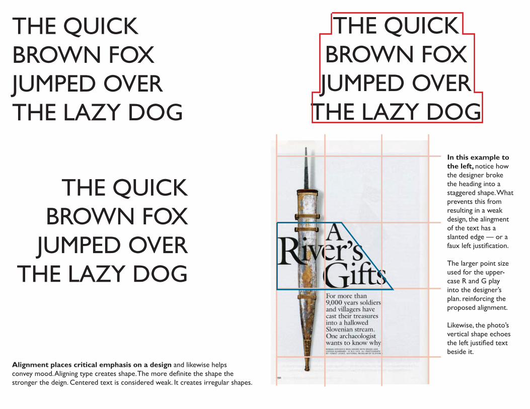
Alignment places critical emphasis on a design and likewise helps convey mood. Aligning type creates shape. The more defi nite the shape the stronger the deign. Centered text is considered weak. It creates irregular shapes.
THE QUICK BROWN FOXJUMPED OVERTHE LAZY DOG
THE QUICKBROWN FOX
JUMPED OVERTHE LAZY DOG
In this example to the left, notice how the designer broke the heading into a staggered shape. What prevents this from resulting in a weak design, the alingment of the text has a slanted edge — or a faux left justifi cation.
The larger point size used for the upper-case R and G play into the designer’s plan. reinforcing the proposed alignment.
Likewise, the photo’s vertical shape echoes the left justifi ed text beside it.
THE QUICKBROWN FOXJUMPED OVER
THE LAZY DOG

Obviously, the eye instinctively jumps to bolder, larger text. Above are examples of a heading utilizing Gill Sans, 36pt and 48pt/leading 43pt. As a designer you choose what will be the emphasis on the page, and where the reader will begin the process of interpreting the work.
THE QUICK BROWN FOXJUMPED OVERTHE LAZY DOG
THE QUICK BROWN FOX
JUMPED OVERTHE LAZY DOG
THE QUICK BROWN FOXJUMPED OVERTHE LAZY DOG
THE QUICK BROWN FOX
JUMPED OVERTHE LAZY DOG

Between these two print material both achieve a sense of typographical hierarchy by placement of text, size of words, contrastiing/complimentary color tones, and subtle backgrounds.
In the case of the Yoga page spread, the letterform “g” has been sized dramatically to attract your attention. Notice also that both designs utilize common, recognizable fonts. They are not using decorative or expressive type fonts.

If you remember this ad from last week, only the headline is established with a sense of dominace to the page. All other sections of the ad remain in the same size and in the same stlye. There is no grid system in place whatsoever.

To sum up:
01. Design is based on a set of rules and strict principles. Random design is weak.
02. Achieving successful order to your layout designs requires: utilizing formal design principles & primary design elements.
03. Four Basic Design Principles: Balance: controls information fl ow, enhances page/ad Contrast: adds impact to design, surprises viewer Value / Color: coneys mood and emphasis Unity: provides order to page; assembles elements in hierarchy
04. Page layout system includes: grid, consistency with all elements
05. Four Basic Design Elements: Line: controls elements, organizes dimensions Texture: creates mood; physical paper/printed text Shape: creates motion, organizes elements Type: creates mood, displays shape, adds energy
06. Type Hierarchy Guidelines: • alignment places critical emphasis on a design or headline • bolder, larger text helps control viewer’s eye • individual letterforms can be generated at larger sizes or can be an unique font itself • it is preferred for you to utilize recognizable fonts • aligned type creates a shape • text that is centered has a weak shape
• uppercase letters are harder to read, slowing reading speed; never use capitals in long pieces of copy • experiment with kerning; kerned type has a more defi ned shape • control leading, tighter leading adds emphasis • DO NOT STACK TYPE • do not mix more than two or three typefaces together • use one typeface family in various weights • do not mix serifs with serifs; do not mix sans-serifs with sans-serifs