Embed Size (px)
Citation preview
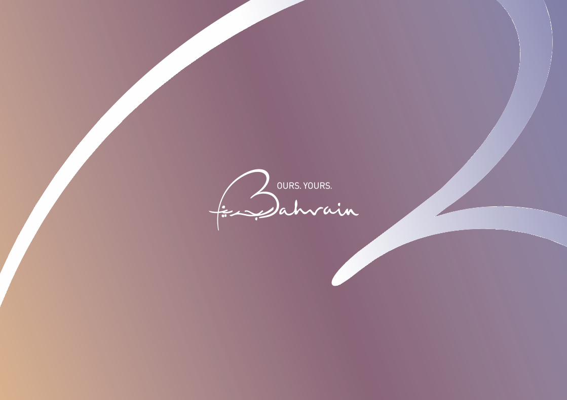
1
Bahrain Country Brand Guidelines
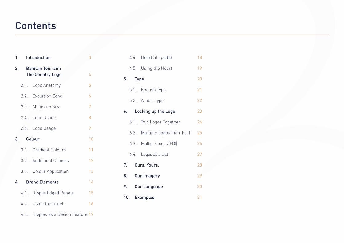
Contents
1. Introduction 3
2. Bahrain Tourism: The Country Logo 4
2.1. Logo Anatomy 5
2.2. Exclusion Zone 6
2.3. Minimum Size 7
2.4. Logo Usage 8
2.5. Logo Usage 9
3. Colour 10
3.1. Gradient Colours 11
3.2. Additional Colours 12
3.3. Colour Application 13
4. Brand Elements 14
4.1. Ripple-Edged Panels 15
4.2. Using the panels 16
4.3. Ripples as a Design Feature 17
4.4. Heart Shaped B 18
4.5. Using the Heart 19
5. Type 20
5.1. English Type 21
5.2. Arabic Type 22
6. Locking up the Logo 23
6.1. Two Logos Together 24
6.2. Multiple Logos (non-FDI) 25
6.3. Multiple Logos (FDI) 26
6.4. Logos as a List 27
7. Ours. Yours. 28
8. Our Imagery 29
9. Our Language 30
10. Examples 31
3
1. Introduction
Our brand identity is an expression of who we
are and what we stand for. It gives a distinctive
voice to all our communications.
This document has been created to help you
understand the Bahrain brand. It provides the
framework of what the brand should look like.
The brand identity has been created with careful
consideration. It is important that it is clearly
understood and consistently applied by users
across all communications.
On the following pages this document will
explain the different elements that make up
Bahrain’s brand identity; what they are, how they
fit together and how to maintain consistency
across everything that is produced.
It is recommended that these guidelines are
read through entirely from start to finish,
before any specific points are referenced.

4
2. Bahrain Tourism: The Country Logo
The Bahrain Country logo has been developed to
convey a number of points.
Its soft, cursive style is friendly, warm, and
above all, welcoming.
There are two versions of the logo, one with an
Arabic strapline, the other in English. The word
Bahrain appears in both languages in each
version. This helps convey the sense of inclusion
and accessibility that is inherent in the country
and therefore the brand.
The full colour version of the logo takes its
tone from a pearl in a subtle nod to the
country’s history.
The large B, reminiscent of a heart shape,
further reinforces the warmth and friendliness
to be found in the country.
Primary Logos
Secondary Logos
Where possible the gradient logo should always be used.
When required, single tone versions of the logo are permitted.
Fawn Teal
Black Dark Blue
White out of Black

5
2.1. Logo Anatomy
Although appearing as a single unified element,
the Bahrain Country logo consists of a number
of different components.
These should never be separated unless
specifically authorised within this document.
• The large B is reminiscent of a heart shape,
and also forms the first letter of the word
Bahrain in both Arabic and English.
• The cursive script is read in two different
directions away from the heart shaped B.
One forms the word Bahrain in Arabic,
the other in English.
• The strapline, shown here in English,
can also appear in Arabic.
Heart Shaped B
Cursive Script, English
Cursive Script, Arabic
Strapline
6
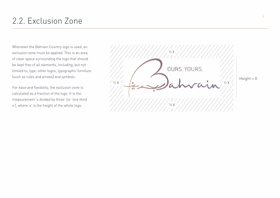
2.2. Exclusion Zone
Whenever the Bahrain Country logo is used, an
exclusion zone must be applied. This is an area
of clear space surrounding the logo that should
be kept free of all elements, including, but not
limited to, type, other logos, typographic furniture
(such as rules and arrows) and symbols.
For ease and flexibility, the exclusion zone is
calculated as a fraction of the logo. It is the
measurement ‘x divided by three’ (or ‘one third
x’), where ‘x’ is the height of the whole logo.
Height = X
7
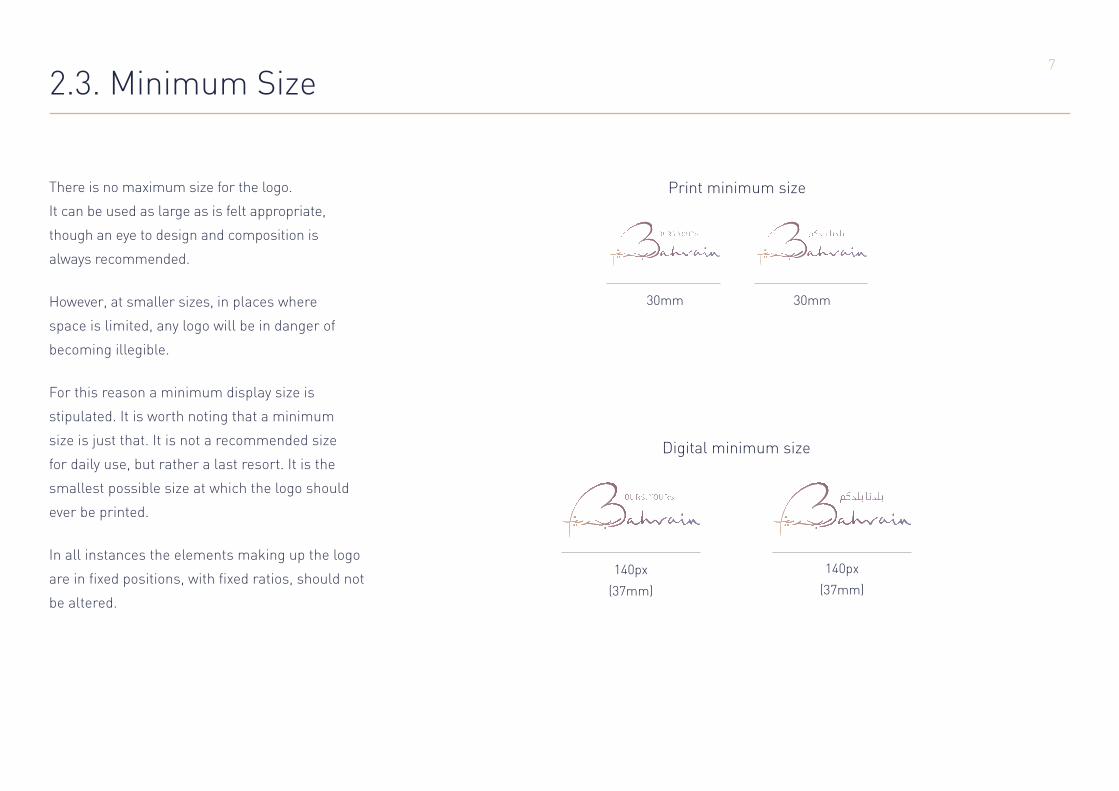
2.3. Minimum Size
30mm 30mm
There is no maximum size for the logo.
It can be used as large as is felt appropriate,
though an eye to design and composition is
always recommended.
However, at smaller sizes, in places where
space is limited, any logo will be in danger of
becoming illegible.
For this reason a minimum display size is
stipulated. It is worth noting that a minimum
size is just that. It is not a recommended size
for daily use, but rather a last resort. It is the
smallest possible size at which the logo should
ever be printed.
In all instances the elements making up the logo
are in fixed positions, with fixed ratios, should not
be altered.
Print minimum size
Digital minimum size
140px 140px
(37mm) (37mm)

8
2.4. Logo Usage
The Bahrain Country logo should appear in as
consistent a manner as possible.
It is understood that the differing nature of
communication material will require some
flexibility in the use of the logo. This document
explains what is permissible without diluting
the brand identity.
However, some uses are not allowed.
These rules apply to both the English and Arabic
versions of the logo.
Do not recolour the logo with unauthorised colours.
Do not move the components around, or distort the logo from its original composition.
Do not stretch the logoor distort it.
Do not apply drop shadows or other effects that will alter the appearance of the logo.
Do not shear or rotate the logo,or distort it.
Be careful not to use the logo on backgrounds that interfere with or
obstruct its display.
9
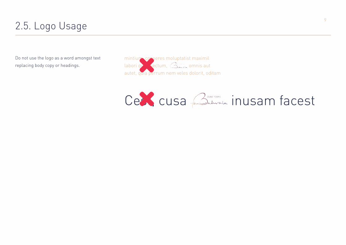
2.5. Logo Usage
mintium, conseres moluptatist maximil labori quae sectum, omnis aut autet, quia perrum nem veles dolorit, oditam
Do not use the logo as a word amongst text
replacing body copy or headings.
Cest, cusa inusam facest

10
3. Colour
Colour plays an important part in
visual communications.
In the case of Bahrain, colours have been
chosen to reinforce the feeling of Bahrain
being warm and welcoming, a fun,
exciting and rewarding country to visit.
The colours are reminiscent of the hues of a
pearl in recognition of Bahrain’s history.

11
3.1. Gradient Colours
Gradient
+20°
C 13
M 30
Y 46
K 0
Pantone 727c
R 221
G 179
B 141
C 51
M 74
Y 33
K 11
Pantone 5135c
R 130
G 84
B 117
C 56
M 50
Y 13
K 0
Pantone 7675c
R 126
G 127
B 171
Tints Tints Tints
Gradient should always be used at a +20 degree angle
Fawn Plum Iris
12
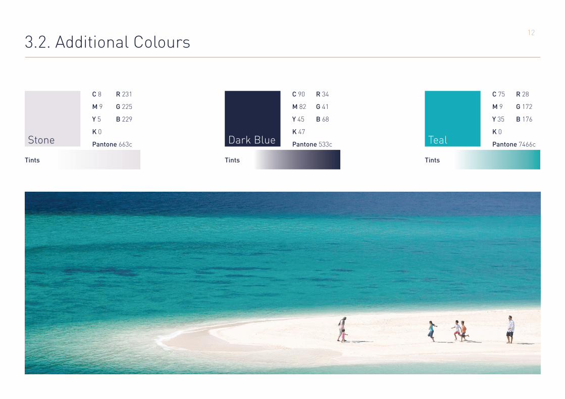
3.2. Additional Colours
C 8
M 9
Y 5
K 0
Pantone 663c
R 231
G 225
B 229
C 90
M 82
Y 45
K 47
Pantone 533c
R 34
G 41
B 68
C 75
M 9
Y 35
K 0
Pantone 7466c
R 28
G 172
B 176
Tints Tints Tints
Stone Dark Blue Teal

13
3.3. Colour Application
The brand colours work best when used in
the following permitted combinations.
White on Fawn Dark Blue on Fawn White on Teal Dark Blue on Teal
Gradient on Stone Dark Blue on Stone Dark Blue on White Gradient on White
Gradient on Dark Blue Fawn on Dark Blue White on Gradient Dark Blue on Gradient
Stone on Dark Blue White on Dark Blue

14
4. Brand Elements
A brand indentity is not simply a logo.
Although the logo is one of its most
recognisable visual features, there are
often elements that work to build effective
and consistent visual communications.
For the Bahrain Country brand the most
important are the ripple-edged coloured
panels, the heart-shaped B and the font.

15
4.1. Ripple-Edged Panels
Panels of flat colour are an important element in
most brands, as it is impractical to assume that
text and logos can be easily legible when placed
over every photograph.
For The Bahrain Country brand, panels
have been developed to have their own
unique visual style.
The ripples along the edges are inspired by
the flag of Bahrain and the fact that the
country is positioned between two seas.
The panels must use colours from the primary
and secondary palette (see section 3.1 Primary
Colours and section 3.2 Secondary Colours) with
elements placed within them taking their colour
from the chart of prescribed combinations in
section 3.3 Colour Application.
Panels should never have less than six full
ripples, plus two half ripples.

16
4.2. Using the Panels
When using the English logo on a panel,
the ripples should always be on the left
hand side.
When using the Arabic logo the ripples
should always be on the right.
Our depthsYour delight
تاريخنا. مغامرتكم.

17
4.3. The ripples as a design feature
The ripple-edge can also be used as a
design element on images and text boxes.
تنوع أسواقنامتعتكم
البحرين غنية بالمجمعات التجارية العصرية الفخمة التي تحفل بأفضل الماركات العالمية من األزياء واإلكسسوارات واألجهزة، لكن زيارة سوق المنامة القديم تجربة غنية بحد ذاتها. في هذا
المعلم التاريخي ستجدون مئات المتاجر الصغيرة التي تزهو بأقمشة محلية وسجاد يدوي الصنع، باإلضافة إلى مجوهرات
مشغولة بالذهب ومرصعة بالآللئ البحرينية الفريدة.

18
4.4. Heart Shaped B
The heart shaped B is the only element from the
logo that it is permissible to isolate on its own.
It can be used to add visual interest
as a reminder of the brand when it is
not prudent to use the full logo.

19
4.5. Using the Heart
The heart shaped B can be a subtle branding
device or a bold primary statement when
no other is evident.
The B can be cropped at the edges, but should
always be recognisable.
Kingdom of BahrainMinistry of Industry & CommerceTourism Sector
Lorrum untibus aut lis erspe vercid quias rae
con pereicipita con preptat.
Ratur rae sincient ut liquo berion nis reribus
unto te eliquis et qui ommolore serioriosa
sinient oribearum ulluptae conse cum
doluptaspis volupid ma inciendent pa cor
remque etur adion core
Letterheads Surrounding copy in documents
As part of a backgroundOn it’s own

20
5. Type
The Bahrain Country brand typeface
family is DIN, a modern and versatile sans
serif typeface.
It should be used across all materials including
annual reports, leaflets and advertising.
Use DIN for Western applications and DIN Next
for Arabic applications.

21
5.1. English Type
Aa Bb Cc Dd Ee Ff Gg Hh Ii Jj Kk Ll Mm Nn Oo Pp Qq Rr Ss Tt Uu Vv Ww Xx Yy ZzAa Bb Cc Dd Ee Ff Gg Hh Ii Jj Kk Ll Mm Nn Oo Pp Qq Rr Ss Tt Uu Vv Ww Xx Yy Zz
Aa Bb Cc Dd Ee Ff Gg Hh Ii Jj Kk Ll Mm Nn Oo Pp Qq Rr Ss Tt Uu Vv Ww Xx Yy Zz
Aa Bb Cc Dd Ee Ff Gg Hh Ii Jj Kk Ll Mm Nn Oo Pp Qq Rr Ss Tt Uu Vv Ww Xx Yy Zz
DIN
DIN Medium (Headings)
DIN Light (Body Copy)
DIN Bold
DIN Black

22
5.2. Arabic Type
ا ب ت ث ج ح خ د ذ ر ز س ش ص ض ط ظ ع غ ف ق ك ل م ن
ه و ي
ا ب ت ث ج ح خ د ذ ر ز س ش ص ض ط ظ ع غ ف ق ك ل م ن ه و ي
DIN Next
DIN Next Medium (Headings)
DIN Next Light (Body Copy)

23
6. Locking up the Logo
The rules to follow when using the Bahrain
Country Logo vary by circumstance. Four
different principles are described on the
following pages.

24
6.1. Locking up the Logo: Two Logos Together
This is the most straightforward use of the
Bahrain Country Logo. It should always feature
after the other logo with which it is appearing.
It should never be smaller, and ideally it would
be in proportion to the other logo, to create a
balanced lock up.
When the partner logo is to appear before the English Bahrain logo.
When the partner logo is to appear before the Arabic Bahrain logo.
For use in English, reading left to right.
For use in Arabic, reading right to left.
25
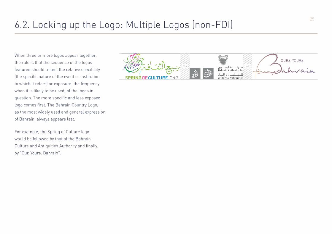
6.2. Locking up the Logo: Multiple Logos (non-FDI)
When three or more logos appear together,
the rule is that the sequence of the logos
featured should reflect the relative specificity
(the specific nature of the event or institution
to which it refers) or exposure (the frequency
when it is likely to be used) of the logos in
question. The more specific and less exposed
logo comes first. The Bahrain Country Logo,
as the most widely used and general expression
of Bahrain, always appears last.
For example, the Spring of Culture logo
would be followed by that of the Bahrain
Culture and Antiquities Authority and finally,
by “Our. Yours. Bahrain”.
26
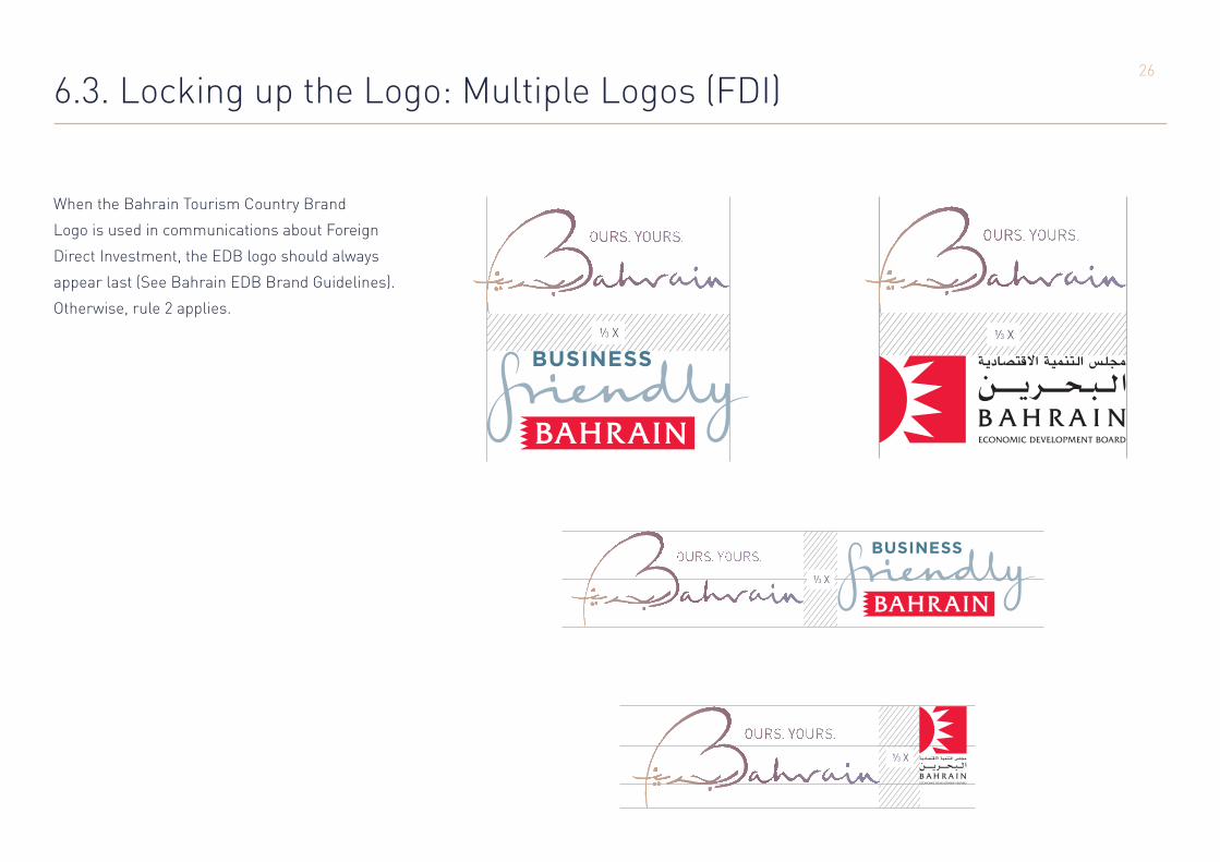
6.3. Locking up the Logo: Multiple Logos (FDI)
When the Bahrain Tourism Country Brand
Logo is used in communications about Foreign
Direct Investment, the EDB logo should always
appear last (See Bahrain EDB Brand Guidelines).
Otherwise, rule 2 applies.
27
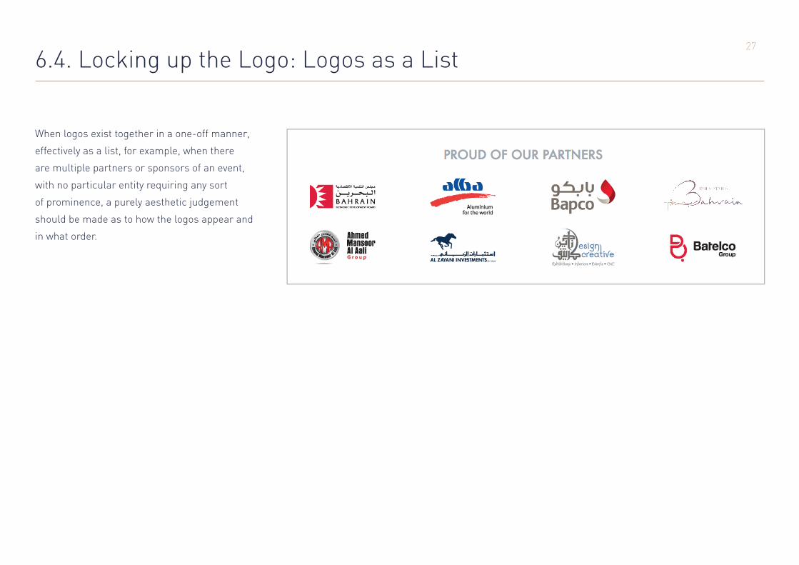
6.4. Locking up the Logo: Logos as a List
When logos exist together in a one-off manner,
effectively as a list, for example, when there
are multiple partners or sponsors of an event,
with no particular entity requiring any sort
of prominence, a purely aesthetic judgement
should be made as to how the logos appear and
in what order.

28
7. Ours. Yours.
Generosity. Openness. Sharing. These qualities
are implicit in Ours. Yours. Bahrain.
The statement contains an essential truth:
for 4,000 years of history, Bahrainis
have welcomed visitors with open
doors and open hearts.
“Ours. Yours.” encapsulates Bahrain
in two simple words. It is an idea that
begins to establish a rapport with our
guests before they have even arrived.
It gives us a stage upon which to present our
offering: a rich history, a vibrant culture,
attractions, food and above all, ourselves. It is
the profound personal connections we make
with our visitors that set Bahrain apart.
Our raceYour rush
Our depthsYour delight

29
8. Our Imagery
“Ours. Yours.” has people at its heart, and the
imagery we use to bring the concept to life
should reflect this. Photography should be
natural, colourful and vibrant, reflecting the
qualities of Bahrainis. A slice-of-life display
of Bahrain, as both Bahrainis and our guests
enjoy it.
With these aims in mind, people should
feature in our photography wherever
possible and plausible.
Pictures, better than words, communicate the
humanity of Bahrain. We should aim to make
all of our assets – websites, social media,
brochures, media releases, exhibition materials
and so on – rich with this imagery.
30
9. Our Language
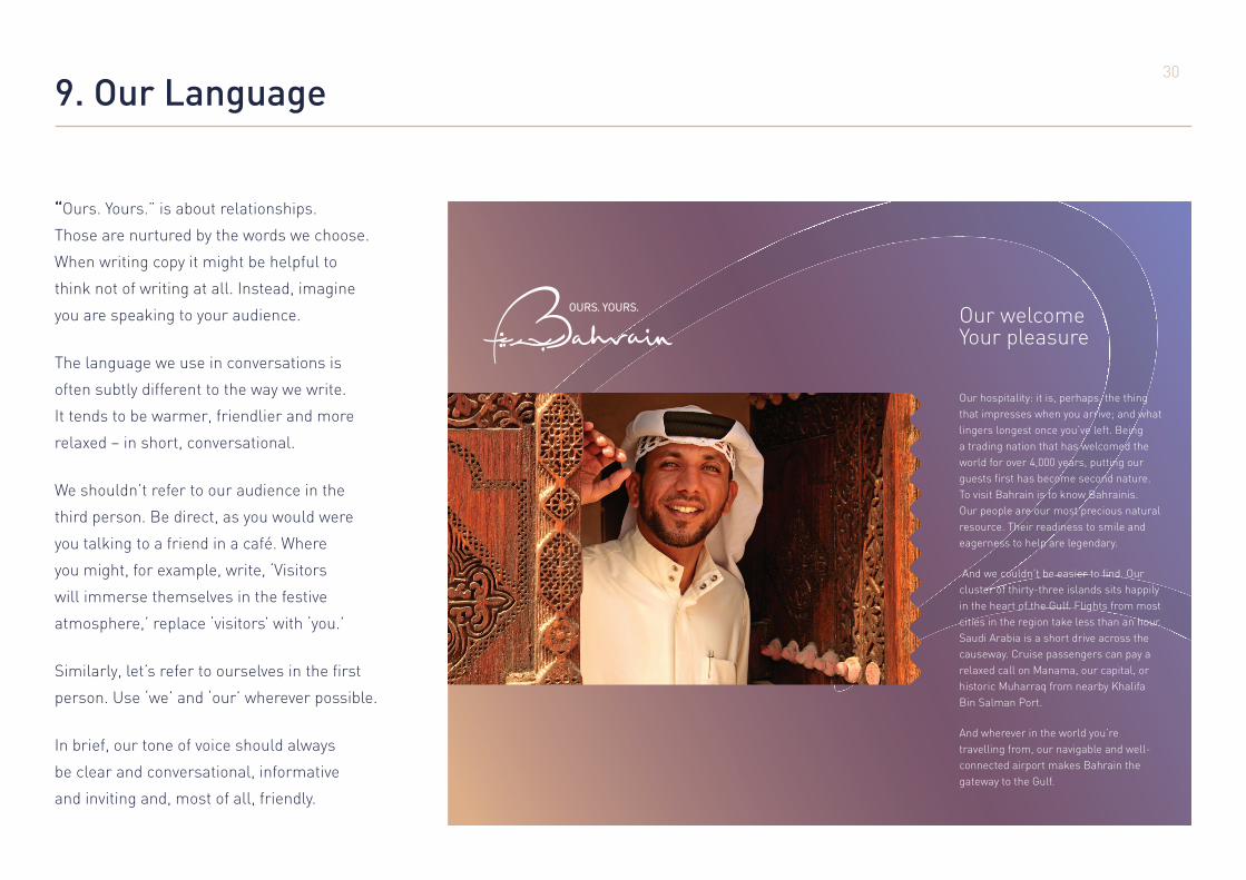
“Ours. Yours.” is about relationships.
Those are nurtured by the words we choose.
When writing copy it might be helpful to
think not of writing at all. Instead, imagine
you are speaking to your audience.
The language we use in conversations is
often subtly different to the way we write.
It tends to be warmer, friendlier and more
relaxed – in short, conversational.
We shouldn’t refer to our audience in the
third person. Be direct, as you would were
you talking to a friend in a café. Where
you might, for example, write, ‘Visitors
will immerse themselves in the festive
atmosphere,’ replace ‘visitors’ with ‘you.’
Similarly, let’s refer to ourselves in the first
person. Use ‘we’ and ‘our’ wherever possible.
In brief, our tone of voice should always
be clear and conversational, informative
and inviting and, most of all, friendly.
Our welcomeYour pleasure
Our hospitality: it is, perhaps, the thing that impresses when you arrive; and what lingers longest once you’ve left. Being a trading nation that has welcomed the world for over 4,000 years, putting our guests first has become second nature. To visit Bahrain is to know Bahrainis. Our people are our most precious natural resource. Their readiness to smile and eagerness to help are legendary.
And we couldn’t be easier to find. Our cluster of thirty-three islands sits happily in the heart of the Gulf. Flights from most cities in the region take less than an hour. Saudi Arabia is a short drive across the causeway. Cruise passengers can pay a relaxed call on Manama, our capital, or historic Muharraq from nearby Khalifa Bin Salman Port.
And wherever in the world you’re travelling from, our navigable and well-connected airport makes Bahrain the gateway to the Gulf.
31
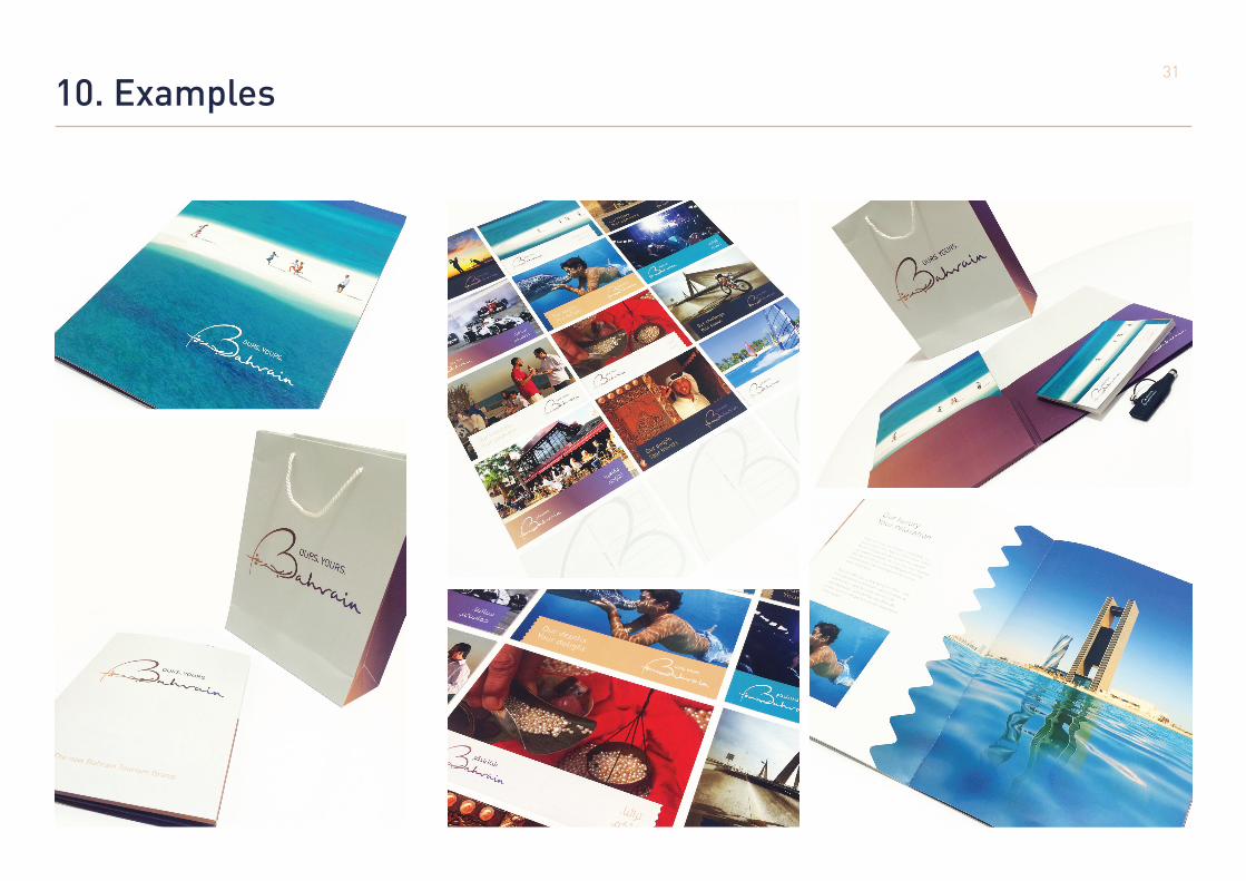
10. Examples

3232
33