Embed Size (px)
Citation preview
Atlas of
Socioeconomic Deprivationin New Zealand NZDep2006
Public Health Intelligence Occasional Bulletin No. 50
Citation: White P, Gunston J, Salmond C, Atkinson J, Crampton P. 2008.
Atlas of Socioeconomic Deprivation in New Zealand NZDep2006.
Wellington: Ministry of Health.
Published in June 2008 by the Ministry of Health
PO Box 5013, Wellington, New Zealand
ISBN: 978-0-478-31763-3 (print)
ISBN: 978-0-478-31764-0 (online)
HP 4590
This document is available on the Ministry of Health website:
http://www.moh.govt.nz
–
Foreword
Reducing inequalities in health is central to New Zealand’s health strategy. The
New Zealand Deprivation Index 2006 (NZDep2006) is essential for measuring
socioeconomic differences in population health. This atlas will make the
NZDep2006 index more accessible by presenting the index as a series of maps.
Mapping is a powerful communication tool that enables people to make sense of
data by revealing otherwise hidden patterns and trends in the spatial distribution
of the underlying data. The atlas therefore serves as a geographical user interface
allowing us to explore the diverse landscape of NZDep2006.
The 21 District Health Boards (DHBs) are at the centre of the delivery of health care
in New Zealand, and NZDep is a critical tool in their funding and planning decision
making. For example, the index is used extensively for monitoring inequalities
across a range of health indicators, including hospitalisations, morbidity and
mortality, and for needs-adjusted capitation funding.
Like its predecessors, the atlas NZDep2006 atlas will appeal to many different
users and organisations. However, for the first time, the atlas is explicitly based on
the DHB and Territorial Authority (TA) structure. The 73 TAs are included because,
increasingly, DHBs are considering wider environmental and social factors as
key determinants in the health and disability landscape. The inclusion of the
TA boundaries allows the pattern of deprivation within and between TAs to be
compared to the patterns within and between DHBs. Another first for the atlas is
the inclusion of a CD containing the index and ready-to-use NZDep2006 maps that
will improve the index’s accessibility and boost its usability.
We hope the atlas and the data CD will be useful to you, and serve to stimulate
practical research that is targeted towards the goals of improving population health
and reducing health inequalities.
Deborah Roche
Deputy Director-General
Health and Disability Systems Strategy Directorate
Ministry of Health
Atlas of Socioeconomic Deprivation in New Zealand NZDep2006 | iii

iv | Atlas of Socioeconomic Deprivation in New Zealand NZDep2006
Contents
Foreword iii Visualising the population distribution across New Zealand 14
The Authors vii NZDep2006 thematic map design 15
Acknowledgements viii Map layouts in the atlas 16
Overview 1 NZDep2006 data CD 16 Purpose of this atlas 1
Using NZDep2006 with GIS 16 Content of this atlas 1
Reading the maps: Analytical errors inherent Background to this atlas 1 to mapping 17
Construction of the New Zealand Index Where to next with mapping NZDep? 19 of Deprivation 2006 2
Cautions 20Audience for the atlas 2 The indicator becomes the reality (reification) 20
Visualising NZDep 2 Apparent simplicity 20
Socioeconomic Deprivation 5 Ethical Issues 21
Area Measures of Deprivation 7
Measures of material and social deprivation 7
Associations between socioeconomic deprivation and outcomes 7
Weaknesses of area measures of deprivation 7
Summary 8
NZDep2006 Index of Deprivation 9
Ethical interpretation of maps: pseudo-scientific verity and objectivity 21
Risk of harming communities by portraying them as ‘deprived’ 21
Justification for creating the deprivation indexes and maps 22
Deprivation and ethnicity 22
Description of the index 9 Longitudinal Analyses and Comparisons of Deprivation Profiles, 1991–2006 24Variables used to construct the index 9
Introduction 24 Calculating NZDep 9
Comparing areas over time 24 Validation of NZDep, does it measure small area deprivation? 11 Comparing relationships with
deprivation over time 27 Use of the index in local government planning 11
The Maps 29 Interpretation of NZDep2006 12
Average Deprivation Scores for Social Variation within New Zealand Census Area Units 187 Communities 13
References 201 Mapping NZDep2006 14
Why map NZDep2006? 14
Who is the NZDep2006 atlas for? 14
Atlas of Socioeconomic Deprivation in New Zealand NZDep2006 | v

List of Tables List of Figures
Figure 1: New Zealand Index of Deprivation 2006 Table 1: Description of nine deprivation variables, in
(NZDep2006) profile of New Zealand ........................... 3 decreasing importance, used to construct the New
Zealand Index of Deprivation 2006 .............................. 9
Figure 2: New Zealand Index of Deprivation 2006
(NZDep2006) profiles of the Gisborne and Queenstown- Table 2: Comparison of New Zealand Index of
Lakes Territorial Authority districts................................ 3 Deprivation 1996 (NZDep96), 2001 (NZDep2001) and
2006 (NZDep2006) distributions ................................ 25
Figure 3: All-cause hospitalisations and New Zealand
Index of Deprivation 1996 (NZDep96), males aged less
than one year, by ethnicity, 1996/97 ............................ 3
Figure 4: All-cause mortality rates per 100,000 (age-
and ethnicity-standardised), for 1–74-year-old males and
females in three national cohorts, by New Zealand Index
of Deprivation 1991 (1991–94), 1996 (1996–99) and
2001 (2001–04) ........................................................... 4
Figure 5: Relationship between the New Zealand Index
of Deprivation 2006 (NZDep2006) and smoking......... 10
Figure 6: Distribution of New Zealand Index of
Deprivation 2006 (NZDep2006) scores, with the
NZDep2006 decile scale superimposed .................... 12
Figure 7: Variation in New Zealand Index of Deprivation
2006 (NZDep2006) profiles........................................ 13
Figure 8: New Zealand Index of Deprivation 2006
(NZDep2006) profile of New Zealand ethnic groups ... 23
Figure 9: Comparing deprivation deciles over time
(hypothetical outcome data), New Zealand Index of
Deprivation 1991 (NZDep91), 1996 (NZDep96), 2001
(NZDep2001) and 2006 (NZDep2006) ....................... 27
vi | Atlas of Socioeconomic Deprivation in New Zealand NZDep2006

The Authors
Paul White BA (Hons), MSc, PhD Jinny Gunston BSc (Hons) is a GIS June Atkinson NZC Statistics is
is a Principal Technical Specialist specialist and GeoHealth advisor a SAS expert. June is the data
in spatial epidemiology and project with Public Health Intelligence in the manager for the Health Inequalities
manages Geographical Information Ministry of Health, on secondment Research Programme in the
System (GIS) use within Public from the University of Canterbury. Department of Public Health,
Health Intelligence (PHI) in the Jinny is a graduate of the University University of Otago, Wellington.
Ministry of Health and across the of Portsmouth, England, and has
Ministry more widely. He is the worked on the Great Britain Historical Peter Crampton MB ChB, PhD,
co-founder and a director of the GIS Project. Her thesis on the use MPH, FAFPHM, MRNZCGP is the
GeoHealth Research Laboratory, of GIS in the analysis of historic dean and head of campus at the
a partnership between PHI and documents won the Washington Map University of Otago, Wellington.
the Department of Geography, Society’s Ristow Prize Honourable Before this appointment, Peter was
University of Canterbury. Paul’s Mention in 2006. professor of public health in the
research interests centre on spatial Department of Public Health at the
epidemiology with particular Clare Salmond BSc (Hons), University of Otago, Wellington.
reference to the application of MSc retired from her position as a Peter is a specialist in public
spatial methods for outbreak senior lecturer in biostatistics in the health medicine. His research
detection, syndromic surveillance Department of Public Health at the focuses on social indicators and
and infectious diseases; issues University of Otago, Wellington, in social epidemiology, health care
of health inequalities and rural 2004, but has maintained her active policy, and primary health care
access and segregation; and the association with the New Zealand organisation and funding. He
evangelistic application of GIS and Deprivation Index (NZDep) project. has taught undergraduate and
spatial analysis for practical public Clare has 35 years’ experience postgraduate courses related to
health use. Paul teaches widely, working as a biostatistician at the public health, health systems and
contributing to undergraduate, Wellington Hospital Epidemiology health services management.
postgraduate and continuing Unit and at the University of Otago
professional development (in Dunedin and Wellington). She
programmes in public health, health has published extensively in
geography and GIS. He holds epidemiology and medical research.
two honorary appointments as
adjunct senior fellow, Department of
Geography, University of Canterbury,
and research fellow, Centre of Public
Health Research, Massey University.
Atlas of Socioeconomic Deprivation in New Zealand NZDep2006 | vii
Acknowledgements
The NZDep2006 atlas of deprivation is a joint publication We are especially grateful to David Bateman Ltd for
between the Wellington School of Medicine, Otago permission to re-use and update descriptive information
University, which developed the New Zealand Index of published in the second edition of Degrees of
Deprivation NZDep, and Public Health Intelligence (PHI) Deprivation in New Zealand (Crampton et al 2004).
in the Health and Disability Systems Strategy Directorate
of the Ministry of Health, which designed and undertook The conceptual approach to mapping NZDep2006,
the atlas mapping. together with the mapping style and atlas layout has
been completely rethought and redesigned for this atlas.
The authors are grateful for the continued financial This has required much discussion and attention to
support of the Ministry of Health. In particular, the detail, so the authors would like to thank Dyfed Thomas
authors thank Barry Borman, without whom the atlas in PHI for his helpful comments during the initial stages
would not have been possible. of the atlas design and also Kylie Mason, Saira Dayal,
Erin Holmes and Faith Roberts in PHI for their time and
The original NZDep91 project, on which NZDep2006 invaluable map proofreading skills.
is based, was funded by the Health Research Council
of New Zealand. Statistics New Zealand supports the The contents of this book have benefited considerably
NZDep project by providing data, access to the Data from the assistance of the authors’ colleagues, but
Laboratory and technical assistance. Much of the the responsibility for the book remains solely with the
data and all of the maps in this atlas have been based, authors.
partially or wholly, on the high-quality national data sets
Statistics New Zealand collects and maintains. Statistics
New Zealand provided access to the data in this study
in accordance with the security and confidentiality
provisions of the Statistics Act 1975. The results
presented in this study are the work of the authors, not
Statistics New Zealand.
We are grateful to the co-authors of the previous
two editions of the atlas (Degrees of Deprivation in
New Zealand: An atlas of socioeconomic difference.
Crampton et al 2000b; and, 2nd edition, Crampton et al
2004), for their valuable assistance, and in particular to
Russell Kirkpatrick, who so ably produced all the maps
therein.
viii | Atlas of Socioeconomic Deprivation in New Zealand NZDep2006
Overview
Purpose of this atlas The purpose of the Atlas of Socioeconomic
Deprivation in New Zealand NZDep2006 is to reveal
the socioeconomic landscape generated by the New
Zealand Index of Deprivation 2006 (NZDep2006). This
atlas provides a mapped version of NZDep2006, and
updates the first and second editions of the deprivation
atlas (Crampton et al 2000b; Crampton et al 2004).
The term ‘NZDep’ is used throughout the atlas as a
generic term to refer to the indexes of socioeconomic
deprivation for 1991, 1996, 2001 and 2006 (respectively,
NZDep91, NZDep96, NZDep2001 and NZDep2006).
Content of this atlas The NZDep2006 atlas has four components:
• important background information about how
NZDep is created and how to use the index
• the NZDep2006 maps
• tabular lists of NZDep scores
• a CD containing the index with and NZDep2006
maps of the 21 DHBs that are ready to use.
The first section of the atlas provides background
information on the theory of deprivation, details
concerning NZDep2006, the methods used to create
this atlas, a brief discussion of the problem of confusing
NZDep with the underlying reality, a discussion of
ethical issues related to mapping NZDep, information
about how to carry out longitudinal analyses that
compare NZDep scores across different censuses, and
information to assist in the interpretation of the maps.
The second section of the atlas contains NZDep2006
maps by District Health Board (DHB) and Territorial
Authority (TA). The third section provides Census Area
Unit average deprivation scores for 2006, a concordance
list of Census Area Unit names and numbers, and lists of
DHBs and TAs with their numerical codes.
Most sections in the first part of this atlas are similar
to those in the second edition but have been updated
using 2006 information and graphs. All remaining
sections are new to this edition, including the section
‘Mapping the New Zealand Index of Deprivation
2006’, which describes how the maps are laid out and
discusses the assumptions underpinning the mapping
and cartographic visualisation of the index, including
pitfalls that can trap unwary map users.
In addition, for the first time, the atlas includes a CD
containing the NZDep2006 index and NZDep2006 maps
of the 21 DHBs for you to use. The spreadsheet format
of the data ensures the data are immediately available
for analysis, and the inclusion of meshblock and Census
Area Unit identifiers makes the data easy to use in a
Geographical Information System (GIS).
Background to this atlas This atlas follows a long tradition among social
researchers and geographers of mapping
socioeconomic conditions. For example, in the late
1800s Charles Booth made coloured maps of inner
London, with the colour scheme corresponding to seven
socioeconomic categories. Black areas, were labelled
‘Lowest class. Vicious, semi-criminal’. At the other end
of the socioeconomic spectrum, yellow areas were
labelled ‘Upper-middle and Upper classes. Wealthy’
(Jones 1966, p 174). It is noteworthy that Booth
described people’s wealth and social position using his
notion of their behaviour; people living in poor parts of
town were not merely poor, but ‘vicious’.
A contemporary of Booth, B Seebohm Rowntree,
carried out an influential study of poverty in the city of
York published as Poverty, A study of town life (Rowntree
2000). His book contained a map coloured according to
the following four socioeconomic categories.
• Dark green: ‘The poorest districts of the city,
comprising the slum areas. Some of the main streets
in these districts are, however, of a better class.’
• Yellow: ‘Districts inhabited by the working classes, but
comprising a few houses where servants are kept.’
Atlas of Socioeconomic Deprivation in New Zealand NZDep2006 | 1
• Brown: ‘The main business streets, consisting of
shops and offices. Between these principal streets
are many old and narrow lanes and courts.’
• Light green: ‘Districts inhabited by the servant-
keeping class.’
Clearly, in Rowntree’s mind, the keeping of servants was
an important characteristic distinguishing the rich from
the poor.
Recent social atlases have tended to use more
statistically based and less overtly judgmental
ascriptions in their socioeconomic categorisations. A
Social Health Atlas of Australia (Glover et al 1999) for
instance, maps a range of census-derived variables
to convey information on socioeconomic conditions
in Australia. These variables include the proportion of
dwellings rented from state housing authorities, the
proportion of dwellings with no car, and the Australian
Bureau of Statistic’s Index of Relative Socio-Economic
Disadvantage. Friesen and colleagues (2000), similarly,
use a variety of socioeconomic variables in their social
atlas of Auckland, Mapping Change and Difference: A
social atlas of Auckland.
Construction of the New Zealand Index of Deprivation 2006 Since the 1980s there have been major changes in the
way New Zealand society is organised and in the ways
in which we view our communities. A wealth of data
is available from censuses, surveys and research that
describe some of the effects of these changes. This
atlas presents information relating to one summary
measure derived from the Statistics New Zealand 2006
Census of Population and Dwellings, the New Zealand
Index of Deprivation 2006 (NZDep2006).
The index is constructed from nine Census 2006
variables, and provides a summary deprivation score from
1 to 10 for small areas. A score of 1 is allocated to the
least deprived 10 percent of areas, and 10 is allocated to
the most deprived 10 percent of areas. The methodology
behind the construction of NZDep2006 is detailed in the
section on the NZDep2006 index of deprivation.
The maps in this atlas portray the NZDep2006 scores as
quintiles. The deciles have been collapsed into quintiles
for cartographic purposes which are explained in the
section on mapping NZDep2006.
The potential social benefits, and possible harms, of
social atlases are discussed in the section on ethics.
Suffice to say here that the current atlas aims to
provide an accessible and easy-to-interpret profile of
socioeconomic deprivation in New Zealand communities
as measured by NZDep2006.
Audience for the atlas NZDep is used in a wide variety of contexts as a tool for
needs assessment, resource allocation, research and
advocacy. The maps and data in this atlas are provided
to assist social service planners in the health sector,
central and local government, community groups,
researchers and students in the measurement and
interpretation of socioeconomic status as an important
facet of communities.
The atlas is not only a resource for those interested in
the social geography of New Zealand communities,
but it also aims to stimulate interest in the value and
potential of social atlases. The concept of a social atlas,
focusing on social, cultural and economic aspects of our
society, is relatively undeveloped in New Zealand. As
with its predecessors, the first and second editions of
Degrees of Deprivation in New Zealand (Crampton et al
2000b; Crampton et al, 2004), and the Contemporary
Atlas New Zealand (Kirkpatrick 1999) and New Zealand
Historical Atlas (McKinnon et al 1997), this atlas takes a
step towards providing such a resource. While this atlas
describes socioeconomic deprivation, a need remains
for a more comprehensive and in-depth social atlas
that describes other facets of the social, cultural and
economic fabric of New Zealand.
Visualising NZDep Maps are a powerful means of conveying complex
information in an easy-to-interpret manner. For
example, the maps convey sociodemographic and
geographical information in an integrated way, showing
the interrelationships between NZDep, urban and rural
divisions, population density, and so on.
Mapping NZDep is, however, just one example of the
index’s use. Graphical depictions of deprivation are also
a useful means of communicating otherwise complex
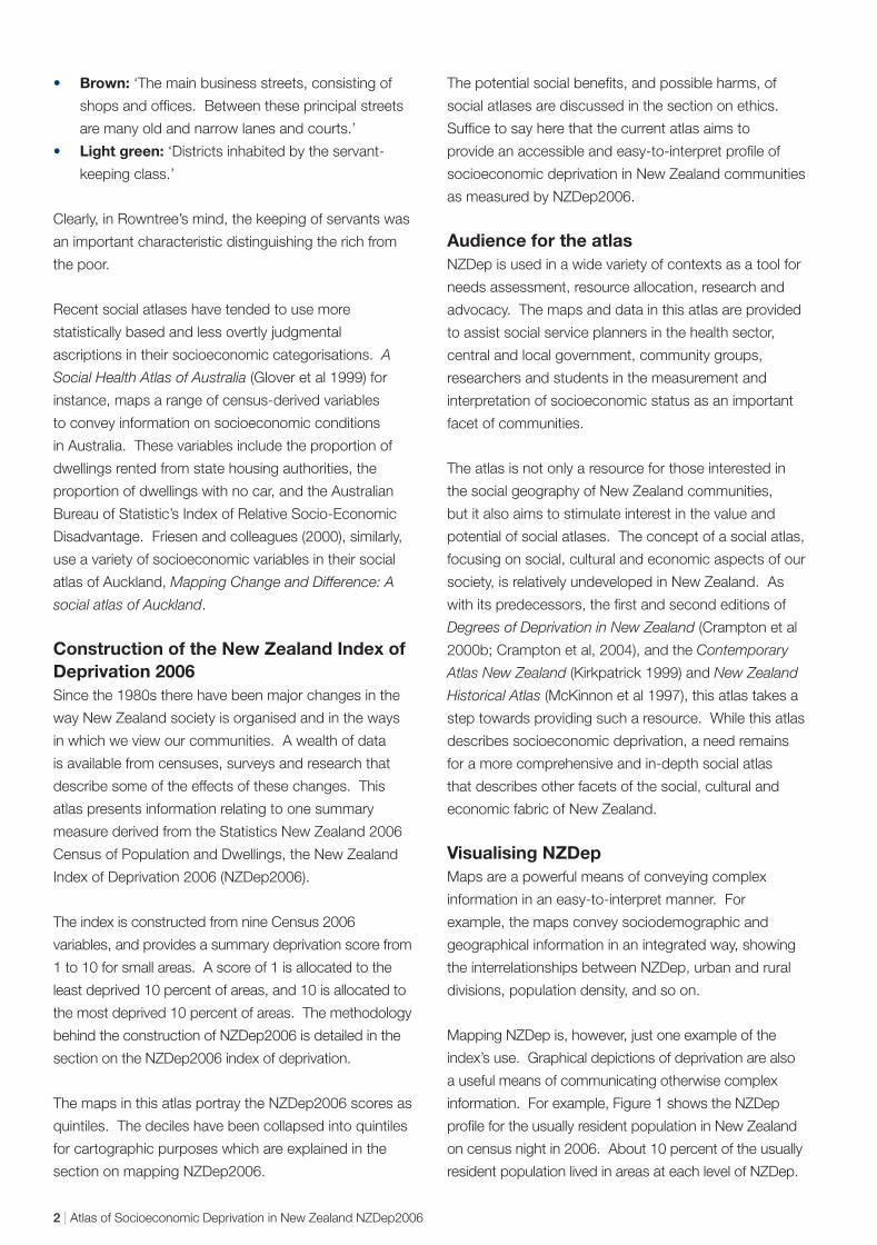
information. For example, Figure 1 shows the NZDep
profile for the usually resident population in New Zealand
on census night in 2006. About 10 percent of the usually
resident population lived in areas at each level of NZDep.
2 | Atlas of Socioeconomic Deprivation in New Zealand NZDep2006
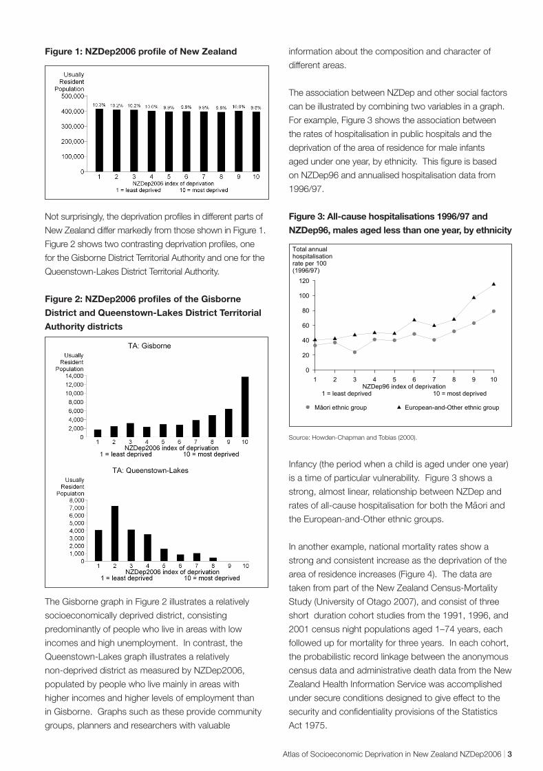
Figure 1: NZDep2006 profile of New Zealand
Not surprisingly, the deprivation profiles in different parts of
New Zealand differ markedly from those shown in Figure 1.
Figure 2 shows two contrasting deprivation profiles, one
for the Gisborne District Territorial Authority and one for the
Queenstown-Lakes District Territorial Authority.
Figure 2: NZDep2006 profiles of the Gisborne
District and Queenstown-Lakes District Territorial
Authority districts
The Gisborne graph in Figure 2 illustrates a relatively
socioeconomically deprived district, consisting
predominantly of people who live in areas with low
incomes and high unemployment. In contrast, the
Queenstown-Lakes graph illustrates a relatively
non-deprived district as measured by NZDep2006,
populated by people who live mainly in areas with
higher incomes and higher levels of employment than
in Gisborne. Graphs such as these provide community
groups, planners and researchers with valuable
information about the composition and character of
different areas.
The association between NZDep and other social factors
can be illustrated by combining two variables in a graph.
For example, Figure 3 shows the association between
the rates of hospitalisation in public hospitals and the
deprivation of the area of residence for male infants
aged under one year, by ethnicity. This figure is based
on NZDep96 and annualised hospitalisation data from
1996/97.
Figure 3: All-cause hospitalisations 1996/97 and
NZDep96, males aged less than one year, by ethnicity
1 2 3 4 5 6 7 8 9 10 NZDep96 index of deprivation
1 = least deprived 10 = most deprived
0
20
40
60
80
100
120
Total annual hospitalisation rate per 100 (1996/97)
aori ethnic roup M ggroup ropean-and-OtherEu ethnic
Source: Howden-Chapman and Tobias (2000).
Infancy (the period when a child is aged under one year)
is a time of particular vulnerability. Figure 3 shows a
strong, almost linear, relationship between NZDep and -rates of all-cause hospitalisation for both the Maori and
the European-and-Other ethnic groups.
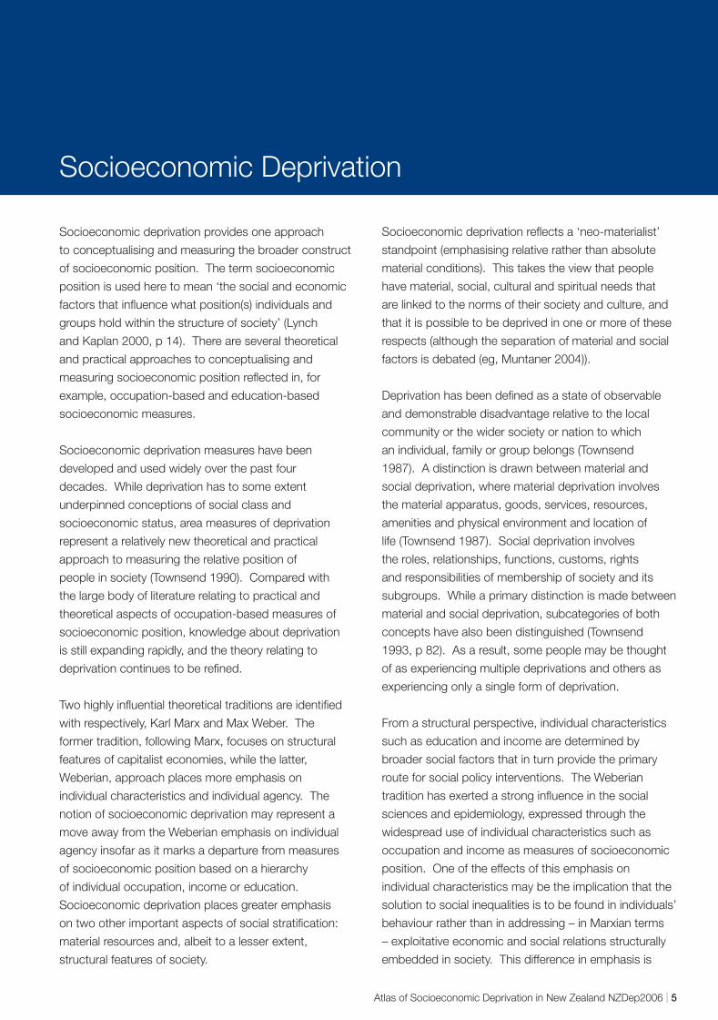
In another example, national mortality rates show a
strong and consistent increase as the deprivation of the
area of residence increases (Figure 4). The data are
taken from part of the New Zealand Census-Mortality
Study (University of Otago 2007), and consist of three
short duration cohort studies from the 1991, 1996, and
2001 census night populations aged 1–74 years, each
followed up for mortality for three years. In each cohort,
the probabilistic record linkage between the anonymous
census data and administrative death data from the New
Zealand Health Information Service was accomplished
under secure conditions designed to give effect to the
security and confidentiality provisions of the Statistics
Act 1975.
Atlas of Socioeconomic Deprivation in New Zealand NZDep2006 | 3
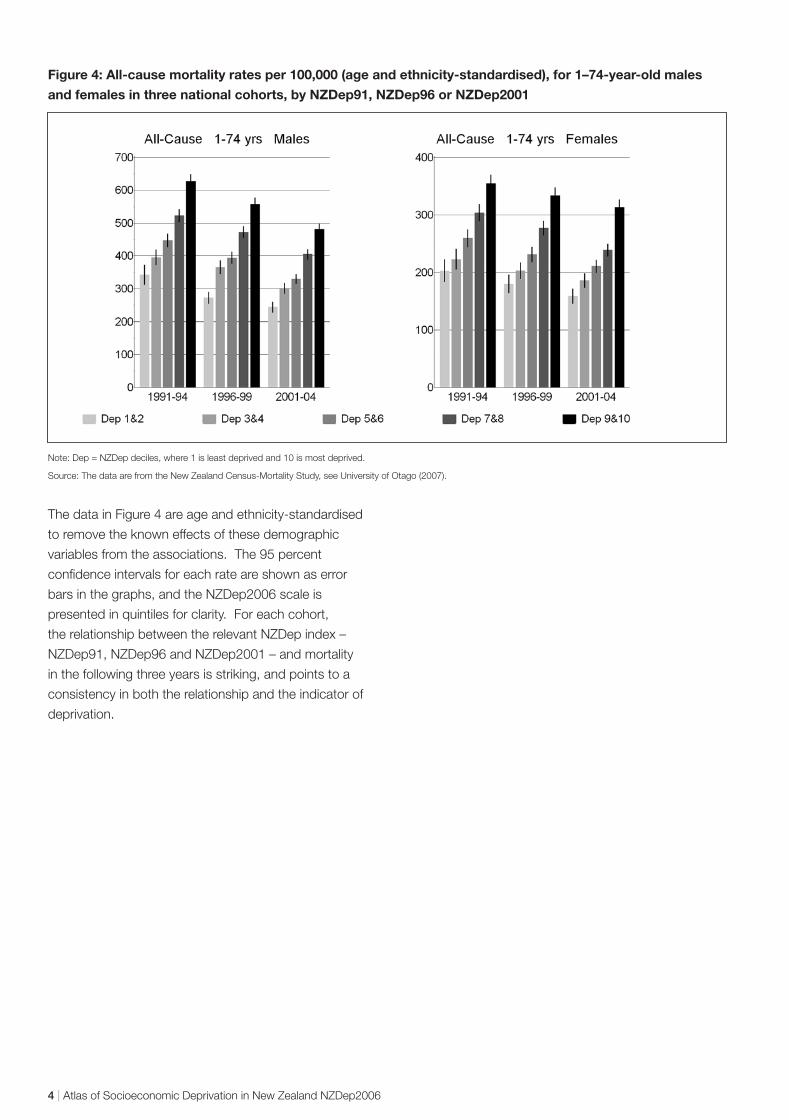
Figure 4: All-cause mortality rates per 100,000 (age and ethnicity-standardised), for 1–74-year-old males
and females in three national cohorts, by NZDep91, NZDep96 or NZDep2001
Note: Dep = NZDep deciles, where 1 is least deprived and 10 is most deprived.
Source: The data are from the New Zealand Census-Mortality Study, see University of Otago (2007).
The data in Figure 4 are age and ethnicity-standardised
to remove the known effects of these demographic
variables from the associations. The 95 percent
confidence intervals for each rate are shown as error
bars in the graphs, and the NZDep2006 scale is
presented in quintiles for clarity. For each cohort,
the relationship between the relevant NZDep index –
NZDep91, NZDep96 and NZDep2001 – and mortality
in the following three years is striking, and points to a
consistency in both the relationship and the indicator of
deprivation.
4 | Atlas of Socioeconomic Deprivation in New Zealand NZDep2006
Socioeconomic Deprivation
Socioeconomic deprivation provides one approach
to conceptualising and measuring the broader construct
of socioeconomic position. The term socioeconomic
position is used here to mean ‘the social and economic
factors that influence what position(s) individuals and
groups hold within the structure of society’ (Lynch
and Kaplan 2000, p 14). There are several theoretical
and practical approaches to conceptualising and
measuring socioeconomic position reflected in, for
example, occupation-based and education-based
socioeconomic measures.
Socioeconomic deprivation measures have been
developed and used widely over the past four
decades. While deprivation has to some extent
underpinned conceptions of social class and
socioeconomic status, area measures of deprivation
represent a relatively new theoretical and practical
approach to measuring the relative position of
people in society (Townsend 1990). Compared with
the large body of literature relating to practical and
theoretical aspects of occupation-based measures of
socioeconomic position, knowledge about deprivation
is still expanding rapidly, and the theory relating to
deprivation continues to be refined.
Two highly influential theoretical traditions are identified
with respectively, Karl Marx and Max Weber. The
former tradition, following Marx, focuses on structural
features of capitalist economies, while the latter,
Weberian, approach places more emphasis on
individual characteristics and individual agency. The
notion of socioeconomic deprivation may represent a
move away from the Weberian emphasis on individual
agency insofar as it marks a departure from measures
of socioeconomic position based on a hierarchy
of individual occupation, income or education.
Socioeconomic deprivation places greater emphasis
on two other important aspects of social stratification:
material resources and, albeit to a lesser extent,
structural features of society.
Socioeconomic deprivation reflects a ‘neo-materialist’
standpoint (emphasising relative rather than absolute
material conditions). This takes the view that people
have material, social, cultural and spiritual needs that
are linked to the norms of their society and culture, and
that it is possible to be deprived in one or more of these
respects (although the separation of material and social
factors is debated (eg, Muntaner 2004)).
Deprivation has been defined as a state of observable
and demonstrable disadvantage relative to the local
community or the wider society or nation to which
an individual, family or group belongs (Townsend
1987). A distinction is drawn between material and
social deprivation, where material deprivation involves
the material apparatus, goods, services, resources,
amenities and physical environment and location of
life (Townsend 1987). Social deprivation involves
the roles, relationships, functions, customs, rights
and responsibilities of membership of society and its
subgroups. While a primary distinction is made between
material and social deprivation, subcategories of both
concepts have also been distinguished (Townsend
1993, p 82). As a result, some people may be thought
of as experiencing multiple deprivations and others as
experiencing only a single form of deprivation.
From a structural perspective, individual characteristics
such as education and income are determined by
broader social factors that in turn provide the primary
route for social policy interventions. The Weberian
tradition has exerted a strong influence in the social
sciences and epidemiology, expressed through the
widespread use of individual characteristics such as
occupation and income as measures of socioeconomic
position. One of the effects of this emphasis on
individual characteristics may be the implication that the
solution to social inequalities is to be found in individuals’
behaviour rather than in addressing – in Marxian terms
– exploitative economic and social relations structurally
embedded in society. This difference in emphasis is
Atlas of Socioeconomic Deprivation in New Zealand NZDep2006 | 5
important insofar as structurally mediated solutions to
social inequalities are generally, and inherently, more
radical than individually mediated solutions that tend to
focus on incremental alterations to the status quo.
Area-based measures of deprivation, although mainly
aggregates of individual characteristics, move towards
reflecting structural elements related to area and
community – that is, they are more likely to reflect
aspects of the physical and social infrastructure of
communities than are single variable individual
measures such as income. However, area-based
measures of deprivation clearly fall short of including
the more fundamental structural features of society that
determine social position, such as exploitative economic
and social relations.
Lynch and Kaplan (2000, p 20) describe a hybrid
Marxian–Weberian view that serves as a useful
theoretical starting point for understanding the concept
of socioeconomic deprivation.
The social and structural relations between groups in any
particular society have a broadly defined material basis
that is determined by a group’s access to productivity
in relationship to the economy. This relationship is
characterised by the group’s effective control of
resources. Exercise of this control exploits, dominates,
alienates, and excludes other less advantaged groups.
The above theoretical statement emphasises the material
basis for defining and describing the social and structural
relations between groups in society – it is this material
basis that the concept of socioeconomic deprivation
most clearly taps into. The statement then links this
material basis with an individual’s or group’s relations
to the means of production; that is, in Marxist terms,
material resources are determined (in part at least) by
one’s access to the productive economy (via capital
or labour).
6 | Atlas of Socioeconomic Deprivation in New Zealand NZDep2006
Area Measures of Deprivation
Although studies of socioeconomic deprivation were
commonplace in the 19th century, much of the modern
scientific and statistical work on area measures of
deprivation was first carried out during the 1970s, 1980s
and 1990s, for the purposes of research, planning and
resource allocation (Liberatos et al 1988; Townsend 1993).
Area-based classifications have been developed
largely in order to make summary measures available
in circumstances where information is otherwise hard
to collect or unavailable. Area-based measures of
deprivation have been developed in the United Kingdom
and United States (Carstairs 1995; Krieger et al 1997;
Kunst and Mackenbach 1995; Liberatos et al 1988;
Morris and Carstairs 1991). Area-based indices have
also been developed in Australia and New Zealand
(Castles 1994; Crampton et al 1997a; McLennan 1990;
Reinken et al 1985).
Measures of material and social deprivation Most area measures of deprivation have focused on
measuring material deprivation, mainly because of the
existence of suitable variables in routine data sets. United
Kingdom area measures of deprivation have generally
not included direct measures of income, due to its non-
availability in census data sets (Rose and O’Reilly 1997,
p 117). However, it is increasingly recognised that social
aspects of deprivation are just as influential in relation
to health status as are material aspects of deprivation
(Macintyre et al 2002; Morris and Carstairs 1991).
Variables included in area measures of deprivation can
be further classified into two groups: demographic
and deprivation variables (Crampton et al 1997b).
Demographic variables such as age, sex and ethnicity are
not directly amenable to change or influence, but may be
associated with increased risk of deprivation. Deprivation
variables are more direct markers of deprivation, for
example, income, housing occupancy and access to
a telephone. Several researchers have argued that
demographic variables should be excluded from area
measures of deprivation as they are not direct markers of
deprivation (Crampton et al 1997b; Morris and Carstairs
1991; Townsend 1990). Demographic variables are not
included in the NZDep index of deprivation.
Associations between socioeconomic deprivation and outcomes The use of area measures of deprivation assumes
associations between socioeconomic deprivation and
outcomes at various levels (eg, individual, family and
neighbourhood) and allows different levels of association
to be explored (Macintyre et al 2002). For example, at
the area level, deprived neighbourhoods may adversely
affect health outcomes for individuals living in those
neighbourhoods and, at the individual level, deprived
individuals are more likely to suffer poor health outcomes
than are less deprived individuals. An increasing
number of studies are examining these multiple levels
of association (see, for example, Anderson et al (1997),
Duncan et al (1999), Kleinschmidt et al (1995), Reijneveld
(1998), Shouls et al (1996), and Davey Smith (1998)).
Weaknesses of area measures of deprivation Possible weaknesses of area measures of deprivation
include their complexity, vulnerability to the selection
of census variables, inconsistent statistical methods,
measurement error when applied to individuals,
ecological fallacy problems, spatial autocorrelation
when used in ecological studies (Lorant et al, 2001),
statistical limitations of small area aggregate data, and
the interval between censuses (Crampton and Laugesen
1995). Possible weaknesses of particular relevance are
described below.
Complexity
Whereas area measures of deprivation may be easy to
understand (usually as ordinal scales such as lowest
to highest), the methods used to derive them can be
complex. Similarly, the selection of variables for inclusion
Atlas of Socioeconomic Deprivation in New Zealand NZDep2006 | 7

in area measures, and the statistical techniques for their
transformation, vary considerably between different
measures (Carr-Hill 1988; Crampton and Laugesen
1995; Morris and Carstairs 1991), and so may lead to
confusion regarding the choice of measure.
Measurement error
Measurement error inevitably occurs when area-based
measures of socioeconomic position are applied to
individuals, because not all people in deprived areas
are deprived, and not all socioeconomically deprived
people live in deprived areas (Blakely and Pearce
2002; McLoone 2001). For example, NZDep96 has
been shown to be only weakly correlated with an
individual deprivation index (Salmond and Crampton
2001; Salmond and Crampton 2002). The effect of this
measurement error generally reduces the strength of
observed associations between socioeconomic position
and health outcomes. However, researchers have found
that the use of small spatial areas, such as meshblocks,
diminishes the extent of measurement error (Crayford et
al 1995; Hyndman et al 1995).
Small area census data
Concerns have been raised about the use of census
data from small areas (Morphet 1992). First, small
denominators may lead to spurious high proportions.
Secondly, random variation between small areas may
limit the representativeness of small-area data. Clearly,
care must be taken in the interpretation of studies
using small area measures of deprivation; strength and
consistency of associations are important in confirming
the validity of results.
Summary In summary, deprivation of area of residence is
increasingly recognised as a salient predictor of life
chances (Krieger 1992; Krieger et al 1997; Macintyre
et al 1993). Although there has been much debate
concerning the choice of variables and their weighting,
and the selection of statistical techniques, there is
general agreement that area measures of deprivation
provide powerful means of measuring variations in health
status (Curtis 1990; Gilthorpe 1995; Gordon 1995; Lynch
and Kaplan 2000, p 28; Morris and Carstairs 1991;
Reading et al 1994; Townsend 1993).
8 | Atlas of Socioeconomic Deprivation in New Zealand NZDep2006
NZDep2006 Index of Deprivation
Description of the index NZDep2006 describes the deprivation experienced by
groups of people in small areas. Its methodology is
based on its predecessors, NZDep91, NZDep96 and
NZDep2001, and was created from data from the Statistics
New Zealand 2006 Census of Population and Dwellings.
The small areas used to create the index were unique
to the deprivation project (NZDep2006 small areas).
The building blocks for these small areas are standard
Statistics New Zealand meshblocks. In a city, these are
roughly a block in size. Where necessary and possible,
geographically connected meshblocks within slightly
larger Statistics New Zealand boundaries were pooled
to create NZDep2006 small areas, each with a usually
resident population of at least 100 people.
There are 23,786 NZDep2006 small areas compared
with 41,376 meshblocks. The impact this aggregation
has with respect to mapping NZDep2006 is discussed in
the section on mapping NZDep2006.
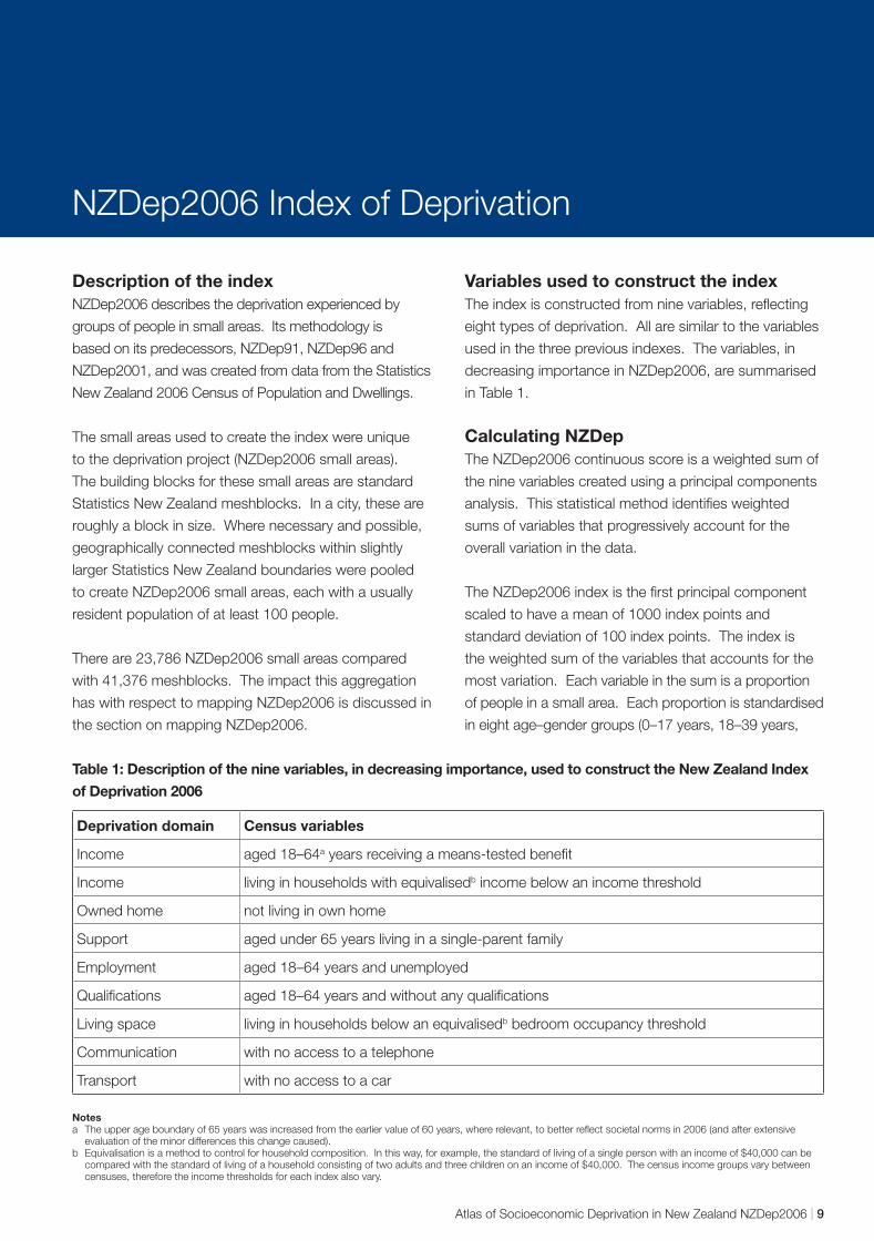
Variables used to construct the index The index is constructed from nine variables, reflecting
eight types of deprivation. All are similar to the variables
used in the three previous indexes. The variables, in
decreasing importance in NZDep2006, are summarised
in Table 1.
Calculating NZDep The NZDep2006 continuous score is a weighted sum of
the nine variables created using a principal components
analysis. This statistical method identifies weighted
sums of variables that progressively account for the
overall variation in the data.
The NZDep2006 index is the first principal component
scaled to have a mean of 1000 index points and
standard deviation of 100 index points. The index is
the weighted sum of the variables that accounts for the
most variation. Each variable in the sum is a proportion
of people in a small area. Each proportion is standardised
in eight age–gender groups (0–17 years, 18–39 years,
Table 1: Description of the nine variables, in decreasing importance, used to construct the New Zealand Index
of Deprivation 2006
Deprivation domain Census variables
Income aged 18–64a years receiving a means-tested benefit
Income living in households with equivalisedb income below an income threshold
Owned home not living in own home
Support aged under 65 years living in a single-parent family
Employment aged 18–64 years and unemployed
Qualifications aged 18–64 years and without any qualifications
Living space living in households below an equivalisedb bedroom occupancy threshold
Communication with no access to a telephone
Transport with no access to a car
Notes a The upper age boundary of 65 years was increased from the earlier value of 60 years, where relevant, to better reflect societal norms in 2006 (and after extensive
evaluation of the minor differences this change caused). b Equivalisation is a method to control for household composition. In this way, for example, the standard of living of a single person with an income of $40,000 can be
compared with the standard of living of a household consisting of two adults and three children on an income of $40,000. The census income groups vary between censuses, therefore the income thresholds for each index also vary.
Atlas of Socioeconomic Deprivation in New Zealand NZDep2006 | 9

40–64 years, 65 years and over, for each gender) to the
New Zealand population structure. This equivalises the
small areas, so that some areas cannot be considered
more deprived than others simply because their
populations have different age structures. For example,
a small area with a high proportion of young families
is likely to have a low number living in their own home
simply because the parents are young, whereas another
area with a high proportion of older adults is likely to
have a greater proportion living in their own home.
This distinction between the areas is, therefore, partly
attributable to their different age structures.
The NZDep2006 scale of deprivation from 1 to 10 divides
New Zealand into tenths of the distribution of the first
principal component scores. For example, a value of 10
indicates that the small area is in the most deprived 10
percent of small areas in New Zealand as measured by
the index. Each meshblock in a small area is given the
NZDep2006 value of the small area.
In this atlas, the 10-point NZDep2006 scale has
been reduced to a five-point scale (quintiles). That is,
NZDep2006 values 1 and 2 are combined into the first
quintile, which indicates the least deprived 20 percent
of small areas, and so on, until the NZDep2006 values 9
and 10 are combined into the fifth quintile, or the most
deprived 20 percent of small areas.
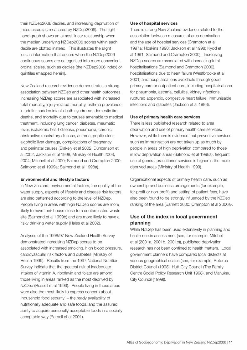
Validation of NZDep, does it measure small area deprivation? Health variables
The first two NZDep indexes, for 1991 and 1996,
were extensively validated to confirm their usefulness.
Validation answers the question: does the index
accurately describe levels of deprivation in small areas?
Scores were explored in several areas for which local
knowledge was readily available, and no anomalies
were detected. The indexes were then correlated with
key health variables as a measure of criterion validity,
since NZDep itself does not contain health information,
and many researchers have found that socioeconomic
deprivation, as measured by area-based composite
indices, correlates with measures of health status
(Crampton et al 1997a; Eames et al 1993; McLoone and
Boddy 1994; Morris and Carstairs 1991).
The first index, NZDep91, was validated using mortality
data, lung cancer registrations and hospital admission
rates (Crampton et al 1997a). The similar NZDep96
index was validated using smoking data from the 1996
census, since smoking was known to be strongly
correlated with socioeconomic factors (Benzeval et al,
1995; Marmot et al, 1991; Statistics New Zealand and
Ministry of Health, 1993). More recent work shows
that the strong relationship continues (Blakely and
Wilson, 2005). As expected, the relationship between
the proportion of people smoking in an area and the
NZDep96 area ranking was striking: the more deprived
the area, the larger the proportion of people who smoked
(Crampton et al 2000c; Salmond et al 1998b).
The most recent census, in 2006, also included a
question on smoking, so the opportunity was taken to
validate NZDep2006 against smoking. As expected,
there was a very strong relationship (Figure 5). The
left-hand graph shows a slightly non-linear relationship
between the proportion of smokers in areas defined by
Figure 5: Relationship between NZDep2006 and smoking
Proportion Proportionof smokers of smokers
0.4 0.4
0.3 0.3
0.2 0.2
0.1 0.1
01 2 3 4 5 6 7 8 9 10
0 900 1000 1100 1200
NZDep2006 (deciles) NZDep2006 median scores within deciles
10 | Atlas of Socioeconomic Deprivation in New Zealand NZDep2006
their NZDep2006 deciles, and increasing deprivation of
those areas (as measured by NZDep2006). The right-
hand graph shows an almost linear relationship when
the median underlying NZDep2006 scores within each
decile are plotted instead. This illustrates the slight
loss in information that occurs when the NZDep2006
continuous scores are categorised into more convenient
ordinal scales, such as deciles (the NZDep2006 index) or
quintiles (mapped herein).
New Zealand research evidence demonstrates a strong
association between NZDep and other health outcomes.
Increasing NZDep scores are associated with increased
total mortality, injury-related mortality, asthma prevalence
in adults, sudden infant death syndrome, domestic fire
deaths, and mortality due to causes amenable to medical
treatment, including lung cancer, diabetes, rheumatic
fever, ischaemic heart disease, pneumonia, chronic
obstructive respiratory disease, asthma, peptic ulcer,
alcoholic liver damage, complications of pregnancy
and perinatal causes (Blakely et al 2002; Duncanson et
al 2002; Jackson et al 1998; Ministry of Health 2008,
2004; Mitchell et al 2000; Salmond and Crampton 2000;
Salmond et al 1999a; Salmond et al 1998a).
Environmental and lifestyle factors
In New Zealand, environmental factors, the quality of the
water supply, aspects of lifestyle and disease risk factors
are also patterned according to the level of NZDep.
People living in areas with high NZDep scores are more
likely to have their house close to a contaminated waste
site (Salmond et al 1999b) and are more likely to have a
risky drinking water supply (Hales et al 2002).
Analyses of the 1996/97 New Zealand Health Survey
demonstrated increasing NZDep scores to be
associated with increased smoking, high blood pressure,
cardiovascular risk factors and diabetes (Ministry of
Health 1999). Results from the 1997 National Nutrition
Survey indicate that the greatest risk of inadequate
intakes of vitamin A, riboflavin and folate are among
those living in areas ranked as the most deprived by
NZDep (Russell et al 1999). People living in those areas
were also the most likely to express concern about
‘household food security’ – the ready availability of
nutritionally adequate and safe foods, and the assured
ability to acquire personally acceptable foods in a socially
acceptable way (Parnell et al 2001).
Use of hospital services
There is strong New Zealand evidence related to the
association between measures of area deprivation
and the use of hospital services (Crampton et al
1997a; Hoskins 1990; Jackson et al 1998; Kydd et
al 1991; Salmond and Crampton 2000). Increasing
NZDep scores are associated with increasing total
hospitalisations (Salmond and Crampton 2000),
hospitalisations due to heart failure (Westbrooke et al
2001) and hospitalisations avoidable through good
primary care or outpatient care, including hospitalisations
for pneumonia, asthma, cellulitis, kidney infections,
ruptured appendix, congestive heart failure, immunisable
infections and diabetes (Jackson et al 1998).
Use of primary health care services
There is less published research related to area
deprivation and use of primary health care services.
However, while there is evidence that preventive services
such as immunisation are not taken up as much by
people in areas of high deprivation compared to those
in low deprivation areas (Salmond et al 1998a), frequent
use of general practitioner services is higher in the more
deprived areas (Ministry of Health 1999).
Organisational aspects of primary health care, such as
ownership and business arrangements (for example,
for-profit or non-profit) and setting of patient fees, have
also been found to be strongly influenced by the NZDep
ranking of the area (Barnett 2000; Crampton et al 2000a).
Use of the index in local government planning While NZDep has been used extensively in planning and
health needs assessment (see, for example, Mitchell
et al (2001a, 2001b, 2001c)), published deprivation
research has not been confined to health matters. Local
government planners have compared local districts at
various geographical scales (see, for example, Rotorua
District Council (1998), Hutt City Council (The Family
Centre Social Policy Research Unit 1998), and Manukau
City Council (1999)).
Atlas of Socioeconomic Deprivation in New Zealand NZDep2006 | 11
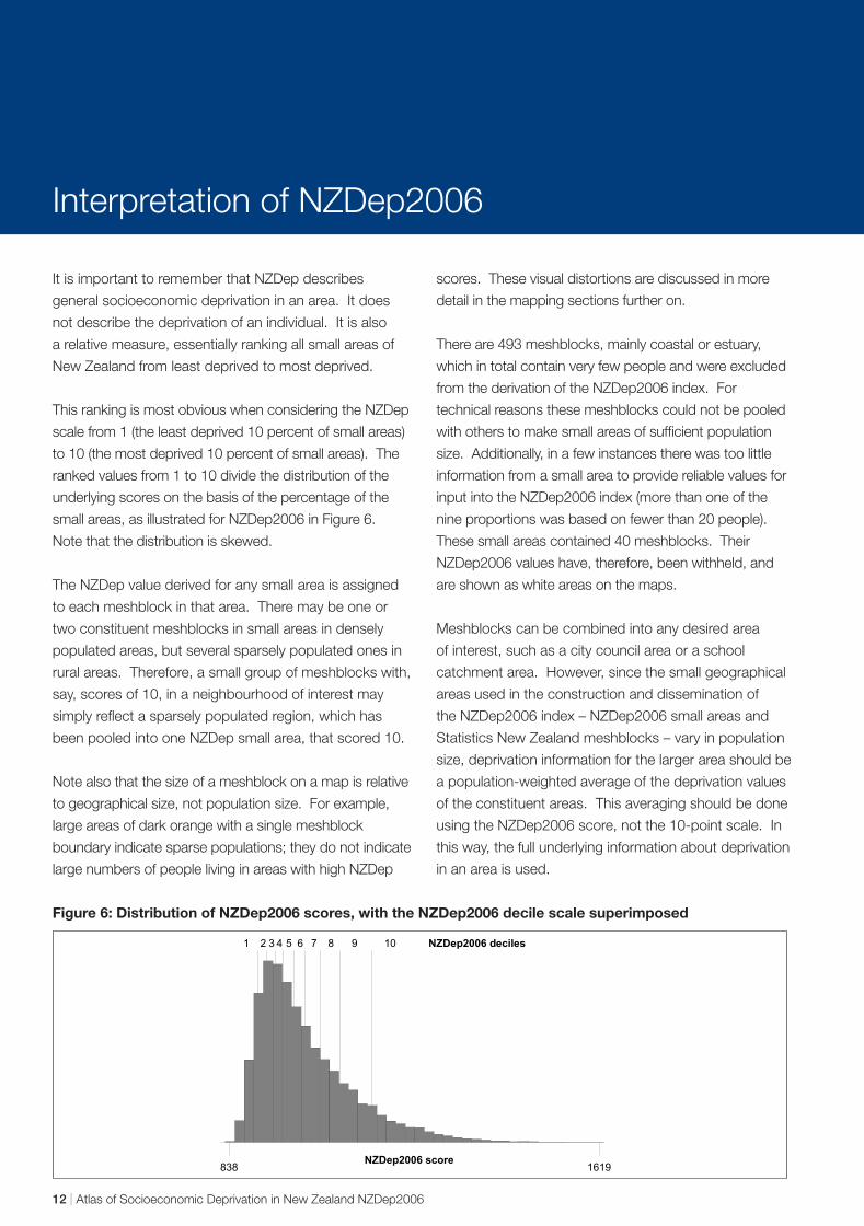
Interpretation of NZDep2006
It is important to remember that NZDep describes
general socioeconomic deprivation in an area. It does
not describe the deprivation of an individual. It is also
a relative measure, essentially ranking all small areas of
New Zealand from least deprived to most deprived.
This ranking is most obvious when considering the NZDep
scale from 1 (the least deprived 10 percent of small areas)
to 10 (the most deprived 10 percent of small areas). The
ranked values from 1 to 10 divide the distribution of the
underlying scores on the basis of the percentage of the
small areas, as illustrated for NZDep2006 in Figure 6.
Note that the distribution is skewed.
The NZDep value derived for any small area is assigned
to each meshblock in that area. There may be one or
two constituent meshblocks in small areas in densely
populated areas, but several sparsely populated ones in
rural areas. Therefore, a small group of meshblocks with,
say, scores of 10, in a neighbourhood of interest may
simply reflect a sparsely populated region, which has
been pooled into one NZDep small area, that scored 10.
Note also that the size of a meshblock on a map is relative
to geographical size, not population size. For example,
large areas of dark orange with a single meshblock
boundary indicate sparse populations; they do not indicate
large numbers of people living in areas with high NZDep
scores. These visual distortions are discussed in more
detail in the mapping sections further on.
There are 493 meshblocks, mainly coastal or estuary,
which in total contain very few people and were excluded
from the derivation of the NZDep2006 index. For
technical reasons these meshblocks could not be pooled
with others to make small areas of sufficient population
size. Additionally, in a few instances there was too little
information from a small area to provide reliable values for
input into the NZDep2006 index (more than one of the
nine proportions was based on fewer than 20 people).
These small areas contained 40 meshblocks. Their
NZDep2006 values have, therefore, been withheld, and
are shown as white areas on the maps.
Meshblocks can be combined into any desired area
of interest, such as a city council area or a school
catchment area. However, since the small geographical
areas used in the construction and dissemination of
the NZDep2006 index – NZDep2006 small areas and
Statistics New Zealand meshblocks – vary in population
size, deprivation information for the larger area should be
a population-weighted average of the deprivation values
of the constituent areas. This averaging should be done
using the NZDep2006 score, not the 10-point scale. In
this way, the full underlying information about deprivation
in an area is used.
Figure 6: Distribution of NZDep2006 scores, with the NZDep2006 decile scale superimposed
838 1619 NZDep2006 score
1 2 3 4 5 6 7 8 9 10 NZDep2006 deciles
12 | Atlas of Socioeconomic Deprivation in New Zealand NZDep2006

Territorial�������Authorities
Social Variation within New Zealand Communities
It is important to note that there is frequently
a considerable amount of variation between
neighbourhoods or small areas within any given larger
geographical area. For example, if a Territorial Authority
(TA) boundary is used for creating an NZDep profile,
there may be relatively deprived and relatively non-
deprived pockets within that TA. This point is illustrated
in Figure 7, starting with the New Zealand population and
then focusing on successively smaller areas.
Figure 7: Variation in NZDep2006 profiles
As can be seen in the New Zealand NZDep profile at the
top of Figure 7, there are approximately equal numbers
of people in each NZDep category. When three territorial
authorities in the Auckland area are compared, marked
differences in their NZDep profiles are observed. Again,
when two different area units from Manukau City are
compared, there are clear differences in their
NZDep profiles.
Area�����Units
Territorial������Authorities
New�Zealand
Atlas of Socioeconomic Deprivation in New Zealand NZDep2006 | 13
Mapping NZDep2006
The majority of the atlas is taken up with the maps of
NZDep2006. This section describes how the maps are
laid out and discusses some of the pitfalls that can trap
unwary map users.
Why map NZDep2006? The aim of this atlas is to make NZDep2006 accessible.
Mapping is a powerful communication tool. It helps us to
make sense of data by allowing otherwise hidden patterns
and trends in the spatial distribution of the underlying data
to be revealed. These patterns and trends are seldom
apparent in more traditional forms of graphical output
such as graphs and tables. This is important because
geography matters, and our health and our health care
systems are driven by complex interactions with our
environment. As a result, the geographical perspective
has been a longstanding area of interdisciplinary health
and social research (Curtis and Taket 1996, Gatrell
2002, Meade and Earickson 2000), providing insight and
explanation, and also, through mapping, opening up data
for others to interpret (Koch 2005). This atlas, therefore,
serves as a geographical user interface to NZDep2006.
In creating the 2006 atlas, we have resisted the
temptation to interpret the spatial patterns of
NZDep2006. This is for you to do. Our job in producing
this atlas has been to provide an objective, descriptive
picture. What this picture means, is for you to decide.
This is because, as the above sections outline, NZDep is
a sophisticated model that aims to capture dimensions
of the complex socioeconomic environment that shape
our health and wellbeing. Elements contributing to the
various landscapes of deprivation include demography,
history and ethnicity. Consequently, it is simply beyond
the scope of this atlas to interpret and explain what these
patterns mean. Were we to do so, we would inevitably
be providing an interpretation that is just one of many
competing views of a complex landscape. Therefore, it
is the purpose of this atlas to help stimulate debate by
unravelling the spatial picture of deprivation across New
Zealand, rather than by attempting to explain it.
Who is the NZDep2006 atlas for? The NZDep2006 atlas will, like its predecessors, have
wide appeal. Indeed, the geography of deprivation could
be portrayed in many ways to meet the demands of the
many different people and organisations that will use the
index and find value in the atlas. However, unlike the first
two editions of the atlas, this third edition has adopted
the District Health Board (DHB) structure of New Zealand
as the primary frame of reference for the maps. This is
because the health sector will be one of the key users of
NZDep2006. The 21 DHBs are at the centre of health
care delivery in New Zealand, and NZDep is a critical tool
in funding and planning decision-making. For example,
every three years DHBs are required to undertake a
health needs assessment. NZDep is used extensively
in this assessment for monitoring inequalities across a
range of health indicators, including hospitalisations,
morbidity and mortality, and for needs-adjusted
capitation funding.
Increasingly, DHBs are including wider environmental
and social factors as key determinants of the health
and disability landscape. Factors such as housing and
land use are the responsibility of district councils, so the
DHB maps in the atlas also includes Territorial Authority
(TA) boundaries. Seventy of the 73 TAs (at the 2006
census) form a coterminous relationship with the DHBs.
The three exceptions are Queenstown-Lakes District (in
both Southland and Otago DHBs), Kapiti Coast District
(in both Capital & Coast and MidCentral DHBs) and
Ruapehu District (in both Waikato and MidCentral DHBs).
The inclusion of the TA boundaries allows the pattern
of deprivation within and between the 73 TAs to be
compared in relation to the DHBs.
Visualising the population distribution across New Zealand New Zealand had a population of 4,027,947 at the time
of the 2006 census (usually resident population: Statistics
New Zealand), with a low population density of 15 people
per square kilometre. This compares to the United
14 | Atlas of Socioeconomic Deprivation in New Zealand NZDep2006
Kingdom average population density of 244 people per
square kilometre in a country of roughly similar size.
The New Zealand population is more than 85 percent
urban (Statistics New Zealand). Consequently, most
land in New Zealand is uninhabited and comprises
large mountainous regions, lakes and rivers, areas of
forestry, agricultural land, and national parks. This has
important visual impacts when mapping population-
based phenomena such as NZDep. Therefore, the first
maps in the atlas aim to introduce the sparse population
geography of New Zealand to provide important context
within which to interpret the NZDep maps.
The first two maps provide a physical relief of New Zealand
depicting the variations in height and the geographical
distribution of physical features that are defining hall
marks of New Zealand. Clearly evident in these maps
are the Southern Alps forming the main divide running
the length of the South Island. Across the Cook Strait,
the mountains continue, extending from the southern tip
of Wellington through the Central Plateau that dominates
much of the central North Island, reaching to the west in
Taranaki and extending northeast towards East Cape.
On the adjoining pages are maps of population density.
The first population density maps are conventional
choropleth maps, created by dividing the population
within a meshblock by the meshblock land area. By
dividing the total number of meshblocks into fifths (or
quintiles) based on the population density, the distribution
of the population is immediately apparent. Most of the
map appears white, especially in the central North Island
and nearly all of the South Island, representing the lowest
level of population density in these mountainous and
forested regions. It is only by zooming in to the relatively
small populated areas, predominantly around the coast,
that a higher degree of population density becomes
apparent. A better reflection of population density is
perceived in the following cartogram map.
Cartograms, or value-by-area maps (Dent 1999),
resize the units used to create the map to reflect the
magnitude of the data represented by the map (Dorling
1996). Consequently, the mapping units with high
population density are made larger, and the areas with
low population density are much smaller. These maps
present a grossly distorted image and are challenging to
interpret at first. However, the apparent difference in the
geographic distribution of the population when compared
to the choropleth maps becomes clear, with the main
population centres more discernable.
The visual distortions in the cartograms arise from the units
used to map NZDep2006. As with the previous editions
of the atlas, NZDep2006 is created from aggregated
census data and released at the small area census
geography level, comprising meshblocks with a population
of approximately 100 individuals and the larger Census
Area Units (CAUs) of about 1,500 people. These two
census geographies are continuous across New Zealand.
Meshblocks (41,384 at the 2006 census) group together
to form CAUs (1,919 at the 2006 census), that then
group together to form TAs (73), DHBs (21) and public
health services (PHS) (12). In most, but importantly not all
instances, TAs form DHBs and DHBs form PHS.
The visual distortion due to population density appears in
the cartograms described above because all meshblocks,
and all CAUs are created to be approximately population
equal. In urban areas with high population density the
census mapping units are small, whereas in rural areas
with much lower population density, the units are much
larger. It is important, therefore, to bear in mind the
physical and population density maps when viewing and
interpreting the NZDep2006 maps.
NZDep2006 thematic map design Maps are documents and have a language similar to
structured text (MacEachren 1994; Robinson et al
1995; Kraak and Ormeling 1996). The message the
map is delivering should be clear and not mislead or
confuse. The map layout in the atlas has been designed
to be as clear as possible, with the spatial distribution
of NZDep2006 as the central focus. Equally, careful
consideration has been given to the use of colour, font,
symbols and composition in the contextual data that is
included to help interpret the deprivation maps.
Following cartographic best practice for visual clarity and
objectivity, the NZDep2006 atlas has broken with the
style of the first two editions in two notable ways: First,
by using a quintile thematic grouping, and secondly, by
using a sequential monochromatic light-to-dark colour
scheme. While NZDep2006 has been operationalised into
deciles of meshblocks and CAUs, for mapping purposes a
thematic range of 10 classes is beyond what is considered
readily discernable by the human eye (MacEachren 1994).
The principle aim of a map is visualisation so optimising
visual acuity should be a central aim in designing the map
Atlas of Socioeconomic Deprivation in New Zealand NZDep2006 | 15
layout. A cartographic norm recommended for thematic
maps is a minimum of four classes (Dent 1999) and no
more than eight classes (Robinson et al 1995; Kraak and
Ormeling 1996). Therefore, the original NZDep2006 decile
score has been collapsed into quintiles, with each quintile
created by adding the two sequential deciles together,
so deciles 1 and 2 form quintile 1, deciles 3 and 4 form
quintile 2, and so on. Similarly, the divergent red-green
colour ranges of the first two editions of the atlas have
been replaced with a sequential monochromatic orange
scheme (from light for quintile 1 (least deprived) to dark
for quintile 5 (most deprived)). This colour scheme more
effectively shows the magnitude change and spatial
variation of NZDep2006 across the quintiles (Robinson
et al 1995; Bygott 1969). In addition, the sequential,
monochromatic colour scheme is also suitable for viewers
with colour-impaired vision (Brewer 2006).
Map layouts in the atlas The mapped sections of the atlas are divided into the
21 DHBs, with each section laid out similarly. The title
page for each section provides a quick reference map
showing where in New Zealand the DHB is. In addition,
the title page has some summary information including
the DHB’s population (the Statistics New Zealand census
2006 usually resident DHB population), the proportion of
the population in urban areas (the Statistics New Zealand
census 2006 usually resident meshblock population) and
the population change between the census years 2001
to 2006 (again the Statistics New Zealand census 2006
usually resident meshblock population1). For ease of use
each DHB mapped section in the atlas can be easily
identified by the blue title page with the DHB name on
the right-hand page margin.
Following the DHB title page map, the next section is
a double-page spread. The left-hand page has charts
showing the population in each of the five NZDep2006
quintiles. The top chart is for the DHB, with the charts
below of the TAs within the DHB (where a TA crosses a
DHB boundary, only that proportion of the TA population
in the DHB is included). The right-hand page is a
thematic map of NZDep2006 for the entire DHB. This
map includes the names of the main population centres
and TAs (with the TA boundaries in black, or black on
grey where the TA boundary is also the DHB boundary).
The DHB map also includes blue outlined boxes that
indicate areas shown in greater detail on the succeeding
pages. These maps form the bulk of the NZDep maps in
1 Rounding causes a difference between the meshblock aggregated population total for a DHB and the total DHB population provided by Statistics New Zealand.
16 | Atlas of Socioeconomic Deprivation in New Zealand NZDep2006
the atlas. The areas mapped in detail represent the main
population centres such as the cities and towns but also
rural population settlements, and were selected where
the detail of these areas cannot be easily seen on the
main DHB map. As these maps vary in size from a large
city to a smaller rural town they include state highways
and other contextual information as a useful reference to
orientate readers unfamiliar with the DHB. Each double
page set of maps contains a map legend that shows
the colour for each of the NZDep quintiles. For further
information on reading the maps and the charts refer
to the map symbology and the keys to interpreting the
charts and maps that are on the pages immediately
before the first DHB maps.
The detail maps also include the meshblock boundaries.
However, it is important to note that these are for
contextual reference only. The NZDep2006 index is
created from aggregations of meshblocks; therefore
the meshblock boundaries shown on the maps are
not necessarily the NZDep2006 small areas used to
calculate the index. Consequently, any apparent patterns
of meshblocks of a similar NZDep quintile should be
interpreted with caution, as they do not necessarily infer
clustering. This is explained further below.
NZDep2006 data CD For the first time, the atlas includes a CD containing
data and NZDep2006 maps of the 21 DHBs ready for
you to use. The data includes spreadsheets of both
the meshblock and CAU NZDep2006 indices. The
spreadsheet format ensures the data are immediately
available for analysis. The inclusion of meshblock and
CAU identifiers makes the data ready and easy to use
in a Geographical Information System (GIS). Therefore,
to encourage your own GIS exploration of NZDep2006
the corresponding meshblock and CAU digital boundary
data are also included. These boundary files are in the
propriety ESRI Shape file format for use with the ArcGIS
suite of analytical and mapping tools.
Using NZDep2006 with GIS Unlocking the spatial dimension of data has become
more commonplace through the use of GIS to integrate
geographically referenced data for mapping and analysis.
Across the health sector, GIS are increasingly being used
as they enable disease and health services data to be
mapped and spatially analysed together with explanatory
socioeconomic and environmental data. Using
NZDep2006 geographically in this way will help to
unmask hidden detail, enabling otherwise obscured
relationships and explanatory potential hypotheses to be
considered (White 2005).
The data contained on the CD when used within a GIS
environment will allow users to exploit the rich potential of
NZDep2006 more fully than is possible just with the atlas
DHB maps. The inherent flexibility of GIS affords huge
opportunities to create user-defined visualisations. These
custom-made maps will enable users to explore the spatial
landscape of NZDep2006 to meet their own needs. In this
sense, the atlas is a starting point for users. Hopefully, it
will stimulate ideas and encourage spatial thinking about
the varying geographies of deprivation in New Zealand.
Reading the maps: Analytical errors inherent to mapping As with all analytical techniques, important assumptions
underpin the spatial aspects of NZDep relating to the
census geography used to map, visualise and therefore
interpret the index. These assumptions are compounded
through the use of GIS (Murray and Shyy 2000). The
availability of geocoded indices such as NZDep, and
the ease of use of GIS are advantageous in terms of
empowering a wider and more diverse range of users to
undertake valuable health research. However, whilst the
use of mapping and GIS in health is now commonplace,
atlases such as this together with easy-to-use GIS have
made potential errors arising from the age old geographic
concerns of the ecological fallacy and the modifiable
areal unit problem (MAUP) easier to make (White 2005).
The ecological fallacy
The ecological fallacy derives from ascribing to individuals
the characteristics of a group (Green 1994). With respect to
NZDep, this means inferring the meshblock and CAU index
value to all individuals within that meshblock and CAU. This
is similar to the problem of a statistical mean attempting
to adequately describe the full variation of a range of data
(White 2005). A large variation in a range of census data
tends to exhibit extremes of census values that can result in
misleading mapped visualisations (Dorling 1993).
The ecological fallacy can be demonstrated by
considering a typical neighbourhood meshblock. Each
neighbourhood will include people of varying occupations
and levels of income that each represents different
degrees of deprivation on the NZDep scale, for example
quintiles 1 and 3. However, that meshblock can have
only one NZDep score overall, and could therefore be
classified as quintile 2, reflecting the average census
data from all the people (who returned census forms) in
that meshblock. In this case, neither of the individuals
in quintiles 1 and 3 is accurately represented at the
individual level. Therefore, it is important to remember
that NZDep is a population indicator and not an
individual-level indicator, with the meshblock NZDep
value and quintile reflecting the population as a whole
generally and not individuals specifically.
The problem at the core of the ecological fallacy is
heterogeneity: the larger the aggregations of data,
the more dissimilar in characteristics are the people
represented. For example, 140 people in a meshblock are
more likely to be similar in characteristics than are 1500
people in a CAU. However, dissimilarity occurs even at the
meshblock level, and indeed at every level of aggregation.
In addition to size, administrative spatial units are
vulnerable to the ecological fallacy, in this instance
relating to the visual interpretations arising from the shape
of the units. Shape has noticeable impacts on people’s
perception of census unit mapped data such as NZDep
(Robinson et al 1995), although, as Openshaw and Rao
(1995) observe, this is much less understood compared
to the problem of areal unit size. As meshblocks are
constructed for census administrative use, they are
arbitrary in shape insofar as the current configuration is
one realisation of many alternative forms (Morphet 1993).
Meshblocks can, therefore, exhibit strange shapes that
arise from the convenience of census enumeration.
The two problems of size and shape interact and can
lead to visual distortions when mapping census unit
data. Census units encompass residential and non
residential areas such as industrial or recreational land.
These predominantly non-residential units will contain
the smallest population counts, and it follows that these
populations will also comprise very small areas of the
unit. The resulting census unit is geographically large in
comparison to its neighbours in an attempt to keep the
population approximately equal. However when mapped,
these large and irregularly shaped units have undue
influence on perception by drawing the viewer to these
least populated areas (Monmonier 1996; MacEachren
1994; Kraak and Ormeling 1996). This means that census
unit maps are not visually equal as the least populated
rural areas have greater visual dominance compared to the
most populated urban areas.
Atlas of Socioeconomic Deprivation in New Zealand NZDep2006 | 17
The modifiable areal unit problem
The severity of the problem posed by ecological fallacy
is, as Martin (1996a) notes, dependent on the way in
which data are aggregated into different areal units for
analysis. This leads to the second problem encountered
in the spatial analysis of ecological data, the modifiable
areal unit problem (MAUP). The MAUP relates to the way
in which geographical space is partitioned for analysis,
and in particular the size and shape of the areal partitions
(Openshaw 1977, 1984).
Size or scale effects result from the differences in data
patterns that become apparent as many smaller units of
analysis are combined to form fewer but larger units of
analysis, for example, meshblocks aggregated to form
CAUs. This impacts NZDep. A CAU of, for example, 20
meshblocks representing a range of NZDep scores has
to take a single quintile value, and so cannot represent
the variability of NZDep across all 20 meshblocks. This is
similar to the ecological fallacy problem of heterogeneity.
However, unlike striving to solve the ecological fallacy
by using smaller units to maximise homogeneity, the
problem with the ever-changing patterns of the MAUP is
understanding which size units are correct.
The second aspect of the MAUP, termed shape or
zonation effects, results from the way in which the areal
units are created. Differences in the patterns result as
the areal unit boundaries are altered (Openshaw 1977;
Green 1994; Flowerdew and Green 1994; Amrhein
1995). The overall distribution of data remains the same.
However, localised distributions alter as local boundaries
move, changing the shape of the individual zones within
the study area. For example, a single meshblock of a
neighbourhood experiencing population growth could,
at the next census, become sufficiently large to need to
be split into two meshblocks (in order to maintain the
population threshold of approximately 140 people). The
split to form the two new meshblocks could be made
in several ways, with a particular street ending up in
either one of the new meshblocks, according to how the
boundary between the two is drawn.
The two aspects of the MAUP are similar to those
discussed with regard to the ecological fallacy. However,
unlike the data interpretation errors that were the concern
of the ecological fallacy, here the problems of areal unit size
and shape affect data counting. In the example above, the
two new meshblocks are unlikely to have exactly the same
size populations or population characteristics, with the
variation between them dependent on the placement of the
boundary. This could result in the NZDep value of the two
meshblocks changing according to where the boundary
bisects the neighbourhood. Unfortunately, even though
the problems of inappropriate areal units for geographical
analysis are well recognised, there are no clearly defined
answers (Morphet 1993; Openshaw and Rao 1995; Martin
and Higgs 1997).
The ecological fallacy and the modifiable areal unit
problem in practice
The ecological fallacy and the MAUP directly affect
interpretation of choropleth maps such as those illustrating
NZDep2006. The visual assumption is made that all of
a meshblock or CAU is uniformly populated (Robinson
et al 1995; Kraak and Ormeling 1996), when in reality
the distribution of the population is inconsistent and
highly variable, accommodating industrial, agricultural,
recreational as well as residential areas. However, the
NZDep2006 maps do not show the varying population
distribution, and instead suggest that a given meshblock
is homogeneous. This leads to a further inherent
assumption that, for example, the meshblock NZDep2006
quintile value changes abruptly at the boundary of
the areal unit (Rase 2001). In practice, given that the
boundary locations of meshblocks and CAUs are just one
of many alternatives, such changes will not always occur.
These boundary impacts are directly relevant to mapping
NZDep2006. To reach confidentiality thresholds,
NZDep2006 is created from 23,786 NZDep2006 small
areas. These small areas are aggregations of the 41,376
individual meshblocks for which census data are available.
However, NZDep2006 is mapped by individual meshblocks
and not by the NZDep2006 small areas. Given that the
small areas are created from groups of meshblocks, with
each constituent meshblock of a small area assigned
the same NZDep2006 value, the resulting mapped
pattern of meshblocks could appear clustered purely
from this aggregation process. These apparent clusters
are, of course, different from any ‘real’ clusters that may
occur in areas where there are local concentrations of
neighbourhoods (meshblocks) of similar NZDep values.
Consequently, it is prudent to exclude the meshblock
boundaries in the NZDep2006 maps because including
them can give an impression of clustering where none
exists. In addition the meshblock boundaries implicitly
describes a spatial framework (the 41,376 meshblocks)
that does not reflect the actual framework used in
18 | Atlas of Socioeconomic Deprivation in New Zealand NZDep2006

the creation of the index (the 23,786 NZDep2006
small areas). However, the meshblock boundaries do
provide useful contextual information to help interpret
the maps; for example, meshblock boundaries often
follow geographical features such as roads and rivers,
and provide some sense of the population distribution.
Therefore the meshblock boundaries are included on the
detail NZDep2006 maps that focus on populated areas,
but are excluded from the DHB level maps.
Nevertheless, as the NZDep2006 mapping data is
included on the CD accompanying the atlas, GIS users
are encouraged to consider alternative mapping options.
Population mapping frameworks such as the meshblocks
used here that fail to identify or delineate non-populated
from residential regions provide a false impression and are
considered fundamentally flawed by some researchers
(Martin 1989; Dorling 1993; White 2005). As a result there
are compelling arguments to not use mapping units that
strongly influence the visual interpretation of data (Martin
1996a). Equally compelling are arguments advocating
alternative mapping formats for census unit data, including:
• population density cartograms (Dorling 1993, 1996)
• frame free or surface maps (Bracken 1994; Martin
1996b; Openshaw and Alvanides 2001)
• population delineation or Dasymetric mapping
(Langford and Unwin 1994; Kraak and Ormeling
1996; Dent 1999; Martin et al 2000; Eicher and
Brewer 2001)
• combinations of surface and Dasymetric methods
(Bracken and Martin 1989; White 2005).
The aim of using these, perhaps less familiar, methods
is to challenge our understanding of how we visualise
geographic distributions, encourage critical thinking
of mapped information, and through the increasing
awareness of alternative forms of cartographic portrayal,
understand more about the population data we are
analysing. Combined, these methods are opening
up new opportunities in the analysis, communication
and understanding of health information by improving
the visual acuity of the population data the maps are
showing. As a result GIS users of NZDep2006 are
encouraged to explore these alternative formats.
The problems posed by changing patterns and rates
associated with the use of census administrative boundaries
are endemic to all spatially aggregated data (Openshaw
and Alvanides 2001). Ignoring the problem perpetuates the
potential for misinterpretation of analytical results. Thus,
the effects of areal unit size and shape cannot be ignored,
with the impact of differing areal units as important as a
potential source of error to interpreting mapped data as
confounding and bias are to epidemiological studies (White
et al 2008). As a result, anyone using mapped data such
as NZDep2006 should explicitly consider the underlying
spatial framework used to describe the spatial distribution.
Therefore, it is important that users of the atlas read the
enclosed maps critically. Remember, what you see is
one version of many alternatives and is a product of the
meshblock census framework used to create the maps.
Where to next with mapping NZDep? Increasingly, digital formats are replacing traditional
paper-based products. This is demonstrated to some
extent by the inclusion of the CD with this atlas. Digital
media such as the internet are far more cost-effective,
more flexible in output, and reach a far wider audience
than do traditional formats. This is important for an index
such as NZDep2006 that is not confined to the DHB or
even TA geography that this atlas implies. Increasingly,
New Zealand’s health sector is evolving to accommodate
changes in health care delivery. This is demonstrated
through the creation of Primary Health Organisations
(PHOs) across New Zealand. The majority of health
dollars are spent in primary health care; therefore as
PHOs become more established, it is feasible that the
focus for future editions of the NZDep atlas (from a health
perspective) may shift from DHBs to PHOs. Alternatively,
as there are many ‘geographies’ of deprivation in New
Zealand, reflecting both the complex diversity underlying
NZDep and the wide user base, it is equally possible that
future editions of the atlas may require several different
spatial realisations. Such competing needs can only
readily be accommodated through the flexibility of
digital media.
The interactive nature of internet mapping and GIS
technologies affords opportunities to create user-
defined visualisations. These custom made maps
will open up NZDep by enabling users to explore the
spatial landscape of NZDep to meet their own needs.
Therefore, to remove the constraints of conventional
paper-based mapping and meet the NZDep mapping
needs of tomorrow, it is likely that future editions of the
atlas will be digital and available online.
Atlas of Socioeconomic Deprivation in New Zealand NZDep2006 | 19
Cautions
The indicator becomes the reality Apparent simplicity (reification) The NZDep deciles (ie, groups from 1 to 10) have been
The potential problem of confusing the indicator, or constructed, so they can be readily used in a variety
measure, with the underlying phenomenon arises with of contexts. This simplicity should not be allowed to
all measures of socioeconomic position. The problem obscure the underlying complexity of construction, the
has its basis in the inability of any one socioeconomic limitation of components available from the census, and
indicator to capture all aspects of the complex social the underlying theoretical assumptions.
variable that it attempts to measure. Carr-Hill and
Chalmers-Dixon (2002) discuss this:
A common problem is to confuse the index with the
phenomenon it purports to measure and, as a result,
forget that an index is only a proxy or partial measure.
[Emphasis added]
This common problem is referred to as reification. It
is crucial that users of any measure of socioeconomic
position recognise this problem and scrutinise both the
theoretical basis for, and the construction of, the specific
index they are using. Carr-Hill and Chalmers-Dixon
(2002) give the following United Kingdom based example
in relation to the DETR2000 index of socioeconomic
deprivation:
The tendency is not unknown with measures of
deprivation where it is more common to use phrases
such as the ten most deprived local authorities, rather
than ‘the authorities with the top ten scores on the
DETR2000 index’.
Users of NZDep indexes should refer to ‘areas that have
the most deprived NZDep scores’ rather than ‘the most
deprived areas’.
20 | Atlas of Socioeconomic Deprivation in New Zealand NZDep2006

Ethical Issues
For centuries, maps have been used as a tool of
colonisation and as a means of asserting power and
control over others (Harley 1988). It is, therefore, not
surprising that ethical issues arise when mapping a social
characteristic such as socioeconomic deprivation that
is emotionally and politically charged. Indeed, the term
‘deprivation’ itself is not without its problems – it can be
interpreted as a stigmatising label. Two important ethical
issues are discussed briefly here: the pseudo-scientific
verity and ‘objectivity’ of the deprivation maps, and the
risks of harming communities by visibly portraying them
as ‘deprived’.
The section ends with our justification for producing
the maps. We hope, of course, that the maps result in
positive social change, and benefit those communities
that have suffered as a result of two decades of social -and economic upheaval, or, in the case of Maori,
over 160 years of social and economic upheaval.
Nevertheless, it is also up to users of the maps to
consider the ethical issues that are inherent in their use,
and to satisfy themselves that the likely benefits outweigh
the possible harms.
Ethical interpretation of maps: pseudoscientific verity and objectivity By pseudo-scientific verity, we mean that NZDep maps,
through their use of national statistics, and by imposing
on the landscape rigid boundaries and colours, convey a
sense of objectivity and certainty that may be misleading.
For example, as the mapping sections discuss, the
maps suggest more homogeneity and clearer boundary
definitions than exist in reality.
More importantly, the atlas presents socioeconomic
information about areas, towns and cities in a seemingly
value-neutral format. This ‘objective’ style is adopted
in other contemporary social atlases, for example, A
Social Health Atlas of Australia (Glover et al 1999),
Contemporary Atlas New Zealand (Kirkpatrick 1999),
and Mapping Change and Difference: A social atlas of
Auckland (Frieson et al 2000). This (more recent) style
represents a marked departure from the earlier
approach taken by, for example, Booth and Rowntree
(Rowntree 2000), who were unabashed in their use
of frequently pejorative labels for the poor – in the late
1800s Booth referred to people living in the poorest
areas of inner London as ‘vicious and semi-criminal’
(Jones 1966, p 174).
More recent social atlases, including this one, ostensibly
present a more ‘objective’ picture of the socioeconomic
landscape. Nevertheless, it is important to remember
that any attempt to portray socioeconomic conditions
is coloured by the preconceptions, judgements and
particular worldview of the researchers and authors.
As the previous section on mapping makes clear,
the apparent ‘objectivity’ potentially sets a trap if the
worldviews and judgements of the map-makers are not
made explicit.
In this respect, atlases may be particularly vulnerable
to uncritical interpretation if readers look only at the
maps and not the accompanying text. For example,
some earlier NZDep maps raised the charge of ‘emotive
cartography’ – using colours for their emotive impact
rather than the clear communication of data (they used
divergent red and green to colour the deprivation scale,
with red for the most deprived areas and green for the
least). These colours created the perception, in some
minds at least, that the maps inferred red is bad and
green is good. This concern has been addressed in this
version of the atlas through the use of a monochromatic,
sequential, thematic shading scheme.
Risk of harming communities by portraying them as ‘deprived’ The second ethical problem relates to the direct harms
that might occur as a result of the maps highlighting the
poor socioeconomic circumstances of communities.
Individual communities may feel marginalised or
stigmatised as a direct consequence of the labelling
Atlas of Socioeconomic Deprivation in New Zealand NZDep2006 | 21
- -
- -
effect of the maps. For example, ‘dark orange areas
are bad areas’ could be a message derived from the
maps. This message may inadvertently lead to further
disinvestment or reluctance by businesses to move to, or
invest in, these communities. People and communities
may be marginalised in so many senses: in terms of
their access to work and their means to earn an income;
in terms of gender discrimination; in of terms racism;
or because of where they live, and so on. The ethical
problem posed here is that maps in this atlas may serve
as a further means of marginalising communities.
Justification for creating the deprivation indexes and maps Due to the ethical concerns discussed previously, it is
necessary to state once again the purposes of creating
both NZDep and the deprivation maps. These purposes,
and the subsequent use of the indexes and maps,
serve as our justification – we hope that the benefits
more than compensate for the potential harms caused
by the maps. The NZDep projects are, of course, not
value-neutral. NZDep is informed by a public health
action philosophy, incorporating, among other things,
a commitment to a fair distribution of society’s benefits
and wealth and community mobilisation as a means of
achieving social change. NZDep was created by health
researchers with three specific purposes in mind: for use
in resource allocation formulas; as a tool for community
groups to advocate on behalf of their constituencies; and
as a research tool. In short, it was created as a tool for
public health action. It is in this respect that this edition
of the atlas adopts DHBs as the mapping framework, but
by including the data CD we implicitly recognise there is
more than ‘one deprivation landscape’, so empowering
users to explore alternative deprivation geographies.
An important, and perhaps more covert, aim of the maps
was to introduce into policy and planning an easy way
for people to see inequalities – to make more visible the
socioeconomic divisions that characterise our society.
Insofar as the maps have the capacity to shape people’s
understanding of our social fabric, they are intended to
challenge policy makers and planners to see afresh the
divisions in our socioeconomic landscape, and to ‘de
normalise’ our sometimes uncritical acceptance of these
divisions. The most important inequalities have, in many
respects, become so familiar to us that they are invisible.
They have become normal features of our social
landscape, and as such often fail to register. Our social
radar screens are attuned to picking up abnormalities.
However, as is clearly illustrated in publications such as -Hauora: M aori Standards of Health IV (Robson and Harris
2007), inequalities are not abnormal in New Zealand;
rather they are an aspect of the national landscape that
we live with and, for the most part, tolerate.
We hope that by putting marginalised communities at the
centre of our frame of reference we can assist community
mobilisation, the formulation of equity-promoting social
policies and public health action. Indeed, we hope that
the eyes of planners and policy makers are drawn to
the ‘dark orange areas’ so that they become the focus
of their attention. We hope also that the maps might
succeed in challenging dominant ways of thinking and
dominant discourses and power structures, and help to
‘de-normalise’ inequalities.
Deprivation and ethnicity The New Zealand population consists of several ethnic
groups. The distribution of NZDep2006 scores is not
the same across these groups (see Figure 8). The -NZDep2006 profiles of Maori and Pacific peoples
are very different from the profiles of the overall New
Zealand population, Asian people, and the combined
European/P akeh a and (relatively small) Other ethnic
groups.
-Maori and Pacific peoples are disproportionately
represented in the more deprived areas of the country
(high NZDep2006 values). This highly unequal
distribution of material and social resources across
different ethnic groups has roots in New Zealand’s
colonial history and in its contemporary social structures.
Some of the profound health and social consequences -arising from the disparate resource base of Maori and
Pakeh a are described and discussed further by Pomare
and others (1995), Durie (1998), Reid (2000), and Robson
and Harris (2007).
22 | Atlas of Socioeconomic Deprivation in New Zealand NZDep2006
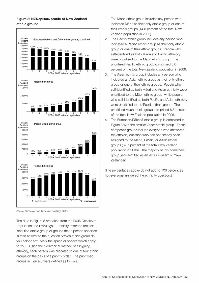
- -
Figure 8: NZDep2006 profile of New Zealand
ethnic groups
Source: Census of Population and Dwellings 2006.
The data in Figure 8 are taken from the 2006 Census of
Population and Dwellings. ‘Ethnicity’ refers to the self-
identified ethnic group or groups that a person specified
in their answer to the question ‘Which ethnic group do
you belong to? Mark the space or spaces which apply
to you’. Using the hierarchical method of assigning
ethnicity, each person was allocated to one of four ethnic
groups on the basis of a priority order. The prioritised
groups in Figure 8 were defined as follows.
-1. The Maori ethnic group includes any person who -indicated Maori as their only ethnic group or one of
their ethnic groups (14.0 percent of the total New
Zealand population in 2006).
2. The Pacific ethnic group includes any person who
indicated a Pacific ethnic group as their only ethnic
group or one of their ethnic groups. People who -self-identified as both Maori and Pacific ethnicity -were prioritised to the Maori ethnic group. The
prioritised Pacific ethnic group comprised 5.6
percent of the total New Zealand population in 2006.
3. The Asian ethnic group includes any person who
indicated an Asian ethnic group as their only ethnic
group or one of their ethnic groups. People who -self-identified as both Maori and Asian ethnicity were
-prioritised to the Maori ethnic group, while people
who self-identified as both Pacific and Asian ethnicity
were prioritised to the Pacific ethnic group. The
prioritised Asian ethnic group comprised 8.5 percent
of the total New Zealand population in 2006.
4. The European/P akeha ethnic group is combined in
Figure 8 with the smaller Other ethnic group. These
composite groups include everyone who answered
the ethnicity question who had not already been -assigned to the Maori, Pacific, or Asian ethnic
groups (67.7 percent of the total New Zealand
population in 2006). The majority of this combined
group self-identified as either ‘European’ or ‘New
Zealander’.
(The percentages above do not add to 100 percent as
not everyone answered the ethnicity question.)
Atlas of Socioeconomic Deprivation in New Zealand NZDep2006 | 23
Longitudinal Analyses and Comparisons of Deprivation Profiles, 1991–2006
Introduction NZDep2006 is the fourth census-based NZDep index to
be produced (the earlier ones were NZDep91, NZDep96
and NZDep2001). The first two indexes were created
one calendar year apart, with the second, NZDep96,
improved in two ways. First, we dropped two variables
for theoretical reasons. Secondly, we were able to
include another deprivation variable into NZDep96 from
a new question in the 1996 census relating to whether
people had access to a telephone or not. These
changes – from 10 variables in the 1991 version to
nine variables in the 1996 version, eight of which were
common to both indexes – mean that these indexes
should be compared with caution. Additional technical
reasons to be cautious are outlined below.
There are fewer obvious differences between NZDep96
and NZDep2001 or between NZDep2001 and
NZDep2006. We are aware that many researchers
would like to use the index to inform longitudinal studies.
We can distinguish two types of longitudinal study –
those comparing areas over time, and those looking for
changes in the relationship between deprivation and
some other variable (eg, mortality) over time.
Our conclusions are as follows:
• Comparisons of areas as small as single
meshblocks across time may not be meaningful.
Comparisons of areas at a higher aggregation,
such as Territorial Authorities or Census Area Units
should be reasonable, although we advise caution
in interpreting small changes over time as being
practically meaningful. See the following section
‘Comparing areas over time’.
• Comparisons of relationships between deprivation
and another variable, over time, are reasonable. See
the section ‘Comparing relationships with deprivation
over time’.
Note that each NZDep index of relative deprivation
(NZDep91, NZDep96, NZDep2001 and NZDep2006)
divides the country into 10, where the highest value
indicates the 10 percent of NZDep[year] small areas with
the most deprived NZDep[year] scores. It is important to
remember that by definition 10 percent of small areas will
always fall into the most deprived group – irrespective of
the absolute deprivation in those areas at that time or the
overall wealth of the country.
Comparing areas over time Meshblocks can change deprivation values between any
two censuses for substantive and technical reasons.
Substantive reasons
The NZDep value of a meshblock may change between
any two censuses for two substantive reasons.
• The local neighbourhood changes in population size
and/or characteristics through housing development
such as new subdivisions or inner-city apartments
created in disused office or warehouse space, or
housing demolition.
• The local neighbourhood changes in characteristics
as a result of changes in house ownership.
These two changes may give rise to either or both of two
consequences.
• The size of the usually resident population in the
meshblock changes somewhat, and the meshblock
boundary remains unchanged.
• The size of the usually resident population increases
substantially, and Statistics New Zealand splits
the original meshblock into two (or more) new
meshblocks. In this case, the original seven-digit
meshblock number is discontinued and new ones
are created with the same first five digits. Thus,
the original meshblock number ends with the two
digits ‘00’. If necessary, it is then split into, say,
two meshblocks with the same first five digits and
the endings ‘01’ and ‘02’, while the ‘00’ number is
discontinued. If, later, the ‘02’ meshblock needs to be
split, the ‘02’ number is discontinued and (if it is again
split in two) the numbers ‘03’ and ‘04’ are used.
24 | Atlas of Socioeconomic Deprivation in New Zealand NZDep2006
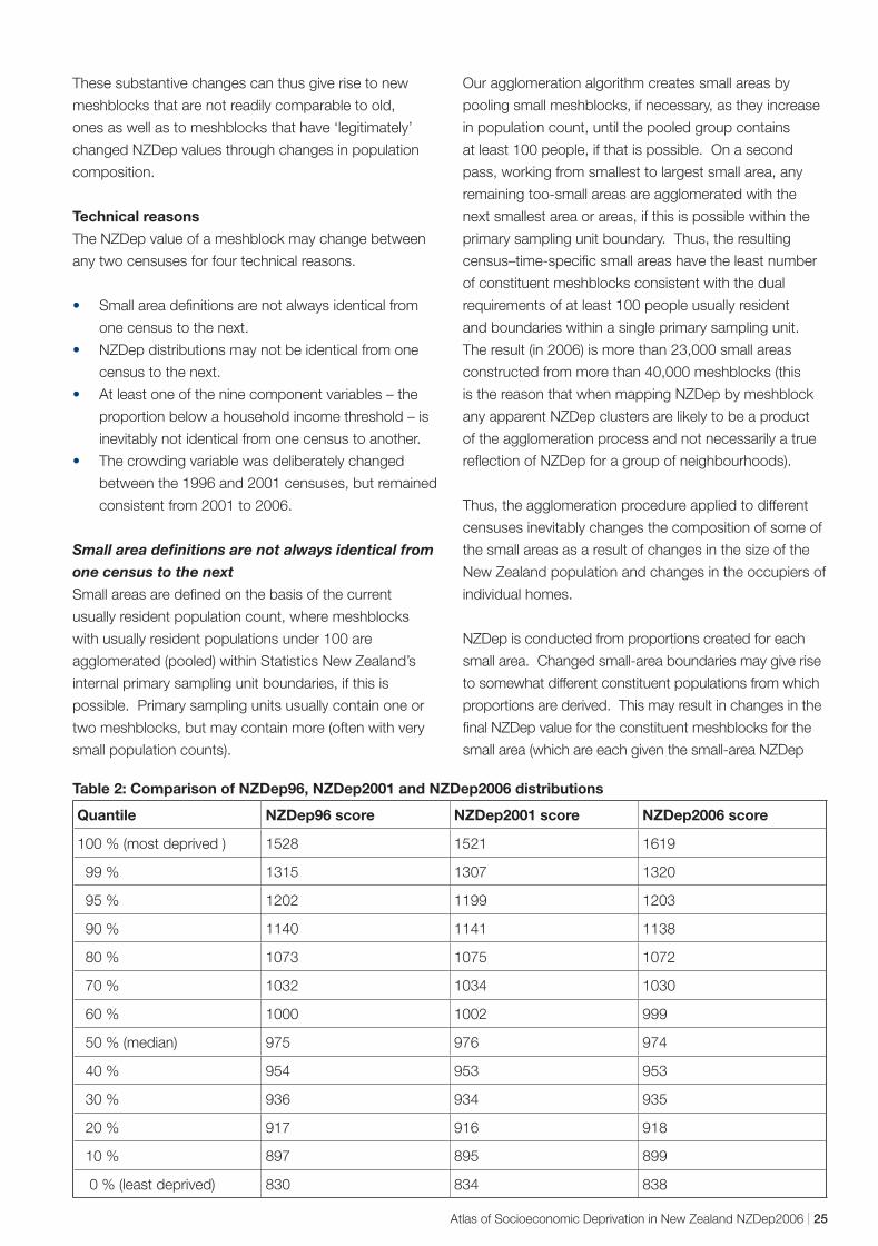
These substantive changes can thus give rise to new
meshblocks that are not readily comparable to old,
ones as well as to meshblocks that have ‘legitimately’
changed NZDep values through changes in population
composition.
Technical reasons
The NZDep value of a meshblock may change between
any two censuses for four technical reasons.
• Small area definitions are not always identical from
one census to the next.
• NZDep distributions may not be identical from one
census to the next.
• At least one of the nine component variables – the
proportion below a household income threshold – is
inevitably not identical from one census to another.
• The crowding variable was deliberately changed
between the 1996 and 2001 censuses, but remained
consistent from 2001 to 2006.
Small area definitions are not always identical from
one census to the next
Small areas are defined on the basis of the current
usually resident population count, where meshblocks
with usually resident populations under 100 are
agglomerated (pooled) within Statistics New Zealand’s
internal primary sampling unit boundaries, if this is
possible. Primary sampling units usually contain one or
two meshblocks, but may contain more (often with very
small population counts).
Our agglomeration algorithm creates small areas by
pooling small meshblocks, if necessary, as they increase
in population count, until the pooled group contains
at least 100 people, if that is possible. On a second
pass, working from smallest to largest small area, any
remaining too-small areas are agglomerated with the
next smallest area or areas, if this is possible within the
primary sampling unit boundary. Thus, the resulting
census–time-specific small areas have the least number
of constituent meshblocks consistent with the dual
requirements of at least 100 people usually resident
and boundaries within a single primary sampling unit.
The result (in 2006) is more than 23,000 small areas
constructed from more than 40,000 meshblocks (this
is the reason that when mapping NZDep by meshblock
any apparent NZDep clusters are likely to be a product
of the agglomeration process and not necessarily a true
reflection of NZDep for a group of neighbourhoods).
Thus, the agglomeration procedure applied to different
censuses inevitably changes the composition of some of
the small areas as a result of changes in the size of the
New Zealand population and changes in the occupiers of
individual homes.
NZDep is conducted from proportions created for each
small area. Changed small-area boundaries may give rise
to somewhat different constituent populations from which
proportions are derived. This may result in changes in the
final NZDep value for the constituent meshblocks for the
small area (which are each given the small-area NZDep
Table 2: Comparison of NZDep96, NZDep2001 and NZDep2006 distributions
Quantile NZDep96 score NZDep2001 score NZDep2006 score
100 % (most deprived ) 1528 1521 1619
99 % 1315 1307 1320
95 % 1202 1199 1203
90 % 1140 1141 1138
80 % 1073 1075 1072
70 % 1032 1034 1030
60 % 1000 1002 999
50 % (median) 975 976 974
40 % 954 953 953
30 % 936 934 935
20 % 917 916 918
10 % 897 895 899
0 % (least deprived) 830 834 838
Atlas of Socioeconomic Deprivation in New Zealand NZDep2006 | 25
value). Such a change, therefore, may have more to do
with the boundary changes for the small area than any
changed circumstances among the residents. This is the
modifiable areal unit problem discussed in the mapping
section. Aside from analytical distortions, this can also
lead to erroneous visual interpretations. Therefore, it is
important to remember when analysing and mapping
NZDep that the meshblock boundaries are for context only
and are not necessarily the small areas used to calculate
the index.
NZDep distributions may not be identical from one
census to the next
The base NZDep values are the scores on the first
principal component of the correlation matrix of the nine
component-adjusted proportions. Table 2 shows close
agreement on the form of the NZDep96, NZDep2001 and
NZDep2006 distributions. Each has been derived with a
mean of 1000 and a standard deviation of 100.
The NZDep variable ‘proportion below a household
income threshold’ is not identical from one census to
another.
Changes to the income categories in the census due
to changes in dollar values give rise to changes in the
household income variable. This household variable
assumes the relevant median income within each income
category (obtained in 2006 from Statistics New Zealand’s
Survey of Family, Income and Employment) as the value
to use for adding up incomes over family members. This
gives rise to a finite number of possible family incomes,
depending on the number of earners in the family and
how much each of them is estimated to earn. In turn, this
yields a finite number of equivalised household incomes
(that is, incomes adjusted to take account of the size and
composition of the household).
From the distribution of people within these categories,
we have to decide which of these finite values will be the
threshold below which we will define a household, or
people, to have a ‘low’ equivalised household income.
The threshold of equivalised household income used
in 1996 was 17,100 ‘equivalised dollars’, which cut
off 13.9 percent of households; in 2001 it was 17,700
‘equivalised dollars’, which cut off 15.0 percent of people
(the change from household to people is because,
in 2001, Statistics New Zealand staff provided the
information in the raw data set of individuals, whereas,
in 1996, the information was calculated in the data
laboratory and the threshold cut off decision was made
from a household file). The change between 2001 and
2006 is, however, slight, as the threshold in 2006 cuts off
14.96 percent of people.
As a result of the changed proportions of individuals living
in households below the equivalised income threshold,
there has been a slight difference in information added to
the composite NZDep index, though this difference was
very small in the last two indexes – and will have been
swamped by changes in the underlying monetary value.
The crowding variable changed between the 1996
and 2001 censuses but has remained consistent
from 2001 to 2006
The definition of ‘crowding’ used in the NZDep96
calculations was the definition from the Organisation
for Economic Co-operation and Development (OECD),
which counted the number of people and the number
of bedrooms available in a household (see Urlich et al
1994). A ratio of more than one ‘equivalent’ person per
bedroom was defined to be ‘crowded’ for the purposes
of establishing the proportion of people in a small area
living in ‘crowded’ accommodation. A person-equivalent
was defined following Morrison (1994): children aged 10
years and over are equivalent to one adult; children aged
under 10 years are equivalent to half an adult.
In the 2001 and 2006 indexes we have improved our
indicator of crowding by using the Canadian definition
(Statistics New Zealand 1998, p 79), which allows
couples and certain small children (on the basis of
their ages and sexes) to share a bedroom. This has
resulted in a better performance for the indicator in the
principal component analysis. Whereas the OECD-
defined variable in 1996 had a weight of 0.228, which
was the lowest of all the weights (range 0.228–0.363),
the Canadian-defined variable in 2001 had a weight of
0.309, again the lowest, but in closer alignment with
the other eight coefficients (range 0.312–0.361). In
2006, the weight was similar to 2001 (0.318), and
again in close alignment with the other weights (range
0.311–0.371).
As a result of the change in the definition of crowding,
the information added to the composite NZDep96 and
NZDep2001 indexes was slightly different, however, the
information between the last two indexes, NZDep2001
and NZDep2006, was unchanged.
26 | Atlas of Socioeconomic Deprivation in New Zealand NZDep2006
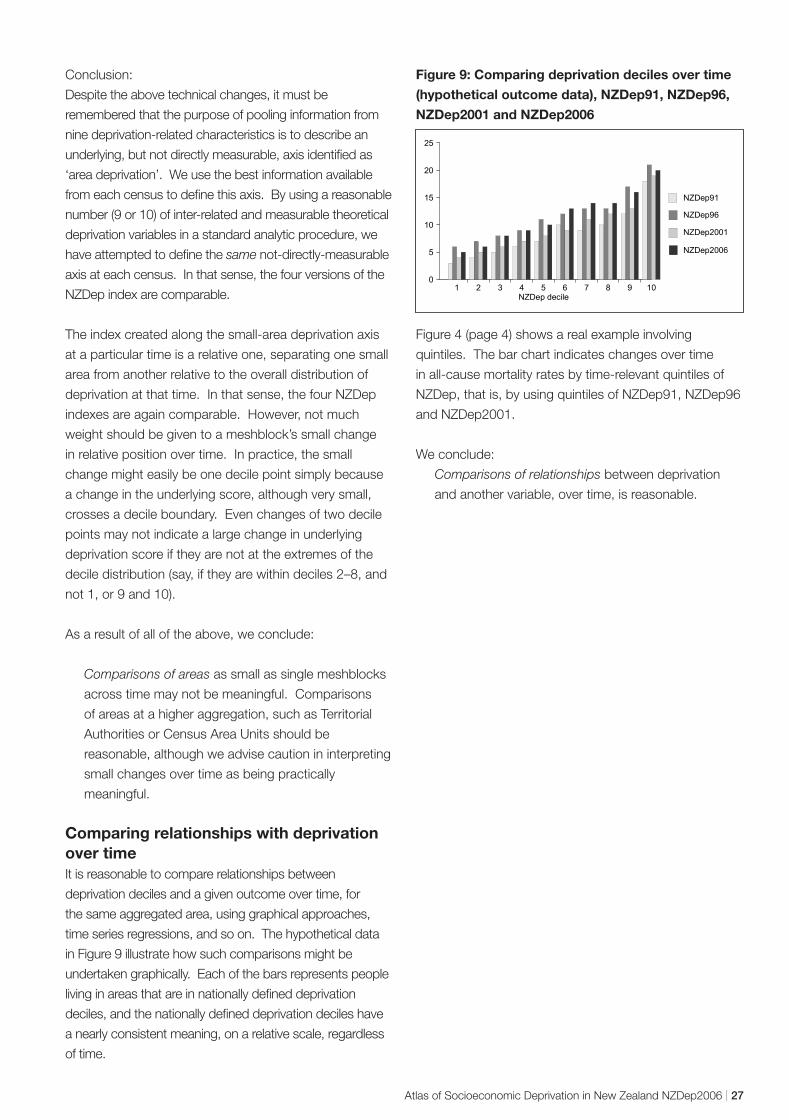
Conclusion:
Despite the above technical changes, it must be
remembered that the purpose of pooling information from
nine deprivation-related characteristics is to describe an
underlying, but not directly measurable, axis identified as
‘area deprivation’. We use the best information available
from each census to define this axis. By using a reasonable
number (9 or 10) of inter-related and measurable theoretical
deprivation variables in a standard analytic procedure, we
have attempted to define the same not-directly-measurable
axis at each census. In that sense, the four versions of the
NZDep index are comparable.
The index created along the small-area deprivation axis
at a particular time is a relative one, separating one small
area from another relative to the overall distribution of
deprivation at that time. In that sense, the four NZDep
indexes are again comparable. However, not much
weight should be given to a meshblock’s small change
in relative position over time. In practice, the small
change might easily be one decile point simply because
a change in the underlying score, although very small,
crosses a decile boundary. Even changes of two decile
points may not indicate a large change in underlying
deprivation score if they are not at the extremes of the
decile distribution (say, if they are within deciles 2–8, and
not 1, or 9 and 10).
As a result of all of the above, we conclude:
Comparisons of areas as small as single meshblocks
across time may not be meaningful. Comparisons
of areas at a higher aggregation, such as Territorial
Authorities or Census Area Units should be
reasonable, although we advise caution in interpreting
small changes over time as being practically
meaningful.
Comparing relationships with deprivation over time It is reasonable to compare relationships between
deprivation deciles and a given outcome over time, for
the same aggregated area, using graphical approaches,
time series regressions, and so on. The hypothetical data
in Figure 9 illustrate how such comparisons might be
undertaken graphically. Each of the bars represents people
living in areas that are in nationally defined deprivation
deciles, and the nationally defined deprivation deciles have
a nearly consistent meaning, on a relative scale, regardless
of time.
Figure 9: Comparing deprivation deciles over time
(hypothetical outcome data), NZDep91, NZDep96,
NZDep2001 and NZDep2006
1 2 3 4 5 6 7 8 9 10 NZDep decile
0
5
10
15
20
25
NZDep91
NZDep96
NZDep2001
NZDep2006
Figure 4 (page 4) shows a real example involving
quintiles. The bar chart indicates changes over time
in all-cause mortality rates by time-relevant quintiles of
NZDep, that is, by using quintiles of NZDep91, NZDep96
and NZDep2001.
We conclude:
Comparisons of relationships between deprivation
and another variable, over time, is reasonable.
Atlas of Socioeconomic Deprivation in New Zealand NZDep2006 | 27